Reverb lets Amazon’s Alexa live inside your Mac, iOS and Android devices

Now you can use Amazon’s Alexa virtually anywhere you want using Reverb, the new free app from Rain Labs. The app connects to Amazon Echo services and allows you to use Alexa through your Mac, desktop, IOS and Android phones or tablets. And you don’t need to be connected to wifi to use it.

When you open the app on your chosen device you’re prompted to sign into your Amazon account. Now you’re ready to use Alexa. The familiar blue Alexa ring appears on the screen, you activate Alexa by clicking the ring with your mouse or holding your finger on it and giving a command. It’s that easy. You can also access Reverb directly from your favorite browser. 

The new version of the Reverb app uses Alexa v2, which gives you access to news flashes, timers, weather, alarms and more. It also enables Smart Home Skills so you can control your Alexa compatible smart devices. Unfortunately, the one key feature you can’t access is playing music, due to Amazon’s restrictions placed on using their music service on apps.

Reverb even allows you to use your installed Alexa skills. So you can say “Alexa play ocean sounds”, “Alexa play Jeopardy ” or my personal favorite “Alexa order a pizza from Dominos”.

Possibly the best thing about having the app on your phone, tablet or computer is you won’t have to buy multiple Echo devices for each room in your home or office – And it’s FREE.

Reverb, from Rain Labs is available for download now for Mac at the Mac App Store, for iPhone and iPad at the iOS App Store, and for Android at the Google Play Store.

Filed in categories: Android, iOS, News

Tagged:

Reverb lets Amazon’s Alexa live inside your Mac, iOS and Android devices originally appeared on on March 1, 2017 at 11:37 am.

Note: If you are subscribed to this feed through FeedBurner, please switch to our native feed URL http://the-gadgeteer.com/feed/ in order to ensure continuous delivery.

Dress your Apple Pencil in leather

Brian Holmes over at Pad&Quill says that their all-new Leather Apple Pencil Grip solves every problem you never knew you had with your Apple Pencil. Made from the same full-grain American leather that P&Q uses in their other bags, the two piece Leather Apple Pencil grip is hand-sewn using a baseball-style stitching technique and has an attached lightning charger cap holder and a stainless steel pocket clip. The leather grip is available in three colors, is priced at $49.95, and is backed by a 10-year warranty. It starts shipping in April and you can check it out now at padandquill.com.

Filed in categories: Cases and Covers, iOS, News

Tagged:

Dress your Apple Pencil in leather originally appeared on on March 1, 2017 at 7:30 am.

Note: If you are subscribed to this feed through FeedBurner, please switch to our native feed URL http://the-gadgeteer.com/feed/ in order to ensure continuous delivery.

Prynt case review

In this day and age, it’s nice to still have physical copies of favorite photos to have something tangible to look at on your desk or wall. Prynt brings a polaroid type experience by printing photos straight from your phone. It will also replay a video if you hold your phone over the photo with the Prynt app. Let’s take a look at this nifty case!

I received the Prynt case in white, along with a pack of Zink paper (a special inkless photo paper), instructions, and a microUSB cable to charge the case.

The Prynt case is compatible with the following smartphones:

  • iPhone 6/6S
  • iPhone 6/6S Plus
  • iPhone 5/5S/SE
  • Samsung Galaxy S5

My iPhone 7 Plus wasn’t listed on the compatibility list, but I was lucky and found it to work just fine!

I made sure to charge the Prynt case with the MicroUSB cable. It only took a couple of hours to fully charge, then I was ready to go. I added the Zink paper into the hatch, which fit one ten-pack at a time.

I had to press this side button to get my iPhone into the case.

Here’s the back of the case with lightning port.

The iPhone 7 Plus fit very snugly into the Prynt, but I had to remove my own iPhone case.  It made me a bit nervous to push in, but then I realized I was able to remove the “top” portion of the case by pressing against the two latches, and then snapping the cover back in.

Here I used the Prynt case with the super thin Totallee case, which I’m reviewing soon. It doesn’t sit well, so I recommend to just remove any case altogether.

After downloading the Prynt App from the iOS store, I connected the Prynt case by hitting the shutter button, and it connected automatically.

Here’s a screenshot of what the Prynt app shows you when taking a photo. You can mail a Prynt, physically print it, or edit the photo.

When printing the photos, it comes out of the case near the top of the phone. It’s similar to a Polaroid camera, but the nicer since the photo is printed right away, instead of having to wait for the photo to develop.

I found that when printing my photos, the colors were a bit “washed” out, and not very accurate to what’s on screen. It’s not terrible, but not great.

Here I was playing with the built in photo editor in the Prynt app. They have basic effects such as adjusting light, color and hue, as well as fix redeye, and adding text to the print.

You can do some freehand drawing right on the photo before printing.

You can also create your own memes.  This is the best I could do for this coffee setup. 🙂

There is a cool feature within the Prynt app where it can record a short video while you’re taking a photo. That six second video that was recorded after the shutter press is actually embedded into the photo. The video plays on the photo itself in augmented reality style when you hold the Prypt app over the physical photo. It’s like AR (Augmented Reality) with your own printed photos and the Prynt. More can be seen on their own website via the “how it works” link.

Overall, I had fun using the Prynt case. I printed a few shots and gave them out to my friends at a party, which was fun, but having the phone in the Prynt case was a pain since it’s so bulky.  I think I’d rather have a thinner case or separate printer. I’m going to guess that the next revision of the Prynt will be thinner, and hopefully, the quality of the photos will be better. For now, it’s a lot of fun to have at gatherings and nice to have a physical print of your favorite photos.

Source: The sample for this review was provided by Prynt. Please visit their site for more info and Amazon to order.


Product Information

Price: $149.99
Manufacturer: Prynt
Requirements:
  • iPhone 6/6S
  • iPhone 6/6S Plus
  • iPhone 5/5S/SE
  • Samsung Galaxy S5
Pros:
  • Fun to use
  • Never failed to connect
Cons:
  • Huge in size
  • Photos look washed out and not accurate to digital version

Filed in categories: iOS, Reviews

Tagged:

Prynt case review originally appeared on on February 26, 2017 at 9:45 am.

Note: If you are subscribed to this feed through FeedBurner, please switch to our native feed URL http://the-gadgeteer.com/feed/ in order to ensure continuous delivery.

The IconFactory Linea iPad Pro sketchbook app review

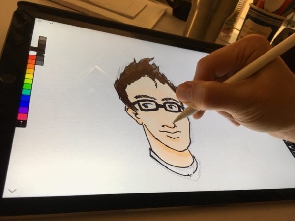
One of my favorite tech innovations of the past year is Apple’s iPad Pro paired with the Pencil. There have been many digital styli that have preceded it, but for me, nothing’s come close to touching the Pencil for note-taking and drawing.

I’ve been dabbling in iPad sketching apps for almost as long as they’ve been available. Procreate, Adobe Sketch and Paper have been my go-to apps for different reasons. I like the simplicity of Paper, the depth of Procreate and the Creative Cloud integration of Sketch, and I’ve been bouncing between all three for quite some time.

When I found out that The IconFactory was creating their own sketchbook app that was built from the ground up around the Pencil, you can bet that caught my eye.

Linea feels like it pushes all the right buttons for me. Its toolset boasts the simplicity, and more important, the restraint, of Paper, while offering several very useful features. Let’s crack this nut.

The Interface

The IconFactory did a fine job with their layout. It puts everything within reach while remaining compact, maximizing the canvas area. It can be hidden with a simple tap on the arrow in the bottom of the screen. The layer, grid, and paper textures can be toggled with a quick double-tap on the respective icons. It’s fast and intuitive.
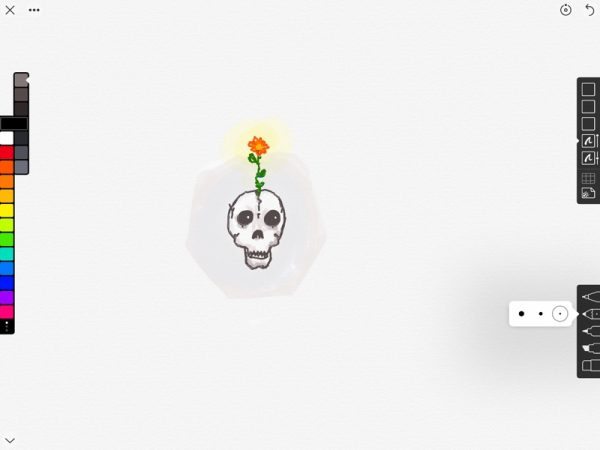
The interface is so tidy and gets out of the way.

I love the way they handled the color selection. Tapping on a hue reveals a second row of swatches with lighter and darker shades. Sliding the swatch bar up or down moves to the next row of colors. There is an entire row of customizable swatches if you want to pick out your own palettes.

On the opposite side, you’ll find the layer tab, grid selection, and paper texture. Five layers are all you get, but that’s been plenty, in my experience. Each can be moved up or down, turned on or off and adjusted for transparency. A layer can be merged down with the one under it. It’s worth noting there are no blend modes as you might find in other drawing apps.

Multiple layers make it easy to pencil, ink and color.

There is no import option, which is a shame. I often import source material to the canvas so I don’t have to swap back and forth between apps to keep drawing.
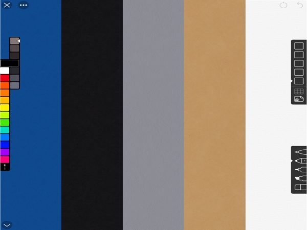
Blueprint, black construction, gray bristol, butcher paper and paper grain.

The paper textures are a nice touch. There are five distinct colors and the texture themselves can be turned on and off with a quick double tap. There are also five types of grids and a number of handy templates, including storyboards, app icons and mobile device screens, perfect for design prototyping.

I appreciate the multiple export settings available, such as multiple file types and transparency options. I can even export a layered PSD to finish up in Photoshop.

The Tools

Finally, there are the drawing tools, themselves. At your disposal are a mechanical pencil, art pencil, technical marker and wedge marker. Each have several tip sizes and utilize the Pencil’s pressure sensitivity in different ways. For instance, the pencil tools act as you’d expect, where a firmer press against the glass creates a darker line. Whereas the marker creates a thicker line with more pressure.
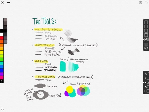
For an app claiming to be built around the Pencil, it’s curious that the art pencil tool doesn’t take into account the angle at which the Pencil is being held. It wouldn’t work if you were trying for an angled shading technique, for instance.

There’s also an eraser, of course. With a Pencil connected, the app defaults to using a finger as the eraser. It’s an intuitive approach that’s not unlike using your finger to remove marks on a dry erase board.
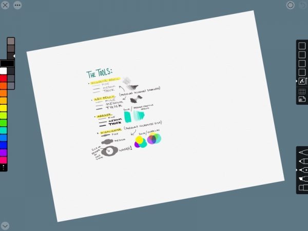
What’s more, undo and redo can be quickly accomplished with a two or three finger tap on the canvas, respectively. You can pinch to zoom, as you’d expect, but you can also rotate the canvas.

Conclusion

After spending some time with Linea, I found a lot to like. Right out of the gate, it’s a refreshing entry in a category with many excellent alternatives, and I feel like with a few tweaks and additions, it could prove to be the one I go back to the most

Linea is available on the App Store for $9.99. If you want to give it a closer look, you can watch some short demo videos on The IconFactor website.

Source: The app for this review was purchased with my own funds. Please visit The IconFactory for more info and the iTunes App Store to buy it.


Product Information

Price: $9.99
Manufacturer: The IconFactory
Retailer: iTunes
Pros:
  • Intuitive finger/Pencil control
  • Simplified art tools and color selection
  • Unique templates and grids
  • Uncluttered interface
Cons:
  • Could further utilize the Pencil's abilities
  • Lacking a selection tool and image import

Filed in categories: iOS, Reviews

Tagged: , ,

The IconFactory Linea iPad Pro sketchbook app review originally appeared on on February 24, 2017 at 10:30 am.

Note: If you are subscribed to this feed through FeedBurner, please switch to our native feed URL http://the-gadgeteer.com/feed/ in order to ensure continuous delivery.
This card reader from ADATA works with iOS, Android and Windows

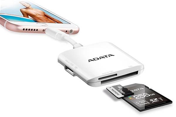
The ADATA AI910 Lightning Card Reader Plus is a 3-way card reader that works with iOS, Android, your laptop and desktop computers. It features an SD card slot and a micro SD card slot that support cards with capacities up to 256GB.

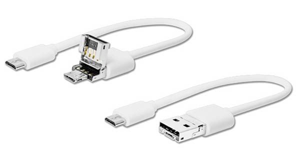
With a lightning connector and a 2-in-1 connector that has both USB A and micro USB connectors, you can share files across iOS, Android, Windows devices, action cameras, and more. Use the adapter to share files, backup files, even playback 4K video.

With a pass-through connection that can be used with power banks or a USB wall adapter, you won’t have to worry about running out of juice while watching video from a memory card on your iPhone or Android device.

The ADATA AI910 Lightning Card Reader Plus is priced at $47.37. You can find more info at ADATA and order one from Amazon.

Filed in categories: Android, iOS, News

Tagged:

This card reader from ADATA works with iOS, Android and Windows originally appeared on on February 24, 2017 at 8:00 am.

Note: If you are subscribed to this feed through FeedBurner, please switch to our native feed URL http://the-gadgeteer.com/feed/ in order to ensure continuous delivery.