Polar Vantage V Pro multisports watch review

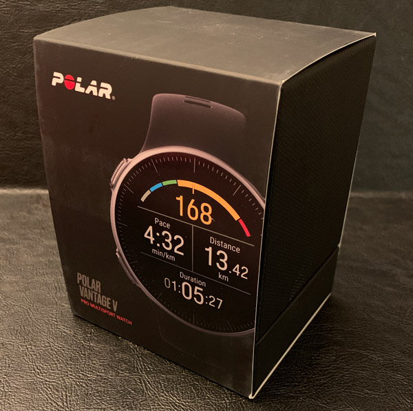
REVIEW – I love receiving new fitness gear to review…nine times out of ten, it amps up my desire to get/be/stay in-shape, workout, pound pavement, etc. As the years roll by, it gets increasingly difficult to be epic but I am a firm believer in that you get what you sow. Today’s tech-world gives us countless gadgets, websites, apps, and support systems to exercise more efficiently and effectively. Hopefully motivating and empowering each of us to reach our goals from wanting our pants to fit to gaining a six-pack. In this case, Polar has sent me their latest and greatest professional multisports training watch: the Vantage V to checkout for this review.

This review will be coming from the perspective of a fifty-something who isn’t nearly as energetic as they use to be back in the day. I will never run a marathon or do a triathlon but do try to workout daily, including running, walking, stairs, elliptical, weights, tennis, etc. For me the key is the long-game, to enjoy exercise but not to the point of injury. Typically I wear a mechanical watch throughout my day and swap it out for a fitness device when I workout, usually an Apple Watch for music and pace/duration. But for the next month or so, I’ll be focusing on the Vantage.

What is it?

The Vantage V is Polar’s flagship multisports training watch engineered to help top-level triathletes, marathoners, hardcore runners, etc. improve their performance and achieve their goals. The Vantage V is Polar’s replacement for the V800. In addition to upgrading the technologies within, Polar has change the overall aesthetics of the watch, going from a rectangular, utilitarian design to a the more classic round form factor.

What’s in the box?

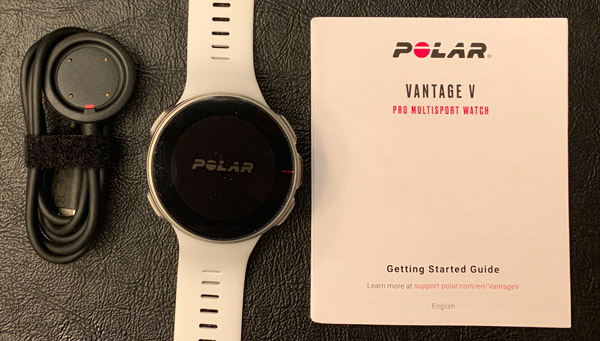
  • Polar Vantage V pro multisport watch
  • Charging cable
  • Polar Vantage V user manual
  • Information note

Specifications:

  • Measurements: 46 x 46 x 13 mm
  • Weight: 68 g
  • Display: Always on color touch display with Gorilla Glass. Size 1.2”, resolution 240 x 240.
  • Battery: 320 mAh Li-pol battery. Battery life up to 40 h in training mode (GPS and wrist-based heart rate).
  • GPS & Barometer: Integrated GPS & GLONASS. Assisted GPS for fast fix times. Barometric altitude, incline, ascent and descent.
  • Connectivity: Bluetooth Low Energy. Custom USB cable for charging and data synchronization.
  • Watch: Time & date. Alarm with snooze.
  • UI languages: English, German, French, Italian, Dutch, Norwegian, Spanish, Portuguese, Swedish, Finnish, Danish, Polish, Russian, Turkish, Indonesian, Czech 
  • Sensors: Compatible with Polar BLE heart rate sensors.
  • Water resistance: Waterproof (WR30)
  • Wristbands: Durable and comfortable silicone.
  • Sizing:

    • Small: wrist circumference 130-185 mm
    • Med/Large: wrist circumference 155-210 mm

Design and features

As I said, the Vantage V is Polar’s flagship, GPS enabled sports watch engineered to track nearly any and all sport and fitness activities: running, swimming, cycling, elliptical, yoga, martial arts, tennis…to name a few. Like a majority of past and present Polar products, their latest & greatest can also track your daily activities including heart rate, steps taken, and calories burned.  But like it’s predecessor, using the Vantage “as a fitness band would be like taking a Ferrari to the grocery store to buy milk”. It works and you’ll look getting there but there are certainly lower priced, just as effective alternatives 😉 .

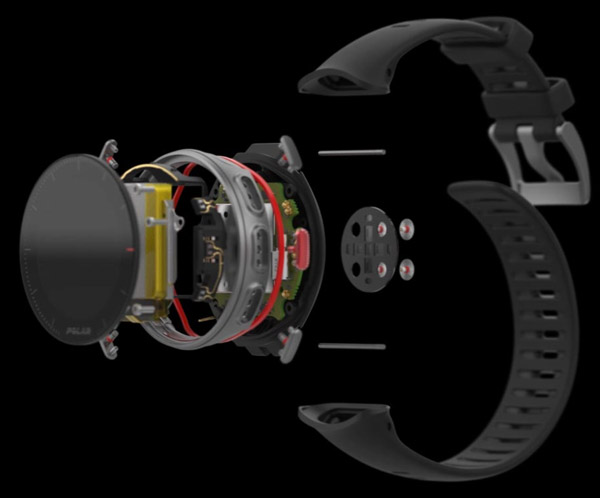
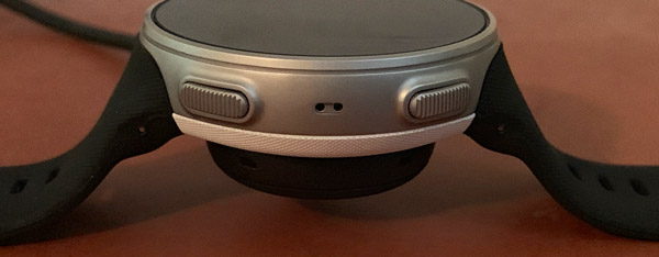
The Vantage V is definitely a well-made device, constructed from aircraft aluminum, gorilla glass, and solid yet comfortable rubber. These premium materials combine to give this multi-sport watch a quality look and feel. The 1.2 inch 240×240 color touchscreen is protected by gorilla glass and is surrounded by the aluminum case that flow nicely into its rubber back.

Fit and comfort

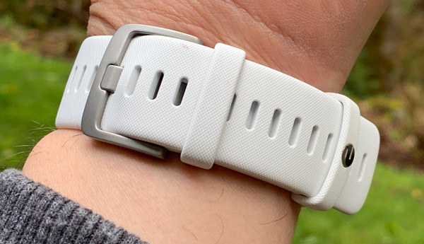
As with a majority of fitness watches, the Vantage V comes on rubber strap.

The rubber is soft, flexible, and overall the band is very comfortable to wear. The strap has a knurled texture to it with a standard buckle and locking, logoed free loop to keep the end of the strap in place.

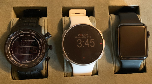
For being a 46mm watch that sits 13mm high, the Vantage V doesn’t wear too big or heavy on the wrist. Here you can see it in comparison to the Suunto Elementum Terra and larger of the two Apple watches. The Vantage wears very nicely on my 7 inch wrist and compared to a stainless steel watch, it’s so light I barely know I have it on.

Setup and Configuration

The first step I did in the setup process was to charge the Vantage using its proprietary charging pad.

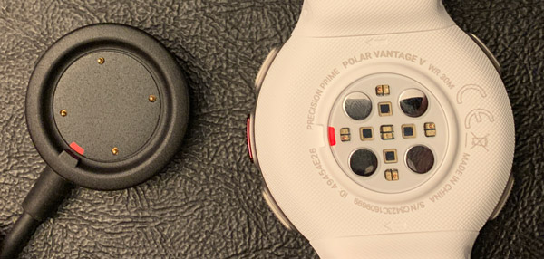
There are four metal plates on the back of this fitness watch engineered to make contact with the corresponding pins on the charging pad. This is definitely a bit old school when many of the big players in smartwatches use inductive charging that can be done on any wireless charging pad.

The watch has to sit in a specific orientation to charge. There is a red tab on both the Vantage and charger that align.

The watch and pad are held together magnetically.

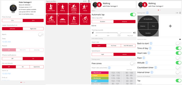
As the watch was charging, I (re)downloaded the Polar Flow app onto my iPhone and logged into my account I setup for previous reviews. All of my preferences were still there, so other than confirming all my info hadn’t changed…getting everything dialed in was quick and easy. That said, 99% of configuring the watch happens either in the app or on the Polar Flow web-interface (I recommend the website. I found it easier).

Setting up your Polar world can be anywhere from a relative short effort to a long and detailed one. The Polar Flow app/website enables you to tweak many facets of that ecosystem, down to how your watch face presents your data and what sensors are being used/enabled during each specific activity.

Once you have your activities arranged and personalized as you want them, you simply sync your watch and smartphone or computer. For you newbies to Polar, I can almost guarantee you that you’ll continue to tweak your profile and watch configurations as you become more accustomed to how you use your multisport watch and what data/stats are important to you as you workout. The more time, effort, and thought you put into this, the more you ultimately get out of using the Polar experience.

Operations

The Vantage V can be controlled by it 1.2 inch touchscreen or 5 physical buttons along the sides of the case. The Vantage products have an MIP display (memory in pixel) with a resolution of 240×240. When I reached out to Polar regarding the Vantage’s screen this was their response:

We decided to go with the MIP display instead of OLED, because an OLED display consumes a lot of power and is not very readable in bright sunlight. We figured extended battery life and the ability to see the display continuously when training (during indoor and outdoor sessions) are important for athletes.

After using various Apple, Samsung, Android Wear watches (not to mention smartphones) over the years, I’ve become relatively accustom to OLED displays and how much they pop especially in low light. But I 100% agree with Polar on this one, I’d rather not have to charge my watch every night and be able to see my time on a bright summer run.

Like its casing, the Vantage V buttons are constructed of aluminum with a ridged pattern machined into their surface. The buttons are easy to find and use while working out. The left side has the LIGHT and BACK (pauses/ends the workout) buttons.

The right side has the page UP and page DOWN buttons for navigating thru the user interface and the red START/SELECT button is for beginning activities, laps and selecting/confirming objects in the various menus.

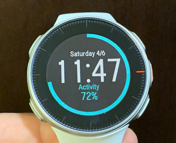
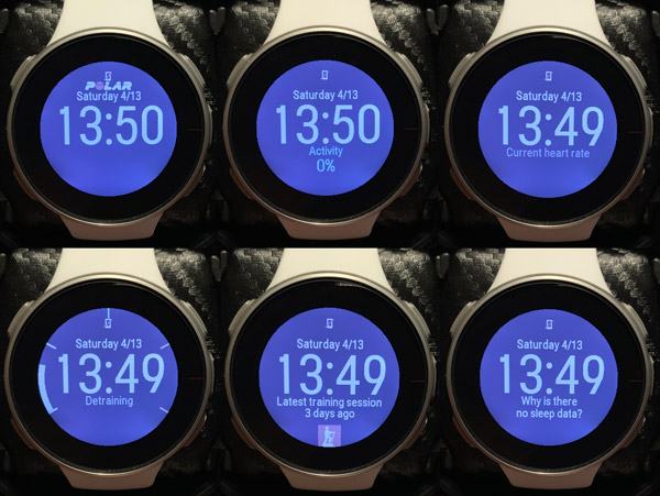
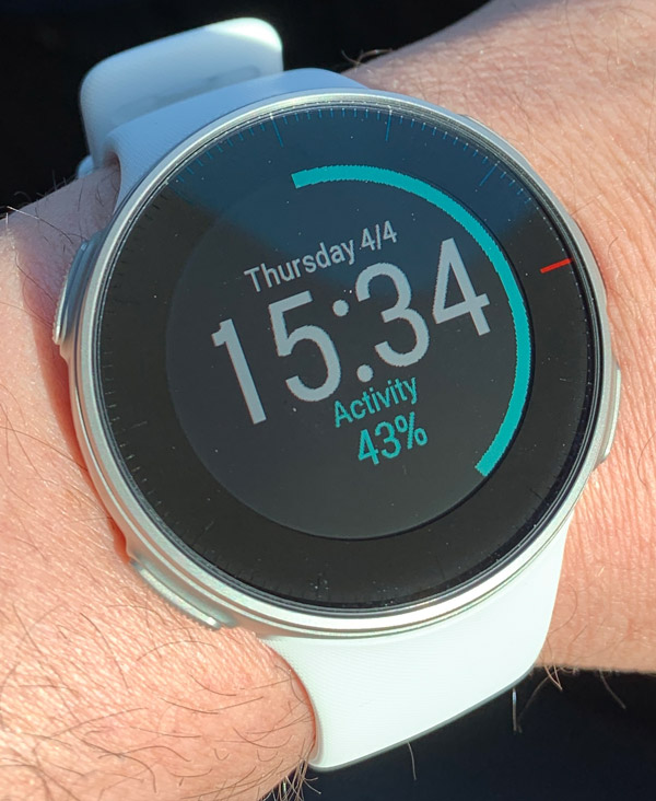
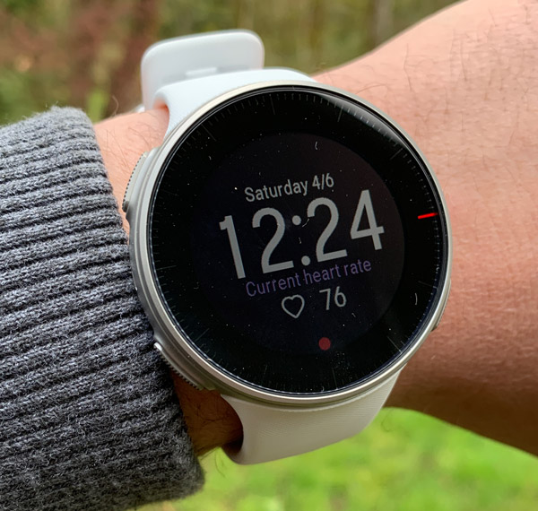
The six main screens all display time, day, and date. The other information you can have at the glance at your wrist is: percentage of your daily activity goal, heart rate, training arch, nag reminding how long it’s been since you last worked out, and sleep data.

In a recent firmware update, Polar has enable smartphone notifications which works very well across the board from my emails and messages to when my security cameras detect movement.

Performance

The Vantage V works as you would expect in today’s high tech world. The Polar OS, while be it a bit old school, is zippy enough, lag-free, and gets the job done. I’d call it direct, usable, and to the point.

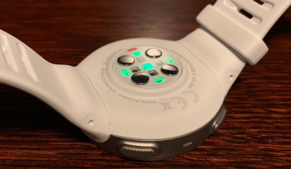
The Vantage series has Polar’s new Precision Prime fusion heart rate sensor engineered into back of the watch.  The sensor array has 9 LED that accurately monitors your heart rate during your workout or 24/7 throughout your day. I tested the Vantage’s accuracy against my Apple Watch and elliptical’s handle grip sensors and on average all correlated nicely though there was a bit more variability in the wrist sensors when compared to the fixed grips.

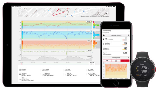
The Vantage V can also calculate Running Power using the heart rate monitor, GPS and barometer data from the wrist – no additional foot pods or sensors needed. This calculation is done with Polar’s proprietary algorithm and it helps you monitor the external load of your running (aka during intervals, hills, or to maintain a constant effort level during a race). The Vantage V can also use Running Power to calculate your Muscle Load, the load that your training session puts on your joints and your muscular and skeletal systems.

GPS distance and pace both seemed relatively accurate from my initial survey standpoint. I ran or walked several known routes and the distances & times were within a few percentage points of what I believe it should have been.  I hope to review this and a few other features more in-depth this summer as I workout more out side.

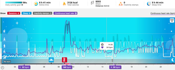
Polar’s Sleep Plus feature automatically detects the timing, amount, and quality of your sleep in hopes of better rest to ultimately improve your recovery and performance. Or in my case, Sleep Plus let’s me know when my wife’s snoring interrupts my sleep.

Battery life is incredible… Compared to my Apple, Samsung, or Wear OS smartwatches I have used thus far, the Vantage lasts many times longer than the any of the competition. In addition to using the GPS during my outdoor workouts, I had the watch continuously monitoring my heart rate 24/7 and my sleep quality at night and it still latest nearly a week before needing to be recharged.

To conserve power, the Vantage V doesn’t automatically sync with your smartphone, 99% of the time I had to force the issue by long pressing the lower left button on the watch.

Ecosystem

If I had to select the best part of the Polar experience, it would be the Polar Flow ecosystem it creates for its users. I grant you a system is only as good as the data being fed into it. But Polar engineers work diligently to not only provide you a worthy training companion but a place to nerd out over the data it collects.

The Polar Flow app/website enables you to dive very deep into the details of your training and performance metrics.

The Vantage V wirelessly syncs data from the watch to your mobile device which then updates your flow account with your most recent efforts. Without the app, data syncing must be done by plugging the watch into your computer via the charging cable.

Is It a Smartwatch…

That is a question I have been asked about this watch more than once during this review…and my answer is sort of. It doesn’t do apps or pay for stuff or even play music while you run. But like I mentioned above, it does give notifications, provides pace/distance/HR/etc on the fly, and does a great job gathering fitness and physical performance data then transferring it back to the mothership (aka Polar Flow) for further, more detailed analysis. As a modern day digital watch goes, the Vantage V is smart enough and does everything that I need, less music while pounding pavement. That said, I believe Polar will ultimately have to get on the bandwagon like others and produce less niche devices and cater a bit more to the mainstream. Cause lets face it, Apple is kicking @$$ and taking names. But that is just my 2 cents…

What I like

  • Well made hardware
  • Comfortable, light-weight form factor
  • Very sport-/training centric design
  • Polished, integrated fitness ecosystem
  • Smartwatch functionality has been added thru firmware updates
  • Collects huge quantity of data and presents it in a well thought out Polar Flow interface
  • Excellent battery life

What needs to be improved

  • Expensive
  • Can’t stream music
  • Isn’t a true “smartwatch”

Bottom Line

For this review, I wore the Vantage V nonstop for nearly two weeks then on and off when I exercised for approximately a month. I hate to say it but the Polar Vantage V is out of my league…that is the cold hard truth of it. For how I use a fitness smartwatch, this bad-boy is definitely overkill. It has been fun to try out but the realist in me knows I’ll never truly use many of the features of the Vantage or Polar Flow ecosystem. I’m definitely more of an Apple Watch, Samsung, or Wear OS kind of athlete. I like my motivational tunes streaming thru my earbuds and I would trade that over the differential the Vantage V gives you over the more mainstream fitness/smartwatches.

Final thoughts

The Vantage V and the Polar ecosystem that support it are an extremely powerful training tools that really anyone could use to improve their personal best in whatever sport or exercise regime they live in. That said, this flagship fitness and training watch is tailored more for the true athlete wanting to optimize their performance at the very far end of the curve. Though Polar, via firmware updates, has and continues to add smartwatch functionality to both variations of the Vantage. The Vantage V is impressive, with really have zero complaints other than no wireless music capabilities but that is a known quantity going into it.

As I said, I’ll continue to use the Vantage V this summer and will hopefully have a follow on review that discusses its accuracy and niche capabilities this Fall.

Price: $499.95
Where to buy: The Vantage V is available directly from Polar and Amazon
Source: The sample of this product was provided by Polar.

Filed in categories: Reviews

Tagged: ,

Polar Vantage V Pro multisports watch review originally appeared on The Gadgeteer on May 8, 2019 at 11:00 am.

Note: If you are subscribed to this feed through FeedBurner, please switch to our native feed URL http://the-gadgeteer.com/feed/ in order to ensure continuous delivery.

Moshi VersaCover Case with Folding Cover for iPad Pro/Air review

REVIEW – My household is home to several tablets and cell phones. We use them so much that I am always looking for a case that incorporates functionality with style and versatility. I just got the opportunity to test and review the Moshi VersaCover Case with Folding Cover for iPad Pro/Air. Here is my summary.

What is it?

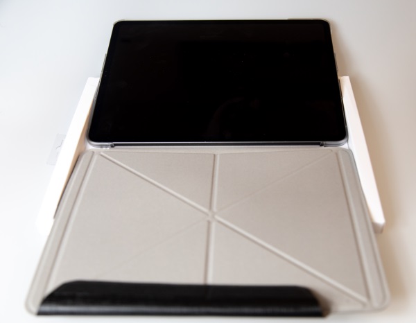
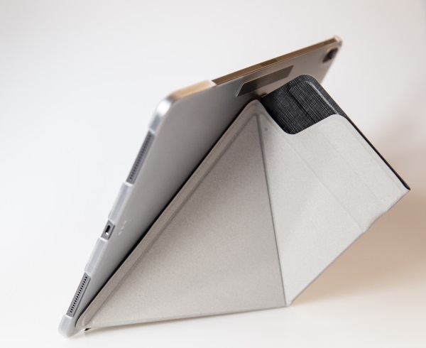
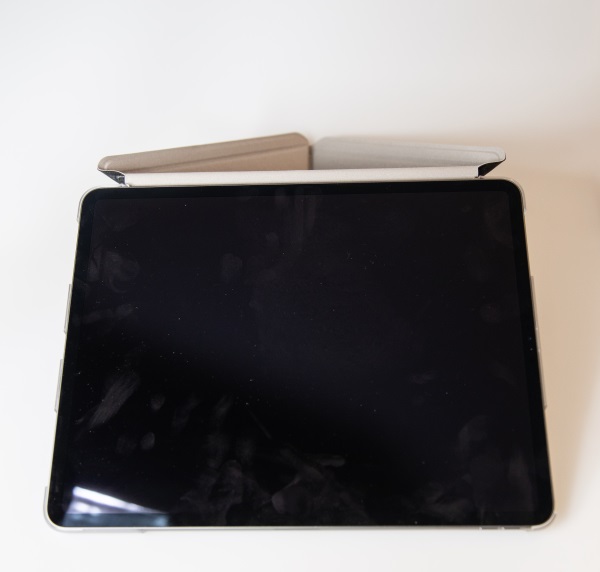
The Moshi VersaCover Case with Folding Cover for iPad Pro/Air is an iPad case that utilizes a unique folding cover that allows you to display your iPad at angles optimized for typing, reading, and browsing the web. It has a soft microfiber cover with a shock-absorbing frame bonded to a shatter-proof hard-shell case to protect the back of your device. The case also has a built-in magnet that supports the iPad auto-wake/sleep feature. It is available in two colors.

What’s in the box


1 x Moshi VersaCover Case with Folding Cover for iPad Pro/Air
1 x Product Box with printed instructions

Design and features

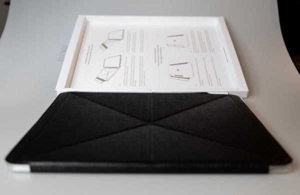
This case comes with a microfiber cover and a clear see-through back that holds the iPad. The back has all of the necessary cutouts for the camera, etc.

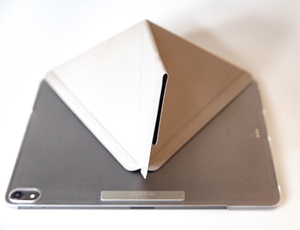
The microfiber cover magnetically closes around the back of the back cover to provide for a secure enclosure. There is enough space between the closing flap and the tablet to hold the Apple pencil.

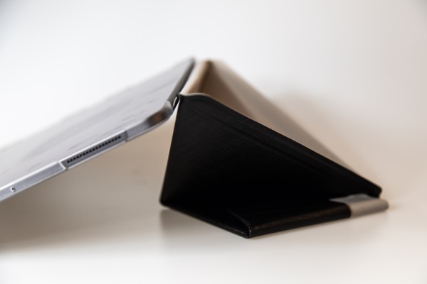
The cover folds and clasps together magnetically to form a stand for the tablet to be used in multiple positions.


What I like

  • The quality
  • The design that includes a place for the Apple pencil

What can be improved

  • Stability

Final thoughts

There are many types of cases for mobile devices including cases for tablets. The cases are designed for various types of use and purpose. This case provides decent protection and for someone who uses their tablet in their hands and occasionally on a flat surface, this case may work. For a “heavy” user like myself that uses a tablet on various surfaces and does a lot of typing, this case does not work. In addition, in a market that is flooded with cases are various price points and with lots of versatility, the cost for this case may not match the function and need for many.

Price: $49.95 – $79.95
Where to buy: Moshi website and Amazon
Source: The sample for this review was provided by Moshi

Filed in categories: Reviews

Tagged:

Moshi VersaCover Case with Folding Cover for iPad Pro/Air review originally appeared on The Gadgeteer on May 8, 2019 at 9:00 am.

Note: If you are subscribed to this feed through FeedBurner, please switch to our native feed URL http://the-gadgeteer.com/feed/ in order to ensure continuous delivery.
Skylum Software Luminar 3.1.0 with Accent AI 2.0 photo editing software review

REVIEW – Recently, I had the opportunity to review Skylum Software’s Luminar Flex photo editing plugin which offered much of their full Luminar product’s AI-based (Artificial Intelligence) editing available in Photoshop or other supported software.  Skylum has been in the lab and has released Luminar 3.1.0 with their new Accent AI 2.0 logic for one-touch photo editing.

What is it?

Luminar 3.1.0 is an update to Luminar 3, a full-featured photo editing package with tools like clone and stamp, cropping, transformations, layers, lens correction, color adjustments and so on.  So what, you say?  There are a lot of tools like that, you say?  Yup – I agree with you.  They’re a dime a dozen. Just pick the one with the interface and price that make the most sense to you and cents to your bank account and edit away.  Of course, you will take a lot of time editing your photos, tweaking curves, balancing exposures, adding layers in various opacities to get the look you want.  Or…you can use Luminar 3.1.0.  Its full plate of AI-based looks makes one-touch image enhancement stupid-simple for those of us that don’t have the time to fiddle.  OK – I’m retired, so I have the time, but I have far better things to do.

Fair warning – this review is about photo editing software, so this is going to be photo-heavy.  Also, I left the photos large-ish, so you can get a better look at the results.

Design and features

Let’s get this out of the way right now – Luminar is a full-featured photo editing package.  It does all the things other editing packages do and does them all well.  It can add layers.  It can blend effects in a multitude of ways.  It can adjust exposure, color balance, contrast, brightness, tint, and so on.  It can crop, clone, transform, skew, and basically do anything to your images that you could want. Its interface is fairly good, but like Photoshop or any other heavy-duty tool, there is a lot to it and it will take some learning to get good at it.

Photoshop has several “automatic” fix tools that are pretty good at one-click image improvement.  Luminar takes that up a notch, or ten notches, with their AI-based one-touch tools. And, they provide a ton of ’em.  That’s what this review will focus on since that’s what sets Luminar apart from the competition.

Setup

After downloading the software, I installed it on my Microsoft Surface Book.

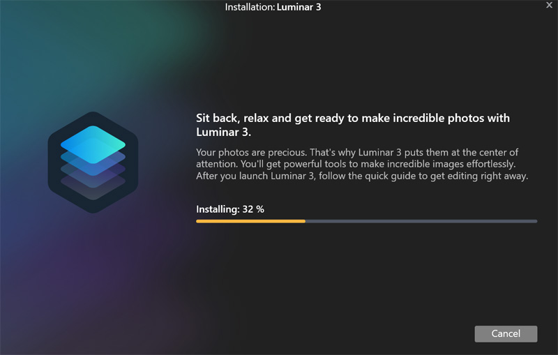
The installation was pretty standard until it asked for my photo library.  Since it asked, I pointed it to my library. Big mistake,  I have my photos on my Drobo 5N2 storage robot.  I currently have it populated with 5400 RPM disks.  Given that it is network-based, and has relatively slow disks, it simply isn’t that fast.  Add to that that I have over 160,000 photos on it, and I had to sit for a couple of hours while Luminar spun through them all, building a catalog.  Note to self: point it a small folder and add catalogs for specific subjects!

Once it finished, I created a new catalog for images for this review. As you add new images to a cataloged folder, Luminar automatically adds them to the catalog, so they show up the next time you open Luminar.

Here are the minimum requirements:

System Requirements for Mac OS

  • MacBook, MacBook Air, MacBook Pro, iMac, iMac Pro, Mac Pro, Mac mini
  • Processor Intel 64-bit Core 2 Duo or better
  • Memory 8 Gb RAM or more
  • macOS Mojave 10.14, High Sierra 10.13.1, Sierra 10.12.6, El Capitan 10.11.5
  • Hard disk 10 GB free space, SSD for best performance
  • Display 1280×768 size or better

System Requirements for Windows

  • Windows-based hardware PC with mouse or similar input device
  • OpenGL 3.3 or later compatible Graphics Cards
  • Processor Intel Core i5 or better
  • Memory 8 Gb RAM or more
  • Operating System Windows 7 (only 64-bit OS), Windows 8.1 (only 64-bit OS), Windows 10 (only 64-bit OS)
  • Hard disk 10 Gb free space, SSD for best performance
  • Display 1280×768 size or better

I ran tests on my Microsoft Surface Book with 8GM RAM, Core i7-6600u 2.6GHz processor and Win 10 Pro 64-bit. Based on the requirements, my laptop is at the bottom in terms of RAM, but better than the minimum processor speed.  While I have an SSD, as stated above, my images are on network attached storage, so I pay a performance hit there as well.

Performance

When I chose images for this review, I decided to grab a selection of pretty good images, and some pretty bad ones, in terms of lighting and contrast.  If we’re going to have AI do the heavy lifting here, let’s see how intelligent it really is.

I created a new catalog for these images and let Luminar grab the images once I copied them into the catalog.  Luminar has a complete suite of image management tools that include folders, where Luminar can manage your image folders and albums, where you can put similar images from different physical folders – think playlists in iTunes.

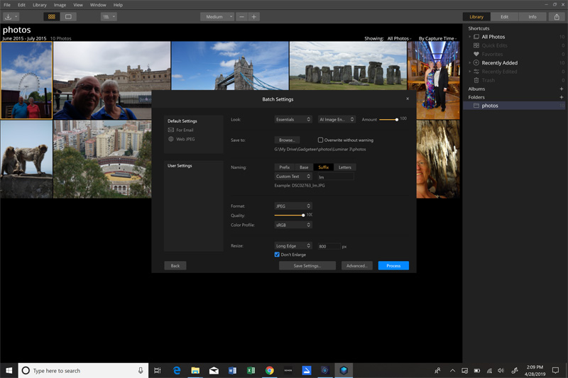
I also decided to try the batch processing option to get an idea of how practical that process is.  If Luminar really bills itself as easing photographer’s workflow, it should actually make that workflow easier!

The batch processing window has a couple of default options to export images for email or the web.  You get to decide what family of “looks” filters, and the specific AI filter to use when each image is processed as well as the level of the filter’s strength, from 0% to 100%.  You pick the output destination, naming options, output file format, quality, and color space.  Finally, you can resize the images with a variety of sizing or edge-binding options.

Given the limitations I have on my laptop, after grabbing eleven images for this review and choosing the Essentials collection AI Image Enhancer look at 100%, high-quality JPG output, setting an 800-pixel long-edge resizing and firing it up, I was prepared to sit and wait.  I was pleasantly surprised when just about 90 seconds later, my images were all exported.  Let’s see how they turned out.

Image 1

Let’s start with a shot of my wife & me in front of the London Eye.  The lighting was horrific and the image was dark and flat. We were in shadows and are quite dark.

After processing, you can see how much richer the sky looks and we are brightened considerably.

To my eye, our shirts are a little over-boosted and have a bit of red tint added to our faces.  This is easily controlled by dialing back the filter from 100% to perhaps 75%, but since I processed this all in batch mode, it was what it was.

Image 2

Here we are at the Tower of London on a cloudy day.  We are backlit and pretty dark and the overall image is flat with little contrast.

After processing, contrast is up and everything looks much sharper. The traces of blue that were actually in the sky are now visible and our faces are brighter but like Image 1, have a red tint.

There was only so much Luminar could do lightening our faces. I would have to spend time in a new layer and process that layer with our faces independent from the rest of the image.

Image 3

London Bridge on a beautiful day.  Colors look pretty good, but a little flat, compared to what the eye sees – a typical limitation of cameras.

After processing, everything is boosted and richer. This should be a postcard!  The algae just above the waterline is now visible, where it fell off in the shadows in the original image.

Image 4

Stonehenge. Another partly cloudy, low-contrast day.  Colors are all muted and the stones look flat and featureless.

After processing, contrast is improved and colors are boosted.  I’m not as thrilled with how the stones were rendered as they are now darkened and some detail is lost.

Image 5

Here we are on a formal night on a cruise.  Overall, I thought this looked pretty good straight out of the camera.

After processing, I do like the brightened shadow area in my tux, but I think some of the colors in my wife’s dress are a tad over-boosted.  Like other images, there is a bit of red introduced in our faces.

Image 6

Another horrible image out of the camera.  These Barbary macaques on Gibraltar were posing perfectly but there was no light on their faces.

After processing, the detail in their faces comes out as well as detail and color in their fur and detail on the wall

Image 7

This is a bull ring in Malaga, Spain.  Straight out of the camera, colors are flat and the image is pretty low contrast.

After processing, the image pops. I really like how this turned out.

Image 8

Here we are, overlooking the marina in Monaco. This image looks pretty good out of the camera as the lighting was good and the sun was high, providing good contrast.

After processing, the sky and water are enhanced but my shirt, that was pretty darn bright already, is a bit overblown. The red tint we have been seeing on skin is there, but not as pronounced in this image as in previous ones.

Image 9

This is a view of Cassis, France from a bluff.  There was a bit of light haze that day, making it difficult to get a really great photo.

After processing, the filter took care of the haze and really made this look great!  Look at how it pulled the light purple out of the shadows on the plant in the lower right.

Image 10

Here we are in the Caves of Drach in Porto Cristo, Mallorca, Spain.  This is underground with limited lighting and no flash.

After processing, everything is lightened up.  While there is red/yellow tint, that is mainly due to the incandescent lighting, not the AI filter.  I would take more time to edit this image, removing the color cast in Luminar – a very simple task.

Image 11

We had yet another beautiful sunset a couple of days ago, so I ran outside with my phone and took this. My Galaxy S9+ did an admirable job but failed to really capture the depth of colors I saw with my eye.

After processing, I now see pretty much what I saw with my eyes outside that evening.

I want to reiterate that all examples here were processed with me doing exactly no work at all.  I just put them in a folder, chose a couple of options and came back two minutes later to complete, resized, processed images. Even with multiple images with really poor lighting and exposure, Luminar did a pretty good job rendering usable images, and in the worst cases, would only take a tweak or two to finish up.

What I like

  • A plethora of included, AI-based looks – about 70 different looks
  • Comprehensive manual image tools
  • Complete control over how much each look adjusts the images
  • Beyond simply scaling back on the filter, you can also tweak how it gets applied with the updated Accent AI 2.0 slider
  • Comprehensive file naming tools for batch processing

What needs to be improved

  • The interface takes some learning, but that’s pretty much the case with any image editing tool with this much power.  Overall, Luminar does a good job being easy to use once you spend some time with it.
  • Filters at 100% seem to over boost pretty regularly
    • This can be mitigated by scaling back from 100% filter application
  • When exporting images, either directly or as a batch, there is no option to save the file in its original folder – that would be a nice option, especially with all the batch renaming and overwriting protection options

Final thoughts

Overall, I am pretty impressed with Luminar 3.1.0 and its ability to improve images with a single touch.  In addition, the variety of provided looks, from artistic to dramatic to simple to complex is impressive.  The amount of power it brings to improve your images is terrific, especially at its price point.

If you are looking for a tool that can definitely help you process your images to get them to look like what you envisioned when you hit the shutter release, Luminar 3.1.0 should be on your short list of tools to consider.

Price: $60; $69 with a Photography 101 online class; $129 with the Photo 101 class plus Aurora HDR editor
Where to buy: Direct from Skylum Software
Source: The sample of this product was provided by Skylum Software.

Filed in categories: Reviews

Tagged:

Skylum Software Luminar 3.1.0 with Accent AI 2.0 photo editing software review originally appeared on The Gadgeteer on May 7, 2019 at 12:00 pm.

Note: If you are subscribed to this feed through FeedBurner, please switch to our native feed URL http://the-gadgeteer.com/feed/ in order to ensure continuous delivery.
RAVPower FileHub review


REVIEW – My gadget nerd instincts are always on the lookout for some new device that can make my life easier and add convenience to my workflow. Until recently, when I edit pictures on my iPad, I would load the pictures from my compact flash card via a card reader. For me, this meant plugging out the power cable from my iPad and therefore stopping it from charging. Once I was done with editing the picture I would then insert the compact flash card into another card reader that is attached to my laptop so I could perform the additional functions that I need. My laptop does not have a USB-C port like my iPad Pro so that is why I use 2 card readers. Enter the RAVPower FileHub that allows me to wirelessly connect to the same storage as my iPad and once I am done with the photo, I can copy it to the storage on the FileHub and access it from my laptop.

What is it?

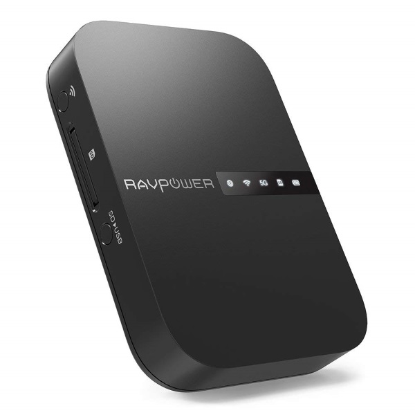
The RAVPower FileHub is a multipurpose device that can instantly convert a wired network to wireless with super-fast speeds of up to 433 Mbps Wi-Fi over 802.11ac and 300 Mbps on an 802.11n connection. It also offers additional features like one key backup to transfer files from an SD card to portable hard drive, and it can read USB hard drives up to 3TB and SD/SDHC/SDXC cards up to 256GB. You can also connect up to 5 mobile devices simultaneously allowing you to stream media from the SD or USB drives, or you can share files directly between two different storage devices.
Both Android and IOS devices are supported.

What’s in the box


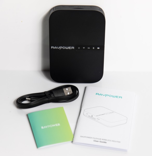
1 x RAVPower FileHub
1 x Micro USB Cable
1 x User Guide
1 x Warranty/Support Card

Design and features

Specifications
Connectivity Technology: Wireless
Data Transfer Rate: 300 Mb per second
Data Transfer Rate: 5 GHz, 2.4 GHz
Item Dimensions: 4.45 x 3.03 x 0.91 in
Item Weight: 7 ounces
Wireless Compatibility: 2.4 GHz Radio Frequency, 5.8 GHz Radio Frequency

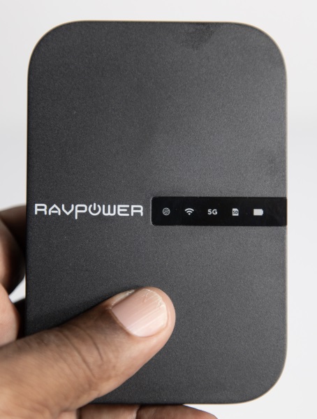
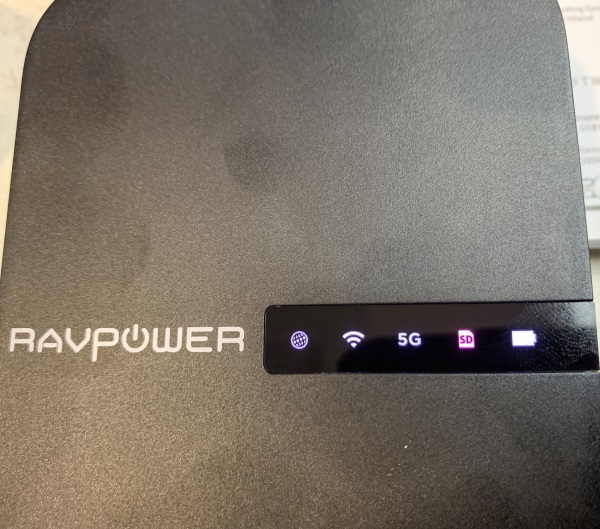
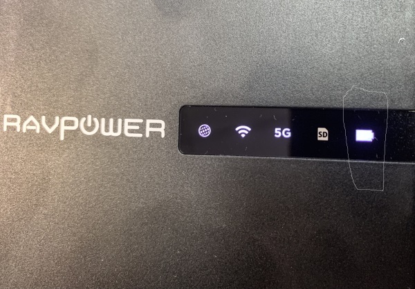
On the top surface of the hub, there is the brand name and a status indicator window. The status indicator from left to right as seen below shows internet, wifi, 5G, SD card, and USB connectivity.

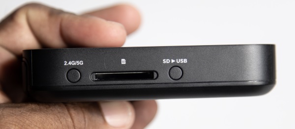
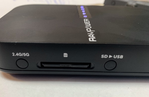
On one side of the hub, there is a switch to select 2.4Ghz and 5Ghz, the SD card slot and the selector to choose  SD and USB.

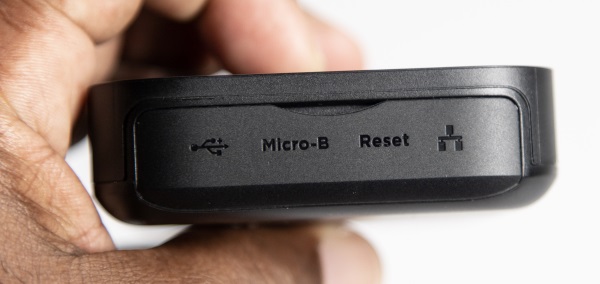
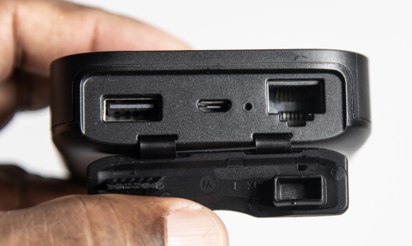
On the next side of the hub there is a rubber cover, Underneath the cover, there is a USB-A port, a micro USB port, and a network port.


On the 3rd side of the hub, there is the power button. (There is nothing on the 4th side of the hub)

Performance

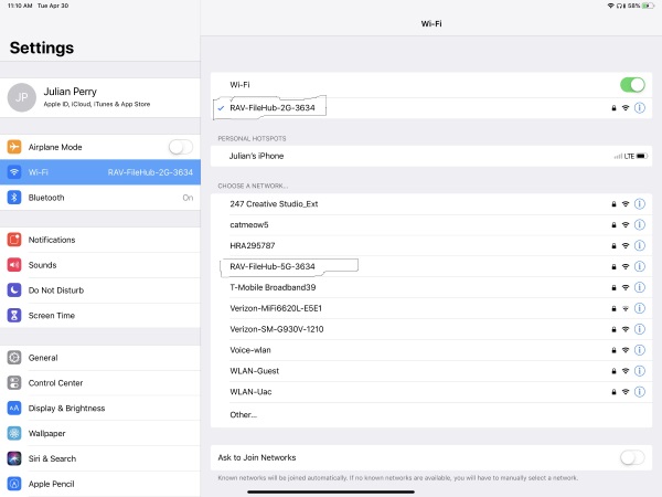
The FileHub is lightweight and compact and very easy to set up. First I charged the device and then I downloaded and installed the app on my iPad. I then powered on the device and for my test, I decided to power on both the 2.4Ghz and 5Ghz options. Both appeared in the list of available devices on my iPad and I was able to connect to either one using the provided password. This was very simple. For most of my testing, I used one of my hotspot devices that is only 2.4Ghz, but I also tried it with my 2G/5G hotspot as well. The first picture below shows the indicator display on the front of the device with all of the options turned on. The device is connected to my iPad.
The next picture below shows an SD card inserted into the FileHub.

The picture below shows a USB card reader with a Compact Flash card in it, connected to the USB port on the FileHub.

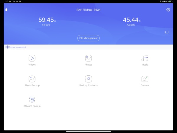
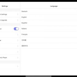
The following three screenshots from the app show the connection process in order. As you can see in the first screenshot, the FileHub shows up in the wireless device list as both 2.4G and 5G since I have both turned on. In the second picture, the main screen in the app is shown, and the third picture shows the selection screen to connect the FileHub wirelessly to the internet. In this case, it is via my hotspot.


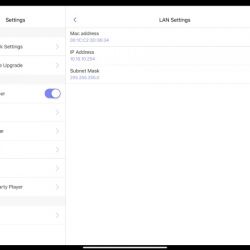
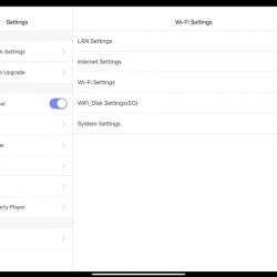
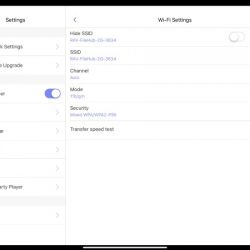
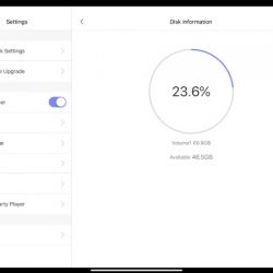
The following are screenshots from the app that show some of the features and functions:


I separated the following 2 screenshots from the app that show the thumbnails of my raw files in the first shot and the second shows the thumbnails as they start to show up as pics. I quite understand that at an average of 30MB per photo that they will take some time to fully populate. However, the amount of time it takes is so long that previewing raw files for selection is just about impossible.

What I like

  • The connectivity options
  • The versatility
  • The built-in battery
  • The device is lightweight and compact
  • The performance
  • The functionality as a charger and to be powered externally
  • It functions as an access point, router or bridge
  • The battery lasts long enough for the average work day

What can be improved

    • The ability to display raw files faster
    • A numerical(%) battery level meter both in the app and on the device
    • The battery meter on the app shows what appears to be a different battery level than the device


Final thoughts

I really like this device and its features. While it is impossible for any device to offer everything, this device offers access to my SD cards and to other types of cards using a card reader and the USB option. I love that I can share my storage with multiple devices and although it requires a wireless connection, it offers a bridge connection so I do not have to choose between connecting to it or the internet. I have both!!. In addition, it functions as a router and a NAS which is just fantastic. For the functionality and the amazing price, I give RAVPower and this device two thumbs all the way up!!

Price: $55.99
Where to buy: Amazon and RavPower website
Sample: The sample for this review was provided by RAVPower

Filed in categories: Reviews

Tagged:

RAVPower FileHub review originally appeared on The Gadgeteer on May 7, 2019 at 11:00 am.

Note: If you are subscribed to this feed through FeedBurner, please switch to our native feed URL http://the-gadgeteer.com/feed/ in order to ensure continuous delivery.
Master & Dynamic MW65 wireless headphones with active noise canceling review


REVIEW – One of the perks of reviewing products is that sometimes, we get to test something before it’s offered for sale to the public. Not only did I get to do that with the new Master & Dynamic MW65 wireless headphones with ANC (active noise canceling), but M&D make some of my favorite headphones, too. I had a feeling this headphone was going to be fun and I wasn’t wrong. Once again, Master & Dynamic has scored big with an all-new product.

What is it?

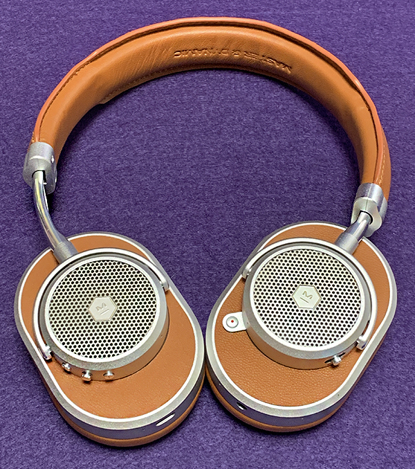
The MW65 ANC Wireless headphone is the latest in a line of impossibly good-looking headphones from Master & Dynamic. Like their previous models, the MW65 uses real metal with real leather resulting in a premium feeling (and sounding) headphone that’s priced accordingly—as in, not cheap. The MW65 is the first Master & Dynamic headphone to incorporate active noise canceling—something that’s becoming more and more common in wireless headphones. It’s an over-ear, closed-back design making it suitable for commuting. The MW65 is also optimized for Google Assistant.

Specs

  • 40mm beryllium drivers
  • Up to 24 hours battery life, 
  • Charges to 50% in 15 minutes and 100% in 40 minutes
  • 4.2 AptX Bluetooth range of 65+ feet
  • Two active noise-cancelling modes
  • Google Assistant
  • Replaceable lambskin ear pads

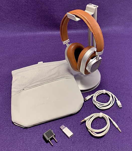
In the box

  • MW65 ANC wireless headphone
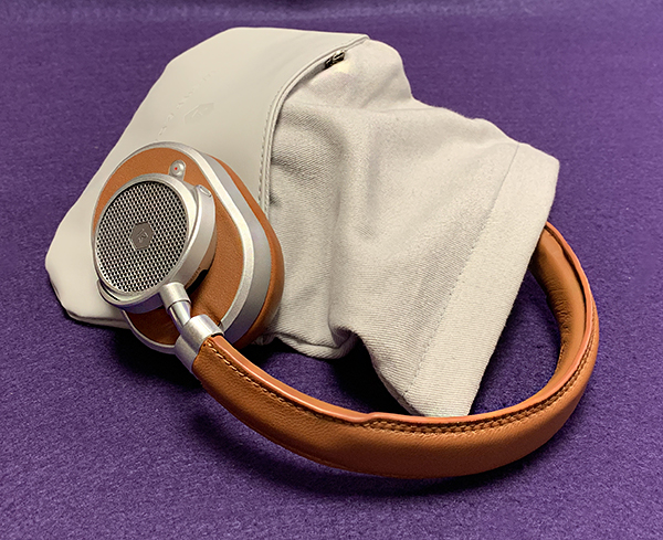
  • Canvas and leather carrying pouch
  • USB–C to USB–C charging cable 
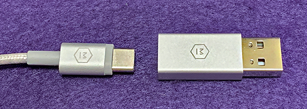
  • USB–C to USB adapter
  • 3.5mm to 3.5mm audio cable 
  • Airplane adapter

Design and features

When it comes to Master & Dynamic, What I say is beginning to sound like a broken record. IMHO, Master & Dynamic make the most beautiful headphones available at any price. Just looking at them (and holding them) makes you want them—they are that pretty. Others may disagree, but they would be wrong. 

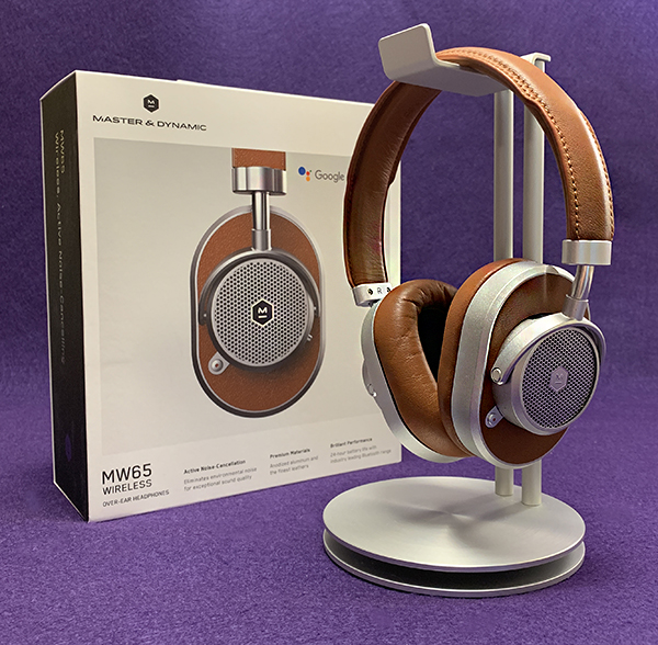
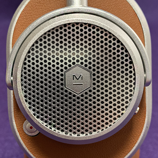
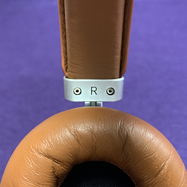
Note: Despite the different Master & Dynamic headphone models I’ve reviewed, I’ve never received my favorite color combination—silver metal with brown leather—until now. The wait was worth it—it’s a stunner. 

As I said, the MW65 is all leather and anodized aluminum. Many headphones today (cheap and expensive) are made with a good amount of plastic to keep weight down, making them feel cheaper than they are. It’s understandable. However, M&D have made the MW65 as light as any plastic headphones I’ve reviewed. How’d they do that?

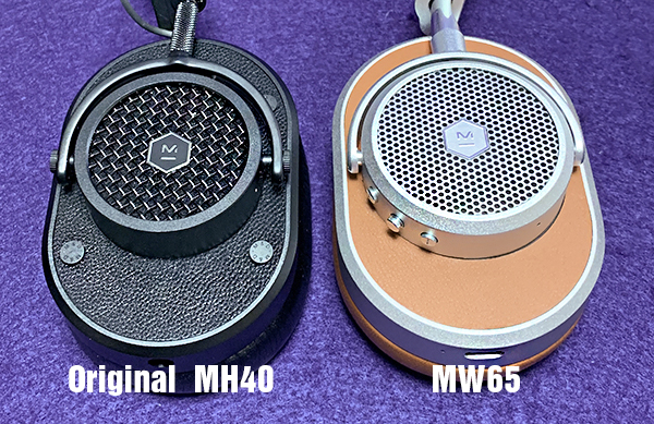
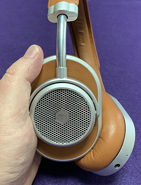
Master & Dynamic calls the MW65 over-ear as opposed to on-ear. Technically, that’s true, but the ear cups are on the small side. For many, they will feel more like on-ear. It’s a weird in-between feeling. It fits my ears just fine, but I can see where it might annoy some people. I compared the MW65 ear cups to the original MH40 headphone’s ear cups. The MW65 ear cups are ever-so-slightly smaller, but the interior opening is noticeably smaller which can make them feel more on-ear than over-ear.

The ear cups are replaceable, but after removing one of them, it took some time to get them to snap back together as seamless as before. My OCD wouldn’t let it go until it looked perfect.

Since the MW65 headphone is wireless, it has a built-in rechargeable battery. This is recharged via USB-C, a faster and more welcome alternative to micro USB. Battery life is rated up to 24 hours listening. I’m not one to use a headphone until the battery dies. I never reached the point where I had to recharge because it’s always been my habit to recharge daily.

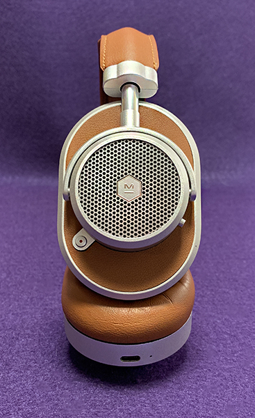
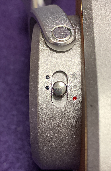
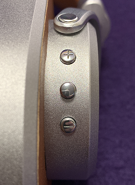
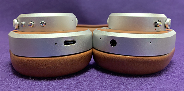
The MW65 headphone’s button array on each ear cup is laid out in an easy-to-grasp design. The left ear cup houses the On/off/pairing slider and ANC buttons. The On/off/pairing button comes with tiny LED lights that indicate pairing and battery level indicator. The bottom of this cup has the mini plug port for wired listening should it be desired.

The ANC button is set farther away from the On button. What’s interesting is that ANC comes with two modes—High and Low. High is for Airplanes, busy streets and similarly noisy environments. Low is used for a quieter (but not too quiet) environment. Each time the ANC button is pressed, a female voice prompt tells you (in English) either “Noise canceling is High, Low or Off.” Voice prompts are always better than beeps you have to translate in your head. The High setting is total ANC on. The Low setting allows a bit more environmental noise in. This works best for low background noise and windy environments. 

There’s an ongoing argument about how much ANC can alter the sound of music in a headphone. I have two thoughts on this. I’ve never heard a headphone where ANC does not affect how music sounds. What’s important is how much music may be affected. Also, using ANC in an airplane with its background engine noise is always preferable to not using ANC—no matter how much it alters audio.

That said, the MW65 headphone has really good ANC. Yes, it slightly alters how music sounds, but unless I’m closely paying attention, I just don’t notice it. I don’t hesitate turning it on anytime I feel it’s called for. Note that more headphone makers offer ANC and it’s getting better as technology improves over time.

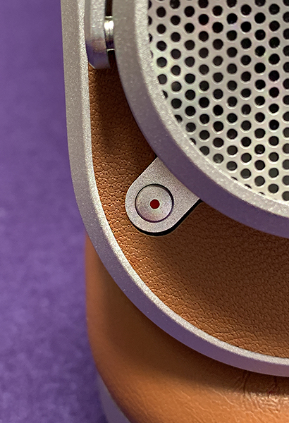
The right ear cup has the charging port and separate Volume up and Volume down buttons placed on each side of a larger Play/pause button. This button also serves as Call answering, Skip forward and Skip back depending on how many taps you apply. Call quality for the person I was talking to, was decent but not great, although I could hear them just fine. People I talk to have yet to experience excellent call quality from any headphone I use (regardless of price) that’s as good as Apple’s own AirPods.
Another benefit of the M&D MW65 headphone is Google Assistant. Since it’s built-in, you can use the headphone to get info from Google, play music via Google music and get directions help via google maps. The downside is that (at least with Apple iOS) the Google app needs to be pulled up on the iPhone and the mic button tapped in order to work. It’s not native where you can just say, “Hey Google” and it responds. But once inside the app, Google understood my commands way better than Apple’s Siri ever does. Apple needs to get on the ball if they want to compete. I noticed that when the mic icon is tapped there’s quite a bit of static in the background. However, once a command has begun, the static disappears. I can’t tell if this is an issue with M&D or Google. 

I’m lukewarm about Google Assistant being used over headphones and earphones. It’s weird when I see people walking around talking to themselves whether it’s Google, Amazon’s Alexa or Siri. Maybe over time that will become more normal, but I’m not sure I want it to.

The really good news with the M&D MW65 headphone is that it sounds as good as it looks. Whether wired or wireless—and with or without ANC—music sounds full and rich. Master & Dynamic has a known sound signature across its entire line that exhibits a bit of a bass boost that’s never overpowering. It’s just enough to make listening a pleasure for hours. Sure, whatever music you’re listening to may sound a bit less accurate than what comes from a more “accurate” headphone, but who cares? Even though I am a fan of extremely accurate music reproduction, I admit that it can become aurally fatiguing after a while. These never become tiresome. 

What I like

  • Luxurious in both sound and feel.  
  • Well made
  • ANC works well
  • ANC doesn’t alter audio much
  • Light weight and comfortable 

What needs to be improved

  • Expensive
  • No Bluetooth 5

Final Thoughts

When you combine a comfortable-to-wear headphone with a sound that’s pleasing to just about anyone, it’s a winner. But when you then add superior build quality, Google Assistant and active noise canceling to the mix, you have more than a winner, you have a keeper. The Master & Dynamic MW65 headphone is a keeper.

Price: $499 US
Where to buy:
Source: The sample for this product was provided by Master & Dynamic.

Filed in categories: Reviews

Tagged:

Master & Dynamic MW65 wireless headphones with active noise canceling review originally appeared on The Gadgeteer on May 7, 2019 at 9:00 am.

Note: If you are subscribed to this feed through FeedBurner, please switch to our native feed URL http://the-gadgeteer.com/feed/ in order to ensure continuous delivery.