Think Tank Lily Deanne Tutto premium-quality camera bag review

Over the past 30 years I have probably purchased and resold 15 different types of camera bags looking for that perfect bag.  I have looked at backpacks, over the shoulder bags and roller bags and have come to a conclusion: one bag will not ‘cut the mustard’ when it comes to my camera bag needs.  I have a great Think Tank roller bag that I use when I must carry 2 pro camera bodies, several lenses, flashes and a laptop to action shoot jobs.  However, I still needed a camera bag that I could use for fun day trips or even vacations where I was not taking so much stuff and did not want to look conspicuous.  I finally found what I think is my almost perfect bag in the Lily Deanne.  Let’s take a closer look.

What is it?

The Lily Deanne is a camera bag designed by women for professional photographer women.  Honestly the looks of this bag really allow a man or a woman to use this bag.  Think Tank wanted to create a bag that did not look like a camera bag and would look professional enough to carry into events like weddings, meetings, corporate events or even on the street.  The bag comes in three different sizes.  The Lucido which will hold a single standard DSLR with 1-3 lenses and an 8in table.  The second bag is called the Mezzo and it will carry a single standard DSLR, a mid range zoom, 2-3 additional lenses and a 10in tablet or 11in laptop.  Finally, the bag I got the Tutto will carry a gripped DSLR, a mid range zoom, 2-5 additional lenses, 2 flashes and up to a 15in laptop.

Hardware Specs

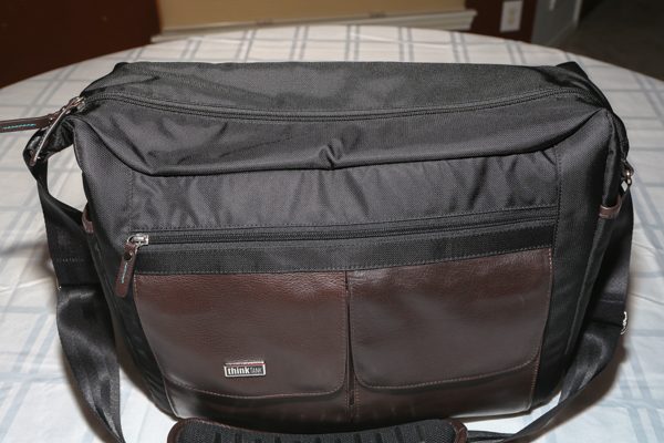
The bag is made of full grain Dakota leather.  The black parts of the bag are 420 high-density nylon with a durable water-repellent coating.  The strap is made of nylon seat belt webbing that is adjustable in length and comes with a heavy duty nicely padded strap that has yet to cut into my shoulder.  All the zippers are YKK RC Fuse abrasion-resistant zippers.  The bag weighs 3.3 pounds.  Think Tank has some of the best warranties in the business and they will guarantee and warrant their products against any defects in material or workmanship for as long as you own the product.  I have had other professional photographer friends get new wheels for roller bags or sometimes an entirely new bag when a bag that is several years old and heavily used has come up with an issue.

What’s in the box?

The bag came in a gorgeous box and was wrapped in some beautiful tissue paper.  The packaging of the bag could not have impressed me more.  In the box came the actual bag, some closed cell foam dividers and a nice seam-sealed rain cover that comes in its own pouch.

Design and Features

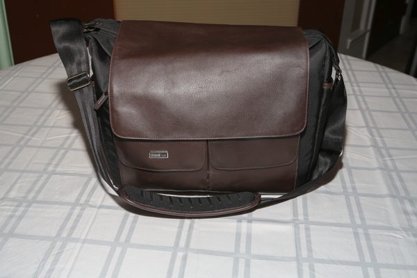
Looking at the intro picture you can see the bag is covered with a main flap.  That flap is attached to the bag via magnets.  Velcro is nowhere to be seen on this bag and it really makes my day.  I can’t tell you how many times I have been at an event and wish to get into my bag and have tried to quietly open a Velcro attachment.  When you flip the flap back you can see there is a big main zippered compartment up top, a side zippered area and two smaller flaps.
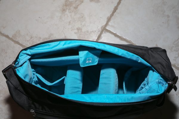
Once you unzip the top zipper, you are presented with the main storage compartment.  The entire inside of the bag is lined in a brilliant turquois blue.  That color really makes it easy to see what is inside the bag.  A lot of bags are lined with black material and in dim or dark environments it is nearly impossible to find what you need in the bag.   At the top of the bag you see a flap with a picture of a computer on it.  Simply flip the flap back and up to a 15 inch laptop can be stored in this area.  The divider of the computer area and the camera area is nicely padded.  The back part of the bag is not as well-padded but very sturdy feeling due to the full grain Dakota leather.  The bottom of the laptop compartment comes down to a V shape and is padded.
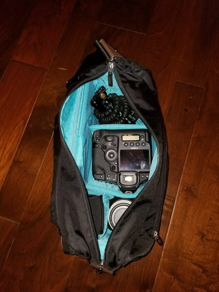
In the main camera compartment area, I currently have set up to hold a flash,  a bracket, a professional DSLR with a built in grip, and attached to it is a 24-70 lens, rain proof bag, and an additional 70-200 lens on the side.  All the dividers are fully adjustable.  Simply pull them out and arrange them as you wish.
This front zippered area has a red loop on the upper left where you could clip key rings or the popular Think Tank compact flash card holder.  There is a small sleeve that you can see that will hold my Note 8 if I wished.  The rest of the area is just open to store whatever items you wish.  It is not super expandable and I would limit items in that area to fairly flat items.

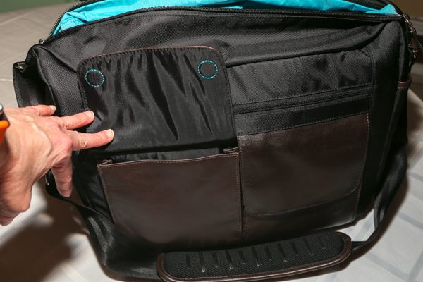
The two front flaps are also closed with magnets that you can see in the stitched blue circles as the top of each flap.  Inside the left pouch which is also lined with the turquoise material you will find a similarly sized slot that I use to hold filters and then in front of that slot I slide my lens caps.   The right flap has slots to hold pens and pencils and a couple of other small slots to hold various smaller items.  The sides of the bag have a single snap that can be undone to hold a standard water bottle or possibly a hard sunglass case.   You can also see the underside of the shoulder pad where it has rubber grips that keep it in place on your shoulder.
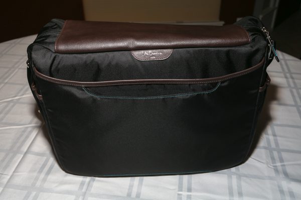
Finally, the back of the bag has a luggage carrier slot where you can slide the handle of a roller bag completely through and it will allow you to place this bag securely on top of a roller bag.  You can see the definition of this slot outlined in the turquois stitching.  There is also one additional storage slot behind that roller bag slot to put additional flat type items.
What I like

I love the looks of this bag.  I have received many compliments on it.  I really like how I can keep the bag on my shoulder and reach in and grab the camera equipment I need quickly and easily.  That was what I hated about backpack bags.  I always had to put them down to get what I need.  The bag stands easily on its own.  It certainly holds all I need and more.  I also love that no one realizes I am carrying around a lot of expensive camera equipment.  Finally, I love the warranty and quality of the bag.  I just have not found another company that beats the quality of Think Tank.

What needs to be improved

It does hold so much stuff that yes, I can overpack and the bag can get very heavy very quick.  I wish they had figured out a way to attach a grab handle to the top of the bag.  That would have been a nice feature when my shoulders were getting tired of holding all the weight.

Final thoughts

In conclusion, I use this bag when I have a lighter photo shoot or when I need to be inconspicuous.  Once the camera is out of the bag and I am taking pictures, I really don’t notice the weight of the bag.  I can easily reach in and swap out lenses quickly.  I have used this for a couple of wedding engagement shoots and the bag was perfect in the public environments where the client wanted their pictures taken.

Price:  $299.75
Where to buy: B&H Photo/Video
Source: The sample of this product was purchased with my own funds

Filed in categories: Reviews

Tagged:

Think Tank Lily Deanne Tutto premium-quality camera bag review originally appeared on The Gadgeteer on March 5, 2018 at 11:00 am.

Note: If you are subscribed to this feed through FeedBurner, please switch to our native feed URL http://the-gadgeteer.com/feed/ in order to ensure continuous delivery.

Rezzimax TUNER review

A few years ago I took a pretty bad fall while skiing and injured my neck and suffered a concussion, which has had lasting effects to this day.  I was interested in the Tuner from Rezzimax because it offers multiple applications for high frequency massage of your neck, shoulders, face or anywhere else you may need a little relief.

What is it?

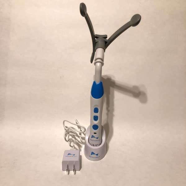
The Rezzimax Tuner is a compact yet powerful personal massager that is aimed to assist people with migraines, neck pain, jaw pain (TMJ), sinus pain and other ailments.  In a few minutes of use the user can experience substantial relief if not total resolution of the pain they are experiencing.  The Tuner is portable, wireless and easily fits in your hand.  It utilizes adjustable high frequency vibrations to massage your problem area and bring relief in a short time.

Hardware Specs

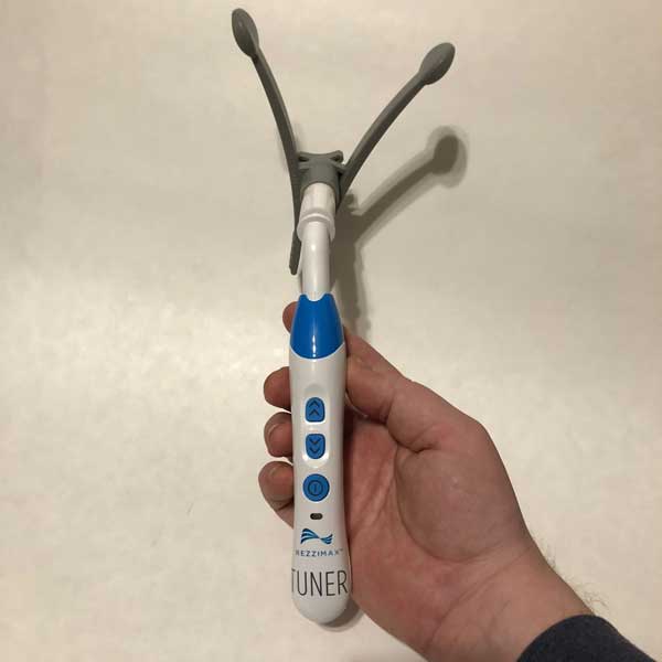
The Tuner weighs two pounds and is 10 x 6 x 2.5 inches (about the size of an electric toothbrush when the massaging head is not attached).  I couldn’t find any information about the battery but I have been able to get many sessions with this out of one charge so battery life isn’t a concern for me.

What’s in the box?

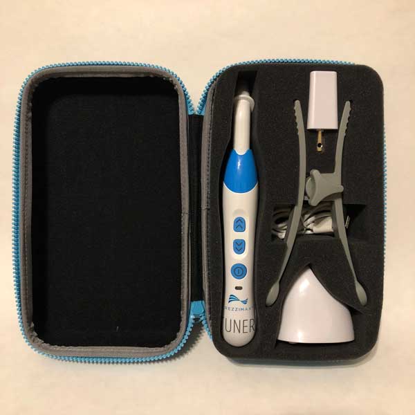
When you purchase a Tuner, you receive a hard sided carrying/travel case with a sturdy sipper closure.  Inside the case you will find the Tuner base, adjustable massaging head attachment, a charging base, USB/micro USB power cable and a wall adapter that is similar in size to an iPhone power cube.

Designs and features

The first thing I noticed about the Tuner compared to other massagers I have seen or used was the compact size.  With the sturdy, hard-sided carrying case I have been able to pack this in my briefcase or suitcase to go to the office or on a trip without taking up much room.  Once I began using it I instantly was aware of the resonance technology that they discuss on their website.  This massager vibrates at a much higher frequency than other products on the market.  At first I didn’t know if this would make a difference but after a few sessions with it I really noticed a difference in my neck pain, sinus pressure and overall stress level.  It has a way of humming you into a very relaxed state while your trouble area is worked on.

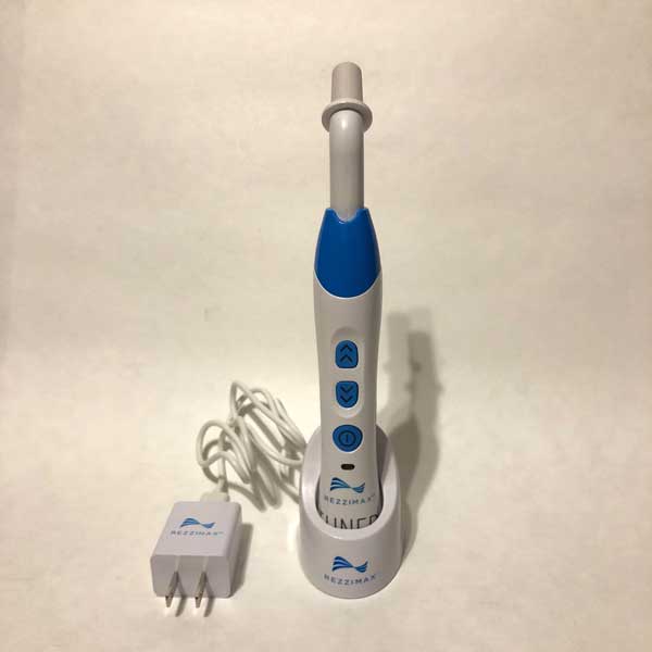
The battery life has not been an issue for me.  I have used it multiple times on a single charge, and while I cannot find information on the battery capacity or battery life, I am not concerned with running out of juice once charged.  The unit charges wirelessly in the base so all you have to do is set the Tuner base in the charging cradle and it begins the charging cycle automatically.  I love this feature as I’m sure anyone with anything that charges wirelessly does.

The dark grey adjustable massaging head can open or close to fit most of your needs.  I say “most” because I have a slightly larger than average head and the arms do not open wide enough for me to massage moth of my temples at once, which is a big drawback for me as that was a feature I was really looking forward to.  I do use the adjustable head to massage my neck, face and head and it honestly feels AMAZING!   In one of their videos they even show putting the massager in your mouth in between your cheeks and upper gums to relieve TMJ pain.  I have yet to try this as I don’t have TMJ issues but I can imaging it would provide relief just like it has for my headaches, neck pain and sinus pressure.  You can also use the tuner without the grey attachment for a more precise and intense massage.  I usually go without the attachment for my neck where I can really get into those tight muscles that cause my headaches and where I hold my stress.

What I like

  • It works!
  • 7 levels of vibration to dial in the treatment you like best
  • Results in minutes
  • Compact size/carrying case
  • Wireless charging
  • Long battery life
  • Natural alternative to pain management through medication
  • Attractive and high quality design

What needs to be improved

  • Wider messaging head to fit more people to massage temples
  • At $249, it comes in at the higher end of personal massagers.

Final thoughts

Since receiving the Tuner, I have been hooked.  I have used it when I am in pain or had sinus pressure but have also used it just to relax at the end of the day.  I keep it in my briefcase so I can use it at the office or at home and find myself reaching for it instead of the bottle of Advil.  If you suffer from any of the issues I have mentioned here or that are listed on the website, or just carry a lot of stress and get relief from massage, I can confidently recommend this product.  I think the price tag of $249 is a little high but can’t argue much since I have seen results and it has relieved my pain.  From that perspective, I think it is worth it.

Price: $249
Where to buyRezzimax
Source: The sample of this product was provided by Rezzimax.

Filed in categories: Reviews

Tagged:

Rezzimax TUNER review originally appeared on The Gadgeteer on March 4, 2018 at 11:00 am.

Note: If you are subscribed to this feed through FeedBurner, please switch to our native feed URL http://the-gadgeteer.com/feed/ in order to ensure continuous delivery.
Constantly monitor temperature and humidity with the SensorPush wireless sensor

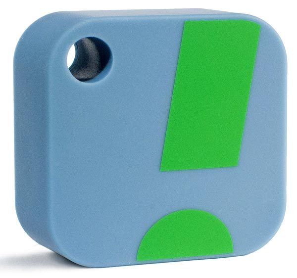
When we got a new fridge last year, I wanted to monitor its temperature for a while to be sure it was safe for storing my insulin.  My fridge had a temperature display, but it would only show me a snapshot of the conditions in there, so I could never be sure that the insulin had never been in freezing conditions.  That would be the same weakness for every other thermometer I had on hand.  After some research, I found the SensorPush.  It’s a little fob-like device about the same size as those tracking fobs you can add to your keyring.

The SensorPush connects via Bluetooth to an app running on your phone or tablet.  Inside, it has a Swiss-made sensing component that provides reliable, accurate measurements.  It can push readings via Bluetooth 4.0 to your mobile device, and you can monitor hourly, daily, monthly, and yearly records of both temperature and humidity so long as you are within Bluetooth range.  You can also get alerts if the readings are outside your desired limits.  You can add an optional SensorPush G1 WiFi Gateway for data and alerts via the internet.

The SensorPush is $49.99; the optional G1 gateway is $99.95.   You can purchase them at Amazon.

Filed in categories: Reviews

Tagged:

Constantly monitor temperature and humidity with the SensorPush wireless sensor originally appeared on The Gadgeteer on March 4, 2018 at 9:00 am.

Note: If you are subscribed to this feed through FeedBurner, please switch to our native feed URL http://the-gadgeteer.com/feed/ in order to ensure continuous delivery.
Sōlis SO-3000, SO-6000 and SO-7000 Chromecast and Bluetooth speaker review

When a company comes out with three Bluetooth speakers all at once, my interest gets piqued. Sōlis is an audio company that makes vacuum-tubed Bluetooth audio systems and has now branched out into the home wireless speaker market. Sōlis has three smart speakers that utilize Google Chromecast, WiFi wireless as well as Bluetooth: the SO-3000, SO-6000 and SO-7000 speakers.

What is it?

While home wireless speakers are a growing segment, their popularity pales compared to the totally wireless and portable Bluetooth speakers that can survive a thunderstorm, flood, hurricane—you name it. The main advantage that home speakers have over portable is (usually) audio quality. With rare exception, Bluetooth speakers made for the indoors perform and sound more refined and richer than portables.

While the three Sōlis indoor speakers have similar abilities, their differences are in size, design and—for one in particular—audio quality.

Each Sōlis speaker incorporates Google’s Chromecast—Google’s version of Apple’s Airplay (Sōlis does not use Airplay). The Sōlis speakers also incorporate Bluetooth which—for Apple device users like me—can be a bit more convenient and easier to pair and use than Chromecast, but at a cost in audio quality.

Specs

The three Sōlis  speakers share some identical specs listed here:

  • Wireless:
    Bluetooth 2.0
    Wi-Fi – 802.11a/b/g/n/ac compliant – Dual Band 2.4 GHz & 5 GHz supported
  • Hi-Res audio compatible – Chromecast built-in supports hi-resolution lossless audio from select streaming services
  • Multi-room streaming and wireless control (with Chromecast)
  • Input: Auxiliary (AUX) input
  • Top-mounted control buttons
  • Supplied accessories:
  • External AC power supply
  • Auxiliary line in cord
  • Power: 120V AC 60Hz
  • Individual specs here:

SO-3000:

  • Two 3” full range stereo speakers
  • Power output: 2 x 18W RMS
  • Cloth-covered wooden cabinet with tuned bass port
  • Dimensions: 6.3”(H) x 11.8”(W) x 3.7”(D)

SO-6000:

  • Two 3” full range stereo speakers
  • Power output: 2 x 18W RMS
  • Wooden cabinet with tuned bass port
  • Dimensions: 5.5”(H) x 9.5”(W) x 7.1”(D)

SO-7000:

  • 2-way bass reflex stereo speaker system
  • One 5.25-inch subwoofer
  • Four 2-inch full range drivers
  • Power output: 2 x 25W RMS + 50W RMS Subwoofer
  • Wooden cabinet with high gloss black accent panel
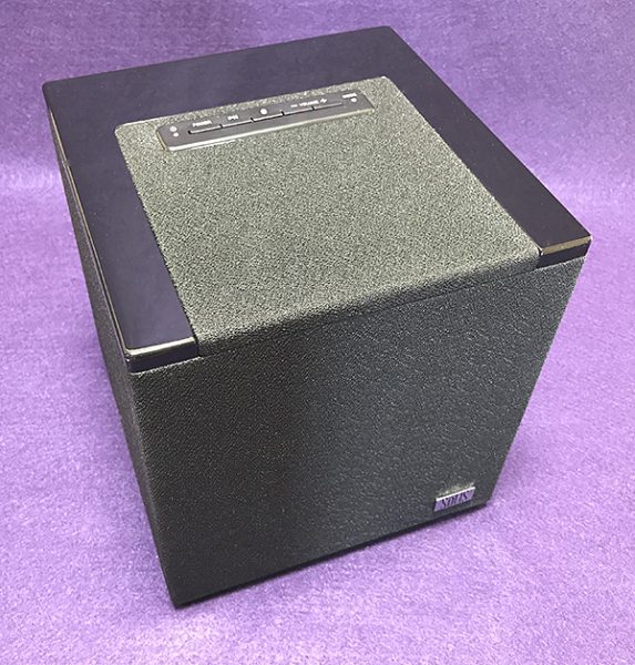
  • Dimensions: 7.9”(H) x 7.9”(W) x 7.9”(D)

The audio specs for both the SO-3000 and SO-6000 are identical on paper. The practically sound identical too, so it’s not surprising. The only difference seems to be styling, meaning that the price premium of the SO-6000 over the SO-3000 is cosmetic only. The SO-7000 sounds much richer and fuller than the other two Sōlis speakers thanks to its built-in subwoofer. The additional bass is perfect for larger rooms. Although the other two speakers sound good, once you hear the SO-7000, it’s hard to switch back. The improvement is that pronounced.

Design and features

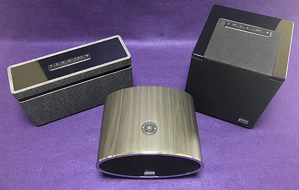
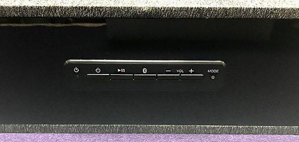
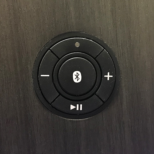
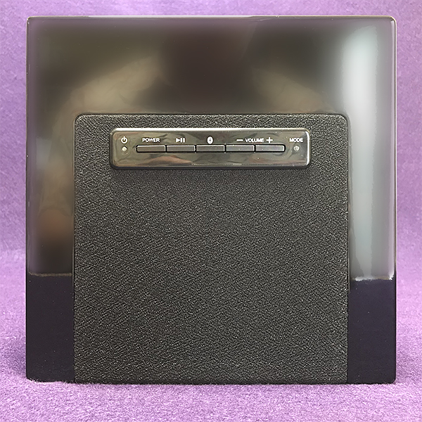
Each speaker has similar pairing setups with lights that indicate whether the speakers are connected or not. The SO-3000 and SO-7000 speakers have an identical left to right button array on top beginning with the Power button followed by Play/pause, Bluetooth pairing, and ending with Volume down and up buttons and Mode light. The SO-6000 speaker has the same button functions arrayed in a circle.

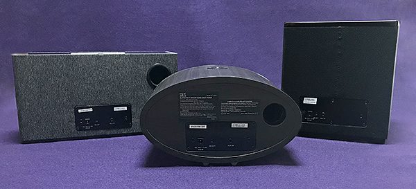
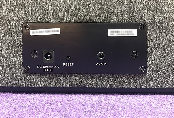
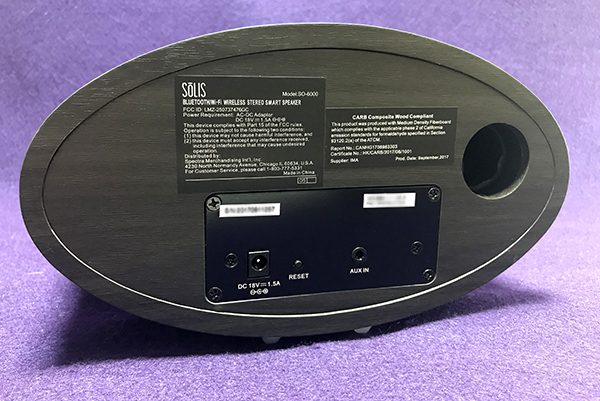
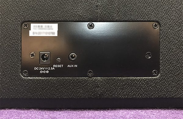
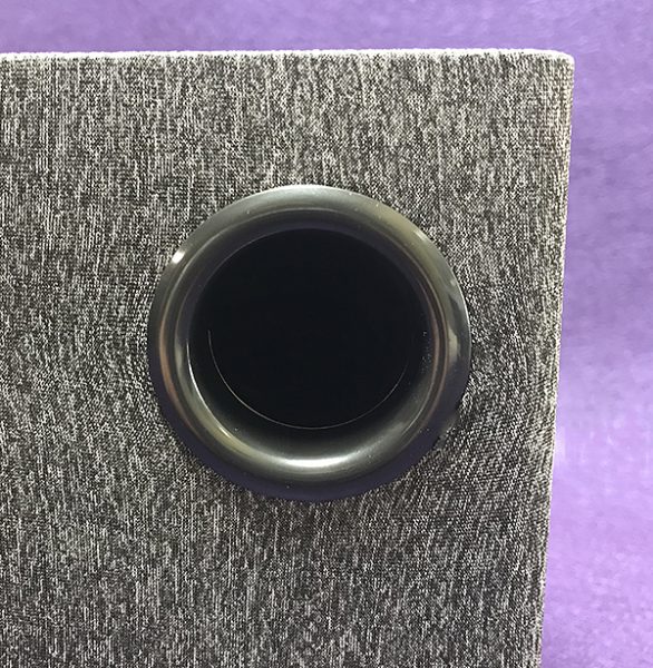
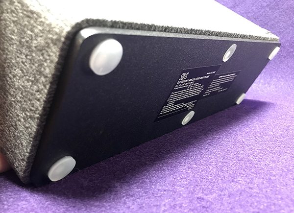
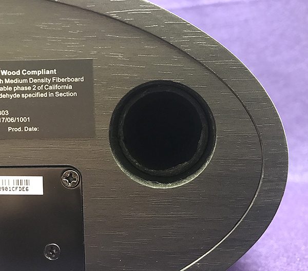
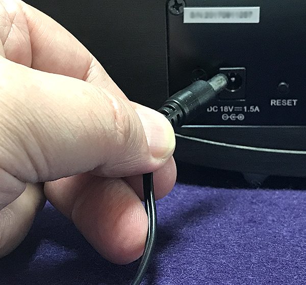
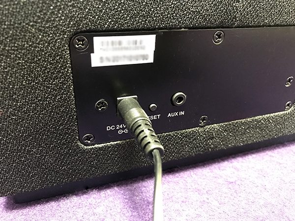
The backs of the speakers contain an AUX port, power cord port, and a small reset button. The SO-3000 and SO-6000 have bass ports while the SO-7000 has that built-in subwoofer mentioned earlier.

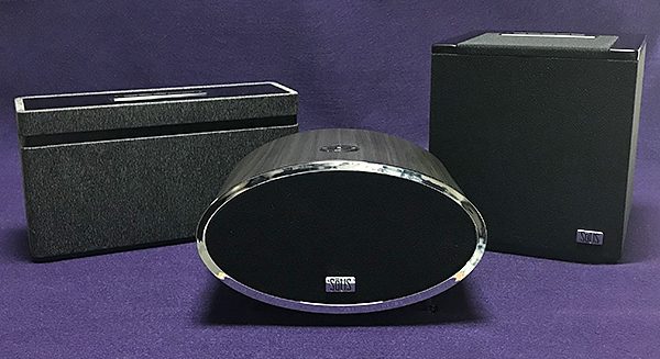
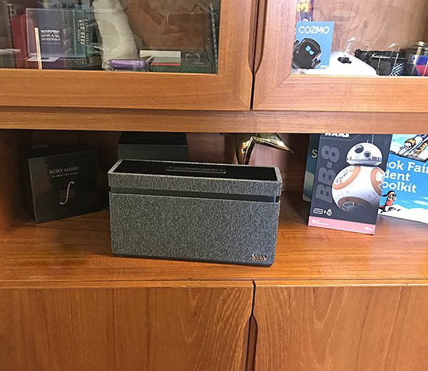
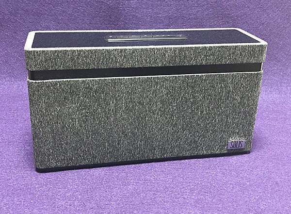
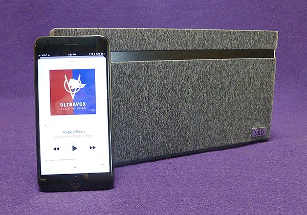
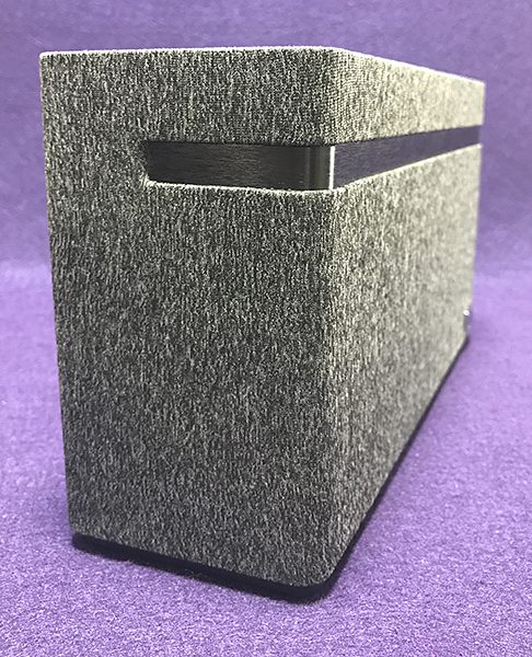
The SO-3000 is the more traditional looking speaker. It’s a rectangular-shaped box design that’s wrapped in gray speaker cloth belted by a gloss black band. It’s a conservative look that should blend with any decor. If you want a speaker to not be noticed, the SO-3000 is it.

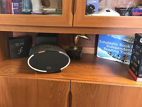
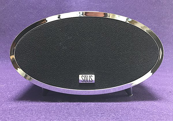
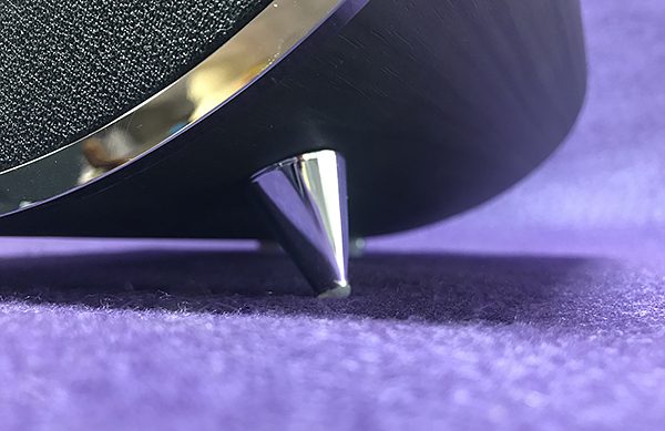
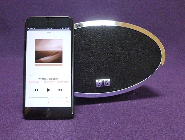
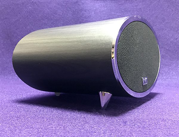
Although the specs may be identical, the SO-6000 has a short, tubular oval shape that screams mid-century modern—right down to the wood grained exterior and pointed chrome legs. You either like the SO-6000’s appearance, or you don’t. I’m a big fan of mid-century modern, so I love the look.

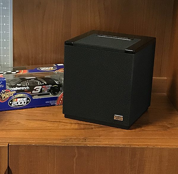
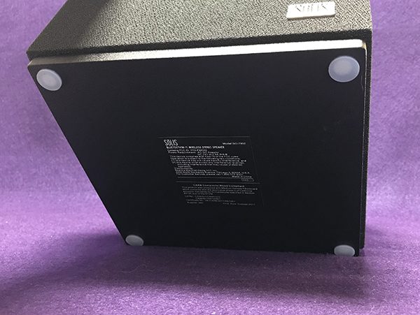
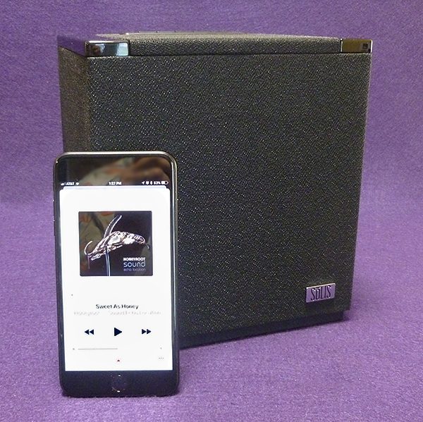
The SO-7000 is the big boy of the group. Its cube shape is almost a perfect square giving the speaker a traditional, but purposeful look. The speaker is covered in jet black cloth with subtle shiny black accents.

None of the Sōlis speakers are portable. Each needs to be plugged in at all times. These speakers are made for indoor use—they are not water resistant and can’t be dropped or treated roughly.

Chromecast requires wifi to operate, and setup is fairly easy and straightforward. An advantage of Chromecast is that it can stream higher resolution files than Bluetooth—but any audio quality differences are more noticeable on the SO-7000. Also, since Chromecast utilizes wifi, it provides a more stable connection than Bluetooth.

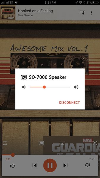
Although it was developed for Android devices, Google makes iOS versions of their Home and Play Music app, so I was able to utilize its functions. Chromecast’s setup is through the Home app. Music is then played through the Play app. I don’t subscribe to Google Music, so I wasn’t able to stream anything except their radio stations based on musical taste and any music purchased from Google. To use Apple Music, I had to use Bluetooth.

I did run into Bluetooth interference when the SO-7000 speaker was located in my dining room, but once I moved the speaker to my studio building, the issue disappeared. Despite much trial and error, I was never able to figure out what was causing the interference.

Using Bluetooth vs Chromecast made me realize that Google has some work to do. Since both are built into each Sōlis speaker, I figured that switching between them as they played would be easy and give an accurate audio picture of how they compare. I was wrong. Keep in mind that I am using Google Home and Music apps on my iPhone. I do not use Android devices, so YMMV.

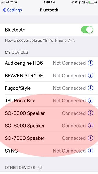
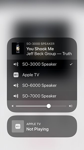
First Bluetooth: Switching between speakers could not have been easier—except when it wasn’t. As music played through the Apple Music app, all I had to do was tap the appropriate speaker in the Bluetooth list. Since all the speakers could be simultaneously connected, they all were listed. Here’s where it gets weird—music would play through one speaker (the SO-3000) and I could then switch to another speaker (SO-6000). So far, so good. However, when I switched back to the SO-3000 speaker—no volume. So I would then switch back to the SO-6000 speaker that had just played—no volume there either. The same was true when I added the SO-7000 speaker into the mix. Only when I paused the song and re-hit Play, did the speakers play. I’m not sure if this is a function (malfunction?) of Bluetooth 2.0, but it was annoying.

Chromecast has its own quirks. Even though I could successfully switch between each speaker, Chromecast required me to first disconnect one speaker before I could move to the next one. Plus, sometimes, the song would restart rather than pick up where it left off when I disconnected the previous speaker. I’m not sure which is more maddening. My conclusion is that is you want to use the Sōlis speakers in different rooms as separate speakers with the option of connecting as a wireless system, you will be better served by Sonos, Heos, or another dedicated system. If you just want to combine the speakers as a home unit, Chromecast performs that task just fine by creating what they call a “Group.” Once I created this group, all three speakers worked flawlessly together.

Note that Chromecast requires a home wifi network to work. Bluetooth does not.

Enough griping about music streaming! Despite the time required of switching or combining speakers and dealing with the quirks of each option, the Sōlis speakers offer good sound for almost any situation. Plus most people won’t purchase all three speakers at once. I just wanted to point out that using more than one speaker concurrently throughout the house may not go as smooth as you’d like.

So, how do they sound?

No matter what music I played among the three speakers, it was the SO-7000 that stood out. Bass dance tracks like Ultravox’s “Accent on Youth” from their “Rage in Eden” album or “Sweet as Honey” by the studio band Honeyroot from their album “Sound Echo Location” have more bottom end to get your feet moving and the bass is more accurate sounding. When played on both the SO-3000 and SO-6000, these tracks exhibited a boominess that wasn’t present on the SO-7000 speaker. This was fairly consistent no matter what songs I played. Only an ultra bass-heavy track like Brian Eno’s “Written, Forgotten” from his album “Small Craft on a Milk Sea” tripped up the SO-7000. There is such low bass on this track that the SO-7000’s subwoofer slightly buzzed when the volume was set high. However, it still sounded better than on the SO-3000 or SO-6000 which exhibited all kinds of buzz from the bass.

The bottom line is at normal volumes, All three Sōlis speaker sound good until they are pushed past comfortable volume levels. Just don’t listen to the SO-7000 first, because it will spoil the fun listening to the other two speakers. They just can’t measure up to their big brother.

What I like

In addition to Chromecast, it’s nice that Bluetooth is an option. At this point, any wireless speaker that does not include Bluetooth is a waste of money, so kudos to Sōlis. The speakers’ styling is classic and tasteful, no matter which speaker is chosen. Audio quality is good to better than good depending on the speaker.

What needs to be improved

I would prefer that the Sōlis speakers incorporated Apple’s AirPlay in addition to Chromecast. Bluetooth 2.0 is sensitive to interference. The more recent Bluetooth 4.0—with better range and audio—would be a welcome addition. Any kind of an IPX water resistance rating would be nice. The price of the SO-6000 is inordinately high compared to its “spec twin” SO-3000.

Final Thoughts

If you are looking for an easy to use and portable Bluetooth speaker, the Sōlis speakers are not for you. However, if you want a stylish room speaker that you can set and forget, then any of Sōlis’ models should work. It just depends on budget and styling (SO-3000 or SO-6000) vs. audio quality (SO-7000).

Price: SO-3000 – $199.99 US, SO-6000 – $269.99 US, SO-7000 – $299.99 US
Where to buy: Best Buy
Source: The sample of this product was provided by Sōlis.

Filed in categories: Reviews

Tagged:

Sōlis SO-3000, SO-6000 and SO-7000 Chromecast and Bluetooth speaker review originally appeared on The Gadgeteer on March 3, 2018 at 11:00 am.

Note: If you are subscribed to this feed through FeedBurner, please switch to our native feed URL http://the-gadgeteer.com/feed/ in order to ensure continuous delivery.
Scriba Stylus review

The digital stylus, reimagined. That’s what Scriba did, investing an impressive amount of research and design into building a stylus for creatives that’s not quite like anything else I’ve played with before. It’s definitely innovative, and there’s a lot to like. How does it work? Let me draw you a picture… or two… or three…

What is it?

It’s a Bluetooth-enabled stylus for your mobile devices that’s been  features a unique ergonomic design, “squeeze motion” technology instead of buttons, and haptic (vibration) feedback.

Hardware specs

  • Stylus weight: 16 grams
  • 200 hours of rechargeable battery life
  • Charges via micro-USB cable
  • Dynamic “squeeze motion” technology for extended app interactions
  • Haptic (vibration) app support for tactile feedback

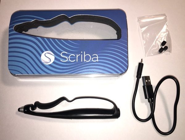
What’s in the box?

  • The Scriba stylus
  • Micro-USB charging cable
  • 3 additional replacement silicone tips

Design and features

About Scriba

I spent some time talking to David Craig, Scriba’s founder, to learn more about the origins of the product. Based in Dublin, Ireland, the Scriba team set out on a mission to rethink the concept of the digital stylus from the ground up. It’s an impressive story that involves rigorous usability testing, industrial design, and the development of 136 different prototypes (136!) that resulted in a product that has since received numerous prestigious design and innovation awards. Check out the full story on their web site, which details their long journey. It’s a good read.
Overview and Walkaround

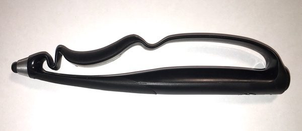
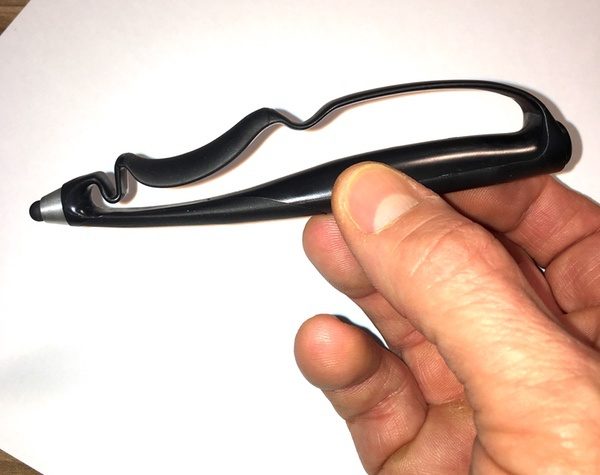
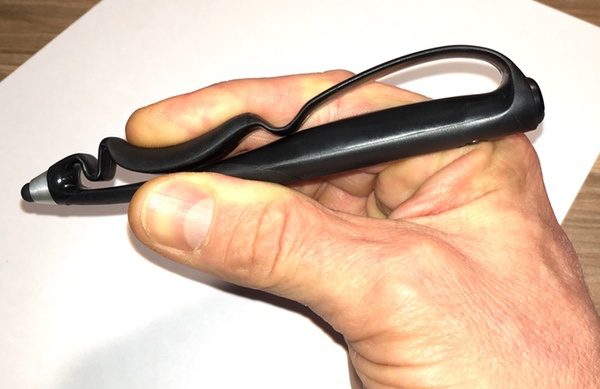
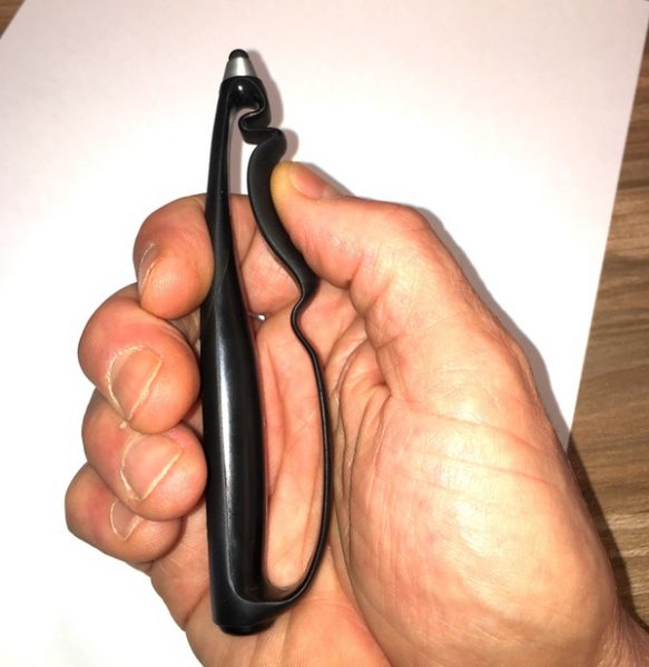
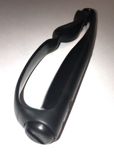
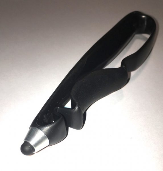
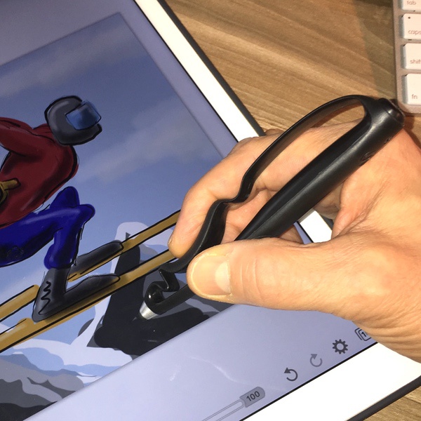
The Scriba is is based an open-framed, ergonomic layout that’s designed around the shape and movement of your hand. The barrel of the stylus is straight and rests along your thumb line, while the body is contoured to create a natural grip point for your pointer finger. The primary contact points for your thumb and pointer finger are enhanced with a rubberized surface to improve control.

You won’t find any buttons on the Scriba. The body of the stylus is flexible, and responds to squeezing/pinching between your thumb and forefinger. This enables what Scriba refers to as “squeeze motion” pressure-responsive technology, which provides airbrush-like control of stroke widths in drawing/painting apps. The Scriba stylus also utilizes haptic feedback, which uses a vibration in the pen to confirm other squeeze-based actions or alerts in compatible apps.

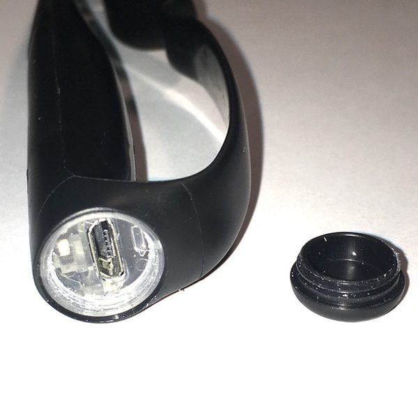
To charge the Scriba, unscrew the cap on the base of the pen and plugging in the micro-USB cable. You won’t need to do that too often, though: the Scriba stylus can go for an outrageous 200 hours of continuous use between charges  and 6 months of standby mode! Considering that the whole device barely tips the scales at a feather-like 16 grams, this is really impressive. The unit can be recharged in about two hours.

The Scriba utilizes standard silicone tips on the business end. The top is secured by a screw-on aluminum cap to keep it tightly in place, which is nice to keep the tip from popping off in the middle of a drawing session.

Apps and Compatibility

It’s important to note that the advanced features of the Scriba are dependent on using Scriba-enabled apps. A list of iOS-compatible creative and productivity apps are listed on their web site (Android and Surface compatibility are in development). Scriba is continuing to partner with app developers to expand their compatibility, so it’s worth watching their site for updates if you’re looking for specific app pairings.

Scriba also produces their own apps that fully leverage the features of the stylus including a paint program, photo app, and slide presentation tool. I’ll touch on these in the performance review below.

Performance

My weapon of choice for drawing is the Apple Pencil, which I consider the gold standard for creative pursuits. It sets a really high bar for control, intuitive use, and natural feel. After a month with the Scriba, I’m impressed with what it has to offer. There’s a lot to like about the Scriba’s innovative design, and a ton of potential in the future.

From an ergonomics perspective, the form factor of the Scriba is marvelous. It sits naturally in your hand, requiring less pressure than typical-pen style designs to maintain constant control while writing or drawing. It also feels great when engaged in free-flowing hand/wrist movements you’ll use for drawing or painting. It’s so light that you are barely conscious of the weight of the device. And boy, is it comfortable… I was really surprised at how comfortable it is for extended drawing sessions.

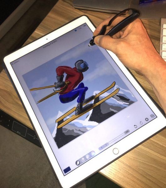
I took the Scriba for a spin in my favorite drawing package (Procreate), to see how it would work. While pressure sensitive control is not available at this time, the control and precision for general work (sketching, inking, and linear airbrush effects) is excellent. The silicone tips provide the same challenges as other similar styli with respect to ultra-fine detail, but the fine point helps to overcome this issue. Here’s a sample piece I did that I was very happy with:

Taking the Scriba to work with Brushes4Scriba, Scriba’s paint program, shows the potential of the squeeze motion technology. If you’ve ever worked with an airbrush, this will be a natural fit for you. Here’s a sample shot of me playing with stroke weights in the Brushes4Scriba app:

You can set limits on the minimum/maximum brush widths variations and levels of transparency to create variations in stroke types for graphic-style illustration, like so:

You also have a variety of patterns to choose from that you can apply to brush strokes to give texture to your work:

I’m still getting used to the airbrush-style controls… here’s one I did after a bit more practice:

The squeeze motion technology, coupled with the haptic feedback, enable additional extensibility depending on the app you are using. All Scriba-enabled apps pair with the device by squeezing the stylus. Then you can use a “hard squeeze” to enable toggling between functions, moving between slides in a presentation, or as a remote to snap pictures (when using Scriba’s custom apps). Haptic feedback compliments the functions by delivering a vibration when these functions are used.

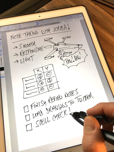
I also tested the Scriba in ZoomNotes to get a feel for how it works for general writing. Handwriting note apps are very dependent on software, of course, but I found the Scriba to be very comfortable and more than capable of performing general writing functions comfortable and effectively.

Here’s where we get to the greatest area of potential improvement for the Scriba stylus: app compatibility. You can use the Scriba like you would any silicone-tipped stylus in most drawing/writing programs and get all the benefits of the ergonomic form factor. The bluetooth-enabled squeeze-motion technology and haptic feedback, however, are only available in a limited set of apps at this time. I like where Scriba is going with their own apps, especially the Brushes4Scriba app, but they could use some refinement and are not available outside of the iOS yet. In speaking with David, this is the next hurdle for the Scriba team. I’m really looking forward to seeing where they go as their own apps evolve and we get more compatibility in the future. In the meanwhile, you’ll want to check the compatibility against any tools you intend to use.

If there is one other area that I would nitpick, it’s in the silicone tip. Silicone tips can sometimes get a bit dodgy when playing with ultra-fine details, like dotting your “I’s” in a note taking app. I’m also spoiled by my Apple Pencil, however. Compared to other styli I have used that are on the market, however, it’s got great detail control.

And that battery life? 200 hours of continuous use? I haven’t charged it since I got it. Amazing.

What I like

  • Wonderful, natural ergonomics.
  • Excellent control for free-flowing wrist/hand movements.
  • Absurdly light and comfortable for all-day use.
  • 200 hour battery life.
  • High potential in the squeeze motion technology for airbrush-style painting.

What needs to be improved

  • Mainstream app compatibility is limited but in development.
  • No support for Android or Surface devices (yet).
  • Native Scriba apps could use some refinement.
  • Silicone-style tip does have some issues with fine detail (typical for this type of stylus).

Final thoughts

I really like the Scriba Stylus. For creatives and digital note takers, there’s a lot to like in the ergonomics, control, and comfort that this design brings. Battery life is off the charts. There’s also a ton of potential in the squeeze motion technology, especially for those who are familiar with airbrush-style tools. I’m looking forward to seeing where Scriba goes as they evolve their own toolset and extend compatibility with other platforms beyond the iOS and other drawing, painting, and writing apps. It’s going to be fun!

Price: 65 Euros (About $80 US), with 8 Euros for shipping to the US ($90 US in total)

Where to buy: Scriba

Source: The sample of this product was provided by Scriba.

Filed in categories: Reviews

Tagged:

Scriba Stylus review originally appeared on The Gadgeteer on March 2, 2018 at 9:00 am.

Note: If you are subscribed to this feed through FeedBurner, please switch to our native feed URL http://the-gadgeteer.com/feed/ in order to ensure continuous delivery.