Hudly Wireless heads-up display review

REVIEW – Pretty much every car made today is a rolling computer, with who knows how many processors controlling everything from the fuel system to your high-tech LCD display. But there are still many older cars on the road with nothing but an AM/FM radio to keep you entertained and informed. Many of these low-tech cars can be retrofit with an Apple CarPlay or Android Auto head unit. But if the dash of your car doesn’t allow or that sort of thing is too much hassle, the Hudly Wireless is engineered to bring the smarts of your phone to you while you’re driving in a non-distracting, hassle-free manner. Let’s see how well it does bringing some modern day features to our very low-tech Ford Thunderbird when paired with my iPhone X.

What is it?

The Hudly Wireless is a portable head-up display (HUD) designed to project navigation directions, notifications, and other info from your smartphone to your field of view while driving. The latest Hudly product connects wirelessly to both iOS and Android devices and can be installed in virtually any car. Though be aware, for whatever reason Google Pixels and Nexus devices are not compatible.

Design and features

The Hudly Wireless portable head-up display began earlier this year as Kickstarter and Indiegogo campaigns receiving nearly $750k in combined funding with 1500+ backers.

The Hudly Wireless measures 7.1 by 5.3 inches and stands about 2 inches high with base, less the transparent screen. Its casing is made of black plastic and adheres to your car’s dash via a removable 4.0-by-3.0-inch adhesive base.

The Hudly wireless has a 6.2” screen with a resolution of 800 x 480. The screen reflects onto an adjustable transparent display with a special coating that optimizes the reflection clarity and enhances the color and contrast of whatever you’re viewing. A sensor automatically adapts the brightness to ambient lighting conditions for optimal visibility. According to Hudly, the Wireless can get 5 times brighter than the typical smartphone screen.  Overall, I found the screen very bright, clear, and readable in all lighting conditions.

Hudly uses optical collimation to display directions in a similar focus plane as the road, elevating your reaction time and situational awareness since there is no longer a need to refocus your eyes for directions.

I have to disagree with this feature… I found that the screen was definitely on a closer plane of viewing than the road and objects ahead of me. That said, it is no more a distraction than a mounted smartphone or display in a typical modern car.

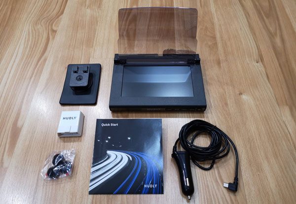
In the Box:

  • Hudly wireless heads-up display
  • Cigarette lighter power cable
  • Adjustable mount
  • Cable clips
  • Microfiber cloth
  • Optional OBD2 smart module

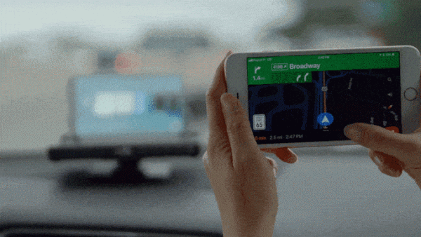
Installing the hardware and setting up the app is easy and takes just minutes to get things operational. Then each time you want to use the Hudly Wireless, your smartphone automatically reconnects to the device via WiFi.

But you do have to reestablish the mirroring from your phone to the Hudly. Occasionally the connection would flake and I had to power cycle the Hudly for it to work again but that was a rarity.

Like other vehicle tech-accessories, the Hudly Wireless is powered by a 12-volt power cord that plugs into the miniUSB charging port on the back of the device. The power cable is long enough to go around your dash and along your windshield enabling you to tuck it out of sight/the way. Though since I was using this in multiple vehicles, I never got around to making the wiring look presentable.

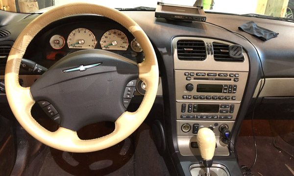
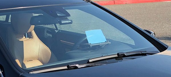
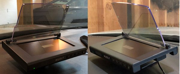
Here you see the Hudly Wireless installed in our very low-tech T-bird and it worked well even considering the steep angle of the windshield. Though I did prefer it off to the side and turned towards me, once again due to how the Hudly sat and the angle of the windshield.

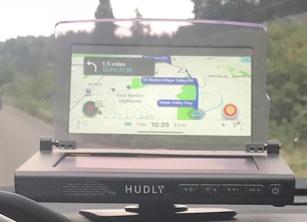
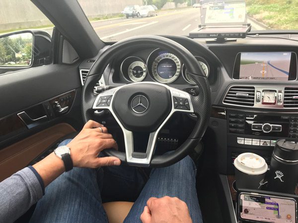
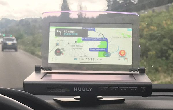
Here you see the Hudly installed in my three-year-old car and how it compares to the nav unit in my dash. Overall, the dash screen was brighter but the fact I could mirror Waze on the Hudly was much preferred to the stock nav software. You can also see how your smartphone has to be on and mirroring the screen for the Hudly to work. For extended use, you’d need to plug in your smartphone cause having your WiFi connected plus mirroring/casting with the screen on definitely chews thru your battery.

The front of the device has the power, volume, and brightness buttons for easy access/control. The speaker was loud enough to hear while driving.

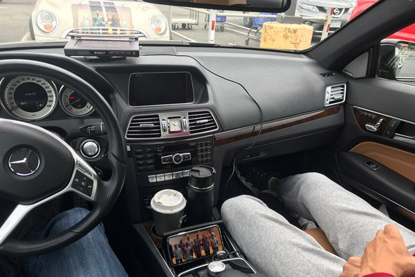
If you look real close, you can see Straight No Chaser on YouTube streaming from my iPhone to the Hudly Wireless. There is no safety feature to prohibit this sort of thing while driving. I was able to stream/view many video apps…anything Apple allows to be Screen Mirrored.

As it would happen, my wife was driving towards me while I was testing the Hudly Wireless and the first thing she said to me was how obnoxious the glare from the screen was. Obviously, the special reflective coating works both ways. I told her it was a safety feature like the flashing/oscillating motorcycle headlights.

What I like

  • Well build/engineered device
  • Bright, clear display
  • Mirrors your smartphone screen
  • Adds modern day functionality to old vehicles
  • Quick and easy to setup
  • Loud audio/speakers

What needs to be improved

  • Focal point more in the car than looking forward
  • Smartphone has to be on and mirroring/casting
  • Connection occasional had to be reset

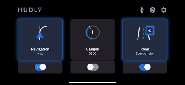
For you motor-heads, the optional OBD2 smart module enables you to also stream your car’s performance data to the Hudly screen as well.

Final thoughts

Bottom line…the Hudly Wireless head-up display works as advertised. It enables you to mirror your smartphone’s screen in front of you while motoring down the road. The screen is bright, vibrant, and clear, easily seen in all lighting conditions. That said, in today’s high tech world, I see it as a relatively niche device. Most vehicles today coming with pretty good tech as a standard/included option, the ability to install Apple CarPlay/Android Auto head units into older cars, or just using a well-placed mount for your smartphone all of which gives you the same capability/features as the Hudly Wireless.

Price: $299
Where to buy: gethudly.com and Amazon
Source: The sample of this product was provided by Hudly.

Filed in categories: Reviews

Tagged:

Hudly Wireless heads-up display review originally appeared on The Gadgeteer on September 15, 2018 at 11:00 am.

Note: If you are subscribed to this feed through FeedBurner, please switch to our native feed URL http://the-gadgeteer.com/feed/ in order to ensure continuous delivery.

KYZA Travel Wallet review

REVIEW – I would say that I am an occasional traveler, getting on a plane maybe 4 to 6 times a year to go somewhere.  But even though I am not a heavy traveler, I am always on the lookout for travel gear that can make my life a little easier during the trip.  For some time I have wished that I could find an easier way to keep track of all the stuff you need while traveling… wallet, cash, cards, boarding passes, passports, notes, business cards, and more.  I hate having all those things spread out across my wallet, my suitcase, and my laptop bag.  So I decided to give the KYZA travel wallet a try.

What is it?

A leather travel wallet (2 actually) that keeps all your travel documents organized like your cash, credit cards, passport, boarding passes, receipts, notes, business cards, and more.

Product specs

Made of 100% genuine leather; brushed leather on the exterior and smooth leather on the inside. The wallet includes an inner wallet for your everyday travels and an outer wallet for your travel necessities.

Outer wallet:

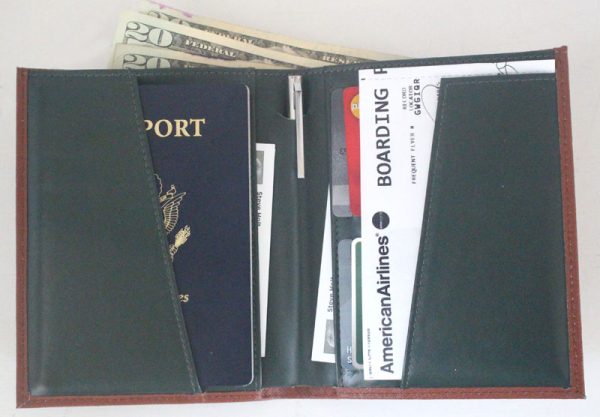
  • Two slip pockets for boarding pass and passport
  • Note/cash compartment
  • Travel pen
  • Four credit card slots

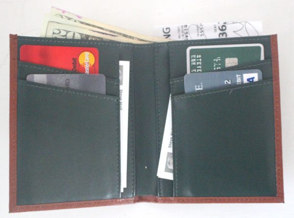
Inner wallet:

  • Four credit card slots
  • Note/cash compartment
  • Rear slip pocket

Note: this travel wallet is designed for passports up to 125mm x 88mm (4.9 in x 3.5 in).

The larger outside wallet
The smaller inside wallet
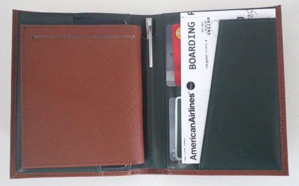
Here is the smaller wallet slipped into the larger wallet.
Here is the smaller outside wallet with numerous items inside.
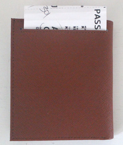
This is the back of the smaller wallet where the outside slit pocket is located.

What’s in the box?

A larger outer wallet, a smaller inner wallet, and a drawstring cloth bag to hold them when you aren’t traveling.

Design and function

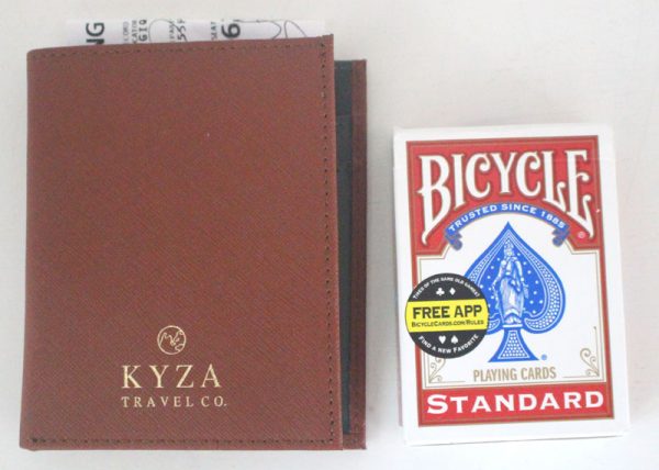
When you look close at the KYZA you can tell that it is a quality product.  It doesn’t feel cheap and I imagine that it will last for several years of use.  The inner wallet is smaller and thus can be slipped into the outer wallet to keep everything together while you are traveling.  And the inner wallet is designed to slip out to use during your daily touring away from your hotel room.  As you can see from the pictures, the KYZA is quite thick when you get everything inside.  I did not feel comfortable having the KYZA (both the outside and inside the wallet together) in my suit coat inside pocket because it was so thick.  So I kept it in my laptop bag while en-route.  It was however wonderful having all my travel stuff together in one place instead of spread out in multiple places.

Here are some pictures of the how thick the wallets are when compared to a deck of cards and my existing wallet I use every day at home:

The larger outside wallet
The smaller inside wallet
Both of the wallets together
The smaller outside wallet compared to my everyday wallet at home

As you can see from the pictures, the number of slots and pockets in the KYZA is wonderful, and you can place all manner of things inside… cash, passport, boarding passes, receipts, business cards, credit cards, notes, and more.  There is even an ink pen nicely tucked inside the center spine of the outer wallet so that you never have to hunt for a pen when you have to fill out a form or sign a receipt.  Very nice.

I did have a couple of negatives that I want to mention.  The KYZA doesn’t come with RFID protection for your credit cards.  There are competing products that are also very nice out there that are cheaper and come with RFID protection, so KYZA needs to add that to be competitive.  Also, the KYZA logo on the outside is a bit too much for my taste.  It makes the wallet look like something I picked up a trade show, not a premium product that costs almost $130.  They could have easily done a small stamped logo in the leather on the front if they really wanted their logo on there, or better yet inside the wallet.

Final thoughts

I really like the KYZA despite the conspicuous logo emblazoned on the front and the lack of RFID protection.  I have some travel bags that have RFID protection and can utilize those to keep my KYZA safe when needed.  But it would be nice at this price point to have a feature that competing products already have.  I can’t give my highest recommendation to the KYZA, but it is a high-quality wallet that does the job and will last you a long time.

Price: $129.99
Where to buyKYZA website
Source: The sample of this product was provided by KYZA

Filed in categories: Reviews

Tagged: ,

KYZA Travel Wallet review originally appeared on The Gadgeteer on September 15, 2018 at 9:00 am.

Note: If you are subscribed to this feed through FeedBurner, please switch to our native feed URL http://the-gadgeteer.com/feed/ in order to ensure continuous delivery.

BoxLock smart padlock review

REVIEW – Road rage. PTSD. Spam. Phishing. You know something has become widespread when there’s a name for it that most folks recognize. Here’s a new one – Porch Pirate. Those are the folks who drive around behind delivery vehicles and grab packages from the stoops of the intended recipient. And, like any good contagion, there is a solution. BoxLock is a lock for a porch box that can be unlocked by your delivery person only with the bar code of the tracking number of expected packages. The Gadgeteer, of course, is on the case and have been testing one they sent us. Read on for the details.

Note: Photos may be tapped or clicked for a larger image.

What is it?

The BoxLock is a heavy-duty hasp-type lock with an integrated bar-code scanner. The software that you configure your lock with allows you to add package tracking numbers to the account. When the delivery person scans the tracking number from your package, the lock opens.

What’s in the box?

  • Lock
  • MicroUSB charging cable
  • USB 110V charger
  • Instruction sheet
  • Printed Master BarCode card

Design and features

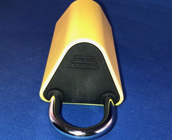
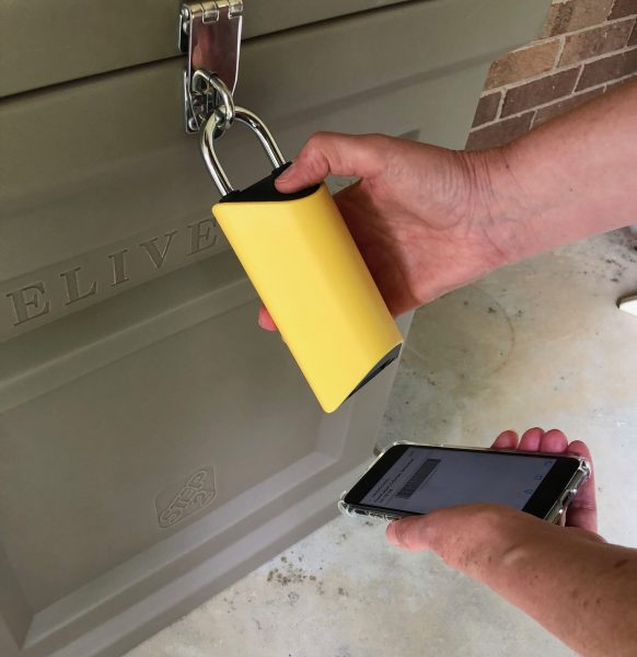
The BoxLock is a bright yellow 1.25” triangular lock 5” long on the rear, and 3.5” long on the angle that faces forward. The hasp is 1.25” in diameter inside, and extends about that amount from the top in the locked position. One flat side is against the back of the hasp, the opposite angle faces out. When naturally grasped, your thumb falls onto that angle at the top, where a button is placed that, when pressed, engages a light and a bar-code scanner beam. When a package whose tracking number is entered into the lock’s account, the lock will open, and the owner of the account can get an alert. If the lock is left open for a set amount of time, another alert will be sent, warning the owner that the lock was not properly re-engaged.


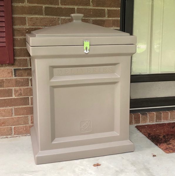
Since the hasp is a pretty standard padlock size, it will fit into most places that can be secured by a standard padlock. This means you could even have your shed or backyard be the place the delivery person opens to leave your package. I had planned to move my rear deck box (which normally houses electric hedge clippers, electric blower, and a 100 ft. heavy-duty extension cord and various other garden implements) to the front porch to test the lock. BoxLock was kind enough to include a Step2 box, one of the models which they also sell from their website. This vented box came preassembled and ready to place on my front stoop. The deck box had to be assembled, which was not an easy task. The metal hasp fits the BoxLock perfectly, with the bright yellow of the box lock drawing attention to the “Deliveries” label molded into the box. This made no difference to drivers whose habits have become ingrained. But, if we can ever get deliveries there, it can be easily weighted and it would make walking off with packages a bit more problematic.

Setup

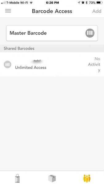
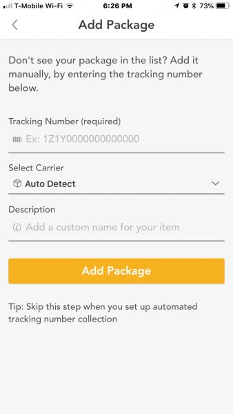
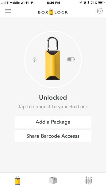
The lock will not work until it has been activated with an account, which is a good thing. You wouldn’t want a lock that you can’t control accidentally locked to something. Setup requires creating an account in the website or app and agreeing to the privacy policy of an unknown company (of course). Once you’ve fully activated your account, scanning or entering the serial number adds it to your account, and you’re in complete control. You can re-name the lock, or add anyone you’d like as a user by sending them a barcode that is their unique access code. You’ll get a notification (or at least a notice in your account) that they have accessed it.

Performance

Performance in unlocking with a package was perfect. Also, when I sent the signal from my account to open the lock, it immediately popped open every time. The one area that could use some work is when I sent the barcode to my Lovely Bride for her to be able to unlock the box using it on her phone. She was never able to get that to work. I could wiggle it around and play with the various distances and angles and finally get it to work with her phone barcode, but she hasn’t the patience for that. Printing out a card that I would expect her to have on her person every time she goes to fetch packages from the porch is a little beyond the pale. I’ve only just gotten her to see the need to carry her phone on such missions.

The lock, when used by the delivery companies, worked flawlessly. Through my video doorbell, I watched the first driver walk up on the porch, check the notes I had left on the delivery, and walk up to the lockbox. He swung the lock up and saw the scanner in the bottom, and then tested the button. He then grabbed the package he had set down, scanned it, and chuckled slightly when the lock popped open in his hand. He put the package in the box, locked it back, and gave the lock a tug to ensure it was secure. This was repeated with each driver who bothered to read the delivery instructions. Which brings up another issue. I’m lucky to get drivers to read that I want packages delivered to the front door, where they will be out of the sun and rain. (Our side door is south-facing and gets blisteringly hot.) It doesn’t matter how many times I call and ask, There is always some new driver who takes the route, and it’s not delivered to the correct place. The other issue is that the Post Office delivers many packages for other carriers. If it’s a package that meets the USPS parcel minimums, all of the shippers just have them fulfill the shipment. These are stuffed in the mailbox along with the rest of the mail. Even valuable packages like RAM or medicines are shoved in the mailbox with the mail and left to bake in the sun.

What I Like

  • Easy setup and entry of packages into account
  • Auto-recognizes the “Big Three” common carriers (UPSP, FedEX, UPS)
  • Allows adding other account users with their own custom barcode

What needs to be improved

  • Getting carriers to use it is going to take time
  • Using barcodes on phone screens in daylight is still problematic

Final thoughts

I love this product. It addresses a real problem that is growing, especially around gift-giving seasons. I think it would earn a permanent place on my front porch, except for two factors: having a strong-box on your porch is not very “welcoming”, and my Lovely Bride can’t get into it through her phone barcode. The other side of this is getting carriers to use it. Most of the prescription medicine deliveries are left in the mailbox, rather than delivered to the door.

Price: $129.00
Where to buy: Amazon.
Source: The sample of this product was provided by BoxLock.

Filed in categories: Reviews

Tagged:

BoxLock smart padlock review originally appeared on The Gadgeteer on September 14, 2018 at 11:30 am.

Note: If you are subscribed to this feed through FeedBurner, please switch to our native feed URL http://the-gadgeteer.com/feed/ in order to ensure continuous delivery.

AirSelfie2 flying camera review

REVIEW – Everyone either has or wants a drone and it’s hard to fault them because drones are both fun and useful. They are fun because you can capture awesome video from locations that you would otherwise never be able to do. And drones are useful because you can use them to see things like your roof, gutters, etc, without climbing a ladder. All this fun and usefulness can also equal an expensive and bulky gadget. Let’s check out the AirSelfie2 pocket-sized flying camera and see if it’s just a toy or a worthy pocket drone.

What is it?

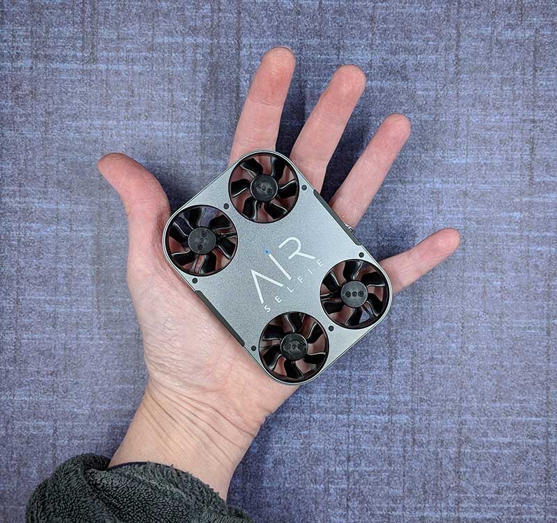
The AirSelfie2 is the 2nd generation AirSelfie flying camera which is a small playing card deck-sized drone that is designed to… you guessed it… take selfies and capture video.

What’s in the box?

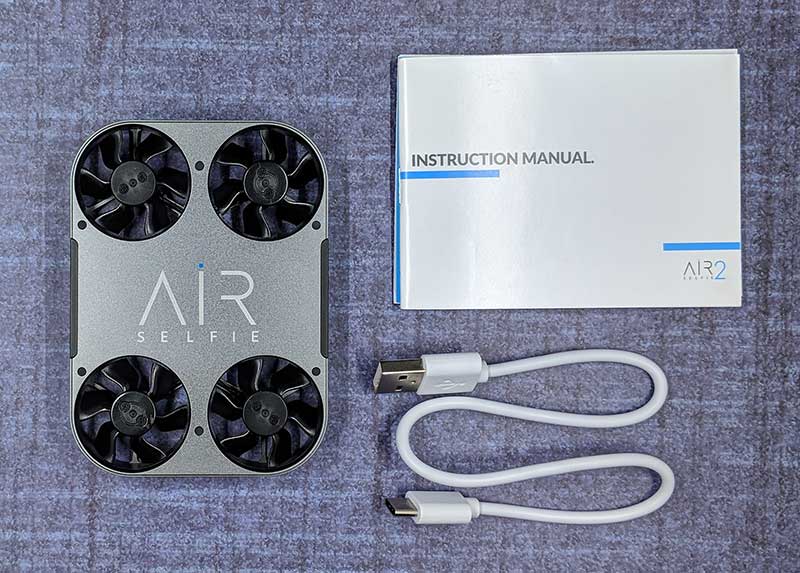
  • AirSelfie2 drone
  • USB-C charging cable
  • Storage case (this was missing with my sample)
  • Instruction manual

Hardware specs

Video:1080p 30fps – Photo:12MP wide-angle (81°)
Wide-angle: ƒ/2.0 aperture
Gyro/Barometer/Geomagnetic sensor
Brushless motor
Built-in Micro SD card 16GB
400mAh 7.4v Built-in Battery
2.4G Wi-Fi
Control distance 65 feet / 20 meters
Size:98.5 x 71.2 x 13.6mm (3.8”x2.8”x0.5”)

Design and features

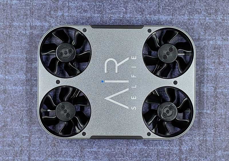
The AirSelfie2 is a sharp looking little drone with a gray metal colored aluminum housing and four propellers.

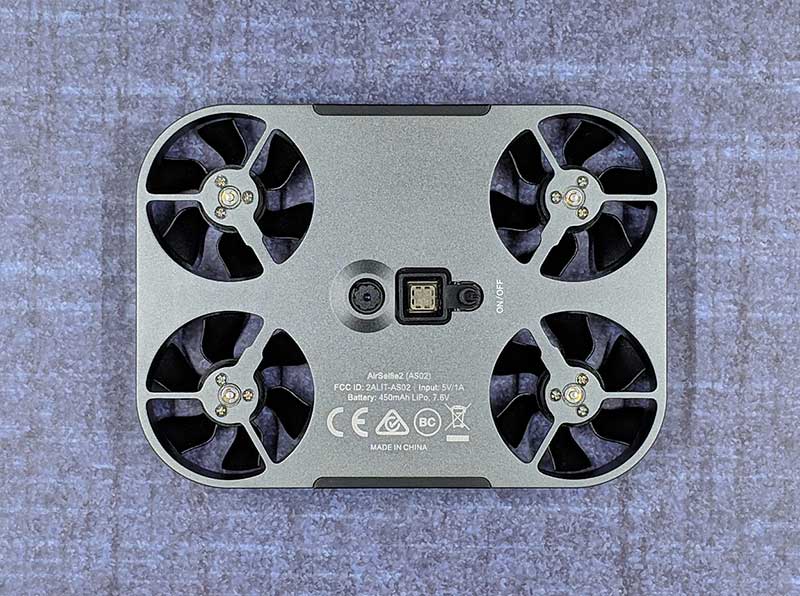
On the bottom side of the drone, you find two sensors and the power switch. The round sensor on the left is the visual sensor and the square sensor next to it is the sonar sensor. The small button on the right is the power switch which you have to hold in for a few seconds to toggle power.

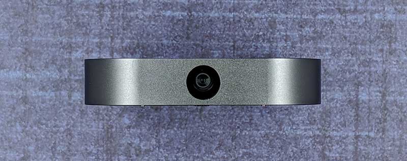
There’s a 12MP camera one end.

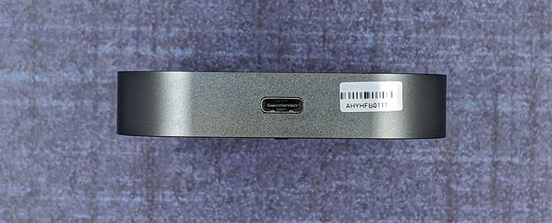
And on the opposite end, you’ll find a USB-C charging port.

The AirSelfie2 looks like a gadget that James Bond would use on a mission. Although it’s lightweight, it doesn’t look or feel like a toy. It’s well made and the design looks much more robust than some small plastic drones I’ve tested in the past.

Let’s fly!

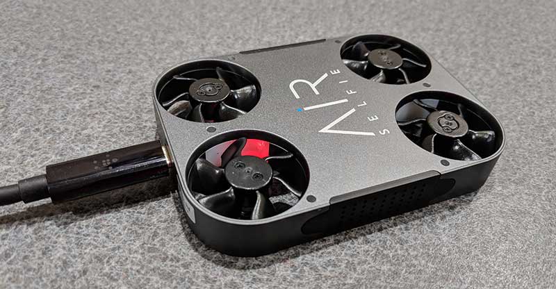
Before you can fly the AirSelfie, you have to charge it using the included (or any) USB-C charging cable. It takes about an hour to fully charge the battery from fully empty to full which provides up to 5 minutes of flight time. While charging, an LED in one of the propeller areas glows red. When charging is complete, the LED turns off. This status LED also glows blue when the AirSelfie is powered on.

You will also need to install the iOS or Android Airselfie app on your phone or tablet. I tested the AirSelfie2 with my Pixel 2 XL.


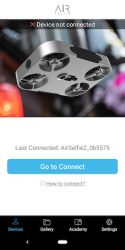
The app doesn’t use Bluetooth to control the drone. It generates its own WiFi connection. Each time you want to fly the AirSelfie, you have to power it on, launch the AirSelfie app, and then go into your WiFi settings to connect to the AirSelfie’s WiFi.


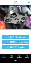
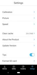
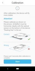
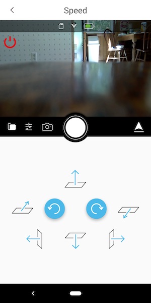
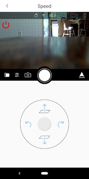
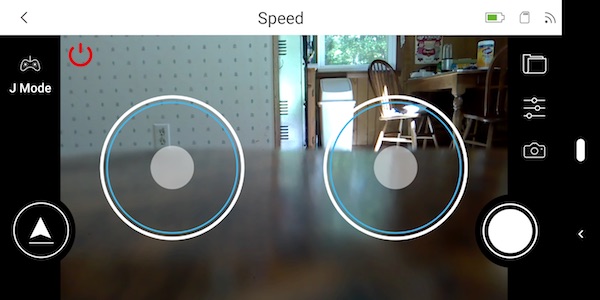
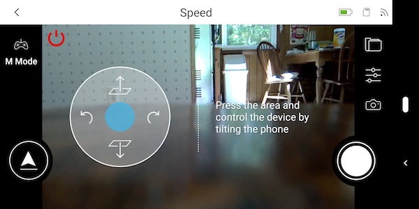
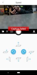
The app is pretty basic, It offers 3 different flight control styles, a way to calibrate the drone, and a few settings that you can customize. The flight control styles include an easy one-handed version shown above on the left and a slightly harder one-handed version on the right which controls the drone by physically tilting the phone in the direction that you want it to fly.

The other two control styles are two-handed joystick style touchscreen controls.

I tried all of the control styles but I kept going back to the easy (first style) because it’s easier. Go figure 🙂

I thought the AirSelfie sample that was sent to me was defective because I couldn’t get the propellers to spin up when I would press the arrow button in the app. It took me a while to figure out that you need to press and hold that button for a few seconds to start the propellers. Then you have to place the drone on your flat palm with the camera facing you and toss it gently in the air. It might sound scary, but launching it is easy. Landing it is a bit harder. You’re supposed to bring your hand up under it and grab it. Most of the time when I did this, the propellers would spin fast like the AirSelfie was a captured bug trying to get away. I finally learned that you have to grab it and raise your hand to signal it to turn off.

Pics and video


Since the AirSelfie2 is marketed as a flying camera, I had hopes that it would be a good flying camera and taking pictures and capturing video with the app was easy when it worked. But regularly, I’d see a capture failed message on the screen when I’d tap the shutter button. To fix this issue, I would have to restart the app and/or cycle power on the AirSelfie. I found this to be an annoying problem that seemed to happen right when I could have captured a decent selfie.


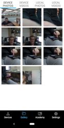
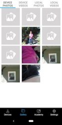
Most of the time my selfies were at weird angles or chopped off half of my body. Indoor selfies just look ok although I think they are a little dark and on the flip side, outdoor selfies can be completely blown out if it’s a sunny day. Click the images above to see the full-sized picture.

The AirSelfie2 can also capture video. Video without sound though… which is to be expected because the propeller noise would drown out any other noise. Check out the video below that shows how to fly it and video from the AirSelfie2 itself.


From the short video, you can tell that the AirSelfie2 is NOT a stealth drone. It makes quite a bit of noise and the video capture quality is about the same as the image capture quality – not stellar. It also drifts while hovering, so you end up cutting off half a person when you press the shutter button.

What I like

  • Tiny pocket size
  • Good build quality

What needs to be improved

  • Image and video quality
  • Drifts while hovering
  • Short flight time (3-5mins)
  • Would be nice to have a self-landing feature so you don’t have to grab it out of the air

Final thoughts

I tested the AirSelfie2 on multiple occasions and had the same results each time. The images that this little flying camera capture just arn’t that good for a $200 camera. Yes, the device is cool, but cool only goes so far. My advice is to save your money and buy a drone from a brand name that has 3 initials and a built-in gimbal 🙂

Price: $199.95
Where to buy: Amazon
Source: The sample for this review was provided by AirSelfie.

Filed in categories: Reviews

Tagged: ,

AirSelfie2 flying camera review originally appeared on The Gadgeteer on September 14, 2018 at 9:00 am.

Note: If you are subscribed to this feed through FeedBurner, please switch to our native feed URL http://the-gadgeteer.com/feed/ in order to ensure continuous delivery.
Blue Yeti Nano USB microphone review

REVIEW – What if you took the Yeti USB microphone and took a shrink ray to it? That was my thought when I saw the Blue Yeti Nano microphone. But how does it sound, and what features would be missing from the smaller package? I tried out the Nano to find out.

What is it?

The Yeti Nano is a high-quality USB microphone designed for professional podcasting that comes in four different colors.

Hardware specs

Power Required/Consumption: 5V 150mA
Sample Rate: 48kHz
Bit Rate: 24bit
Capsules: 2 Blue-proprietary 14mm condenser capsules
Polar Patterns: Cardioid, Omnidirectional
Frequency Response: 20Hz – 20kHz
Sensitivity: 4.5mV/Pa (1 kHz)
Max SPL: 120dB (THD: 0.5% 1kHz)
Dimensions (mic w/stand): L: 4.29” (10.9cm) W: 3.78” (9.6cm) H: 8.31” (21.1cm)
Weight: 1.39lbs (0.63 kg)
Headphone Amplifier
Impedance: >16 ohms
Power Output (RMS): 130mW
THD: 0.009%
Frequency Response: 15Hz – 22kHz
Signal to Noise: 100dB
System Requirements
Operating System: Windows 7, 8.1, 10 or macOS (10.10 or higher)
USB Compatibility: 1.1/2.0/3.0

What’s in the box?

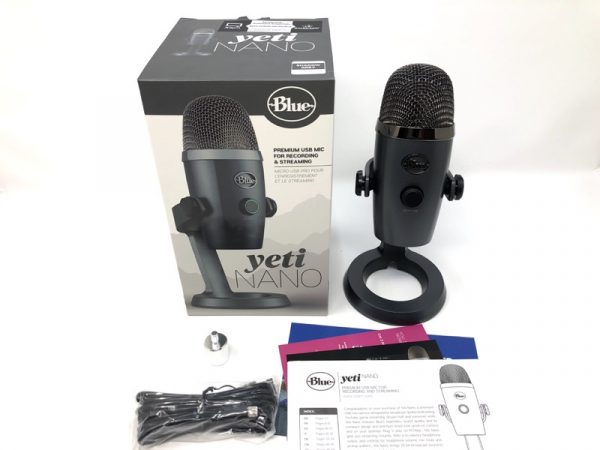
Yeti USB microphone (including desktop stand), USB cable, 3/8” to 5/8” adapter

Design and features

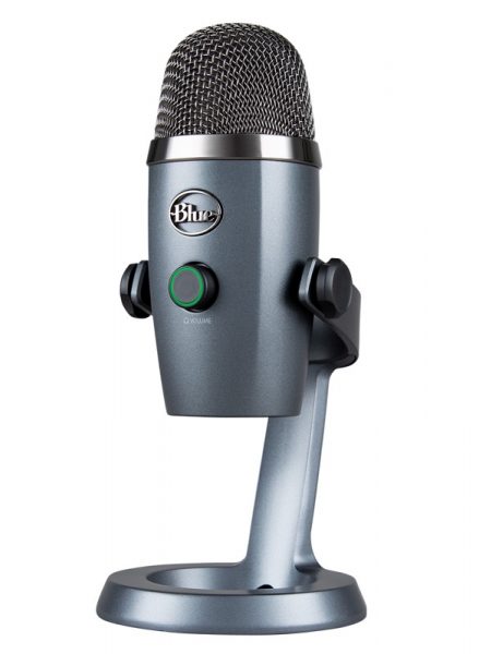
The Nano really does look like a smallish version of the regular Yeti. It comes attached to a handsome desk stand.

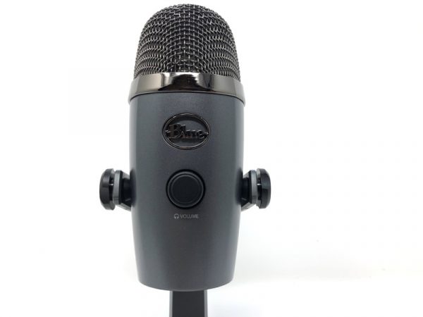
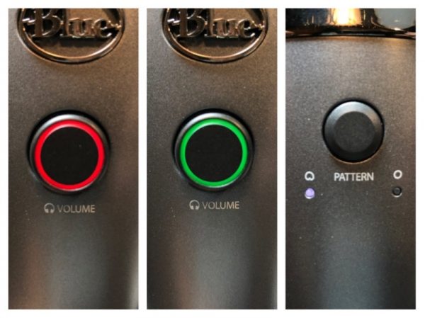
The only control on the front is a volume knob. It also doubles as a mute button.

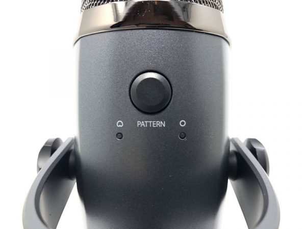
There’s only one button on the back to select between microphone patterns. You can choose between cardioid or omnidirectional.

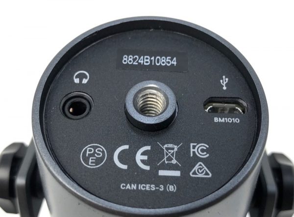
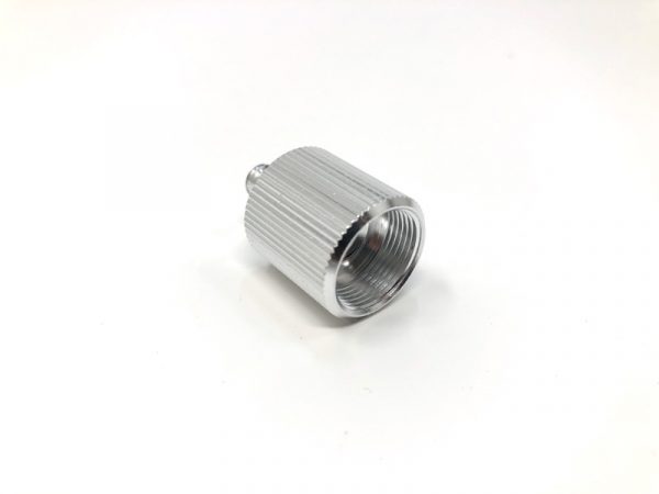
I was elated to find a threaded adapter on the bottom for boom stand users like me. There’s also a low-latency headphone jack and a microUSB port.

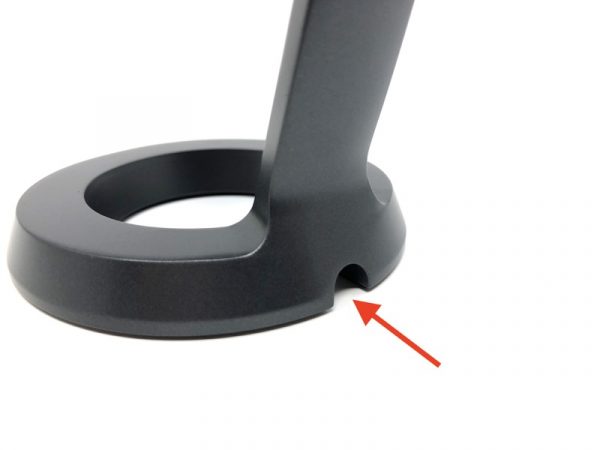
Here’s a nice design feature: There’s a notch at the base of the stand to allow your cables to exit gracefully. I like it!
Blue was good enough to include a threaded adapter so you can use a standard microphone stand.
Setup

The Nano was detected by my Apple laptop without issue. Once powered up, the volume knob turns red for mute, and green for on. Pressing the rear button toggles between mic patterns.

Performance

I returned to my recording booth and placed the Nano next to my studio mic, the Neumann TLM103 connected to a tube preamp.

Then, I spoke an excerpt from “Mrs. Frisby and the Rats of NIMH” and recorded on both mics simultaneously. No processing was done whatsoever. The Nano was plugged directly into the computer with no further modification.

What I like

I have no complaints about the sound quality of the Nano- unless I compare it to my studio mic. It’s a very unfair comparison because my Neumann mic setup plus tube preamp costs over 10x as much vs. the Nano. However, there’s a LOT of fiddling involved to get my studio setup dialed in just so. There’s virtually no setup at all with the Nano. It is the closest thing to plug and play.

I also noticed that the Nano “only” comes with two mic patterns (cardioid and omni), but it’s all most podcasters or voiceover artists would need. If you need a figure-8 pattern for interviews with a single mic, you’d be better off with the standard Yeti.

What needs to be improved

None. For this price, it’s hard to go wrong.

Final thoughts

If you’re looking for a starter USB mic that has everything you need and nothing you don’t, the Yeti Nano is a fine choice.

Price: $99.99
Where to buy: Blue Designs and Amazon
Source: The sample of this product was provided by Blue Designs.

Filed in categories: Reviews

Tagged:

Blue Yeti Nano USB microphone review originally appeared on The Gadgeteer on September 13, 2018 at 11:30 am.

Note: If you are subscribed to this feed through FeedBurner, please switch to our native feed URL http://the-gadgeteer.com/feed/ in order to ensure continuous delivery.