Ethohome Gravis Weighted Blanket review

NEWS – The Ethohome Gravis Weighted Blanket is a reasonably priced, high quality, weighted blanket that could be the solution for some people who suffer from restless sleep or nighttime anxiety. At $269.99 for the 25 pound version, the Gravis was super effective in my testing and priced right around the same as other weighted blankets of similar quality.

What is it?

Weighted blankets hit the mainstream in 2017, but they have been around for a long time, mainly used to treat autistic children or adults with severe anxiety issues. There are a number of studies done on the effectiveness of weighted blankets, but the majority of supporting evidence I’ve found has been anecdotal. After using the Gravis Weighted Blanket for a few weeks, you can definitely add my experience to all of the positive feedback surrounding weighted blankets. Results may vary among individuals though, so I’m not going to debate the effectiveness of weight blankets in general; I’ll just be reviewing this particular weighted blanket by Ethohome.

The Gravis Weighted Blanket comes in a box that at first seems way too small to hold such a heavy item. The plastic handle on mine was broken when it arrived and the company has since rebranded itself from Montage to Ethohome, so the packaging may be different and of better quality at this point.

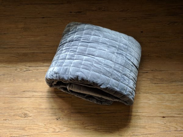
The Gravis blanket comes with an attached cover and is compacted into what appeared to be a vacuum sealed plastic bag.

Once removed from the plastic bag the blanket expands a bit. Upon first picking up the deceptively light looking blanket you’ll quickly realize how difficult it is to manage a 15-25 pound blanket.

Design and features

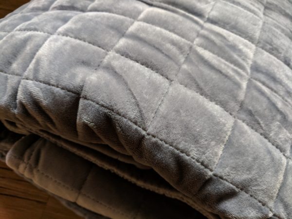
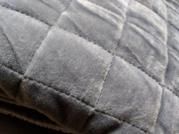
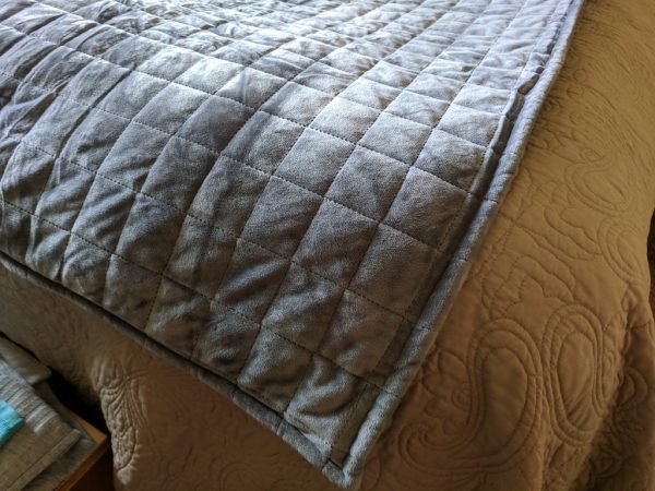
The design of the Gravis is similar to most other weighted blankets. The blankets achieve their weight via thousands of glass pellets sewn into little sections of the blanket. The Gravis stands out in my opinion mainly because of how quiet the pellets are. A few other weighted blankets I’ve tried have been really noisy, producing a loud rain-on-a-tin-roof sound every time I rolled over or shifted my weight. The cover of the Gravis may be to thank for this; it’s a thick felt-like material that’s very soft to the touch.

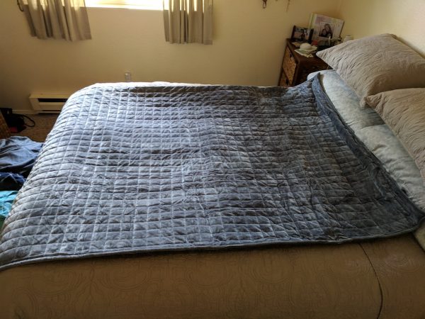
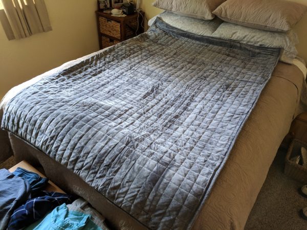
You’ll find that most weighted blankets don’t come in traditional bed-covering sizes like full, queen, or king. Weighted blankets those sizes would be impossible to manage and the weight would be dispersed too much to be effective. The 25 pound Gravis I tested measures 72 x 48 inches.

For maximum benefit, Ethohome recommends using a blanket that’s about 10% of your body weight. Although some people may prefer a heavier or lighter blanket. It’s also very important to remember that the Gravis, or any weighted blanket for that matter, should not be used by children under the age of four or by any individual weighing 50 pounds. It would be very easy for a child or person that small to not be able to move themselves out from under a heavier blanket and that could prove dangerous.

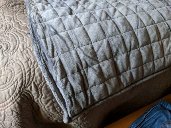
The quality of the seams on the Gravis is impressive. After a few weeks of use and making my bed each morning, there are no signs of pulls or tears.

The Gravis itself is secured to its cover via strong fabric ties in each corner. The cover has a sturdy zipper that folds away discreetly once it’s closed.

I did notice that after some time, the blanket started to bunch up in the corners a bit. With a regular blanket this is easily remedied by tossing it up into the air and laying it back out flat on the bed. That won’t be possible with the Gravis, but it wasn’t too difficult to spread the blanket out flat again and work out the bunching.

The Ethohome website says that the Gravis’ cover is machine washable, but that the blanket should only be hand-washed. That makes sense, because I’d never expect something this heavy to be washed effectively in a consumer strength washing machine.

Performance

I’m a restless sleeper. I’ll wake up anywhere from two to three times each night, lie awake for a bit and then fall back asleep. While using the Gravis, I’ve had the most complete night’s sleep since I can remember. I no longer wake up during the night and I’ve found that I fall asleep much faster than ever before. The few times I’ve slept away from home during the testing period, I found myself missing the comforting weight and restful sleep the Gravis provided.

What I like

  • Included Duvet cover
  • Great quality

What needs to be improved

  • Can bunch up

Final thoughts

Weighted blankets may not work for everyone, but if they do work for you, the Ethohome Gravis is a great choice. The Gravis is of very high quality, has an included cover, and is reasonably priced. The Gravis comes in one color, Space Gray and three versions; 15, 20, and 25 pound.

Price: $269.99 for the 25lb version
Where to buy: Ethohome
Source: The sample of this product was provided by Ethohome.

Filed in categories: Reviews

Tagged:

Ethohome Gravis Weighted Blanket review originally appeared on The Gadgeteer on October 13, 2018 at 9:00 am.

Note: If you are subscribed to this feed through FeedBurner, please switch to our native feed URL http://the-gadgeteer.com/feed/ in order to ensure continuous delivery.

RevoNext QT3 quad driver hybrid in-ear headphones review

REVIEW – In the world of earphones, there is one constant that ties them all together, and it’s this: there is no constant. It may sound contradictory, but hear me out. I have reviewed earphones that are made with dynamic speakers, armature speakers—and hybrids that utilize both speaker designs. These earphones have ranged from a single speaker to six speakers per ear. And the one (non)constant has been that price has never been dependent on the number of speakers an earphone has. Case in point: the new RevoNext QT3 quad driver hybrid in-ear headphones have four speakers—two dynamic and two armature speakers per ear. For $70. That’s 70, not 700! Despite this ridiculously low price, are they worth it?

What is it?

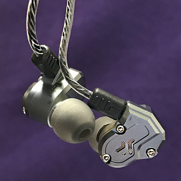
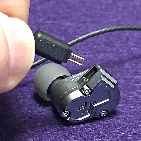
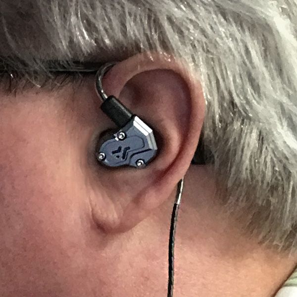
The RevoNext QT3 quad driver hybrid in-ear headphones are an aluminum over-the-ear, quad driver earphone with removable cord. Over-the-ear means that the cord goes up and behind the ear—much like the earphones that stage musicians wear. The earphones are universally-sized as opposed to a custom molded earphone. The hybrid speakers are both dynamic (best for bass) and armature (more accurate) designs. Theoretically, this hybrid approach results in a more rounded, best-of-both-worlds earphone, but the reality is more blurred than that.

Specs

  • Type: In-Ear
  • Connectivity: Wired
  • Cable Length: 49 in.
  • Sensitivity: 105dB
  • Impedance: 15Ω
  • Frequency Range: 7Hz-40KHz
  • Plug Type: 3.5mm
  • Pin Type: 0.78mm
  • Weight: 25g

Design and features

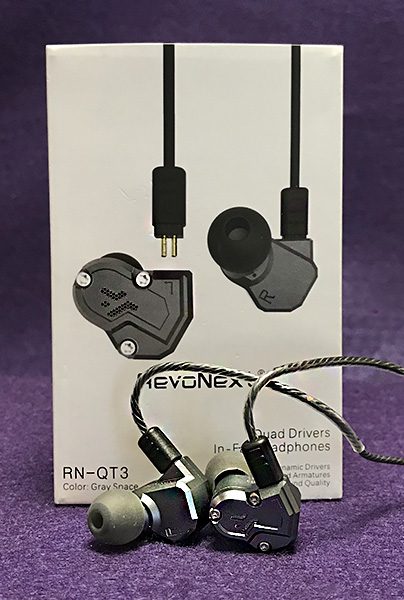
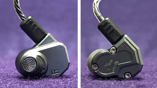
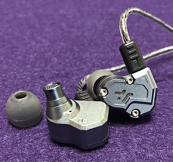
The QT3 earphones are encased in an aluminum shell, which is almost unheard of in this price range. Not only that, but they are built quite strong. When holding them, you would never guess the price was so low. The parts fit together almost seamlessly. The 49 in. cable is more than long enough for almost any use. The removable cable uses a standard 2 pin connector that easily separates, but is a bit fragile. RevoNext is said to be working on a Bluetooth adapter that will use the same 2 pin connector allowing the QT3 earphones to easily switch to wireless mode. That will be interesting to see. The cable has a standard 3.5 mm mini plug connector, so using the QT3 with a newer iPhone will require the infamous Apple dongle. A cable with its own lightning connector would have been a nice option.

Each earphone is clearly marked L and R for quick insertion. Since they are over ear, getting them properly inserted is a bit more tricky than regular earphones, but only until you get used to it. Three sizes of silicone ear tips are included.

Comfort with the QT3 earphones is good, not great. While they never became painful when wearing for an extended period of time, I always knew they were there. Note that it’s almost impossible to get a perfect fit with over ear earphones that are universally sized. Ears are just too different. The QT3s are available in matte black, space gray and red. I was sent the space gray to review, but given a choice, I would have chosen red, because … red.

As I said before, the quad speakers are hybrid—in this case, two balanced armatures, one dynamic bass driver and one dynamic sub-bass driver. Bass is more accurate than you would expect, given that two bass drivers should make the QT3s a bass monster. My first impression of these earphones was that they were weak on bass, but the more I listened, the more they opened up. The treble comes off as a bit too bright on certain songs. The QT3 earphones are not as forgiving as some other earphones I’ve heard, but those were way more expensive.

So how do the RevoNext QT3 earphones sound? 

I was sampling Elton John’s classic “Madman Across the Water” album and enjoyed how the QT3 earphones were able to exhibit detail. Yes, there were parts that were too bright, but older recordings can be guilty of that. The title song had none of this and was totally pleasant to listen to.

Emmy Lou Harris’ poignant “Red Dirt Girl” is another example of some too-bright spots. While the album leans towards bass, her voice comes across as hot and gritty. I was able to fix this by adjusting the EQ, which I’m usually not a fan of doing. However, it worked magic with this song.

Orchestral Manoeuvres in the Dark (OMD) have some serious bass on many of their songs. “Metroland” has a potent bottom end that you can hear (but not feel) with the QT3 earphones. Once again, changing the EQ did the trick and brought down the treble to a smoother level.

What I like

The RevoNext QT3 earphones are kinda amazing. Their build quality is as good or better than many earphones I’ve reviewed regardless of price.

What needs to be improved

Treble is the QT3s weak spot. I skipped over some songs simply because they were to brittle sounding.

Final Thoughts

Okay, I’ve heard better single, dual, triple and quad driver earphones before. But never at—or even close—to this price. Seventy bucks is a steal for earphones of this quality. If RevoNext can smooth out the QT3’s too-bright tendencies, then they could easily compete head-to-head with any quad-speaker earphone costing much more.

Price: $70 US
Where to buy: Amazon
Source: The sample for this product was provided by RevoNext.

Filed in categories: Reviews

Tagged:

RevoNext QT3 quad driver hybrid in-ear headphones review originally appeared on The Gadgeteer on October 12, 2018 at 11:00 am.

Note: If you are subscribed to this feed through FeedBurner, please switch to our native feed URL http://the-gadgeteer.com/feed/ in order to ensure continuous delivery.

Sense home energy monitoring device review (part 1)

REVIEW – Monitoring electrical usage is useful to reduce energy cost, to understand what electrical devices are being used in real time and historically, and to discover abnormal operation that may indicate current or anticipated problems with electrical devices.  Sense Home Energy Monitoring has the potential to achieve all of this. Read on to see what I think!

What is it?

The Sense Home Energy Monitor is a device that is installed in an electrical panel and monitors the current and voltage supplied to that panel at a high sampling rate – about 1 million times a second (1 MHz). It provides the instantaneous Watts consumed on a timeline displayed on a mobile appThe device also analyzes the data it collects and sends the data to Sense.com. There, the data is matched to other data collected by other devices using machine learning algorithms. When Sense.com matches a device to data collected by the Sense Home Energy Monitor the Sense app will be able to alert the user when that device is on and other statistics about that device’s use.  Sense integrates with IFTTT so that it may act as a trigger to other actions when devices turn on or off. The app also provides its own set of alerts, as discussed below.

What’s in the box?

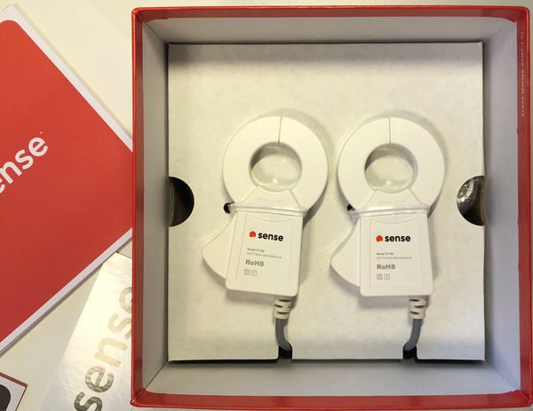
Sense Home Energy Monitor
Intro Manual
Install Manual
Sense sticker
2 current transmitters
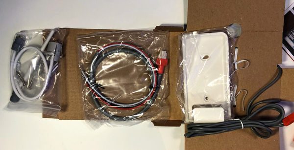
240V supply line
WI-FI antenna
antenna extension cord (for inside cabinet installation)
mounting bracket and screws (for external cabinet installation)

Design and features

Specifications

Technical Specs
Monitor Size and Weight: 137mm x 66mm x 32mm, 220g
Power consumption: < 5W, 0.1A

Current Transformer Specs
CAT III 300V 250A max
Cable length: 46″ (116.84cm)
Inside Diameter: 1″ (2.54cm)

Environmental Ratings
Relative Humidity: < 90%:
Temperature: 32-122ºF (0-50ºC)
Elevation: < 9842′ (3,000m)

Compatibility
120VAC (90V-130V), 60Hz
200A, 120V split-phase service.

Wireless
802.11b/g/n Wi-Fi
Bluetooth Smart
Bandwidth use: ~300MB per day

Signal Processing
1MHz Sampling Rate
(4M data points per second)
1GHz ARM Processor

Unboxing

The Sense Home Energy Monitor comes in a glossy cardboard telescopic box. The front of the box shows the sense inside at actual size. The sides of the box show icons of different electronic devices.
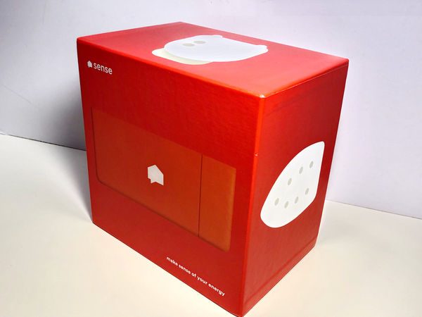
When the box cover is lifted off, a fact about each electronic device is printed on the inside box

The icons (except for the one depicting the Sense unit) are used in the app to display what type of device is consuming power.

Inside the box, the Sense monitor is mounted in a cardboard frame. Below the sense monitor, the current transmitters are mounted to the outside of a folded cardboard panel which also contains the holder for external mounting, power leads, antenna, and the antenna extension cable.

Design and features

Hardware

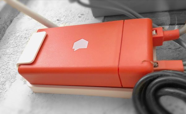
The Sense monitor is unlike most gadgets that we review on The Gadgeteer because it isn’t designed to be interacted with at all. In fact, the entire monitor can be installed inside the home’s electrical panel. What is obvious is that the manufacturer went through great lengths to make the monitor easy to install. While external mounting is always an option, the size and shape of the monitor will accommodate even the most cluttered electrical panels. The connection of the power supply and the current transmitters are made with high-quality quick connectors. The mains wires are pre-stripped and tinned. The entire installation took only 20 minutes.

For now, the Sense monitor only works on 240V single split-phase 60Hz service. This excludes most other continents besides North America and most commercial installations.

Hardware Installation

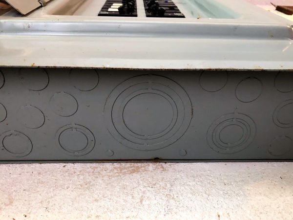
The electrical panel and the original wiring in the house are from 1971. A couple of surface mount boxes block the lower right-hand side knock-outs and the left-hand side doesn’t have lower penetrations. In addition, the panel is in the garage in the corner of the house and the Wi-Fi signal needs to travel between several floors and walls to get to the router. In light of these conditions, it was decided to mount the monitor externally and rout the cables through the bottom of the panel.
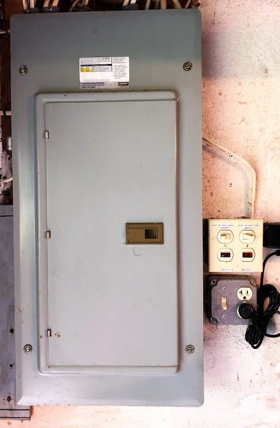
The bottom of the panel has plenty of options
There are also plenty of blanks in the panel to add the breakers.
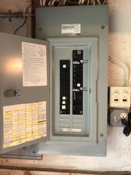
The inside of the panel is not the neatest, but my electrician said he’s seen worse. Most notably, there is plenty of room around the mains.
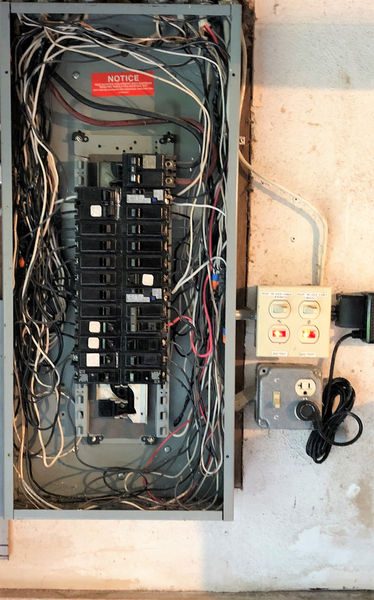
The only potential snag during an install is the correct placement of the current transmitters. They are labeled with arrows cast into the plastic housing to indicate which direction corresponds to positive current flow. The arrows are a little difficult to see. Even if one is installed backward, it’s possible that Sense automatically corrects the flow of electricity so that the electrical panel consumes power rather than generating it. After the install, the new breaker, current transmitters, and Sense Monitor are mounted. The Wi-Fi signal is tested before the panel is closed.
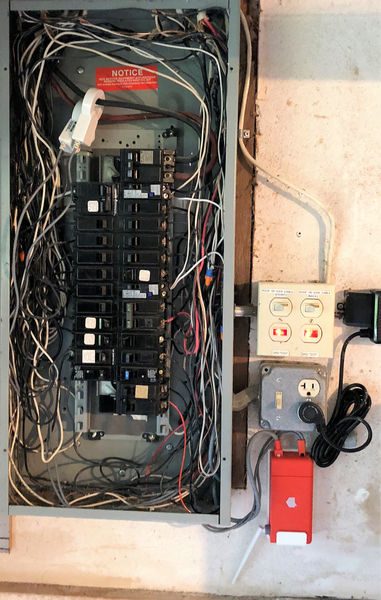
After the install is completed I have a newly installed gadget!
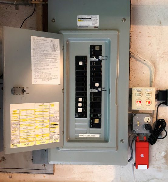
Note that the install above is for a unit that does not include solar power generation monitoring. The Sense monitor can also monitor the power generated by a solar power system. The solar installation would be similar except that the unit would come with two sets of current transmitters.

Software Installation

I installed version 22.2 from the iOS App Store and the Play Store. The download size is 11.27 MB for Android and 16.5 MB for iOS.  The first screen has a button for you to accept the terms of service and the privacy policy. It’s important that you understand that the Sense Monitor will be transmitting all power consumption to Sense.com. It requires always-on broadband internet in the location it is installed and will use about 300 MB a day. Also, Sense indicates that they may share personal information to comply with laws or to respond to lawful requests and legal processes. After accepting the terms of service and privacy policies you are presented with the screen below
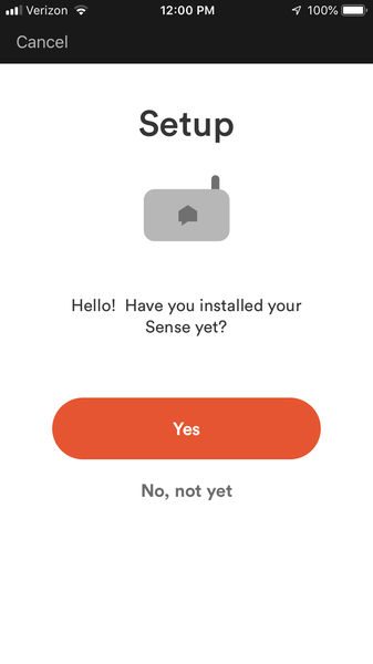
You can only create an account once the monitor is installed and powered. Furthermore, you need to be within Bluetooth transmission distances to pair the Sense monitor to the Wi-Fi signal it will be using to communicate with the internet. After you acknowledge that the sense is set up, it uses Bluetooth interrogation to find the installed monitors and set up the account. The Sense will scan Wi-Fi networks and the app will prompt you to enter the Wi-Fi credentials to connect to the network. After the Sense monitor is connected to the internet it will chime and the app will provide the ability to create an account. Only one account can be created per sense monitor, but that one account can be accessed on multiple devices simultaneously. So, if the account will be shared, then pick a password that can be shared as well.

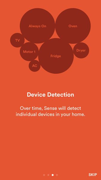
After the account is created the signal monitoring starts and the next four screens are displayed.

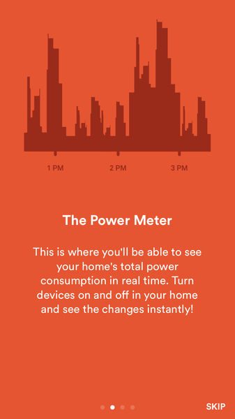
The potential of sense to identify when items are running, and to trigger events based on that detection, enables the detected appliances to trigger push notifications and events and also permits logging of that appliance’s use. The two examples, of knowing when the dryer is stopped or when the sump is running are two key items that I’m waiting to enable on my installation. (I’ll be able to do this once Sense identifies those items.)

Software Design

After reading the above screen the power timeline is displayed. The power timeline shows the real-time and historical power usage.
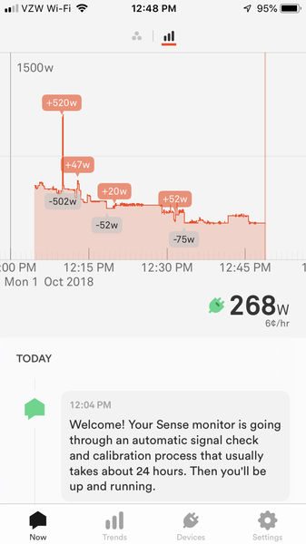
Large changes in usage are identified by the change in power drawn in Watts; positive changes are in orange and negative changes are in grey. The timescale can be pinch-zoomed to show 90 seconds across the screen or three years worth of data. The vertical axis (Watts) can also be pinched zoom to identify large contributors to the power draw or minuscule changes. (The vertical timescale cannot be panned – it always crosses at 0 Watts.) Clicking the circle icon at the top creates a free-floating bubble chart. The circle size is proportional to the percentage of energy used at the time. Like the power timeline, this display can be pinch-zoomed as well.
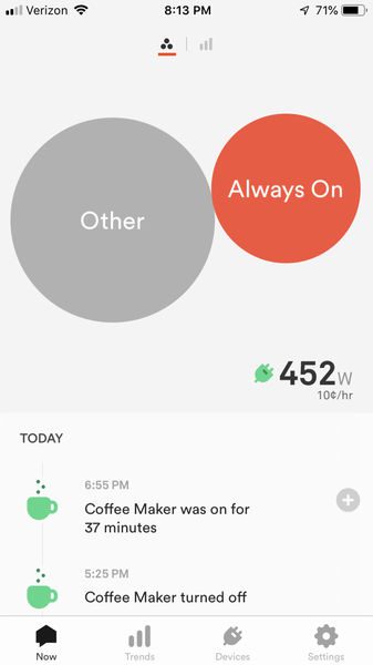
 

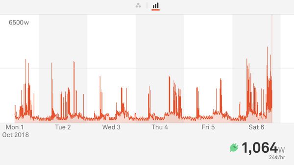
If the device is in landscape mode the display rotates accordingly. In either case, the total usage is shown in the lower right-hand side of the screen. Clicking on the power usage brings up the usage screen, but the usage screen can also be navigated to from the trends screen.
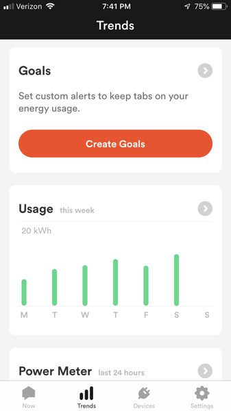
The trends screen shows goals, usage and power meter.
Goals
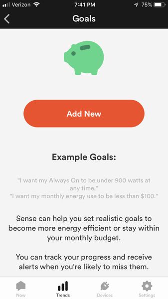
Goals allow a user to define the total measured usage, or the measured usage that is always on, to be under a specified dollar amount or energy at any point, or at the end of a day, week, month or cycle. Many goals can be set at the same time too. This is a truly flexible system that will allow you to keep an eye on meeting electrical energy consumption goals.
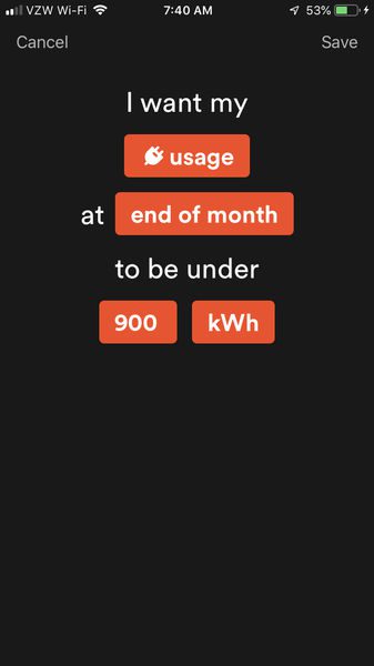
The text of the goal is changed by clicking on the orange boxes. When it comes time to assign a time period to the goal the app displays recent historical values in the space below the text. This helps in ensuring the goal is reasonable. All in all, I wish more apps offered this type of S.M.A.R.T (specific, measurable, achievable, results-focused, and time-bound) goal setting.

Usage
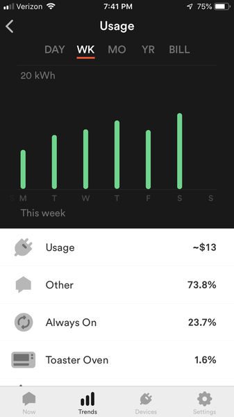
Usage shows a bar chart of the day, week, month, year or bill period. The devices contributing to the users are shown below the bar chart. The percent that each device contributes to the usage in the period is displayed next to the device. A click on the device will highlight only that device’s contribution to the usage on the chart, and show the energy that the device used and the dollar amount that the energy consumed cost.
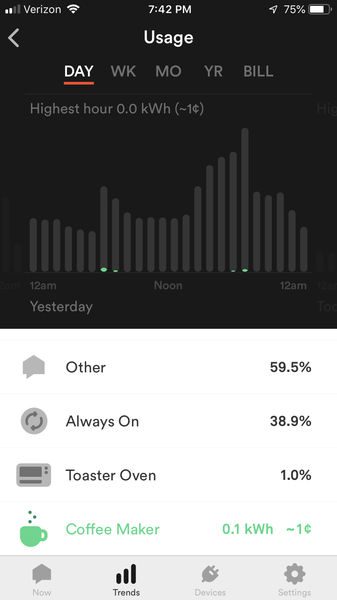
Power Meter

The power meter shows the last 24 hours in the trends screen and clicking on it brings up a screen similar to the Now screen

The Devices screen shows each device and the current power the device is consuming.

 Over time this screen will be populated with more and more devices.  This early on in the Sense usage I only have the three other devices besides the “Always On” device. A click on the device will show stats for the device, usage for the particular device, and a power meter for the last 24 hours for that device. This screen is helpful to verify that the device that Sense thinks is on is actually the device being used in the house.

The settings screen permits changes to the account
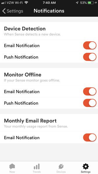
virtually the only difference between the iOS and Android versions is a general submenu on the iOS version which permits sound to be enabled or disabled. The Android version does not have this feature.

Operation

This will be part 1 of the operation review. It will take a couple of months to get a full understanding of the potential of Sense. Why? Well, based on the typical usage of appliances and the way that machine learning takes place, it is nearly impossible to speed up the assignments of devices to the electrical signals they generate. Normally I don’t like nuisance notifications, but I think that I’d have more peace of mind if periodically the app reminded me that it’s still matching devices to the power draw.

The only function immediately available is the power timeline. That alone is a very valuable tool. It shows what the main power draws are and what the minimum power draw is per day. The minimum power draw can indicate if there are power ‘vampires’ drawing power without providing any benefit. Just having the Sense installed makes me more cognizant of the energy usage in my house. Similar to the phenomenon people experience wearing a step-counter, if there is a measure that one has control over, control is likely to be better managed.

I installed my Sense on a Monday afternoon. By that evening the signal check was complete and Sense started to listen to the home and identifying devices. By late Tuesday evening, it identified my Coffee Maker. Actually, it only identified the maintenance heating of my Keurig. Over time it may identify the main heating and the pump. Wednesday, It determined that my minimum power usage, or always on value, is 156 Watts, or 13.7 kWh. From Sense’s statistics, it has determined that the average always on value is 288 Watts. Thursday morning, Sense determined that my average daily power usage is 9.2 kWh. Friday at 1:30 AM it found a new device and named it Heat 1. I wasn’t sure if this was a toaster or another part of my coffee maker. Saturday afternoon if found a new device and named it Heat 2. It seems that from the power meter I was able to determine this is a toaster oven. This is a Breville toaster, so the heating element cycles frequently. My app was alerting me that the toaster was turning on and then turning off 17 seconds later about every minute. I turned the alerts off for this appliance.

What I like

  • Easy Installation
  • Beautiful UI

What needs to be improved

  • More indication that patterns are being matched
  • Would be great if you could “force” a detection

Final thoughts

The Sense Home Energy Monitor delivers on providing instantaneous and historical energy usage and promises enhanced device detection. After living with Sense for an extended time I will provide a thorough review of how it has impacted my life.

Price: $299, $349 for the solar version
Where to buyAmazon
Source: The sample for this review was provided by Sense.

Filed in categories: Reviews

Tagged: ,

Sense home energy monitoring device review (part 1) originally appeared on The Gadgeteer on October 12, 2018 at 9:00 am.

Note: If you are subscribed to this feed through FeedBurner, please switch to our native feed URL http://the-gadgeteer.com/feed/ in order to ensure continuous delivery.

LILU Lip Care necklace and Lip Balm Pearls review

REVIEWS – A few months ago, we had a news item about the LILU Lip Care necklace and Lip Balm Pearls.  I love jewelry with a hidden function, like the LiLu pendants, which have a hidden lip balm inside.  It’s a clever way to keep a lip balm or some lip tint with you even when your clothing doesn’t have a pocket.  LILU offered The Gadgeteer one of their pieces for a review, and I – and my dry lips – were happy to be selected to give one of their necklaces a try!

Let’s allow the folks at LILU to tell us what inspired this line of jewelry:  “We created LILU to solve our most persistent cosmetic fail:  Dry, Colorless Lips.  You know the story- It’s easy to have great-looking lips as you walk out the door.  But that never lasts.  And those long-wearing lip-care products dried out our lips…   So we created an innovative way to carry a small amount of lip balm in beautiful jewelry and accessories.  Our patented Lip Balm Pearl® is a breakthrough in cosmetics. ”  

LILU products won the COSMOPROF 2018 Innovation-Prestige Award for Package Innovation.

LILU packs their pendants in an organza bag with a little square of anti-tarnish paper to keep the sterling silver shiny and bright.  Their packaging for the necklace and the Pearl refills is made of 100% recycled paper that can be recycled again.

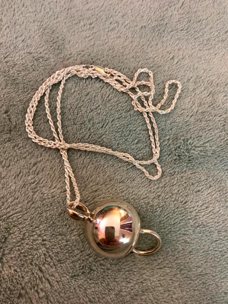
As you’ll see in the top photo, you’ll receive your necklace with a tube of lip balm Pearls.  This an assortment of all three colors, plus another Simple Shimmer Pearl in addition to the one that’s already loaded in the pendant.

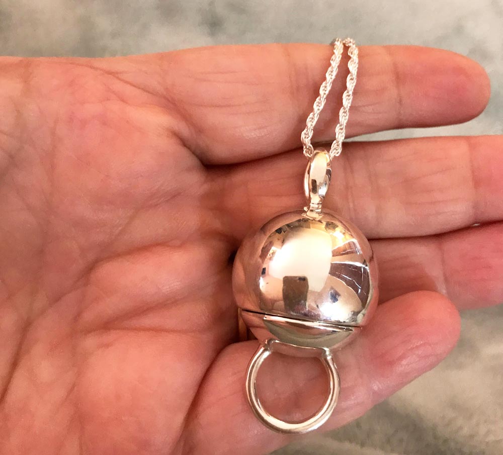
I received the Kira pendant in .925 sterling silver.  I don’t have a caliper to measure it with, but the sphere is about 0.75″ in diameter.  The entire length, including the attached bail on top and the ring on the bottom is about 1.75″ long.  Each pendant comes with a 30″ sterling chain that’s sturdy enough to hold such a substantial pendant.  The one I received is a rope chain.  It appears to be lightly diamond cut for extra sparkle.

You can see the size of the pendant in my hand.  The silver is highly polished and shiny.

The ring on the bottom of the sphere is useful for opening the bottom so you can use the lip balm.

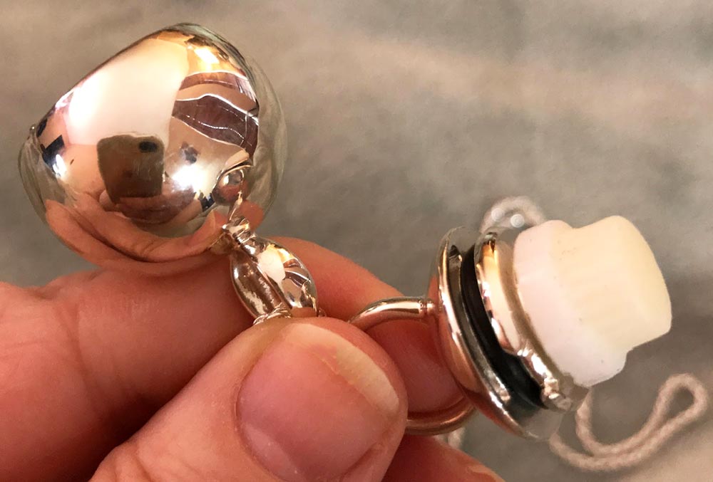
Here you see the pendant opened up.  The Pearl (Simple Shimmer shown here) is mounted in the base that screws off.  You can see how the ring on the bottom will also give you a good grip as you apply the balm.

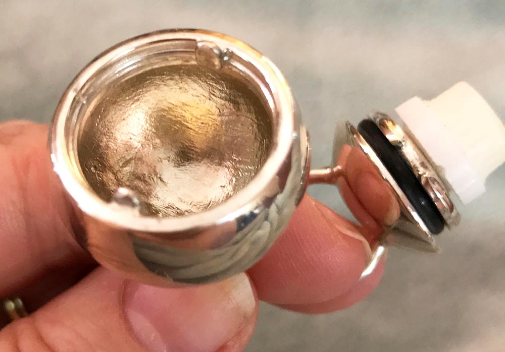
The interior of the pendant is more than big enough to accommodate the Pearl.  This means that the balm won’t get smeared inside as you open and close the pendant.

The Pearl and its holder are held securely in the top of the pendant.  The body of the pendant has two tabs that fit into the channel on the base, then you screw the two pieces together.  A rubber ring helps seal the base into place.

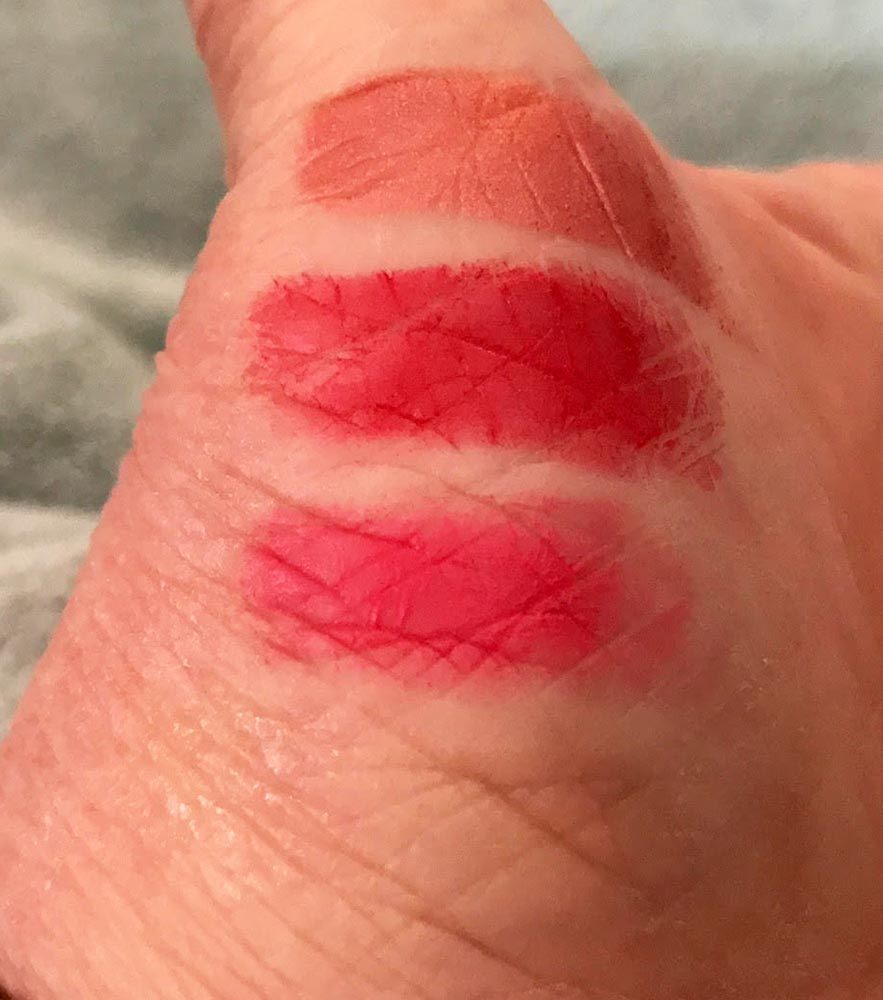
The assortment of Pearls included with your purchase gives you an extra Simple Shimmer balm, plus one each of the three lip tint colors:  perfect pink, radiant red, and berry blush.  Each Pearl is seated in a rubbery base and is capped to protect the product.  To change Pearls, you just pop out the empty one, press a new one into place, then pop the protective cover off.

LILU says they are committed to providing beauty care with green and healthful ingredients.  Their lip balm supplier is Private Label Select, based in Taos, New Mexico.  Private Label Select has all the designations shown below:

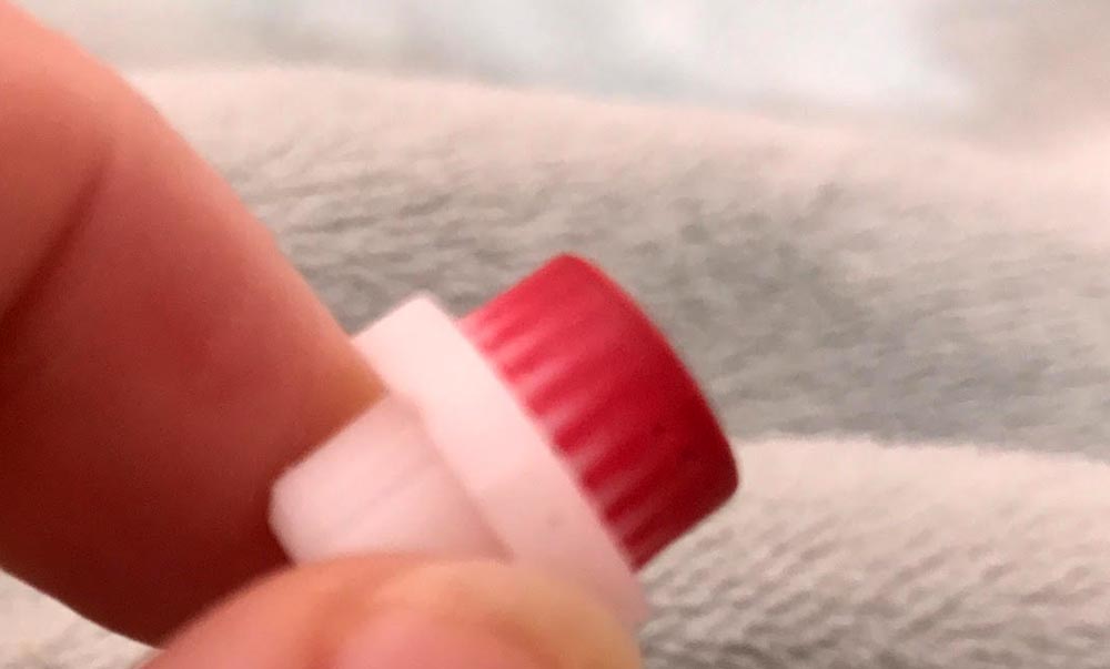
This picture is a bit fuzzy, but you can see that the lip balm is supported by bristles.  LILU says you can use the bristles of an empty Pearl as a lip scrub after you replace it.

Here you can see the balm colors on the side of my hand.  The Simple Shimmer is at the bottom of the image.  I don’t know for sure, but I think the colors are berry blush at the top, radiant red in the middle, and perfect pink just above the clear Shimmer.

None of the Pearls are overly shiny, nor do they have a lot of glitter.  LILU says you can use these Pearls alone or with your favorite lipstick.  I almost never wear lipstick, so I use them alone.  I often have trouble with lipsticks and even regular lip balms; both products often chap my lips instead of moisturizing them.  I have used the clear Pearl almost exclusively, but I haven’t had any chapping from the LILU products.

A tube of four replacement Pearls is available directly from LILU for $12.99.  You can choose a tube of four Pearls of a single color or get an assortment tube like the one included with purchase.

What I like

  • Beautiful pendant
  • Comes with a sturdy chain
  • Well made and nicely finished
  • Clever way to carry a lip balm with you
  • I like that I can use the pendant with a lip tint or a lip balm
  • Lip balm keeps my lips soft and hydrated

What needs to be improved

  • I wish the refill Pearls were identified by color name in the sample tube so I knew for sure which color to order.

Final thoughts

The LILU Lip Care pendants are a very clever way to keep a lip balm or lip tint close at hand.  The sterling silver Kira pendant is very attractive, and no one would ever know that it was anything other than a beautiful piece of jewelry unless they see you open it up to use the lip balm.  Not everyone wears white metals and the sterling pieces might not be in everyone’s budget, so it’s very nice that LILU offers some lower-priced options plated in gold or silver.  Oh, and there’s always the 14K gold Cossette pendant for $2200.00 if you’re looking for an incredible holiday gift for someone special!

By the way, I just ordered another LILU pendant.  My daughter loves the LILU I just reviewed, so the second one will be a Christmas gift for her.

Price: $149.00 for the 0.925 sterling silver Kira necklace reviewed here
Where to buy: LILU
Source: The sample of this product was provided by LILU Lip Care

Filed in categories: Reviews

Tagged:

LILU Lip Care necklace and Lip Balm Pearls review originally appeared on The Gadgeteer on October 11, 2018 at 12:00 pm.

Note: If you are subscribed to this feed through FeedBurner, please switch to our native feed URL http://the-gadgeteer.com/feed/ in order to ensure continuous delivery.

Woolnut MacBook sleeve review

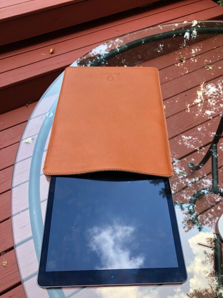
REVIEW – Sleeves and covers for laptops abound. No matter the size, shape, or model, you can probably find a cover that gives you padding for your “ultrabook” design laptop. What many folks want, however, is something that shows their personality, their style. If you’re a MacBook user who loves wool, leather, and natural finishes and are searching for a laptop sleeve, Woolnut has something just for you: the MacBook 12 sleeve. I was sent the MacBook 12 sleeve in Cognac, but it is also available in Black. They have sleeves in sizes for MacBooks Pro (13 and 15) for all models – Retina, TouchBar, and non-TouchBar, as well as MacBook Air 13.

Note: Photos may be tapped or clicked for a larger image.

What is it?

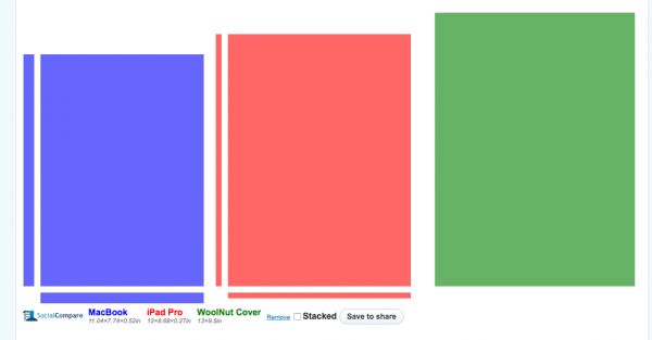
I have been using my iPads as my primary computer since the very first model. While I still have to use my MacBookPro for some things (thanks, WordPress composer!), I usually type or write-up my initial thoughts about gadgets I am reviewing on an iPad first. I’m currently writing on my 12.9″ iPad Pro in Nebo with an Apple Pencil. This is an editing setup I can take virtually anywhere, but the iPad is a bit- um – unwieldy. So, when the offer was extended to the team for the MacBook 12 sleeve, I volunteered to test it. I know the iPad Pro is not exactly the same size or shape as the MacBook, but after looking at the dimensions of the Woolnut 12 case, I realized either of them were going to be covered without a problem. Here are the sizes of these three things compared with the excellent website SocialCompare.

Design and features

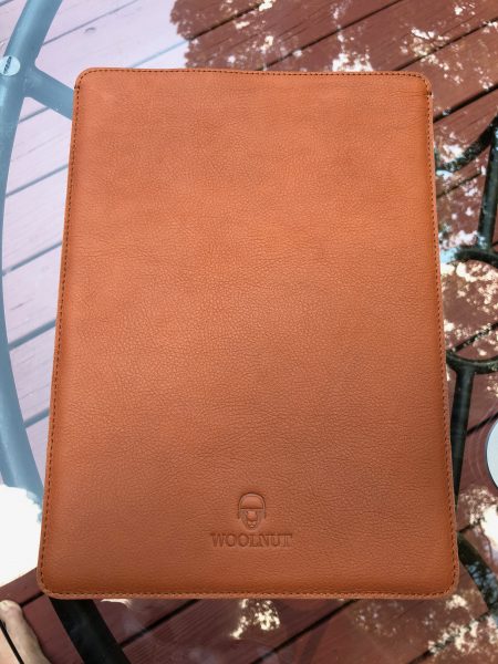
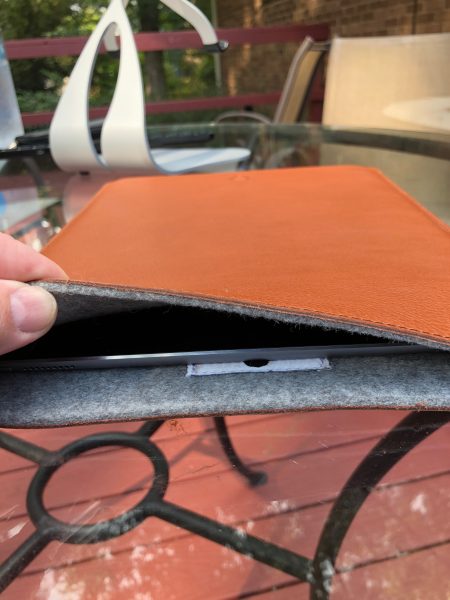
The Woolnut sleeve gets its name from the felted wool lining in their cases. In the case of this sleeve, it is fully lined with a good eighth of an inch of 100% natural grey wool felt. This is bonded to a high-grade, vegetable-tanned glove-soft leather, then top-stitched around three sides to form an envelope. The stitching is contained around the top of the sleeve on both pieces of leather, and a strong back-stitch is placed at the place where the side stitching begins. All the stitching is smooth and even.

What I Like

  • High-quality materials
  • Excellent craftwork
  • Elegant design

What needs to be improved

  • I can think of nothing to improve this.

Final thoughts

Leather sleeves are prized by many laptop and tablet users for the rich, supple feeling they have while you’re carrying your device around between uses. This “carrying around” adds oils and small scratches to the hide that grows into a character that is unique. Every leather article I’ve ever had is totally different after a few months of use, due to acquiring this patina. It’s something to look forward to. I’m looking forward to seeing how this one develops.

Price: €65
Where to buy: Woolnut website
Source: The sample of this product was provided by Woolnut.

Filed in categories: Reviews

Tagged: ,

Woolnut MacBook sleeve review originally appeared on The Gadgeteer on October 11, 2018 at 9:00 am.

Note: If you are subscribed to this feed through FeedBurner, please switch to our native feed URL http://the-gadgeteer.com/feed/ in order to ensure continuous delivery.