Scout Indoor Camera review

REVIEW – Scout has a new Indoor Camera. Why should this interest you? Scout is a DIY alarm system and service that installs in as little as a few minutes. There are no screws and monitoring can be turned off and on as you need it. It’s great for anyone that wants to slowly build their home security system and possibly the perfect solution for renters that aren’t allowed to make changes to their apartments.

What is it?

The Scout Indoor Camera is an IOT USB powered camera that you can use standalone with the Scout Hub or as part of their larger security system.

What’s in the boxes?
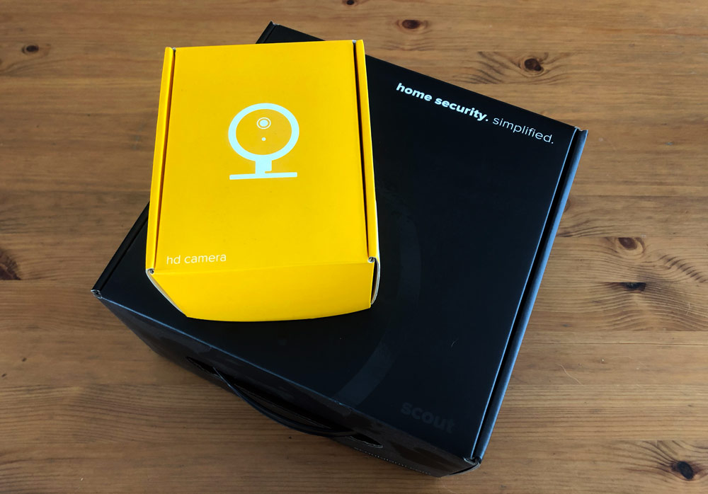
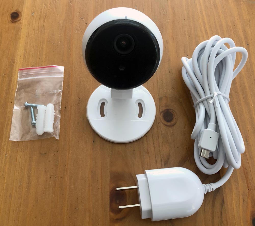
Scout Indoor Camera
(1) Camera, (1) USB-Micro B wall adapter w/ 10′ cord, (1) Mounting screw package with drywall anchors
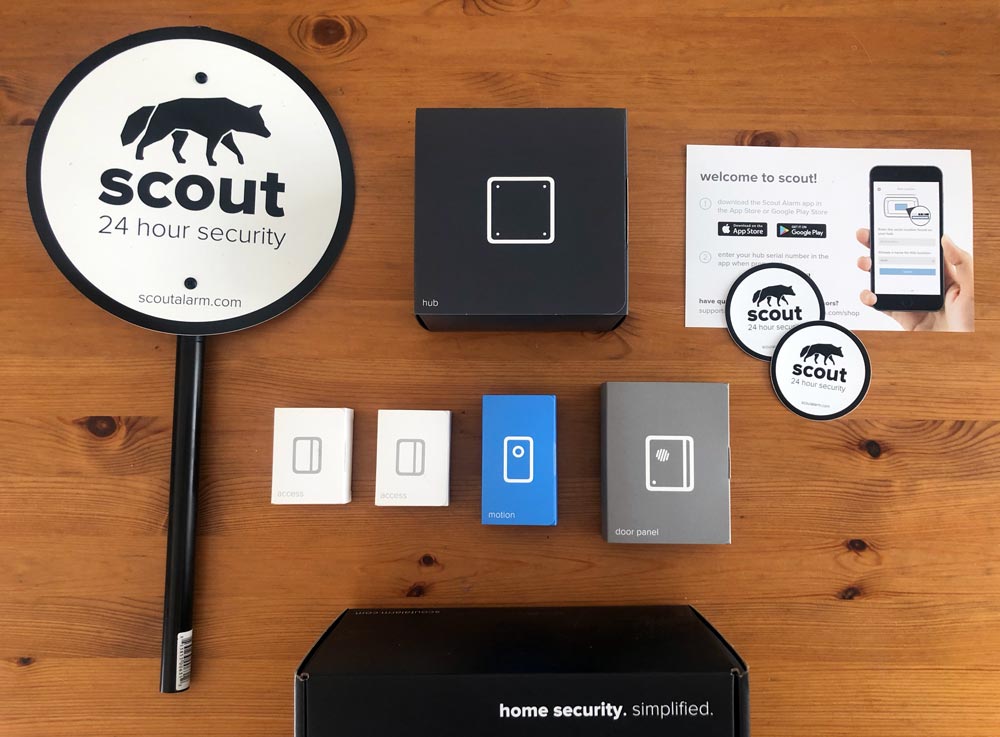
Scout Small Pack
Hub, Door Panel, Motion Sensor, Access Sensors (2), Key Fobs (2), Yard Sign, Info card
Hardware specs

  • 1080p HD video
  • 115º field of view
  • Infrared for night vision
  • 84 x 60 x 60mm
  • Wall adapter with micro-USB cord

Design and features

The system is modular and designed to be easy to install and use. In fact the App is the installation manual and deals with the process quite well. All of the components are available in Arctic (light theme) or Midnight (dark theme) to help them blend in with your home. Out of the parts of the Scout Small Pack, only the Scout hub is hardwired. All of the remaining components are battery powered with CR12 or CR123 batteries. The App is also clean and easy to navigate.

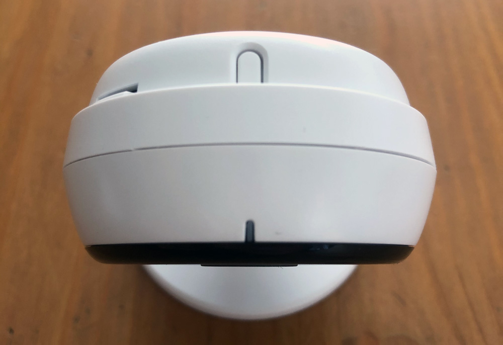
The Indoor Camera is small and inconspicuous.
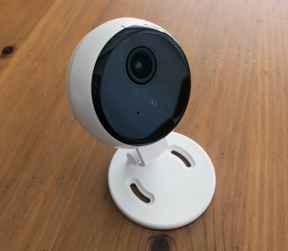
On the top front there’s an LED and behind it a reset button should you need to use it.
System Setup

Here’s a quick primer on setting up the main security system as it’s really the camera we’re reviewing here. As mentioned, all the installation instructions are in the App which will walk you through setup step by step, so make sure you download that first.

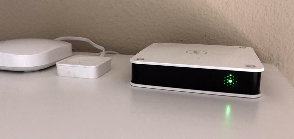
To get started, plug in the Scout Hub’s power cord and connect it to the wall. You’ll also need to connect it to your router with ethernet and then set it up in the App. Mine sits next to our Wemo Bridge and is connected to our eero router. Follow the App instructions to get it set up and it will glow green when all is good.
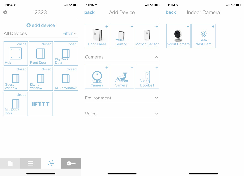
Now you’ll want t0 install and add your additional sensors. In the App, go to the 3rd tab (with the asterisk type logo shown in the left image below) and click (+) Add Device at the top. Choose the appropriate sensor type (screenshot on the right is after choosing Indoor Camera). I’m on the iOS 13 beta, which I think is causing the font/logo overwriting issue on the middle image.
Both the door panel and access sensor have a similar install process. Determine a location where you have room for the panel and the magnet side. Peel the backing off the adhesive to attach the larger side to the door (or moving side of a window) and then pull the label hanging out to engage the battery. The App will find the device and then ask you to temporarily place the magnet side and confirm open/close status before adhering in place. Repeat the install process for any additional sensors and then you can jump into individual settings.

Here’s what each of the modules look like before and after install.
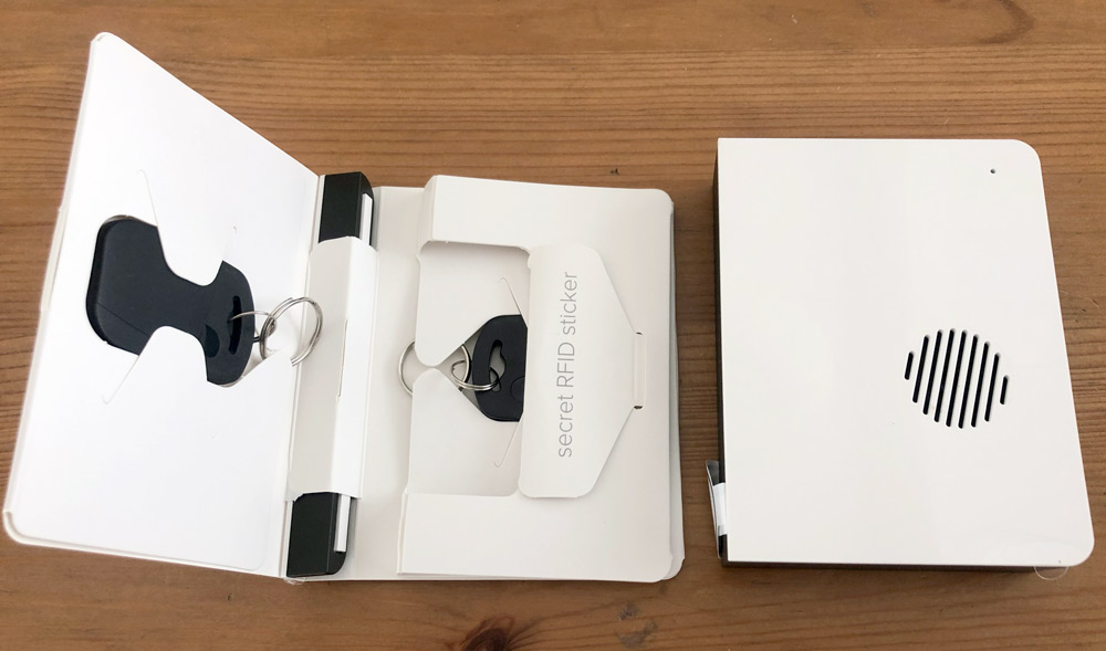
This is the Door Panel on the right. In the envelope is a key fob, the Door Panel magnet, another key fob and an RFID sticker. Here’s a closer look at the fob and sticker.
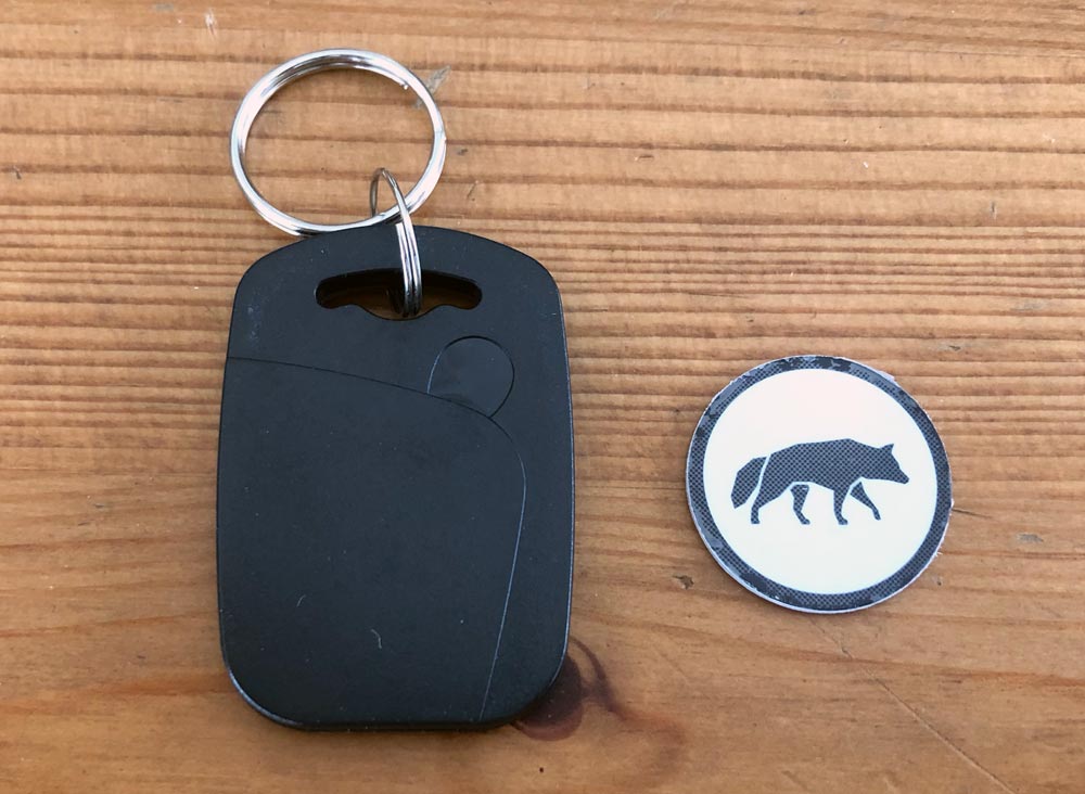
We mounted the Door Panel on the door at roughly chest height and the receiver on the molding of the door jamb. We didn’t have enough room to mount the magnet piece inside the molding edge, but it is shallower and sits pretty flush with the front of the Door Panel even though it’s sitting on higher molding. My Scout door panel is an older unit without the speaker grill passthrough of the newer model.
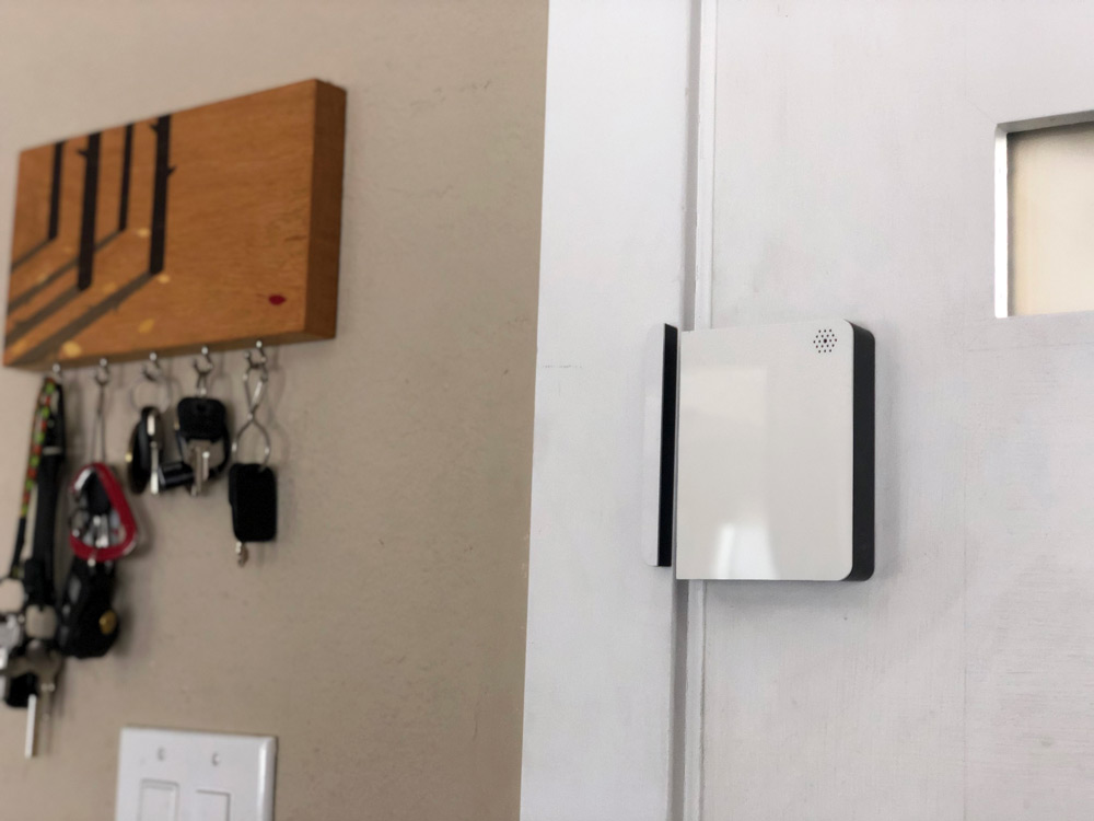
To arm or disarm the system, you just hold a fob or RFID sticker to the lower right corner of the door panel.
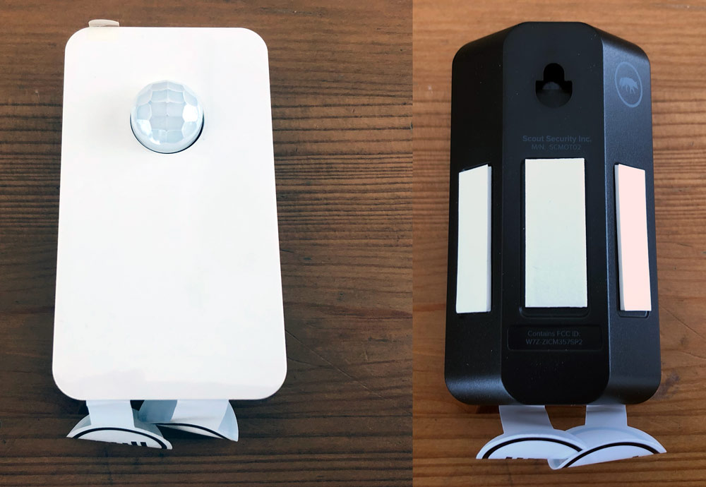
The Motion Sensor is very unobtrusive and has a 90º shape with a flat back so it can be mounted in a corner for a better room view or flat on the wall if necessary.
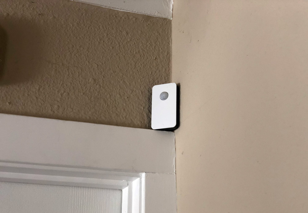
We’ve got ours tucked into a corner resting on a door molding.
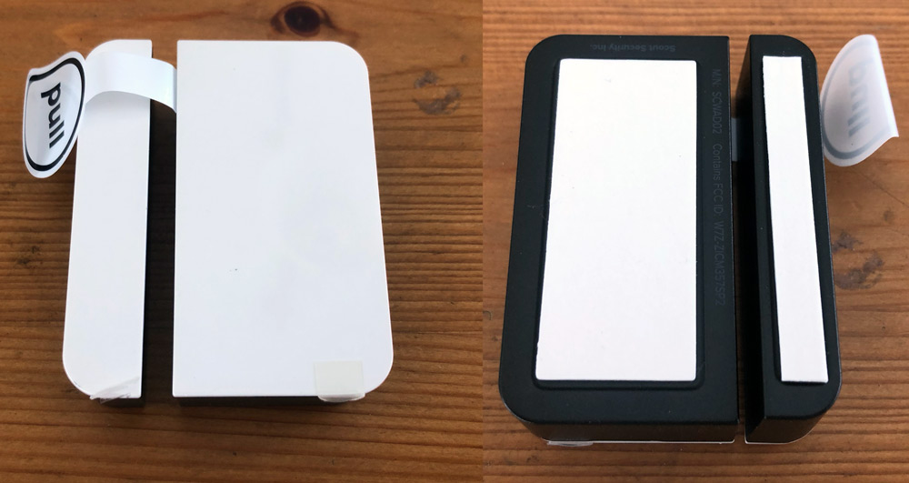
This is an access panel. It can be used on doors or windows, but ones that you aren’t using to arm and disarm the system.
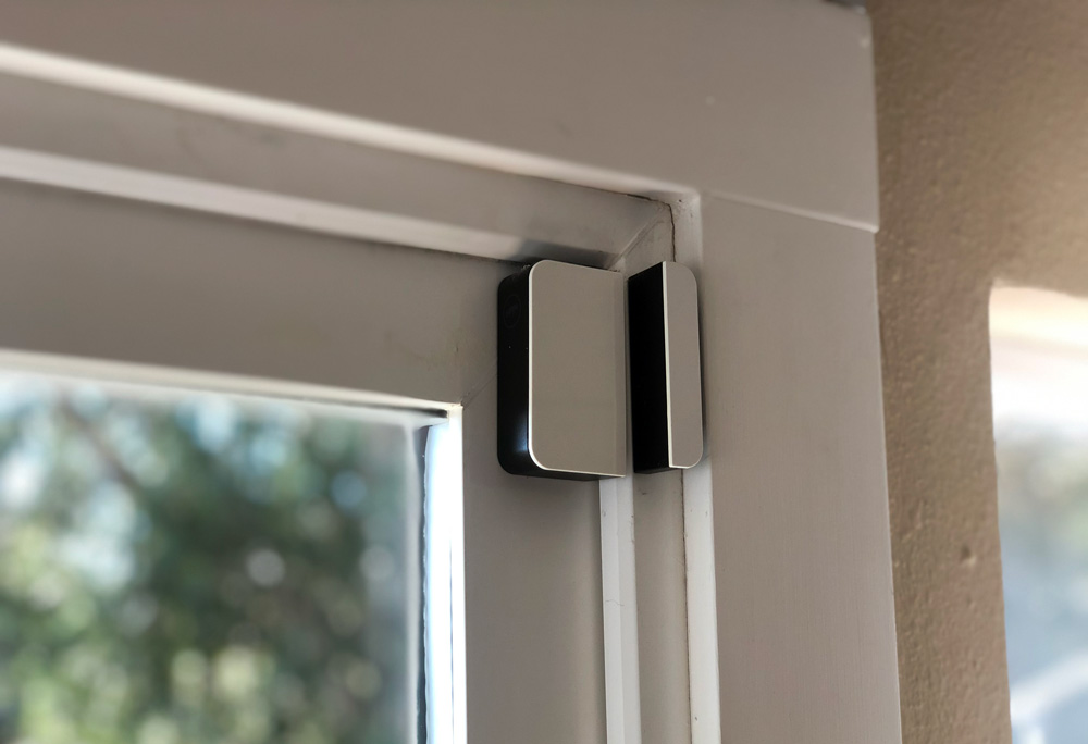
Here’s one installed on the sliding door to our deck.

You can order and install as many as you need, or start with the critical elements and build as you go.

Camera Setup

Having setup other sensors, the camera isn’t too different although there are few more steps.

Connect the included cable to the wall adapter and a wall outlet near your install location. On the back of the camera, the USB-Micro port feels very cramped and the foot doesn’t completely bend out of the way.
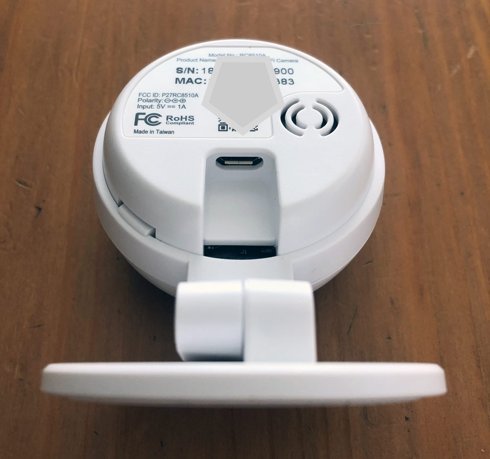
Fear not though, the camera rotates in the holder so you can spin it to get a better angle. Very helpful for installation and even more so for opening up additional mounting opportunities like mounting upside down if necessary.
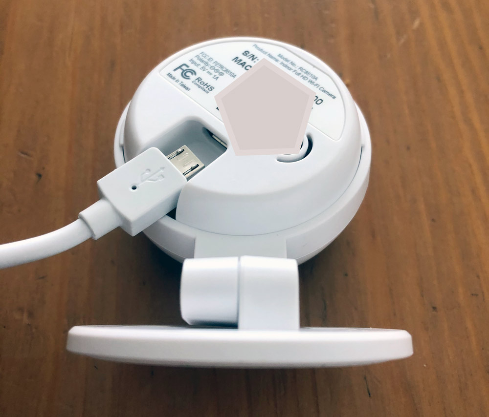
Now you’ll want to open the App and go through all the steps. I’d recommend doing this near the area where you’ll mount the camera, but don’t worry about installation yet as you’ll want to see what the camera sees and may choose to change location based on that. Follow those previous steps to select the Indoor Camera for setup.
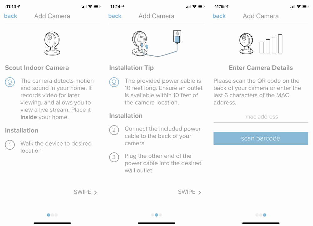
You can scan the QR code or manually enter the last 6 characters of the MAC address. Scanning worked just fine for me.
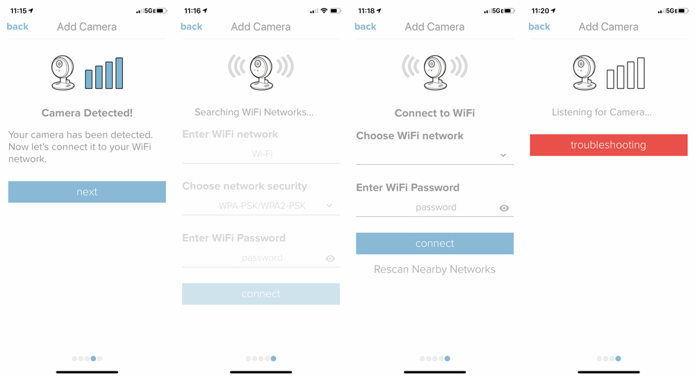
It should find your camera and move you along to choosing your wifi and entering your password. I did have an issue where the app kept failing to connect my camera to my network. I’m not sure, but I believe that my phone was disconnecting from the camera’s wifi too early and returning to my home network automatically. I told my phone to forget my home network, and then tried again and it worked right away. I was then able to re-join my home network with my phone with the password and all was right with the world again. Again this could be my beta iOS acting up.
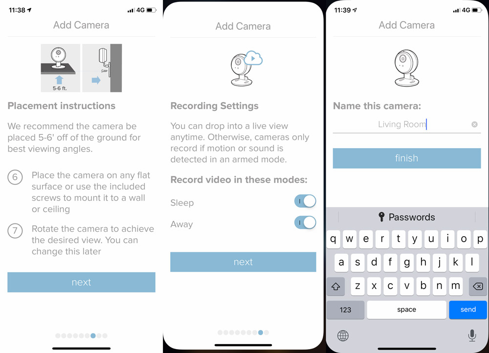
Now you’ll want to place the camera, select recording settings and name your camera.

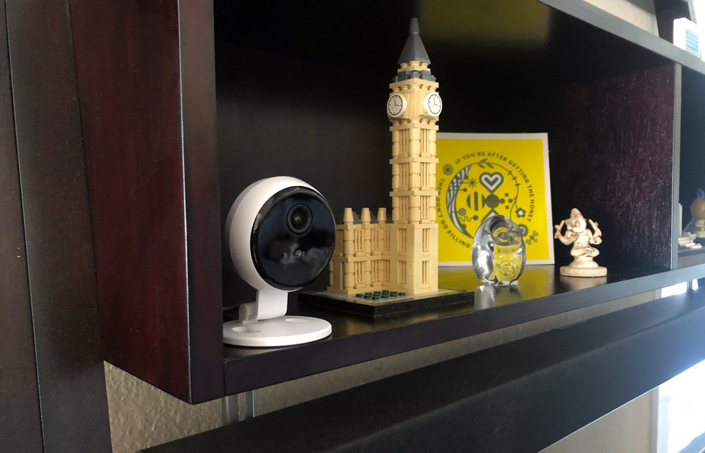
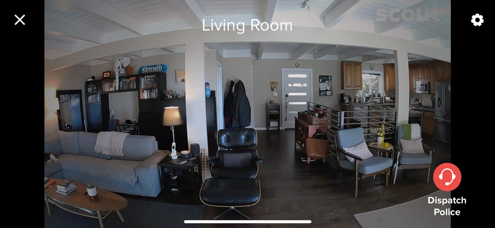
We’ve got an open floor plan in our house and some of the typical mounting areas (high corners) result in sections of the room that feel too far away. I found it helpful to take a picture with my phone from each location to rule out some options before even getting to the camera. In the end we found a good spot in the furniture above the TV. There’s enough knick knacks that it doesn’t scream camera.
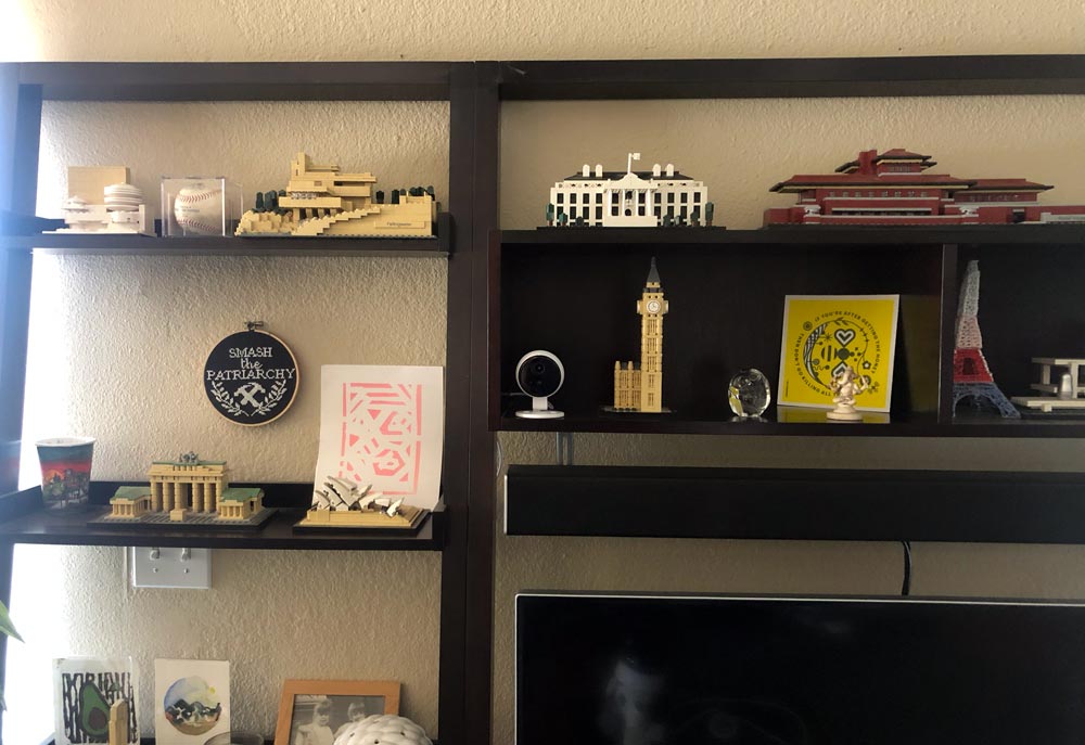
This location provides a majority view of the room as well as a clear shot of the front door which is likely to be the point of any unauthorized entry. Here’s a live screen capture from the App.
Performance

Let me start with this. I purchased Scout’s security system over three years ago shortly after we purchased our home. We wanted an easy to use system that didn’t require paying for installation or require a monthly monitoring plan. At the time there were only a couple of options and it was actually the promise of Scout’s camera at that time that sold me on the system. I went ahead and sprang for it even though that camera didn’t end up materializing until this Indoor Camera was announced this year.

What I want to get to is that the system has been great. It installed easily and outside some early generation battery drain issues (which have been solved), it worked exactly the way we hoped it would. The motion sensors didn’t trip with our small dog, although we deactivated those after getting two much larger puppies (45 and 70lbs). The Access sensors reliably detect if windows or sliding doors are open or closed, and the front entry panel worked really well when we all carried keys.

As we upgraded to a smart door lock, and keyless lives in general, we moved from key fobs to one of the RFID stickers that we have on a unique item in the entry area for us to use. Just unlock, enter, grab that item and swipe on the door panel to disarm. Simple. Repeat in reverse to arm the system.

On to the camera. The first thing I did once set up was use it to troubleshoot my DirecTV dish placement. We just had the aging roof replaced and the dish had not been reinstalled. I set the camera up on a stool pointed at the TV, zoomed in much further than this shot below and then got up on my flat roof.
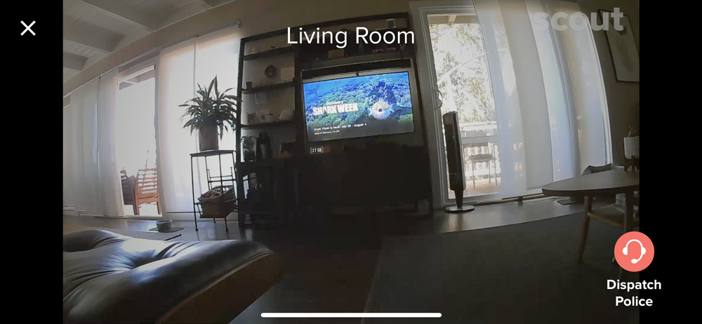
Using my iPad Pro and the Scout App with the volume turned up I watched and listened for the TV to start getting reception as I maneuvered the dish into a good position. It actually worked pretty well once I got the elevation and azimuth for my zip code. Yay!

As for camera performance, it always a bit tricky to review products that are there for ‘in-case-of’ reasons. Security systems can be that way if you don’t use them daily. Right now it’s the middle of summer and my kids are usually home so the system doesn’t get activated. Over the last week however they’ve been out of state, visiting grandmothers.

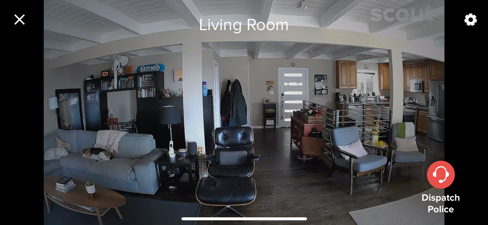
I’ve been able to open the App during the day to check on the dogs. A quick click on the thumbnail I can look and see that yep, there they are on the sofa where they like to spend their days.
From the main screen in the App, the Home tab shows you the active camera(s) and lets you change the alarm mode. The 2nd tab shows recent activity which details out doors and windows opening/closing as well as new device installations.
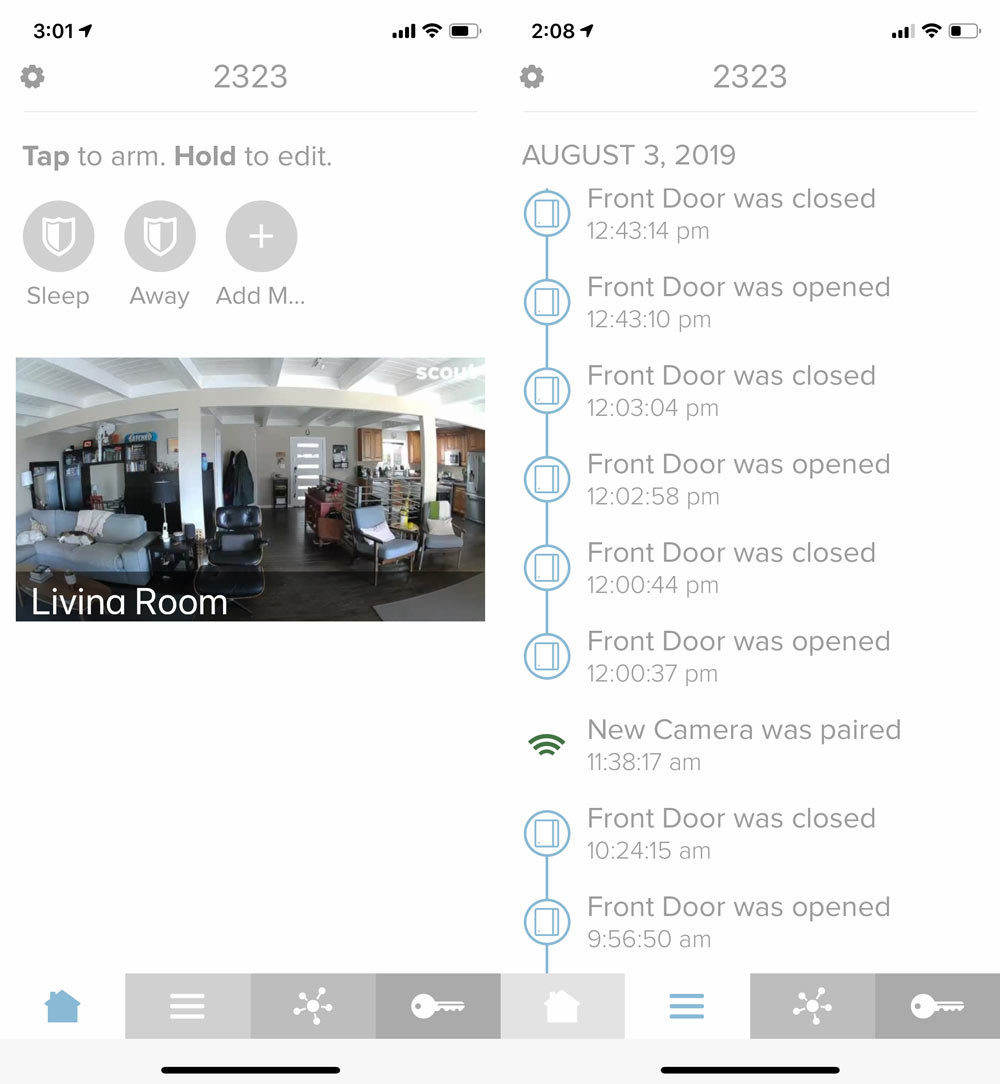
I didn’t get a chance to actually test the alarm getting tripped and recording video. A little cautious when it comes to inadvertently dispatching police and having to deal with any false alarms.

So it’s not all rosy. I did find that the thumbnail above doesn’t auto-update until you click into it, so it’s not always a ‘live’ view there. Good thing to keep in mind.

If you log into the website, the Indoor Camera does not show as being part of the system. Not sure what’s going on there, but my guess would be the majority of users live in the iPhone App.

I also found that the night time view is overstated. Here’s a shot of the room at 10pm with the lights out.
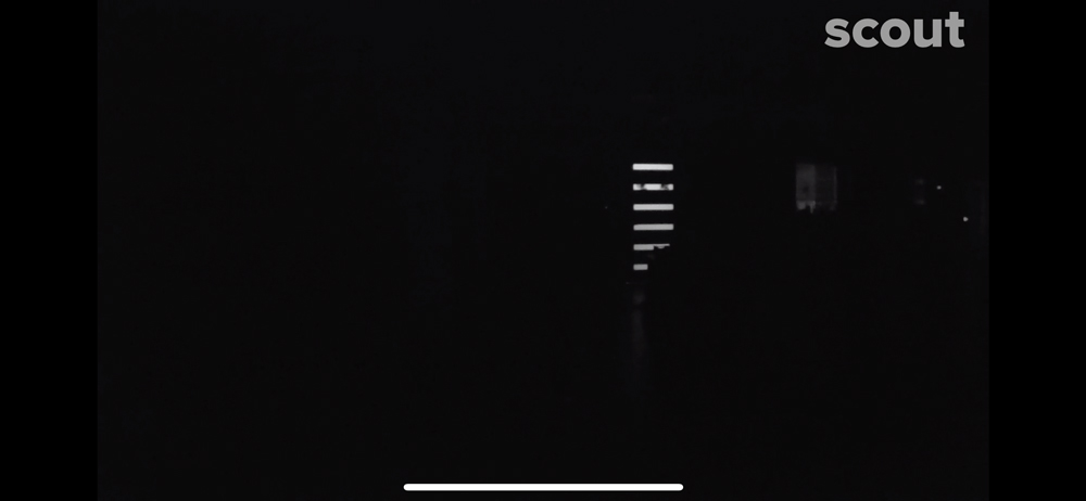
Tried lightening it up in Photoshop, but to no avail. This is the one area where Scout’s Indoor Camera seems to falls short. Google’s Nest Cameras have a much better implementation of this. Funnily enough, you may have caught that Nest Cam was listed as compatible in devices you can add. As you may be aware, ‘Works with Nest’ is undergoing some changes, and the Scout App would not let me connect. Hopefully this is something they’ll sort out soon.

Let’s conclude.

What I like

  • Small size with multiple mounting positions and a long cord
  • Clear video with a good wide view during the day
  • Good live view with the ability to pan and zoom within the field of view

What I’d change

  • Night time visibility needs work. Couldn’t see much at all.
  • Would like to see a “Midnight” or dark color option as well
  • Camera doesn’t seem to be supported by their website log in, only their app

Final thoughts

I’ve been happy with the setup and performance of the Scout Alarm System for the 3 years we’ve been using it. The camera is a great addition and adds a much needed component they were missing. Unfortunately, the performance of the night vision isn’t good enough to recommend the camera as the right solution. Hopefully, this is something they can address with a firmware update as everything else is pretty thought through.

Price: $99
Where to buy: Scout Alarm and Amazon
Source: The sample of this product was provided by Scout Alarm.

Filed in categories: Reviews

Tagged:

Scout Indoor Camera review originally appeared on The Gadgeteer on August 15, 2019 at 9:00 am.

Note: If you are subscribed to this feed through FeedBurner, please switch to our native feed URL http://the-gadgeteer.com/feed/ in order to ensure continuous delivery.

Brightech Owen Nightstand review

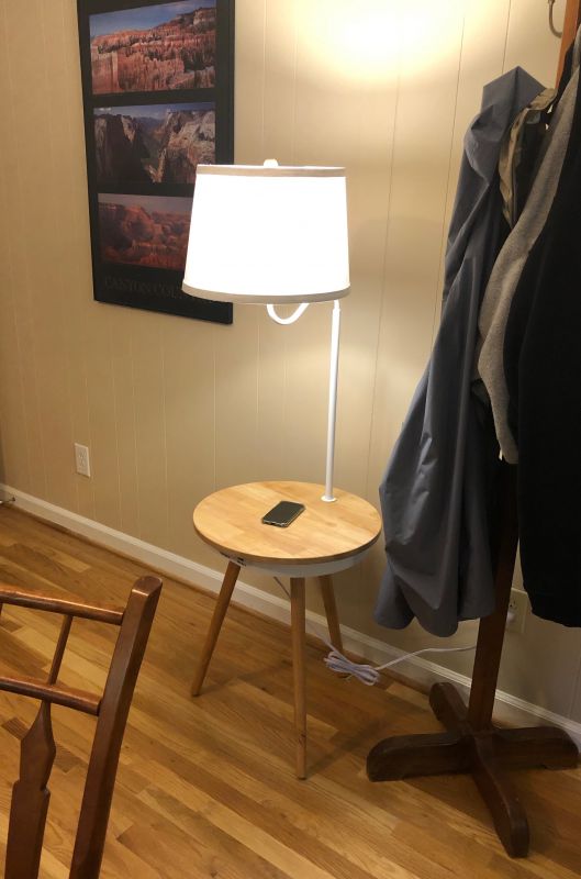
REVIEW – It’s back-to-school time, and folks are thinking about changing where they live, setting up dorm rooms, and generally getting ready to snuggle down and study. Having a cozy corner with a lamp and a place to sit your coffee/tea/adult beverage has been a necessity since students read by oil lamps and candles. Nowadays, however, having places to charge laptops, tablets, or phones are just as important. BrightTech has recently released a table they call Owen that incorporates a lamp, a wireless charger, and both a USB port and an AC plug. I was sent a sample to test and have been using it for a few weeks now.

What is it?

A wooden table 19” diameter and 23.5” high with a built in lamp, power ports, and a wireless charging area.

What’s in the box?

Everything you need except a power outlet!

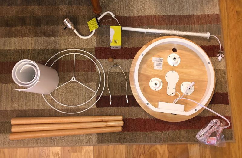
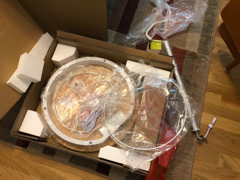
  • Wooden tabletop 19” in diameter with charger, leg sockets, and lamp connection kit assembly
  • Top and bottom powder-coated rings for the shade
  • Collapsable shade cover
  • Two-piece prewired lamp with socket
  • Harp and wooden finial
  • Three solid wood legs with metal sockets installed

Design and features

When the box containing the Owen table arrived, I was sure it was something else. Even when I opened the outer box and saw the picture, I was sure there would be another box with the shade or something. When I opened it, I was amazed at the compact and complete packaging. All the pieces are cleanly finished, made of quality materials, and fit together on the first try. I think it took all of 15 minutes to unpack, take photos, and assemble.

Setup

Setup is pretty straightforward.

  • Screw in the legs to the pre-attached threaded studs.
  • Connect the two tubes of the lamp assembly (prewired).
  • Pass the wires through the hole in the table.
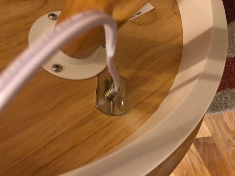
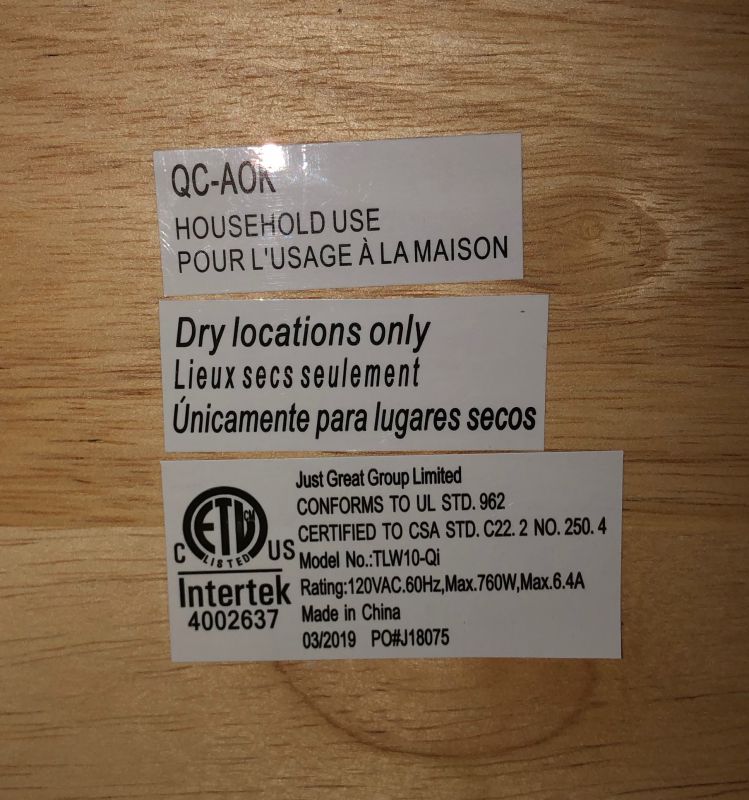
  • Tighten the threaded holder for the lamp. (See detail in picture above.)
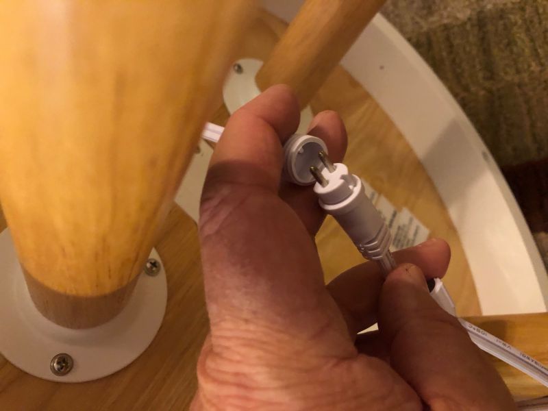
  • Attach the power cable to the table’s electronic assembly. (See detail in picture below.)
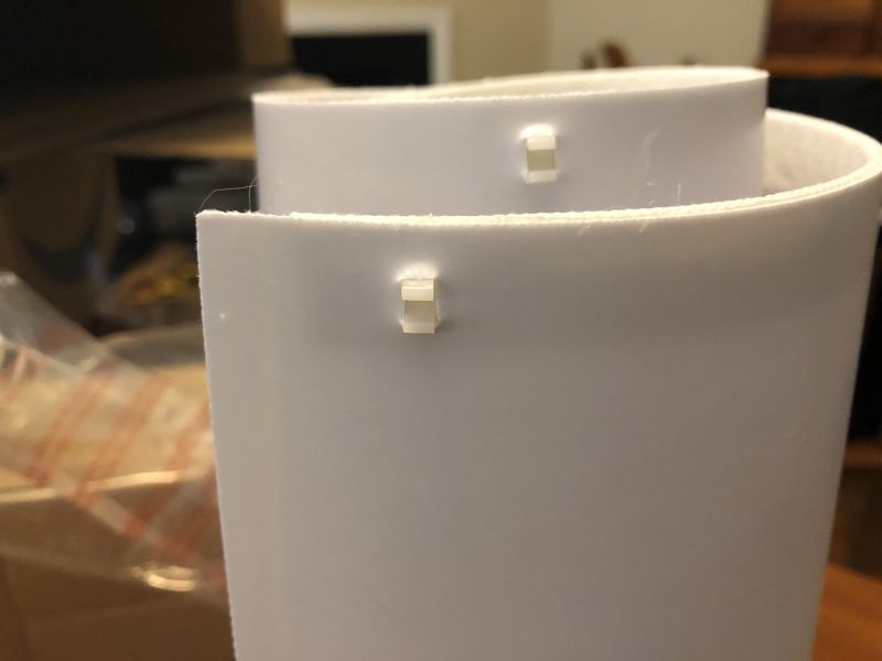
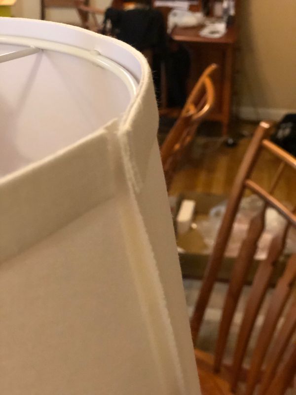
  • Unroll the shade cover and click the two wire circles into the clips of the shade and press the Velcro seam together. (Shade clips shown in second picture below.)
  • Attach the harp to the two clips on the side of the socket and screw in the bulb.
  • Attach the shade to the harp with the included finial.
  • Place the table where want it and plug it into the wall.

Performance

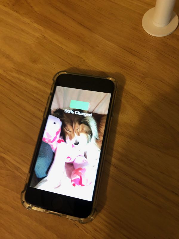
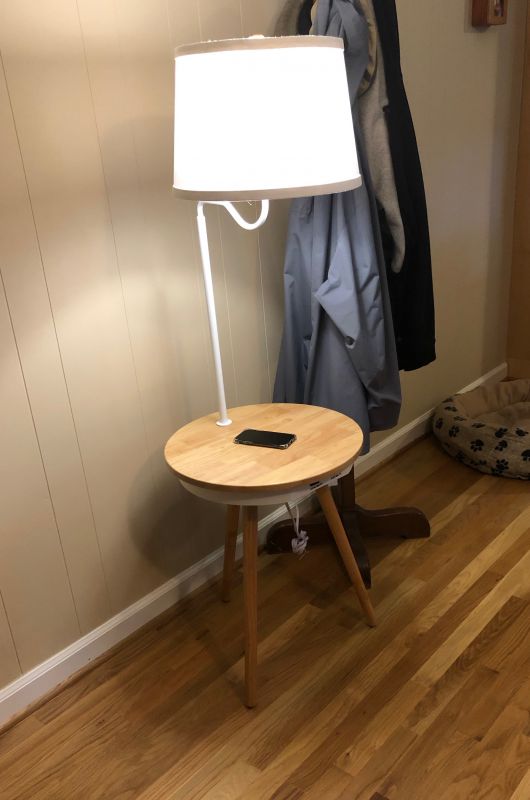
The built-in wireless charger works really well. It’s not fiddly or touchy, like some disk chargers that let the phone slide off the sweet spot due to the vibrations of walking nearby. The switch for the light is tight and always works. The light from the bulb is a very white light, but the shade diffuses it well.


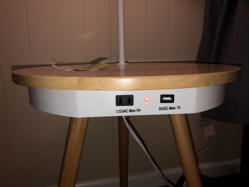
The AC and USB ports have a red light that glows when the unit is plugged in, which is really bright if you’re using this for a night table. I wish they would have mounted the plugs in the back or under the table so that light wasn’t always shining out and the ugly plugs didn’t show. Be aware, this table is not heavy-duty (Load limit is 2.5 pounds), so don’t pile it up with huge volumes.

What I like

  • Easy to assemble
  • Looks surprisingly good for a kit table
  • Everything you need is in the box

What I’d change

  • I wish the red power light wasn’t so bright or visible.
  • Plugs could be around back, rather than on the front.
  • The Velcro seam in the shade is really ugly.

Final thoughts

For what it is, it’s a really nice little piece of furniture for a casual room like a reading nook, dorm room, or man-cave. I would have liked to have something like this when I was grad school, rather than the whale oil lamps we used back then!

Price: $80.99, on sale for $79.99
Where to buy: BrightTech website
Source: The sample of this product was provided by BrightTech.

Filed in categories: Reviews

Tagged: , ,

Brightech Owen Nightstand review originally appeared on The Gadgeteer on August 14, 2019 at 10:00 am.

Note: If you are subscribed to this feed through FeedBurner, please switch to our native feed URL http://the-gadgeteer.com/feed/ in order to ensure continuous delivery.
Lepow 15.6-inch USB-C portable display review

REVIEW – I switched from a huge 27″ iMac to a MacBook more than 7 years ago and although I still use an external monitor with it when I work in my office (Gadgeteer HQ), I sometimes wish for some extra screen real estate when I’m working away from home. One solution is to buy a bigger MacBook, but that’s not a solution I want to take. Another solution is a portable monitor like the Lepow USB-C display. Let’s check it out.

What is it?

The Lepow USB-C display is a 15.6-inch portable display that connects to laptops and mobile devices with a USB-C cable.

Hardware Specs

Screen size: 15.6 inch
Visual area: 344.16 x 194.59mm
Panel type: IPS
Dimensions: 368 x 225 x 8.8 mm
Aspect ratio: 16:9
Resolution: 1920×1080
Display color: 16.7M
Color temperature: 6800K
Visual angle: H: 85/85Min V:85/85Min
Contrast ratio: 1000:1
Brightness: 300cd/m2
Output interface: 3.5mm headphone jack
Speaker: 1Wx2

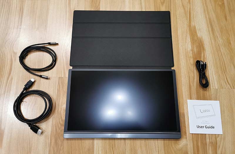
What’s in the box?

  • Lepow USB-C monitor
  • Magnetic cover
  • Screen protector
  • USB-C to USB-C cable
  • HDMI to mini HDMI cable
  • USB-A to USB-C cable
  • User Guide

Design and features

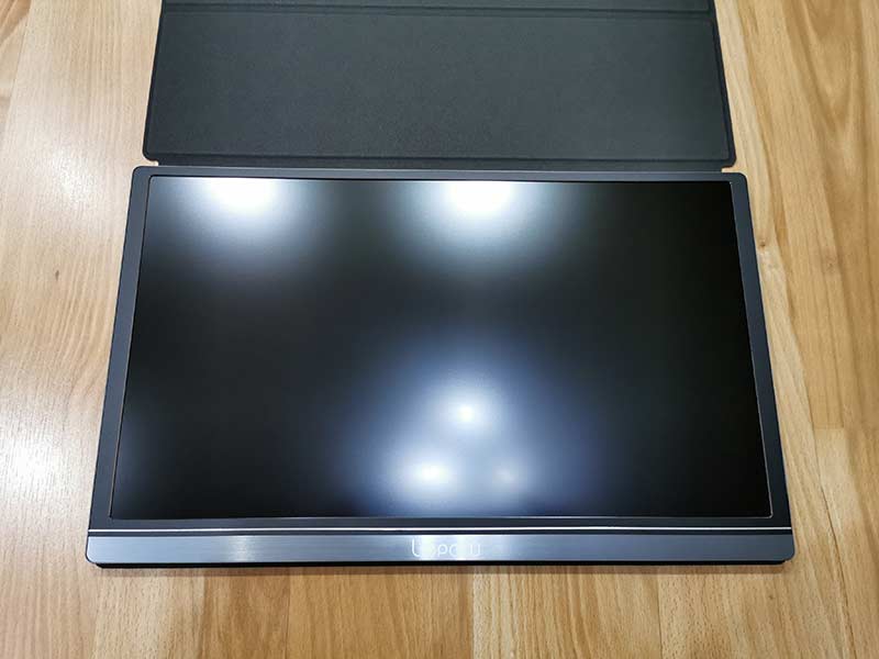
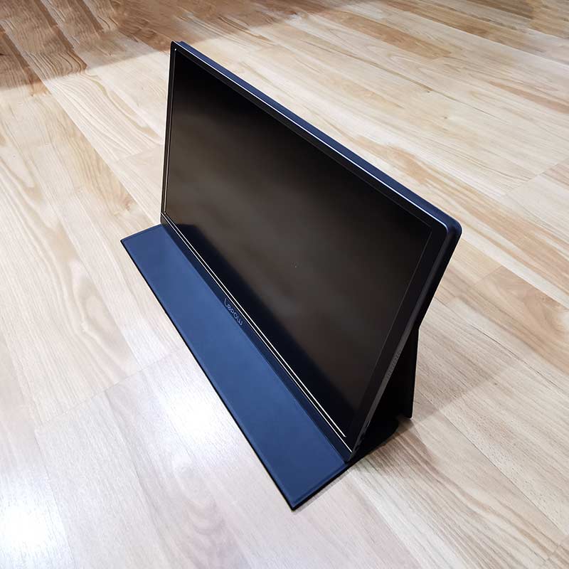
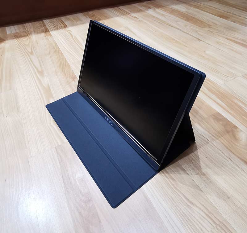
The Lepow 15.6-inch USB-C portable display immediately reminded me of a supersized iPad Pro with an Apple smart cover. It’s designed like a slab/tablet, without a built-in stand. That’s what the case is for.

The display has slim bezels and a dark grey shell that holds a matte screen that unfortunately is not a touchscreen.

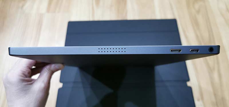
Both sides have ports and speaker vents. The left side has a mini HDMI port, the main USB-C port, and a 3.5mm headphone jack.

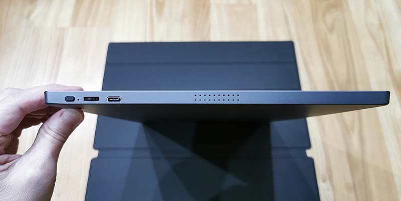
The right side has another speaker vent, a power button, a roll key for menu selections, and a PD USB-C port.

The monitor does not have a built-in battery so it requires an outside power source. It can pull power from a laptop, a smartphone, a tablet, or you can connect a USB-C cable and an AC adapter to the USB-C PD port on the side and use that to power the monitor and charge the device (laptop, phone, etc.) connected to the other USB-C port on the opposite side of the monitor.

As mentioned above, the Lepow monitor does not have a built-in kickstand, but the included smart cover not only protects the screen when you’re not using the display, but it can fold into a stand.

The cover has grooves so you can customize the viewing angle and small magnets at the edges hold the cover to the monitor for ease of use.

Using the Lepow USB-C portable monitor with a laptop

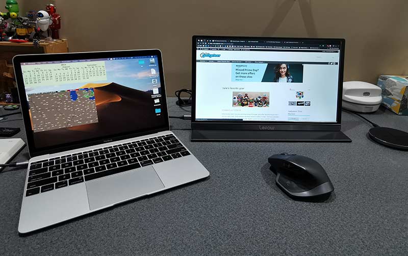
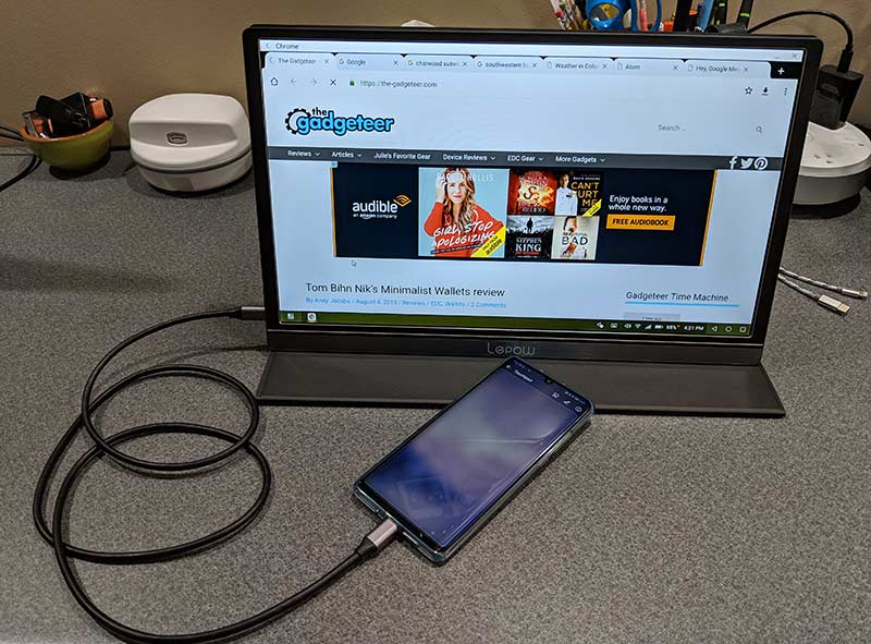
I tested the Lepow monitor with my 2016 12in MacBook and my Huawei P30 Pro smartphone, both of which have a USB-C port for easy connection. The Lepow also has a mini HDMI port that you can use with the included mini HDMI to HDMI cable to connect the monitor to full-sized HDMI port.

One of the best things about the monitor is that it doesn’t require its own power source because it pulls the power it needs from the connected device. That means that you won’t need to carry a bulky power supply with you or need to be near a wall outlet to use the display because it powers on as soon as it’s connected to the laptop or phone.

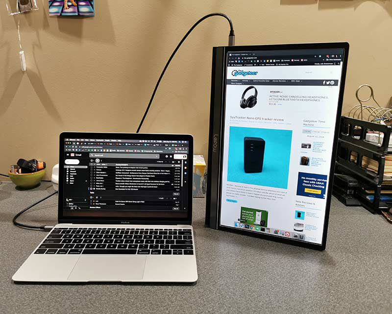
By default, the monitor is in landscape orientation when connected to a macOS or Windows laptop.

However, you can go into the settings on the computer to rotate the display like you see above. The only problem is that when you physically rotate the Lepow USB-C monitor, the folding cover doesn’t make a very sturdy stand in that orientation. And even worse is the fact that there’s the cable sticking out of the top of the monitor when it’s in this orientation and the monitor will rest on the roll key which when pressed, will bring up the onscreen menu. All that said, it is doable in portrait orientation, just not very convenient compared to a traditional landscape orientation.

The monitor’s built-in speakers on both sides of the display are not impressive when it comes to volume or audio quality. Even at full volume, the audio is weak and definitely not loud enough if you’re using the monitor in a noisy environment.

Using the Lepow USB-C portable monitor with a smartphone or tablet

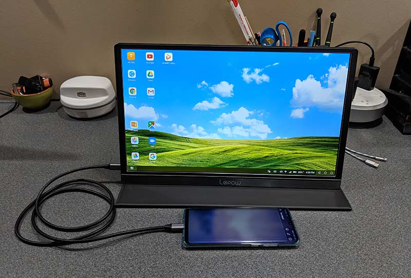
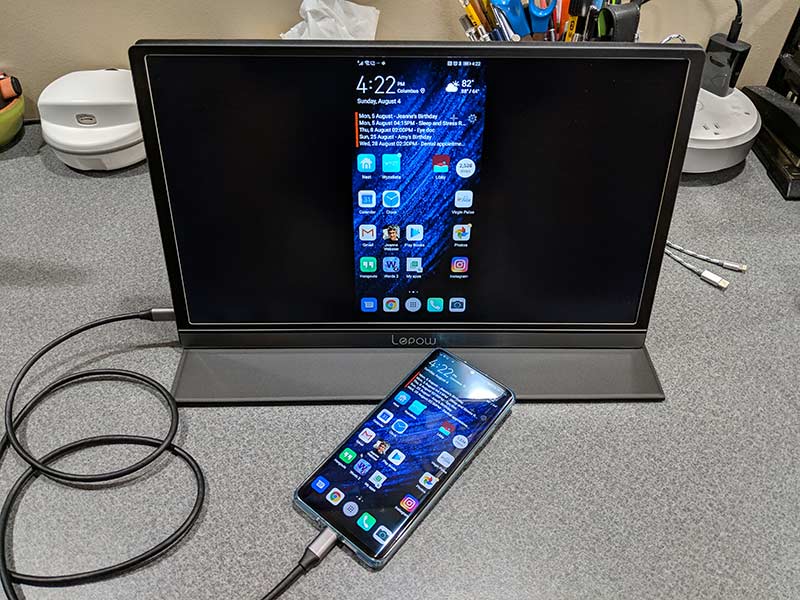
If you happen to own a smartphone or tablet that allows for video out though USB-C like the Huawei P30 Pro (shown above) or a Samsung Galaxy device, the Lepow monitor can turn your mobile device into a computer-like device with a full screen experience.

Depending on the device that you use, it really does feel like your phone becomes a computer. With the Huawei connected to the Lepow, it becomes a touch pad.

I tested the monitor with normal everyday activities like using it to surf my favorite sites, work in spreadsheets, work in documents, editing images using Photoshop, and watching videos. Note that I did not use the monitor for gaming as I don’t play games. But for all the tasks that I did try with the Lepow, it worked fine.

The colors are good, the image was clear and crisp, and viewing angles are decent. I’m not going to say that the Lepow is better than my BenQ 27inch monitor which has a resolution of 2560×1440, but the Lepow’s 1920×1080 resolution is perfectly adequate for its intended use as a portable companion monitor for travel or small workspaces.

One thing I did notice early in the review process was that the monitor defaults to 30% brightness and doesn’t save changes to the brightness setting or other settings. So even if the computer times out and the monitor goes idle, when you wake it back up, the Lepow screen’s brightness goes back down to 30%.

I also noticed that routing all the audio through the Lepow monitor’s built-in speakers was not a very good experience. Volume levels are low even with the volume setting cranked to the max.

What I like

  • No power adapter needed
  • Portable
  • Pass through power port

What I’d change

  • It would be nice if settings were saved between sessions
  • Volume through the built-in speakers is very weak

Final thoughts

There are 100’s of excellent full-sized monitors on the market but the selection of ultra-portable monitors is limited, especially monitors that only need a USB-C connection to work. No bulky AC adapter needed.

If you don’t mind that the monitor doesn’t save settings like brightness and volume, the Lepow 15.6-inch USB-C portable display has a lot going for it. It has a nice screen, with vivid colors, and crisp text. It’s portable enough to fit in a gear bag along with your laptop and it comes with a magnetic case that doubles as a stand.

Price: $169.99
Where to buy: Amazon
Source: The sample for this review was provided by Lepow.

Filed in categories: Reviews

Tagged: ,

Lepow 15.6-inch USB-C portable display review originally appeared on The Gadgeteer on August 14, 2019 at 9:00 am.

Note: If you are subscribed to this feed through FeedBurner, please switch to our native feed URL http://the-gadgeteer.com/feed/ in order to ensure continuous delivery.
Homiee BP1003 blood pressure monitor review

REVIEW -Remember in The Lion King, when the hyenas, Shenzi, Banzai and Ed, say,

“Mufasa”
“Ooooo, do it again”
“Mufasa”
“Ooooooo”
“Mufasa, Mufasa, Mufasa”

It’s just fun to say.  Kinds of like, “sphygmomanometer”.  OK, maybe that’s a little more difficult than “Mufasa”, but it’s still a fun word.  What is it, you ask?  That’s the official, hoity-toity medical word for a blood pressure cuff.

One of the most important health indicators is blood pressure. High blood pressure means that there is too much resistance in your arteries and that can increase your risk for stroke, heart attack, and heart or kidney failure. Low blood pressure can predict future heart issues.

Other than going to a local grocery store and use that public blood pressure tester with questionable cleanliness and accuracy, what is a health-conscious person to do if they want to keep tabs on their blood pressure regularly? Homiee has the answer with their reasonably-priced BP1003 home blood pressure monitor.

What is it?

The BP1003 is a battery-operated, automatic blood pressure and pulse monitor. It can store 120 individual readings for two different users.  It can also detect atrial fibrillation (AFib) – a quivering or irregular heartbeat.

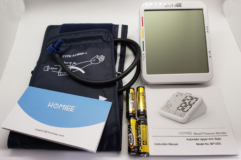
What’s in the box?

  • BP1003 monitor
  • Adjustable cuff
  • 4 AA batteries
  • Welcome card
  • Instruction manual

Hardware specs

  • Dimensions: 4.7 x 3.9 x 6.3 inches
  • Weight: 1.32 pounds
  • BP accuracy: +/- 3mm Hg
  • Pulse accuracy: +/- 5%
  • Memory: 120 readings for each of two users (about 8 weeks of 2 x daily readings)
  • Cuff size: 9″ – 17″

Design and features

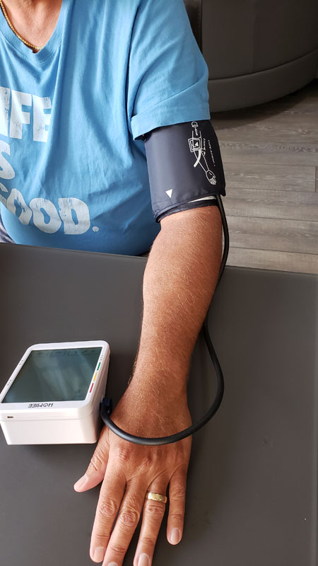
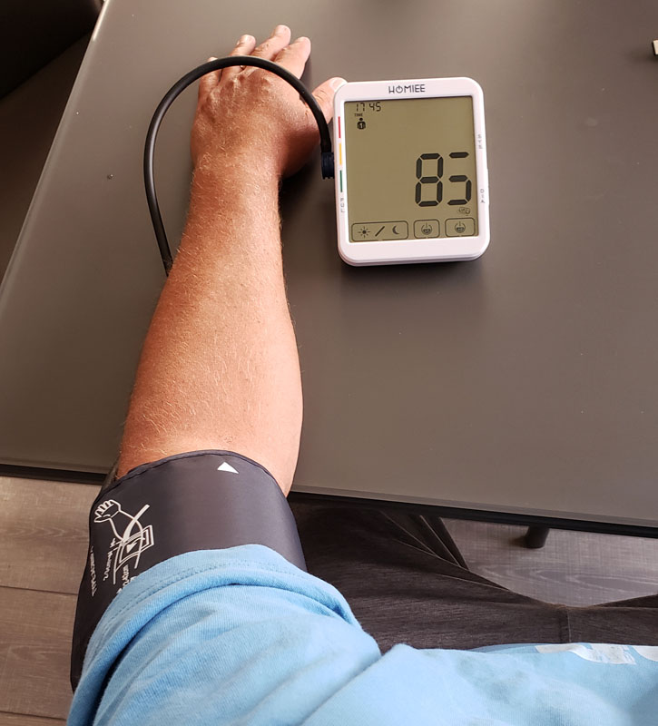
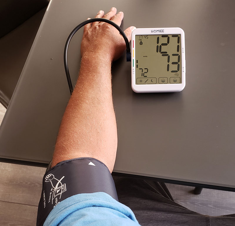
The main unit is a solidly constructed wedge design, meant to keep the display aimed comfortably at your eye when you are seated and the unit is on a table.  It works for me.  The cuff is adjustable and secures with several inches of overlapping velcro, making it easy to get your arm in and snug up the cuff.  The cuff’s hose is long enough to allow you to comfortably have your arm resting with the monitor in front of you.

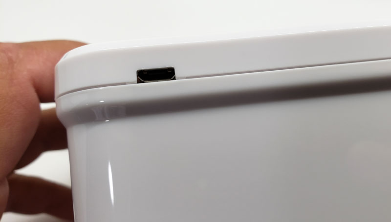
On the back, we find a micro-USB port.


Interestingly, there is nothing in the manual about it.  Online, I discovered that it is a power port if you elect to eschew the convenience of batteries and tether yourself to a wall plug. I won’t be doing that.

Setup

Setup starts pretty simply.

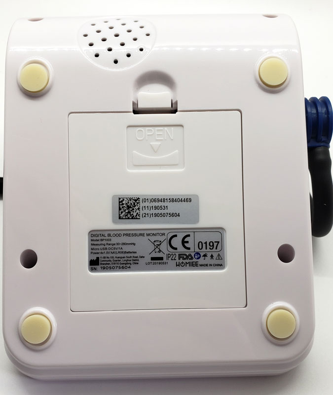
Install the included 4 AA batteries in the back battery compartment.

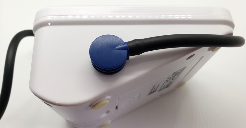
Plugin the cuff hose.

Then, the setup gets a little more complicated.

On the right side of the unit, we find two buttons:

They are cleverly labeled “M” for memory to access the stored readings and “L” for setup. OK – I don’t get that last one, but that’s what it is. To complete the setup, hold the “L” button until the user icon flashes.  Hitting “M” when something is flashing changes values. Hitting “L” changes the active parameter. So, hit “L” to get to the year and “M” to set it, “L” to get to the month and “M” so set it, “L” to get to the day, and so on. This continues for the hour, minute and measurement units – millimeters of mercury (mmHg) or kilopascals (KPa). Your doctor most likely uses mmHg. This is the same process used to changes from user 1 to user 2.  Suffice it to say that the user interface needs some tweaking.

Performance

First – a note about the photos. Any missing segments on digits are an issue with the photo and not the unit.  LCDs flash a little bit.  While this isn’t visible to the naked eye, a camera’s shutter can open at just the wrong time and a segment may appear to be off when it is actually on to the eye.

After putting on the cuff, you press the “x1” or “x2” button to start a blood pressure reading. More on the “x1” and “x2” button later.


Like all blood pressure units, the cuff inflates beyond where it needs to be to read the pressure, and then slowly deflates while it records the systolic number or top number, followed by the diastolic or bottom number. The systolic number measures pressure inside your arteries during a heartbeat while the diastolic number measures that same pressure between beats.  Once both numbers are recorded, the cuff deflates completely and the reading is complete.

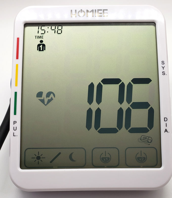
The large pressure numbers count down as the pressure is released.

While readings are being taken, the heart icon on the left flashes as it detects heartbeats.  This indicator turns off after the reading unless it defects AFib. In that case, it will remain on and will also show when you review historical readings where AFib was detected.

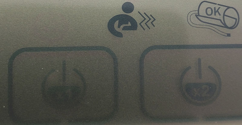
If you move your arm too much during a reading, the person icon shows up to remind you to sit still.  To the right of that is the OK icon, indicating that the cuff is properly attached.  It will indicate if the cuff is too loose, ensuring that you get a good reading.

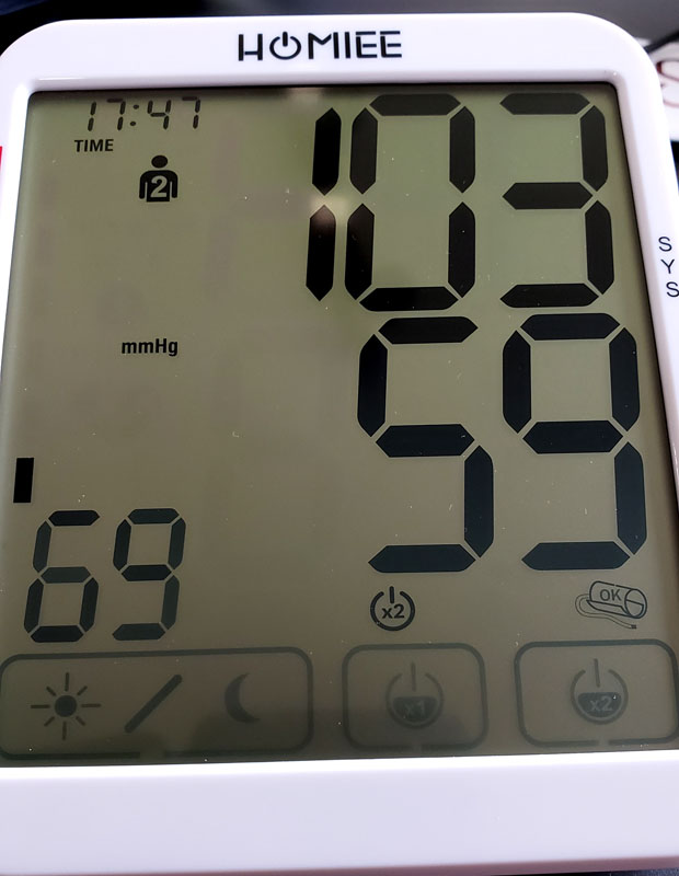
Once you get a good reading, the display shows your systolic and diastolic numbers in large, easy to read numbers, Your pulse is shown in the lower left in smaller numbers.  A vertical bar graph along the left indicates if you are in the green (normal), yellow (at risk) or red (see a doctor – now!) zones.

One problem with blood pressure readings is that they are notoriously variable.  I was at my doctor’s office and a nurse took it the old-fashioned way with a manual cuff and stethoscope. It was abnormally high so another nurse took it the same way five minutes later and got results 10-15 points lower on both numbers.  Automated monitors suffer from the same variability.  Homiee has an answer for that.

Remember the “x1” and “x2” buttons?

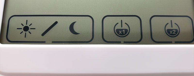
Pressing x1 will a single reading.  Pressing x2 runs a reading, pauses for a few seconds and then runs a second reading.  It then averages the two providing what should be a more accurate overall reading by allowing for the small variances that happen naturally.  I really like this feature.

To the left of those buttons are the day and night buttons. Pressing these provides overall eight week averages and weekly averages for daytime or nighttime measurements.

To change users, as mentioned above, hold the “L” button for three seconds until the user icon flashes and then press the “M” button to change users.

Here we see a user #2 reading for my lovely, and low-pressure wife.

When you aren’t in reading mode, pressing the “M” button will cycle through the last 120 readings for the selected user.  Time and date are shown for each reading along with the AFib indicator if AFib was detected for that reading.

One thing to note is that the display never shuts off.  It always displays the time, user, and the buttons along the bottom. LCDs have a very low power draw, so that shouldn’t affect battery life in any meaningful way.

Another user interface issue for me is that there is seemingly no way to get out of memory review other than wait for the unit to power down and revert to time display mode. After fiddling a bit, I discovered that hitting the “x1” button reverts the unit into reading mode without actually starting a reading.  Again, poor user interface design.

Finally, holding the “M” button for several seconds will wipe out all stored readings.

What I like

  • Accurate
  • Super easy to read
  • Good memory for tracking trends
  • The double reading averaging feature

What I’d change

  • The user interface needs to be improved and simplified – especially for switching users.

Final thoughts

We should all be aware of our blood pressure.  For a healthy person, once a year readings during your annual physical can suffice.  But as we age, or are otherwise at risk for health issues, that need becomes more critical.  The Homiee BP1003 is a capable unit that can help you track your blood pressure and watch for any trends that might warrant a trip to the doctor.

Sphygmomanometer
Oooooo, do it again!
Sphygmomanometer
Oooooooo
Sphygmomanometer, sphygmomanometer, sphygmomanometer!

Price: $49.99
Where to buy: Amazon
Source: The sample of this product was provided by Homiee.

Filed in categories: Reviews

Tagged:

Homiee BP1003 blood pressure monitor review originally appeared on The Gadgeteer on August 13, 2019 at 9:00 am.

Note: If you are subscribed to this feed through FeedBurner, please switch to our native feed URL http://the-gadgeteer.com/feed/ in order to ensure continuous delivery.
BenQ ZOWIE XL2411P 144Hz 24-inch e-Sports Monitor review

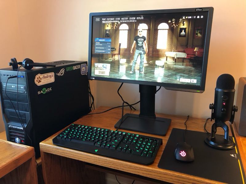
REVIEW – Without a doubt, the two most important components of a good gaming system are the video card and the monitor.  The monitor is what gamers are looking at while playing, and the video card is what renders the games on the monitor.  When I designed my current system, I included a GeForce GTX 1070 Ti, a solid, mid-range video card.  For a monitor, I use a Dell UltraSharp U2715H.  This monitor is a compromise for a gaming system.  On the one hand it’s wonderfully large (27 inches), has great resolution (2560 x 1440), and includes a wealth of ports (including DP, mDP, 2xHDMI, 5xUSB); on the other hand, it has a60 Hz refresh rate and a lethargic 8 ms response time.  It’s a great general-purpose monitor, but it’s not ideal for video gaming, especially for fast-paced, first-person shooter (FPS) games.  This is why I was super excited to get an opportunity to review the BenQ ZOWIE XL2411P gaming monitor.

What is it?

BenQ is a Taiwanese company that sells projectors, monitors, speakers, gaming accessories, and other digital products.  ZOWIE is their line of gaming products, and the XL Series is their premier line of monitors targeted at competitive esports gamers.  The BenQ ZOWIE XL2411P is an entry-level gaming monitor that offers good specifications at a reasonable price point.  It’s targeted at video gamers, especially those who play competitive FPS games like Overwatch, CS: GO, and Rainbow Six Siege.

What’s in the box?

  • The monitor (aka the panel)
  • The base
  • The stand arm
  • Power cord
  • Display port to display port video cable

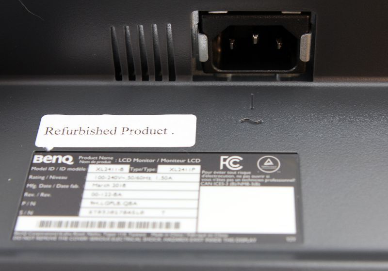
Surprisingly, there were no manuals, quick start guides, or CD-ROMs included with the monitor.  It’s possible that they were not included because BenQ sent me a refurbished monitor instead of a new one.

Hardware specs

  • Panel Type:  TN
  • Refresh Rate:  144 Hz
  • Response time‎:  1ms (GtG)
  • Resolution:  1920 x 1080
  • Pixel Pitch:  0.276 mm
  • Size:  24 inches
  • Aspect Ratio:  16:9
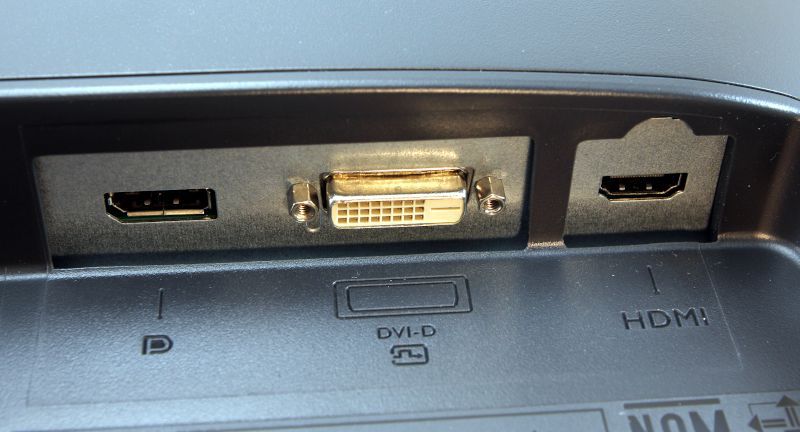
  • Video Ports: DisplayPort, DVI-DL, and HDMI
  • Other Ports:  Audio jack
  • VESA mount:  100 x 100 mm
  • Panel Dimension:  22.5 x 13.5 inches
  • Max/Min Height:  22/17.5 inches
  • Weight:  12.8 pounds

Design and features

When it comes to consumer products, some companies have a “form over function” design philosophy—I’m looking at you, Apple.  With the XL2411P, BenQ has taken the opposite approach of “function over form.”  It’s made out of black plastic, has a nearly ¾-inch bezel all the way around, and doesn’t have any sort of visual bells or whistles.  You might say it’s rather pedestrian to look at.  But this is totally ok, because BenQ has decided to invest in what’s really important for gaming:  The panel.

Installation and setup

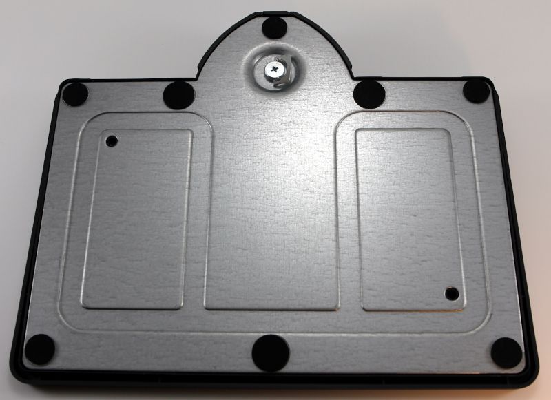
The first step for installation is to connect the arm onto the base.  On the bottom of the base is a thumbscrew.  I inserted the arm into the base and tightened the thumbscrew until it was snug.

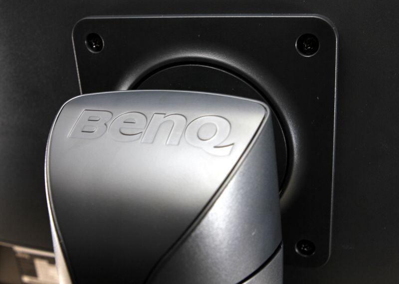
The second step was connecting the panel to the arm, which I found easier to do with the help of a second person, and it requires a medium-sized Phillips screwdriver (not included).  I removed the four screws from the back of the panel, and while my wife held the panel up to the arm, I reinserted the screws.  All of these pieces seem very solid and sturdy; short of giving it a good, hard shove, this monitor’s in no danger of tipping over.  The base has a built-in little tray for storing small items; I promptly put the remote to my speakers in there.

The third step was to insert the power cable and the video cable.  I used the display port cable to connect it to my computer.

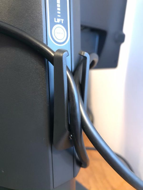
On the back of the monitor arm is a pair of small plastic arms used for cable management.  When I tucked the power cable and the video cable into them, however, they warped and looked like they were going to snap off, so I removed the cables and just left this alone.  I prefer the hole-in-arm solution that their XL2430 monitor uses, which is also what my Dell uses.

This monitor is quite flexible.  The panel can be raised up 4.5 inches by pressing the height release button on the back of the arm, and it can be freely tilted in any direction up, down, left, or right.  This allowed me to position the monitor in my optimal viewing position.

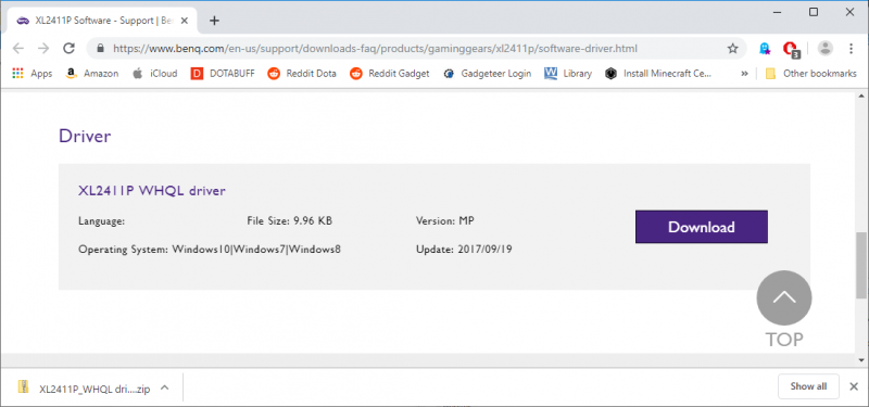
When I started up my computer, Windows 10 used a default driver for the monitor, and that worked, but as it’s a gaming monitor, I thought it would be best to install a specific driver.  I found a driver on BenQ’s website and installed it.

When I turned this monitor on, the first thing I noticed was that the colors were really washed out in comparison to my Dell, and there were two reasons for this.  The first reason is that my Dell is an IPS panel, whereas the XL2411P is a TN panel.  IPS panels are known for their color accuracy, whereas TN panels are known for their fast response time.  There’s also a third type, a VA panel, that takes a middle road.  The BenQ monitor has a much crisper image, especially when objects are moving quickly in a game, but the colors are likely to be less vibrant.

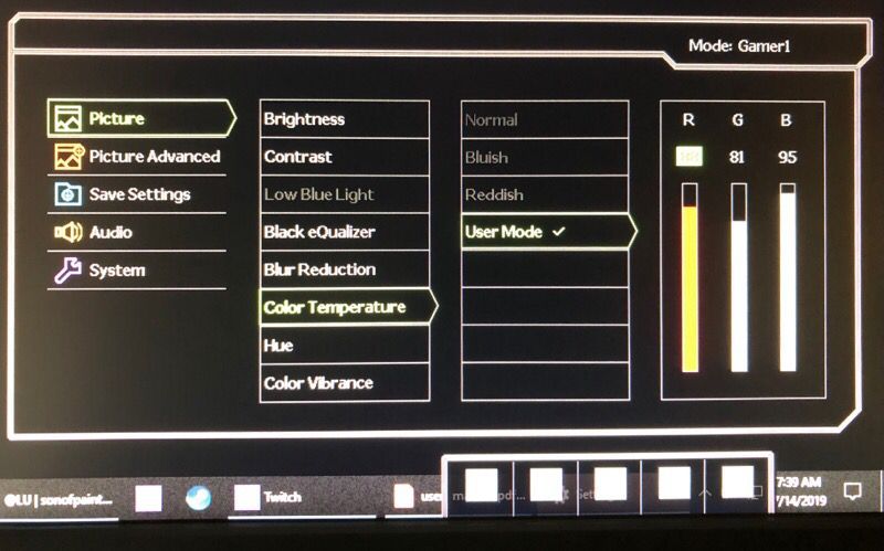
The second reason is that the default settings for the monitor are less than ideal.  The XL2411P has a host of settings that you can use to adjust the display image, including brightness, contrast, color temperature, hue, color vibrance, and sharpness.

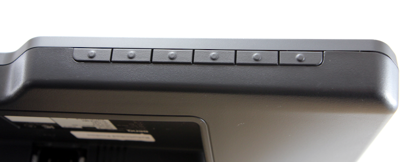
This monitor has 8 pre-defined groups of settings, which it calls picture modes.  You can test any of these, but if none of them suit your fancy, you can choose your own settings and save it in one of three slots.  The modes and settings can be configured with the control keys found on the lower right of the monitor.

With so many choices, it can be a bit intimidating to figure out what the optimal settings should be. The good news is that a host of other people have had this same issue, and a quick search online returns many suggestions.  I tried a few of the suggestions and then began tweaking things until I found a set that worked for me.  If you buy this monitor, you’ll definitely want to spend some time tweaking it for your own tastes.

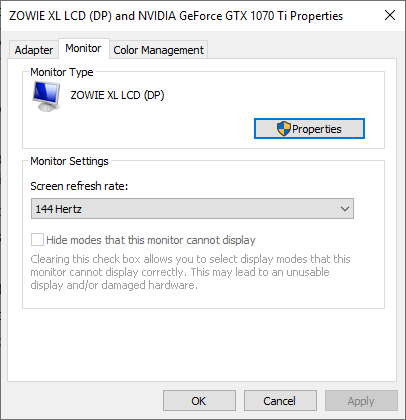
The final step in setting up the monitor was to set the refresh rate.  On Windows 10, I found this setting by going to:

  • Settings
  • System
  • Display tab (on the left)
  • Advanced Display Settings
  • Display Adapter Properties (which opens a new window)
  • Monitor tab

Set the screen refresh rate to 144 Hertz.

If you want to learn more about this monitor, you can download and read the user manual.

Panel Features

The XL2411P has a refresh rate of 144 Hz.  The higher the refresh rate, the more images per second, the smoother the game appears to be.  60 Hz is fine for ordinary activities; 144 Hz is great for gaming, especially for FPSs; and 240 Hz is for those at highest levels of competitive gaming.

This monitor has a response time of 1 ms (GtG).  The grey-to-grey (GtG) response time is a measurement of how long a pixel takes to changes colors.  The lower the value the better, and the higher the refresh rate, the more important it is to have a lower response time.  Low response times prevent ghosting, which is where fast-moving objects on the screen leave a trail behind them as they move across the screen.  Most monitors are under 10 ms; my Dell, for example, has a response time of 8 ms.  Gaming monitors should have 5 ms or less, and a 1 ms response time is good.   To achieve a 1 ms response time, the XL2411P has a feature known as advanced motion acceleration (AMA) that must be enabled using the control keys.  This drives more voltage to the liquid crystals, thus producing images faster.

BenQ’s monitor also has a feature known as the Black eQualizer.  In some games, enemies will tend to hide in dark corners of the map in order to ambush other players.  The Black eQualizer can be used to lighten up these dark spots, making it easier to see other players.  This will slightly decrease overall image quality, but that’s a small price to pay for avoiding ambushes.

It’s Color Vibrance feature makes it possible to tune the colors so that images are more realistic and colors are more vibrant.  This is more of a “personal preference” feature than it is a “make the game easier” feature.  It’s Flicker-Free Technology is an eye strain reducing feature.  Normally LED panels don’t have flickering, but apparently, it can be an issue when using poor cabling or outdated graphics cards, and this can cause eye strain when gaming for a long time.  The XL2411P eliminates this flicker, thus increasing eye health and comfort.

My Testing

Reading a list of features is fine, but the real test comes when playing games.  I began by testing the monitor with Dota 2, a multiplayer online battle arena (MOBA).  First, I tried various ways to create rapid movement, such as panning back and forth and zipping around with Storm Spirit’s ultimate.  Second, I played many games, switching back and forth between my Dell monitor and the BenQ ZOWIE monitor.  When it comes to movement and refresh rate, I honestly can’t tell any difference between these monitors.  I doubt this due to any lack in the XL2411P; rather, I think this is more about Dota, which is a slower-paced game that doesn’t take advantage of the XL2411P’s capabilities.  I can, however, see a difference in appearance.  Dota is sharper and more vibrant on the Dell, which is probably due to it having an IPS panel and a higher resolution.

I continued testing with Player Unknown’s Battle Grounds (PUBG), a battle royale game, using a first player perspective (FPP), my personal preference.  In this game, I can definitely tell a difference.  When looking around in game, I can visibly see the game refresh faster with XL2411P.  Trees and rocks look crisper, and cars that are driven are clearer.  Now if the monitor could help me shoot straighter, that would be something!

Expert Testing

I don’t play very many FPS games, so I decided to get some expert help from a couple of guys who do.  My son, Jacen, is the President of Liberty University’s Gaming Club and Director of Liberty Esports.  Jacen and his business partner, Jaden, started the College Call of Duty League (CCL) where universities compete against each other regionally and nationally each year.  Jacen (pictured left) plays on Liberty’s Overwatch and Dota teams.  His friend, Trevor Ray (pictured right), is the manager of Liberty’s Dota team, and he plays on Liberty’s Dota and Rainbow Six Siege teams.

Together they tested the ZOWIE monitor on four FPS games, CS:GO, Rainbow Six Siege, Apex Legends, and Overwatch, and the following is a summary of their thoughts.

The Black eQualizer definitely made it easier to spot enemies who were trying to hide in CS:GO and Rainbow. These games are more realistic, and they tend to have dark places on the map.  This feature was not as useful in Apex and Overwatch, as they are already very bright games.

The high refresh rate and low response time were helpful in all the games, but they were most noticeable in Rainbow, Apex, and Overwatch, as these games have a lot of very fast movement.  They saw no trace of ghosting, especially once they set the AMA to the highest setting, “premium.”  Even when they were zoomed in with a sniper rifle and tracking an enemy across the screen, there were no signs of blurring or trails.

Jacen preferred the sturdier base of the XL2411P over the base of his monitor, an MSI Optic G24C.  Trevor liked the UI of the XL2411P as well as its rich set of features and options; he found changing the settings with the control keys to be easier on the BenQ than with his monitor, an AOC G2460P.  Both of these guys, however, echoed my observations that the color on the XL2411P was worse; they spent more time on the BenQ adjusting the settings than they did on their own monitors, though in the end they were happy with their settings.  Here are the settings that Trevor uses, if you need something to get you started:

  • Brightness: 15
  • Contrast: 50
  • Low Blue Light: 0
  • Black eQualizer: 2
  • Blur Reduction: off
  • Color Temp: R:92 G:92 B:97
  • Hue: 50
  • Color Vibrance: 11
  • AMA: Premium
  • Instant Mode: ON
  • Sharpness: 7
  • Everything else:  Default

In addition to gaming, Trevor ran a set of tests designed to detect backlight bleeding.  This is a problem common with TN panels where excess light from behind the panels “bleeds” around the edges, causing a visual distraction. Trevor ran the Eizo Monitor Test, which can highlight backlight bleeding, as well as other problems.  I’m happy to report that he found no sign of this problem on the ZOWIE monitor.

In summary, Jacen and Trevor declared the XL2411P to be a solid monitor that is good for gaming and a great value at its price point, so long as you are willing to spend some extra time adjusting the settings.  If buying a new monitor now, Trevor asserted that he would definitely consider buying the BenQ over his AOC, as it can take advantage of his EVGA GTX 1070 video card.  Jacen, however, gave a more nuanced answer.  If gaming on a laptop—he games on a Razer Blade 14 RZ09—he would probably stick with his MSI, as all the video ports on his MSI are capable of 120 Hz, the max refresh rate that his Razer can push, whereas on the BenQ, only the DP port can do 120 Hz.  If, however, he switched to a desktop with a more capable video card, which he would prefer to do, then yes, he would also consider buying the BenQ over his MSI.

The experts have spoken.

Extra Features

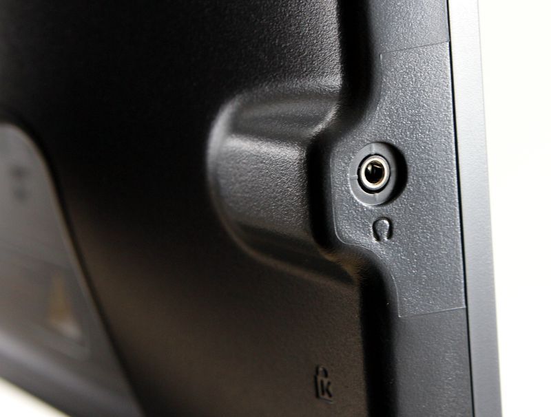
There are no built-in speakers on the XL2411P, but it does have an audio jack on the left side, which works great.

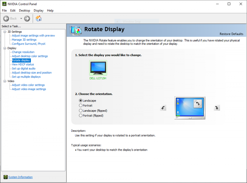
The monitor can also be rotated 90° so that it’s in portrait mode.  On my PC, I used the NVIDIA Control Panel to let Windows know that I wanted to rotate the display.  This feature is typically used with Microsoft Word or other editing tools where it’s advantageous to see an entire page of text at once.  I’m honestly not sure how this would be useful for a gaming monitor, but it’s here if you need it.

The XL2411P also has a Kensington lock slot on the back to help secure the monitor if necessary.
What I like

  • Great set of features, like the Black eQualizer, especially for this price point
  • High refresh rate, low response time
  • Solid base, flexible arm for adjusting the panel

What I’d change

  • Improved default color settings
  • Studier cable management system

Final thoughts

If you’re looking to get into the fast-paced world of competitive FPS video games, or if you want to upgrade your current monitor without breaking the bank, then I think you should take a hard look at the ZOWIE XL2411P monitor.  It may not be the most attractive monitor on the outside, but it’s got it where it counts, a rich set of features that are going to help you take your game to the next level.  Just keep in mind that you will have to spend some extra time configuring this monitor.  I think, however, that you will find it to be worth the time you spend.  Game on!
Price: $199 (new), $187 (refurbished)
Where to buy:  BenQ Direct (new, refurbished) and Amazon
Source: The sample for this review was provided by BenQ.

Filed in categories: Reviews

Tagged: ,

BenQ ZOWIE XL2411P 144Hz 24-inch e-Sports Monitor review originally appeared on The Gadgeteer on August 13, 2019 at 8:00 am.

Note: If you are subscribed to this feed through FeedBurner, please switch to our native feed URL http://the-gadgeteer.com/feed/ in order to ensure continuous delivery.