Totallee iPhone 7 Plus case review

I have the iPhone 7 Plus, which is a big phone at 5.5 inches. I often look for the thinnest case possible to fit into my back pocket or small handbag. I still want protection, but without all the bulk. Totallee has released a super thin iPhone case called “the scarf”. Let’s take a look at how it fits the iPhone. 

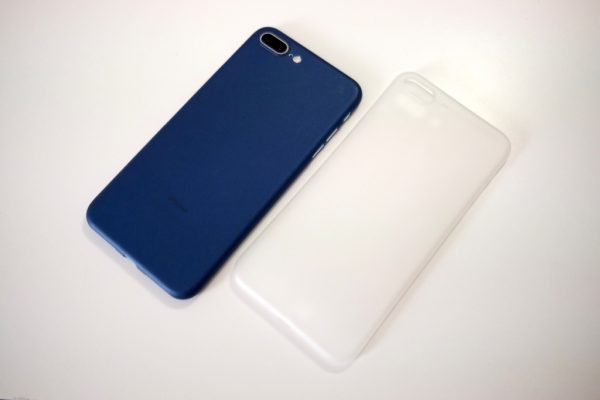
I was given the frosted white and navy blue colors.  I like the white since it matches my silver iPhone 7 Plus and recently have been sporting the navy blue to change it up. Both cases are slightly frosted/transparent.

The case is only 0.02″ thin and made of plastic. It covers the back of the iPhone completely, as well as the sides.

The front of the case also protects the edges but doesn’t give a lot of padding.  I have dropped my phone plenty of times and to my surprise I haven’t had any dings yet with the scarf case-even on the front of the phone!

The speaker holes line up well and audio sounds normal. Some cases cover up the phone microphone and make them muffled, but with the scarf, there are no issues.

The power and volume buttons also lined up perfectly, and I was able to access them without any problems.

The camera is covered nicely, and the cutouts line up perfectly. The only thing I found a bit annoying is that the case scratches easily. I supposed that’s better than my iPhone getting scratched however.

I really enjoy using Totallee’s scarf case, as it gives me the grip I like and protection I need, without the bulk. Totallee includes a 2-year warranty for all purchases. For the price, it’s an excellent choice for anyone who is just looking for some minimal protection. Just keep in mind that if you tend to drop your phone a lot, there isn’t much thickness to the case. For me, it wasn’t a problem.

Source: The sample for this review was provided by Totallee. Please visit their site for more info and Amazon to order.


Product Information

Price: $19
Manufacturer: Totallee
Retailer: Amazon
Requirements:
  • iPhone 5/5s/se
  • iPhone 6/6s
  • iPhone 6/6s plus
  • iPhone 7/7plus
Pros:
  • Very thin
  • Lightweight
  • Grippy
  • Great price
Cons:
  • Scratches easily

Filed in categories: Cases and Covers, iOS, Reviews

Tagged:

Totallee iPhone 7 Plus case review originally appeared on on March 13, 2017 at 1:24 pm.

Note: If you are subscribed to this feed through FeedBurner, please switch to our native feed URL http://the-gadgeteer.com/feed/ in order to ensure continuous delivery.

Developer with visual disability creates Big Keys iOS keyboard app with emojis

As I get older, I find that I often look over my glasses instead of through them because I’m at that glorious age when it’s tough to see small things like text on my phone without taking off my glasses first. Even though I wear bifocals, it’s sometimes really tough to see tiny things close up. It makes me wonder how people with real vision issues are able to enjoy using their smartphones and tablets without a lot of frustration.

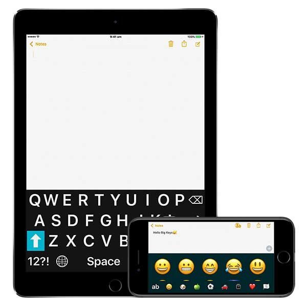
One software developer, Hassan Hattab has taken matters into his own hands (eyes?) and created Big Keys, an iOS keyboard app that not only allows you to resize the characters for easier viewing, but the keyboard app also has emojis!

Accessibility is a big deal to the app founder, Hassan Hattab. He has a visual disability which contacts or glasses can’t fix. For years Hassan wanted to be able to see his keyboard better (and those emojis too!). He created this app to help himself, and many users in using and seeing their keyboards on their iPad and on the iPhone.

Big Keys Features:

Adjust the font size and emojis size on the keyboard.
Numeric Keypad for faster data entry.
Track the last pressed key.
Use gestures for faster typing.
Free selection of color combination to make it easier to see and work with the keys.

Check out the video:

You can read more about Big Keys at http://www.youapps.co/BigKeys and buy it for $2.99 through iTunes.

Filed in categories: iOS, News

Tagged:

Developer with visual disability creates Big Keys iOS keyboard app with emojis originally appeared on on March 10, 2017 at 4:12 pm.

Note: If you are subscribed to this feed through FeedBurner, please switch to our native feed URL http://the-gadgeteer.com/feed/ in order to ensure continuous delivery.

AstroPad Studio iOS app review

From almost the very first day selling iPads, I was asked some version of this question: “Can I control my Mac with it?” Over the half-decade since the launch of the iPad, that answer has moved from “sorta” to “yes, and there are a few solutions, but they are really hinky” to, finally, “Yes. Full stop.” The final piece of the puzzle was a combo called AstroPad Studio. There’s an app for your iPad, and one for your Mac, and they sent us a license for the combo to test out. It was a lot of fun.

Note: Photos may be tapped or clicked for a larger image.

The install/download of the two pieces is easy enough – go to the app store for iOS and download. For the Mac app, you’ll need to visit astropad.com to download. There are two pricing plans: the Standard, one-time-pay version for $30, and the Studio version, with a subscription that costs $65/year or $8/month. The upgrade to Studio is significant. You not only get constant updates for free but priority support, Magic Gestures, Custom Pressure curves, the Eraser tool and a lot more. I’m going to concentrate the rest of the review on the Studio edition, but the Standard edition would be great for anyone who needs to use their Mac from their iPad occasionally for such things as file transfers, running programs that behave differently on a Mac than an iPad (*koff* WordPress’ *koff* arcane web client *koff*), or even Windows programs via Boot Camp/Parallels/Fusion. It’s truly a remote control of your Mac. But if you don’t need the pressure sensitivity pen input, or the “macro”-type feature of custom gestures, you’ll be OK with the Standard.
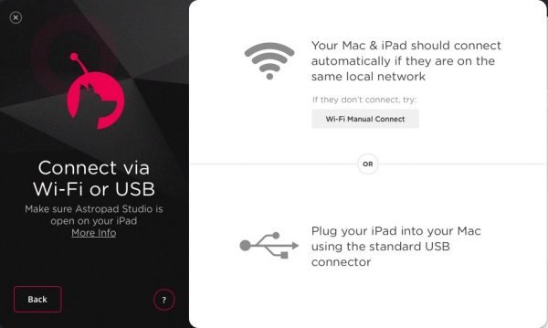

To set up, you simply launch each one from their respective machines, making sure you’re on the same wifi network. There’s a bit of handholding you have to do the first time, but every time after that, launching the Mac app gets you the “launch the app on your iPad” dialog box, (or launching the iPad version from your iPad and get the “Launch AstroPad on your Mac” dialog.) and you’re in business.

If there is a lot of traffic or spotty connectivity, you can actually connect your iPad directly with a USB cable, or manually tweak the connection, but I never had a problem. Besides using the setup at home for testing, I used the Mac/iPad Pro to present to a user group at a restaurant we frequent. Even on a different wifi network from my house, AstroPad studio reconnected without missing a beat.

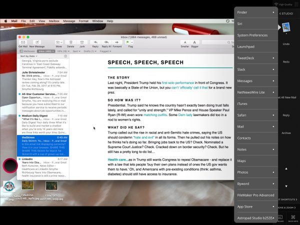
Multiple monitors pose no special problem either. From within the Mac app, you can choose which monitor (or part of a monitor) will be viewed by the iPad. On the iPad, you have access to a wealth of controls: finger-gestures that give you control-click or option-click, quick switching between “draw” and “erase” if you’re using a drawing tool, etc. You can also choose to view the entire defined area or zoom into 100% for closer work. There is a toggle to allow you to virtually hold down modifier keys while clicking or drawing as well.
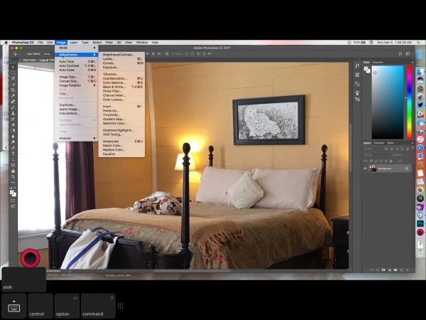

Much of the hype around AstroPad has been around getting the full version of Photoshop on the Mac (see photo above) with the control of the Apple Pencil, and I must say it was quite an effective combination, but you’re not limited to just drawing and editing. Any Mac app will work with Astropad, and Apple Pencil is quite a bit more accurate than a mouse.
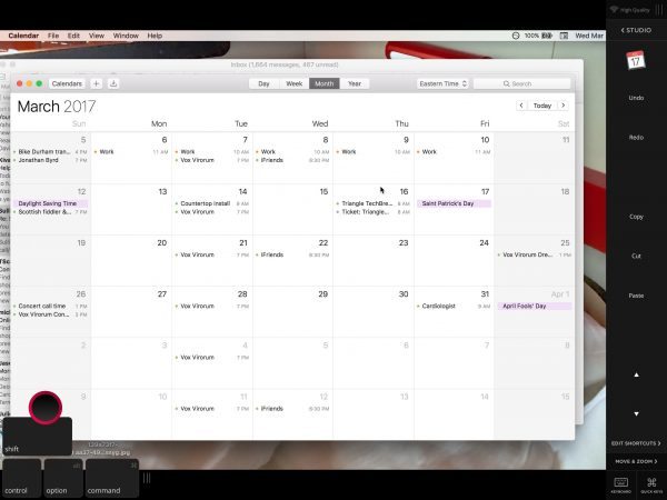
I edited and uploaded the text and photos to this article from my MacBook through my iPad. The biggest issue was using the virtual keyboard: the spacebar doesn’t extend under the “M” key like on most keyboards because the designers made the inverted T arrow keys too large. I kept getting sentences with no spaces until I figured out what was going on. The other quibble was the keyboard hide button is on the bottom left. The iPad standard placement is bottom right, so, again, non-standard design fooled my muscle memory. But these irritations aside, it was pretty cool to export photos from Photos and have them be renamed to our standard convention, then drag them over to the upload area within Safari, and place them from my iPad. I imagine in the next decade or so, WordPress will actually have a touch interface for editing, but meanwhile, we have AstroPad!
Since I don’t have a drawing tablet for my Mac, this app combo saves me having to buy that, find space for it, and learn to use it. Drawing on one surface and having the resulting marks appear on another surface (the way a traditional drawing tablet works) is a bit unnatural, but with the iPad and Apple Pencil, it’s like having a touchscreen Mac with a drawing tablet on top. There is a product you can buy from Wacom called the Cintiq which gives you an actual monitor you can draw on digitally, but the cost is quite prohibitive. (The cheapest one on their site is $999 for a 13″ display.) If you have a Mac and an iPad, this software may be the solution to having to use such a display. Since I have a MacBookPro and a large display already, having a third monitor attached would prove awkward. Using my iPad Pro, however, is easy, because I can not only have it anywhere on my desk or lap but anywhere on the network. I can sit out on the deck using an iPad with the Mac still hooked up on the desk, and easily work on my Mac editing photos, or uploading photos from there to our web host, something that usually requires using my Mac. Well, I actually am using my Mac, but I’m touching my iPad. It’s getting pretty meta at this point….

Regarding subscriptions. If you are really needing Apple Pencil-quality input, and use Photoshop or other pen-based input on a regular basis, your investment in a pen-enabled display may be warranted. But, if you’re just trying things out, or you’re a student, or just dabble in fields where pen on Mac would be an upgrade, you can try Astropad Studio without a huge investment. And if you’re short on space, or want the flexibility that an iPad can give you artistically, this solution could really change your art. Give it a month or two, and see. That’s the beauty of subscriptions: you’re not having to pay a huge upfront fee, but you get all the benefits at once.

Source: The sample for this review was provided by Astropad, LLC. Please visit for more info.


Product Information

Price: Standard $30; Studio $65/year or $8/month subscription
Manufacturer: AstroPad, LLC
Requirements:
  • Mac, iPad, Wifi network or USB cable to connect devices
Pros:
  • Robust – setup once, and it just works
  • Works with any Mac app
  • Tiered pricing means you can pay when you use it
Cons:
  • Virtual Keyboard layout for iPad text entry is not standard, causes typos

Filed in categories: iOS, Reviews

Tagged:

AstroPad Studio iOS app review originally appeared on on March 8, 2017 at 9:58 am.

Note: If you are subscribed to this feed through FeedBurner, please switch to our native feed URL http://the-gadgeteer.com/feed/ in order to ensure continuous delivery.

Apple certified pqireader helps you edit, create, and watch video on your iOS device

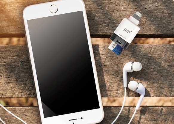
A few days ago I told you about the ADATA AI910 Lightning Card Reader Plus adapter that lets you share files between iOS, Android and Windows computers. But if you don’t care about Android or Windows, the new pqireader from PQI looks like a more compact adapter designed to share data between two devices like the iPhone and an action cam.

The pqireader doesn’t require a network connection to work. Just plug it in and access the video and image files on your iPhone or iPad.

It also features a built-in micro SD card slot so you can pop the card out of your action cam or dashcam and then view the files or edit the video files on your iOS device.

The pqireader supports 4K video and the files stored on the reader can be encrypted to use Apple Touch ID so that a valid fingerprint is required to access them.

PQI says that this adapter will be available this month but so far has not revealed pricing. Visit PQI for more info and keep an eye on their Amazon store for the pqireader.

Filed in categories: iOS, News

Tagged:

Apple certified pqireader helps you edit, create, and watch video on your iOS device originally appeared on on March 2, 2017 at 1:30 pm.

Note: If you are subscribed to this feed through FeedBurner, please switch to our native feed URL http://the-gadgeteer.com/feed/ in order to ensure continuous delivery.

DesignSkin The Slider iPhone 7 case review

Cases for smartphones are a constant subject of review here on The Gadgeteer. The latest craze I’ve seen in the case market is adding a place to store a few ID/Credit cards and some cash. The Slider, from DesignSkin, is one such case recently sent to me for testing.

Note: Photos may be tapped or clicked for a larger image.


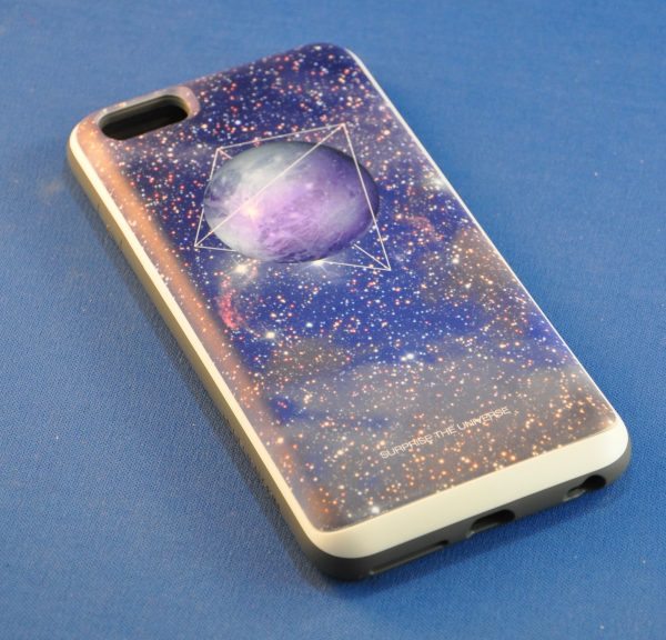
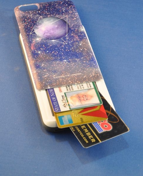
The case is available for a handful of the most popular smartphones on the market and comes with many different graphic back panels. I requested the “Surprise the Universe” pattern. It arrived very quickly, and fit my iPhone 6s Plus perfectly. The interior of the case and the outer edges are a slightly pliant grey plastic.

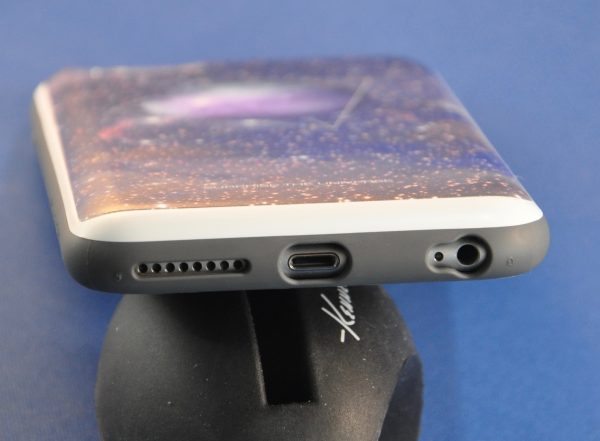
There are cutouts in the usual places for camera, flash, ringer silencing switch, speaker, microphones, lightning port and headphone jack.

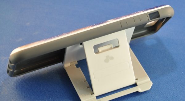
The volume buttons are covered, but their location is clearly marked on the case exterior. There is a similar denotation of the location of the Sleep/Wake button.

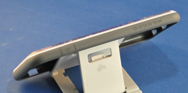
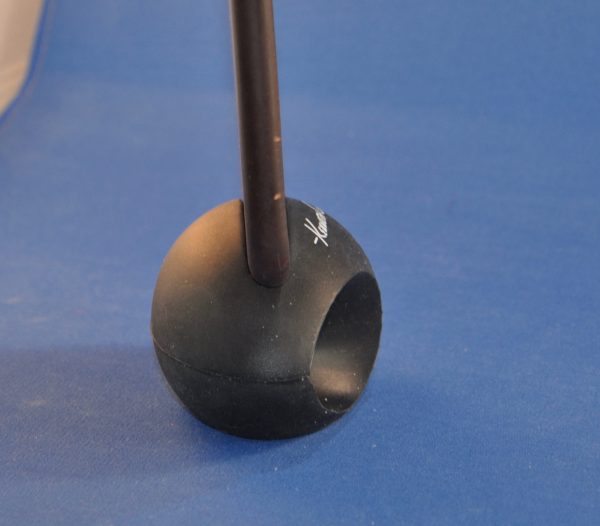
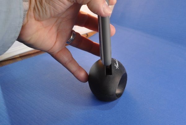
The case wraps around the screen and protrudes slightly – just enough to not actually touch any surface that you may place your phone on face down, but not really enough to protect it should there be sand or anything gritty on that surface. The edges, while not sharp, are not “grippy”, but slightly slippery. Though not as slick as a bare phone, it gives very little grip. The thickness of the plastic around the outside of the phone, however, should truly protect it in case of a drop, but that thickness works against things being connected through the ports. Docks, some headphones, several charging cables, and my DXO One camera are not able to connect well enough to operate normally. (See a dock and the regular Apple leather case versus the Slider in the two photos below.)


The “Slider” feature is just that: the rear panel of the case slides up to reveal a credit-card sized pocket that will hold 2 or 3 cards, depending on the thickness. The thin plastic that covers it shows no signs of being a screen for the wallet, so there is a good bit of stealth in the case as well. If you want to carry your driver’s license, a credit card, and a door access card, I’m sure you’d have no problem with the card being read through the backing. If you need to carry more than that, however, you’ll be out of luck, because there is zero “wiggle room” in the hidden pocket.


The printing on the back of the case is a matte finish and is evenly applied. The graphic actually appears to have depth in, but it’s just an optical illusion. Not sure if the paint will scratch off over time. It has zero scratches from the time I’ve been using it, but I usually don’t keep anything else in my shirt pocket with my phone.


All told, if you’re looking for a soft case with a nice look and a bit of protection that will let you hide a card or 3 inside, this could be your model. At $19.99, it won’t break the bank, even if you decide to get several designs.

Source: The sample for this review was provided by DesignSkin. Please visit Amazon.com to purchase.


Product Information

Price: $19.99
Manufacturer: DesignSkin
Retailer: Amazon
Requirements:
  • Device to protect
Pros:
  • Easy to insert phone into or to remove.
  • Allows easy, yet hidden access to cards.
  • Raises screen above tabletop
Cons:
  • Thick edges prevent some cords and accessories from attaching.

Filed in categories: Cases and Covers, iOS, Reviews

Tagged:

DesignSkin The Slider iPhone 7 case review originally appeared on on March 2, 2017 at 11:15 am.

Note: If you are subscribed to this feed through FeedBurner, please switch to our native feed URL http://the-gadgeteer.com/feed/ in order to ensure continuous delivery.