Kiwi Design Google Nest Hub wall mount review

REVIEW – I’m an enthusiastic investor in the Google ecosphere.  I have a Nest thermostat and Hello doorbell.  Before they were rolled up into the Nest brand, I purchased a Google Max, two Google Assistants, two Google Minis and three Google Home Hubs.  I particularly love the Home Hub (now the Nest Hub) – the screen size is just right, great sound and ambient information display with slide show.  The problem is – if you can call it a problem – sometimes where you want the hub there just isn’t a good place for it to sit.  Kiwi Design wants to fix that situation with the Nest Hub Wall mount.  So yeah, let’s check that out.

What is it?

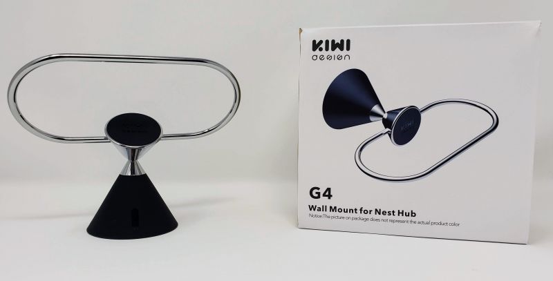
The Kiwi Design Wall Mount for the Nest Hub is just what the name suggests – a mount to fix your Nest hub to the nearest wall or other vertical surface.

What’s in the box?

The Nest Hub wall mount and a brief instruction guide.

Design and Features

The mount is almost entirely metal with a rubber hood that covers the core mounting bracket.  The bracket itself has 4 mounting holes that allow you to permanently fix the mount to a surface where you care to drill into.  Under the wall plate, there is also a 3M sticky pad in case you don’t want to drill holes in your wall or cabinet.
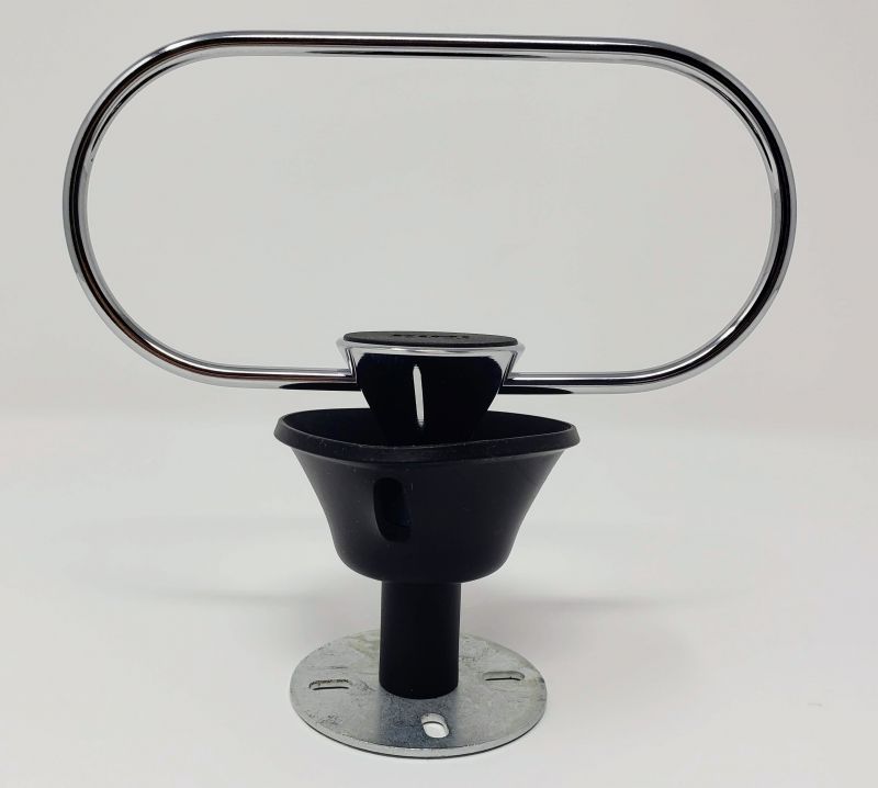
Almost visible in the shot above is the cable management loop (almost visible thanks to black on black coloring).  This is a pretty nifty little feature – just make a doubled-up loop of the excess power cord, push it through the loop and wrap it around the base of the mount.  No unsightly cords dangling all over the place.
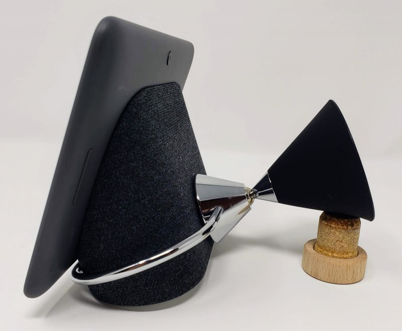
The metal oval is where you place the Nest Hub.  There is a rubber disk on the back side of the oval that protects your Hub from any damage and also provides a friction point to prevent the hub from moving around.  There is a ball joint between the mount and the oval which allows you to re-position the Hub to a suitable angle.
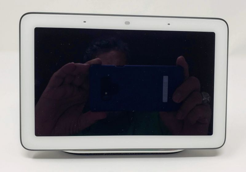
And the Hub sitting in the mount viewed from the front.  Other than a minor bit of the metal oval, the mount is almost completely invisible.

Performance

Kiwi Design certainly brought the rubber to the road with this one.  I decided to mount the Hub that lives in my home office because I wanted to reclaim the desk space but didn’t want to lose the Hub itself.  I mounted it just to the right of my desk over a set of bookshelves where it would be close enough to see without giving up valuable real estate.  I chose to use a wall anchor to mount the…well, mount.  To me, that suggests a more permanent solution than 3M tape, and a solution I am willing to commit to.
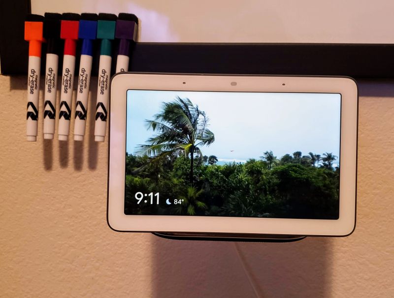
Here it is on my wall under my whiteboard.
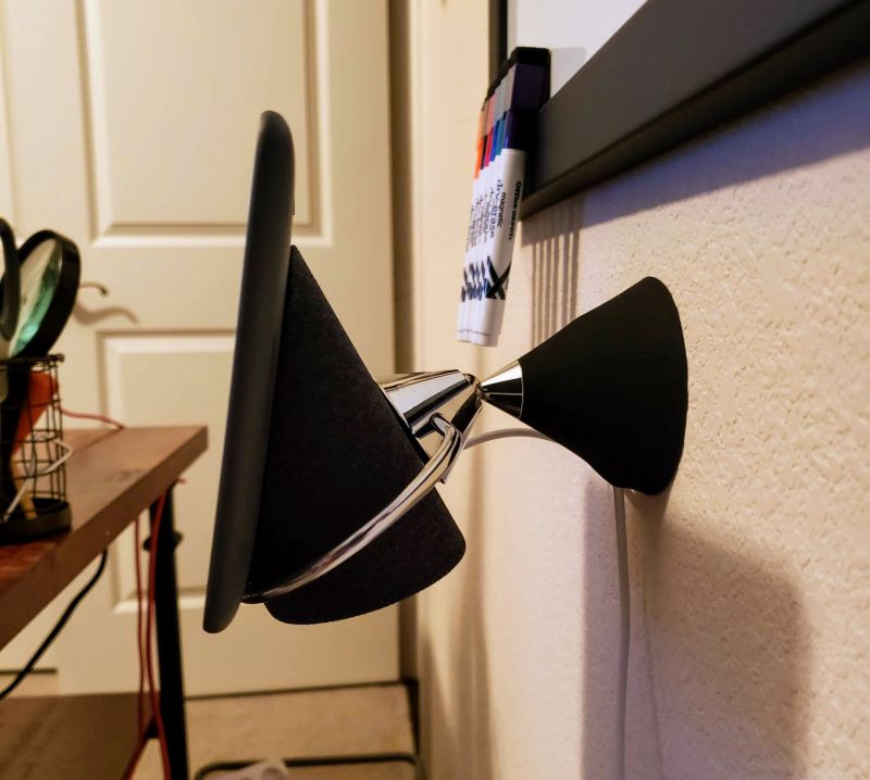
From the side.  As you can see, the ball joint allows me to angle the Hub to the right viewing position, and the entire affair is hidden from view.  The mount is close to perfect – the only thing I would change is to make the swivel mount somehow capable of a 90 degree angle so it could be mounted under a cabinet (thinking ahead to mounting the Kitchen Hub).  Otherwise, this does exactly what you’d expect, it does it well, is solidly made and reasonably priced – some might consider it a little high, but I have an investment in this equipment, so I want premium materials and a mount that doesn’t feel like cheap plastic.

What I Like

  • The look and feel of the mount and how it gets out of the way to let the Hub shine
  • The cord management
  • Being able to angle and swivel the Hub as needs dictate

What I’d Change

  • Make a 90 degree version – although that is a VERY minor issue compared to how well the current mount works

Final Thoughts

The Kiwi Design Wall Mount for the Nest Hub is just what I’ve been looking for.  It feels and works like a well-made unit with all the right touches.  I can definitely see myself buying a few more for my other Hubs and I hope they make a mount for the upcoming Nest Hub Max.

Price: $21.99
Where to buy: The Nest Hub Mount can be purchased directly from Kiwi Design at the link below or from Amazon.
Source: The sample of this product was provided by Kiwi Design.

Filed in categories: Reviews

Tagged: ,

Kiwi Design Google Nest Hub wall mount review originally appeared on The Gadgeteer on August 10, 2019 at 9:00 am.

Note: If you are subscribed to this feed through FeedBurner, please switch to our native feed URL http://the-gadgeteer.com/feed/ in order to ensure continuous delivery.

How to automatically delete Google’s Web & App Activity data

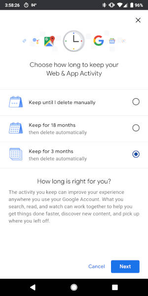
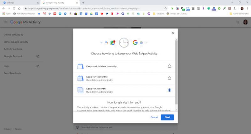
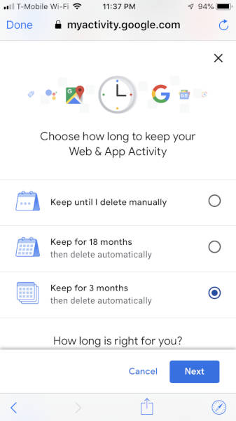
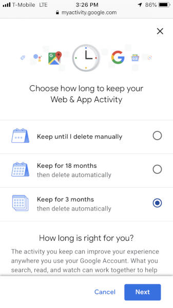
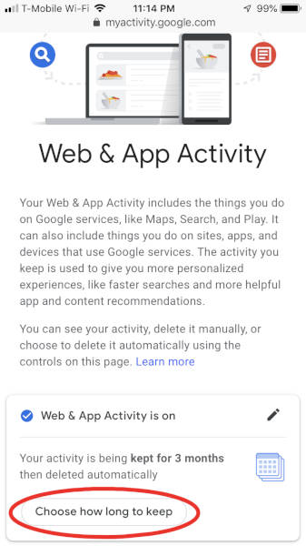
ARTICLE – Google recently announced a new feature that allows users to automatically delete their web and app activity (CNET). You can choose from three options: “Keep until I delete manually”, “Keep for 18 months”, or “Keep for 3 months”. Once you go through the steps to automatically delete this data on one device, it will be set for all devices that are logged into that Google account.

Why might you want to delete this data? Because Google saves information about your searches, browsing, etc. when the Web & App Activity setting is turned on (Google support webpage):

  • Searches and other things you do on Google products and services, like Maps
  • Your location, language, IP address, referrer, and whether you use a browser or an app
  • Ads you click, or things you buy on an advertiser’s site
  • Information on your device like recent apps or contact names you searched for
  • Sites and apps you use
  • Your activity on sites and in apps that use Google services
  • Your Chrome browsing history
  • Note: Activity could be saved even when you’re offline

So, how do you delete your Web & App Activity automatically? Just follow the steps below for Android devices, PCs, and iOS devices. NOTE: all screenshots can be clicked on to view a larger image.

Android


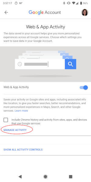
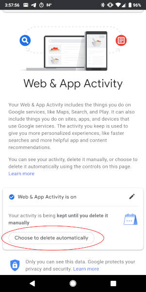
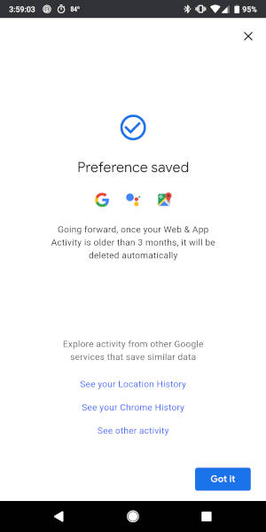
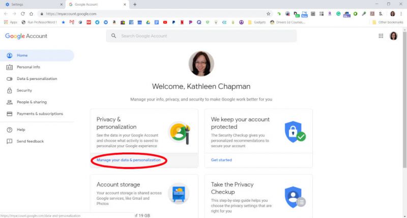
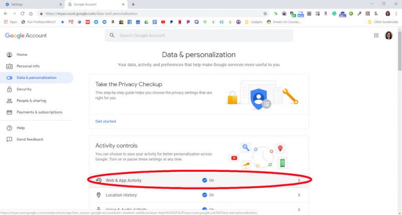
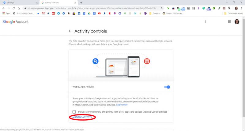
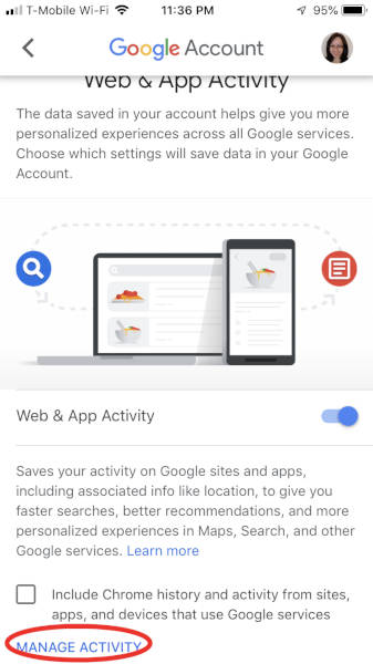
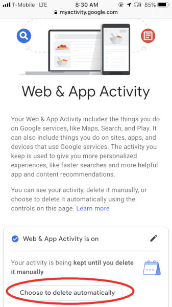
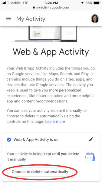
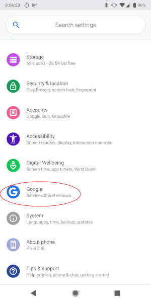
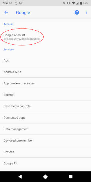
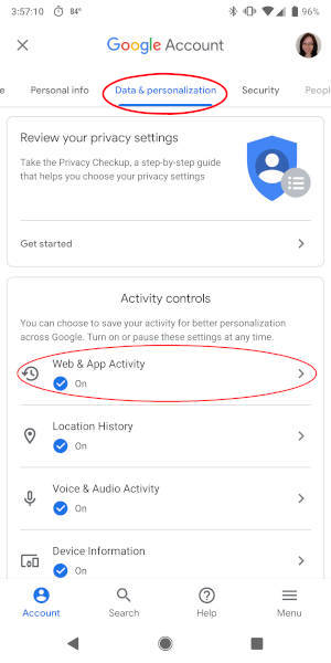
To do this on an Android phone, you’ll need to go to your phone’s settings > “Google” > “Google Account” > “Data & personalization” tab > “Web & App Activity” > “Manage Activity” link > (shown in the screenshots above)…


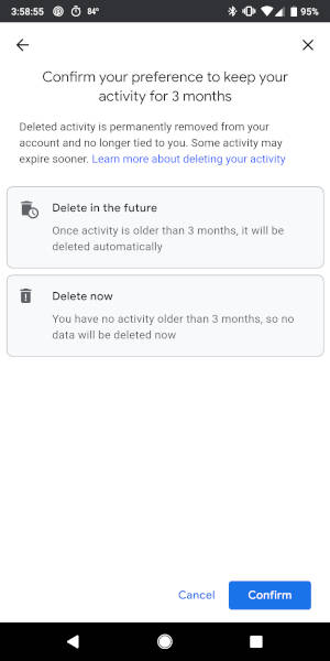
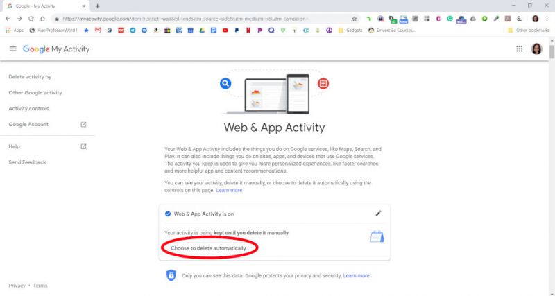
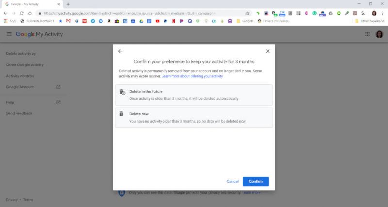
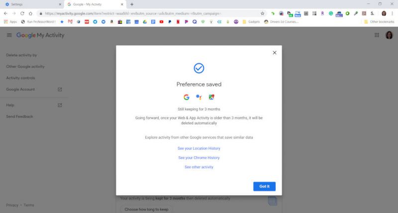
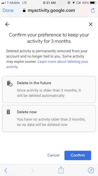
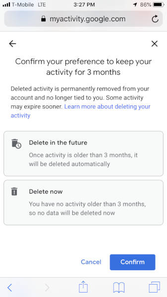
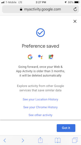
…”Choose to delete automatically” > make your selection and tap on the “Next” button (your preferences will be saved) > “Confirm” button > then tap on the “Got it” button to complete the steps.

PC


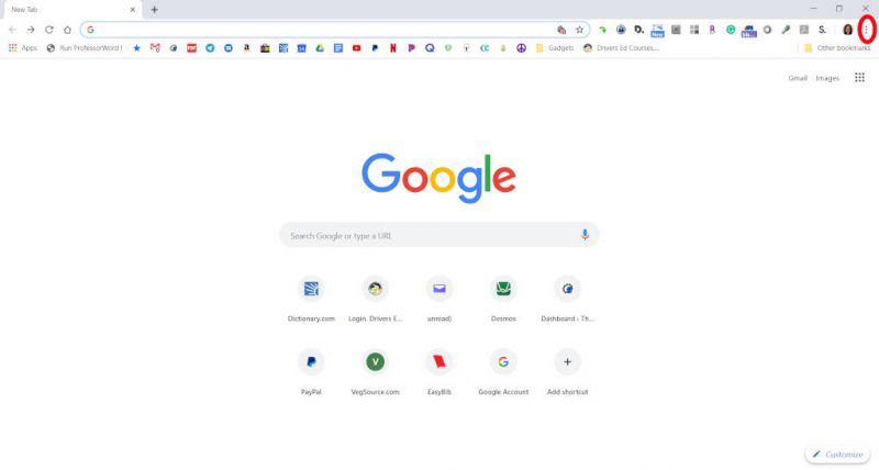
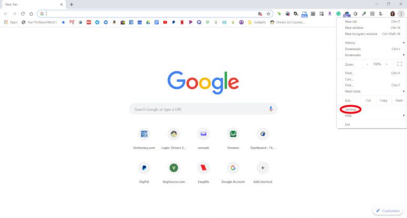
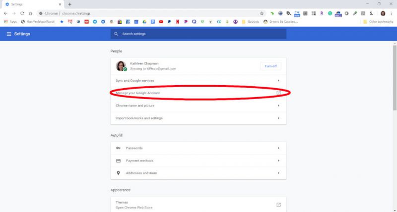
On a PC you would do the following: launch Chrome > log into your Google account > click on the vertical ellipsis in the upper right corner of Chrome (overflow menu) > “Settings” > (shown in the screenshots above)…


…”Manage Google Account” > “Manage Your Data & Personalization” link >…


…”Web & App Activity” > “Manage Activity” link >…


……”Choose to delete automatically” button) > make your selection and tap on the “Next” button >…


…”Confirm” button > and tap on the “Got it” button to finish.

iOS

You can even get to Web & App Activity settings through Gmail’s settings as illustrated in the following iOS steps.


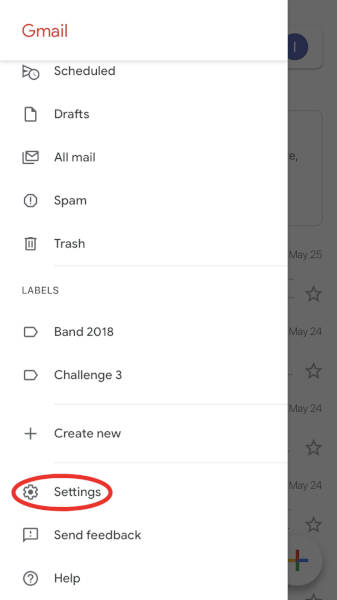
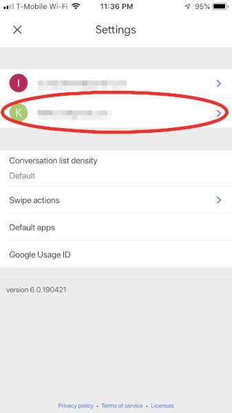
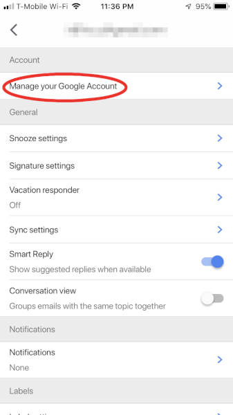
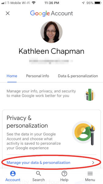
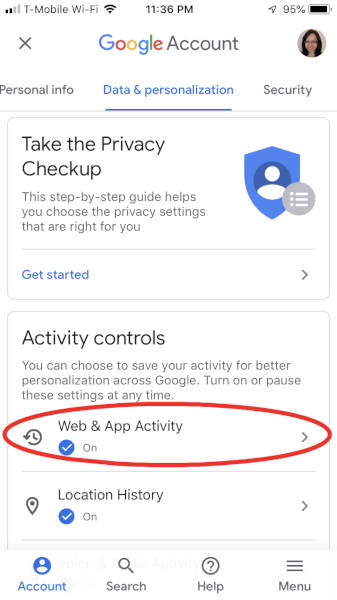
To automatically delete your web and app activity data using Gmail on an iOS device you need to do the following: open your Gmail app > “Menu” > “Settings” > tap on your account > “Manage your Google Account” > “Manage your data & personalization” >…


…”Web & App Activity” > “Manage Activity” link > “Choose to delete automatically” >…


…make your selection and tap on the “Next” button > “Confirm” button (your preferences will be saved) > tap on the “Got it” button to finish.

And if you don’t use Gmail, you can also use the Safari app on your iOS device and alter the Web & App Activity settings as shown in the following steps.


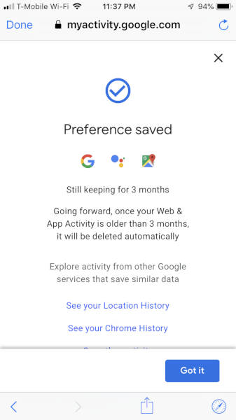
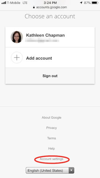
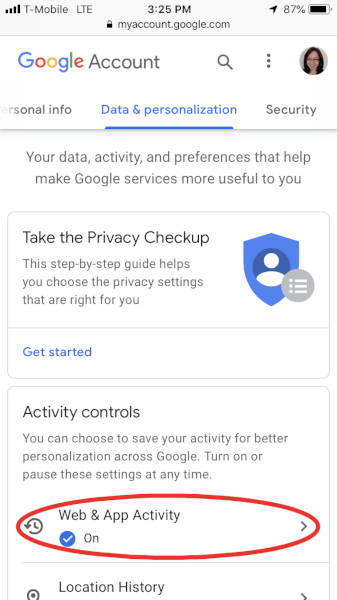
Tap on your Safari app > go to “google.com” > log into your Google account > tap on your profile picture located in the upper right corner of the screen > “Account settings” > “Data & personalization” tab >…


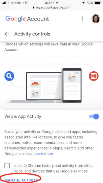
…”Web & App Activity” > “Manage activity” > “Choose to delete automatically” >…


…make your selection and tap on the “Next” button > “Confirm” button > and last, tap on the “Got it” button to finish.

I’m glad that Google is providing features like this so that people like me can have a little more control over their collected data!

Filed in categories: Articles

Tagged:

How to automatically delete Google’s Web & App Activity data originally appeared on The Gadgeteer on May 31, 2019 at 10:00 am.

Note: If you are subscribed to this feed through FeedBurner, please switch to our native feed URL http://the-gadgeteer.com/feed/ in order to ensure continuous delivery.
I love using Google Maps AR!

ARTICLE – On May 7, 2019, Google made available to Pixel devices the long-awaited Google Maps Augmented Reality (AR) feature. I have a Pixel 2 XL and my Google Maps AR states that it is a “Preview” of the feature.

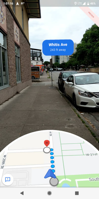
I was on a trip to Austin, Texas – a place that was not familiar to me – and using the AR feature was awesome! It was lunch-time and I wanted to walk somewhere to get something to eat. I opened the Google Maps app on my phone, typed in Subway (the sandwich shop), I then tapped on “Directions”. Afterward, the lower part of the screen on Maps gave me the option to either tap on “Start”, “Start AR”, or “Steps & more”. After tapping on “Start AR”, Maps directed me to point my camera at buildings and streets. Initially, I was not near a street or any identifiable buildings so it did not know where I was. However, when I approached a street, it identified where I was and started guiding me towards my destination.

I chose a Subway that was really close to me, so the directions were really “straight” forward (see what I did there?).

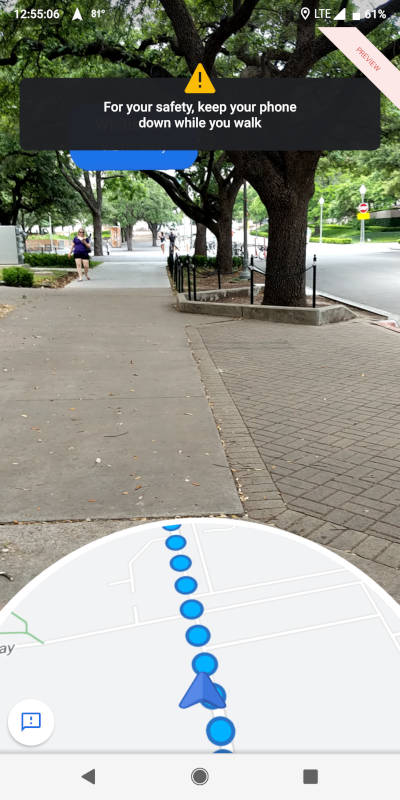
And, for safety purposes, Maps warned me that I should keep my phone down while walking and pay attention to my surroundings so I don’t run into any hazards.

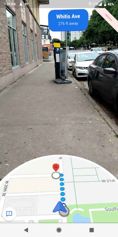
It was really cool to be able to see how close I was getting to my destination.


Getting closer…

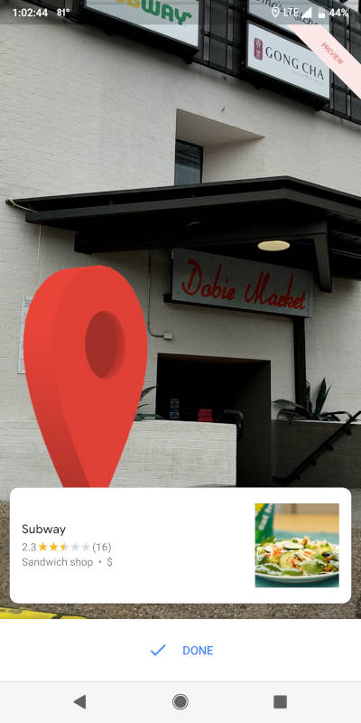
I arrived!! I thought it was really entertaining to see the big red Maps location marker (pin) grow larger as I approached where I was going. This building housed several businesses on different floors so I had to go inside and ask exactly where the Subway was. In a couple of minutes, I found my destination, but no lunch for me! It was CLOSED!!! 🙁

Anyway, I truly love using Google Maps AR! It’s unquestionably helpful and super fun to use.

By the way, when Google first announced the AR feature, they presented an option to use a cute cartoon fox as an AR guide. He was sadly missing from my adventure. Perhaps he went to a Subway that was open.

Filed in categories: Articles

Tagged: ,

I love using Google Maps AR! originally appeared on The Gadgeteer on May 29, 2019 at 3:40 pm.

Note: If you are subscribed to this feed through FeedBurner, please switch to our native feed URL http://the-gadgeteer.com/feed/ in order to ensure continuous delivery.
Declutter Gmail’s web interface by using the Simplify Gmail Chrome extension

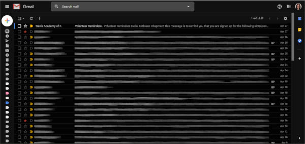
ARTICLE – In the past, my Gmail web interface looked a bit cluttered (shown in the above screenshot). I was curious about streamlining this look and stumbled upon several tech news articles that pointed me toward the Simplify Gmail Chrome extension. This extension was written by a former lead designer of Gmail, Michael Leggett, with the help of some of his friends.

Ta-da! This is what my Gmail looks like after using the Simplify Gmail extension. You can see that the Gmail logo located in the upper left-hand corner of the screen has been removed completely and the Compose “+” button has been moved from the upper left to the lower right corner of the screen.

The “Search mail” box has also been moved from the top center of the screen to the upper right side of the screen. Google’s Calendar, Keep, and Tasks has also been moved from the right sidebar to the Overflow menu (the ellipsis) located just above the Compose “+” button in the lower right corner of the screen.

To see your “Inbox”, “Snoozed”, “Sent”, “Drafts”, “Labels”, etc. menu items in the right sidebar, you just click on the Menu icon located in the upper left corner of the screen. I left these hidden to obtain an even cleaner look.

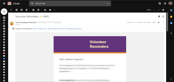
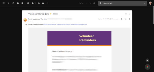
When I opened my emails before using the Simplify Gmail extension, this is what my screen looked like (above screenshot).

And here is what my opened-email screen looks like after using the extension. Again, the Gmail logo is gone and has been replaced with several icon buttons all located on a single line (the “Main Menu”, “Back to Inbox”, “Archive”,  “Report Spam”, “Delete”, “Mark as Unread”, “Snooze”, “Moved to”, “Labels”, and the “Overflow menu” buttons). The “Search email” box has also been moved off to the upper right corner of the screen.

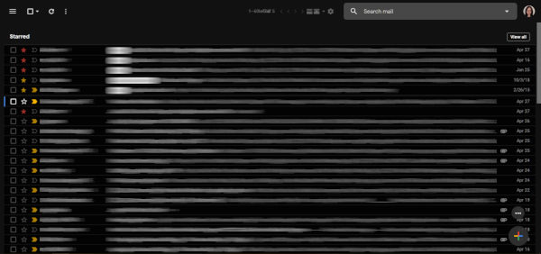
NOTE: Depending on your Gmail settings, this extension may not work for you. For example, it didn’t work well for me when using the “Multiple Inbox” setting in Gmail as shown in the screenshot above. Using Multiple Inboxes with this extension, I could no longer see the distinct inboxes that I set up. And because the list of emails expanded side-to-side to fit the screen, the Compose “+” button overlayed the email list. In addition, the number of emails being displayed (e.g. 1-60 of 60 located at the top center of the screen) was overwritten by that of another inbox. But, once I got rid of Multiple Inboxes, the extension worked well for me.

Just in case you are curious about whether or not it is safe to use his extension, Mr. Legget posted the Simplify Gmail code in GitHub for those of you who wish to examine it.

The Simplify Gmail Chrome extension is available from the Chrome Web Store for those of you who like a cleaner, less cluttered Gmail web interface.

Filed in categories: Articles

Tagged: ,

Declutter Gmail’s web interface by using the Simplify Gmail Chrome extension originally appeared on The Gadgeteer on April 29, 2019 at 8:00 am.

Note: If you are subscribed to this feed through FeedBurner, please switch to our native feed URL http://the-gadgeteer.com/feed/ in order to ensure continuous delivery.
Set your Google Home Mini free with a portable battery base

NEWS – Did you receive a Google Home Mini as a holiday gift? Instead of keeping it prisoner on a table or shelf, tethered to a power cord, set it free with a portable charging base from KIWI Design. The bowl-shaped base holds a 7800mAh portable power charger that will keep your portable voice assistant running all day. Take it with you to the bathroom when you’re getting ready in the morning, out to the kitchen when your cooking dinner, and then to the bedroom to listen to some tunes while you’re falling asleep. The KIWI Design rechargeable battery base comes in 3 colors to match the Home Mini and is priced at $30.99 on Amazon.
Filed in categories: News

Tagged: ,

Set your Google Home Mini free with a portable battery base originally appeared on The Gadgeteer on December 28, 2018 at 10:00 am.

Note: If you are subscribed to this feed through FeedBurner, please switch to our native feed URL http://the-gadgeteer.com/feed/ in order to ensure continuous delivery.