Voamoko Type-C Wireless Numeric Pad with USB Hub review

REVIEW – Do you wish your laptop had a real number pad on it? There are definitely times where I’ve had a project pop up during a trip where a full size keyboard was nowhere to be found. Voamoko’s Type-C Wireless Numeric Pad with USB Hub might just be the solution that you can keep in your bag without taking up much space.

What is it?

The Type-C Wireless Numeric Pad with USB Hub is a portable number pad that you can use with your laptop for the feel of a full size numeric keyboard without the bulk. The built-in USB hub adds some needed backwards compatibility to newer computers.

What’s in the box?
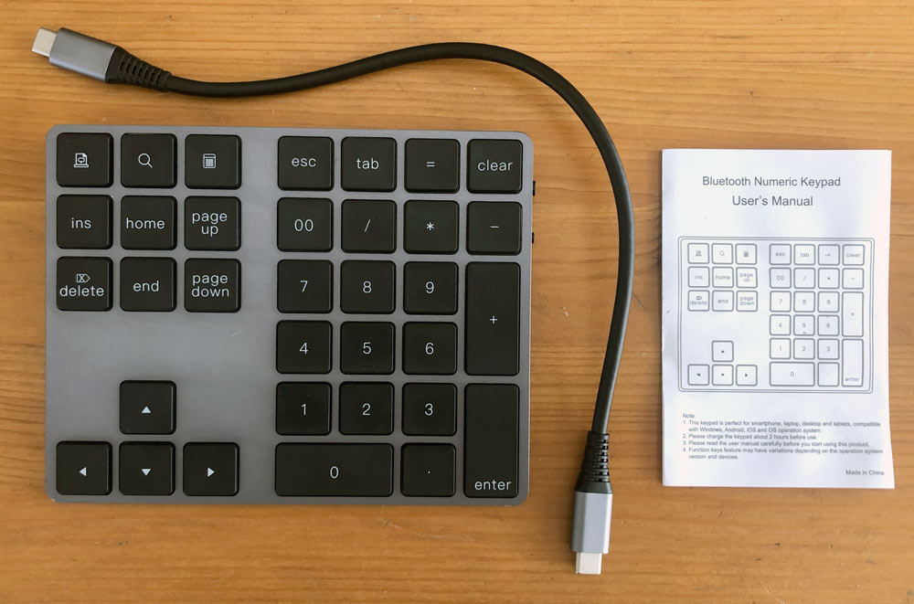
  • Numeric key pad
  • USB cable (Type-C to Type-C)
  • User manual

Hardware specs

Support: Windows/macOS/iOS/Android (Some shortcut keys are not supported on macOS & iOS)
– Keyswitch life & response: 500 million strokes times & 5 millisecond
Design: 34 key aluminum keypad
USB hub: Two USB-A 3.0 ports (when connected with USB-C cable)
Wireless: Bluetooth 3.0 for keypad only functionality
– Controls: Power switch, BT pairing button and LED indicator
Power: Input of 5V at 100mA, Output at 900mA per port
Duration: 2 hours to charge, 50 hours use, ~2 months standby
 Dimensions: ~ 5.5″ x 4.5″ and 0.5″ at top of the ramped design

Design and features

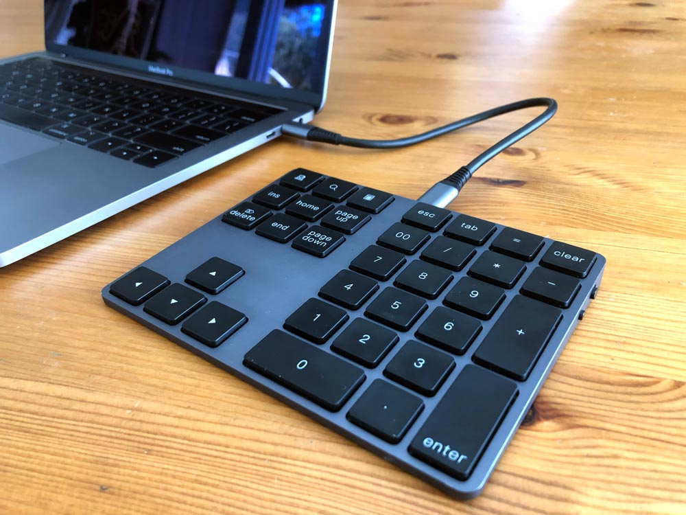
Voamoko’s numeric pad was clearly designed to aesthetically match MacBooks from Apple. It’s available in both silver and space gray so you can complete your kit. It’s also compatible with PCs running Windows and iOS devices.
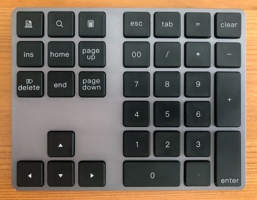
The solution provides a true number pad for anyone craving that extended keyboard feel that’s missing from almost all laptops. Because it’s Bluetooth you can move it exactly where you need it.
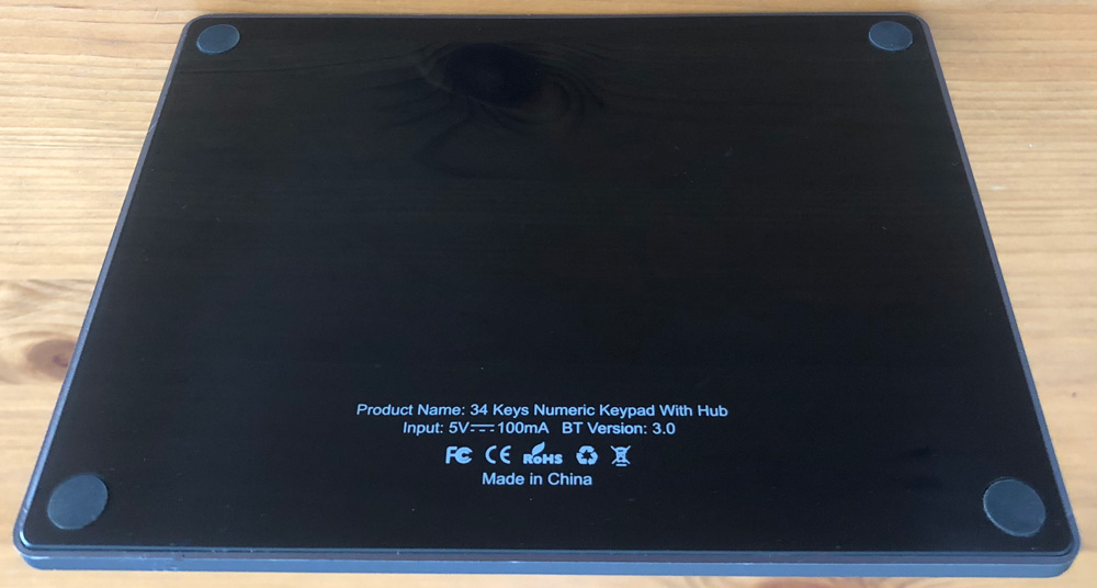
The bottom is plastic which helps with wireless signals and the four rubber feet keep it from moving around.
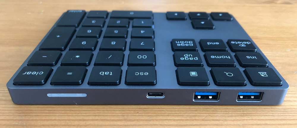
It also adds two USB-A ports when connected with the included USB-C to C cable, which makes it easier to continue using any peripherals you haven’t upgraded to USB-C.
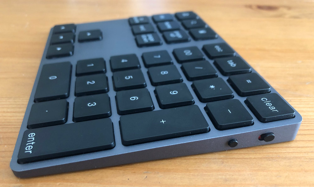
A power switch and a paring button can be found on the right side where you can see the tapered design very similar to the Apple Magic Trackpad.

Setup

First you’ll need to connect the keypad’s USB-C cable and connect it to your computer or a wall adapter.
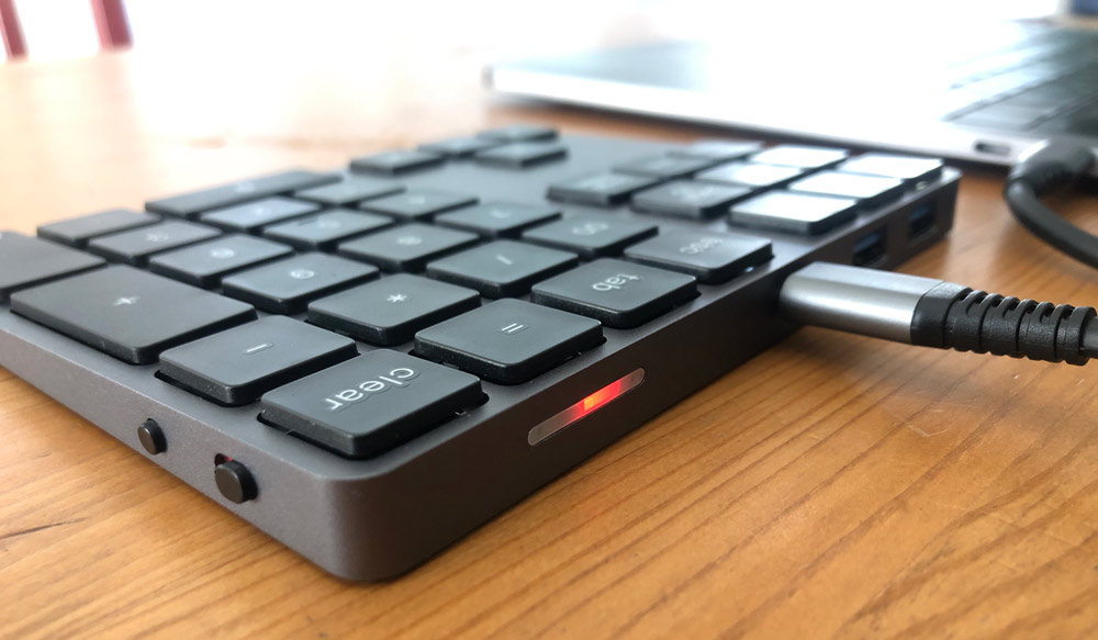
You’ll see a solid red light at the back of the keypad confirming it’s charging. Allow about 2 hours for a full charge. Note that you will not be able to use the keypad until you setup Bluetooth.
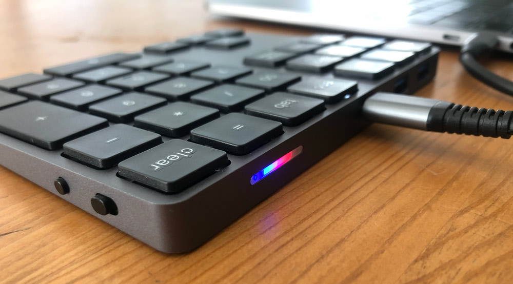
Slide the switch so that green is showing (instead of red) and then press the small round button to place it in pairing mode. On the back you’ll now see a flashing blue light next to the red light. On you computer open your Bluetooth preference panel, look for “Bluetooth Keypad” and click connect.

Performance

I use a standing desk and a large monitor at work with Apple’s Magic Trackpad 2 and full-size Magic Keyboard with Numeric Keypad. It’s a great setup as I work in spreadsheets and gantt programs regularly. The funny part is that I’m actually not at my desk for the majority of the day. When I’m in meeting rooms and elsewhere I’m limited to the numbers along the top of my Macbook Pro. Definitely works, but it’s just not the same as having a number pad when you’re really trying to enter numbers quickly and accurately.

The Voamoko Numeric Pad straight up solves this problem. It’s lightweight, small and fits in a back pocket or between your hand and the laptop you’re lugging around anyway. Just place it next to your computer and switch it on.
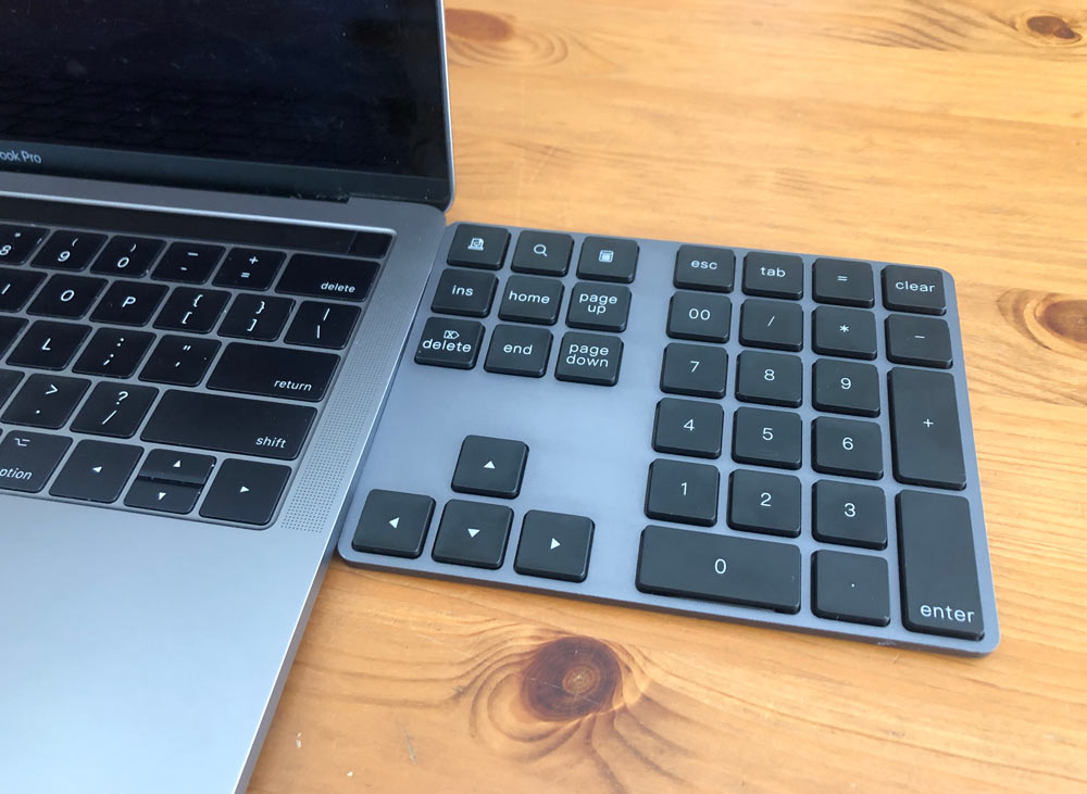
When placed directly next to the right side of my 15″ laptop it’s lays out just like the keys on my Magic Keyboard.

The USB hub is a great feature as you likely have some hard drives, peripherals or that USB-A to lighting cable that came with your iPhone that you connect to your computer with some frequency. It’s a welcome benefit that doesn’t add volume to the keypad in any negative way. It does mean that you need to keep that cable handy or always hanging out of the back of the keypad.
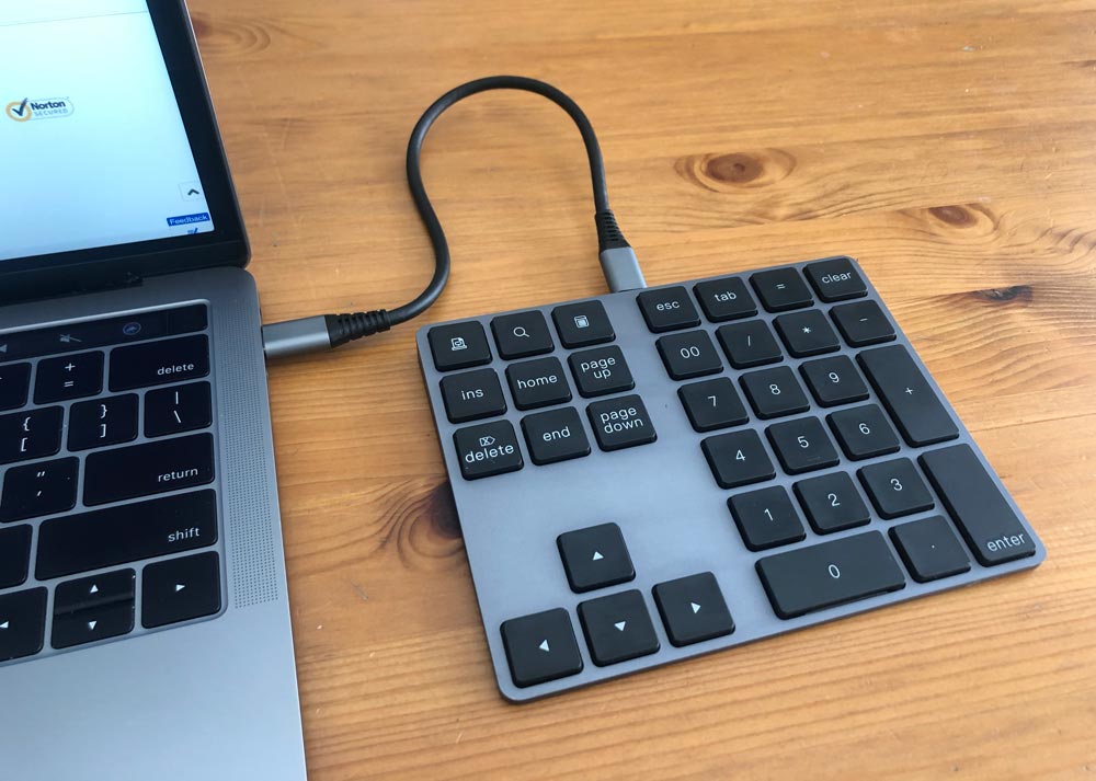
That included cable is short (only x inches) with straight connectors. I connect it to the right side of my laptop since I’m right handed. Does that mean that this could be a great solution for left handed users? As “I’m am not left-handed” (Princess Bride sword fighting scene playing in my head now), I can’t speak to if that would actually be a benefit since you’re likely used to standard key layouts. But back to my previous point, connecting it to the right side ports pushes it further away from my laptop to a point that it starts to feel awkward.

This is either not an issue at all, or an easily remedied problem. If you are only using the number pad functionality and charge the keypad when not it use, you won’t run into this issue. If you want the USB hub functionality, a cable with a 90º connector on the computer end of the cable, or just a longer cable that can reach around to ports on the left side will solve the problem.

As for the actually hub functionality, the USB 3.0 seems to work great. I connected a 3.0 Seagate drive through the keypad and moved a large file (1.36GB) from my computer to the drive in about 10 seconds.
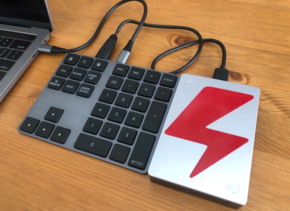
There also seems to be no issue using both USB ports simultaneously. As with any hard drives, make sure your cables are fully pushed in and try not to bump things around while working with them. They all tend to disconnect way too easily.

I was also able to easily pair it with my iPad Pro. I’m not sure I’ll be using it in that scenario very often, but it’s great to know that it can. Finally, there is no backlighting on the keypad which is to be expected, but just wanted to make sure you know.

What I like

  • Number pad with my laptop!
  • Lightweight and low profile
  • Wireless in number pad only mode
  • USB 3.0 hub when used with cable

What I’d change

  • Longer cable to reach to far side of laptop

Final thoughts

If you miss having a numeric pad when you’re on your laptop, this is a great solution. If you need a USB-A 3.0 ports on your laptop, this is a great solution. Either of those alone plus the solid build quality, portability and price puts the on the Voamoko Type-C Wireless Numeric Pad with USB Hub on the recommended list for me.

Price: $49.99
Where to buy: Amazon or Voamoko
Source: The sample of this product was provided by Voamoko.

Filed in categories: Reviews

Tagged: , ,

Voamoko Type-C Wireless Numeric Pad with USB Hub review originally appeared on The Gadgeteer on August 6, 2019 at 8:00 am.

Note: If you are subscribed to this feed through FeedBurner, please switch to our native feed URL http://the-gadgeteer.com/feed/ in order to ensure continuous delivery.

DreamHost Reviewed – Is DreamHost any Good, and Which Plan Should You Choose for WordPress?

Founded in 1996, DreamHost are one of the most well-established independently owned hosting companies in business today. They offer a wide range of packages for all types of websites, including some affordable and feature-packed WordPress focused plans. In this DreamHost review, we focus on those plans aimed at WordPress users, including their lower-priced shared hosting… View Article

The post DreamHost Reviewed – Is DreamHost any Good, and Which Plan Should You Choose for WordPress? appeared first on WinningWP.

Panther Vision PowerCap 2.0 review

REVIEW – For those of us of a certain age, the need for wearable illumination with a wide vertical field to light both fields of view in our bifocals is very important. For years I have been struggling to find a good single-point method that doesn’t require me to adjust the light to provide both distance and reading illumination. Let’s see if the Panther Vision PowerCap 2.0 baseball cap with integrated LEDs fits the bill (pun intended).

What is it?

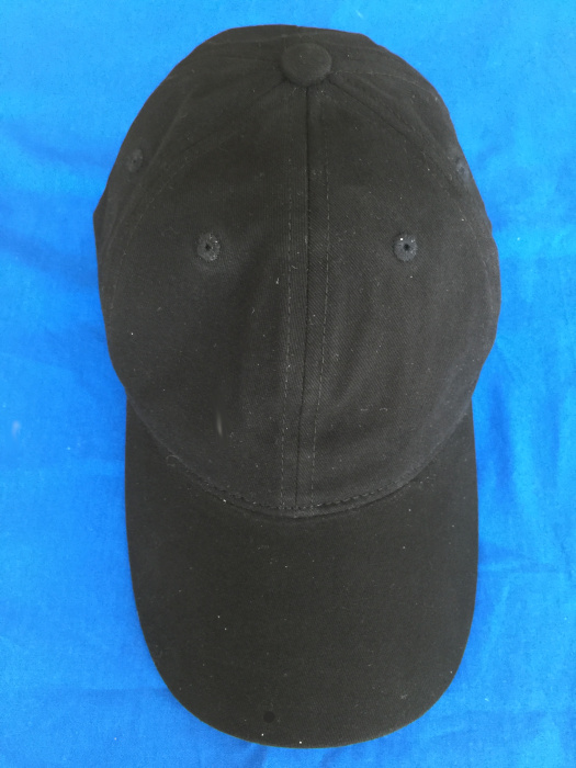
The Panther Vision Power Cap 2.0 is a ball cap style hat with an LED light built into the brim / bill of the cap. The Power Cap is advertised as a “Headlamp in a Hat.”

What’s in the box?

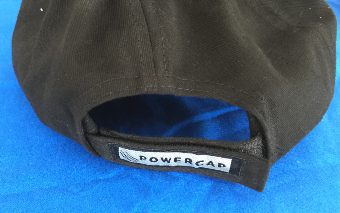
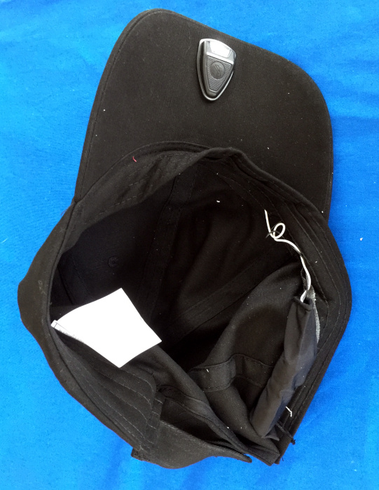
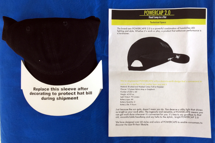
The Power Cap that I received is a black, hook-and-loop adjusting cap. The bill of the cap was protected with a cardstock sleeve that is intended to protect the LED light and its wiring during shipping. A one-page descriptive flyer was also included in the box.

Hardware specs

The PowerCap 2.0 weights approximately 22 ounces when loaded with 2 AA (LR6) batteries. The maximum light output of 75 lumens. Estimated battery life is 9 hours in mixed power-level use.

The PowerCap is available with either a snapback or Velcro strap to adjust sizing.

Design and features

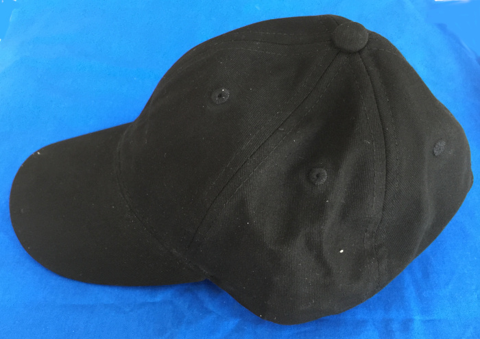
I was sent a plain black, Velcro strap PowerCap 2.0 made from brushed and washed cotton twill with a two-piece Velcro strap that is used to adjust the fit of the cap.

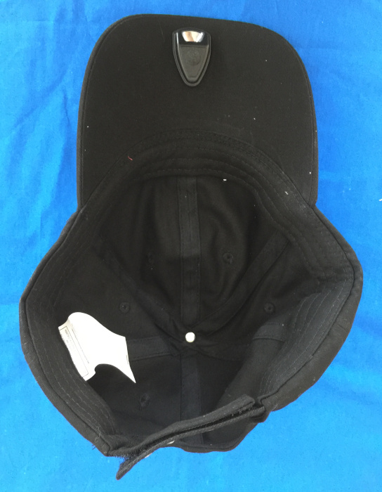
The cap has a single LED module with an integrated switch in the front center of the bill with wires running inside the cloth of the bill and around the side of the cap inside the sweatband. The batteries are housed in a standard AA battery holder that is housed in a cloth sleeve that keeps the battery pack contained in the hat. The battery holder rests just above the sweatband inside the hat, but is noticeable, both visually and by feel when wearing the cap. However, the battery pack does not make the cap uncomfortable, but it does take a period of adjustment.

The location of the battery pack means that the cap is balanced front-to-back better than most headlamps or lights that clip onto the bill of caps (I have about 15 different models of headlamps and clip-on lights and most have a tendency to slip with use).

I would like to see Panther Vision offer the PowerCap with a flex-fit back in addition to the Velcro strap and Snapback size adjusting systems. While I have the beginnings (or early middle) of male-pattern baldness, I still have sufficient hair on the back of my head that it sticks out uncomfortably through the little hole between the adjuster and the body of the cap. This is a general critique I have of most adjustable caps, not just the PowerCap.

The cap is water resistant and hand washable, but the batteries must be removed before immersing the cap for an extended wash.

The PowerCap 2.0 differs from the first generation PowerCap design which sport a larger 2 LED module which spaces the lights out across the bill of the cap placing one roughly over each eye. I find this dual light system distracting due to the dual shadows created by the widely-spaced LEDs.

Performance

Until now, I have been unimpressed with the caps with integrated lighting. At various times, I’ve looked at models with multiple LED lights that cast weird shadows or that don’t cover both near and far parts of my field of vision. Some use coin cell batteries that run down quickly while others place the batteries in positions that make the cap unbalanced or just uncomfortable. I have been equally unimpressed with wearing traditional headlamps over the top of ball caps because the bill of the cap tends to block the light needed for close-up work and the elastic straps have a tendency to either pull the light out of position or pull the whole cap back off of my head. My solution for the past few years has been to attach third-party clip-on lights to my existing hats and caps. My lights of choice have been lightweight models that won’t alter the balance of my hat/cap significantly but eat coin-cell batteries and have a limited lifespan. The PowerCap 2.0 has checked off all of the boxes toward being my unicorn cap (not to be confused with the Figment hat that I purchased at Epcot).

I have been using the PowerCap for several weeks now in situations from crawling around in my attic to wire a new garage light,  to checking my pool pump in the middle of the night, to looking for a dropped pen under my desk, to trips to the latrine on camping trips. It has performed well in all these scenarios (maybe a little too well when camping, I’m not sure I wanted to see all of the latrine’s details).

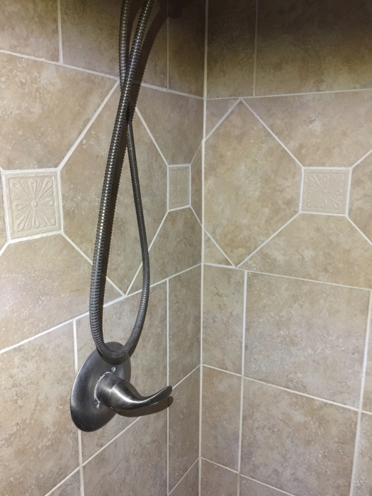
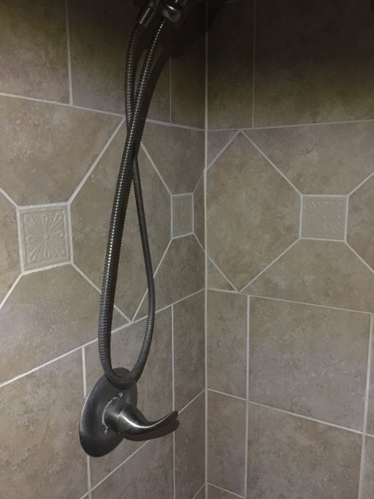
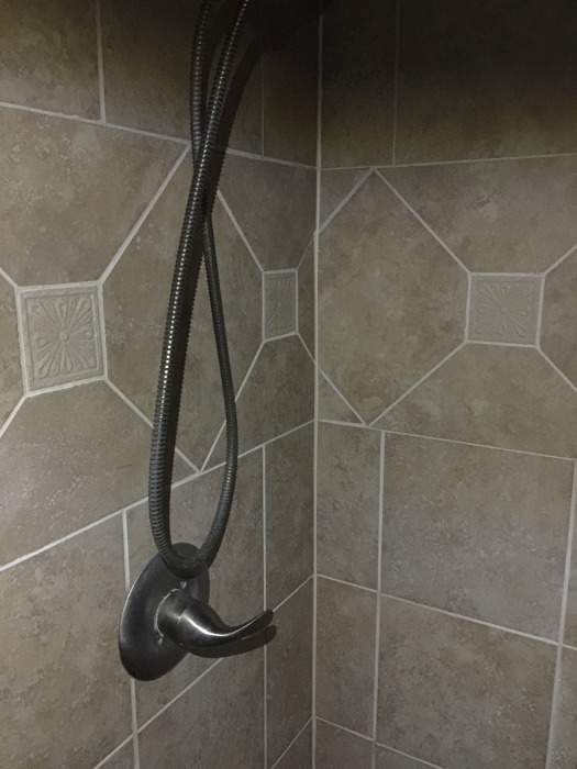
The LED module on the PowerCap 2.0 has a single LED and a large round button that serves to cycle the LED through a typical Off-High-Medium-Low-Off pattern. There is a significant step down in lumens from the high to medium setting and a smaller step down between medium and low. I do not have a light meter to give you the specific reading, but the pictures below, show the setting in a dark test environment–my master bath WC / shower which is the only room in the house without either a window or skylight. The band across the top of the pictures is due to the brim of the cap (50%) and the top bar of the sliding shower door (50%). The pictures show the cycle of off-high-medium-low.

The difference between medium and low is greater than the pictures suggest.  The only time I really use the low setting is for those midnight trips to the latrine when camping (after the first visit).

I would like to see a more intelligent switch design that lets me rapidly cycle through the various light intensities and then switch to an on-off mode after say 10 seconds without pressing the switch. For example, it would be nice for the system to allow me to press the switch button twice to select the medium illumination level and then in two minutes when I’m done with the light, just press the button once more to switch it off, rather than having to cycle through low before arriving at off. It would also be nice if the electronics remembered what setting I last used and return to that setting when I next turn on the light.

What I like

  • Overall comfort
  • Good light coverage (it illuminates both the  distance and reading portions of my field of view through my bifocals)
  • Single point of light rather than multiple
  • Uses AA (LR6) batteries rather than coin-cell for longer battery life

What I’d change

  • I would prefer to see the hats available in flex-fit style
  • Battery pack could be better padded and/or possibly relocated
  • A more intelligent switch that doesn’t require cycling through the different illumination levels to turn it off.

Final thoughts

I find the Panther Vision PowerCap 2.0 to be a big improvement over both the previous generation of PowerCaps and lights that clip on the bill of your existing cap.  I also like it better than traditional headlamps because they don’t work well when worn over the top of a cap, specifically because the bill of the cap blocks the illumination from the headlamp for close up work. I anticipate purchasing many of these to be given away as gifts in the 2019 holiday season.

Price: $29.99
When available: It will be available at Bass Pro Shop, Cabela’s, Dick’s Sporting Goods, and Field & Stream shops by August 5. It will be available at LL Bean by mid-August.
Where to buyPanther Vision, Amazon, Dick’s Sporting Goods, and others.
Source: The sample of this product was provided by Panther Vision.

Filed in categories: Reviews

Tagged:

Panther Vision PowerCap 2.0 review originally appeared on The Gadgeteer on August 5, 2019 at 10:13 am.

Note: If you are subscribed to this feed through FeedBurner, please switch to our native feed URL http://the-gadgeteer.com/feed/ in order to ensure continuous delivery.
Govee TV LED Backlights review

REVIEW – My wife and I love our basement theater room and especially enjoy turning out all the lights and watching our movies like we’re actually in a theater. We had read over and over how LED back lighting made the viewing experience even better. A couple of years ago, we bought a strip light that stuck to the back of the TV and was USB powered, however, it frequently fell completely off the television, the stickers were just not strong enough and it also would not turn off with the TV and had to be plugged in every time. I definitely wanted an upgrade and then the Govee TV LED Backlights popped up for review.

What is it?

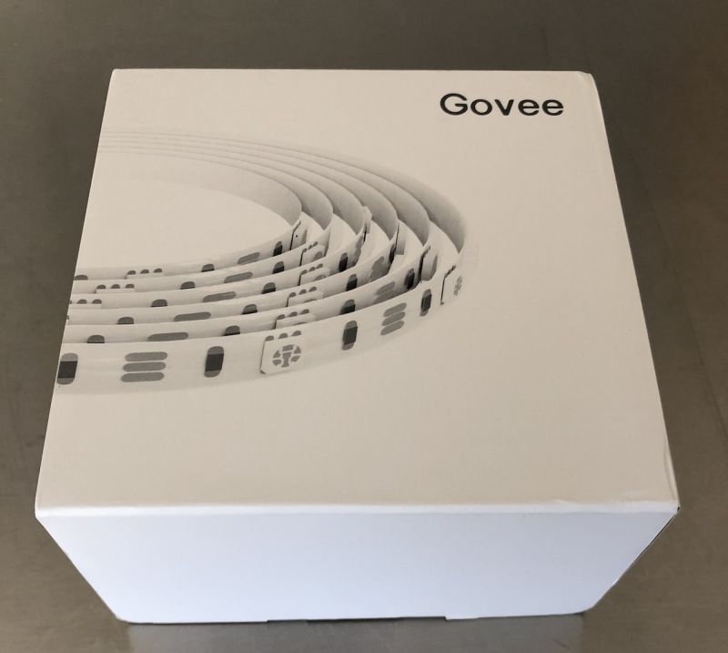
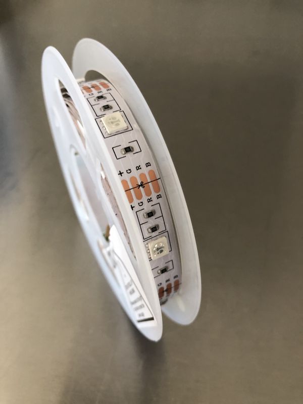
These are multi-color LED lights powered by either USB or power adapter – that connects to Alexa or Google applications for home control. It has a wired remote with push button controls as well. It uses 3M stickers on the backing to apply to the desired surface.

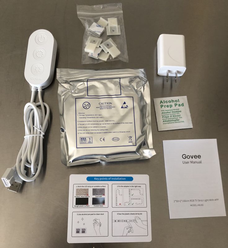
What’s in the box?

  • Power cord with controls
  • Adhesive Clips
  • Power adapter
  • Cleaning swap
  • User manual and install instructions
  • Reel of LED back lights

Design and features

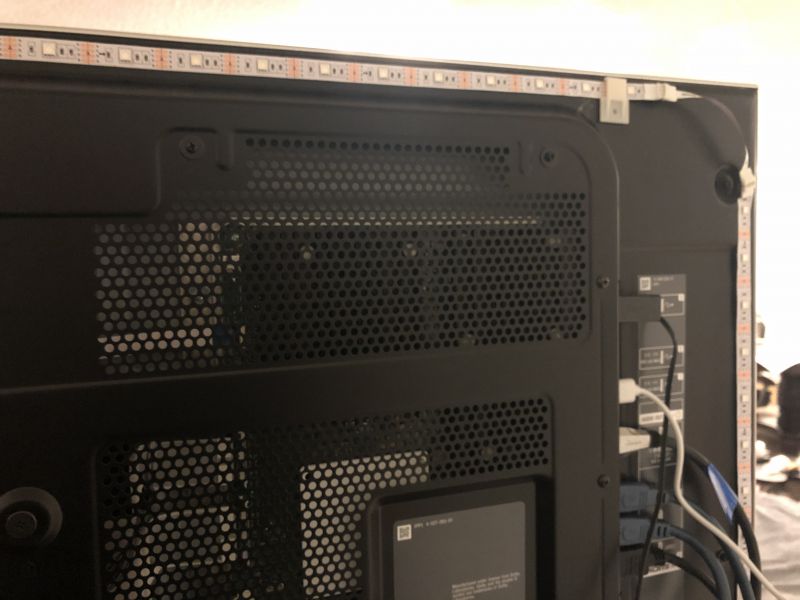
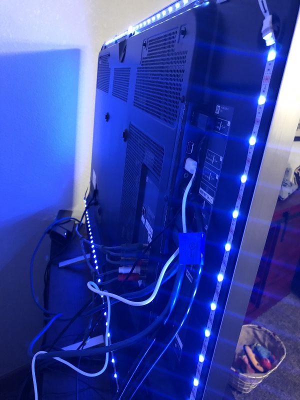
It is a fairly simple design with the reel of LED lights designed to be taken off incrementally, the pull off tape removed and then applied to the desired surface. As I worked my way around the back of the TV, I also applied clips along the top of the screen to lessen the effect of gravity on the strips sticking, which was the downfall of our original lighting. Simply plug the lights into the USB adapter and then into the TV USB slot and you’re ready to go.

After downloading the app, you’re able to connect your phone to the corded remote, although the app is not required to use as all features can be accessed via the wired controller. There are three basic settings: Music, Color and Scenes. Music will change the color based on the ambient music in the room, color allows you to select the specific color, and Scenes is preloaded with 7 different colors for Movies, Dating, Candlelight, Romantic, Breathe, Blinking and Energetic settings. Brightness can be adjusted from 0 to 100%, however if using the USB port on the TV we have found you can only go up to 20% so you will need the included wall power adapter if you want to get the full 100% – however we actually enjoyed the quality at 20% and left it plugged into the TV USB port.

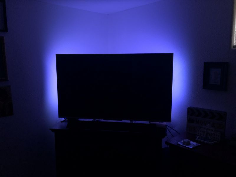
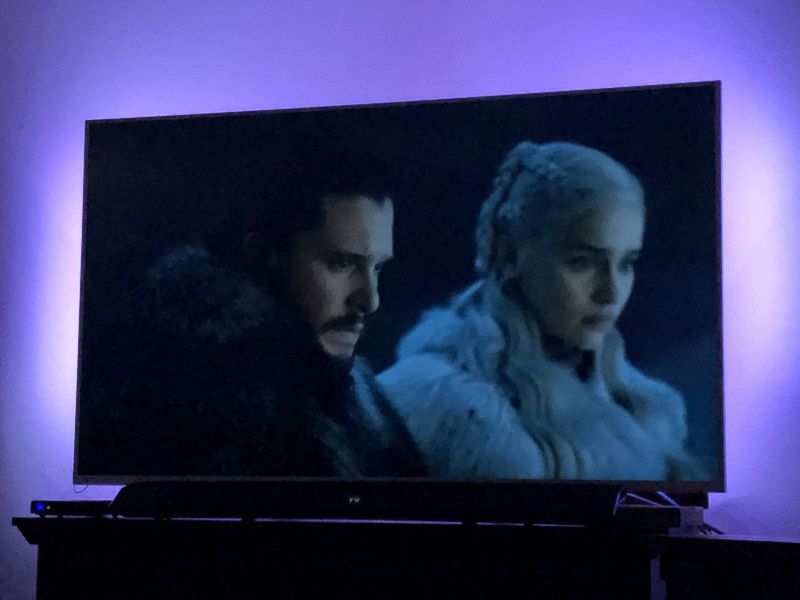
So here you can see the halo it provides behind the television. At first I thought this would be a distraction, however we both found over time that it lessens strain on the eyes and also makes it much easier to transition back to regular lighting once you’re done watching television. As you can see below, it doesn’t have a negative effect on viewing either, as we purposefully picked a rather dark scene from a recent show that we remembered being difficult to see during the first viewing:

Performance

Overall, the performance of the lighting was great. We were able to customize the color to best suit our viewing experience and should we ever have a party, we have built in lighting that will change with the music! Our previous lighting had one color and nothing more than an on/off setting. The strips have stayed adhered to the back of the television without a problem and the controls on the phone or the physical controller both work ideally. It is a bit frustrating that we can’t use it at full power via the USB port on the TV but it is easily remedied by the plug power adapter that is included with the unit. Finally, you can connect it to your smart phone via the company’s app and then also connect it to Google and/or Alexa for voice controls. It integrated nicely into our collection of smartphone controlled devices.

What I like

  • Strong adhesive – stays in place once installed
  • Customizable colors
  • Easy smartphone integration and controls – straight forward product with simple controls

What I would change

  • Honestly, this is the first product I’ve reviewed where I can’t really think of much to improve on. It does what I expect of it and I wouldn’t change a thing.

Final thoughts

I’m thoroughly impressed and delighted with the Govee TV Backlight, it has performed very well and met every expectation. Additionally, it comes at a very reasonable price at $21.99 via Amazon but keep an eye out as I believe they run promotions as well for even more value. I’m glad I was able to pick this item up, it has definitely made our theater room viewing experience better overall.

Price: $21.99
Where to buy: Amazon
Source: The sample of this product was provided by Govee.

Filed in categories: Reviews

Tagged: ,

Govee TV LED Backlights review originally appeared on The Gadgeteer on August 5, 2019 at 8:00 am.

Note: If you are subscribed to this feed through FeedBurner, please switch to our native feed URL http://the-gadgeteer.com/feed/ in order to ensure continuous delivery.
Tom Bihn Nik’s Minimalist Wallets review

REVIEW – We’ve reviewed lots of wallets here at The Gadgeteer, and quite a few products from Tom Bihn as well.  So it only makes sense that we review the new Tom Bihn Nik’s Minimalist Wallet.  How does it stack up against Tom Bihn’s high-quality, durable, well-designed bags and travel accessories?  Let’s find out!  Gadget on!

What is it?

Tom Bihn Nik’s Minimalist Wallet is a wallet that caters to the minimalist crowd in size, thinness, and simplicity, yet is durable, affordable and available in many different colors, fabrics and configurations.

What’s in the box?

Hardware specs

  • Styles:
    • Wallet #1 – $24, Two interior fabric pockets. No exterior pockets.  (reviewed here)
    • Wallet #2 – $26, Two interior pockets — one pocket is fabric, the other pocket is clear urethane for your ID or any other card you might want to show off. No exterior pockets.
    • Wallet #3 – $30, Two interior pockets: one is fabric, the other is clear urethane. One exterior pocket.   (reviewed here)
    • Wallet #4 – $32, Exactly the same as Wallet #3 except for one the addition of a small webbing loop.
    • Wallet #5 – $30, Two interior pockets, both of which are fabric. One exterior pocket (reviewed here)
  • Materials:
    • Exterior:
      • 210 denier 2×2 Ballistic nylon
      • 400d Halcyon
    • Lining: 120d Aether ripstop
    • Window (Wallet #2 & #3 Only): .016″ clear urethane
  •  Colors:
    • 210 Ballistic nylon in Black, Cloud (reviewed here), Coyote, Dawn, Island, Viridian, and Grass
    • 400 Halcyon  nylon in Black and Nordic
  • Dimensions:
    • Unfolded: 5.7″ x 3.9″ / 145 x 100 mm
    • Folded: 2.9″ x 3.9″ / 75 x 100 mm
  • Weight: 0.6 oz / 16 grams (all styles are approximately the same weight)
  • Construction:
    • Made in USA with fabric from Korea / Japan / U.S.A.
    • 100% finished seams

Design and features

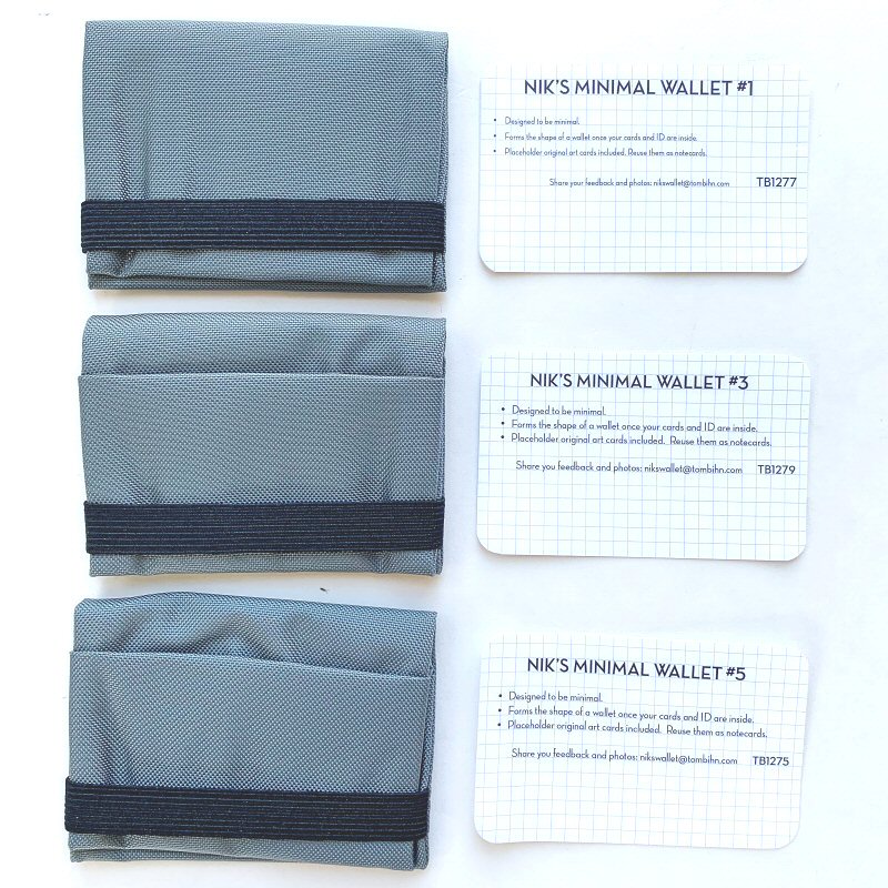
The Tom Bihn folks graciously provided three of the five styles of their Nik’s Minimalist Wallets to review.  Let’s start with the basics that are common to some or all of these wallets, and then we’ll progress into more specific features of the wallets.

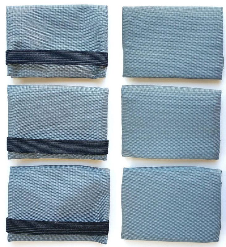
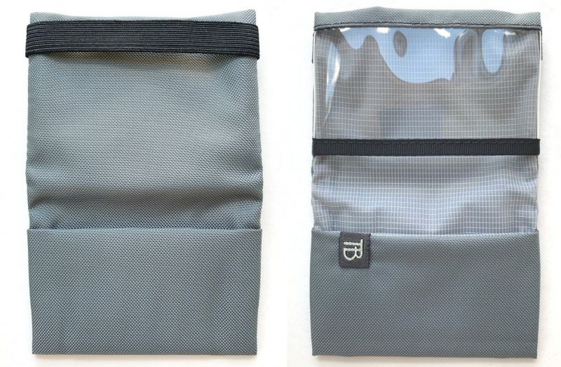
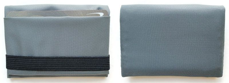
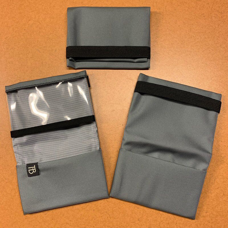
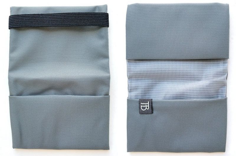
My initial impression of the Nik’s Minimalist Wallets was that they are small, thin, lightweight and feel very well-constructed and durable.  I also really liked the color, which was “Cloud,” a type of gray color that can look different depending on the lighting conditions, as can be seen in the images in this review.  The above photo above shows the “front” and “rear” view of the three Nik’s Minimalist Wallet samples that I reviewed.  All look very similar from the outside and each holds about 6-10 cards and/or some folded cash bills.

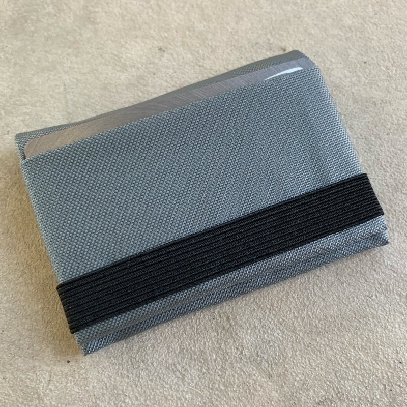
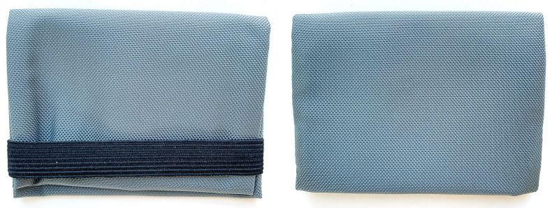
The above photo illustrates the relative footprint size of the Nik’s Minimalist Wallet.  It is quite small and lightweight, and the material is soft, which makes it perfectly suited for either back pocket or front pocket carry, and could even easily be carried in the chest pocket of most shirts.  Additionally, one of the features common to all of the Nik’s Minimalist Wallets is a simple but elegant elastic band, which is used to keep the wallet closed.  It gave me a feeling of greater security knowing that the wallet could not accidentally open or items fall out of it inadvertently due to this elastic band.

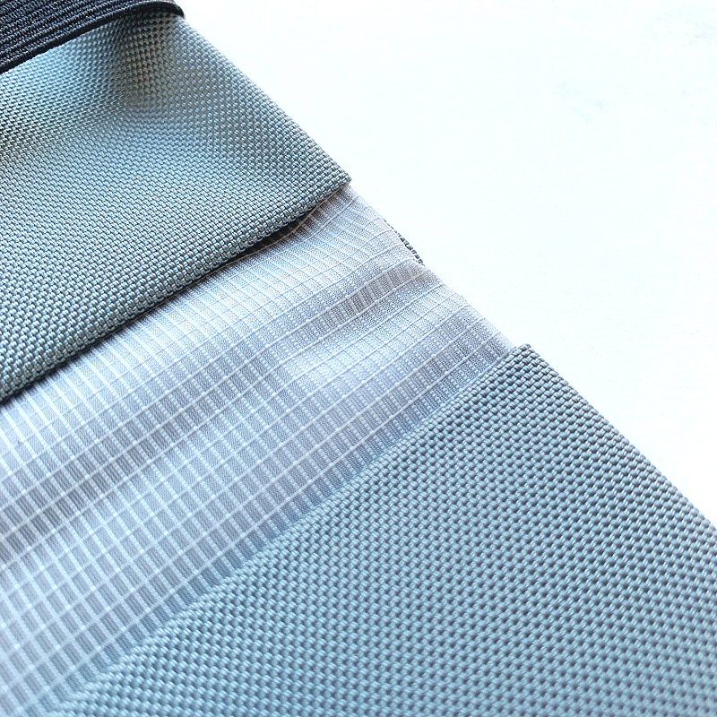
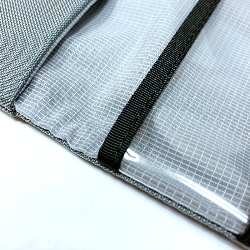
The Nik’s Minimalist Wallet is made from two materials, an exterior shell, and interior lining material.  Depending on the wallet selected, the exterior is either 400D Halcyon nylon or 210D Ballistic nylon, the latter being the material of the wallets reviewed here.  210D Ballistic is a “ballistic” type of nylon material this is lightweight with a smooth feel but very durable, and fairly water-repellant.  The interior lining is 120D Aether ripstop nylon material that is very lightweight and also has some water-repellant properties.  The use of high-quality, lightweight, durable, engineered fabrics like these is among the hallmarks of Tom Bihn’s products.

Nik’s Minimalist Wallet #1

Nik’s Minimalist Wallet #1 is the simplest and most minimalist of the five wallet designs, but don’t let that fool you—it still manages to easily and securely hold several cards and some cash.


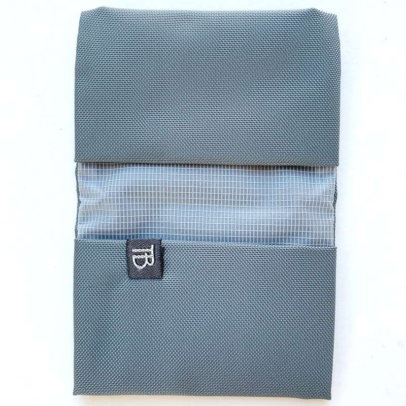
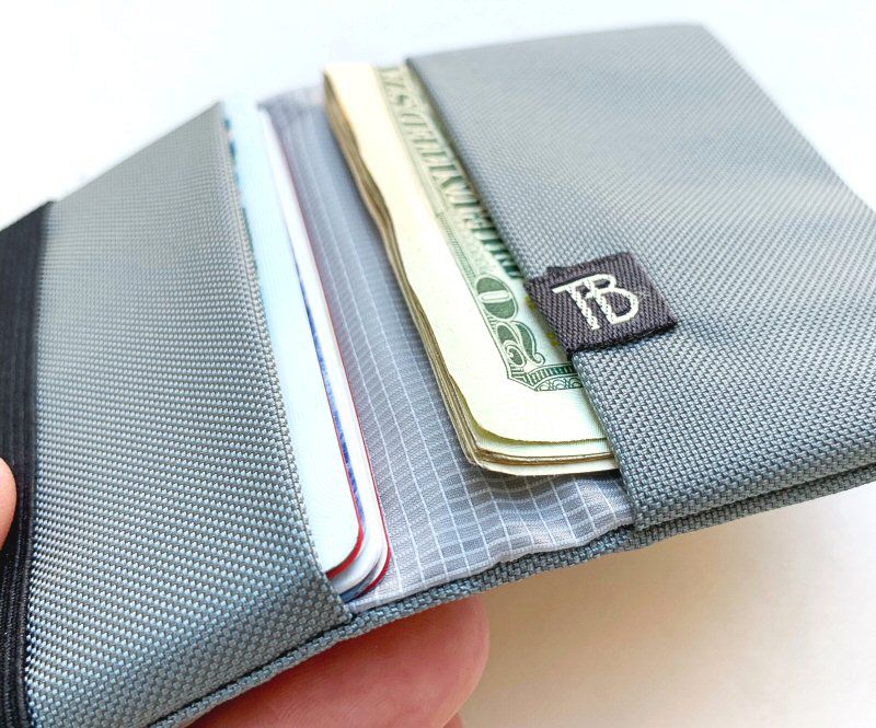
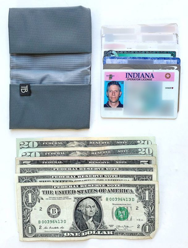
The interior of the Nik’s Minimalist Wallet #1 has two pockets, one on either side, which is the basic interior layout for all of the five wallet designs.  I really like how Tom Bihn has chosen to orient these pockets, with their openings toward the wallet’s central fold.  This means that when the wallet is closed, the likelihood that a card or some cash will fall out is greatly reduced, and when the elastic strap is used, this likelihood reduces to almost zero.   There is also a small, simple “TB” logo tag sew to the inside.  If you’ve read my other reviews, you might know that I am a fan of minimal to no exterior branding, and the Nik’s Minimalist Wallet hits a home run for me here.

Due to the aforementioned fabrics used in the construction of the Nik’s Minimalist Wallet, when empty, it is quite unstructured and even somewhat floppy.  This is by design, as these wallets were intended to be very minimalist and featuring thin, lightweight, durable materials without any rigid stiffening materials that just add bulk and weight.
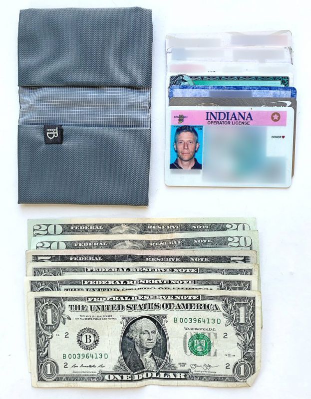
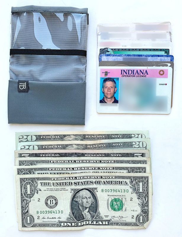
To realistically evaluate the Nik’s Minimalist Wallet, I loaded it up with the above items: 6 bills and 7 cards, which is a fair representation of what I might typically carry in my wallet on an average day.

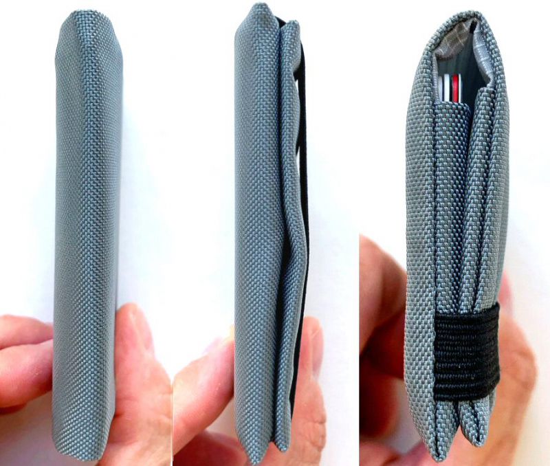
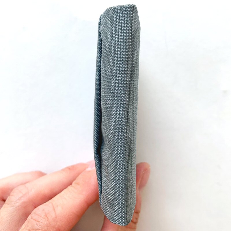
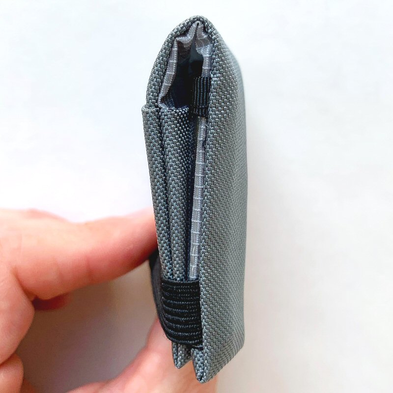
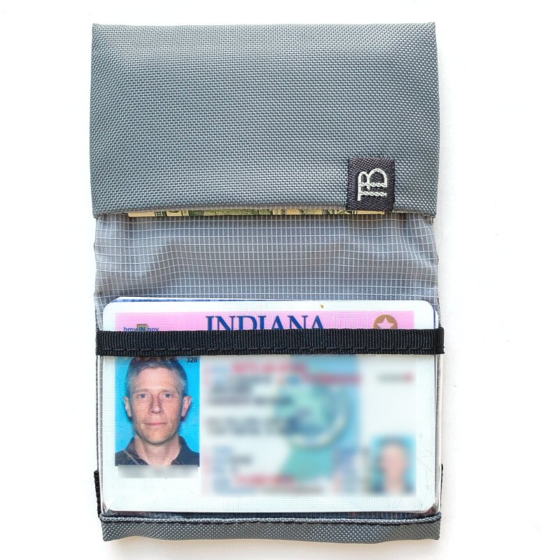
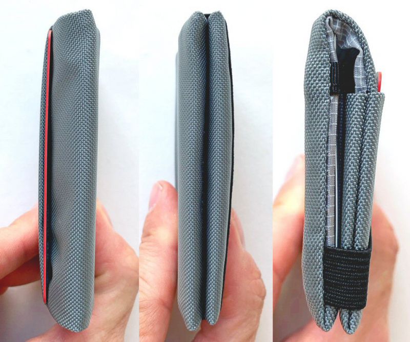
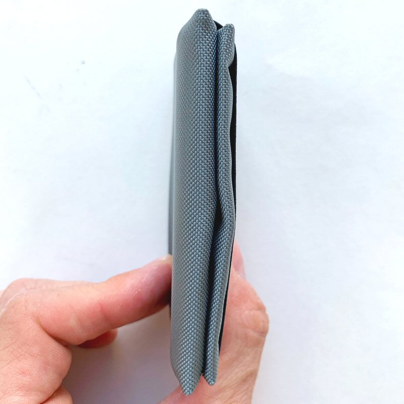
As seen in the photos above, once loaded, the Nik’s Minimalist Wallet #1 takes on form and shape and yet doesn’t really increase appreciably in thickness due to the thinness of its materials and construction.

One aspect I did notice about each of the Nik’s Minimalist Wallets was that when US paper bills are folded in half once and placed into one of the wallet’s pockets, the top edge of the cash sits just past the centerline of the wallet, which is where the wallet would tend to naturally fold.  Note that this effect is also further illustrated in the far right photo in the series of three photos above.  This means that the very top edge of the cash can get a bit curled.  While this is certainly not a show-stopper by any means, I think that if the Nik’s Minimalist Wallet were even just a few millimeters wider, this curling of the edge of the bills would have been prevented.

Nik’s Minimalist Wallet #3

Next up is Nick’s Minimalist Wallet #3.  This version further builds on the features of Nik’s Minimalist Wallet #1 reviewed above.  It add an exterior pocket has the same interior pocket configuration as Nik’s Minimalist Wallet #1, but one of its two interior pockets has been converted into a transparent window pocket for an ID card.

The ID window pocket is made from .016″ clear urethane, which is fully transparent and very durable without adding greatly to the wallet’s thickness.


Even with the added exterior pocket, Nik’s Minimalist Wallet #3 is still quite thin when empty.

What the above photo fails to convey is that, although it may appear thick when empty, this wallet is actually very thin and compressible.

As with Nik’s Minimalist Wallet #1, to realistically evaluate Nik’s Minimalist Wallet #3, I once again loaded it up with the above items: 6 bills and 7 cards, which is a fair representation of what I might typically carry in my wallet on an average day.

I placed the cash bills, folded over twice, in the non-window pocket and all of the cards save one in the window pocket with my ID to the front so that it would be visible should I need to show it.

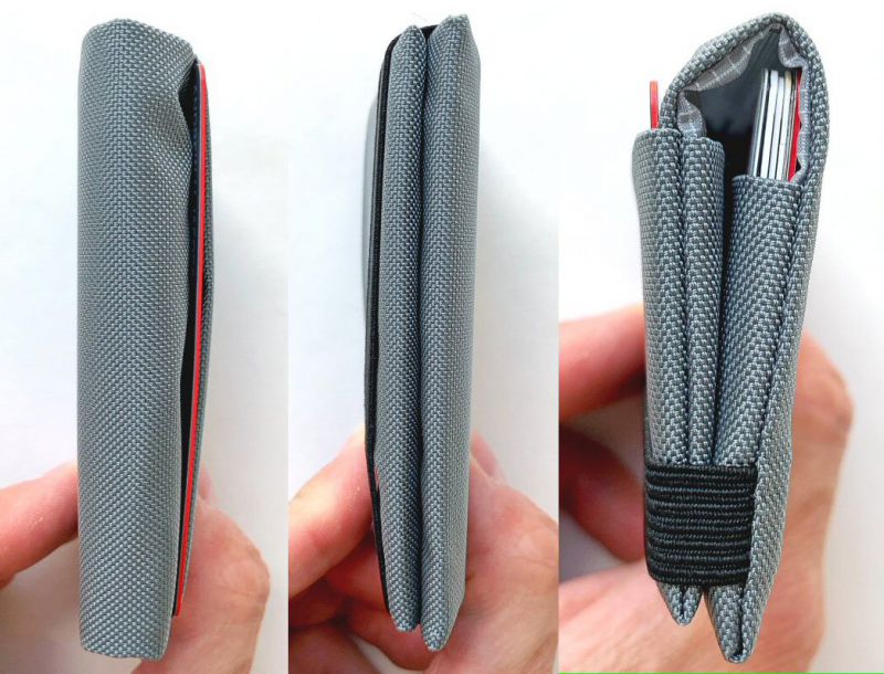
In the exterior pocket, I place the card that I use most often.  The exterior quick-access pocket can actually hold more than one card—I found that it could hold two cards easily and even up to three cards, though this does start to get a bit snug.  While this exterior pocket does provide quick access to your most often used card or two, or even some folded cash, I think the one and only drawback of this pocket is that it is somewhat exposed, so there is the potential for a card or cash placed within it to fall out, though this possibility does seem remote.  Also, the more items that are placed in the wallet (not just in the exterior pocket), the snugger all of the contents fit, thus holding everything together that much more securely.

The series of photos above illustrate that Niks’ Minimalist Wallet #3 does not increase appreciably in size once it has been filled with several cards and cash.

Nik’s Minimalist Wallet #5

Nick’s Minimalist Wallet #5 was the third and final version sent by Tom Bihn.   It includes the same exterior pocket and interior pocket configuration as Nik’s Minimalist Wallet #3, but the transparent urethane window pocket has been converted to a fabric pocket.

As with Nik’s Minimalist Wallet #3, even with an additional pocket added to the exterior, Nik’s Minimalist Wallet #5 is quite thin when empty.

Once again, as with the wallets above, to realistically evaluate Nik’s Minimalist Wallet #5, loaded it up with the above items: 6 bills and 7 cards, which is a fair representation of what I might typically carry in my wallet on an average day.


While the Nik’s Minimalist Wallet #3 is a bit thicker than  Nik’s Minimalist Wallet #1 due to the added exterior pocket, it is roughly the same thickness as Nik’s Minimalist Wallet #3—which is actually quite thin even once loaded.

As with Nik’s Minimalist Wallet #3, the exterior pocket here served quite well for quick-access carry of my most often-used card.

What I like

  • Very small, compact, thin, and lightweight
  • Durable materials and solid construction
  • Highly suitable for back pocket or front pocket carry (or even front shirt-pocket carry)
  • Available in multiple styles, colors, and fabrics to suit the needs of the user

What I’d change

  • Nothing

Final thoughts

really like Tom Bihn’s Nik’s Minimalist Wallet.  Its design is the definition of functional minimalism: simple, yet with enough organizational features to still be useful; lightweight, yet with high-quality, durable materials and construction, and with a small enough footprint and thickness to easily be carried in the back or front pants pocket or even front shirt pocket.  Its many colors, materials, and styles give the user many options to suit his or her EDC  needs.  Plus, the price is extremely affordable at $24-$32 depending on the Wallet style selected.  If you are in the market for a small, minimalist wallet that is durable and affordable, I would encourage you to give the Tom Bihn’s Nik’s Minimalist Wallet a serious look.

Price:

  • $24 for Wallet #1
  • $26 for Wallet #2
  • $30 for Wallet #3
  • $32 for Wallet #4
  • $30 for Wallet #5

Where to buy: Tom Bihn
Source: The samples of this product were provided by Tom Bihn.

Filed in categories: Reviews

Tagged: ,

Tom Bihn Nik’s Minimalist Wallets review originally appeared on The Gadgeteer on August 4, 2019 at 8:39 am.

Note: If you are subscribed to this feed through FeedBurner, please switch to our native feed URL http://the-gadgeteer.com/feed/ in order to ensure continuous delivery.