Nanoleaf remote review

REVIEW – Not all 12 sided dice are for role-playing games. At least one of them can help automate your home.

What is it?

The Nanoleaf remote is pretty unique as remotes go. It doesn’t have any buttons, screens or even charging ports. Instead, it has 12 sides that encourage you to pick it up and play with it. How does it work? What can it control? Let’s find out.

Hardware specs

Dimensions: about the size of a tennis ball (but 12 sided)
Power: runs on 2 AA batteries
Battery Life: 3 years standby, 1 year of active use

What’s in the box?
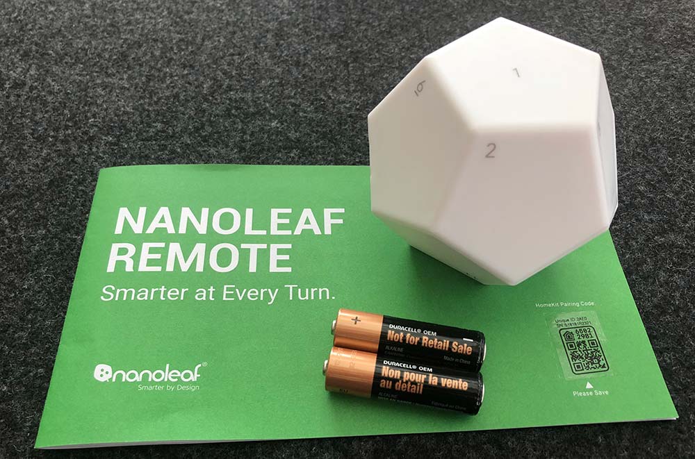
  • 1 Nanoleaf remote
  • 1 Pair of AA batteries
  • 1 Instruction manual

Design and features

The Nanoleaf remote is a dodecahedron with softly rounded corners and edges. It feels good in the hand and it should as the whole premise is that this remote is meant to be touched, picked up and rotated. It’s also a very visual system which makes sense given that Nanoleaf’s core product is a modular lighting system. Each side is numbered 1 through 12 while producing its own color. Each can be individually programmed to act as a trigger for Homekit scenes or Nanoleaf panel color changes. There’s additional functionality if you’re using it with the Nanoleaf panels, as rotating the remote on a given side can adjust the brightness of your panel’s lights.

Setup

Physical setup is as simple as installing the batteries. The remote is already disassembled in the box.
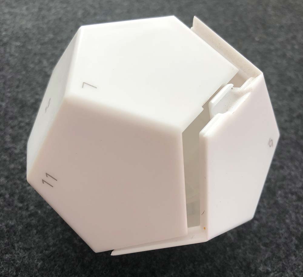
The only thing to note is that the left battery should be negative up and the right is positive up. There’s no physical markings inside on the battery compartment that I could see and the illustration is confusing.
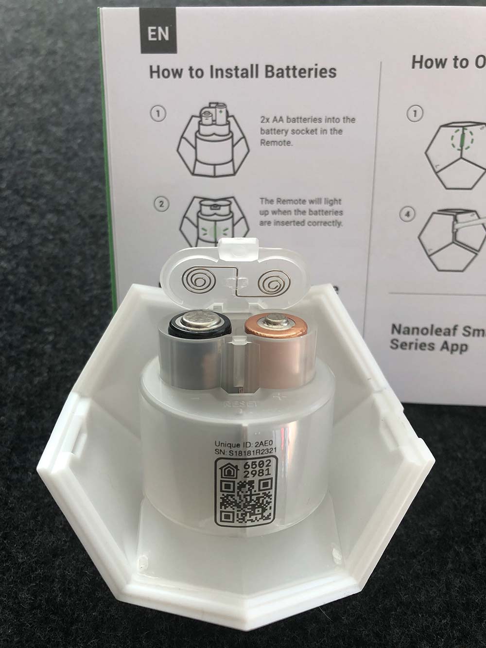
Pretty trivial though as the compartment is easy to open and close, and it lights up right away if you’ve got it right. Here’s a quick video of that startup sequence. (Please excuse the vertical video. I have no idea what I was thinking.)

Before you snap the two sides together, you’ll need to download the Nanoleaf app for Apple or Android and there are QR codes for both in the manual to get you to the right place quickly. Once you’re in the app, create an account and you’re now ready to pair with the remote.

Click the ‘Remote’ button in the bottom center and then the big ‘+’ at the top. Click on ‘Remote’ and then follow the instructions. I used the Homekit Setup Code which found the remote quickly and landed me on a page to customize the name and choose from the rooms I already have set up in Homekit.
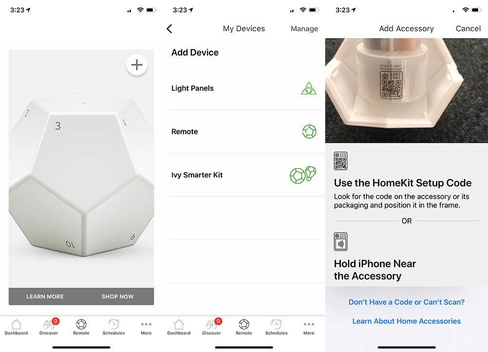
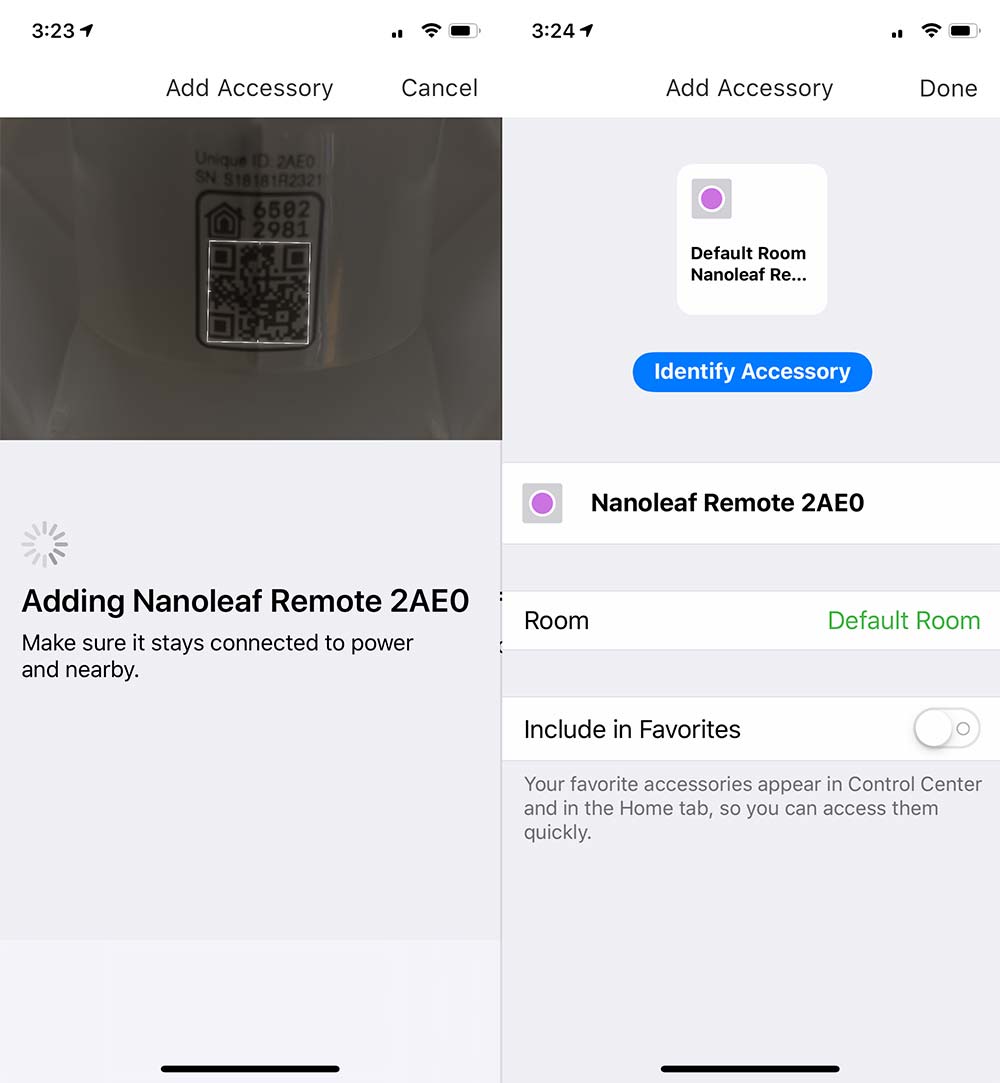
That same ‘Remote’ icon at the bottom now drops you to a screen where you’re presented with all 12 sides to customize. From having set this up originally I had ended up setting side 1 to an ‘All Off’ function, so I repeated that step in the Nanoleaf app for this walkthrough. As you can see in the pic, it has you finish the configuration in the Apple Home app.
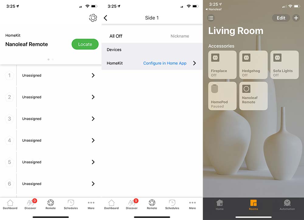
From the Home app, you need to press and hold ‘Nanoleaf Remote’ to see that I have 12 unconfigured buttons and see the ‘Settings’ button. Pressing ‘Settings’ lets you customize all 12 sides. For side 1, I’ve selected 5 lights that I want to turn off. All the others are already on schedules or infrequently used.
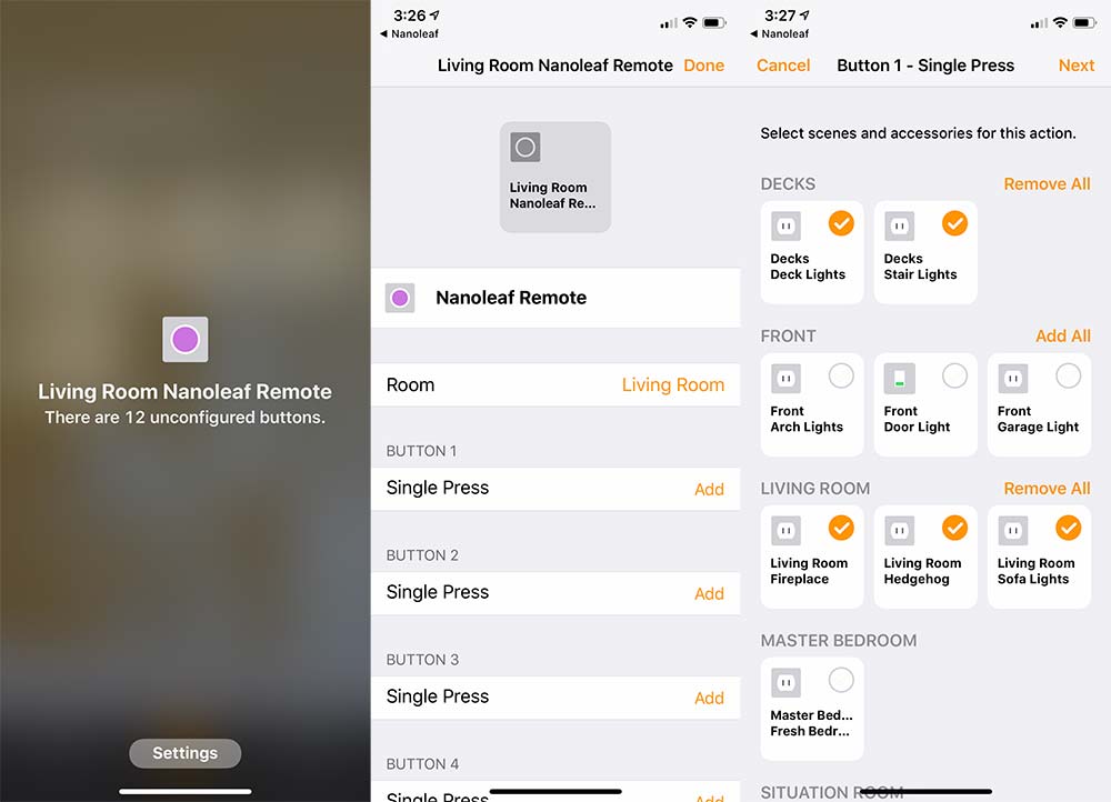
When you hit next, you need to define what action is being taken. In my case, they’re all set to ‘Turn Off’. Then you click done. Continue this for each side and set the action that you’re looking for. In my case, I set each even number to turn a specific Wemo on, and the next odd number to turn that same one off. I did not have actions for the final 3 sides.
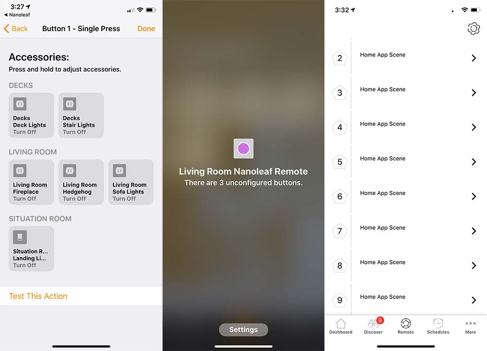
I’ll cover that last pic a bit more about the way I programmed the remote in the next section as I definitely feel like I’m using the remote for a very specific, narrow functionality and not taking advantage of its power.

Performance

In our house, we recently set up an Apple Homepod and added a Wemo Bridge to allow our multiple Wemo products to be Siri/Homepod compatible. We primarily have Wemo Outlets (both original and the newer minis) and then two Switches. As we continue please know that my review is based on controlling Wemo products and not any other Homekit accessories or Nanoleaf products.

We’ve been using Siri to turn on our various accessories, and used Alexa before getting a Homepod. The Nanoleaf remote added a very tactile (and quiet) action to accomplish the same thing. It’s actually quite refreshing instead of talking to a disembodied voice. In our case, picking up the remote and turning it from side 1 to side 2 activates the lights around our sofa.

I started realizing how narrow my use was when I originally set up the remote. I had 2-6 turning on different lights and realized that I needed the ability to turn off specific ones while leaving others on. That meant I needed to be able to remember which sides did what which led me to the even/odd setup which has been working pretty well.

Here’s a video of turning on and off our deck lights at night to give you an idea of the interaction of using it as an on/off trigger.

I can imagine that if you’re using the remote to control Nanoleaf’s own light panels or any other Homekit compatible color changing bulbs, part of the charm may be in the discovery of different color palettes as you rotate to find one that fits your mood. When using it as a binary on/off, you end up looking at each side more to find the number you want to turn to.

It helps that each side produces a different color as you can pick it up and rotate it in your hand until you see the color you want and then wait or set it down to trigger the action. It still means you need some recollection of what each color means. Here’s what that looks like.

There’s also haptic feedback as you rotate the remote in place looking for which number you want to turn to. I’m guessing this is to provide tactile feedback when controlling brightness levels on compatible hardware.

Within the Apple Home app, there’s no additional interaction unless you want to change settings. Back in the Nanoleaf app, however, I was surprised to see that each of the different sides all had the same name… ‘Home App Scene’ (the last photo in the setup section shows this). You could go into each one and retitle it, but it appears that there’s no back and forth communication between the Home and Nanoleaf apps as far as naming action goes, so it would really just be a housekeeping exercise. The Home app (settings) is going to be your source of truth for what the action is anyway.

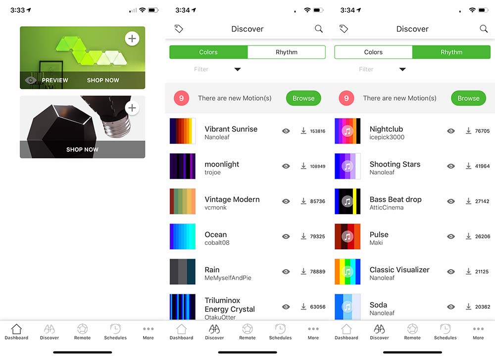
The Nanoleaf app does show a good bit more of what I’m missing by not having Nanoleaf light panels. There are schedule settings, a store and a ‘Discover’ section that has some amazing looking Colors and Rhythms which unfortunately look like they don’t work with the lights within the remote itself as I cannot select it as a device to download to.
As often as Alexa would respond with ‘you have multiple devices with that name’ (I guess many of them share the word ‘lights’); the Nanoleaf remote is not a surefire replacement either.  It’s pretty reliable, but sometimes you’ll turn to the side and nothing happens. I’m going to hedge my bets here and say that this is unlikely to be a sole Nanoleaf issue. Nanoleaf plus Homekit, plus Wemo Bridge, plus Wemo outlet… You get my point. Multiple opportunities for a handoff failure.

What I like

  • The size, shape, and illumination
  • The action of picking it up and rolling/rotating to trigger an action
  • The battery life (assuming it meets their claims)

What needs to be improved

  • Would like to see some of that color customization available for the remote
  • When it doesn’t trigger a light, it’s hard to understand what didn’t work

Final thoughts

I have to say that it’s incredibly fun to play with.  It’s also a great conversation starter. It looks cool, so guests pick it up and are intrigued by the light changing on the remote itself, and even more so when lights around them power up.  Somehow this just feels more magical than asking our non-human family member/assistants to do the same thing.

Price: $49.99
Where to buy: Nanoleaf
Source: The sample of this product was provided by Nanoleaf.

Filed in categories: Reviews

Tagged:

Nanoleaf remote review originally appeared on The Gadgeteer on September 17, 2018 at 4:00 pm.

Note: If you are subscribed to this feed through FeedBurner, please switch to our native feed URL http://the-gadgeteer.com/feed/ in order to ensure continuous delivery.


Thwart the laundry room sock monster!

NEWS – Get your own army of monsters to combat the monster that eats your socks every laundry day!  Insert a pair of socks into one of these Sock Monsters, and the pair will make it through the washer and dryer together.  You can even leave the socks in a Monster for drying on a clothes line.

Each Monster is 1.96″ x 2.55″ x 1.96″.   They are made of silicone and are, of course, washer- and drier-safe.  You’ll get 8 sock grippers in each set.  Sock Monsters are $12.99 at Animi Causa.  You might want to pick up a set for each family member!

Filed in categories: News

Tagged:

Thwart the laundry room sock monster! originally appeared on The Gadgeteer on September 17, 2018 at 11:00 am.

Note: If you are subscribed to this feed through FeedBurner, please switch to our native feed URL http://the-gadgeteer.com/feed/ in order to ensure continuous delivery.

Logitech MX Vertical advanced ergonomic wireless mouse review

REVIEW – Do you have hand or wrist issues due to an RSI (repetitive stress injury) from using a mouse with your computer day in and day out? I’ve had some issues with my mousing hand for a year or so and have been trying a variety of ergonomic mice to see if one of them might help with those issues. The newest mouse that I’ll be testing is Logitech’s MX Vertical advanced ergonomic mouse.

What is it?

The MX Vertical is Logitech’s latest mouse which has been designed to provide a more neutral grip to prevent forearm twisting which can lead to RSI.

What’s in the box?

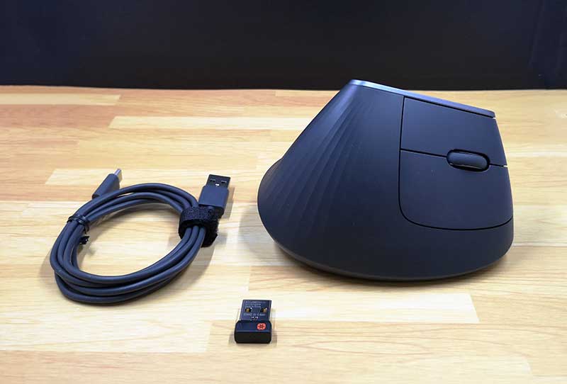
  • Logitech MX Vertical mouse
  • USB receiver
  • USB-C charging cable

Design and features

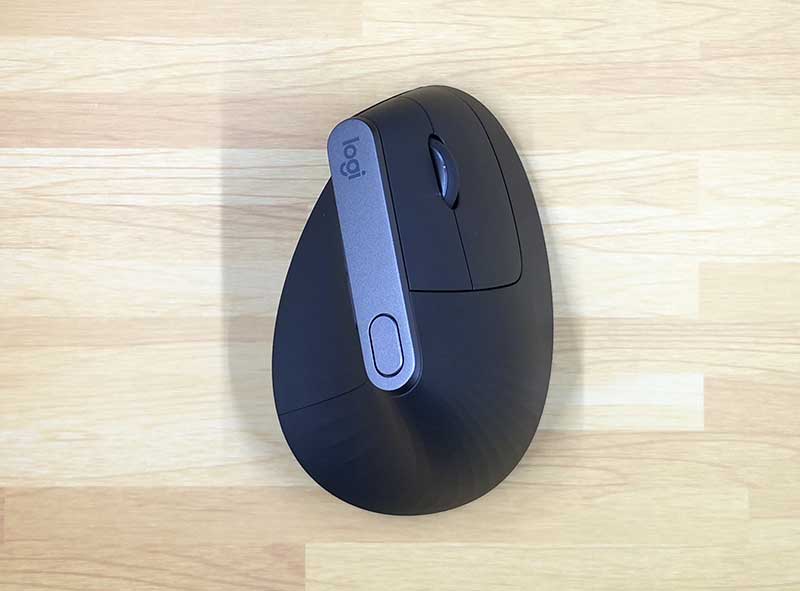
The MX Vertical mouse has a similar style to Logitech’s other mice including the MX Master 25 which I’ve been using for the past year or so. The MX Vertical has a dark gray / slate colored soft touch covering that provides grip and comfort.

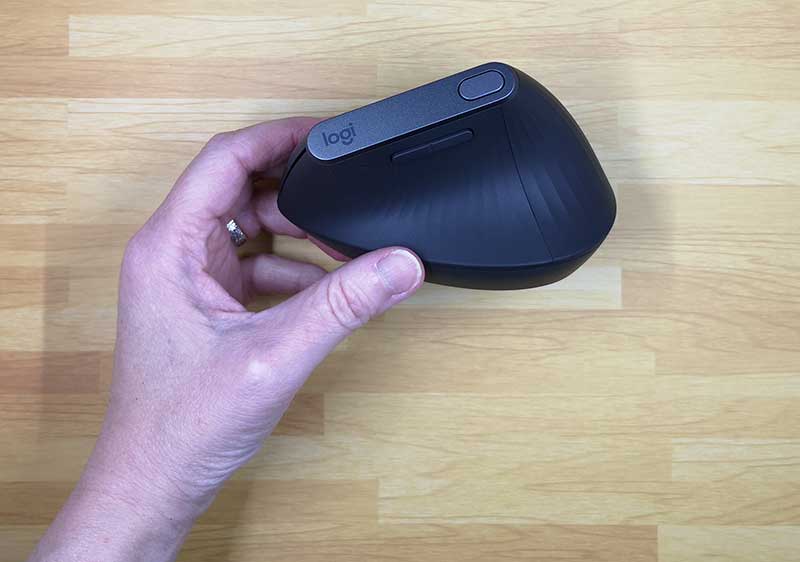
This is a 2 button mouse with a click scroll wheel, and 3 other programmable buttons. A large button on the top and rocker button above the thumb rest area.

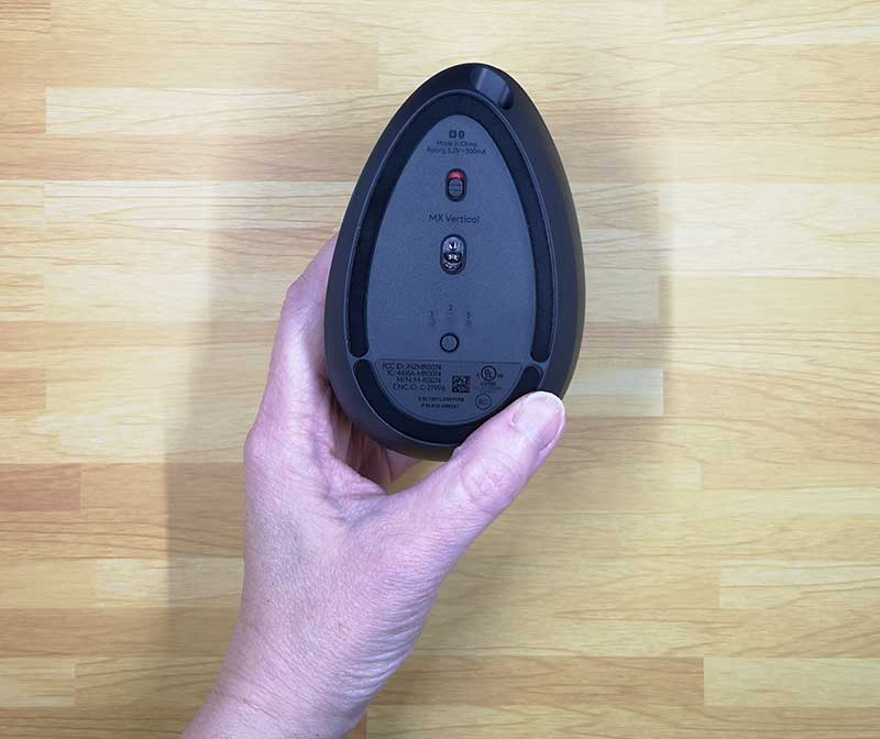
On the bottom of the mouse are the power switch and the channel switch that allows you to switch between up to 3 different devices that are paired with this mouse since the mouse can be connected to your computer, or tablet via Bluetooth or the included USB receiver. You can have the mouse connected to your laptop using the USB receiver and your phone or tablet using Bluetooth and easily switch between them with a press of the button on the bottom of the mouse.

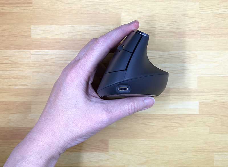
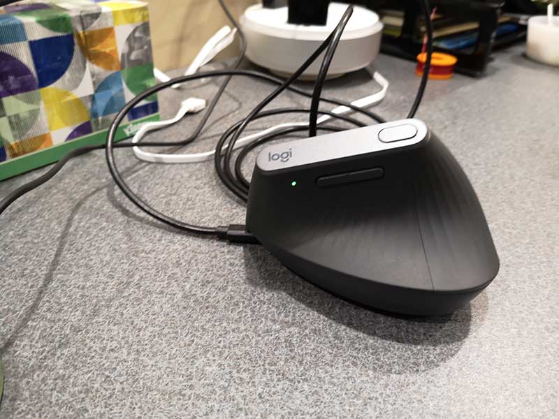
You can also connect the mouse to your computer using the included USB-C cable which plugs into the front of the mouse.

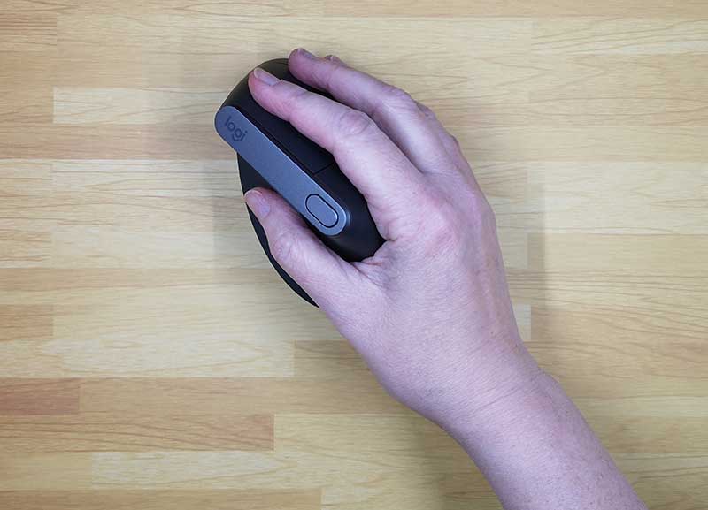
As mentioned, the MX Vertical is designed to provide a neutral grip so that you don’t have to rotate your forearm counterclockwise to use it. It provides a 57-degree angle that is supposed to deliver the optimal ergonomic posture for your hand. There’s a ledge for your thumb to rest and your index finger and middle fingers rest on the left and right buttons.

Let’s mouse around!

Like with any battery powered device, the first step before using it is to charge it up. To charge the Logitech MX Vertical mouse, you just connect the included (or any) USB-C cable to your computer or a USB power adapter. A small LED will light up to let you know that the mouse is charging. A full charge power the mouse for up to 4 months and if it does run out of juice, you can get 3hrs of use out of a quick 1-minute charge.

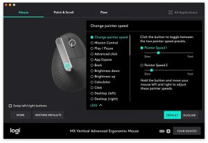
After charging is completed, you can start using the MX Vertical right away but connecting it to your computer using one of the three methods already described above. Out of the box, the left and right mouse buttons work as you would guess they would and the scroll wheel does what scroll wheels do… it scrolls. The scroll wheel can also be clicked to select things like most scroll wheels can do. By default, the top button can be used to switch between two pointer speeds and the rocker button scrolls left and right. However, if you don’t like those settings, you can customize them using the Logitech Options app for PC or macOS.

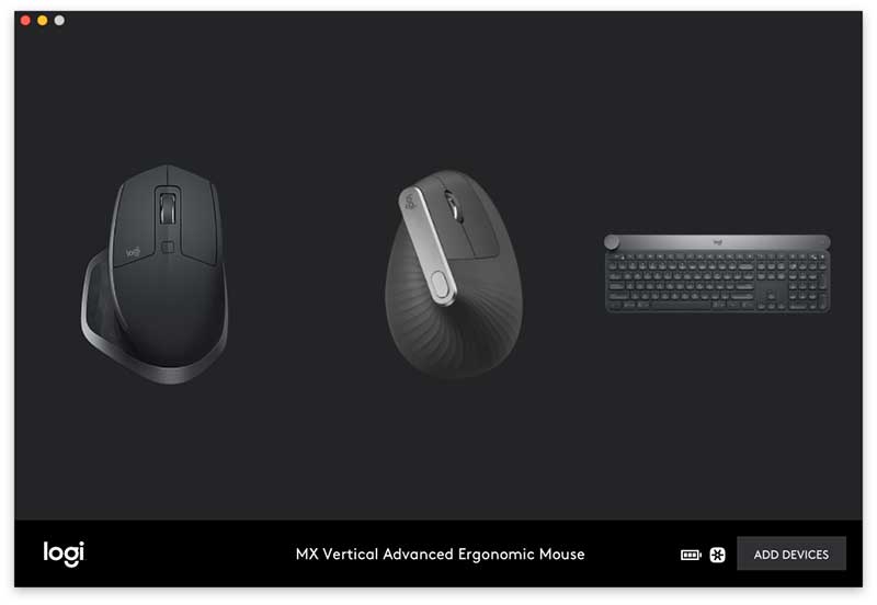
This app will detect all your Logitech connected devices and let you program and customize buttons and settings.


The options app will also let you setup Duolink which gives you the ability to control the computer using gestures with the mouse while holding a function key on the keyboard.

What I like

  • 4-month battery life on a full charge
  • Smooth movement on desktop
  • Multiple device switchable

What needs to be improved

  • Scroll wheel feel
  • Needs to be heavier

Final thoughts

I’m a big fan of Logitech products and have been using their mice and keyboard for years. I use their Craft keyboard daily and the MX Master 25 mouse daily. I was excited to try the MX Vertical because I do have inflammation in my mousing thumb and thought it might help. But, after using the MX Vertical for the last couple of weeks, I’ve switched back to the MX Master 25 which feels better to me for a couple of reasons.

First of all, I don’t like the feel of the MX Vertical’s scroll wheel. It has a ratchet click feel (and sound) when you scroll it vs. the completely smooth scroll setting on the MX Master 25 mouse which I prefer.

I also found that it was harder to do select text and do finer cursor movement in apps like Photoshop when I use the MX Vertical vs. the MX Master 25.

For me, I didn’t find that the ergonomics provided enough benefit to make me want to switch from my current favorite mouse. All that said, there’s nothing wrong with the Logitech MX Vertical. It’s a nicely made wireless mouse that works just fine for most people and for most tasks. It’s just not going to become my new favorite.

Price: $99.99
Where to buy: Amazon
Source: The sample for this review was provided by Logitech.

Filed in categories: Reviews

Tagged: ,

Logitech MX Vertical advanced ergonomic wireless mouse review originally appeared on The Gadgeteer on September 17, 2018 at 10:00 am.

Note: If you are subscribed to this feed through FeedBurner, please switch to our native feed URL http://the-gadgeteer.com/feed/ in order to ensure continuous delivery.
Kingston DataTraveler Bolt Duo review

REVIEW – Phones and even tablets often serve as the most-used, or even the only, camera that most people have these days.  The cameras on most of these devices take great pictures, so they are a good, convenient method of documenting your daily life.  The problem with relying on a mobile device as your camera is that there isn’t unlimited space to store your pictures plus the apps and other data you need.  There isn’t always an easy method of transferring your photos to another device so that you can delete some images to free up space again.  In the past, I have reviewed a flash drive that allowed you to transfer images from your mobile device to a computer, but that device had some problems.  (It worked great, but it turned out to rely on an app that wasn’t written for it nor supported for it.)  There are no such problems that I encountered when I was reviewing the Kingston DataTraveler Bolt Duo flash drive for Apple mobile devices.  Let’s give it a closer look.

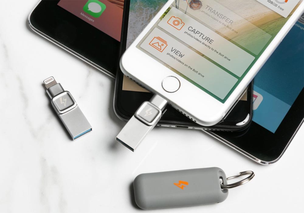
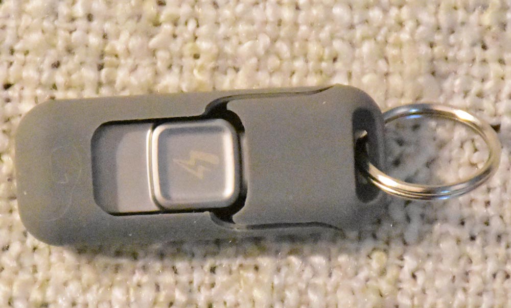
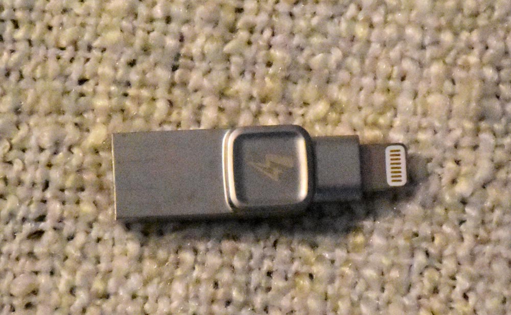
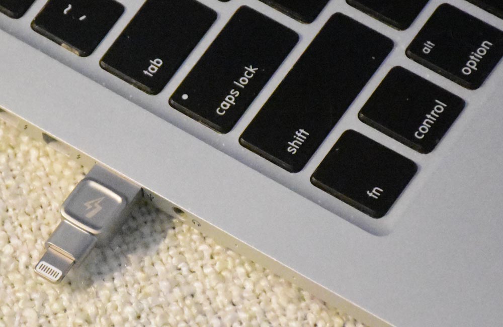
The Kingston DataTraveler Bolt Duo (seen at the top in an image from Kingston, but all others are my own images) is a flash drive with a Lightning connector on one end and a USB 3.1 plug on the other.  It’s Apple® certified, so it’s designed to work with most models of the iPhone and iPad.

Please forgive the dust and lint on the silicone sleeve.  It is a dust magnet!

Hardware specs

  • Connections: 1 Lightning, 1 USB 3.1 Gen 1
  • Dimensions: 1.6″ x 0.48″ x 0.26″ alone; 2.6″ x 0.79″ x 0.43″ in keychain accessory
  • Weight: 0.25 ounces alone; 0.51 ounces in keychain accessory
  • Compatible with:  iPhone 5, iPhone 5s, iPhone 6, iPhone 6+, iPhone, 6s, iPhone SE, iPhone 6s+, iPhone 7, iPhone 7+, iPhone 8, iPhone 8+, iPhone X, iPad (4th generation), iPad Air, iPad Air 2, iPad (2017), iPad Mini, iPad Mini 2, iPad Mini 3, iPad Mini 4, iPad Pro (1st generation), iPad Pro (2nd generation)
  • OS support:  iOS 9.0 and newer
  • Warranty:  2-year warranty with free technical support
  • Capacity:  32GB with storage for up to 8000 photos or two hours of video; 64GB with storage for 16,000 photos or 4 hours video; or 128GB with storage for 32,000 photos and 8 hours of video

Setup

Setup couldn’t be simpler.  You plug the Bolt Duo into your iPhone or iPad and follow the prompt to install the app from Apple’s App Store.

Once it’s installed, you’ll see options and the capacity of your Bolt Duo.  You’ll see that I received the 64GB drive.

The app has three options:

  • Transfer photos or videos to the Bolt drive
  • Capture photos or videos using the Apple device’s camera and microphone directly to the Bolt drive
  • View the contents of the Bolt drive on the Apple device

Each time you plug the Bolt into the iPhone or iPad, you’ll be prompted to allow the app to access the Bolt device.  You’ll also be asked to allow the app to access the device’s camera and/or microphone when you want to capture images or videos directly to the Bolt.

Performance

Of course, I started out by transferring images from my iPad to the Bolt Duo.  It took at least five minutes to transfer the 2000 images and videos I have on my iPad to the flash drive.

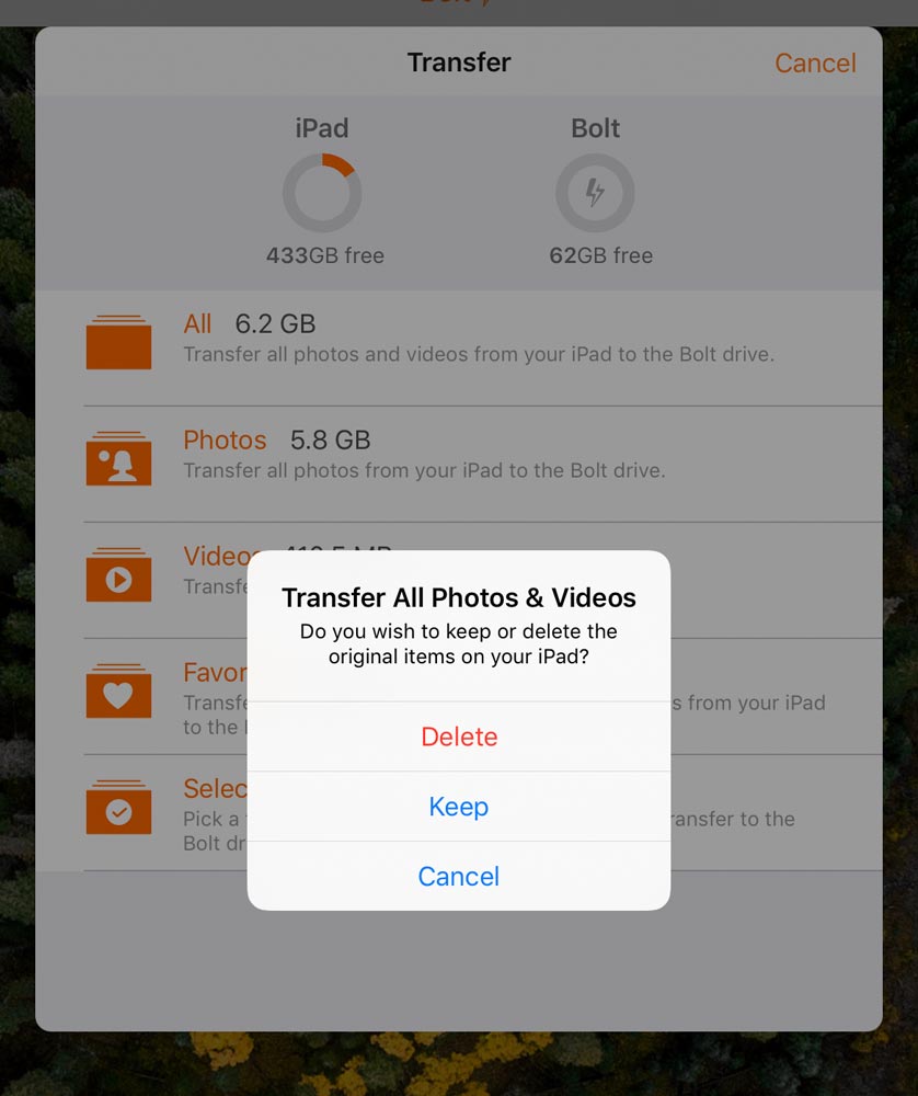
You can choose to copy over all photos and videos, only photos, only videos, only things in a Favorites album, or you can select only certain images/videos to transfer.  You can also keep everything on the iPad/iPhone or you can choose to delete them as they copy.  I retained all mine on the iPad.

After the transfer was complete, I used the app to View the contents of the flash drive.  Without looking at each and every one of the 2000 items on my iPad, it seemed that everything was copied to the Bolt.

I used the Capture option to store a photo directly on the Bolt.  After allowing the app to access the camera and mic, taking a picture with the app was as easy as taking a picture directly on the iPad.  There are only three camera modes in the app, though.  You can take a regular photo, a square photo, or a video.  Once the photo was snapped, it showed up on the Bolt in a new album, called Bolt Camera.  There was no appreciable delay in saving the image to the flash drive.

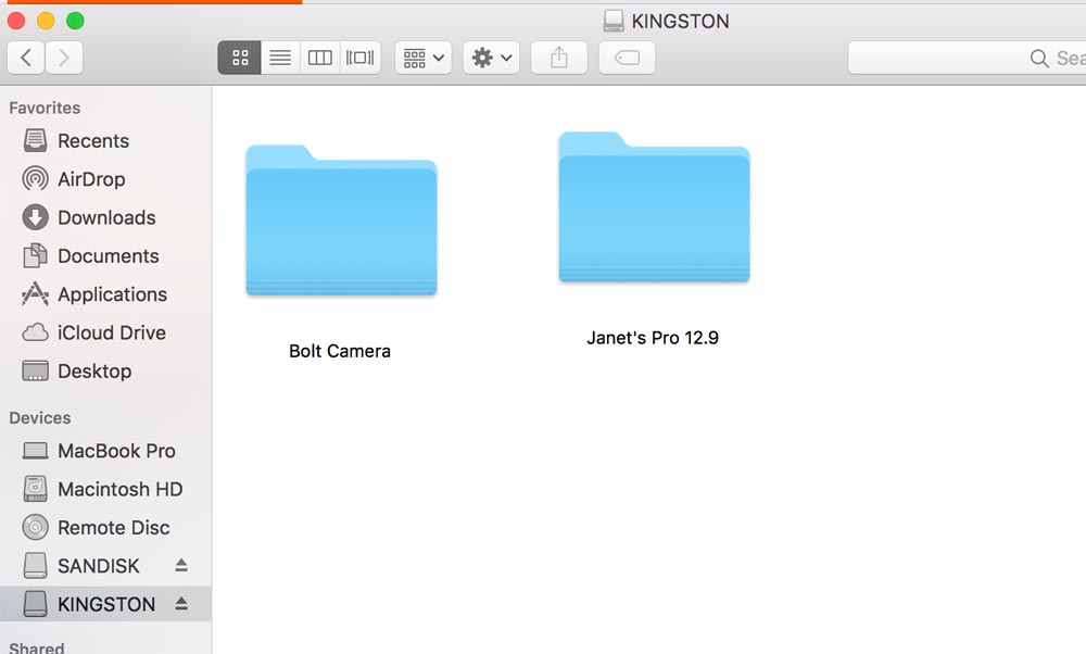
I next plugged the Bolt Duo into my MacBook Pro and checked out the contents of the Bolt using Finder.

You can can see the drive shows up in Finder as KINGSTON.  You’ll also notice there are two folders – one for the images captured directly onto the Bolt and one for my iPad’s images.  When I opened the iPad folder, placeholders were quickly populated for the images, but it was slow actually drawing the images.

I tried copying a picture from my computer to the Bolt, then transferring it to my iPad Pro.  It worked flawlessly.  You use the iPad’s “share” button to save the image to the tablet.

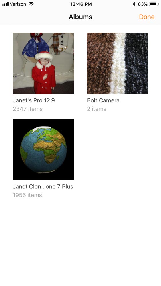
Since there was still a lot of free space on the Bolt drive, I downloaded the app to my iPhone and plugged the drive into my phone.  I was able to copy all my phone images to the Bolt Duo without having to first remove the images from the iPad.  There are now three albums on the Bolt, as you can see from the screen capture from my iPhone.

What I like

  • Small form-factor that can be easily carried with you
  • App is simple and easy to use
  • Quickly backs up images from the Apple device to the Bolt Duo
  • Can skip using the device’s storage and save images or videos directly to the flash drive
  • Didn’t require a driver to use the Bolt on my MacBook Pro

What needs to be improved

  • Nothing

Final thoughts

The Kingston DataTraveler Bolt Duo is a great way to transfer images from a mobile device to your computer so you can free up space on the Apple device – or just as a backup, even if you don’t need to save space on your mobile device.  You can also use the Bolt to transfer pictures back to the mobile device, if needed.  And you can store images and videos directly to the Bolt without using any space on your iPhone or iPad.  The app is simple and easy to use on both iPad and iPhone.  And you can backup both your iPhone and your iPad, or even your family’s devices, to the same Bolt Duo.  It may be perfect for its intended functions.

Price: $44.99 for the 64GB model reviewed here
Where to buy: Kingston or Amazon
Source: The sample of this product was provided by Kingston

Filed in categories: Reviews

Tagged: ,

Kingston DataTraveler Bolt Duo review originally appeared on The Gadgeteer on September 17, 2018 at 9:00 am.

Note: If you are subscribed to this feed through FeedBurner, please switch to our native feed URL http://the-gadgeteer.com/feed/ in order to ensure continuous delivery.
My fab five cases for the new iPhone Xs Max

Like many of you including our very own Julie Strietelmeier I set my alarm for 3am EST to preorder the new iPhone Xs Max. Of course, I’ll be needing a new case to protect my hefty investment, so I searched around to see what was available. Not surprisingly there are already a ton of options. Here are five that peaked my interest, in no particular order.

iPhone XS Max Leather Case – (PRODUCT)RED

I know, I know it’s another Apple product but, they do make a nice leather case. I really like the red leather and the fact that it has the Apple logo embossed on the back. And money from every purchase goes to a good cause. If you’re not a fan of red the case is also available in seven other colors including Midnight Blue, Forrest Green, and Saddle Brown. You can purchase the case from Apple’s website for $49.

Nomad Rugged Tri-Folio

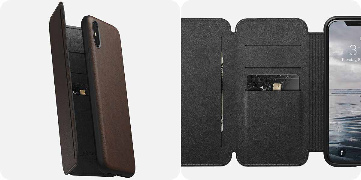
I got the chance to review a couple of Nomad’s cases for the iPhone X, and I loved them. So it’s no surprise that they would make my list. The Rugged Tri-Folio is different from other wallet cases. It has more flaps and even more storage. Designed to completely replace a traditional wallet it has four card slots and two pockets for cash or anything else cluttering your pockets. And of course, it’s made of Horween leather with a high-grade polycarbonate body, bonded to a raised TPE bumper on the edge. Giving your new iPhone protection from all angles. You can pre-order it on Nomad’s website for $79.95 with shipping on September 18th.

Waterfield Fused Suede Case

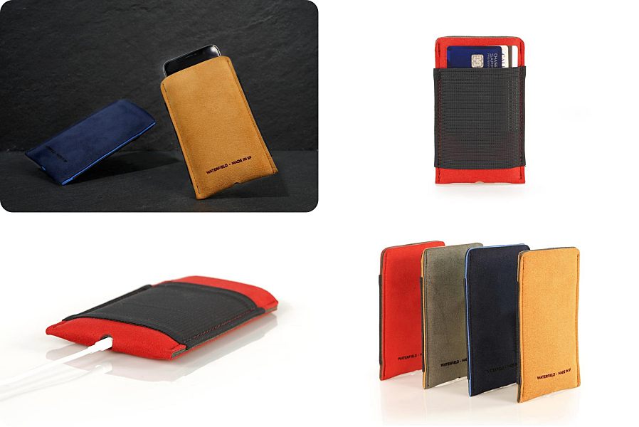
This new case from Waterfield is quite unique. It’s more of a pouch then a case that your iPhone slides into. Made of soft Ultrasuede the case protects your phone from scratches and minor dings. There’s also a mesh pocket on the back that can hold a few credit cards or a pair of AirPods. And there’s a cutout on the bottom of the case that allows you to charge your iPhone or hold a conversation with the device still safely protected. The Fused Suede Case comes in two sizes for the iPhone Xs Max, one for using the phone without a case and one for using the phone with an existing case. It’s available in four different colors, Ash, Camel, Navy, and Red. You can pre-order the Fused Suede Case on Waterfield’s website for $29. Expected to ship by September 28th.

Pad & Quill Traveler Protective Case

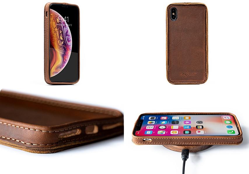
Another leather case that I like is the Traveler Protective case from Pad & Quill. Pad & Quill is well known for making high-quality leather accessories, and this case is no exception. Handmade from rugged American full-grain leather the case actually molds to your grip and your iPhone like magic. The Traveler has a nice slim profile that only adds 2mm of thickness. And it has cut-outs for all the phones ports and is fully wireless charging compatible. The case can be pre-ordered from Pad & Quill’s website for $59.95. You’ll have a little bit of a wait, the case doesn’t ship until late October.

totallee Thin iPhone XS Max Case

The iPhone Xs Max has a great design and the best way to show that off is to use a minimalist case. The totallee Thin case is only .02-inches thick and weighs only 0.1oz. Now that’s about as minimalist as it gets. The case maintains the original look of the iPhone XS Max. No branding, no bulk, no nonsense. It comes in 3 finish options. Matte which allows you to show off that Apple logo. Glossy, for that nice shiny look, and leather for a more sophisticated look. The Thin iPhone Xs Max case is available on totallee’s website for $25-$29. Pre-orders are expected to ship on September 30th.

So there you have it my top five cases for the new iPhone Xs Max so far. As I mentioned, there are already a dizzying number of choices available. Hopefully, this list helps make buying that new case just a little bit easier.

Filed in categories: Articles

Tagged:

My fab five cases for the new iPhone Xs Max originally appeared on The Gadgeteer on September 17, 2018 at 8:00 am.

Note: If you are subscribed to this feed through FeedBurner, please switch to our native feed URL http://the-gadgeteer.com/feed/ in order to ensure continuous delivery.