The MightyPurse is an inexpensive phone-charging wallet

NEWS – I’ve written about purses or wallets with built-in backup batteries before, but most of those have been rather expensive.  The Hbutler MightPurse Quilted Wallet is an inexpensive alternative to those bags.

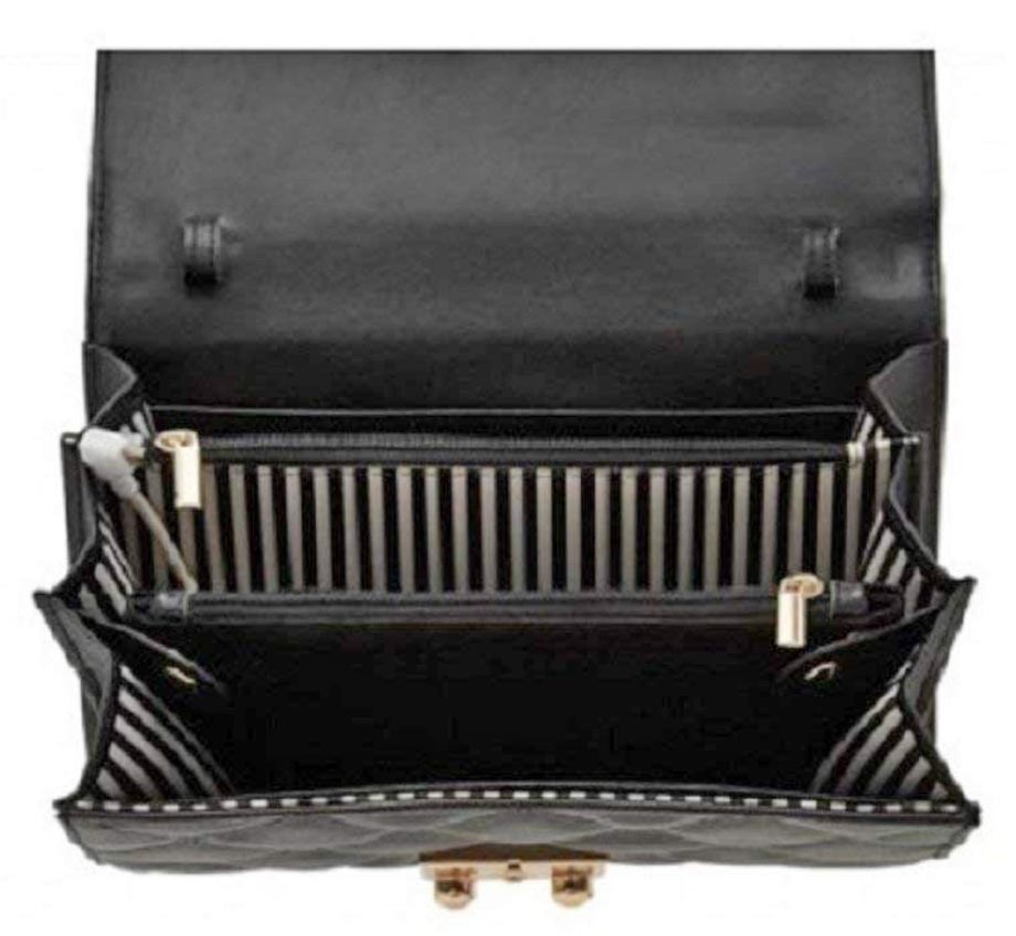
Hbutler makes this wallet of leather.  The quilted design and the push-lock closure on the front flap make this bag look similar to a designer bag I’ve seen.  Inside, the wallet has a triple gusset construction that features two separate organizational compartments along with 16 credit card slots, 2 bill-folds, coin compartment, and room to put your phone and other items.  Concealed inside is a slim, lightweight 4000mAh rechargeable battery that can recharge a smartphone up to two times.  Auto power-on technology starts the phone charging as soon as it’s plugged in.  The battery has a built-in microUSB charging cable, and a certified iPhone Lightning adapter is included.  Finally, there’s a concealed USB cord to recharge your purse.

The quilted wallet is 5.11” tall x 8.26” wide x 1.37” deep and weighs 17.4oz.  It comes with a detachable leather-and-chain strap for wearing the bag crossbody or on your shoulder.  (Sorry for the fuzzy picture.  That was the best the listing had.)

The Hbutler Women’s MightyPurse Quilted Wallet is available in black with gold hardware or red with silver hardware for $29.99 from Amazon.

Filed in categories: News

Tagged: ,

The MightyPurse is an inexpensive phone-charging wallet originally appeared on The Gadgeteer on September 19, 2018 at 12:00 pm.

Note: If you are subscribed to this feed through FeedBurner, please switch to our native feed URL http://the-gadgeteer.com/feed/ in order to ensure continuous delivery.

PadMate PaMu Scroll BT 5.0 wireless earbuds review

REVIEW – With the increasing lack of headphone jacks on popular devices, wireless earbuds are appearing on the market with increasing rapidity. The latest I’ve been asked to review has just started their crowdfunding campaign and is from a company we’ve already seen good products from – PadMate. Their recent Indiegogo launch has already earned past their $20,000 goal. Why all the backers? Read on.

Note: Photos may be tapped or clicked for a larger image.

A while back, I was sent the first iteration of PadMate’s wireless earbud line. They were great for sound and connectivity, but I was not a fan of the charging case design. The team has gone back to the drawing board and improved not only the case, but the size and connectivity of the product and launched it as the PaMu Scroll.

What is it?

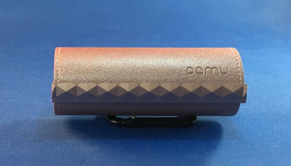
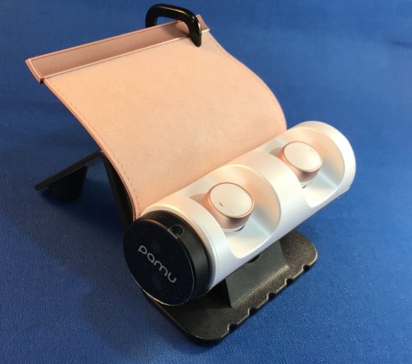
The Scroll is a new type of case for wireless headphones. We’ve seen cases with removable lids, which can get lost or not seal, we’ve seen connected lids like the Apple AirPods, which can get sprung out, but also make opening and removing a bit more trouble. The Scroll is a flap of leather that is rolled over the opening, which holds the earbuds into their magnetic charging mounts, yet allows you to get your fingers around them in order to remove them for use. It’s securely sealed with two sets of magnets, yet releases with the flick of a finger.

Hardware specs
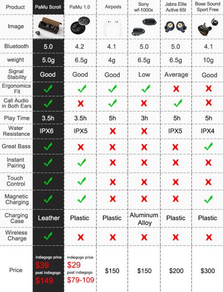
(from the Company’s IndieGoGo campaign)

What’s in the box?

  • Earbuds
  • Charging case
  • 3 sizes of silicone tips
  • USB-A to microUSB charging cable (1’ long)

Design and features

The size of the PaMu Scroll buds is a bit smaller than the previous models, only .75” versus a full inch for the first model, but they are still a subtle oval with a hidden button on the face. The ear tips are a good bit smaller, and the whole unit fits more flush into your outer ear area, which makes them a bit less noticeable.
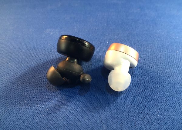
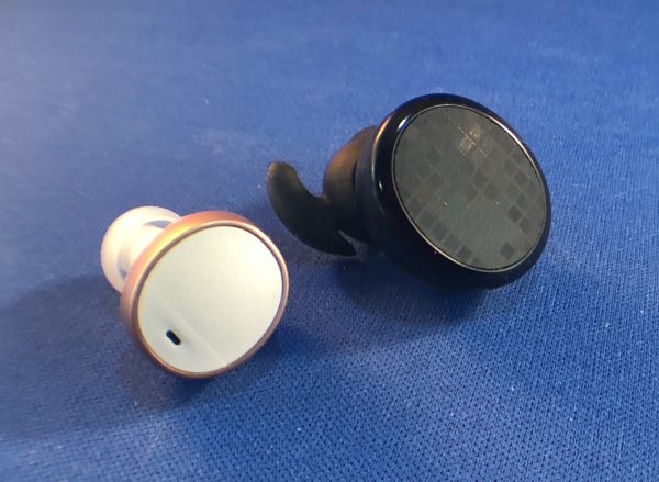
Still, however, there is that tell-tale blinking light, though. They now are sweat-resistant (IPx6), so they’re going to be better for sweaty sports. The Video on the website shows someone with them on in the shower. You do you.
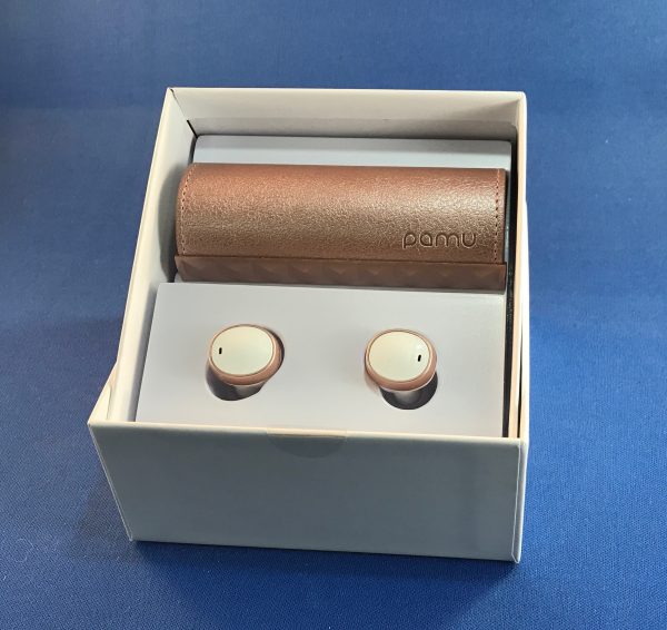
The PaMu Scroll is sleek and stylish right out of the box. The earbuds are held separately from the charging holder, so that you can appreciate the beauty of both at first glance. Like the previous PaMu earbuds, the Scroll units are easily placed into the charging cradle, and due to the form fit and magnets, it is impossible to get them in the wrong space. They are also marked L and R to avoid any attempt at this. When you remove them from the charger, just like the previous model, they start trying to pair with themselves and any BlueTooth units in pairing mode. These, however, use the new BlueTooth 5.0 spec, so their pairing is more solid.

I was sent a set in Sakura (rose gold) to test. They are also available in several darker shades: Rock ‘n’ Roll, Graphine, and Glory Edition. They look (sorta) black, bronze, and blue, I think. (Your vision may vary.) Each color also has a different pattern on the leather cover. The Sakura cover is a pebble grain.

The interior is a natural suede finish, and there is very even decorative stitching along the outer edge. A metallic plastic piece on the end houses the magnetic catch that seals the cover onto the body of the case. There is a single magnet on each end of both the cover and the case for this purpose.
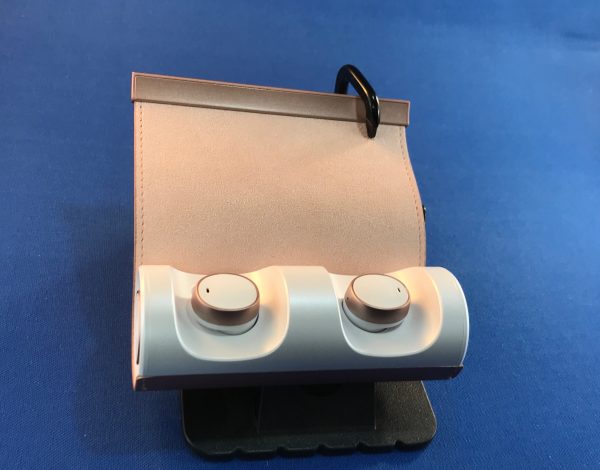

On the left side of the cylindrical case is a microUSB charging port.

On the right side there are 4 LEDs to indicate level of charge of the case itself.
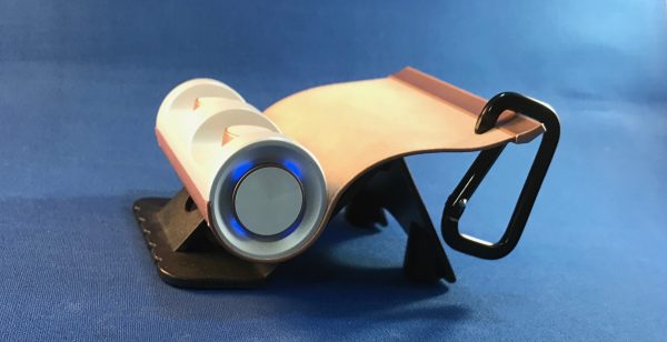
Like the earlier model, there is no on/off switch or other way to force the case to reveal available charge. This can only be done by removing and inserting one of the earbuds, or by plugging in the case for charging.
The case itself is 3.75” long and just under 1.5” in diameter. The two ends are indented with the center pulled back up into a center pedestal about .75” in diameter. There is a metallic accent around this center area that matches the metal accent on the earbuds. The plastic of the Sakura case and earbuds is white. On the others, it looks blackish, but I couldn’t really tell in the promo videos.

Setup

Pairing and moving between several devices is clean and easy. We’re still not to that “Do What I Mean” stage where earbuds will be able to know which device we’re listening from, but it’s no bother to turn off the PaMu Scroll in my iPad settings and click connect in the Bluetooth settings of my iPhone.

Performance

While the sound quality was still full and rich (better than my AirPods!), they’re still not able to give the same body-thumping sound of a good set of speakers, or the head jarring rattle of really large over-the-ear cans. But for walking around, listening to podcasts or some street tunes? They are fantastic!

What I Like

  • Great sound, especially at this price.
  • Pairs quickly and solidly (BlueTooth 5.0!)
  • Stylish look on earbuds and case
  • Case is substantial

What needs to be improved

  • None that I could find, really

Final thoughts

I was sent these by mistake, so I had no say in the color. Even though I’m not a fan of white and rose gold, I have still been wearing these almost daily since I got them. Every now and again, I’ll pull out the AirPods or the original PaMu’s, and there is always some reason that I go back to these at the next listening session. They really give a full depth, especially to podcast sounds, and that’s usually what I’m listening to when wearing earbuds.

Additional item

I was not able to test this add-on, but there is a microUSB to Qi wireless adapter available. The crowdfunding price is currently $10. It plugs directly into the charging base and looks like it’s part of the unit (well, except I have a white case and it’s black.) I don’t have a Qi charging pad yet.

Price: $39 at super-early bird price. $49 at regular backer price. $149 retail after Indiegogo funding round.
Where to buy: IndieGogo
Source: The sample of this product was provided by PadMate.

Filed in categories: Reviews

Tagged:

PadMate PaMu Scroll BT 5.0 wireless earbuds review originally appeared on The Gadgeteer on September 19, 2018 at 11:00 am.

Note: If you are subscribed to this feed through FeedBurner, please switch to our native feed URL http://the-gadgeteer.com/feed/ in order to ensure continuous delivery.


Vizio debuts three new Dolby Atmos soundbars starting at $499

NEWS – On Tuesday Vizio announced pricing and availability on its 2018 Dolby Atmos soundbars.

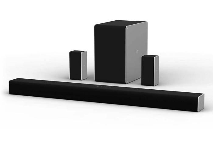
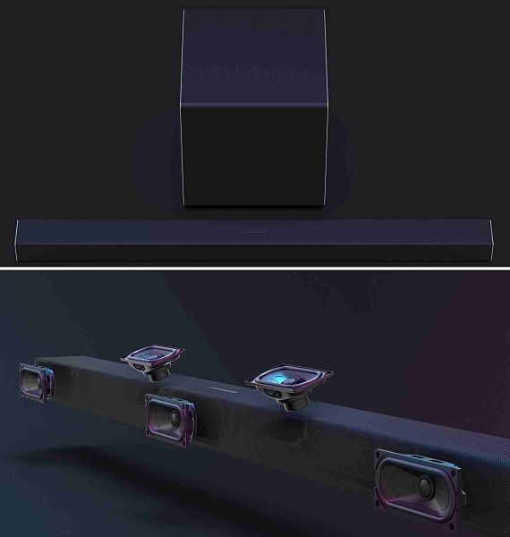
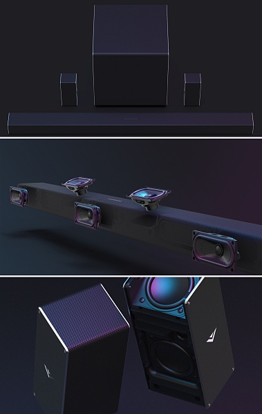
The 36-inch 5.1.2 model is the first to hit the market with a price tag of $499.99. The sound system features a total of eight speakers. Five in the soundbar itself (3-front firing and 2-up-firing), two rear satellite speakers, and a wireless subwoofer.

The two larger 46-inch soundbars will be available later this year, presumably just in time for the holidays. They include the 3.1.2 model without rear speakers ($799.99), and the flagship 5.1.4 model ($999.99).

The 5.1.4 system boasts four dedicated up-firing speakers. Two in the front and two more in the rear satellite speakers, for a grand total of 10 speakers.

What is Dolby Atmos?

Simply put with Dolby Atmos, sound moves around you in three-dimensional space, so you feel like you’re inside the action. It uses an object-based system to make it sound like the action is not only happening in front and behind you but, above you as well.

The Vizio Home Theater sound systems are Dolby Vision compatible and support 4K, HDR10, and other HDR standard content.

Along with Dolby Atmos, the soundbars will include Wi-Fi connectivity with Google Chromecast Built-in and Google Assistant integration with voice-control. All three soundbars will also feature two HDMI 2.0 ports (one-input/one-output).

I own a 46-inch Vizio 5.1 soundbar, and I love it, so I’m eager to see what they can do with the Dolby Atmos technology. Unfortunately, I’m going to have to wait until later this year to find out.

Vizio’s 36-inch 5.1.2 Dolby Atmos soundbar is available today. For a list of retailers and to learn more about these new soundbars go to Vizio’s website.

Filed in categories: News

Tagged: , ,

Vizio debuts three new Dolby Atmos soundbars starting at $499 originally appeared on The Gadgeteer on September 19, 2018 at 10:00 am.

Note: If you are subscribed to this feed through FeedBurner, please switch to our native feed URL http://the-gadgeteer.com/feed/ in order to ensure continuous delivery.
Black & Decker Infuser 3-In-1 Digital PowerCrush Blending System review


REVIEW – My family is one that is on a major healthy lifestyle journey, and we are always on the lookout for products that allow us to create nice variations of our specific diet. Some of the mandatory tools are a blender, a juicer, etc. When I got a chance to take a look at this 3 in 1 combination, I readily accepted. Let’s see how it went.

What is it?

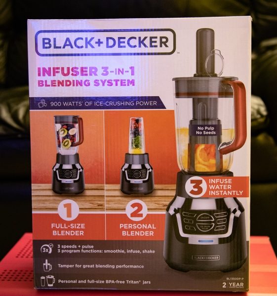
The Black & Decker Infuser 3-In-1 Digital PowerCrush Blending System combines a personal blender, and regular blender and an infusion blender in one device.

What’s in the box


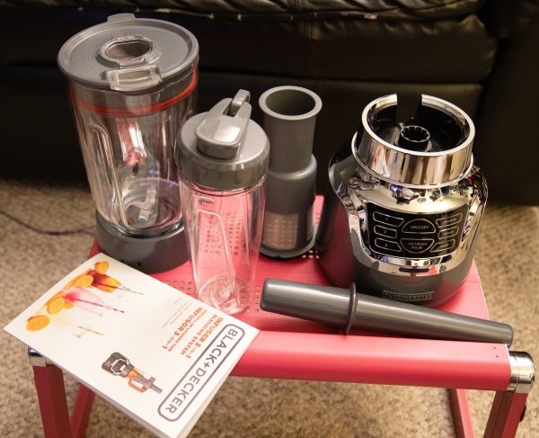
1 x 3-in-1 blender base unit
1 x 6-cup blending jar
1 x 18-oz. blending jar
1 x Infuser and infusion filter
1 x Instruction/recipe booklet

Design and features

The system is constructed of a metal base and plastic blending parts and combines three blending devices in one.  Its motor produces 900 watts of power that pulverizes even ice, with the use of its 4-tip QuadPro Stainless Steel Blades.

Here are some specs:
Parts material: Glass, Plastic
Dimensions (Overall): 9.88 inches (H) x 15.0 inches (W) x 7.88 inches (D)
Weight: 8.82 pounds
Finish: Baked-on Paint
Capacity (Volume): 48 ounces
Includes: Stainless steel multipurpose blade, Pouring Shield, Blending Cup with Lid, Glass Bowl, Rubber Seal, Instruction Manual, travel jar, infuser insert, tamper
Features: Pulse Feature, Pouring Spout, Hideaway Cord Wrap, Variable Speed, Stainless Steel Blades, Push Button Controls, Indicator Light
Base – Metal Finish: Stainless Steel
Appliance Capabilities: Blends, Crushes Ice, Mixes, Purees, Chops, infuses, emulsifies, Juices, Liquefy
Care and Cleaning: Dishwasher-safe Parts, spot or wipe clean
Number of Speeds: 3
Warranty: 2-year limited warranty

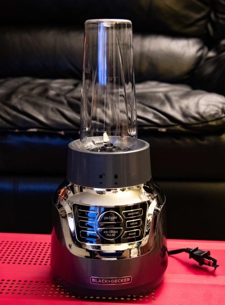
The personal blender includes an 18 oz jar that can be used on-the-go with the snap lid. It works much like every personal blender and creates a smoothly blended mixture.

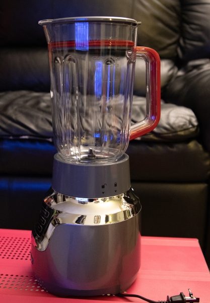
The picture below shows the system set up as a traditional blender. It functions well in this combination as well.


The infuser device basically uses an infusion filter with a “pusher”. You place the ingredients in the inside of the filter and then use the “pusher” to apply pressure downwards onto the ingredients as the blade spins. The blade action starts off as a pulsating action to crush the ingredients and then a fast, free spinning action as the blades work to pulverize the ingredients while the juice escapes through the filter into the jar. As far as I know, the true concept of infusion does not involve a blade, but for my personal use, this is better because the resulting mix is very rich in flavor. “Infusion is the process of extracting chemical compounds or flavors from plant material in a solvent such as water, oil or alcohol, by allowing the material to remain suspended in the solvent over time (a process often called steeping)”. – Wikipedia

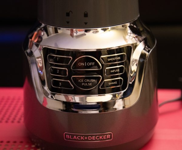
The base unit of this 3 in 1 infuser is made of plastic and metal and is sleek and shiny with a digital touchpad control interface. From left to right, there are 3 speeds controls: an on/off and ice crush control the uses a pulsing action, a smoothie selection that spins consistently to blend, an infuse control that is a pulsing and then free spinning action that is used for juicing, and a shake mode that is also a fast free spinning motion. Basically, they are intuitive controls for the three speeds, three programs, and a pulse function to provide the desired consistency.

Performance

The personal blender use of this system works very well and produces a very smooth blend. I also actually have and have reviewed the Black & Decker personal blender as a separate device, so I was expecting the same great performance and it did not disappoint. While the base unit is slightly different for the separately sold personal blender, the performance is the same except that this system has 900 watts of power and does the job even faster and, slightly better.


Below is the mixture that is a result of the infusion/blending process. the ingredients were blueberries, raspberries, and blackberries. The flavor was smooth, rich, and tasty.
The pictures below show frozen Kale, frozen bananas, frozen strawberries, pineapple, almond milk and ice cubes in the blender and the resulting mixture that was very tasty. You can see in the middle picture that I have the ingredient “pusher” in the center hole in the blender cover as opposed to the attached hole cover that it comes with. This is because I had a minor accident with it and it broke off. (my fault). The blender action is a constant speed at either speed 1, 2 or 3.


The next set of pictures show a smoothie in the personal blender that was made from frozen bananas, kale, apple, peanut butter, and protein powder.  The smoothie action by the blender starts with an on/off cycle until the ingredients are pulverized, and then it changes to a constant speed to finish off mixing the smoothie. It makes an excellent and really smooth smoothie with no type of pulp.


What I like

  • The 3 in 1 feature
  • The blending results
  • The infuser/juicer

What can be improved

  • Some of the materials used have resulted in this label on the seller’s website: – WARNING: This product can expose you to chemicals including Styrene, which is known to the state of California to cause cancer, and Bisphenol-A, which is known to the state of California to cause birth defects or other reproductive harm. For more information go to www.P65Warnings.ca.gov. www.p65warnings.ca.gov 
  • Less plastic for some of the parts. Maybe a glass jar for the blender?


Final thoughts

This 3 in 1 blender system is very convenient and a great use of precious countertop space. It is really nice to make one reasonably priced purchase and have all 3 systems in one. It works well, and we have been using it continuously for our fruit and vegetable shakes. While I am not necessarily a fan of all of the plastic parts that are a part of this system, so far it has held up well. As far as performance goes, I am happy. I will post an update should there be a need to. For now, I give the Black & Decker Infuser 3-In-1 Digital PowerCrush Blending System a thumbs up. (Still researching the whole Styrene issue and effect).

Price: $49.99
Where to buy: Target
Source: The sample for this review was provided by Black & Decker.

Filed in categories: Reviews

Tagged: ,

Black & Decker Infuser 3-In-1 Digital PowerCrush Blending System review originally appeared on The Gadgeteer on September 19, 2018 at 9:00 am.

Note: If you are subscribed to this feed through FeedBurner, please switch to our native feed URL http://the-gadgeteer.com/feed/ in order to ensure continuous delivery.

The Samsung Galaxy S10: what we think we know

ARTICLE – Rumors abound when people get word of new smartphones, and that consistent truth prevails about the upcoming Samsung Galaxy S10. Let’s take a look at some of the most likely features of this highly anticipated phone.

It may debut in January 2019 at CES

Tech analysts say Samsung’s Galaxy S10 will be available in several models, but the company will manufacture one that supports the 5G network in limited supply.

The brand usually shows off its Galaxy S-series at the Barcelona Mobile World Congress in February and then launches the models a month later. But since competitors will reportedly showcase their 5G-enabled phones to CES in January, Samsung may accelerate bringing the Galaxy S10 to the market, doing so a month earlier than the usual February event.

However, a Samsung representative recently said that the company’s first 5G-compatible phone would be a model other than the Galaxy S10. If that’s true, the company may decide to keep people guessing about the Galaxy S10 a bit longer.

After all, people have been hearing about Samsung’s foldable phone for a while. The brand wants to be the first to offer a bendable phone. Rushing to provide it could be detrimental though, particularly if the company doesn’t work out all the kinks first. The point is that Samsung may realize it’s best not to roll out the S10 until it’s ready for the mainstream.

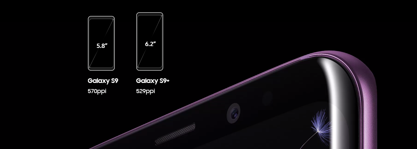
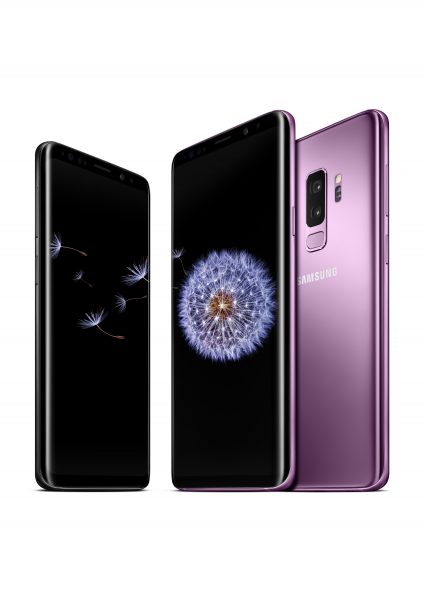
Samsung’s S9 Galaxy model, a precursor to the S10

There will be three models

Reports indicate that Samsung will follow Apple’s lead and release three models of a phone in the same product family. The smallest of the three will also be the least expensive option, although there are no solid details about prices for the Galaxy S10 yet.

Besides holding off Apple as a likely competitor, Samsung will also contend with Google, which is releasing new Pixel models in October. A substantial difference in prices between Samsung’s three models could help them achieve marketplace dominance, especially if the costs appeal to a wide section of potential consumers.

It’s rumored to include five cameras

It wasn’t long ago that phone manufacturers made headlines by releasing models with both front and back cameras. Now, a phone with only two cameras doesn’t capture as much interest as it once did. Even the latest iPhones, which have dual-camera setups, include innovative features like the ability to adjust the bokeh setting after taking a picture.

Reports suggest that Samsung will generate a buzz around the Galaxy S10 by releasing at least one of its models with five built-in cameras to appeal to people who love taking pictures with their phones. It probably didn’t hurt that Huawei recently launched its P20 Pro with three cameras, suggesting phones with several cameras will soon be the norm.

The model will have an ultrasonic fingerprint sensor

Today’s most popular smartphones offer increasingly advanced security features. Although the least expensive Galaxy S10 model — thought to be called the S10 Mini — will likely have an optical fingerprint sensor, the highest-end option should have one that’s ultrasound-based.

The advantage of using ultrasound technology mainly concerns accuracy since the sensor takes a three-dimensional model of a fingerprint.

Everyday consumers may not have such advanced security on their list of priorities. However, depending on the reliability of the ultrasound scanner, perhaps Samsung could position the phone as an option for government contractors.

We could potentially see dramatic display changes

Considering that people regularly use their phones for video calls and streaming marathons, the screen characteristics of the gadgets are of increasing importance. Updates about the Galaxy S10 highlight its screen aspect ratio of 19:9, representing a significant difference from other phones that Samsung sells.

Moreover, some people in the know think the smartphone might have an “infinite” display with extended side curves and no bezels. After all, achieving the aspect ratio mentioned above requires making the bezels at least thinner than those on the Galaxy S9 phones.

A less likely possibility about the screen is that it may have a “self-healing” coating, eliminating the need to buy a screen protector for the phone because it repairs cracks after they happen. The news of that development broke after a patent leak.

There’s no indication that Samsung would use that new screen-saving technology on the Galaxy S10. But, if it did, people might be more likely to purchase the potentially expensive phones and not feel so worried about dropping them and dealing with severely broken screens.

Samsung may still have secrets up its sleeve

As the rumor mill continues to churn and stimulate speculation, tech enthusiasts must remember how rare it is for all the major aspects of a gadget to leak before its release date.

Even if people figure out many of the Samsung Galaxy S10’s main features, the brand will likely reveal some previously unknown factors.

Filed in categories: Articles

Tagged:

The Samsung Galaxy S10: what we think we know originally appeared on The Gadgeteer on September 19, 2018 at 8:00 am.

Note: If you are subscribed to this feed through FeedBurner, please switch to our native feed URL http://the-gadgeteer.com/feed/ in order to ensure continuous delivery.