Baron Fig Vanguard Softcover Notebook review


I like notebooks. Even in this increasingly digital world, in which we use apps on phones and tablets to record notes to ourselves and share them with others instantly, I find a traditional notebook to be useful. From anything to jotting a quick reminder to making to-do lists to keeping a journal, an old-school paper notebook can come in handy. And while Baron Fig is best known  for their original Confidant Hardcover Notebooks, they also know that sometimes you might want something slimmer. So they designed their Vanguard Softcover Notebook line with a thinner, soft cover and fewer pages, it and complements their Confidant well. Let’s check it out!

Options

The Baron Fig Vanguard Softcover Notebook is available in the following options:

  • Sizes (Pocket and Plus sizes reviewed here)
    • Pocket (AKA Small) – 3.5 x 5 inches, 48 pages ($9 per 3-pack)
    • Flagship (AKA Medium) – 5.4 x 7.7 inches, 72 pages ($12 per 3-pack)
    • Plus (AKA Large) – 7 x 10 inches, 104 pages ($15 per 3-pack)
  • Colors (both reviewed here)
    • Light Gray
    • Charcoal
  • Page Type
    • Blank
    • Ruled (reviewed here)
    • Dot Grid (reviewed here)

Packaging

The Vanguard notebooks are sold only as 3-packs, not individually.  As shown above, each 3-packed was shrink-wrapped, with a simple cardboard band around each pack.

Features, Functions, and Performance

After removing each 3-pack of Vangards from their shrink wrap, the first thing I noticed was that these notebooks, though softcover, felt of very high quality, from the covers to the pages to the binding.  More on these details below, but together these features contributed to a very favorable first impression.

The above photo illustrates the difference in size between the Pocket and Plus Vanguard notebook sizes.  There is an intermediate size, the Flagship, between these two sizes, but I was only provided these two sizes for review.  Baron Fig calls their somewhat unconventional notebook sizing “smart” dimensions—they are slightly wider and shorter than most other notebooks of this type.  More on the sizing below.

Above, a bit of an idea of the thickness comparison.  The Pocket size (top) has 48 pages, while the Plus size (bottom) has 104 pages.

As mentioned above, one of the little features that I liked about the Vanguard notebooks was the binding stitching.  It may seem like a minor detail, but when minor details are done well, they can become emblematic of the quality of a product as well as a bit of a characteristic trademark.  The yellow stitching is noticeable enough that can help make the Vanguard notebooks more easily recognizable compared to other, similar notebooks.  I also found the stitching to be very carefully done—in the few months that I used these notebooks, not a single stitch came loose, and considering that I carried the Pocket in my pants pocket daily and the Plus to frequent work meetings, I think this is impressive.

Above is a shot of the open cover of the Pocket size Vanguard.  Like its hardcover cousin, the Confidant, Baron Fig has kept the design simple and minimalist, with a single blank rectangle inside the cover for the user to write, sketch, doodle…well, whatever they wish.  I was sent the Dot Grid version of the Pocket size Vanguard.  I’d never used a notebook with Dot Grid style pages before, and I wasn’t sure if I’d like it.  Turns out, I love it.  It’s very versatile because it can essentially be used as a grid-style guide for drawing or sketching, but the dots can also be used like lines on a ruled page.  And the dots are visible, yet faint enough to be unobtrusive.

Above, a photo of the open cover of the Plus size Vanguard.  Again, the Confidant-like, minimalist rectangle is present on the inside cover to allow the user to customize their notebook to their liking.  Also I liked the width between the ruled lines—not too narrow, not too wide.  This may not seem like much, but for me it is an important design element.  I’ve used various brands of ruled notebooks for many years and some had line spacing that was far too wide, which felt like I was wasting valuable space.  Like the dots of the Dot Grid Vanguard above, the ruled lines are visible enough to be useful, yet faint enough to not seem overbearing.

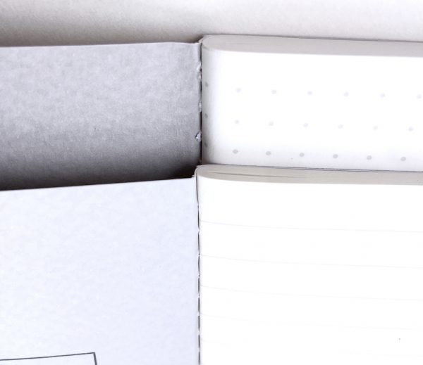
Above, a closeup of the Pocket size Dot Grid page Vanguard with Charcoal cover (top) and the Plus size Ruled page Vanguard with Light Gray cover (bottom).  Visible are the cover texture, the binding stitching, the page dots or lines and the tightness of the pages.  The pages themselves are acid-free, fine grain paper, safe from degradation and allowing minimal ink bleed-through.

Although the photo above makes the Pocket size Vanguard seem a bit large, it really is the perfect size to carry in…well…a pants pocket, purse, bag or backpack.  I’ve been carrying a Pocket Vanguard in my pants pocket as part of my EDC for a while now, and its minimal footprint and thickness almost make me forget its even there.

The Vanguard Plus on the other hand, is a great notebook for jotting in all types of situations.  I’ve used one as my work notebook, toting it to meetings for note-taking and the like.  The soft, yet durable cover means I can stuff it into or grab it out of my backpack, drag it into conference rooms or just about anywhere and it will continue to hold up (and it has).

Conclusion

Like the Baron Fig Confidant Hardcover Notebook that I reviewed a while back, I’ve become a big fan of Baron Fig’s Vanguard Softcover Notebooks. I typically carry a Pocket size Vanguard in my…well, pocket of course…as part of my EDC.  And like their Confidant counterparts, the Vanguard’s construction is very high-quality, with soft, yet durable covers, high-quality paper and sold, yellow stitched binding. If you are in the market for some thoughtfully-designed and well-built softcover notebooks, give the Baron Fig Vanguard a look.

Source: The sample for this review was provided by Baron Fig. Please visit their website for more information or to order. You can also find some Baron Fig products on Amazon.


Product Information

Price: ‘Pocket’ size 3-pack $9, ‘Flagship’ size 3-pack $12, ‘Plus’ size 3-pack $15
Manufacturer: Baron Fig
Retailer: Amazon
Requirements:
  • None
Pros:
  • + Quality construction
  • + "Smart" dimension sizing
  • + Reasonably priced
Cons:
  • None

Filed in categories: Reviews

Tagged:

Baron Fig Vanguard Softcover Notebook review originally appeared on on June 6, 2017 at 8:36 am.

Note: If you are subscribed to this feed through FeedBurner, please switch to our native feed URL http://the-gadgeteer.com/feed/ in order to ensure continuous delivery.

Fredorch UFO 360° Rotating LED wall light review


Adding additional light to a place with no electrical outlets can be a challenge when you don’t want to pay an electrician. Stick up lights are one solution, but they usually run on batteries and require the flip of a switch to turn on the light. The Fredorch UFO 360° Rotating LED wall light looks like a much better alternative. Let’s take a closer look at this oddly named light.

What is it?

The Fredorch UFO 360° Rotating LED wall light is a micro USB rechargeable LED light that sticks where ever you like and turns on when it detects motion.

What’s in the box?

Fredorch UFO 360° Rotating LED wall light
micro USB cable
3M adhesive sticker
Instructions

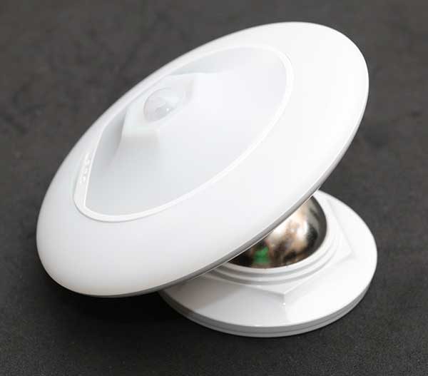
The Fredorch UFO 360° Rotating LED wall light has two parts. The light or what I guess would be considered the UFO module, and the base.

On the bottom of the light is a magnetic ring that attaches to the steel ball in the base.

The ball allows the light to swivel and rotate so you can aim the light where you want the beam to point.

The light actually has two parts. An outer ring and an inner light. Tilting the outer ring provides access to the switches that can be set so that the light automatically turns on when motion is detected.

You can set the outer ring to light up by itself.

Or you can set the inner and outer lights to light up at the same time.

The image above makes the light look amber. It’s not. It’s a white light. For some reason my camera would not capture the true color when both lights were on.

The tilting outer ring also provides access to the micro USB connector for charging the built-in battery.

Installing the Fredorch wall light is simple. Using the included two-sided 3M adhesive sticker, you put the sticker on the base, then attach the base to the wall, and the light to the base.

I decided to install the light in a closet that only has a one bulb pull string fixture in the ceiling. That light works pretty well if all I need is a towel on one of the upper shelves, but if I need to find something lower or on the floor, I can’t see anything without using a flashlight.

Adding the Fredorch wall light now lets me find what I need and I don’t even have to pull a string or press a button. As soon as I open the door, the light detects motion and turns on. There’s no delay at all. And when I shut the door, the light will turn off within 15 or 20 seconds.

Final thoughts

The Fredorch UFO 360° Rotating LED wall light is very useful. It’s one of those things that make me say “Why didn’t I get one of these a long time ago?” Now that I have this one, I will be thinking of other places in my house that can use some extra light.

Source: The sample for this review was provided by Fredorch. Please visit their site for more info and Amazon to order.


Product Information

Price: $15.99
Manufacturer: Fredorch
Retailer: Amazon
Pros:
  • Turns on when motion is detected
  • Easy to install
  • Tilting and rotating
  • Rechargeable
Cons:
  • None

Filed in categories: Reviews

Tagged:

Fredorch UFO 360° Rotating LED wall light review originally appeared on on June 6, 2017 at 7:00 am.

Note: If you are subscribed to this feed through FeedBurner, please switch to our native feed URL http://the-gadgeteer.com/feed/ in order to ensure continuous delivery.

Apple announces the HomePod, challenger to Amazon Echo and Google Home


One of the most interesting announcements made today at Apple’s Annual WWDC was the release of the Apple HomePod, Apple’s entry into the home assistant arms race.

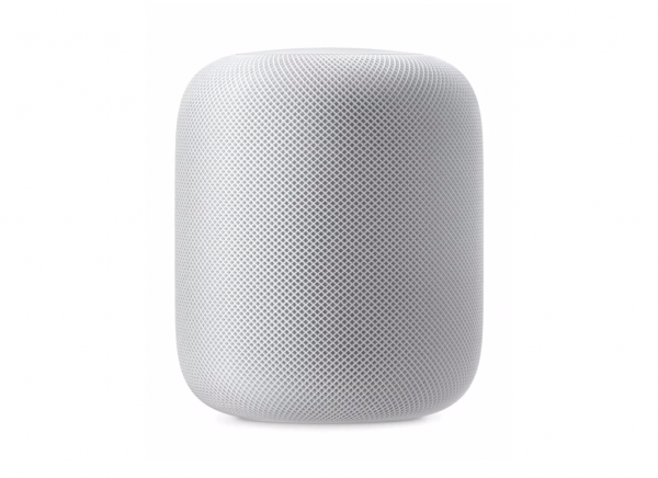
A straight up challenger to the champ, Amazon Echo and the runner-up, Google Home, Apple’s HomePod takes Siri out of your iPhone and places her squarely, for better or worse, in your living room. Marketed primarily as a wireless speaker, the HomePod will be able to use “spatial awareness” to sense its location in a room and adjust its audio accordingly. 

The HomePod is just under seven inches tall, has six microphones, and is powered by the Apple-designed A8 chip. One of the best features of the HomePod, something glaringly missing in the Echo, is the ability to sense other HomePods and unify the listening experience utilizing an update to AirPlay 2.

Of course, the HomePod, triggered by the phrase “Hey Siri,” will have all the requisite home assistant features like controlling HomeKit devices and answering basic questions.

Time will tell if Siri’s voice recognition can compete in the home with Amazon’s Alexa, but the HomePod’s specs certainly outpace the sound quality of Amazon’s device. Although at $350, the HomePod is about twice as expensive as the Echo.

The Apple HomePod will be available in December and is not yet available for preorder. The device comes in two colors, white and “space gray”.

Visit Apple.com for more info.

Filed in categories: News

Tagged: , , ,

Apple announces the HomePod, challenger to Amazon Echo and Google Home originally appeared on on June 5, 2017 at 7:02 pm.

Note: If you are subscribed to this feed through FeedBurner, please switch to our native feed URL http://the-gadgeteer.com/feed/ in order to ensure continuous delivery.

NIFTY Mobile Charger review


You have them. I have them. What do we all have? Personal portable devices of course.  Millions of them are out there, and the more feature-rich they become, the more power they require. But because these devices are intended to be portable, we can’t always use them near a power outlet. Hence the boom in portable batteries and chargers to power our devices while on-the-go. The NIFTY Mobile Charger is one such portable battery, and its looks and features piqued my interest. Let’s check it out! Gadget on!

Options

The NIFTY Mobile Charger is available in three colors/finishes:

  • Signature Stone Red – Sandstone finish (reviewed here)
  • Stone Gray – Sandstone finish
  • Suede Black – Soft Tough finish

Specs

Per the NIFTY site, the NIFTY Mobile Charger’s specs are the following:

  • Dimensions – 106x59x25mm / 4.1×2.3x.9in
  • Weight – 156g  / 5.5oz
  • Material – Flame Retardant ABS Thermoplastic
  • Battery – 6800 mAh lithium-ion
  • Input Power – 15 Watts
  • USB-A Output –
    • TriCircuitry:
      • Qualcomm® Quick Charge™ 3.0
      • Fast-Charging 2.1A iPhones
      • Fast-Charging 2.4A Android Devices
      • Max 18 Watts
  • Type-C Output –
    • Max 15 Watts
  • Features –
    • Priority Pass-Through Charging
    • Powerloop Technolgy™
    • TouchSense™
    • TriCircutry™
    • Lumi I/O™
    • Intelligent Variable Output Delivery™
    • Dual-C™

Packaging & Contents

The NIFTY folks sent me both a NIFTY Mobile Charger (with cables included) to review as well as a 1-ft Lightning to USB Cable to connect to my iPhone 6 Plus. The packaging for both products is similar: a thin, stiff cardboard sleeve in a primarily white color scheme on the exterior which covers the interior black box that contains the actual product and accessories.

Above are shown the package backs which list features of the enclosed devices.

Above, the 1-ft Lightning to USB Cable’s exterior package is shown on the left, and the interior box is shown on the right.

The interior box is a clamshell-style with a magnetic closure. The 1-foot Lightning to USB Cable is enclosed in a plastic bag inside the box, as shown above.

Shown above are the contents of the separately-packaged 1-foot Lightning to USB Cable: the cable itself (with a Velcro strap) as well as a small instruction booklet.

Above is a photo of the NIFTY Mobile Charger’s interior box, which looks very similar to the 1-ft Lightning to USB Cable’s box, but with a “NIFTY” logo embossed on the front.

The NIFTY Charger’s interior box, which elegantly presents the device nestled into a cavity in a tray, which has a pull-tab to the left for easy lifting of the tray out of the box.

Beneath the tray are found the items shown in the photo above and which are listed below:

  • NIFTY Mobile Charger (show in its own plastic tray)
  • 3-foot Type-C (to USB) cable
  • 1-foot Lightning (to USB) cable
  • Microsuede drawstring cable pouch
  • Quick Start Guide booklet
  • Info card
  • (2) NIFTY decals

Features & Functions

Let’s start with the separately-provided 1-foot Lightning to USB Cable.  This cable, as well as the two cables provided with the NIFTY Mobile Charge itself, are a flat, ribbon-type which helps to greatly reduce or even eliminate tangling. More details on the cables to follow below.  Also included with each cable is an attached Velcro cable wrap, a very handy feature.

Above is the NIFTY Mobile Charger with its accessories, the micro suede accessory pouch (top left), 3-foot Type-C to USB cable (top right) and 1-foot Micro USB to USB cable (center).

The image above depicts both the 3-foot Type-C to USB cable (top)  and the 1-foot Micro USB to USB cable (bottom).  NIFTY calls their flat, ribbon-style cables Flatline cables and claims that they are made with aluminum, are seamless and have oval-shaped connectors with precision-welded internals that make them 240 times more durability than the industry standard and able to withstand 6,000+ bends.  In addition, both are equipped with Velcro straps to keep them secure when they are wound.  These cables both look and feel of very high quality, and I did not experience cable triangulation even once.


The micro suede pouch is a really nice added bonus.  It has a rich, luxurious feel and has the NIFTY logo embossed into one side in a very subdued style.  Both the 3-foot Type-C to USB cable and the 1-foot Micro USB to USB cable both easily fit into the pouch, with room to spare for another cable or two, or a few other small items.

The pouch’s locking toggle keeps its drawstring secure and keeps items from falling out.  Sidenote: In a pinch, I was able to use the micro suede pouch to clean some smudges off my glasses.  Bonus!

In fact, the micro suede pouch is just the right size that the NIFTY itself will actually fit into it, as shown above, though I don’t think that is the pouch’s intended purpose.

One of the first things I noticed about the NIFTY Mobile Charger was that it has no buttons or switches.  Instead, the NIFTY is equipped with Powerloop Smart Sensing Technology, which means it is essentially on standby mode until a device is plugged into it, and then it delivers the fastest, safest charge to that device.  I like that because I don’t have to remember to turn it on or off.  What it does have are two ports, a full-sized USB port, and a Type-C port.  The USB port is ringed with a white LED which NIFTY calls Touchsense.  A simple tap or any slight movement of the NIFTY illuminates the LED for a few seconds to improve its visibility and make it a bit easier to connect to the USB port.  In addition, NIFTY has Lumi I/O, a linear, dynamic, multi-function LED indicator on the top with five LED bars.  This LED glows red while being charged and white while charging other devices.  Its five bars indicate the status of the battery life while power is either incoming our outgoing.  It looks very sharp but is also very functional.

Above is an action shot of the NIFTY Mobile Charger doing its thing.  The cable on the right is the Type-C to USB cable.  I have the Type-C end plugged into the NIFTY and the USB end into a wall adapter, which is charging the NIFTY.  The cable on the left is the USB to Apple Lightning cable.  I have its USB end plugged into the USB port on the NIFTY with its Lightning end plugged into my iPhone 6 Plus’s Lightning port.  With NIFTY’s Priority Pass-Through Charging, it always charges devices that are plugged into it first, then charges itself afterward.  The NIFTY’s TriCircuitry enables Qualcomm Quickcharge 3.0. But as far as I’m concerned, the bottom line is that the NIFTY Mobile Charger charges fast.  It was able to completely charge my iPhone 6 Plus from about 20% up to full charge in under 20 minutes.  Crazy fast.  In fact, with its Intelligent Variable Output Delivery, NIFTY will automatically assign priority to each device plugged into it, depending on its charging needs.  Sidenote: I don’t have a MacBook with Type-C charging capability, so I was unfortunately not able to evaluate the NIFTY’s Type-C charging capability.

The first time I picked up the NIFTY Mobile Charger, I would have sworn the exterior was made from anodized aluminum with some type of textured finish.  However, the exterior is not aluminum, but rather a flame retardant ABS thermoplastic that is lightweight yet rigid and with a “sandstone” texture finish (which helps give it some grip).  It allows the NIFTY to be slim, small and lightweight—it is only 5.5oz (156g).  I can tuck it into lots of places with ease.  It also feels very durable.  And it looks cool.

Conclusion

I am a huge fan of the NIFTY Mobile Charger.  It is slim, small and lightweight, so I can stow it and take it just about anywhere.  Plus it looks cool.  It is also packed with tons of features, all of which I found to be useful, like the Lumi I/O LED indicator, its TouchSense port automatic illumination, Priority Pass-Through Charging and Powerloop Technology.  But because this is a mobile charger, probably the most important feature is its power, and it has power in spades.  Its USB-A output TriCircuitry includes Qualcomm Quick Charge 3.0 and it has an 18W output, while its Type-C Output has 15W.  And 2.1A means it will charge a phone and a tablet simultaneously, and prioritize with Intelligent Variable Output Delivery.  So it charged my devices very fast, faster than any other mobile charger I’ve ever used.  If you are in the market for a mobile charging solution, I would strongly encourage you to take a look at the NIFTY Mobile Charger.  While it’s a good price at $79.99, as of this writing it is on sale on the NIFTY site for $49.99, which is an absolute steal.

Source: The sample for this review was provided by NIFTY Electronics. Please visit their website or Amazon for more information or to order.


Product Information

Price: $79.99
Manufacturer: NIFTY
Retailer: Amazon
Requirements:
  • USB port or adapter to charge the NIFTY Charger
Pros:
  • + Charges multiple devices FAST
  • + Compact, lightweight and durable. And looks cool.
  • + Cables are included
  • + Clever use of LED indicators
  • + Smart detection and prioritization of devices being charged
Cons:
  • – NONE

Filed in categories: Reviews

Tagged:

NIFTY Mobile Charger review originally appeared on on June 5, 2017 at 7:30 am.

Note: If you are subscribed to this feed through FeedBurner, please switch to our native feed URL http://the-gadgeteer.com/feed/ in order to ensure continuous delivery.

Create your perfect Misfit fitness tracker with M.Y. MISFIT


If you’re anything like me, you want choices when it comes to the style of your gadgets. Black might be a great choice if you’re a Ninja, but for me, it’s too boring. Misfit’s activity trackers have never been considered boring and now they are giving you total control to personalize your next Misfit tracker.

M.Y. MISFIT lets you mix-and-match and truly customize their wearables by selecting the device, device color, strap style, material, and more. Device choice includes the Shine 2, Ray, Phase, and Vapor which is coming soon.

With hundreds of style combinations, it might be a little overwhelming, but more choices are always better than none. Right?

After deciding on a Misfit device, customers have a wide range of colors to choose from, including Jet, Rose Tone, Silver, Midnight and Champagne. Then they can choose a custom strap from a selection of silicone, field, paracord, leather, and more.

M.Y. MISFIT is available now at misfit.com/mymisfit with prices starting at $79.99.

Filed in categories: News

Tagged:

Create your perfect Misfit fitness tracker with M.Y. MISFIT originally appeared on on June 5, 2017 at 6:29 am.

Note: If you are subscribed to this feed through FeedBurner, please switch to our native feed URL http://the-gadgeteer.com/feed/ in order to ensure continuous delivery.