Yubico YubiKey 4 hardware security key review


In today’s world of technology and internet security, there always seems to be a website being hacked and personal details being compromised.  A password, even a complex one, isn’t really enough.  Luckily there are a few options out there to make our data a bit safer. You can use two-factor authentication with software (using an authenticator app on a mobile phone, for example) or using a hardware key, such as Yubico’s YubiKey. Two-factor authentication (2FA) adds an extra layer of security to your account that you, and only you, can access in order to prove your identity. Let’s take a look at how the YubiKey 4 and 4 Nano work.Note: Images can be clicked on to view a larger size.

Different services use different types of security protocols. YubiKeys are capable of performing multiple protocols, so you can use the same key for almost an unlimited number of services. U2F is a popular open authentication standard that enables internet users to securely access any number of online services, with one single device, instantly and with no drivers, or client software needed.

YubiKey 4 Series comes in multiple form factors. Each option includes the same internal components, functionality, and capabilities. I was sent the 4 and 4 Nano.

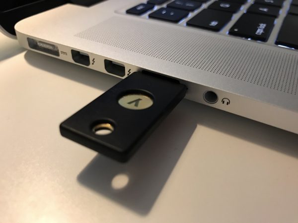
The YubiKey 4 fits on a keychain and plugs into a USB-A port such as on my 2015 Macbook Pro

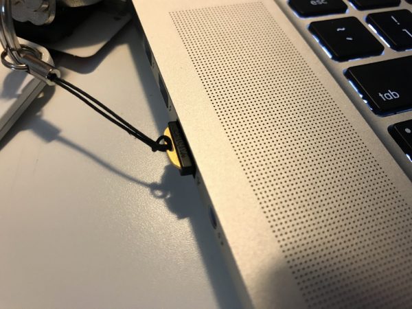
The YubiKey 4 Nano is good for semi-permanent installation and also plugs into a USB-A port. I have put mine on a lanyard for convenience.

Benefits of the YubiKey

  • Prevents unauthorized access by requiring the physical presence of the key to log in on that device
  • Easy to use: Plug it in and touch the gold button or edge; no codes to type or apps to install
  • Affordable: The same YubiKey can be used with nearly unlimited services
  • Durable: Crushproof and water-resistant, no batteries or moving parts
  • Everywhere: Use it on Microsoft Windows, Mac OS X, Linux, and Chrome OS for Chromebooks
  • Convenient: Fits on a keychain, in a wallet, or inside a USB port

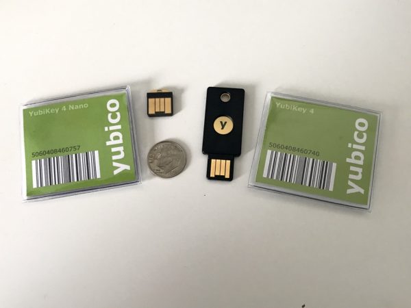
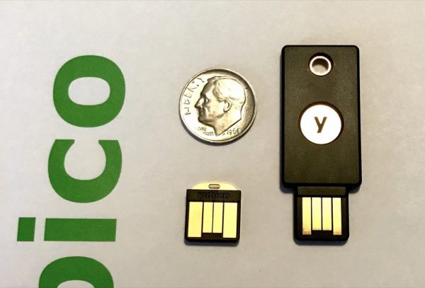
The YubiKey 4 Nano is on the left, and the YubiKey 4 is on the right. For size reference, I’ve included an US dime coin.

YubiKey works with tons of online services and applications such as Google, Facebook, Dropbox, Windows, MacOS Sierra, and password managers such as LastPass, Dashlane, KeePass, etc.

For LastPass, it was very easy to set up the YubiKey. In account preferences, it will ask you to insert your device into the USB port and touch the gold plate on the key itself.

It then acts as a keyboard and types a long string of characters into the YubiKey slot.  You can add multiple keys for extra security, which is really nice to have. (This is a feature of LastPass Premium.)

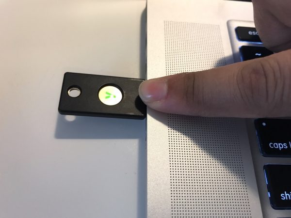
The same process goes for adding it to any of your favorite online services. Look into account preferences for an option along the lines of “set up a hardware key”. Then insert your YubiKey, follow instructions, and all is set. The YubiKey 4 and 4 Nano work exactly the same by touching the gold plating on the device to activate the key when logging in.  It’s given me peace of mind knowing that I have an extra layer of security on top of my two-factor authentication mobile app and password. To note, you aren’t stuck if you lose your YubiKey or don’t have it near you. You can still log in with a mobile authenticator token, or old-fashioned password.

I highly recommend investing in a second or third round of protection for your most used and important websites.  The YubiKey is available at a discount for education, GitHub users, and also available in bulk trays for businesses.

Source: The sample for this review was sent by Yubico. Please visit their website for more info.


Product Information

Price: $40-50
Manufacturer: Yubico
Requirements:
  • USB A port
  • Mac, Windows or Linux computer
Pros:
  • Very easy to set up
  • Secure
  • Portable
Cons:
  • Very easy to lose unless attached to keys or a lanyard

Filed in categories: Reviews

Tagged:

Yubico YubiKey 4 hardware security key review originally appeared on on May 31, 2017 at 9:00 am.

Note: If you are subscribed to this feed through FeedBurner, please switch to our native feed URL http://the-gadgeteer.com/feed/ in order to ensure continuous delivery.

The Curiosity app – for the “things that make you go hmmmm…”


Did you know that having only 5% of self-driving cars on the road can improve start-and-stop traffic jams? It can according to the National Science Foundation’s Cyber-Physical Systems program. Click here to read more about it. Did you know that cats meow for us? They do it to communicate to us and rarely do it to communicate with other cats. Click here for more information. These are just a couple of fascinating short articles that you can read about every day on the Curiosity app (Android, iOS, Kindle, and web versions). This awesome app has something for everyone. The app spotlights five articles per day in their Daily Digest. In addition, it has hundreds (if not more) articles and short videos on subjects like Animal IQ, Aztec Empire, Beards, Beer, Dogs, Drones, Etymology, Finance, Hair, Jobs, Memory, Myths, Pain, Painting, Parenting, Rain, Relationships, Social Behavior, Teeth, Tickling, etc. The articles and related videos are short and to the point and there are links to additional articles and videos. The app cites many reputable sources for their information like the National Science Foundation, NASA, National Geographic, World Health Organization, several scientific magazines, and several university studies to name just a few.

The Curiosity app even has mind puzzles like this one: “Alice comes across a lion and a unicorn in the forest. The lion lies on Monday, Tuesday, and Wednesday, and speaks the truth the other days. The unicorn lies on Thursday, Friday, and Saturday, and speaks the truth the other days. Today, the lion tells Alice, ‘Yesterday I was lying.’ The unicorn replied, ‘So was I.’” Which day of the week is it? Find out the answer here.

This wonderful app has even enticed both of my children (middle school / high school age) to read almost every day solely for enjoyment purposes (one of which who professes to hate reading)! Both think it’s a treat to read the articles and if they miss a day, there is even more to read about later. WIN!!! Even younger readers may love this app with articles like “Dogs Have Music Preferences, And Most Like Reggae“. Give it a try! The Curiosity app is available for free in the following formats: Android appiOS app, Kindle app, or the web version.  I’m sure you’ll get hooked on it just like my family.

Filed in categories: News

Tagged:

The Curiosity app – for the “things that make you go hmmmm…” originally appeared on on May 31, 2017 at 8:00 am.

Note: If you are subscribed to this feed through FeedBurner, please switch to our native feed URL http://the-gadgeteer.com/feed/ in order to ensure continuous delivery.

Evergraph makes lithophanes from your images


You may have clicked through just to find out what a lithophane is. A Lithophane is an artwork that has been molded or etched into a thin material (originally this was done on translucent porcelain) and can only be seen when the artwork is backlit. Think of it kind of like a 3D version of a photo negative. This type of artwork was first produced almost 200 years ago, but you can get one now from Evergraph.

Evergraphs are available in small plug-in nightlight versions, larger framed LED backlit versions and a version that can be hung in a window for natural backlighting.

The Evergraphs are made of a hard, non-porous material that has been etched with your custom image.

The small nightlight version is priced at $67, the wood-framed version is priced at $169 – $289, and the window Evergraphs are priced at $59 – $119. For more info visit evergraphs.com.

Filed in categories: News

Tagged: ,

Evergraph makes lithophanes from your images originally appeared on on May 30, 2017 at 1:17 pm.

Note: If you are subscribed to this feed through FeedBurner, please switch to our native feed URL http://the-gadgeteer.com/feed/ in order to ensure continuous delivery.

Topo Designs Commuter Briefcase review


Let’s talk about hybrid/convertible work bags for a minute. Are you a briefcase, messenger, or backpack person? What if you didn’t have to choose? I like the flexibility of convertible bags, but finding one that is both functional and business appropriate has been a challenge. After two months of testing, I think I’ve found it. Let’s have a look at the Topo Designs Commuter Briefcase!
Style, Materials, and Build

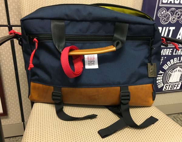
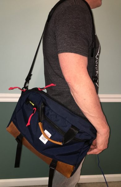
Topo’s signature adventure-oriented design style combines unusual color combinations & elements in products that typically look more at home in casual or outdoor environments. The Commuter Briefcase, however, bridges that gap with a business-friendly look that can still rumble on the weekends. Horween leather accents and a streamlined profile make for a good looking bag when dressing up for meetings, but it still works with a pair of jeans for a trip to the coffee shop as I have demonstrated in the pics attached. I like the way that Topo plays with adventurous color palettes in all their products, and you’ll find that design aesthetic here as well. There’s all black version for the conservative types, but you’ll also find a navy & green version of the bag that play with bright color accents to give the bag a unique pop (mine is the navy with brown leather). Some may find it to be a bit too casual for formal settings, but I think it works in most business settings.

(By the way… that is a Ramones T-Shirt I am wearing in the pics. Pair that with a sports coat and you’re good to go for any high-level board meeting. Right? Maybe? OK. Moving on…)

Underneath the good looks, materials and construction in the Commuter Briefcase are all about quality and durability. 1000D Cordura is the primary material with a Horween leather base and padding all around to protect your delicate electronics. The interior is lined with a coated pack cloth that is both stain and water-resistant. While buckles and clips are all plastic, they are heavy duty and built to take heavy abuse. All the zippers are overbuilt built with glorious, chunky YKK zips that will probably outlast the bag. Assembly and stitching throughout is exceptional, with reinforcement in all the right places and no loose seams to be found after kicking it around for two solid months.
Layout and Design

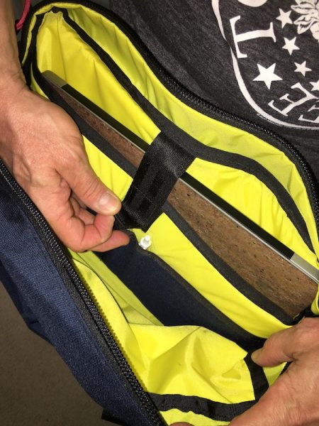
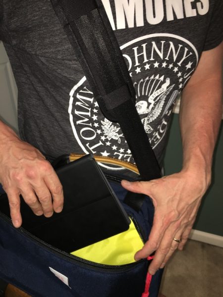
The Commuter leverages a classic briefcase form factor with excellent accessibility. A top  zipper (with two pulls for left- or right-side access) opens to the main compartment, which includes a padded laptop sleeve. The front zippered pocket runs the length and height of the bag and is big enough to accommodate a tablet and extras. A couple of additional small pockets are built into the laptop sleeve (one open, one zippered, and two pen loops). It’s a simple, functional layout is gives you quick access to everything in the bag. On the downside, there’s not a lot of pocketing for corralling your extra bits. If you need of extra organization, you’ll want to bring your own pouches and accessories to manage your stuff.
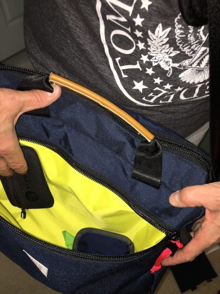
At 16″ by 11″ by 4.5″ and just over 2 pounds I feel that the Commuter Briefcase hits the sweet spot for overall size, capacity & weight. You can load up a 15″ laptop, a tablet, chargers, headphones, a notebook or two, and all of your daily bits & pieces (chargers, pens, keys, etc.) with room leftover to pack a snack or a small lunch. If you want to go minimal (like a tablet and essentials), it’s still streamlined enough that you won’t feel like you’re carrying too much bag. While I have not flown with it (yet), I expect that the size will make it an excellent personal item to stow under an airline seat.

One Bag, Three Carry Options

The Commuter Briefcase’s key differentiator is the three-way carry system. Numerous bag designers have developed variations on this theme, but this may be the best implementation I have seen yet. 
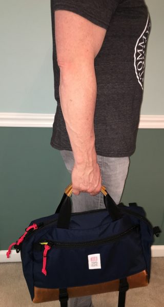
The first carry option is briefcase style, in which you carry the bag by the two top handles. The handles themselves are substantial nylon webbing, wrapped with Horween leather grips that add a touch of padding. Some may want more padding, but I find that they are comfortable enough without being so bulky that they get in the way when not in use.
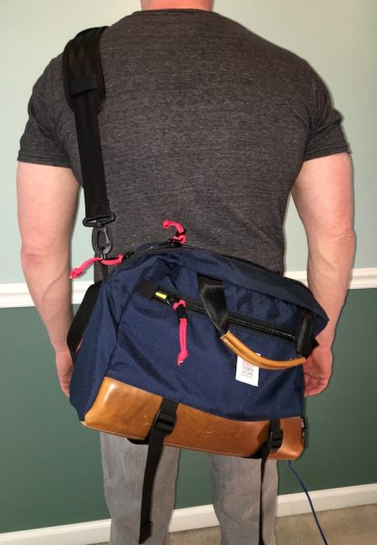
There’s a detachable shoulder strap for messenger mode, made of nylon webbing with heavy-duty plastic swivel buckles with an 18″ closed foam pad. Drop length on the strap accommodates a broad range of body types, and the generous shoulder pad makes it easy to find a comfortable position. This is my main carry mode and I have found that the pad, while thin, is very comfortable. The thinner pad also makes it easy to stash when not in use without taking up a lot of space in the bag.
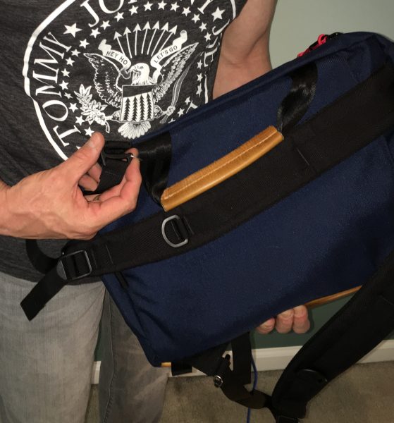
For backpack carry, you’ll find a pair of shoulder straps stashed into a rear pocket. Rotate the bag to a vertical orientation, pull the straps out (they are permanently attached at the shoulder points), and clip them into attachment loops at the “bottom” of the bag. There’s also a nylon grab handle that sits at the top of the bag in this configuration. The setup is comfortable for all-day carry with good padding and nice adjustment length in the straps. Topo also includes a removable waist strap if you need it.

Daily Use

Testing bags is one of my favorite things, so I am very particular about how a bag’s intended design translates into daily use. After two months of living with Topo Designs Commuter Briefcase, I think it hits all the marks for functional usability. It’s easy to use, adapts well to many situations, and (most importantly) works well in all of its intended forms.

For commuting and life in the office, it’s a great choice. The size is just right to carry your laptop and all of the workplace accessories and works well whether you’re traveling by car or by train with easy access to all of your stuff.  Getting in and out of the bag during meetings is easy if you need to grab things, and it’s light enough that you don’t mind slogging it around from conference room to conference room. It doesn’t look out of place in business environments, and looks good dressed up or dressed down for casual days.
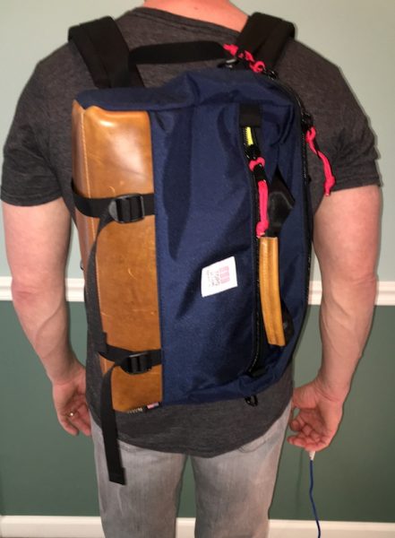
The Commuter Briefcase works just as well as a travel companion for day trips or extended adventures. It’s light and streamlined enough that you can use it like a messenger bag, yet still have a protected spot to stash your tablet if you need it. It’s not fully waterproof, but the materials are rugged enough that it can take some abuse while the coated pack cloth gives additional protection against dirt and spills with water resistance. The backpack mode is great if you want to go hands-free, and works well for all day carry if you need it. I have a business trip to Europe coming up over the summer, and I’m looking forward to testing this bag out as my personal bag for airline travel, business meetings, and sightseeing. I’ll post a report on that when I get back!

Nitpicks and Caveats

I don’t see any big deal-breakers in terms of design flaws here, but the Topo Designs Commuter Briefcase does have some quirks that you should know about related to organization, style, and design choices.

Some have commented that they would like to see more organization in the Commuter for corralling loose bits. I find that some bag designers tend to over-design these spaces to the point that they become very mission-specific. My preference is to add organizer pouches for customization, and I think that the open layout of this bag lends itself well to that. If you prefer more built-in organization, however, this may not be the bag for you.

There is a pair of cinch straps on the bottom of the bag, but they don’t seem particularly necessary to me. I think they are better suited for securing longer items (an umbrella, a tripod, or maybe a rolled up jacket). Nor have I found a need to use the waist strap. It’s a nice bonus, but it’s just not necessary for a bag of this size unless you’re hiking (in which case you would probably use a backpack). These are both nice little additions, but I don’t see them as necessary for a bag that if focused more towards business and casual use than true outdoor adventuring (I would use one of their backpacks for that). 

While the look of the bag will definitely stand out in the office, materials and hardware tend towards functional use. Some may not like the use of plastics and nylon in all of the buckles, snaps & straps. Quality is excellent, and I don’t see any potential fail points in these items. They do tend to favor the rugged end of the bag’s style, however, and you may find them out of place if you are looking for a more formal look in your daily carry. 

Finally, the backpack straps are permanently stitched to the bag at the shoulder points and are not removable. They also tend to protrude from their pocket a bit when stored. Some reviewers have commented that these issues can be irritating, but I have not found this to impede the other functions of the bag. Honestly, I think this a trade-off that you have to consider the ability to convert to backpack mode on-the-fly; if this is a function you don’t plan to use much, you may want to consider a bag specifically designed for briefcase-style carry. 

A Note on Accessories

When I purchased this bag, I also bought two additional items to help with organization. I’m pleasantly surprised to report that I found both items to be even more useful in practice than I expected.
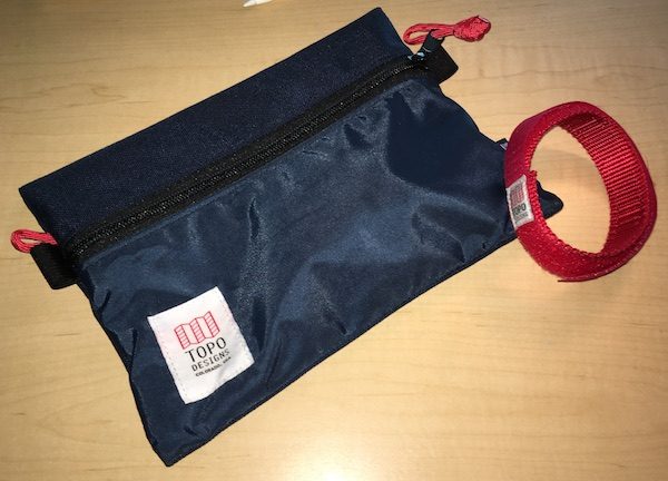
The Topo Medium Accessory Bag is treated to use. Its made from 1000D Cordura with the same coasted pack cloth as the bag, and includes loops and attachment points to hook it to a chord or carabiner if needed. At 9.5″ by 7.5″ it’s perfect to round up all my chargers, cables, and loose bits; it also fits nicely in either the main compartment or the front compartment with plenty of room to spare.

The Topo Designs Strap is a 10.5″ nylon strap with an additional 8.5″ hook-and-loop fastener extension. Topo makes these as a multifunctional accessory: you can use them to manage your skis or tools, to peg your pants leg while biking, or even as a watch strap. I found that this works great for securing a water bottle to my bag strap.

As with the Commuter Briefcase, both accessories are rock-solid builds and look like they will take long-term abuse. They are nice additions that extend the usability of the bag, without any extra frills that interfere with their functionality.
Conclusion & Pricing

After two solid months of living with the Topo Designs Commuter Briefcase on a daily basis, it has quickly become one of my favorite bags. Attention to detail and function translate to a design in the Commuter that is easy to live with and adapts easily to work, play and travel. It looks good in professional and casual settings and works equally well in all three carry modes. Overall this is one of the best realizations of a one-bag, multifunctional daily carry solution that I have found yet.

Topo Designs builds all of their products in an environmentally-friendly facility in Colorado and uses materials that are all sourced in the U.S. The Commuter Briefcase retails for $189, which is a good price considering the features and the fact that’s made in the USA. Topo also makes a variety of accessories at different price points; the medium accessory bag I tested is $17, and the strap is $12. To find out more and to check out their whole lineup of gear (including clothing and accessories), hop on over to Topo Designs web site.

Note: This product was not supplied for testing by Topo Designs. I paid for this with my hard-earned nickels. Visit Amazon for current pricing and to order.


Product Information

Price: $189.00
Manufacturer: Topo Designs
Retailer: Amazon
Pros:
  • Good looking in office and casual environments.
  • Excellent build quality, made in the USA.
  • Works well in all carry modes.
  • Simple, functional, and effective design.
Cons:
  • Minimal organization options may not suit everyone's tastes.
  • Might be too casual for formal business settings if that's the look you are going for.

Filed in categories: Reviews

Tagged:

Topo Designs Commuter Briefcase review originally appeared on on May 30, 2017 at 11:02 am.

Note: If you are subscribed to this feed through FeedBurner, please switch to our native feed URL http://the-gadgeteer.com/feed/ in order to ensure continuous delivery.
Android 7.0 tips: Notifications and power notification controls


I thought it might be interesting to write up some tips about Android 7.0 (Nougat) features that I find fun to use. I realize that not all our readers have Android 7.0, but for those of you who do, you will find some of the new features very handy. One of those features that I really enjoy using is being able to customize my notifications in the notification shade and Nougat offers a faster and easier way to manage them.


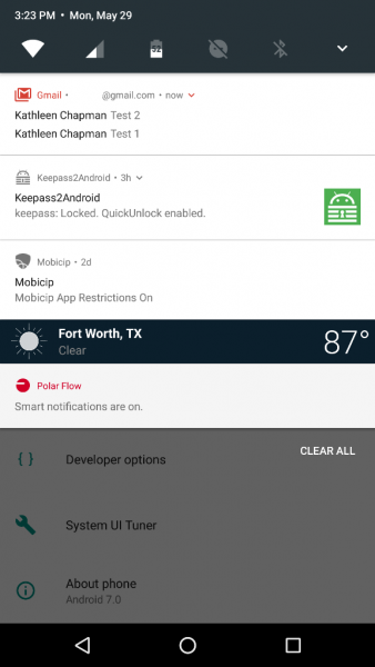
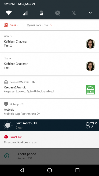
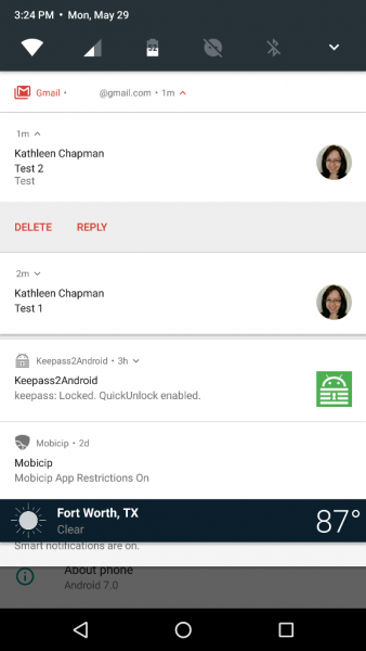
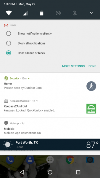
Android 7.0 now allows apps like Gmail to bundle their notifications in the notification shade (although not all apps do this). When you receive several emails, Gmail will group them together in the notification shade like that shown in the left screenshot above. If you pull down on the Gmail notification, it will separate each email as shown in the center screenshot above. And, if you continue to pull down on each email, you will be given the options to Delete or Reply.

Now, to easily manage your notifications, you’ll need to pull down on the notification shade and long press on the notification you wish to customize. This reveals three options to choose from: “Block all notifications”, “Show notifications silently”, or “Don’t silence or block”. Pretty sweet, right?

But wait, that’s not all. What if you would like to prioritize your notifications in the notification shade by order of importance? Nougat allows you to do so via the Power Notification Controls available in the System UI  Tuner.


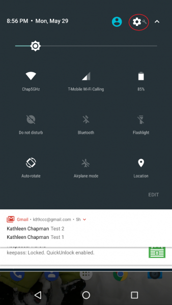
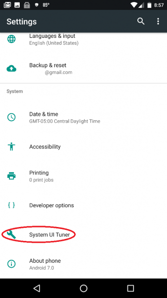
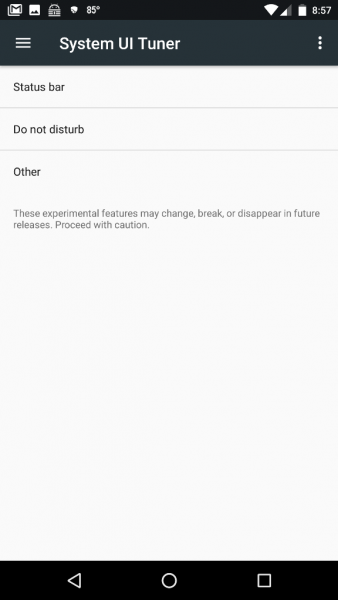
Where is the System UI Tuner? It is located in your device Settings (the gear icon located in the upper right corner after pulling down on the notification shade twice as shown in the left screenshot above) but it does not show up automatically so you will have to long press on the Settings gear icon for about five seconds then release. After you release, a message pops up saying, “Congrats! System UI Tuner has been added to Settings.” Another message warns you (after opening the Tuner) that it is “Fun for some but not for all. System UI Tuner gives you extra ways to tweak and customize the Android user interface. These experimental features may change, break, or disappear in future releases. Proceed with caution.” (Ooh, how I hope they don’t take this away!!!)

NOTE for HTC users who wish to access the System UI Tuner: Thanks to hasmujo on YouTube, there is a workaround for you to access the System UI Tuner. To do this you will have to download Nova Launcher (the free version is fine) if you don’t already have it installed.


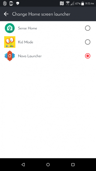
Once installed, you’ll need to set Nova Launcher as your new launcher by tapping on the following:

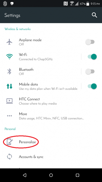
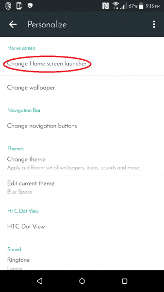
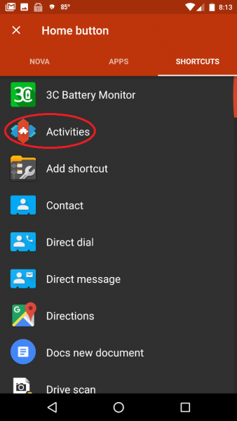
device Settings (gear icon) > Personalize > Change Home screen launcher > Nova Launcher (depicted in the screenshots above; you can revert to your previous launcher later once you’ve selected all the System UI Tuner settings you want).


Now you’ll need to set up your phone’s soft Home key to launch the System UI Tuner. To do this you’ll need to tap on the following:

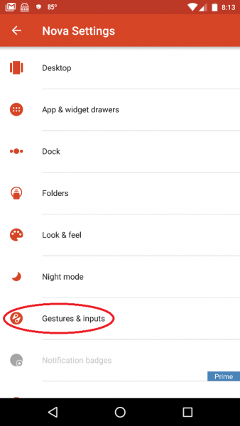
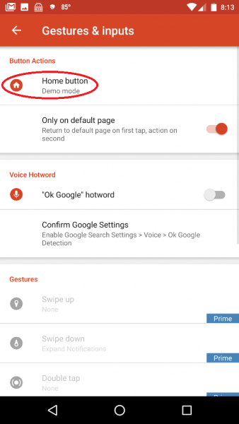
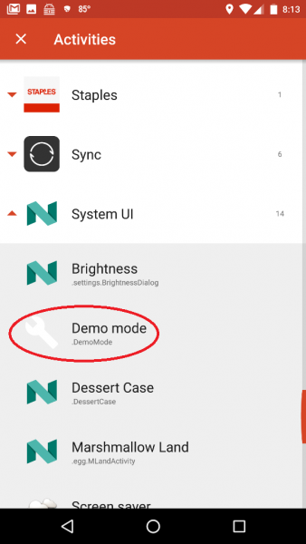
Nova Settings app (in the App Drawer) > Gestures & Inputs > Home button > Shortcuts (located at the top of the app screen next to “Nova” and “Apps”)> Activities > System UI > Demo mode (the steps are shown in the screenshots above which may be tapped on to view a larger size).

After setting up the Home button to launch the Demo mode System UI setting, you’ll then back out of all these settings then tap on the soft Home key on your phone (you might need to tap on the Home button twice if you weren’t already on your phone’s Home screen). This launches the System UI Tuner settings. Now back to Power Notification Controls…


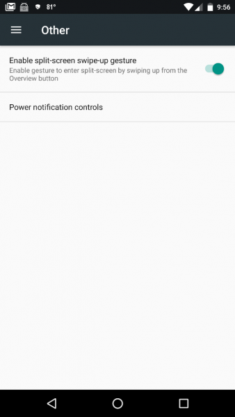
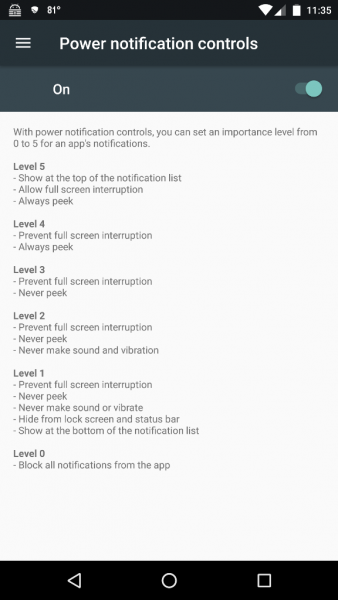
To navigate to and turn on the Power Notification Controls, you’ll need to go to the System UI Tuner settings by tapping on your device Settings icon (gear icon) > System UI Tuner (located near the bottom of the list) > Other > Power Notification Controls and slide the button to the On position (shown in the right screenshot above).


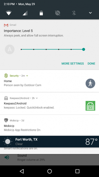
Now when you long press on a notification in the notification shade, you will see information like that shown in the left screenshot above. Each of the dots on the horizontal slider bar represents a notification importance level (shown in the right screenshot above):

  • Level 5
    • Show at the top of the notification list
    • Allow full-screen interruption
    • Always peek
  • Level 4
    • Prevent full-screen interruption
    • Always peek
  • Level 3
    • Prevent full-screen interruption
    • Never peek
  • Level 2
    • Prevent full-screen interruption
    • Never peek
    • never make sound and vibration
  • Level 1
    • Prevent full-screen interruption
    • Never peek
    • Never make sound or vibrate
    • Hide from lock screen and status bar
    • show at the bottom of the notification list
  • Level 0
    • Block all notifications from the app

Notice the grayed out “A” located on the left of the slider bar? When this is NOT grayed out, it means that the app automatically determines the level of importance for you. This is the default setting of installed apps, and you must tap on the “A” to be able to customize the level of notification importance. Voilà! There you have it – custom notifications!

Isn’t Android awesome? And it just keeps gettin’ better with time…

Filed in categories: Articles

Tagged:

Android 7.0 tips: Notifications and power notification controls originally appeared on on May 30, 2017 at 7:58 am.

Note: If you are subscribed to this feed through FeedBurner, please switch to our native feed URL http://the-gadgeteer.com/feed/ in order to ensure continuous delivery.