Google Nest Hub review

REVIEW – Remember a few years ago when digital photo frames were a popular gift? These days people don’t want a gadget that can only do one thing, they want a jack of all trades, and that’s what the Google Nest Hub aspires to be. Let’s take this photo frame on steroids for a spin.

What is it?

The Google Nest Hub is a digital photo frame, speaker, smart home control hub, digital assistant, and more.

Hardware specs

Display: 7” LCD touch screen
Speaker: Full Range Speaker
Microphones: 2 mic array
Connectivity: Wi-Fi and Bluetooth support
Power: 15W adapter
Ports: DC Power Jack
Dimensions & Weight: 7.02 in W x 4.65 in H

What’s in the box?
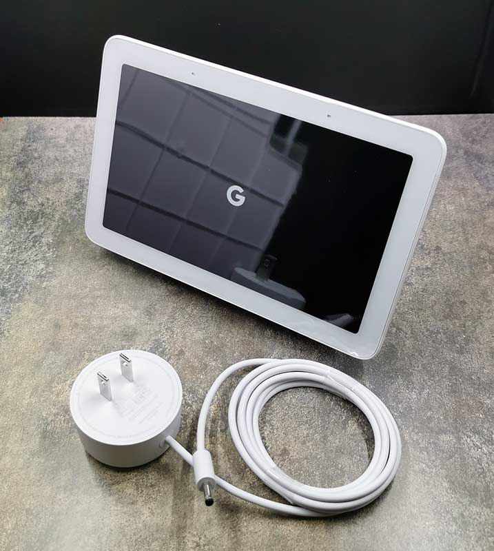
  • Google Nest Hub
  • AC power adapter

Design and features

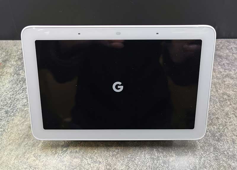
The Google Nest Hub is a small touchscreen tablet that has a built-in stand so that it’s always at the perfect angle for viewing video and photos.

At the top of the display are two far-field microphones with an ambient light sensor between them.
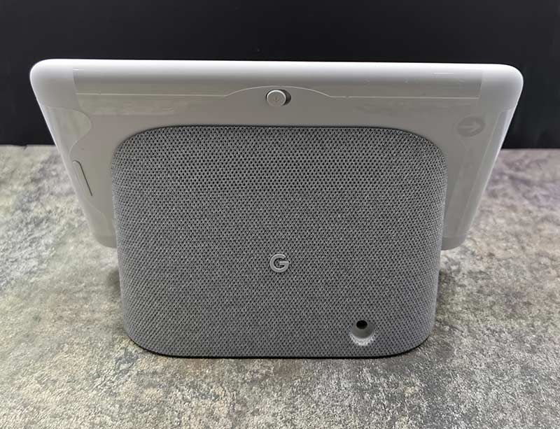
On the back edge of the Nest Hub is a mute switch at the top and on the side is a volume button.
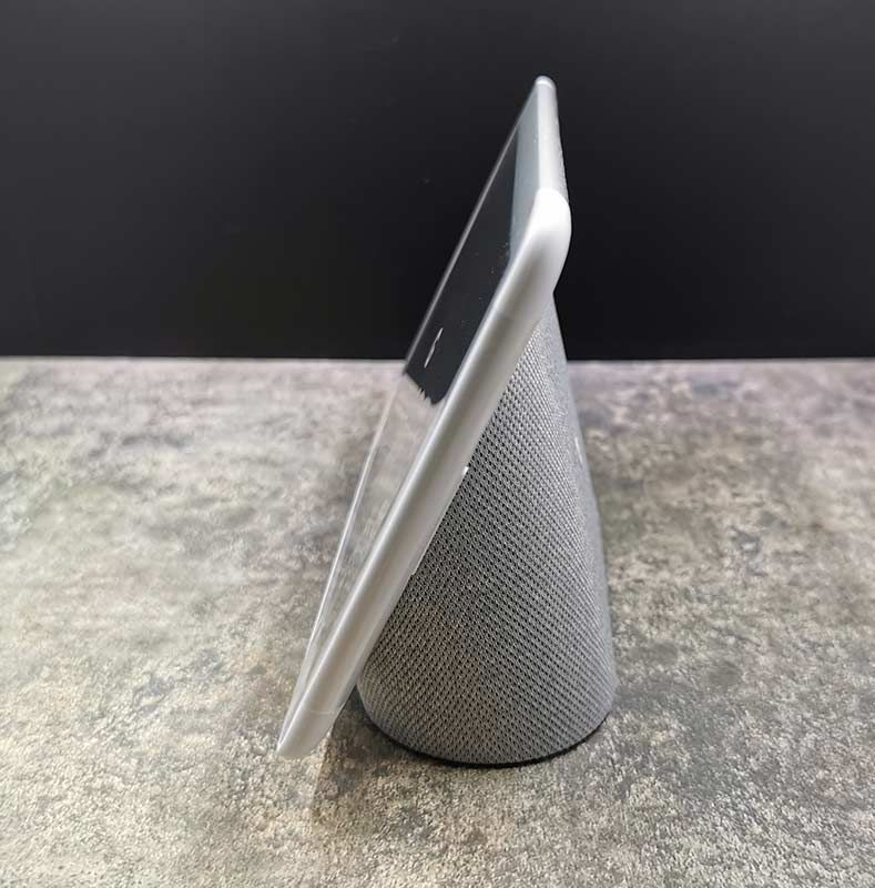
The Google Nest Hub is available with a Sand, Aqua, Chalk, or Charcoal material covered stand that has a small Google badge attached in the center.
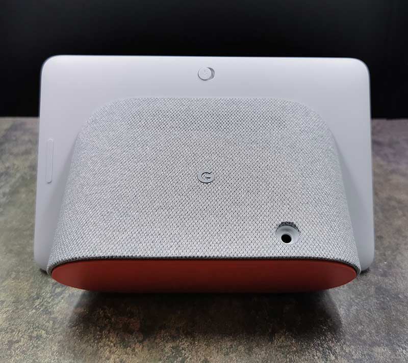
A power port is located at the bottom of the stand. It uses a proprietary connector instead of a USB-C cable. Oh well.
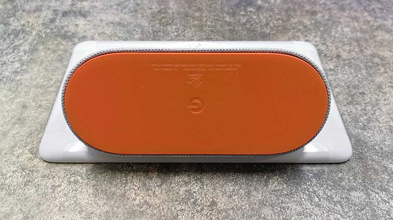
The bottom of the stand has a bright orange rubber pad that keeps the Nest Hub from sliding around when you’re interacting with the touch screen.

Setting up the Nest Hub

You’ll need a mobile device with the Google Home app to get the Nest Hub up and running.


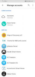
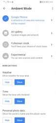
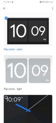
The Google Home app is where you configure settings like the clock style, which photos albums you want to as a backdrop slideshow when the Hub is idle, and connecting a variety of other devices that can be controlled with Google Assistant.

What can it do?

Although the Nest Hub is marketed as a digital photo frame, there’s a lot more to this device than just being able to view your latest vacation pics. Let’s check out the main features.

Digital photo frame
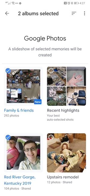
Let’s start with the main feature which the ability to show your favorite images on the 7inch display. To use this feature, you’ll need to have your images already stored in Google Photos. Then in the Google Home app, you can specify which albums you would like to show and you can create live albums images of your family and friends that will automatically update as new images are added to your Google Photo archive.
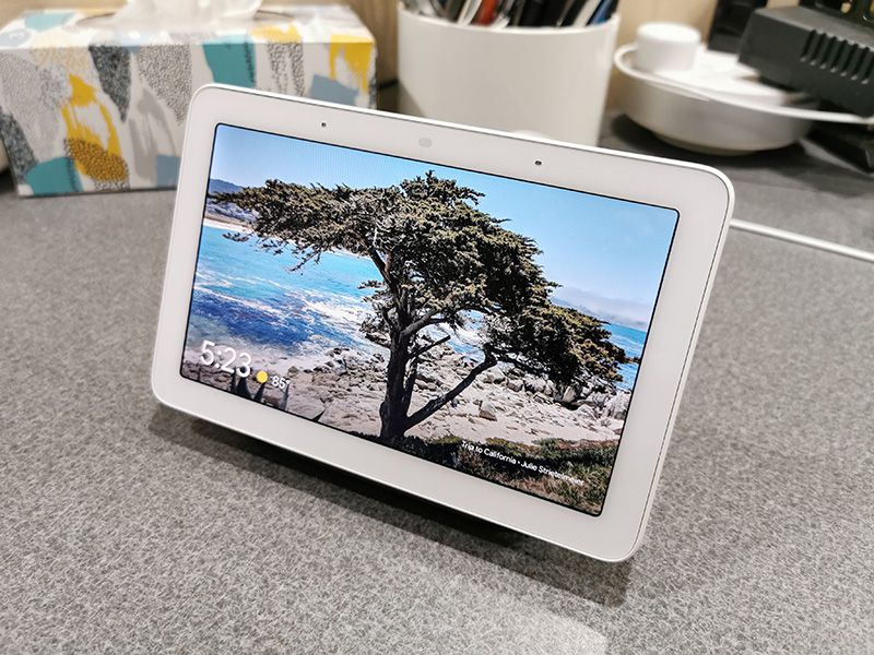
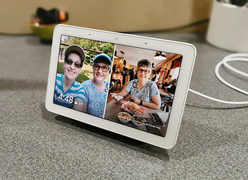
As a digital photo frame, the Google Nest Hub has a nice looking display (although small at only 7 inches) that is crisp and vibrant. The display uses an ambient light sensor to adjust the brightness so the images look good in any lighting conditions.

I like that the slide show includes the current time, the name of the album where the images are coming from, and the current weather / temperature.

If you have images in portrait orientation, you can configure a setting where it will show multiple images on the screen like the ones you see above. You can also swipe either direction in the center of the screen to see the previous or next picture.

You can also tell the Hub what images to display just by saying “Hey Google, show me pictures from my vacation in California”. At least that’s what it’s supposed to do. It was really disappointing when the Nest Hub informed me that it could not show images from that account when I used this voice command. With a little research, I discovered that if you have a Google Suites account, which I do, that this feature doesn’t work. <sniff>

Smart home hub
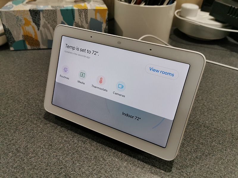
You can also use the Google Nest Hub as a smart home hub for all your connected devices like Nest thermostats (which I have), security cameras, and many more.

On any screen, you can pull down from the top for a dashboard of your connected devices. From there you can interact with them either manually with your finger, or with your voice by saying “Hey Google, show me my porch camera”, or “Hey Google, turn up the temperature”.
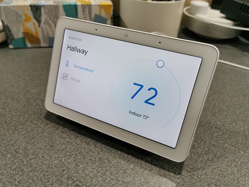
I found that I was able to easily control my older Nest Thermostat buy using the onscreen controls or my voice.
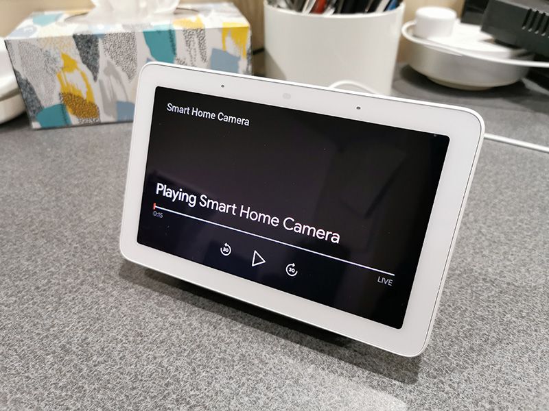
Using the Nest Hub to see live footage of from my Wyze security cams wasn’t quite as easy. A lot of times, I’d see a blank screen like I show above.
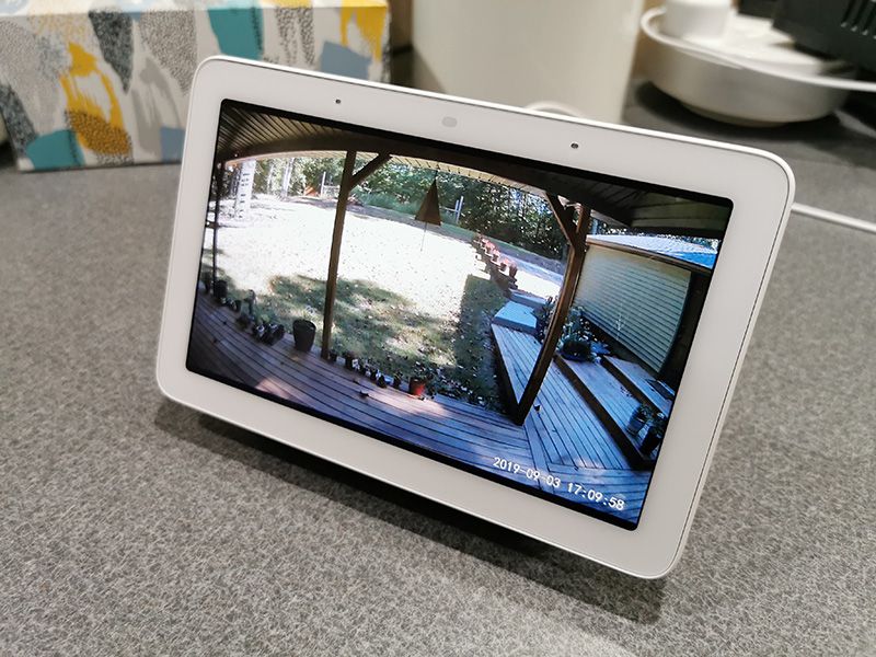
Eventually, after pausing, and playing, the live view would show up on the screen. One cool feature is associating commands like “show my camera…” and “play a video of…” to a specific screen like a TV. My Vizio TV happens to have Chromecast built-in, so I could use my voice to cast a video to the TV which would then automatically turn on and start playing. The only downside is that once you associate another display with the Nest Hub, it’s difficult to get a video to show on the Hub’s display instead of the TV.

Streaming music
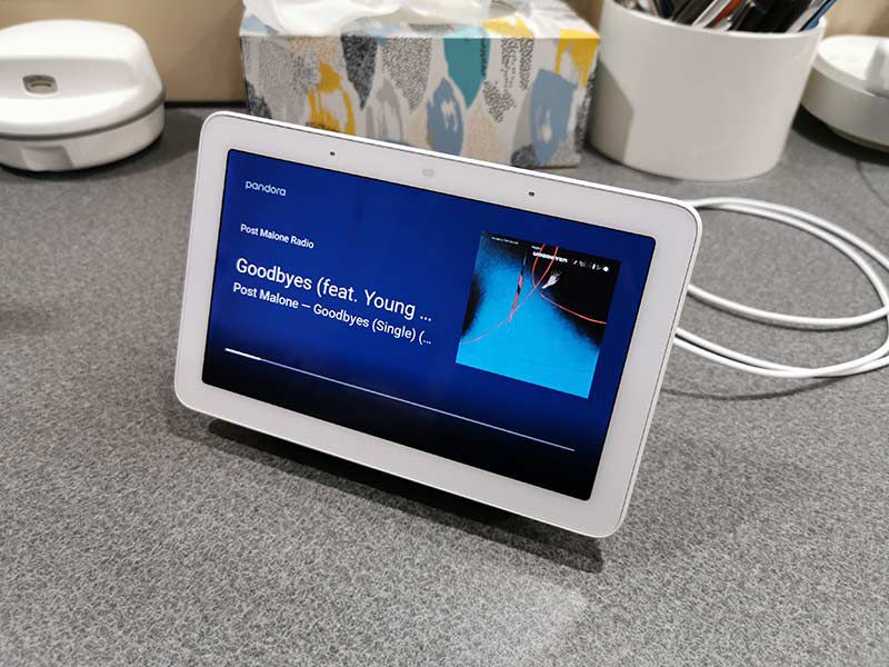
Using the Google Home app, you can associate streaming services like Google’s Music service, Spotify, and Pandora with the Hub. Then you can just say “Hey Google, play music from Post Malone”.
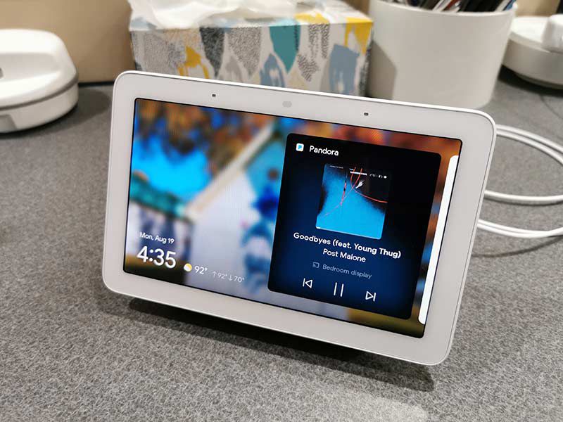
The Google Nest Hub isn’t going to impress an audiophile, but for a small speaker, it sounds pretty good. Having the album art and song titles right there where you can see them is nice too.
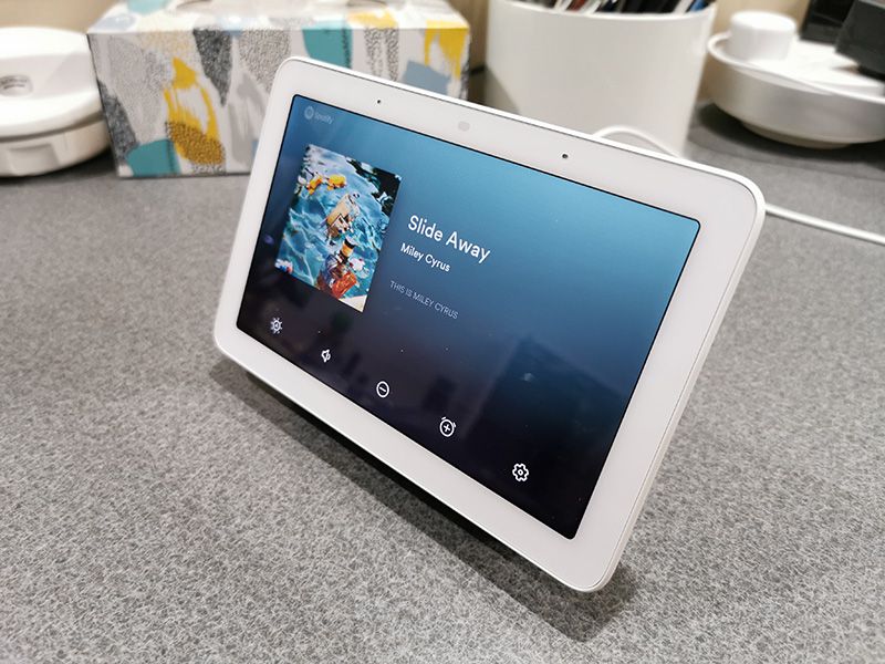
You can also swipe up from the bottom of the display to get access to touch buttons for volume and brightness, or you can use the physical buttons on the back of the display.

Assistant
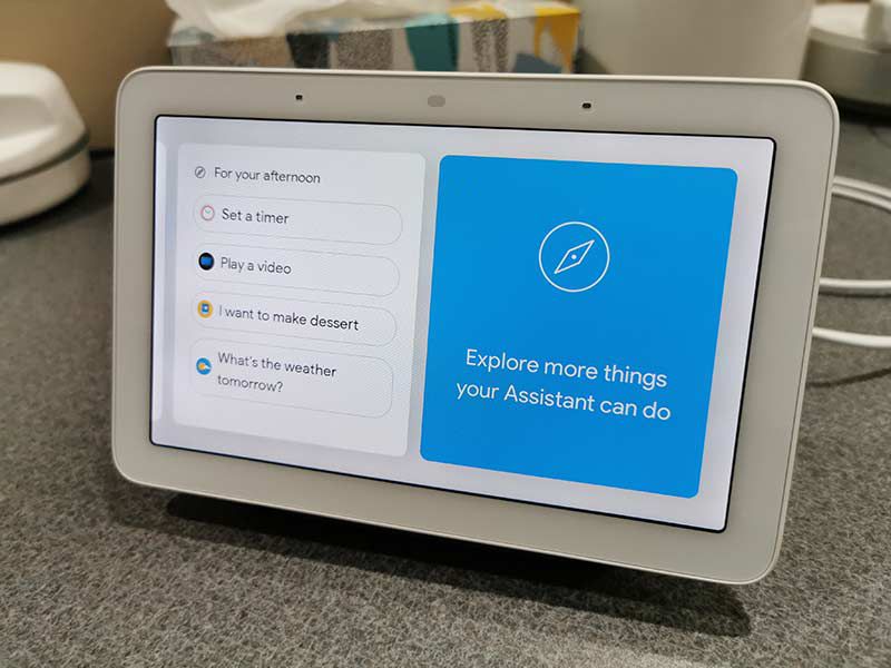
Since I use an Android phone, I already use Google Assistant on phone, so using it with the Google Nest Hub is not different other than the fact that you have a nice large display to see the results.
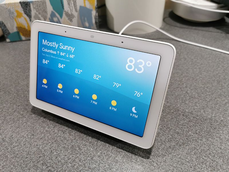
Asking questions like “Hey Google, what’s the weather like today” brings up a nice display and sound effects like birds chirping in the background.

I did run into another G Suites problem when I try the command “Hey Google, what appointments do I have today?”. I’m told that the command isn’t available but that she’s learning new commands all the time. Gee thanks Google… not.
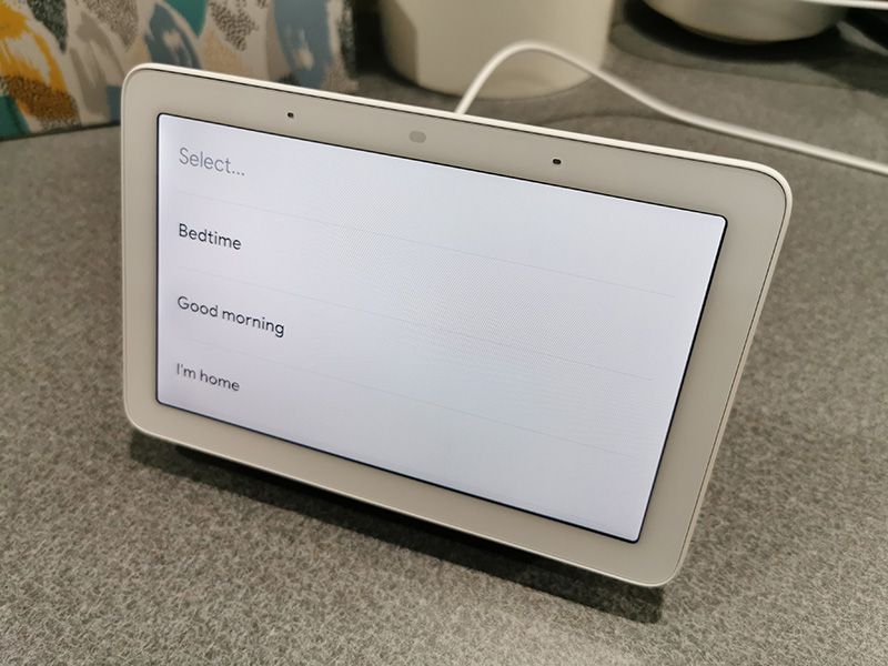
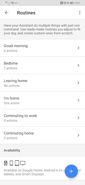
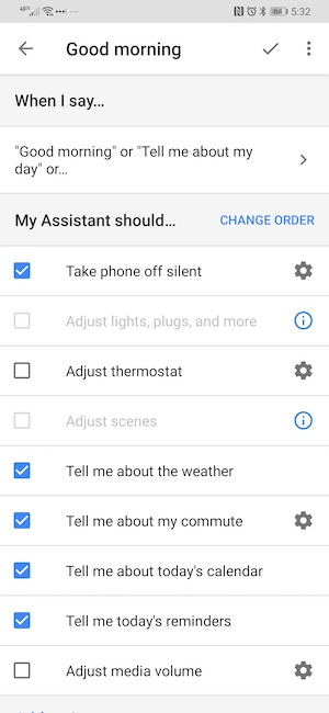
Another assistant feature is the ability to create routines that you can trigger with your voice like saying “Hey Google, good morning”, or “Hey Google, I’m home”.


Using the Google Home app on your mobile device (it sure would be nice if you could also use the Hub to customize these features too) you can create a list of things to happen once you say the trigger words to launch a routine.

One annoying issue I’ve run into is that saying “Hey Google” to interact with the Google Nest Hub would also trigger any Android phones or tablets also in the same room. At least when I would ask to play music or video, it would only play through the Hub and not all the devices at the same time 😉

Alarm clock

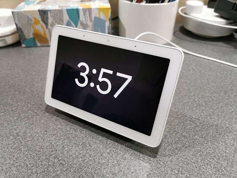
If you long swipe from the left edge of the screen, you can put the Google Nest Hub into clock mode which just shows the time of day. You can also use commands to set alarms, to turn the Hub into your bedside alarm clock. The only downside is that you can set different alarm sounds for the alarms.

Watching videos
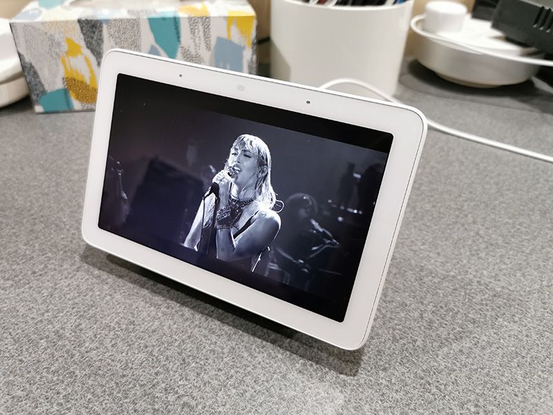
You can ask the hub to play videos from on Youtube by saying something like “Hey Google, play Taylor Swift videos”. I found that works great for the first video but then it will usually switch to playing some other videos. For example, I asked it to play Sam Smith videos and it played one and then switched to playing Taylor Swift videos.

What I like

  • Simple setup
  • Easy to use
  • No learning curve if you’re already used to using “Hey Google”

What I’d change

  • Make all the Google Assistant commands work with GSuite accounts

Final thoughts

As a digital photo frame and smart home controller, the Google Nest Hub is an affordable device with enough features to keep you happy. It has a nice display, decent speakers, and you can control most features just with your voice. As long as you’re not a GSuite user like I am, it’s a useful gadget for your home.

Price: $99.00
Where to buy: Google
Source: The sample for this review was provided by Google. Please visit their site for more info.

Filed in categories: Reviews

Tagged: , ,

Google Nest Hub review originally appeared on The Gadgeteer on September 6, 2019 at 10:00 am.

Note: If you are subscribed to this feed through FeedBurner, please switch to our native feed URL http://the-gadgeteer.com/feed/ in order to ensure continuous delivery.

Huawei P30 Pro Android Smartphone review

REVIEW – I purchased the Pixel 2 XL back in October of 2017 and liked it quite a bit. But WiFi and Bluetooth connectivity issues had me trying alternatives over and over again only to go back to the Pixel because I couldn’t find a phone I liked better enough to spend the cash. I’m happy to say that after trying the Samsung Galaxy S10+, Pixel 3 XLEssential Phone, The iPhone X Max, and others, that I finally found a phone that I’ve stuck with… the Huawei P30 Pro. Let’s take a closer look.

What is it?

The P30 Pro is Huawei’s flagship Android smartphone.

Hardware specs

Processor: HiSilicon Kirin 980 Octa-core, 2600 MHz, ARM Cortex-A76 and ARM Cortex-A55, 64-bit, 7 nm
OS: Android (9.0 Pie), Huawei Emotion UI
Cellular: LTE (FDD): Bands 1, 2, 3, 4, 5, 7, 8, 9, 12, 17, 18, 19, 20, 26, 28, 32
LTE (TDD): Bands 34, 38, 39, 40
UMTS: 800, 850, 900, 1700/2100, 1900, 2100 MHz
GSM: 850, 900, 1800, 1900 MHz
Data: LTE-A, HSDPA+ (4G) 42.2 Mbit/s, HSUPA
GPU: Mali-G76 MP10
Screen: 6.47-inch, 19.5:9, 398 ppi (1,080 x 2,340)
RAM: 6GB/8GB
Storage: 128GB/256GB/512GB
Bluetooth: 5.0
Wi-Fi: 802.11 a, b, g, n, ac, dual-band
Battery: 4,200 mAh
Cameras: 40MP + 20MP + 8MP rear + ToF / 32MP front
Dimensions: 158 x 73.4 x 8.4mm
Weight: 192g

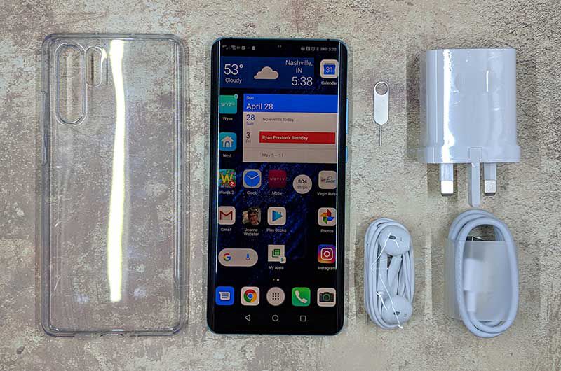
What’s in the box?

  • Huawei P30 Pro
  • Protective case
  • USB charger (UK version) and USB cable
  • USB-C earbuds
  • SIM removal tool

Design and features


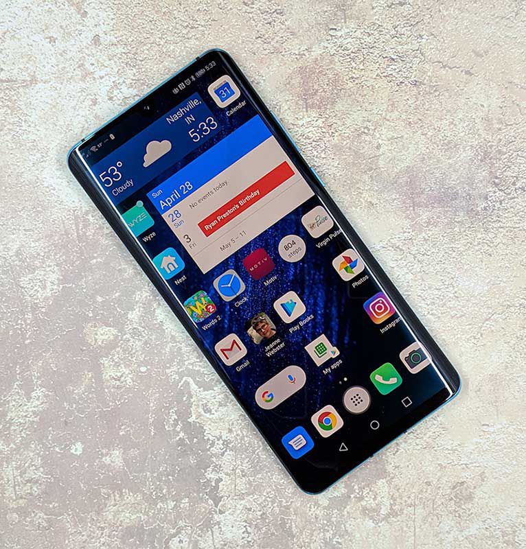
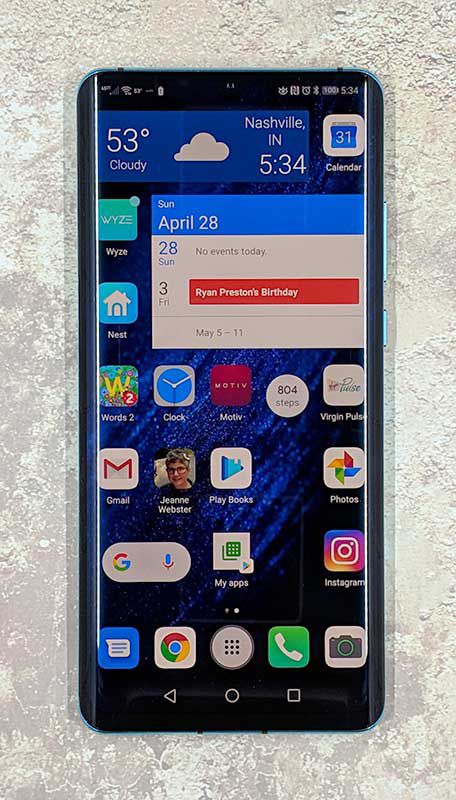
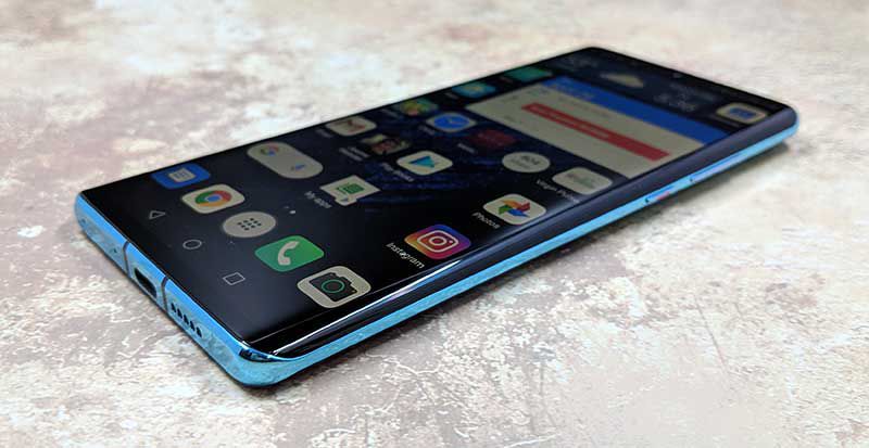
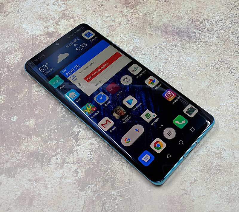
My first impression after taking the P30 Pro out of the box was that it reminded me a lot of the Samsung Galaxy S10+ due the curved sides of the display and sleek style. The top of the phone is all screen and there are also no buttons other than the virtual nav buttons. There isn’t even a speaker grill for your ear, but I’ll talk more about that later.

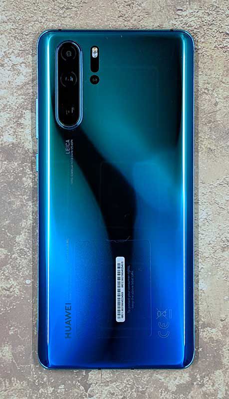
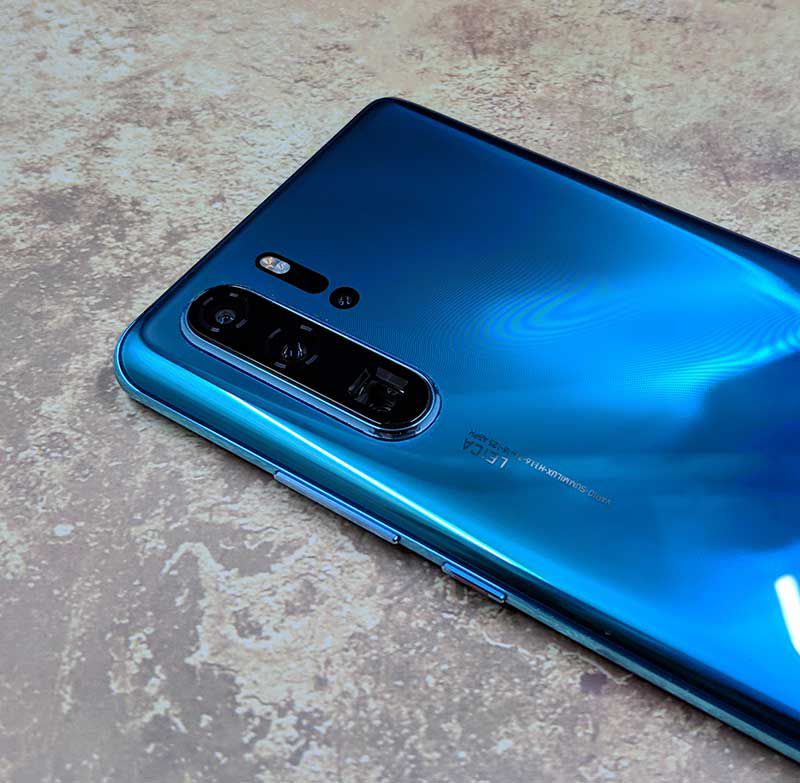
The back of the phone has a long camera bump with 3 lenses. Next to the bump is an LED flash and a ToF camera. What’s a ToF camera? This article on Pocket-lint explains it pretty well.

The left side of the phone is buttonless, while the right side has a one-piece volume button with a power button below it.

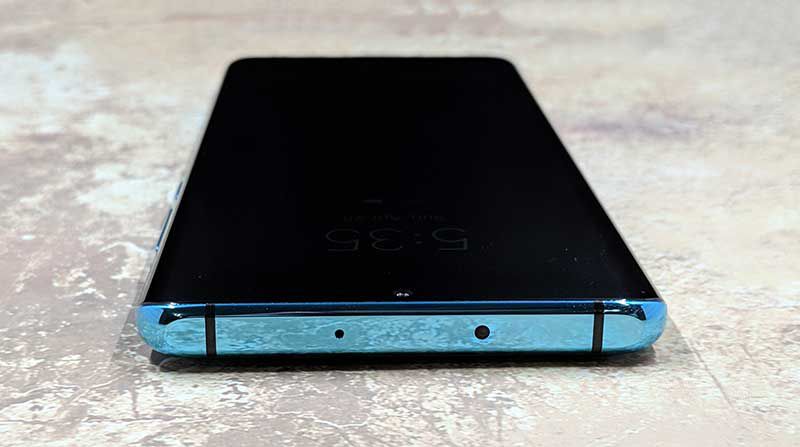
Along the top edge of the Huawei P30 Pro, you will find a microphone and an IR transmitter so that you can use the phone as a universal remote using the included Huawei Smart Remote app and your AV equipment.

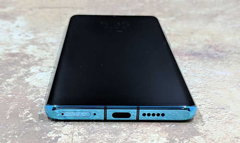
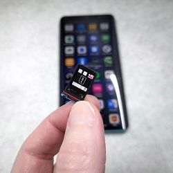
On the bottom edge of the phone is the SIM card tray, another microphone, the USB-C port, and the speaker.


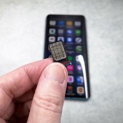
The SIM card tray has two sides, one side is for your regular SIM card and the other side can hold Huawei’s proprietary nanoSD card.

Display

Unlike the Huawei P20 that I reviewed last year, the P30 Pro does not come with a pre-installed screen protector which would have been a welcomed feature due to the curved edges.

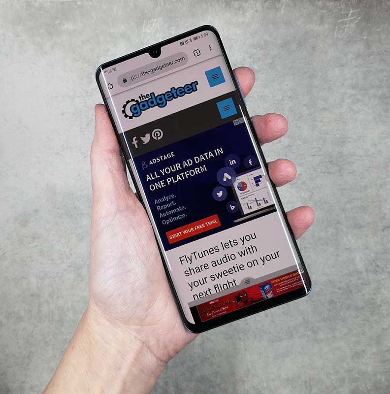
The P20 Pro’s screen is bright, vibrant, crisp, and clear to my eyes. It has a small teardrop-shaped camera cutout in the top center of the display that doesn’t bother me in the least.

If you dive into the display settings, you’ll find options to turn on a blue light filter, manual adjustments for the color mode that allow you to switch between normal and vivid modes and color temperature settings of default, warm or cool settings. You can also manually choose between the screen resolution of HD+ which is 1550 x 720 or FHD+ which is 2340 x 1080. Or you can toggle Smart resolution which will automatically lower the resolution to save power.

Fingerprint reader

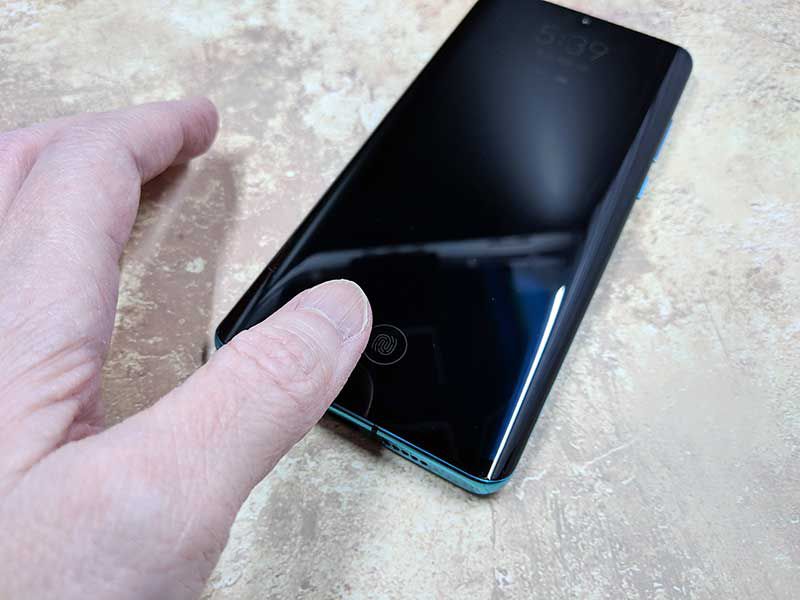
Several months ago I bought the Samsung Galaxy S10+ to replace my Pixel 2XL. The phone was really nice, but the reason I ended up sending it back was the in-screen fingerprint reader. It didn’t work at all for me. So when I read that the P30 Pro also had an in-screen fingerprint reader, I was pretty sure the experience wouldn’t be any different from the Samsung’s. I’m happy to say that I was wrong! The in-screen fingerprint reader on the P30 Pro is AWESOME and works 99% of the time for me which is unheard of when it comes to me and fingerprint readers.

The P30 Pro also has face recognition, so if for some reason it can’t read my thumbprint, my face unlocks the phone. I couldn’t be happier.

When it comes to the look and feel, I can’t complain about the P30 Pro. Although I don’t care about curved screens, it hasn’t caused me any issues. This phone is well made with a solid feel and premium look and feel. I can’t crush it when I do my Gadgeteer squeeze test, so I think it’s built to last.

I even dropped from about 3ft onto the concrete floor in my garage this week and it survived with only two scuffed corners – I didn’t have it in a case at the time. My bad. The next day I put the free case that shipped with the phone back on it.

Camera

The Huawei P30 Pro has a unique camera setup. On top is the 20MP ultra wide angle lens with a 40MP SuperSpectrum camera below that, and a horizontally placed 8MP periscope telephoto lens at the bottom. Next to that trio of cameras is an LED flash with the tiny ToF camera below that. The ToF camera helps with portrait mode pics.

Zoom!


The 5x zoom on this camera is pretty impressive. Check out the pics above which I took a couple of weeks ago during a vacation to Red River Gorge in Kentucky. Note that if you zoom in to the max, that it’s pretty tough to find your subject when you’re zoomed in that far and details definitely suffer. A tripod is really needed if you plan to use the zoom feature.

Wide angle


Night

d

32GB selfie cam

Everyday shots look great!


Just like the P20, I love the P30 Pro’s camera. Some might say that the colors are a little too vibrant especially when you use it in HDR mode, but I think the pictures look great.

Audio quality

You would think that as a flagship phone, that Huawei would have gone all out of the audio capabilities of this phone. So you might be surprised that the P30 Pro does not have stereo speakers. It only has one downward firing speaker that is located on the bottom right edge.

If you’re looking for the speaker earpiece for calls, you’re not going to find one because the speaker is actually under the display just like the fingerprint reader.

Is the lack of stereo and a traditional speaker grill for your phone a big problem? Nope, not really. Ok, maybe just a little bit when it comes to calls. But for the main speaker, I rarely listen to music through a phone’s speaker, so wired or Bluetooth earbuds are no problem. But for calls, I do notice that even at maximum volume, that I sometimes wish the sound was louder. Usually, this is when I’m in a noisy environment. If I’m home, there’s no issue.

Software and user interface

Like the P20, the P30 Pro ships with Huawei’s own interface skin that’s called EMUI. EMUI doesn’t make Android look that much different from stock, but it adds extra features like the ability to take screenshots by knocking twice on the screen with your knuckle. You can also knock once and then draw an S to take a scrolling screenshot for really long pages. There’s even a built-in tool to record a screencast.

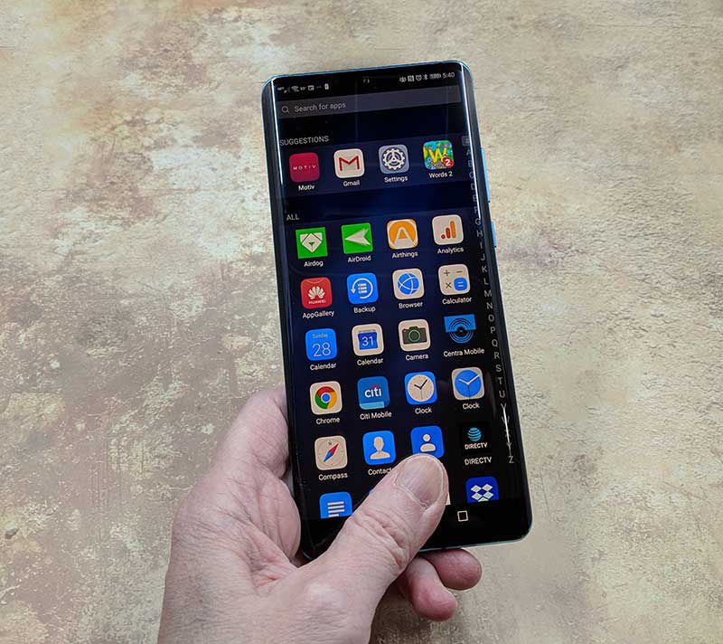
One thing I don’t like about Huawei is that they include their own versions of the stock Android apps like a browser, app gallery, compass, calendar, clock, calculator, etc. I don’t use any of these apps because I prefer Google’s versions. So it’s annoying that I can’t uninstall them.


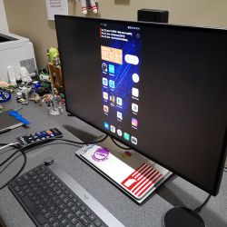
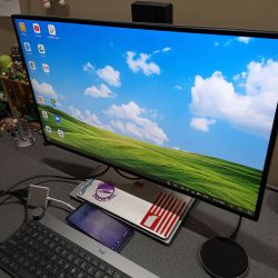
Carrying over from the P20, there’s a cool feature that allows the P30 Pro to easily connect to a monitor or projector if you have a USB-C HDMI, VGA, DVI dock adapter. Just plug it in and it will let you choose if you want to mirror the phone display or use a full-screen user interface on the larger screen. In full-screen mode, it’s like the Samsung DEX Station without paying for the extra hardware. It worked great with my BenQ PD2710QC DesignView 27-inch Designer Monitor.

The user interface in full-screen mode is easy to use just like Windows or MacOS and it reinforces my dream of one day using my phone as my one and only computer.

As an added feature, when the P30 is connected to a monitor or projector, the phone’s screen will turn into a touchpad that you can use to move the cursor around on the screen. Otherwise, you’ll have to use your finger or a Bluetooth mouse and keyboard.

Using the Huawei P90 Pro for phone calls

I didn’t have any issues making and receiving calls on the T-mobile network with this phone. Even when I’m in my office (basement) of my house, the phone holds a signal and I’ve yet to have it drop a call.

As far as call audio quality, the volume level on the receiver’s side has been fine. On my side, I’ve wished for a little more volume, especially when trying to hear the other side of the conversation when I’m in a noisy environment.

Overall performance and battery life using the Huawei P30 Pro for day to day tasks

During a typical day, I use my phone to make and receive calls (shocker!). Make and receive text messages, play a rousing game or two of Words With Friends, check my email, send emails, read books, surf, listen to music through Bluetooth earbuds, take pictures for reviews that I’m working on, and occasionally watch a video on YouTube. For all those tasks, the P30 Pro performs wonderfully. Apps open quickly, webpages load quickly, everything works at the speed I’ve come to expect from a smartphone.

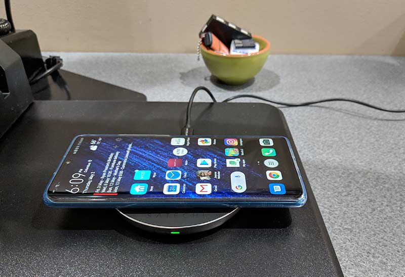
When it comes to battery life, the Huawei P30 Pro can easily get me through the day and when I need to top it off before going to bed (I don’t leave my phone plugged in overnight), it recharges quickly either by plugging it directly into power with a USB-C cable, or charging it wirelessly on a wireless charger like the Satechi Aluminum Type-C PD & QC Wireless Charger.

Speaking of charging, the P30 Pro supports reverse charging which allows you to use the phone as a wireless charger for another device that supports wireless charging. Just put the P30 Pro face down and it becomes a wireless charging pad.

What I like

  • Camera
  • Battery life
  • Fingerprint reader
  • Wireless charging
  • A clear case is included in the box

What needs to be improved

  • In screen speaker for calls could be improved as far as volume
  • No micro SD card slot
  • Mono speaker
  • Not officially available in the US

Final thoughts

After trying several phones over the past 2 years, it’s the Huawei P30 Pro that has taken the spot as my daily driver. It has every feature I want in a flagship smartphone. It has a nice display, excellent fingerprint reader, wireless charging, great battery life, a fullscreen desktop mode when connected to a monitor, and an excellent camera. There’s only one downside to this phone and it’s the fact that it’s not officially supported here in the US. That didn’t stop me from buying one though and I’m happy that I did.

Price: $909.00 from Amazon
Where to buy: Amazon
Source: The Huawei P30 Pro for this review was purchased with my own funds.

Filed in categories: Featured Items, Reviews

Tagged: , ,

Huawei P30 Pro Android Smartphone review originally appeared on The Gadgeteer on June 19, 2019 at 7:04 pm.

Note: If you are subscribed to this feed through FeedBurner, please switch to our native feed URL http://the-gadgeteer.com/feed/ in order to ensure continuous delivery.
Doogie S90 Modular Android smartphone review

REVIEW – If you have a job that requires you to be outdoors in the elements, or in harsh environments, a ruggedized smartphone is a necessity. Trouble is that there just doesn’t seem to be many rugged smartphones on the market these days. I do have one to show you today though and it’s built like a tank on steroids. It’s the Doogee S90. Let’s check it out.

What is it?

The Doogee S90 is a ruggedized Android smartphone that isn’t just built to withstand tough environments, it’s also designed to be modular so that the functionality can be expanded.

Hardware specs

Processor: MediaTek Helio P60 octa-core 2Ghz
GPU: Mali G72 MP3 graphics processor running at up to 800MHz.
OS: Android 8.1 Oreo
Display: 6.18″ 1080 x 2246 pixels
Memory: 6GB RAM 128GB storage
Camera: 16 MP (rear) 8 MP (front)
Protection: IP68, IP69K, and MIL-STD-810G
Qi charging capability
Battery: 5050mAh
Height: 3.8 in Width 1.99 in
Weight: 10.8 oz. alone, 15.6 oz. with the extended battery module attached

What’s in the box?


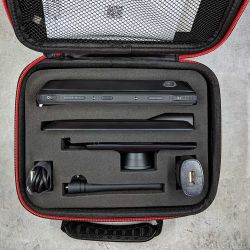
If you opt for the Super bundle, the S90 and modules come packaged in a zippered rigid suitcase which is a nice touch.

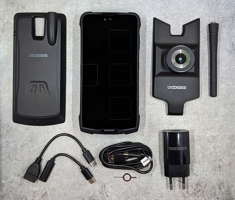
  • Doogee S90 smartphone
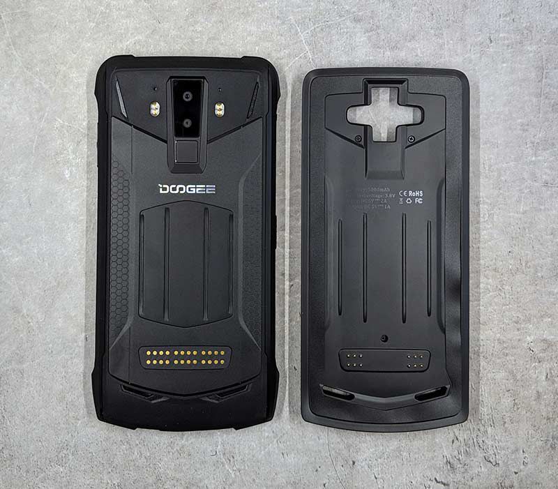
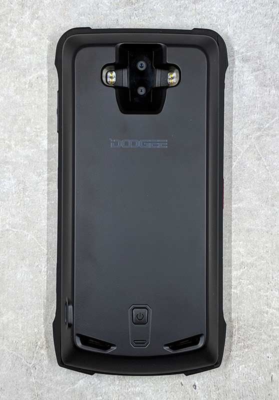
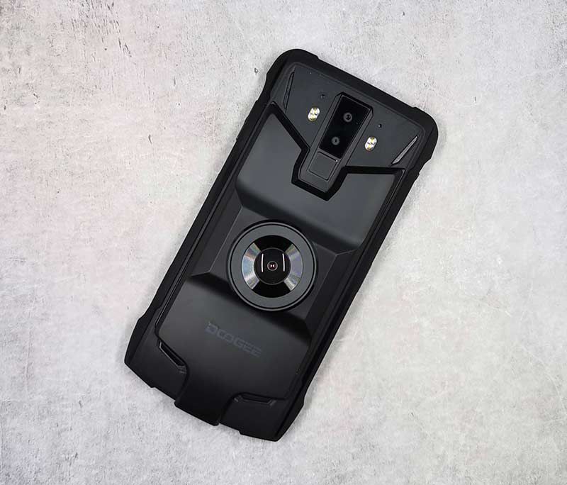
  • Extended 5000mAh battery module (installed on the camera in this photo)
  • Night vision camera
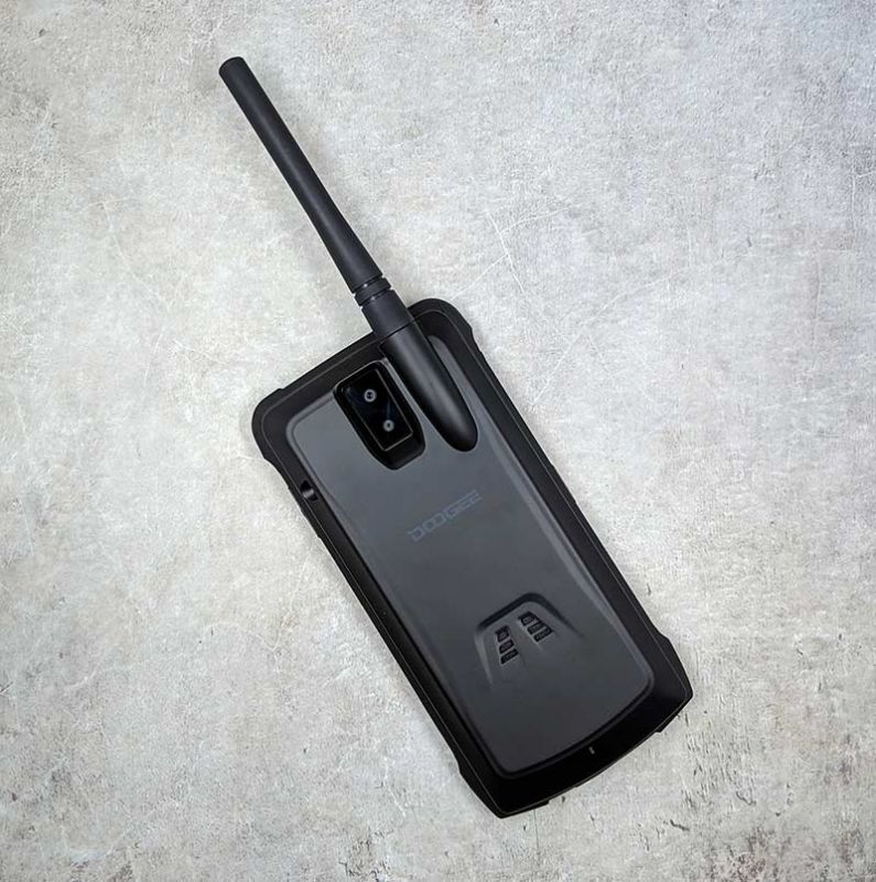
  • Walkie talkie module & antenna
  • USB-C to OTG adapter
  • USB-C to 3.5mm headphone jack adapter
  • USB-C cable
  • Power adapter (EU style)
  • SIM card removal tool

Doogee is also going to offer a gamepad module but one wasn’t included with my review sample.

Design and features

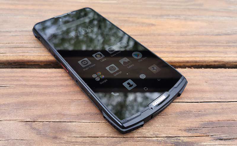
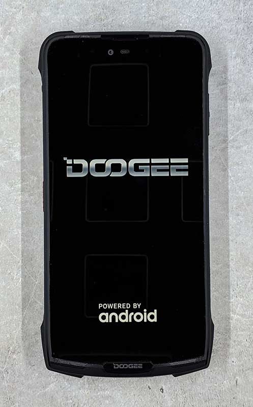
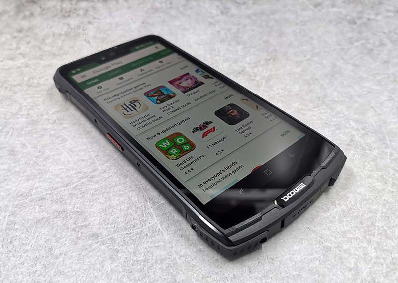
First of all, the Doogee S90 is probably not a phone that a typical person would want to buy because it’s quite heavy at about 11 ounces. The heft comes from the rugged housing. This phone is built like a tank. It has a raised metal frame around the display so that a fall on a flat surface won’t crack the screen.

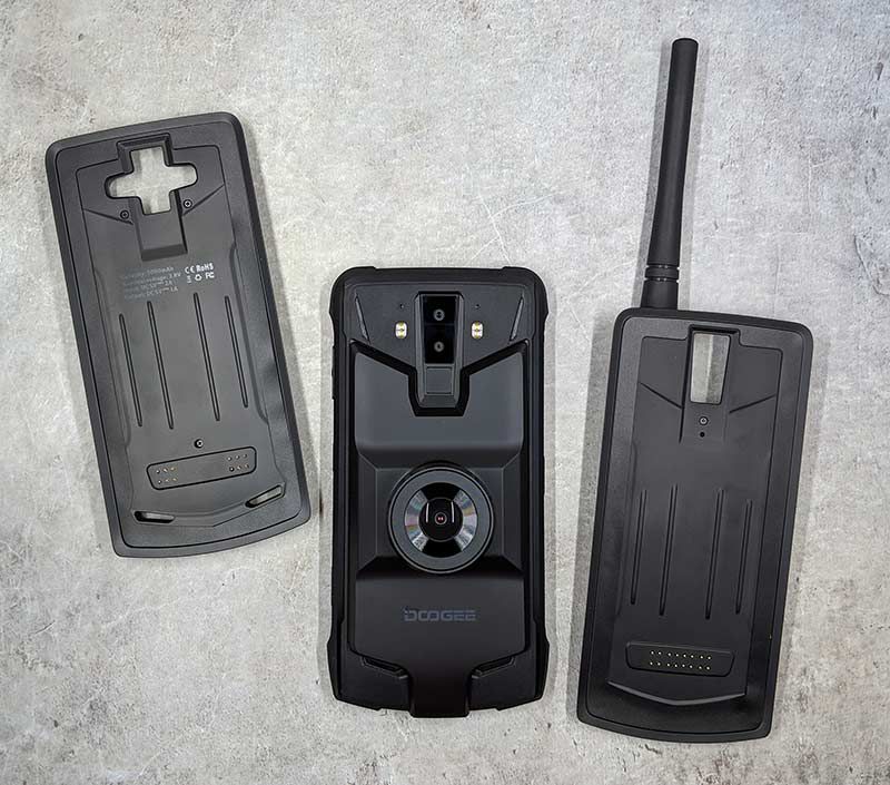
The back of the S90 is designed to allow for a variety of modules to attach to the back of the phone by using magnets to securely hold the module in place. This feature reminds me of Motorola moto mods for their moto Z series of Android smartphones.

The back of the phone also has dual LEDs that turn the phone into a flashlight. Below the camera lenses is a fingerprint reader.

But the problem is that when you attach the extended battery module, the fingerprint reader is covered making it no longer accessible. This really didn’t bother me because, like many phones I’ve reviewed, the fingerprint reader didn’t work well for me.

By itself without any of the modules attached to the Doogee S90, the phone weighs 10.8 ounces, but add a module like the extended battery and oh boy, it becomes super heavy at 15.6 ounces which is practically a pound.

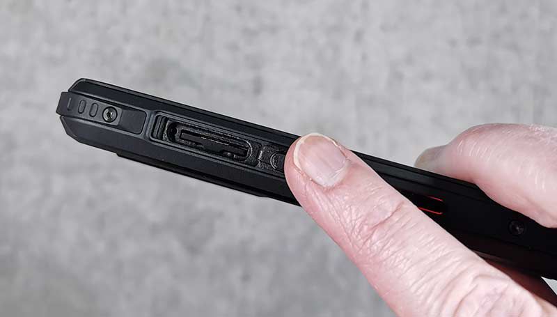
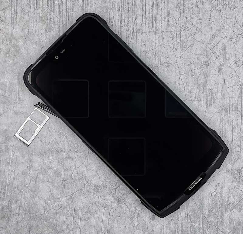
The left side of the phone has the SIM card and micro SD card tray.  The tray is recessed which makes it harder to eject than traditional phones. Included with the phone is a special SIM ejection tool that has a little hook at the end that you can use to pull out the tray.

Be aware that the Doogee S90 is a GSM phone so it will only work with GSM carriers in the US like T-mobile and AT&T (sorry Verizon). I did all my testing with this phone on the T-mobile network.

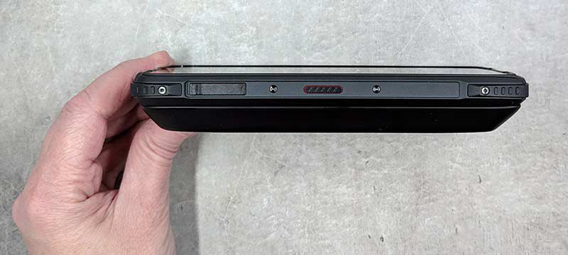
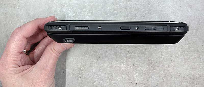
In addition to the SIM tray on the left side of the phone, there’s a custom key that you can program to perform shortcuts or launch apps. The key can be programmed to do different things based on one press, a double press, or a long press. It’s handy, for example, to program a double press to toggle the flashlight on and off.

The opposite side of the phone has three buttons, the one on the left is a dedicated shutter button to snap a picture when the camera app is open. The middle button is the wake/power button, and the button on the right (which would be the top of the phone) is the up/down volume button.

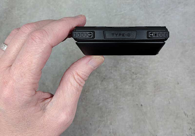
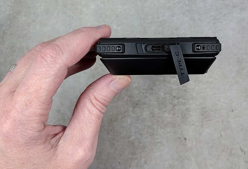
The ports on the S90 are protected from dirt and dust with covers, like the USB-C port on the bottom edge of the phone. Note in the image above, the extended battery module is attached to the phone.

I find charging port covers to be annoying to use every time I want/need to charge the phone’s battery. Luckily, the S90 can also be charged wirelessly if you have a Qi wireless charger. Note, that you’ll need to remove the extended battery in order to charge the phone on a wireless charger.

Display

The S90’s display is bright, crisp, and has vivid colors. I had no issues with touchscreen sensitivity and I enjoyed watching video, reading text, etc while testing this phone. The display is very nice.

Audio quality

The S90’s speakers are located on the bottom part of the back of the phone. Even at full volume, audio sounds clear and crisp. I enjoyed listening to video using the built-in speakers. You might be wondering if the modules will block the speakers. I’m happy to report that the extended battery and the camera modules do not block the speakers. However, the walkie talkie module does cover them.

Camera


The Doogee’s camera does a respectable job and I was surprised by how nice the images turned out. I’m not going to trade the S90’s camera for the one in my Huawei P30 Pro, but the shots weren’t bad at all.

Modules

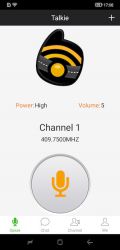
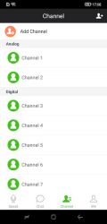
The walkie talkie module turns the phone into an app powered communicator that will let you listen and transmit on a frequency range from 409.75 mhz – 409.9875mhz.


I played around with the module and the app but all the testing was one sided since I didn’t have anyone to talk to.

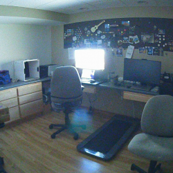
The night vision module is pretty cool. It’s able to take pictures in total darkness without using a flash. Here are some before and after samples.


The images are super grainy but still cool none the less.

Software and user interface


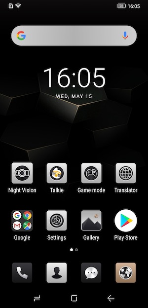
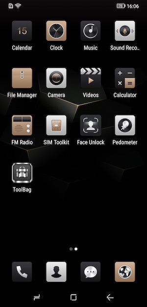
The S90 runs on Android v8.1.0 (Oreo) so it doesn’t have the latest version of the OS and it’s also not promised that it ever will receive any OS updates or even security updates. That said, the interface is relatively the same as regular Android if you don’t mind the silver, bronze, and black theme / icons.

Using the Doogee S90 for phone calls

I can’t comment on how well the S90 works on other networks like AT&T, but I didn’t have any major issues making and receiving calls on the T-mobile network with this phone except when I’m in my office (basement) of my house. For some reason, this phone seems to have issues holding on to the cell signal down there and on several occasions, people have tried to call me and have gotten my voice mail.

As far as call audio quality, the volume level and clarity on both sides of conversations have been just fine.

Overall performance and battery life using the Doogee S90 for day to day tasks

During a typical day, I don’t do anything too crazy with my phone. I use it to make and receive calls. Make and receive text messages, play a rousing game of Words With Friends, check my email, send emails, read books, surf, and occasionally watch a video on YouTube. For all those tasks, the S90 performed flawlessly. Apps open quickly, webpages load quickly, everything works at the speed I’ve come to expect from a smartphone.

When it comes to battery life, the Doogee S90 feels like it never runs out of juice. This is especially through if you use are using the phone with the extended battery module which adds an extra 5000 mAh to the phone’s built-in 5050 mAh battery. The phone will stay on standby for days and days between charges.

What I like

  • Affordable
  • Rugged
  • Expandable with modules

What needs to be improved

  • Heavy
  • Allow the extended battery to charge wirelessly

Final thoughts

Should you buy the Doogee S90? That’s the $400 question. Why $400? That’s the price of this phone. Just going by price alone, the S90 is a decent deal. Especially when you consider how rugged the phone is and the great battery life when using the extended battery module. The issues with the phone come from not knowing if it will be supported with security and software updates. My guess is that it’s very doubtful it will ever get Android v9 (Pie). That means you’ll have to ask yourself if running the latest OS version is as important as an affordable rugged Android smartphone that comes with some interesting modules. I’ll be sticking with my Huawei P30 Pro and later in the year plan to get the latest Pixel. But that’s because I personally always want the latest and greatest. What about you? Would you consider a phone like the Doogee S90? Let us know in the comments below.

Price: $399.99
Where to buy: Doogee
Source: The sample for this review was provided by Doogee.

Filed in categories: Featured Items, Reviews

Tagged: ,

Doogie S90 Modular Android smartphone review originally appeared on The Gadgeteer on May 16, 2019 at 10:00 am.

Note: If you are subscribed to this feed through FeedBurner, please switch to our native feed URL http://the-gadgeteer.com/feed/ in order to ensure continuous delivery.
Gadgeteer time machine – Remembering the PalmPilot and its spinoffs

ARTICLE – For those of you who are new here, The Gadgeteer will be 22 years old this summer. That’s a long time to be writing about gadgets and as you can imagine, I’ve amassed quite a collection of devices over the years which I keep in a special drawer down in my Gadgeteer lair.

The other day I opened that drawer of gadgets-from-days-gone-by (yes, that’s the drawer’s name) and started sifting through the contents and ended up taking everything out to create the group shot that you see above.

There are a lot of great memories connected to these devices and I thought it would be fun to take a walk down memory lane and bring all of you along with me for the trip. So let’s go!

PalmPilot and friends

I consider the USRobotics PalmPilot to be the first real PDA (Personal Digital Assistant). I know there were Casio and Sharp databank style devices before the PalmPilot came on the scene, but they weren’t real PDAs in the way I/we think of them today. When I think of a PDA, I think of a touch screen, with a stylus, a selection of core apps like a calendar, task manager, address book, memo pad, etc., and the ability to install other apps to extend its capabilities.


The PalmPilot with its grey plastic housing, matching “toothpick” stylus, and iconic black on green non-back lit LCD display is the device that you can really thank for the Gadgeteer website.  This device is what originally fueled my excitement for reviewing products. I had so much fun with that little device, testing and writing about 100’s of cases, styluses, programs, and all the crazy accessories.

Do you remember The Bridge from Midwest PCB Designs? This little adapter would let you use a case with the PalmPilot’s HotSync cradle and was actually inspired by me. Go read the review for more on that back story.

Jeff Hawkins, Donna Dubinsky, and Ed Colligan were the inventors of the PalmPilot and ended up leaving USRobotics/3Com/Palm Computing to start their own company called Handspring. They developed the Handspring Visor devices which also ran the Palm operating system. I had (and still do) several Visors which were exciting devices because they had a Springboard slot which allowed 3rd parties to create special accessories like modems, remote controls, etc.

But Handspring wasn’t the only company who made PDAs powered by the Palm operating system. Sony’s line of Clie devices was also popular. Back in the late 90’s and early 2000’s, Palm, Sony, and Handspring were popping out new devices with stunning frequency. Sony was one of the best innovators of the time with their devices that had rotating displays and other unique features.

The image above is the Sony Clie PEG-N710C. It’s funny to read my review of this device from 2001 and see how excited I was about the fact that this device had a 320 x 320 resolution display back when 160 x 160 was the norm. My how times have changed. 😉

My first smartphone

The Palm Treo 650 was my first smartphone and as luck would have it, I still have this 15-year-old device and was able to find a charging cable that works with it. When I plugged it in, I was really surprised when it powered up. I thought it would be fun to see if it might still work as a phone, but when I checked for the SIM card slot, I didn’t find one because it was a Sprint phone. Those were the days when Sprint and Verizon didn’t use SIM cards and phone batteries lasted for days instead of hours.

Here’s an interesting tidbit… I “hacked” that Sprint branded Treo 650 to work on the Verizon network. The Treo was high tech then, but we are talking 2G speeds (if that). So it wasn’t that great as a web surfing device, but it worked if you had an unlimited supply of patience. Those were the good old days.

The Palm Centro was another favorite smartphone of mine mainly because it was so cute. I still had one in my drawer and was able to charge it up too and was very surprised to find a bunch of old text messages and a few old emails still saved on it.

Today Apple, Samsung, and even Sony could learn a thing or two by revisiting these devices from 15 – 20 years ago. Then Palm, Handspring, and Sony were in a pseudo “arms race” to see who could come up with the most featured packed devices. It was like they threw everything but the kitchen sink into each new model just to see which features would stick. Now, they only seem to throw in extra cameras and consider that to be the pinnacle of innovative.

Did you enjoy this quick stroll down nostalgia lane? What was your favorite device from 10 – 20 years ago? Please share your thoughts in the comment section below. And also be sure to check out our new Gadgeteer Time Machine widget in the right sidebar towards the top of the page. It shows Gadgeteer reviews from 1, 5, 10, and even 20 years ago each day.

Filed in categories: Articles

Tagged: ,

Gadgeteer time machine – Remembering the PalmPilot and its spinoffs originally appeared on The Gadgeteer on February 6, 2019 at 7:55 am.

Note: If you are subscribed to this feed through FeedBurner, please switch to our native feed URL http://the-gadgeteer.com/feed/ in order to ensure continuous delivery.
The Cosmo Communicator is every mobile device you will need in one compact package

NEWS – As a self-confessed nerd, everyone that reads my news stories knows that I am a sucker for gadgets. I am also pretty much “tied” to my smartphone and tablet, and my entire home runs on some sort of technology for most tasks that can be handled by technology. Every day on my commute back and forth to work, I carry my iPhone and iPad in my backpack and during the commute, I am on one or the other. While the apple environment does integrate devices and allows you to answer a phone call on the iPad, I wonder if there is a newer technology device that marries both devices into one much like a device I once saw called a Phablet.
The Cosmo Communicator is touted as the complete mobile communication tool that provides a pocket computer, mobile phone, and camera all in one compact device. It features a keyboard, a world-wide dual-SIM mobile phone and can be used for emails, messaging, editing documents, making calls and taking photos. Its specifications include a dual-display: an external 2″ touchscreen when the device is closed and large 6″ touchscreen when the device is open, a high-resolution 24MP camera, 6GB of ram and 128G of flash storage, along with NFC for payments, a fingerprint sensor and a smart toggle button for security and control.

The crowdfunding for the Cosmo Communicator ended on December 6th, 2018, and managed to raise 453% of the intended fundraising goal. You can read more about this device on their Indiegogo page. It should start shipping in June of this year(2019) and should retail for around $570.

Filed in categories: News

Tagged: ,

The Cosmo Communicator is every mobile device you will need in one compact package originally appeared on The Gadgeteer on January 30, 2019 at 12:00 pm.

Note: If you are subscribed to this feed through FeedBurner, please switch to our native feed URL http://the-gadgeteer.com/feed/ in order to ensure continuous delivery.