Elechomes Ultrasonic Humidifier (6L) review

REVIEW – The Elechomes Humidifier offers a large tank and several modes and options, so you can customize it for exactly how you intend to use it, including aromatherapy.

What is it?

Featuring a timer and remote control, Elechomes UC5501 Ultrasonic 6L Vaporizer adjusts the humidity of your home or office to your exact specification.

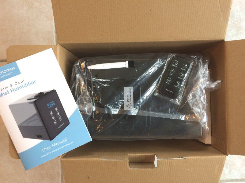
What’s in the box?

  • Humidifier
  • Remote control
  • Cleaner brush
  • Instruction manual

Hardware specs

  • Product dimensions: 11.6 x 7.7 x 11 inches
  • Item weight: 5.07 pounds
  • Material: ABS
  • Voltage: 120V/60Hz, Power: 280W
  • Warm mist : 550mL/h
  • Cool mist: 300mL/h
  • Coverage: 750 sq. ft.
  • Consecutive working time: Up to 40 hours

Design and features

Setup

It comes fully assembled. To fill the tank, just lift it up by the handle, pop it upside down and unscrew the cap.

The instruction manual says to use cool water and fill it with at least 3 liters. For this, I needed to use a measuring cup the first few times. For all it’s impressive features, I was shocked there was no fill line on the water tank. Even my cheapest, most basic humidifier has a minimum and maximum fill line.

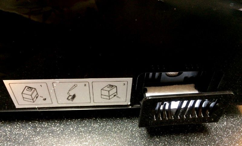
To use the aromatherapy feature, there’s a small box on the side where you can pour a few drops of essential oils. I noticed the scent wasn’t as strong as my tiny humidifier solely intended for aromatherapy, where you drop the oils right into the water. However, I really appreciate the dual functionality. Before this, I needed two devices to humidify the air and disperse scents, and this does it all in one.

Performance

This worked like a charm and had some really useful features.

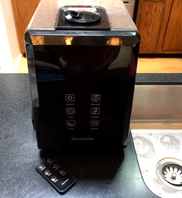
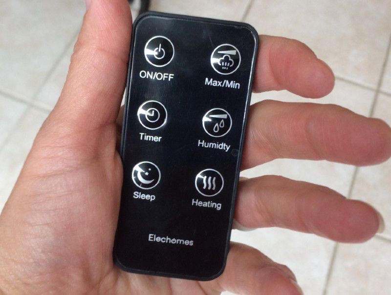
You can decide if you want a low, medium or high level of mist with the Max/Min button.

The humidity setting lets you set a specific humidity level percentage, and it will automatically adjust throughout the day and night to keep your space at your desired humidity until you turn it off or the tank runs out.

You decide if you want a cool, low heat, medium heat or high heat mist temperature.

And my favorite settings were the timer and sleep options. My son gets bloody noses, and we’ve found they’re greatly reduced if he sleeps with a humidifier. This model let me set the mist to only run during his sleeping hours, where other humidifiers just went continuously until they burned out of water. Since it’s only working when I need it, I only have to fill it every two or three days instead of every single day. Plus, the sleep mood makes it nearly silent so it doesn’t disturb my little guy’s slumber.

I also appreciated that you can adjust where the mist is dispersed directionally with two rotating nozzle pieces. For me, it was simple to direct the mist toward my son’s pillow. If you had a large room, you could adjust the nozzle to disperse in opposite directions for better coverage. Or if you had it sitting in a corner, you could manually point the mist outward into the room. Our previous humidifiers simply shot mist straight out, and I was surprised at how much I used and enjoyed having this customization.

What I like

  • Easy to set up and use
  • Aromatherapy option
  • Timer and sleep functions
  • Adjustable mist nozzle

What needs to be improved

  • Add a fill-line to the water tank, maximum/minimum lines would be even better

Final thoughts

For everyday humidifier users, Elechomes Ultrasonic 6L Vaporizer comes with useful features and customizations that are well worth the cost.

Price: $99.99
Where to buy: Amazon
Source: The sample of this product was provided by ElecHomes.

Filed in categories: Reviews

Tagged:

Elechomes Ultrasonic Humidifier (6L) review originally appeared on The Gadgeteer on May 31, 2019 at 9:00 am.

Note: If you are subscribed to this feed through FeedBurner, please switch to our native feed URL http://the-gadgeteer.com/feed/ in order to ensure continuous delivery.

Plott Cubit review

REVIEW – Redecorating generally means there will be math to do.  Making sure pictures are hung at the right height is made that much more difficult if there are multiple pieces competing for attention on the same wall.  And if you are anything like me, then you revel in OCD, which means you will end up patching holes in the wall as you move things around to get them in the right spot.  The Cubit from Plott wants to help you solve this problem so you “hang once and done”.  How well does it deliver on this promise?  Read on to find out…

What is it?

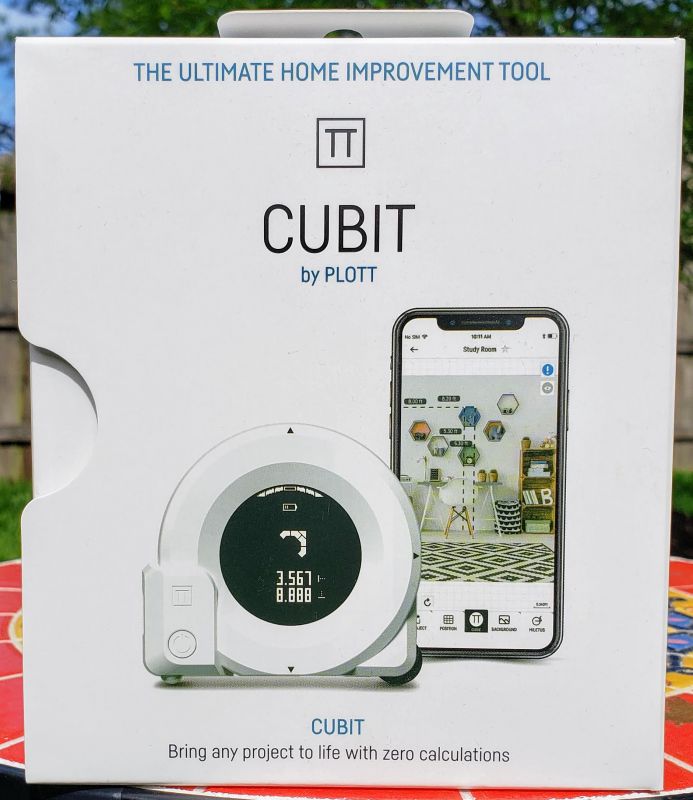
The Plott Cubit is self-described as the “Ultimate Home Improvement Tool”.  Pairing up with an augmented reality application on your phone, the Cubit is a connected two-dimensional laser (and analog) measuring tool.

What’s in the box?

  • The Cubit measuring tool
  • A USB charging cable (you will need a wall transformer if you do not have an open USB port somewhere)
  • Some basic instructions

Design and Features

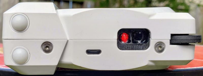
The Cubit has X and Y axis lasers to handle the measuring backed up by an analog roller. Here is the bottom of the device:

The charging port, the Y axis laser and the analog roller balls are on the bottom of the Cubit.  The black wheel on the right side is there as a guide and does not actively measure anything.

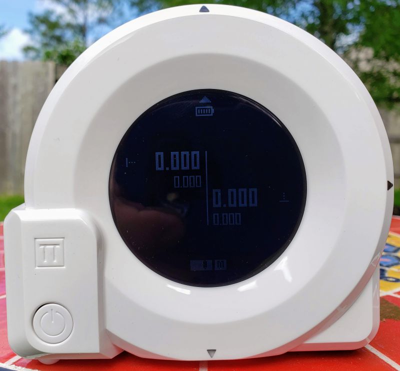
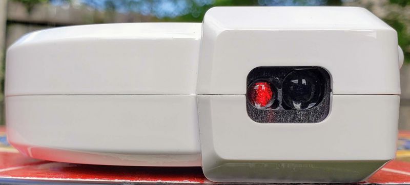
The left side of the Cubit has the X axis laser.  As you can see in the first picture above, the Cubit has an LCD screen that shows you the battery state, the level state of the device (to help you move in straight lines – good to have when rolling along the wall, but a traditional level works better when trying to plumb a picture), a unit of measure indicator (so you can tell whether you are using Imperial or Metric measurements), the direction of measurement (up/down/side-to-side) and, of course, the actual measurement.  When placing objects in the AR app, the Cubit will also display a directional arrow that helps you get to the nail placement and other real-world locations referenced in your AR design.  More on how that works in a moment.

The front also has the main button where you can turn the Cubit on or off, clear the current measurements and change the Guide mode.  Non-Guide mode allows you to measure independent of the app and Guide mode helps the app figure out where the device is on the AR surface (aka, your wall).  Communication between the device and the app is through Bluetooth, but you pair with the Cubit in the app and not through your Bluetooth connections.  That seems to indicate to me it is a Bluetooth Low Energy device, but nothing in the instructions specifically say it is.  If you have an older device or one that does not support this standard, this might not work for you.

The screen can be a little difficult to read – it is a black and white LCD with pretty low contrast, so if you have a bright room (or use it outdoors), it is hard to see.  Also, I often found that I had to move my hand around on the device in order to let the lasers do their work, and sometimes that meant covering the display.

Finally, on top of the Cubit there is a “mark” button used to capture a reading – think of it as a shutter button on your camera that captures a point in time for your measurement.

How it works

After you open the box and plug the Cubit in to charge, head to the Google or Apple app store to download the Plott app.  Although there are some measurements you can take using the device without the app, you need the app to fully appreciate the things Cubit can do.  Thankfully Plott does not make you sign up for an account – everything happens locally on your phone.

With the app installed and the Cubit charged, we are ready to start.  Open the app and select Let’s Plott to begin a project – this button in the app essentially creates a virtual folder on your phone to group the items you create.  This is a high-level grouping, though, and not an actual project.  Once the container is created, you can start an actual project.  If you are a professional interior designer, for example, this could correspond to a client with multiple projects clustered inside for that client.  Once you’ve given your container a name, you can start your first project.  You are prompted to select an outdoor project where you can use the Carta (a wheeled companion device from Plott that lets you measure and plan walkways, decks, etc.) or an indoor project using the Cubit.  Select indoor, give the project a name, and you are ready to start.

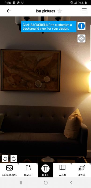
The first step is to take a picture of the wall to use as a background for the augmented reality work – and this is where I had my first problem.  We have an open floor plan house with 12 foot ceilings, which means our walls are both long and high.  There does not appear to be a way in the app itself to stitch together multiple pictures, so at best I can only get a small portion of a wall.  This screenshot does not do complete justice to the issue.  The picture I took to get here was in landscape mode, and properly cropped before being accepted as the background.  In the image below the background is scrollable right and left, so you can see the entire background – but the main work in the app is done in portrait.

Back to my issue, though.  The wall where this is taken is 12 feet high, but I am only able to get back far enough to capture about 6.5 feet.  And the entirety of the wall is 21 feet. but I can only grab about 10 feet successfully.  There is no ability within the app to take multiple pictures and stitch them together into a complete background.  There is an AR mode for setting a background image that could theoretically work, but I could never get it to capture the entire wall.  Whether that is because of lighting or something else in the app, every time the app would stop scanning the surface of the wall and just take what it had up to that point.  And without an ability to import a self-stitched photo into the project, I ended up having to break up the wall into multiple projects.

And that’s where I encountered the second issue.  Because I did not have a solid endpoint (like a corner or doorway) I had to either “eyeball” the reference point where the Cubit could begin measurement of the horizontal and vertical axis’s, or I had to get out a tape measure to figure out where the background edge should start in the real world.  Both methods lead to a slight deviation in actual size, so measurements will not be as precise as if you could position the Cubit at an aforementioned origin point like a corner or doorway.

Issues aside, once you have your background selected, the app will ask you for the dimensions of the background, and this is the first place where the Cubit comes into play.  You place the Cubit at an appropriate X-Y intersection (like the wall edge and the ceiling) and let the dual lasers measure to the opposite side of the space.  Pressing the mark button on top sends the measurement back to the app.  Because I was working with segments of my wall, in order to get accurate measurements I had to tape pieces of cardboard at the end of the space in the background image so the lasers would not project to the next wall end.

With the wall now measured, you are ready to add an object like a picture.  Press the Object button in the app and add your object – in my case, a framed piece of art.  Again, you go back to the camera (or add from the library if you have previously used the app).  Once you’ve taken the picture and cropped it, you can roll the Cubit across the edge to capture the height and width of the picture.  That information is stored with the image so you can import it into future projects.  Next, you have to “flip” the object so you can take a picture of the back.  This picture allows you to select the place where you will hang the picture – the wire or sawtooth hardware that the hook rests on.

And your object now shows up on your background.  Move it around as you like until you find the place that works for you.  Tap the “Change Reality” button once to set the picture where you want it, and in an odd choice, tap the nail indicator on the object and tap the “Change Reality” button a second time.  The object is now set in the room, and you can use the Cubit from the X-Y origin point to move to where you will insert the nail.

The final problem – if you use a wire on the back of your picture and a standard picture hook, the app does not compensate for the arc the wire will create, so depending on how much excess wire you have, the picture could end up 1-3 inches lower than expected, perhaps more.

What I like

  • The combination roller and laser systems seems suited to measuring physical objects very well – wish the app supported that outside of the auspices of a “project”
  • If you are a professional designer and use this often, it could be a great tool with some changes

What needs to be improved

  • The app is not very intuitive to use and does not allow common functions like importing existing objects or images
  • It is far too easy to have measurements that do not match the real world, making the entire point of the device somewhat moot – you can get measurements with a photo that are sufficient to have custom clothing made, so why can’t this be more accurate without workarounds?
  • When used for the primary purpose – hanging a picture – there is no way to adjust for the method in which you hang the picture accurately, so your results may not end up as intended – again, you can’t devise workarounds, but it sort of defeats the point for ease of use
  • Even if you are willing to work within these issues, it can be hard finding a retailer who has the Cubit in stock

Final thoughts

I think with some work on the app this could be a very useful device for the professional designer.  To me, though, it is a LOT of work over a more manual approach to accomplish what should be a reasonably simple and straight-forward task.  If Plott can overcome some of the issues I encountered, this could become a very interesting tool.  As it stands now, however, the app and device combination will end up making more work with less desirable results.

Price: $109.99
Where to buy: NewEgg
Source: The sample of this product was supplied by Plott.

Filed in categories: Reviews

Tagged: ,

Plott Cubit review originally appeared on The Gadgeteer on May 30, 2019 at 10:00 am.

Note: If you are subscribed to this feed through FeedBurner, please switch to our native feed URL http://the-gadgeteer.com/feed/ in order to ensure continuous delivery.

Akaso Trace 1 dash cam review


REVIEW – I have tested several dash cams lately. Most have been OK, but cameras in general are improving at quite a clip. Witness the current dash cam under review, the Akaso Trace 1.

What is it?

A small box with both a front- and rear-facing camera that takes high-quality videos, with time stamping, and fantastic low-light resolution.

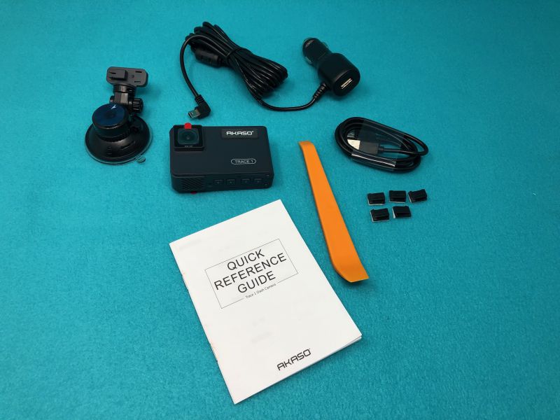
What’s in the box?

  • Camera unit
  • Suction mount
  • Power plug with captive miniUSB plug and pass-thru jack
  • Mounting clips and tool
  • Quick start guide

Hardware specs

(From company website)

  • FRONT AND INSIDE RECORDING: Trace1 dual dash cam is equipped with dual lenses to capture exterior and interior of the car simultaneously at 1080p30 (340-degree field of view combined). When inside recording is not needed and turned off, the front lens records 1080p60 for crisper and smoother image.
  • UNPARALLELED NIGHT VISION: Thanks to the state-of-art Sony STARVIS at both lenses, which extends the sensitivity of sensor beyond visible light to near-infrared range, and WDR technology, Trace 1 dash cam excels capturing every detail of your surroundings regardless of lighting conditions.
  • G-SENSOR & PARKING MONITOR: Loop recording comes standard, and built-in G-sensor locks the recording clip to ensure data integrity when collision gets sensed. Parking monitor protects your vehicle even when parked – it enables the car dash cam to turn on if any impact is detected, record for 30 seconds and turn off again.
  • OTHER FEATURES: Trace 1 dash camera supports up to 128GB of mircoSD storage (class 10 or above and at least 16GB recommended, memory card NOT included); efficient heat dissipation design; internal microphone with on/off option; auto LCD off to save power.
  • PERFECT DASHCAM FOR EVERYONE: With so many tech and safety features packed into an affordable package, this dash cam front and rear is a perfect option to everyone – beginners and seasoned taxi and rideshare (Uber, Lyft) drivers alike. All AKASO car camera – dash cam comes with 30-day hassle free return and 1-year limited warranty.

Design and features

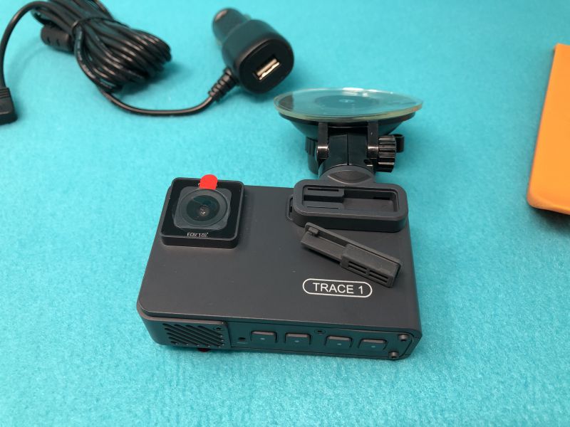
The Trace 1 is small, even by today’s miniaturized standards. At 3” x 1.75” x 1”, it’s barely as large as an action camera. There’s a 2” (diagonal) screen on the rear side, and an f1.8 camera with a .5” diameter lens pointing out both sides. On the rear, there’s a 4-element IR light that allows for great night-time video of the car interior, as well as your blind spots to either side. Both cameras sport a 170º field of view.


The suction mount has a sticky silicone gripper 2.25” in diameter, with a quarter-turn locking mechanism. I only had it fall off once, after sitting out in the sun all weekend. When I brought it in for this review, however, I noticed that I had left the protective film on the silicone! It wouldn’t have slipped at all if I’d removed that film and actually stuck the bare gripper to the glass.


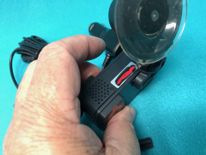
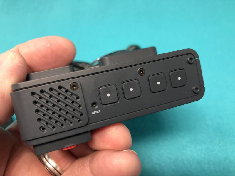
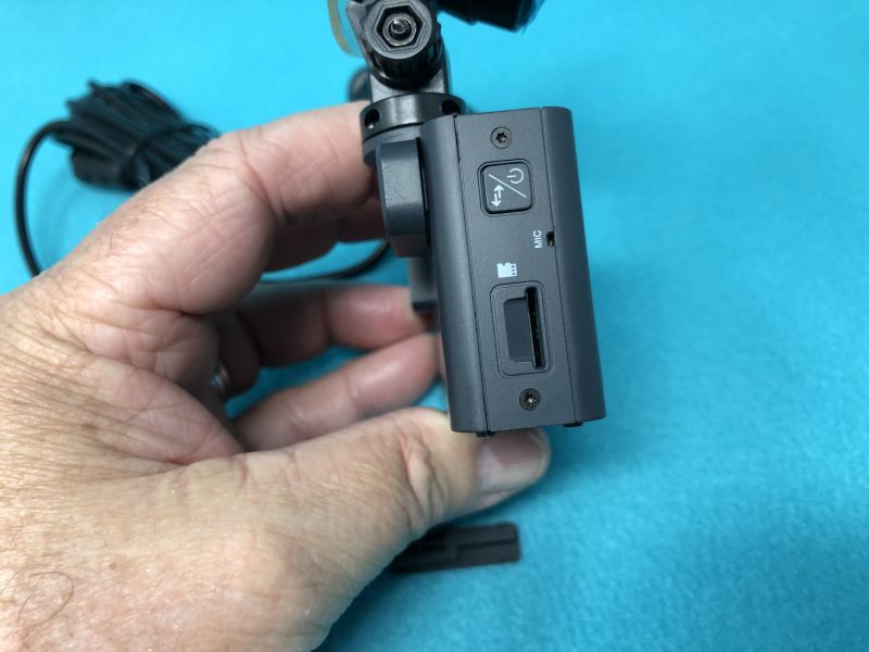
There are four function buttons across the bottom, as well as an on-off button above the card slot on one end. The miniUSB power port is on the top, and there’s a pin-hole mic between the card slot and the power button.


There are various protected grills/vents on several sides, at least some of which is for sound. For a tiny little unit, it’s easy for me to review my last drive home, with a podcast playing, over the noise of lawnmowers and kids that I’m hearing on my back deck writing spot.
The default setting for the firmware is for English, with no parking mode, incident mode (where the clip being recorded will be locked if a jolt or collision is detected based on the motion sensor), with a time-stamp on the videos. This is pretty standard. The four buttons across the bottom of the unit change function when you press them. They are used to replay captured video, format the data card, change the date, turn off the beeping sound, etc.

Setup

Setup of the Trace 1 was minimal. Other than installing a TF storage card (not included), affixing the suction cup mount to the windshield and routing the wire and attaching it to a power plug, there’s really nothing to it. (I didn’t set the time/date at this point, which shows in the video clips.) By default, it’s set to turn on when it has power and stay in “park” mode as long as the battery lasts. Park mode can be set to three levels of sensitivity (as can the normal “incident” mode). This will start recording video and audio if there is a jolt or crash to the vehicle. You can select the length of videos, and in Park mode, the camera will record video until there is no more motion, and then finish the clip. This will allow you to view what happened in case of a parking lot crash where someone hits your car, then drives off.

Here’s a short clip from my exciting commute into work. Note the car passing me on the left at about 7 seconds, which shows in the front camera after the view transitions from rear to front view.

Performance

What I like

  • Single unit takes front and rear-facing video
  • 170º coverage on both front- and rear-facing cameras totals 340º of coverage
  • Both cameras capture high-def video
  • Light and small
  • Runs on battery power for a good while.

What needs to be improved

  • I can’t think of anything.

Final thoughts

As noted in previous dash cam reviews, I have a very short commute and most drivers obey the rules of the road and tend to not try to make me hit them for insurance fraud like in some countries. But, given the nature of changes in our society, there seem to be increasingly many incidents that could be helped by having a video camera on and running all the time. If you’re feeling that vibe, this is a pretty nice little unit to consider.

Price: $99.99
Where to buy: Amazon
Source: The sample of this product was provided by Akaso.

Filed in categories: Reviews

Tagged: ,

Akaso Trace 1 dash cam review originally appeared on The Gadgeteer on May 30, 2019 at 9:00 am.

Note: If you are subscribed to this feed through FeedBurner, please switch to our native feed URL http://the-gadgeteer.com/feed/ in order to ensure continuous delivery.

E-WIN Champion Series gaming chair review


REVIEW – Gaming; it’s something we are capable of doing for hours at a time, but don’t give any thought into the chair we sit in! I’ve recently started to get back into PC gaming after a bit of a hiatus and realized that the chair I have is not all that comfortable. I wanted something that would give me more back and bottom support, as well as keep me happy while working or gaming for a few hours. I recently got the chance to review one of E-WIN’s gaming chairs, so I chose the awesome looking E-WIN Champion Series Gaming chair. Let’s take a look!

What is it?

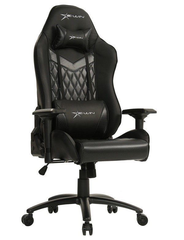
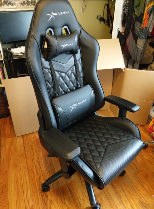
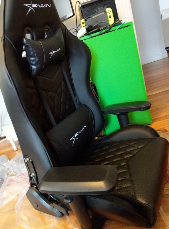
The E-WIN Champion Series Gaming Chair is ergonomic, padded with a racing seat design and PU leather material. It has vertical adjustments along with adjustable armrests, and a quilted surface. It comes with both a neck and back pillow for comfort.

What’s in the box?

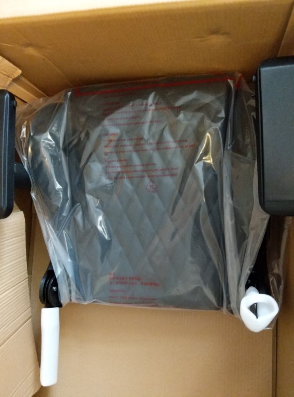
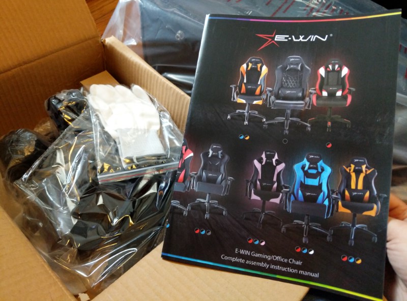
  • Disassembled chair
  • Screws, bolts etc
  • Instruction manual
  • White gloves

Hardware specs

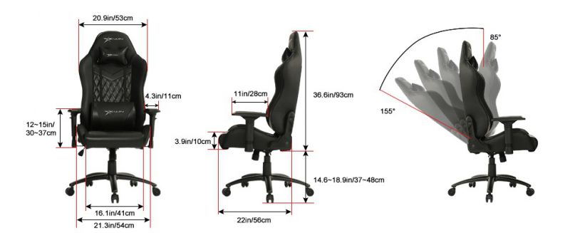
The E-WIN Gaming Chair’s frame construction is metal, with high-density separated foam. The rolling wheels and base are made of aluminum, and the cover of the entire chair is PU leather with a quilted pattern down the middle. The height of the chair goes from 14.6 in – 18.9 in, and the width is about 29.6 in including the armrests. The angle at which the chair tilts forwards and back is between 85 – 155 degrees. The max supported weight is 330lbs.

Design and features

The E-WIN Champion Series Gaming Chair is designed for comfort in mind while gaming or office work. The armrests have front, back, left and right sliding buttons, which are great for someone like me who is constantly adjusting the comfort level of the chair. The seat height is adjustable and the back can recline between 85 and 155 degrees.
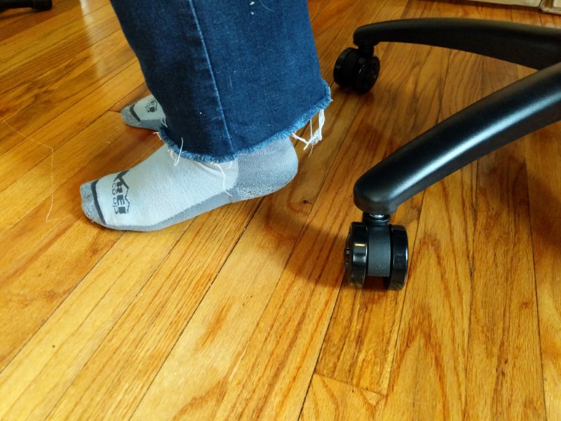
The lowest height setting of the chair is a slight problem for someone my height (5’4″) who has shorter legs (26″ inseam) since my feet don’t hit the floor flat. While this isn’t a deal breaker, I sometimes had trouble getting up without the chair tiling forward a bit. I’d love for it to be an inch or two lower like other office chairs.

There are adjustable and removable neck and back pillows attached with straps. I liked the support of having the back pillow the best since it fits my lumbar region nicely.

Setup

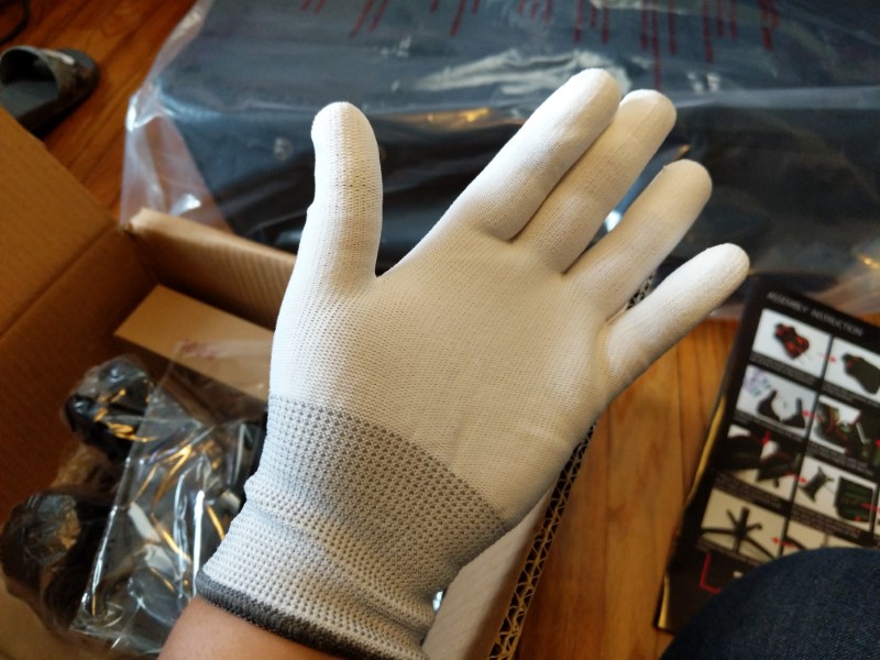
Set up was pretty easy compared to traditional office chairs. E-WIN provided white gloves to protect your hands, which was a nice touch. The instructions were pretty clear and it took me a couple of hours to assemble. The parts weren’t too heavy so I was able to lift and put it together myself.

What I like

  • Sturdy feel
  • PU leather has a decent feel
  • Very comfortable for many hours (4+) of sitting

What needs to be improved

  • Height adjustment should go lower

Final thoughts

I really enjoyed using the E-WIN Champion Series Gaming Chair for everyday use. I love the back support/pillows, how wide and tall the chair is, and is breathable. It’s very ergonomic and has great support for the lower back. I’d probably recommend it a bit more if you’re a bit taller or have longer legs, but overall it’s extremely comfortable!

Price: $309.00
Where to buy: ewinracing.com and Amazon. If ordering from the EWIN site, you can use the
code “Gadgeteer” for 20% off
Source: The sample of this product was provided by E-WIN Racing.

Filed in categories: Reviews

Tagged: ,

E-WIN Champion Series gaming chair review originally appeared on The Gadgeteer on May 29, 2019 at 10:00 am.

Note: If you are subscribed to this feed through FeedBurner, please switch to our native feed URL http://the-gadgeteer.com/feed/ in order to ensure continuous delivery.

Roborock Xiaowa E35 robotic vacuum/mop review

REVIEW – Robotic vacuums suck.  Well, that’s their job, right?  They suck all the dust bunnies, hair, and dirt up from your floors so you don’t have to. Roborock’s new Xiaowa (pronounced ZY-o-wa) E35 robotic vacuum ups the ante by adding wet mopping to its repertoire.

What is it?

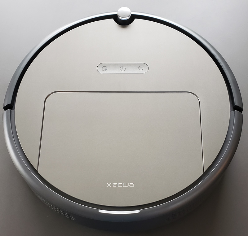
The E35 is a fairly standard looking robotic vacuum in the familiar Roomba round design. It has multiple cleaning modes, including wet mopping, and multiple suction levels based on floor material and desired sound volume. Before robots become our evil overlords and while they are still in servant mode, let’s take a look and see if the E35 deserves a place in your home.

What’s in the box?
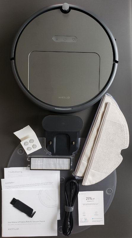
  • Xiaowa vacuum
  • Charging home
  • Charging home guide plate
  • Charging cord
  • Extra dust bin filter
  • Bruch cleaning tool
  • Mopping reservoir with pad
  • Extra mopping pad
  • Four extra mopping reservoir filters
  • Troubleshooting guide
  • Installation guide
  • User manual
  • Accessory discount card

Hardware specs

  • Dimensions: 13.7 x 13.8 x 3.6 inches
  • Weight: 7 pounds
  • Battery: 14.4V 5200 mAh

Design and features

As I mentioned above, the overall design is pretty standard for robotic vacuums.  It is round, with a side sweeper brush and collision-sensing bumpers.  It also has an optical collision sensor that sounds good on paper.  More on that later.

Setup

Set up was pretty straightforward.  You unbox everything, snap the clear plate onto the docking station and plug in the cord. Then, you power up the vacuum by holding the power button down for a few seconds.  Once it powers up, hit the button for return-to-dock and it self-parks and charges – a voice prompt reports “charging”. You can also just place the vacuum on the dock manually, but what fun is that?

Downloading the app was a little more difficult because I made it that way. I looked for the app in the Google Play store.  I couldn’t find it.  I tried “Roborock”. I tried “Xiaowa”.  Neither worked. Then I got creative and scanned the QR code on the included setup guide.  It turns out that app control is handled through the Mi Home app. So, live and learn. I guess directions do help at times.  After creating a Mi Home account, I waited for the vacuum to completely charge.  It arrived with about a 35% charge.

The charging base is pretty standard for a robotic vacuum.  It has a status light on top when the vacuum is trying to find it.
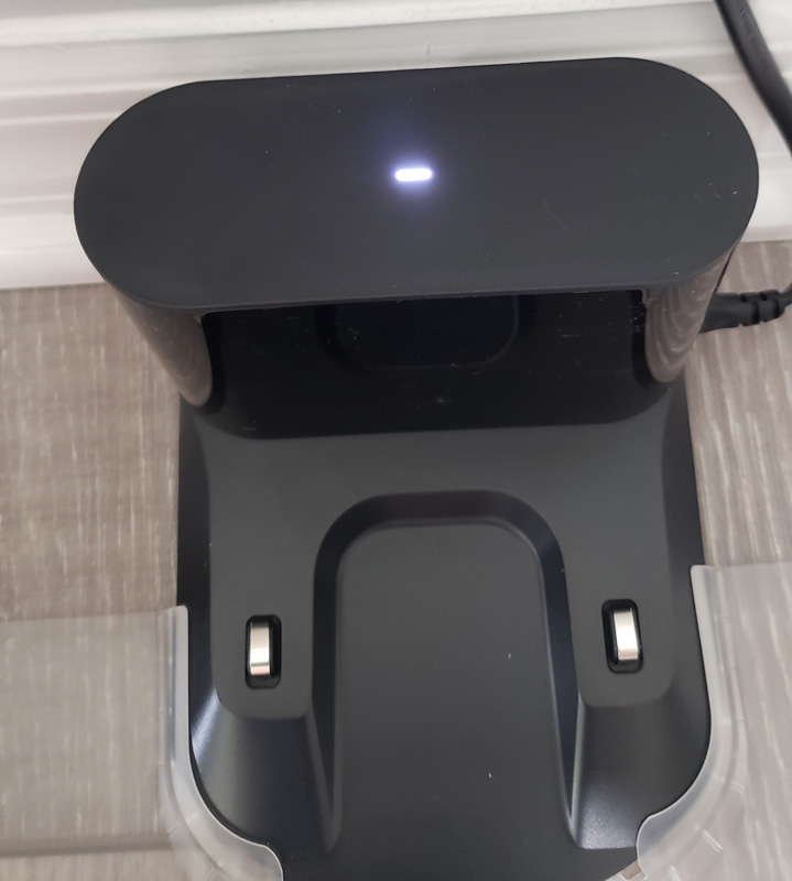
I installed the Mi Home skill for Alexa as well so I can be so lazy that I don’t even have to pick up my phone to start vacuuming. I went through the app looking for customization options.  You can name your location and the robot.  I tried “Jeeves”, but when I tried to initiate it via Alexa, she kept hearing me say “GPS” and not Jeeves. So I opted for “Rosie”.  Since the vacuum’s voice is female, Rosie makes more sense than Jeeves, anyway. I can tell Alexa to “turn on Rosie” and the vacuum starts up.  “Turn off Rosie” sends it back to the charging dock.

Performance

Vacuuming

I decided to let Rosie go to town and vacuum. I let her loose and she immediately got hung up on the track to my sliding door.
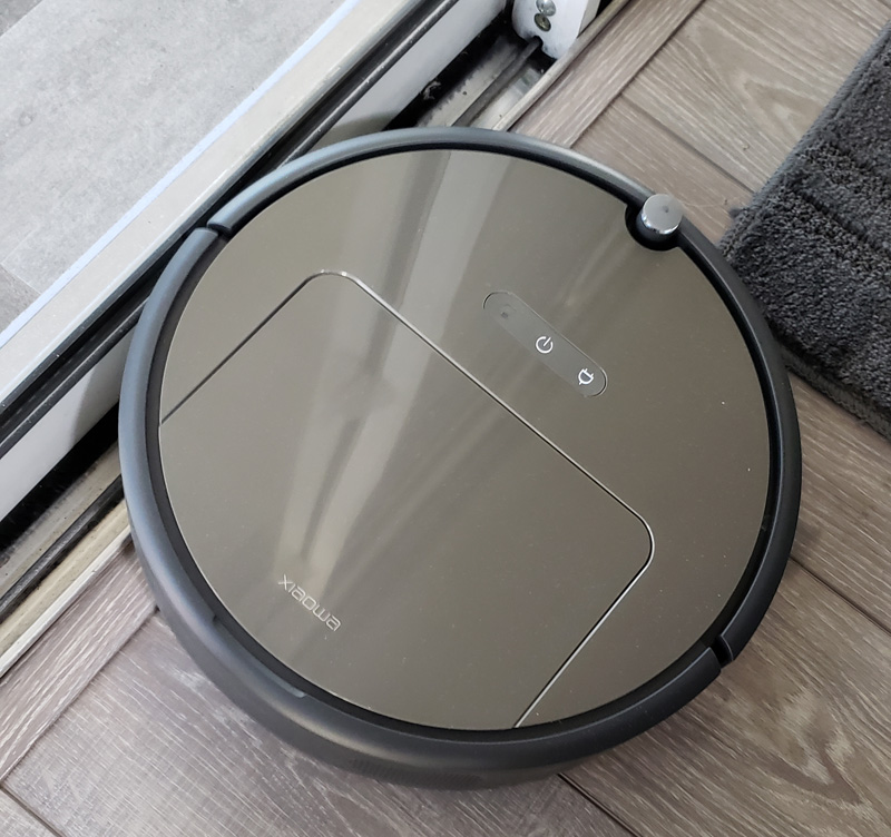
She couldn’t extricate herself and she said she had an error code 3.  A pop-up on my phone indicated her wheels were stuck and to please free her.  I did, and she happily continued on.

I was surprised how relatively quiet the vacuum is. To my ear, it is noticeably quieter than our Roomba. The other thing that surprised me was how fast it was.  Our home is roughly 2,000 square feet.  We usually have the two guest rooms closed off, bringing the square footage to clean down to perhaps 1,200 – 1,400 square feet.
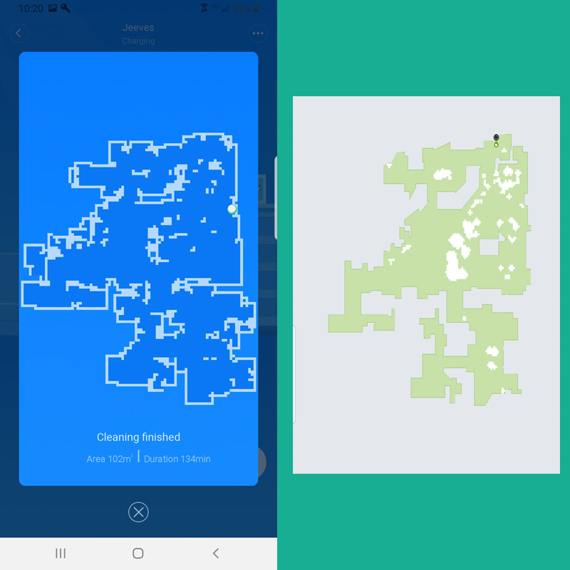
The shot above shows the cleaning map from the Xiaowa on the left and the Roomba on the right. As you can see, they are essentially the same.  The Xiaowa cleaned the area in 134 minutes.  The Roomba did it in 295 minutes.  The Roomba had completed it before in 225 minutes.  To me, this is a significant difference.

The Xiaowa is designed for a very efficient vacuuming pattern. As best it can, it goes in straight lines to complete an area.  Once it has covered the entire area, it runs around the perimeter.  Contrast that with the Roomba that will move in straight lines, but also a fair amount of random movement, making it more inefficient.

The E35 will also automatically adjust suction based on whether it is on hard flooring or carpeting. That’s a nice touch as it keeps the noise down.

I was impressed with the amount of dust, hair, and dirt the vacuum picked up.  Unfortunately, I was so impressed, I forgot to take a photo. I did take one after another clean, however, which still shows a fair amount of debris captured.

Getting to the dustbin is really simple – just lift the top door. The little blue light shows it is connected to Wi-Fi.
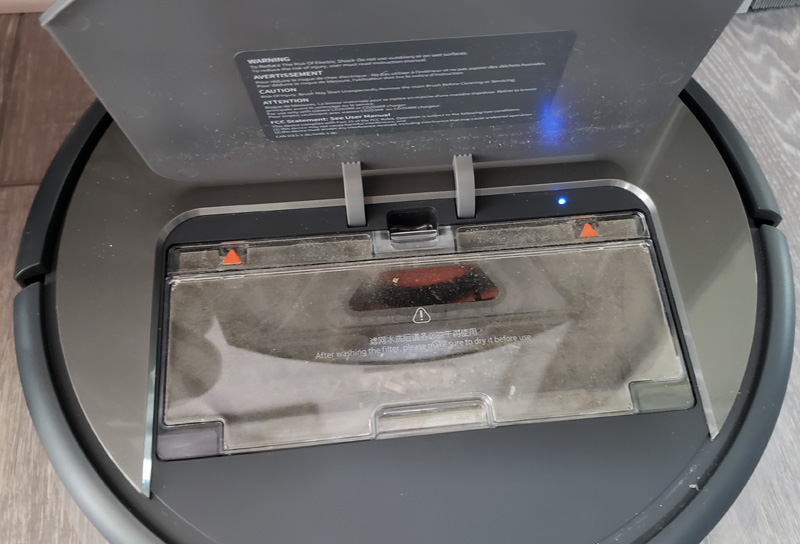
Grab the bin by the finger tabs in the front and back and it lifts right out. A voice prompt mentions that the bin has been removed. This is so much better than our Roomba that always drops debris on the ground.  This bin lifts out very cleanly.

Open the large door, and the debris dumps out easily into the trash can.  Then, snap out the filter and give it a bang or two on the trash can side.
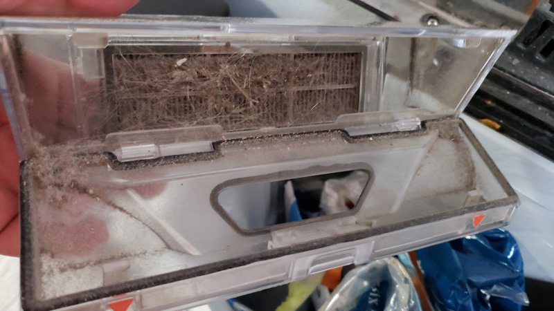
Once debris-free, snap the filter back in, close the bin door and drop it back in place in the vacuum.  The voice tells you it is properly installed and you’re ready to clean again. The filters can be rinsed, dried and used again.

I also used its scheduling feature to run in silent mode overnight.  We woke up in the morning to find the robot sitting on the small black rug we have in front of the front door.  It seems that the Xioawa does not do well with black rugs.  It has both an impact bumper and an optical obstacle avoidance sensor.  It appears that the contrast between the rug and floor confused the optical sensor.

One feature of most robot vacuums is virtual walls, where you can block off an area for the vacuum not to enter. Unfortunately, the E35 doesn’t come with any.  You have to purchase them separately.  The virtual wall is a black magnetic strip that you place at a boundary that you don’t want the vacuum to cross. Not including some of the material is a bit of an oversight. Plus, who wants to put black magnetic tape all over the floor?

Mopping

One of the attractions with this model is that it also can mop. To test out mopping, I closed Rosie in my master bathroom.  You have to block access to carpeted areas and take up any throw rugs or you will wind up with mopped carpet.

To mop, you put a mopping pad on the mopping reservoir and fill the reservoir with water.
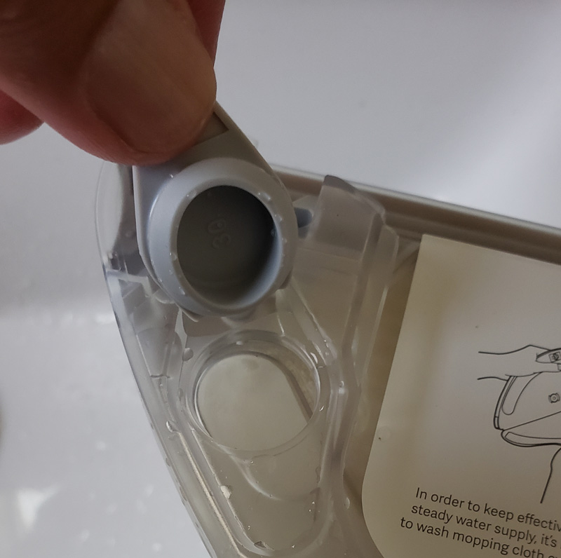
The reservoir fits under the back of the robot.  Here it is sticking out as I slid it into place.
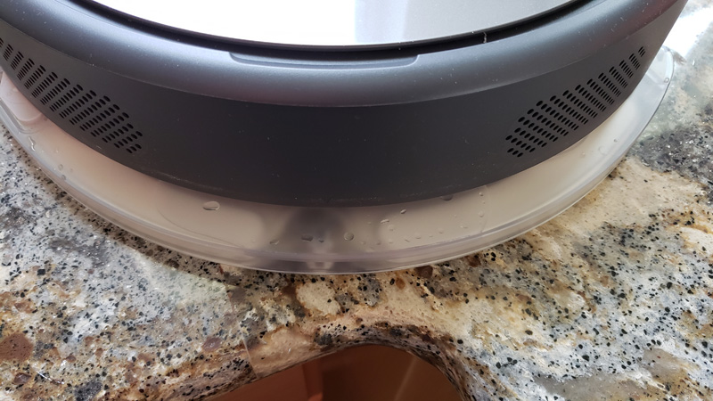
And, here it is snapped in place.
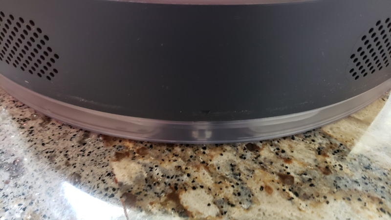
Because it installs in the back, and the vacuuming area is in the front, the robot does a cursory vacuum before dragging the mopping pad over the area to be cleaned.  Here is Rosie, happily mopping away.  Note the complete lack of a wet streak behind the vacuum.
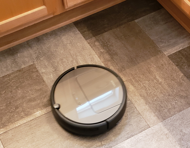
I watched it mop the entire bathroom.  It covered the main areas, including entering the toilet room and the doorway.  Then, it went around the perimeter before completing the cleaning and stating that I needed to take it to the charge station as it couldn’t find it. Of course, that’s because it was locked in the bathroom.

At one point, I did see a slight wet streak behind it, but essentially, the floor was dry immediately. It took 16 minutes to clean the bathroom, but I figured since I never really saw any moisture, it didn’t really do anything. I was wrong.
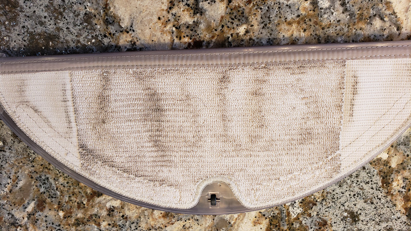
There was a fair amount of dirt removed.  Pretty impressive, and perhaps a little embarrassing. Of course, there would be no point in mopping a perfectly clean floor. The pads slide in a channel and then use velcro to stick to the reservoir, making them easy to remove and clean.

Other points

The Mi Home app provides status for the vacuum.
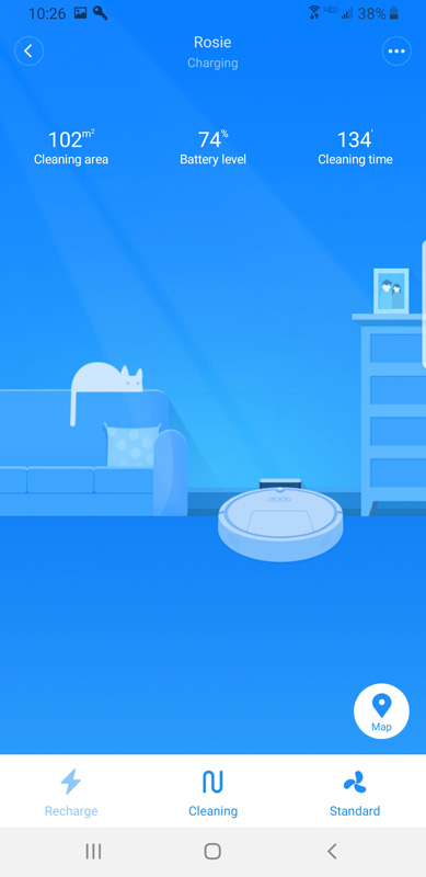
You can choose from cleaning several modes:
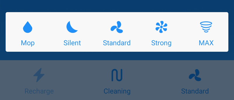
  • Pure mopping
  • Silent (really: quiet – it isn’t silent)
  • Standard – standard suction
  • Strong – stronger suction for heavy dirt
  • MAX – maximum suction for really heavy dirt

You can also do spot cleaning by placing the vacuum in a dirty area and choosing spot cleaning.  The vacuum will clean in a spiral, covering about a five-foot circle.

Finally, if you are so inclined, you can run the vacuum by remote control.
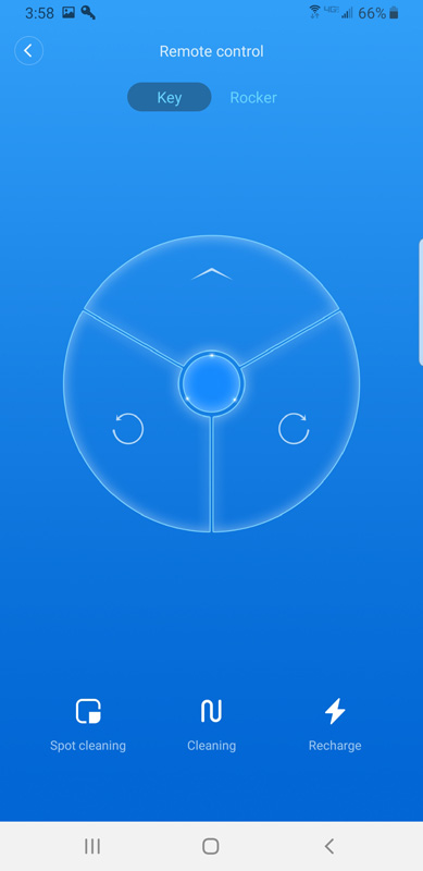
Of course, that negates a lot of the benefits of having a robot to do the cleaning for you.

Like most robot vacuums, it will find its way home at the end of the cleaning cycle, or, in the middle, if it needs to recharge.

You can also check cleaning logs to see how the vacuum has been doing.
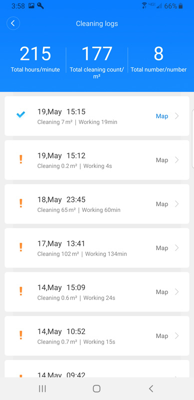
Xiaowa also allows for scheduling so it can clean when you aren’t around.

What I like

  • It’s quiet, relatively speaking
  • It’s fast
  • It mops
  • Large debris bin
  • Alexa integration
  • Nice voice prompts

What needs to be improved

  • Gets stuck too easily on a sliding door track
  • Gets stuck on a black throw rug
  • No included virtual wall
  • Virtual walls have to be stuck to the floor

Final thoughts

I really like the Roborock Xiaowa E35 robot vacuum with some reservations.  As I wrote this, I had it mopping the large living area.  It got stuck three times on the sliding door track. Grr…

Still, it mopped the roughly 750 square foot area in 93 minutes while I sat, watched golf and wrote this review.

With its excellent debris removal, great bin design and mopping, it looks like Rosie will have a permanent place here.

Price: $359.99 ($305.99 with Prime)
Where to buy: Amazon
Source: The sample of this product was provided by Roborock.

Filed in categories: Reviews

Tagged: ,

Roborock Xiaowa E35 robotic vacuum/mop review originally appeared on The Gadgeteer on May 29, 2019 at 9:00 am.

Note: If you are subscribed to this feed through FeedBurner, please switch to our native feed URL http://the-gadgeteer.com/feed/ in order to ensure continuous delivery.