Airpower Wearbuds Fitness Band and Earbuds review

CROWDFUNDING REVIEW – Airpower, an innovative smart device developer, is unveiling their Wearbuds, dubbed the “world’s first wristband-housed true wireless earbuds.” They will be available for preorder on Kickstarter starting today June 20th, 2019.

What is it?

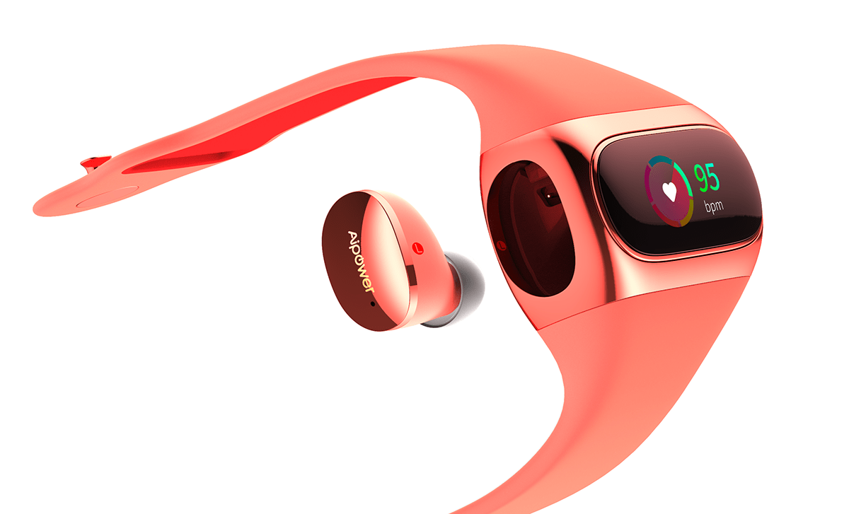
The Wearbuds are touted as the “World’s First True Wireless Earbuds Housed in a Fitness Band.” And indeed, they are indeed sporty wireless earbuds that click securely into the body of a wrist fitness tracker.

Obligatory promotional material shot.

In combining the earbuds, charging case and fitness tracker into one wearable package, Airpower hopes to solve the problems of lost charging cases and digging around in your backpack for your earbuds.

There is an invisible wire that has long plagued true wireless experience. The innovative patented design of Wearbuds enables the earbuds to be stored and charged in a fitness band, bringing both audio and fitness tracking experience to consumers. — Oliver Sha Fei, co-founder of Aipower

What’s in the box?

  • Wearbuds Fitness Band + Earbuds
  • Getting Started cards
  • Charging cable

Features & Specs

  • True wireless and Bluetooth 5.0
  • Qualcomm smart audio chipset
  • Support aptX codec
  • Graphene-augmented drivers
  • Instant pairing
  • Earbuds playtime: 4h (12h with the band)
  • Fitness band battery life: up to 7 days
  • Earbuds: IPX7 waterproof
  • Fitness band: IPX6 water-resistant
  • On-wrist fitness data: heart rate, steps, sleep patterns, etc.
  • On-wrist notifications for call, message, apps (Facebook/Twitter/Instagram)

Hands-on Experience

Note: The supplied Wearbuds unit that I was given is a prototype, so my experience with the wrist tracker, earbuds and app may differ from the final shipped product.

Airpower was kind enough to ship me a prototype of their Wearbuds. I’m going to break down my early impressions into three sections to cover everything the Wearbuds professes to do: wrist-worn fitness band, wireless earbuds, and the companion mobile app.

Fitness Tracker Band / Charging Case

When I first laid eyes on the Tracker Band, it sort of reminded me of a kids GPS smartwatch. It’s certainly a lot more fashionable than something a kid would wear, but it still had that rounded clunkiness to it.
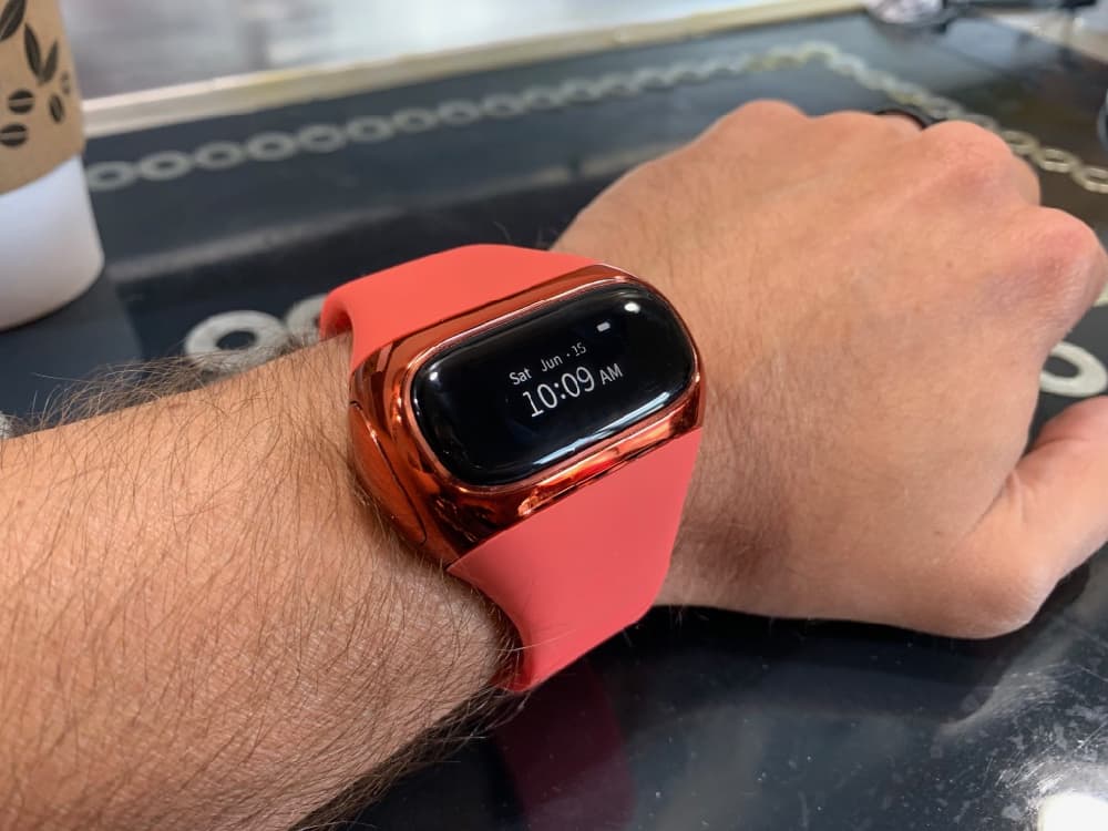
The strap of the Band felt very similar to the function of a sports tracker, and was easy to place on my wrist. After wearing it for a few moments, I could feel the metal disc attached to the nub keeping the strap in place begin to rub against the inside of my wrist, depending on the angle of my hand.

The self-consciousness of wearing something this thick on my wrist was apparent for the first few hours, but would come right back every time I would accidentally brush my wrist against something. I don’t know if I could ever get past it, maybe in time, but it definitely is meant to be an all-day type of device. And, it apparently tracks sleep, so it’s meant to be an all-night type of device, too.

There are no buttons to speak of. Not even a power button. It was already “on” when I received it, and the only way one could tell if the battery had actually died is by attaching or detaching the earbuds to see if the display would react.

There is a proprietary USB charging connector that attaches to the “underbelly” of the Band, held in place by strong magnets.
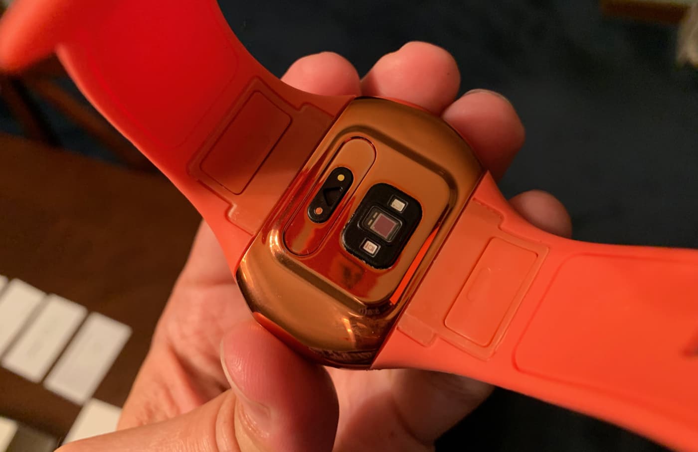
The charging port and heart rate sensor.

The Band’s functionality was extremely spotty. For instance, I don’t think I ever really “learned” how to raise my wrist to get the display to light up. It would take several dips and twists and flips of my wrist before I saw the time light up. And from what I can tell, the only way to switch modes is to have that display turn on, first.

Sometimes I would see it come on without even really moving my wrist around. I couldn’t tell if it was just a delay from a previous movement or if I was keeping my wrist resting on the table at the perfect angle to keep triggering it.

Once the display is on, which actually takes up a relatively small strip of the “face” of the tracker, you can switch modes by swiping to the left or right, and then enter that mode by double-tapping on the display. Once in the selected mode, like “Daily Report” for instance, you can get back to the main menu by swiping to the right to display a large “< BACK” and then double-tapping on that.

This took a lot of trial and error.
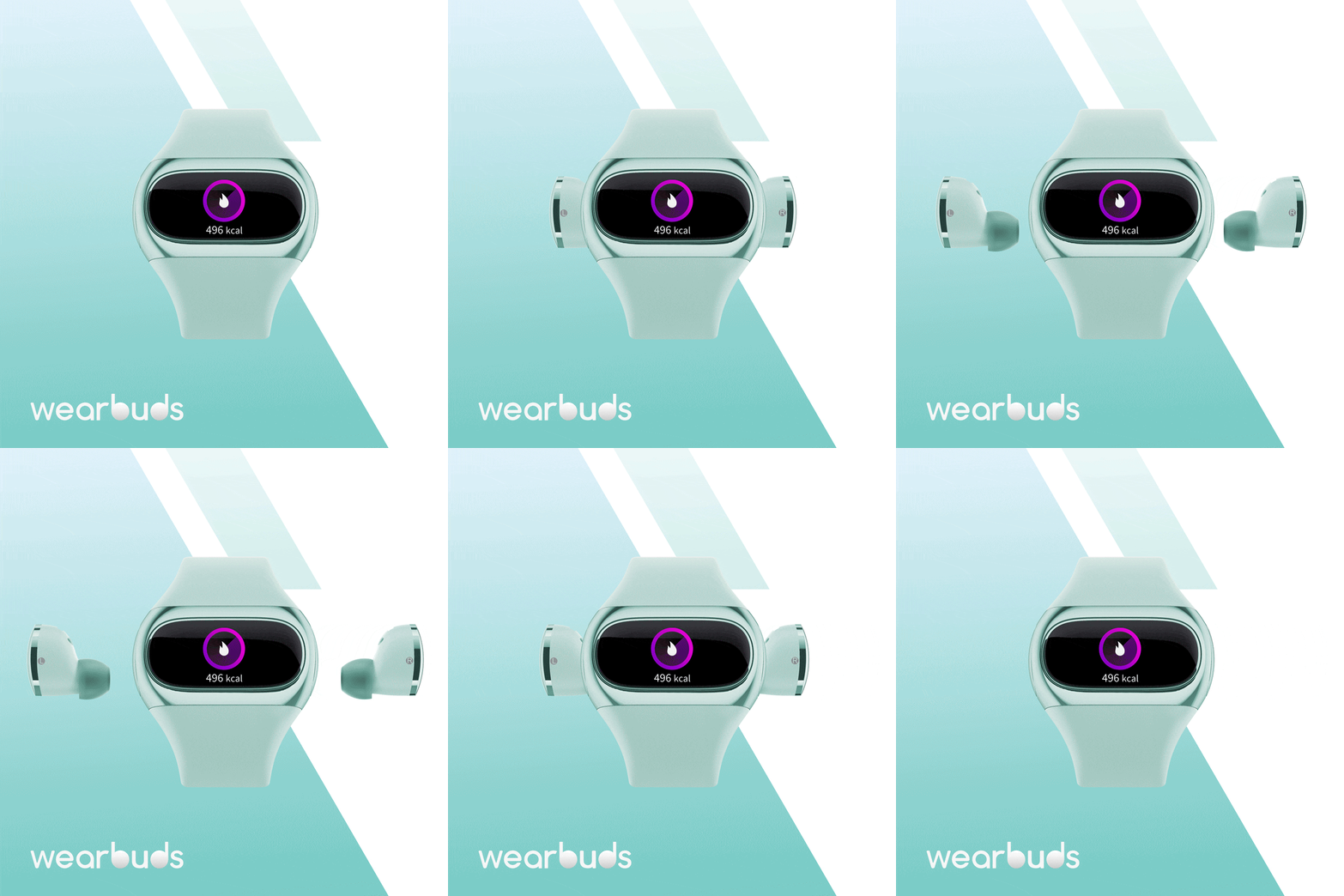
Animation displaying how the earbuds pop in and out of the Band.

To be fair, I received a note with the prototype explaining that this interface “needs to be fine-tuned.” So there may be some drastic improvements in using this.

The functionality of the Band is somewhat limited. You can enter heart rate mode, which (accurately from what I can tell) determines your heart rate, but not passively throughout the day. There is also a “daily report” mode that shows your steps and other stats, and a sport mode used for starting a walk, run or biking workout.

It’s also capable of displaying notifications from apps such as texts, WhatsApp, and phone calls, as well as a programmable “sedentary” reminder to get up and walk around periodically.

For the most part, the Band acts as a pedometer and portable earbud charging case. I would have vastly appreciated a more reliable way to turn on the display, such as a tap or even a small button.

The steps recorded from the Band were within a couple hundred steps of what was recorded by my iPhone, which seems pretty accurate.

I recorded a walk using the Sport function, but again ran into some trouble. During the walk I somehow got back to the main watch screen, and didn’t know how to get back to the workout in session. So I tried to start a new walk workout and after a very slow 3-2-1 countdown, it resumed the current walk. Very odd. I thought for sure I was going to crash something.

Again. Prototype stuff.

I should mention the battery life is listed at 7 days in the specs, but I can’t imagine it would last nearly that long. After a full day of wear (14 hours) the Band was at 35% power. I believe I had given the earbuds a full charge from the Band’s battery … this action alone would reduce it by about 40%. I suppose not charging the earbuds would boost the longevity of the Band, but having something that acts as a charging case for your earbuds is the entire point of this device.

At the current state, this prototype fitness band is clunky and unreliable. It’s hard to say how much better it will get since Airpower has a couple months to work on it. But, good news, the device is capable of receiving firmware updates via the app.

Earbuds

The true wireless earbuds housed within the Band are quite small. They only come with one earbud size, and while they did fit my ears snugly, I’m not sure they would be a fit for everyone. They pop in and out of the left and right sides of the Band with a push-snap mechanism, reminiscent of the action of inserting an SD card. They don’t shake out when inserted and remain flush against the side of the Tracker.

Here they are, little guys.

However, once they’re removed, the Band itself looks a bit odd, two gaping holes on either side of the body. I think that’s why most earbud charger cases have a cover on them, I think … and I snickered immaturely when I had this thought … for modesty’s sake.

They pair with your phone as independent devices. The pairing sequence was fairly easy, following the provided instructions.

The earbuds are able to be operated in single or dual mode, and have a touch sensitive area on the flat part of the bud itself. In dual mode, double tapping either earbud will skip or rewind the track, respectively. Tap and hold will increase or decrease the volume, and a single tap will answer or hang up a call. Additionally, a triple-tap (!) will activate Siri.

When using a single earbud, which activates mono audio, I think, the taps are limited to increasing or decreasing the volume, answering calls, and invoking Siri. I appreciate the extra attention in this detail.

The effective tap area is most of the flat surface. I think that surface is capacitive. I could touch this area twice very lightly and it seemed to react, it didn’t require a forceful double-tap like Apple’s AirPods.

The earbuds sound pretty good. They’re a little flat, and not very punchy in either the bass or treble. That can be helped by a little in-app equalization, if available, but they do block out a good amount of external sound. They’re decent. The batteries seemed to last around 4 hours of constant use on a full charge, which is very close to what was listed on their Kickstarter page.

They were a nice, snug fit, for me, but perhaps not all.

They charge using the Band’s power, so the battery life of the Band itself is highly dependent on how often you’re charging the earbuds. They’re listed as having 35mAh battery in each earbud, and the Tracker Band has a 160mAh battery, so charging the earbuds twice in a day would nearly deplete the Band’s power.

Airpower Companion App

The Airpower app is available on iOS and Android, and is specifically made for the Wearbuds. At the moment, it doesn’t look like it will sync with other devices, but it could when and if they’re developed.
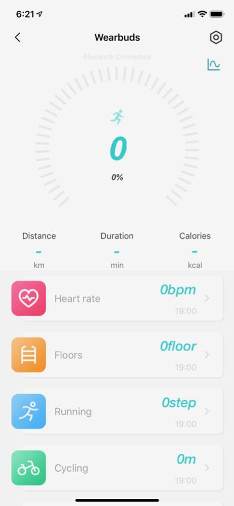
The app itself does a good job of displaying fitness data generated from the Tracker, such as steps, floors climbed, heart rate and workout stats. From what I could tell, this information doesn’t sync with the iOS Health app, so this information is only stored within the Airpower app.

The app itself can only be used to interact with the Band in a couple different ways, such as starting the heart rate monitor and putting it in “Find” mode, which lightly vibrates the Band if within range.

While limited in use, the app is almost necessary, as it’s the only way one could feasibly keep track of the fitness data history without write access to the Health app.

What I Like

  • Ambitious concept
  • Audio quality is pretty good

What Needs to Be Improved?

Again, this is an early prototype review, so there’s no telling what will be addressed before launch.

  • Ease of use of the fitness tracker interface, it’s extremely buggy
  • Incorporation of tracker data with Apple Health app
  • Would like a ‘tap to wake up display’ on the Band
  • Wish the Band was a little more trimmed down, but it’s basically a charging case on your wrist

Final Thoughts

The inherent problem in reviewing an early prototype is that any oddity I came across had to be approached with the possibility that it might get fixed or improved when the final product is released. My opinions should be taken with a $49 grain of salt.

While the earbuds were decent enough, this is a market that is positively exploding right now with the popularity of true-wireless earphones. There are dozens of them on Amazon, ranging in price from tens to hundreds of dollars.

The same can be said of fitness trackers.

The Wearbuds feels like one of those Kickstarters that falls into the “World’s First” category of devices and products that answers a question that nobody asked. While I’m sure there is a demographic of people who both want to track their workouts and like to listen to audio, there are thousands of existing products that address both of these subjects collectively better than solving the mild issue of misplacing a charging case.

Where can I find more info?

Starting on June 20, 2019 at 1pm ET, Airpower’s Wearbuds Kickstarter campaign will begin, aiming to hit a $50,000 goal by mid-August and begin shipping in September. You can begin pledging during this time, and your Super Early Birdpledge of just $49 will secure your preorder.

Filed in categories: Reviews

Tagged: , ,

Airpower Wearbuds Fitness Band and Earbuds review originally appeared on The Gadgeteer on June 20, 2019 at 1:00 pm.

Note: If you are subscribed to this feed through FeedBurner, please switch to our native feed URL http://the-gadgeteer.com/feed/ in order to ensure continuous delivery.

Wacom Cintiq 16 display tablet review

REVIEW – Within just a few weeks, I’ve graduated from my old Intuos 3 drawing tablet to the new Intuos Pro tablet and now to this: the Wacom Cintiq 16 display tablet. Reviewing the Cintiq 16 has left me with two differing opinions. It’s a drawing tablet that will either excite you or leave you wanting more. It’s missing some pro level features that may or may not be important, depending on how you work. That’s not surprising since it’s less than half the price of Wacom’s same-sized Cintiq Pro 16 tablet. 

What is it?

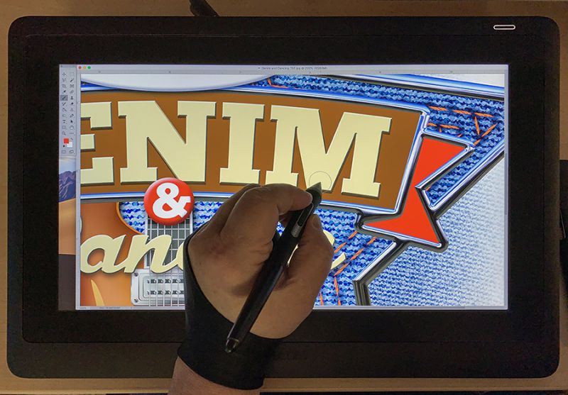
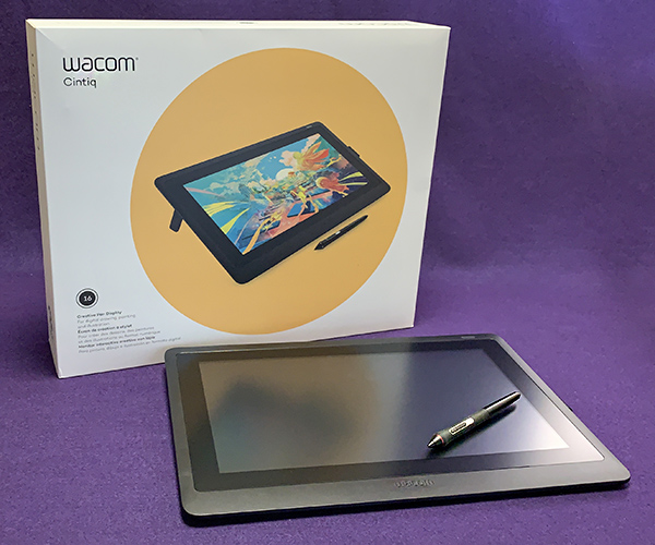
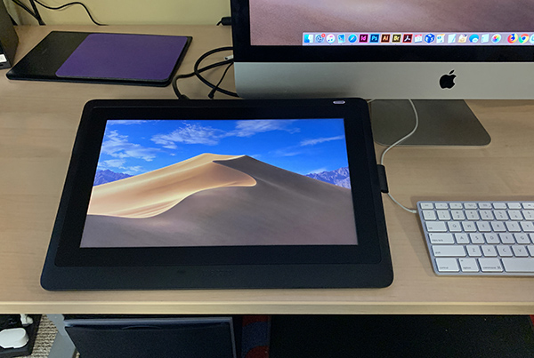
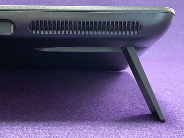
The Wacom Cintiq 16 display tablet is Wacom’s least expensive display tablet in the Cintiq line. It is different from the Cintiq Pro 16—a much more expensive tablet with more features. The Cintiq 16 has a built-in 15.6 in. HD display that allows you to draw right on the screen with the Wacom Pro Pen 2, a pen with 1,892 levels of sensitivity (I’ll explain later), tilt-response and virtually lag-free tracking. The pen is extremely customizable and requires no batteries or recharging. Extra pen nibs (tips) are included. It has built-in 19° stand legs for ergonomic drawing (an optional adjustable stand is available). These legs can be collapsed for working flat or in your lap.

Specs

  • Model Number DTK-1660
  • Tablet Size 16.6 x 11.2 x 1.0 in.
  • Active Area 13.6 x 7.6 in.
  • Weight 4.2 lbs
  • Black color
  • Pen: Wacom Pro Pen 2 
  • Pressure-sensitive, cordless, battery-free
  • Pressure Levels 8192, both pen tip and eraser
  • Tilt Recognition ±60 levels
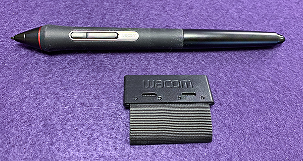
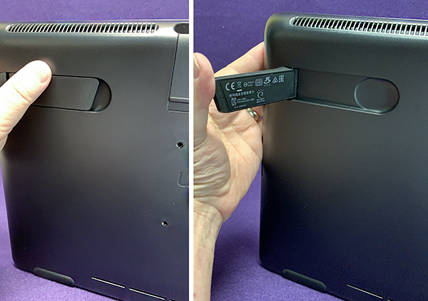
  • Detachable Pen holder with 3 replacement nibs with removal tool
  • Latex-free silicone rubber pen grip
  • Tablet resolution 1920 x 1080 (Full HD)
  • Active Matrix TFT LCD
  • Displayable colors: 16.7 million
  • Contrast ratio: 1000:1
  • Aspect ratio: 16:9
  • 3 in 1 cable with HDMI, USB 2.0 and AC adaptor
  • System requirements: HDMI port and standard USB-A port, internet connection for software downloads

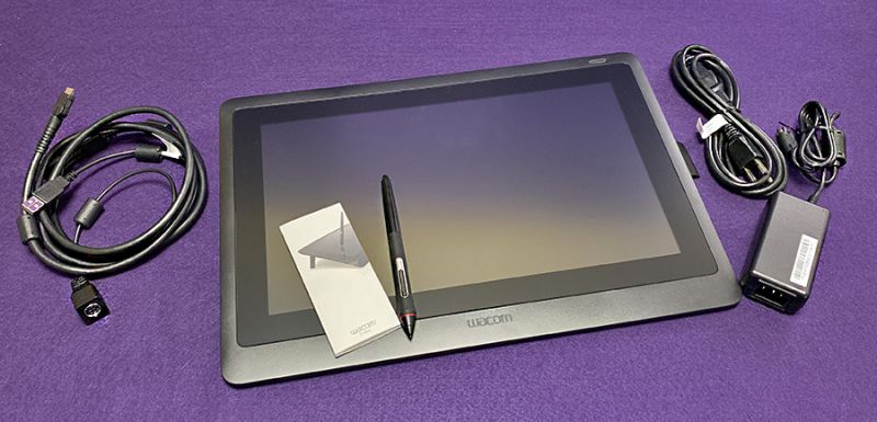
What’s in the box

  • Wacom Cintiq 16 display tablet
  • Wacom Pro Pen 2 (battery free)
  • Removable tab (includes 3 standard nibs)
  • 3 in 1 cable
  • Quick start guide

Design and features

The Wacom Cintiq 16 display tablet looks very much like its pro cousin, the Cintiq Pro 16 with key differences. The Pro 16 has 4K resolution vs HD. There are no express keys on the Cintiq 16. However, there is an optional $100 Wacom ExpressKey Remote featuring customizable buttons and a Touch Ring for programming shortcuts. For the record, I never use Wacom’s express keys on any tablet. The reason is simple: my first Wacom tablet—from the stone age—had no express keys. So I learned to use the Mac keyboard for shortcuts and well, habits are hard to break.

The Cintiq 16 display is not laminated. What that means is that the surface you draw on is separated from the LCD screen underneath. On the Pro 16, the drawing surface and LCD are laminated into one piece, which reduces or eliminates parallax—a tiny visual gap where the pen nib doesn’t look like it’s actually touching what is being drawn. Parallax may or may not bother you. On the Cintiq 16, the gap is so small that I have no issue with it, but it’s worth pointing out.

 Let’s talk display color—more specifically, gamut. Gamut describes a range of color within the spectrum of colors that are identifiable by the human eye. Got that? The Cintiq Pro 16 has 94% of Adobe’s RGB color gamut (a standard measurement), which simply means that it can show 94 % of usable colors. That’s a good thing. The Cintiq 16 only supports 72%. Obviously, the Pro version shows a wider range of color and yes, it matters if you’re a pro artist. However, if you never see the pro version, you may not notice this at all.

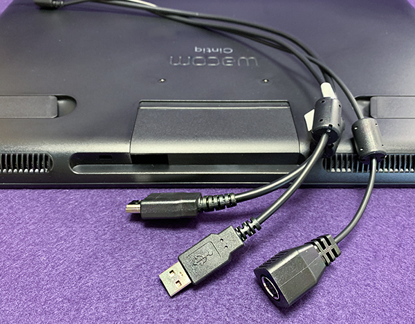
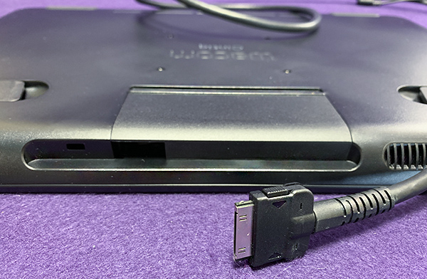
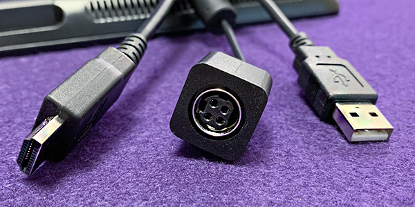
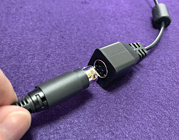
The Wacom Cintiq 16 display tablet has a 3 in 1 cable: USB, HDMI and power. This cable is way more convenient than the ridiculously thick cable on an older Cintiq Pro 13 I once owned and really disliked.

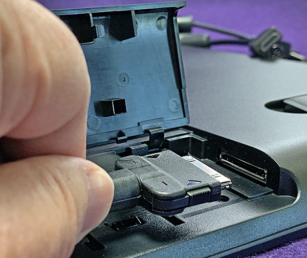
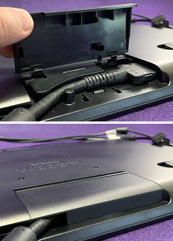
This cable has one connector at one end that easily connects into a port underneath the top of the tablet. It’s protected by a snap-shut lid. The cable splits into 3 parts. Both the HDMI and USB (A) must be connected to a computer. My iMac has no HDMI (thanks Apple!), so I had to purchase a Thunderbolt 2 to HDMI adapter. It wasn’t expensive, but I wish proper connectors were included. Keep in mind that computers have all kinds of video ports, so make sure you have or can get the proper adaptor, if necessary.

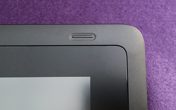
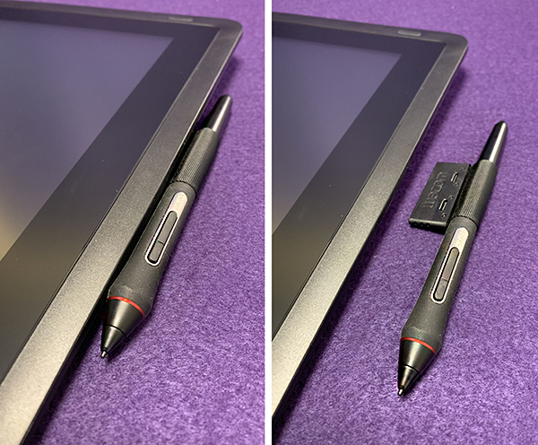
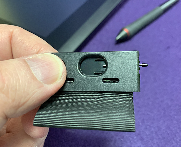
A simple lighted On/off button is all that appears on the top of the tablet. There’s a nifty pen holder on the Cintiq 16 that snaps into either side of the tablet, which benefits both left and right handed people. This pen holder also houses extra nibs—a clever solution for not misplacing the tiny nibs. 

Build quality on the Wacom Cintiq 16 is typical Wacom—as in first-rate. I’ve never had a Wacom tablet break. Any tablet I’ve replaced has been because it just got too old—but it still worked! In fact, when I the Cintiq 16 for review, I was able to give 3 older Wacom tablets to some local college students. 

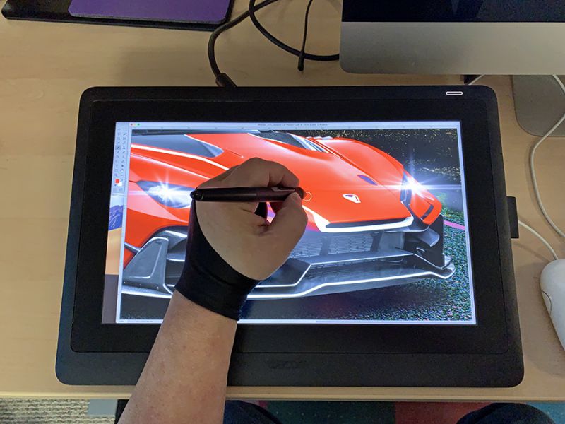
The Cintiq 16 is made for illustrators, both beginners and pros on a tight budget. Drawing is effortless. The surface has just enough texture for a more natural feel. It’s almost like paper—much better than an iPad with its glossy glass surface. Since you’re looking directly at the tablet screen while drawing, the experience is more natural and intuitive than the Intuos tablet which requires looking at a monitor while your hand is drawing on a desktop. It can take some getting used to. The Cintiq eliminates that hand/eye disconnection.

One feature I miss using the Cintiq 16 is multi-touch gestures, which let you pan, zoom or rotate your work. My Intuos Pro has multi-touch, but I turned it off because it’s hard to use while holding the pen and looking at a separate monitor. But since I’m working directly on the screen of the Cintiq 16, pan and zoom suddenly becomes important. A keyboard will be needed much less when using a Cintiq, but the lack of multi-touch tethers you back to it. For many, that one missing feature may be a deal-breaker.

Despite its “not pro” status, the Cintiq 16 uses the same Pro Pen 2—the best pen Wacom makes. This little wonder has 1,892 levels of pressure, making it way more sensitive than the previous pen with its paltry 2048 levels. This increased sensitivity allows you to be more expressive in drawing because as you vary pressure while drawing, line work becomes thinner or wider—just like a brush. There’s also a 60° tilt range, so the pan acts like a pencil as it’s tilted—again, making the line thicker or thinner. Note that the app you are using must have pressure sensitivity built in for this to work. The better drawing/painting apps will sport this feature.

The Pro pen 2 is perfectly balanced for hours of comfort without hand cramping. Nibs are replaceable—they will wear out with age. The pen is also battery free. Wacom utilizes what they call electromagnetic resonance technology providing power through inductive coupling. So there is no battery weight or charging—ever.

Despite the benefits of the Wacom Cintiq 16, I still prefer the Intuos Pro. Why? Because I learned on the Intuos and it’s now second-nature to me. Plus, I do a LOT of Photoshop work in my day job and freelance. When I’m retouching a photo, my hand can be in the way. That’s not an issue with the Intuos. But that’s me—I am not an illustrator.

Needless to say, if you’re an illustrator or just like to doodle, the decision to go with this tablet or an Intuos Pro becomes much more difficult.

What I like

  • Build quality
  • Pro Pen 2 included
  • Screen quality is good despite that it’s not Wacom’s best
  • Sensible cable management

What needs to be improved

  • Monitor has some parallax
  • Color not as accurate as Pro model
  • Still expensive, even at less than half the price of the Pro model
  • Express keys are an extra-cost option
  • Adjustable stand is an extra-cost option

Final Thoughts

The Wacom Cintiq 16 display tablet has a lot going for it. Other tablet makers have been coming out with cheaper tablets and Wacom has wisely responded with this tablet—an affordable option with Wacom quality included. Yes, there are trade-offs when compared to the Pro version, but if you are on a tight budget or just beginning your career, this is a great tablet to get started. There are enough features included that you won’t feel like you’re missing out. Later, after you become more proficient with it, you can then upgrade to the Pro line.

Price: $649.95 US
Where to buy: Amazon
Source: The sample for this product was provided by Wacom.

Filed in categories: Reviews

Tagged: ,

Wacom Cintiq 16 display tablet review originally appeared on The Gadgeteer on June 20, 2019 at 9:00 am.

Note: If you are subscribed to this feed through FeedBurner, please switch to our native feed URL http://the-gadgeteer.com/feed/ in order to ensure continuous delivery.
Huawei P30 Pro Android Smartphone review

REVIEW – I purchased the Pixel 2 XL back in October of 2017 and liked it quite a bit. But WiFi and Bluetooth connectivity issues had me trying alternatives over and over again only to go back to the Pixel because I couldn’t find a phone I liked better enough to spend the cash. I’m happy to say that after trying the Samsung Galaxy S10+, Pixel 3 XLEssential Phone, The iPhone X Max, and others, that I finally found a phone that I’ve stuck with… the Huawei P30 Pro. Let’s take a closer look.

What is it?

The P30 Pro is Huawei’s flagship Android smartphone.

Hardware specs

Processor: HiSilicon Kirin 980 Octa-core, 2600 MHz, ARM Cortex-A76 and ARM Cortex-A55, 64-bit, 7 nm
OS: Android (9.0 Pie), Huawei Emotion UI
Cellular: LTE (FDD): Bands 1, 2, 3, 4, 5, 7, 8, 9, 12, 17, 18, 19, 20, 26, 28, 32
LTE (TDD): Bands 34, 38, 39, 40
UMTS: 800, 850, 900, 1700/2100, 1900, 2100 MHz
GSM: 850, 900, 1800, 1900 MHz
Data: LTE-A, HSDPA+ (4G) 42.2 Mbit/s, HSUPA
GPU: Mali-G76 MP10
Screen: 6.47-inch, 19.5:9, 398 ppi (1,080 x 2,340)
RAM: 6GB/8GB
Storage: 128GB/256GB/512GB
Bluetooth: 5.0
Wi-Fi: 802.11 a, b, g, n, ac, dual-band
Battery: 4,200 mAh
Cameras: 40MP + 20MP + 8MP rear + ToF / 32MP front
Dimensions: 158 x 73.4 x 8.4mm
Weight: 192g

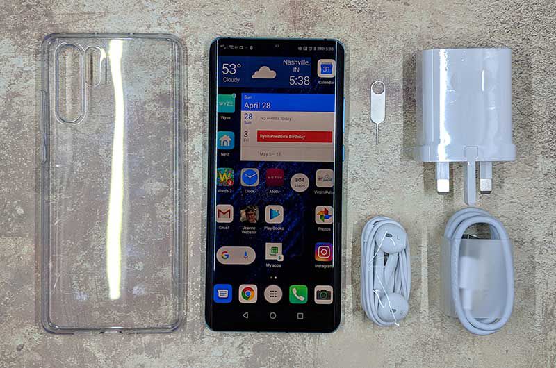
What’s in the box?

  • Huawei P30 Pro
  • Protective case
  • USB charger (UK version) and USB cable
  • USB-C earbuds
  • SIM removal tool

Design and features


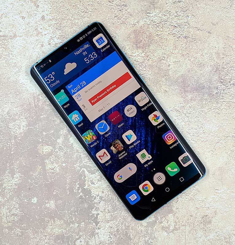
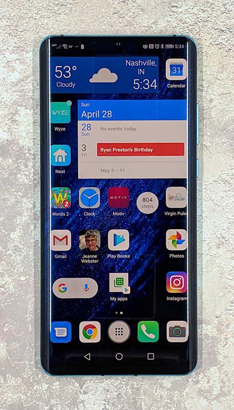
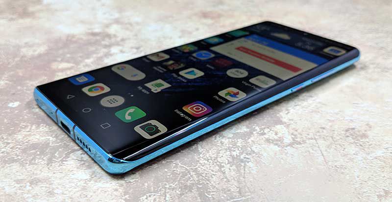
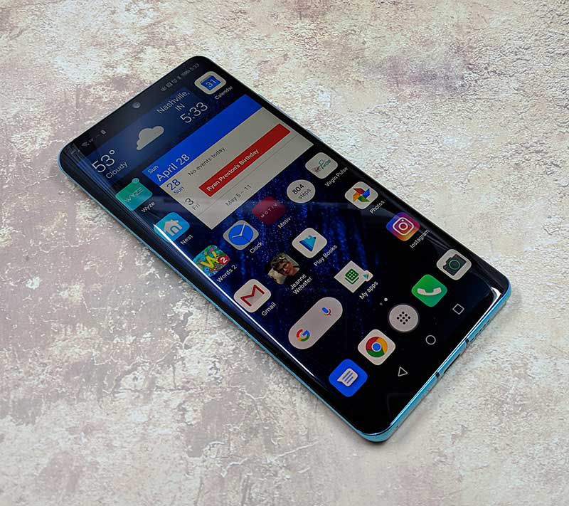
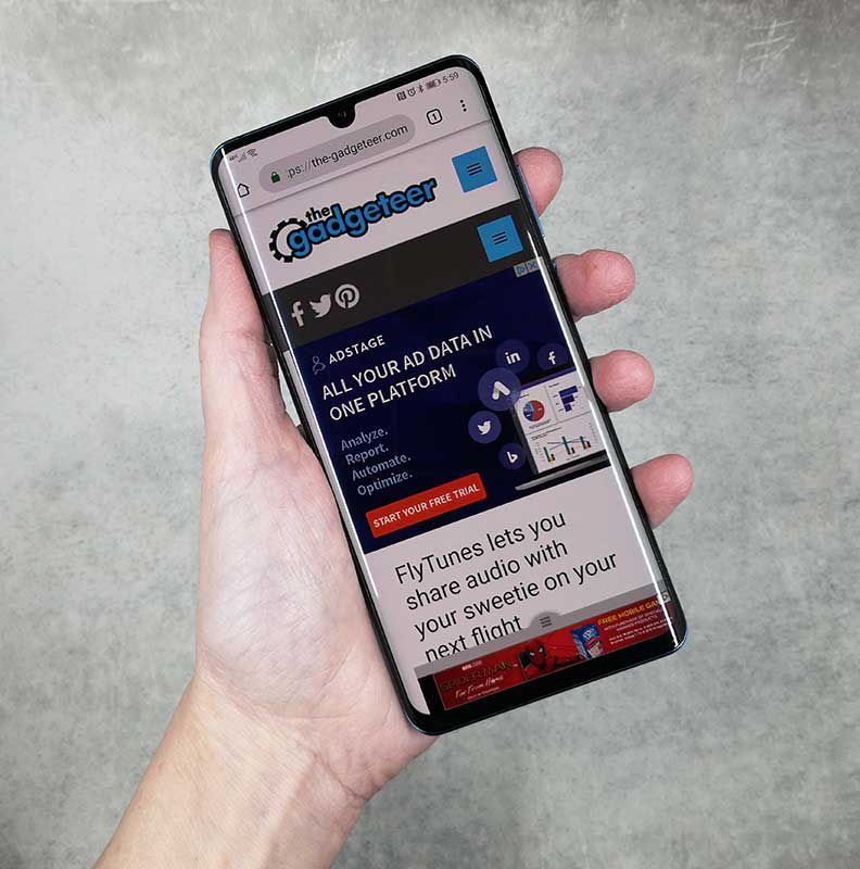
My first impression after taking the P30 Pro out of the box was that it reminded me a lot of the Samsung Galaxy S10+ due the curved sides of the display and sleek style. The top of the phone is all screen and there are also no buttons other than the virtual nav buttons. There isn’t even a speaker grill for your ear, but I’ll talk more about that later.

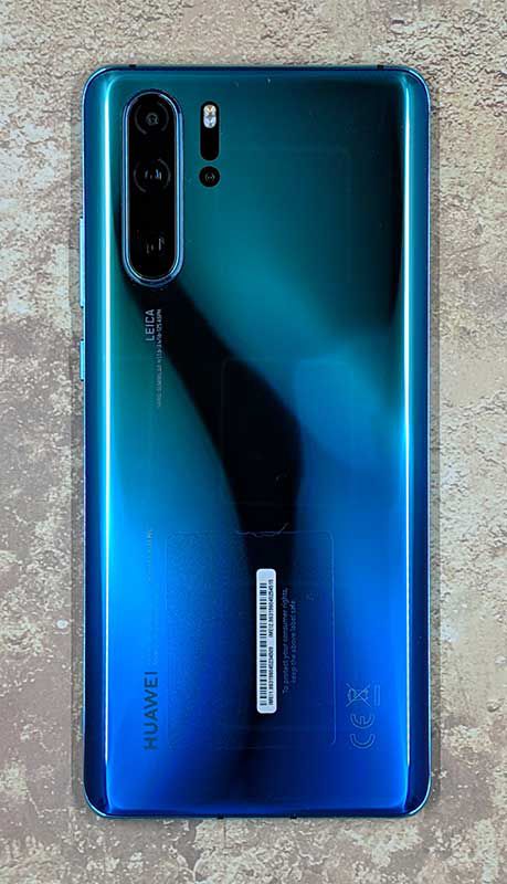
The back of the phone has a long camera bump with 3 lenses. Next to the bump is an LED flash and a ToF camera. What’s a ToF camera? This article on Pocket-lint explains it pretty well.

The left side of the phone is buttonless, while the right side has a one-piece volume button with a power button below it.

Along the top edge of the Huawei P30 Pro, you will find a microphone and an IR transmitter so that you can use the phone as a universal remote using the included Huawei Smart Remote app and your AV equipment.

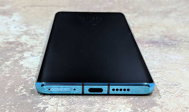
On the bottom edge of the phone is the SIM card tray, another microphone, the USB-C port, and the speaker.


The SIM card tray has two sides, one side is for your regular SIM card and the other side can hold Huawei’s proprietary nanoSD card.

Display

Unlike the Huawei P20 that I reviewed last year, the P30 Pro does not come with a pre-installed screen protector which would have been a welcomed feature due to the curved edges.

The P20 Pro’s screen is bright, vibrant, crisp, and clear to my eyes. It has a small teardrop-shaped camera cutout in the top center of the display that doesn’t bother me in the least.

If you dive into the display settings, you’ll find options to turn on a blue light filter, manual adjustments for the color mode that allow you to switch between normal and vivid modes and color temperature settings of default, warm or cool settings. You can also manually choose between the screen resolution of HD+ which is 1550 x 720 or FHD+ which is 2340 x 1080. Or you can toggle Smart resolution which will automatically lower the resolution to save power.

Fingerprint reader

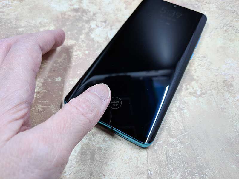
Several months ago I bought the Samsung Galaxy S10+ to replace my Pixel 2XL. The phone was really nice, but the reason I ended up sending it back was the in-screen fingerprint reader. It didn’t work at all for me. So when I read that the P30 Pro also had an in-screen fingerprint reader, I was pretty sure the experience wouldn’t be any different from the Samsung’s. I’m happy to say that I was wrong! The in-screen fingerprint reader on the P30 Pro is AWESOME and works 99% of the time for me which is unheard of when it comes to me and fingerprint readers.

The P30 Pro also has face recognition, so if for some reason it can’t read my thumbprint, my face unlocks the phone. I couldn’t be happier.

When it comes to the look and feel, I can’t complain about the P30 Pro. Although I don’t care about curved screens, it hasn’t caused me any issues. This phone is well made with a solid feel and premium look and feel. I can’t crush it when I do my Gadgeteer squeeze test, so I think it’s built to last.

I even dropped from about 3ft onto the concrete floor in my garage this week and it survived with only two scuffed corners – I didn’t have it in a case at the time. My bad. The next day I put the free case that shipped with the phone back on it.

Camera

The Huawei P30 Pro has a unique camera setup. On top is the 20MP ultra wide angle lens with a 40MP SuperSpectrum camera below that, and a horizontally placed 8MP periscope telephoto lens at the bottom. Next to that trio of cameras is an LED flash with the tiny ToF camera below that. The ToF camera helps with portrait mode pics.

Zoom!


The 5x zoom on this camera is pretty impressive. Check out the pics above which I took a couple of weeks ago during a vacation to Red River Gorge in Kentucky. Note that if you zoom in to the max, that it’s pretty tough to find your subject when you’re zoomed in that far and details definitely suffer. A tripod is really needed if you plan to use the zoom feature.

Wide angle


Night

d

32GB selfie cam

Everyday shots look great!


Just like the P20, I love the P30 Pro’s camera. Some might say that the colors are a little too vibrant especially when you use it in HDR mode, but I think the pictures look great.

Audio quality

You would think that as a flagship phone, that Huawei would have gone all out of the audio capabilities of this phone. So you might be surprised that the P30 Pro does not have stereo speakers. It only has one downward firing speaker that is located on the bottom right edge.

If you’re looking for the speaker earpiece for calls, you’re not going to find one because the speaker is actually under the display just like the fingerprint reader.

Is the lack of stereo and a traditional speaker grill for your phone a big problem? Nope, not really. Ok, maybe just a little bit when it comes to calls. But for the main speaker, I rarely listen to music through a phone’s speaker, so wired or Bluetooth earbuds are no problem. But for calls, I do notice that even at maximum volume, that I sometimes wish the sound was louder. Usually, this is when I’m in a noisy environment. If I’m home, there’s no issue.

Software and user interface

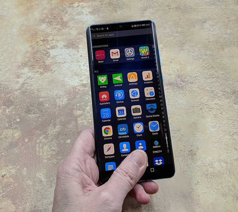
Like the P20, the P30 Pro ships with Huawei’s own interface skin that’s called EMUI. EMUI doesn’t make Android look that much different from stock, but it adds extra features like the ability to take screenshots by knocking twice on the screen with your knuckle. You can also knock once and then draw an S to take a scrolling screenshot for really long pages. There’s even a built-in tool to record a screencast.

One thing I don’t like about Huawei is that they include their own versions of the stock Android apps like a browser, app gallery, compass, calendar, clock, calculator, etc. I don’t use any of these apps because I prefer Google’s versions. So it’s annoying that I can’t uninstall them.


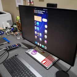
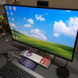
Carrying over from the P20, there’s a cool feature that allows the P30 Pro to easily connect to a monitor or projector if you have a USB-C HDMI, VGA, DVI dock adapter. Just plug it in and it will let you choose if you want to mirror the phone display or use a full-screen user interface on the larger screen. In full-screen mode, it’s like the Samsung DEX Station without paying for the extra hardware. It worked great with my BenQ PD2710QC DesignView 27-inch Designer Monitor.

The user interface in full-screen mode is easy to use just like Windows or MacOS and it reinforces my dream of one day using my phone as my one and only computer.

As an added feature, when the P30 is connected to a monitor or projector, the phone’s screen will turn into a touchpad that you can use to move the cursor around on the screen. Otherwise, you’ll have to use your finger or a Bluetooth mouse and keyboard.

Using the Huawei P90 Pro for phone calls

I didn’t have any issues making and receiving calls on the T-mobile network with this phone. Even when I’m in my office (basement) of my house, the phone holds a signal and I’ve yet to have it drop a call.

As far as call audio quality, the volume level on the receiver’s side has been fine. On my side, I’ve wished for a little more volume, especially when trying to hear the other side of the conversation when I’m in a noisy environment.

Overall performance and battery life using the Huawei P30 Pro for day to day tasks

During a typical day, I use my phone to make and receive calls (shocker!). Make and receive text messages, play a rousing game or two of Words With Friends, check my email, send emails, read books, surf, listen to music through Bluetooth earbuds, take pictures for reviews that I’m working on, and occasionally watch a video on YouTube. For all those tasks, the P30 Pro performs wonderfully. Apps open quickly, webpages load quickly, everything works at the speed I’ve come to expect from a smartphone.

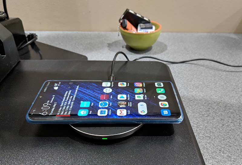
When it comes to battery life, the Huawei P30 Pro can easily get me through the day and when I need to top it off before going to bed (I don’t leave my phone plugged in overnight), it recharges quickly either by plugging it directly into power with a USB-C cable, or charging it wirelessly on a wireless charger like the Satechi Aluminum Type-C PD & QC Wireless Charger.

Speaking of charging, the P30 Pro supports reverse charging which allows you to use the phone as a wireless charger for another device that supports wireless charging. Just put the P30 Pro face down and it becomes a wireless charging pad.

What I like

  • Camera
  • Battery life
  • Fingerprint reader
  • Wireless charging
  • A clear case is included in the box

What needs to be improved

  • In screen speaker for calls could be improved as far as volume
  • No micro SD card slot
  • Mono speaker
  • Not officially available in the US

Final thoughts

After trying several phones over the past 2 years, it’s the Huawei P30 Pro that has taken the spot as my daily driver. It has every feature I want in a flagship smartphone. It has a nice display, excellent fingerprint reader, wireless charging, great battery life, a fullscreen desktop mode when connected to a monitor, and an excellent camera. There’s only one downside to this phone and it’s the fact that it’s not officially supported here in the US. That didn’t stop me from buying one though and I’m happy that I did.

Price: $909.00 from Amazon
Where to buy: Amazon
Source: The Huawei P30 Pro for this review was purchased with my own funds.

Filed in categories: Featured Items, Reviews

Tagged: , ,

Huawei P30 Pro Android Smartphone review originally appeared on The Gadgeteer on June 19, 2019 at 7:04 pm.

Note: If you are subscribed to this feed through FeedBurner, please switch to our native feed URL http://the-gadgeteer.com/feed/ in order to ensure continuous delivery.
EGO 21″ Self-Propelled Peak Power electric lawn mower review

REVIEW – Since EGO sent me their Power+ 530 CFM blower, I’ve become a fan of EGO and more importantly, an advocate for clean battery-powered lawn equipment. I’m no tree hugger, but I do appreciate the advantages of yard tools that use no gas, have no fumes and are even quieter! You don’t appreciate the genius of cordless tools until you use one. EGO has now incorporated battery powered tech in the new EGO 21″ Self-Propelled mower with Peak Power. 

What is it?

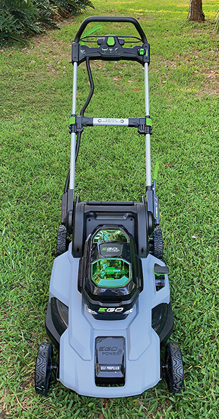
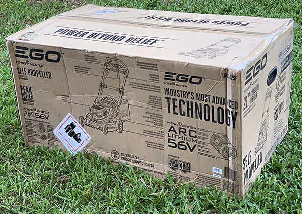
The EGO 21″ Self-Propelled mower with Peak Power is a dual-battery mower that rivals any home gas powered mower. Its two batteries allow for longer run times with increased efficiency. It features push button starting, is self-propelled with speed control, uses any EGO battery and is water resistant if caught in the rain while mowing.

Specs

  • 21″ Deck
  • Brushless motor
  • Weather Resistant (ipx4)
  • LED Headlights
  • Mulching, bagging, side discharge functions
  • 3 position handle heights
  • One handed height adjustment
  • Maximum cutting height: 4 inches
  • Minimum cutting height: 1 ½ inches
  • Grass bag capacity: 2 bushels
  • Rear wheel size: 9 inches
  • 5 year warranty

Design and features

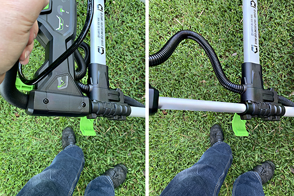
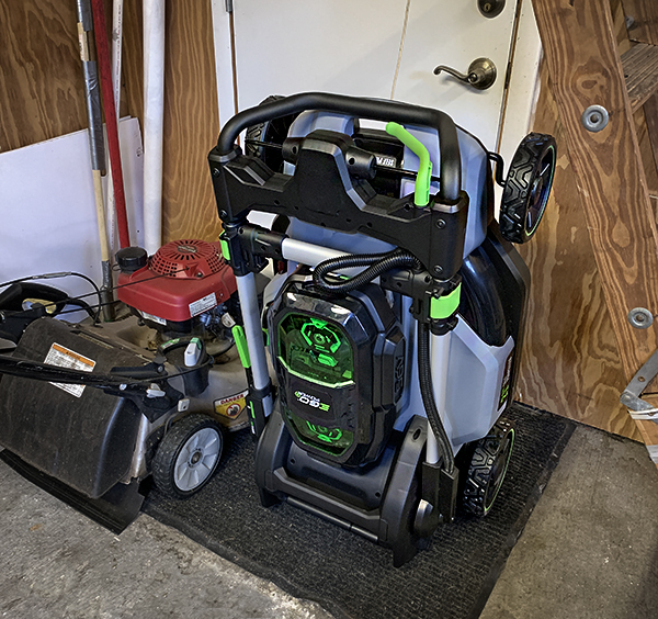
The EGO 21″ Self-Propelled mower’s lightweight outer shell may be made of plastic, but it’s high-grade, tough and water resistant. The handle folds down and the mower can be stored upright taking up less valuable garage space. 

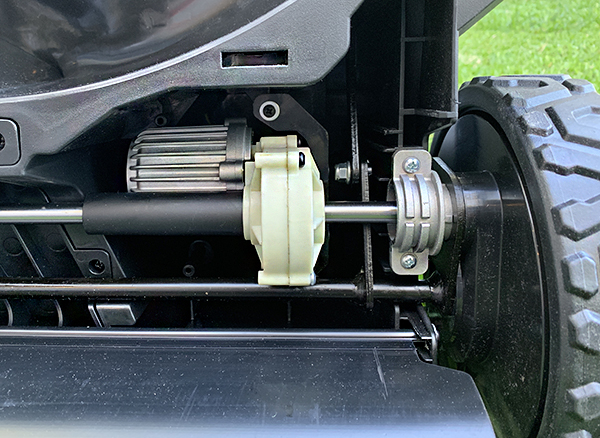
The motor that drives the EGO mower is brushless. Why is this important? The oversimplified explanation is that brushed motors use carbon (which wears with age)  and brushless units use magnets to generate power resulting in less generated heat and more efficiency.

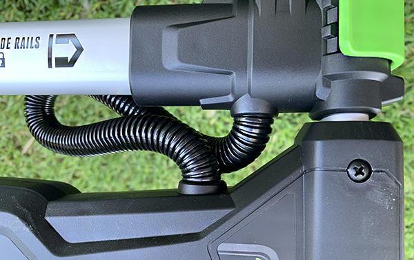
All wiring on the mower is protected by plastic tubing. My Honda doesn’t even have this feature. 

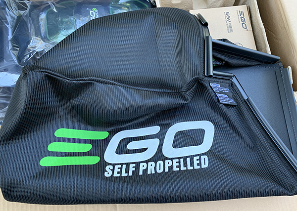
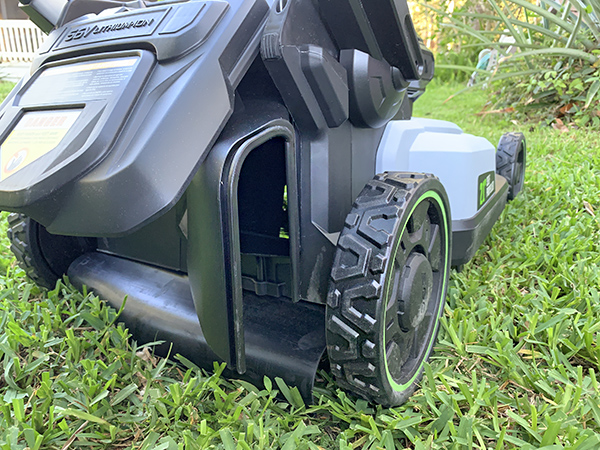
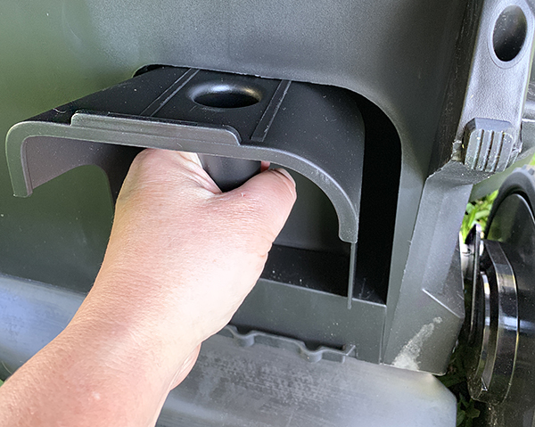
Three methods of grass discharge are available: Side, rear (with bag) and mulching. I only use rear bagging if I have a thick area of grass that leaves clumps. Otherwise, I always use the mulch setting. Attaching the rear bag is simple: just lift the rear flap and place the bag into the slots. Side discharge is technically rear discharge with a curved attachment directing grass to the side. It’s an awkward solution at best.

One cool feature on the EGO mower is useless to me: headlights! The lights come in handy if you get caught mowing as the sun sets and want to finish before dark. Unfortunately, this is useless where I live in Central Florida because dusk is when the bugs come out to feed on flesh.

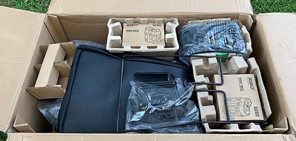
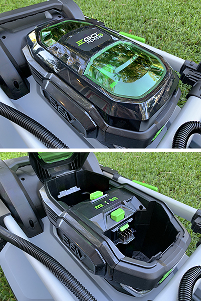
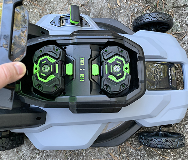
Setting up the EGO mower could not have been easier. There’s really nothing to do except unfold and lock down the handles, plug the rear discharge with the included attachment (if using mulch mode) and insert the two included 56-Volt 5.0Ah batteries. That’s it. There are further adjustments to be made, but those are set after you’ve been mowing to see what works best.

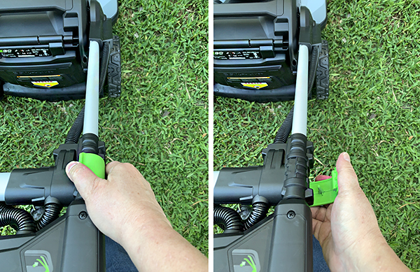
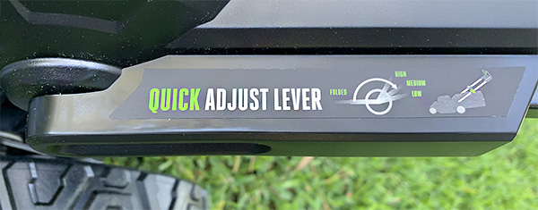
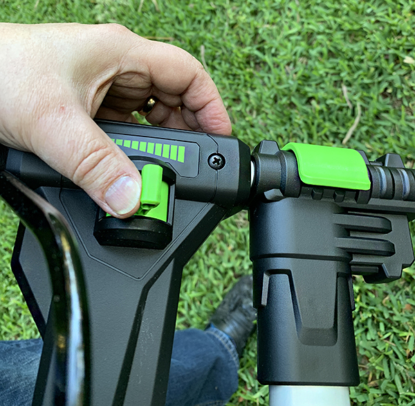
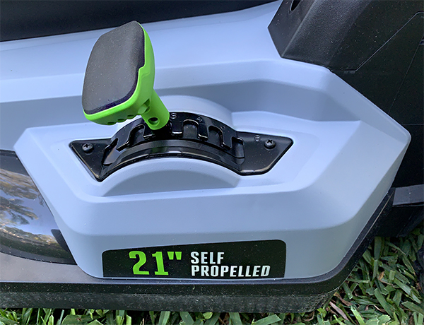
You will want to adjust the mowing height. Again, it’s easy to do. The EGO mower has one lever that raises and lowers the mower. This is so much easier than adjusting each wheel independently as on my trusty Honda gas mower. The handle can be lowered and raised depending on your height. I’m average height and the regular setting works fine. There’s also a speed lever for determining how fast the self-propelled function will go. This setting is a bit touchy. Even though the lever covers a wide range of speed, the middle part alone can go from “too slow for my walking speed” to “ludicrous mode.” I would have preferred more fine-tuning over a wider range.

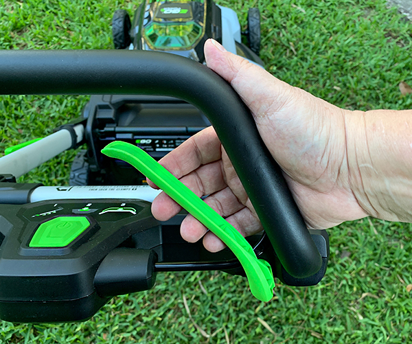
There’s another minor issue I have with the self-propelled function. The accelerator is a lever on the right side of the handle bar that’s controlled by your thumb or four fingers. You squeeze it sideways to operate. That’s easy to do (if a bit odd feeling), but when I come upon an obstacle and forget to let go of the accelerator, there is so much power in the wheels wanting to go, go, go, that the rear of the mower will start hopping until I let go of the lever. Granted, it’s me not doing it right, but I can’t help but feel that a better design might help this.

My lawn situation requires the need for the self-propelled function. I have a large back yard and I will never own a mower I have to manually push. The speed adjust lever can be used on-the-fly as you’re walking, but I found it works a bit better if the speed is adjusted as you stop for a turn before proceeding. I also have to continually play with the lever depending on grass thickness and if I am going uphill or mowing on flat ground. Note that the self-propel function will work without the mower even running—as long as a battery is inserted. This is very convenient if you need to take the mower to another part of the yard or over concrete and don’t want the mower blade spinning.

EGO has managed to make mowing much easier. For instance, before using my Honda gas mower, I would have to check the gas level. Then I would check the oil dipstick (I once seized the motor of an almost new Toro mower by not checking the oil—lesson learned). Then I had to remove and shake out the air filter. Then I pulled the string hoping the motor would catch—it’s a Honda, so it usually did. Then I would have to press button 1, then button 2  and then pull the safety bar to get the blade to spin. Get the picture? 

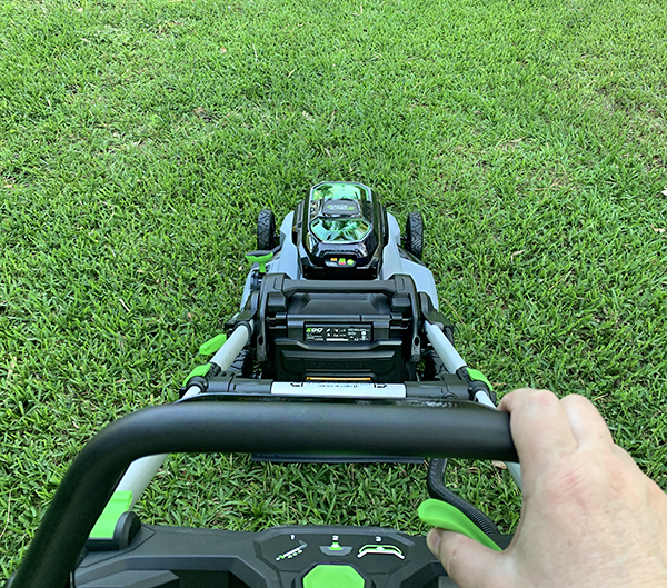
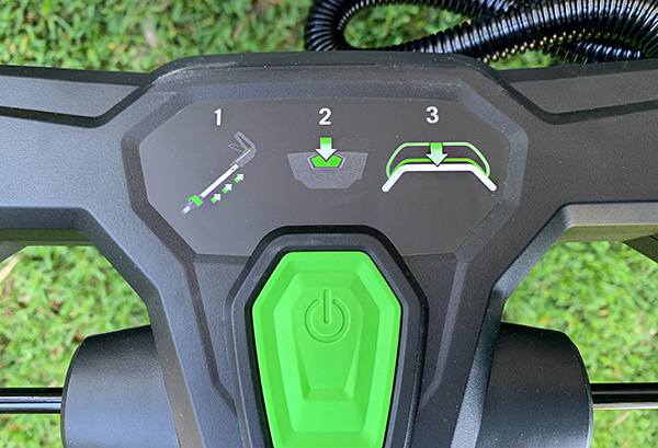
With the EGO, I insert the batteries (if they aren’t already inserted). Then I pull the safety bar and push the big, green button. No gas. No oil. No filters. No carburetor. No fumes. It’s mind-blowing when you think about it. But wait, that’s not all. The EGO mower is much quieter than the Honda ever was. You can have a normal conversation while the EGO is running. Hearing protection is not needed while mowing. Actually, I still wear earphones while mowing, because I’m addicted to audio books, but I digress.

The Ego mower also feels as powerful as the Honda. It cuts through just about any grass—damp or dry—except when it doesn’t. Let me explain. While the mower seldom refuses to cut, I managed to cause it to shut down when mowing too-tall grass in the morning. In Florida’s humidity, grass is usually wet (not damp) in the morning hours. This wet grass would clump under the mower and causing it to stall. I would have to turn it on its side to clean it out before it would restart. There’s both bad and good news here. The bad news is that the EGO won’t plow through wet grass—to be fair, the Honda won’t either. The good news is that I can just turn the mower over and scrape it clean. Turn a gas mower on its side and you run the risk of flooding the engine or starting a fire if it’s too hot. Once the underside was scraped, the EGO started right up. No fuss, no muss.   

Mowing through “normal” grass with self-propelled activated is a breeze. The mower is light and easily maneuverable. My back yard is over an acre and I wanted to see if the extended range of having two batteries would allow me to mow the yard without the batteries dying. Sadly, the mower stopped before I could finish. However, my yard is much larger than a typical suburban yard, so this mower should mow most yards with power to spare. Also, the EGO mower came really close to finishing. I just had a small section left to do. It was impressive because I didn’t expect to get as far as I did. 

Note that the EGO 21″ Self-Propelled mower with Peak Power ships with two 56-Volt 5.0Ah batteries. If they had been EGO’s 56-Volt 7.5Ah batteries, I could have completed the yard with no recharging. 

I got about an hour and 20 minutes life from a single charge to both batteries. Battery life is dependent on different factors, like if the grass is high and thick, wet or dry or even how much the self-propelled mode is used. Unfortunately, there’s no battery life indicator on the batteries, so when mowing, the battery is lit green until it’s spent—then it turns red. Not very useful. However, EGO has a new battery available with a built-in fuel gauge. This newer battery did not ship with the mower.

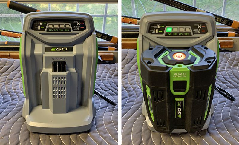
Each included 5.0Ah battery completely recharges in about 40 minutes with EGO’s included rapid charger, which charges in half the time of EGO’s regular charger. A single recharged battery would have been enough for me to finish the back yard, so at most, I would have been delayed 40 minutes. Lemonade break, anyone?  

The EGO 21″ Self-Propelled mower with Peak Power is expensive. But when you consider EGO’s long warranty and factor in the cost of gas, oil, upkeep as well as the price of a good gas mower, EGO’s price looks more justified. 

What I like

  • Extremely easy to use
  • Mows as well as a gas mower
  • Long-life batteries
  • Quiet
  • Long warranty
  • Easy storage

What needs to be improved

  • Expensive 
  • Self-propelled setting could be fine-tuned
  • Side discharge is awkward

Final Thoughts

I could go on and on about how much fun it is to use the EGO mower, but I won’t because it’s not. Mowing is still mowing and in Florida’s summer heat and humidity, it’s still a chore. However … EGO has turned something I dread doing into almost—but not quite—a pleasure. To me, that’s a big, big win. 

Price: $749 US
Where to buy: Home Depot
Source: The samples for this product were provided by EGO.

Filed in categories: Reviews

Tagged: ,

EGO 21″ Self-Propelled Peak Power electric lawn mower review originally appeared on The Gadgeteer on June 19, 2019 at 1:04 pm.

Note: If you are subscribed to this feed through FeedBurner, please switch to our native feed URL http://the-gadgeteer.com/feed/ in order to ensure continuous delivery.
CINEMOOD Portable Movie Theater projector review

REVIEW – When the whole family wants to watch a movie or see the big game together, we gather around the large screen TV in the living room.  When I want to catch a Dota match on Twitch or see the latest Dude Perfect video on YouTube, I use my iPad.  Is there room in our family for a gadget that fits somewhere in between these extremes?  It would need to combine the take-it-anywhere convenience of an iPad with the screen-is-large-enough-for-two of a TV.  CINEMOOD’s Portable Movie Theater (PMT) wants to be this gadget!

What is it?

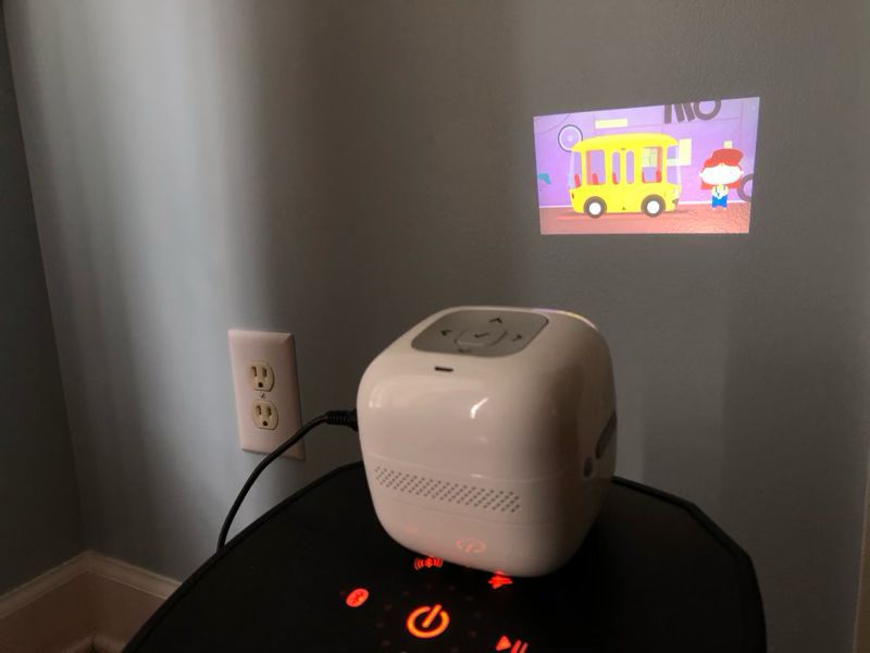
The PMT is a smart, portable projector.  It’s a projector that turns any smooth, white surface into a screen for watching videos and other digital content.  It’s small and light enough to be very portable.  Want to join a friend on the beanbag and project on the wall?  No problem.  Want to lay on a bed together and project onto the ceiling?  Still no problem.  It’s also smart, which means that it’s more than just a projector.  The PMT has its own operating system that connects to your WIFI, runs apps, and downloads content from the Internet.  Conceptually, it’s very similar to an AppleTV or a Roku, but it uses a projector instead of plugging into your TV.

I think the PMT has two target audiences in mind.  First, it’s clearly aimed at little kids.  It’s small, light, and easy for kids to take anywhere without any cables, and it comes pre-loaded with content geared towards little kids.  Second, it’s also aimed at couples or friends who want to spontaneously enjoy a video together from traditional sources like YouTube, Netflix, and Amazon Prime Video.

What’s in the box?

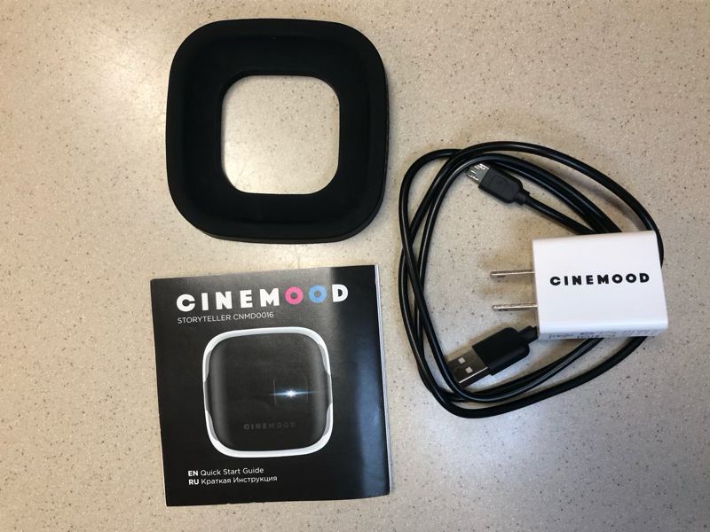
  • The projector
  • A micro-to-USB cable with wall charger
  • A rubber stand for holding the projector steady
  • A manual with 6 pages of English instructions

Hardware specs

  • 3 in x 3 in x 3 in
  • 0.5 lbs
  • Internal, rechargeable, non-replaceable battery with up to 5 hours of battery life
  • 3.5mm audio support
  • 16 GB of internal memory, though only 6.8 GB are free out of the box
  • 2.4 GHz WIFI and Bluetooth 4.0 support
  • Support for a variety of audio, video, and image formats
  • Screen mirroring (iOS only)

Design and features

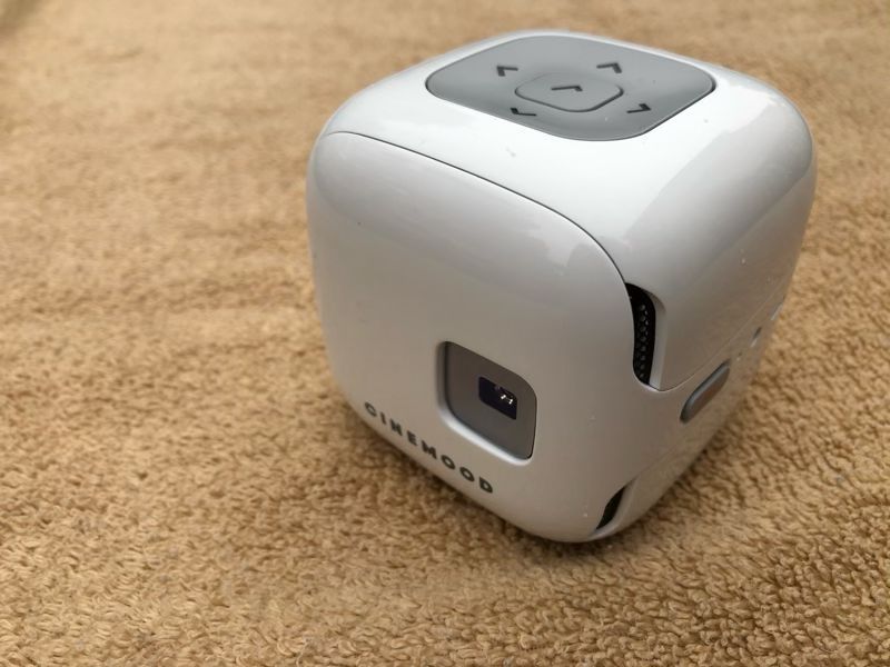
Do you remember EVE, the cute little robot that WALL-E met?  The PMT kind of reminds me of her:  small, white, and minimalist.  It’s a slick-looking little gadget.

Installation and setup

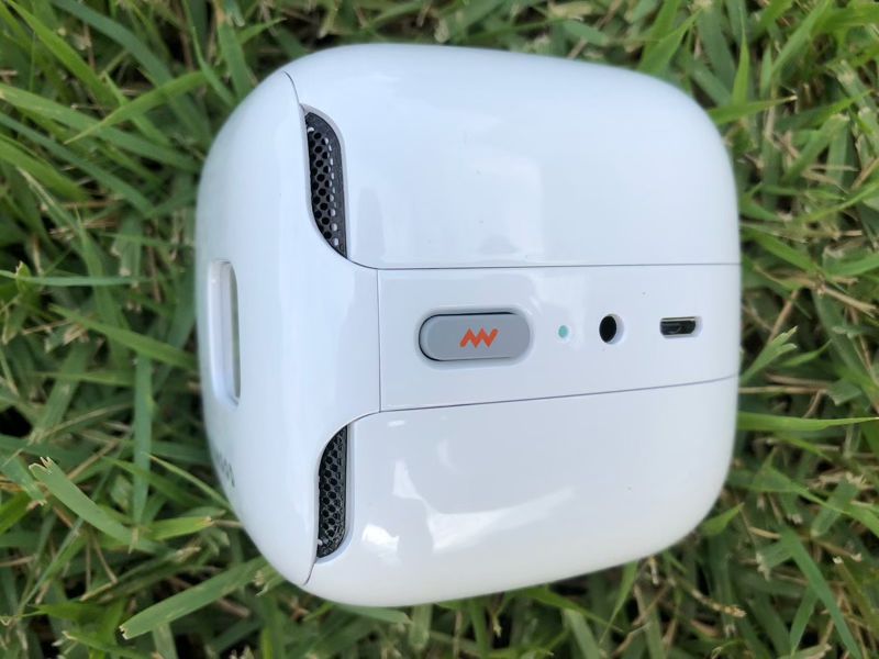
The PMT comes charged, but my unit was only about 30% charged, so the first step was to charge it up with the wall charger and USB cable, which I plugged into the micro-USB port.  When it’s charging, a little LED on the side turns red; when finished, it turns green.  The manual notes that I should only charge the PMT while it is off, so once the battery is drained, I won’t be able to use the projector until I charge it again.  The first time I started the projector, it asked if I wanted English or Russian.

Hardware

The PMT itself is a nice bit of hardware, sturdy and well-built, made of white plastic; it seems very durable to me.  The projector is a decent quality for the price.  The colors are reasonably rich and vibrant when I project on the wall a couple feet in front of me; when projecting onto a wall that’s 6 feet away, it’s a lot more washed out.  This projector is not very bright (35 lumens), so I can only use it at night or in a dark room.  The speakers are small and very tinny-sounding, as I would expect from such a small device.  Little kids probably won’t notice this, but adults will want to use a better audio source.  The PMT comes with a 3.5mm audio jack, so I plugged in the headphones that came with my iPhone and got clear and better sound.  Of course, using headphones defeats the point of a device that can be shared with others, so I plugged the PMT into my Soundcast VG5.  These two are a nice combination, as the VG5 not only provides great audio but also acts as a small stand.

It would be even better if the audio could be connected via Bluetooth instead of an audio cable.  Fortunately, the PMT supports Bluetooth audio, and it paired with the VG5 without any problem.

The power button is on the left side near the LED.  I’m not sure what processor is inside CINEMOOD’s projector, but it’s not exactly fast.  When I press the power button (the one with the little red lightning symbol), it takes over a minute to boot up.

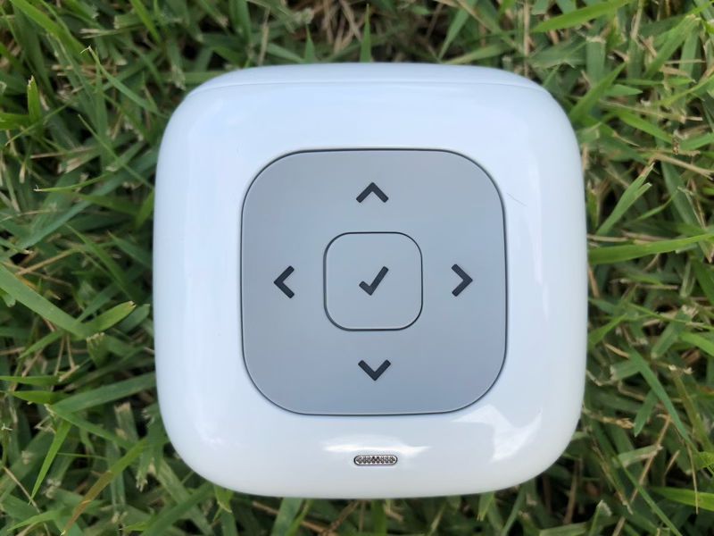
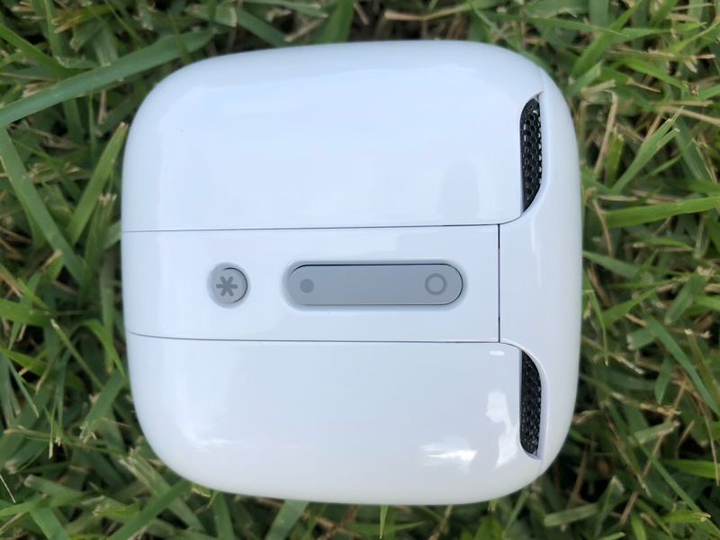
On top of the PMT are the navigation buttons.  While in the OS, these are used to navigate through the apps and select content to watch.  When playing a show, they are used to control the volume, fast forward, rewind, and pause.  The only problem I found—and it’s a huge one—is that there’s not really a pause button.  If you hit the center button, it shows the pause symbol, but it actually stops the video; when I click again to restart, it starts from the beginning.  This makes it nearly useless for watching any long content, like a movie, where you might want to pause to get some more popcorn or take a bio break.

On the right side is a rocker button that is used to focus the projector.  There’s also a flashlight button that turns on the projector as a light in case you need to see something in a dark room.  It’s a nice little touch.

The operating system (OS)

The operating system in the PMT is called CINEMOOD OS, and I suspect it’s a version of Android.  It comes with a variety of pre-installed apps, many of which I’ll describe below.  Apps cannot be removed, but unwanted content can be deleted by pressing and holding the check button.  The content remains visible and can be downloaded from the internet at any time.  Deleting the unwanted content frees up space for your own content.

One of the first things that the OS wanted to do is connect to my WIFI, so it can access online content.  In the Settings app, I checked for updates to the OS.  It took several minutes to download and install the current update, and I’m currently on version 4.9.89.

Mobile app

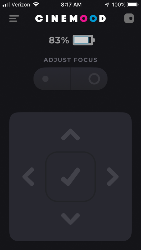
I downloaded the CINEMOOD mobile app from Apple’s app store.  After pairing via Bluetooth, it functions as a remote control, providing the 5 navigation buttons and the focus button as well as a battery indicator.  Pairing was sometimes a problem; occasionally I had to reboot the CMT before the app could find it.

Content

The CINEMOOD organizes its content so that all the kid content is seen first.  I tapped past it until I found the Apps Section and then tapped down to find the YouTube app.  When I started it, I was faced with a dialogue box that said, “You should be logged in your CINEMOOD account for this action.”  I can’t watch YouTube without an account; in fact, a lot of the content on this device is locked out until unless I create an account.

I went back up and found Settings and tapped down to find the Account app.  This brought up the following message:  “Enter your phone number.”  CINEMOOD wants my phone number!?  I tried entering a random number, but they send a text message with a code that I have to enter in order to create the account.  This made me mad.  If I spend hundreds of dollars to buy a gadget, why would they lock me out of parts of it until I give them my phone?  Nothing about a projector requires my phone number to work.  I used My Trash Mobile to enter a temporary phone number and the code that they sent.  CINEMOOD then asked for my email, so I used TempMail to enter a temporary email.  Then it asked for my credit card number.  Seriously!?  The PMT isn’t a home theater, it’s a trojan horse designed to collect my personal information.  At first, I was stuck, because there’s no way I’m giving CINEMOOD my credit card just to set up an account.  Eventually, I found a bit of a silver lining for this storm cloud:  I can use the mobile app to assist with the account creation process.  It makes it easier to enter my phone and email, and it also gives me the option to defer adding my credit card until a later date, which I did.  Now I can use the YouTube app, but it’s a rather limited app.  There’s no home or trending section, and no way to view my subscription.  I can only watch videos about CINEMOOD—I’m rolling my eyes here—or I can search by subject.  There’s no way to sort or filter any of the results, so I pretty have to watch the top hits that are returned.

After watching a couple of videos, I decided to go back and check out the kid’s content.  In the Listen section, there are audio books that are read out aloud to you.  The titles are in the public domain, like Alice in Wonderland and Treasure Island.  There’s also some classical music, like Vivaldi’s Four Seasons, and an assortment of other music and sounds.

In the Dream Time section, there are some items designed to calm a child down before bedtime.  There are some quiet music and something called “themes,” which was music with an animated image that runs for 2 minutes.  There are 10 themes, one is free, but the rest have a lock symbol on them.  If I want to access this content, I will need to pay $1 for each of them.  If the averages hold out, that’ll cost me $9 for 18 minutes of content.  As it turns out, there’s a LOT of content on this device for which I have to pay extra.  I started counting and quit once I reached $400.  Be careful!  If you enter your credit card, your kids could spend hundreds of dollars downloading extra content.

In the Watch section, there’s video content that your kids can watch.  There’s a bunch of short cartoons that will only appeal to little kids and some educational videos.  There’s also a Disney app, which has some safety videos and more educational videos.  To be clear, this device doesn’t have any Disney movies, like The Incredibles or Moana.  The Disney videos that they do have are freely available on YouTube.

In the Read section, there are books for kids to read.  When I select a book, it takes me to a splash screen with Russian words.  It appears as if the app is frozen at this point, but it’s not; the secret is to use the right navigation button to “turn” to the next page in the book.  The books in this section are also in the public domain.

The Scenery section appears to show relaxing videos of various destinations, such as beaches or underwater, but the content is all locked.  The Play section was perhaps the most interesting, as it teaches kids how to create shadow puppets and then displays a white screen for them to practice.  Some of the puppet tutorials were free; others cost money.

Back in the Apps section, there’s an app for Netflix and one for Amazon Prime Video.  At this point, I’m honestly too scared to enter my credentials for these services; I don’t really know if CINEMOOD is intercepting them or not.  Yes, I’m probably paranoid, but given the rest of what they’ve done, I’m unwilling to accept the risk.  There’s also a Telegram app, but I don’t know why I would use the PMT to read my email and two other apps that I’ve never heard of, IVI and Ameba.

The internal content that comes with the PMT is not bad content; it will probably keep your kids entertained for many hours.  Unfortunately, there’s really nothing amazing about it, as you can get all this content (or something similar) for free on the Internet.  If you have cable TV, Netflix, Amazon, Hulu, or even just YouTube, you already have better content available at your fingertips.  By the way, there’s no way to filter any type of inappropriate content from your kids.  If you unlock YouTube, Netflix, etc., your kids will be able to watch anything they can find.

The next source for content is that which you load on the PMT yourself.  There are two ways to do this.  First, you can connect your PMT to your computer and copy files over.  I used the USB cable, the same on that I used for charging and connected the PMT to my Windows 10 computer.  I then copied an MP3, a JPG, a MOV, and an M4V.  All of these showed up in the My Stories app in the My section and could be viewed and played without any problem.  If you use a Mac to copy the files, you’ll need to install Android File Transfer onto your computer.  Second, you can plug a USB drive directly into the PMT.  To do this you will either need a USB drive with a micro USB plug, or you’ll need a female-to-female USB adapter.  I don’t have either of these, so I was unable to test this feature.

The final source of content is from an iOS device.  According to CINEMOOD’s website, if I update the CINEMOOD OS (and I did), then I can use the screen mirroring feature on my iPhone to display content on the PMT.  This is the feature that I’m most excited about, but I could never get it to work.  The screen mirroring on my iPhone can find and connect to my AppleTV with no problem, but it can’t find the PMT.

Android and iOS device both have app stores for their devices, but there’s no equivalent for CINEMOOD OS.  I only get the apps that come with the device, unless perhaps they release new apps that are available with an OS update.

Extra Features

The website says that the PMT should last for 5 hours on a charge, and that’s exactly what I got in my testing.  Keep in mind that the battery is not replaceable, so once it wears out, the PMT won’t work any longer.

The PMT comes with a rubber stand, which can be used to keep its place and adjust the viewing angle.

What I like

  • Slick design
  • Good hardware

What needs to be improved

  • Fix the pause button
  • Remove the account creation process
  • Stop trying to charge hundreds of dollars for additional content
  • Add parental controls
  • Fix iOS screen mirroring
  • Add the ability to remove unwanted apps

Final thoughts

I think the idea of a portable projector that makes it easy to access video content for kids and adults is a great idea.  CINEMOOD’s flaws, however, keep it from realizing this idea.  The lack of a functional pause button alone is a deal-breaker for me.  Their attempts to collect my personal information and get me to spend hundreds of dollars on additional content leaves me not trusting this company or its product.  I’m sorry to say it, but I just can’t recommend this gadget to you.  I think you’d be better off either buying tablets for your kids or using a pico projector that uses the content on your phone, tablet, or Roku stick.

Price:  $349.99
Where to buy: Amazon
Source: The sample for this review was provided by Cinemood.

Filed in categories: Reviews

Tagged: , , ,

CINEMOOD Portable Movie Theater projector review originally appeared on The Gadgeteer on June 19, 2019 at 9:00 am.

Note: If you are subscribed to this feed through FeedBurner, please switch to our native feed URL http://the-gadgeteer.com/feed/ in order to ensure continuous delivery.