iPhone case, iPhone car mount, MacBook skin, and more – Review updates


Today we have 5 quick review updates from one of our newest writers, Bob Patterson. We regularly like to update our reviews days, weeks, months, and even years later to let you know how the product stands up long after the initial review. Click through to view the list of updated reviews and then scroll to the bottom of each review to see the latest update.

WTFactory SlimClip VR Steady iPhone case review by Bob Patterson

Tronsmart Element T2 Bluetooth speaker review by Bob Patterson

Penclic Mouse R2 Wireless pen-style mouse review by Bob Patterson

Berrolia No.2 Aluminum iPhone mount review by Bob Patterson

Cover-Up MacBook and iPhone stone cases review by Bob Patterson


Product Information

Price:

Filed in categories: Reviews

Tagged:

iPhone case, iPhone car mount, MacBook skin, and more – Review updates originally appeared on on May 25, 2017 at 11:16 am.

Note: If you are subscribed to this feed through FeedBurner, please switch to our native feed URL http://the-gadgeteer.com/feed/ in order to ensure continuous delivery.

Photolemur photo editing software review


We are in the middle of a popular photo explosion, in case you’ve been hiding under a rock for the past decade. Not since the introduction of the Brownie camera in 1900 has there been such interest in photography by the general public. For $1 (about $30 in today’s money), normal everyday people could make this new thing called a “snapshot” and share it with friends. Today, with no processing and printing needed, this happens instantly, rather than in a few days when the roll is finished, sent off, and returned. With this amazing power comes tools to make our photos even better than the smart lens systems and photo software built into our cameras already does. I was offered a copy of a program called Photolemur that is able to clean up rough camera shots and bring out the data that is there.

Note: Photos may be tapped or clicked for a larger image.

I came to photography late in life. When my Lovely Bride and I went on one of our first real vacations sans-kids in 2001 to the Berkshires, I bought a Kodak DC3400 Zoom. It inspired me to walk around with a camera, and soon I was moving up to better and better hardware, learning all the little bits of info I could about lenses, fstops, aperture, depth-of-field, bokeh, filters (the glass kind, not the software kind), and photo-editing software. Much of the hardware we use today automates much of that manual adjustment into a half-press on the shutter or a tap on the touch screen to activate auto-exposure and autofocus. The framing and composition of the photo still takes a good eye, or, at least, an attention to the craft. But the post-processing is still a maze of adjustments and exposure curves. I can do it if I have a particular shot that I want to go deeper with than the simple “enhance” button on most software, but Photolemur takes this to a new level.
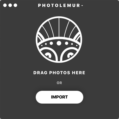
The app itself brings up a single window with the directions: “Drop photo here or Import.” The “Import” button just pulls up a file picker dialog box.
Once you drag/drop or import an image, some type of software magic happens, and soon, your image shows up with a “Before/After” bar that you can drag from left to right to see all the changes that the software will do. There’s a button on the right lower corner that lets you export (rename, move to other drives, etc.)

That’s it. You either like the transformed photo or you don’t. I choose some of my first photos to show here, since they were taken with a very old camera, by a newbie photographer, and just to revisit some nostalgia on my part. I’ve got a few of these framed around the house, and have even sold prints of one.

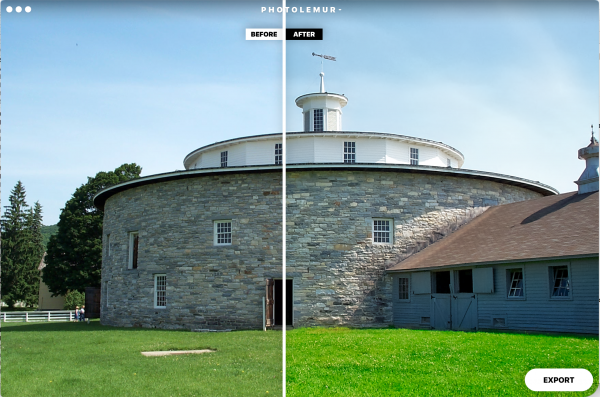
The round stone barn above is from a Shaker Village in Western MA. Note the vibrancy of the grass and the better definition of the stones on the After side. I like the improvement here. But full sun with large blocks of color is pretty easy. Let’s walk inside.

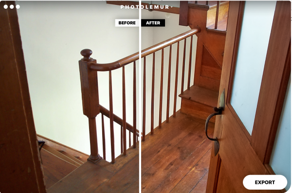
The back stairs out of the kitchen were behind a partially closed door. The wood grain attracted me, as did the light. I like how Photolemur brightened the wood without losing the crispness of that grain. The newel post on the left was helped immensely, but it’s easier to see the difference in the floor.

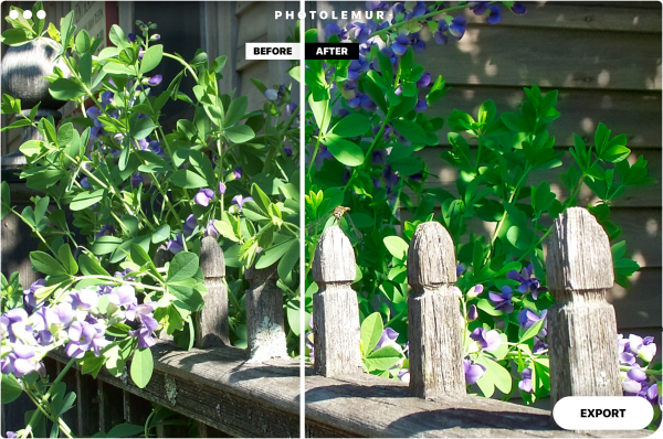
Bright sun again, and, being one of the first dozen or so shots I had taken, I really over-exposed that middle post. But I caught the dragonfly sitting on it, and that was my goal. The green of the background flowers of this “After” shot is too artificial to me. Those leaves are soft and fuzzy, and the software makes them out to be slicker.

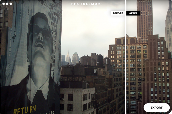
A few months after this, my job sent me to New York City to lead a software launch. (This was August of 2001 – before 9/11.) This was the view outside my room.

That building on the right that is split shows how well the software pulls the details out of the shadows. I’m happy with this improvement. (This is from the New Yorker hotel looking out across 8th Avenue if I recall correctly. If I stuck my head out the window and looked right, I could see Madison Square Gardens.)

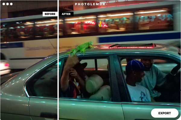
We went up to Times Square and walked around after dinner. Three guys with an iguana passed by on Broadway as my group was standing on the curb, and I fired off a shot. Photolemur really helps pull out colors here. (It was about midnight, with loads of neon, motion, and shadows.) Check out that look on the driver’s face. I never saw that before.

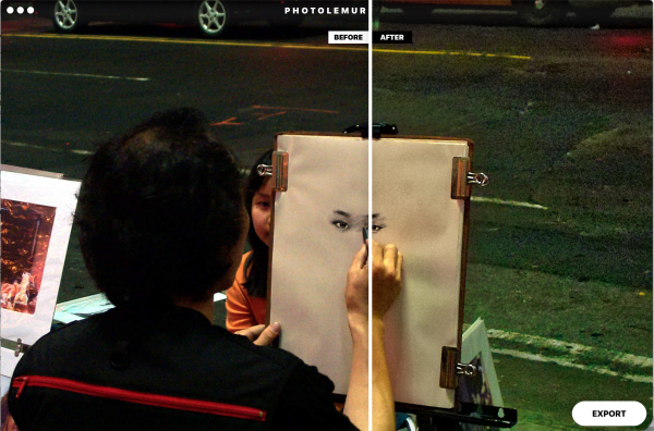
Further down the block, things were a little quieter, and I captured this charcoal artist at work. The software over-compensates in this shot, to me. The roadway and even the artist’s arm have a bit of a green cast.

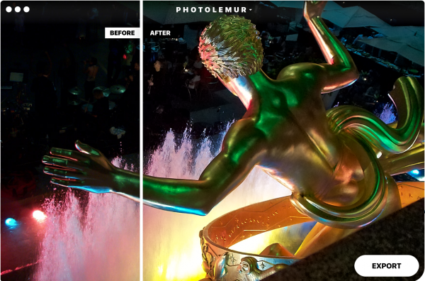
Next night, I walked over to Rockefeller Plaza, as one does. It was late summer, so the ice rink was replaced with a restaurant and dance floor.

This shot from behind the iconic statue of Prometheus has a few better highlights, but the background detail is far improved. There is another band member to the left of the trumpet player, and those little globs floating above Prometheus’ left hand are cymbals from a drum set. You can see them clearly in the After shot!

So, as you can see, Photolemur can pull some amazing data out of what may be a pretty decent shot to start with. It combines color saturation, brightness, and contrast based on how it’s algorithm interprets your photo subject. Sometimes it’s spot on, but sometimes, it goes a little overboard.

If you’re not “into” photography, or just want to run through a batch of photos, you may really like having a simple drag and drop solution to processing your pics. If you’ve spent a lot of time learning Photoshop, Aperture, LightRoom, or The GIMP, or even Graphic Convertor, you may feel you can do as good or almost as good a job as this. With the subscription pricing, you could sign up for a month or so after a vacation, run through your photos, then unsub. At $36 a year, it’s still cheap by the standards of normal boxed software, even if it is a one-trick pony. If you’ve migrated to iOS or Android for more of your photo and post-processing, moving it over to an actual computer just to tweak details may be more than you care to do.

Source: The sample for this review was provided by Photolemur. Please their site for more info.


Product Information

Price: Sold as a subscription. Currently $4/month billed monthly, or $3/month billed annually.
Manufacturer: Photolemur
Requirements:
  • Mac or Windows, a supported camera (most are supported), and photos over 800×600 pixels.
Pros:
  • Great automatic processing of almost any image!
  • No twiddly settings to learn!
  • Simple yes/no processing!
Cons:
  • If you don't like what it does, there's no way to only go part-way.
  • Sometimes, lighting can play tricks on the algorithm.

Filed in categories: Reviews

Tagged: , ,

Photolemur photo editing software review originally appeared on on May 25, 2017 at 9:02 am.

Note: If you are subscribed to this feed through FeedBurner, please switch to our native feed URL http://the-gadgeteer.com/feed/ in order to ensure continuous delivery.

Moment iPhone lens kit review


It wasn’t that many years ago that we were toting enormous gadgetry around – shoulder camcorders the size of a suitcase, cameras as big as a Scooby Doo lunchbox, cassette players like bricks dangling from our belts and behemoth computers large enough to block out the sun.  It wasn’t pretty, but it got the job done… sort of. If you were going on an outing, carrying all the paraphernalia was daunting, cumbersome and heavy, to say the least. 

Fast forward a decade or so and now we all carry the equivalent of these gadgets, plus much more, in our pockets. The smartphone has met virtually all of our electronic needs and has knocked even the venerable camera from its pedestal.

Half a life ago, I discovered that my point-and-shoot camera took photos on par with my Nikon FM2. Sure, I didn’t have many manual controls over the image, and no telephoto or macro, but the results were surprisingly good. I once carried a bulky camera bag packed with the camera body, three or four lenses, light meter, flash, tripod, batteries, lots of film (yeah, I’m old) and all of the other goodies.  When I went to see relatives, it wasn’t a visit – it was an assault because of all the gear I carried! Since then, I’ve taken more of a minimalistic view on my every-day-carry. I found that the smaller something is, the more likely I am to bring it with me and have it when I need it. I’ve even managed a month-long trip to Singapore, Hong Kong, and China with nothing more than a small backpack. I certainly couldn’t have done that 20 years ago, and definitely wouldn’t have wanted to make the voyage with a bulky camera bag.

Smartphone cameras have evolved to become capable, even desirable, to preserve our favorite memories – always with us, good resolution, vivid color gamut, and automatic exposure enables many of us to take photos rivaling Ansel Adams, except one thing: the lens.

Even with multiple lens smartphones, we are still limited by the factory lenses. An eBay or Amazon search will show you hundreds of inexpensive clip-on, screw-on, magnet-on lenses and cases that try to fill the gap. I purchased several before a recent international trip and took over 4000 photos in 10 days using half a dozen of these bargain-basement lenses, many with anticlimactic results. Not only were the optics of dubious quality, the attachment systems with their clips and magnets were colossally disappointing. Getting the lenses securely attached was a painful endeavor each and every time and, even damaged my Zagg screen protector. Photos were discolored, dimmed, and sometimes out of focus. The clamps and clips simply were not consistent and were jostled out of position with the slightest bump.  There had to be a better way.

After returning to the states and many an hour web surfing, I found Moment, the crowd-funded maker of quality smartphone lenses and a really clever bayonet mounting system.  I bought my first lens and haven’t looked back since.
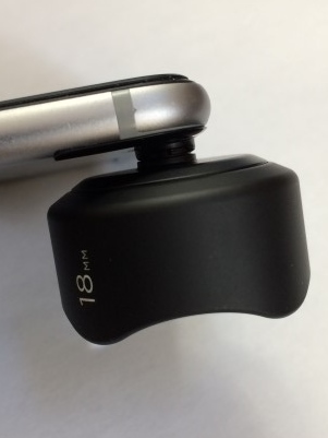

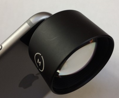
Users have the option of purchasing an elegant case for iPhone, Galaxy and Google phones, or affixing a plate to the back of their device.  Because my iPhone is also a medical device for me and is equipped with a monstrous battery case, I chose the latter so I don’t have to keep swapping cases.  The plate is sturdy, affixed with strong adhesive and can be removed, albeit with some effort. The lenses come in a 60mm 2X telephoto, wide angle, fisheye and macro flavors, all connecting to the case or mounting plate securely and accurately. Moment has announced a new mounting system coming in June 2017, but I’ve found the current system more than adequate. To make things easy for current lens owners, they are offering a conversion ring, allowing the first incarnation lenses to fit the second generation cases and mounting plates.

The images below (except macro) were taken using a stationary tripod, identical lighting on the same subject. Ony the lens was changed between each photo. Other than resizing for posting, no alterations have been performed.
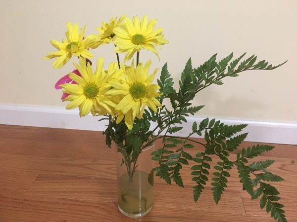
No lens
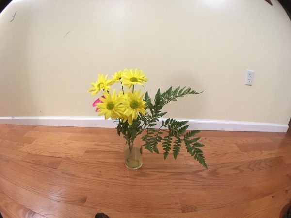
 

Superfish 170°
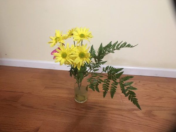
 

18mm wide angle


2X telephoto


10x macro

The multi-element lenses are top-notch, exquisite works of art in themselves, heavy and substantial, but not so much that they inhibit the user from nimble deployment.  Attaching and detaching are done with a slight twist. Since purchasing my first, the telephoto, I liked it so much I bought the other three lenses, a cleaning pen, caps, and a handsome storage case.  I’ve gone so far as to purchase additional mounting plates so my wife can use the lenses on her aging iPhone 5S.
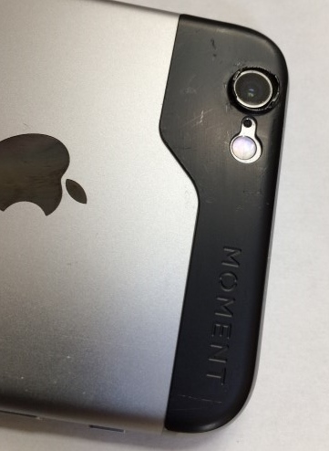

The optics in these lenses are simply superb. Every moment (pun intended) I have captured has been clear and beautiful.  Because of the small size of the lenses, about the same diameter as a U.S. 50 cent piece, carrying the whole set in a pocket is quite comfortable.
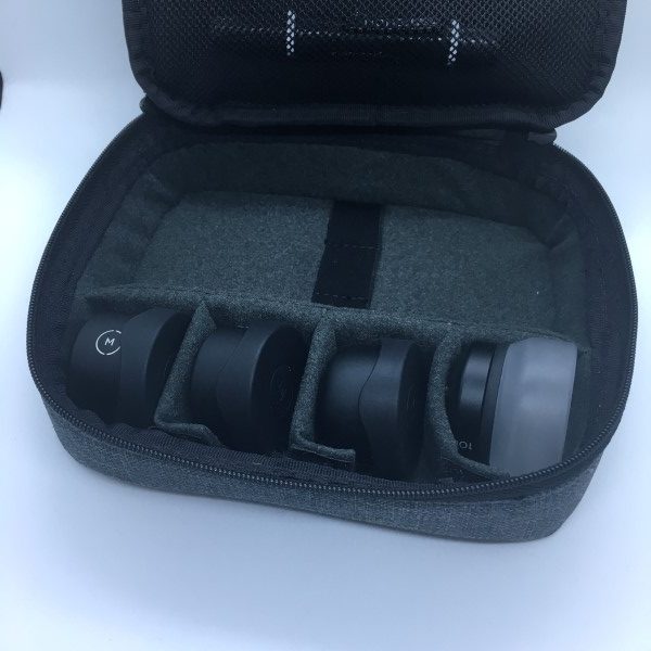

Using the lenses with the default camera app will yield great results, but to really tap into the potential, Moment’s app adds the capability of tweaking the settings depending on the lens being used.  You can also change the format from JPG to TFF and RAW.  I’ve also installed Camera+ ($2.99 in the App Store) that brings back many of the manual settings that had been previously inaccessible to iPhone camera users.
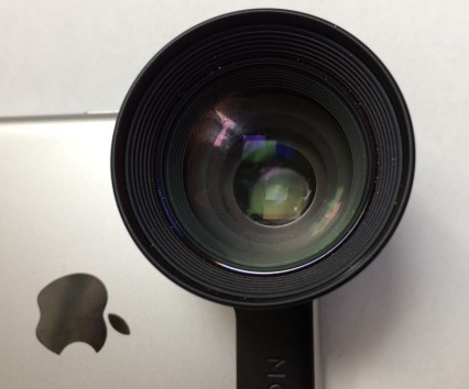

Now the bad part… these lenses are quite expensive, to say the least. Averaging about $90 each, a full set with all the bells and whistles can run in excess of $600. Of course, you don’t have to buy them all, but I can say that if you want the best lenses, these are the ones. At some point, I would also love to see a lens with a stronger telephoto to bring distant images even closer. Maybe at some point, Moment may also be able to offer a zoom.

Hey, I can dream, can’t I?

With hundreds of lens options bouncing around in cyberspace, Moment has done an excellent job taking smartphone photography seriously. These world-class lenses dramatically enhance your smartphone photos. Gone are the days of carrying a boatload of goodies around when you need a serious camera, just stuff a few of these in your pockets.

Source: The sample for this review was purchased with my own funds. Please visit Moment for more info and Amazon to order.

Filed in categories: Reviews

Tagged: ,

Moment iPhone lens kit review originally appeared on on May 24, 2017 at 8:30 am.

Note: If you are subscribed to this feed through FeedBurner, please switch to our native feed URL http://the-gadgeteer.com/feed/ in order to ensure continuous delivery.

OLALA S75 7500 mAh power bank review


Carrying around enough potential energy to fuel our increasing appetite for connectivity is a never ending balancing act. Hardware engineers make energy-efficient phones and tablets, and Developers respond with ever-increasingly sticky apps and websites. Engineers make better, lighter, more efficient batteries, and we leave them on longer and whine that the device is larger. Into this mix walks the arbiter of fairness, the humble battery pack maker. “Here. If you need power, use one of these. When you don’t, leave it home, or in your bag.” Olala has even going a step further with their latest power bank by including cables and a sliding cover to hide them. They sent me a sample just before we left the country for two weeks.

Note: Photos may be tapped or clicked for a larger image.


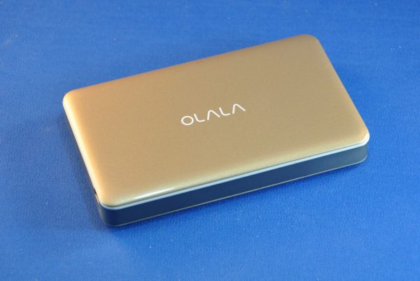
The Olala Power Bank will work for any USB powered device but is specially designed to look inconspicuous with recent Apple devices. It has a Gold case, which would perfectly match the Gold iPhone, but it looked fine, even though I have a Space Grey iPhone 6s, and my Lovely Bride has a silver iPhone 6 (shown below).

Overall, it’s a 125 mm x 75 mm x 15mm (~5″x~3″x~.75″) rounded rectangle with smooth sparkly gold plastic panels on the larger sides and a metalized band around the narrow edges. The top has a white silk-screened Olala logo centered on it and hides the secret chamber with the hidden cables.

Sliding the top panel with the logo up reveals a cord on one side with a Lightning connector and one on the other with a standard USB connector. There is a slight click to hold it open or closed fully, as well as notches on each side to allow the cables to be extended while the cover is closed. The bottom has silk-screened legal registration info. The other surfaces are free of printing.

One short side has a standard USB jack for output to any device, and a microUSB port for charging. There are 4 battery level LEDs between the two.

On one long edge, there is a button which activates charging or lets you see the battery level if there is no load on the outputs. While a hassle, the button is a nice protection from the device powering on due to a short across the connectors. And, being on the edge, it’s not going to be easily pressed by something on top of the unit.
On our trip, this became our best tool for “topping up” our phones and iPads while out-and-about. Using the car’s USB port meant audio only going through the car stereo, which caused us to miss a few turns. (We weren’t listening to anything on the car stereo, and there was no “just play the GPS” setting on it.) Then, we decided to use this Olala pack between the car and the phone. Our phone got topped up, and so did the power bank, and we could hear the turn-by-turn directions of our phone’s speaker.
When we left the car, we’d sometimes walk for a good long time, taking photos, doing walking tours, or exploring museums together. The Olala rescued us by letting us sit at a cafe for a cuppa and reorient our thoughts while charging. But it wasn’t too much trouble to plug it in and have it charge our phones while we were taking photos, reading about various points of interest while walking, or writing Yelp reviews. The sleek profile and short cable made it an easy solution to the power battle we all face, and the 7500 mAh battery meant it could provide a full charge to both my Lovely Bride’s iPhone 6 and my 6s, with enough left to make sure each of us got a little extra as well.

Source: The sample for this review was provided by Olala. Please visit their site for more info and Amazon to order.


Product Information

Price: $32.99
Manufacturer: Olala
Retailer: Amazon
Requirements:
  • USB source for charging battery
Pros:
  • Integrated cables that hide away
  • Can be charged while charging a device
  • Holds 2+ full iPhone charges
Cons:
  • 7500 mAh is not a multi-day multi-device capacity
  • Cords for non-Apple devices must be taken along
  • USB-to-microUSB cord for charging

Filed in categories: Reviews

Tagged:

OLALA S75 7500 mAh power bank review originally appeared on on May 23, 2017 at 9:00 am.

Note: If you are subscribed to this feed through FeedBurner, please switch to our native feed URL http://the-gadgeteer.com/feed/ in order to ensure continuous delivery.
Mujjo Samsung Galaxy S8 full grain leather case review


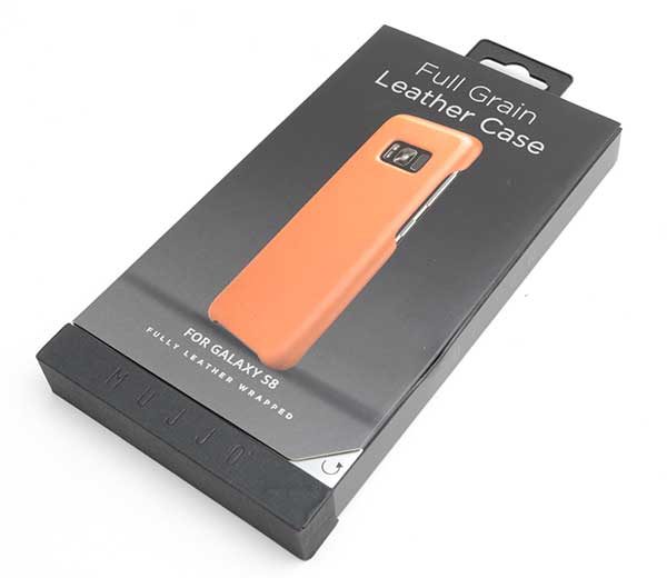
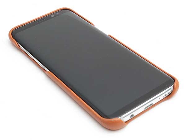
The new Samsung Galaxy S8 is one of the nicest looking smartphones ever to be created. So why would you want to cover it up with a generic plastic case that adds bulk, and takes away from the aesthetic of the phone? One case that protects the phone without detracting from its beauty is the Full Grain Leather Case from Mujjo.

What is it?

The Full Grain Leather Case from Mujjo is a premium quality full-rain leather case that snaps over the back of the Samsung Galaxy S8.

Design and features


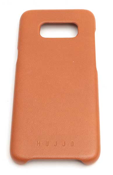
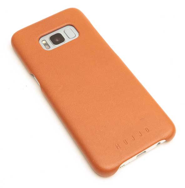
Available in saddle tan or black, I was sent the saddle tan version of the Mujjo Full Grain Leather case. The images in this review do not really do justice to how nice this case is. Also, my images make the case look a little more orange than the case is in real life.

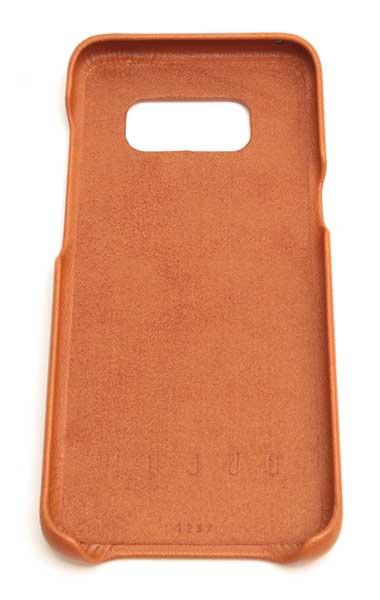
The case is wrapped in leather on all sides, with a soft microfiber suede interior.

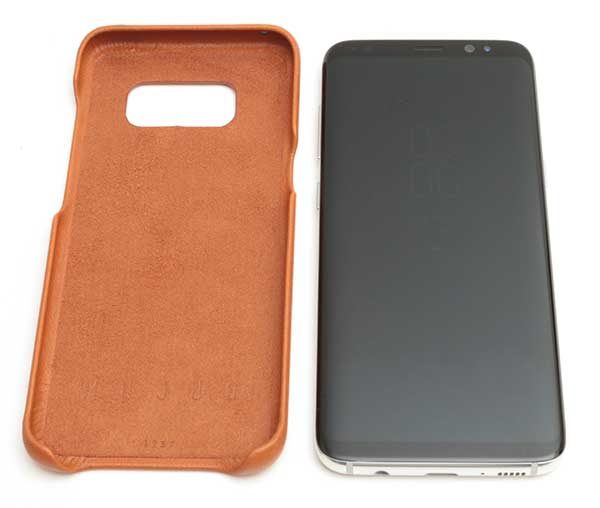
Installing the Galaxy S8 in the case and removing the phone from the case takes little to no effort.

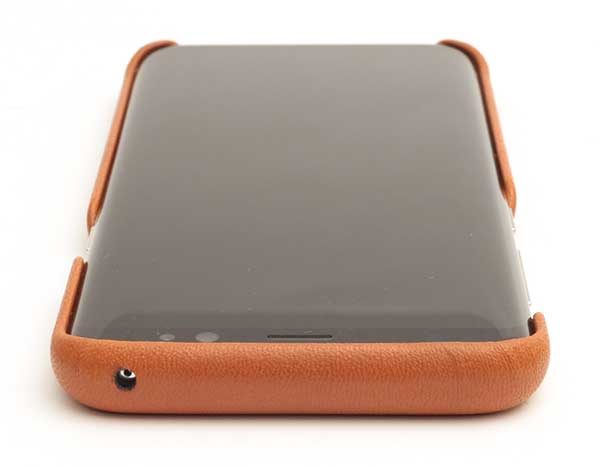
The case has expertly aligned cutouts for the microphone at on the top edge of the phone.

On the right side is a cutout for the power button.

The opposite side of the case has a long cutout that provides access to the volume button and Bixby button.

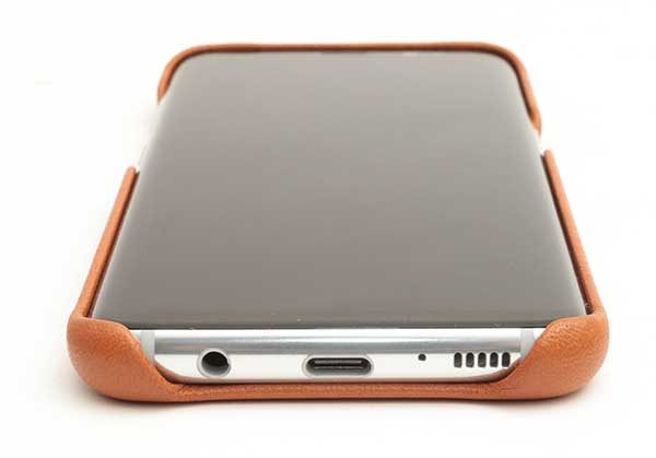
The cutout at the bottom of the phone allows access to the earphone jack, Type-C charging port, 2nd microphone, and the speaker.

You’ll also notice that the top edges of the case rise slightly higher than the surface of the display to project the screen from scratches and scuffs when it’s positioned face down.

A large opening on the back of the Mujjo case provides clearance for the LED flash, camera, and fingerprint scanner.

Final thoughts

The Samsung Galaxy S8 Full Grain Leather Case from Mujjo is gorgeous. It is made very well and fits perfectly. There is nothing about this case that I don’t like. It feels great in my hand and adds just the right about of grip to the phone while not being overly bulky.

Source: The sample for this review was provided by Mujjo. Please visit their site for more info.


Product Information

Price: $41.93
Manufacturer: Mujjo
Pros:
  • Lightweight
  • Beautiful
  • Perfect fit
Cons:
  • None

Filed in categories: Reviews

Tagged: , ,

Mujjo Samsung Galaxy S8 full grain leather case review originally appeared on on May 22, 2017 at 9:00 am.

Note: If you are subscribed to this feed through FeedBurner, please switch to our native feed URL http://the-gadgeteer.com/feed/ in order to ensure continuous delivery.