Miggo Pictar Plus iPhone camera grip review


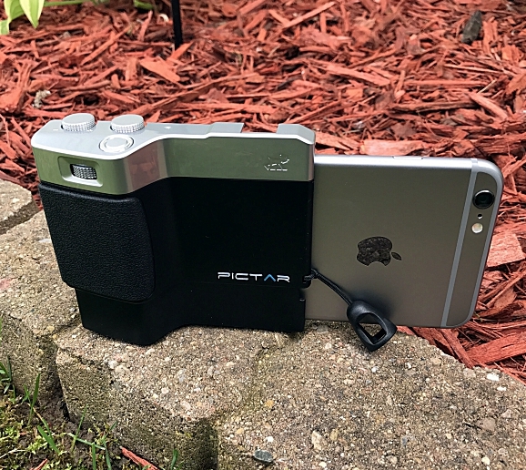
I fashion myself as somewhat of an amateur photographer. I’ve been fascinated with photography ever since I took Mr. Bunton’s “Intro to Photography” class way back in the ninth grade. And like a lot of people I love taking photos with my iPhone. Apple forever changed the way we take photographs when they introduced the first iPhone 10 years ago. With each iteration, the iPhones camera gets better and better. It takes amazing photos, but taking them has always presented different issues. The fact is the iPhone isn’t a camera, it’s a phone, and holding it with one hand to take a photo can be tricky. And if you want to use a tripod you have to buy special cases and or mounts made specifically for the iPhone. Miggo has changed all of that with the Pictar and Pictar Plus. Pictar is a camera grip that claims to turn your iPhone into a DSLR camera. Since I love taking pictures with my iPhone both recreationally and for my product reviews for the-gadgeteer, I jumped at the chance to review the Pictar Plus. Does it really turn the iPhone into a DSLR camera? Let’s take some photos and find out.

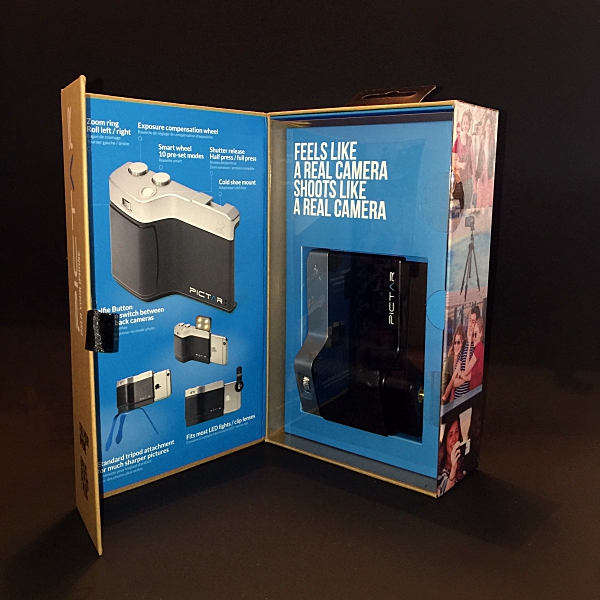
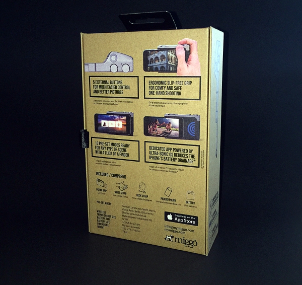
I don’t usually start off a review by talking about the product’s packaging, but when I received the Pictar Plus from Miggo I was really impressed. I thought to myself “Wow if they put this much thought and innovation into the packaging I can’t wait to try out the actual product”. The box opens like a book (the front flap is held closed by a magnet) and the Pictar Plus is displayed behind a plastic window. The box itself is covered with lots of information about the Pictar Plus. A real nice presentation that I thought was worthy of a mention.

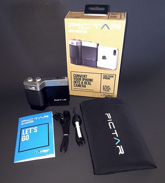
Inside the box, you get the Pictar Plus, wrist strap, neck strap, neoprene padded carrying case and Users Manual.
The Pictar comes with a CR1/2AA battery already installed. To activate the battery, first, open the battery compartment by pushing in the release catch and removing the battery cover. Then pull out and discard the pull tab at the bottom of the battery. This will then allow the battery to connect fully with Pictar. Then click the battery cover back in place. According to Miggo, the battery should last up to 6 months with normal use.

Installing my iPhone into Pictar was easy. After taking it out of its case (you can use Pictar with some very slim-fitting silicone bumper cases) I slid it into the spring loaded bottom of the Pictar, with the back of the phone facing in. Then pressed down until the top of the iPhone clicked into place. Removing it was just as easy.

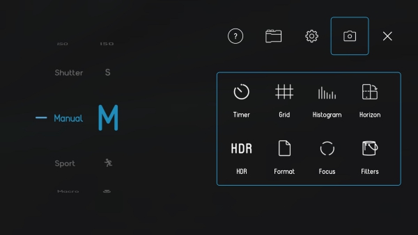
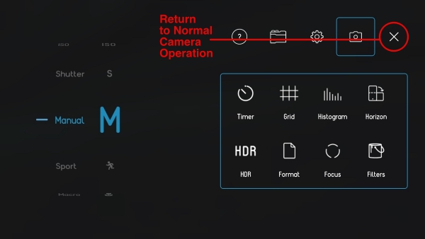
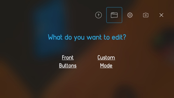
Before you can use Pictar you have to download their free app from the app store. The app is really the brains of the whole operation. Pictar’s Camera app unlocks key features that are inaccessible on iPhone’s native camera app. It connects with the iPhone using a high-frequency dual tone that is inaudible to the human ear. When used, each dial and button emit a unique tone that is detected by the app generating a corresponding action. This also significantly increases the battery life when compared to Bluetooth connectivity. The app itself is easy to use. The first time you launch it there is a short tutorial that prompts you to use each different dial and button, showing in real time what function each performs. The app has nine different built-in modes, Auto, Sports, Macro, Shutter priority, ISO priority, Manual, Selfie, Movie, and Filter. A note about the Filter mode. There are 38 different filters that can be applied before taking a picture which is really cool. However, only 2 of them are free to use. If you want to use any of the other 36 you have to purchase them. Separately each is a $1, or you can buy the bundle for $10. All things considered, that’s not bad, but it would have been nice to include more than 2 free filters. Clicking on the gear icon in the upper-right corner of the Home screen allows you to change and customize lots of settings. There are five main icons at the top right of the settings screen. The question mark icon takes you to the Tutorial / User Guide menu, the Pictar icon to the customization of buttons menu, the Gear icon to Sound, Geotagging, Purchase Restore and Reset menu, the Camera icon to the camera settings menu and the X returns you to normal camera operation.

Much like a DSLR camera, Pictar Plus offers five external control buttons. This allows you to easily change settings and take pictures with one hand. No more tapping your iPhone’s screen to set focus, exposure, etc.
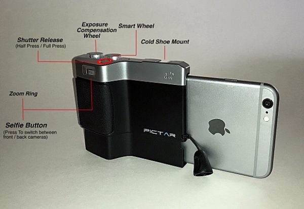
The Smart wheel allows you to choose between Pictar Plus’s 9 different modes. The Exposure compensation wheel allows you to control brightness levels even before shooting. And just like with an advanced camera, the exposure compensation wheel changes the exposure in steps of 1/3 aperture, and the clear display appears at the bottom of the iPhone screen. The Shutter release has two functions. A half-press locks focus and exposure for easy tracking of a moving object and a full-press for immediate shutter release. The shutter button also allows you to take pictures while wearing gloves during the cold weather. The Zoom Ring allows you to zoom in on a subject without having to touch the screen to pinch-and-zoom. It also doubles as a Selfie button. Clicking the Zoom ring will switch between the iPhone’s front and back camera for easy “selfie” shots. The Virtual Wheel is located on the right side of the Camera app screen and allows you to control different modes such as Flash modes, Shutter speed, ISO and more – simply by using your thumb.
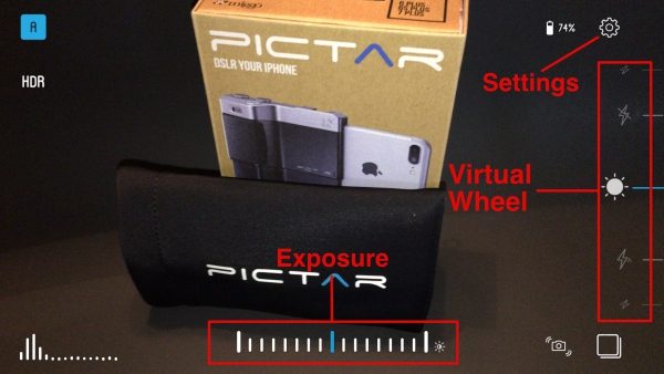
The dials can all be reprogrammed to do different things. For example, you can have the Zoom Ring control the flash, white balance, etc. In that case, zoom in and out would be done by “pinching” the iPhone’s screen, like before. All of this can be done in the settings menu I mentioned earlier.

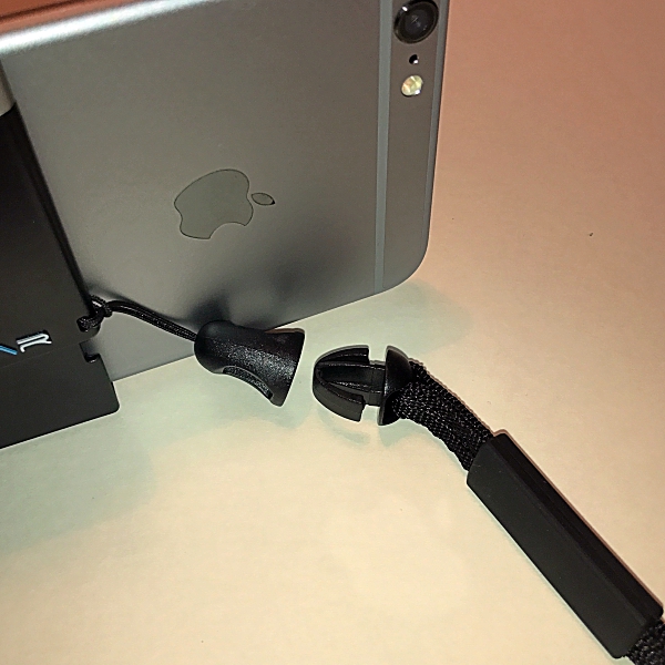
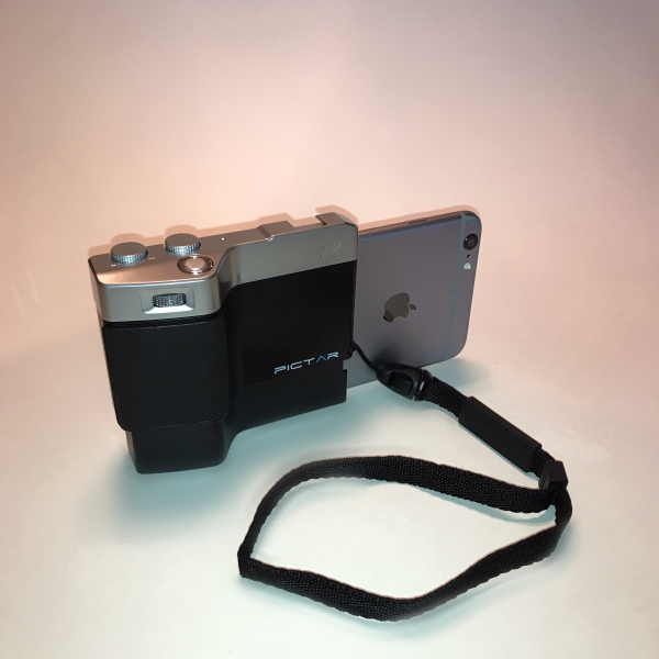
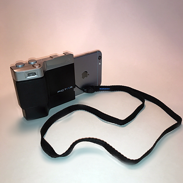
The Pictar Plus also comes with wrist and neck straps. This is nice because if you’re like me you’ve dropped your iPhone more than once trying to get that perfect shot. Once you attach the connector to the Pictar Plus you can easily change between the two straps with just a snap.
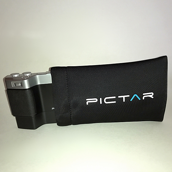
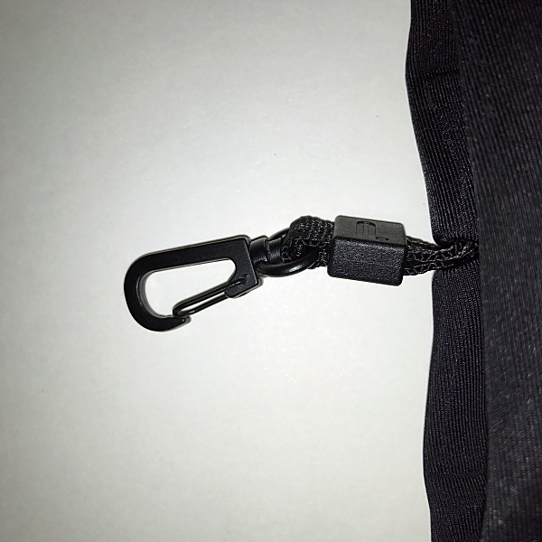
There’s also a nice neoprene padded carrying case for the Pictar Plus. It comes with the added feature of a small metal carabiner that can be attached to a bag or belt loop.
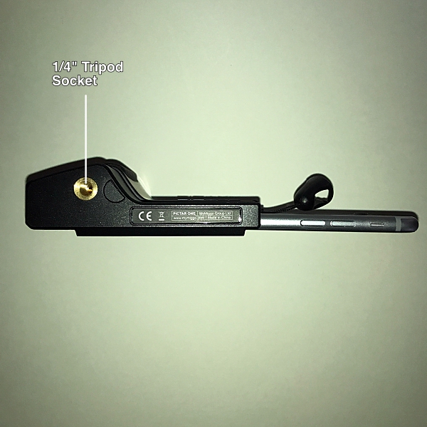
Just like a real camera, Pictar has a standard 1/4” thread tripod socket on the bottom. This is ideal to attach a tripod or other stabilization device and is great for selfies or night time shots, that require long exposure times where the camera needs to be steady.
The top of the Pictar has a standard-size cold shoe mount to allow you to attach many full-size camera accessories, such as LED lights or microphones. I also like that the iPhone’s lens is open when attached to Pictar, giving you the ability to attach most ‘clip on lenses’.

I really loved using the Pictar Plus. It turned taking pictures with my iPhone into a more camera-like experience. It’s really light weight coming in at .17 lbs. so it doesn’t add any extra weight to the iPhone. I like how it’s designed to be held and operated with one hand. And the non-slip grip and wrist strap gave me a real sense of security. I took Pictar Plus along with me while walking my dog and took some photographs using some of the different functions and modes. I was very impressed with how much easier the Pictar Plus made taking photographs. I took a selfie with my dog Zoey and liked being able to switch cameras from back to front simply by pressing the Zoom Ring.

Using the Action Mode I took pictures of the flags that were flying above the local High School football field. It was really windy, but with the Action Mode I was able to capture the flags with no blur, and the images came out sharp and clear. With the Zoom Ring, I was even able to get a close up of Old Glory.

Miggo even provides a link to a Mobile Photography Workshop that has videos on how to use Pictar to capture better pictures in different scenarios. Definitely worth checking out before using Pictar. I look forward to using these tips on my next photography adventure with the Pictar Plus.
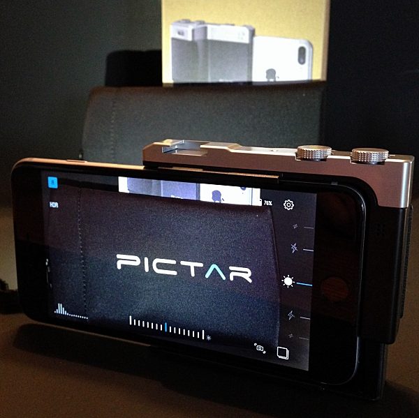
Does the Pictar Plus turn your iPhone into a DSLR camera? I might not go that far, but it’s pretty darn close. All and all I think it’s a great product. It makes taking photographs with your iPhone fun and easy, whether you’re an amateur like me or a seasoned photographer. And with all of the Pictar Camera apps built-in features, the photo possibilities are endless. I know it got me excited about taking pictures with my iPhone and I’m sure it will do the same for you.

Pictar comes in 2 models, Pictar, for iPhone sizes, 4s / 5 / 5s / 6 / 6s / SE and 7 and, Pictar Plus, for iPhone, 6 Plus / 6s Plus and 7 Plus. They’re priced at $99.99 and $109.99 respectively.

Source: The sample for this review was provided by Miggo. Please visit their website for more info, or Amazon to purchase.


Product Information

Price: $109.99
Manufacturer: Miggo
Retailer: Amazon
Pros:
  • Easy to use
  • Can operate with one hand
  • Lightweight
  • Wrist and neck straps
  • Multiple modes and settings
  • Neoprene carrying case
Cons:
  • Not enough included free filters in Camera app

Filed in categories: Reviews

Tagged: , ,

Miggo Pictar Plus iPhone camera grip review originally appeared on on June 23, 2017 at 8:46 am.

Note: If you are subscribed to this feed through FeedBurner, please switch to our native feed URL http://the-gadgeteer.com/feed/ in order to ensure continuous delivery.

Braven performs a 360 with the new STRYDE portable speaker


It really wouldn’t be summer without Braven dropping a new speaker on us. And 2017 is no different. True to form, Braven has gone 360° full circle with their new STRYDE 360 portable Bluetooth speaker.

Braven has crafted a soda can shaped speaker to fit into any active lifestyle where water, salt, sand, and snow are as plentiful as air.

The STRYDE 360 is a speaker made to take on the elements with a full IPX7 waterproof rating and with a shockproof exterior for truly roughing it outdoors. Its cylindrical shape will deliver 360-degree sound from dual passive radiators with custom, in-house tuning—all on a 12 hour single charge from its built-in 2500mAh rechargeable battery. The lightweight and vertically shaped STRYDE 360 easily fits in cup holders and water bottle cages as well as backpacks, sport bags or purses. There’s also built-in voice control that works with a smartphone to give a command or make and take calls hands-free.

“Our BRAVEN team believes that you should be able to listen to your favorite music everywhere you go, rain or shine,” says Kristin Archer, Marketing Director BRAVEN Audio. “With the STRYDE 360, our customers are finally able to have a speaker that is compact and portable enough to bring anywhere with sound loud enough for all of your indoor and outdoor summer activities.”

The STRYDE 360 is available now in Silver/Electric or Slate/Crimson for $99.99 US at BRAVEN.com and Amazon.

Filed in categories: Reviews

Tagged:

Braven performs a 360 with the new STRYDE portable speaker originally appeared on on June 23, 2017 at 7:25 am.

Note: If you are subscribed to this feed through FeedBurner, please switch to our native feed URL http://the-gadgeteer.com/feed/ in order to ensure continuous delivery.

Logitech Spotlight Wireless Presenter review


Throughout most of recorded history, a pointed staff has been the preferred method of directing an audience’s attention towards an item displayed during a presentation. A significant advancement came in the 1980’s with the advent of the laser pointer, which allowed presenters to identify specific items on large screens from great distances.  These days, in large venues it isn’t uncommon for the presentation to be displayed on multiple screens. Furthermore, the presentation may be simulcast to remote locations. In these situations a software pointer is needed; a means to control that software pointer is the most pressing need of the modern presenter. The Logitech Spotlight Wireless Presenter is a remote control which allows control of the presentation and can remotely move the mouse pointer by sensing movement of the remote. Let’s see how it works!

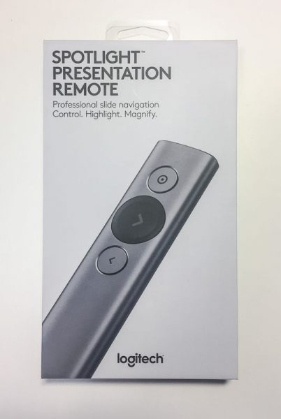
Th Logitech Spotlight Wireless Presenter comes in an attractive gray hard cardboard box, suitable for presentation as a gift to your most esteemed lecturer.

The back of the box summarizes some of the key features of the device. Some of the features include: the capability of highlighting and magnifying circular regions on the screen, using the remote to control the position of the cursor, receiving a vibration alert 5 minutes before the end of the presentation, quickly charging the remote one minute for three hours of use, and using the remote up to 100 feet from the receiving computer.

Opening the box is easy, but the process of unboxing the presenter is designed to be a noteworthy experience. Removing the top cover reveals the remote secured in gray foam with an accented green circle around the next (slide advance) button. The base of the remote is shrouded by a piece of cardboard that requests you download the driver software for the remote.  We’ll review the functionality of the software later in the review.

The remote itself is a very sleek and minimalist design of an aluminum wand 5.1 inches long and 1.1 inches wide. The cross section is somewhat like that of a pharmaceutical tablet. It is finished in an anodized coating of either gold, slate, or silver. The slate model (which is the color of the model The Gadgeteer is reviewing) has dark gray contrasting colors for the next button, USB receiver, battery\antenna cover, and end pieces. The other two color options have white contrasting colors. The top of the remote has three buttons: a large scalloped next button in the contrasting color is set between the pointer button above and back button below. The pointer and back buttons are circular and set slightly below the surface of the remote so that their location is easily determined by feel alone. Holding the remote is very natural. There is no sense of worry about if the right button is being pressed. It feels natural and substantial at the same time.

The front of the remote has a dull plastic cap that hides a white LED underneath. The LED pulses while charging and is illuminated continuously when charging is complete. The LED is also briefly illuminated when the unit is turned on.

The bottom of the remote has a patch of material that is roughly 1″ wide and 3″ long that covers the battery and antenna. This remote includes a rechargeable battery even though most other presentation remotes are powered by replaceable batteries. The theory is that the replaceable batteries are easily obtained and replaced more quickly than the time it takes to find the right cable and sufficiently charge a rechargeable battery. The Spotlight gets around this in two ways: The recharging cable is (almost) a standard type-C device and the charge time for a 3-hour presentation is about 1 minute.

I qualify the type-C cable because the design of any type-C cable that is used for charging the remote must fit within the narrow channel that surrounds the female socket.

I only have one other type-C cable and this just barely fits. I imagine that some USB cables may be thicker around the plug and some may be thinner, as is the case with the many mini and micro USB cables I have.

When not in use, the USB receiver that comes with the remote can fit into the base of the presenter. The receiver is held in place by two plastic tabs that grab the receiver by the indentations on either side.

Back to unboxing; removing the remote reveals a pull tab which allows you to access the charging cable stored under the top layer of packaging.

The charging cable is made from a soft-touch plastic and is almost 5 1/2″ long tip to tip. It is for the most part a conventional type-A to type-C device except that it has an extra-long body on the type-C side. Even though the shroud around the type-C side is longer, it is still only flush when inserted into the remote, which means that one must pull the plug in order to remove the cable. It would be better to make the shroud even longer or come up with some other creative way of charging the presenter.

Under the cable is another compartment that holds a storage pouch the pouch is made from imitation leather and has an imitation felt inside

The storage pouch is a bit too small to hold the charging cable as well as the presenter. But, if you wrap the charging cable around the presenter it fits nicely.

The box also has directions on how to remove the battery from the electronics at the units end of life; the backing is pried off with a flat screwdriver and the battery is removed from within.

Now that you are thoroughly familiar with the hardware it is time to use this on a presentation. The software is downloaded from the Logitech site and installed on your computer.  However, the driver software isn’t entirely necessary. Without the software the remote functions as a mouse and allows forward or reverse slide progression by pressing the next or back buttons (emulating the left and right arrow keys), movement of the cursor by holding the pointer button, and emulating the left mouse button click by clicking the pointer button. If you do decide to install the software you get a host of other features. Either way, it would be great if the USB dongle which fits in the base of the unit were designed as a USB hub, so that it could function both as a USB receiver for the remote and as a USB thumb-drive for a presentation or for storing the actual drivers.

The software is signed by Logitech so there shouldn’t be any issues with installing this on most systems. After installation the software walks you through installing the charging cable, and while the computer counts down one minute of charging, which should provide 3 hours of presenting, the installation program describes the features of the long life battery (how a full charge lasts 3 months), the fast charging, and the intelligent power management (it turns off after 5 minutes of idleness). After the charging is complete the installation walks you through installing the USB receiver or connecting with Bluetooth.

After the device is connected the installation runs a feature tour which highlights some of the most basic features, such as advancing and reviewing slides and using the pointer to highlight and select a button on the screen.

The main window of the installed software has a Windows mobile style to it. the buttons are big so that it is easy to manipulate with the pointer or finger. The main screen shows what the timer is set for, what each of the buttons does if they are long-pressed, the battery state and an icon for settings.

I have the pointer set up for multiple states so that I can switch from highlight to magnify and then to circle by double clicking the top button. This sub-menu also allows adjustment of the side of the items. The size is independently adjustable for each mode, but the color is only displayed in white. The cursor icon to the right of the size slider can be hit to enable or disable the cursor display, and this is also interdependently adjustable for each mode.

The hold next and hold back sub-menus are very similar and determine what to do when the button is long pressed. For the hold back button, I have determined that it should emulate shift-F10, which is the context menu, or right button menu, in Windows. Mac users need to enable universal access and then a right mouse click then can be achieved by Ctrl + 5 on a keyboard with a num pad or Fn + Ctrl + I  on a laptop. These features enable the pointer to act almost like a gyro-mouse, although the hold to move, click to left click, hold another button to right click is a bit cumbersome, it does give a significant amount of control.

The settings screen has 4 tabs for Pointer, Alert, Connectivity and About. The pointer menu adjusts the delay of the pointer movement and the auto center feature. I think that the auto center feature is indispensable so that you don’t have to go searching for the pointer after a brief pause. I have turned the pointer speed all of the way up since a delay in the speed feels like lag in the transmission. Slowing the speed down does appear to make the movement of the pointer more fluid in the screen and a slower pointer may be easier to follow, so this really should be set to your individual presentation style.

The alert settings allow you to set the speed of the vibration and enables or disables the time alert and battery alert. I’m not sure if the battery alert is different than the time alert.

The connectivity screen provides a Bluetooth or receiver setup for connecting the presenter to the computer. If the Bluetooth method is used the computer instructs you to press the pointer and back buttons simultaneously to pair the pointer to the Bluetooth receiver. The about screen provides permission settings for updates, auto start, and anonymous data collection.

To give an impression of how this actually works I made a quick presentation video. I wanted to show how the presenter worked in comparison to a laser pointer so i shot this with a video camera against a screen.

In conclusion, this is a very powerful, very sleek and sturdy device.  As you may imagine, all of these features come at a premium price. The presenter retails for $129.99, which is about the most expensive presenter you can buy. Gyro mice generally cost a bit less than this and will not have the magnification or highlighting capability out-of-the-box.

The software opens up a host of possibilities for presentations as I have briefly demonstrated in the video above. By enabling magnification of the presentation materials the software improves the information density of the presentation – a real game changer for how presentations are prepared and delivered. I recommend this for anyone who is a frequent presenter.

Source: The sample for this review was provided by Logitech. Please visit their site for more info and Amazon to order.


Product Information

Price: $129.99
Manufacturer: Logitech
Retailer: Amazon
Requirements:
  • Windows® 10 or later,
  • Windows® 8
  • Mac OS X 10.10 or later
  • Chrome OS™
  • Android 5.0 or later
  • Logitech Proprietary Receiver:
  • Windows 10 or later,
  • Windows 8,
  • Windows® RT,
  • Windows® 7
  • Mac OS X 10.05 or later
  • Chrome OS
  • Linux®
Pros:
  • Intuitive usehiglight
  • Stylish
  • Robust
  • Unique software
Cons:
  • Software must be installed (downloaded on presentation computer or carried separately)
  • Cannot configure highlight color
  • Cannot adjust 5:00 warning timer
  • Cannot change size of time display on window
  • Expensive

Filed in categories: Reviews

Tagged:

Logitech Spotlight Wireless Presenter review originally appeared on on June 22, 2017 at 8:10 am.

Note: If you are subscribed to this feed through FeedBurner, please switch to our native feed URL http://the-gadgeteer.com/feed/ in order to ensure continuous delivery.

D-Link OMNA 180 security camera review


Security cameras and nanny cams have become a huge market. Even baby monitors have added night vision capabilities, so you can just grab your phone from your pocket, desk, or nightstand and check on anything you’ve decided to secure at a moment’s notice. D-Link, a longtime maker of routers and wireless equipment, recently sent The Gadgeteer one of their OMNA 180 CAM HD’s for review. I’ve been working with it for a few weeks now.

Note: Photos may be tapped or clicked for a larger image.

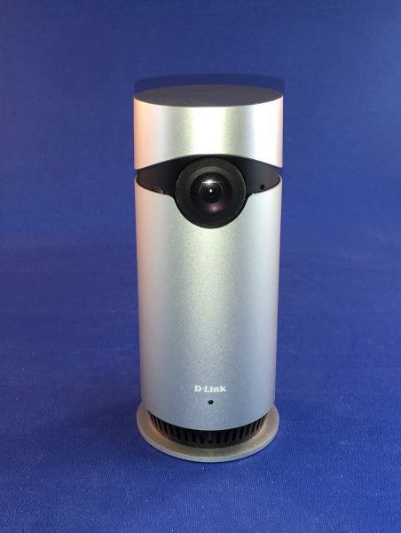
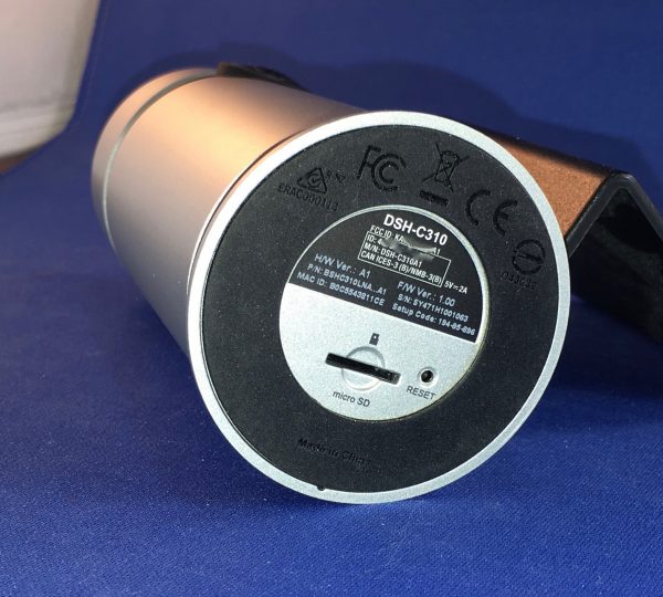
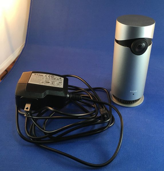
The unit itself is a smooth column 5.125″ high and just over 2″ in diameter. It weighs 8.1 oz (230 g). There is a lens near the top and a microphone opening just to the side of that. Around the bottom, there are openings for the speaker. The single port is a fitted microUSB connection. On the bottom, there is a micro SD card slot and a reset button. At a half-pound, the whole unit feels hefty and doesn’t slide on the table, due to a rubberized gasket around the bottom.

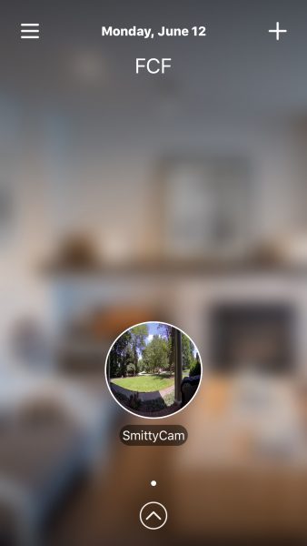
Setup was pretty straightforward. I downloaded the Omna app, created a “Home” (you can have multiple) by connecting to my wifi network.

Once you have a home, you add an accessory by plugging the device in and waiting for the blinking orange LED. When you click “Next”, you’ll see your device’s ID number, which is also printed on a sticker on the back of the device. (Sorry, didn’t capture this screen.) Save the settings, and you’re done.

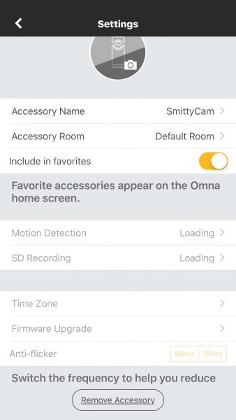
You can easily go back and edit any names you’d like to. As long as you keep power to the camera, it will save video and stills to a micro SD card. Through the app, you can get a live view of the camera, set up motion activation, and the frequency of micro SD card writes. You can also change the time zone and update the camera’s firmware (which I had to do soon after receiving it.)

You can activate the mic on the camera and listen in through the app, too. This worked quite well. This, of course, adds to the size of the files being sent to your storage card. You can also speak to the camera, which is a great way to absolutely freak your dog out. (Sorry, Jack!)

Given enough light, the images that you get from this camera are fairly clear, but the 180º fisheye effect takes some getting used to. I was able to run it easily off of a power bank, out on the porch, which was pretty nice. It would be nice if they added an internal battery, in the case of power outage.

When I first was setting it up, I took a few shots in my office, with nothing but a desk lamp and my computer screens on. The results, while usable, look more like something from an earlier episode of a police procedural than a cutting edge HomeKit device.

I did notice that the device ran pretty warm during testing. I rarely ran it longer than an hour or so, and it was always very warm to the touch afterward. Not sure what a 24/7 session would do.

The three kitchen shots I included because 1) they are being shot with just the LED over the sink and another light on the other end of the family room, and 2) they show the quality of photos you get with decent lighting. The last one, sitting on the island, shows my Lovely Bride’s fuzzy slippers as she watches yet another British Crime Drama. There is no other light in that room except the TV screen. Not too shabby!

I was sent a first unit that got bricked almost out of the box. Took a bit of time to get it replaced since it was a review unit, but the help desk folks were very friendly and helpful, as far as they could go. There is no “replacement” for a defective unit through the Dlink site – it’s done through the place of purchase. Right now, that’s Apple. From my time in Apple Retail, I know that 2 weeks after purchase, you had to contact the manufacturer, even if the product was in warranty. (All Apple-branded products have a one-year warranty that is honored in-store. Almost all third-party products sold there have at least a one-year warranty, but that’s handled through the manufacturer.) I called support several times and was consistently told there is no way to swap it out except at the place of purchase.

There isn’t a way that I found to get the camera connected to a network or service for archival storage. It’s the onboard micro SD or nothing. This may limit recording in some locations, where it may be difficult to replace the card. (Think: your vacation home three states away.) But for a daily nanny cam or pet sitter, it is nothing to swap it out or slip it into a computer to copy files, then erase and reinsert.

I am not a fan of the photos in this format. Everything is warped – my front porch and walk are perfectly straight in reality, but you can’t prove it by those photos above! If there was a way to easily force the camera (or the software) to post-process the image into something that looks less like a 1960’s movie LSD scene, I’d probably be more of a fan. But at this stage, I’m not.

Source: The sample for this review was provided by D-Link. Please visit D-link for more info, or Apple to purchase.


Product Information

Price: $199.95
Manufacturer: D-Link
Retailer: Apple
Requirements:
  • Wireless network, Apple device with HomeKit, microSD (TFT) card
Pros:
  • Sleek look.
  • Easy setup.
  • Good software.
Cons:
  • Odd photo output.
  • No online storage.
  • Unable to have camera replaced by customer service.

Filed in categories: Reviews

Tagged:

D-Link OMNA 180 security camera review originally appeared on on June 21, 2017 at 9:00 am.

Note: If you are subscribed to this feed through FeedBurner, please switch to our native feed URL http://the-gadgeteer.com/feed/ in order to ensure continuous delivery.
BBQ Dragon Chimney of Insanity charcoal starter review


There’s something magical about charcoal grilling, especially during the long days of summer. You just can’t replicate that taste on a gas grill. Since 2013 BBQ Dragon has been bringing new innovations to the charcoal grilling market, and I have one of their latest gadgets on the back patio for testing. It’s the Chimney of Insanity, a chimney starter that BBQ Dragon claims is the best in the industry.

What’s a chimney starter? And is the Chimney of Insanity the best around? Let’s go make a fire and find out!

Design and Build

Before we begin, let’s take a moment to recognize how cool this thing looks. That raised dragon logo? The name die-cut out of the base instead of boring vent holes? You know you want it on display at your next cookout. I’d probably manufacture some story about how I won it in a martial arts contest at an ancient dojo, nestled in a hidden mountain valley… but that’s me.

Now let’s get down to business. For those of you who don’t know, modern-day chimney starters have been around since the 1960s. The basic concept is pretty simple: charcoal is suspended on a rack in a metal cylinder with holes cut in the bottom to promote air flow. Ignite your starter material under the charcoal and, as the charcoal starts to burn, and updraft is created that speeds up the process of firing up the whole stack. It’s a tried-and-true design, with variations offered by hundreds of manufacturers.

What makes the Chimney of Insanity unique? Well, they’ve added a 3″ tube, bent at a 90-degree angle, that’s accessible from a side vent on the cylinder. This allows for side-loading your starter material, which is a great safety feature (you don’t have to move a hot chimney to add more starter fuel underneath). That’s not the only benefit, however: if you blow air through that tube, it’s designed to create a vortex in the chimney that will dramatically accelerate the ignition of your coals. BBQ Dragon makes a fan specifically designed to attach to this tube that was not tested here, and videos show the rig lighting a full batch of charcoal in under 10 minutes. Given that a traditional chimney starter usually takes 20-25 minutes to fire up, this is an impressive time saver.

In addition to the innovative tube design, the overall build on the Chimney of Insanity is excellent. Heavy-duty materials are used throughout the construction, with extra rivets added at all the seams to ensure durability. It’s got a burly vinyl handle and heat shield, which allow for confident handling when loaded with rocket-hot coals. After killing several cheap chimney starters, I bought a heavy-duty Weber model that’s lasted several seasons. The Chimney of Insanity’s construction quality is easily on par with the Weber, and I expect that it will last just as long.

Testing the Insanity

I wanted to put the Chimney of Insanity through its paces, so I set up three different performance tests to see how it lives up to its claim.

For the first test, the Chimney of Insanity squared off against my old Weber chimney starter. I measured out two pounds of natural lump charcoal (my preferred heat source) for each chimney. Each chimney also got three sheets of 8-1/2″ by 11″ paper as starter material (rolled up and placed under the starter for the Weber, and inserted in the tube for the Chimney of Insanity). Both chimneys were fully lit and ready for grilling after about 25 minutes. I found the Chimney of Insanity easier to fuel with the side tube (and definitely easier to handle), but not particularly fast under normal circumstances compared to the Weber. 

For the second test, the Chimney of Insanity was loaded to the brim with traditional charcoals. Paper was loaded into the side tube and lit, adding additional paper every few minutes as needed to stoke the burn. Things got off to a slow start, so we added some manpower by blowing into the side tube periodically after about 5 minutes to speed things up. That’s when I started seeing the benefits of the design, with a fully lit chimney ready to go in under 20 minutes. A nice improvement, but my technique was still lacking. 

For the final test, the Chimney of Insanity was loaded with 50 charcoal briquettes and 6 hunks of raw hickory wood (to add flavor}, filling the whole chamber. We also borrowed one of the wife’s old hair dryers to simulate the effects of the BBQ Dragon fan (you know… for science). We started the fire, gave it a couple minutes to settle in, then turned on the hair dryer and aimed it at the tube.

Ladies and Gentlemen, please step back for your own safety. We have liftoff.

After a moment, you could hear a dull roar emanate from the chimney. Within a few minutes, we didn’t just have fire… we had roaring flames belching out of the top of the stack. It was as if Smaug himself woke up and decided to torch those pesky dwarves poking around for his treasure. Just check out the photo below:

Neat, right? It was impressive to behold. I’d say we had the whole chimney lit at about 15 minutes, which is great considering that I had some big ol’ chunks of raw hickory wood stuck in there. Honestly, we had to dial back on the hair dryer action every minute or so to make sure that we didn’t create a catastrophe in the back yard.

We’ve since used the Chimney of Insanity in this manner several times, with similar results. I would imagine that the BBQ Dragon fan, which is specifically designed to fit the vent, would produce more impressive results with a consistent low-velocity airflow. Sadly, I did not get the opportunity to test it here.

I can’t leave the testing portion of the review without a gratuitous food pic. Here was that night’s dinner: chicken thighs, legs & breasts with my homemade barbecue rub and sauce, baby sweet peppers marinated in garlic and olive oil, and sliced potatoes roasted in foil. The hickory wood adds an extra layer of flavor and smoke. Let me know if you want the recipes!

Additional Notes

The Chimney of Insanity is a nice chimney starter, but there are some things to consider if you’re looking to buy. It’s a good size (6″ diameter, 11″ tall), but there are bigger models out there if you need to fire up extra charcoal. The Weber I tested it against is 7″ in diameter and 12″ tall, and left more room when loaded with the same amount of charcoal (see picture above). I measured the Chimney of Insanity’s capacity at about 2 pounds of lump charcoal or 50 standard briquettes. If you are using standard briquettes, I don’t know that you’ll notice a size issue here; if you use wood chunks or natural lump charcoal, however, the extra size is helpful for managing odd-sized fuel. If you have a bigger grill, you might be firing up multiple stacks of charcoal anyway. Mine is a standard Weber kettle 22-1/2″ grill, and I found the Chimney of Insanity’s amount sufficient for most two-zone grilling (filling half of the grill, and leaving the other half for indirect cooking).

You’ll also see some discoloration in the pictures that resulted from firing up the chimney several times. This is something I have seen happen with every chimney starter I have owned, and it’s the result of the high heat you’re playing with. I think it shows that you’re using your toys often and well, but you should be aware that the shiny exterior will show signs of use over time.

Finally, it could be argued that you could get similar results by applying a steady air stream to any stack of charcoal. I’ve done this on camping trips with an air compressor. The BBQ Dragon fan, in fact, was originally sold for this purpose without the Chimney of Insanity (see our review here) . I do like the fact that the side vent give you much more control for a safe burn, however, and consistent results with each grilling session.

Conclusion and Pricing

Bottom line? I believe that the Chimney of Insanity performs well as a replacement for your current chimney starter with a solid build, a great handle, and some nice additional safety with the side-loading tube. The real magic happens when you get airflow going through that side tube. That’s when the beast earns its name, firing up a full stack of charcoal in half the time it would take otherwise.

At about $30, the Chimney of Insanity is just about right in terms of pricing when compared to similar models. You can get a cheap chimney for under $15, but it probably won’t last more than a season or two. The better-built models (like this one) usually range between $25 and $40 and can be expected to last several seasons. With the additional design features adding to the performance, I think the Chimney of Insanity is a good buy for the charcoal griller.

Source: The sample for this review was provided by BBQ Dragon. For more info visit their site or Amazon.


Product Information

Price: $29.95
Manufacturer: BBQ Dragon
Retailer: Amazon
Pros:
  • Solid construction
  • Great handle
  • Innovative design
  • Can light a stack of charcoal in half the time with air flow support
Cons:
  • Works best with a source for air flow (purchased separately)
  • Holds about 2 pounds of charcoal, which may not be enough for larger grills

Filed in categories: Reviews

Tagged: ,

BBQ Dragon Chimney of Insanity charcoal starter review originally appeared on on June 20, 2017 at 7:43 am.

Note: If you are subscribed to this feed through FeedBurner, please switch to our native feed URL http://the-gadgeteer.com/feed/ in order to ensure continuous delivery.