Focal Spark and Spark Wireless earphone review

The more I review Focal earphones and headphones, the more impressed I become. Yeah, French speaker maker Focal makes outrageously priced products such as their $4,000 Utopia headphone—rated by many reviewers as the best headphone available today. But kudos to Focal for also offering affordable audio for the rest of us. Case in point: The new Focal Spark and Spark Wireless earphones.

Sometimes the only criteria used when people look at earphones is looks, price and whether they are wireless or not. Yet, audio quality is often missing from this equation. That’s both too bad and understandable. Too bad because the sound quality is (sadly) not a priority in today’s emphasis on convenience. Understandable because most of the time, you can’t try out earphones before you buy. You usually have to rely on reviews (such as this one) that can hopefully offer some help in any purchase decision.

The Focal Spark earphones have made this decision a little easier, because the Sparks are attractive, priced right and are offered both wired and wireless. And most importantly (at least to us audio snobs), both the Spark and Spark Wireless sound excellent for the money!

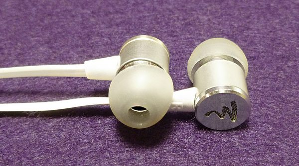
With the exception of wires, both the Spark and Spark Wireless look identical and have the same audio specs. Do they sound the same? Yes, with a small difference—more on that later.

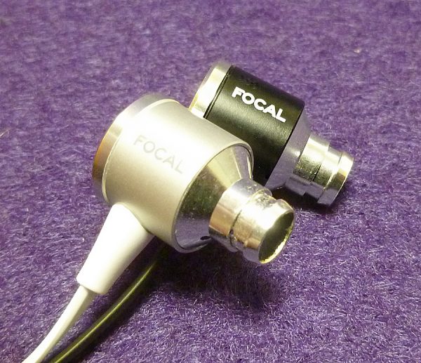
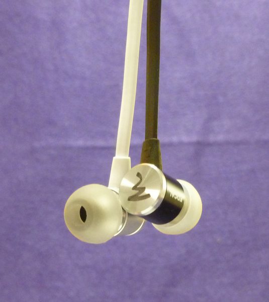
The Spark comes in black, silver/white and (a really bright) cobalt blue. The Spark Wireless is also available in black and silver/white but swaps the blue for a classy rose gold/light gray combination.

Both versions of the Spark earphones use a 9.5 mm mylar dynamic speaker, which gives them a forgiving sound signature. What do I mean by forgiving? Simply put, dynamic speakers aren’t quite as accurate as the more expensive armature speaker earphones, but they can make most lower resolution mp3 music files you have sound fun. Armatures can be accurate to a fault and sound fantastic with high-resolution music files, but can result in lower resolution MP3 files sounding much less fun.

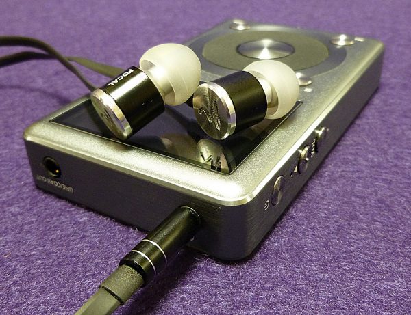
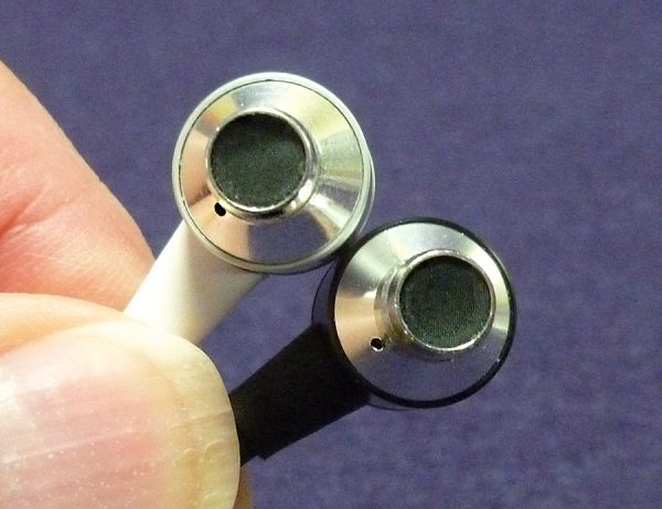
The earphone shells are lightweight aluminum—they weigh practically nothing. This (lack of) weight could make them good for exercising, but since there is no IP waterproof rating available, I would caution against using them during heavy exercise.

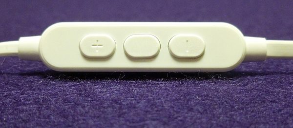
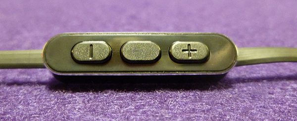
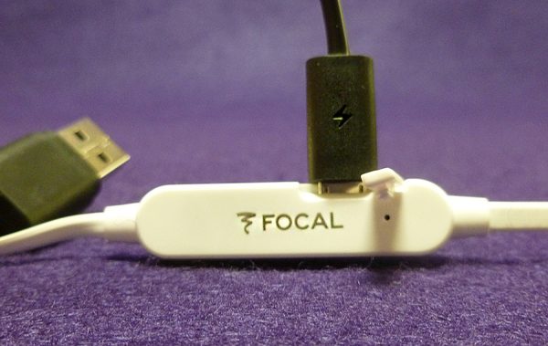
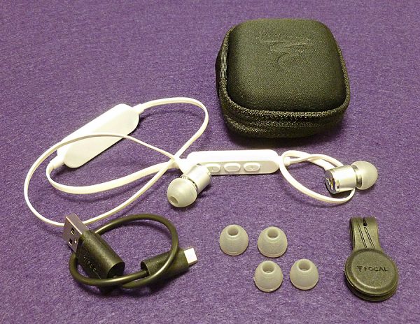
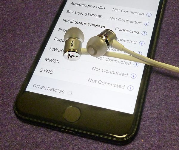
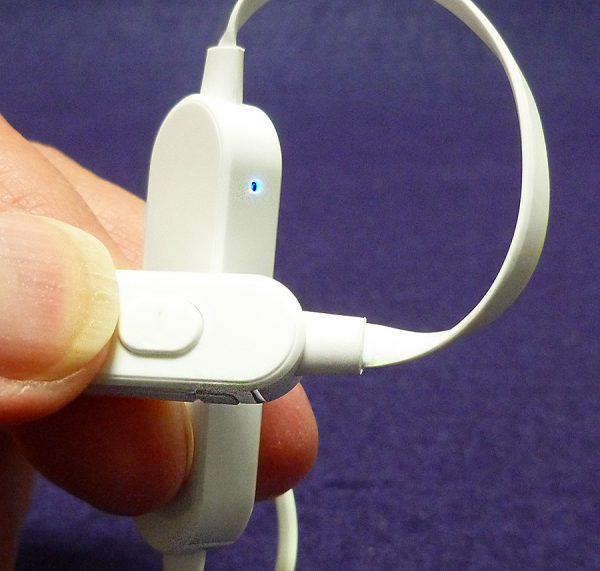
Both versions of Spark have an inline remote for volume/play/pause/call buttons. The Spark Wireless also has on/off capability. The wires on both are wide and flat. This can help reduce tangles but won’t eliminate them entirely. Speaking of wires, the Spark Wireless isn’t technically wireless. There is a short wire that connects the left and right earphones. This wire houses that inline volume remote as well as a battery/Bluetooth 4.0 module. This module is centered between the left/right earphones, so it hangs below the back of the neck, out of the way. One quibble with the Spark Wireless is that since the on/off button is a few inches below the left earphone shell, there is a slight off-balance in weight distribution. It’s not a huge deal, but it is noticeable.

The on/off buttons also house the call mic. Call quality is first-rate. No one I spoke with on a call could tell I wasn’t using my iPhone directly.

The Spark Wireless will fully charge in 2 hours for 8 hours of use—not bad at all. There’s a polite voice prompt over the earphones that warn you when the battery is low. It’s a nice reminder and you don’t have to look for any blinking light.

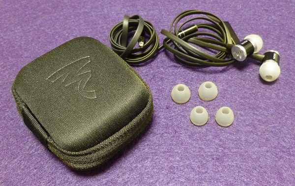
Three ear tips (S/M/L) come with both Spark and Spark Wireless. While not a great selection, it should work for most people—but not me. Even with the largest tip, I wasn’t getting the noise isolation or proper bass response that comes with a good seal. So, I had to use a go-to pair of ear tips I keep on hand because most earphones (not just Focal) I review fall short in ear tip selection. I guess I have weird ears.

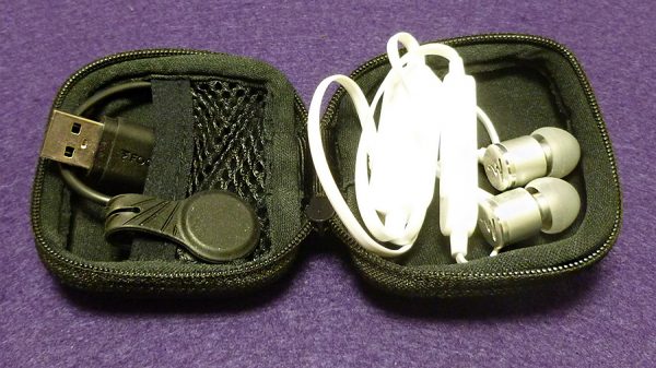
Also included with both Spark and Spark Wireless is a nice zippered carrying case. The fit is tight, but the case offers great protection. The Spark Wireless has an additional charging cable and a magnetic clip for securing the battery to a shirt collar for use while moving around. There is no instructions either in the box or online about how to properly use the battery clip. I think I figured it out, though. Note that the charging cable is very short. This can be somewhat awkward for charging, but it does easily fit into the case with the Wireless earphones.

There are two important questions to ask regarding the Spark and Spark Wireless earphones: Do they sound good and does the Spark Wireless sound as good as the wired Spark?

Let’s deal with the Spark first.

When they are first used, they tend to be on the bright (treble) side. I found myself lowering treble on my iPhone equalizer. After a few hours of what’s called “burning in,” the sound opened up and I reset the equalizer to the flat setting—my usual choice.

Once broken in, the Spark has excellent sound across the frequency range. Bass is accurate and can have a potent kick when required. A good example of this is Simple Minds cover of “Bring on the Dancing Horses” from their “Neon Lights” album. The first notes are extremely low bass and the Spark earphones let you feel as well as hear them.

The Sweet’s 70s classic, “Fox On the Run” has a high pitched electronic swirling sound in the song that verges on painful with the Spark earphones—only this is not from distortion, it’s in the song. The Sweet’s recordings have always been a bit on the bright side with weak bass. The Sparks are just being true to the music.

The Knife’s “Silent Shout” is one of my favorite bass testers and the Spark earphones don’t disappoint. There is no distortion at all—even when the volume is turned up to damaging levels. Once again, bass can be felt as well as heard.

Speaking of volume, one noticeable difference between the Spark wired and wireless is the amount of volume. The (wired) Spark earphones can get a bit louder than the wireless version. The only explanation I can think of is that a direct, wired connection is stronger than wireless. However, the difference is only noticeable when both the wired and wireless are compared side-by-side. Both can get plenty loud!

Now, the Spark Wireless.

I listened to the same songs with the Spark Wireless and had trouble telling any difference (except the volume) between the two. The Knife’s “Silent Shout” had the same bass kick as it did on the wired Spark. And The Sweet sounded a bit bright on the Spark Wireless also. Basically, you can take everything I noted about the Spark and apply it to the Spark Wireless. They’re so close, that I can safely say they sound identical. You may have to up the volume button one extra press for an equal match, but that’s all.

The Bluetooth signal on the Spark Wireless held up quite well for appx. 50 feet in my house with its many walls.

Disregarding the fact that the Spark Wireless is more expensive—should you choose wired or wireless? It used to be that wired earphones always sounded better. With the Spark and Spark Wireless, that’s just not true. The only deciding factor left is the convenience of not being tethered to a smartphone vs. having to remember to charge the earphones. Unless a music source doesn’t have Bluetooth, such as an older iPod or other digital music players, I would choose the Spark Wireless hands down. It may be more expensive and require periodic charging, but wireless is the future of audio and now is as good a time as any to step into that future.

The Focal Spark earphones sell for $69 US. The Focal Spark Wireless earphones sell for $99 US.

Source: The samples for this review were provided by Focal. Please visit www.focal.com for more information and keep an eye on Focal’s products on Amazon to order one.


Product Information

Price: $69 US – Spark; $99 US – Spark Wireless
Manufacturer: Focal
Retailer: Amazon
Pros:
  • Sound great
  • Both wired and wireless almost identical
  • Comfortable
  • Affordable
  • Well built
  • Attractive
Cons:
  • Uneven weight distribution with inline remote on Spark Wireless
  • No waterproof rating

Filed in categories: Reviews

Tagged:

Focal Spark and Spark Wireless earphone review originally appeared on on July 15, 2017 at 8:55 am.

Note: If you are subscribed to this feed through FeedBurner, please switch to our native feed URL http://the-gadgeteer.com/feed/ in order to ensure continuous delivery.

Switchmate Bright instant smart lighting switch review

Last year I reviewed the original Switchmate Smart Light and now they have recently come out with version two which they’ve named the Switchmate Bright. Let’s give this smart light switch controller a try.

What is it?

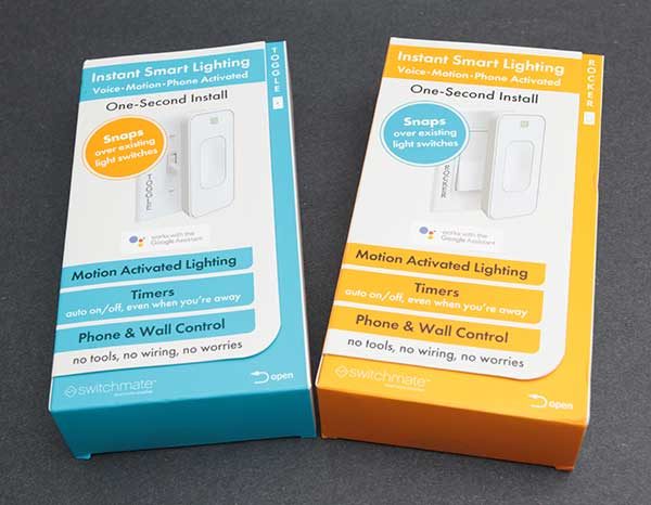
The Switchmate Bright is a wireless controller for your existing light switch (toggle or rocker style) that physically toggles the switch on and off with your smartphone or a simple touch.

What’s in the box?

Switchmate Bright
2 AA batteries
Switchmate stickers
Instructions

Design and features

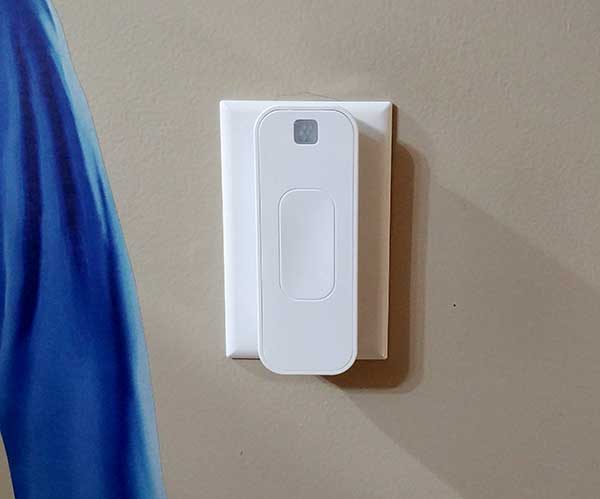
The new version of the Switchmate is significantly smaller (narrower) than the original version.  It is available in white or ivory. I was sent the white version.

It’s made of plastic with a touch-enabled switch on the front and a motion sensor at the top.

On the back of the Switchmate are two magnets that help this device achieve an almost install because absolutely no tools or wiring is needed. It uses the magnets to stick/attach to the existing light switch cover.

The slot on the back of the Switchmate fits over the light switch and a motor inside the Switchmate manually flips the light on and off.

Installing the Switchmate Bright

Installation is about as simple as it can get. First, you slide the battery cover off the back of the Switchmate, insert the included AA batteries, and put the cover back in place. According to the Switchmate FAQ, batteries should last between 8 and 12 months before they need to be replaced.

Then you install the iOS or Android version of the Switchmate app on your mobile device. The app will guide you through the rest of the setup which asks you touch the switch on the front of the Switchmate so the app can detect and connect to the switch via Bluetooth LE. Switchmate does not use WiFi or need an active connection to the internet to work.

Then you place the Switchmate Bright over your existing light switch with the switch in the ON position. The magnets on the back of the Switchmate make contact with the screws in the switch cover to hold it in place.

That’s it. You’re done. Plug and play.

Using the Switchmate Bright

After the Switchmate Bright has been installed, you can touch the front of it to toggle the switch on or off. You can also use the app to toggle the switch, have the Switchmate set to turn on the light when motion is detected, set the switch to turn on and off at predetermined times, or use your voice in the app to tell the Switchmate to toggle the switch.

Using your finger to toggle the light just by touching the face of the Switchmate works every time. When the switch is touched, a blue LED will blink. This is the easiest way to use the Switchmate, but it’s not exactly going to give you a smarthome kind of experience. That’s where the Switchmate app comes in.


The app is where you configure timers, motion detection settings, and can enable the welcome home feature.

There are two timers that you can set that enable you to program the Switchmate to turn the light on and off at the times you specify. You can also have these timers set to repeat based on the day of the week, weekends, and more. The nice thing about the timers is that they work even if you’re not within Bluetooth range of the Switchmate. Once the timer is set, it will happen regardless of the location of you and your mobile device.

The motion detection feature can also be customized to only work during certain hours of the day and you can specify how long you want the light to remain on after motion has been detected.

There’s also the Welcome Home feature that you can enable so that the Switchmate will turn on the lights when you arrive home.

How far is the control range for this switch? The claim is up to 150ft. My house isn’t that large, but I was able to control the Switchmate that I installed downstairs from upstairs at the other end of the house. And the nice thing is that the app will show you if the light is on or off by the way the onscreen control button looks. If it’s dark, the light is on and if it’s light, the light is off.

Like the original version of the Switchmate, there can be a slight lag when you press the onscreen button in the app and when the switch actually toggles. The delay is the longest after not using the switch in awhile. But is lightning fast if you toggle it again.

And just like the first Switchmate, there is still a motorized sound when the switch activates.

Voice control

The Switchmate will soon work with Alexa, but for now, you can tap the microphone button in the app and use your voice to tell the named switch to turn on or off.

The voice commands you use for the Switchmate begin with “Turn” and then the name of the Switchmate switch and finally the function which is “Off” or “On”. For example, if I named my Switchmate “front porch” and I wish to turn it off then I would press the microphone in the upper left-hand corner of the app and would then say “Turn front porch off” and Switchmate should turn that light off. I didn’t have a lot of great success using my voice to control the Switchmate. It took more time repeating my command than just tapping the button for the light in the app to toggle it on or off.

Final thoughts

If you’ve been thinking about adding a smart lighting feature to your home but didn’t want to buy brand new bulbs for all your light fixed or deal with hubs, wiring, etc. The Switchmate Bright is one of the easiest ways to add digital control for your lights. Just open the package, install the batteries, install the app, slap the Switchmate over your existing switch and you’re done.

I like gadgets that are easy to install and just work. The Switchmate Bright is that type of gadget.

Source: The sample for this review was provided by Switchmate. Please visit their site for more info and Amazon to order.


Product Information

Price: $39.99
Manufacturer: Switchmate
Retailer: Amazon
Pros:
  • No tools needed installation
  • Simple application
  • Timers, voice control, and motion detection settings
  • Does not require an internet connection
Cons:
  • None

Filed in categories: Reviews

Tagged:

Switchmate Bright instant smart lighting switch review originally appeared on on July 14, 2017 at 1:42 pm.

Note: If you are subscribed to this feed through FeedBurner, please switch to our native feed URL http://the-gadgeteer.com/feed/ in order to ensure continuous delivery.
Armor-X iPad Pro cover review

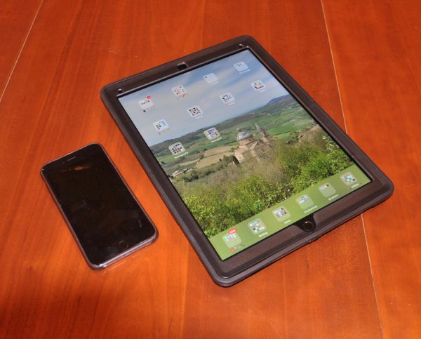
I love my 12.9″ iPad Pro, but, like most folks have mentioned in reviews, I find it a bit difficult to balance when trying to carry it around during use. I’ve found a case that I like for use around the house or on the road, but it’s more a stand, even though it has a hand strap. When Julie offered the team the Armor-X cover for iPad Pro, I pondered if it would be right for my needs. They sent it for testing, and I’ve had it a week or two, so it’s time to report on the results.

Note: Photos may be tapped or clicked for a larger image.

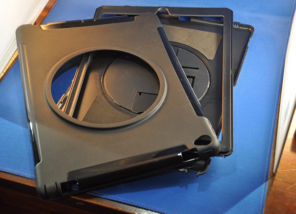
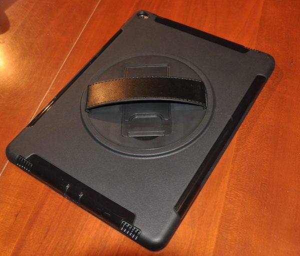
The Armor-X case is made up of three pieces: a two-piece inner hard plastic frame, and a tough rubberized outer case that seals the two together, as well as adds a hand-hold and stand on the back.


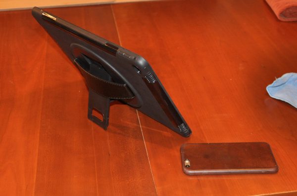
The stand is folded under where the hand strap spans, and there is a circular insert in the back of the case to allow it to rotate.

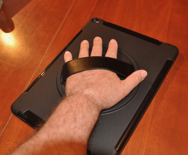
You can hold it in any position, and there is no need to worry that the iPad will slide out of the case. It is firmly attached to the handgrip, and the leather strap is easy to adjust to your hand. I am not able to comfortably get my thumb around the edge while holding the grip, but those with larger hands may. If using in a portrait mode, similar to a clipboard, you’ll find it a natural for sketching, taking notes, or annotating a checklist, as you would with paper.


The ports and buttons are nicely protected. There is a snap-over cover for both the headphone jack and charging port. I was able to use most of my cables without incident.

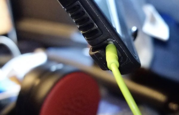
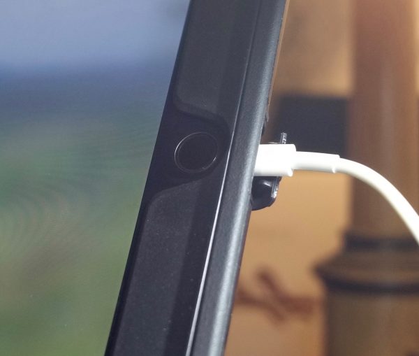
The buttons are clearly marked, and work well in the case. The sound, funneled through louvered openings (see picture above with green headphone cable), does not appear muffled in any way. There are openings for the cameras, touch sensor, and microphones. The touch sensor is perhaps the only thing you may find a bit compromised. Given its position at the edge, and the thickness of the case (shown in the picture above with white charging cable), you may have an issue getting it to read your fingerprint from some angles. I have both of my thumbs scanned twice in my preferences, which gives me a better chance of having either one read by the sensor, but your mileage may vary. For Apple Pencil users, charging can be an issue, and there is no clip, silo, or other holder for the Pencil or any other stylus. The Pencil, because it is heftier in diameter than most cables, doesn’t fit perfectly into the port. You can wiggle it around and make it charge, in a pinch, but it’d be better to connect a cable and the Pencil adapter, to prevent any incidents with the port or your Pencil.


The stand is a nice touch, but will probably not be used as much as the handle. It slides down from under the hand strap and only will support the iPad in landscape orientation. It will almost stand up in portrait, but not steadily enough to be comfortable in use. If you need to quickly write up a report and have a keyboard in your bag, it’s going to be very comfortable. I wrote this entire article with the stand on my kitchen table using my Logitech K811 keyboard. I love using this iPad with a Bluetooth keyboard.

There is no pass-through for the Smart Connector in this case, which may be a turnoff for some potential users, but with the dearth of accessories that work with that connector, I don’t really see this as a negative. If there is a sudden influx of compelling Smart Connector chargers, stands, or other peripherals, that might change. The only such item I’ve seen that would make me think twice is the Logi charger stand, but I don’t think a lot of folks have this stand.

With the iPad installed, it’s a bit hefty at 40.8 ounces (yes, that’s 2.5 pounds!), but the iPad itself is 1.5 pounds buck naked. Adding this much protection and functionality for only another pound is not too much, in my opinion. I found that even with the added weight, the iPad is actually more manageable than the bare unit itself. Part of this has to do with the size of the device itself. Being so thin, yet so large, it’s hard to manage holding it with one hand trying to wrap around the edge. It’s just too skinny. With this case, however, it has added thickness, as well as grip, even before considering the added convenience of the built-in handhold on the back.


While it’s great for those who use their iPads Pro while holding it for moderate periods of time, I don’t have that kind of need in my life. (In the picture above, I’m holding the iPad with my left hand while wielding a DSLR in my right. And I’m more worried about dropping the camera than the iPad!) A building, fire, or home inspector, teacher, lecturer or other professionals who want to have a good list or notes while walking around or standing before a group sans podium would benefit from this case. Next time I demo iOS to a large group, I’ll be using this, so that I can get the most image on the display, and can see what I’m presenting. I’ve done similar workshops with iPhones and regular iPads, and it’s great to have a case that lets you gesture with one hand while securely holding the device in the other.

Source: The sample for this review was provided by Armor-X. Please visit for more info.


Product Information

Price: $35
Manufacturer: Armor-X
Requirements:
  • iPad Pro 12.9
Pros:
  • Rugged and durable
  • sturdy hand-strap grip
  • stand for sitting in Landscape
Cons:
  • Stand is a bit fiddly, doesn't work in Portrait
  • No holder for Apple Pencil

Filed in categories: Reviews

Tagged: ,

Armor-X iPad Pro cover review originally appeared on on July 14, 2017 at 8:00 am.

Note: If you are subscribed to this feed through FeedBurner, please switch to our native feed URL http://the-gadgeteer.com/feed/ in order to ensure continuous delivery.
Modarri car building sets review

If you think back to your favorite toys when you were a kid, were they video games or were they toys that let you use your imagination like construction sets and other building toys? I’m going to show my age here, but some of my favorite toys when I was a budding gadgeteerling were Lincoln Logs, Tinker Toys, and an Etch A Sketch. I spent hours playing with these toys because each time I built or drew something, it was new. You can still buy those classic toys today, but if you’re looking for a new toy for your kids that promotes creativity and open-ended play, check out Modarri. They call it the Ultimate Toy Car. Let’s see if that’s true. 

What is it?

Modarri are car building sets designed for kids and those who are still young at heart. Each car building set comes with at least one car and individual parts that you can mix and match to create different looks.

In the image above, you can see what is included in a single car set. The single car set includes 6 frame pieces, a set of wheels, and a hex screwdriver.

Although it’s not obvious, you can even mix and match tires and seats if you have more than one car.


The wheels feature real suspension and shock absorbers.

The Modarri car frame parts stack on top of each other and are held in place with two screws.

The hood goes on first.

Then the fenders.

And then the metal frame that has the screws which are retained in the frame so that they won’t fall out and get lost.

The whole idea of the Modarri car building system is that you can mix and match the parts to create new cars.

Three car sets like the one shown above contain extra parts like the traffic cones and additional screwdrivers. And of course, the more pieces you have, the more variations of cars you can build.


All of the car parts except the metal frame with the screws and some of the wheel mechanism are made of plastic. The parts feel rugged enough though, so they should be able to stand up to some rough play.

Building the cars isn’t the only fun kids can have. You can also “drive” the cars by putting your finger in the seat. Since the wheels have built-in suspension, you can actually steer the cars, which is fun.

Modarri also offers a carrying case so you (I mean your child) can keep the cars, parts and tools organized and tidy.

The case can hold a dozen cars and has a removable tray and a handle for easy transport.

Final thoughts

So is Modarri the ultimate toy car building set? Yes, it is. These cars are a lot of fun to assemble, disassemble and “drive”. The system is very LEGO-like, but the Modarri cars look a lot more like a real car than any LEGO car does.

If your child likes to build things and likes race cars, Modarri car building sets are sure to keep them (and you) entertained for hours.

Source: The sample for this review was provided by Modarri. Please visit their site for more info and Amazon to order.


Product Information

Price: $19.99 and up
Manufacturer: Modarri
Retailer: Amazon
Pros:
  • Promotes creativity and imagination
  • Many possible design combinations
  • Easy to assemble and disassemble
  • Screws attached to frame
Cons:
  • Can get expensive if your kid wants to collect them 😉

Filed in categories: Reviews

Tagged: ,

Modarri car building sets review originally appeared on on July 13, 2017 at 10:39 am.

Note: If you are subscribed to this feed through FeedBurner, please switch to our native feed URL http://the-gadgeteer.com/feed/ in order to ensure continuous delivery.
Kingston HyperX Pulsefire gaming mouse review

The next stop on my gaming gear journey has us looking at a gaming mouse. Now, Kingston is not a brand I usually associate with gaming peripherals, rather, I think of internal components instead. When the Kingston HyperX Pulsefire FPS gaming mouse was offered up for review, I thought I would give it a chance. Would their name live up to my expectations? Time to find out.


Inside of the box you’ll find the HyperX Pulsefire gaming mouse and a quick start guide.

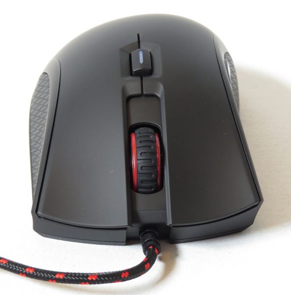
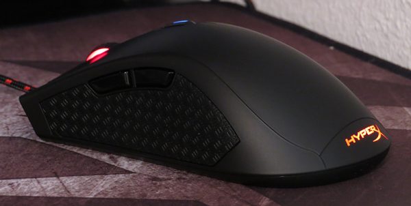
This mouse is meant to be plug and play. There is no special software to customize the buttons, and there are four DPI settings that cannot be changed. Each preset DPI setting is indicated by the button color, ranging from 400 DPI to 3200 DPI. I ended up using the third highest setting for day to day and gaming use, but could switch easily to whichever I wanted with a push of a button. I really liked the color indicator feature so that I would know which DPI setting that I was on.

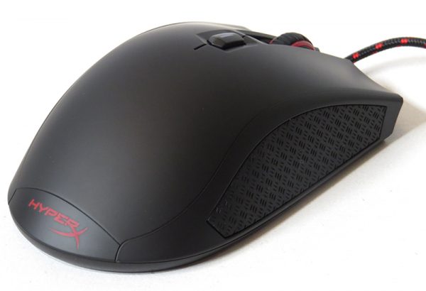
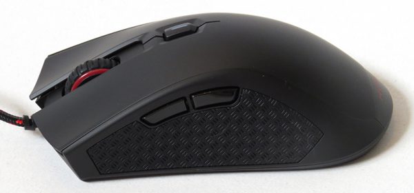
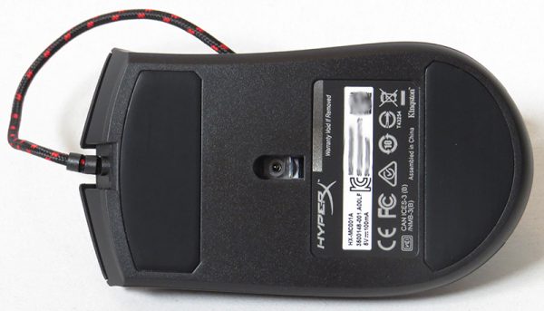
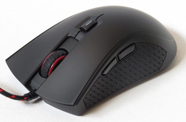
The mouse is lightweight and would glide smoothly across my mouse pad. It is a hair larger than my previous mouse, but weight wise, it was around the same. There are tactile, textured grips on each side of the mouse to theoretically keep your hands from slipping around. I’ve never had a problem with slipping, but it felt nice under my fingers either way. The Pixart 3310 optical sensor had no problem working on the wood of my desk or on my mouse pad. I never felt any hesitation due to the sensor; it always worked perfectly regardless of whatever game I played.

It took about a week to get used to the slight differences between my old mouse and the Kingston one, but once I did, it was very comfortable and felt normal to use. There are six buttons on this mouse; the left and right standard buttons, the scroll wheel, DPI button, and two thumb buttons. The layout of the thumb buttons were perfectly placed and easy to press, and it was easy to customize them using in game settings for what I used them for.

After getting my key bindings set up, (my previous mouse has software that sets the key bindings for each game) figuring out which DPI setting worked best for me, and getting used to the feel of the mouse, I have had no desire to switch back to my old mouse. The ease of gliding across my mouse pad is the main reason, as my old mouse would catch on the bottom from time to time due to a bottom pad wearing down.

I also liked the look of the mouse. The black and red color scheme is simple, yet you get that splash of color. The durable, braided cord is also black and red, and made it easy to figure out which cord was which in the back of my computer.


Overall, I really liked the Kingston HyperX Pulsefire gaming mouse and it definitely lived up to the expectations I had for it. The quality and comfort level is great, and it is simple and easy to use. The biggest downside I see is that you lack any customization outside of pre-sets, and that can be a deterrent if you can’t find a DPI level on the mouse that suits you. For a casual gamer though, this mouse is worth looking into.

Source: The sample for this review was provided by Kingston HyperX. Please visit their site for more info and Amazon to order.


Product Information

Price: $49.99
Manufacturer: Kingston HyperX Gaming
Retailer: Amazon
Pros:
  • – Easy to use
  • – Well made with a nice aesthetic design
Cons:
  • – Not able to customize DPI

Filed in categories: Reviews

Tagged: ,

Kingston HyperX Pulsefire gaming mouse review originally appeared on on July 13, 2017 at 7:55 am.

Note: If you are subscribed to this feed through FeedBurner, please switch to our native feed URL http://the-gadgeteer.com/feed/ in order to ensure continuous delivery.