Hudway Cast heads-up car display review


REVIEW – Over the past year, I have reviewed a few smartphone dash mounts that are used to hold your mobile phone and keep it in a position so that you can glance over and look at it for navigation, etc. While this method may seem convenient, it still requires you to turn your head and depending on what information you are looking for, you may turn your eyes away from the road and the traffic ahead. Even with built-in navigation in my truck, I still have to turn my head. These days, there has been a huge increase in accidents and fatalities from being distracted by a mobile phone, including people trying to pick up dropped phones from the floor of their cars while driving. The Hudway Cast offers what seems like a great solution by mirroring certain information from your phone right on to a heads-up display that is directly in front of your normal viewing position while driving. And, since the display is transparent, it does not distract or block your view.

What is it?

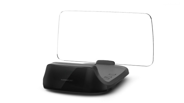
The HUDWAY Cast is a portable heads-up display that can be installed in any vehicle. It uses a wireless connection and/or a hard-wired connection to your smartphone to mirror your smartphone screen keeping the display directly in front of your eyes. You can launch the most common navigation apps on your smartphone, and then select mirroring to stream it to the HUDWAY Cast.

What’s in the box
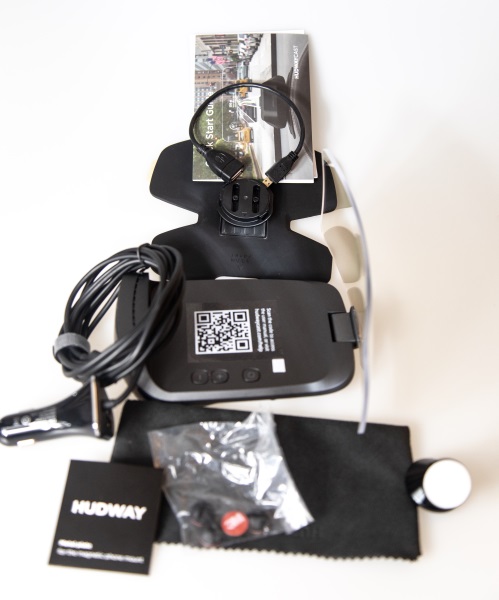

1 x Hudway Cast
1 x Hudway Cast Dashboard Mount with Adhesive Back
1 x Felt Protective Cover
1 x Pack of Cable Clips
1 x Quick Setup Guide
1 x DC Power Cable and Adapter
1 x USB-A Connection Cable
1 x Magnetic Phone Mount and Cell Phone adhesive Back Plate

Design and features

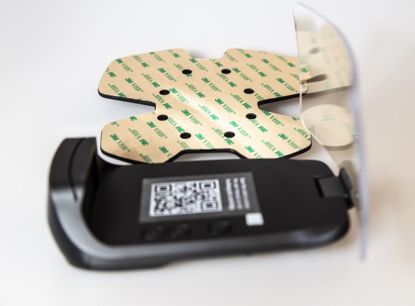
The Hudway cast is made up of a flexible base plate that has a built-in mount for the Cast on one side, and adhesive on the opposite side that allows it to adhere to your dashboard. The Cast itself is made up of a display screen that can be kept folded down when not in use and flipped up when in use. On the body of the Cast, there is an OS (IOS/Android) selection button and +/- volume buttons.
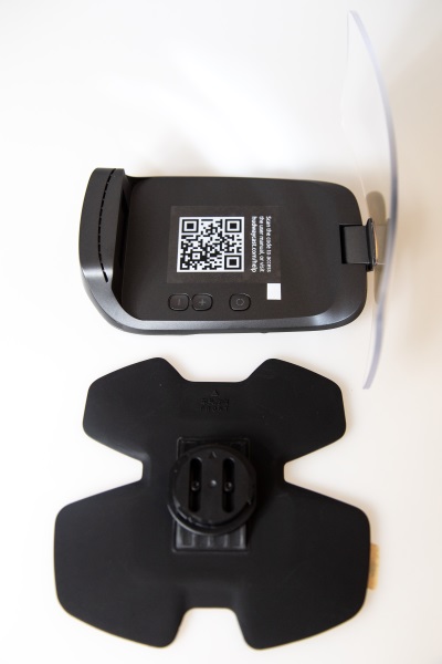
The picture below shows the Cast with the display screen flipped open, and the baseplate with the adhesive backing side facing up.
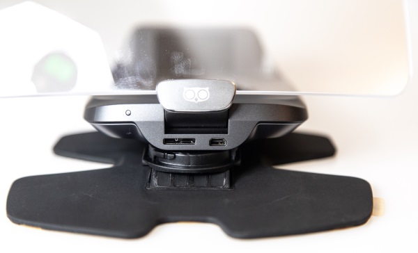
On the front of the base of the Cast (This side faces the windshield), there is a power port and a connector port that is used with the included adapter to connect to with either your Android or iPhone. The power port can also be connected to an ODB connector cable if you have one. The OBD connector cable provides both power and data (Not included with the Cast).
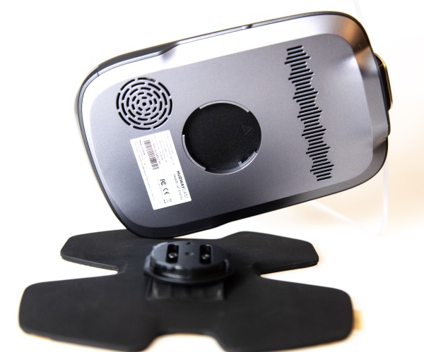
The following picture gives you a better view and understanding of the base of the Cast and how it connects to the dashboard mount.
Performance

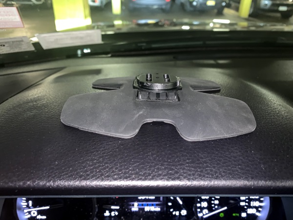
The first thing that you want to do is install the dashboard mount for the Cast. You have to figure out the best placement so that when you flip open the display for use, it is in the correct viewing position for you to see the display and for it not to obstruct or distract from your view. This is not the easiest process, but for my testing, I placed the Cast with the dash mount attached on my dashboard without removing the adhesive cover. Once I figured out the best placement, I marked the location with a sticker at one edge and then installed the dash mount by removing the adhesive protector and sticking it to my dashboard. I actually wiped off the dashboard first with alcohol cleaning pads to remove any debris and/or residue, but I soon found out that much like 3M double-sided tape, the best way to ensure that it sticks is to heat the adhesive surface with a heat gun. Since I did not have one handy, I stuck the mount on knowing that it was not sticking to the dashboard very well and drove to the railroad station as I do every day and caught my train. I figured that with my truck parked in the sun all day, that the adhesive would heat up and adhere properly. I was right, and it worked. My process is obviously not recommended but I would recommend using a heat gun to heat up the adhesive to ensure that the mount sticks properly to the dashboard.
Taking pictures of the display screen in normal light is tricky so I decided to take the pictures while parked in my underground parking. The next set of pictures show various screens on the Cast along with what is shown on the connected phone. It is important to note that while the display shows real-time information, the app on the phone shows the concept of the corresponding display information. I have also provided examples of the real-time comparison between the phone and the display in the last 2 sets of pictures below.
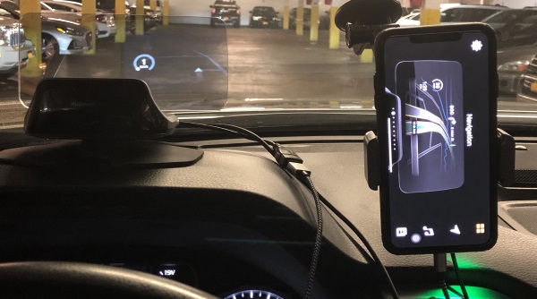
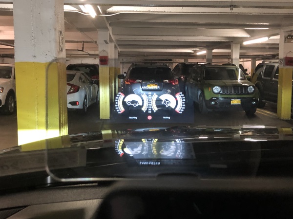
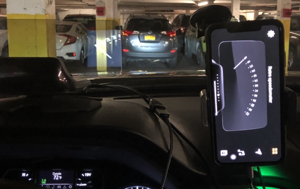
Corresponding screens below between my iPhone and the actual display information.
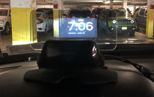
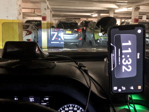
Corresponding screens below between my iPhone and the actual display information.

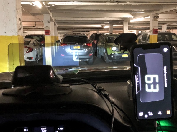
All of the testing information displayed above was conducted with the Cast receiving data via my cell phone. I did notice that for instance, the MPH on the cast differed quite a bit from the MPH displayed on the vehicle’s digital speedometer. Since I knew that Hudway also makes an ODB connector cable that attaches to the vehicle’s ODB connector, I decided to request one from them so I could compare the information from the speedometer to that on the Cast’s display once it was receiving data directly from the car. I also felt that such a connection would influence other data such as mileage, etc. Hudway readily agreed, and promptly sent the ODB connector cable.
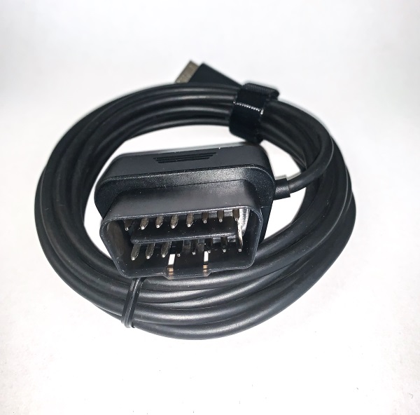
So with the connectivity using the OBD connector cable, it supplies both power and data to the Cast. There is also still the app that connects to your phone. The test results with the OBD connector cable yields more accurate results when viewing constantly changing MPH, but there is always still a +/- 2 to 3 MPH difference between the car’s speedometer and the Cast. In addition, for some reason when using the cable, the display would go to a default screen if I minimize the app, which is unlike when using the cable connected to the phone. In the latter case, the display goes blank.
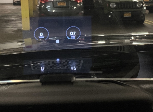
The Cast also allows you to use other navigation apps like Maps, Waze, Google maps, etc by using screen mirroring to the Cast. It has built-in speakers that allow it to give audible navigation directions as well.

What I like

  • The concept
  • The display and the infinite possibilities
  • The information options
  • The build quality

What I’d change

  • Design the mount with all connectivity built-in to the mount and not the device so that it easy to attach and detach the device
  • Include OBD Connector Cable
  • Reduce the overall size of the device so that it will fit cars with windshields that have a lower degree of slope.

Final thoughts

After testing the Hudway Cast quite a bit, I have mixed feelings. I love the concept and the capabilities, but in my opinion, the design is flawed. The fact that there is no base that houses the electronics and connectivity makes the process of connecting and disconnecting the device quite cumbersome and tedious, with what seems like wires everywhere to be managed each time. Since common sense suggests that the device should be removed if the car is parked in direct sunlight especially on a hot day and also for security reasons, this cumbersome process cannot be avoided. However, I do believe that with a few improvements, this is a gadget that I would love to always have in my car. I am aware that Hudway has a new and improved device called the Drive, which by its stated features, will likely address most if not all of my concerns and therefore make it the perfect on-the-road companion. Given the impending release of the Drive, I would wait for it and pass on the Cast.

Price: $189
Where to buy: Hudway website
Source: The sample for this review was provided by Hudway.

Filed in categories: Reviews

Tagged:

Hudway Cast heads-up car display review originally appeared on The Gadgeteer on July 13, 2019 at 8:43 am.

Note: If you are subscribed to this feed through FeedBurner, please switch to our native feed URL http://the-gadgeteer.com/feed/ in order to ensure continuous delivery.

Waterfield Designs Minemo Slim Wallet review

REVIEW – Slim, minimalist wallets have been on the rise for some time, and in fact, we have reviewed several of them here at The Gadgeteer.  Recently, one of the companies whose bags, pouches, wallets, and other products we have come to admire, Waterfield Designs, administered their  Next Generation Wallet community design project, soliciting feedback via multiple surveys directly from customers and fans.  That feedback was used to not only update some of their existing wallet designs but also to create new wallets not previously offered in their wallet product lines.  One of those new wallets was their Minemo Slim Wallet.  Let’s check them out!  Gadget on!

What is it?

The Minemo Slim Wallet is a small, thin, compact bi-fold style wallet with a minimalist style that is designed to hold a few cards and some cash.

Hardware specs

  • Material options =

    • Oil-tanned, full grain Black, Blue, Brown, or Dark Brown Leather – each $59
    • Heritage Blue, Stone Red or Forest Brown Italian Waxed Canvas (Forest Brown reviewed here) – each $49
  • Capacity = Holds about 8 cards and some folded cash, plus 1-2 cards in the exterior quick-access pocket
  • Optional RFID blocking liner available for an additional $10
  • Dimensions = 4″ x 2.6” x 0.375”
  • Weight = 0.8 oz.
  • Location of manufacture = Workshop crafted in San Francisco, CA, USA

Design and features

The new Minemo Slim Wallet is one of Waterfield Designs’ newest wallets.  It is the direct result of the Next Generation Wallets survey which was administered to customers and other interested folks back in January-February of 2019.

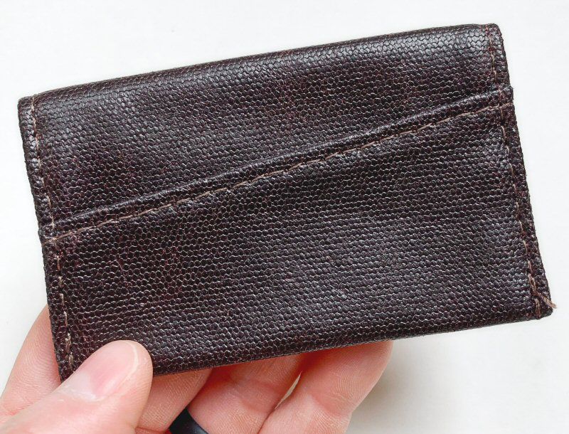
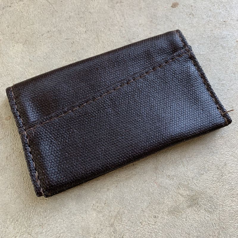
My initial impressions of the Minemo Slim Wallet that I was sent to review were twofold: first, it is indeed slim, and second, the look and feel of its material are quite unique.

While the Italian Waxed Canvas fabric of this review sample was quite unique in look and feel (and available in Heritage Blue, Stone Red, and this Forest Brown color), the Minemo Slim Wallet is also available in Black, Blue, or Dark Brown oil-tanned, full-grain leather.

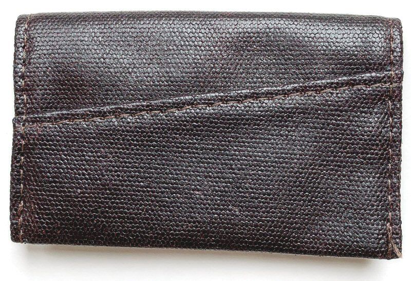
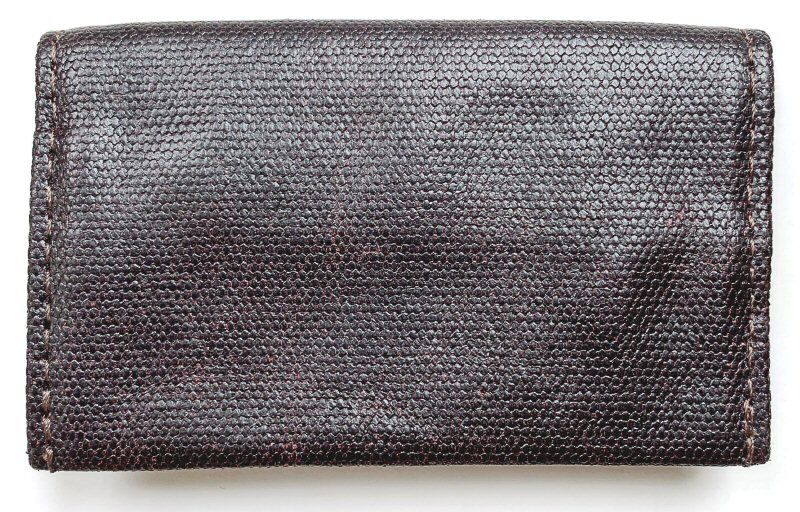
The Minemo Slim Wallet is available in Black, Blue, Brown, or Dark Brown Leather, or Heritage Blue, Stone Red or Forest Brown (reviewed here) Italian Canvas.  The Italian Canvas material looks and feels almost like a waxed canvas material in both visual an tactile properties.  Furthermore, on close inspection, the fabric has what appears to be a very small “hex” or “honeycomb” pattern.

The Minemo Slim Wallet is not only slim, but it also has a small footprint at only 4″ x 2.6”, which makes it a great option for either front- or back-pocket carry, and in fact would probably work fine for even front shirt-pocket carry (though I don’t tend to carry my wallets this way).  Additionally, the Minemo Slim Wallet has been designed to fit inside some of Waterfield Designs’ larger wallets for travel, such as their Passport Finn Access Wallet or their new Travel Wallet (reviews of both are in-process—stay tuned).

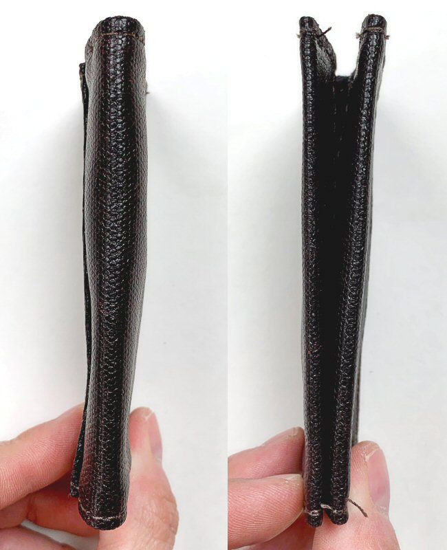
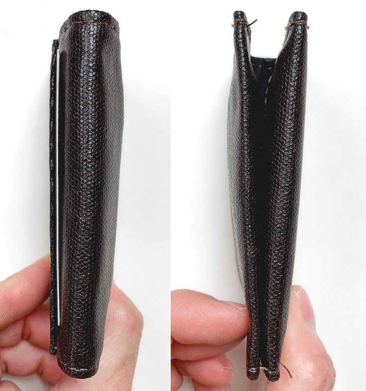
As mentioned above, the Minemo Slim Wallet is indeed slim at 0.375″ thick when empty.

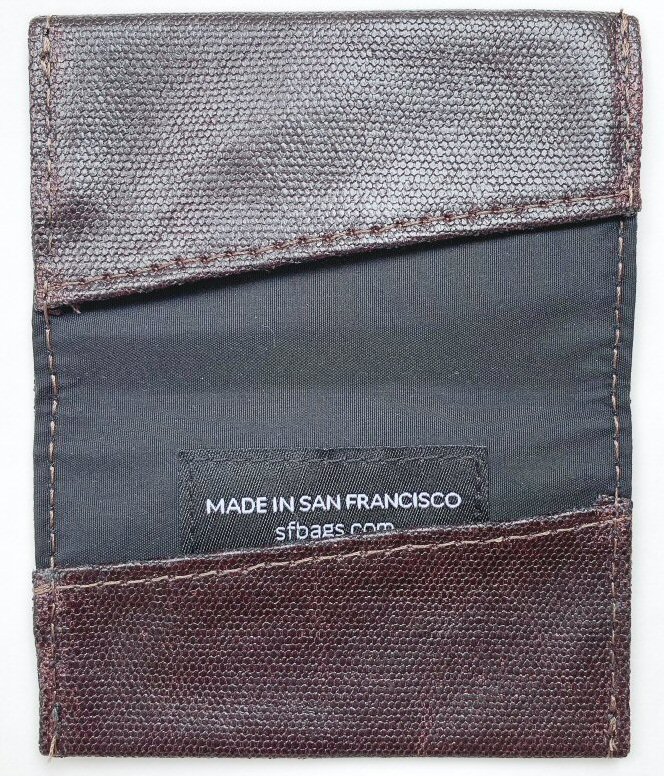
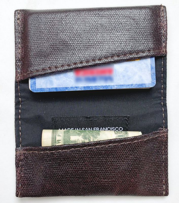
The Minemo Slim Wallet is lined, and has a simple diagonal pocket on either side to hold cards or cash.  For an additional $10, the Minemo Slim wallet can include an RFID protection liner as well, but this feature was not included in the item reviewed here.

To test out the Minemo Slim Wallet, I loaded it up with the above items: 6 bills and 7 cards, which is a fair representation of what I might typically carry in my wallet on an average day.

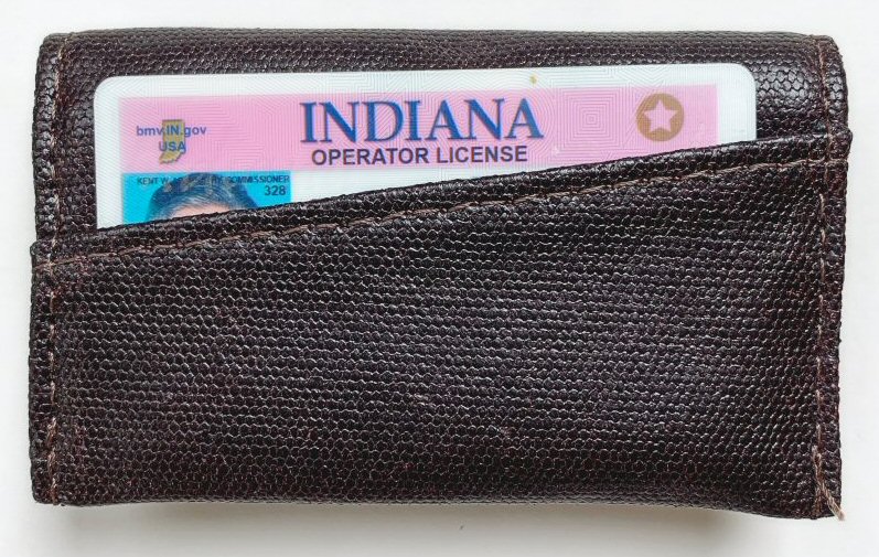
The exterior of the Minemo Slim Wallet has a single easy-access diagonal pocket on the front, which allows the user to insert an oft-used item for quick access, such as an ID or some cash.  Note that if this Minemo Slim Wallet had included the optional RFID protection, any item placed into this exterior pocket would be outside of the RFID protection, which can be both a risk or benefit.  The risk is that someone with malicious intent could access the data on a card stored in this exterior pocket without your knowledge via wireless technology. The benefit is that if you use a certain card often via wireless means—a chipped credit card, and so forth—you could use this card without removing it from the inside of the wallet, or even removing it from this exterior pocket.

Above, I’ve loaded the Minemo Slim Wallet with the remaining 5 cards (my ID being in the outside pocket) in the top pocket, and the 6 bills in the lower pocket.  One drawback to the Minemo Slim Wallet here is that, if you want to put cash bills into it, you have to double fold them, which adds a lot of thickness to it.

I think the number of cards and bills that I placed in the Minemo Slim Wallet were probably just a bit more than it was designed to carry regularly; while  I’m certain I could have put more cards and/or bills into it, this would continue to increase the thickness, and with the word “Slim” right in its name, I think the Minemo Slim Wallet is intended to provide a more svelte, minimalist carry for your wallet items, which means you should probably be carrying less in it than you would in a typical wallet.

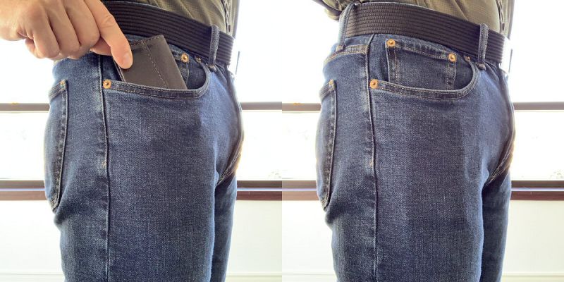
As seen above, the Minemo Slim Wallet is very suitable for back-pocket carry like just about any traditional wallet.  I barely know it’s there!

Where the Minemo Slim Wallet excels, however, is in front-pocket carry, where its very small footprint, super thinness, and very soft material make it quite comfortable.

And finally, the Minemo Slim Wallet is actually quite suitable for front shirt pocket carry as well, as long as you don’t put too much into it, which will make it heavier and can pull your pocket downward.

What I like

  • Very small, very slim, very suited for either front or back pocket carry
  • External quick-access pocket is handy
  • High-quality materials and construction

What I’d change

  • Perhaps make the footprint just a bit larger—cash bills must be double-folded to fit, which increases the thickness

Final thoughts

The Waterfield Designs Minemo Slim Wallet is an excellent slim, compact, minimalist wallet if you want to carry a handful of cards and cash.  It has a classy look and feel and although it is a bit on the pricey side, its materials and construction give me the impression that it will last a long time and only get better with age.

Price:

  • Italian Waxed Canvas styles are $49.99
  • Oil-tanned, full-grain leather styles are $59.99
  • For RFID protection liner, add $10 to any wallet price

Where to buy: Waterfield Designs (AKA SF Bags)
Source: The sample of this product was provided by Waterfield Designs

Filed in categories: Reviews

Tagged:

Waterfield Designs Minemo Slim Wallet review originally appeared on The Gadgeteer on July 12, 2019 at 11:00 am.

Note: If you are subscribed to this feed through FeedBurner, please switch to our native feed URL http://the-gadgeteer.com/feed/ in order to ensure continuous delivery.
Flösku Remote Case and Halo Apple Homepod stand review

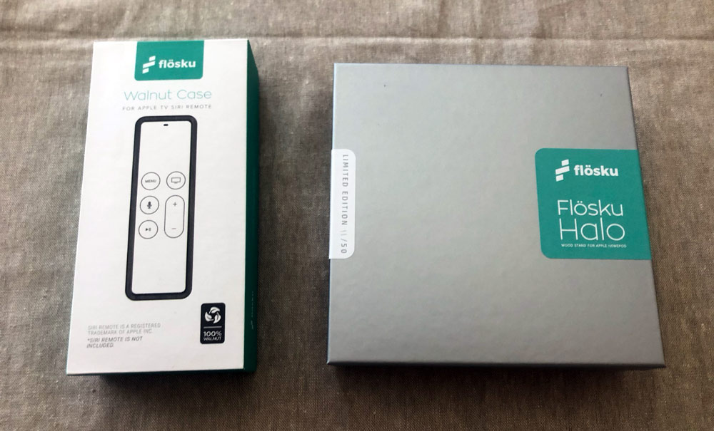
REVIEW – Flösku is a relatively new company based in England and their first accessories are precision crafted for Apple products. We’re taking a look at their Remote Case for Apple TV and the Halo Stand for Apple Homepod.

What are they?

The Remote Case is aptly named as it’s a two-piece case that encloses the Apple TV 4k remote. The Halo Stand is a perch specifically for the Apple Homepod. Both products being reviewed are made entirely from wood and more specifically, walnut.

What’s in the boxes?

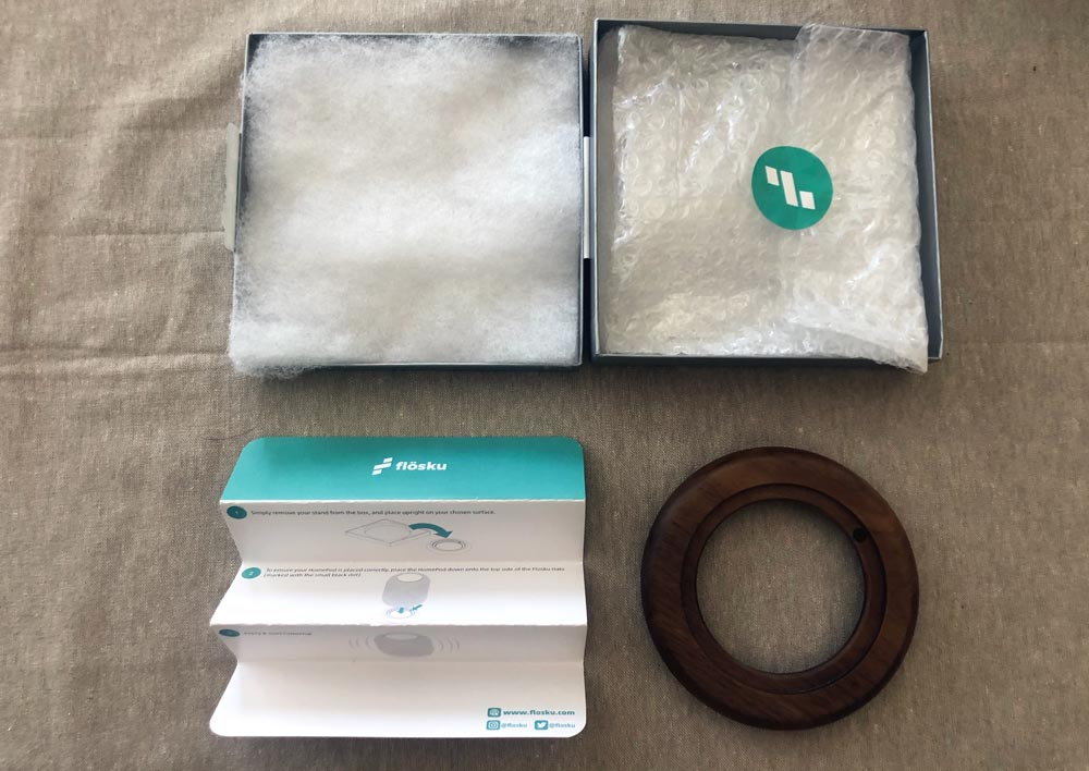
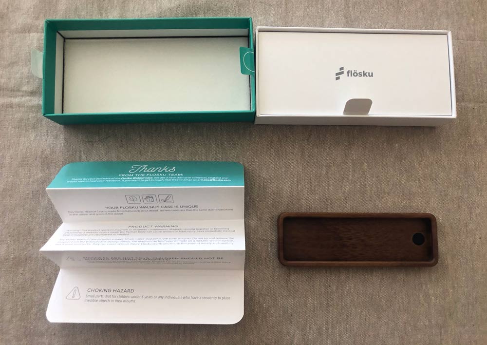
  • Each product is lovingly packaged in the equivalent of a jewelry box and includes instructions.


Hardware specs

  • Both products are 100% walnut and assume you own the corresponding Apple product; the Apple TV remote for the Flösku Remote Case and the Apple Homepod for the Flösku Halo Stand.

Design and features

Flösku clearly both enjoys and is proficient working with wood as evidenced by these two accessories. They also create in aluminum which they use for a stand machined for the Apple Pencil, but let’s look closer at these wooden gems individually.

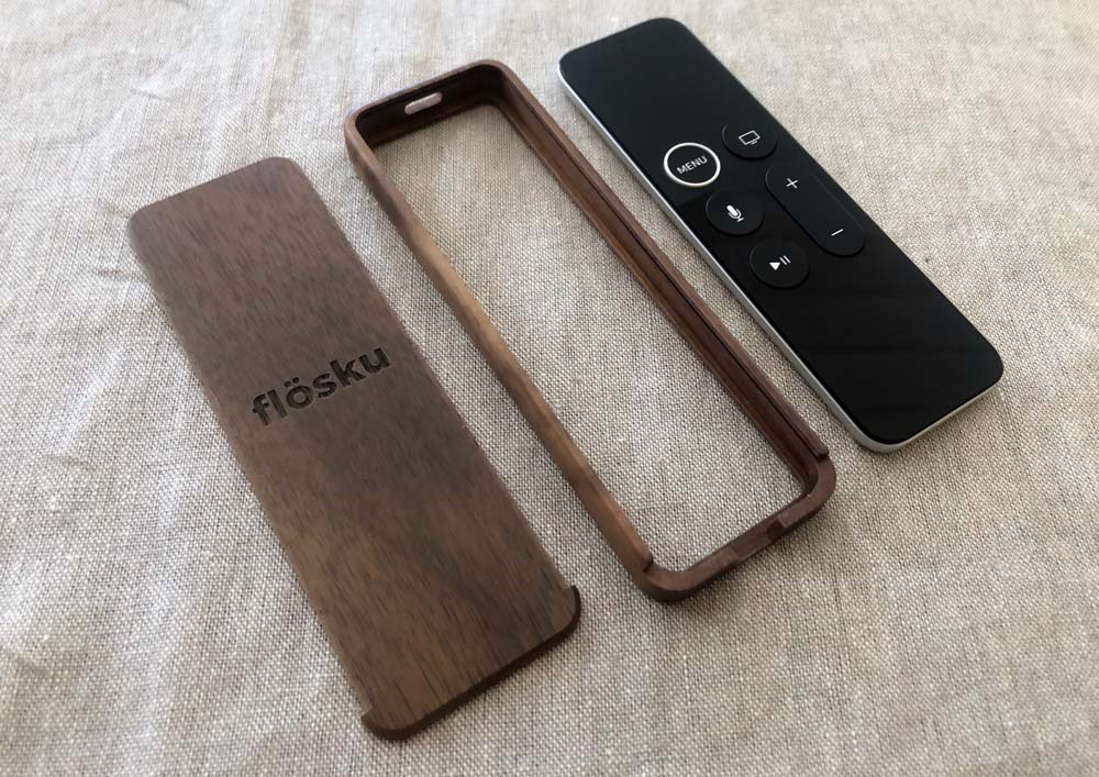
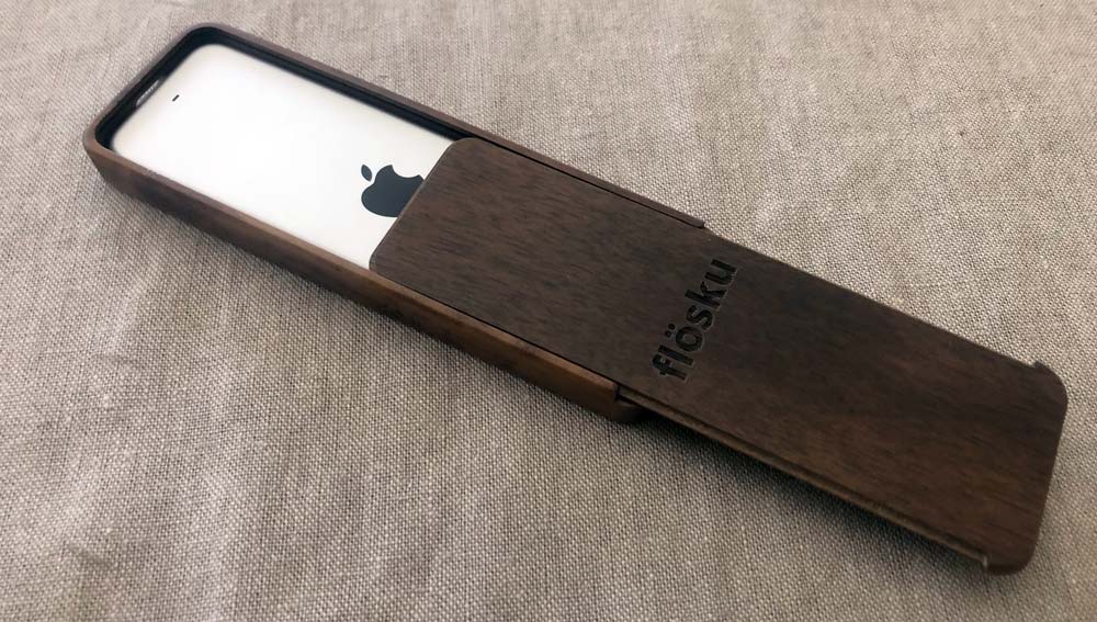
The Remote Case is made with two separate pieces.

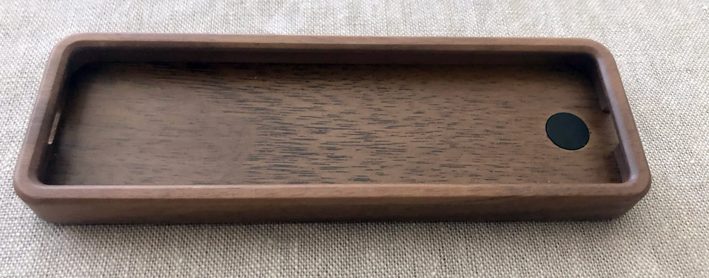
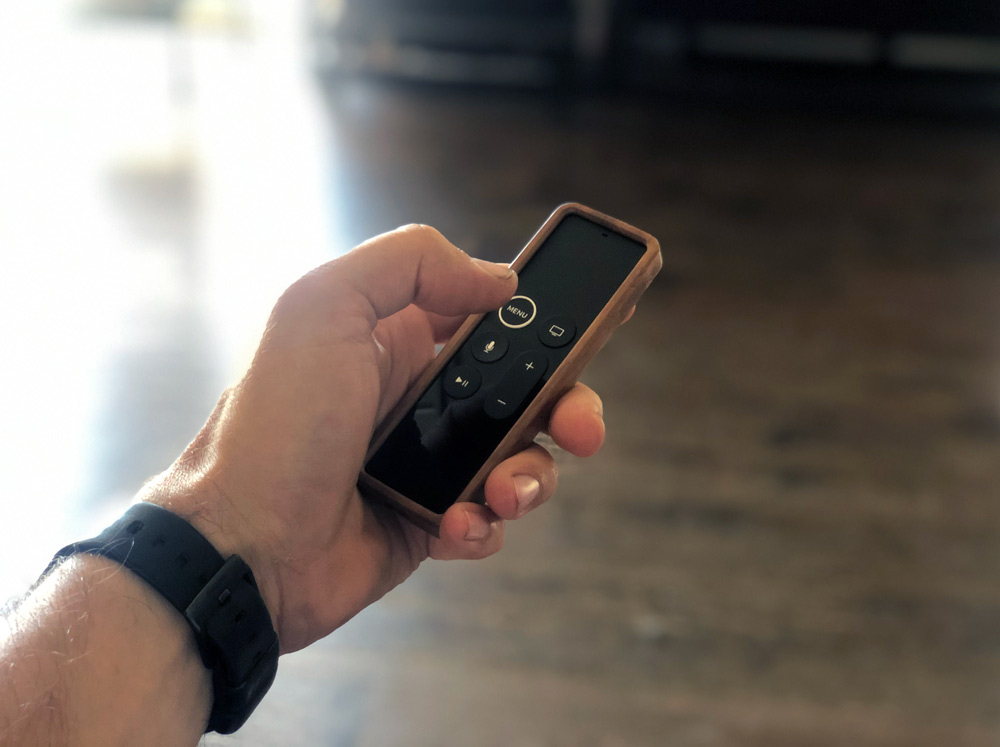
A recessed frame allows the remote to nestle into place with a cut-out windows for the IR blaster at the front and the lightning charging port at the bottom. The back is perfectly flat with a machined edge that slides into grooves along the inside edges of the frame and closes completely flush. The Flösku logo is recessed into the back panel very tastefully.

Flösku added a neodymium magnet in the back panel for attaching the remote to metal objects nearby.  You’ll notice the installed remote will now have a walnut lip around the top surface, but you’ll still have full access to all the remote’s controls.

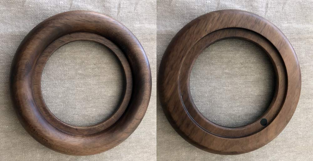
The Halo Stand is a remarkably clean and elegant donut shape (yes, there are elegant donuts out there) with a rounded surface that faces up toward the Homepod and a flat side for resting against your table.

Flösku added a small round sticker just to help easily identify which side is down as the two sides are pretty similar in profile.

Setup

Remote: Slide the back from the case towards the end where you can see there are two parts to the case. When removed, gently place your Apple TV remote face down into the frame with the charging port on the open end.

It’s a precision fit, so you may need to push the remote around the edges to seat it evenly. When done, slide the back panel back into the case from the charging end.

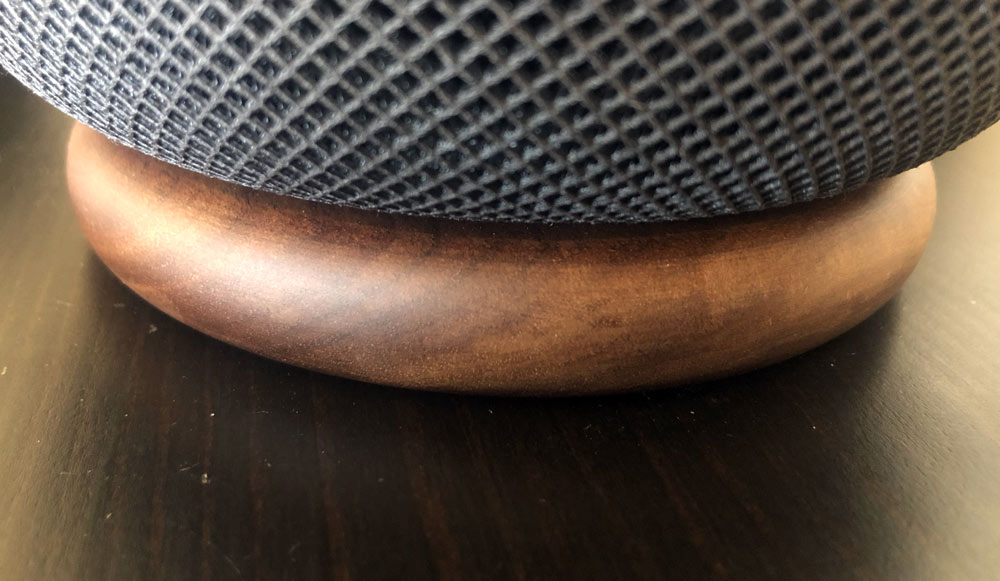
Halo: Place the stand flat side down and then place your Homepod on top making sure that its foot sits inside the top surface of the Halo.

Performance

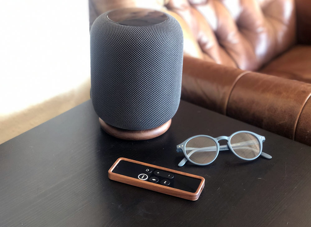
When the Homepod originally launched it wasn’t too long after that there was rumbling on the interwebs of the elastomeric foot leaving discolored rings in the surfaces of wooden furniture. I didn’t experience that issue myself, but can tell you that the Halo would definitely prevent that from occurring since you’ll now have a wood-to-wood relationship. Additionally, I prefer the look of the Homepod with the Halo underneath. We have a large selection of dark woods around our house and it fits right in.

There’s no further adjustments or interactions required, unless you’re moving your Homepod from room to room for some reason, so performance critique is really deciding if anything has changed with Homepod use. I haven’t noticed any issues with the stand affecting Homepod’s sound for one. I was originally concerned that foregoing the soft rubbery foot might lead to some vibration or other rattle. Nothing of the kind presented itself. No issues either when it comes to moving the Homepod when dusting. If anything, it’s actually easier as I can slide it out of the way and back again without having to upend the Homepod and clean the rubber foot.

As for the remote, there’s a little more performance to consider looking at the case as it’s now in your hand constantly.

The walnut just feels great to hold. It’s warm and smooth and the raised perimeter allows you to hold it without accidentally  hitting the touchpad area until you’re ready to actually do so.

The IR blaster at the front of the remote lines up with the hole beautifully, as does the charging port with enough clearance for lightning connectors with overmolds larger than Apple’s own cables. The remote doesn’t need to be charged often, but it’s certainly nice to not need to remove the case for charging.

The magnet feature in the case doesn’t offer much functionality, as it’s not strong enough to hang the remote on any surfaces and doesn’t seem to aid keeping the back cover in place either. It could provide some stability if your side table is metal, but even that’s a stretch.

What I like

  • Warm walnut color and feel
  • Quality precision build
  • Compliments the Apple products they’re for
  • Remote case can stay on for charging

What I’d change

  • Remove the magnet on the Remote Case (no benefit)
  • Offer more wood and color options on both products

Final thoughts

Making accessories for accessories can be really hard for many different reasons. Flösku has found a way to create a family of products that are beautiful, compliment each other and enhance functionality (or at a minimum without impeding it). If you’ve got some of the aforementioned Apple accessories and like natural materials, these are worth a look.

Price: $43.81 – Flösku Remote Case for Apple TV, Walnut | $50.08 – Flösku Halo Stand for Apple Homepod, Walnut
Where to buy: Flösku
Source: The sample of this product was provided by Flösku.

Filed in categories: Reviews

Tagged:

Flösku Remote Case and Halo Apple Homepod stand review originally appeared on The Gadgeteer on July 12, 2019 at 10:00 am.

Note: If you are subscribed to this feed through FeedBurner, please switch to our native feed URL http://the-gadgeteer.com/feed/ in order to ensure continuous delivery.
Underwater Audio Swimbuds MP3 review

REVIEW – Earbuds that can withstand sweat and weather are getting pretty common on the market, but what about waterproof sources for that sound you’re listening to? I was recently sent a set of waterproof earbuds with a built-in MP3 player designed for swimming. Is such a thing possible? I took the plunge to test the Swimbuds MP3 from Underwater Audio to find out. Let’s dive in, shall we?

What is it?

Earbuds and a built-in MP3 player designed to work while swimming.

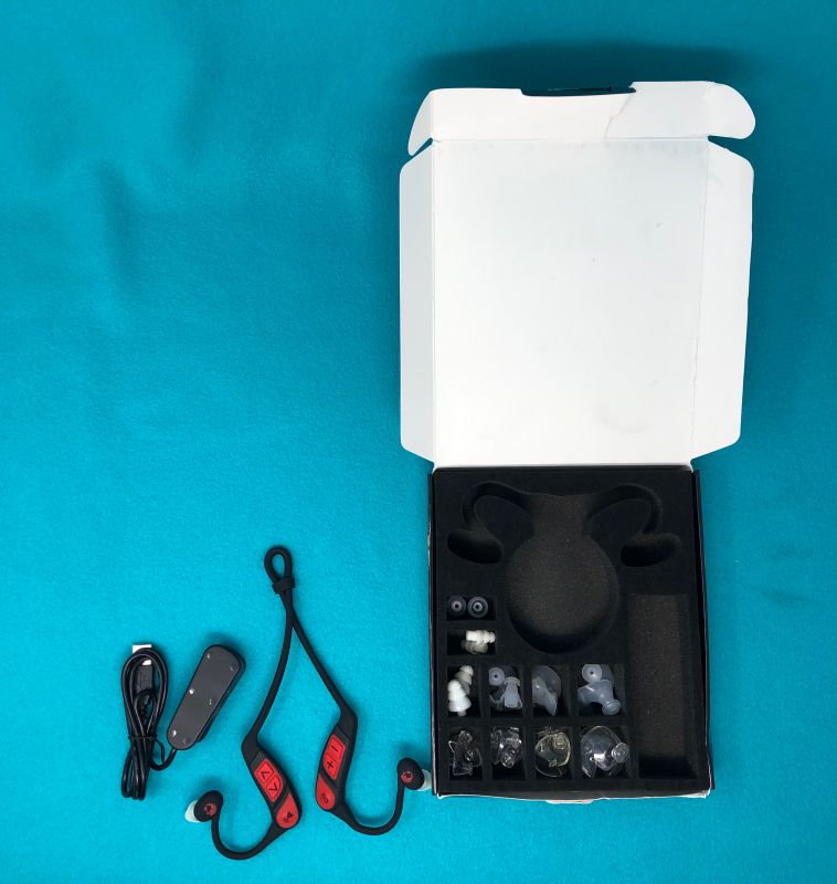
What’s in the box?

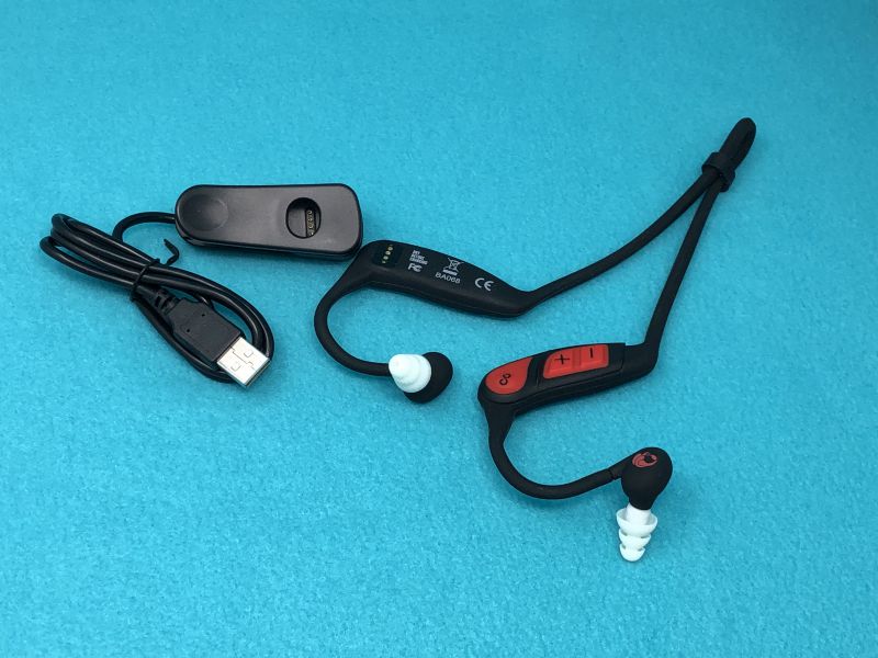
  • The actual headpiece
  • USB charger for unit
  • 11 pairs of ear tips
  • instruction sheet

Hardware specs

  • All-in-one MP3 player and headphone
  • 8GB of storage (up to 2,000 songs)
  • Impermeable to 10 feet (3 meters)
  • 7 hours of playback time
  • 4 styles of earbuds with various sizes so you can find the fit that works for you

Design and features

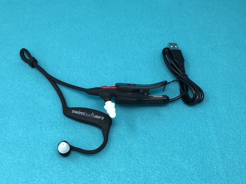
The big question with a waterproof electronic device is “How are you going to power this while keeping it sealed?” For this unit, it’s an external USB-equipped clip that holds the main unit’s charging touch-points against a matched set of pogo-pins in the charger. It’s a very tight fit, and there’s an opening in the clip so you can see the LEDs that give you indicators of the charge and power conditions.

Setup

Setup is fairly straightforward. The unit will read .mp3 files only, and they are just placed in the root of the device, just like you’re loading a thumb drive. No folders, no syncing, no frills: just dump them in, and they’re available.
This brings up one of the irritating things – .mp3 files. I never use this old format anymore. To create a bunch of files to listen to, I had to convert the desired files to the format needed, and then delete the old version to avoid having duplicates. Plus, there’s no good way to organize the order the songs would play in.

Performance

I did have a bit of trouble at the start. The unit would not show up on my Mac, which is a brand new Mac mini running MacOS Mojave 10.14.5. The USB port would charge it, but it never showed up alongside the other discs that are attached. I sent an email to the support line, and after they finally got the message that I know how to attach and clip it into the holder and it’s an issue with the unit, they walked me through a hard reset, which was as simple as holding down the power button for 10 seconds. Once it reset, it never gave me a moment’s problem. (Note to support: I’d put hard reset at step one or two, not step 5. And maybe assume folks can figure out how to connect the clip after they tell you the first time that it’s charging.)

Wearing the unit while swimming laps at my wife’s gym was trouble free. I’m not big on laps, but having music to encourage me along made the time seem to pass more quickly. The raised controls for stop, start, volume up/down, or skip/replay are easy to use because the buttons are raised. One side controls volume, the other controls playback/rewind. Easy-peasy.

With a large number of ear tips included, I was able to have my ears sealed off from water, but full of my music. Much more fun than just listening to my labored breathing.

What I like

  • Simple content loading
  • Many various ear-tips
  • Raised controls make adjustments easy

What I’d change

  • Playlists would be nice
  • .mp3 file format is very limiting

Final thoughts

Swimming has been the most enjoyable exercise I’ve ever done. It’s time-consuming and monotonous, however, which makes it boring. Having music or an audiobook to keep your mind occupied while your body does what it needs to do really makes it a better experience. I’m going to try and do more laps, and I’m depending on the Swimbuds to carry me through. They were great to use during testing, and I recommend them to anyone needing a workout soundtrack.

Price: $80.00
Where to buy: Underwateraudio.com
Source: The sample of this product was provided by Underwater Audio.

Filed in categories: Reviews

Tagged: ,

Underwater Audio Swimbuds MP3 review originally appeared on The Gadgeteer on July 12, 2019 at 9:00 am.

Note: If you are subscribed to this feed through FeedBurner, please switch to our native feed URL http://the-gadgeteer.com/feed/ in order to ensure continuous delivery.
Uten Barbecue Charcoal Grill review

REVIEW – Take your charcoal grill on the road! This week we’re checking out the Uten Barbecue Charcoal Grill, It’s a lightweight & portable design made for transporting to the campsite, the beach, or the park. How does it hold up to the testing? To the review!

What is it?

It’s an open-styule portable charcoal grill.

What’s in the box?

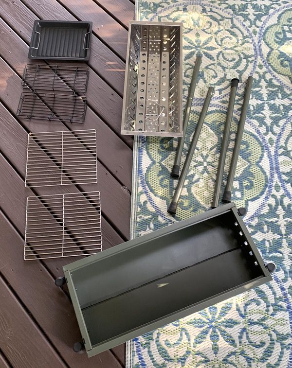
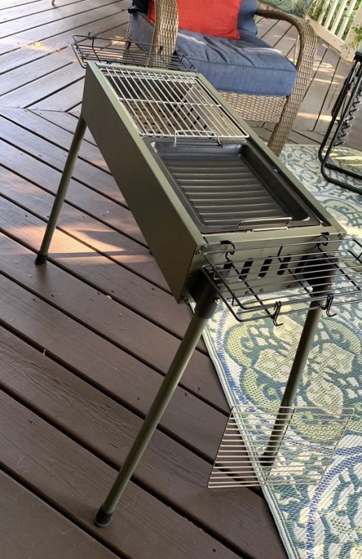
You’ll get the grill with a full-length charcoal basket, 2 grill grates, 1 griddle plate, 2 removable side baskets, and 4 detachable legs.

Hardware specs

  • Dual vent design
  • 14.65 pounds
  • 31.6” by 12.6” by 27” tall fully assembled

Design and features

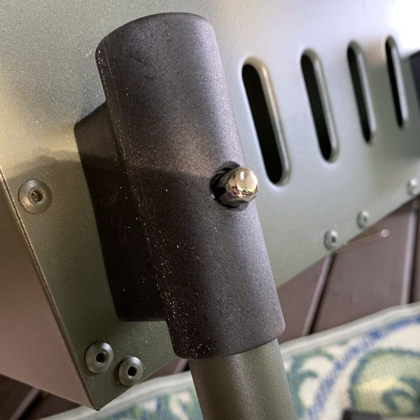
The Uten Barbecue Charcoal Grill is a lightweight portable cooker. Weighing in at just under 15 pounds with detachable legs, the 31.6″ by 12.6″ by 6″ footprint (with the legs removed) is very packing friendly. You con’t find any assembly instructions, but you won’t need them. There are 10 total parts to the unit. You have 4 legs that use spring-tabs to pop into the leg brackets on each corner of the fire box:

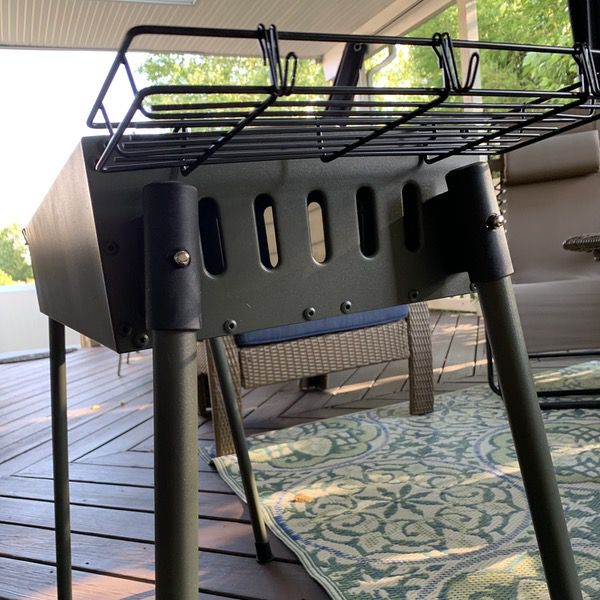
A pair of wire side baskets hook into each side of the grill: 

Drop the aluminum charcoal tray into the fire box, and add your grill grates and/or griddle tray, and you’re in business. With about 2 minutes of work you’ll have almost 400 square inches of cooking area to work with. I’m estimating that to handle 8-10 burger patties, 8 decent sized boneless chicken breasts, or a whole heap of hot dogs.

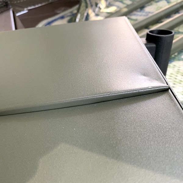
There are some quality issues that come with grills on the cheaper end of the scale, and you’ll find them here. The shot below is from the underside of the firebox, which has a two-part floor. See how the two floor components don’t line up? It doesn’t impact performance, but it’s a bad bit of quality control.

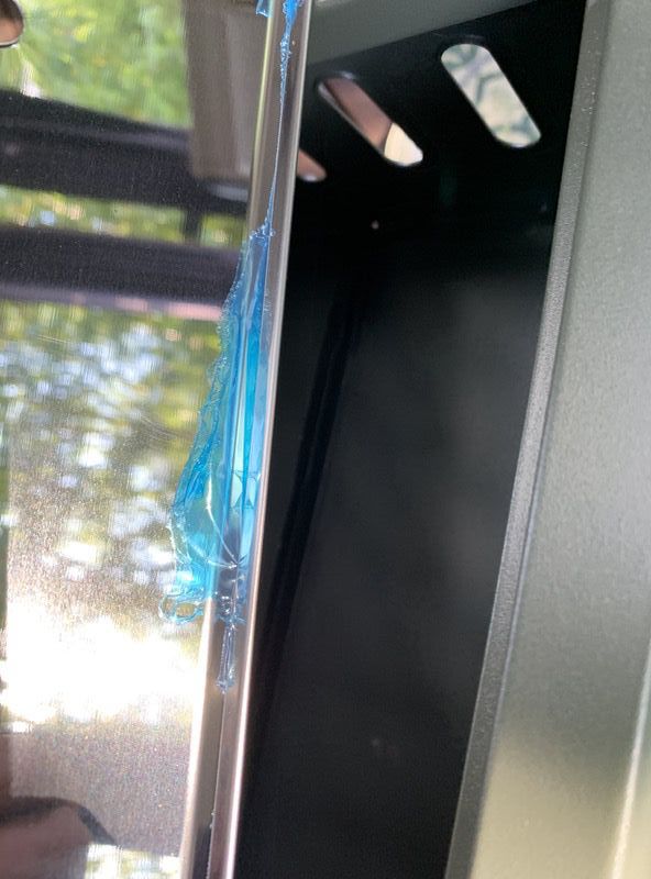
Here’s another weird bit. The charcoal tray was covered with a blue film to protect it during shipping. It looks like that film was put on before finishing the seams of the tray, so you can’t completely peel it off. I got most of it with a knife, but had to burn the rest off before the first cook.

Despite those issues, it looks like a fairly solid camp grill. Let’s fire it up and see what happens!

Performance

So we moved the grill down to the patio to get cooking. Even though it’s a lightweight build, it’s surprisingly stable when set up. Those legs brackets with the spring post locking mechanisms are tight, and the legs are splayed slightly to add a bit of extra stability. Rubber feet on the bottom of the legs provide a bit of extra grip, too. I wouldn’t want the kiddos or pets running around it, but it’s stable enough for safe use on unstable surfaces like grass, sand & dirt.

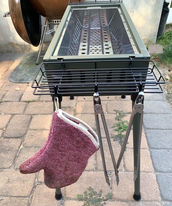
The side baskets are useful for holding your assorted accessories, and the inclusion of two baskets is a nice touch. I really like that there are 6 hooks (3 on each side) for hanging tools and gloves.

We fired up a chimney of lump charcoal for purposes of our test. For those that don’t know, lump charcoal burns hotter and faster than composite briquettes. Our chimney gave us a thin layer of charcoal across the length of the fire basket.

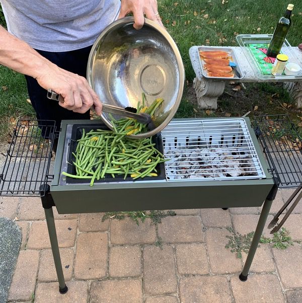
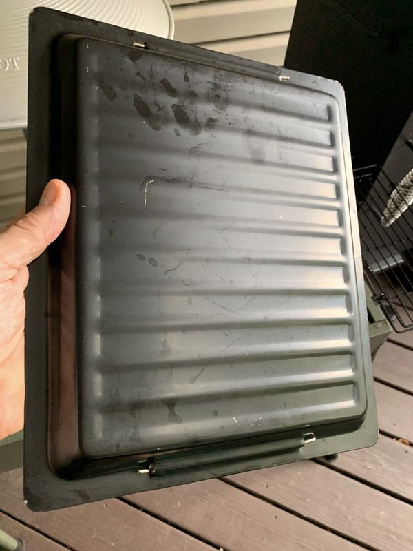
For this cook we’re using the griddle to saute up some green beans & peppers marinated in olive oil, melted butter, and garlic. The griddle is firmly nestled in the firebox, so it’s not prone to slipping around during use. It’s also got a nice thickness to it, so it distributes the heat evenly. Note that the griddle does have ridges, so it’s not ideal for frying eggs or pancakes.

We grilled some chicken breasts dry-rubbed with a blackening spice on direct heat using the grill grates. The grill grates are aluminum, and typical of what you see in lower cost grills with respect to thickness. I think they’ll hold up just fine with proper care. They don’t lock in tightly like the griddle does, however, so you’ll want to be careful moving your food around, or the grill grate could slide on you a bit. I’d probably want to figure out a modification to fix this for long-term safety.

We finished things off with some toasted garlic bread over the coals, switching out the griddle for the other grill grate.

Here’s the finished product. While I only used one chimney of charcoal, the grill has nice venting on the sides to help maintain heat. The griddle side was plenty hot enough to provide a steady saute for 15-20 minutes to let the beans cook through without burning. We got good grill marks on the chicken on a relatively slow cook as well.

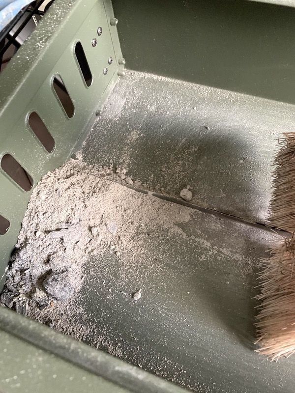
Once cooking was done, we took a look at how the grill held up. Cleaning is a problem because that two-piece bottom creates a big seam down the middle. I was able to get to a lot of it with my brush, but there’s no port to catch ashes. You’ll need to turn it over to get all the corners cleaned. The lack of a trap for collected grease (like what you’ll find when you do burgers) is also an issue. If the coals don’t catch it, it will be difficult to clean.

The charcoal insert is showing some discoloration after one grill session, but held up pretty good to one chimney of coals.

And the griddle held up surprisingly well. Not a burn mark or discoloration to be found.

Overall I am pretty happy with the Uten Barbecue Charcoal Grill as a light duty, occasional use grill. If you’re looking for something you can toss in the car for a weekend adventure I think you’ll find this be a great solution. But we do need to talk about the fact that it’s not designed for heavy use.

All of the materials in the build are relatively thin, and there’s no buffer between the charcoal chamber and the sidewalls. I’ve seen some reviews pointing to the paint on the firebox flaking off, as well as corrosion and warping. One particular review reported an incident where the leg brackets actually melted. Given their positioning next to the side vents, I could absolutely see this happening if you completely loaded the firebox end-to-end with charcoal. That would also make the side baskets unusable as well due to the intense heat.

It’s a light-duty cooker, and won’t take the intense heat. If you fill the thing with coals soaked with lighter fluid, you’ll kill it pretty quickly (you’re not using lighter fluid to light your grill anyway, right?). But if you’re putting a chimney or two in there and loading your coals with space for the vents, I think it will last a couple of seasons with care.

What I like

  • Easy to assemble
  • Stable
  • Nice baskets & hooks for accessories
  • Good for light duty use

What I’d change

  • Construction quality has some flaws
  • Grill grates can slide around a bit
  • Difficult to clean ashes & grease out of the firebox without a trap
  • Lightweight design will not hold up to heavy heat or extended use

Final thoughts

For an occasional use outdoor grill, the Uten Barbecue Charcoal Grill is a fine solution. It’s got decent cooking area, and some nice features with side baskets and hooks that benefit you when you’re at a location where table space is at a premium. The legs are well planted and stable for use on rough surfaces, too. Just keep in mind that the construction is lightweight and not designed for high heat or regular use like a backyard grill.

Price: $65.99
Where to buy: But it on Amazon.
Source: The sample of this product was provided by Uten.

Filed in categories: Reviews

Tagged: , ,

Uten Barbecue Charcoal Grill review originally appeared on The Gadgeteer on July 11, 2019 at 1:28 pm.

Note: If you are subscribed to this feed through FeedBurner, please switch to our native feed URL http://the-gadgeteer.com/feed/ in order to ensure continuous delivery.