ChargeTech ThinCharge iPhone Battery Case review

We’ve all been there. You’ve been running around all day in a virtual whirlwind of activity, using your phone nonstop to take photos, chat, check your bank balance, check off a shopping list item, when suddenly it hits you. That red battery indicator. “How could I be at 10% already?!” you think to yourself as you quickly pocket your phone to conserve what little juice you have, just in case a real emergency pops up. A cold wave rushes over you as you realize you don’t have a charging cable or extra battery.

Fortunately, ChargeTech is aiming to take the dread out of scenarios like this with their updated ThinCharge Battery Case, combining a protective, one-piece body with a plentiful battery to create the thinnest unibody battery case on the market.

Fit and Feel

The case itself looks and feels like a fairly standard case. It’s matte black and unassuming, and that’s a good thing. One wouldn’t even know that there is a battery inside other than the fact that it weighs nearly half a pound (0.42lb)! The case is only 0.49″ thick, which, compared to the 0.28″ regular thickness of the iPhone, is basically like a regular protective case.

It’s certainly got some heft, but it’s not much bigger than a regular rubber case.

It surprises me every time I pick up my phone just how much heavier it is. I have a rubber case that is almost as large as this one without a battery in it, and that’s really saying something. Most of the case is rubber, save for the plastic back where the batter is integrated. On the bottom is a small power button, lightning port and a row of 4 LEDs that indicate the battery level of the case. It really is quite thin compared to what you’d expect.

The power button is really small. Like the size of the head of a straight pin. And it protrudes from the bottom of the case a bit, right on the curve of the edge, like a piece of the case that didn’t get sanded down. I’m not sure what else could be done, but I’m not a fan of that little button. It scrapes against my finger almost every time I pick up my phone. Also, it’s pretty tough to press in… I had to do so with my thumbnail.
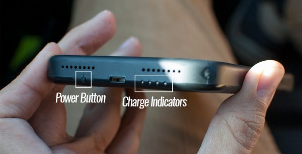
That rough little power button.

The case was easy to install, a simple matter of bending the top back a bit and fitting the phone onto the lightning stem on the bottom. There is a suede lining on the inside to protect the back of the phone while installing it. It’s a nice, snug fit.
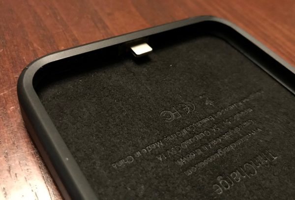
It’s convenient that you don’t need anything extra… the case and phone charge simultaneously through the single lightning port on the bottom, though I think most battery cases work this way. This is the thinnest one I’ve seen, though, the only detriment I’ve noticed would be a bit of extra weight.

Overall, I’d say the construction of the case is fair. You can clearly see where the rubber meets the plastic of the battery and there are some minor blemishes where the seams are, but it’s nothing too worrisome.

Battery Capacity

The battery in the 7+ case sports a 3600mAh capacity. Compared with the 2900mAh battery in an iPhone 7+, one could conceivably completely recharge the phone’s battery 1.25 times. Considering the battery in my 7+ has very rarely been in the 10% red zone at the end of the day, I could go quite some time without having to reach for a charge cable.

That almost begs the question of if I even need to carry an external battery or battery case, considering how good the 7+ battery life is. Most days, that’s a no. But I’ve definitely been in some instances where it would have been nice to have some extra juice… out backpacking, at a concert or amusement park, anytime where I’ll be away from home until very late and didn’t think to charge my phone midday.
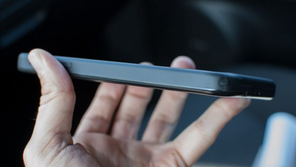
All the juice you need in one package.

The battery in the phone case acts like an external battery that’s always attached and connected to the phone, but only begins to charge the phone when you press in the power button for a few seconds to turn it on. You’ll see the LED indicators turn on, and your phone’s charging icon should turn on as well. Then, it merely acts as if your phone was attached to an external battery.

This differs a bit from Apple’s own charging case, which, since it’s imbued with special Apple magic, uses its own battery power first then automatically switches over to using the phone’s battery. No buttons needed. This case, and probably most others out there, require you to manually turn on the juice.
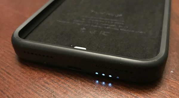
The indicator charge is nice, but sure is bright in a dark room.

I decided to do some tests on the battery and how much and how quickly it charged…

Test Run #1

30% phone battery level at 6:45pm. Switched on the case charge button with 100% charge on the case battery. At 9:24 it was back up to 92% and the case batter was flashing 1 LED. I was also actively using my phone for an hour of that time alternating between Safari and Ulysses, writing an article.

Test Run #2

I didn’t use the cable to charge my phone overnight but rather used the case. Phone was at 50% by the time I got home and I had it back up to 100% by the end of the night. So I left it off the cable downstairs. It was liberating to have that option instead of always have to account for if my phone was on a cable or not at the end of the evening.

Once the power is on, it does automatically turn itself off when the phone’s battery hits 100%, saving any remaining power. I noticed no heat coming off the battery while charging or discharging. It worked fairly seamlessly, once I got into the habit of remembering to turn it on.

It’s worth noting that the case’s battery percentage does not appear in the battery widget on the phone, but that seems like a function that’s only suited to Apple products, like the pencil and some M1 enabled Bluetooth headphones.
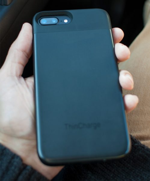
You can get a sense of the thickness of the back with this shot, how much it protrudes from the camera.

Weird Thing #1

I plugged in the phone all night and it didn’t seem to charge up the case battery at all. The phone was charged. Maybe I forgot to turn off the case and it was charging the case while the case was charging the phone, so it sort of canceled out the case charging.

Weird Thing #2

I plugged my phone into the charger at home and it didn’t recognize as charging. Restarted my phone and it started working just fine, so it must have just been a strange fluke with the OS and recognizing the cable.

Weird Thing #3

When a charging port is hooked up to the case, the indicator lights glow. And blink. Brightly. Since I charge my phone next to my bed on a nightstand, it illuminates the entire wall with a pulsating light while charging at night and I’ve had to flip the phone around so the bottom faces a different vertical surface.

Verdict

Overall, I liked the ThinCharge case, and will probably keep using it as my main iPhone case. Now that I’m used to the extra weight and girth and know how to work with the case, it’s really come in handy during those times when I didn’t want to hunt down a cable. It’s usefulness outstrips the relatively minor quibbles I could find.

You can order the ThinCharge iPhone case from ChargeTech’s website. The iPhone 7 case is $60 while the 7+ case will run you $70.

Source: The sample for this review was provided by ChargeTech. Please visit their site for more info and to see their other products.


Product Information

Price: $70
Manufacturer: ChargeTech
Pros:
  • – Very thin for a battery case
  • – One charging port for both phone and case
  • – Sturdy and protective construction
Cons:
  • – Case has some rough edges where the sections meet
  • – That tiny yet obtrusive power button
  • – Bright charging LEDs, but cannot be turned off

Filed in categories: Reviews

Tagged: ,

ChargeTech ThinCharge iPhone Battery Case review originally appeared on The Gadgeteer on November 16, 2017 at 10:00 am.

Note: If you are subscribed to this feed through FeedBurner, please switch to our native feed URL http://the-gadgeteer.com/feed/ in order to ensure continuous delivery.

BeatsX earphones, Wemo Wi-Fi switch, igloohome deadbolt, and more – Review updates

We have another batch of review updates for you today that include a couple headphone review updates, a couple home automation product review updates, and more. Find out how these reviews are still performing AFTER we posted the review. Click through to see the list of recently updated reviews and then scroll to the bottom of each review to read the updates.

This Is Ground Mod Mobile 2 review by Jacob Haas

BeatsX Wireless Earphones review by Jacob Haas

Wemo Wi-Fi Smart Dimmer Light Switch review by Dave Moore

igloohome Deadbolt 02 Digital smart Lock review by Dave Moore

Aukey EP-B39 neckband wireless Bluetooth headphones review by Dave Moore

Filed in categories: Reviews

Tagged:

BeatsX earphones, Wemo Wi-Fi switch, igloohome deadbolt, and more – Review updates originally appeared on The Gadgeteer on November 16, 2017 at 9:00 am.

Note: If you are subscribed to this feed through FeedBurner, please switch to our native feed URL http://the-gadgeteer.com/feed/ in order to ensure continuous delivery.
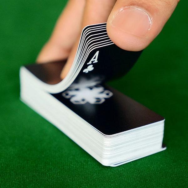
Playing cards for your EDC

Air Deck is a set of playing cards that have been created with travelers in mind. The 3.43 x 1.26 inch deck of cards is around half the size of a traditional deck of cards and is made of waterproof PVC so you don’t have to worry about spilling a beverage on them during a heated match of Slap Jack. 

The cards are designed to last for years of card game fun and are tear, scratch, and bend resistant. They are sized just right for a quick game of Rummy on an airplane tray table, or a game of Euchre on the beach.

Air Deck was a successfully funded Kickstarter crowdfunding campaign and now these casino quality cards are available to everyone. You can read more about them and order a pack for $10.71 from Amazon.

Filed in categories: Reviews

Tagged:

Playing cards for your EDC originally appeared on The Gadgeteer on November 16, 2017 at 8:00 am.

Note: If you are subscribed to this feed through FeedBurner, please switch to our native feed URL http://the-gadgeteer.com/feed/ in order to ensure continuous delivery.

SoundWhiz SymphoniQ Hybrid Over-Ear Bluetooth Headphones review

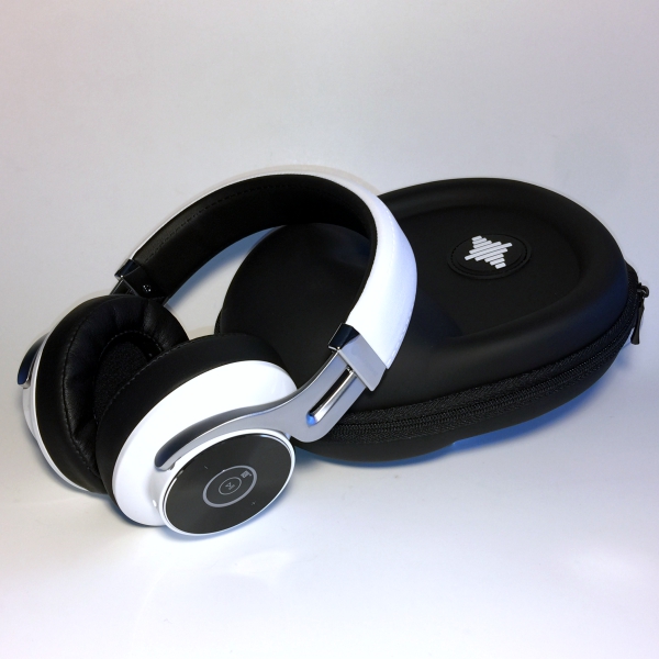
There are a lot of different styles of Bluetooth headphones on the market today. On-the-ear, over-the-ear, and in-ear are the most common. Personally, I own a pair of on-the-ear Sports headphones that I use when I go to the gym or walk my dog. I even have a pair of earbuds that I only use when cutting my grass. One thing I don’t own is a pair of high-quality headphones that I can use solely for the purpose of relaxing and just listening to music. The Soundwhiz SymphoniQ Bluetooth headphones are exactly that and I was fortunate enough to get my hands on a pair to review for the Gadgeteer.

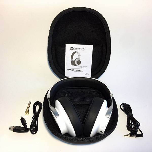
In the Box

  • SymphoniQ Bluetooth Headphones
  • Hard Shell carrying case
  • Micro USB charging cable
  • Audio cable
  • 3mm to 5mm jack converter

Technical Specs

  • Bluetooth Version: 4.1 with APT-X
  • Noise Cancellation: CVC6
  • Pairing: Normal or NFC
  • Play Time: Up to 20Hrs
  • Talk Time: Up to 18Hrs
  • Standby: Up to 6000Hrs
  • Speaker: 40mm Dynamic Driver
  • Frequency: 10Hz – 20KHz

The first thing that appealed to me about these headphones was their striking design.

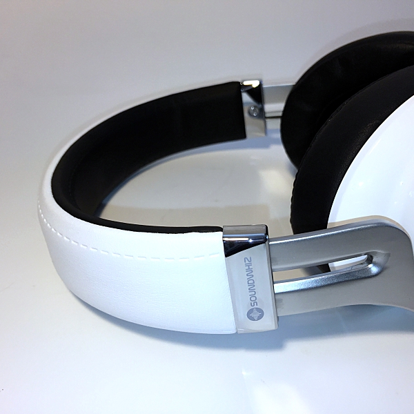
The clean Arctic white with black accents and just a touch of chrome gives them a real modern, edgy appearance. The SymphoniQ has build quality you can FEEL. The earcups are made of metal with soft leather covered memory foam ear cushions.

No cheap plastic here.

The adjustable headband is strong & flexible and has just enough spring to hug your ears for a stable fit without being over tight. I found them to be a little tight in the beginning but after wearing them for a few days they broke in nicely.

SoundWhiz even includes a nice executive looking hard-shell carrying case.

The headphones come with a built-in 480 mAh rechargeable battery. Charging the SymphoniQ is done using a Micro USB charging cable plugged into any standard USB port such as a phone adaptor or PC. SoundWhiz recommends charging the headset for 3 hours prior to first use. Once charged the headphones have an impressive 20 hours of playback time and up to 600 hours of standby time.

Pairing the headphones with your favorite Bluetooth device is easy.

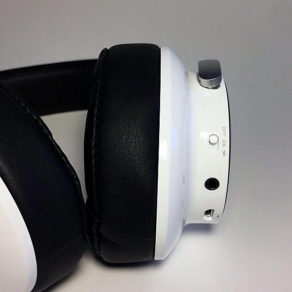
Simple slide the on/off switch (located on the right ear cup) to the Bluetooth icon and hold for 2 seconds. The LED indicator light (located on the side of the right ear cup) will flash red and blue. Open your devices Bluetooth setting and select ‘SoundWhiz SymphoniQ’. Once connected the blue LED indicator light will flash twice every 4 seconds.

There is even friendly voice prompts that will tell you when the headphones are powered on or off, pairing, connected or disconnected.

The SymphoniQ also automatically connect to the last paired device when you turn them on. To reconnect with a paired device in standby mode, short press the Multi-Function button to find paired devices in range.

If you have an Android device you can connect using NFC. Make sure your Android devices NFC is enabled and hold it next to the headphones Multi-Function-Button. The connection should occur automatically within a few seconds. 

The SymphoniQ also has Dual-Pairing which allows you to connect two Bluetooth devices simultaneously. If the headphones battery is low, or if you prefer a wired connection you can use the provided audio cable.

SoundWhiz even throws in a 5mm jack converter so you can plug into a stereo system, amp, or musical instrument.

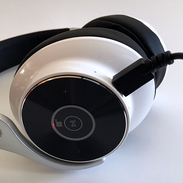
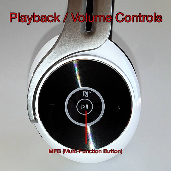
 The headphones controls are located on the side of the right ear cup. During music playback, you can control volume, play and pause music, and next or previous track.

The large disc design of the controls makes them easy to use; no more fumbling for buttons.

Playing and pausing music is done using the headphones MFB (Multi-Function Button). A short press of the MFB will play and pause music playback. A short press of the (+) and (-) icons will raise and lower volume respectively. To play next track press and hold the (+) icon, do the same to the (-) icon to play previous track. 

 A built-in HD mic with CVC6 noise cancellation allows for crystal clear phone calls even when you’re somewhere with a lot of ambient noise. To answer an incoming call short press the MFB, another short press will end the call.  A short double press of the MFB will automatically redial the last number. You can even manage 2 simultaneous calls using just your headset.

The SymphoniQ headphones feature an innovative hybrid semi-open back ear cup design.

To be honest, before I reviewed the SymphoniQ headphones I had no idea what an open back headphone was. What I learned is that there are generally two types of over-the-ear headphones, closed-back, and open-back.

Closed-back headphones are what most of us are familiar with. They basically isolate you from the outside world. It’s just you and your music. Open-back headphones usually have a grill on the back of the ear cups allowing music to escape outward. Doing this provides a significantly larger soundstage, it’s like listening to music in a room as opposed to it being beamed into your head. 

On the SymphoniQ instead of a grill SoundWhiz designed the ear cups so that sound could escape outwards and the face plates are more acoustically transparent and not hermetically sealed, therefore, allowing sound to escape out.

This would explain why these headphones sounded so different to me when I first put them on. Indeed the music sounded more spacious and detailed. Definitely, a different listening experience then what I was used to. 

These headphones produce a really rich sound, with a deep resonant bass and crystal clear mids and highs. Even though the bass really pumps it doesn’t bleed over to other parts of the music, it’s still controlled and detailed.

Vocals remain clean and the treble is clear and bright, so things like snares and high-hats pop out very nicely. All and all these headphones work wonderfully for listening to any kind of audio genre. From classical and rock to hip-hop and rap the SymphoniQ headphones handles them all beautifully.

I even use them to listen to my TV’s audio and they do a great job with both movies and sports.

Because these headphones are semi-open back you still get pretty good noise isolation. There is some sound bleed but overall they do a good job of keeping out most ambient noise.

The SoundWhiz Symphonic Bluetooth Headphones are the perfect combination of style, comfort, and sound. Priced at $74.99 these headphones SHOULD be at the top of every Holiday shopping list this Christmas.

Source: This sample was provided by SoundWhiz. Please visit their site for more info and Amazon to order.


Product Information

Price: $74.99
Manufacturer: SoundWhiz
Retailer: Amazon
Pros:
  • Stylish
  • Comfortable
  • Great sound quality

Filed in categories: Reviews

Tagged:

SoundWhiz SymphoniQ Hybrid Over-Ear Bluetooth Headphones review originally appeared on The Gadgeteer on November 15, 2017 at 4:04 pm.

Note: If you are subscribed to this feed through FeedBurner, please switch to our native feed URL http://the-gadgeteer.com/feed/ in order to ensure continuous delivery.

Action Method Notebooks review

Originally designed for creative professionals, the Action Method is a note-taking system that focuses on identifying the action steps you need to keep your projects moving forward. Behance, the creators of the Action Method, have also developed a full line of beautiful notebook products designed specifically to work with their system. For this review, we’re taking a look at both the Action Method and their fancy notebooks. How does it all work together? Let’s review! 

How does the Action Method work?

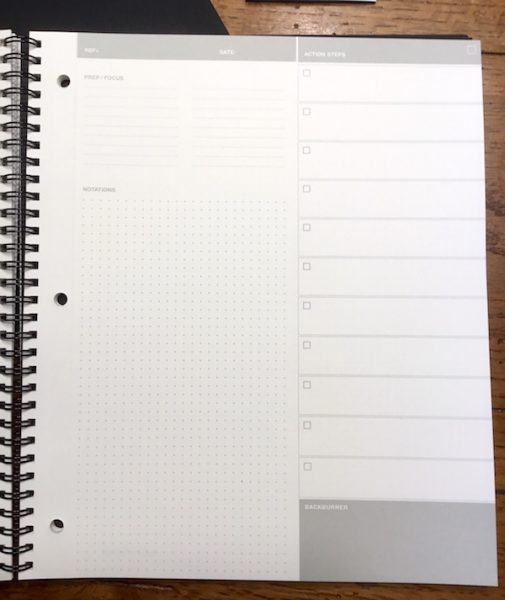
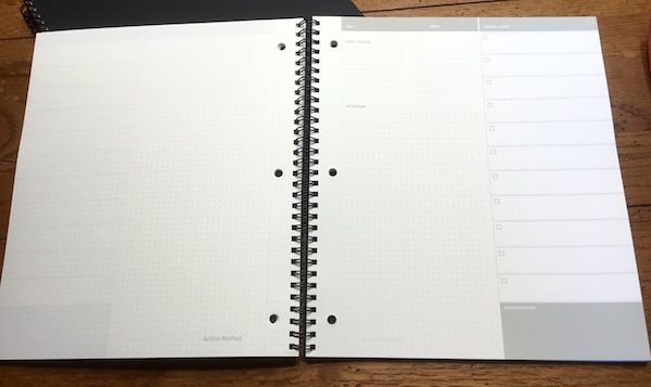
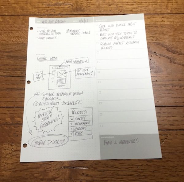
The Action Method is a template for your note taking, breaking the page into four distinct zones to keep your notes organized as you go.

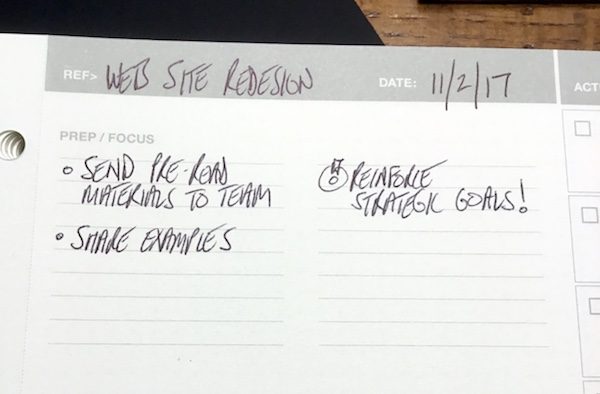
The “prep/focus” area is for pre-work setup including preparation activities and important focus areas for the upcoming session.

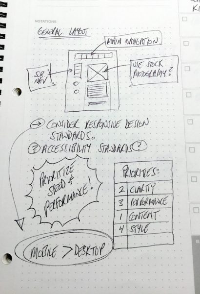
The “notations” area is for capturing your running notes, ideas, and sketches during the session.

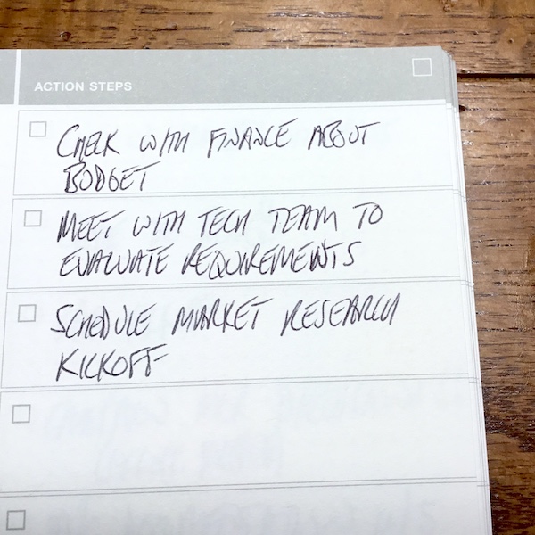
The “action steps” area is for capturing important tasks and activities to be completed after the session and includes checkbox areas to indicate when they are completed.

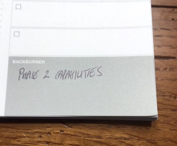
The “backburner” section to capture lower-priority items for future follow-up.

It’s a wonderfully simple and intuitive system. They key is the Action Steps action, which allows you to clearly identify and prioritize your critical next steps when your note taking session is completed.

Beautiful, functional notebooks

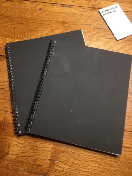
Featuring top-quality materials and beautifully minimalist design, the Action Method Notebooks are lovely to work with. They also integrate some clever features that promote their overall usability. I’ve got two different types of Action Method Notebooks for my review.

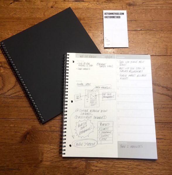
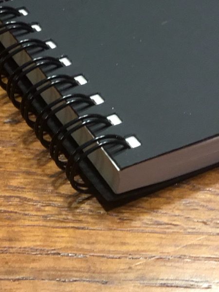
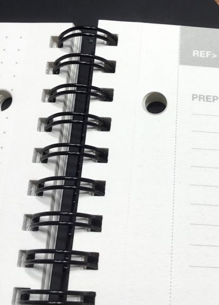
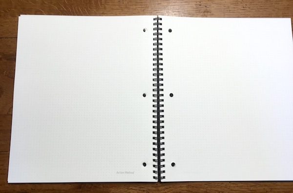
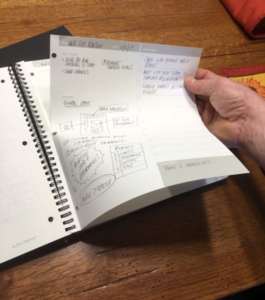
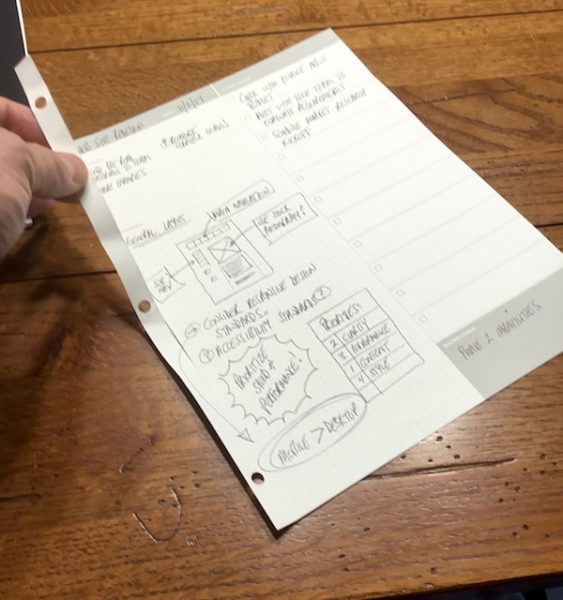
The Reduced Action Notebook variant I’m testing is designed with all the features of the Action Method system, but without the branding or color integration found in other products in the lineup. The cover material is a thick, semi-rigid material with a suede-like texture. The interior paper is a soft white 80-pound vellum that has a subtle texture and excellent hand feel. Bound with black double-spiral binding, each page also has two sets of perforations: separate the pages at the first perforation for loose pages, or at the second perforation to use the pre-drilled holes to add your notes to a three-ring binder.

On the Reduced Action Notebook, you’ll find each page is printed on the front face with the Action Method four-zone template in a neutral grey. The notation area features a dot-grid pattern to facilitate writing and drawing, and this pattern is also printed on the back of each page if you need more room for your observations and musings. In other notebooks in the product line, the action steps area is highlighted in solid blocks of bold color to stand out from the rest of the page. The Reduced Action Notebook uses the same layout but presents the action steps in simple framed boxes.

If you’re a designer, the Dot Grid book may be more to your liking. It’s the same style notebook, but the Action Method template is replaced with the dot grid pattern covering the front and back of all pages. This leaves the whole page open for sketching layouts with the grid pattern as a background guide. The Reduced Dot Grid Notebook I am testing also foregoes the external branding for simple, all-black cover. 

Speaking of which… the Action Method Notebook series sports a variety of notebook products to fit your needs. My notebooks are each 8.5” by 10.5”, but different sizes are available as well as hard-bound Moleskine-style journal books, loose notepads, and notepads that just feature the action step format (which you could pair with your Dot Grid notebook for a complete note-taking solution). You can check out all the variations on the Action Method web site.

Let’s take some notes!

You can take your notes on any old piece of paper, but there’s something special about incorporating beautifully crafted notebooks into your daily work life. When you combine that with a simple & elegant system for organizing yourself, the result is a wonderfully useful set of work tools.

If you are a fan of high-end notebooks, you’ll love the Action Method products. The material quality is on par with competitive products like Rhodia or Moleskine. The covers are durable, classy, and hold up well with continuous handling. The thick interior pages have beautiful texture with a great hand feel. The minimalist & elegant styling looks great when you pull it out of your bag for that big meeting. As a day-to-day notebook, they just feel good (and look good) to use.

The pages themselves are great for note taking. The soft white color is easy on the eyes, reducing eye strain. They also absorb inks wonderfully, reducing the smudges and smears that you sometimes get on cheaper papers. There’s no bleeding through to the back of the page. The grey printed templates and grid patterns are dark enough to read well but light enough that they don’t conflict with handmade scribbles (I tested blue and black inks for this). I tend to crawl all over the place when I take notes on a blank page, but I also don’t like the formality of ruled pages that makes me feel like I need to stay within the lines. The dot grid patterning for your note taking areas is a great solution. It’s excellent for sketching out designs, but also provides helpful guides to make your handwritten notes easier to read later.

I was pleasantly surprised by how intuitive & simple the Action Method is as a note taking system. I’ve tried a variety of note taking methods to organize myself (most recently the Bullet Method) and found that many systems put too much complexity into the task of sorting and organizing things for my tastes. I just don’t like to think that much. The Action Method, by breaking down your notes down into four simple categories, allows you to focus on your thoughts and not the process. It’s wonderfully liberating, especially for those of us who are creative types.

I typically oversee 10-15 different project work streams at a given time covering a broad range of creative, strategic and technical categories. I’m also moving constantly between projects as I interact with my different work teams. This can create a nightmare for keeping myself organized. The nice thing about the action method is that I can focus my thoughts and actions around specific work streams by dedicating a page to each project in my notebook. With easy reference to the action steps, I can quickly sort myself out and prioritize my next steps with a quick scan of the individual project pages. It’s really useful for keeping me focused.

When it comes to deep dive meetings (such as creative brainstorming activities or group workshops), the Action Method format really facilitates the output of those sessions. When there’s a lot of information flying about the room, you can quickly lose yourself in a sea of notes. With the Action Method, I can make sure that I pull the key action elements out of the content stream on-the-fly, with a clear set of post-meeting priorities to focus on.

Since I started this evaluation, I have had several people around the office ask me about my notebooks after seeing me use them in meetings. I’ve had numerous compliments on the simple format, the organization of to-do items, and the quality of the products. It speaks well to the attractiveness & effectiveness of the Action Method Notebooks… these aren’t the kind of thing that usually gets attention!

Considerations and caveats

Notebooks and note-taking systems are a deeply personal experience. We all have our own preferences and working styles. That being the case, the Action Method Notebooks may (or may not) be right for you.

Price is the first and most obvious consideration. I really enjoy the quality and feel of high-end notebooks, but they’re not for everyone. While Behance offers most of their products on their website for under $20, their shipping costs are rather high. The two notebooks I am testing cost $16 each, for example, but $10.25 for USPS priority shipping (the cheapest option available) brings the net cost up to $22 each. It looks like the price comes down the more you buy, but this is kind of a bummer. There are many alternative low-cost options out there is price point is a concern.

I’m a big fan of the Action Method, but it may be overly simplistic for some. It’s great for organizing the notes from a meeting or work session. If you’re accustomed to taking ongoing detailed notes throughout your day, however, you may get frustrated with this as a running note taking system. Detail-oriented project managers may also want more options for organizing your notes, subdividing action steps, etc.

I should point out that the covers are not coated in any way so the material will pick up scratches & soak up liquids. They do protect the interiors very well but expect some scars and marks along the way.

Conclusions and pricing

Maybe I’m old school, but I just can’t quit paper notes. And as a creative professional, I appreciate products that put an emphasis on style, elegance, and efficiency. If you’re looking for a new solution to organize your note taking that works intuitively and looks/feel great, I’d highly recommend the giving the Action Method Notebooks a try.

Behance offers a full range of products and accessories on their site that range from $5 to $20 including different style wire-bound notebooks, bound journals, pocket-sized books, pad styles, and more (see my notes above about shipping costs). Check them out at the Action Method web site.

Source: The sample for this review was provided by Behance. For more info visit their site and Amazon to order.


Product Information

Price: $5.00 and up
Manufacturer: Behance
Retailer: Amazon
Pros:
  • Beautifully crafted, high quality notebooks
  • Minimalist upscale design
  • Simple, intuitive note taking method
  • Nice range of accessories and add-ons to customize your note taking
Cons:
  • Can get expensive, especially with shipping
  • Cover material picks up smudges and scars

Filed in categories: Reviews

Tagged:

Action Method Notebooks review originally appeared on The Gadgeteer on November 15, 2017 at 11:07 am.

Note: If you are subscribed to this feed through FeedBurner, please switch to our native feed URL http://the-gadgeteer.com/feed/ in order to ensure continuous delivery.