ZTE Axon M Android smartphone review

Extended (tablet) mode

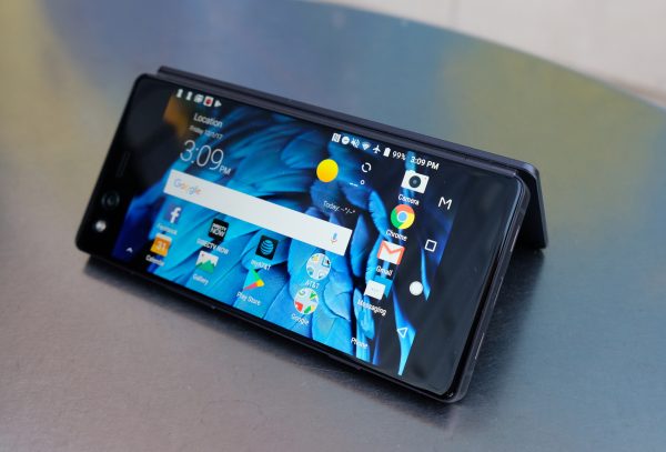
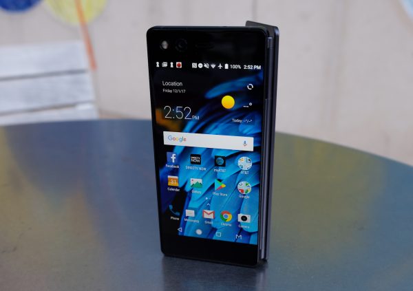
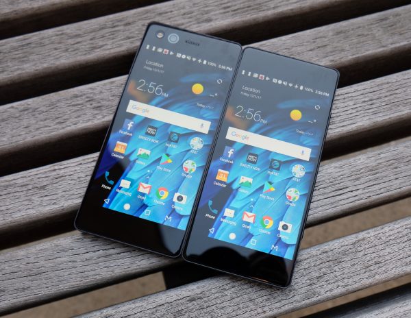
ZTE’s Axon M is one of the devices that threw us for a loop in 2017. The company managed to the be the first to come out with a foldable smartphone with two screens. A multitaskers dream, the displays on the Axon M are each a 5.2-inch 1080p IPS display. Together they combine to form a 6.75″ tablet-like display with a somewhat distracting seam running down the middle.
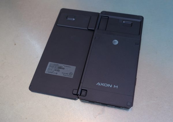
 Unsurprisingly, weighing 8.1 ounces and measuring 5.9 x 2.8 x 0.5 inches the ZTE Axon M is heavier and bulkier than your typical smartphone, but that’s the price you pay for getting 2 displays. Fortunately, it’s still somewhat pocket friendly. Because it has its hinge on the right side, it houses most of its buttons on the left side. Running along the left side of the device, ZTE has placed a fingerprint reader that doubles as a power button, a volume button, and a third somewhat programmable button. The programmable button lets you quickly launch TV mode which in turn lets you load the YouTube or DirecTV app. That said, we’d like to have the option to program that button with whatever app we choose.
But what is especially awkward in the design is the camera placement. The Axon M houses a single 20MP camera. Taking regular non-selfie photos with the camera is an awkward experience because you have to flip the phone around.  The camera itself takes ok photos. In daylight, the photos offer pretty accurate colors and visuals are pretty sharp. But the phone struggles with autofocus and in low light, photos tend to be noisy and often blurry, probably due to the lack of optical image stabilization.
The displays on the Axon M are not flagship level displays, but they are solid displays with sharp visuals and accurate colors, we just wish they could reach higher brightness levels. The bigger issue for some may be the seam running down the middle in Extended (tablet) mode. Personally, we adjusted to it after a few days and eventually forgot it was there. It’s not that different to the notch on the iPhone X, which is also distracting at first, but you’re able to adjust to it over time.

Dual Mode

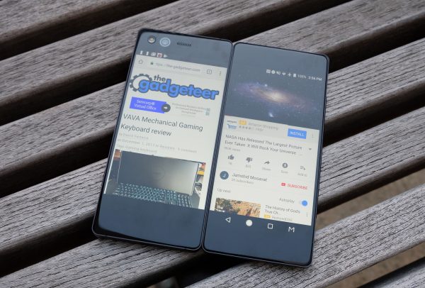
 Besides single screen mode, there is Mirror Mode, Extended Mode, and Dual (multitasking) mode. Mirror mode is useful for two people watching movies on either side or playing a game like Battleship. Extended mode takes a single app and extends it across the two displays. For example, that means you get double the real estate for your web browser or Facebook feed. Mirror mode is useful for two people watching movies on either side or playing a game like Battleship, especially if the device is folded like a tent.

Mirror Mode

 Last but not least, Dual (multitasking) mode lets you run a different application on each screen – so you can have Twitter opened on one display while watching YouTube on the other. This set up is pretty much a multitasker’s dream, and so much better than using a split screen window mode on a single cramped smartphone display.
When you start up the phone, you’ll go through an easy tutorial which shows you how to switch between different modes. A 3 finger swipe moves an application over to the opposite display.  Switching between modes is easy and generally works well, but we often ran into some slowdowns when switching between modes, as well as some app crashes. We hope that ZTE will push out an update that addresses these bugs soon. ZTE has said that they are committed to frequently updating the Axon M and that they will be updating it to Android Oreo.

The Axon M can be folded like a tent

 AT&T picked up the ZTE Axon M because it’s the perfect device for a DirecTV user. After all, you can be watching DirecTV on one display while checking your email or Tweeting on the other. We showed the device to a DirecTV user and they got really excited about it, but they actually assumed it was a tablet before we explained to them that it was a phone. Speaking of DirecTV, the Axon M comes preloaded with the DirectTV app, along with lots of AT&T bloatware apps, all running along side Android 7.1.2 Nougat.

The unibody metal construction of the Axon M is very solid

 The phone is powered by a capable Qualcomm Snapdragon 821 processor with 4GB of Ram. When we tested the phone with AnTuTu, it scored a benchmark of 128845. That indicates that it’s a capable, fast performer, though not nearly as fast as flagships like Huawei Mate 10 Pro and Note 8, and its performance is more in line with the Galaxy S7. In general, even in Dual mode with two apps running in tandem, performance is good and the phone is able to handle running two apps without issue. However, it’s switching between modes that can be a buggy experience sometimes.
The 3,180 mAh battery provides solid battery life, especially for a device with two displays! We were able to get a full day of use on a charge.

Final Thoughts

 We have to give ZTE tons of credit for taking the plunge and innovating in the smartphone category. One thing is for sure, the ZTE Axon M is a vision of the future. There are already rumors swirling that both Samsung and Apple are coming out with foldable smartphones, so we expect to see more competing foldable phones in the not too distant future. Overall, ZTE has done an admirable job with the Axon M, especially for a first gen device. But we’re even more excited for a second gen Axon M which we hope will be thinner, sporting a better camera, rocking bborderless displays and running less buggy software.
The ZTE Axon M is an AT&T exclusive and it retails for $724.99 off contract. The phone comes standard with an extensive (and above average) 2 year warranty that includes a free premium protection plan.
Source: The sample for this review was provided by ZTE and AT&T. Please visit their site for more info.
 

Product Information

Price: $724.99
Manufacturer: ZTE
Retailer: AT&T
Pros:
  • Two screens – did we mention two screens!? Switching between modes is easy
  • This is a multitasker’s dream device
  • Good battery life and performance despite having two displays
  • Sports an audio jack and microSD card slot
  • Ideal for DirecTV users
  • Well made unibody metal design
Cons:
  • AT&T exclusive
  • Camera is awkward to use
  • Software can be buggy
  • Middle seam can be distracting
  • Pricey

Filed in categories: Featured Items, Reviews

Tagged: , , ,

ZTE Axon M Android smartphone review originally appeared on The Gadgeteer on December 4, 2017 at 11:00 am.

Note: If you are subscribed to this feed through FeedBurner, please switch to our native feed URL http://the-gadgeteer.com/feed/ in order to ensure continuous delivery.

IK Multimedia iRig Mic HD 2 review

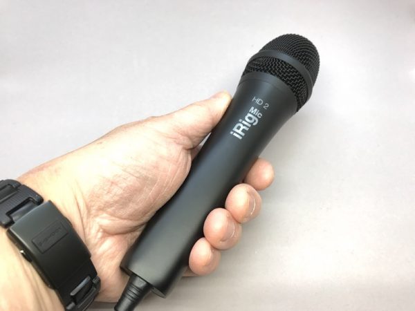
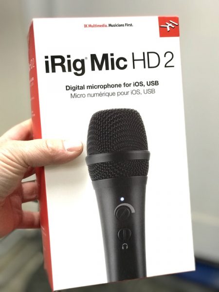
If you want to record audio on the iPhone, you always have the built-in microphone. But if you want to step up your recording game, connecting an external microphone can be a little daunting.  The IK Multimedia iRig Mic HD 2 is a quality, affordable condenser microphone that will do the trick.

  • Microphone Type: condenser, electret
  • Capsule Size: 0.55″
  • Polar Pattern: cardioid
  • Interface Type: USB digital microphone with a built-in low-noise, high-definition preamp
  • Conversion: 24-bit A/D, 24-bit D/A
  • Sampling Rate: 44.1 kHz, 48 kHz, 88.2 kHz and 96 kHz
  • Frequency Response: 20 Hz – 20 kHz, -3 dB
  • Maximum Sound Pressure: 125 dB
  • Sensitivity: -40 dB, 10 mV/Pa
  • Windscreen: built-in
  • Sensitivity: adjustable over a 40 dB range
  • Controls: Built-in low profile input gain and headphone volume contols/li>
  • Metering: Built-in multicolor LED for status and audio level indication
  • Connector Type: standard Micro-USB
  • Headphones Output: 1/8″ TRS jack
  • Power: powered by connected device

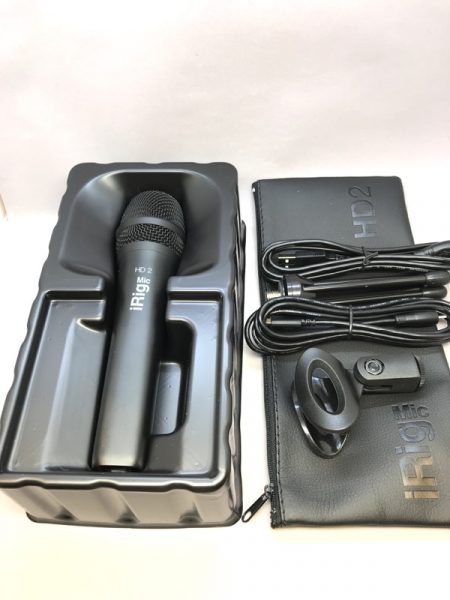
Package includes

  • iRig Mic HD 2 microphone
  • Lightning to micro-USB cable
  • USB to micro-USB cable
  • Protective storage bag
  • Mic clamp
  • 5/8″ to 3/8″ thread adapter
  • Table top stand

Dimensions

  • Size: 188mm/7.4″ x 49mm/1.93″
  • Weight: 325g/11.46oz
  • Cables length: 1.5m/59″

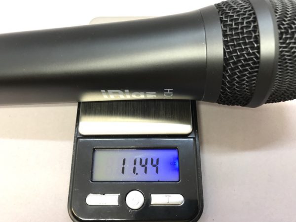
For you road warriors, the scale showed 11.44 oz for the mic itself, pretty much in line with the published specs.

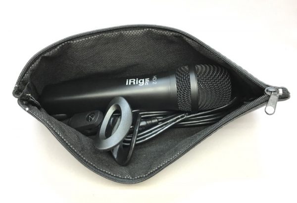
 I was pleased to see that the iRig Mic HD 2 came with a zippered bag that actually fits all of the included pieces.
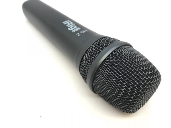
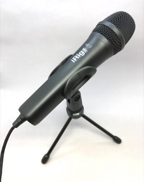
On the front end is a condenser electret microphone with a cardioid pattern.
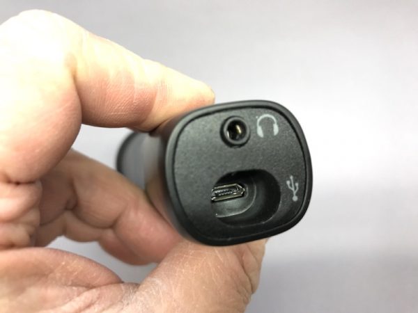
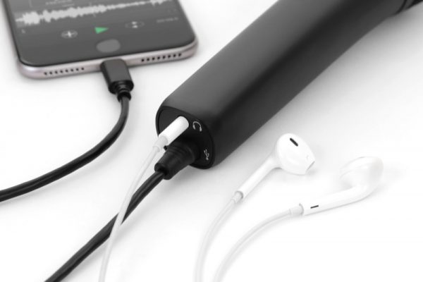
On the back end is a headphone jack for monitoring, and a recessed mini USB port.  The recessed nature of the port really limits the cables you can use, so I stuck with the ones that came with the kit.

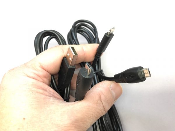
Speaking of cables, the kit comes with two.  One connects to your standard USB, the other is Lightning for iOS devices.
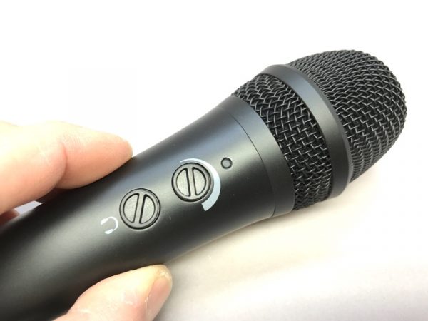
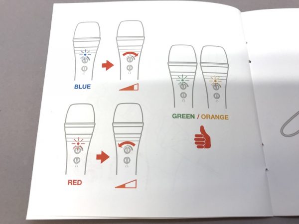
You’ll find two knobs on the mic body:  One for microphone gain, and the other for headphone monitoring.  And LED blinks blue, red, green and orange to let you know what’s going on.

This page in the instructions shows what the colors mean. If it’s blue, increase gain.  If it’s red, you’re probably clipping and need to turn things down. Ideally, you’ll want to be in the green or orange range.

This little fold-up tripod is a great addition. I noticed the mic clip even comes with a threaded adapter to use with a standard “camera” style tripod attachment as well as a mic stand.

So how does the microphone sound? I placed these two microphones side by side in my purpose-built sound room, to eliminate variables of environmental noise.  On the left is the Neumann TLM103, and on the right is the iRig Mic HD 2.

Before you readers with Golden Ears cry afoul, I KNOW these are like apples and oranges: The TLM103 is a large-diaphragm condenser, and the iRig is an electret condenser.  But apples and oranges are both fruit for different occasions, and I would hesitate dragging my Neumann outside the house.

These two clips were recorded at the same time. No EQ or compression added.

Sample 1:  The Neumann TLM103 with a Grace Audio M101 preamp and Yamha AG03 mixer to a fanless PC recording with Audacity.

Sample 2: iRig Mic HD 2 connected directly to an iPhone 7Plus


Comparing the two samples, the Neumann TLM103 (and other gear) sounded just a little warmer. The iRig Mic HD 2 sounded terrific.  Maybe just a hint brighter and some barely imperceptible noise deep in the grass. Unless you’re doing industrial tests in anechoic chambers, or you have a serious case of “I must spend 10x more money”, the iRig Mic HD 2 is an excellent value in a compact package.

Source: The sample for this review was provided by IK Multimedia. Please visit http://www.ikmultimedia.com/ for more info and Amazon to order one.


Product Information

Price: $129.99
Manufacturer: IK Multimedia
Retailer: Amazon
Requirements:
  • USB or Lightning port
Pros:
  • Quality condenser microphone at an affordable price. Comes with all the cables and a mini tripod.
Cons:
  • I would have preferred two LEDs for sound level (one for signal, a second for clip). Dials are a little hard to use unless you have baby fingers.

Filed in categories: Reviews

Tagged:

IK Multimedia iRig Mic HD 2 review originally appeared on The Gadgeteer on December 4, 2017 at 9:00 am.

Note: If you are subscribed to this feed through FeedBurner, please switch to our native feed URL http://the-gadgeteer.com/feed/ in order to ensure continuous delivery.

Logitech Craft keyboard review

I’ve been writing about and reviewing products for over 20 years now and in that time, I’ve come to learn that the most important tools for my job are a camera, a mouse, and a keyboard. Today I want to tell you about a new keyboard that I’m testing (and typing on right now). It’s the Logitech Craft keyboard and it’s a stunner.

What is it?

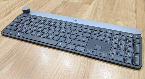
The Craft keyboard from Logitech is a full-sized premium wireless keyboard that’s been designed to be used on your desk when paired with a laptop, desktop computer, phone or tablet.

Hardware specs

Connection support: Logitech Unifying 2.4GHz wireless technology Bluetooth Low Energy technology
Power: Rechargeable with USB type C cable (included)
Size: 5.87 x 16.93 x 1.26 in

Design and features
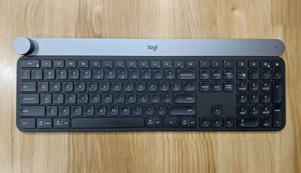
The keyboard has low profile non-mechanical keys that are more like a laptop keyboard than a traditional desktop keyboard. You can click the image above to get a closer look at the QWERTY layout which includes a dedicated number pad on the right side and a row of function keys along the top.

The keys have a comfortably rounded depression on top of each key and the matte finish of the plastic feels great under your fingertips.

Even though the Logitech Craft keyboard does not have mechanical keys, I really really like the feel of the keys. I’m a touch typist, so I’m picky when it comes to keyboards, and I enjoy typing on this one.
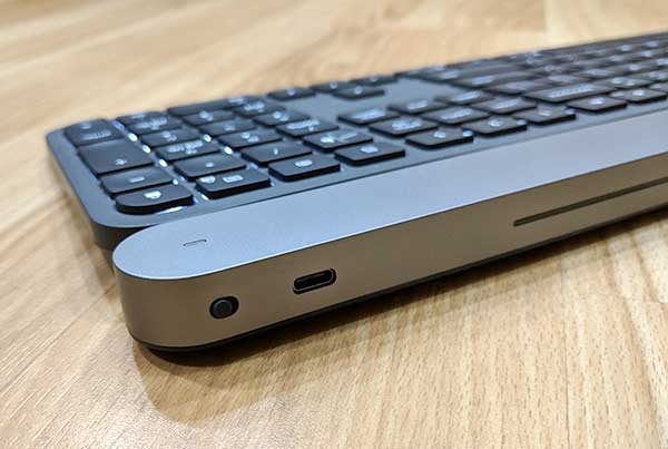
The Logitech Craft keyboard has a power switch on the back and a USB Type-C port beside it which is used to charge the keyboard’s internal batteries. According to the Craft product page on Logitech’s site, the keyboard’s batteries should last for a full week on a charge. That has to be a mistake because I’ve been using this keyboard for several weeks and it’s still going strong.

There’s a small LED in the upper right corner of the keyboard will glow red to indicate that the keyboard needs to be recharged.
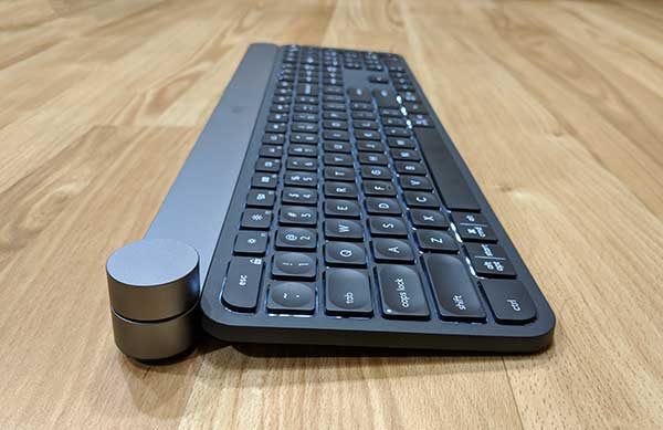
One of the notable features of the Craft keyboard is the Crown input dial in the upper left corner. This smoothly turning knob provides a different function in a variety of applications and can be customized in the Logitech application that you can install on your Windows or macOS computer.

If you don’t install the application, turning the Crown will adjust volume levels up and down on your computer, while pressing the dial will play or pause music, and pressing and turning the dial at the same time will adjust screen brightness.
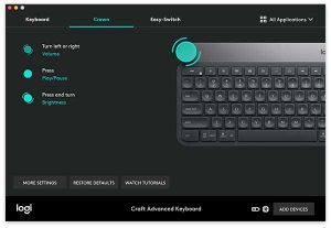

When you install the Logitech Options application, it will detect the applications that you have installed on your computer and will allow you to customize what the Crown can do in each of these apps when each detected app is in focus.

For example, if you are working in a web browser like Chrome or Firefox, turning the Crown will let you switch between tabs.

In Photoshop, the Crown can do different things based on the tool that you have selected. If you have the cropping tool selected, rotating the Crown will zoom in and out on your image, if you have a paintbrush selected, turning the Crown will change the size of the brush, etc.

Once you can train yourself to use the Crown, it becomes very useful.

You can also add other applications not detected by the Logitech Options app to add Craft Crown capabilities to other apps on your computer.
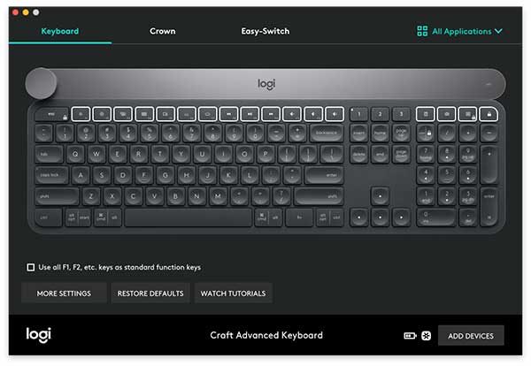
In addition to customizing the function of the Crown knob, you can also customize the function of the F-keys.
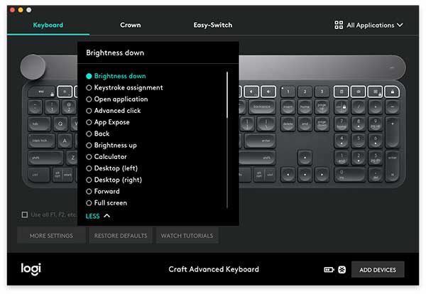
Unfortunately, you can’t setup macros for the F-keys. You can only choose from a list of features.

By default, the function keys already offer features that will let you set screen brightness, media controls including next, previous track, play/pause and volume. But you can also use it to show open windows or show all apps.
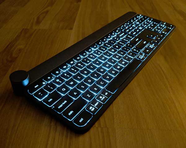
The Logitech Craft keyboard also has backlit keys. You can adjust the brightness of the keys using the function keys and built-in proximity sensors will cause the keys to light up to “welcome” you when your hands get near the keyboard after it’s been idle and then the backlight will fade in intensity depending on ambient lighting. I have the backlight turned off to save battery life, but the “welcome” feature still works even with that setting.

This keyboard can be paired with up to 3 devices using Bluetooth and/or the unified USB dongle that is included with the keyboard. Switching between paired devices is easily accomplished using the dedicated 1, 2, and 3 device switch keys next to the number pad.

I did all my testing of the Logitech Craft keyboard with my 12″ MacBook and a Pixel 2 XL smartphone. Switching between devices was fast and effortless.

What I like

This keyboard has a premium look and feel. It’s heavy which is a good thing. It stays put and won’t slide around on your desk.

The feel of the keys and the sound of the keystrokes has a perfect level that’s not too loud or too soft.

I like using the Crown knob mainly for adjusting volume and sometimes find that I forget to use it in other apps because I’ve used my mouse or keyboard shortcuts for various functions for so long that it’s tough to break that habit and use a different way of doing things.

One feature that I was really surprised to have with the Craft keyboard is a Windows-style delete key that even works when paired with my MacBook. If you’re familiar with macOS computers, you’ll know that the delete key is really a backspace key which removes the character to the left of the cursor but we don’t have a dedicated key to delete the character to the right of the cursor like Windows computers. I am excited that the delete key on the Craft keyboard lets me have the best of both worlds.

What needs to be improved

If battery life is really only supposed to last 1 week per charge, then that would be at the top of my improvement list.

As I mentioned above, I’ve been using this keyboard for 3 or more weeks every day for at least an hour and it’s still running on the initial charge, so I can’t complain about battery life until I’ve had a lot more time with this keyboard.

Look for an update after the first of the year when I am able to get a better handle on battery life expectations.

Another improvement I’d like to see is the ability to program macros for the F-keys instead of only being able to choose from a pre-set list of functions using the Logitech Options app.

Final thoughts

I enjoy using the Logitech Craft wireless keyboard. The keyboard is very well made and I find it comfortable to type on. The Crown knob adds a new way to interact with my apps that is fun and intuitive.

If the $200 price tag doesn’t frighten you away, the Logitech Craft keyboard is worth checking out.

Source: The sample for this review was provided by Logitech. Please visit their site for more info and check Amazon for lower prices.


Product Information

Price: $199.99
Manufacturer: Logitech
Retailer: Amazon
Pros:
  • Can be used with up to 3 devices
  • Comfortable keys and layout
  • Programmable knob and function keys
  • Delete button for macOS devices
Cons:
  • Expensive
  • Possible battery life limitations (I will need to revisit this)

Filed in categories: Reviews

Tagged: ,

Logitech Craft keyboard review originally appeared on The Gadgeteer on December 3, 2017 at 3:00 pm.

Note: If you are subscribed to this feed through FeedBurner, please switch to our native feed URL http://the-gadgeteer.com/feed/ in order to ensure continuous delivery.

Nomad Clear Case and Clear Folio iPhone X case review

The cost of repairing the screen on the new iPhone X is $279. All other damage repairs will cost you $549. Even if you purchased Apple Care+ @ $199 screen repairs would still cost you $29 and all other damage would cost you $99.

Either way, protecting your investment with a great case is more important than ever before.

I first became aware of Nomad’s Clear Case from reading an article that our very own Julie Strietelmeier wrote: “While you wait to pre-order the iPhone X, shop for a case to protect it”.

I had reviewed an Apple Watchband from Nomad earlier and knew they produced a quality product.

Upon seeing the Clear Case I immediately fell in love with it. Something about the design was different and new much like the iPhone X it was going to protect. As luck would have it before I got around to ordering the case from Nomad I received a review offer for the Clear Case.

Needless to say, I jumped at the opportunity.

My good luck continued when I received my package from Nomad. Not only did they send me the Clear Case they also included the Clear Case Folio. So this review will cover both cases.

Clear Case

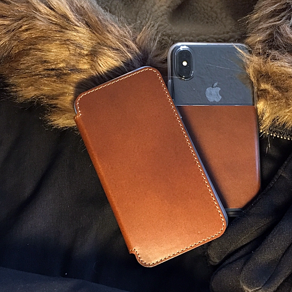
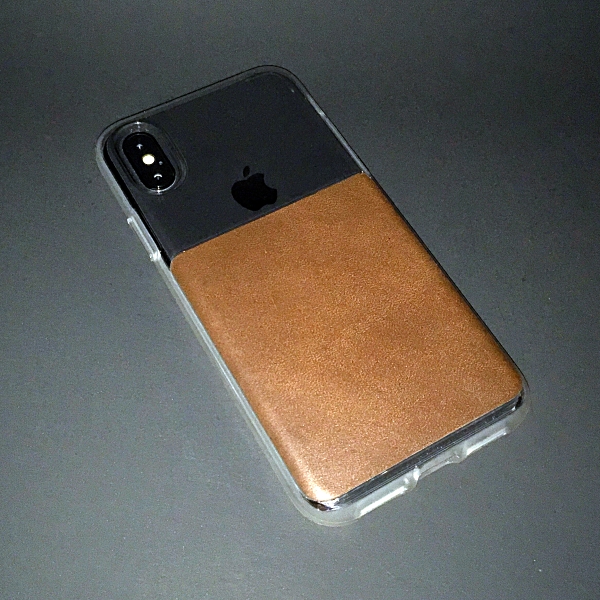
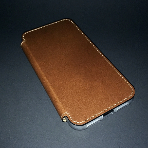
The Clear Case is perfectly balanced. It combines the rustic feel of Horween leather with a sleek, minimalist design. The combination of clear plastic and dark leather give this case a really unique look that perfectly compliments the design of the iPhone X.

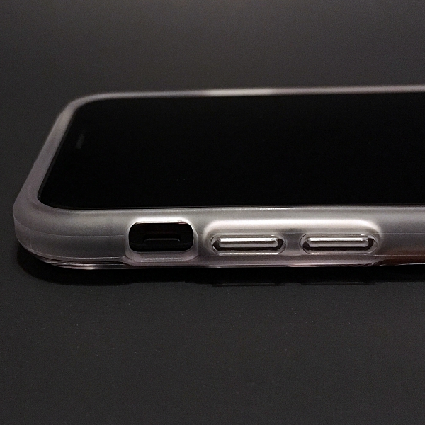
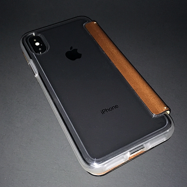
To protect your new iPhone the Clear Case has a rubber TPE bumper, which provides full perimeter and screen protection. Not only does it provide protection, it’s also a little tacky so it gives you a better, more confident grip on your phone.

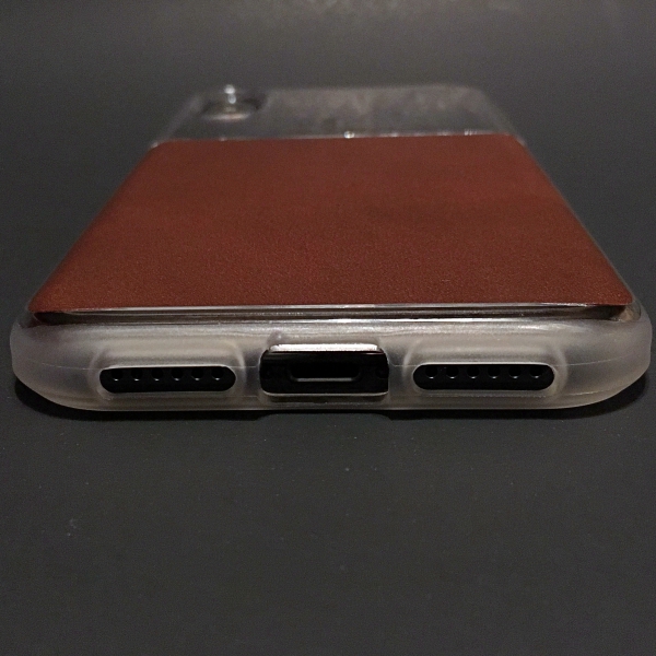
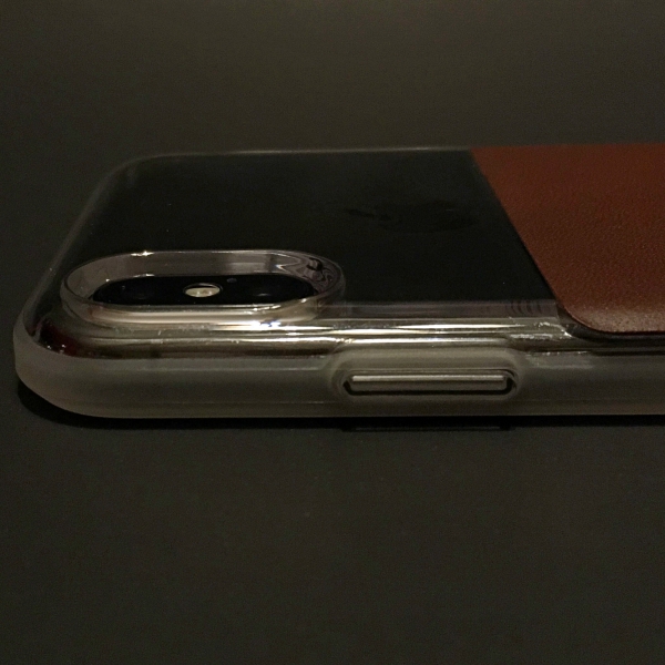
There are plastic covers for the iPhones volume and side buttons as well as cutouts for the speakers and lightning port. The iPhone X’s camera is also well protected by a raised bezel.

The Clear Leather Case gives 6ft drop protection that will ensure your phone stays in one piece.

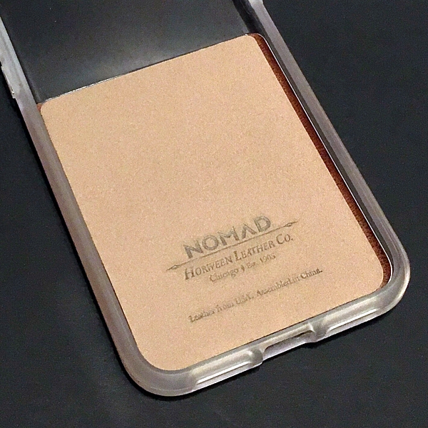
Inside, the bottom half of the case is lined with a soft micro-fiber to cushion your iPhone.

The Clear Case is also compatible with wireless charging.

Clear Case Folio

The Clear Case Folio is designed exactly like the Clear Case, it uses the same clear polycarbonate and It has the same TPE rubber bumper, cut-outs, etc.

It also offers the same 6ft drop protection and wireless charging compatibility.

The big difference is the leather folio cover which not only protects your iPhone’s screen but also doubles as a minimalist wallet.

The folio is designed with 3 card slots and a cash pocket. Nomad’s logo is also nicely emblazoned on the inside.

The folio is capable of holding up to 6 cards, but I found that anything more than 3 cards and a couple of bills made the case a little to bulky. The sweet spot for me was more like 1 or 2 cards and a couple bills.

Personally, I wouldn’t use this as my everyday case. But its perfect for going shopping, out to dinner, to the movies or anywhere that I don’t want the extra bulk of both my wallet and iPhone in my pockets. However, if you’re in the market for a wallet case they don’t get much better then Nomad’s Clear Case Folio.

Let’s talk about the leather

What separates these 2 cases from others out there is the leather that Nomad uses in producing each case.

The Horween Leather Company of Chicago has been around since 1905. Horween is revered for their traditional tanning techniques. The vegetable tanning method used to produce these hides result in a rugged yet beautiful leather that develops a rich patina with extended use. There are no synthetic tanning chemicals, synthetic dyes, spray paints or spray sealants used in making this leather allowing for it to scuff and scratch naturally, giving each case its own unique look.

It also guarantees that no two cases will ever look the same.

Conclusion 

Both the Clear Case and Clear Case Folio are exceptional cases. Each case does a great job of showing off the beautiful design of the new iPhone X as well as providing great protection. 

The Horween leather accents give both cases a rugged yet refined look that will only get better the more you use them.

The Nomad Clear Case and Clear Case Folio are priced at $39.95 and $49.95 respectively and can be purchased on Nomad’s website.

Now all you have to do is decide which case is right for you. Or maybe that someone special on your Christmas shopping list.

Source: The samples for this review were provided by Nomad. Please visit their site for more info and to purchase. You can also check their offerings on Amazon.


Product Information

Price: $39.95-$49.95
Manufacturer: Nomad
Retailer: Amazon
Pros:
  • Great looking minimalist design
  • Horween leather
  • 6ft drop protection
  • Folio Case has room for up to 6 credit cards and a cash pocket

Filed in categories: Reviews

Tagged: ,

Nomad Clear Case and Clear Folio iPhone X case review originally appeared on The Gadgeteer on December 3, 2017 at 9:30 am.

Note: If you are subscribed to this feed through FeedBurner, please switch to our native feed URL http://the-gadgeteer.com/feed/ in order to ensure continuous delivery.
Tofu Multi 8-Port USB charger review

I have reached peak USB charger.  I’ve got a multi-USB charger at my desk at work, multiple ones at home, and even on a side table where I watch TV. I think I have one in my garage, too. I pretty much turn my nose up at these, but then the Tofu Multi 8-port USB Charger came along with a useful LCD display.

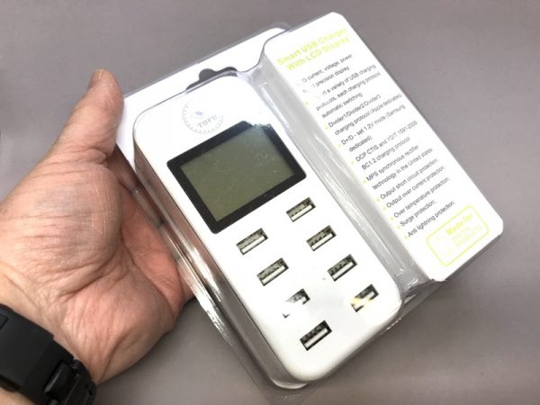
The Tofu charger comes in a rather ordinary clamshell package without any branding at all.
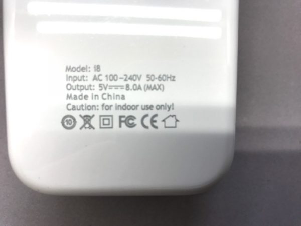
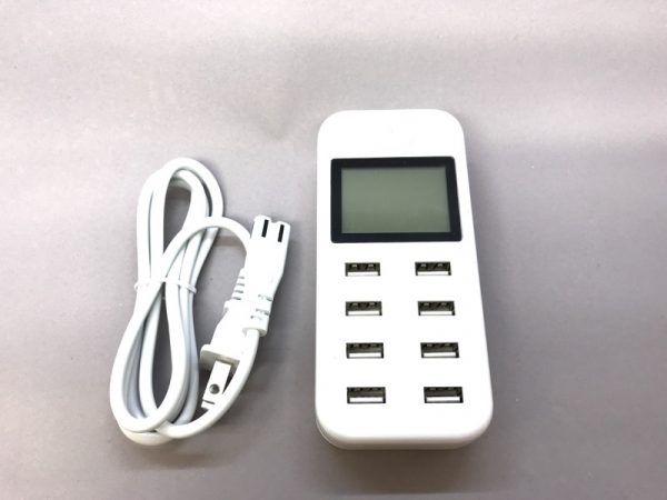
According to the Amazon page, the charger is rated at max.2.4A per port or 8A overall.

The charger comes with one power cord. No external adapter or wall-wart needed.

Without the cord, the charger weighs 6.35 ounces.
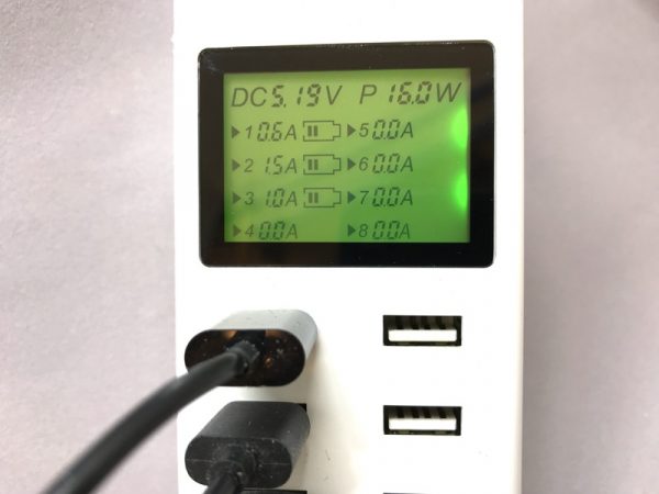

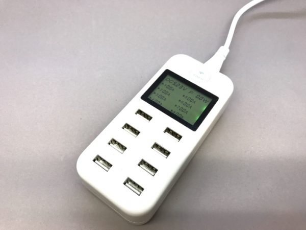
The best feature of the charger is the LCD display.  On the top row, the LCD shows the output voltage, estimated power (Watts) total, and the individual current (amps) per port.  In this example, I have three different things charging at once.

I love being able to tell what’s going on at a glance. With the Tofu Multi 8-port USB Charger, I can tell what each individual device is up to. It’s a bit overkill if you just want to charge things, but if you’re a control freak like me, this is a godsend.

Source: The sample for this review was sent by Tofu. Please visit Amazon for more info.


Product Information

Price: $24.99
Manufacturer: Tofu
Retailer: Amazon
Requirements:
  • 100-240VAC input, USB output
Pros:
  • Very handy LCD display tells you what's happening at each port.
Cons:
  • A main power switch would have been handy. No obvious way to turn off the green backlit LCD.

Filed in categories: Reviews

Tagged:

Tofu Multi 8-Port USB charger review originally appeared on The Gadgeteer on December 2, 2017 at 11:00 am.

Note: If you are subscribed to this feed through FeedBurner, please switch to our native feed URL http://the-gadgeteer.com/feed/ in order to ensure continuous delivery.