LectroFan Kinder Sleep Sound Machine and Night Light review

According to Harvard Medical School, there are several variables that have an influence on sleep quality, including temperature, light, and noise, and this is true for infants, toddlers and adults, alike. Eliminating stressful elements and distractions in the bedroom can lead to better sleep, which has given rise to various white noise devices, like the LectroFan Kinder Sleep Sound Machine.

What is it?

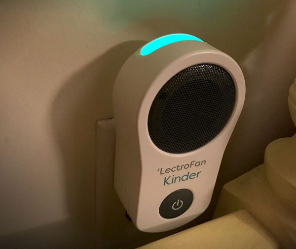
The Kinder Sleep Sound Machine is a small speaker that plugs directly into the wall and emits dozens of unique, non-repeating nature sounds, ambient noises or lullabies to promote more restful sleep for your child. It also sports a top facing multi-color LED with several brightness levels. LectroFan makes several models of white noise devices, but this one in particular is aimed at infants and toddlers.

Hardware specs

  • Plugs directly into a wall outlet
  • High fidelity, non-looping sounds create a peaceful environment and mask noise disturbances
  • Soothing LED nightlight displays a rainbow of color
  • Controlled by easy to use iPhone or Android smartphone app
  • No Wi-Fi or internet connection required

What’s in the box?
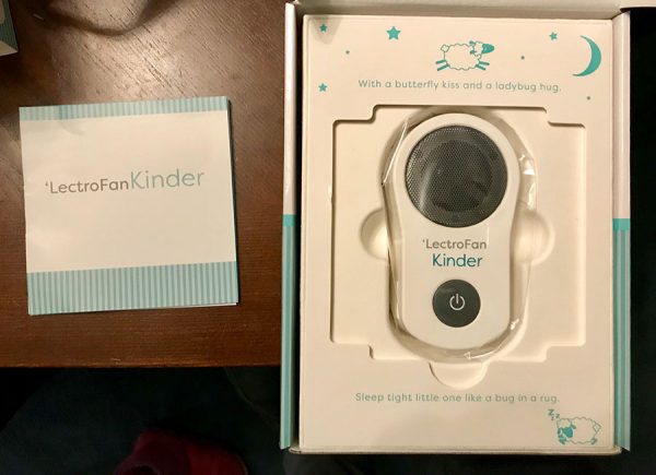
And that’s all you need. The packaging is cute, though.
  • Sound machine
  • Instructions

Design and Features

I’ve used a sound device in my daughter’s room since she was a baby, just a simple one with about 7 different looping sounds. The one thing I disliked about that one was the few sounds that it had (rain, ocean, heartbeat) were noticeably repetitive. You could make out the loops in the sound waves very quickly and that was super annoying to my ears.

That’s where one huge difference lies between that old device and this LectroFan Kinder Sound Machine. Not only does the Kinder have 75 sound environments, the sounds are very high fidelity and non-looping. From what I understand, the proprietary technology behind LectroFan’s sound machines mean the audio created is somewhat organic and not just one looping sound file. So if you have the sound set to Ocean, you’re not going to hear the same one wave over and over again. Any loop was undetectable, to me, when testing out the different effects.

My favorites were the fan sounds… attic fan, box fan, industrial fan and even an oscillating fan. Since I usually sleep with a fan on in the room, the Kinder did a great job in emulating that low steady hum. I also appreciated the top-facing nightlight. At the very dimmest setting, it’s just about perfect, although I wish it could get a bit dimmer, still. The multi-color LED allows a wide range of colors or slowly cycle through a rainbow, which is a neat effect in a dark room.

I mostly kept it at a blue-green, since that seemed like the best color conducive to a sleeping environment. Although if you really want your kid to have some nightmares, you could choose red.

The Kinder Sound Machine is controlled entirely through the downloadable app, so if you don’t have a compatible smartphone, you might as well stop reading right now. With so many sounds and light colors to choose from, I don’t see how else you could control it. The app is easy to use and connects to the device via Bluetooth, so you can use it almost anywhere in the house.
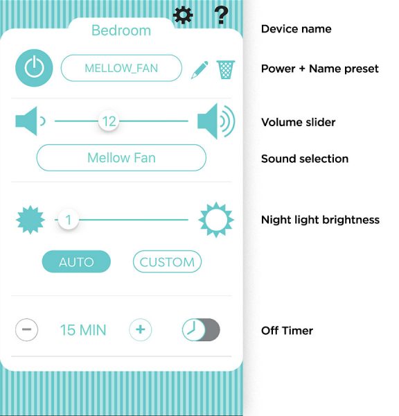
Everything is controlled through their cute, straightforward app.

The Kinder does have a physical button on the device itself that turns it on and off, using the last setting programmed into it. The good thing about remote operation is that you can place the device in an out of reach socket, like behind a dresser or bed, and turn it on or off without having to be in the room.

Using the app is simple and intuitive, but feels a little clunky when trying to browse through all of the sounds. It allows for savable custom presets, so you can find your perfect mix of sound, light color and levels for both brightness and volume.

Naturally, the star of the show is the sound quality. The tiny speaker does a fantastic job of reproducing the ambient noises. It’s plenty loud and has natural-sounding acoustics. And they didn’t skimp on the sound selection… everything from nature, with rainstorms, distant thunder and several beach scenes, to a wide range noise “colors”, from muffled deep brown to hissy white.

They all sound great and most importantly, are designed to be unobtrusive and ignorable. After a few moments, it’s like your brain just sort of tunes out the noise and focuses on something else, which is exactly what you want when trying to fall asleep.

What I liked…

  • great audio fidelity
  • app is easy to use
  • adjustable nightlight

Might be a turn-off, literally…

  • has an on/off button on the device, but requires smartphone app to control light/audio levels

Final thoughts

The LectroFan Kinder is fantastic. I wish I would have had it when my daughter was younger, so I didn’t have to listen to those repetitive ocean waves while rocking her to sleep so many evenings. Simple to use and dozens of ambient non-looping sounds to choose from. I loved it.

Price: $79.95
Where to buy: You can purchase the LectroFan Kinder Sound Machine on Amazon.
Source: The sample of this product was provided by LectroFan. You can find out more on their website.

Filed in categories: Reviews

Tagged: ,

LectroFan Kinder Sleep Sound Machine and Night Light review originally appeared on The Gadgeteer on March 8, 2018 at 11:00 am.

Note: If you are subscribed to this feed through FeedBurner, please switch to our native feed URL http://the-gadgeteer.com/feed/ in order to ensure continuous delivery.

Ember mug, Wyzecam, FIXD, and more – Review updates

Do you ever wonder what happens after we review a product? Do we immediately stop using the product because it breaks? Or do we continue to use it for years and even decades? To answer those questions, we like to do review update posts, so we can take a look back at past reviews and comment on how well the product stands the test of time. Check out these latest review updates by clicking on the review links below and then scrolling to the bottom of the page to read the latest dated updates.

Logitech Craft keyboard review by Julie Strietelmeier

FIXD car health sensor review by Julie Strietelmeier

WyzeCam security camera review by Julie Strietelmeier

Ember Mug by Julie Strietelmeier

DockCase MacBook sleeve with built in USB C hub review by Julie Strietelmeier

Filed in categories: Reviews

Tagged:

Ember mug, Wyzecam, FIXD, and more – Review updates originally appeared on The Gadgeteer on March 7, 2018 at 12:09 pm.

Note: If you are subscribed to this feed through FeedBurner, please switch to our native feed URL http://the-gadgeteer.com/feed/ in order to ensure continuous delivery.
Native Union Eclipse 3 port charger review

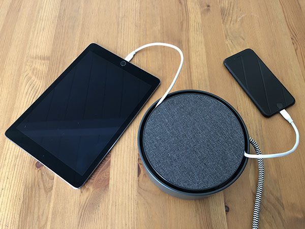
I’m pretty good about charging my phone throughout the day, and with wireless charging now included on more phones it’s easier than ever to stay charged. Inevitably though, I’m actively using my phone or other non-wireless-charging device when I really need a charge. My solution has been to strategically place cables around the house. It gets the job done, but the result is a visual mess (cables never getting put away), or the cables get into a fight with the Roomba. This has resulted in countless hours browsing for a functional and aesthetically pleasing solution. The latest candidate is the Eclipse Charger from Native Union which I’ve been using for a couple weeks now.

What is it?

The Eclipse is a smart USB charger that has more in common with home decor than the typical wall adapter. It sits on a table top and can provide 7.8 Amps of power for up to three devices at the same time. Native Union clearly has a vision for the Eclipse, and for a device that’s meant to blend in visually, they’ve made sure that it still stands out.

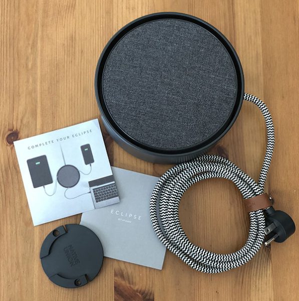
What’s in the box

Eclipse Charger
Wall Mount
Quickstart Guide and Cable Offer

Design and features

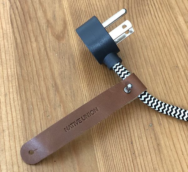
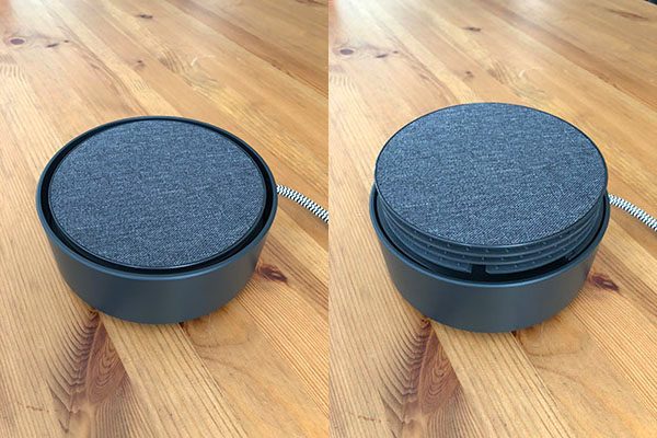
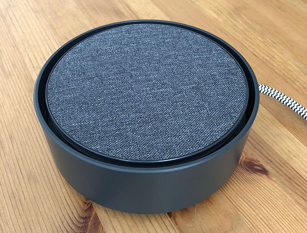
The Eclipse is available with different top surfaces. I’ve chosen to review the textile version (shown here) that looks right at home next to our fabric covered sofa. It’s also available with wood or marble top surfaces for a premium. It has a good heft keeping it in place during operation with smooth sides and fabric covered power cord giving it a clean look. The 90º plug keeps the cord close to the wall with a letter wrap to handle any extra length.

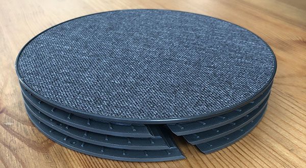
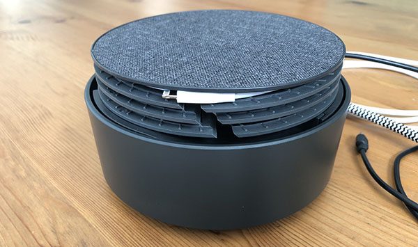
Cable management is a central function of this product and Native Union has a pretty novel solution that involves providing your own cables. The Eclipse uses a gesture based system where two taps on the top results in a cable reel magically emerging out of the center of the product. A single tap activates a nightlight “halo” feature that helps you find and connect your cables in the dark.

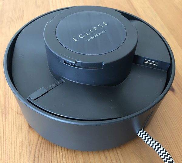
You should only need to access the ports during initial setup. A slight counterclockwise turn and then a lift of the reel, reveals 3 USB ports, one of which lets you choose between USB-A and USB-C.

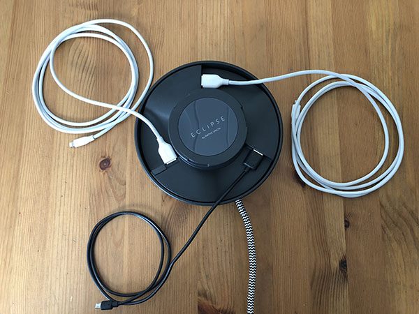
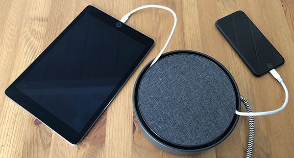
Connect your 3 favorite cables (up to 6’ long) to each of the USB ports. I’ve used a pair of Anker 6’ Powerline Lightning cables and Micro-USB that came with a Mophie battery case.

The reel has 3 channels equidistant around the perimeter and it’s important to note how they work as you put it back into place with a clockwise twist.

Your first cable needs to route up to the top channel through the slot that breaks through all three tiers. From there you’ll wind it clockwise until your cable end tucks away. Repeat this process with the second and third channels. When finished a double-tap hides it all.

What I like

It looks great and is very functional. In designing the Eclipse, they purposefully left a gap between the center reel and the outer wall which lets you close the mechanism with cables in use. You can unwind as much (or as little) cable as you need before closing it back up.

What needs to be improved

There are a couple of things that I feel could use some refinement. It’s supposed to work with most cables, but cables come in a lot of sizes and shapes. The micro/USB cable I used has an oversized end that barely fits. Winding it loosely allowed me to shift the end to an area with more allowance. It’s not a deal-killer as you likely have a few varieties as I do.

The gesture thing is cool at first, but seems to misfire frequently, either ignoring my taps or reading it as a single tap turning on the nightlight that glows from the bottom of the device. Adding a slight delay between taps helps remedy this but I find myself wishing for a physical button that just works every time.

Final thoughts

Overall I like the Eclipse as it has solved a rat’s nest cable problem for me. Something about the design and the manual nature of winding has me wanting to put them away when not in use. A quick tip is to put your most frequently used cable into the bottom channel. If you connect your top cable and go to use cable 2, you’ll end up having to thread it under the first cable every revolution.
The only other thing you should know is that the Eclipse is significantly bigger than you might think. Here it is next to a soda can for reference. That said, the diameter makes sense for limiting the number of times you need to wrap cables and if you have a big enough table, it’s not a major issue. The Eclipse has found a place on my side table.

Price: $80 / $100 / $160 for Textile / Wood / Marble
Where to buy: Native Union and Amazon

Source: The sample for this review was purchased with my own funds.

Filed in categories: Reviews

Tagged:

Native Union Eclipse 3 port charger review originally appeared on The Gadgeteer on March 7, 2018 at 11:00 am.

Note: If you are subscribed to this feed through FeedBurner, please switch to our native feed URL http://the-gadgeteer.com/feed/ in order to ensure continuous delivery.
DockCase MacBook sleeve with built in USB C hub review

I love my 12″ MacBook that I bought as a refurb from Amazon a couple years ago. It’s the perfect size and the perfect weight for everyday use and especially for travel. I actually downsized from a 13″ MacBook Pro just to get a smaller and lighter machine. But downsizing also meant that I would have to sacrifice performance and expansion capabilities.

I honestly haven’t had any issues with the smaller MacBook’s performance, but expansion, on the other hand, has been a challenge at times due to the machine only having one port which is used for both charging AND peripherals.  A USB hub is pretty much a necessity with this computer if you ever want to connect something to it like an external monitor, wired keyboard, wired mouse, flash card reader, etc. USB Type-C expansion hubs are a dime a dozen, but have you ever seen a sleeve style case with a built-in hub? You will now because this is a review of the DockCase for the 12″ MacBook.

What is it?

The DockCase is a slim microfiber leather and aluminum sleeve style case for 12, 13, and 15 inch Apple MacBooks that has built-in USB, USB Type-C, Ethernet, HDMI, microSD and SD card readers.

What’s in the box?

  • DockCase
  • USB Type-C to Type-C cable
  • Quick start guide

Design and features

If you didn’t look at the end of the case, you might not even realize that it’s more than a slipcover for your MacBook. Depending on the size of your MacBook, the DockCase comes in several colors like the red version that was sent to me.

On the end of the case, you’ll find the following ports:

1 LAN Ethernet(1000M Gigabit)
1 HDMI Video Output (4K@30Hz,1080P@60Hz)
1 USB C Power Delivery Charging (Up to 100W)
1 USB C 3.1 Data (Up to 5 Gbps)
3 USB 3.0 Data (Up to 5 Gbps)
Multi-in-1 Card Reader (SD-XC, SD, MMC, RS-MMC, SD-HC, Micro-SD)

A third Type-C port is on the side of the DockCase. This port is used to connect the DockCase hub to your MacBook using the included Type-C to Type-C cable.

As a case, the DockCase is just a basic sleeve that’s made of microfiber leather which is a synthetic (fake) leather with the look and feel (but not the smell) of real leather.

The interior of the DockCase has one main pocket to hold the MacBook, and a narrow pocket on the side that holds the included USB Type C to Type C cable.

The short cable is easily removed and stowed in the DockCase when it’s not being used.

My 12-inch MacBook it nicely in the 12-inch DockCase along with the cable.

Using the DockCase with my 12-inch MacBook

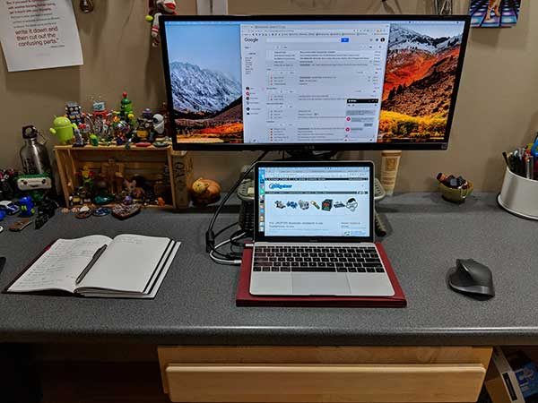
To use the DockCase, you connect one end of the included USB C cable into the USB C port on the MacBook and the other end of the cable goes in the USB C port on the side of the DockCase. To keep your MacBook charged you will need to connect your existing charger cable into the USB PD port on the DockCase which is located next to the HDMI port. You can see how the cables are connected by checking the image above.

I do wish that the included Type C cable was a round cable instead of a flat cable, which looks awkward routed from the MacBook to the back of the DockCase.

I tested the DockCase with my 12-inch MacBook connected to 4-year-old 29-inch ultra wide LG LED monitor. The LG monitor is not 4K, but the DockCase is able to handle 4K@30Hz or in my case, 1080P@60Hz. I couldn’t tell any difference using the DockCase’s HDMI vs. using the LandingZone docking station’s HDMI, which is what I’ve been using for the last several months.

The documentation that comes with the DockCase advises that you NOT use the USB ports to charge your phone or other devices. They are supposed to be used for data transfers only. Even so, I had to test them to see if they would actually charge my phone, a Pixel 2 XL. The 2nd Type C port next to the Type C PD port would not charge my phone at all, but the other three USB ports did seem to be charging the phone.

I tested the DockCase’s card slots which worked fine. I was able to read each one individually and transfer files between two cards. I was also able to copy files to and from USB flash drives. So, the hub does work as intended. But there is one problem and that’s heat.

The DockCase hub gets noticeably hot after several minutes of use (especially when you’re connected to an external monitor using the HDMI port). I used an IR thermometer and recorded readings of 100F to as hot as 120F. These temps weren’t hot enough to burn my skin, but the heat did make me nervous that it could become a fire hazard at some point and made me leery of leaving my MacBook connected to it while unattended. That said, the heat dissipates when the MacBook is not being used.

What I like

  • It’s a case with a built-in hub
  • Nice for the newest MacBooks that only have one USB Type-C port like my 12″ MacBook

What needs to be improved

  • The hub gets too hot
  • Not supposed to use it to charge phones or other devices
  • No room for other accessories like a charger

Final thoughts

Having a case for newer MacBooks that combines everyday protection with a USB hub is unique and useful while remaining relatively slim and sleek. If they can solve the heat issue, I think they have a winner on their hands, but as it is, I’m worried about recommending something that could be a fire hazard.

Price: $119.00 – $149.00 depending on size. $119 for the 12″ version reviewed here.
Where to buy: DockCase and Amazon
Source: The sample for this review was provided by DockCase.

Filed in categories: Reviews

Tagged: , ,

DockCase MacBook sleeve with built in USB C hub review originally appeared on The Gadgeteer on March 6, 2018 at 1:00 pm.

Note: If you are subscribed to this feed through FeedBurner, please switch to our native feed URL http://the-gadgeteer.com/feed/ in order to ensure continuous delivery.
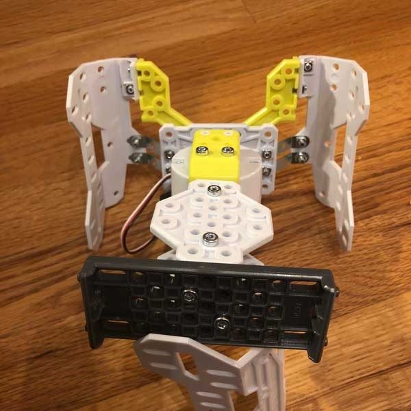
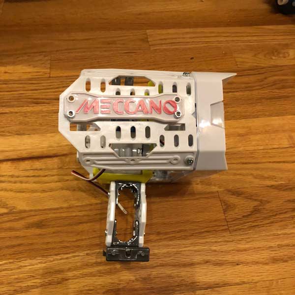
Meccano Erector M.A.X. Robotic Interactive Toy with A.I. review

I have two young sons, 7 and 5, who are obsessed with building.  Legos, old sets of Lincoln Logs, boxes, whatever.  They are constantly building and creating things.  Recently my 7 year old started getting into robots so when I saw the Meccano M.A.X. robot erector set I knew it would be a hit.  I was correct.

What is it?

Well, the product name and title of this review pretty much says it all.  MAX is an artificial intelligence robot erector set.  There is a 66 step instruction guide to assemble MAX and there are a lot of parts, motors, bolts, nuts, etc. everything you would expect in an erector set.  What makes MAX different is that once assembled, it is a fully interactive toy for your kids.  Or for you if you end up not wanting to share it with the kids, or for those of you who just love building things and robots, no judgment here, this thing is pretty cool!

Hardware specs

  • 12″ tall when assembled
  • 332 parts
  • 2 hand tools
  • 1 AC/DC wall mount charger (10.4W)
  • 1 rechargeable Ni-MH 1800mAh battery
  • Recommended for kids 10+ (like I said mine are 7 and 5 so they needed my help but it was a great project for us)

What’s in the box?

332 pieces, 2 hand tools (all you need to assemble), instructions, stickers for decorating MAX and a wall charge

Design and features

The build process is like most any other erector set or similar project.  The pieces are dense plastic so I don’t worry about it breaking after a week of play like other products.  The instructions are actually very well thought out and easy to follow, which is a great thing when you are looking at a pile of 332 pieces!


Once assembled you have to download MAX’s brain software onto the brain module.  Then MAX comes to life.  Once your child (or you) brings MAX to life he starts asking you questions to learn about you.  This process takes about 10 minutes.  After that, MAX begins to learn.  It has commands that are in the instruction book that allow you to interact with him, some of which are unlocked after a period of time of interacting with it.  It has built-in infrared sensors to help it avoid obstacles when it is moving around.  You can ask MAX questions, ask it to deliver something using its gripping hands, ask it to tell you something interesting and a number of other things that my kids have just loved.

MAX is a great project to challenge young minds interested in S.T.E.M subjects and a great introduction to engineering and robotics projects.

What I like

  • Great project to work on with my kids
  • A toy that learns as you play with it
  • The sense of accomplishment my children (and I) got when MAX was built
  • Very reasonable price (on Amazon for $119.99 with a MSRP of $149.99)

What needs to be improved

I am not sure why you have to download the brain software after receiving it rather than it coming preloaded with it.  That was a little annoying but not an issue, just delayed play time a little after building it while I installed software.  Maybe Meccano is making changes to the A.I. software so when you download it you are getting the latest version, but I don’t know.

Other than that, I don’t have any complaints.  We really enjoyed the build process and the fun playing with MAX and watching it learn.

Final thoughts

As with any erector set, building it is part of if not most of the fun.  In the case of MAX, building it was a blast to work with my kids on but seeing MAX learn and its abilities grow has been really fun in the time we have had with it.  I work a lot so I am always looking for fun projects to work on with my kids so we can spend some quality time together.  When that quality time also engages their minds and imaginations and nurtures their interest in building, robotics, and science, well that’s a home run for me.

I definitely can recommend this product for kids of any age who this product fits their interest but would definitely recommend sticking with the 10+ age recommendation if they will be working on it alone.  With adult supervision, it can be fun for kids of all ages but you may have to take a lot of breaks because 332 pieces is a lot for one sitting with a 7 and 5 year old!

Price: $119.99
Where to buy: Amazon
Source: The sample of this product was provided by Meccano.

Filed in categories: Reviews

Tagged: ,

Meccano Erector M.A.X. Robotic Interactive Toy with A.I. review originally appeared on The Gadgeteer on March 6, 2018 at 10:00 am.

Note: If you are subscribed to this feed through FeedBurner, please switch to our native feed URL http://the-gadgeteer.com/feed/ in order to ensure continuous delivery.