Grill Masters Club Experience Subscription Service review

It’s time to step up our grilling game, people. This week we’re checking out the Grill Masters Club, a subscription service that delivers a new collection of grilling products to your doorstep each month. Let’s fire up the grill and see what we get!

What is it?

It’s a subscription service that delivers a new grilling products to your doorstep every month. You also get access to their newsletter and members-only Facebook group for recipes, tips, videos, product discounts, and monthly giveaways.

What’s in the box?

4-5 new & different products come in the box each month. These products can include barbecue sauces, hot sauces, rubs, seasonings, wood chips, or grilling accessories. You also get a reference card with tips on using your new treasures and a brand new recipe each month. Here’s a picture of the first two sample boxes I received for reference:

Design and features

The Grill Masters Club team curates every month’s package for your grilling adventures. Everything is sourced, tested, packed, and shipped from their home base in Jacksonville, Florida. Each box is built on a theme like “The Twisted Texan” or “Exotic Fruit and Spice.” All of the products come from small batch manufacturers, giving you a chance to play with new items that may not normally be available in your area. 

I’ve received two sample deliveries so far, and I’m impressed with what I’m seeing. Each item is a full-sized product good for multiple uses. The variety of sauces, seasonings, and rubs gives you all kinds of options to experiment with on your meats, vegetables, and side dishes. Here are some sample pics from my first box:

A reference card for all the products is also included that provides some background information on the manufacturers and tips on how to use the item in your cooking. You also get a recipe card that goes along with the theme of the month.

The Grill Masters Club also supports your membership with an e-mail newsletter and a members-only Facebook group that provides ongoing articles and videos to develop your skills. The content covers the whole spectrum of grilling topics from recipes to tips and techniques. You also get access to members-only exclusive giveaways and product discounts. The content is excellent and updated several times a week, so they are clearly investing the time to make sure that this service adds value to your experience.

It’s a grilling article, so I have to show off some home cookin’! I paired off the mustard-based barbecue sauce in my first batch with some hand-cut boneless pork chops, and used the jalepeno garlic seasoning to spice up a batch of roasted broccoli. Both met with high praise from my grateful family:

I’ll continue to post updates on my experiences with the Grill Masters Club throughout the summer. I’m not gonna lie: I really like what I am seeing so far!

What I like

  • Quality products with bold, interesting flavors
  • Product variety gives you lots of options and new flavors to play with each month
  • Opportunity to experience new products from small batch makers you may not have access to in your area
  • Excellent online community with robust content

What needs to be improved

  • None to report at this time!

Final thoughts

Whether you’re a grilling newbie or a seasoned pitmaster, the Grill Masters Club is a great option for trying out new flavors, refining your skills, and adding some variety to your menus. In my opinion, the product quality and their dedication to online content make this a worthwhile investment. Your friends and family may thank you.

Price: $32.95/month for a one-time sample, $29.95/month for a 3 or 6-month subscription, or $27.95 a month for a full year subscription to the service.
Where to buy: Visit the Grill Masters Club site for more information.
Source: The sample of this product was provided by Grill Masters Club.

The post Grill Masters Club Experience Subscription Service review appeared first on The Gadgeteer.

Filed in categories: Reviews

Tagged: ,

Grill Masters Club Experience Subscription Service review originally appeared on The Gadgeteer on April 19, 2018 at 2:00 pm.

Note: If you are subscribed to this feed through FeedBurner, please switch to our native feed URL http://the-gadgeteer.com/feed/ in order to ensure continuous delivery.

Soundbrenner Pulse smart vibrating wearable metronome review

Growing up a band geek and being married to a professional visual designer for marching bands I have been around metronomes pretty much all my life.  I thought I had seen them all including the plethora of apps available for Android and Apple.  That was until I got the chance to review the Soundbrenner Pulse.  The Pulse is a metronome you can wear on your body that lets you feel the pulse of the beat.

What is it?

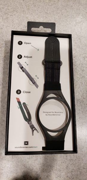
It is a device you can fit into multiple bands and wear on your body.  It comes with two different sized wrist/ankle straps and you can order a separate body strap if you wish to wear it around your chest or upper leg.  This metronome comes with a ton of options for configuration and is really a cool device if you are a musician or someone involved in teaching music.  It allows you to adjust the speed, time signature and subdivision of the beats as you wish.  You can even set up play lists if you have sets you wish to call up for each individual song.

Hardware Specs

  • Has over 6 hours of battery life
  • Works with IPhone 4S or later
  • Works with IPad 3 or later
  • Works with modern Android phones
  • Any Mac with support for Bluetooth 4 – Additional DAW software required
What’s in the box?

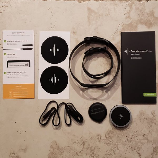
The top picture above is showing what is in the main Soundbrenner Pulse box:

  • Soundbrenner Pulse
  • Long band
  • Short band
  • Charging station
  • Charging cable – actual plug not included just a USB
  • Quick start flyer
  • User manual
  • Some stickers

The second picture shows the body strap in its box.  It states it is for use on the chest, shoulder or leg.

Before I did anything else after opening the boxes I hooked the Pulse up to the charging station.  The above picture shows the charging station.  You simply plug one end of the USB cable into the flat disk.  On the flat disk you need to keep the side with the electrodes facing up and then plug the other USB end into a USB port on your computer or in my case, a USB port in my wall socket.

You then place the Pulse directly on the docking station lining up the electrodes.  The first time you use it and every time you go to recharge, the display on the Pulse will glow an orange/red color to indicate that it is charging.

When the Pulse is fully charged it will glow green.

Design and features

Registering in the app.

I downloaded the SoundBrenner Metronome app onto my Samsung Galaxy S9.   I am happy to report that the app worked flawlessly with my phone and I never had any issues with it operating or any issues with the app connecting with the Pulse.  The above picture shows the opening screenshot of the app.  I chose the second option since I had a Pulse.  I found it interesting and very cool that they also let you use this app without a Pulse.  Your phone would work as the actual metronome with sound on/off and a display showing the beats.  The app was free to download and install and never prompted me for any additional funds.  There was also no extra advertising on the app.

After indicating that I had a Pulse, the next screen gave me the option to login if I had an existing account or to register.  I chose the register button.
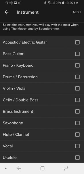
Before allowing me to actually register, the app asked several questions. The next screen asked me to select the instrument that I will be using the most.  I chose vocal.  I could not see how this really impacted the application and once chosen, I never found a way to change this setting again.
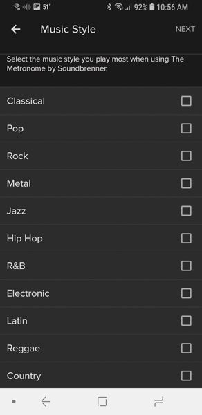
The next screen asked me to choose the music style I play the most.  Just like the musical instrument option above, once chosen and I was finished registering, I could not find a way to change it.  I also was not sure how it impacted the application.  I chose the classical option.
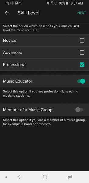
The next screen of the registration process was asking about my skill level.  Since this app would be used by my husband I picked professional and turned on the Music Educator switch.

Finally, I came to the actual registration screen.   It asked for my name, email and a password.  I found it unusual that it did not ask me to type the password twice or have an option to display the password I was typing in.  I had to be especially careful when typing in that password so I would remember what I typed.   When the ‘Done’ button was clicked, I did get an email confirmation to the email address I had entered.  It gave me a link where I had to confirm the email address to finalize the registration process.

Using the app.

After registering I was now allowed to link up the Pulse to the application.  On this next screen, I clicked on the button to ‘Add a Soundbrenner Pulse’.

The first thing you are told to do is to make sure the Pulse is on your body.  Holding the device in your hand and trying to interact with it is hit or miss.  Once I had it strapped to my arm it recognized every tap I gave.

The next two screens had you go through the motions of turning the Pulse on and off.  Once on your wrist, you can turn the Pulse dial either direction to activate it.  Then you simply place two fingers flat over the device.  When it turns on you do get a long extended vibration and it will glow white.  When turning off you get a shorter vibration and the white color fades out.

Once the device was on, I selected the PulseC231D from the screen above and the app was connected to it.

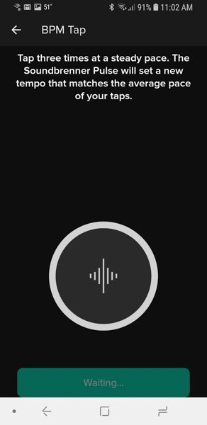
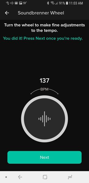
The next few screens were a tutorial on how to use the Pulse.  You can set your own tempo by tapping two fingers flat on the device.  Doing that it starts to repeat the tempo you set.  Once the metronome is running you can tap twice with two fingers to turn it off or turn it back on.  Another cool thing is once the metronome is running you can turn the dial right to increase the tempo or left to slow it down.
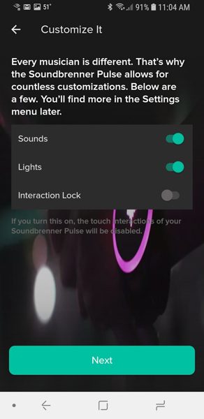

The last two setup screens let you adjust how the app interacts with the Pulse.  If you turn the sound on that is really turning the metronome sounds on in the app and not the Pulse itself.  The Pulse only vibrates the tempo.
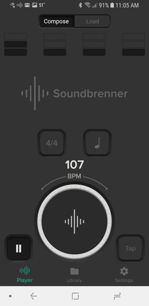
This next screen above is the main screen of the application.  You can adjust a lot of different settings from this page.  The button with the quarter note on it (top right above the 107) is how you adjust the subdivision of the beats.   The button with the 4/4 is how you adjust the time signature for the beats.  You can configure the app to beat slightly stronger on the first count of each measure.   So for example with 4/4 and a quarter note the app will have 4 beats per measure.

The two screens above show the subscreens for subdivision and time signature.  There are really a ton of very cool options here.

The app comes with a set song library of set rhythms and time signatures.  You have the option of creating new songs in the library and even editing existing songs.  You set the beats per minute, the time signature, what beats are the accent beats and the subdivision of the notes.

Once you have all of your songs set, you can then build yourself a setlist.  This is a pretty cool option.   You can have all of the songs in the order you will play them.  Then as you play the setlist it will work its way through your songs in the order you put them in.
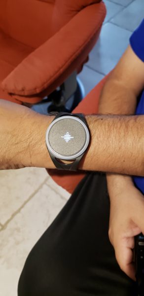
The last two pictures above show the Pulse on my husband’s wrist then on my much smaller wrist.  I have to admit that for me the Pulse is a rather large device.  If I were a musician using the device, I would build a setlist and then put the device on my upper arm under my sleeve.  I could then double tap my way through the setlist without having the large Pulse out on my wrist in the open.  My husband did not feel that it was too big for him and it did not appear that much larger on him than a lot of watches would that are out there for men.

What I like

  • I love the customization of this device.
  • It comes with two different sized straps that would fit my upper and lower arms along with my ankles, I can also buy a larger body strap to wear in other places.
  • It was very easy to interact with.  I loved how easy it was to set a tempo by just tapping on the device and it was simple to start and stop.
  • The app itself offered so many options in the subdivision and time signatures.  It also allowed you to set what beats were the accent beat or set no accent beat at all.

What needs improvement

I think if they offered a smaller version of the Pulse it might attract more female users who might want to keep the device on their wrist.

Final thoughts

My husband took this to work with him and had several of the band directors play around with it.  One director who was very percussion oriented mentioned how this would be a great device for individuals to practice at home with.  Practicing at the proper tempo really helps you to be prepared for the actual performance.  The directors also thought it would possibly be a cool device for the drum majors to use.  Often times I see drum majors with small metronomes in the stand at a marching contest getting the beat just before a song.  With the Pulse, they could be wearing the device and have the setlist all ready to go.  If the band gets off tempo, a quick double tap on the device will turn it off.   I would think this device is would be great for anyone who sets the tempo for their own small bands.   I would not recommend that it be worn by anyone who has to follow someone else’s lead in a band.  For example, if you are the guitar player and there is a drummer setting the tempo, listen to the drummer and don’t try to follow your own beat.  I am sure my husband will be using this device at future marching band rehearsals next fall.

Price: $99.00
Where to buy:   Amazon
Source: The sample for this review was provided by Soundbrenner.

The post Soundbrenner Pulse smart vibrating wearable metronome review appeared first on The Gadgeteer.

Filed in categories: Reviews

Tagged:

Soundbrenner Pulse smart vibrating wearable metronome review originally appeared on The Gadgeteer on April 19, 2018 at 9:00 am.

Note: If you are subscribed to this feed through FeedBurner, please switch to our native feed URL http://the-gadgeteer.com/feed/ in order to ensure continuous delivery.

Aicook Blender, 15-Piece Smoothie Blender Mixer review


What is it?

The Aicook 15-Piece Blender is a portable blender that is designed to blend fruits, and vegetables, and many other ingredients that are used to create smoothies or health drinks, etc.

What’s in the box


Package contents:

1 x High torque power (Base unit)
1 x Stainless steel flat blade
1 x Stainless steel cross blade
1 x Tall Cup
2 x Short Cup
1 x Shake and take Cup
1 x Sip & seal lid
2 x Stay fresh re-sealable lid
2 x Handled lip ring
1 x Recipe guide
1 x Instruction manual
1 x Service card attachment

Design and features

The first thing that I noticed about Aicook Blender is its similarity to the Nutribullet Blender. The base unit is the same in size (circumference), height, and weight, and almost identical in design.
The cups are also very similar and of the same material, but my Nutribullet did not come with a stainless steel flat blade. The blades and housing are almost identical as well, with the exception of their weight and how solid they feel. The Aicook blades and housings feel much lighter and not as well built.

On to testing:

In my household, eating healthy is an everyday endeavor, so ingredients are always readily available. We started with the cross blade and a fruit combination of watermelons, and bananas, and within seconds the Aicook pulverized the fruit into a just about perfect drink, and it did so in a third of the time that it takes the Nutribullet to do the same job.

This was really exciting since it did the job in about 30 seconds and there was no undesired pulp to strain. We tried the same blend again with additional fruit and milk to make a milkshake, but since there is only one speed, we were unable to get the thick milkshake texture. It was either it needed to be blended more because chunks of fruit still remained, or a few seconds later, it was complete liquid.

Nevertheless, we were very happy with the way it blended our health drink mixtures.

We use a lot of almond products in our health food creations, and in many cases, we use the Nutribullet to blend almond nuts into a flour type mix, that we then use to make various dishes.

Since this was a test, we used just a small amount of almonds with the flat blade.


We blended them for about 30 seconds, and we could see the almonds being blended into a nice texture, of what we call our version of almond flour or meal. After checking the texture, we blended for 30 more seconds and it was just about done with the exception for a few almonds.

We were very happy with the mixture and we figured that it only needed about 15 more seconds of blending. We put it back on and started to blend but in about 10 seconds we heard a pop and there was a strong smell of burning rubber. Lo and behold, when we took off the cup, the rubber gear (or what seems to possibly be some composition of rubber and/or plastic) that engages to perform the blending had broken apart. This was very disappointing since otherwise, the blender performed amazingly well and handled tasks much faster than the Nutribullet.


Based on this issue, we decided not to risk any further testing.

What I like

Despite the failure of the flat blade and its housing, I really like this blender. It works at a great speed that does the blending job very quickly, and it blends to liquid form very quickly and effectively. The base unit is solid, and the set comes with all of the accessories that anyone would need.

What needs to be improved

The only complaint that I have about this blender, and it is a major one, is the quality of the blades and their supporting housings. Not only does the quality need to be better, but if it is the case that the part I received was simply defective and not a good representation of the usual quality, then the quality control needs to be much better. And, since the blender is capable of such great speeds, the ability to have a speed selector would be a plus.

Final Thoughts

The Aicook Blender has all of the potential to be a great product, and at its price point it is very competitive. While the base unit is well built, it seems that they skimped on the build quality of some of the other parts, possibly to keep the cost down. While I had the unfortunate experience of the equipment failure, I still like this blender and I may purchase a replacement flat blade (if available), and try it again.

Price: $65.99
Where to buyAmazon
Source: The sample for this review was provided by Aicook.

The post Aicook Blender, 15-Piece Smoothie Blender Mixer review appeared first on The Gadgeteer.

Filed in categories: Reviews

Tagged: ,

Aicook Blender, 15-Piece Smoothie Blender Mixer review originally appeared on The Gadgeteer on April 18, 2018 at 10:00 am.

Note: If you are subscribed to this feed through FeedBurner, please switch to our native feed URL http://the-gadgeteer.com/feed/ in order to ensure continuous delivery.

EZVIZ ez360Pano panoramic WiFi camera review

I’ve been using home security cameras for many years now. I find that they give me peace of mind when I know I can check in at any time and from anywhere to see what’s going on when I’m not physically at home. But there’s one problem with most cameras that don’t offer a motorized pan and tilt feature. The camera’s field of view usually isn’t wide enough to let you see an entire room without setting up multiple cameras. That’s where the EZVIZ  ez360Pano WiFi camera shines. Let’s take a look.

What is it?

The EZVIZ ez360Pano is a panoramic WiFi camera with a 360° field of view and a maximum of 1344 x 1344 pixel resolution in fisheye mode.

The EZVIZ ez360Pano offers two-way audio, night vision, microSD local recording, cloud recording with a subscription (the camera comes with a 30-day free trial), and it supports dual-band WiFi 2.4GHz/5GHz.

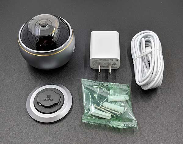
What’s in the box?

EZVIZ ez360Pano camera
Mounting plate and hardware
USB power cable
Power adapter

Design and features

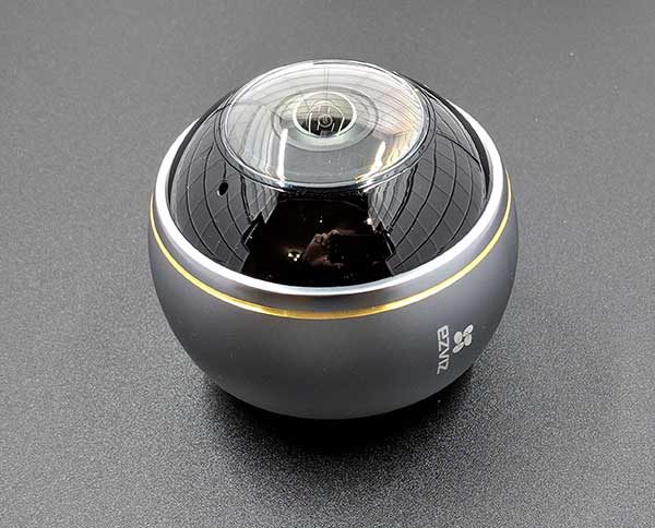
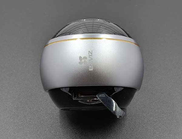
The ez360Pano camera is about the size of a tennis ball, with a metal housing around the camera lens.

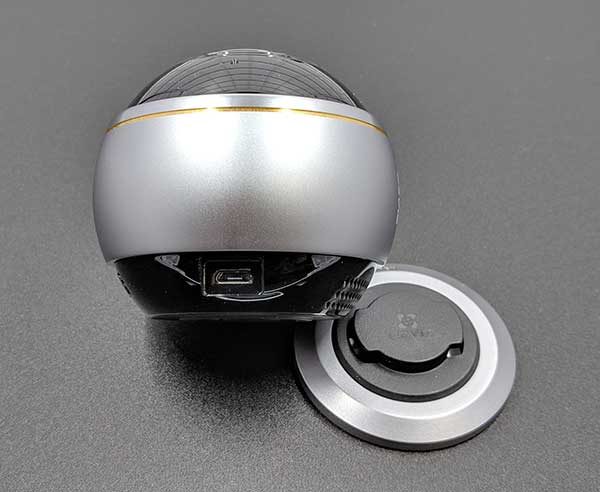
There’s a microSD card slot in the base of the camera that is protected by a snap-on cover.

And there’s a micro USB connector on the base that is used for power.

The camera needs to be mounted to a wall or the ceiling using the included base plate and hardware. Unfortunately, the ez360Pano camera isn’t designed to be placed on a shelf or a window sill.

I installed the EZVIZ ez360Pano camera in a temporary location on a support beam for our upstairs banister. I would have rather installed it on the ceiling, but we have a cathedral ceiling in the main room of the house with no easy way to get to it or provide power. So I settled for the easy way out and rubberbanded the camera to the stair rail. You can just call me the MacGyver of home security cameras.

EZVIZ app


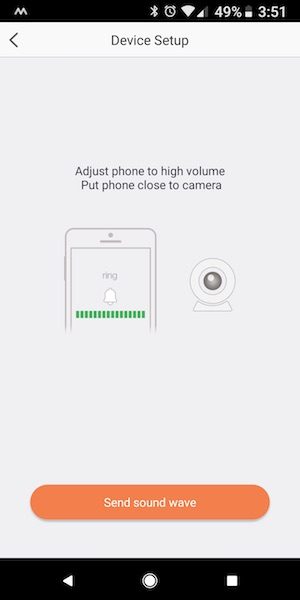
Setting up the camera is relatively quick and easy using the EZVIZ app. The app guides you through the steps of connecting the camera to your wireless network by using the QC code on the bottom of the camera and with sound. Yeah, don’t ask me about the sound part, I was really confused and surprised when the app showed that it would be using sound waves (I couldn’t hear anything) to set up the device.


Once the camera is placed and connected to the network, it will show up on the home screen of the app. The home screen shows a snapshot of the camera’s live view at app launch time. Below the snapshot is a link to the messages page and settings page.

The messages page is a list of motion detection alert thumbnails. Tapping the thumbnail image will let you view the captured video.


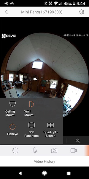
The app allows you to switch the view style from ceiling mount to wall mount and you can also choose from fisheye, 360 panorama and quad split screen views. The fisheye view is shown above on the right.

Turning the phone to landscape orientation enlarges the view. In this view, you can’t zoom in or anything. What you see is what you get.


This is the 360 Panorama view which I like best. The app offers a cool feature when you’re in this view. It lets you watch all the motion captured video clips one after the other for the current day and 2 previous days. It’s kind of like a time lapse of the entire day’s events. If you have a micro SD card installed in the camera, you can also view the video history which shows a timeline and red lines for different events. You can scroll through the timeline and watch the clips that way too.

When you turn the phone to landscape orientation you can see a full-screen view in 360 panorama mode. You can’t zoom using two fingers in this view.

The EZVIZ ez360Pano camera has really good night vision as you can see from the image above.

This is what the screen looks like if you choose the ceiling mount 360 panorama view mode. I’m sure this mode would look much better if the camera was actually on my ceiling…

The only viewing mode which allows you to pan and zoom with your fingers is the quad split screen view and as you can see from the image above, that mode looks pretty bad. I think each section should have a larger frame around it so you can more easily differentiate between each window.

The EZVIZ  ez360Pano WiFi camera comes with 30 days of free Cloud Play which saves the notification video clips to the cloud and also lets you watch a video montage of the current and previous day’s motion detected events.

The camera comes with a 30-day free trial of the Cloud Play service which saves the motion clips to the cloud. After the 30 days, you have to subscribe to one of their plans for each of your EZVIZ cameras if you want to store the video clips in the cloud for safe keeping. The prices are:

7 Day Playback per Camera
Save 7 days of video
$5.99/month
$59.99/year

30 Day Playback per Camera
Save 30 days of video
$10.99/month
$109.99/year

Of course, you can also use a micro SD card in the camera which will also store the motion clips.

What I like

  • I like the 360Pano’s 360-degree wide view because it lets me see a large area without needing to pan and tilt.
  • Easy camera setup

What needs to be improved

  • micro SD card is only used to store motion detection clips and not 24/7 video.
  • The app doesn’t offer the ability to block certain areas of the view from sending motion detection alerts.
  • The push motion notification alerts sent to Android devices can’t be dismissed by swiping them from the lock screen. You have to go into the app for them to disappear from the notification bar at the top of the phone’s screen.
  • The app only allows you to zoom and pan in quad view which offers four tiny windows that are hard to see on a smartphone display.
  • The app doesn’t always remember camera view mode settings.
  • Cloud Play subscription is per camera.

Final thoughts

The EZVIZ ez360Pano WiFi camera is a nice camera because it has such a wide angle view. It’s also easy to setup and does a good job of capturing motion and delivers a clear image even in the dark. The main things that I don’t like about this camera are the Cloud Play subscription service and the fact that the camera doesn’t record video to the micro SD card 24/7.

Right now there are so many security cameras on the market that it’s a buy’s smorgasbord. While the ez360Pano does offer the panorama feature which 99% of other cameras lack, the price per camera and the subscription fee per camera may take this one out of the running for a lot of potential buyers.

Price: $179.99 (Cloud Play subscription is an additional purchase but is not required)
Where to buy: Amazon
Source: The sample for this review was provided by EZVIZ.

The post EZVIZ ez360Pano panoramic WiFi camera review appeared first on The Gadgeteer.

Filed in categories: Reviews

Tagged:

EZVIZ ez360Pano panoramic WiFi camera review originally appeared on The Gadgeteer on April 17, 2018 at 4:59 pm.

Note: If you are subscribed to this feed through FeedBurner, please switch to our native feed URL http://the-gadgeteer.com/feed/ in order to ensure continuous delivery.

Speck Presidio Sport Case review

What is it?

A very protective case offering full, rugged protection with a smooth sport visual instead of harsh angles.

What’s in the box?

Presidio Sport Case for iPhone X

Design and features

Speck isn’t new to the case business. They’ve been creating protective products for devices since 2001, and I want to disclose that I worked for them around 8 years ago. They’ve learned a lot in the past 17 years and the Presidio Sport Case showcases a lot of that knowledge.

There’s a number of features so I’m just going to lay them out here and we’ll take a closer look at the key ones in the review.

These features are called out on the packaging…

  • 3-Layer construction of a polycarbonate shell, an Impactium™ Shock Barrier and an Impactium Sport outer layer.
  • Military-grade 10 feet drop protection
  • 360º port protection
  • Raised bezel screen protection
  • Soft-touch no slip grip
  • Microban® anti-microbial technology

Additionally these two are called out on the website description; the first of which seems rather important to be absent from the packaging.

  • Qi wireless charging compatibility
  • Lab-tested durability

It’s available in 5 different color combinations. The one shown here is Gunmetal Grey/Cobalt Blue/Slate Grey.

Installation

Installing the case is pretty easy thanks to the flex corners in Speck’s design. Lead with the left side of the phone so that the mute switch and volume keys tuck under the edge of the case, then press down on the right corners of the phone until fully seated.

Performance

It can be hard to think about performance when talking about a case, but that’s what we’re going to do. To start, let me say that I would prefer to run my phone without a case. All the buttons and switches function just the way they should and feel great. As is the case with a lot of us, a phone is too important to my work and personal life to risk an accident. So, a case it wears.

More protective cases like this one add enough dimension that the buttons get recessed too far for easy access. The solution is to cover the buttons and try to maintain functionality. Well, Speck nailed it. All the buttons press beautifully and you know you’ve pressed them. Similarly, the mute-switch dial is a fantastic alternative to a cavity that would be too small for my fingers. A small turn and the haptics of the phone vibrate to let you know you’re muted. When you find yourself idly playing with a feature like this, you know they got something right.

The inner frame has a scalloped design all the way around the inside edges which provide rigidity while reducing weight and serving as an anchor for the softer, shock-absorbing layers. The case weighs about 48g which brings the already hefty iPhone X up to 174g when installed. It doesn’t feel significantly bigger than most normal cases and is definitely smaller than some of the real rugged options out there. The outer layer has a great feel and walks that fine line between avoiding a slippery case and one that’s too grippy. No issues with wireless charging either which I wondered about initially.

Testing drop performance is a tricky thing if you don’t have a budget to replace a phone. I’m happy to report that this case protected mine beautifully when I accidentally fumbled my phone picking up my car from the dealer. It fell from waist height to polished cement and landed on a corner with a sound that didn’t give me that uh-oh feeling. All good.

The hinged door does a great job of protecting the lightning port in between the speaker holes which line up the way they should. The door is large enough for some cables with large connector overmolds, and opens and closes with a nice positive snap. The living hinge design wants to stay in the closed position, but it doesn’t overly fight you when connecting a cable. The back is totally flat including the lens area which is great for tapping out messages with your phone flat on a table, at least until a cable is connected, when the displaced port cover lifts the end of the phone off the table.

So what’s this Microban? They’re a company that’s been around for over three decades fighting damaging microbial growth before it starts. Here’s the thing; it’s not the kind of feature that you can really see or tell is working as a consumer. So maybe think about it this way. How frequently do you hand your phone to someone else to share a photo or a website? Set it down in a taxi, or on a cafe counter? If it works even close to as well as they say it does, it definitely can’t hurt and if it’s on a case that you like, why not?

What I like

  • Flat back – the back of the case is perfectly flat counteracting the normally protruding camera lens. Tap away to your heart’s content without your phone rocking around.
  • Button feel – The tactility is perfect. You can press and know you’ve pressed.
  • Rotary switch – Great solution for a case that would otherwise have a deep finger hole recess for accessing the switch.
  • Hand feel – the case has a silky touch without being too tacky or slippery.
  • Screen protection – the iPhone screen is recessed into the case even when using an additional glass screen protector.

What needs to be improved

  • I would love to see the lightning cover be removable. It’s great protection, but when open with a connected cable the case doesn’t lay flat. It would be great to see this as an optional part that can be removed before installing your phone.
  • A mention of Qi compatibility on the packaging.

Final thoughts

There’s a lot to like about this case, and very little to gripe about. If you’re looking for a case with better than average protection against drops and accidents, this is a solid choice.

Price: $44.95
Where to buy: Speck Products and Amazon
Source: The sample of this product was provided by Speck Products

The post Speck Presidio Sport Case review appeared first on The Gadgeteer.

Filed in categories: Reviews

Tagged: ,

Speck Presidio Sport Case review originally appeared on The Gadgeteer on April 17, 2018 at 10:00 am.

Note: If you are subscribed to this feed through FeedBurner, please switch to our native feed URL http://the-gadgeteer.com/feed/ in order to ensure continuous delivery.