Wofalodata Fast Wireless Charger review


What is it?

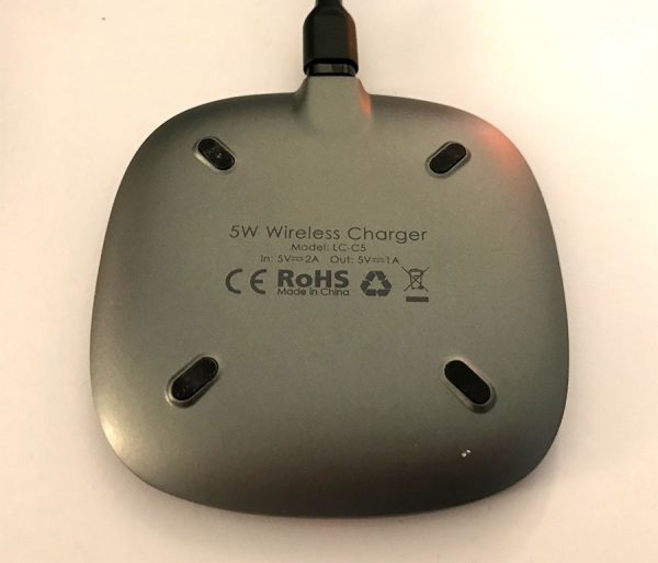
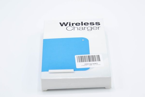
The Wofalodata Fast Wireless Charger is a 2 in 1 wireless charging pad with a kickstand that meets the QI fast charging technology standard.

What’s in the box

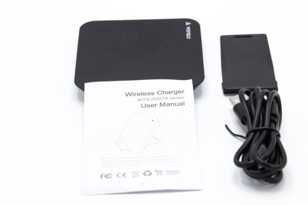
Package contents:

1 x Wireless charger
1 x Kickstand
1 x Micro USB cable
1 x Instruction booklet

Design and features

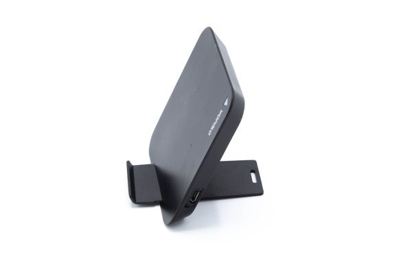
The Wofalodata Fast Wireless Charger is a small and compact wireless charger that conforms to the QI wireless charging technology standard. It is made up of a wireless charging pad and a removable kickstand that can be neatly tucked away in the back.

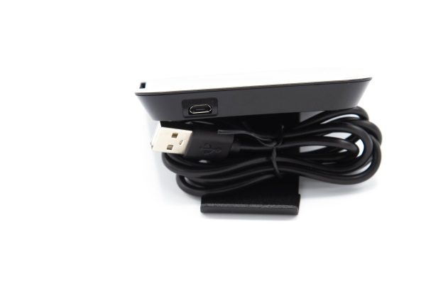
On the side, there is a micro USB port that accommodates the included micro USB cable to supply power to the pad for charging.

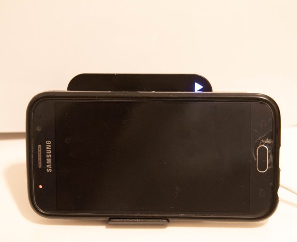
On the front of the charging pad, there is a LED light. When the charger is first plugged in, the LED blinks red and then goes to a steady blue when it is ready to provide charging. The instructions suggest that you can place your phone in a horizontal or vertical position, but I found that with my iPhone 8Plus, it was awkward and would tend to want to tip over. The vertical position did not seem to allow the larger phone to make good contact with the charging pad. Horizontally, it fit well, but that is as far as the good news goes when trying to charge my iPhone 8Plus. Once I placed my phone to charge, it would initially charge for approximately 2 minutes with the steady blue LED light, and the blue LED would start blinking for about 90 seconds and then the LED would turn red and the phone would stop charging. After a few seconds, the LED would turn blue again, and start charging again. This cycle of events continued until I removed the phone from the charger, and occurred each of the dozen or so times I tried.
Now it is important to note that I have at least 3 other Qi wireless charging pads, 2 of which are cheap no frills pads, and one is a more expensive Samsung pad. Irrespective of the make, they all perform flawlessly. This issue that I experienced with this charging pad is unexplainable.

After deciding to no longer risk trying to charge my iPhone on this pad, I tried an old Samsung Galaxy 6 phone, and that worked without issue. In about 30 minutes, the Samsung charged approximately 30 percent.

What I like

  • Wireless charger is lightweight
  • Nice and convenient Kickstand

What can be improved

  • Wireless charger must be able to charge all cell phones that meet the QI wireless charging standards.

Final thoughts

There are numerous inexpensive wireless chargers available today, and each one needs to meet the basic criteria for wireless charging to be considered for purchase. While this charger is lightweight and has a nice compact form factor, the issues I experienced with it when trying to charge my iPhone 8Plus, make it a “no go” for me.

Price: $12.99
Where to buy: Amazon
Source: The sample for this review was provided by Wofalodata.

The post Wofalodata Fast Wireless Charger review appeared first on The Gadgeteer.

Filed in categories: Reviews

Tagged: , ,

Wofalodata Fast Wireless Charger review originally appeared on The Gadgeteer on May 3, 2018 at 10:00 am.

Note: If you are subscribed to this feed through FeedBurner, please switch to our native feed URL http://the-gadgeteer.com/feed/ in order to ensure continuous delivery.

Twelve South SurfacePad iPhone 7 Plus/8 Plus case review

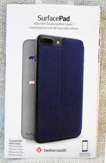
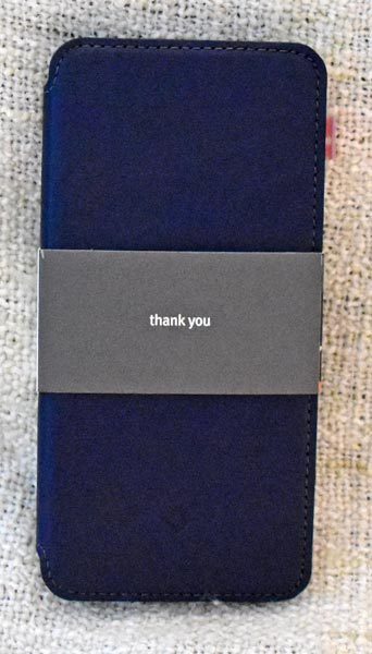
As we mentioned in a recent news post, the SurfacePad for iPhone is a thin, minimal leather cover for your iPhone 7/8, iPhone 7/8 Plus, or iPhone X.  It protects the front and back of your phone from pocket hazards and from getting surface scratches from tables and countertops.  Twelve South was kind enough to offer a SurfacePad to The Gadgeteer for review, and I was selected to put the cover for the iPhone 8 Plus/7 Plus to the test.

Hardware specs

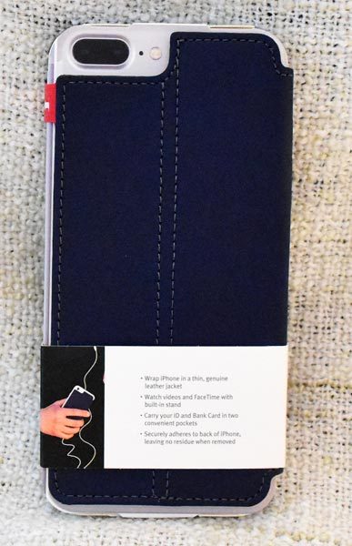
  • Ultra-thin, full-grain leather cover
  • Applies like a screen protector, with an adhesive pad instead of a shell case
  • Hands free viewing & display stand
  • 2 card slots to streamline your everyday carry
  • Qi charging compatible for iPhone 8
  • Thickness: .07 inches (2 mm)
  • Weight: 1.6 ounces (45.3 g)

Design and features

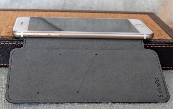
I received the SurfacePad for iPhone 7 Plus.  I requested and received the deep teal color.  The case is very well made, with even, self-colored topstitching.  The phone’s screen is completely covered;  a cutout on the back leaves the back camera, flash, and microphone uncovered.  The double-row topstitching on the back acts as a hinge for using the SurfacePad as a horizontal stand for the iPhone.

Setup

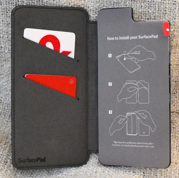
There really isn’t a lot of “setup” involved, but you should make sure that the back of your phone is clean and dust-free for best adherence of the sticky pad.  Luckily, the adhesive that holds the case in place is removable, repositionable, and reusable, because it took me a couple of tries to get the phone centered and affixed to the case just as I wanted it.  There’s a video at Twelve South to show you how it’s done.

Performance

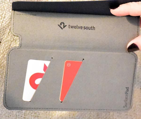
There are two slip pockets for IDs or cards that aren’t filed in your iPhone’s Wallet app.  You can see more of how the back is attached so it can be folded into a horizontal stand, which we’ll see later.

The front of the case is embossed with the Twelve South logo.  The interior of the front cover is branded with the SurfacePad name, and the Twelve South logo is under the adhesive pad flap.

You can see the interior edge with the silence slider and the volume buttons.  The leather is soft enough that you can operate the volume buttons through the closed case.  You’ll be able to adjust your playback volume while listening to music, or you could even trigger the camera release through the case if you don’t need to see the screen while you’re taking photos.

When I was taking photos with the back camera, I let the front cover hang down and I held it like a camera grip in my left hand while I operated the on-screen camera release “button” with my right.

You can see that some of the metal side is left uncovered by the leather hinge.

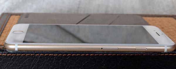
Even when closed, you can see that the entire side with the power button is left uncovered.  This of course makes it easy to access the power button, even when the case is closed.

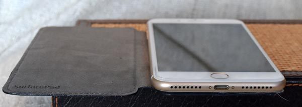
The metal of the top and bottom is also left uncovered, which leaves a lot of metal open to scratching, but it also means you can hear the speakers and use the charging cable unimpeded.

The leather hinge is flexible enough that you can fold the case completely to the back to hold and use the phone one-handed.  I found it comfortable enough to hold for a couple hours on a call.

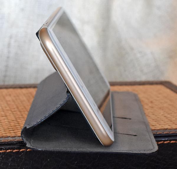
The case was also useful as a horizontal stand.  It was nicely stable in this position.  I could even tap on the screen while it was standing like this without fear of it tipping over.

What I like

  • Attractive leather case that protects the screen as well as the back
  • Front cover folds to the back for one-handed holding and use
  • Can be used as a horizontal stand
  • Room for two cards if you like to use your phone case as a minimal wallet
  • If your phone allows it, the cover is Qi-compatible for wireless charging
  • Adhesive pad adheres strongly to the back of the phone, and it can be removed without residue

What needs to be improved

  • Not really a needed change, but be aware that folding the front cover back will block the back camera

Final thoughts

The Twelve South SurfacePad is a beautiful, protective cover for the Apple iPhone 7 Plus.  It protects my screen in my purse, it serves as a horizontal stand, and it looks good doing it.
Price: $49.99
Where to buy: Twelve South and Amazon
Source: The sample of this product was provided by Twelve South

The post Twelve South SurfacePad iPhone 7 Plus/8 Plus case review appeared first on The Gadgeteer.

Filed in categories: Reviews

Tagged:

Twelve South SurfacePad iPhone 7 Plus/8 Plus case review originally appeared on The Gadgeteer on May 2, 2018 at 1:32 pm.

Note: If you are subscribed to this feed through FeedBurner, please switch to our native feed URL http://the-gadgeteer.com/feed/ in order to ensure continuous delivery.

DrinKup smart water bottle review

I have never been a big water drinker unless I was working out or physically working on something that was making me sweat.  Now living in south Texas that can be easily achieved by stepping outside.  However, working in a cubicle farm every day in my 7:30 – 4:30 office job never really required me to drink much if any water.   When I did make myself drink more water I seemed to be more focused on it in the morning hours and just before lunch.  Once I came back from lunch, I rarely ever drank any water.  I do know that I was finding myself to be very tired at the end of a work day which was probably a byproduct of being dehydrated.  Luckily for me, I received the opportunity to try out the new DrinKup smart water bottle.  It is supposed to remind you when to drink and keep you hydrated for the time periods you specify.  Let’s see how that worked out for me.
What is it?

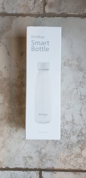
The DrinKup Smart water bottle is a water bottle that is supposed to track your hydration levels throughout the day.  It tracks them by using a ‘smart’ bottle cap on the bottle that measures how much water you have drunk.  It has an associated app that works on iOS and Android that allows you to enter in drinks you have outside of the bottle and track things like exercise so it knows if you need more or less water during the day. Please excuse the line you see going through the middle of the box.   I apparently overindulged when it came to opening the outside packaging and cut through a bit too far into the actual item box.
Hardware Specs

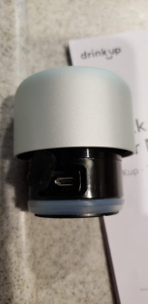
It comes packaged in a really nice box and is available in four different colors (yellow, red, white and blue).  The aluminum bottle cap includes a touch sensor screen with a LED display and a rechargeable battery.  The bottle is stainless steel with a 316 double wall vacuum insulated body.  It is supposed to keep cold water cold up to 24 hours and hot water hot up to 12 hours.  I have left water with ice in it at 4:30 pm and come in the next day at 7:30 am and there is still ice in the bottle.  The bottle is also BPA free.  The bottle will hold 17oz or 500ml of liquid. The battery is rated to last up to 2-3 months depending on how much you use it.  The app does show a battery level indicator in it.  You can see that you charge the bottle cap via a USB port in the lid.  This port is covered by a rubber cover and you then must twist the lid to fully cover the port when charging is complete.
What’s in the box?

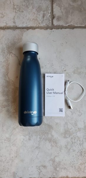
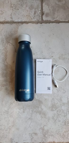
Inside the box, you will find three items.

  1. The water bottle with the lid attached.
  2. A quick user manual
  3. A USB cable for charging the lid

Design and Features

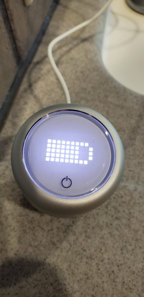
The first thing I had to do was to charge up the water bottle cap.  I plugged the USB cable into the port on the bottle and put the other end into a USB socket on my wall outlet.  You can see from the image above what it looked like when charging.    When charging was complete the display no longer showed the battery.   Once the cap was charged I downloaded the app onto my phone.  I am currently running a Samsung S9 so I downloaded the Android version.
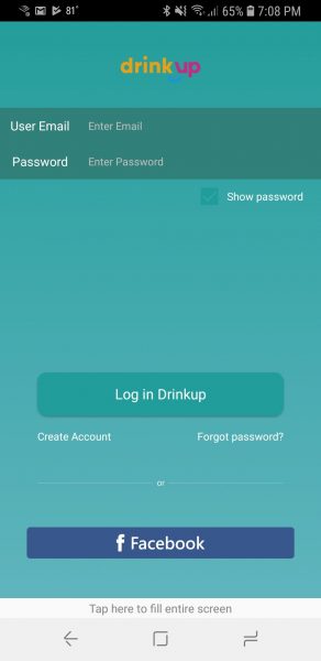
The first screen asked me to log in or create an account.  I clicked the create account button and received the following screen below.
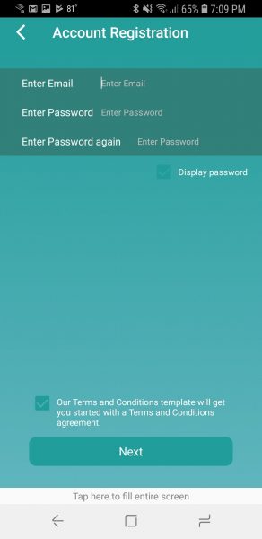
I entered my email, password and agreed to the terms and conditions.  Once done I clicked the ‘next’ button.
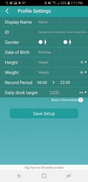
The next page asked me to fill in basic profile information.  I do have a couple of issues with this page.   The height would only allow me to enter in my height in decimal feet.  It would have been much easier to enter 5ft 7in rather than 5.58.  I am sad to admit I had to find a Google converter to figure that one out.  I really do not like math!   My other complaint has to do with the record period.   This is the period of time in which the bottle will nag you to drink if it feels you are dehydrated.   It only lets you put in whole hours.  I wanted to track from 7:30 am to 4:30 pm but had to stick with 7 am to 5 pm.  It should be noted that the ID field is how you can get friends to find you on the app.  Once set it cannot be changed.  The display name is just the name the app will display on the home page of the app.  I then chose the option to pair the bottle.  At this point, I had to put the cap on the bottle to activate it.  The app found the bottle pretty quickly and I gave my bottle a name.   Note that it is on the bottle settings page where you can apply firmware updates to the cap itself.
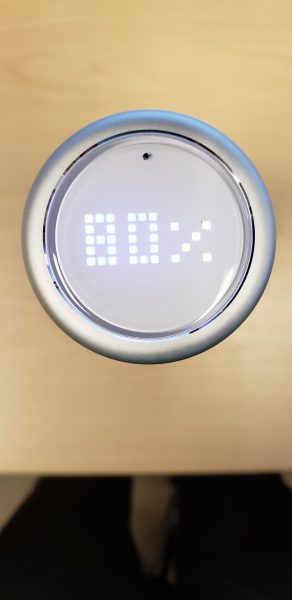
As my day went along I would periodically be reminded to drink up.  The bottle cap will vibrate pretty quietly 3 times and you will get a notification on your phone.   It is pretty quiet, but I have to admit if you are in a meeting and only one person is talking everyone around me did notice.   Fortunately, there is a setting under the bottle settings that lets you turn off the lid vibration.  Each time I drank, I put the lid back on.  Within 5 seconds or so, I would hear a high pitched electrical whine and then the display would show how hydrated I was.  The above picture is showing the display indicating I was 80% hydrated.   Notice the black dot on the top of the display.  I actually put that there with a permanent marker.  There is no way to tell which way is the right way ‘up’ so when the devices display the percentage, half the time I was trying to read the results sideways or upside down.  You are supposed to be able to tap on the cap with your finger at any time to display your hydration level.  I found this to be a bit hit or miss.
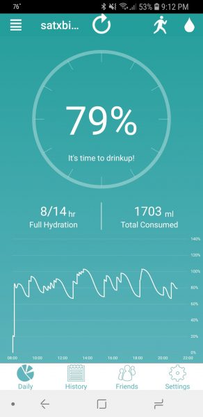
The above picture shows my hydration graph for a single day.  You can see when it starts to drop around 80% it will notify me to drink up.  At that point, you see the jump in the hydration level.

What I like

I love that the lid will stay charged for such a long period of time.  I have used it for a little over a week and it just lost one of the bars on the battery.  It does do an excellent job of keeping me hydrated.  I forgot to mention that the app will connect to Fitbit and Apple watches.  I have neither one, but according to the website, once connected the app will prompt you to drink more if it knows you are being more active.   It does give you the ability to manually enter an exercise in 30-minute intervals from 30 to 300 minutes in categories of low, medium or high intensity.  I used that and did notice the amount of nagging to drink did increase.  The other thing I like is the app gives you the ability to enter in drinks taken without the bottle.  Maybe you go to lunch and have a glass of water for lunch.  You can manually enter that into the app.  The app also lets you connect to friends who also have a DrinKup bottle which could make staying hydrated a bit more fun.  Finally, the app will let you know if the water in your bottle has gone stale.  I left the bottle over the weekend at work.  When I got back on Monday it was flashing an X to indicate that I had stale water and should refresh it.

What needs to be improved

This bottle is pretty darn pricey for what it is.  I could only find this water bottle for purchase on the DrinKup bottle website and they charge $79 for the bottle.   I know there are apps out there that will remind you to drink no matter what device you are drinking from, but this could be good for those times you don’t have your phone with you.  The couple of issues I mentioned with setting up my profile in the app could be corrected – allow half hour increments in tracking period, allow height in feet and inches.  Another thing that could be made to work better is the ability to tap on the cap and display your hydration level.  I found myself tapping multiple times with the flat of my finger as described in the FAQ before I could finally get it to display.   Finally, they could put an indicator on the top of the bottle to show where the top of the display is located.

Final thoughts

I can say for certain that this bottle did an excellent job of keeping me hydrated.  I think a few things could be fine tuned in the app that would make it a whole lot more usable.   I do think the bottle and app are priced quite a bit higher than I would ever pay to get one.   I would recommend this to folks who feel like they have the $79 to burn, but I don’t think too many people would be jumping at the opportunity.

Price: $79
Where to buy: DrinKup Website
Source: The sample for this review was provided by DrinKup.

The post DrinKup smart water bottle review appeared first on The Gadgeteer.

Filed in categories: Reviews

Tagged: ,

DrinKup smart water bottle review originally appeared on The Gadgeteer on May 2, 2018 at 10:00 am.

Note: If you are subscribed to this feed through FeedBurner, please switch to our native feed URL http://the-gadgeteer.com/feed/ in order to ensure continuous delivery.
Mohu Blade HDTV antenna review

What is it?

The Mohu Blade HD antenna is an over the air HD antenna that is designed to receive high definition TV channels that are being broadcast over the air for free.

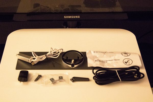
What’s in the box


Package contents:

1 x Blade Antenna
1 x 10’ Coaxial Cable
1 x 90 Degree Coax Adapter
1 x Power Injector
1 x Antenna Kickstand
1 x Safety Bracket
2 x 3/16*32L Wood Screws
2 x 16mm Wood Screws
1 x Instruction Leaflet

Design and features

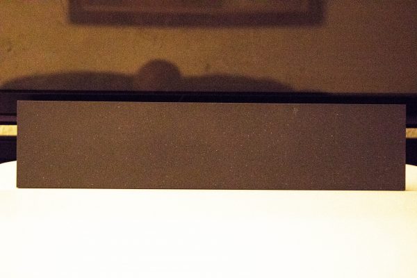
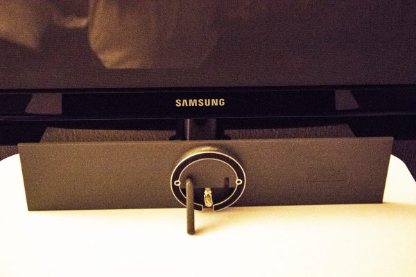
The Mohu Blade HD antenna is a simple design with a sleek look that easily blends into the surrounding environment. That actual antenna blade and surface is a nice “cool” gray, and it measures 18 inches by 4 inches. It is slightly less than a centimeter thick, except for the protrusion in the center of the back for the coaxial cable connection and the kickstand. (I did not mount it to the wall)

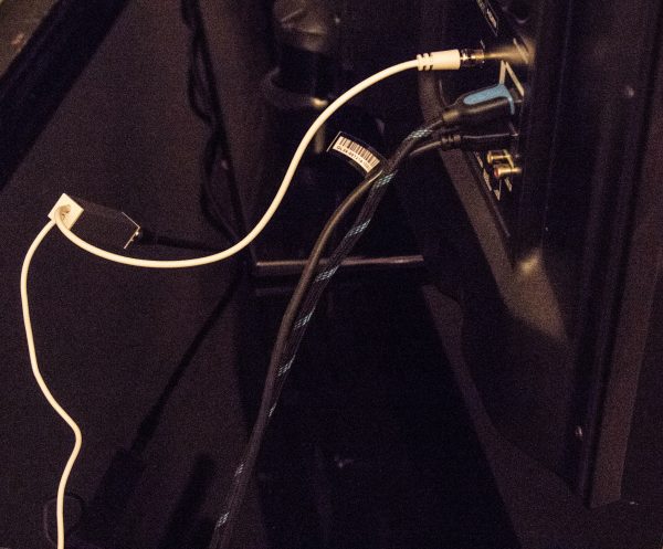
Once you connect the 90 degree coaxial adapter and the coaxial cable, you connect the other end of the coaxial cable to one end of the included power injector. The other end of the power injector has two cables. One goes to the USB AC adapter and the other plugs into the TV’s coaxial input.

After making all of the necessary connections, you choose the “TV” input on your TV, and at least in my case, I selected the “scan” option for the TV to scan and save the channels that were being received via the antenna. After that, it was ready to go, with all received channels being displayed in HD.


What I like

I love the simplicity of this antenna, the sleek and unobtrusive look, the slim form factor, and the ease of installation. I also love that every channel that it is able to receive, displays with great quality and consistency. The reception is very good with very few glitches.

What can be improved

The only improvement that I can think of is that a longer coaxial cable should be included with the antenna. Since the instructions state that “for an antenna to work effectively in this situation it must be moved away from large metal objects, and placed in a window facing the direction of the towers”, a few more feet of coaxial cable would add some flexibility for placement. The instructions also state that if needed, “additional coaxial cable can be added, but excessive cable may cause reception loss”. Since no specifications were provided to identify what the approximate maximum length of cable should be, I am uncertain of what length of cable I can add, and therefore if repositioning the antenna further away, would net me more channels.

Final thoughts

Over the air antennas have come a very long way in quality, design and capabilities. This OTA HD antenna does not disappoint and does exactly what is designed to do. It performs very well, and since the cable company in my area does have its share of outages, this antenna is now permanently attached to my living room TV.

Price: $49.95
Where to buy: Amazon
Source: The sample for this review was provided by Mohu.

The post Mohu Blade HDTV antenna review appeared first on The Gadgeteer.

Filed in categories: Reviews

Tagged:

Mohu Blade HDTV antenna review originally appeared on The Gadgeteer on May 1, 2018 at 12:00 pm.

Note: If you are subscribed to this feed through FeedBurner, please switch to our native feed URL http://the-gadgeteer.com/feed/ in order to ensure continuous delivery.
AUKEY Graphite Wireless Charger review

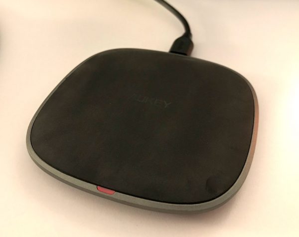
Wireless charging isn’t a new technology, but it’s rapidly becoming an industry standard in mobile devices because of its ease of use. Despite this fact, I haven’t seen very many chargers that are visually impressive. Most of the time, they’re just black, plastic pucks relegated to the corners of a desk or nightstand. AUKEY’s Graphite Wireless Charger adds a touch of class to that boring appliance.

What is it?

The AUKEY Wireless Charger is small pad, about 3.5” squared, that wirelessly charges devices compatible with Qi technology. This includes a variety of Samsung Galaxy phones and newer iPhone models.

Hardware specs

The Graphite Wireless Charger features broad compatibility, working with all Qi-enabled devices such as iPhone X / 8 / 8 Plus and Samsung Galaxy Note8 / S8 / S8+, even through most cases (thickness less than 3mm/0.12”). Non-wireless-charging devices require a wireless charging adapter (not included). The charger supports standard wireless charging speed (5W output). Product dimensions are 3.4 x 3.4 x 0.5” and it weighs in at 7.2oz.

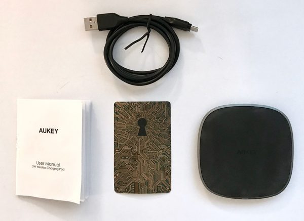
AUKEY. Gold. Key. Get it? I like the sticker that it came with.

What’s in the box?

  • Graphite Wireless Charger
  • 1m/3.3ft USB 2.0 A to C Cable
  • User manual

Design and Features

After browsing Amazon’s selection of wireless chargers, I found that the AUKEY’s Graphite Charger stands out as one of the classier offerings. In fact, this compact charging pad won a couple of  awards for its design. It’s quite a handsome piece of kit. The charger has a good amount of weight to it, nearly half a pound, and the grips on the underside keep it from sliding around on most surfaces.

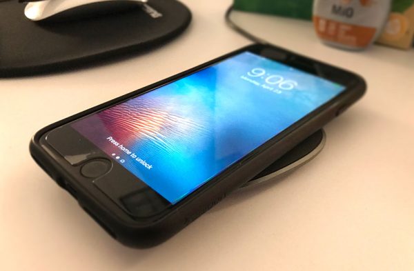
Place phone. Start charge. That’s all there is to it.

The port on the charger is USB C. I haven’t seen very many examples of this. Although your mileage may vary when it comes to interface preferences. I just happen to have a bunch of USB C cables laying around from owning a Nintendo Switch, so for me, it was a pleasant surprise.

In terms of function, the Graphite Charger works how you would expect. Place the phone on the surface and it starts charging at a standard speed (5W output.) It’s not a fast-charge device, more suited for a work desk or nightstand for long trickle charging.

A nice weight and grippy pads keep the charger in place.

There is one LED light on the top of the charger that is very dim, which I can appreciate. So often, I come across USB chargers or adapters that have an insanely bright LED indicator that must have never gotten properly tested in a dark room. The light on this charger is barely noticeable, and is covered completely when a phone is placed on top of it. That sounds like such a minor thing until you’ve seen your bedroom bathed in the blue glow of some unnecessary light.

One last feature worth mentioning is the fact that you can charge your phone with the case on, which I must plead ignorance on if this is or isn’t a normal function. I just know that I did keep the case on the phone while charging and it didn’t impede the functionality.

Final thoughts

AUKEY’s Graphite charger design looks like it would be right at home alongside an iMac or sleek, aluminum laptop. I appreciated the future-proofing of the USB C port, the non-overwhelming lighting, and the weight and grip of the charger itself. It brings form as well as function.

Price: $31.99
Where to buy: Amazon
Source: The sample of this product was provided by AUKEY.

The post AUKEY Graphite Wireless Charger review appeared first on The Gadgeteer.

Filed in categories: Reviews

Tagged: ,

AUKEY Graphite Wireless Charger review originally appeared on The Gadgeteer on May 1, 2018 at 10:00 am.

Note: If you are subscribed to this feed through FeedBurner, please switch to our native feed URL http://the-gadgeteer.com/feed/ in order to ensure continuous delivery.