BatchPhoto software review

If you work much with digital photos, sooner or later you’ll probably come across the need to edit a batch of photos, applying some form of edit to all of them. Regardless of whether or not you use something like Photoshop, Lightroom, or another image editor, sometimes the right tool for this job is one specifically designed for batch operations – like BatchPhoto from Bits&Coffee.

What is it?

BatchPhoto is a batch photo editing software program for Windows and Mac that can process multiple photos in an automated or semi-automated manner, applying specified actions to each one. There are 50 edit actions that can be applied. BatchPhoto calls them filters, but they’re more than just an Instagram-like filter. These filters include things like applying text, watermarks, resizing, rotating, image touch-up, and many more. Each filter has settings so that you can customize each filter to do exactly what you want it to.

What’s in the box?

The download for BatchPhoto is 34.5MB for Windows and 56.2MB for Mac. The download includes all available versions and has the ability to unlock the full (paid) version with a product key so there’s no re-downloading and installing the paid version if you decide to buy a license.

The installation was pretty much a standard installation, nothing unusual to mention.

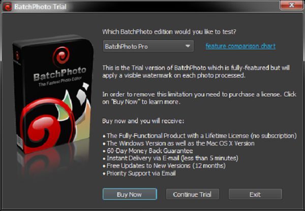
When you first start the program you’re presented with a dialog where you can choose which version to evaluate. There are three versions to choose from, Home, Pro, and EEnterprise.This review covers the enterprise version. For a comparison of features included in each version, see the comparison chart.

BatchPhoto is available in the following languages: English, German, French, Spanish, Italian, and Japanese.
Design and features

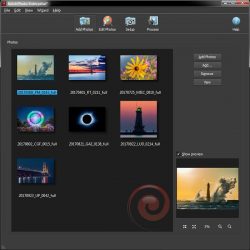
The program uses a simple wizard-like three-step approach:

  • Step 1: Add photos.
  • Step 2: Edit Photos.
  • Step 3: Setup.

Clicking the “Process” button starts the real action of the program, processing each image with the settings you have specified.

Although the program is wizard-like, you can jump between steps at will. You can even skip step one if you’re going to be using a profile to automate the processing of images at a later time (more on profiles later).

Step 1 – Add Photos

BatchPhoto handles just about every image format there is. It can process over 170 image formats, including quite a few RAW formats (including Canon, Sony, Nikon, Olympus, Fuji, Kodak, Pentax) that photographers use. It can also output to almost all of these formats as well. Some formats can’t be output to, like RAW files that are specific to digital cameras.

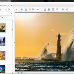
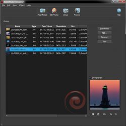
You can add photos via drag and drop or browsing for specific files, or adding files from a folder or multiple folders. The photos list also includes multiple view modes such as detail list, small icons, medium icons, and large icons (icon meaning thumbnails). A Preview window is also in this step and supports zooming.


Step 2: Edit Photos

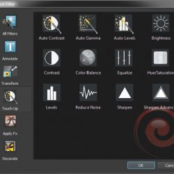
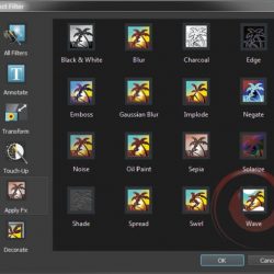
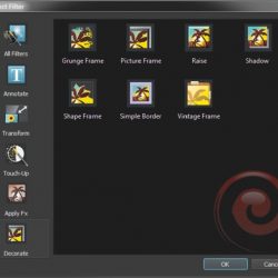
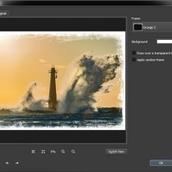
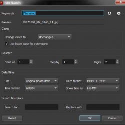
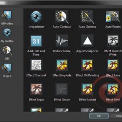
In this step, you specify filters and file renaming options. This is the heart of the program. There are 50 filters, each with its own customizable settings. You can do just about anything that you would want to automate.

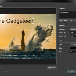
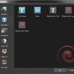
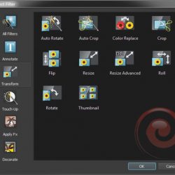
There are far too many filters here to cover each one individually, but I’ll include screenshots of the filters here, along with a couple of their edit dialogs as well.


Step 3: Setup

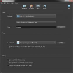
This is where you setup the output options. You can specify the output folder, output format, and other miscellaneous options.

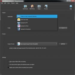
The output options are:

  • Folder on your computer
  • Send via E-mail
  • Upload to FTP
  • Upload to Flickr
  • Upload to Facebook

PDF, TIF, and GIF output formats can create multi-page files where all of the images are included in a single file.

There are also settings for setting the output photo’s date and attributes to match the original file, as well as an option to delete the source file after processing.


Processing

One of the key features of BatchPhoto is its ability to process multiple photos at the same time, greatly reducing the time it takes to process photos. For those who are into technical stuff, this means it will use multiple threads to process the photos. There’s also an option to turn this off if you want.

One of the things I really like is that you can save your settings as a profile for easily loading those settings later, and applying them to batch operations using the “watch folder” feature of the included monitor program. For example, you might have one profile for processing “proof” images, and another profile to process “final” images or one for outputting small images and one for outputting large images.

One thing I did note is that you save the profile via the file menu, but you load them via the wizard menu. BatchPhoto includes many pre-defined profiles for your convenience including a “Convert to PDF Album” that will output your photos to a PDF file and a “Send via E-mail” profile.


Automated processing

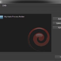
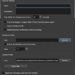
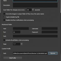
BatchPhoto includes a utility program called Monitor. It can be launched and will run separately from the main program. It can be configured to watch a local or FTP folder for new files. When the new files are detected, it will process them automatically based on a specified profile.

This is a very powerful feature for users that want to automate the processing of files. An example use would be to automatically process and upload files simply by copying or moving them to a watched folder. As soon as that folder is checked (at an interval that you specify), the new files are automatically processed.


Semi-Automated processing

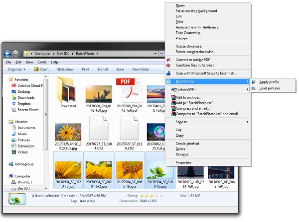
BatchPhoto also includes the option to integrate into the Windows Explorer shell. You can simply select your images, then right click and choose BatchPhoto then Apply Profile and the program will prompt you to select a profile and the selected images will be processed with that profile.
What I like

  • Very versatile in input and output formats
  • Video tutorials on the BatchPhoto website.
  • Profiles for quickly specifying options
  • Output option for processing the files to a subfolder of the original folder.
  • Configurable file renaming options.
  • Multiple thread output. 7 threads on an 8 CPU (4 Core) system.

What needs to be improved

  • I would like to see a ZIP output format where all the files would be created and then moved into a zip file.
  • I saw errors outputting files using the grunge frame with multiple files while using multi-processing. The error did not occur when the setting was turned off.

Final thoughts

BatchPhoto is an excellent batch photo processing solution. It provides powerful editing features, superb configuration options, as well as great output formats and destinations. Whether you’re an amateur or a professional, you’ll probably find that this program will meet most, if not all, of your needs.

Price: $29.95 – $129.95
Where to buy: BatchPhoto
Source: The sample of this product was provided by Bits&Coffee

The post BatchPhoto software review appeared first on The Gadgeteer.

Filed in categories: Reviews

Tagged: , ,

BatchPhoto software review originally appeared on The Gadgeteer on May 29, 2018 at 10:00 am.

Note: If you are subscribed to this feed through FeedBurner, please switch to our native feed URL http://the-gadgeteer.com/feed/ in order to ensure continuous delivery.

LifeProof Goa 22L Backpack review

What is it?

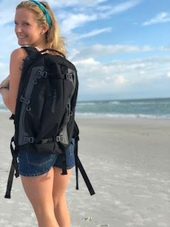
You know the company, LifeProof, who created those insanely durable smartphone cases back in 2013? Well, it turns out there’s a demand for many of the products in our lives to be “life proof” or, protected from water, snow, dirt, and drop damage, including our backpacks! LifeProof has created such a backpack with the Goa 22L Backpack and it is pretty awesome.

What’s in the box?

In the box came the beautiful, black and green LifeProof backpack, alone. I fell in love at first sight.

Design and features

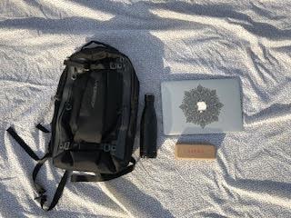
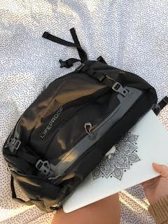
This heavy-duty pack has a multitude of features that set it aside its competition. It’s made from a water-repellent fabric, and even has a sealed, fleeced lined weather-resistant tech pocket that holds up to an iPhone 8 Plus. The tech pocket has a pass-through for cords like headphones and charging cables. If that pocket wasn’t cool enough, there’s also a hydration reservoir pocket that holds up to 3 liters, so you’ll always be hydrated on your adventures. There’s a detachable chest strap for extra comfort, and plenty of convenient smaller pockets on the inside to keep your gear organized. The exterior has 4 side stash pockets for smaller items like passports, wallets, etc. Also found on the outside is a separate reinforced laptop and/or tablet side pocket with padding to keep your electronics safe.


What I like

What I like the most about this pack is the padded laptop pocket, because it’s perfect for me as a traveling student journalist. I adore the ergonomic straps that make the pack completely comfortable, no matter how heavy I make it. The lifeproof-ness is something I particularly favor, also!

What needs to be improved

There isn’t much that I can see needs to be improved with this pack. It comes in 4 sizes, so it can appeal to almost anyone. Though I’m assuming it isn’t 100% waterproof, (I’m not going to soak it in the ocean to find out…) it is water resistant, meaning I can wear it out in the rain, and I plan to! The only thing I can think of is adding the option for more colors or styles. But, this company is pretty on-the-ball, so I’m sure they’ve already considered that.

Final thoughts

This is a greatly anticipated, well designed, nearly flawless backpack and I plan to keep using it for a  long time, being as it will last me a very very very long time! Go LifeProof!

Price: $159.99
Where to buy: https://www.lifeproof.com/en-us/backpacks-coming-soon.html
Source: The sample for this review was provided by Lifeproof.

The post LifeProof Goa 22L Backpack review appeared first on The Gadgeteer.

Filed in categories: Reviews

Tagged:

LifeProof Goa 22L Backpack review originally appeared on The Gadgeteer on May 28, 2018 at 12:00 pm.

Note: If you are subscribed to this feed through FeedBurner, please switch to our native feed URL http://the-gadgeteer.com/feed/ in order to ensure continuous delivery.
ZAGG InvisibleShield Glass Curve Elite Samsung Galaxy S9 screen protector review

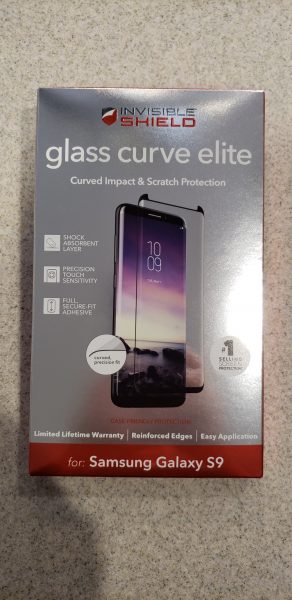
I have used many different screen protectors on my phones, watches and digital camera screens over the years.  The majority have been the peel and stick type that you apply with a water base.  I have used tempered glass screen protectors and a couple of phones and currently on my Garmin Fenix 5s.  I do not, however, have a screen protector on my current phone which is a Samsung Galaxy S9.  I have been hesitant to put one on because I figured that curved screen would give me issues.  Does the new  InvisibleShield Glass Curve Elite from ZAGG make this an easy task?  Let’s find out!

What is it?

The ZAGG Glass Curve  Elite is a tempered glass screen protector.  The one I have was made specifically for the Samsung Galaxy S9.  They make it for the S9 Plus and several other models of Samsung including the S8,  S8 plus and the Note 8.

Hardware Specs

  • It has a custom curved fit to specifically fit the model of phone it was made for.
  • It has a built-in shock absorbent layer that helps prevent the impact of an unexpected drop from shattering your phone.
  • Smooth tempered glass that does not impact the clarity of the screen.
  • Provides impact and scratch protection
  • Provides for precision touch sensitivity (you do have to increase the touch sensitivity in your phone settings before installing the protector)
  • It has a smudge-resistant finish

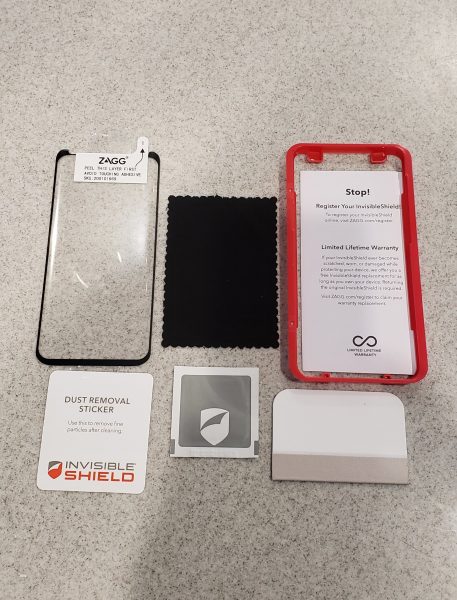
What is in the box?

  • The screen protector
  • A micro fiber  cloth
  • An alcohol wet wipe
  • Instruction book
  • Plastic template to help install the protector on your phone
  • Dust removal sticker
  • A stiff card with cloth on one end to help set the glass to the phone.

Installation process

First off, and I cannot say how important this is, please be sure you are in the most dust free area in your home.  Unlike the peel and stick type protectors, if you get a dust particle under the middle of the protector you will have little to no chance to get it off without breaking the protector.  You can pull back the edges pretty easily to fix bubble and remove dust, but to pull it back all the way to the middle really risks cracking the glass.  That is essentially what happened to me on the first time I tried to install it.  The next time I used the tried and true method of using the bathroom.  I ran the hot shower for a few minutes to steam up the room and remove the dust particles from the air.  I then followed the next steps of shutting the phone off, wiping it down with the alcohol wipe and then wiping with the micro fiber cloth.  I finally used the dust removal sticker and went over the entire screen with it.

The next step was to place the red plastic template over the phone.  In the picture above it goes over the top of the phone exactly in that layout.  It really does help you to position the protector exactly where it should be on the phone.   I then peeled the back sticker off the protector and used the two tabs on the top and bottom of the front of the protector to position the protector.   Once in place, I pulled the top sticker off the top of the template holding it in place on the bottom of the screen.

At this point, you take the hard card and using four fingers, slowly slide the cloth side of the protector towards the top of the phone.  Once the middle of the protector is set, you flip the hard card over and use the non-cloth covered side to slide up the edges.   Watch the video below to see how the installation should work.  They certainly make it seem easy!


What I like

I love the idea of having a tempered glass screen that will fit the curve of the newer Galaxy phones.  I often find that the peel and stick type protectors leave the screen feeling slightly ‘funny’ and it was really noticeable on my Note phones when I used the stylus.  Glass protectors also tend to be much clearer and less susceptible to scratches and ‘dents’ that the plastic type protectors would often get.

What needs to be improved

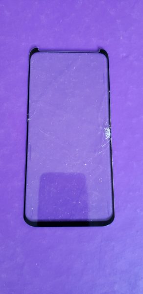
Unfortunately for me, even with three different tries on installing this protector it just did not work for me.  The first time I will totally blame myself.  In my excitement, I tried to install the protector in my breakfast area.  We have a Shetland sheepdog in our home and he is a walking dust magnet.  Even going through the whole alcohol wipe, microfiber wipe, and dust sticker, I still had a ton of dust under the protector.  The sides also failed to seat at all and that could have been due to the amount of dust.   My second attempt I used the bathroom process described above.  I was getting bubbles under the corners and having some difficulty again trying to get the sides of the protector to seat on the phone.  Somehow in the process of trying to seal it the screen cracked on the side.  You can see a picture of it below.

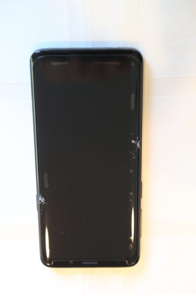
Third time is a charm, right?  Well NO, darn it.  Things were really going well this time.  I was still having issues trying to get the sides to seal on the phone.  I had flipped the card around to the non-cloth covered side and was repeatedly trying to push down and get those sides to de-bubble.  I guess I must have been too firm and I got a crack again.  You can see where I had bubbles on the sides of the phone on the top right and just above the other crack on the left.  For a protector that costs $50 you want to get it right the first time.

Final thoughts

I really wanted this screen protector to work.  Even with three attempts, I could not make it work.  This screen protector is extremely expensive at $50 and I would have spent $150 and still had no protection on the screen of my phone.  The video makes it seem effortless, but I did not find it to be that way at all.  I just can’t recommend this protector unless you feel like you have that special touch and really want to try it yourself.

Price: $49.99
Where to buy: ZAGG and Amazon
Source: The sample for this review was provided by ZAGG.

The post ZAGG InvisibleShield Glass Curve Elite Samsung Galaxy S9 screen protector review appeared first on The Gadgeteer.

Filed in categories: Reviews

Tagged:

ZAGG InvisibleShield Glass Curve Elite Samsung Galaxy S9 screen protector review originally appeared on The Gadgeteer on May 28, 2018 at 10:00 am.

Note: If you are subscribed to this feed through FeedBurner, please switch to our native feed URL http://the-gadgeteer.com/feed/ in order to ensure continuous delivery.
Sengled Element Classic Smart Bulb review

So you’re thinking about dipping into smart home technologies, but want to start simple. The Sengled Element Classic may be just the thing for you. It’s easy to use, sets up in minutes, and is a remarkably inexpensive solution to creating a smart lighting solution for your home. Let’s get illuminated!

What is it?

It’s a smart bulb lighting kit that you control from your smartphone, Amazon Alexa, or Google Assistant.

Hardware specs

Bulbs:

  • 9 W, 60 hz
  • 4.41” by 2.42” (standard socket size)
  • 800 lumens, 2700 K Color Temperature
  • Dimmable with app
  • 240 degree beam angle
  • 25,000 hour lifetime

Hub:

  • 3.07” by 1.02”
  • 2.4 GHz
  • 120 foot range
  • 64 bulb management capacity

What’s in the box?

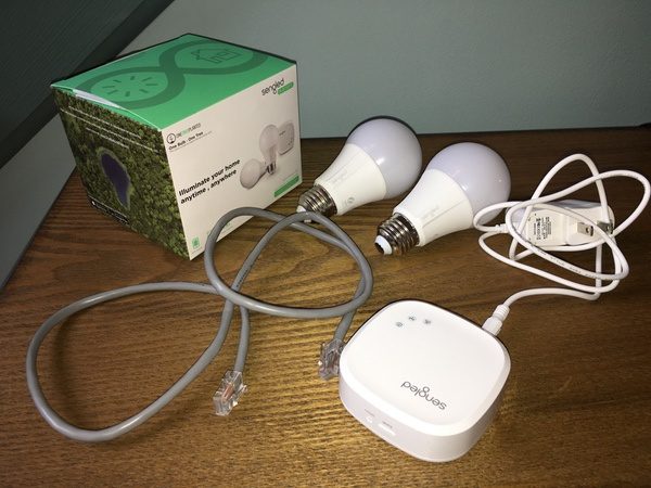
You get two soft-white controllable bulbs, the Element wireless hub, and a power adaptor for the hub. There’s also a network cable to get connected for the setup process.

Design and features

The Sengled Element Classic Starter Kit gives you everything you need to get started with basic smart lighting. The Element hub, when set up on your network, pairs with the bulbs. The app on your smartphone controls the bulb functions. We’ll walk through the setup process and controls in the following sections.

Setup

Setup begins with downloading the “Sengled Element Home” app on your iOS or Android mobile device. You’ll need to create an account with Sengled to get started, after which the app will all you through the setup process.

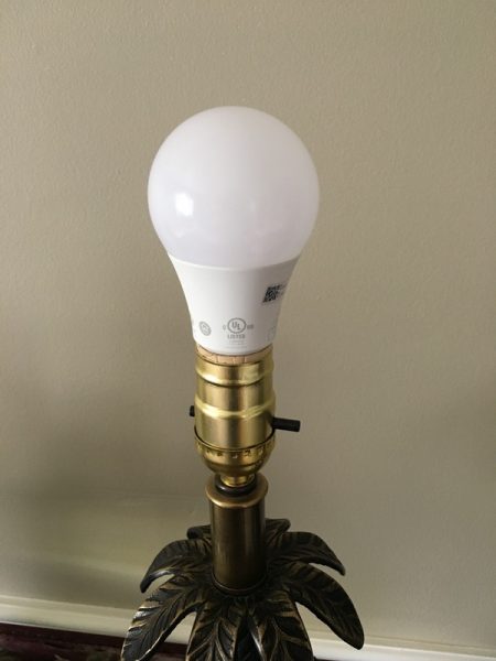
The bulbs that come with my test sample (the “Classic”) are 2 soft-white LED bulbs. While a bit heavier than typical LED bulbs, they have the same form factor and fit in standard lamp sockets. Sengled offers 4-bulb packs, daylight bulbs, tunable daylight/soft bulbs, and multicolor bulbs on their website if you want to get fancy.

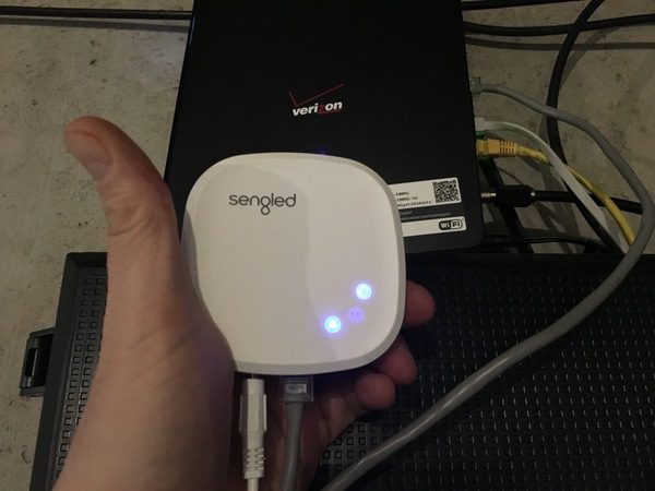
The setup process is very straightforward. You’ll plug the hub directly into your router with the Ethernet cable provided in the kit. Power it up, follow the instructions on the app to pair the hub to your network (you’ll need your network password), and the app will let you know when you’re all connected. You then go to the app to identify the locations of your bulbs in the house.

Once you have set up the connection, you can go fully wireless with the hub. Disconnect it from the router, find a discrete place to plug it in, and you’re good to go. It’s a tiny thing at 1” by 3”, so you can tuck it just about anywhere. See it hiding on one of our hallway display shelves below, behind the Flying Dutchman and Mickey…

It’s important to note that the Sengled setup has limited compatibility with third party hubs. I have the Deco mesh network set up in my house, and I could not plug the hub into one of the remote pods to set it up. Once I finished initial setup at the router, however, I switch back to my mesh network on my smartphone to manage things from the app. You can connect the Sengled system to Amazon Alexa or Google Assistant, but these configurations were not tested for this review. You should check out the Sengled web site to learn more about compatibility before purchasing.

Performance

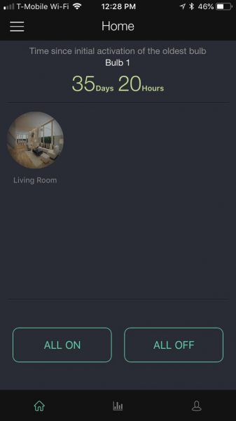
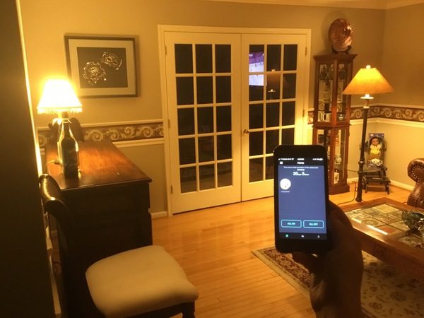
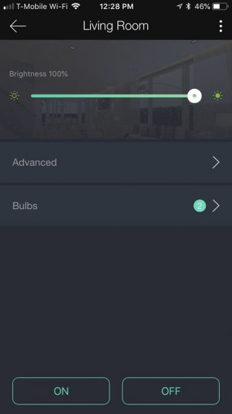
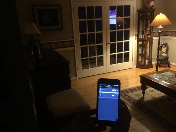
As you set up the app, you’ll identify the room(s) where your bulbs are located. I put both mine in the living room for purposes of the test. Your home screen on the app now serves as your master control:

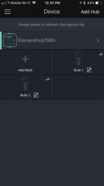
You can also manage your individual bulbs from the app, providing custom names for each bulb. You can expand your setup to include additional bulbs or hubs as well:

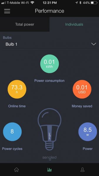
Once established, the app provides monitoring you can use to measure power performance across the setup or at the individual bulb level:

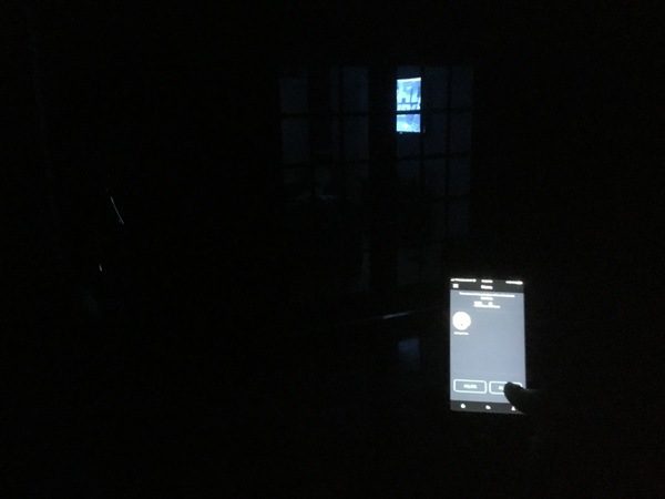
Once you’re in business, you can use the app to power on/off all the Sengled bulbs in a room, including dimmer functions. Here I’m turning everything on at once:

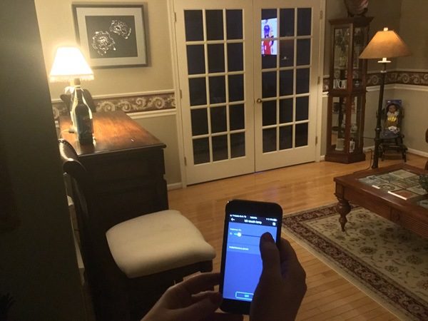
You can also control individual bulbs in the room. Tap on the “Bulbs” button, and you give each bulb a custom name for easy management. You can turn them on and off individually from this screen. Here I went in and turned off the bar lamp for purposes of demonstration:

You can also tap the name of the bulb to set individual dimming. The first pic below is both lights at 100% brightness, while the second shows the couch lamp being dimmed to about 20% brightness. (I should note that the couch lamp has a darker shade to begin with.)

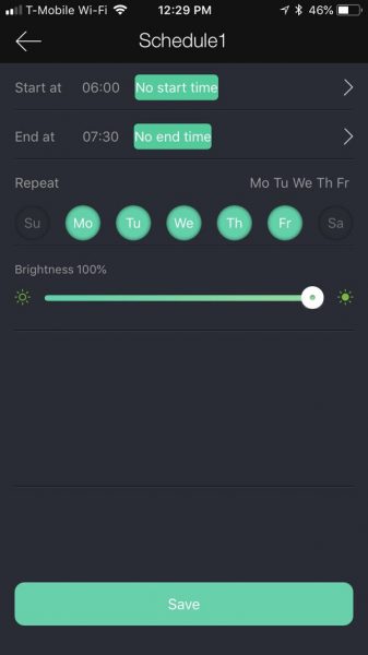
In addition to on-demand control, you have the ability to schedule the lighting by room by tapping the “advanced” button. Here you can set a wake up time to turn the lights on, or two different scheduled events. This includes a start time, end time, brightness, and what days of the week to repeat the function. With two scheduled events available, this means that you could set multiple events for a single room if desired.

It’s important to note that the scheduled event either happens on the day it is set, or is repeated each day that you select in the interface. You cannot schedule for a specific date range, like a vacation.

According to Sengled a single hub can support 64 bulbs. I don’t imagine needing an additional hub unless you’re pushing the 120 foot range of the hub itself.

Setup with Alexa and Google Assistant also looks pretty simple but, as I mentioned, there’s limited compatibility with other hub networks. Advanced kits are offered that support Xfinity Home and Cox Homelife. Again, check the Sengled web site to make sure that the Sengled will work with your home setup.

What I like

  • Quick and easy to set up
  • Simple, clean app interface
  • Scheduling features

What needs to be improved

  • Limited compatibility with third party hubs
  • Would like to see a date-specific scheduling function for trips

Final thoughts

At $39.99, the Sengled LED Classic Smart Bulb system looks like a great deal to set up some basic smart lighting for your home. It’s easy to set up and use, and has options to expand beyond the basic kit for about $10 per additional bulb. There are a ton of options available in the form of advanced hubs and bulbs if you want to go beyond the basics. You’ll also want to check compatibility with existing systems if you’ve already started investing in smart home technologies. 

Price: $39.99
Where to buy: All Sengled products are available for purchase on Amazon.
Source: The sample of this product was provided by Sengled.

The post Sengled Element Classic Smart Bulb review appeared first on The Gadgeteer.

Filed in categories: Reviews

Tagged: ,

Sengled Element Classic Smart Bulb review originally appeared on The Gadgeteer on May 27, 2018 at 9:00 am.

Note: If you are subscribed to this feed through FeedBurner, please switch to our native feed URL http://the-gadgeteer.com/feed/ in order to ensure continuous delivery.
PACElid (original version) review

Two ideas among many that I am big fan of are hydration and multi-functionality.  Where is this going, you ask?  Allow PACElid to elegantly link these two ideas together.  When I’m out hiking, rucking, traveling or even just running errands around town, I usually have my Nalgene bottle along, and PACElid lets me take a few other small items along for the ride.  How does it do this, you ask?  Let’s check out PACELid in a little more detail.  Gadget on!

What is it?

In military terminology, PACE is an acronym and methodology used to build a communication plan.  PACE stands for Primary, Alternate, Contingency, and Emergency means (i.e. technologies or systems) of communication.  Chris Way, inventor and developer of PACElid, has for the past 20 years “worked and played side by side with some of the most experienced and accomplished athletes, climbers, and military/government operators” and learned the value of trustworthy and reliable gear.   Chris founded Northstar Gear Co. as a way to produce PACElid, which is a screw-on lid for several popular wide-mouth water bottle brands that has its own storage compartment inside, allowing you to take along a few items atop your bottle.  PACElid began as a successful Kickstarter campaign and has since become a successful product in its own right.

Hardware specs

  • Injection-molded high-impact plastic material
  • Watertight screw-down lid
  • 2017 version with universal threads fits wide-mouth Nalgene, Klean Kanteen and Hydroflask bottles. Original version (reviewed here), fits only wide-mouth Nalgene and Klean Kanteen bottles.
  • Available in Black, Red, Green and Blue colors

What’s in the box?

  • PACElid
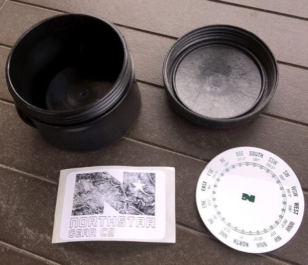
  • Northstar Gear Co. logo adhesive decal
  • Northstar Gear Co. compass adhesive decal

Design and features

Right out of the box, PACElid looked and felt like a very high-quality, durable item, one designed and built for folks who are hard on their gear, go on hardcore adventures, or both.

PACElid has a series of notches around the perimeter of its lid, which makes it easier t0 grip when twisting the lid on or off.  Note that the newer, 2017 version has a series of raised fins around the perimeter, along with the notches.

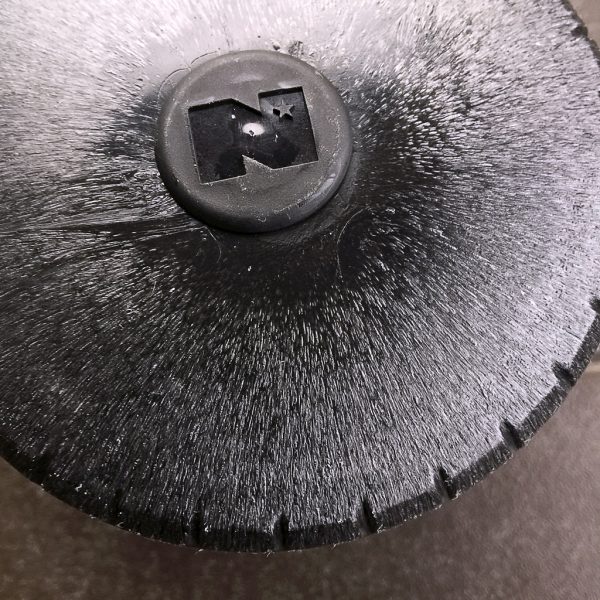
This original version of PACElid has a cool visual appearance molded into it, as seen in the image above (more on this below).  In addition, the Northstar Gear Co. logo is embossed into the top of a small, raised “button” on the PACElid’s lid.

Note that the version being reviewed here is the original PACElid, one that is compatible with wide-mouth Nalgene bottles and Klean Kanteen bottles.  (The latest version, the 2017 version with universal threads fits those plus Hydroflask bottles.)

One of the subtle yet functional features of PACElid is the small loop molded into its side.   This loop can be used to attach PACElid to its bottle (so you don’t lose it), or it can be used to attach items like a carabiner or other fastener.

Above, a closeup of the PACElid’s surface.  While the surface appears as if it would feel “grainy,” it actually doesn’t.  This texture is just below the smooth surface and is visible, but not tactile.


So what does PACElid look like on the inside with its lid removed?  See image above.  It’s basically what you’d expect: a cylindrical space with a raised bottom to allow clearance for the bottle threads.

Above is the Nalgene bottle that I used in my evaluation of PACElid.  It is a standard, wide-mouth 32-oz Nalgene bottle (and Boiler Up! to you Purdue fans out there).

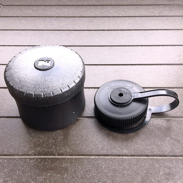
Above is a side-by-side photo of what PACElid (on left) is replacing: the Nalgene bottle’s lid (on right).

And finally, the above image shows the PACElid atop the now lid-swapped Nalgene bottle.  PACElid is obviously a much larger lid than the stock Nalgene lid, but it does have a screw-down compartment inside.

I wanted to try loading PACElid with a few small EDC items to see how much it could hold (see above).  I included my Leatherman Squirt PS4 mini multi-tool, a set of earbuds for my iPhone, a small set of EDC tools, most of which I reviewed here a while back, and a small One-decade Rosary.
As you can readily see in the photos above and below, all of these items fit inside the PACElid’s compartment with a bit of room to spare.

I took the now-filled PACElid on a short wintertime ruck (hiking with a weighted backpack) and it performed flawlessly.  I even dropped PACElid on the hard ground a couple of time and it was not damaged at all, save maybe a few scuffs.  It was really convenient to have the EDC items at hand and readily accessible.

In the above photo, I had taken PACElid on a family vacation where we did a lot of hiking.  I dropped a few handfuls of jelly beans into the PACElid’s compartment, filled my Nalgene bottle, threw it all in my backpack, and took off.  The jellybeans were a nice little “pick-me-up” along the trail.

What I like

  • If you already carry a Nalgene, Klean Kanteen or Hydroflask, PACElid gives you a quick and easy way to store a few items along with it
  • Very reasonable cost

What needs to be improved

  • Even with PACElid empty, the combination of water bottle and PACElid can be a bit top-heavy if the water bottle itself is not full of liquid

Final thoughts

PACElid is a really clever idea that was realized into a really durable, well-built product.  It gives your water bottle a little bit of extra versatility by providing some extra storage space, and couldn’t we all use that?  It’s a great product and I’m looking forward to seeing what else Chris Way and Northstar Gear Co. come up with in the future.

Price: $19.99 (2017 version with universal threads), $24.99 (original version, reviewed here)
Where to BuyPACElid.com (2017 version with universal threads), Amazon (original version, reviewed here)
Source: Item was purchased with the reviewer’s own funds.


The post PACElid (original version) review appeared first on The Gadgeteer.

Filed in categories: Reviews

Tagged:

PACElid (original version) review originally appeared on The Gadgeteer on May 26, 2018 at 10:00 am.

Note: If you are subscribed to this feed through FeedBurner, please switch to our native feed URL http://the-gadgeteer.com/feed/ in order to ensure continuous delivery.