Bibo – The Ultimate Cocktail Machine Review

REVIEW – There is nothing like sipping on a well-crafted cocktail on a hot summer day.  Many bartenders will tell  you that there is an art to making a great tasting drink.  I know this because I personally have failed a time or two trying to make them.  Sure, anyone can mix a little rum and Coke, or splash some water in scotch, however making a mixed drink that requires several ingredients takes knowing what you are doing OR a machine that says it can do it all for you magically!  That is what the Bibo Ultimate Cocktail Machine promises so let’s see if what it promises can really happen.

What is it?

The Bibo Cocktail Machine is a machine that uses premixed pouches of non-alcoholic mixers in combination with the alcohol you add to give you the perfect mixed drink.   It reads the bar-code on the pouch to know exactly how much water to add to the mix.   It uses one pouch per drink so there are no more bottles hanging around with leftover margarita or rum punch mix.  You simply fill the provided shaker with a few ice cubes, add the shot of alcohol, put in your mixing pouch into the machine, punch a button and the mixer is added to the shaker.  Then you get to play bartender by shaking it up and pouring into the glass.  The Bibo company provided me with a Red Bibo and

What’s in the box?

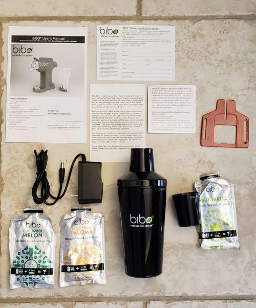
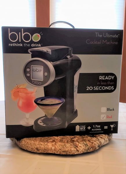
The Bibo company provided me with a red Bibo machine.  They come in both black or red.  The machine itself comes with 3 mixing pouches: Cucumber Melon, Paloma, and Margarita.  The Bibo box also included a shaker, a 1.7 oz (yes that is a generous shot!) shot glass, power cord, instruction manual, registration card and two separate cards explaining the red divider thing you see on the right-hand side of the picture below.  That red divider thing will be used later in 2018 when they start providing mixing pouches that include alcohol in them.   Besides giving me the actual Bibo to review, they also included a separate box of mixing pouches.  The box of mixing pouches they gave me was the variety pack that included two each of the flavors in the original box, plus rum punch, appletini and mai tai mixes.
Design and features

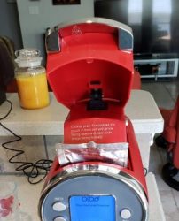
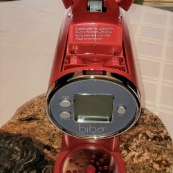
The next three pictures below show you the Bibo machine itself.  The side view shows you the detachable water reservoir at the back of the unit.   You can also see a silver button on the top part of the machine.  There is an identical one on the other side.  Both of those can be pushed in and the entire handle comes out of the top of the machine.  This makes it really easy to clean it afterward.  The middle picture shows the digital display that includes three buttons.  One button is for Info, one for Clean and one for Mix.   The third picture shows the handle at the top of the machine open.  This is where the drink mix pouches will be inserted into the machine.  They will go in that slot right behind the digital display.  There are several cautionary notes in the manual that the pouch insertion area includes a sharp cutting blade inside.  The act of closing the handle on the mixing pouch brings out the blade to slice open the pouch.


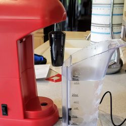
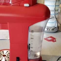
Bibo recommends that you use chilled filtered water if at all possible.  Like anything in life, you get a better result if you start with the best ingredients available.  The two pictures below show the water reservoir detached and filled with filtered water from my refrigerator.  The second picture shows the reservoir mounted back into the machine.  You do hear a distinct click when it is mounted correctly.  The water is siphoned out of the bottom of the reservoir through that black hole at the bottom of the machine.  There is a floating sensor in the reservoir that lets the machine know when it is running low on water.  The other thing they suggest is that you put the drink mix pouches in the refrigerator so they are chilled.  Do not put them in the freezer.

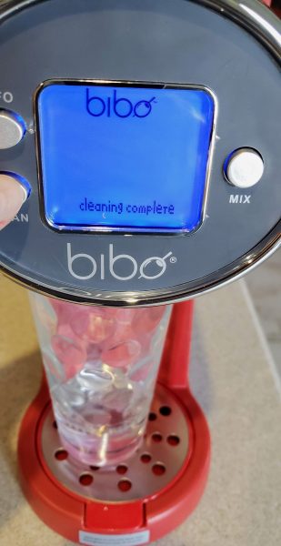
The first thing you need to do is clean the machine.  You will do this step after every drink you make if you wish to switch out the type of drinks you are making.  The cleaning function simply pulls water from the reservoir and runs it through the machine.  You want to be sure there is no mixing pouch inserted in the machine.   I found that after I made a drink I had to push the clean button an average of 3 times in order to clear out the previous drink’s mixing ingredients.  The digital display will indicate when cleaning is complete as you see in the picture below.
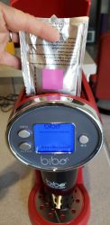
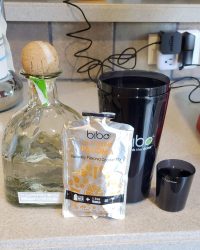
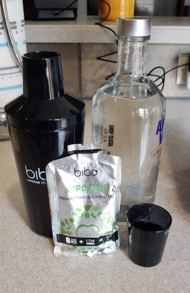
Now we are ready to make our first drink!  In the pictures below, you can see the first drink I made was a tangerine Paloma.   Following the rules of my earlier comment, I chose a really good tequila in which to make the drink.  I put in about 6 ice cubes into the shaker and then according to the instructions on the back of the pouch I added 1.7 oz of tequila into the shot glass.  The shot glass has a nice fill line indicating how much 1.7 oz is.  I put that into the shaker and place the shaker under the Bibo machine.  Next, I put the pouch into the machine.  Note that in the middle picture I am showing the square bar-code facing the front of the machine.  There is a reader inside of the handle that reads that bar-code and will instruct the machine on how much water to add to the mix.  The last picture on the right shows the pouch fully inserted.
   

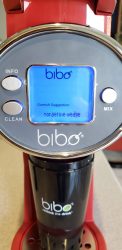
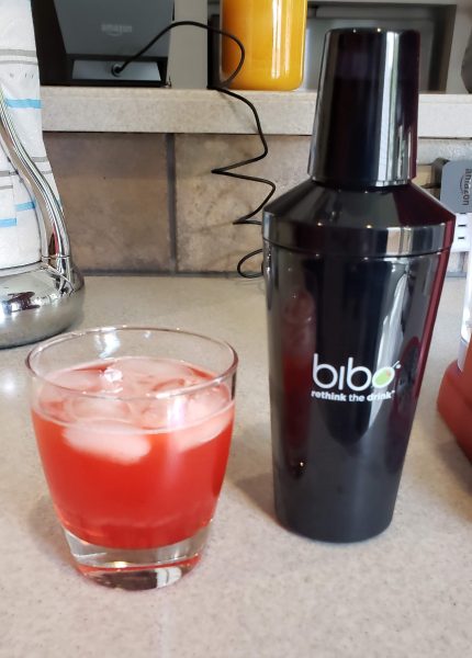
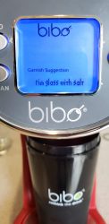
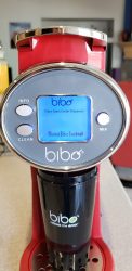
I then closed the handle on top of the pouch.  Immediately I could hear the slicer cutting the pouch open.  Now I sat there like a dummy for a bit and watched the mix slowly start to pour out into the shaker.  I then realized I needed to push the mix button to get the water added.   The first picture shows the display after I pushed the mix button.  It displays ‘Mixing Bibo Cocktail’.  The machine buzzed and I saw that a much larger stream of water and mix now flowed into the shaker.  Since it is all going into the shaker it is not really that important that you push mix right away.  It does need to be pushed though because if you do not, you will end up with a really strong drink because no additional water is added.   When the machine was done adding water it displays a garnish suggesting.  In this case, it suggested a tangerine wedge.  I let the shaker sit a bit longer as the mix continued to drip a bit.   I then did my best Tom Cruise imitation in the movie Cocktail and gave it a good shaking.   Pouring the result into a glass resulted in the picture on the right.

Taste Test Time!  First off let me state that I am not your standard barfly. My husband and I may go out to drink around a couple of times a month.  I am a big time lightweight when it comes to consuming alcohol.  So my first impression of this drink was WOW I can really taste the tequila in this drink.   I then gave it to my husband to taste (he used to actually be a bartender in his younger days) and even he admitted to there being quite a bit of alcohol in the drink.  When I told him I put in 1.7 oz of tequila his eyebrows raised.  He stated that when he bartended the standard shot size they used was around 1.3 oz.   I checked and a lot of websites even agree that 1 oz would be standard.  So 1.7 oz seemed rather high for this particular size of the drink.
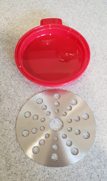
I included a picture below of the drip tray that sits below the shaker.  Bibo designed this really well in that, yes, you will always get drips.  The stainless steel cover comes right off and the bottom part of the drip tray easily comes out for dumping into the sink.
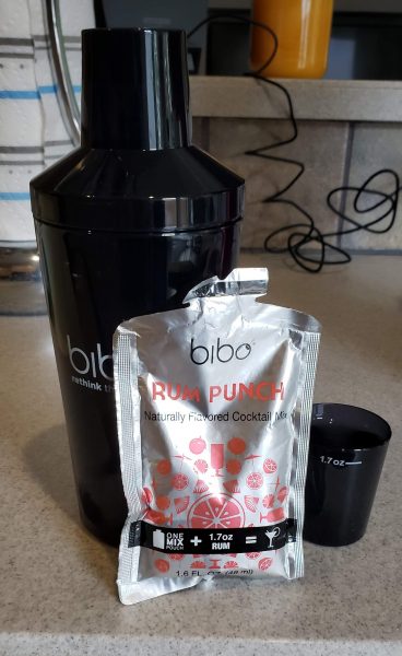
OK, so the first drink was a bit strong tasting.  Maybe it was just the drink mix not being quite what I expected.   So we decided to try a rum punch next.  Once again I used a really good quality rum when mixing this drink.  No house liquor in the Lopez household.  When we do drink, we do it right!.  The picture on the left shows the pouch and the picture on the right shows the resulting drink.  Once again I found myself really tasting the alcohol in the drink.  It was not quite as bad as the Paloma above, but it was certainly still a pretty strong drink.  The spousal unit also gave the drink the same (too much alcohol) review.
 

Our third drink test I decided to go for the big guns.  When I do decide to go drinking, living in Texas makes the margarita my drink of choice.  There are a lot of versions of margaritas out there.  I am under the belief that a good margarita is not frozen and is always served on the rocks with salt.  Even the Bibo suggests rimming the glass with salt.  I skipped the salt this time.  I also reduced the amount of alcohol that I poured into the shot glass.  I limited it to around 1.3 – 1.5 oz.   The resulting drink on the right was pretty darn good.  That drink was finished pretty quickly!
   

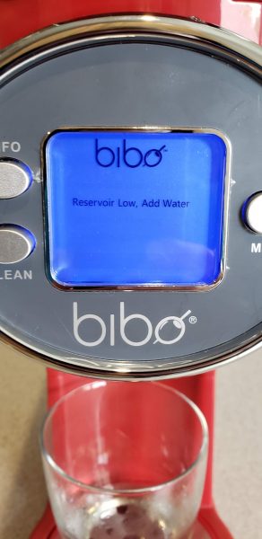
I had been pushing the clean button around 3 times in between making the drinks.  I did this of course after removing the drink pouch from the top handle area.  At this point I received a notice on the digital display that the reservoir was running low on water.  I added more water and the message went away.
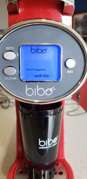
The final drink we made was the appletini.  I normally am not a big vodka drinker, however, my husband loves a good dry martini so I relied on his review mainly for this one.  Once again, I used a good vodka and made the drink.  Bibo suggested garnishing with an apple slice.  I also held back on the actual amount of alcohol to the 1.3 – 1.5 oz.   The resulting drink was quite flavorful!  My husband loved it and even I found the flavor quite tasty.  He made short work of finishing off the drink so nothing was wasted!
 

What I like

I love the fact that I no longer need to have bottles of mix lying around for those rare times friends come over and we want to make a drink.  I also love how easy the machine is to clean.  You can make a new drink in under a minute once you get the hang of doing the clean and putting in a pouch.  I find the appliance pretty compact and it will not take much room.  It is much smaller width wise than our Keurig.

What needs to be improved

I know I stated that we are not heavy drinkers, but I really do think that asking for 1.7 oz of alcohol per drink is really high.  I know, maybe after two or three you may not care anymore, but that initial taste of alcohol in the first couple of drinks was really strong.  I also think that if there is any way to keep the mix from coming out until you press the actual mix button that would be awesome.  One of the first drinks I made initially was the margarita.  I did not post pictures of that one, because I was so wrapped up in putting the pouch correctly and closing the handle that I neglected to have a glass under the Bibo.  As soon as that handle closed, mix started pouring out.  I lost quite a bit to the drip tray before my brain kicked in and put a glass underneath.  Finding the drink mixes you want can be a bit tough.  I see the 12 pack variety around in several places, but if you just want rum punch it was sold out everywhere I looked.   The 12 count variety pack costs $20 which turns out to be $1.66 per drink.  I did find 18 packs of Mai Tai, Paloma, and margaritas at Bed Bath and Beyond for $30 each (if you use their 20% coupon you could get it for $24) and that runs only $1.66 a drink.  I think if you find some you want, grab them.

Final thoughts

If you find yourself hosting parties a lot and have a crowd of folks who all desire different types of drinks, the Bibo may be just the gadget for you.  I actually found it fun to use.  The environmentalist in me did not like generating so much waste with the pouches.  They were foil lined so they were not recyclable from what I could tell.  It does provide a pretty nifty way of mixing an assortment of different drinks.  I am curious to see what brands of alcohol they will be including in their future mixing pouches.

Price: $199 (get 20% off if you have a Bed Bath and Beyond coupon to make it $160)
Where to Buy: Bed Bath and Beyond   (Amazon has it but only through third-party sellers at a much higher cost)
Source: The sample for this review was provided by Bibo. Please visit their site for more info.

The post Bibo – The Ultimate Cocktail Machine Review appeared first on The Gadgeteer.

Filed in categories: Reviews

Tagged: ,

Bibo – The Ultimate Cocktail Machine Review originally appeared on The Gadgeteer on July 10, 2018 at 11:05 am.

Note: If you are subscribed to this feed through FeedBurner, please switch to our native feed URL http://the-gadgeteer.com/feed/ in order to ensure continuous delivery.

AirTV review


REVIEW – There seems to be a big movement across the United States by many folks that want to cut the cord and get the programming they need for an affordable cost. I am one of those folks, especially since in recent times, my cable bill has ballooned to a cost that I can only define as ridiculous. Whenever I get a chance to try a new alternative to cable TV, I “jump” at the opportunity. This device is just such a chance, so here we go.

What’s in the box


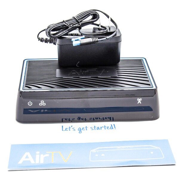
1 x AirTV Streaming Box
1 x AC Adapter
1 x Instruction Booklet

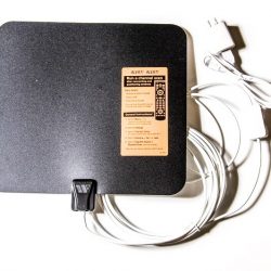
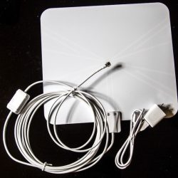
The company was kind enough to also provide the FlatWire OTA antenna for me to be able to test and review all of the functions for the AirTV box.


Design and features

The AirTV streaming box is designed to work with the Sling TV service with an option to add an Over-The-Air antenna to have access to local TV channels as well. The concept here is to offer a good option for you to be able to cut the cable TV cord. Viewing is controlled via the Sling TV app that works on both IOS and Android mobile devices as well as several available streaming boxes such as Roku, Amazon FireTV, XBOX ONE, Chromecast, Apple TV, etc. The Sling TV streaming service (Sling.com) offers 3 streaming packages: Sling Orange – $25 monthly, Sling Blue – $25 monthly, and Sling Orange + Blue – $40 monthly. These options represent different channel options or a combination of channels. They also offer various add-on packages at $5 each per month that include the following:

Categories:

Comedy
Kids
Sports
News
Lifestyle
Premium
Hollywood
Heartland
International
Espanol
In addition, you can get 50 Hours of cloud DVR storage for $5 monthly.

Design

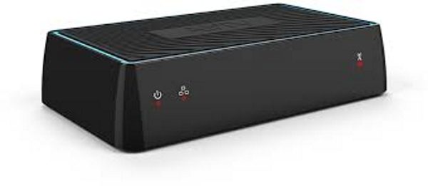
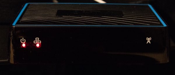
On the front of the box, there are a couple of red LEDs that show the power and connection status. There is also a logo to the extreme right.

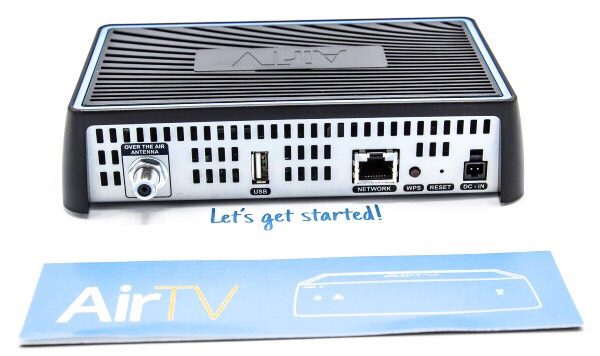
On the back of the AirTv box, there is a coaxial connection for connecting the Over-The-Air antenna a USB port for adding an external drive for additional content of your own, an Ethernet jack for a wired connection, albeit that it can also be connected wirelessly, a “WPS” button for wireless connection, a reset button and the DC in power port.

App

The AirTV works with the Sling Tv app, that allows you to stream both free and paid content to your tablet/mobile device or on to your TV using streaming devices like Roku, Apple TV, etc.

For the pictures below, I used my iPad Pro 12.9 to show the screen examples.
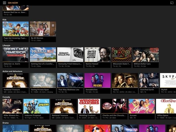
When you first select the app, this is the screen you see. If you have added any favorite channels/content they will show here, or you have the option to add them here if you have not. This is the “My TV” screen.

In the upper left-hand corner, there is a menu icon for selecting the options. Once you select the icon, you get the menu and the options for each screen:

The first option is the My TV option that displays what shows are “On Now”. You can scroll up/down and sideways through this screen to see thumbnails for what is currently showing on each channel.

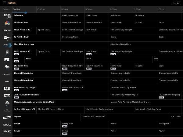
The next option is the TV guide and it looks much like a normal cable TV guide, or at least it looks just like my Spectrum Cable TV guide. You can also scroll up/down and side to side on this screen.

The Channels option shows the channels that you have access to across the top of the screen, and you can scroll across to see the specific channel guide for each channel with a thumbnail view of the shows below. The channel selection is made up of the Over-The-Air channels that you receive and the channels from the Sling TV package that you have subscribed to.

The Sports option shows all of the sports events available according to your subscription channels and OTA channels.

The last two options are the Search option and the Settings option.


The layout for the Sling TV app on the Roku streaming box is very similar and I suspect this would be the same for other devices.

What I like

I really like how well this box works and the layout of the options. The fact that it combines both the Sling TV streaming and the Over-The-Air channels is fantastic and eliminates the need for a separate OTA set up. I have a 300Mbps downstream connection, and this box performs as well as the cable TV box. I also like that it offers several options for the devices that can be used to stream. While the OTA antenna is not a part of this review, it performs very well and brings in over 40 channels in HD quality. I have tried other OTA antennas, and for “MY” scenario, and I must stress the “MY”, it brings in the most channels thus far, albeit that a couple of my local channels do not show up.

What can be improved

Packages that offer a better deal of more channels for the existing costs to better compete with most cable TV services. I would also like the ability to choose the channels for my package (minus premium channels of course).

Final thoughts

I really like the AirTV streaming box and its design. The combination of an OTA antenna along with the streaming package is a great option to cable TV if you are ok with the channels that are included with the packages being offered. On several occasions when my cable TV service went down, I was able to use the AirTV with the Sling TV app to continue to watch TV. However, in order to compete with my cable TV service and get me to cut the cord, the total cost has to be cheaper. Since I still have to rely on my cable TV provider for internet access, cutting the cord would only make sense if Sling offers more channels as a part of the flat rate packages. In order to compete with my current cable Tv subscription and my favorite channels, I would have to subscribe to several Sling TV add-ons as well as the Orange and Blue combination package. The cost of that Sling subscription, along with the cost of internet service, would be more than I currently pay. However, it is important to note that I have quite an upgraded internet package. If I was willing to live with a 60Mbps download speed, which is enough to stream, then I would be able to save some money using Sling TV.

Price: $119
Where to buy: AirTV and Amazon
Source: The sample for this review was provided by AirTV.

The post AirTV review appeared first on The Gadgeteer.

Filed in categories: Reviews

Tagged: ,

AirTV review originally appeared on The Gadgeteer on July 10, 2018 at 9:00 am.

Note: If you are subscribed to this feed through FeedBurner, please switch to our native feed URL http://the-gadgeteer.com/feed/ in order to ensure continuous delivery.
Royole RoWrite Smart Writing Pad review

REVIEW – It can be argued that digital notetaking is infinitely better than writing notes on regular paper because digital notes are always backed up, easily searchable, and can be edited. But what can you do if you want to switch to digital notetaking or journaling, but you also don’t want to give up the feel of writing on paper with a traditional pen? One solution might be the RoWrite Smart Writing Pad from Royole. Let’s take a look.

What is it?

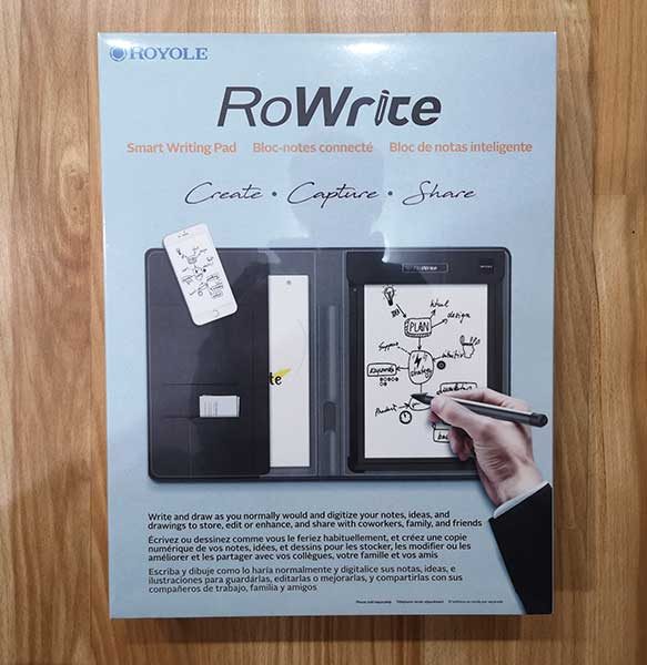
The RoWrite is a specially designed writing surface that when paired with the RoWrite pen, digitizes your text and drawings written on regular paper. The pen includes pressure sensor circuitry that captures 2048 pressure points and the iOS and Android app allows you to edit and enhance your captured images and text after the fact.

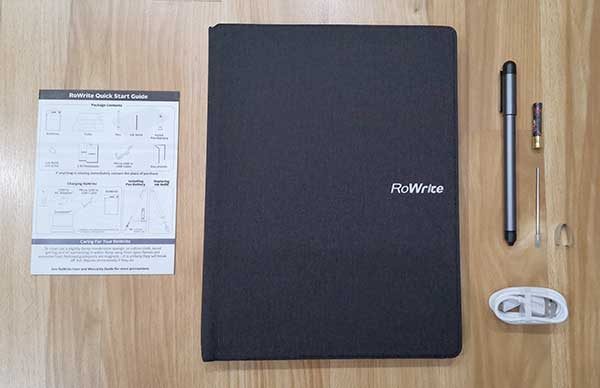
What’s in the box?

RoWrite folio
2 RoWrite A5 sized writing pads
RoWrite digital pen
AAAA Battery
Extra ink cartridge
Cartridge extraction tool
micro USB charging cable
Quick start guide

Design and features

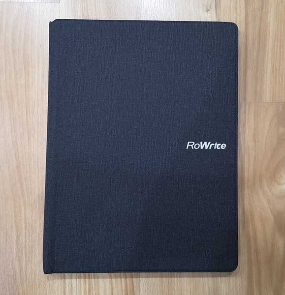
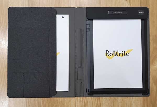
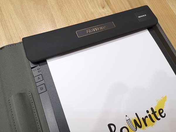
The RoWrite folio is designed like a notepad folio and dimensions of  8.5 x 11-inches. The cover has a soft texture that looks like canvas but I think it’s really a soft flexible nylon material.

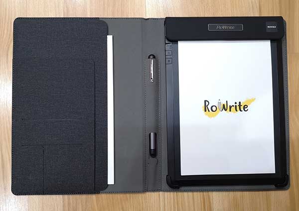
Inside the cover of the RoWrite folio are several slots for papers, cards, and an extra notepad.

And in the center of the folio is a built-in holder for the digital pen.

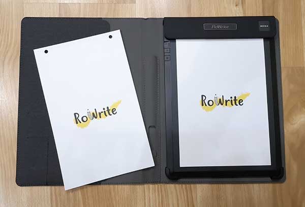
Included with the RoWrite are 2 A5 sized smart writing pads which each have 18 blank unlined pages.

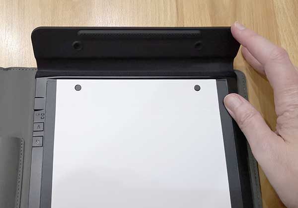
The pads of paper are held in the right side of the RoWrite folio by a magnetic clasp at the top of the notepad.

This clasp easily folds open so that you can replace the pad when needed. Note that I am not sure how much the replacement pads of paper cost because they aren’t listed on the Royole site or any other sites that sell the RoWrite like Amazon.

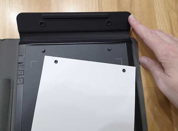
The pads have two holes at the top that make it easy to keep the pads securely in place and the thickness of the pads are designed to make the digital text capturing function of the RoWrite as optimal as possible.

That said, there is nothing special about the pads of paper and you can use your own paper if you make sure that you only write within the area of the A5 size outline. You can see the page outline corners on the digitizing pad in the image above.

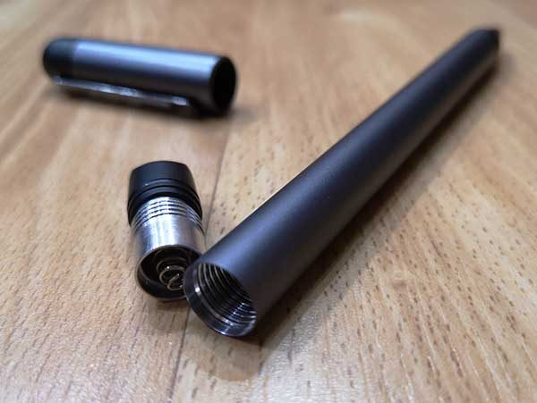
The RoWrite pen looks like a traditional ink pen with an aluminum barrel and cap that has plastic accents on the ends. It uses a standard Type D1 pen refill that you can find on Amazon.

The pen doesn’t have to be charged as it is powered by a replaceable AAAA battery.

The battery compartment is accessed by unscrewing the cap on the end of the barrel. There are advantages and disadvantages to a digital pen that uses physical batteries. An advantage is that it probably runs longer on a physical battery than it might on one charge of a built-in lithium-ion battery. But the disadvantage is that you will have to keep buying new batteries to have on hand and the RoWrite pen uses a AAAA battery, so you might not find replacements at your local Walmart or drug store. But you can buy a package of 8 AAAA batteries on Amazon for less than $5.

I’ve been using the pen on and off for brief writing sessions for a couple of weeks and the battery is at 80% capacity.

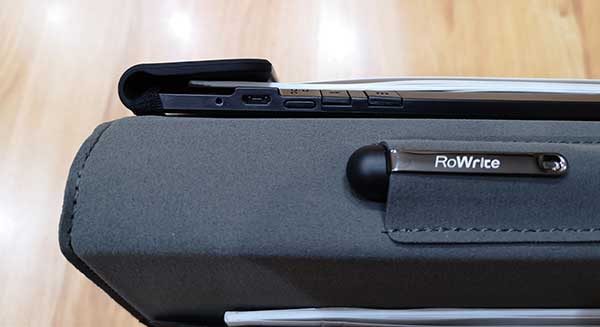
The RoWrite pad has its own built-in battery that requires charging before you can start using it. To charge it, you can connect a micro USB cable to the port on the upper left corner of the pad. You can see the port in the image above along with the power switch to the right of the USB port and two buttons that are labeled A and B. When you press the A button, it will immediately send any digitized text in the RoWrite’s internal memory to the RoWrite app and the cloud and if you press the B button it prompts the RoWrite to create a new page in the app for the next pen strokes even though you might still be writing on the same physical piece of paper.

Testing the RoWrite

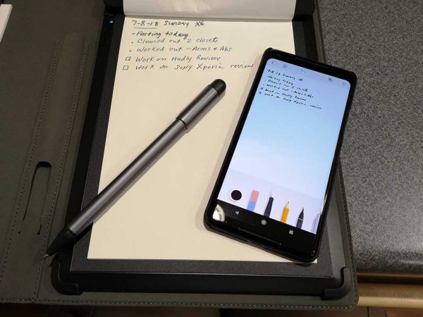
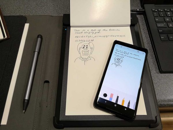
With the RoWrite smart writing pad charged, the battery inserted in the pen, and the RoWrite app installed on your iOS or Android device, it’s ready to start digitizing your written text and drawings. I tested the RoWrite with the Android version of the app on my Pixel 2 XL.

As you write on the paper pad, the marks are immediately recreated on the RoWrite app. You can even press the play button in the app to watch a replay of your writing/drawing session.

The RoWrite app


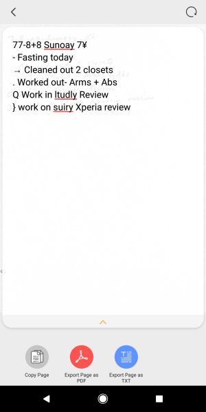
The RoWrite app has a set of basic features that allow you to create digital copies of the physical notes and drawings done on the paper in the folio. As you write, a copy of the same writings appears in the app. From there, you can convert the written words to text. It does an average job of converting the physical writings to text as long as you write clearly and don’t expect doodles or other little drawings to convert correctly. For example, checkmarks, X’s in boxes for tasks and other drawn symbols probably won’t be recognized.


The RoWrite app will also allow you to edit your digital drawings using rudimentary tools to change the color of the pen’s “ink”. You can even erase sections and write on the screen to add to the notes or drawings digitally.


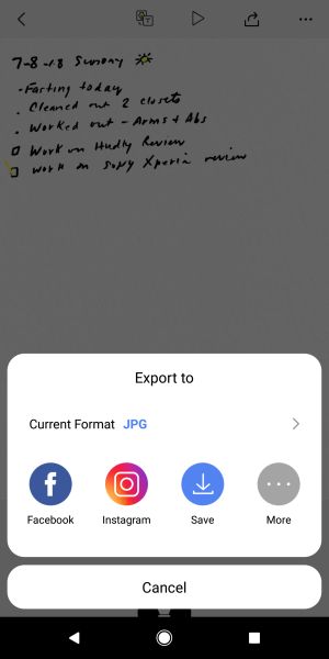
Digital drawings and notes can be saved as a PDF file, a JPG, and shared with a variety of apps like Facebook, Evernote, Instagram, and more.

What I like

  • You can use any paper with the pad as long as you only write within the A5 footprint
  • Instantly captures what you write in the RoWrite app as you’re writing it

What needs to be improved

  • You have to keep the RoWrite pad charged and have a supply of physical batteries on hand for the pen
  • Not sure where you can buy the RoWrite replacement pads of paper

Final thoughts

The Royole RoWrite does what it’s been designed to do and I had no problems with any the functions or features. This product reminds me a lot of the Neo smartpen M1 which I recently reviewed. But with the Neo pen and other digital pens like it, they can only be used with special notepads and notebooks.

The RoWrite can be used with any paper, BUT you have to keep both the pen and the folio charged. Therein lies the choice. Do you go with a digital pen that can be recharged, but uses special paper or do you go with the RoWrite which lets you use any paper you like, but it requires you to buy special batteries for the pen? For me, I  would go with the RoWrite just for the fact that I can use my own paper instead of buying expensive notebooks. While there is a bit of inconvenience with the pen’s batteries, they aren’t very expensive and there’s also the option to get rechargeable AAAA batteries.

Price: $129.99
Where to buy: Amazon
Source: The sample for this review was provided by Royole.

The post Royole RoWrite Smart Writing Pad review appeared first on The Gadgeteer.

Filed in categories: Reviews

Tagged: ,

Royole RoWrite Smart Writing Pad review originally appeared on The Gadgeteer on July 9, 2018 at 5:38 pm.

Note: If you are subscribed to this feed through FeedBurner, please switch to our native feed URL http://the-gadgeteer.com/feed/ in order to ensure continuous delivery.
Lululook Canvas Backpack for men review

Convertible bags are great, but they also present a tricky design challenge to make sure the bag works in both vertical (backpack) and horizontal (messenger) mode. Today we’re looking at Lululook’s take on the convertible backpack/messenger bag. There are ‘s a lot of interesting  design happening here. How does the whole package come together? Let’s have a look!

What is it?

It’s a canvas backpack that converts to a messenger bag.

Hardware specs

  • Cotton canvas with leather accents
  • Molded plastic hardware
  • 12” by 18” by 7”

Design and features

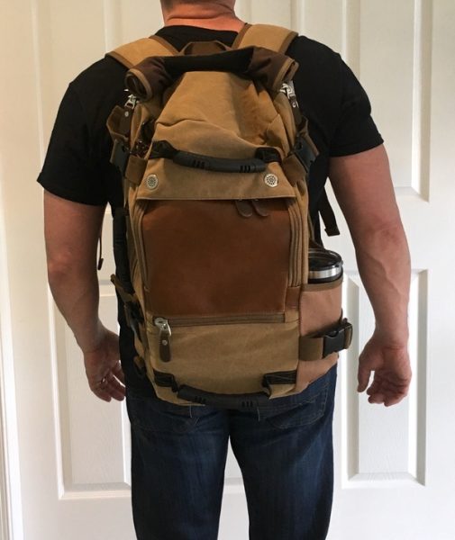
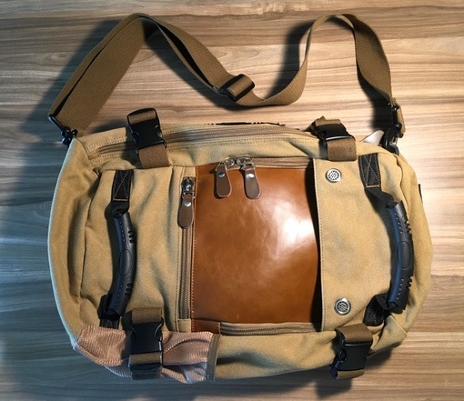
The Lululook Canvas Backpack is a convertible backpack/messenger that’s all about urban style. Tan is the primary color in my tester, but there’s some well-balanced use of earth tones in the trim & hardware (plus some leather hits) that provide visual interest. It’s a good looking piece of carry.

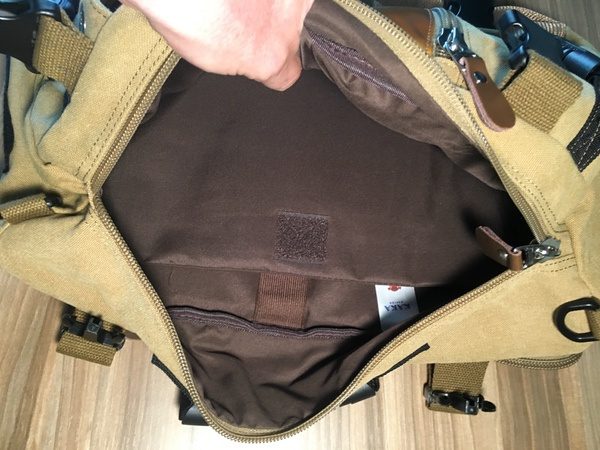
The exterior seems pretty well put together for a bag at this price point. Soft cotton canvas is the primary material, with cotton webbing used for straps throughout. Rugged plastic hardware and chunky zippers (not YKK, unfortunately) add to a build that feels fairly substantial. The interior fabrics are an issue, however, as we’ll see below.

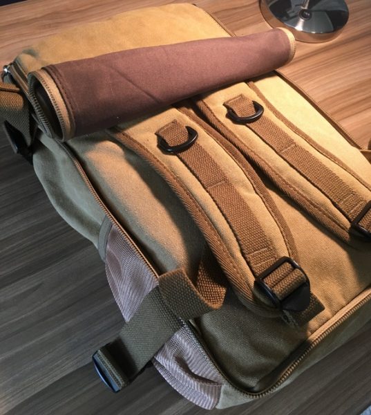
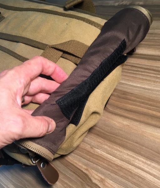
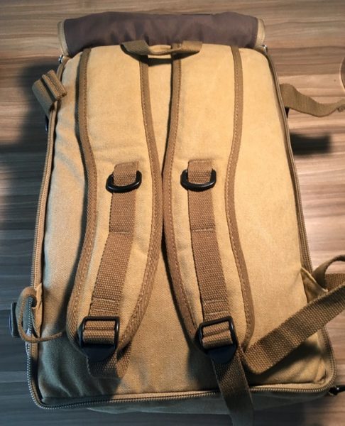
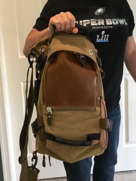
The design is built around a simple 12” by 18” by 7” box shape. The backpack straps are hidden behind a zippered panel on the rear of the bag that rolls up and velcros to the top of the bag when in use. See below for the walk through:

It’s a clever solution that, when combined with the low-profile backpack straps, gives you a nice option for stashing those straps without adding a lot of extra bulk. Those straps are also comfortable despite the light padding.

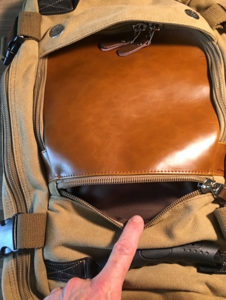
You’ll find two pockets on the front face to organize your goods. That leather flap unzips on three sides to reveal a monstrous pocket that runs almost the full height and width of the bag. There’s also a horzontal pocket below it that’s plenty big enough for power bricks and such.

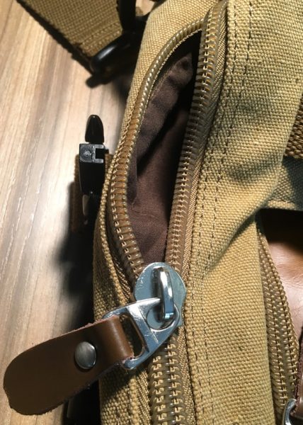
This presents one of the challenges I have with this bag design. See how those zips have to get under that rain hood at the top of the bag? It’s really tough to make that zipper turn those corners under the grommets without a fight. Maybe the zips will loosen up over time, but I found it really hard to get into this compartment.

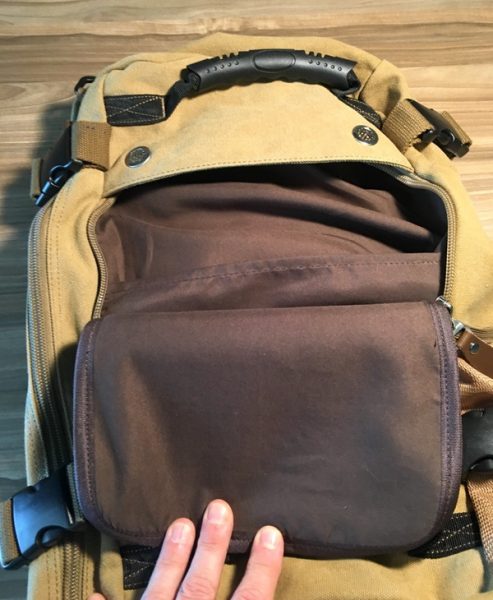
This leads to the second issue I have with the front pocket: not only is it huge and tough to get into, but the pocket is backed by nothing but a thin piece of fabric. There’s a thin fabric divider in this space, but it just gets in the way. I dropped a 9″ by 11″ textbook in there… you can’t see it, can you?

With no internal support, that space just turns into a big floppy black hole. Big items get lost, and small items vanish into the void. Between this and the trouble working that zipper, I found myself not using that pocket much on a day-to-day basis. I also see that thin fabric as an area with a high potential for tearing over time.

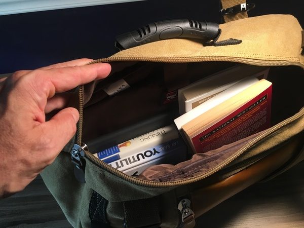
On the plus side… the main compartment is enormous. Some soft padding on the rear panel and the divider will protect a laptop up to 15″, and the rest is just open space for whatever you like. We’re talking roughly 30 liters of space if you’re not putting too much in the front compartments.

I stuffed 6 books, my laptop, and an ipad in there in addition to the textbook in the front compartment with plenty of room to spare. If you like big spaces to bung all your gear, you’ll like this.

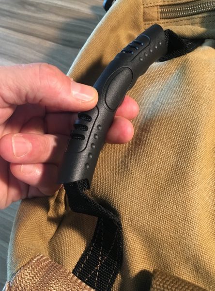
There are some thoughtful additions to design that I like quite a bit. Three rubberized grab handles are placed at the top, bottom, and side of the bag for tossing it around. They’re nice & grippy, and work well when getting in and out of vehicles:

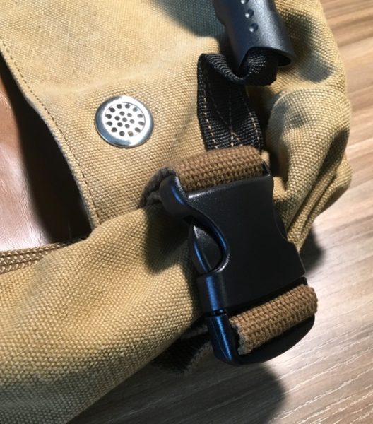
Compression clips at the four corners of the bag are very much appreciated for cinching things down if you’re lightly packed:

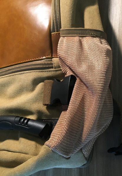
The elastic mesh water bottle pocket is also a nice touch… while I have that compression strap unlocked here, it actually expands with the pocket to handle the Yeti 24 ounce mug you’ll see in some of the other pics:

When you want to go to one-shoulder mode, the included cotton web strap clips on the same side as the main compartment opening and side grab handle (which now becomes a briefcase-style handle). There’s no shoulder pad, but the strap is sturdy and comfortable. The hardware and attachment points are all solid.

Sadly, that front panel pocket is even less usable in this mode. It’s just impossible to access when the bag is turned on its side. The messenger-style carry works great for the main compartment, however, which turns into one big ol’ stuffable space. Note that the compression straps need to be unlocked to unzip to the main compartment in this mode. 

With all those soft fabrics and no framing, it’s important to note that the bag tends to sag and flop based on whatever you put in it. You can see that everything I loaded into the bag sinks to the bottom as shown below:

There’s a lot to like in this bag, but I found myself dealing with tradeoffs in both backpack and messenger mode that took away from the overall usability. If you’re an organizer with a lot of tech, you probably won’t be happy with this bag. If you like a floppy, unstructured bag that will accommodate all kinds of stuff, this may be a good fit for you. I’d prefer to see that front pocket redesigned (or removed entirely) to make this bag really usable.

What I like

  • Good looking, modern style
  • Some nice additional features in the compression clips, multiple grab handles, and water bottle pocket
  • Roomy

What needs to be improved

  • The main front pocket is not very usable
  • The bag could use some more structure to keep your stuff from sinking to the bottom
  • Interior fabrics are flimsy
  • Very little organization for tech and small bits

Final thoughts

The Lululook Backpack for Men is a mixed bag (pardon the pun) for me. It looks great, and there are some nice design elements that I quite like. There are some challenges in the overall layout, however, that you may want to consider if you’re thinking about this one.

Price: $45.99
Where to buy: Visit the Lululook web site for purchasing information.
Source: The sample of this product was provided by Lululook.

The post Lululook Canvas Backpack for men review appeared first on The Gadgeteer.

Filed in categories: Reviews

Tagged:

Lululook Canvas Backpack for men review originally appeared on The Gadgeteer on July 9, 2018 at 2:00 pm.

Note: If you are subscribed to this feed through FeedBurner, please switch to our native feed URL http://the-gadgeteer.com/feed/ in order to ensure continuous delivery.
Ninja Cooking System with Auto-iQ review


REVIEW – Lately, I’ve had a few reviews that were a little bit on the frustrating side, either dealing with problems or just a lot of figuring things out due to the lack of features or inadequate software. The Ninja Cooking System with Auto-iQ broke that trend by being simply a joy to use.

What is it?

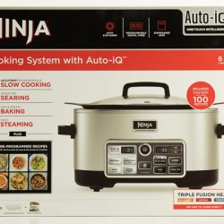
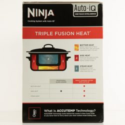
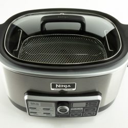
The Ninja Cooking System with Auto-iQ is a multi-cooker system that is four appliances built into one. A slow cooker, a stovetop for searing and sautéing, a steamer, and an oven for baking. Not only that, but it has a little bit of seamless technology tossed in that makes it even nicer to work with.

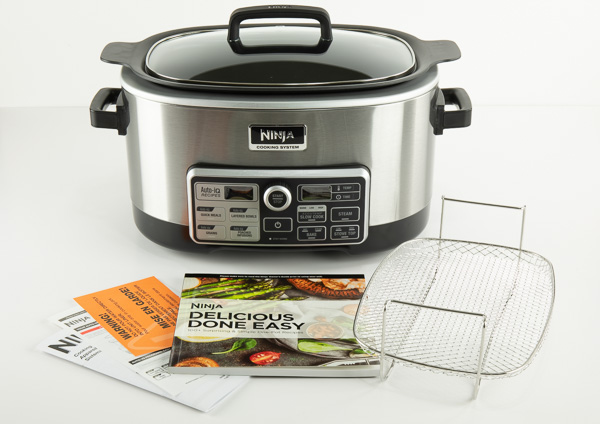
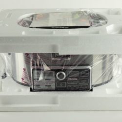
What’s in the box?

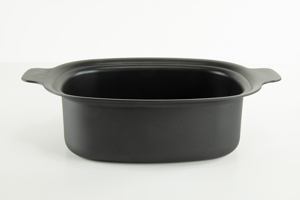
  • 6-Quart Lightweight Nonstick Cooking Pot
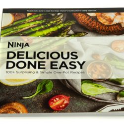
  • 80+ Recipe Cookbook
  • Steaming/Roasting Rack
  • Glass Lid with Handle
  • Multi-Purpose Pan


Design and features

I work from home I and often do a lot of cooking in our household, not just because my wife often works later into the day than I do, but because I enjoy cooking, and I enjoy eating! The Ninja Cooking System was a welcome addition to the various cooking appliances I have, and may very well send a couple of them to an early grave.

I was initially intrigued by the Ninja’s ability to do several things. Often multi-use kitchen items work, but they don’t do each individual task they’re designed to do very well. The Ninja does each thing very well, and I think that’s because they’re each close in function to each other.

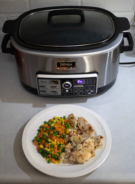
The first thing I did after taking unboxing photos was to toss in a bison roast and fire that baby up for a nice 9-hour slow cook. I must say, it came out fabulous. I think it was one of the best roasts that I’ve cooked. My old slow cooker only had warm, low, and high settings which were often either too low or too high of a temperature. Not with the Ninja! If the settings on the slow cook mode aren’t to your liking you can simply put it into bake mode and set any temperature in the range from 250°–425°F.

I really liked the steam mode, as it had much more room than my regular steamer. The removable steamer rack is 7.25×10.5″ and provides 3.5″ of vertical room to the top edge of the pot. That’s a lot of vegetables! It’s also easier to clean than my steamer.

The steamer rack can also be used to place a small pan or loaf pan in the cooker for baking bread or other items. It did a pretty good job of cooking a small loaf of bread.

The stovetop mode is just as it sounds, it’s like cooking in a pan on the stove top. This was a welcome addition to my kitchen because I really don’t like the electric stove I currently have because it’s too hard to control the heat. The stovetop mode also lets you sear meat and then cook whatever you want without having to dirty a separate pan. When I cook my chili I like to sear my meat very well, then I would normally have to add a little water to get all the caramelized goodness into my crock pot. With the Ninja, I simply seared the meat and then added my other ingredients directly to the pot without using a frying pan.

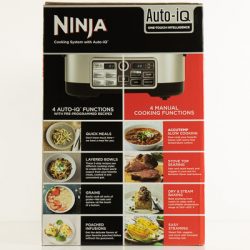
If you’re not comfortable with the manual cooking modes, there are the Auto-iQ modes. Simply pick a meal from the included 80+ recipe cookbook, follow the easy directions and select the recipe number and press start. Some recipes are as simple as just dumping in all the ingredients, selecting the recipe number and pressing start. You can choose from over 80 pre-programmed recipes divided into four Programs: Quick Meals, Layered Bowls, Grains, and Poached Infusions.


I found that the non-stick surface on the cooking pot was fabulous, it cleaned up very easily, even after cooking BBQ ribs for 8 hours. Unlike some slow cookers, being able to remove the cooking pot for cleaning was a real time saver and it is extremely light-weight as compared to a ceramic slow cooker. My wife even commented on how easy it was to wash.

Although the product I received did not include the multi-purpose pan, the product listed on the Ninja site shows that it is included when ordering it through their store.

A PDF of the cookbook is also available on the Ninja website if you want to check out the delicious recipes in the recipe book. The recipe book also contains a chart for steam times for various vegetables and a slow cook chart for various meats.

What I like

  • Additional accessories available such as a loaf pan, mini muffin tray and multi-purpose pan.
  • Temp and Time bake mode
  • Auto-stay warm feature when cooking is done
  • Steaming/Roasting Rack
  • 6-quart capacity

What needs to be improved

I can’t really think of anything that could be improved with this cooker as it does everything so well. If I wanted to be really picky I would say that the stove top feature could heat up a little quicker, but I like how the current model works because I don’t have to worry about it getting too hot too fast.

Final thoughts

Whether it was a roast, ribs, steaks, or corn or whatever else I cooked (can’t remember everything because I’ve used it a lot) everything came out great. I really like the control of time and temperature, without the need to constantly babysit stuff as I would on a stove top or oven. I’m so impressed with this cooker that I’m going to purchase another one because you can never have enough slow cooked food!

Price: $149.99 (other models available also)
Where to buy: Ninja and Amazon
Source: The sample of this product was provided by Ninja Kitchen

The post Ninja Cooking System with Auto-iQ review appeared first on The Gadgeteer.

Filed in categories: Reviews

Tagged: ,

Ninja Cooking System with Auto-iQ review originally appeared on The Gadgeteer on July 9, 2018 at 10:00 am.

Note: If you are subscribed to this feed through FeedBurner, please switch to our native feed URL http://the-gadgeteer.com/feed/ in order to ensure continuous delivery.