AIKO 10W Fast Wireless Charger Stand review

REVIEW – Since Apple (finally) threw its hat into the wireless charging ring with its latest iPhone 8/8 Plus and iPhone X models, wireless charging products have been multiplying in the market like rabbits.  One of the latest that we’ve had the opportunity to evaluate here at The Gadgeteer is the AIKO 10W Fast Wireless Charger Stand.  Let’s check it out!  Gadget on!

What is it?

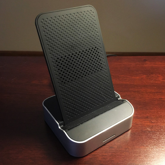
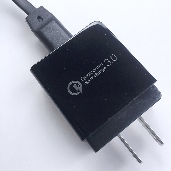
The AIKO 10W Fast Wireless Charger Stand is a wireless charger for Qi-enabled devices that has two charging coils and allows vertical or horizontal orientation while charging.  It also includes a Qualcomm 3.0 AC adapter.

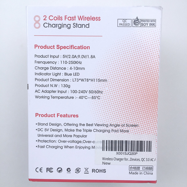
Hardware specs

  • Qi-certified charging
  • Input: 5V/2.0A; 9.0V/1.8A
  • Frequency: 110-250 kHz
  • Output:
    • 5W Output: Samsung S6/S6 edge, Google Nexus 7 (2013) / 6 / 5 / 4, LG G2 / G3 / G6 Plus / Lucid 2 / Lucid 3 / Optimus F5 / Optimus G Pro / Optimus it L-05E / Spectrum 2 / Vu 2 / Vu 3 / V30 / V30.
    • 7.5W Output: iPhone X / iPhone 8 / iPhone 8 Plus (iOS 11.2 or later versions required).
    • 10W Output: Samsung Galaxy S9 / S9+ / S8 / S8+ / S7 / S7 edge / S6 edge+ / Note
  • Sleep Charging mode
  • Horizontal Charging
  • Non-Slip Rubber Coating
  • AC Adapter: Qualcomm 3.0 AC adapter (input 110-240V, 50/60 Hz)

What’s in the package?
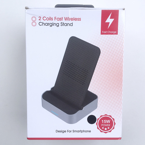
Curiously, “AIKO” does not appear anywhere on this product that I could find.
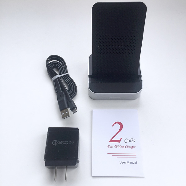
  • Wireless Charger Pad Stand
  • Qualcomm 3.0 AC Adapter
  • 3.3 foot Micro USB Cable
  • User Manual

Design and features

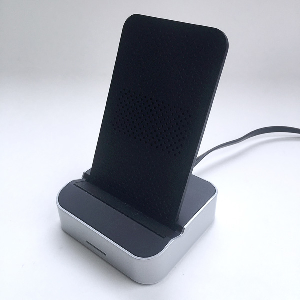
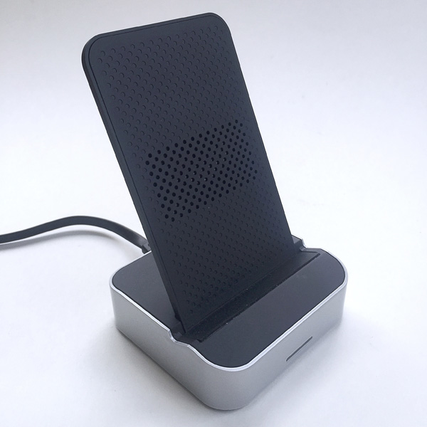
First impression: The charger stand had a style that appeared would aesthetically complement many smartphones, and it had an overall solid feel and construction.

This charging stand includes a Qualcomm 3.0 AC adapter, which is actually a really nice inclusion for the price of this product ($24.99).
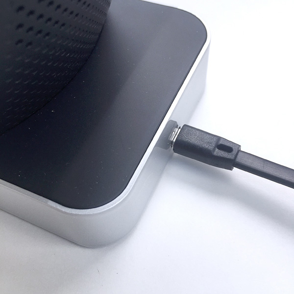
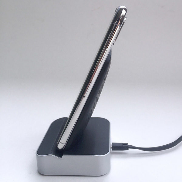
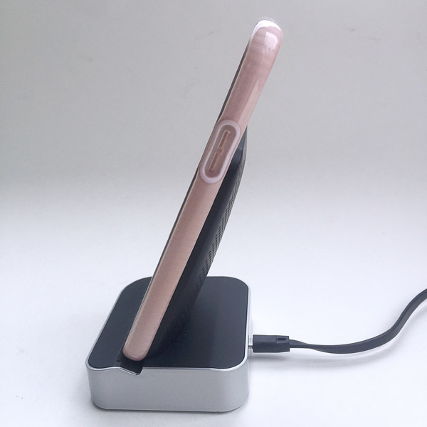
The Qualcomm AC adapter is connected to the charging stand via a flat, ribbon-type USB-to-Micro USB cable that plugs into the back of the charging stand’s base, as depicted in the image above.
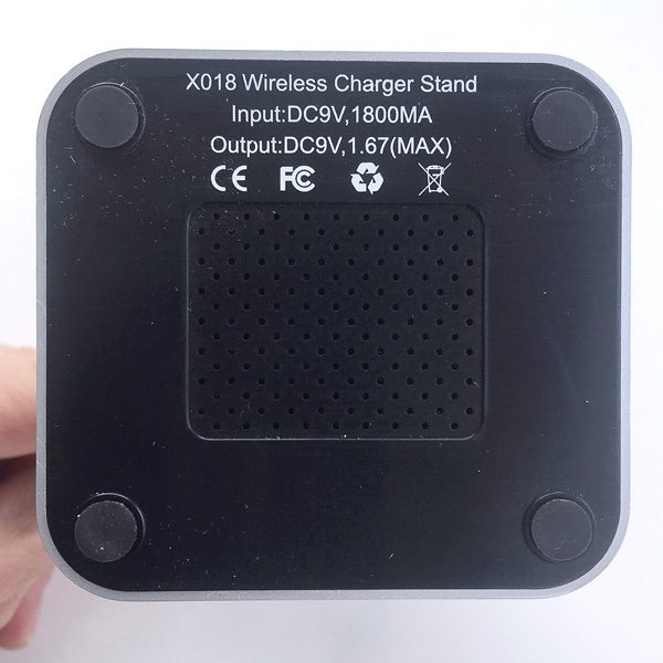
The underside of the charging stand’s base has four small, soft rubber pads, one at each corner, to act as non-skid feet.  In addition, the center of the charger stand’s base has a panel with rows of small holes to help in venting heat during charging.


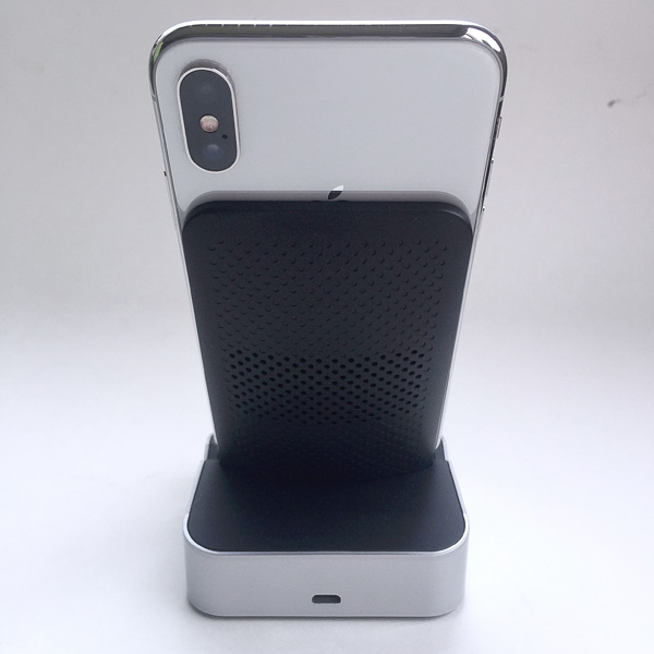
This idea of venting heat from the interior of the charger stand was carried throughout the product, as seen in the image above where light can be seen through the small holes on either side of the upright portion of the charger stand.  These are through-holes that again help to vent heat and keep the innards of the device cooler.
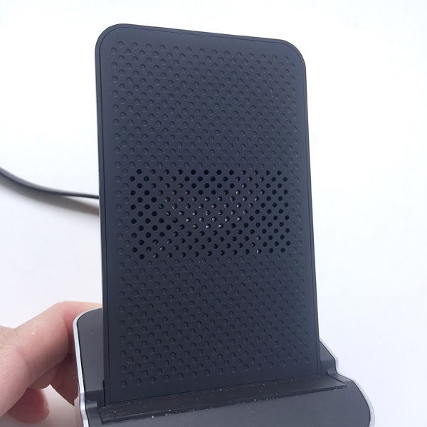
One of the touted features of this charger stand is that it actually includes two charging coils, one above the other, which are oriented such that they form the shape of the number “8.”  Due to having two coils instead of a single coil, and their orientation, this charging stand can be used to charge a phone in either a vertical or horizontal orientation (more on this below).

One additional feature of note: the surfaces of the charging stand that come in contact with the phone to be charged have a soft, rubber-like coating to help prevent scratching of the phone that is being charged.

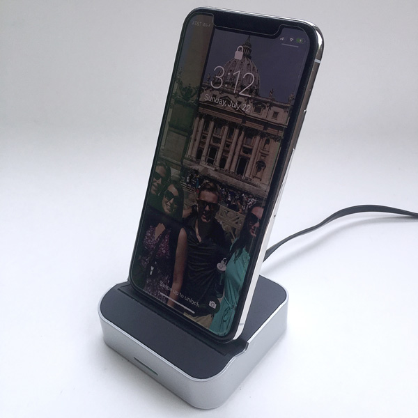
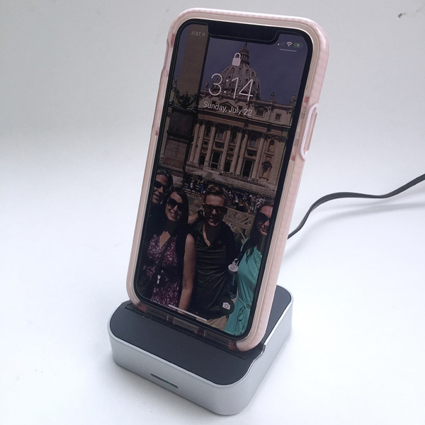
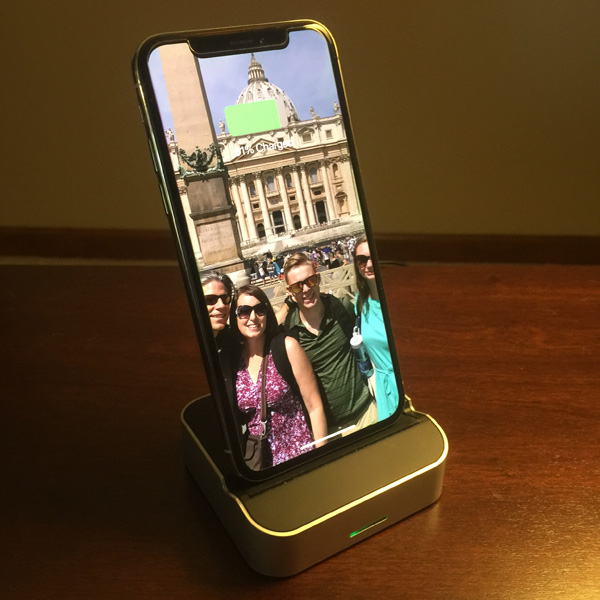
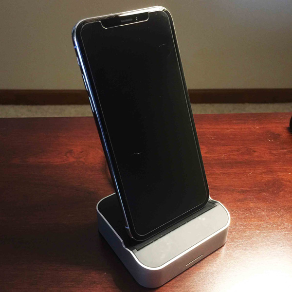
I evaluated this charger stand with my wife’s Apple iPhone X, which had no problem with charging in the vertical orientation.

As seen above, the phone sits down in a bit of a groove to help prevent it from falling over while being placed in the charger stand.

Above, the series of small head-venting holes in the rear of the upright portion of the charging stand are visible.

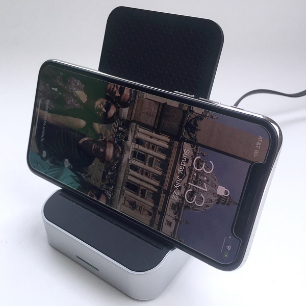
In addition to vertical orientation, I also rotated the iPhone 90 degrees from vertical and placed it onto the charging stand in a horizontal orientation.  Again, no issues with charging in this position.

Finally, I tried the charging stand with the iPhone X while it was placed inside the Tech 21 Evo Check protective case that my wife typically uses.  This is a relatively thick case, probably several millimeters thick, but the charging stand did not have any issues charging the phone while in this case.

Keep in mind that your experience may differ if you use a different protective case; one that is thicker or uses different materials may affect the charging performance of the stand.

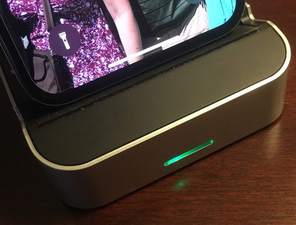
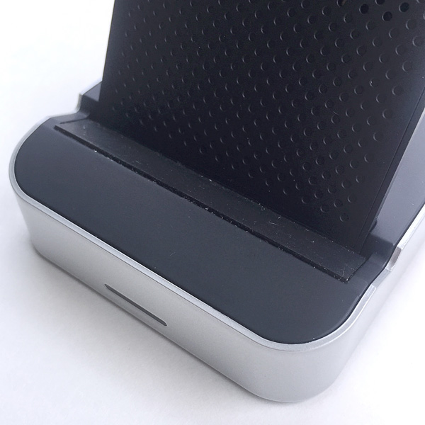
Once a Qi-enabled phone is placed in the charging stand, an LED bar on the front of the base illuminates green to indicate that charging has begun, as seen in the image above.

One thing my wife noticed while using this charger for her iPhone X was that it emitted a relatively quiet but noticeable clicking sound, almost like the ticking of an analog watch, when plugged into a power source.  When the iPhone was placed on it, the frequency of the clicking/ticking increased.  This sound was almost imperceptible under normal, daytime ambient sound conditions, but in a quiet bedroom at night, it was quite annoying.

What I like

  • Minimalist, cool-looking design (IMO)
  • Simple to use
  • Includes an AC adapter

What needs to be improved

  • Faint but annoying clinking/ticking sound

Final thoughts

The AIKO 10W Fast Wireless Charger Stand is a wireless charger for any Qi-enabled wireless charging capable devices.  This charging stand has two charging coils that help enable vertical or horizontal orientation while charging.  The upright portion of the charging stand has a soft material to help protect the phone being charged from scratches and also includes many tiny holes to help vent heat from the inside of the device while charging.  It also includes a Qualcomm 3.0 AC adapter.  This charger stand has a stylish, minimalist design and is simple to operate and can even charge phones that are inside of protective cases (though the case thickness may affect charging performance).  I found this to be a good value for its price.

Price: $25.01
Where to buy: Amazon
Source: The product sample for this review was provided by Amazon.

Filed in categories: Reviews

Tagged: ,

AIKO 10W Fast Wireless Charger Stand review originally appeared on The Gadgeteer on August 2, 2018 at 9:00 am.

Note: If you are subscribed to this feed through FeedBurner, please switch to our native feed URL http://the-gadgeteer.com/feed/ in order to ensure continuous delivery.

Sengled Element Color Plus Smart LED Bulb review

REVIEW – Who says you can’t do professional-style interior lighting on a reasonable budget? The Sengled Element Color Plus smart bulbs enable you to manage your interior lighting from your smartphone with complete control of color, warmth, and brightness. We’re already fans of the Sengled Element Smart Lighting system, and this addition makes it even better! So many colors to choose… let’s set the mood!

What is it?

It’s a new addition to the Sengled smart bulb family of products that offers 16 million customizable color options and tunable brightness levels.

Hardware specs

Bulbs:

  • 8.6 W, 60 hz
  • 4.3” by 2.4” (standard socket size)
  • 800 lumens, 2700 K Color Temperature
  • Dimmable with app
  • 200 degree beam angle
  • 25,000 hour lifetime

Hub:

  • 3.07” by 1.02”
  • 2.4 GHz
  • 120 foot range
  • 64 bulb management capacity

What’s in the box?

My test kit is the Smart LED Starter Kit. It contains two color bulbs, the hub (with power adaptor), and an Ethernet cable.

Design and features

Back in May, I reviewed the Sengled Element Classic Smart Bulb and found it to be an excellent way to get started with smart lighting in your home. Because Sengled’s product lineup is designed to work as an integrated system, the new Element Color Plus can be added to your existing setup or installed as a standalone system.

If you’re doing a standalone setup, the process exactly the same: you’ll load the app on your phone and follow the setup wizard to connect the hub to your network, then to connect your bulbs. Once you have everything loaded, you’ll identify the locations and light fixtures where you’ll place your bulbs. Check out my original review for a detailed breakdown of the process.

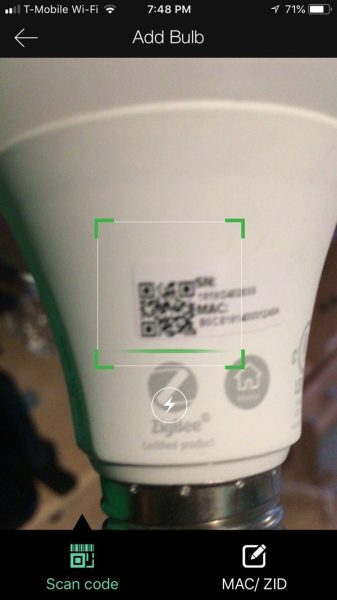
If you already have a Sengled setup installed, you have options. You can add the new hub as a second device controlled by your current app, or just add the bulbs to your existing hub. The app wizard walks you through the process either way, but we did find a neat trick that you can use if you’re just adding new bulbs to your current setup. Each bulb has a QR code on it so that you can scan it in the app and add it to your existing hub without keying in long access codes! Check out the screenshot below:

Once you have them added, you have all the same features for general lighting management that you do for plain white bulbs: adjusting brightness, monitoring power consumption, scheduling when the lights go on and off, etc. As I detailed in my previous review it’s all very intuitive and easy to use.

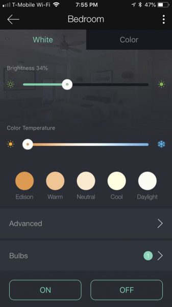
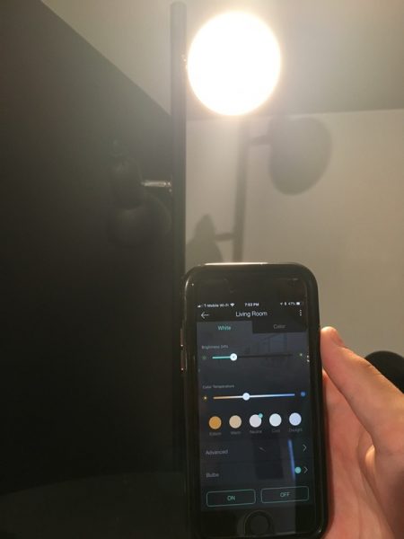
Here’s a bulb that we added to the system for my son’s bedroom. You can set general parameters for brightness and color temperature and manage to turn it on and off from the app:

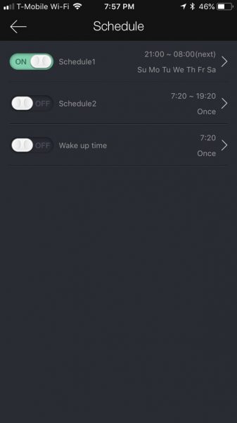
You can also set schedules for when the light will be on, creating different events like the “Wake up time” shown below:

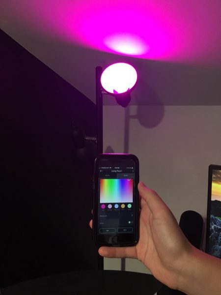
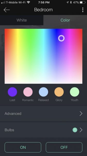
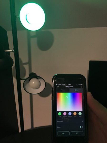
Color management is where the new fun begins. Tap the “color” setting, and you get a full-color palette to play with. You can also alter the whiteness setting to fit the mood:

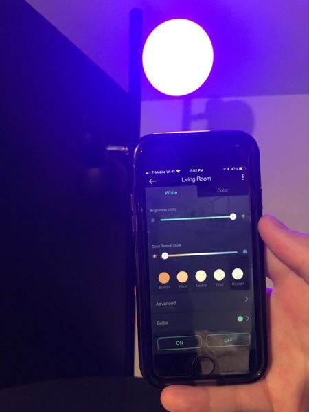
There are 16 million possible color combinations along with the ability to tune your white light brightness & color temperatures from a soft candlelight (or nightlight) setting to full daylight (2000K-6500K). Color changes go into effect instantly and can be set as part of your scheduled events. Here are some examples of the difference when you tweak the color temperature and overall brightness:

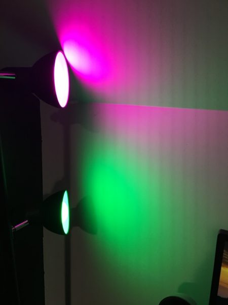
Then we added some color. I chose a pink shade for this pic.

This is more of a green/cyan color:

As you start playing with combinations, you quickly realize that you can completely change the mood of the room with a few taps. Bright party lighting, subdued night lighting, fun colors for a child’s playroom, soft tones for that *ahem!* romantic dinner… the possibilities are endless.

You could also set up a room with multiple bulbs. We set up two bulbs in one lamp for this example. The lower bulb is set to “night light” mode, and the upper bulb for more of a daytime/wake up lighting. We also named them “Night light” and “Bedroom light” to set individual schedules for use:

We also paired the lights with Alexa. She recognizes the different light names so that you can use voice commands to manage the lighting such as “Alexa, turn the bedroom light on!” or “Alexa, make the night light green!” It will work with Google Assistant as well, although we did not try that with this test. Sengled provides a full list of third-party compatibility options on their website for more details.

Here’s the nice thing about the Sengled Element system: you don’t need to buy a full kit if you want to add to your existing network. Each Element hub has a range of 120 feet and can manage up to 64 bulbs, which gives you a lot of room to work with. Sengled now offers 4 bulb styles in the Element series (soft white, daylight, tunable white, and the color bulb we’re reviewing here) that are all fully compatible with the hub, enabling you to expand your setup as you like without buying new hardware. I like that flexibility.

What I like

  • Easy setup
  • Excellent app for managing, controlling, and scheduling lighting functions
  • Fully compatible with existing Element systems
  • Brilliant color options, with a range of brightness and tone
  • Extensible without adding new hardware

What needs to be improved

  • Check the full specs on Sengled’s website for compatibility with third-party network systems

Final thoughts

We’re fans of the Sengled Element Smart Lighting system, and the addition of the Element Color Plus adds even more options with brilliant color and brightness control. With a few clicks, you can paint any room in your house with colors and tones to match your mood and style. Not only is it easy to use, but its price point makes for a very affordable (and expandable) smart lighting solution for your home.

Price: The Color Plus Kit retails for $79.99, and includes two bulbs and a hub. You can buy additional color bulbs for $29.99 each. A four pack of color bulbs with a hub is also available for $139.99.
Where to buy: Check ’em out on the Sengled Element web page. You’ll also find them on Amazon.
Source: The sample of this product was provided by Sengled.

Filed in categories: Reviews

Tagged:

Sengled Element Color Plus Smart LED Bulb review originally appeared on The Gadgeteer on August 1, 2018 at 11:00 am.

Note: If you are subscribed to this feed through FeedBurner, please switch to our native feed URL http://the-gadgeteer.com/feed/ in order to ensure continuous delivery.
Molecule cooling bed sheets review

REVIEW – You might be thinking.. did I see that correctly? Is that bedding? Every good Gadgeteer needs a good night sleep. It’s the middle of summer here in the Pacific Northwest, which means wonderful weather mixed with 90 degree days. The Molecule cooling bed sheet set intrigued me after the first heat wave we had (I do not have air conditioning!) and so I had to give it a try to see if these sheets would keep me cool and comfortable overnight.

What is it?

Molecule sheets are designed to keep you cool while you sleep by being breathable yet durable.

Bedding specs

The sheets come in Twin, Twin XL, Full, Queen, King, and California King sizes. The fitted sheet on all sizes is 15 inches deep.

What’s in the box?

You get a top sheet, fitted sheet, and one pillowcase with the twin sizes, but I have a queen size bed, so it came with two pillowcases.

Design and features

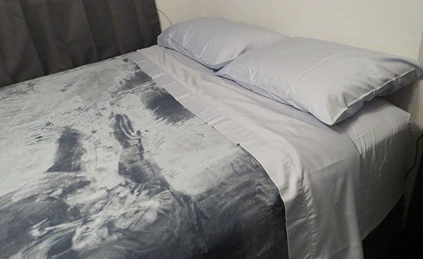
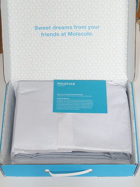
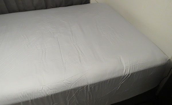
My first impressions were good from the moment I got the box. It was nicely packaged in a box that can be used to store it in the future. When I went to place the sheets on my bed, I worried that the 15-inch depth wouldn’t be enough. My bed has a good 3 inches of pillowtop and is quite thick. I was thrilled when they not only fit but fit easier and better than any other brand of sheet I’ve purchased.


The quality of the sheet set is also top notch. They held up well and did not shrink when washed. There is a soft smoothness to them that is similar to satin sheets but without the slipping and sliding. The stitching is well done all around and the pillowcase tucks around the pillow, making the overall appearance look neat and tidy. I really liked the powder blue color, though either the color or the fabric really emphasized the cat hair on my bed. It was especially noticeable since my cat preferred sleeping on these sheets rather than the soft fuzzy blanket on the bed.


Now, the reason she enjoyed sleeping on these sheets? They actually do what they claim, and do an excellent job of keeping you cool by using TENCEL Lyocell fibers weaved into the fabric. This makes the fabric breathable. I roast like an oven overnight and usually keep my room at around 65 to 68 degrees when possible. Without air conditioning, however, during hot days my room would get into the 80’s and drift down to the mid 70’s by bedtime. The first night of the heat wave, I slept comfortably and did not notice the heat in the room until I woke up. Since using the Molecule sheets on my bed, I have yet to feel sweaty during the night.

I waited an extra week to write this review; expecting at some point, perhaps as they were worn in, that the ability to keep cool would fade. It did not. We are in another heat wave now and after washing and sleeping on these sheets, it still feels like the first day I used them. They are still soft, still comfortable, and still cooling.

She always choses to lay on these sheets instead of the soft blanket.

What I like

  • Thick and well made, yet soft.
  • Keeps you cool at night.

What to consider before buying

  • They are expensive

Final thoughts

Between the heat that my computer generates and the heat waves without air conditioning, the Molecule sheets kept me sleeping comfortably and staying cool. They are a bit pricey, but if you sleep like you are in an oven and can afford them, they work very well and they should fit nearly every type of bed there is.

Price: $199 (Queen Size)
Where to buy: You can purchase these on the Molecule website and Amazon
Source: The sample of this product was provided by Molecule.

Filed in categories: Reviews

Tagged:

Molecule cooling bed sheets review originally appeared on The Gadgeteer on August 1, 2018 at 10:00 am.

Note: If you are subscribed to this feed through FeedBurner, please switch to our native feed URL http://the-gadgeteer.com/feed/ in order to ensure continuous delivery.
Nixplay WiFi Cloud Frame review

REVIEW – Several years digital photo frames were a popular gift idea. I reviewed at least a dozen of them until their popularity grew stale. But what’s old is new again and today digital photo frames are making a comeback. One new frame that I’m going to show you today is the Nixplay WiFi Cloud Frame. Let’s take a look.

What is it?

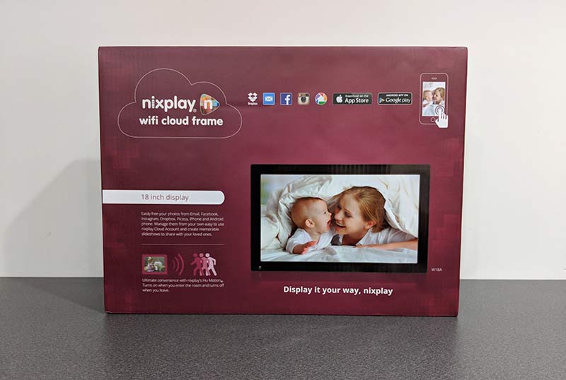
The Nixplay WiFi Cloud Frame is a digital photo frame that can be used to view your favorite images. Nixplay makes a variety of frames but their  Cloud Frames are available in 15 and 18-inch screen sizes. I was sent the 18-inch version.

Hardware specs

Screen Resolution: 1366 x 768 pixels
Aspect Ratio: 16:9
Brightness: 350 cd/m2
Supported Photo Format: JPEG / JPG / PNG
Supported Video Format: H.264 HD 720p
Speakers: 2 x (1.5W) Stereo Speakers, 3.5mm Stereo Headphone Input
Ports: USB Drive / SD / SDHC
Wireless: 802.11 b/g/n
Width: 18.4 inches (467mm)
Height: 11.4 inches (290mm)
Depth: 1.3 inches (33mm) – without stand, 4.5 inches (115mm) – with stand
Weight:2.72kg – without stand, 2.80kg – with stand

What’s in the box?

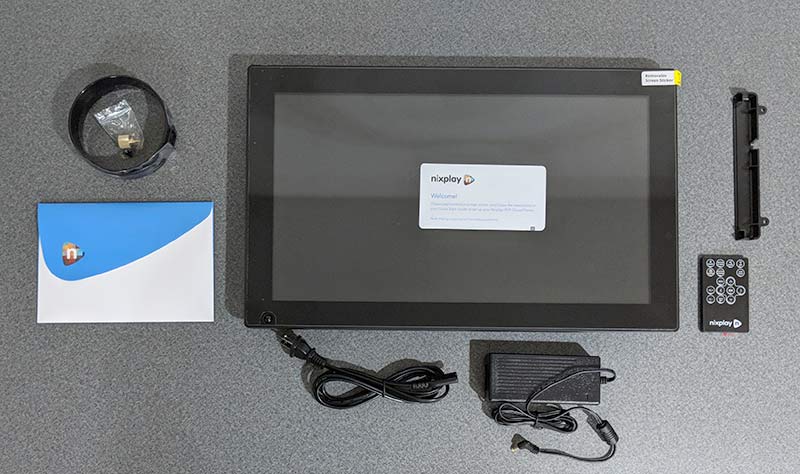
Nixplay WiFi Cloud Frame
Screw in stand
IR remote
AC adapter
Quick start guide

Design and features

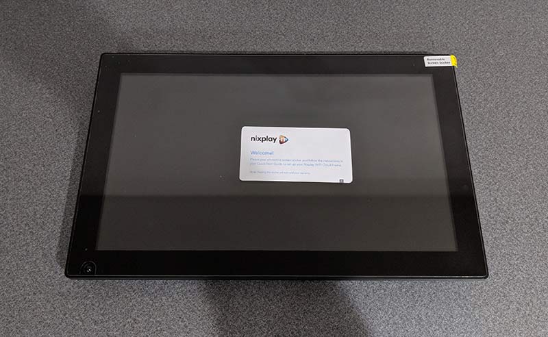
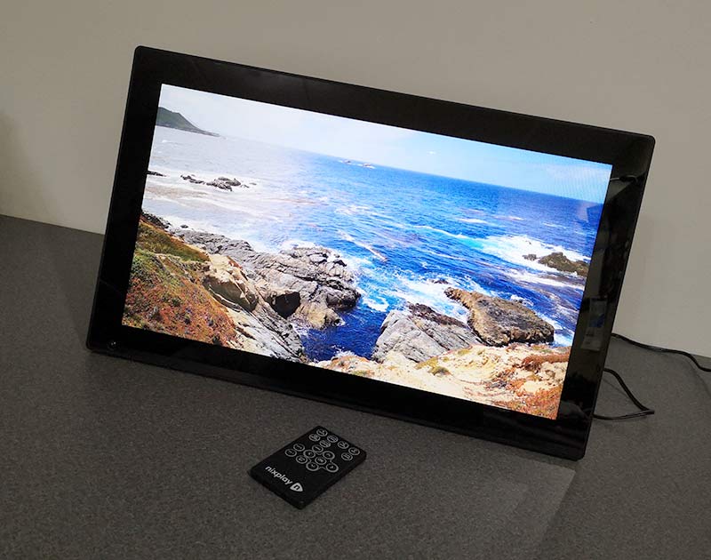
This is the largest digital photo frame that I’ve reviewed and I have to say that if you’re going to buy a digital photo frame, go big or forget it. This 18-inch frame is big and well made. It has black 1-inch bezels on all sides to make it look like a picture frame.

The Nixplay has two sensors that are built into the lower part of the frame. In the lower left corner is the motion detection sensor and there’s also the IR sensor for the included remote control.

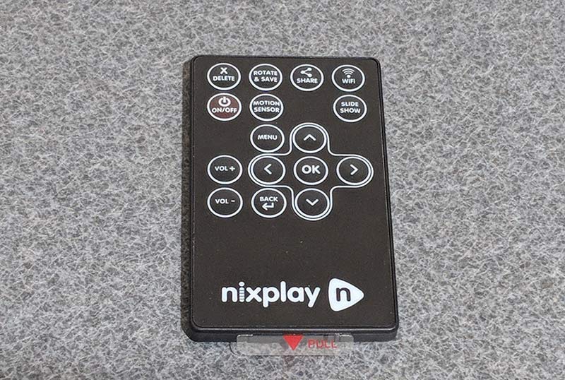
The remote control has a membrane style keypad with functions to control the photo slideshow and video playback.

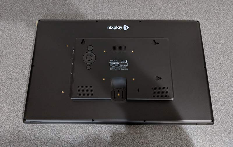
The back of the Nixplay Cloud WiFi Frame has mounting slots to help you mount the frame on a wall in either landscape or portrait orientation.

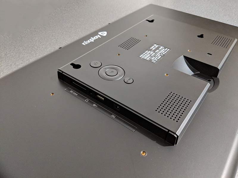
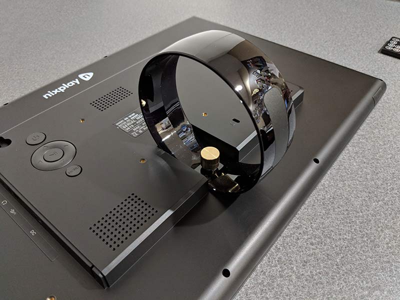
There are also speakers built into the back of the frame and a set of control buttons in case you lose the IR remote control.

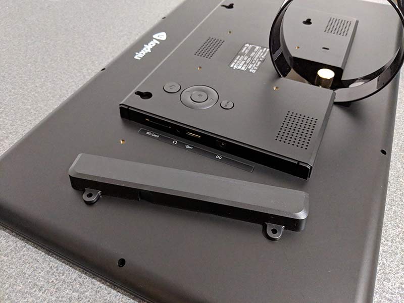
The back of the frame has an SD card slot and a USB port if you want to load your own images from flash memory. There’s also a 3.5mm headphone jack and the power port.

If you don’t want people messing with the ports, you can block them by using the included cover.

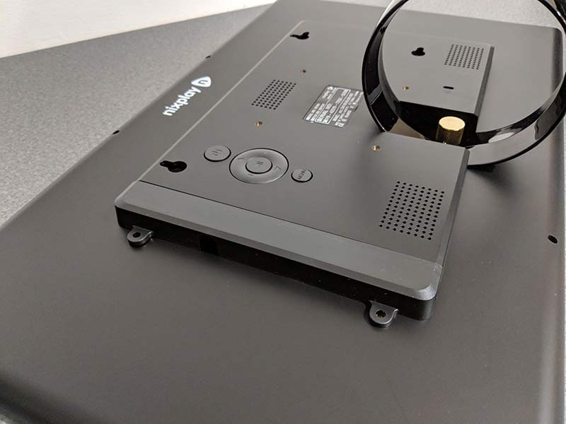
The port cover is secured by two screws.

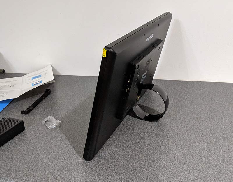
If you don’t want to mount the Nixplay on a wall, you can attach the included stand which snaps into the back of the frame and is secured by a brass thumb screw.

I opted to do my testing of the frame with the stand. However, by using the stand, you can only use it in landscape orientation.

Loading your images and videos into the frame

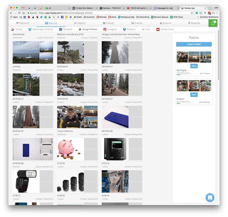
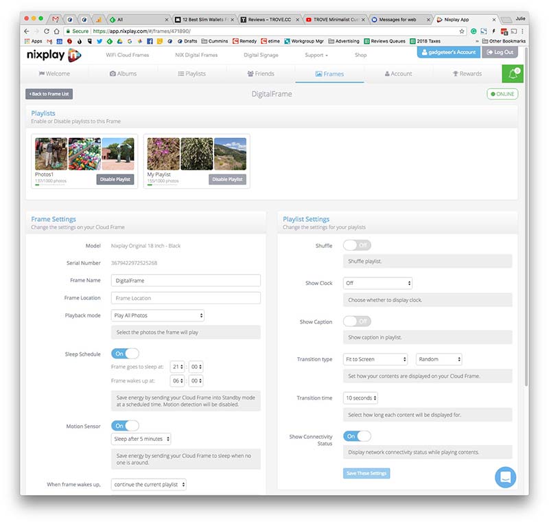
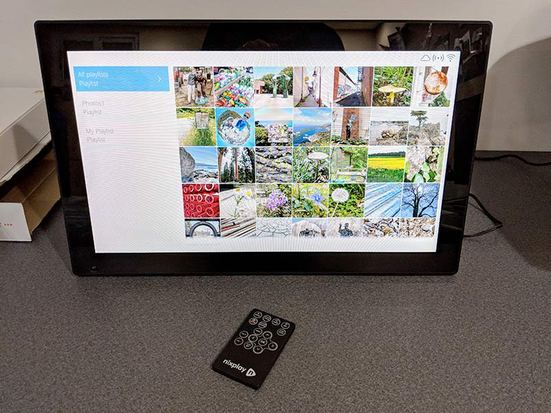
To see slideshows of your favorite images and video, you can load them on an SD card, a USB flash drive, or you can connect the frame to your wireless network and then load images from a selection of social media sites like Dropbox, Facebook, Google Photos, Instagram, Flickr, and Verizon Cloud by using the Nixplay web app. Note that except for the Dropbox dynamic playlist, the other social media sites will not automatically sync new images to the frame. You will need to update the playlists when you add new images that you want to show up on the Nixplay frame. Don’t worry though, it’s as easy as dragging and dropping the images into the playlist from the Nixplay web app.

Another way to get images into the frame is by email. Each frame has an email address assigned to it once you create a Nixplay account. Images sent to the frame using this address will be added to a special playlist.

Last but not least, you can install the Nixplay app on your smartphone or tablet and send images from your device to the frame that way too.

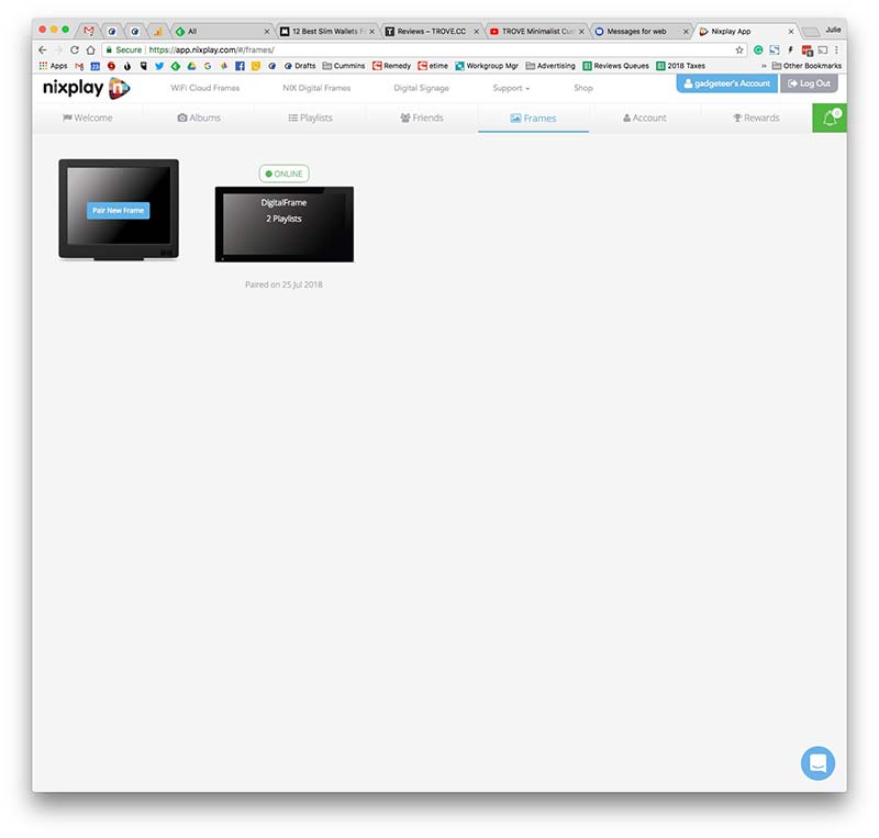
Before you can use the frame, you’ll need to create a Nixplay account which is free and allows you to easily configure a variety of settings on the frame. The free account also allows you to create and modify playlists of up to 10GB of photos for up to 5 different Nixplay frames. If you need to manage more frames, Nixplay offers a Plus account where you’ll have 10 frames per account and 30GB of storage.

For example, if you load an album of photos from Instagram or Google Photos like I did, you can remove images that you don’t want to see or disable the playlist altogether.

Note that the images will be loaded on to the frame itself so that even if you log out of the Nixplay account or lose WiFi connectivity, the frame still continues to work.

Most nicer digital photo frames allow you to set a sleep schedule so that the frame goes into standby mode during the nighttime hours when no one would be seeing it anyway. The Nixplay will allow you to either have the screen turn off or it can display a clock during the sleep schedule hours. But that’s not all. The Nixplay WiFi Cloud Frame goes even one step further by implementing a motion sensor that will put the display in sleep mode when it senses that there’s no one in the room. I love this feature and have found that it works really well.

Another feature worth mentioning is that you can control your Nixplay frame with Alexa. You can ask it to play specific playlists just by using your voice. I don’t have an Amazon Echo set up to test this feature, but you can find out more about it by visiting the Nixplay site.

Display quality

A digital photo frame is only as good as the display quality right? Well, there’s nothing to worry about with the Nixplay because the glossy LED-backlit display is bright, crisp, and vibrant with excellent viewing angles so that you can see image details even if you’re not directly in front of the frame.

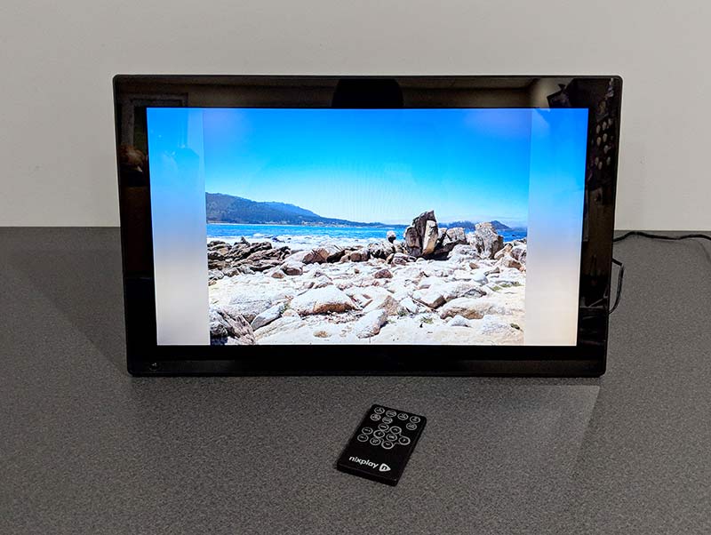
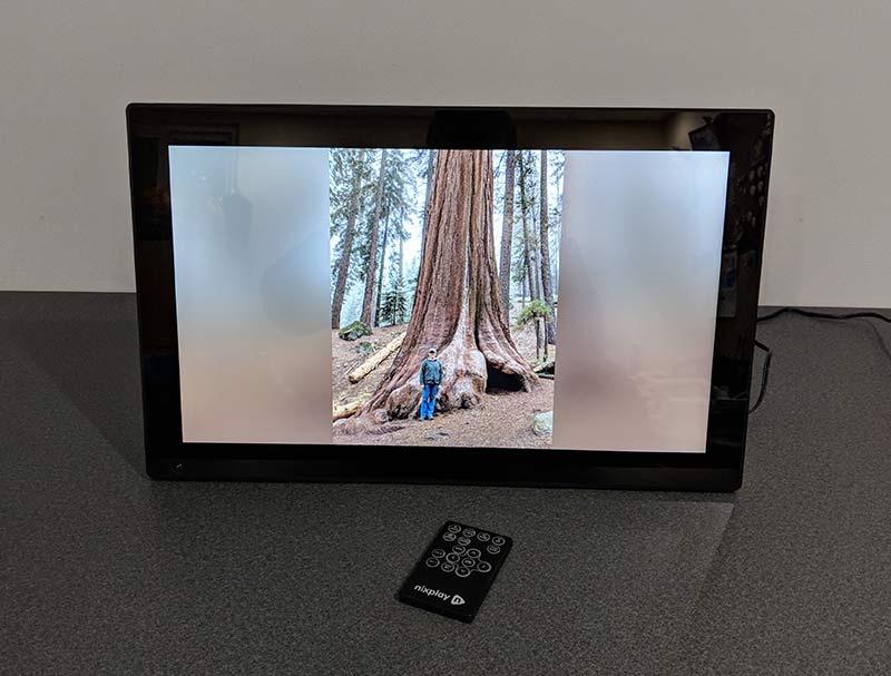
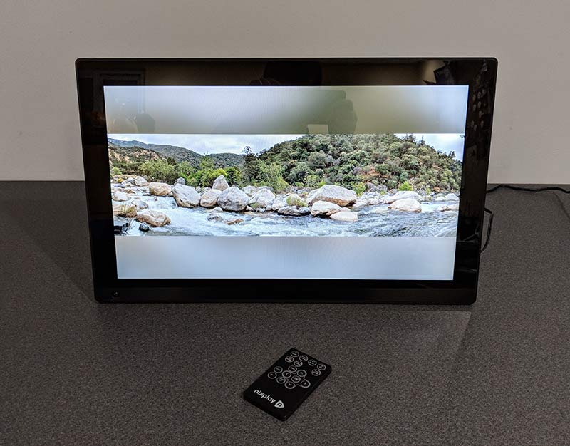
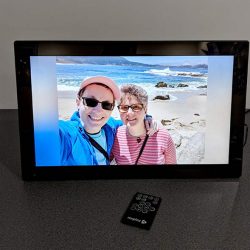
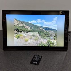
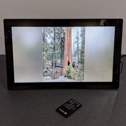
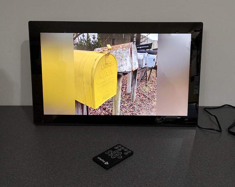
The frame has a 16:9 aspect ratio so images that you take with your phone will probably not fill the screen and you’ll send up seeing bands on the sides or the top and bottom of the screen. The cool thing is that Nixplay makes the color of the bands match the image on the screen.

This way the bands aren’t just white or black.

Here’s an example of a panoramic image that I took while on vacation in Three Rivers California. See how the Nixplay is showing top and bottom bands?

Here are some other examples. Click the pics to see the full image.


You’re probably wondering if there’s a way to fill the screen with the image to get rid of the bands and yes, there is. Actually, there are a few other ways to display your favorite pictures on the Nixplay frame.

You can set the images to fill the frame which Looks good as long as the subject of the image is in the center of the picture and is small enough that certain details don’t get cut off with the image fills the frame. See the image above, it’s an Instagram picture which is typically a square image. I’ve set the image to fill the screen.

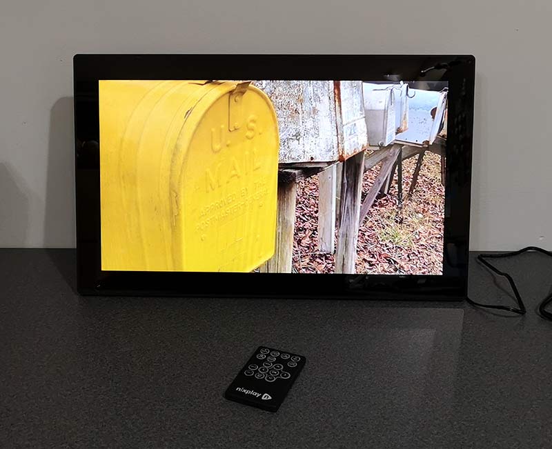
And here’s the original image. See how the tops of the mailboxes are cut off when it’s using the fill display mode?

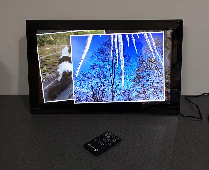
Here’s the snapshot display mode which shows each new image on top of the previous image.

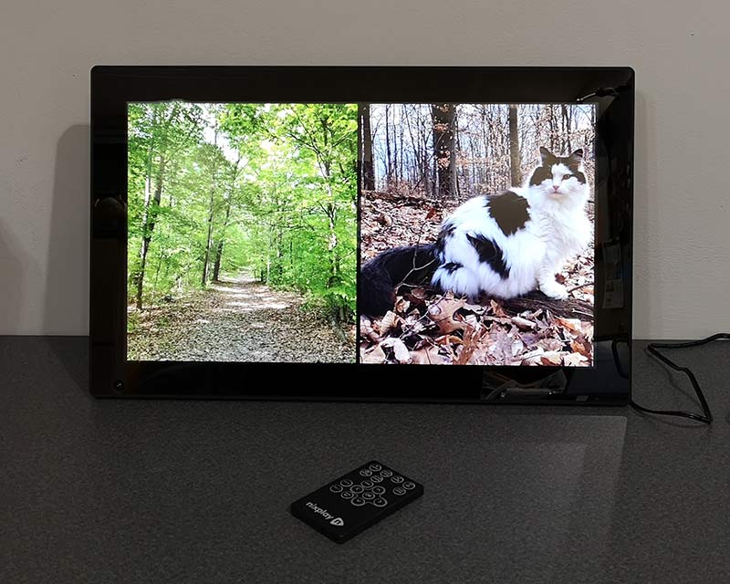
And here’s the tile display mode which shows two images side by side. This mode works great for images that are up and down (portrait) instead of wide (landscape).

In addition to the multiple viewing styles, the frame also has 11 different transition styles when it loads a new image. You can specify the one you like best or just set it to random so it uses all of the styles.

What I like

  • Great display
  • Doesn’t require a paid subscription
  • SD card and USB readers
  • Alexa enabled
  • Motion sensor

What to consider before buying

  • Price

Final thoughts

As I mentioned in the opening paragraph of this review, I’ve reviewed at least a dozen digital photo frames in the last 2 decades, but the Nixplay is the first digital photo frame that has actually impressed me on all fronts. It makes my images look great and the built-in features like motion detection and sleep schedules make this an enjoyable digital photo frame to use.

Price: $279.99
Where to buy: Nixplay and Amazon
Source: The sample for this review was provided by Nixplay.

Filed in categories: Reviews

Tagged: , ,

Nixplay WiFi Cloud Frame review originally appeared on The Gadgeteer on July 31, 2018 at 12:00 pm.

Note: If you are subscribed to this feed through FeedBurner, please switch to our native feed URL http://the-gadgeteer.com/feed/ in order to ensure continuous delivery.
YI Cloud Home Camera review

REVIEW – When the YI Cloud Home Camera review offer came along I thought it would be nice to review and contrast it with other cameras that I have reviewed. Sometimes you win, sometimes you lose – keep reading to find out which this was.

What is it?

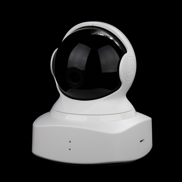
The YI Cloud Home Camera is an indoor surveillance camera that has quite a few useful features including motion tracking and cloud storage.

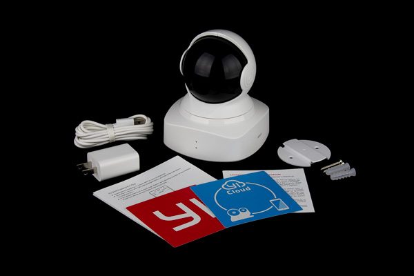
What’s in the box?

  • YI Cloud Home Camera
  • Power cord and wall plug
  • Quick connect sheet
  • Window stickers
  • Wall mount bracket

Design and features

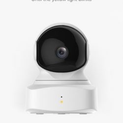
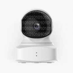
The YI Cloud Home Camera features a 1080p full HD camera with “Complete 360° Coverage”, enhanced night vision, smartphone control, baby crying detection, motion detection and real-time activity alerts as well as two-way intercom audio capability.
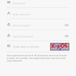
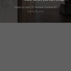
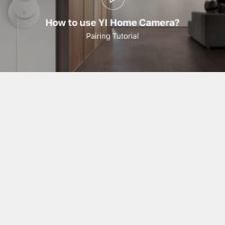
The YI camera was fairly simple to set up. The process begins with signing up for a YI account and verifying your e-mail with a link they e-mail to you:


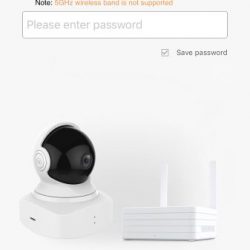
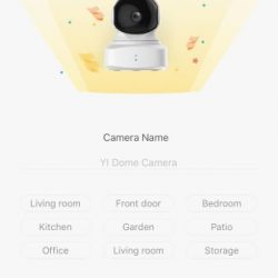
After a pointless 4 page intro, you simply tap the “+” to add a camera and follow the simple on-screen directions to connect to the camera and your home wi-fi.


The camera has a much-too-small QR code on it that you must scan with the phone camera to pair it to the camera, it took it a little while to finally focus well enough on the camera to get it to connect. The camera has audible voice prompts as well, which I thought was a nice touch.

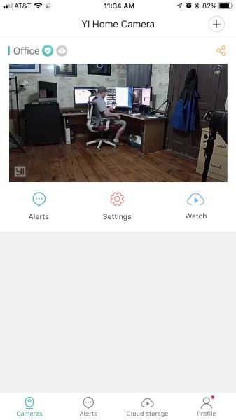
Once connected you’re presented with the default screen for the app, which is a list of the cameras you have connected, which also features an image from the last session as well as options for viewing Sharing, Alerts, Settings, and Watching cloud-stored video. Tapping the image starts the viewing of live video from the camera.

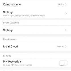
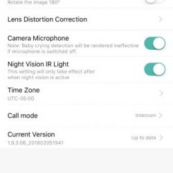
The settings section for the camera is fairly extensive, providing quite a bit of control and options.


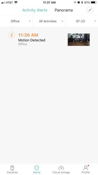
I liked how that during viewing of the camera, you can choose between SD and HD video or choose the Auto option to have the app decide, presumably on your available bandwidth. Other controls include the microphone, record video, take photo, take a panoramic photo, and view full screen. There are also three icons at the bottom of the screen that allows for manual camera positioning, motion tracking, and alert viewing.

Full screen viewing

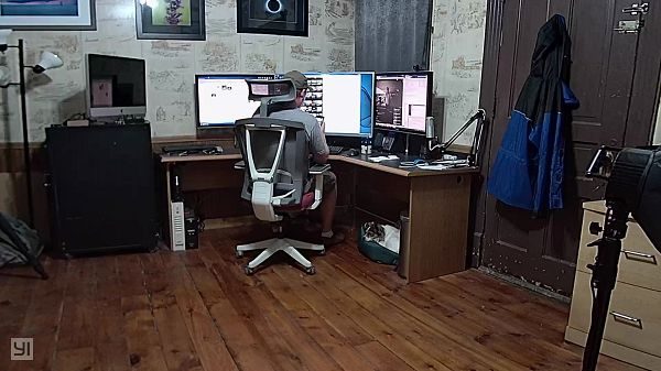
The manual camera positioning is a nice feature, however, it is slow to respond, which makes the positioning of the camera less than easy. The motion tracking feature works very well and is able to track a person as they walk through the room and was even sensitive enough to pick up my motion while just sitting at my desk.

The panoramic photo feature is very poor. When you take a pano image, the camera rotates and takes a picture, repeating this throughout a full rotation and then stitches the images together to produce a 360° image. However, the image stitching is very poor, often leaving gaps in the image coverage up to 3 feet wide.

Another thing that the app needs to improve on is the turning on and off of the motion detection/alert feature. You have to go into the Camera Settings, then once in the Camera Settings you have to tap on the Smart Detection settings, then toggle the Motion Detection setting. This would be really annoying if you had multiple cameras. There is also no indication from the main screen of the app that the camera is set for Motion Detection, so you have to go through the above steps just to see if its on.

Perhaps one of the biggest drawbacks of the YI Cloud Home Camera is the cloud storage subscription price. The options range from $8.66 a month for 7-day storage to $19.99 a month for 30-day storage. You can choose to either upload motion detected videos only (up to 5 devices) or 24/7 around-the-clock upload for only 1 device. I thought these prices were a bit high. The camera also supports a micro-SD card, but that wouldn’t do you any good if the thieves also steal your camera.

The app also notifies you of new logins to your account, which is a nice security feature.

What I like

  • Audible “Waiting to Connect” voice prompt when turned on
  • Activation link email
  • High quality still photos
  • Manual camera control
  • Login notifications

What needs to be improved

  • Very poor pano stitching
  • Alert frequency ranges from low, medium, and high with no indication of what that time period is
  • Notifications are inconsistent. I did not always get a notification while using the app, even if I was not viewing the camera at the time. There’s just an in-app Alerts icon that gets a red dot over it
  • Works only with the app, no website or IP camera capability
  • Motion Detection setting is too buried in the app

Final thoughts

Although the YI Cloud Home Camera features look inviting and seem to have everything you’ll want, the actual use and storage options may be a bit of a turn-off. However, if you’re looking for a budget camera for casual monitoring, this camera might be one to consider, it really depends on what you intend to use it for.

Price: $44.99
Where to buy: Amazon
Source: The sample of this product was provided by YI Technology

Filed in categories: Reviews

Tagged:

YI Cloud Home Camera review originally appeared on The Gadgeteer on July 31, 2018 at 9:00 am.

Note: If you are subscribed to this feed through FeedBurner, please switch to our native feed URL http://the-gadgeteer.com/feed/ in order to ensure continuous delivery.