SpotCam video AI service review

REVIEW – SpotCam, purveyors of Wi-Fi video camera solutions for indoors, outdoors, and doorbell applications is an industry leader for innovative design,  free 24-hour cloud video recording, and connectivity with IFTTT and Conrad Connect. The cloud platform now features optional SpotCam video AI services that actively detect specified events and provide instant notification of the occurrence on your mobile or email. Read on to see what I think!

What is it?

The SpotCam video AI service has six different subscription-based components that can be added to a user’s account in order to increase the automated surveillance capabilities of the camera.  The plans reviewed in this post include Missing Object Detection, Virtual Fence, Human Detection, and Vehicle Detection. There are also Pet Detection and Fall Detection components available that are not reviewed. All of these solutions are cloud-based. No change to the installed hardware is required to enable these features.

Design and features

Each of the video AI components is configured independently. The Video AI system is configured on the web by clicking on the green gear icon below the subscribed SpotCam preview image on the My SpotCam tab of the My Account menu.
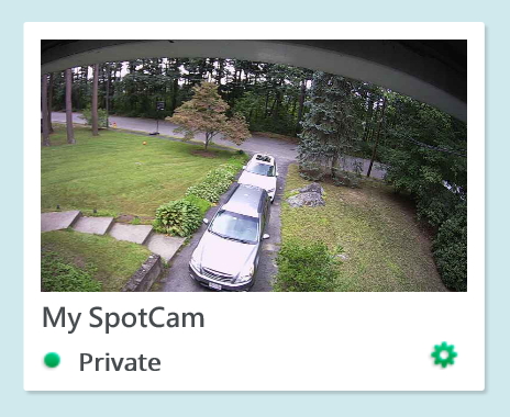
The web browser must support javascript, but since all configuration is on a static image, flash is not required (as it is in order to view movies).

If configuring this using the mobile app, click the gear icon on the subscribed SpotCam preview image and scroll to the bottom of the screen.

Once you click the Video AI item the following menu appears

Each type of detection includes an AI parameter menu. The AI parameters include setting if the camera is mounted inside or outside, indicating if the camera is mounted horizontally, vertically, or slanted, and, in some cases, setting the minimum and maximum object size that can be interpreted.

When the Video AI registers a detection it lists it in the events tab and it places a marker on the timeline of the subscribed camera.

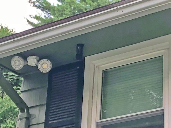
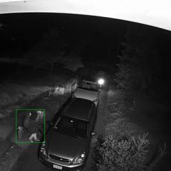
The image below is the “Human Detection” of me taking a picture of the camera for this post.
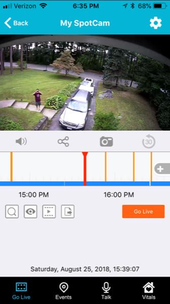
On the web, the AI markers sit above the audio and motion event markers on the video timeline.

The review is based on a SpotCam that I have mounted outside in my front yard. The camera is mounted upside-down below the front soffit of my roof and faces almost exactly due west. For several days of the review, the family was on vacation so the cars in the driveway didn’t move at all.
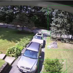
In addition to making a notification in the timeline of the subscribed camera video record, the Video AI can be configured to send an email with a link to an image that corresponds to the detected event. A green box indicates the area that triggered the event in the image.  You can see a green box surrounding me walking towards my car.
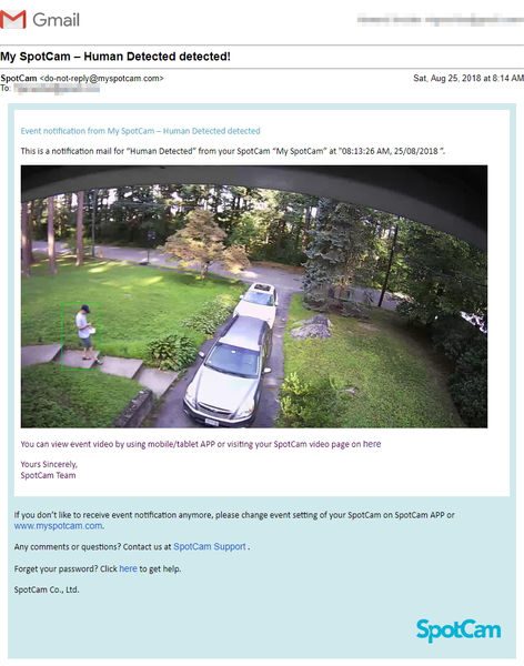
The image is unfortunately only a link to an image on a google server and not an attachment. The image expires as soon as the subscribed network video recording period expires.

The latency for the emails varied considerably. For example, The Human detection emails I received on one day (my son was having friends over so there was above average traffic) were received within minutes or hours later. Also, for what it is worth, I do not believe there is a way to Americanize the date format.

received at 9:13 AM (10 hours ago), “Human Detected” at "09:05:26 AM, 25/08/2018 ”.
received at 9:27 AM (10 hours ago), “Human Detected” at "09:07:08 AM, 25/08/2018 ”.
received at 9:31 AM (10 hours ago), “Human Detected” at "08:13:26 AM, 25/08/2018 ”.
received at 9:32 AM (10 hours ago), “Human Detected” at "09:14:17 AM, 25/08/2018 ”.
received at 10:18 AM (9 hours ago), "Human Detected” at "10:16:44 AM, 25/08/2018 ”.
received at 10:42 AM (9 hours ago), “Human Detected” at "10:03:56 AM, 25/08/2018 ”.
received at 11:02 AM (8 hours ago), “Human Detected” at "10:22:54 AM, 25/08/2018 ”.
received at 11:35 AM (8 hours ago), “Human Detected” at "11:32:10 AM, 25/08/2018 ”.
received at 12:40 PM (7 hours ago), “Human Detected” at "12:39:48 PM, 25/08/2018 ”.
received at 12:42 PM (7 hours ago), “Human Detected” at "12:32:03 PM, 25/08/2018 ”.
received at 12:47 PM (7 hours ago), “Human Detected” at "12:38:05 PM, 25/08/2018 ”.
received at 1:00 PM (6 hours ago), “Human Detected” at "12:59:39 PM, 25/08/2018 ”.
received at 2:36 PM (5 hours ago), “Human Detected” at "01:17:02 PM, 25/08/2018 ”.
received at 2:46 PM (5 hours ago), "Human Detected” at "09:59:18 AM, 25/08/2018 ”.
received at 3:32 PM (4 hours ago), "Human Detected” at "02:10:06 PM, 25/08/2018 ”.
received at 4:07 PM (3 hours ago), “Human Detected” at "08:59:03 AM, 25/08/2018 ”.
received at 4:07 PM (3 hours ago), “Human Detected” at "09:00:52 AM, 25/08/2018 ”.
received at 6:06 PM (1 hour ago), “Human Detected” at "08:37:51 AM, 25/08/2018 ”.
received at 6:37 PM (1 hour ago), “Human Detected” at "09:09:47 AM, 25/08/2018 ”.

Missing Object

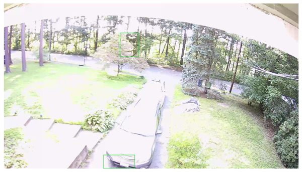
The Missing Object component is designed to determine if objects within a specified region of the image change over time. Only one region can be configured for a missing object detection and the region must be a simple quadrilateral. (Actually, the program will allow drawing a “bowtie” shape but I did not test how this performs.) For this review, I selected the region of the driveway to test if the camera can correctly determine that the cars have moved. During the five vacation days, I received nine notifications that the cars have moved, all (thankfully) false positives. Most of the detections were based on the changing reflection of the sky on the chrome and windshield of the cars, or sunlight variations on the yard. One of the notifications, at 3 AM, was because a moth flew in front of the camera. Unfortunately, when I finally did move one of the cars at 8:14 am, no missing object event was triggered. The image below illustrates that the Video AI thought that the top of a tree and the bumper of the car had gone missing.
Virtual Fence

The virtual fence allows the user to draw a line separating two areas on the image and designate the AI to monitor and detect any objects that cross the line.  Only one fence can be created for the virtual fence detection. The AI can determine in which direction the travel across the virtual fence occurs; therefore, the virtual fence can provide notification of traffic in the forward, reverse, or both directions across the fence. When I enabled the virtual fence, I received 143 notifications within 9 days. Many of the notifications were for trees or bugs at night. Like the human detection example above, some detections came in very quickly while others took hours to appear in my email.


The system did correctly determine I was cutting the lawn and walking up the driveway late at night. The virtual fence does not have a parameter to limit the size of the detected image, so there doesn’t seem to be a way to lower the number of false-positives.

Human Detection

The purpose of the human detection component, as described by SpotCam, is to identify only those motion activities that are based on the presence of human beings. The AI parameter of this component includes a relative size selection for both height and width. It should be possible to detect people near or far in a scene based on their size and the perspective of the camera but I didn’t test this out. The Video AI did a good job of identifying people in the scenes; only one scene identified a tree as a person. As discussed before, the latency on receiving notifications varied considerably. The Human Detection component doesn’t have a mask to exclude detection within certain areas; if it did then some of the detections that occur high in the trees could be avoided.


Vehicle Detection

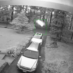
The purpose of the Vehicle Detection component, as described by SpotCam, is to notify the user when a vehicle is detected in the video image.  The AI parameter of this component includes a relative size selection for both height and width. It’s unclear if this parameter can be used to detect near and far vehicles based on perspective, or the relative size of the vehicle (say a Smart car versus a garbage truck.)  The Video AI did a good job of identifying vehicles in the scenes; only one scene identified a tree as a vehicle. As discussed before, the latency on receiving notifications varied considerably. Like the Human Detection component, the Vehicle detection doesn’t have a mask which will exclude detection from certain areas; if it did then some of the detections that occur high in the trees could be avoided. SpotCam warns that the accuracy of this detection might be affected by the headlights of the vehicle during night-time. To ensure proper identification the camera should be placed to avoid being aimed at headlights to improve the accuracy in the night. I did see one capture of path light illumination that was mistakenly interpreted as headlights.


What I like

  • Good highlighting of a video stream
  • green boxes identify the image that triggers AI

What needs to be improved

  • Images are links, not attachments.
  • would be beneficial to “train” the system to recognize “missing objects”
  • not more than one “missing object” area per camera
  • should have video masking on multiple Video AI components.
  • virtual fence size would help eliminate false-positives
  • the latency of email alerts is inconsistent

Final thoughts

The SpotCam Video AI service is groundbreaking in its scope but still has a few bugs to figure out. The number of false-positives is too large to reliably use as an email alert system. I can see that this product may become more robust as computing power, programming, and usage increases.

Price: $3.95/mo, $39/year for “missing object”; $9.95/mo, $99/year for “fall detection”; $5.95/mo, $59/year for other plans
Where to buySpotCam
Source: The sample for this review was provided by SpotCam.

Filed in categories: Reviews

Tagged:

SpotCam video AI service review originally appeared on The Gadgeteer on August 31, 2018 at 11:00 am.

Note: If you are subscribed to this feed through FeedBurner, please switch to our native feed URL http://the-gadgeteer.com/feed/ in order to ensure continuous delivery.

Conbrov 1080P USB charger hidden camera review

REVIEW – I’ve taken a liking to home security since some vehicles near my home were burglarized. I have several security cameras, but, since they look like cameras, if someone was to enter my home, they would like to be the first thing to be destroyed, taken, you get the idea.  I’ve toyed with the idea of having something more discrete and volunteered to have a look at Conbrov’s WiFi 1080P USB charger camera.

What is it?

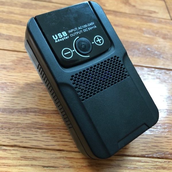
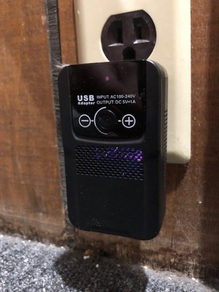
Conbrov’s WiFi 1080P USB charger camera is a plug-in security camera. It looks like an oversized USB charger and equipped with a working 1 Amp USB port, an internal backup battery, and night vision.

Hardware Specs:

  • 1080P resolution, 160° viewing angle, 15fps
  • Internal 500mA battery1 Amp USB port
  • Selectable night vision modes
  • WiFi
  • Maximum SD card capacity of 64GB
  • JustMyCam app

What’s in the Box?

  • Camera
  • Instruction manual
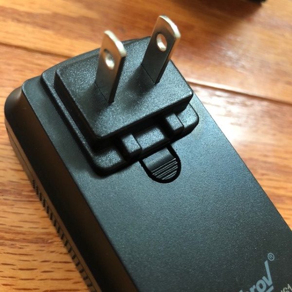
  • Wall plug adapter
  • Conbrov VIP card
  • Amazon “warning” card (covert cameras with audio are illegal to sell on Amazon in the U.S.A)
  • Unicef $1 donation card for submitting a review

Design and Features:

First, let’s address the elephant in the room. I am not a pervert, deviant, voyeur or creep. I have no intention of using this camera for unscrupulous, immoral or illegal purposes. My sole intention is to use this camera to supplement my home security system in a common area of my home. It will never be placed in a location that would compromise the privacy or modesty of anyone living in or visiting my home.

The camera arrived in a strong, largely black box about 3-1/2 X 3-1/2 X 5 inches. The camera is protected by a cardboard “nest” and wrapped in a plastic bag. The camera itself measures 3-1/4 X 2 X 1-1/4 inches. The construction is largely plastic, with sliding doors to access the controls.

Controls are basic, on/off, SD card slot, reset, microphone on/off, and motion detect mode. There are two LEDs with status indicators, but they can’t be turned off. They are under the doors so they are not obvious, but some of the lighting from the LEDs illuminates the inside of the camera and is visible through the cooling vents.

According to the instructions:

I grabbed a 64 GB SD card to format as FAT32 only… Hmmm, really? Windows limits FAT32 to a maximum of 32 GB. There are third-party apps that can format FAT32 drives larger than 32 GB, but the manual specifically states to use Windows only to format the card. So….

I grabbed a 32 GB SD, format it as FAT32, and started through the installation process. I loaded the JustMyCam app on my phone, connected to my network and connected to the camera, all relatively painless.

The app is intuitive and connects to the camera quickly. It allows viewing a live video feed or access to the library of 10-minute videos that the camera records in a loop after the SD card has been filled.  There is even an internal 500mAbattery to keep it running if unplugged or the power goes out. Everything works as described.

Setup functions allow mirroring and flipping of the image, creation of a passcode to safeguard recorded videos, alarm scheduling for mothing detection and recording, SD card management, image management, and network setting.

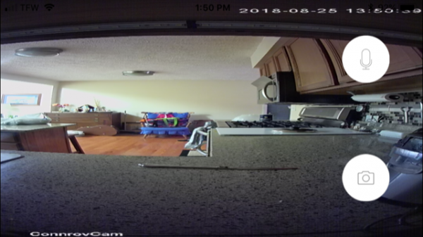
Image quality is sharp, but with a distorted “fish-eye lens” appearance. More significantly, the image cannot be changed from portrait to landscape. Switching to “full screen” squishes the portrait image into a landscape format, making the image barely usable.

Night vision capabilities are quite good with plenty of illumination for the majority of rooms.

A portrait image just isn’t practical for home security, where a wider field of view is a necessity.  Because of this, I won’t be using this camera as I originally intended as a backup for my Canary camera system. Instead, I’ll probably use it in my garage to make sure I’ve closed the door.

What I like

  • Small size
  • Good image quality
  • SD storage

What needs to be improved?

  • Needs landscape image capability
  • Internal battery

Final thoughts:

Conbrov’s WiFi 1080P USB charger camera is a convenient way to add video to your home.  The app is basic but has plenty of useful functionality. Unfortunately, the inability of the camera to produce a landscape picture is a killer if your goal is to use it as a home security enhancement.

Price: $60.95
Where to buy: Amazon (30%off code: 30OFFNT20 expires 9/29/18)
Source: The sample for this review was provided by Conbrov.

Filed in categories: Reviews

Tagged:

Conbrov 1080P USB charger hidden camera review originally appeared on The Gadgeteer on August 31, 2018 at 9:00 am.

Note: If you are subscribed to this feed through FeedBurner, please switch to our native feed URL http://the-gadgeteer.com/feed/ in order to ensure continuous delivery.
BURST Sonic Toothbrush review

REVIEW – When one thinks of a gadget, a toothbrush doesn’t immediately come to mind. But in this day of smart this and smart that, it seems everything is becoming “gadgetized.” And toothbrushes are no different. Give a toothy grin to the new BURST Sonic Toothbrush.

What is it?

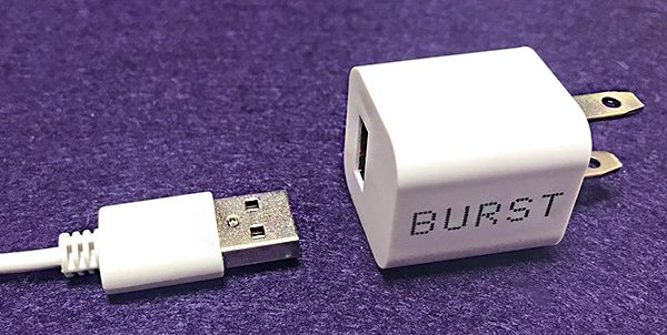
The BURST is a sonic toothbrush with a built-in rechargeable battery (USB charger included). It vibrates at 33,000 sonic vibrations per minute. It has three timed teeth brushing settings. 

What’s in the box 

  • BURST sonic toothbrush
  • USB charger stand
  • Toothbrush head
  • Charger plug

Design and features

Technically, the BURST toothbrush is not a “smart” brush. It doesn’t talk to your phone or keep a brushing history or send your brushing habits to your dentist. What the BURST sonic toothbrush does is brush your teeth in a pleasant and—dare I say—fun way.

The BURST toothbrush is nicely designed and easy to hold in your hand. It’s also designed to stand upright on its wider, flat base. There’s a modern, diamond-shaped pattern embossed into the non-slip plastic handle for easy gripping. An on/off button controls three different brushing selections: Whiten, Sensitive and Massage. The Whiten setting vibrates at 33,000 sonic vibrations per minute. The Sensitive setting at 31,000 sonic vibrations per minute is a less intense version of Whiten. The Massage setting vibrates in a fast, repeating on/off pattern. After trying out the three settings, I decided to choose Whiten and leave it there.

Soft bristles are attached to a replaceable head that easily snaps on and off. The bristles are dark gray and coated in charcoal imported from Japan called Binchotan. BURST claims that the charcoal coating absorbs impurities. Okay, charcoal is used to filter impurities from water, so I’ll have to take their word for it. And no, you can’t taste the charcoal. Hiding among the bristles in the center of the brush head is a flexible “x” shaped tip that BURST claims is a tooth polisher. I have no idea how effective it is, but I can’t feel it when brushing. The back of the brush head has an embedded tongue scraper. 

The brushing head is small which allows brushing in those hard to reach places. I still have my wisdom teeth and my hygienist admits that it’s almost impossible to effectively brush them because I have a small mouth. The BURST toothbrush does reach back there and I figure all those vibrations have to be better than what I was doing. I want to be using the BURST for a 6-month period to see if my hygienist notices any improvement.

Using the BURST toothbrush is quite easy. Dentists recommend brushing for a full two minutes, so the BURST toothbrush has a built-in Quadpacer timer to help you follow this rule. The timer is automatically set for two minutes—broken into four 30-sec. intervals. When you’re done, the toothbrush automatically shuts off. The goal is to spend 30 sec on each quadrant of your mouth. For instance—upper right, lower left, etc.

There’s a minor problem I have with this approach. While brushing my teeth, sometimes I need to spit before I’m done. So I turn off the toothbrush after a timed section. Then I just turn it back on to resume—having to remember where I left off. Unfortunately, the timer settings are not adjustable.

A word of warning: Do not pull the toothbrush out of your mouth while it is still on. Those 33,000 per minute vibrations will spread 33,000 (I’m making this number up) tiny drops of toothpaste and saliva all over the bathroom. You’ve been warned.

As I said, I leave the setting on Whiten. I was unsure of how this setting would work because I have sensitive teeth. However, I have had no discomfort or bleeding with the BURST. That’s even after concentrating the toothbrush on those hard-to-reach wisdom teeth. 

One humorous obstacle I had to overcome was that the vibrations of BURST toothbrush would tickle my mouth to the point I could hardly stand it. The solution was to just keep at it and although it still tickles, I can now put up with it.

When a brush becomes worn (usually every 3 months), replacing them can be done in two ways. BURST offers a subscription service that will automatically send a new brush head every 3 months for $6. That seems reasonable. When you purchase the BURST toothbrush, you’re signed up for the subscription—but you can cancel anytime. If you do cancel, you can still buy brush heads on the BURST site.

What I like

The BURST toothbrush will actually get me to brush better and longer. Only a dental appointment will confirm how effective it’s been. Also, $70 is not an unreasonable amount to pay for a toothbrush that does what the BURST does.

What needs to be improved

It would be nice to be able to customize the timer settings. The charging base comes apart too easily.

Final Thoughts

I would bet that most people don’t brush anywhere close to two minutes. I didn’t. The BURST Sonic Toothbrush has already changed those bad dental habits. It has to be better than what I was doing—and that’s a really good thing.

Price: $69.99 US
Where to buy: Burstoralcare.com
Source: The review sample was provided by Burst. Visit burstoralcare.com for more information.

Filed in categories: Reviews

Tagged:

BURST Sonic Toothbrush review originally appeared on The Gadgeteer on August 30, 2018 at 11:00 am.

Note: If you are subscribed to this feed through FeedBurner, please switch to our native feed URL http://the-gadgeteer.com/feed/ in order to ensure continuous delivery.

Barrington Special Edition Watch Winder review

REVIEW – I have a small but growing collection of automatic watches which I love wearing. In the era of smartphones and smartwatches, many say that old school timepieces are a thing of the past. But I would argue that watches are one of the original gadgets, their style and use still having a place in today’s modern world. But that is a debate for another time… Unlike a battery powered quartz watch, automatic watches wind themselves as you wear them. So, if they sit more than a few days they need to be hand-wound and time reset. Watch winders are engineered to keep the power reserve of your watch full and timepiece ticking while not on your wrist. In this case, Barrington has send their Special Edition single watch winder to review.

What is it?

As the name states, the Barrington Special Edition Watch Winder is a device designed to wind your automatic timepiece so it is charged and good to go at all times. In addition to their quality internal components, Barrington uses fine hardwoods in the construction of their Special Edition series of watch winders. For this review, they send me their single winder in unvarnished American walnut.

Design and features

Barrington is a British company focused on fine watch accessories. They produce high quality watch winders, watch winder safes, and various other accessories to maintain and store your watches. As you can see, their Special Edition watch winder is designed to hold/wind a single watch at a time with a variable number of daily turns and multi-direction capability.

In the box:

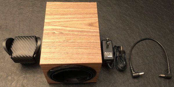
  • Special Edition Barrington Single Watch Winder
  • Standard or Flex holder
  • US power adapter
  • Connecting power cable

Inside the watch winder is an ultra-quiet Japanese motor that you can barely hear when operating. The movement is very smooth and precise. The physical dimensions of the watch winder measures 4.5in/11.5cm (W) x 4.7in/12cm (H) x 6.3in/16cm (D). A good size for on top of an armoire or shelf of a closet.

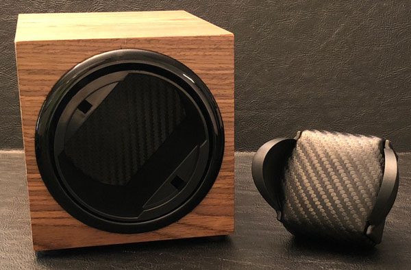
The Barrington watch winder can accommodate their Standard or Flex cushions. Here you can see my watch on their Standard holder. The Standard is designed for watches with a strap/bracelet circumference of 19cm to 24cm. The Flex is suitable for watches with a strap/bracelet circumference of 14cm to 20cm. According to Barrington, their Standard cushion fits approx 70% of customers and the Flex “is preferred if wrist size is slightly smaller”. They sent me the Standard holder and while it fits my rubber strap watch just fine cause I can adjust it. I would need their Flex cushion to accommodate my timepieces with brackets due to my scrawny wrists.

As I have mentioned, the Barrington watch winder has multiple turns per day settings (650/750/850/1000/1950) and rotation directions. The movement is smooth and nearly silent but Barrington says it best:

This single watch winder operates on a basis of gentle rotation to wind watches. Older generation Watch Winders were programmed to be always on (i.e. rotating without a pause) in an effort to wind the watch as quickly as possible. This can lead to over-winding of a watch and potential damage to the main spring. Gentle rotation ensures a consistent movement over a longer period of time that won’t over-wind your watch.

When initially turned on the rotor turns for 1 minute before pausing. The length of the pause is determined by the Turns Per Day setting (a lower TPD setting will mean a longer pause and vice versa) and once it is completed the rotor turns again for just 1 minute. This cycle continues silently until the watch winder is turned off.

If the Direction setting is set to clockwise then the rotor will always rotate in a Clockwise manner; the same principle applies if the Direction setting is set to Anti-Clockwise. However, if the Direction setting is set to the third setting, Alternately Clockwise/Anti-Clockwise, the first 1 minute rotation will be Clockwise, the next 1 minute rotation will be Anti-Clockwise and so on, ensuring your watch gets a balanced, yet gentle, rotation.

This watch winder can be powered by standard AC power or a pair of AA batteries. For this review, I powered the winder on batteries that have lasted nearly two months of on & off operation with no sign of running out of juice. Barrington’s ‘Jump’ feature allows multiple winders to be connected together via the supplied connecting cable and powered from the AC power source…aka there are two power ports, in and out, so you can daisy chain multiple single watch winders together powering them with one AC adapter cord.

The Barrington Special Edition series is all about the hardwood enclosures. As a lifelong, part-time woodworker, the unvarnished American walnut is gorgeous. The exterior is nicely finished with excellent old world craftsmanship. The seams are perfect with ‘BARRINGTON’ routered into both sides of the wooden box.

In addition to American walnut, the Special Edition watch winders are available in: santos rosewood, gray koto, oak, zebrano, and ebony Macassar hardwoods. For those of you not tempted by their Special Edition winders, Barrington’s standard single watch winders are available in: crimson red, glacier white, midnight blue, electric yellow, shadow black, racing green, and burnt amber for a fraction of the cost.

What I like

  • Well made with quality materials
  • Old world craftsmanship
  • Keeps your watch wound and ready for use
  • Variable turn and directions suitable for nearly any watch
  • Capable of daisy chaining multiple winders

What needs to be improved

  • Expensive

Final thoughts

The Barrington Special Edition Watch Winder is the first watch winder I have ever tried and the convince is obvious. Historically when I switch watches, 99% of the time I have to wind and set it but now that all-be-it minor hassle is a thing of the past. The Special Edition’s wooden enclose is beautiful and mechanism within nearly silent. You can definitely find cheaper watch winders or you could take the time and effort whenever the need arises to do it yourself. But the Barrington SE watch winder is a luxury accessory for your old school timepieces that alleviates that task and looks great while doing it.

Price: $395.00
Where to buy: Barrington
Source: The sample of this product was provided by Barrington.

Filed in categories: Reviews

Tagged:

Barrington Special Edition Watch Winder review originally appeared on The Gadgeteer on August 30, 2018 at 9:00 am.

Note: If you are subscribed to this feed through FeedBurner, please switch to our native feed URL http://the-gadgeteer.com/feed/ in order to ensure continuous delivery.

Wondershare Fotophire Image Editing Software review

REVIEW – Photo editing can be drudgery unless you were raised as a graphic designer using Photohsop (like me). Even then, it can be tedious. Today we’re checking out the Wondershare Fotophire Image Editing Software, which combines a whole bunch of image editing features in one package. It’s simple to use, automates a bunch of the work for you, and has a ton of features that don’t require deep graphic experience to execute. Let’s learn more. To the review!

What is it?

It’s a set of tools that allow you to edit & manipulate your photos including filter effects, image enhancements, color correction, background removal, cropping, and the ability to remove unwanted objects.

Software specs

There are three tools included in the Fotophire editing toolkit:

  • The Photo Editor provides basic editing (like cropping, flipping), 200+ filter effects, focus blurs & vignettes, color correction, and more.
  • The Photo Cutter enables you to remove or replace backgrounds in pictures with a set of smart tools that automate the process.
  • The Photo Eraser automates the process of removing unwanted objects from your photos, including watermarks and date stamps.

I’m testing the Windows-based version of the package, but an Apple OS version is also available.

Design and features

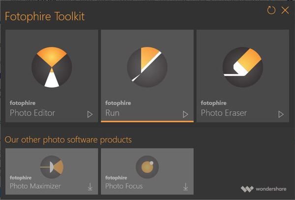
The Wondershare Fotophire Image Editing Software kit provides a suite of tools that allow you to manipulate your photos for professional quality results using a series of easy to use, intuitive interfaces that don’t require extensive graphics experience to master. You’ll start by firing up the toolkit launcher, which gives one-click access to each tool:

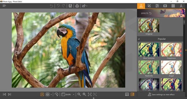
The first tool is the Photo Editor, which offers a HUGE range of filters and effects. Your photo is presented in an interface that uses a combination of intuitive icons, menus, and excellent help tools guide you through their use:

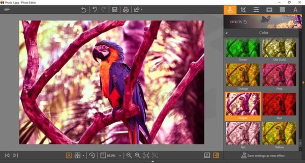
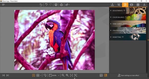
The effects menu provides over 200 canned filters you can apply for different photo treatments. I chose a random effect to give the whole photo a purple filter here:

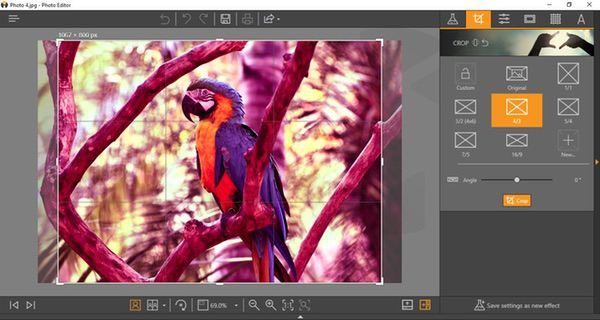
The cropping function, available from all three tools, provides a set of pre-packaged sizing/aspect ratio options, which can then be dialed in with on-screen controls:

If you want to do your own color adjustments, you can forego the pre-selected filters and create your own. There’s a whole subset of tools to adjust color balance, tone, contrast, color saturation, etc. You can save these preferences for future use, and even apply them for batch processing later.

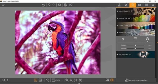
Blurs and vignettes enable you to create focus areas in your image. I added a creative blur here, setting the radius and depth of the filter with my mouse to focus on the parrot and blur the rest of the image. As with other effects tools in the package, everything works with friendly and self-explanatory sliders and onscreen tools that are quick and easy to master.

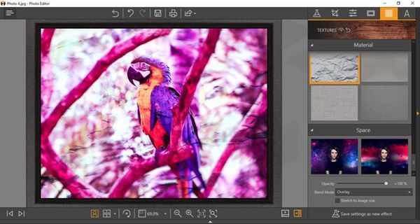
After making those adjustments, I added a frame from another preset menu of options, and then applied a texture to the whole picture.

These samples only scratch the surface of what the Image Editor can do. Color management and tone controls are really deep. You can add text, flip photos, add blends, and more. You can also set the view mode to arrange the desktop with before and after previews if you like, and save your settings for future use or batch processes. It’s an impressive set of features compared to many photo editing apps out there. And the speed is excellent. I ran my tests on an older Windows 10 machine, and saw virtually no lag from application to execution of any of the effects.

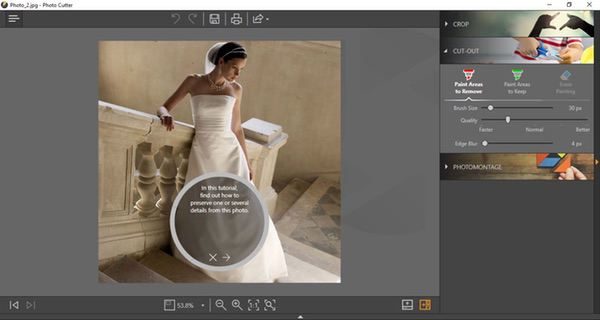
The Photo Cutter tool employs a simple, user-friendly automated feature to remove background elements from your photos for isolating the main subject matter. There’s a handy tutorial that takes you through the process the first time.

To use the tool, you’ll start by drawing lines on your image through the areas you want to remove. As you add these lines (shown in red below), the preview shows you what areas are being eliminated from the photo. If you lose too much of the key image, you can go back and highlight areas to include in the finished piece (shown in green). Adjustment sliders allow you to refine the selection process to accommodate the depth and complexity of the original image.

Once you are happy with the preview, press the “erase” button and the background just… disappears.

The finished art is rendered on a separate layer, and you can add in a different background if you like:

In my previous life I spent many, many late nights doing detailed image cropping and background removal in Photoshop… I can tell you that I would buy this package just for this tool. The automation is really good. You will always have challenges with images that have very similar tones, but most of my testing was spot-on in one or two attempts. And the speed is, once again, excellent for a complex task like this.

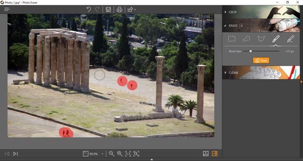
The Photo Eraser is the final tool in the package. Basically, it acts like an automated “clone” tool used in other photo editing programs to remove unwanted objects. The “Erase” tool lets you set the size of spots on the screen (in red below), and the software will basically blend the surroundings to eliminate the image in the spots. Like so:

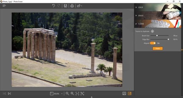
You can also do your own cloning, basically copying an area of the image to another to blend out unwanted objects. I removed the buildings behind the monument hereby extending the foliage in the picture. I exaggerated it a bit so that you can get an idea for how it works:

Of the three tool sets in the Wondershare Fotophire package, this is probably the weakest one in my opinion. The interface is great and responsive, but I found that the automated cloning feature is not always as accurate. It’s nice to have in the package, but doesn’t need to stand on its own… this tool could probably be worked into the Image Editor as opposed to standing as its own app.

While the Wondershare Fotophire package isn’t as robust as a fully-functional commercial image editing tool like Photoshop, I think it ticks off just about all the boxes if you are actively publishing photos online on a regular basis. It does each job very efficiently, and it doesn’t require a steep learning curve to produce professional-looking results.

What I like

  • Simple, well designed, intuitive interfaces
  • Snappy performance
  • Excellent help and tutorial support
  • Robust feature set for a photo editing package

What needs to be improved

  • The Photo Eraser tool could be improved, or even integrated in the Photo Editor tool for simplicity

Final thoughts

I think the Wondershare Fotophire is a good value for what you’re getting. A lot of photo editing tools are extremely limited in scope and capability, requiring you to buy a combination of tools to get what you need if you are frequently posting images. The Fotophire package gives you just about everything you need for essential image manipulation in one package, and you don’t need deep graphics experience to use it.

Price: 1 year license for $49.99, lifetime license for $79.99
Where to buy: Download the demo and purchase at the Wondershare Fotophire web page.
Source: The sample of this product was provided by Wondershare

Filed in categories: Reviews

Tagged:

Wondershare Fotophire Image Editing Software review originally appeared on The Gadgeteer on August 29, 2018 at 11:00 am.

Note: If you are subscribed to this feed through FeedBurner, please switch to our native feed URL http://the-gadgeteer.com/feed/ in order to ensure continuous delivery.