Vankyo LEISURE 3 2200 LUX LED Portable Projector review

REVIEW – The Vankyo LEISURE 3 2200 LUX LED Portable Projector is a low-cost, easy-to-use, portable digital projector with a good amount of input options. At a price of $89.99, the Vankyo LEISURE 3 does what it’s supposed to do, but don’t expect too much from the viewing experience. The Vankyo is serviceable, but it takes a few hits for not being able to process Dolby Digital Sound, function as a digital presentation projector, or including cables for iPhone or Android devices.

What is it?

Portable digital projectors have become pretty popular recently. The ability to immediately project a wall-sized video of content from your phone or laptop is really exciting and when compared to the price of televisions of comparable size, the cost of a digital projector seems to make sense. The best digital projectors are usually in the $300-$800 range. They offer a viewing experience on par with that of a modern, reasonably priced television with the added benefit of portability. Generally, the smaller and more feature-rich the projector, the higher the price.

The Vankyo LEISURE 3 can’t compete on any level with those high-end projectors. This projector costs only $89.99 for a reason. The build quality, included features, and picture quality are all sub-par to mediocre. But, you get what you pay for, and there are a few instances where purchasing a projector of this caliber makes sense.
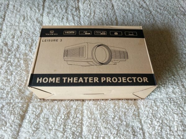
The Vankyo LEISURE 3 comes in a sturdy cardboard box with a carrying handle. This box would make a great case if the Vankyo didn’t already come with a cool zippered carrying case.

The carrying case is a great accessory and of good quality, it makes the Vankyo stand out a bit from other projectors in this price range.
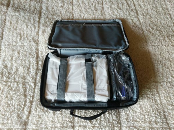
The case has internal velcro straps to keep the projector safe, a separate adjustable compartment for the extra cables and remote, and a sleeve for the manual and quick start guide.

What’s in the box?

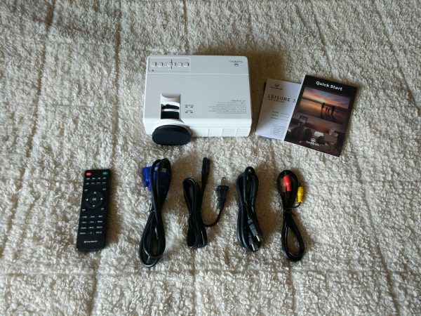
  • Vankyo LEISURE 3
  • Quick start guide and manual
  • Remote control (batteries not included)
  • VGA cable
  • Power cable
  • Standard HDMI cable
  • RCA to 3.5mm video cable

Hardware specs

  • LED Brightness: 2200 LUX
  • Contrast Ratio: 2000:1
  • Keystone: ±15 degree
  • Lamp Life: 40000 hrs
  • Aspect Ratio: 4:3\16:9\auto
  • Projection Size: 33-170 inches
  • Native Resolution: 800 x 480
  • Display Technique: LCD
  • Weight: 2.12 lbs
  • Dimensions: 7.9 x 5.9 x 3.1 in

Design and features

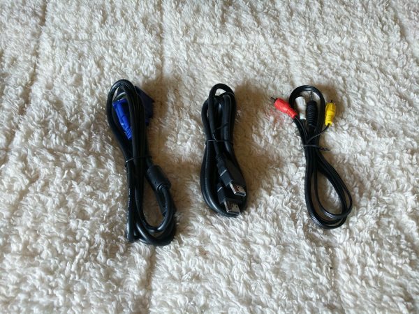
With the provided cables and inputs, the Vankyo LEISURE 3 can accept video input from a few sources. The included cables let you input video from an HDMI source, a computer with a VGA output, an RCA video output, an SD Card, or a USB source. Because you’re only given three included cables, you need to buy additional adaptor cables to be able to input video from your iPhone, Android device, or newer laptop.
You can also output audio from the projector to an external speaker. The internal speaker on the Vankyo works OK in a quiet room or if there isn’t a lot of background noise. The fan on the Vankyo is pretty impressive in how quiet it is. You know it’s running, but it doesn’t really affect the viewing experience.

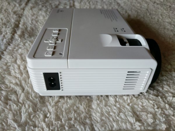
The USB input is what I found most useful. If you format a USB stick with movies, music, or images and insert it into the USB slot, the Vankyo can access the folders with a rudimentary file system. By using a low profile 128gb USB stick, I was able to pack up the Vankyo projector along with about 30 movie files for outdoor viewing on a recent camping trip.
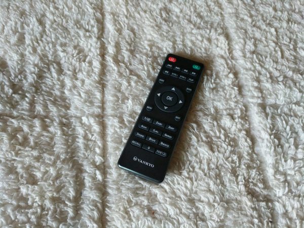
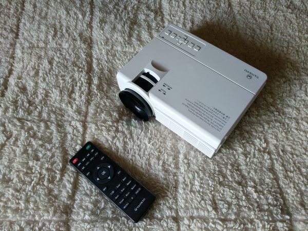
The remote for the Vankyo proved useful at times, but since the Vankyo works best in absolute darkness, I found myself wishing it had a light-up feature to help make the keys visible. Additionally, the IR receiver for the remote is on the back of the projector, so if you’re sitting adjacent to or in front of the projector, the remote is useless.
Setup

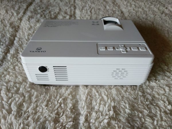
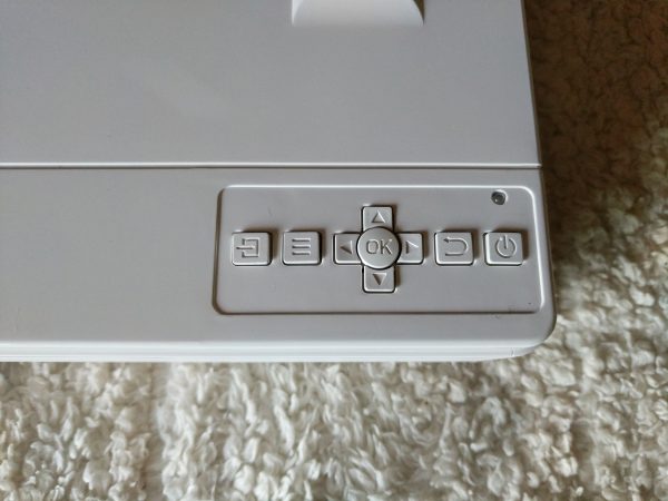
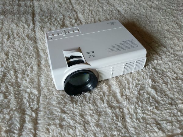
Setting up the Vankyo LEISURE 3 is pretty easy. Just plug in the power cord, connect your video source, power on the projector and you should have some type of image projecting. There are control buttons on the top of the projector and it takes a bit of time to understand them, but once that’s been figured out, the rest of your setup time will be spent on trying to get the best picture and focus.
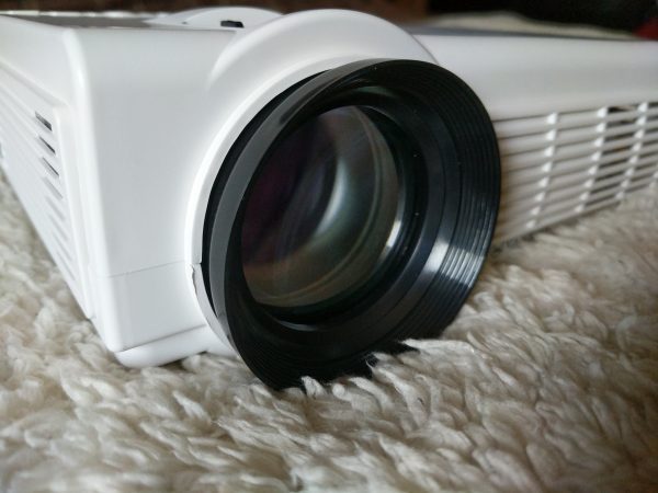
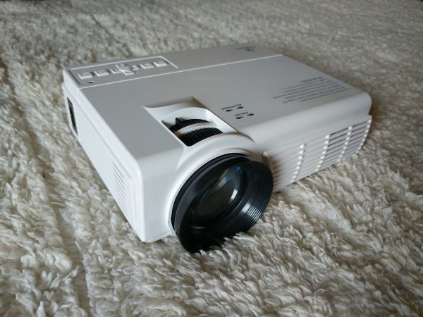
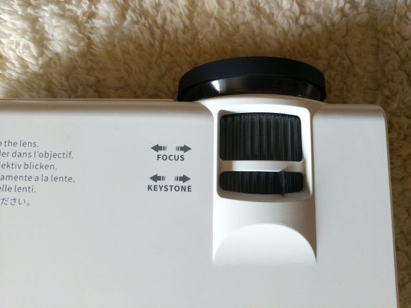
Focus can be adjusted with the Focus dial on top of the projector or by turning the lens itself. The Keystone adjustor allows you to fix the geometry of the picture if it’s not hitting your screen correctly. It’s of note that the keystone can only be adjusted vertically, which I found frustrating.
Performance

For my testing, I set up a screen using a white bedsheet and had the projector about three feet away projecting an image comparable to a 32 inch television.
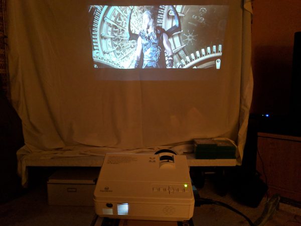
I watched several movies and television shows to test the Vankyo, but mainly tried it out using “Thor: Ragnorak” because of the bright color palette and great audio tracks.

It took me a while to find the best configuration for the picture settings. The picture from the Vankyo LEISURE 3 looks best in COMPLETE darkness, so using the remote to change the picture settings in the dark was frustrating at times.

After some trial and error, I was able to get some decent contrast and color although this varied as the scenes changed.

I was impressed with the color, but disappointed and frustrated by the focus and sharpness of the image.

I was never able to get the bottom of the frame to stay completely in focus, no matter how I adjusted the keystone, focus, or position of the Vankyo. Also, at times the picture would take on a pinkish hue in the whites.

The internal speaker handled the music and cinematic sound from the movie fine. There are a few audio parameters that can be adjusted as well and that helped a lot, but not having the ability to enable Dolby Digital Sound really hurts the experience.

And this is why the Vankyo LEISURE 3 is just a mediocre performer, there was no point during my testing where I was like, “This is so much better than my TV.” The whole point of digital projectors is that “wow” factor to kind of bring the cinematic experience home; the Vankyo just doesn’t come close to evoking that feeling.

Ultimately, for me, the Vankyo LEISURE 3 is kind of like a novelty purchase. It’s cheap and fun to take on camping trips or maybe to play the occasional movie outside after a BBQ or family gathering, but it’s not of good enough quality to use and enjoy on a regular basis.

Additionally, and most importantly for some, you can’t even run a digital presentation on it! Of all the reasons I mentioned to get and use a digital projector, that’s one of the main ones and the Vankyo can’t even function in that sense.
What I like

  • Easy to set up
  • Inexpensive
  • Carrying case included

What needs to be improved

  • No support for PowerPoint, Word, or Excel presentations
  • No support for Dolby Digital Sound
  • Mediocre picture quality and focus
  • Large for a “mini” projector
  • No included smartphone cables/adaptor

Final thoughts

The Vankyo LEISURE 3 2200 LUX LED Portable Projector is a mediocre product at best, but some of its shortcomings are offset by its low cost. The Vankyo functions properly and does what it’s supposed to do, but it lacks options offered in a number of other products in its class, like support for Dolby Digital Sound and the ability to run digital presentations. This might qualify as a good novelty purchase, but you’d be better off investing a little more money in a more versatile, higher quality projector.

Price: $89.99
Where to buy: Amazon
Source: The sample of this product was provided by Vankyo.

Filed in categories: Reviews

Tagged:

Vankyo LEISURE 3 2200 LUX LED Portable Projector review originally appeared on The Gadgeteer on September 20, 2018 at 11:00 am.

Note: If you are subscribed to this feed through FeedBurner, please switch to our native feed URL http://the-gadgeteer.com/feed/ in order to ensure continuous delivery.

JESE Air Purifier review

REVIEW – If there’s one thing we all have in common, it’s breathing. When the chance to review the JESE Air Purifier came along, I figured “why not” – I could use yet another air purifier.

What is it?

The JESE Air Purifier is a small air purifier that not only filters the air but also has an ION function to produce negative ions, which can enhance human immunity, improve myocardial and lung function.

What’s in the box?

  • JESE Air Purifier
  • Power cord
  • Air Filter
  • User manual


Design and features

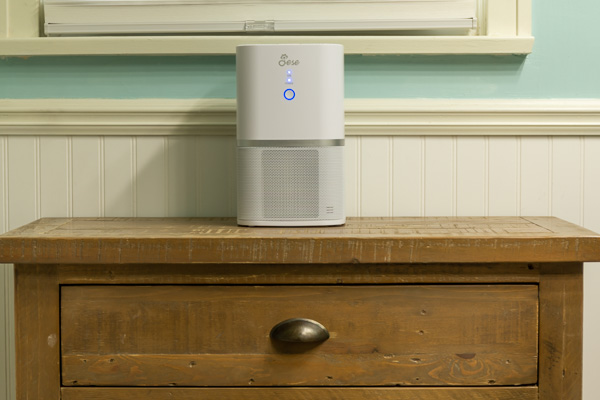
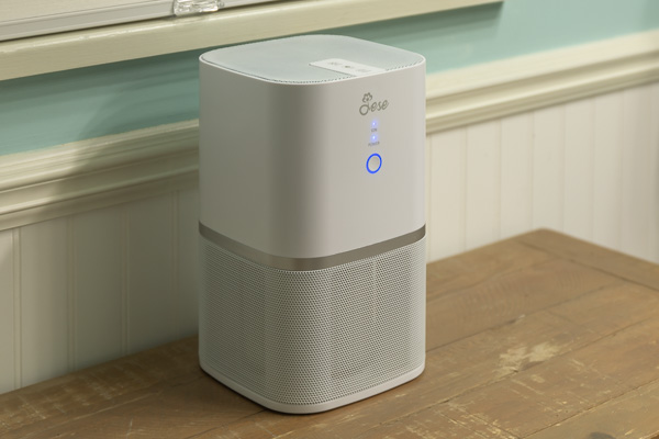
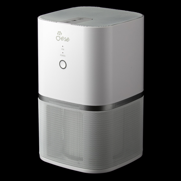
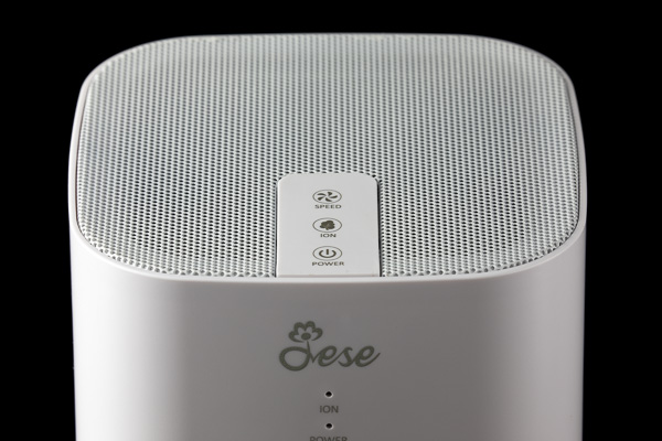
The JESE Air Purifier has an attractive design with easy to operate controls. With power, fan speed, and ion buttons, the controls are simple and easily accessible. Unlike other modern products, the controls are labeled with words instead of just relying on icons that you have to figure out or remember.

LED’s indicate power, fan speed, and ION mode. The front LED ring is blue when on low fan speed, and white when in high fan speed mode. The front LED ring is indented and looks like a button, but it isn’t.

Not surprisingly, the fan can be heard in any standard household room (less than 23dB – about what a quiet whisper is) but isn’t loud enough to be annoying. Pretty much any fan that pushes a fair amount of air is going to make a bit of noise. If you’re the type that likes a little bit of noise when you sleep, this might just make the perfect bedroom addition.

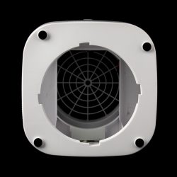
The air is drawn in around the bottom and expelled out of the top of the unit, so in most instances, you don’t have to worry about air blowing directly on you.

The 3-in-1 air filter consists of a primary filter for pet dander and scurf (skin flakes), the second is a HEPA filter for dust, bacteria, mold, and pollen, and the third is an activated carbon filter for smoke and organic pollutants. The JESE Air Purifier gets rid of particles as small as 0.3 microns and the filter is rated for 6 months of use. The filter is supposed to remove 99.97% of household dust. At $15.99 for a filter replacement, filters are a little on the spendy side.

My only complaint (if you can call it that) about this product is the amount of air it circulates. Although it does draw in a fair amount of air, it draws it from a very close proximity to the unit. My previous residence was a bit dusty while we were packing to move, and I expected to find much more dust in the filter than I did. In fact, I ran it for several weeks and I could not see a build-up of dust as I expected.

The ION mode works great and produces a noticeable amount of negative ions.

What I like

  • Attractive design
  • Ease of use

What needs to be improved

  • Expensive filter replacements

Final thoughts

As the JESE product description states, this air purifier is for small rooms and as such, it would be best for a bedroom, bathroom, or on a desktop as a “personal space” air purifier.

Price: $57.99
Where to buy: Amazon
Source: The sample of this product was provided by JESE.

Filed in categories: Reviews

Tagged: ,

JESE Air Purifier review originally appeared on The Gadgeteer on September 20, 2018 at 9:00 am.

Note: If you are subscribed to this feed through FeedBurner, please switch to our native feed URL http://the-gadgeteer.com/feed/ in order to ensure continuous delivery.
Sleepgram adjustable pillow review

REVIEW – Lately, I’ve been obsessed with finding a replacement for my 10+ year old pillow (yeah, I’ve heard that’s gross, but let’s move on) and I have been reviewing various pillows as they are offered to me. The newest one to land on my bed is the Sleepgram pillow. Let’s take it for a nap!

What is it?

The Sleepgram pillow is an adjustable polyester microfiber pillow that has three parts and is available in a queen or king size version.

Design and features

The Sleepgram pillow arrives in a vacuum sealed plastic bag which makes me feel like I’m about to take a mission to Mars or something.

Cutting the bag open and removing the smooshed pillow immediately causes it to inflate into a traditional pillow shaped lump.

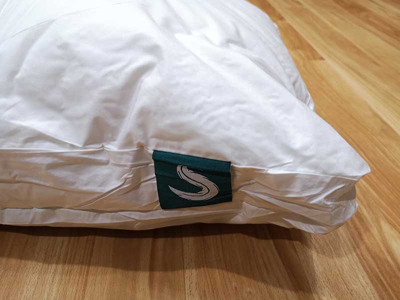
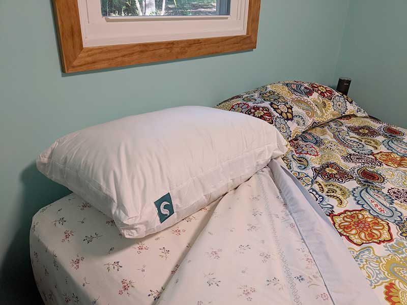
The outer cover is made of white cotton with a teal green label in one corner that has the Sleepgram logo sewn on it.

The white cotton cover is zippered on two sides which is something I’ve not seen before and now think it’s a must-have feature for all pillows with removable inner cores because it makes it infinitely easier to insert the pillow into the cover after a wash.

Unzipping the Sleepgram pillow reveals that the cover itself is filled with microfiber and inside is not one, but two inner pillows. Yes, mind blown…

One inner pillow has a red tab and the other one has a blue tab. The instructions that come with the Sleepgram pillow tell you to put all three pieces in your dryer for about 10 minutes on low or no heat to fluff them up.

Ten minutes later, the pieces are fluffed and reassembled into a pillow.

Standard/Queen size is 18″ x 26″ + 2″ gusset
King size is 18″ x 33″ + 2″ gusset

I was sent the Queen size.

Time for a nap!

Remember that the two inner pillows have colored tabs? The blue tabbed pillow is the soft/thinner pillow and the red tabbed pillow is the medium/thicker pillow. The idea is that you are able to customize the thickness and firmness by using both the blue and red tabbed pillows or just one of them.

For my first nap, I just used the blue (soft) pillow and left the red (medium) pillow out.

I should preface this by saying that I am not a big fan of down/feather style pillows and that’s actually what the Sleepgram is minus the feathers. It has a down-like feel, with a down alternative made of polyester microfiber. That means it’s animal-friendly, allergen free, and dust mite resistant.

The pillow is soft and doesn’t have any weird smells. But like down pillows, it doesn’t provide any bounce back when you lift your head like a foam pillow will do. BTW, a foam pillow is the type that I’ve been sleeping on for eons and is what I like best.

With all that being said, I took a 2hr nap on the Sleepgram and I didn’t hate it which is a not typical for me when I try new pillows. I usually give them a good 5 minutes before switching back to my old favorite. I didn’t do that with the Sleepgram pillow. I slept on it for the entire nap. Does that mean I’ve found my new favorite pillow that I’ll use for the next decade? Hmmm, not quite. As I said, I like foam pillows. So my biggest issue with the Sleepgram is that it gets a bit flat and as a side sleeper, it made my ear hurt, so I found myself trying to fluff it up a couple of times.

For other sleep sessions, I tried other combinations of the two pillows and I didn’t find one that was just right for me, but the blue pillow with the zippered was the most comfortable of all the combinations that I tried.

What I like

  • Machine washable
  • Customizable
  • 100-night money back guarantee
  • 100-year warranty

What needs to be improved

  • No bounce back
  • Sleepgram advertises that this pillow will keep you cooler than other pillows. I didn’t notice a difference.

Final thoughts

I feel a little guilty reviewing the Sleepgram and not loving it because it is a nicely made pillow and I really wanted to love it. I liked everything about the pillow except for the most important thing which is how it felt for me to sleep on it. I’m pretty confident that if you love a feather pillow, you will love the Sleepgram. But if you prefer a pillow with some bounce back like a foam pillow, you might want to look elsewhere. However, you are free to try the Sleepgram pillow since they do offer a 100-night money back guarantee.

Price: $49.95 (standard/queen size), $64.95 (king)
Where to buy: Amazon
Source: The sample for this review was provided by Sleepgram.

Filed in categories: Reviews

Tagged: ,

Sleepgram adjustable pillow review originally appeared on The Gadgeteer on September 19, 2018 at 1:00 pm.

Note: If you are subscribed to this feed through FeedBurner, please switch to our native feed URL http://the-gadgeteer.com/feed/ in order to ensure continuous delivery.
PadMate PaMu Scroll BT 5.0 wireless earbuds review

REVIEW – With the increasing lack of headphone jacks on popular devices, wireless earbuds are appearing on the market with increasing rapidity. The latest I’ve been asked to review has just started their crowdfunding campaign and is from a company we’ve already seen good products from – PadMate. Their recent Indiegogo launch has already earned past their $20,000 goal. Why all the backers? Read on.

Note: Photos may be tapped or clicked for a larger image.

A while back, I was sent the first iteration of PadMate’s wireless earbud line. They were great for sound and connectivity, but I was not a fan of the charging case design. The team has gone back to the drawing board and improved not only the case, but the size and connectivity of the product and launched it as the PaMu Scroll.

What is it?

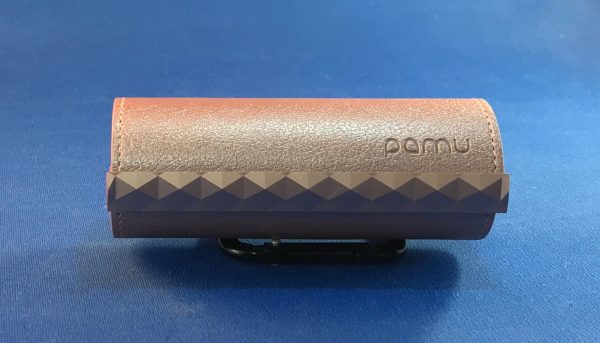
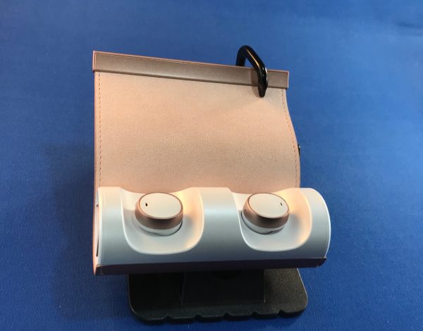
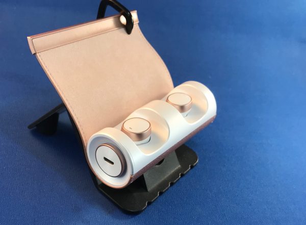
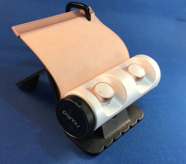
The Scroll is a new type of case for wireless headphones. We’ve seen cases with removable lids, which can get lost or not seal, we’ve seen connected lids like the Apple AirPods, which can get sprung out, but also make opening and removing a bit more trouble. The Scroll is a flap of leather that is rolled over the opening, which holds the earbuds into their magnetic charging mounts, yet allows you to get your fingers around them in order to remove them for use. It’s securely sealed with two sets of magnets, yet releases with the flick of a finger.

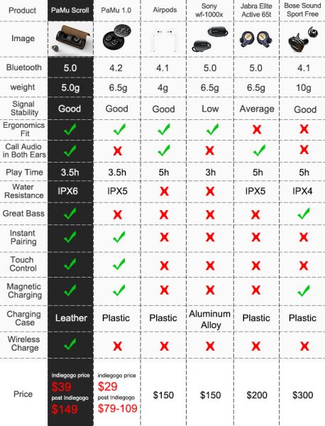
Hardware specs

(from the Company’s IndieGoGo campaign)

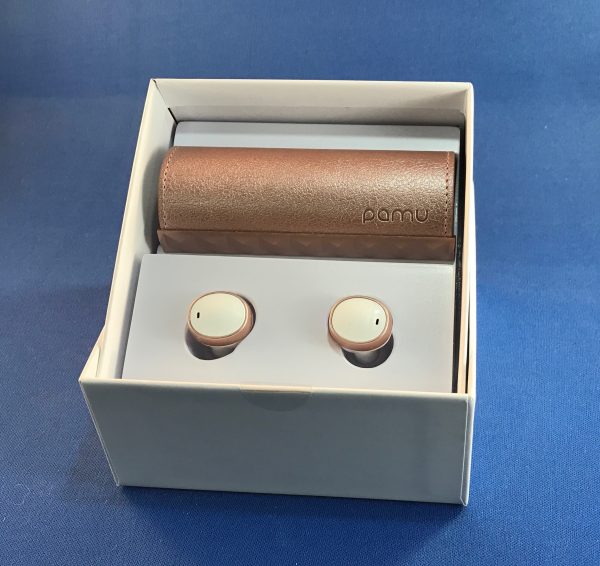
What’s in the box?

  • Earbuds
  • Charging case
  • 3 sizes of silicone tips
  • USB-A to microUSB charging cable (1’ long)

Design and features

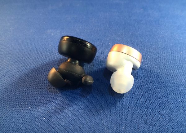
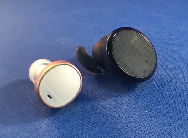
The size of the PaMu Scroll buds is a bit smaller than the previous models, only .75” versus a full inch for the first model, but they are still a subtle oval with a hidden button on the face. The ear tips are a good bit smaller, and the whole unit fits more flush into your outer ear area, which makes them a bit less noticeable.

Still, however, there is that tell-tale blinking light, though. They now are sweat-resistant (IPx6), so they’re going to be better for sweaty sports. The Video on the website shows someone with them on in the shower. You do you.

The PaMu Scroll is sleek and stylish right out of the box. The earbuds are held separately from the charging holder, so that you can appreciate the beauty of both at first glance. Like the previous PaMu earbuds, the Scroll units are easily placed into the charging cradle, and due to the form fit and magnets, it is impossible to get them in the wrong space. They are also marked L and R to avoid any attempt at this. When you remove them from the charger, just like the previous model, they start trying to pair with themselves and any BlueTooth units in pairing mode. These, however, use the new BlueTooth 5.0 spec, so their pairing is more solid.

I was sent a set in Sakura (rose gold) to test. They are also available in several darker shades: Rock ‘n’ Roll, Graphine, and Glory Edition. They look (sorta) black, bronze, and blue, I think. (Your vision may vary.) Each color also has a different pattern on the leather cover. The Sakura cover is a pebble grain.

The interior is a natural suede finish, and there is very even decorative stitching along the outer edge. A metallic plastic piece on the end houses the magnetic catch that seals the cover onto the body of the case. There is a single magnet on each end of both the cover and the case for this purpose.


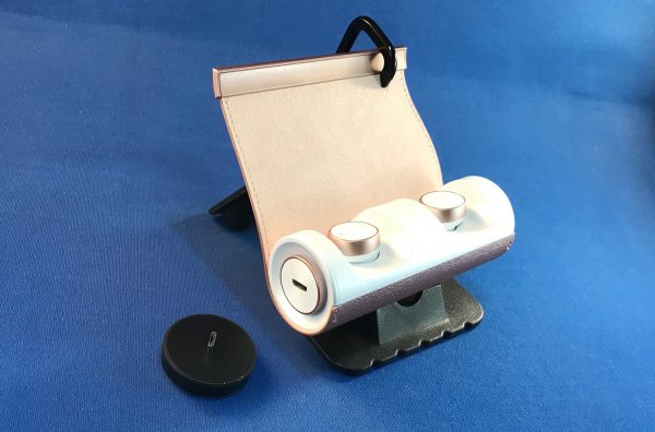
On the left side of the cylindrical case is a microUSB charging port.

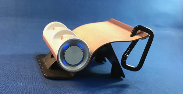
On the right side there are 4 LEDs to indicate level of charge of the case itself.

Like the earlier model, there is no on/off switch or other way to force the case to reveal available charge. This can only be done by removing and inserting one of the earbuds, or by plugging in the case for charging.
The case itself is 3.75” long and just under 1.5” in diameter. The two ends are indented with the center pulled back up into a center pedestal about .75” in diameter. There is a metallic accent around this center area that matches the metal accent on the earbuds. The plastic of the Sakura case and earbuds is white. On the others, it looks blackish, but I couldn’t really tell in the promo videos.

Setup

Pairing and moving between several devices is clean and easy. We’re still not to that “Do What I Mean” stage where earbuds will be able to know which device we’re listening from, but it’s no bother to turn off the PaMu Scroll in my iPad settings and click connect in the Bluetooth settings of my iPhone.

Performance

While the sound quality was still full and rich (better than my AirPods!), they’re still not able to give the same body-thumping sound of a good set of speakers, or the head jarring rattle of really large over-the-ear cans. But for walking around, listening to podcasts or some street tunes? They are fantastic!

What I Like

  • Great sound, especially at this price.
  • Pairs quickly and solidly (BlueTooth 5.0!)
  • Stylish look on earbuds and case
  • Case is substantial

What needs to be improved

  • None that I could find, really

Final thoughts

I was sent these by mistake, so I had no say in the color. Even though I’m not a fan of white and rose gold, I have still been wearing these almost daily since I got them. Every now and again, I’ll pull out the AirPods or the original PaMu’s, and there is always some reason that I go back to these at the next listening session. They really give a full depth, especially to podcast sounds, and that’s usually what I’m listening to when wearing earbuds.

Additional item

I was not able to test this add-on, but there is a microUSB to Qi wireless adapter available. The crowdfunding price is currently $10. It plugs directly into the charging base and looks like it’s part of the unit (well, except I have a white case and it’s black.) I don’t have a Qi charging pad yet.

Price: $39 at super-early bird price. $49 at regular backer price. $149 retail after Indiegogo funding round.
Where to buy: IndieGogo
Source: The sample of this product was provided by PadMate.

Filed in categories: Reviews

Tagged:

PadMate PaMu Scroll BT 5.0 wireless earbuds review originally appeared on The Gadgeteer on September 19, 2018 at 11:00 am.

Note: If you are subscribed to this feed through FeedBurner, please switch to our native feed URL http://the-gadgeteer.com/feed/ in order to ensure continuous delivery.
Black & Decker Infuser 3-In-1 Digital PowerCrush Blending System review


REVIEW – My family is one that is on a major healthy lifestyle journey, and we are always on the lookout for products that allow us to create nice variations of our specific diet. Some of the mandatory tools are a blender, a juicer, etc. When I got a chance to take a look at this 3 in 1 combination, I readily accepted. Let’s see how it went.

What is it?

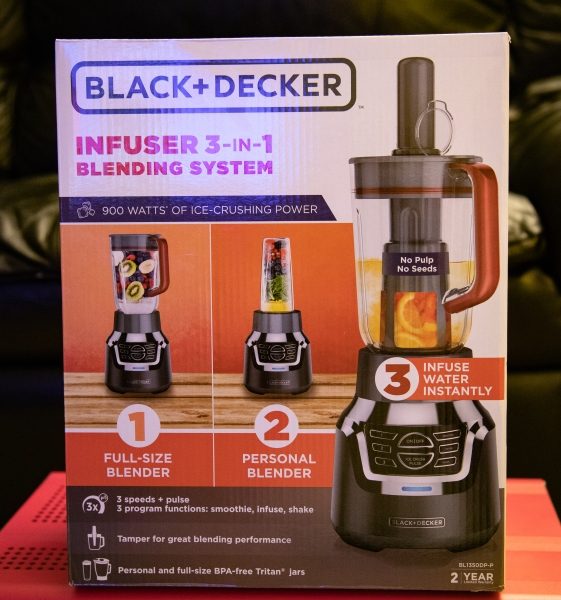
The Black & Decker Infuser 3-In-1 Digital PowerCrush Blending System combines a personal blender, and regular blender and an infusion blender in one device.

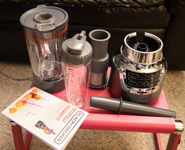
What’s in the box


1 x 3-in-1 blender base unit
1 x 6-cup blending jar
1 x 18-oz. blending jar
1 x Infuser and infusion filter
1 x Instruction/recipe booklet

Design and features

The system is constructed of a metal base and plastic blending parts and combines three blending devices in one.  Its motor produces 900 watts of power that pulverizes even ice, with the use of its 4-tip QuadPro Stainless Steel Blades.

Here are some specs:
Parts material: Glass, Plastic
Dimensions (Overall): 9.88 inches (H) x 15.0 inches (W) x 7.88 inches (D)
Weight: 8.82 pounds
Finish: Baked-on Paint
Capacity (Volume): 48 ounces
Includes: Stainless steel multipurpose blade, Pouring Shield, Blending Cup with Lid, Glass Bowl, Rubber Seal, Instruction Manual, travel jar, infuser insert, tamper
Features: Pulse Feature, Pouring Spout, Hideaway Cord Wrap, Variable Speed, Stainless Steel Blades, Push Button Controls, Indicator Light
Base – Metal Finish: Stainless Steel
Appliance Capabilities: Blends, Crushes Ice, Mixes, Purees, Chops, infuses, emulsifies, Juices, Liquefy
Care and Cleaning: Dishwasher-safe Parts, spot or wipe clean
Number of Speeds: 3
Warranty: 2-year limited warranty

The personal blender includes an 18 oz jar that can be used on-the-go with the snap lid. It works much like every personal blender and creates a smoothly blended mixture.

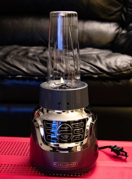
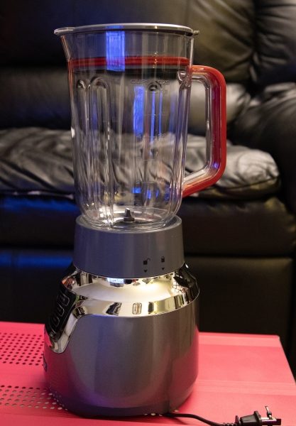
The picture below shows the system set up as a traditional blender. It functions well in this combination as well.


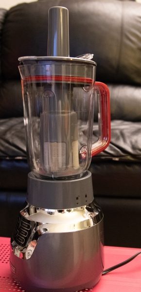
The infuser device basically uses an infusion filter with a “pusher”. You place the ingredients in the inside of the filter and then use the “pusher” to apply pressure downwards onto the ingredients as the blade spins. The blade action starts off as a pulsating action to crush the ingredients and then a fast, free spinning action as the blades work to pulverize the ingredients while the juice escapes through the filter into the jar. As far as I know, the true concept of infusion does not involve a blade, but for my personal use, this is better because the resulting mix is very rich in flavor. “Infusion is the process of extracting chemical compounds or flavors from plant material in a solvent such as water, oil or alcohol, by allowing the material to remain suspended in the solvent over time (a process often called steeping)”. – Wikipedia

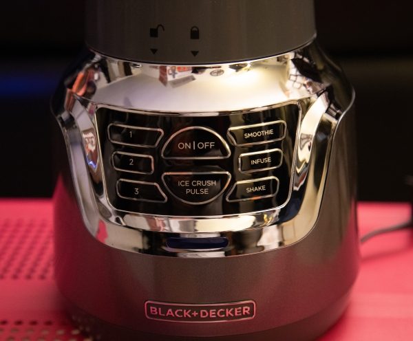
The base unit of this 3 in 1 infuser is made of plastic and metal and is sleek and shiny with a digital touchpad control interface. From left to right, there are 3 speeds controls: an on/off and ice crush control the uses a pulsing action, a smoothie selection that spins consistently to blend, an infuse control that is a pulsing and then free spinning action that is used for juicing, and a shake mode that is also a fast free spinning motion. Basically, they are intuitive controls for the three speeds, three programs, and a pulse function to provide the desired consistency.

Performance

The personal blender use of this system works very well and produces a very smooth blend. I also actually have and have reviewed the Black & Decker personal blender as a separate device, so I was expecting the same great performance and it did not disappoint. While the base unit is slightly different for the separately sold personal blender, the performance is the same except that this system has 900 watts of power and does the job even faster and, slightly better.


Below is the mixture that is a result of the infusion/blending process. the ingredients were blueberries, raspberries, and blackberries. The flavor was smooth, rich, and tasty.
The pictures below show frozen Kale, frozen bananas, frozen strawberries, pineapple, almond milk and ice cubes in the blender and the resulting mixture that was very tasty. You can see in the middle picture that I have the ingredient “pusher” in the center hole in the blender cover as opposed to the attached hole cover that it comes with. This is because I had a minor accident with it and it broke off. (my fault). The blender action is a constant speed at either speed 1, 2 or 3.


The next set of pictures show a smoothie in the personal blender that was made from frozen bananas, kale, apple, peanut butter, and protein powder.  The smoothie action by the blender starts with an on/off cycle until the ingredients are pulverized, and then it changes to a constant speed to finish off mixing the smoothie. It makes an excellent and really smooth smoothie with no type of pulp.


What I like

  • The 3 in 1 feature
  • The blending results
  • The infuser/juicer

What can be improved

  • Some of the materials used have resulted in this label on the seller’s website: – WARNING: This product can expose you to chemicals including Styrene, which is known to the state of California to cause cancer, and Bisphenol-A, which is known to the state of California to cause birth defects or other reproductive harm. For more information go to www.P65Warnings.ca.gov. www.p65warnings.ca.gov 
  • Less plastic for some of the parts. Maybe a glass jar for the blender?


Final thoughts

This 3 in 1 blender system is very convenient and a great use of precious countertop space. It is really nice to make one reasonably priced purchase and have all 3 systems in one. It works well, and we have been using it continuously for our fruit and vegetable shakes. While I am not necessarily a fan of all of the plastic parts that are a part of this system, so far it has held up well. As far as performance goes, I am happy. I will post an update should there be a need to. For now, I give the Black & Decker Infuser 3-In-1 Digital PowerCrush Blending System a thumbs up. (Still researching the whole Styrene issue and effect).

Price: $49.99
Where to buy: Target
Source: The sample for this review was provided by Black & Decker.

Filed in categories: Reviews

Tagged: ,

Black & Decker Infuser 3-In-1 Digital PowerCrush Blending System review originally appeared on The Gadgeteer on September 19, 2018 at 9:00 am.

Note: If you are subscribed to this feed through FeedBurner, please switch to our native feed URL http://the-gadgeteer.com/feed/ in order to ensure continuous delivery.