TaoTronics SoundSurge 60 active noise cancelling headphones review

REVIEW – TaoTronics SoundSurge60 headphones have a comfortable design, Bluetooth connection and built-in microphone.

What is it?

These over-the-ear headphones come with noise-canceling capabilities and fold up nicely to fit inside their hard-shell carrying case. 

What’s in the box?

  • Headphones 
  • Carrying case  
  • User guide 
  • 3.5mm audio cable 
  • Charging cable

Hardware specs

  • Connection: Bluetooth 5.0 or 3.5 mm audio cable
  • Playing time per full battery charge: 30 hours
  • Charge time: 5 minutes for 2 hours of playing time
  • Battery: 2 lithium metal batteries included
  • Dimensions: 7.7 x 6.4 x 3.1 inches
  • Item weight: 9.8 ounces
  • Shipping weight: 1.15 pounds
  • Model: TT-BH060
  • ASIN: B07L5LPSQT

Design and features

Setup

Our headphones arrived charged and ready to use. 

Pairing them with Bluetooth was quick and easy, almost as simple as plugging in the audio cable (which also came with it). Of course, the nice part of the Bluetooth connection was that it made them wire-free, certainly a bonus for anyone using them for exercising or gaming.

The headband is adjustable and fits everyone in my family, from my husband who has a larger-than-average noggin to my 11-year-old. We agreed that the over-ear cushioning was very comfortable, even cushy enough to sleep with them on during a long airplane ride or road trip. 

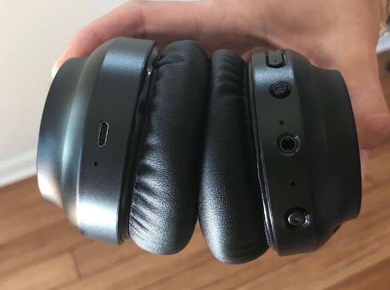
The charging port is located on the left earpiece.

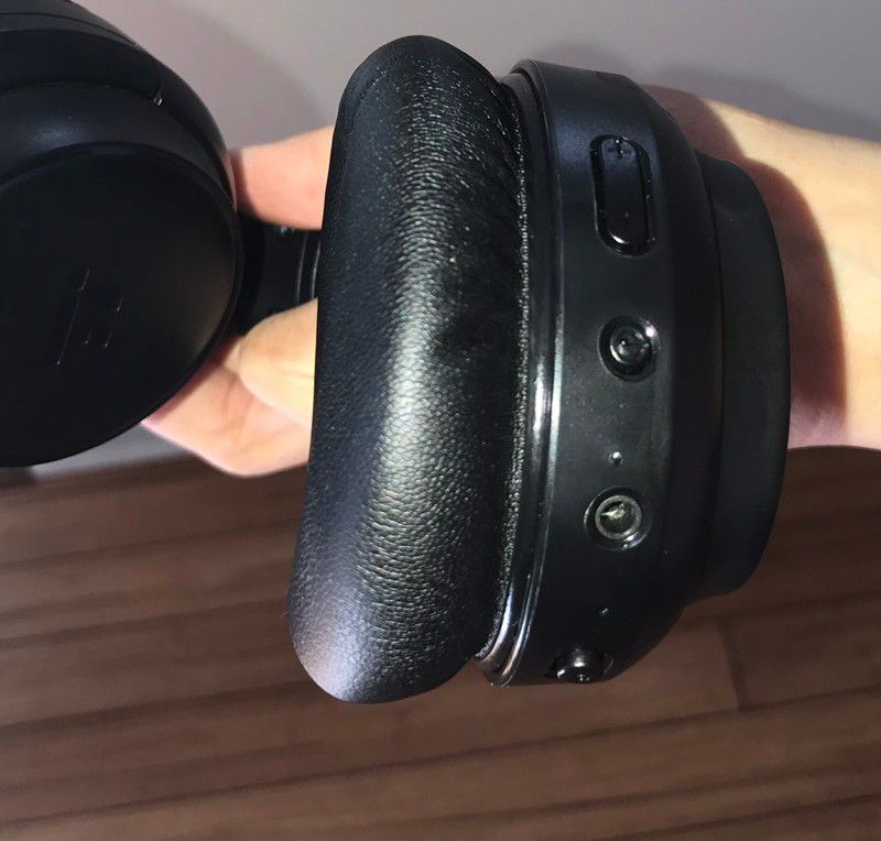
On the right earpiece are all of the other controls: The volume up/down toggle, the power button, the audio input jack and noise-canceling on/off switch.

Performance

The overall sound quality was pretty good. They weren’t as striking or awe-inspiring as higher-end models, but for this price point, the sound was good. There wasn’t any static, and music quality was clear and consistent.

Similarly, the microphone was embedded into the design, and it was clearer and easier to hear than just using a phone or computer mic when we tested it on a Facetime call.

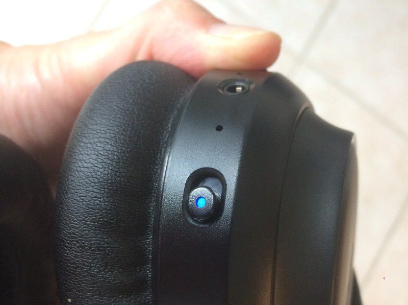
You can flick the switch for noise-canceling, which glows blue to let you know it’s on.

Again, it wasn’t 100 percent perfect. My son could still hear road noise while we were driving, though it certainly softened the sound and kind of felt like you were in a tunnel. However, if he turned his music up, the road noise was effectively canceled out. 

Inside our house, it does a good job muffling but not completely eliminating household noises like the air conditioner, ceiling fan or water running. When my husband had music on, he couldn’t hear the ambient noise around him at all, but could still hear me clapping my hands behind him and our voices were audible but hushed. 

There is some residual noise if you are standing next to someone wearing these headphones, so if your tunes are cranked up, the folks around you will hear some of it. Take note if you’re planning to travel with these!

Besides that minor issue, the headphones are a good choice for travel, work or school because they’re good quality yet aren’t so pricey that losing them would cost you hundreds of dollars. 

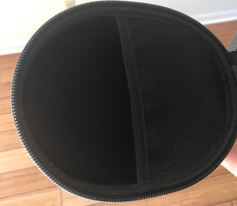
Plus, they come with a zip-close, hardshell carrying case with a mesh compartment perfect for stashing your cords and chargers.

The battery life is amazing, which is another bonus for taking them on a road trip or even an overseas flight. We’ve been using the Surge 60 for weeks, among all four of my family members, and we’ve only had to recharge once. The website says these run for 30 hours per battery charge, and I believe it. They also say that 5 minutes of charging time gives you 2 hours of playing time, another great benefit for traveling, taking to class or work, or really for anyone who’s often on the go.

What I like

  • Comfortable fit
  • Long battery life
  • Convenient, high quality carrying case

What I’d change

  • More effective noise-proofing

Final thoughts

These are a solid pair of headphones, with decent noise-canceling and easy Bluetooth pairing.

Price: $69.99 ($5 off coupon available now on Amazon)
Where to buy: Amazon
Source: The sample of this product was provided by TaoTronics.

Filed in categories: Reviews

Tagged:

TaoTronics SoundSurge 60 active noise cancelling headphones review originally appeared on The Gadgeteer on August 20, 2019 at 11:00 am.

Note: If you are subscribed to this feed through FeedBurner, please switch to our native feed URL http://the-gadgeteer.com/feed/ in order to ensure continuous delivery.

Pad & Quill Lowry Cuff Edition Apple Watch band review

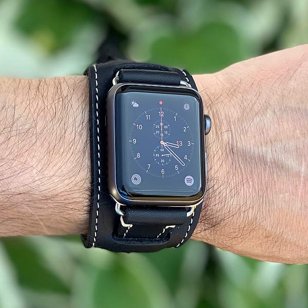
REVIEW – The Pad & Quill Lowry Cuff Edition Apple Watch Band is a tribute to the Lowry Ave Bridge that spans the Mississippi just south of PQ’s headquarters in Minneapolis. The band’s design is inspired by Bund-style aviator bands that protected WWII pilot’s wrists from extreme temps in the air. I recently received one of these stylish bands to review for The Gadgeteer. Here are my thoughts.

What is it?

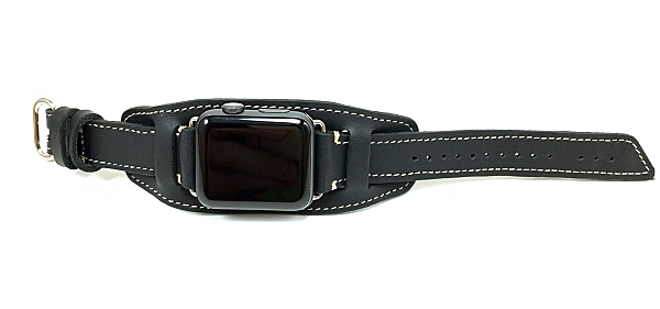
The Pad & Quill Lowry Cuff Edition Apple Watch Band is an American full-grain leather watch band for the Apple Watch.

What’s in the box? 

  • Lowry Cuff Edition Apple Watchband

Design and features

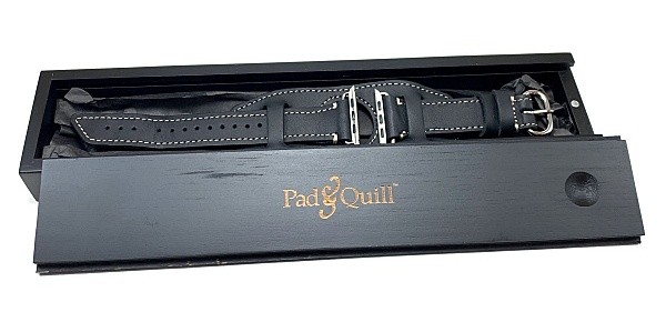
I don’t usually comment on packaging, but love how Pad & Quill packaged this Apple Watch band. The Lowery Cuff Edition arrived packaged in a black wooden box with a tongue and groove sliding top. It just feels like you’re getting something special when you open it up.

The Lowry Cuff Edition is made for 42mm & 44mm Apple Watch gens 1-4. The band is designed to fit wrist as small as 125mm and large as 215mm.

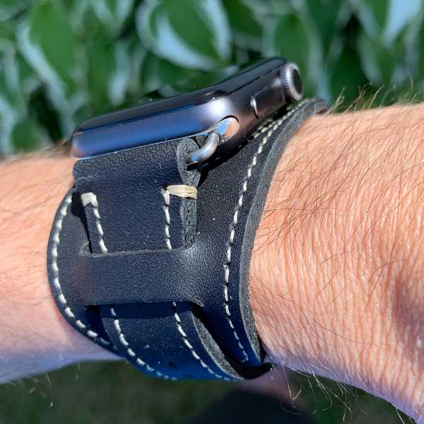
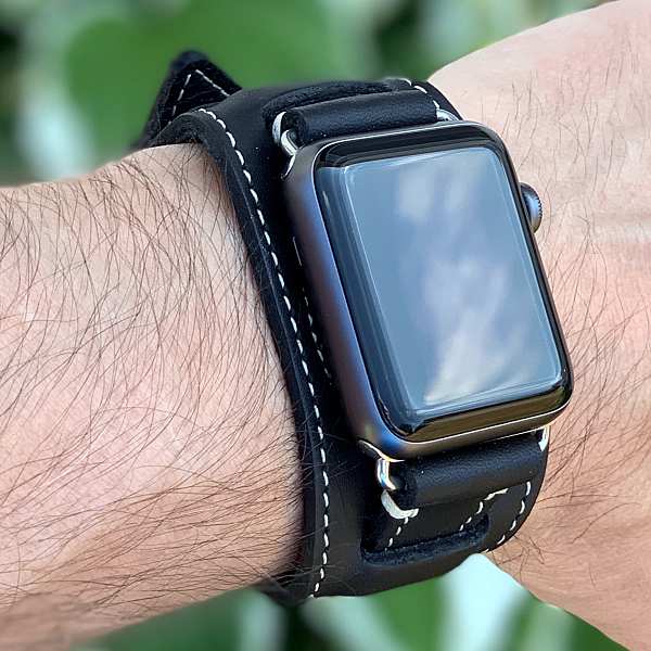
The Cuff style look is classic, yet modern, I chose to go with the Gallop black leather band w/polished nickel hardware. It’s also available in Whiskey and Chestnut colors and Matte black hardware.

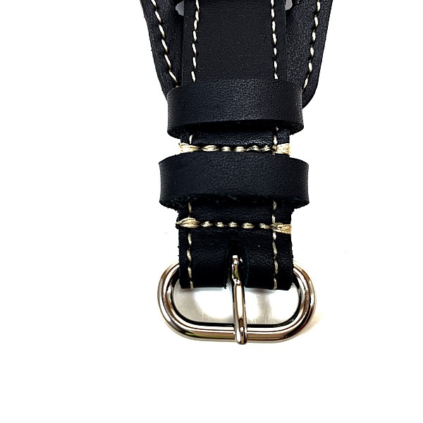
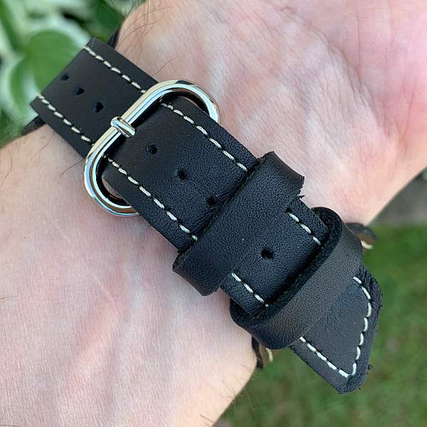
The band is constructed with American full-grain leather. The white precision UV-resistant marine-grade stitching (the same thread used in parachutes and sails) is a nice contrast to the Gallop black leather and polished nickel hardware. 

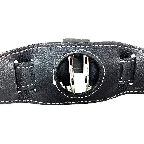
Soft pigskin leather lines the back of the band. There’s also a cutout for the Apple Watch Optical Pulse Sensor.

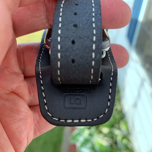
Discreetly embossed on the cuff underneath the watch strap is the initials from the artisan that crafted the band.

The band also comes with Pad & Quills insane 25-year leather warranty.

Fit and comfort

The band is comfortable to wear right out of the box. The cuff is contoured to fit your wrist, so it hugs your wrist and doesn’t feel stiff.

The soft yet strong pigskin leather lining makes the band instantly comfortable against your skin. I wore the band outside in 80+ degree weather and noticed that my wrists didn’t sweat like they do when wearing my rubber sports band. Overall the band is extremely comfortable. 

The only issue I had with the band was charging my Apple Watch. The band has a cutout as I mentioned, but because of its thickness, I couldn’t get it to stay attached to my Nomad Base Station Apple Watch charger. However, since the band is easy to remove, this is little more than a minor inconvenience. Just be aware that it may not work with all charging stands.

What I like

  • Classic styling
  • Full-grain leather
  • Handcrafted 
  • Comfortable 
  • 25-year leather warranty

What I’d change

  • Doesn’t work with all charging stands

Final thoughts

The combination of Classic styling, quality materials, craftsmanship, and comfort makes the Lowry Cuff Edition tough to beat. If you’re looking for a leather band for your Apple Watch, your search should begin and end with Pad & Quill.

Price: $99.95 pre-order price $89.95. Shipping in late August.
Where to buy: Pad & Quill
Source: The sample for this review was provided by Pad & Quill.

Filed in categories: Reviews

Tagged: ,

Pad & Quill Lowry Cuff Edition Apple Watch band review originally appeared on The Gadgeteer on August 20, 2019 at 9:00 am.

Note: If you are subscribed to this feed through FeedBurner, please switch to our native feed URL http://the-gadgeteer.com/feed/ in order to ensure continuous delivery.

Zendure SuperTank Portable Charger review

REVIEW – It’s a problem all gadget-loving folk deal with, the more gadgets you have, the more power you need. The solution, of course, is to buy yet another gadget, one that can supply power to all of those hungry devices, large and small. But, portable power supplies by their nature are quite limiting. The Zendure SuperTank may just be the holy grail of portable power. This aptly named tank of a battery pack can crank out over 100 watts of power, enough to feed four devices simultaneously, including USB-C powered laptops. The design, capacity, and various power modes, which include a low power option as well as a UPS pass-through, make this device a great buy at $179.99.

What is it?

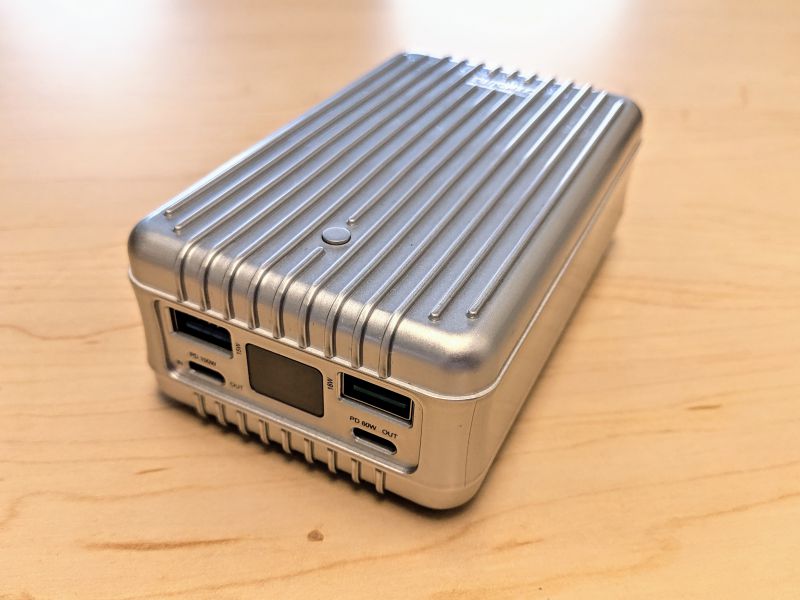
The Zendure SuperTank is a very large, 27,000mAh external battery pack that can deliver over 100 watts of power to four devices simultaneously.


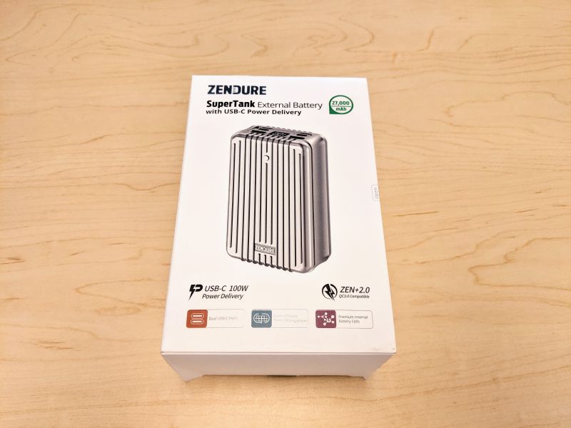
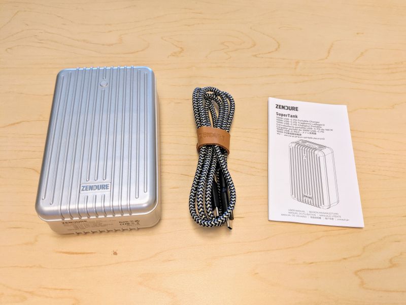
The SuperTank arrives in a sturdy white box, snugly set inside along with a Zendure 5A/100W SuperCord and a somewhat useless instruction manual.

What’s in the box?

  • Zendure SuperTank
  • Zendure 5A/100W USB-C to USB-C SuperCord
  • Instruction Manual

Hardware specs

  • Capacity: 27,000mAh
  • Internal Cells: 3.7 V Premium Lithium-ion Power Cells
  • Dimensions: 4.7″ x 2.8″ x 1.6″
  • Weight: 1.06 pounds / 481g
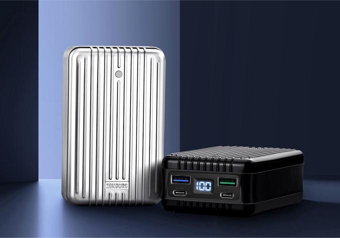
  • Available Colors: Black, Silver, Blue
  • Material: ABC / PC Composite
  • Maximum Input: 5V/3A, 9V/3A, 12V/3A, 15V/3A, 20V/3A, 20V/5A, 100W Max
  • Output: USB-C, USB-A
  • Maximum Output:
    • USB-C (1): 5V/3A, 9V/3A, 12V/3A, 15V/3A, 20V/3A, 20V/5A, 100W Max
    • USB-C (2): 5V/3A, 9V/3A, 12V/3A, 15V/3A, 20V/3A, 60W Max
    • USB-A (1): 5V/3A, 9V/2A, 12V/1.5A, 18W Max (ZEN+ 2.0)
    • USB-A (2) 5V/3A, 15W (ZEN+)
    • Total DC Output: 138W Max
  • Warranty: 2 Years

Design and features

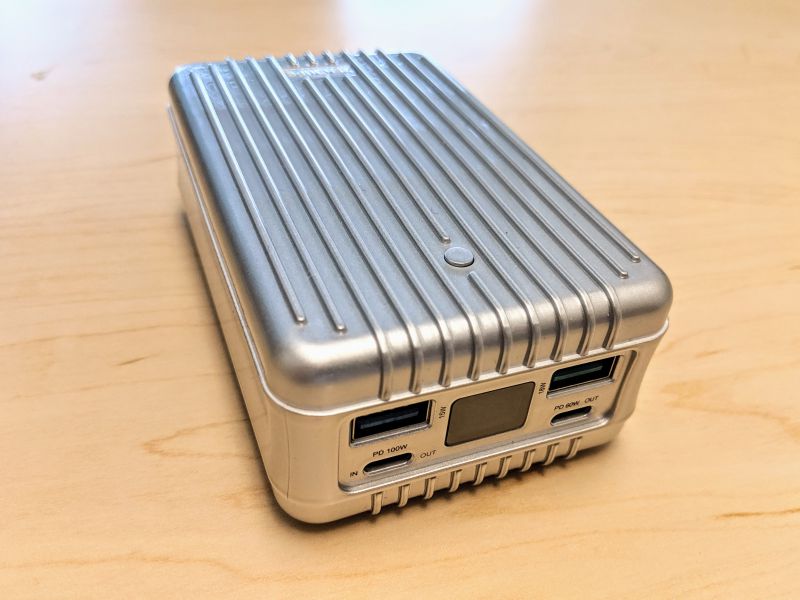
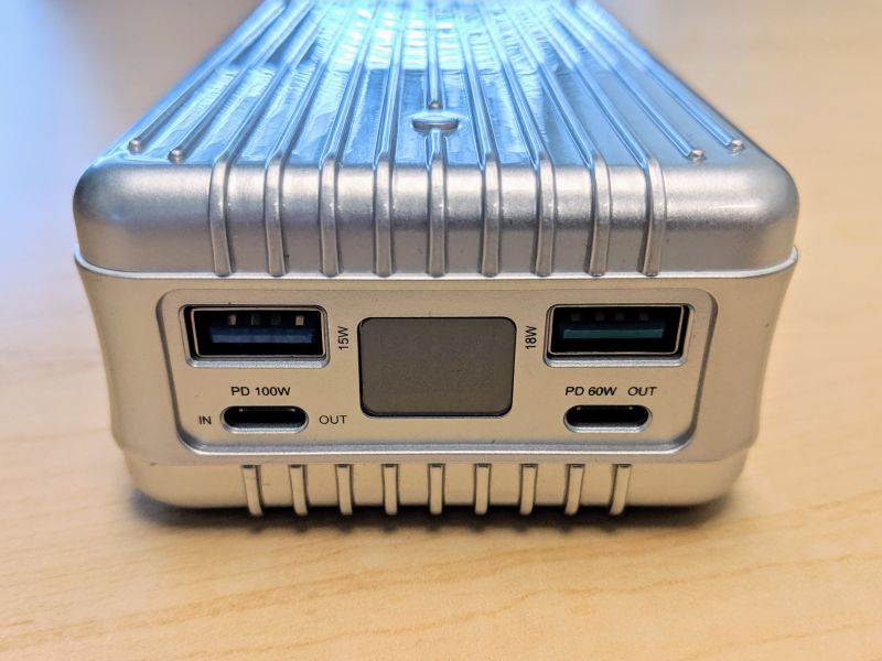
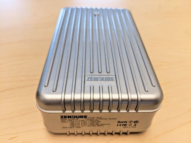
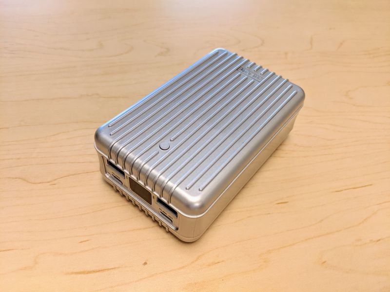
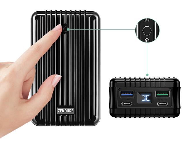
The SuperTank feels heavy and sturdy when being handled despite being constructed of relatively cheap composite plastic. The ports are clearly labeled and the LED display is clear and easy to read.

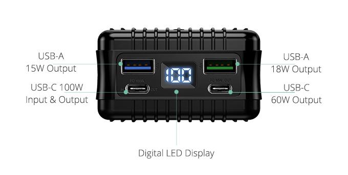
There are four ports on the SuperTank: a 15W USB-A, an 18W USB-A, a 60W USB-C, and a 100W USB-C that functions as both a power output and input port.

The maximum output of the SuperTank is listed as 138W.

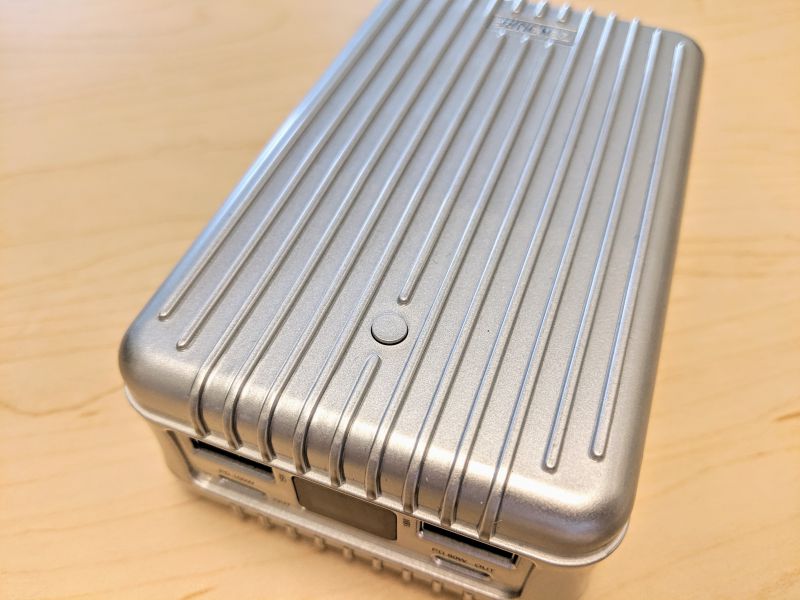
On top of the SuperTank is the device’s only button. This power button turns on the SuperTank and also activates the different battery power modes.

The back of the SuperTank details all of its important technical specifications. The large 27,000mAh capacity of the SuperTank is deliberate in that this is the maximum airline safe battery capacity approved by TSA/EASA for air travel.

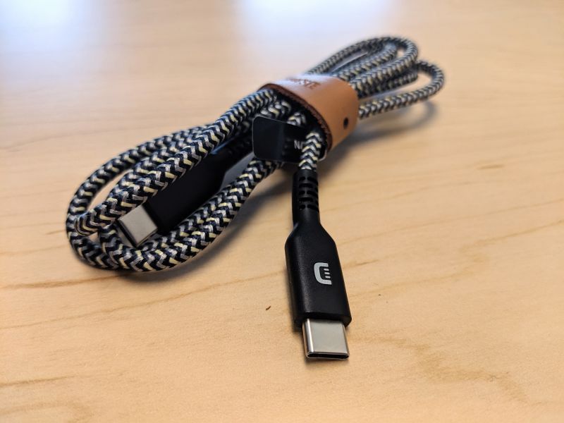
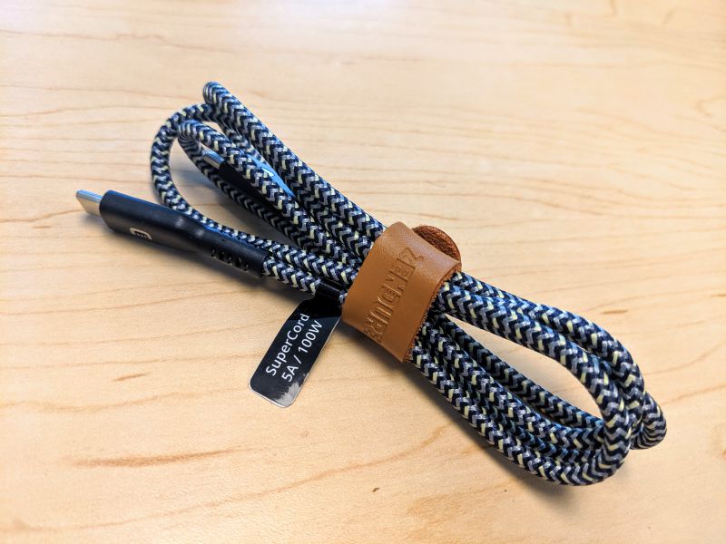
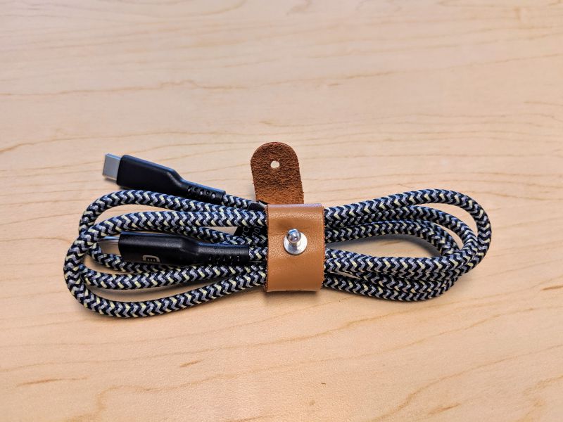
The SuperTank comes with a USB-C to USB-C Zendure SuperCord.

The power rating of the SuperCord is 5A / 100W for proper charging of the SuperTank as well as most laptops that charge via USB-C.

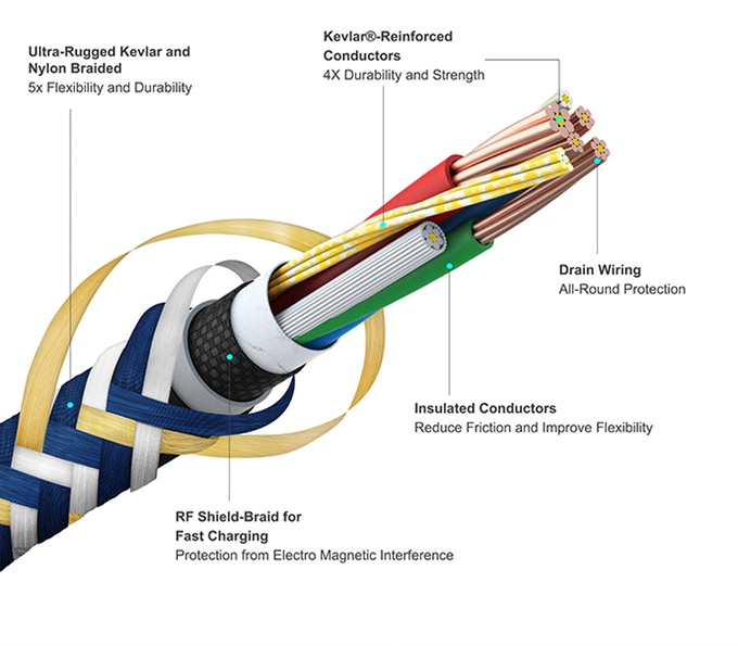
The SuperCord is extremely durable because it’s wrapped in Nylon and reinforced with Kevlar woven in a chevron pattern, surrounding a Kevlar fiber core.

The SuperCord is complimented nicely by a brown leather strap with a small metal clasp.

Setup

The Zendure SuperTank needs to be fully charged before using it for the first time. Depressing the SuperTank’s sole button will activate the battery and display its current charge level. In order to charge the SuperTank properly, you need a power supply that can deliver at least 5W of power over the included Zendure SuperCord. It’s incredible to me that a device that costs as much as the SuperTank does not come with an appropriate USB power block for charging.

After several unsuccessful attempts at charging the SuperTank where the display would either display nothing or a code of 188, I was finally able to get the SuperTank to take the charge. It did take over 18 hours for the device to charge from 0-100. During charging, the LED screen will flash and display the charging power level.

Performance

The SuperTank performed very well in all of my testing, flawlessly charging every device I could connect to it.

The SuperTank has a low power mode for charging low-consumption devices like wearables that sometimes draw less current than is necessary to keep some portable chargers from automatically shutting off. This mode is called X-Charge and it is engaged by double-pressing the power button. The SuperTank will enter X-Charge mode and display the “X” icon. Double-pressing again will turn off X-Charge mode.

The SuperTank also comes with a power delivery direction switch feature. By giving the power button a long 3 second press, you’ll switch the direction of SuperTank’s power flow to ensure that a connected laptop is being charged instead of the laptop charging the SuperTank. You can allow the laptop to charge SuperTank by long-pressing the power button again.

What I like

  • Simultaneously charging several devices at once is super useful
  • UPS and pass-through modes add greatly to device’s functionality
  • Low power mode for charging wearables

What I’d change

  • Requires a powerful power block to charge properly
    • Does not come with a power block for charging
    • Takes very long to fully charge
  • Instructions are vague and don’t fully explain features

Final thoughts

The Zendure SuperTank is a well designed, powerful, highly functional portable power supply that is useful in many ways. From simply charging all of your devices at once while on the go, to working as a quasi-UPS system, the SuperTank can do it all. The manual could be a bit more detailed and it would be great if the SuperTank came with a proper power block, but for $179.99 the SuperTank is a great deal.

Price: $179.99
Where to buy: Zendure and Amazon
Source: The sample of this product was provided by Zendure.

Filed in categories: Reviews

Tagged:

Zendure SuperTank Portable Charger review originally appeared on The Gadgeteer on August 20, 2019 at 8:00 am.

Note: If you are subscribed to this feed through FeedBurner, please switch to our native feed URL http://the-gadgeteer.com/feed/ in order to ensure continuous delivery.

Visionect Joan meeting room management device review

REVIEW – If you have more than 1 conference room and more than 1 employee, you’ve most likely run into overbooked meeting space syndrome.  Sure, most corporate calendar systems will help broker online room bookings, but how can you effectively manage the unwashed hoard of conference room squatters?  The Joan system from Visionect takes a run at solving this problem as well as seeking to provide tools that will help your overall communication strategy.  Let’s see how well Joan works…

What is it?

The Visionect Joan system consists of 2 sizes of e-ink tablets managed by a web platform.  There is a 13 inch tablet which is intended to give a complete view of your meeting rooms (probably deployed at a reception desk or other common area) and a 6 inch tablet designed to be a marquee for an individual meeting space.  The displays are e-ink so they are very low power and will last up to a year on a single charge.  The web platform drives all of the devices.
What’s in the box?

  • One tablet (your choice of size)
  • A very brief instruction sheet
  • A micro-USB charging cable

Design and Features

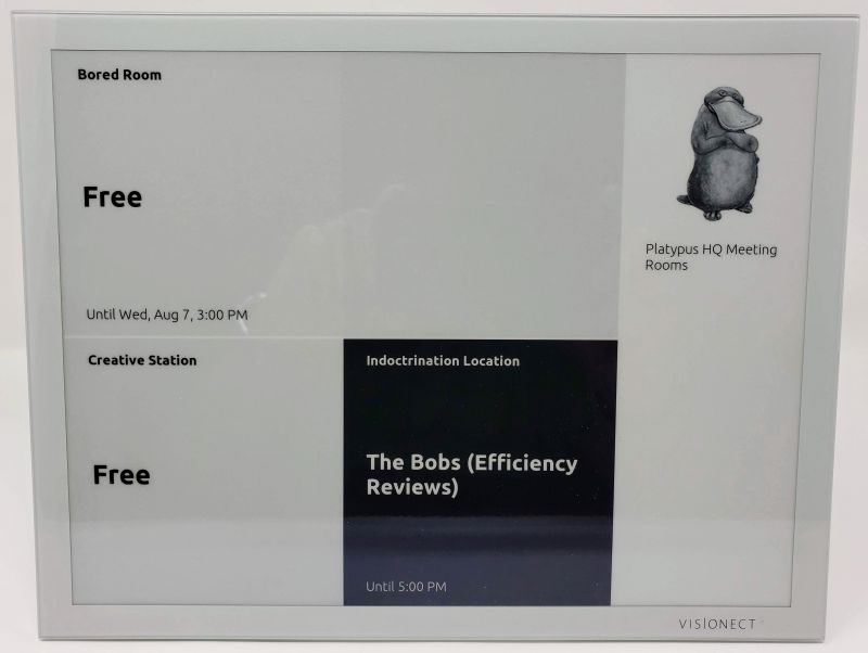
In order to fully take advantage of the Joan system, you need at least 1 each of the 6 and 13 inch tablets.  The 13 inch tablet can serve in a number of capacities, but not more than one at a time.  The larger tablet can act as a single room schedule board, showing current, next and upcoming events in a single room.  The tablet is not a touch screen, though, so it can only display this information and will not allow a user to interact.  There is a room grid view (first picture above) which shows you the current state of up to 9 rooms.  And finally there is a team view – this allows you to select 9 team members and show their current status (in a meeting, available, out of office, etc.).  Buried in the portal is another display mode, a “custom content” display (available only with the Premium subscription – more on this later).  This mode allows you to upload your own images and text to the tablet and can serve as a communications hub.  For example, you can give details about the company picnic, and set that to display Monday through Friday from 9-11 AM on as many devices as you would like.  When active, this custom content will supersede the base function of the tablet – if set to the room grid, the custom content will display from 9-11 AM instead of the room grid.

The 6 inch tablet is intended as a single room display and so it has a capability the larger tablet does not – it is a touch screen that allows you to control the room bookings remotely.  In addition to real time booking, the smaller tablet also supports “hoteling”, a concept which is gaining a lot of traction for larger companies with a geographically dispersed team.  When a team member is going to be in the office, that team member can book a desk to work at for the length of time he/she will be on site.  This type of booking is generally longer than a conference room event, so although the concepts are at the core somewhat the same, how companies approach the booking will differ, and so this smaller tablet will support those differences.

Mounting the tables is relatively simple – the 13 inch tablet has VESA mounting holes but also comes with a heavy-duty magnetic pad that attaches to the wall.
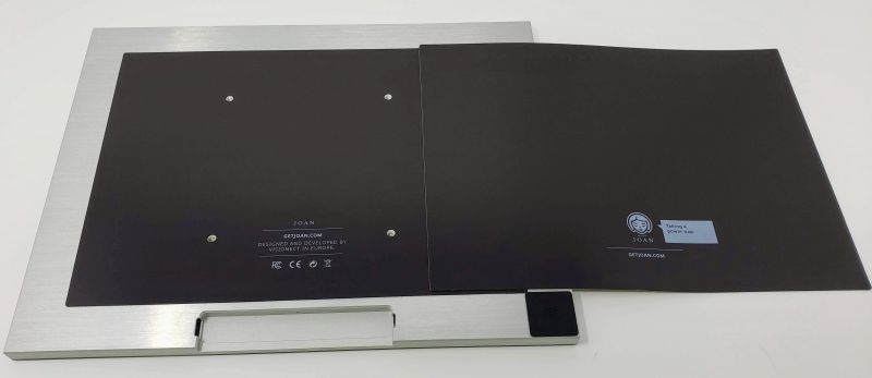
The 6 inch tablet does not have a VESA mount.  Out of the box it supports only the magnetic pad.  Visionect also sells other types of mounts separately, although there are generic 3rd party mounts that will work as effectively for less money.

Joan will also work on an existing display like a TV or large monitor.  As long as you have access to a web browser, your own display can show a status grid of all rooms.  The display is not interactive, though, so you are unable to book or get details on a booking beyond the meeting name, meeting organizer, the number of confirmed attendees, and day/date/time/length of the meeting.  You also need to have a premium subscription to bring your own display – more on pricing and such later.

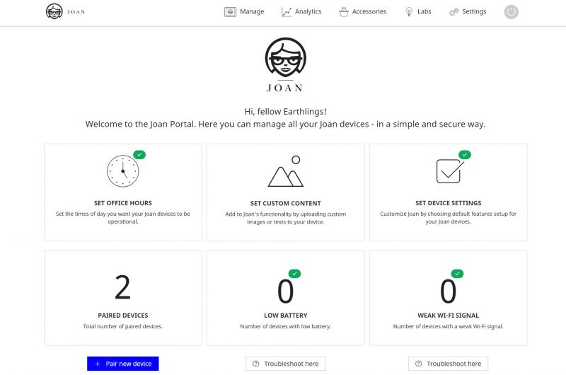
Setting the system up is not a terribly complicated affair.  To begin, you create an account on the Joan portal.  During the account creation process, you can select from Microsoft Exchange, Office 365, Google G-Suite or CollegeNET 25Live systems.  If your particular calendar system is not directly supported but it can generate iCalendar files, Joan will work with that as well.  For any of the systems you simply provide the credentials Joan will use to retrieve and manage bookings, and Joan will return a list of rooms that you have previously defined.  Select the rooms you want, and you are ready to go (at least, from the portal perspective).

Next you have to pair a device.  In order to do this, you have to download a utility that runs on either Windows or a Mac.  This utility connects to a tablet (6 or 13) via the charging cable and will help you set up the local network.  There is an important gotcha awaiting you here, though.  Because the displays on these tablets are e-ink, they will continue to show information on screen long after there is enough juice in the battery to actually boot up.  When the utility attempts to connect, it does not tell you the device is unable to boot nor does it report on the current battery charge – it simply sits on the “connecting” screen waiting for something to happen.  If your tablet is connected to your computer, odds are it is “trickle-charging”, so it might actually sit on this screen for hours before the battery has enough to power the unit.

Once you get past this issue, it should be smooth sailing.  The device will connect to your wireless network (both 2.4 and 5 mHz networks are supported) and will register with Joan.  Back in the portal, name your device and decide which mode it will operate in.  If in a multi-room display, choose your rooms.  Single room?  Pick the room.  Within minutes the display will pick up the data and you will be live.
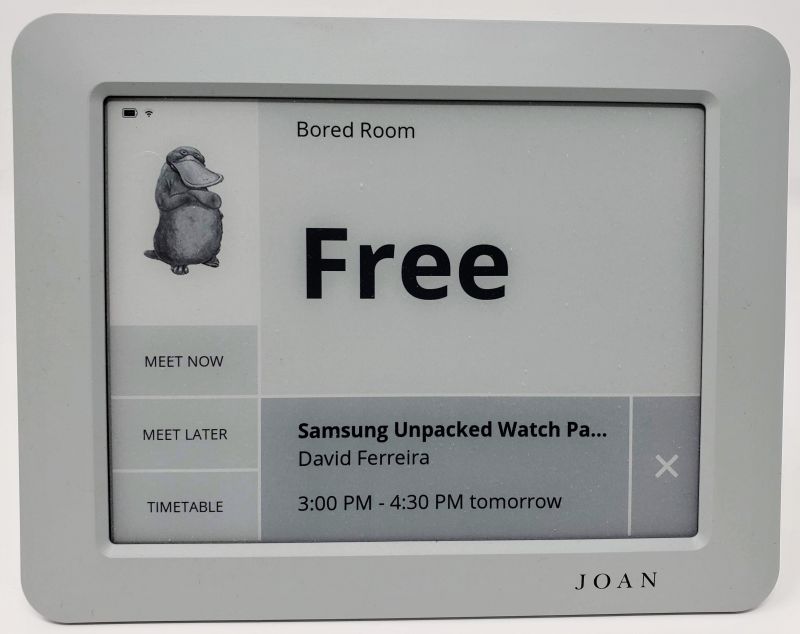
Here’s where it gets interesting.  On the 6 inch tablet, you can manage a room directly from the tablet.  For example, you can hit the Meet Now button to automatically book the room for up to 30 minutes (if another scheduled meeting is less than 30 minutes away, the Meet Now button will only allow you to book up to the next meeting).  Almost instantly the meeting is reflected online, so others can double-book.
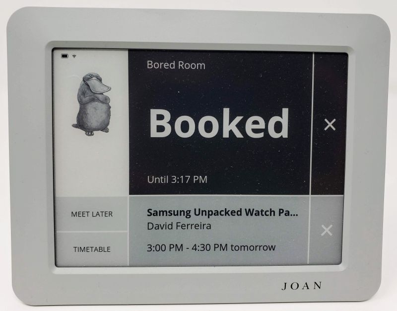
You can also extend a meeting while the meeting is in progress, but only as long as there is until the next booking or the end of the business day.

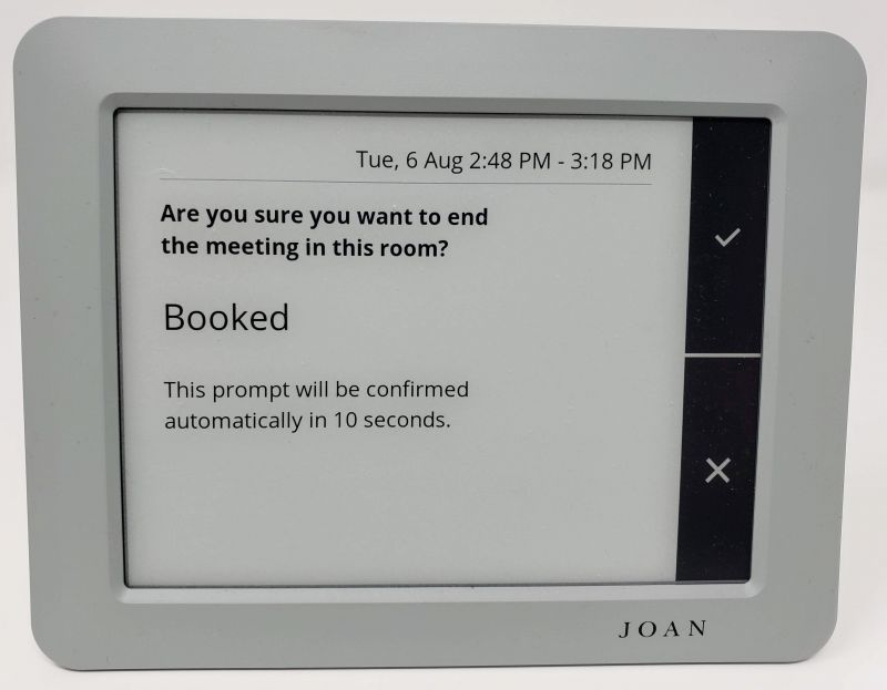
Tapping the X on your booking allows you to end a meeting early and free up the room.  This does not end the meeting online, though – your system will continue to show the room as booked online, but the tablet will show the room as free.
You can also review the room bookings by selecting the Timetable button.
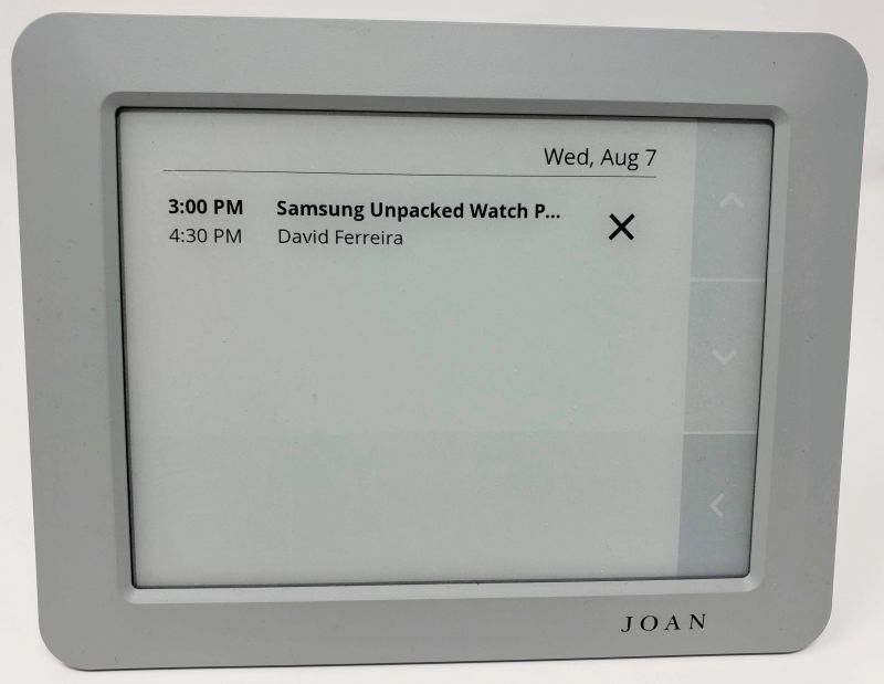
Armed with this information, select the Meet Later button to book the room directly from the tablet.
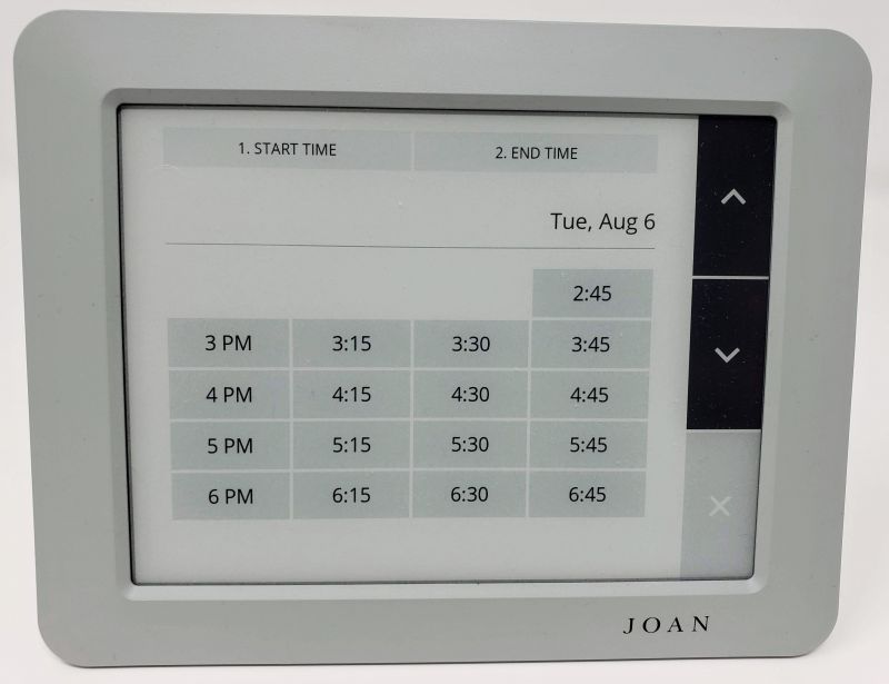
And that’s all it takes to manage your rooms!  The system will even send you email to let you know your battery needs to be charged.  The system is easy to use and has all the right checks and balances to ensure no armed hostilities break out between teams over a double-booked room.

This is where the other shoe drops, though.  Sure, Joan is simple to use but very powerful – and that power comes at a high price tag.  Let’s take my company as an example and price out the system.

First, we want a single master display, so we need a Joan 13 (it comes in either graphite black or slate gray).  That display is $899.  Next, we have 3 conference rooms so that is 3 Joan 6 units (also available in either graphite black or slate gray) at $549 per unit.  Just to get started, we have spent $2,546.  Specialized mounts (secured wall mounts, desk or floor stands), extended device warranties and additional magnetic pads are all extra costs.

Next, there is the subscription cost.  Visionect bills by the device, not by the number of rooms you have to manage as other similar services do.  If you have an Ubuntu virtual machine, you can opt into a self-hosted plan that is essentially free.  The Joan portal manages the devices but the actual scheduling and device display data comes from your hosted instance.  This is a free option up to the point where you have to run your own server – definitely not a “free” choice, but perhaps an acceptable one if you already manage your own IT infrastructure.

Assuming you don’t want this responsibility, Joan also acts as a SaaS provider (Software as a Service).  There are 2 plans available: Standard ($11/month or $119/year per device) and Premium ($21/month or $229/year per device).  It is not entirely clear from the price guide whether the “bring your own display” option counts as a device, but I would assume it does.  The Premium plan gives more integration options (like WebEx meeting rooms and Amazon Alexa management) and additional features (parking management, custom content).

There are some savings in going with annual billing, so for our example we will chose that option.  With 3 devices, our cost is $687, bringing our total cost to start to $3,233.  Not horrific pricing, but not trivial either.

Is it worth it?  If you have room management issues, if your team uses hoteling or if you just want to stay on top of space management, then yes.  If your current system is working for you, probably not.  I will say this, though – if you go with the Joan system, you will be getting one of the best technical support operations around.  I had a few minor issues setting things up for this review, and the Joan team was all over my concerns each time I contacted them.  You won’t feel like you flushed a pile of good money down the drain – they will help quickly and efficiently, and get you back to full operation in short order.

What I Like

  • Pretty much everything: devices, options for integration, support, how well the system works end to end

What I’d Change

  • Price – if you are a startup, this might be a very high cost.  And while both tablets are very well built, it feels like an e-ink display should cost less than this.

Final Thoughts

Visionect’s Joan platform and devices are well thought out and pretty much flawlessly executed.  This would be a life saver at larger companies I have worked for and can scale down to help even the smallest of companies.  If you have the cash and a compatible scheduling system, this could very well be a worthwhile purchase.

Price: Depends on device and configuration
Where to buy: Visionect Joan
Source: A 6 and 13 inch Joan device and a month of Premium service provided by Visionect Joan.

Filed in categories: Reviews

Tagged:

Visionect Joan meeting room management device review originally appeared on The Gadgeteer on August 19, 2019 at 11:00 am.

Note: If you are subscribed to this feed through FeedBurner, please switch to our native feed URL http://the-gadgeteer.com/feed/ in order to ensure continuous delivery.
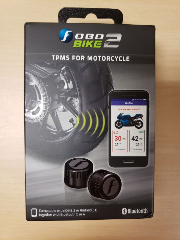
Fobo Bike2 TPMS (tire pressure management system) for motorcycles review

REVIEW – One of the first things I always do before going out on a ride on my motorcycle is to check the tire pressure.  This means rolling the bike forward or backward to make sure the tire valves are accessible, getting down on my hands and knees, rolling out the compressor hose, and checking the tire pressure.  What if I had an app on my phone that would let me see the tire pressure on my bike without having to do all of that?  It sounds like an awesome proposition!  It could even save me the time of having to start up the compressor if the tire pressure is where it should be.  Let’s see if the new Fobo Bike2 TPMS system lets me skip some of my ride make ready process.

What is it?

The Fobo Bike2 TPMS system is a tire pressure monitoring system for motorcycles.  I have had several bikes in my past that came with built-in TPMS systems.  The problem with those systems is that they would not register a tire pressure until the wheels were rolling along at 5mph or faster.  This did me no good if I wanted to know if I had good tire pressure before I started my ride.  The Fobo Bike2 TPMS comes with an app for Apple or Android that lets you see your tire pressure instantly when you are within Bluetooth 5 range of the bike.  It is supposed to monitor the tire pressure throughout the ride and send notifications to your phone if the tire pressure exceeds the maximum or goes below the minimum amounts you set for the tires.  It is even supposed to have a feature where it will allow friends and family to track you on your ride.

What’s in the box?

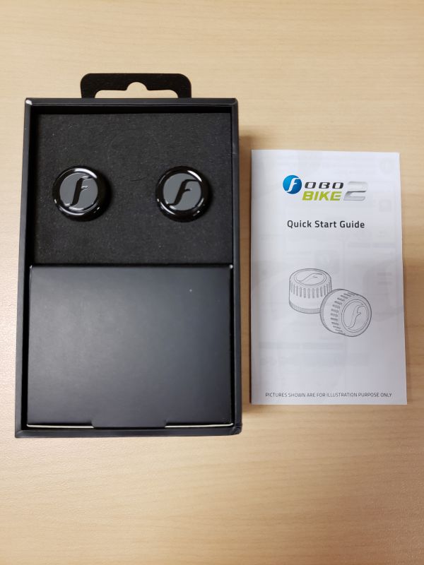
When you slide open the box you are presented with the manual and two tire pressure monitoring modules.  They are inserted very nicely into foam pockets.  The black part below the foam is a box containing the rest of the accessories.

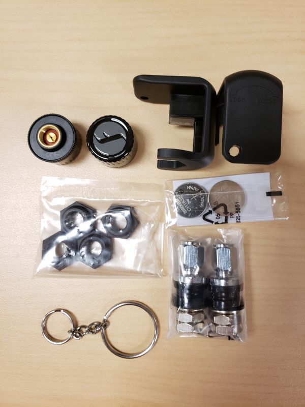
The following items were inside the black box.

  • Two tire pressure monitors
  • Two of the same tool used to tighten and release the locking nuts
  • Two pairs of locking nuts.  You only need one pair to install on a motorcycle so the other is a spare
  • Two extra batteries.  Batteries were already installed inside the TPMS
  • A key chain to hold the tool
  • Two short valve stems.  Some bikes have really long stems and depending on where they sit on the rim, they can cause the Fobo to hit brake calipers or brake rotors.

Hardware specs

  •  Bluetooth: v5.0
  •  Transmit Conducted Power: +5.0dBm (sensor)
  •  Receiver Sensitivity: Conducted Sensitivity -97dBm @ 0.1%BER
  •  Antenna Return Loss: Typical -9dB
  •  Operating Frequency: 2.402~2.480 GHz
  •  Battery Type: CR1632 (sensor). Operating life up to 1 year. (NOTE: The battery operating life varies according to usage and climate temperature)
  •  Operating Temperature: -40°C to +85°C (sensor), -20°C to +60°C (sensor with common CR1632 batteries)
  •  Weight: 7.6g (sensor –with battery)
  •  Sensor Dimension H x D: 13.8mm x 20.2mm
  •  Maximum Pressure800kPa (116psi)
  •  ESD: 8kV air discharge & 4kV direct contact discharge according to CE standard
  •  Operating Humidity: up to 90% non-condensing at 40oC
  •  Dust and Water Proof: IEC60529 compliant to IP57(sensor)
  •  Sensor structural threshold: 100N ball pressure intensity test
  •  Mechanical & Environmental Reliability Testing Standards: IEC 60068-2-2, IEC 60068-2-1, ISO 21750, IEC 60068-2-29, IEC 60068-2-5, IEC 60068-2-32, ISO 15184, ISO 2409, SAE J2657, SAEJ113/13

Design and features

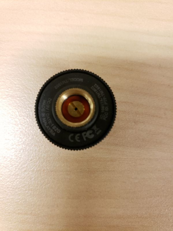
The above picture shows the bottom of the TPMS sensor. The manual states that after you screw the locking nut on the valve, you must have at least five threads available for the TPMS to thread onto the valve.

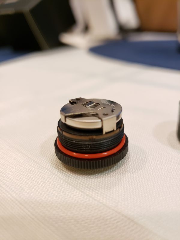
The above picture shows the inside of the TPMS with the cover unscrewed from it.  You can see the battery that is installed and the red rubber grommet around the base to keep the dust and water out.

Setup

The first thing the manual tells you is to install the app on your phone.  The app will work with iOS 9.3 or higher and Android 5.0 or higher.  I installed it on my Samsung Galaxy S9.  The first screen presents you with multiple ways to create an account.  I chose Google.

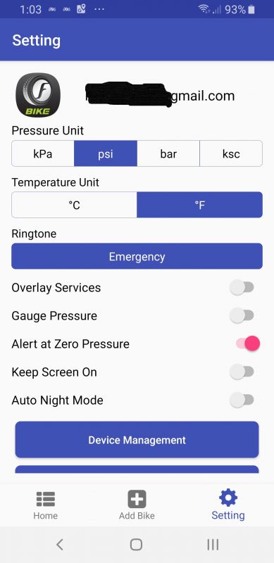
Once signed in, I went to user settings and made sure I was set for Fahrenheit and PSI for pressure.  There are several other features in the settings that are available.

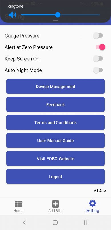
This next screenshot shows you the rest of the options on the app.

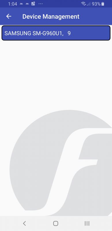
Clicking on device management is pretty worthless.  It shows you your phone type, but you can’t do anything else on the screen.

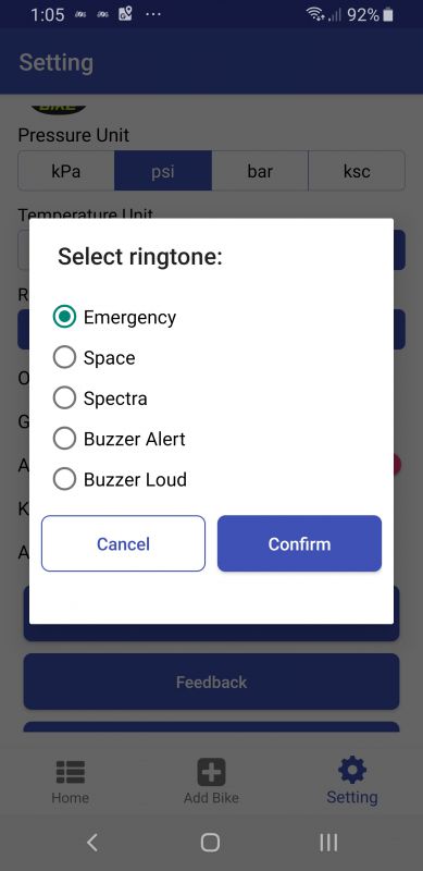
They give several ringtone options.  Choosing different ringtones lets you hear the different sounds.  I ended up picking ‘buzzer alert’ because it sounds exactly like the claxon from Star Trek TNG.  (yes I am a huge Trekkie!).

This is the screen for the ‘Appear on Top’ option.  I left it off.

The next thing I did was to click the Add Bike option at the bottom of the screen.  I was presented with several options.  The screen above shows the first two choices.  I find it interesting that anyone would want to put it on a bicycle.  Even after one day, a bicycle will lose enough pressure for you to need to put more air into the tires.  Any kind of loss of pressure on a bicycle is also pretty noticeable right away.  Other choices included trikes with the two wheels in front or back, trikes with airbag suspension, a bike with a sidecar, a single axle trailer, and a unicycle.  I, of course, picked Motobike.

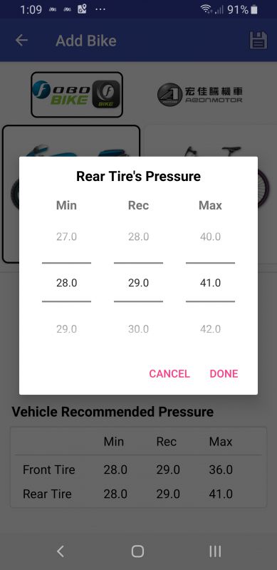
I was immediately presented with a screen where I could add a picture of my bike and then set the minimum and maximum tire pressure settings on my front and rear tires.  You will notice on the left side of the tire pressure popup that there is an option to scroll from 27 to 29 PSI.  I could never set it any higher than 28 PSI as a minimum.  I think that is a flaw in the application.  If my rear tire was down to 28 PSI I would be having some serious issues.  My rear tire has a recommended cold pressure setting of 41.  So technically I should be able to set it at 39 as a minimum.

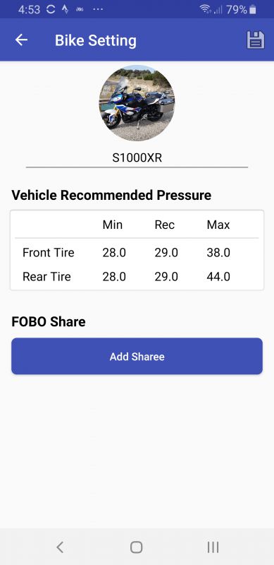
The above pictures show my final settings for the front and rear tires.  I really had to guess at the max pressure.  The cold pressure settings for front and rear on my bike are 31.6 and 41 PSI.   Once the tires heat up, the pressure will rise and I was not really sure what the max pressure should be.  I did not want to get a false alert on high tire pressure.

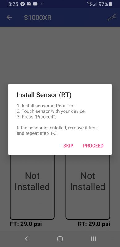
Once I pressed save, I was then asked to install the sensors on the bike.  I started with the rear tire first.

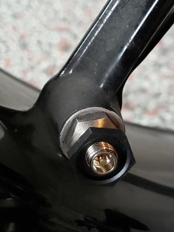
Setup on my bike was fairly simple.  I ride a BMW S1000XR.  This bike has the valves coming off the side of the spoke and they were already very short.   I first screwed the locking nut onto the valve with the bump on the locking nut face down towards the rim.

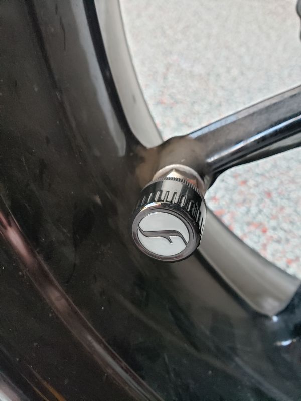
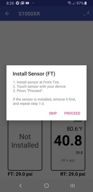
Next, I screwed the TPMS on top of the nut.  When I had it as far down as it goes, I used the locking tool to tighten the locking nut up against the TPMS.     I then touched my phone to the sensor as directed.

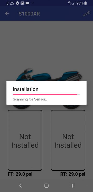
I then clicked ‘Proceed’ in the popup box and got the first response above as it scanned for the sensor.

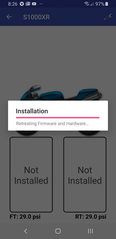
The next screen said it found the sensor and showed the following information.  I think there is a bit of a Chinese to English translation issue going on in this screen.  I have never retreated firmware and hardware before.

I was then asked to follow the same process on the front tire.  Which I did.


After installation of the sensors, I was taken back to this screen showing a green checkmark next to my bike.

Performance

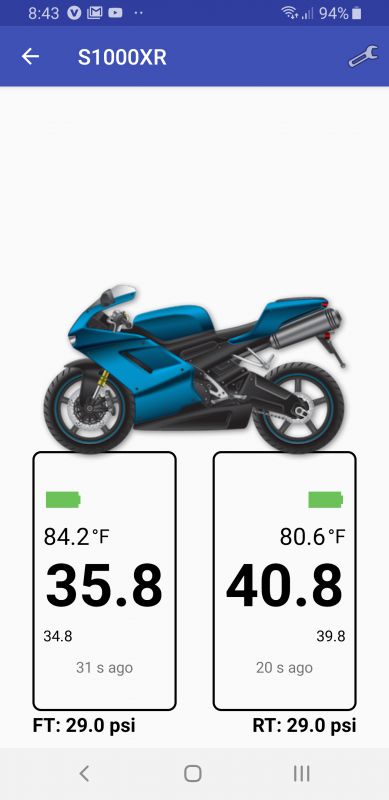
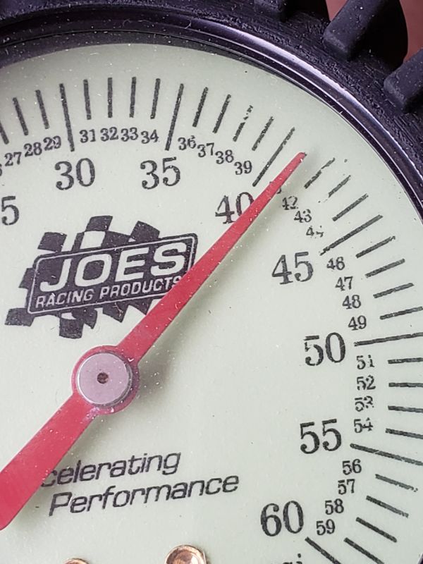
I was a bit leary of trusting the tire pressure presented by the application.  The above screenshot shows the tire pressure for both of my tires.  I find it interesting that there is almost a four degree difference between my front and rear tire.  My bike was in the garage and it was not like I had a fan or a block of ice sitting next to one wheel.  I then used a highly accurate tire gauge that I owned and took a manual reading of both tires.

The Fobo said my front tire was at 35.8 PSI but my gauge showed about 36.5.  The front TPMS said 40.8 and the gauge was right at 41.  That is relatively close.

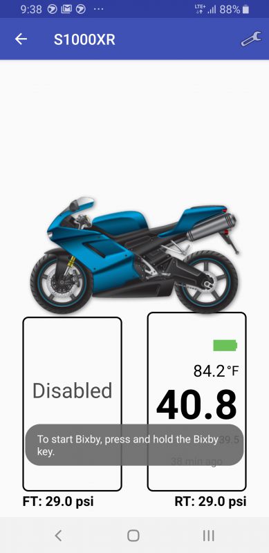
I started to roll my bike out of the garage for a ride when I ran into an issue.  The front-wheel TPMS  hit the back of my brake caliper.  I ended up having to take it off and disable it.  I was really bummed.  The short stem that came with the Fobo won’t help as the stem on the rim is already short.  They offer a T-Valve option, but I do not want to go with that as I think that may not fit either, and I just would not like how it would look.

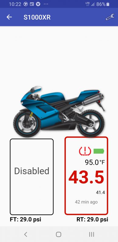
I took the bike out for a 160-mile ride.  I like how the app shows the ambient temp along with the tire pressure reading.   Notice in the screenshot above that the pressure reading is in red.  This was because initially, I had the max pressure set to 43.  Remember when I said I had no clue how high to set it?  I bumped it up to 44 and it went back to normal colors.  The main thing I noticed was the lack of real-time monitoring during the ride.  When I was in my garage, the app was updated around every 10 seconds or so.  I did have the phone in an aluminum side case, so that was most likely blocking the signal.   However, when I stopped for gas, I took the phone out and set it on the seat as I got gas.  I spent a good 15 minutes and the app never updated the reading.  I even put my phone down by the sensor and tapped the sensor with my phone to see if I could force an update.  Two days later, I walked out in the garage with my phone and it gets an instant reading.  I am not sure why it would not read while on the road.   UPDATE – I took my bike out again this weekend, but this time I left my phone in the pocket of my riding jacket.  I am happy to report that when I got off my bike to get gas, the app was showing an updated pressure as of 11 seconds ago.  It updated a couple of times during the time it took me to get some gas.

The app also offers a feature where you can send a link to a friend or family member to track you while on your ride.  I sent an email to my husband, but when he clicked on the link it just got a ‘page not found’ error message.

What I like

  • Pretty easy to set up
  • An almost instantaneous PSI reading on my phone when I step into the garage.  No having to have the bike roll at 5mph.
  • They provide short valve stems as a part of the kit if you need them.
  • The Fobo TPMS is pretty secure.  To steal it, someone would have to have the tool.  Even if they got it off, it would not work for them unless I released the device from my app.

What I’d change

  • The app needs a bit more fine-tuning.  Some wording as mentioned earlier needs to be corrected.  Also being able to set a higher than 28 PSI minimum tire pressure reading would be beneficial.
  • I could not get it to fit on my front wheel.  Maybe a t-valve would work, but it would really look funky. If they could make it just a little less thick, I am sure it would fit on the bike.
  • To actually put more air in the wheel I have to take the Fobo completely off the valve, including the locking nut, which makes it kind of a pain.

Final thoughts

Overall, I would say the Fobo Bike2 TPMS system works well if you can get it to fit on your bike.  I want to blame the lack of monitoring during the ride on me having my phone in an aluminum side case since it worked just fine when I kept it in my jacket pocket.  I would think for someone with a trike, or someone who has issues getting down on their hands and knees to check tire pressure before every ride, this system would provide them a reading really easily.  Lots of bikes have bags and exhausts in the way that make it very difficult to check tire pressure.  For $99 this is a fairly easy way to add it to your motorcycle.

Price: $99
Where to buyAmazon
Source: The sample of this product was provided by Fobo

Filed in categories: Reviews

Tagged:

Fobo Bike2 TPMS (tire pressure management system) for motorcycles review originally appeared on The Gadgeteer on August 19, 2019 at 9:00 am.

Note: If you are subscribed to this feed through FeedBurner, please switch to our native feed URL http://the-gadgeteer.com/feed/ in order to ensure continuous delivery.