Cat Phones Cat S41 rugged smartphone review

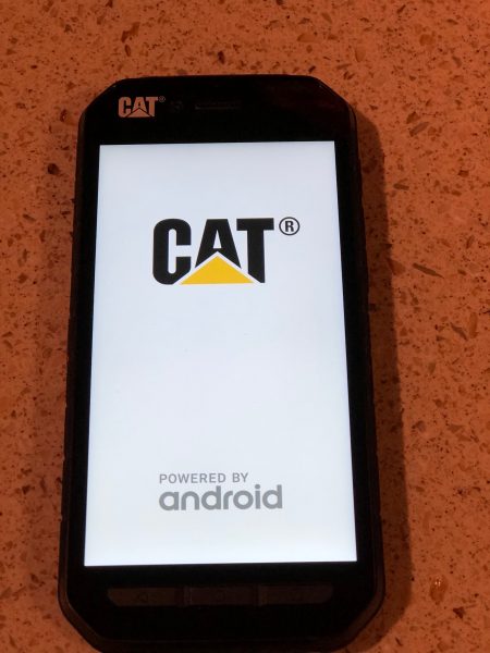
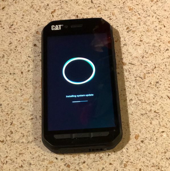
The landscape around Android handsets is a veritable cornucopia of products fighting for attention. Walk by any wireless store, kiosk, or even the electronics aisle in your Big Box store, and you’re pelted with names, numbers, sales, and BOGO offers. I was recently sent the Cat S41 smartphone with Android Nougat for review. I was going to pass, because of my poor track record with Android devices, but I read further into the web verbiage, and thought “This can’t be an actual product!” Read on to see what was so compelling.

Note: Photos may be tapped or clicked for a larger image.

OK, for my version of the perfect mobile phone, you’d need the following:

  • great screen – clear, responsive, with rich colors
  • fast response from the OS – no “press the button and wait” for anything
  • a decent camera and rear flash
  • access to the SIM slot without taking the battery out and rebooting the phone
  • Bluetooth that works with all the devices I have (speakers, trackpads, keyboards)
  • decent battery life
  • upgradable OS

The Cat Phones website lists the specs for the S41 as follows:

Battery
Non-removable Lithium Ion
Capacity 5000mAh, Pump Express 2.0
Standby Time Up to 44 days
Talk Time Up to 38 hours (3G)
Battery Share Functionality Yes

Platform/OS Google Android™ Nougat

Size/Weight
Dimensions 152 x 75 x 12.85mm
Weight 218g

Display
Super Bright 5” Display – FHD (1920 x 1080) IPS, auto switch support and wet finger/glove-on working technology
Corning® Gorilla® Glass 5

Beyond Rugged
IP Rating Beyond IP68 certified: Waterproof up to 2M for 60mins
Drop Test Up to 1.8M (6 ft) onto concrete
Operating Temperature -25°C (-13°F) to 55°C (131°F)
Other Military Standard 810G: Shock and drop proof. Salt fog, sand, dust, dirt, vibration, and pressure resistant
Category 4 Vibration

Multimedia
Audio FM Radio, Music Player
Video Recording 1080p at 30fps
Video Playback 1080p at 60fps

Camera
Main 13MP autofocus with PDAF, LED flash
Front 8MP fixed focus

So, for most of my personal punch list, this phone knocks it out of the park! I couldn’t believe that, not only is it pretty much the same weight as my iPhone 6s Plus (and also the new iPhone 8 Plus), it has battery power for days and can even share that power with another device. And an hour in the deep end of the pool with no problem? Unheard of! And don’t get me started on the headphone jack!
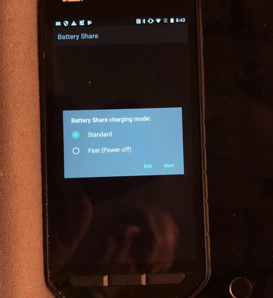

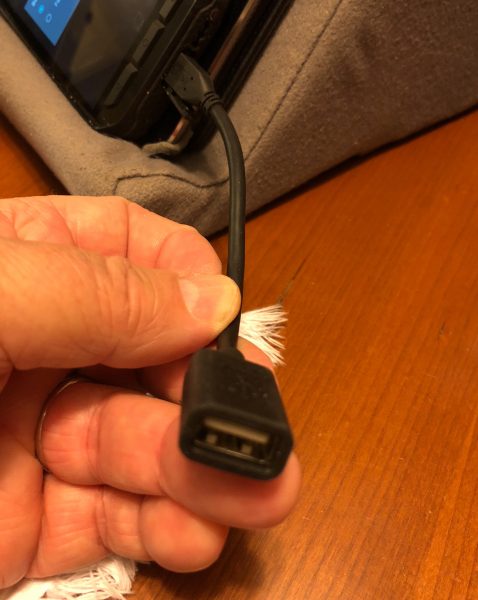
The battery share was of special interest to me, and the “gotcha” that drew me into wanting to do this review. They accomplish this by having a simple microUSB to USB-A female cord that you place in the same port that charges the phone, and an app that reverses the power to flow out of that port. I can’t wait to test this out for realsies on our next trip. Managing power on multi-day trips with limited access to outlets (cars, trains, planes, AirB&Bs and coffee shops) means you’re always having to top off a portable battery pack, and plug in your phone. Also, since you are depending on your phone for driving directions, photos, travel info, and all the other minutiae of travel/vacation life, the battery goes pretty quickly. We have burned through several full battery packs on some days, most likely due to being in remote places where the phones are always struggling to find anything that may resemble a decent signal. With this unit, I was able to top up my iPhone 6s Plus from 58% to 90% in about 45 minutes. And that only cost me 20% of the phone’s battery.

So, the day after it arrived, I paired it with an old (first gen) Apple Wireless Keyboard and a Magic Trackpad. It works perfectly! I love the way the cursor just shows up when you move the trackpad and gets out of the way immediately when you’re not moving it. Makes selecting text while editing so simple! (I would love this on the iPad Pro I’m using to write this article!)

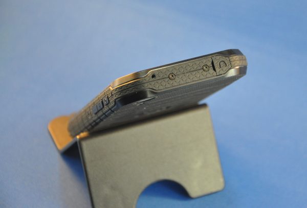
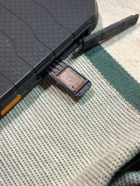
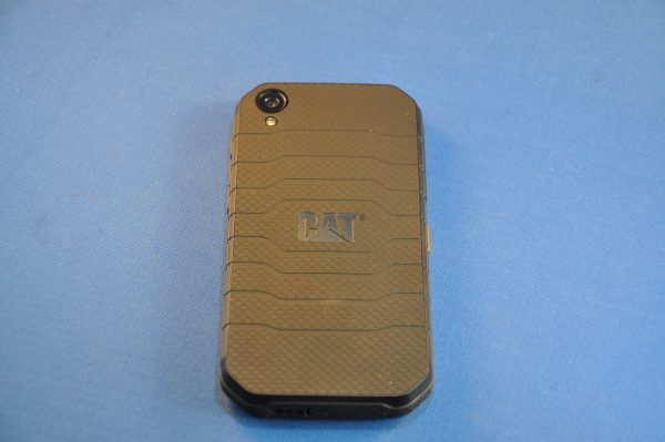
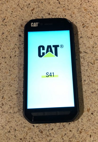
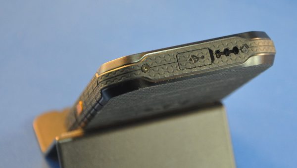
The phone is similar in size to the iPhone 6/6s/7/8, but thicker, so that it looks like a 4/4s with no other comparison. The thickness comes, obviously, from the expanded battery and the integrated weatherproof and shock resistant case. All the ports have covers, and the phone reminds you to close the cover when you unplug a wire from them. The SIM card is fitted into a tray that pops out from the top-left side, behind the same door the TFT card uses. This tray is not the standard push-in-the-hole-and-it-pops-out type of tray. After fighting with it several times, using tweezers and accidentally resetting the phone twice, I finally figured it out: the SIM tray is upside down. Place the phone face down, put your fingernail into the part of the tray that sticks out, and gently pull. Simple.

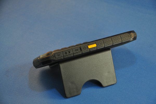
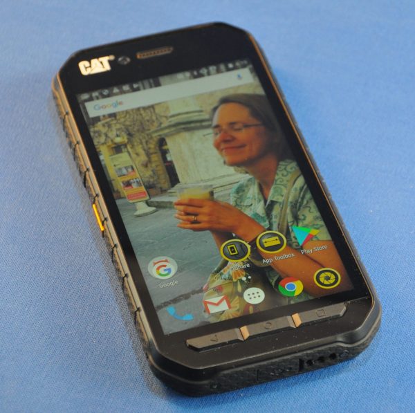
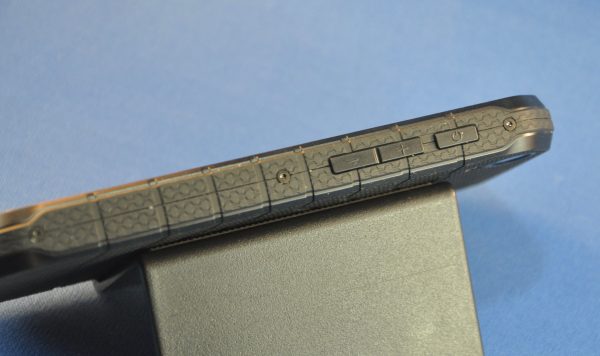
Another interesting feature is the programmable button. There is a yellow button (black and yellow being the Caterpillar brand colors and all!) on the left side of the device that can be programmed with two different functions. A press and a double press will each trigger an app, dial a number, or whatever. I use the short press to trigger voice command, and the long press to toggle the flashlight.

The display has adaptive brightness, as well as being able to respond to wet or gloved fingers, according to the manufacturer. My mileage varied a bit with the damp fingers, but all my gloves are now smart-screen-friendly.

I have played around with 4-5 Android tablets and phones here on Gadgeteer for several years. I keep trying to see what it is that is “good enough” about this platform *vis a vis* iOS to make anyone stay or return. This is the first phone I’ve used that could actually be a contender for the slot in my pocket. If I did not have an inherent mistrust of Google and a huge amount of Apple lock-in (pairing with Apple Watch is huge), I’d probably take this around most days, especially if I thought it was going to rain while I was out, or if I was riding my bike in to work or something. Most days, I don’t need anything this rugged, or with this much battery life, though. If your mileage varies, I recommend it! At £399 ($522 at the time of this writing), it’s not a bad value.

Source: The sample for this review was provided by Cat Phones. Please visit their site for more info.


Product Information

Price: €399 ($473.89 as I write this)
Manufacturer: Caterpillar Inc.
Requirements:
  • none
Pros:
  • Super-tough case integrated into phone itself
  • Bright, clear, high-resolution screen
  • Battery sharing
  • Battery for days
Cons:
  • none discovered

Filed in categories: Featured Items, Reviews

Tagged: ,

Cat Phones Cat S41 rugged smartphone review originally appeared on The Gadgeteer on December 7, 2017 at 11:00 am.

Note: If you are subscribed to this feed through FeedBurner, please switch to our native feed URL http://the-gadgeteer.com/feed/ in order to ensure continuous delivery.

Jelly Pro super mini 4G smartphone review

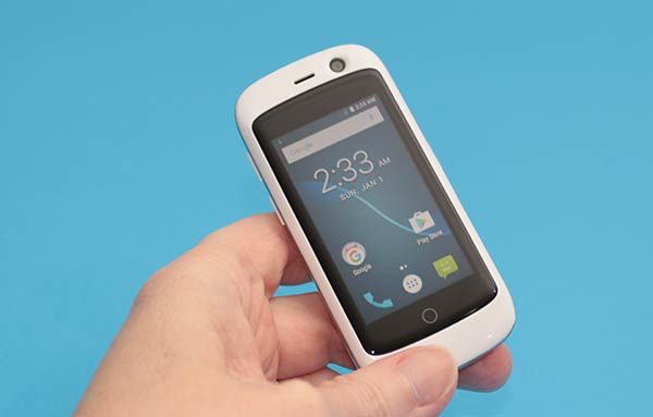
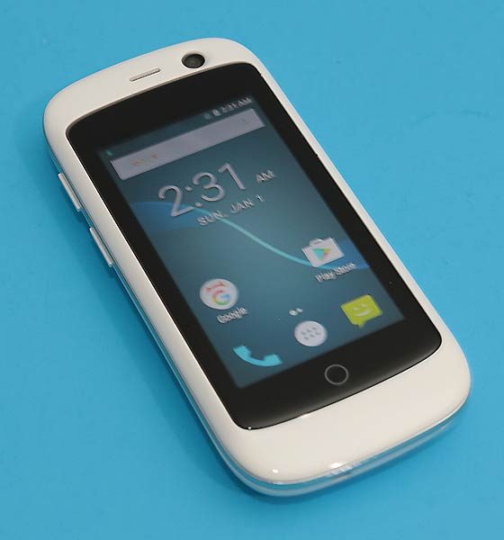
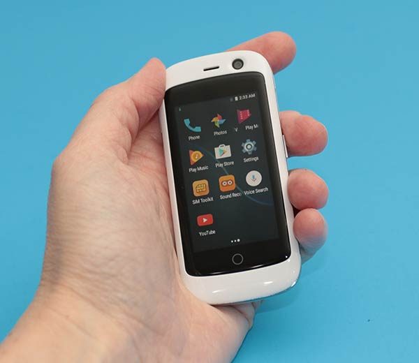
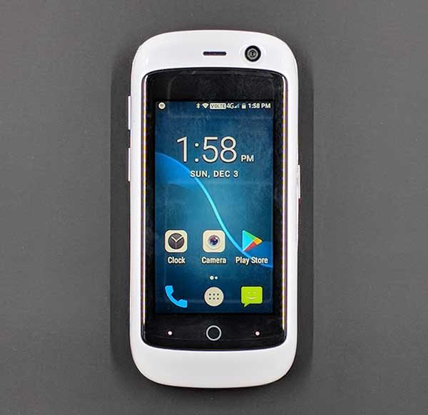
While most new smartphones make it a point to feature larger displays with each new generation of phone, the designers at Unihertz decided to go the opposite direction when they created the Jelly Pro smartphone. This doll-sized Android smartphone might fool you into thinking that it’s a toy. Let me tell you, it’s not. Grab your magnifying glass and let’s take a closer look.

What is it?

Jelly is a tiny Android smartphone that’s pocket and budget-friendly and can support 2 SIM cards and a micro SD card for memory expansion.

What’s in the box?

Jelly Pro
micro USB cable
User manual

Hardware specs

Processor: Quad Core 1.1Ghz
Display: 2.45 inch 240×230 pixel touchscreen
Operating System: Android 7.0
Memory: Flash: 2GB RAM + 16GB
Expandable Memory: Removable microSD
Network: 4G LTE, GSM 850 (Band5)/900 (Band8)/1800 (Band3)/1900 (Band2) MHz;WCDMA 850 (Band5)/900 (Band8)/1900 (Band2)/2100 (Band1) MHz;FDD-LTE Bands 1/2/3/4/5/7/8/12/17/19/20; TD-LTE: Band 40
WiFi, Bluetooth 4.0
Camera (rear): 8MP, (front): 2MP
Battery: 3,300mAH, Non-removable
Dimensions: 3.07 x 4.92 x 1.97 in
Weight: 7 oz

Design and features

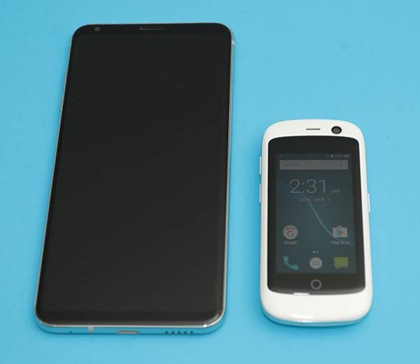
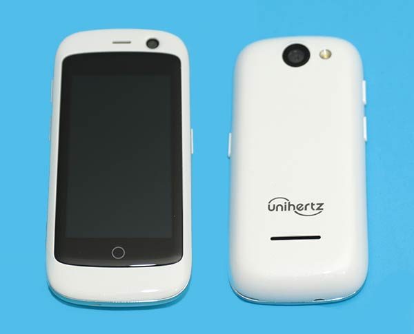
When they say that the Jelly Pro is the world’s smallest smartphone, they aren’t kidding. It looks positively adorable next to an LG V30 in the image above.

The Jelly Pro is available in black, blue, and white like the one that was sent to me.

You won’t find a metal or glass housing on the Jelly Pro. It features good old plastic which I don’t think is a bad thing. Plastic is lighter weight and tends to hold up better than glass and metal as far as scratches go.

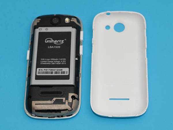
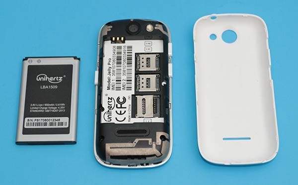
A plastic shell can also mean that the back of the phone can be removed to gain access to a removable battery which is just what the Jelly Pro has inside.

The Jelly Pro is powered by a 950mAh lithium-ion rechargeable battery. Also inside the phone, you’ll find 2 SIM card slots and a micro SD card slot for memory expansion.

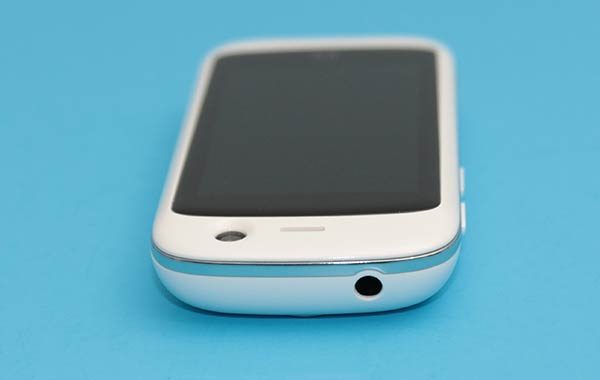
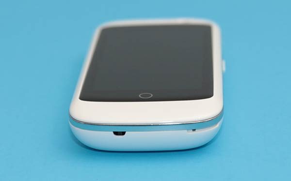
The Jelly Pro smartphone also sports a 3.5mm headphone jack on the top edge.

On the bottom edge is a microphone.

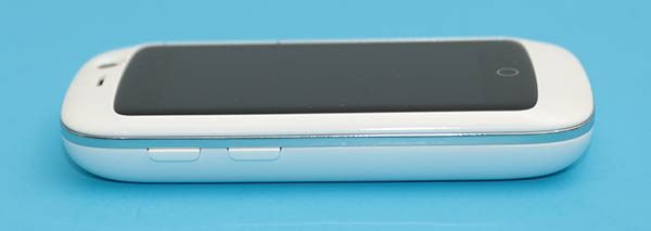
The volume buttons are located on the left side of the phone.

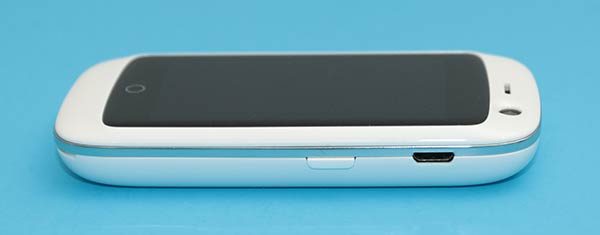
And the power button and micro USB charging port are located on the right side of the phone.

Although the Jelly is a mini-sized phone, it has quite a large “chin”, “forehead”, and bezels for its size.

The phone is comfortable to hold because it fits easily in even the smallest of hands. It also fits in the “girl’ pockets in my jeans which I love!

The Jelly phone feels solid and is able to survive my crushing Gadgeteer squeeze test without surrendering. However, I do hear faint rattling when I shake it, which comes from the volume and power buttons.

Display

The Jelly’s touchscreen display is an eye-squinting 2.45 inches diagonally.

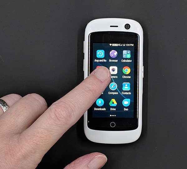
Tapping icons and scrolling isn’t a problem, but reading text can be a challenge.

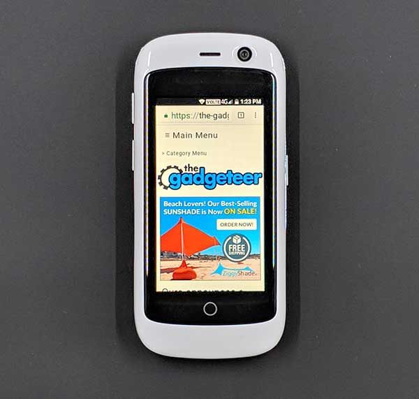
Surfing web pages using the Jelly phone doesn’t provide the best experience either because you constantly need to scroll the page to read more text.

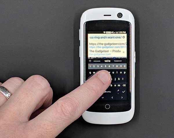
But the worst part about the tiny screen size becomes very noticeable when you need to input text to type in a web page address or send a text message. The onscreen touch keyboard is so small that it takes some finesse to tap the right key because your fingertip is large enough to touch 4 keys at a time. Let’s just say that I spent more typing pressing the backspace key than actual letter keys.

Camera

The Jelly Pro has a built-in 8mp camera. It’s not fair to compare this $125 phone’s camera with the camera on a $1000 iPhone X or the Pixel 2 XL, so I won’t. I’ll just show you some sample images and you can make up your own mind. But as the saying goes, the best camera is the one that’s with you, so the camera on the Jelly Pro is better than not having a camera at all.


Audio quality

This phone is small, but the built-in speaker is surprisingly loud. You’ll have no problem hearing alarms and notifications, and if you’re so inclined, you can even listen to music through the speaker. Music doesn’t sound stellar through the built-in speaker, but it’s good enough in a pinch.

Plug a set of headphones into the 3.5mm jack or pair with Bluetooth headphones and music sounds fine to pretty darn good.

Software and user interface

Surprisingly, this phone doesn’t have a watered down version of Android. It runs on Android v7.0 (Nougat), which is one version older than v8.0 Oreo which is currently the newest version of the Android operating system. That said, v7.0 is still the version that most phones are currently running.

The phone doesn’t come with any bloatware. It has just the standard core Android apps and a few extras like an FM radio app, pedometer app, file manager, flashlight, sound recorder and SIM toolkit.

Speaking of the SIM toolkit, the Jelly Pro can switch between 2 different SIM cards if you happen to have a card for work and a card for your personal business.

I’ve had the Jelly Pro for almost a month and in that time the phone has received at least two updates, which inspires confidence that this phone will have support going forward.

Using the Jelly Pro for phone calls

I have no complaints using the Jelly Pro to make and receive calls. Volume levels on both sides of the call are fine and I didn’t have any issues with dropped calls.

Overall performance and battery life using the Jelly Pro for day to day tasks

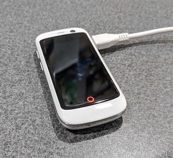
The Jelly Pro has a cool little LED battery charging indicator on the front of the phone that glows red while charging and then turns green after the phone is fully charged. I like this feature which is great considering that I had to look at it a lot due to the short battery life per charge.

If you don’t do anything at all with the Jelly Pro, you should be able to make it a full day on a charge. But if you’re using the phone to make calls, send texts, surf Instagram, etc. You’ll be charging the phone halfway through the day, if not sooner.

What I like about the Jelly Pro smartphone

The size of this phone is my favorite feature mainly because it fits in the front pocket of my snug jeans and I forget it’s there unlike my Pixel 2 XL which sticks 2/3rds out of the back pocket of my jeans.

The Jelly Pro is a cute phone and people will ask you about it when they see you using it. It’s also fun to use as long as all you really want and need to do is to make and receive calls with it.

What needs to be improved

Although the Jelly Pro is considered a smartphone, you probably won’t want to do a lot of smart things with it. You won’t want to read the latest ebook on it, surf your favorite sites on it, play your favorite games with it, or even text your BFF with it unless your answers to questions consist of 1-3 letter answers like K and sup. The screen is just too freaking tiny for any of those tasks.

I’m not saying that it isn’t possible to do all those things with the Jelly Pro smartphone. I’m just saying that you probably won’t want to if you have adult sized fingers and older eyeballs like me.

Final thoughts

In a world full of phablets, it’s refreshing to see an alternative like the Jelly Pro. Testing this phone made me remember the early days of cell phones when I could carry one in my pocket without worrying that it would fall out.

The Jelly Pro is the perfect little phone for people who only want to make and receive calls or want a vacation from a “real” smartphone.

Source: The sample for this review was provided by Unihertz. Please visit their site for more info and Amazon to order.


Product Information

Price: $124.99
Manufacturer: Unihertz
Retailer: Amazon
Pros:
  • Bargain priced
  • Pocket friendly
  • Built-in FM radio
Cons:
  • Battery life is short
  • Tiny onscreen keyboard is tough to use

Filed in categories: Featured Items, Reviews

Tagged: ,

Jelly Pro super mini 4G smartphone review originally appeared on The Gadgeteer on December 5, 2017 at 12:00 pm.

Note: If you are subscribed to this feed through FeedBurner, please switch to our native feed URL http://the-gadgeteer.com/feed/ in order to ensure continuous delivery.
ZTE Axon M Android smartphone review

Extended (tablet) mode

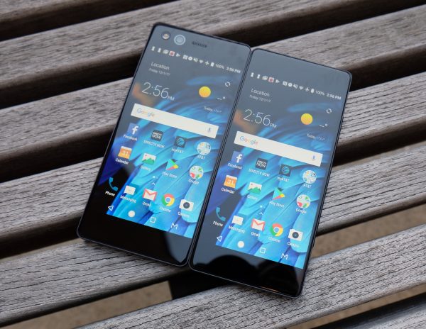
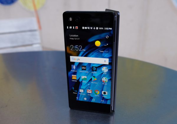
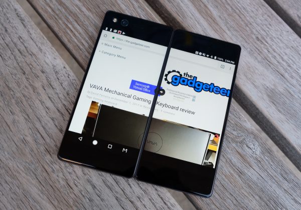
ZTE’s Axon M is one of the devices that threw us for a loop in 2017. The company managed to the be the first to come out with a foldable smartphone with two screens. A multitaskers dream, the displays on the Axon M are each a 5.2-inch 1080p IPS display. Together they combine to form a 6.75″ tablet-like display with a somewhat distracting seam running down the middle.
 Unsurprisingly, weighing 8.1 ounces and measuring 5.9 x 2.8 x 0.5 inches the ZTE Axon M is heavier and bulkier than your typical smartphone, but that’s the price you pay for getting 2 displays. Fortunately, it’s still somewhat pocket friendly. Because it has its hinge on the right side, it houses most of its buttons on the left side. Running along the left side of the device, ZTE has placed a fingerprint reader that doubles as a power button, a volume button, and a third somewhat programmable button. The programmable button lets you quickly launch TV mode which in turn lets you load the YouTube or DirecTV app. That said, we’d like to have the option to program that button with whatever app we choose.
But what is especially awkward in the design is the camera placement. The Axon M houses a single 20MP camera. Taking regular non-selfie photos with the camera is an awkward experience because you have to flip the phone around.  The camera itself takes ok photos. In daylight, the photos offer pretty accurate colors and visuals are pretty sharp. But the phone struggles with autofocus and in low light, photos tend to be noisy and often blurry, probably due to the lack of optical image stabilization.
The displays on the Axon M are not flagship level displays, but they are solid displays with sharp visuals and accurate colors, we just wish they could reach higher brightness levels. The bigger issue for some may be the seam running down the middle in Extended (tablet) mode. Personally, we adjusted to it after a few days and eventually forgot it was there. It’s not that different to the notch on the iPhone X, which is also distracting at first, but you’re able to adjust to it over time.

Dual Mode

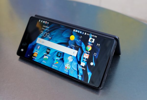
 Besides single screen mode, there is Mirror Mode, Extended Mode, and Dual (multitasking) mode. Mirror mode is useful for two people watching movies on either side or playing a game like Battleship. Extended mode takes a single app and extends it across the two displays. For example, that means you get double the real estate for your web browser or Facebook feed. Mirror mode is useful for two people watching movies on either side or playing a game like Battleship, especially if the device is folded like a tent.

Mirror Mode

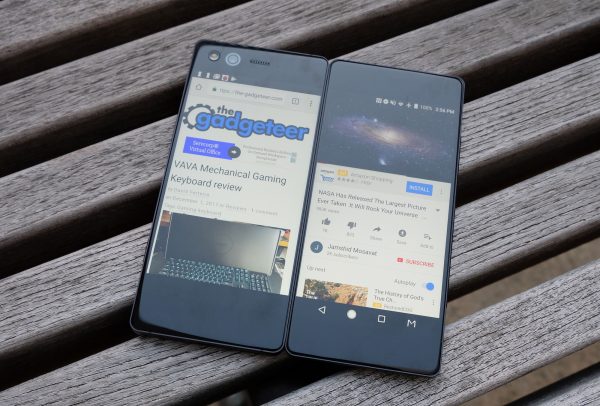
 Last but not least, Dual (multitasking) mode lets you run a different application on each screen – so you can have Twitter opened on one display while watching YouTube on the other. This set up is pretty much a multitasker’s dream, and so much better than using a split screen window mode on a single cramped smartphone display.
When you start up the phone, you’ll go through an easy tutorial which shows you how to switch between different modes. A 3 finger swipe moves an application over to the opposite display.  Switching between modes is easy and generally works well, but we often ran into some slowdowns when switching between modes, as well as some app crashes. We hope that ZTE will push out an update that addresses these bugs soon. ZTE has said that they are committed to frequently updating the Axon M and that they will be updating it to Android Oreo.

The Axon M can be folded like a tent

 AT&T picked up the ZTE Axon M because it’s the perfect device for a DirecTV user. After all, you can be watching DirecTV on one display while checking your email or Tweeting on the other. We showed the device to a DirecTV user and they got really excited about it, but they actually assumed it was a tablet before we explained to them that it was a phone. Speaking of DirecTV, the Axon M comes preloaded with the DirectTV app, along with lots of AT&T bloatware apps, all running along side Android 7.1.2 Nougat.

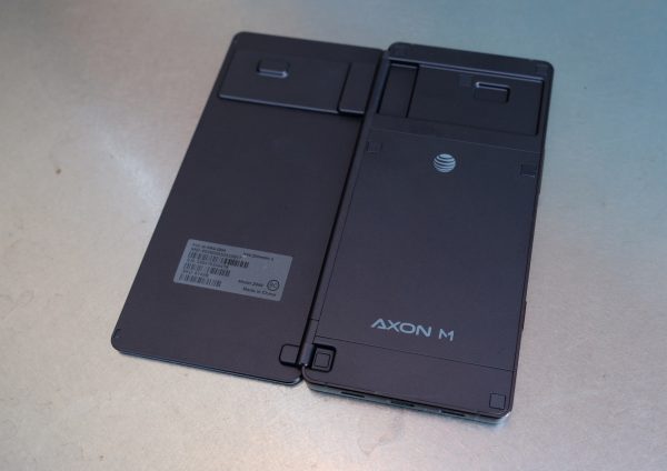
The unibody metal construction of the Axon M is very solid

 The phone is powered by a capable Qualcomm Snapdragon 821 processor with 4GB of Ram. When we tested the phone with AnTuTu, it scored a benchmark of 128845. That indicates that it’s a capable, fast performer, though not nearly as fast as flagships like Huawei Mate 10 Pro and Note 8, and its performance is more in line with the Galaxy S7. In general, even in Dual mode with two apps running in tandem, performance is good and the phone is able to handle running two apps without issue. However, it’s switching between modes that can be a buggy experience sometimes.
The 3,180 mAh battery provides solid battery life, especially for a device with two displays! We were able to get a full day of use on a charge.

Final Thoughts

 We have to give ZTE tons of credit for taking the plunge and innovating in the smartphone category. One thing is for sure, the ZTE Axon M is a vision of the future. There are already rumors swirling that both Samsung and Apple are coming out with foldable smartphones, so we expect to see more competing foldable phones in the not too distant future. Overall, ZTE has done an admirable job with the Axon M, especially for a first gen device. But we’re even more excited for a second gen Axon M which we hope will be thinner, sporting a better camera, rocking bborderless displays and running less buggy software.
The ZTE Axon M is an AT&T exclusive and it retails for $724.99 off contract. The phone comes standard with an extensive (and above average) 2 year warranty that includes a free premium protection plan.
Source: The sample for this review was provided by ZTE and AT&T. Please visit their site for more info.
 

Product Information

Price: $724.99
Manufacturer: ZTE
Retailer: AT&T
Pros:
  • Two screens – did we mention two screens!? Switching between modes is easy
  • This is a multitasker’s dream device
  • Good battery life and performance despite having two displays
  • Sports an audio jack and microSD card slot
  • Ideal for DirecTV users
  • Well made unibody metal design
Cons:
  • AT&T exclusive
  • Camera is awkward to use
  • Software can be buggy
  • Middle seam can be distracting
  • Pricey

Filed in categories: Featured Items, Reviews

Tagged: , , ,

ZTE Axon M Android smartphone review originally appeared on The Gadgeteer on December 4, 2017 at 11:00 am.

Note: If you are subscribed to this feed through FeedBurner, please switch to our native feed URL http://the-gadgeteer.com/feed/ in order to ensure continuous delivery.
LG V30 review

When I made the decision to go back to an Android smartphone after a brief vacation to Apple land this summer, my choices for a new phone were between the Samsung Galaxy S8, Samsung Galaxy Note8, Pixel 2 XL, and the LG V30. I ruled out the Samsung devices because I’m not a fan of the curved sides or the fingerprint sensor location. That meant that my choice was narrowed down to the new Pixel 2 XL and the LG V30. Fortunately for me, Verizon Wireless sent me a loaner unit of the LG V30 which I’ve been using on and off for the last couple of weeks. Let’s take a look to see if I end up choosing to buy the LG V30 or the Google Pixel 2 XL. 

What is it?

The LG V30 is LG’s latest flagship Android smartphone running Android OS version 7.1.2.

What’s in the box?

LG V30
USB (Type-C to Type-C) Cable
USB (Type-C to Type-A) Cable
SIM Eject Pin
Quick Reference Guide

Hardware specs

Processor: Qualcomm Snapdragon™ 835 2.45 GHz x 4 + 1.9 GHz x 4 Octa-Core MSM8998
Display: POLED 6.0″ QHD Plus FullVision™ Display (2880 x 1440) with 538 ppi, Corning Gorilla Glass 5
Operating System: Android 7.1.2 Nougat
Memory: Flash: 64GB RAM: 4GB
Expandable Memory: Removable microSD up to 2TB (sold separately)
Network: CDMA, GSM, UMTS, LTE frequencies: 1.9 GHz CDMA PCS, 800 MHz CDMA; GSM 850/900/1800/1900 MHz; UMTS 850/900/1900/2100 MHz; LTE Bands 2/3/4/5/7/13/20/46/66 Data Transmission: EVDO, EVDO Rev A, 1xRTT, LTE, GPRS, EDGE, UMTS, GSM, HSPA+, HSPA
Camera (rear): 16 MP Standard-Angle Lens f/1.6
Camera (front): 5 MP Wide-Angle Lens f/2.2
Bluetooth: 5.0, Wi-Fi, NFC
Battery: 3,300mAH, Non-removable
Dimensions: 5.97 in x 2.97 in
Weight: 5.57 oz

Design and features


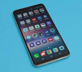
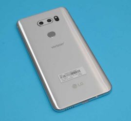
The LG V30 looks a lot like the Samsung Galaxy S8 with polished metal rails around all sides and rounded edges which thankfully, aren’t curved like the S8’s edges. The LG V30 also has a glass back which allows for Qi wireless charging.

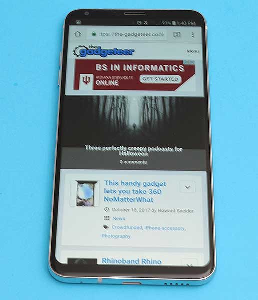
Like the S8, the LG V30 has a buttonless front with a very nice 6-inch display that has minimal top and bottom bezels.

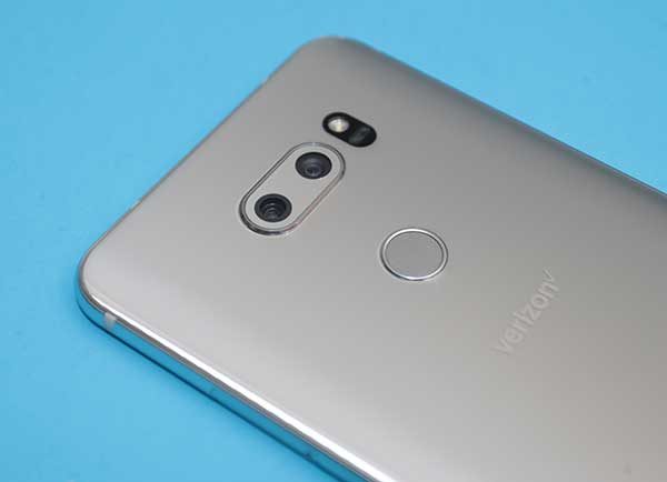
The back of the phone has a dual camera lens and an LED flash at the top with the perfectly placed combination fingerprint sensor/power button in the upper center exactly where your index finger rests when you pick up the phone.

On the left side of the V30 are separate volume buttons that have very good tactile feedback and are raised far enough that it’s easy to find each button with your finger without looking.

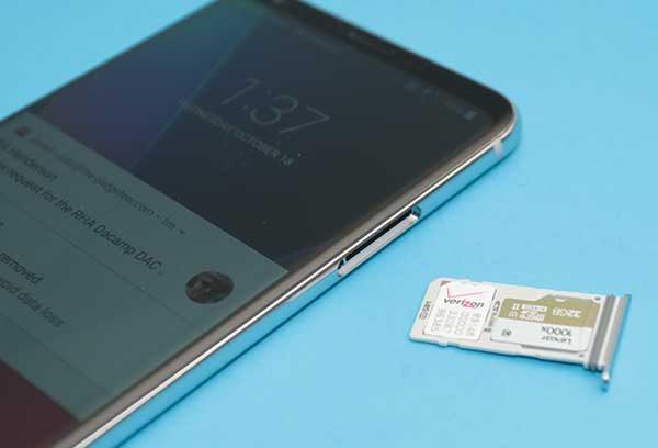
On the opposite side of the phone, you’ll find the combination SIM/microSD card tray.

Correct me if I’m wrong, but I think LG and Samsung are the only high-end smartphones that still offer a microSD card slot. I used to demand this feature in any new phone that I would purchase because I wanted the security of backing up my photos to a card. But in this day and age, I find that I don’t care about this feature quite so much due Google Photos automated image back up to the cloud. It’s still a nice feature to have though.

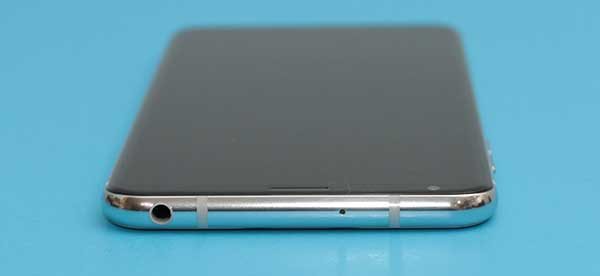
The top edge of the LG V30 has a microphone and what’s swiftly becoming an endangered port: a 3.5mm headphone jack.

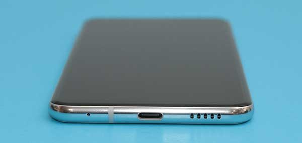
If we examine the bottom edge of the V30, we find another microphone, a USB Type-C port, and a speaker. The location of the speaker is a little unfortunate if you like to hold the phone in your right hand like I do which ends up covering the speaker and muffling the sound.

The fit and finish of this phone get a thumbs up from me. It looks nice, feels solid, and is comfortable in hand. Speaking of in hand, the LG V30 passes the Gadgeteer squeeze test with no complaints, but if I give it a really strong shake, I can hear the volume buttons rattling ever so slightly. Yes, I know I am crazy to still be doing the Gadgeteer squeeze test after 20 years 😉

Display

This phone sports a 6 inch POLED display. If the addition of a P in front of OLED is confusing you, you’re not alone. The P stands for the plastic base layer that is used instead of a glass base layer which is used in most OLED displays.

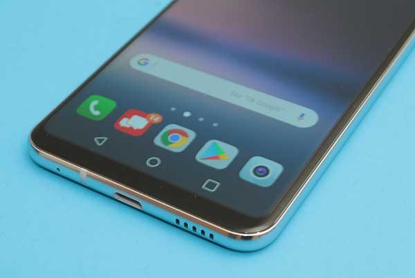
The display has thin bezels and virtual navigation buttons that can disappear automatically in some apps like Chrome shown above.

The nav buttons reappear if you swipe up from the bottom edge of the phone.


In some apps, you can close the nav bar with the small arrow on the left side of the nav bar.


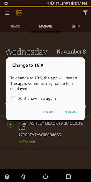
Sometimes you’ll see a double arrow next to the nav bar that will prompt you to switch to the 18:9 display mode.

If you’ve been following the Pixel 2 XL displaygate bruhaha, you’ve heard about the blue tint issue that the Pixel 2 XL has when you tilt the screen. The LG V30 has the same “issue” which is not a surprise since LG makes the Pixel 2 XL and they both share the same POLED display technology.

I wasn’t able to photograph the display well enough to demonstrate the blue tint issue, but suffice to say, that I personally do not find it to be the huge catastrophe that some people feel it to be. I didn’t even notice the problem on the V30 or my Pixel 2 XL until after people started talking about it and then I could see it. But the thing is, I don’t care because I’m not using my phone with it tilted away from me. I use my phones facing my eyes straight on and at that angle, there’s no blue tint.

Then there’s the burn-in issue that some people are seeing on the Pixel 2 XL. This can be an issue with OLED displays, but again, I’ve yet to see it on my loaner LG V30 or my Pixel 2 XL. That said, I’m more anxious about the potential for burn-in than the blue tint issue so I plan to keep an eye on my Pixel 2 XL’s display. Now back to the LG V30 review…

When it’s all said and done, I find the LG V30’s display to have sharp crisp text and bright vivid colors. It’s enjoyable to read, surf and watch videos on it and I have no complaints about the display at this time.

Camera

LG phones usually have decent cameras, but they aren’t known for their cameras like the iPhone and last year’s Pixel XL.

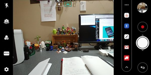
The stock camera app is pretty basic except for the handy built-in sharing bar that you can use to send images to a calendar event, Bluetooth, the LG Memo app, email, and the Verizon messaging app.


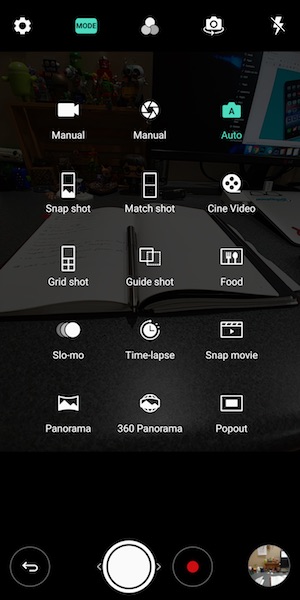
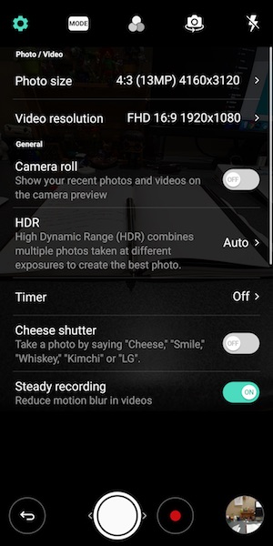
The also has a selection of modes that you can use to spice up your shots. But missing is a portrait mode which has becoming a big selling point for the iPhone and the Pixel 2.


The LG V30’s dual camera lens does offer a really nice wide angle mode that will allow you to fit in a lot more “stuff” in your images. Both images above were taken from the same distance, but the only difference was toggling the wide angle mode in the image on the right.


I was impressed with the images that I shot with the V30. Click any of these example images to view the full sized shot.


All my shots came out great if a bit oversaturated… but I personally like that look when it’s not overdone.

Audio quality

I already touched on the fact that I don’t like the placement of the speaker on the bottom right of the phone. There’s also the fact that it’s just a mono speaker. While most people probably won’t be listening to a lot of audio/music through that speaker, it is a little disappointing that LG didn’t put more effort in that area. My guess is that the decision to go with the placement was to keep the phone as small as possible and the screen’s bezels equally small.

But plug in a pair of headphones and your ears will be happy. Audio through headphones wired and unwired sounds very very nice.

Software and user interface


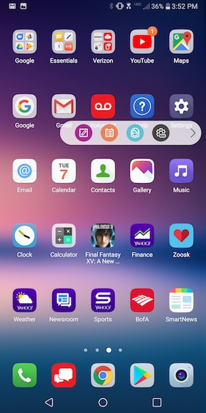
The LG V30’s user interface is pretty basic even with LG’s layer on top of stock Android. LG offers a few extras like the pop out shortcut bar that harkens to Samsung’s edge display. The difference is that you can’t swipe the edge of the screen to pop out the bar, you have to tap on the little tab. Since the tab is quite small, it makes the effort a little frustrating at times. I don’t know about you, but I rarely use these extra nav bars since it’s just as easy to put my most used app shortcuts and widgets right there on the first home screen.

Speaking of home screens, that’s where all your apps icons will live because LG’s custom skin over Android does not include an app drawer.

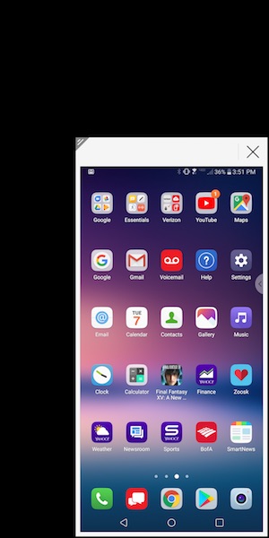
Another special LG feature allows you to shrink the screen for easier one-handed use. I don’t use this either.

One complaint that I do have about software and the V30 is that the phone doesn’t ship with Oreo. It has Android v7.1 Nougat.

Using the LG V30 for phone calls

I didn’t have any complaints from people I talked to while testing the LG V30. Conversations on both sides of my calls were clear and with decent volume. I also did not have any issues with dropped calls while testing this phone. Signal strength seemed to be no better or worse than other phones that I use and test on the Verizon network in my area.

Overall performance and battery life using the LG V30 for day to day tasks

When it comes to overall system speed, I have no complaints about the V30. Apps launch quickly, screens scroll smoothly, and I didn’t notice any sluggishness or problems navigating between apps.

I didn’t do any special battery life testing, but it felt better than other phones I’ve recently tested. You should have little trouble getting through a day on a full charge and if you barely use your phone, it might last for up to a week on a charge if you turn off apps that constantly ping for new info.

Final thoughts

After spending a few weeks with the LG V30 and the Pixel 2 XL at the same time, I ultimately decided to buy a Pixel 2 XL instead of an LG V30. The V30 is a really nice phone and I’ll be sad to send it back to Verizon because it has wireless charging and a microSD card slot, which I like. It also has the volume buttons on the left side of the phone instead of the right side, which I prefer.

But when it came down to it, my main reasons for going with the Pixel 2 XL instead of the V30 are stock Android, faster OS updates, and full resolution automatic image backup to the cloud. Those benefits tipped the scale for me.

Source: The sample for this review was provided by Verizon Wireless. Please visit their site for more info.


Product Information

Price: $840.00
Manufacturer: LG
Retailer: Verizon Wireless
Pros:
  • Thin bezels
  • Wireless charging
  • microSD card slot
  • Extra 1yr warranty through Verizon
Cons:
  • Some people may complain about the slight blue tint on the display when not viewed straight on

Filed in categories: Featured Items, Reviews

Tagged: , ,

LG V30 review originally appeared on The Gadgeteer on November 9, 2017 at 11:00 am.

Note: If you are subscribed to this feed through FeedBurner, please switch to our native feed URL http://the-gadgeteer.com/feed/ in order to ensure continuous delivery.
Samsung Galaxy Tab S3 LTE review

I love tablets.  Specifically, I love Android tablets.  I’ve had most of the major devices since day one including the Motorola Xoom and the earliest Samsung tablet, the Galaxy Tab 8.9.  The last one, well that was a brick – it was heavy, slow and would hurt you if you dropped it on an extremity.

Over the years Samsung has stepped up their tablet game culminating in what many thought was the zenith in Android tablets, the Galaxy Tab 10.1 2014 Edition.  Yeah, naming the tablet is probably not their strong suit.  After that device, though, Samsung introduced the Tab S series, their flagship devices, and today we are going to look at the latest in that line – the Tab S3 LTE version.  How well does this new device stack up against the competition and is it worth your valuable tablet dollars?  Read on to find out!

Before we get into the specifics, let me tell you about my tablet use so you can compare that against how you might use the device.  My tablet is a constant companion – I do occasionally leave the house without it, but not as often as you might think.  With aging eyesight the larger screen is easier for me to read without glasses, making it for me a better choice for email and even SMS.  I read on it, watch movies and TV shows while traveling, settle bar disputes about whether Daniel Craig was in The Force Awakens, figure out which song is playing on the PA system and everything else you would use a connected device for.  Even though WiFi is ubiquitous these days, there are a lot of places where it is not available – like my car – so I prefer that my tablet have LTE connectivity and am willing to pay for that service.

I also want an upgrade path on my device.  Seems that Google is releasing a new major release of Android every year, and while the hardware does not have to change I do want to stay as current as possible on the operating system.  The device needs to perform well, have a bright screen, have enough internal memory to support the apps I want to load, and use as little proprietary connectors or helpers as possible (understanding that the case for a device is of necessity proprietary).  So, no knockoff devices for me.  In today’s tablet market, it is either the Apple iPad and the walled garden that it brings, or a few key players on the Android side – Google and Samsung.  LG and other manufacturers have a tendency of producing low end devices that do not meet my stringent requirements, and worse do not do much to support the units sold.

So on to the latest, the Galaxy Tab S3 introduced at the end of February this year.  Looking at the specs it is not wildly different than the Galaxy Tab S2 introduced almost 2 years ago.  The screen size, resolution and aspect ratio are all the same – 9.7 inches, 2048×1536, and 4:3 respectively.  The memory was bumped up from 3 to 4 gig, but internal storage remained at the same disappointing 32 gig as the S2 LTE version.  Thankfully both tablets allow you to use an external microSD card up to 256 gigs, so your storage options are not so limited.  Front and rear facing cameras are the same (2.1 and 8 megapixels respectively).  The battery is slightly larger in the new tablet, the processor is the same one found in the Galaxy S7 phone line (the Qualcomm Snapdragon 820 vs the older Snapdragon 652).

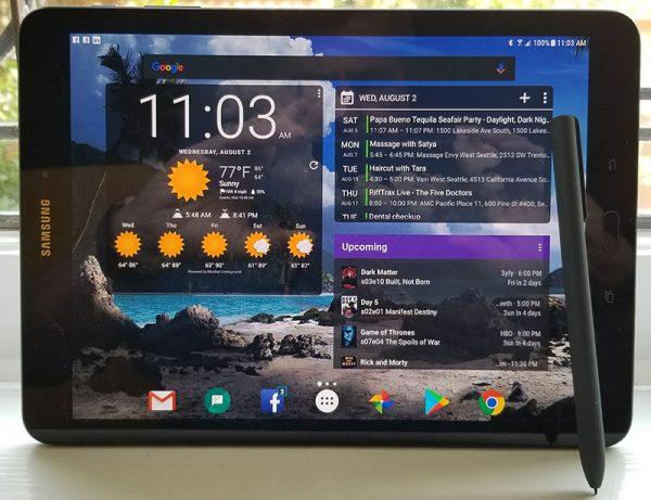
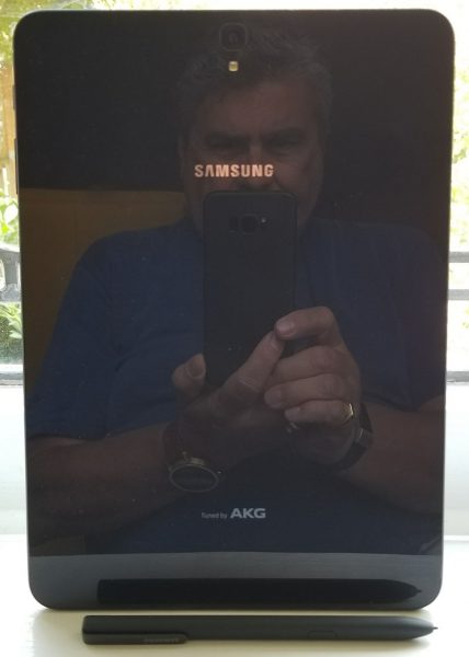
Those are the dry specs.  Sorry, every review has to include that by law.  The differentiation between the S2 and S3 comes in the new SPen, upgraded sound and video, and the software optimizations made to Android to support these.  First, the SPen.  Much like the Note series the S3’s pen makes for a great way to take notes or make quick sketches.  The same SPen software is also on the tablet, but curiously the pen does not have a silo on the tablet in which to store it.  Nor does the official case come with a loop or any other way to carry the pen.  As useful as it can be, the pen really feels like an afterthought for Samsung – like “we gotta give these guys something, but we can’t change the tablet.”  It is going to be the most lost accessory Samsung ever made and at $49 the most profitable one they will sell you.

Also changed this year is the charging and data port.  The previous micro USB standard has been upgraded to the USB Type-C port, so plan on all new cables.  More than just the physical configuration, the port also bumped up to USB 3.1, so your data transfers through a physical cable will be faster.  Important in my use case as a traveling media player.  And in that use case, the new HDR and 4K content modes are very nice – the screen appears sharper, more vibrant and reacts faster to video, meaning no more ghosting when watching an action movie.  The Harmon-Kardon AKG-tuned stereo sound on the new tablet also provides richer audio at higher volumes than the previous tablet.  Except for the black bars at the top and bottom of the screen thanks to the 4:3 aspect ratio, everything you watch or listen to will be just that much better on the Tab S3.

The upgrade to the Snapdragon 820 processor and the additional 1 gig RAM makes for a very snappy experience.  Performance is as smooth as butter – apps open faster and the user experience feels like it should for a flagship product.  You won’t be disappointed by the performance.

The frame for the tablet is aluminum as was the previous version.  The back, however, is glass (as evidenced by my reflection in the photo).  It really gives a premium look to the device, but it comes at the expense of fingerprinting.  Also missing on this version are the snaps found on the back of the S2 that fixed the case to the tablet.  I thought they were outstanding, and am disappointed by the weak magnetic connection the S3 uses.

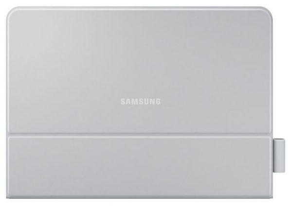
As far as accessories go, Samsung makes an interesting external keyboard that is not Bluetooth.  It connects to and is powered by the tablet via a series of pins on the bottom.  As a matter of fact, I am typing this review using the external keyboard.  And the keyboard folio case as a loop for the SPen, albeit through a rather cheesy stick-on vinyl loop.  The keyboard works well, but for some odd reason Samsung only makes this in a color that does not match the tablet – the S3 is charcoal, and the keyboard folio case is a light gray.  The standard non-folio comes in a color that matches the tablet, so it is strange why this is different.  There are plenty of after-market cases and other accessories, though, so pondering the mystery of the mismatched color is blissfully short.

Now the other shoe drops.  The base WiFi-only version of the tablet is on sale in the US, but so far there is not a US-based mobile carrier who is selling the LTE version.  After waiting many months and even seeing the tablet pass through the FCC (meaning it could be sold here), I am still unable to obtain a T-Mobile-specific model (or AT&T or Verizon, for that matter).  I purchased an unlocked international version, the SM-T825 and have been using it on T-Mobile without any issue.  This version does not support the 700mHz LTE band that T-Mobile has available, but in practice, this has meant literally nothing for me.  I get 4G speeds almost all of the time when I am not on WiFi, so not having the T-Mobile brand on the tablet does not seem to impair my use in any way.

Bixby is also curiously missing.  Introduced at the same event, Bixby is Samsung’s entry into the digital assistant category.  I get that having Bixby native on the S8 line of phones is an important differentiator for Samsung, but the S3 is their flagship tablet product.  Given how buggy the current version is and how limited the functionality is today, you are not missing that much by not having it available.  Hopefully, they will stabilize the software and push it out in a later release, but in the meantime, you can use Google Assistant.
The bottom line?  This is a worthy upgrade from the Galaxy S2 model and is hands-down the leading Android tablet out there.  And that is not solely because most of the competitors (including Google) seemed to have left the market.  On its own merit, the S3 is a great device.  At $650 (what I paid new for the LTE version) and without US carrier support, your mileage may vary.  Regardless of whether you want/need LTE connectivity, either model of the S3 will definitely not disappoint.
Source: The device reviewed was purchased by me.  For more information, visit the official Samsung site and Amazon.


Product Information

Price: $779.00
Manufacturer: Samsung
Retailer: Amazon
Pros:
  • Faster, more fluid than the previous generation
  • Enhanced sound and video playback make for great media consumption
  • SPen is included with all versions of the tablet
  • Comes with Android Nougat (v7) loaded and will get the O upgrade later this year
Cons:
  • Price
  • No US-carrier with an LTE version
  • SPen is going to get lost because there is no on-device storage for it
  • Bixby is not included nor is it available as an update

Filed in categories: Featured Items, Reviews

Tagged:

Samsung Galaxy Tab S3 LTE review originally appeared on The Gadgeteer on August 8, 2017 at 9:00 am.

Note: If you are subscribed to this feed through FeedBurner, please switch to our native feed URL http://the-gadgeteer.com/feed/ in order to ensure continuous delivery.