CIGA Design MY Series titanium mechanical skeleton watch review

CROWDFUNDING REVIEW – If you enjoy wearing a watch on your wrist but a smartwatch is an overkill for your needs, a traditional analog watch is an interesting option. Today I want to show you the CIGA Design My Series titanium skeleton watch which is currently seeking funding on Indiegogo.

What is it?

The My Series titanium skeleton watch from CIGA Design is an auto mechanical wristwatch designed by Michael Young and winner of the 2017 iF Gold Award.

Design and features
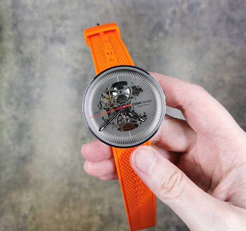
The MY Series watch is a unique watch that is designed so that you can see the inner mechanism of gears, springs, and levers.
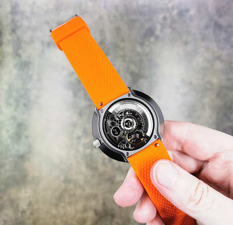
The MY Series uses a Seagull AAA auto-mechanical movement which means that it does not have a battery that you need to charge every night. You just need to wind the crown the first time you’re ready to wear the watch, and from there, the movement of your wrist will keep the spring wound. See that half-circle shaped part on the back? That is a weight that rotates as you move your arm and by some manner of wristwatch sorcery, it harnesses that movement to wind the watch’s internal spring.
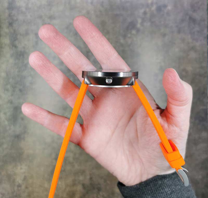
The watch case is made of grade 2 Titanium which makes it strong yet lightweight. The watch is both scratch-resistant on the case and on the synthetic sapphire crystal watch face. It is also 3AT water resistant which means that it’s splash resistant, but not waterproof. You can wear it in the rain, but not in the shower or while swimming.
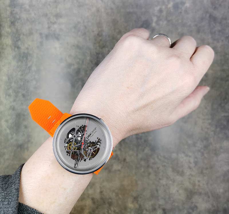
The CIGA Design MY Series titanium skeleton watch is eye-catching and if you hold it up to your ear, it’s ear-catching too because you’ll be able to hear it tick!

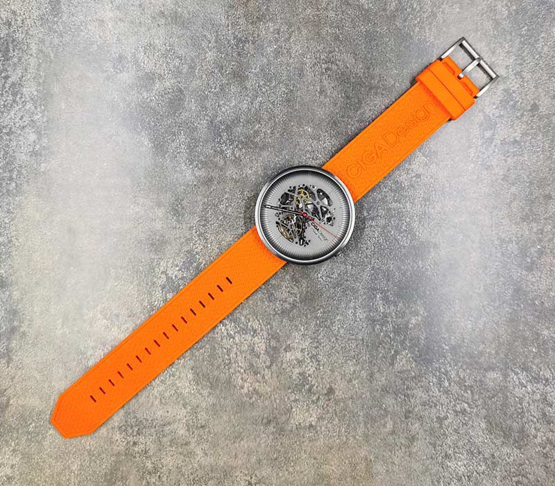
The watch is large on my girly wrist, but it’s comfortable to wear with the included silicone band. I was sent an orange band, but backers will be able to choose from orange, blue, red, and black silicone bands. A free black leather band is also included with each reward so the watch can go from casual to classy just by switching bands.

The dial of the watch has a sort of bowl shape to it with etched marks for the hours and minutes around the edges. If you look at the image above, you’ll see that there are nine marks between each hour marking and the hours are not designated by numbers. I prefer numbers on my watch dials and only one mark per minute instead of two marks, but that’s just me.

I also find the hour and minute hands to be a little hard to see against the watch face since the hands and dial are similar in color. However, it is nice that the ends of the hands have luminescent markers. But, you have to “charge” the markers with light before they will glow in the dark.

What I like

  • Unique see-through design
  • Auto mechanical movement means no batteries or charging required

What I’d change

  • I’d like to see a smaller version more suitable for women
  • Make the hour and minute hands easier to see against the watch face

Final thoughts

The MY Series titanium skeleton watch from CIGA Design is a cool looking watch that is comfortable to wear and easy to use because you don’t have to charge it every day. If all you want to know is the time of day and nothing else, this watch has that covered. Compared to today’s smartwatches, the MY Series might seem simple, but instead of a mini computer that tells the time, this watch has gears, springs, and other parts that all work together without any help from batteries, processors, or software.

Where can I find more info?

The CIGA Design campaign ends on 9/30/19 they are working towards their funding goal of $31,875. You can pre-order a MY Series watch starting at $228. After the CIGA Design campaign ends, rewards are estimated to start shipping in September 2019. Visit their Indiegogo page for all the details.

Source: The sample for this review was provided by CIGA Design.

Filed in categories: Reviews

Tagged: ,

CIGA Design MY Series titanium mechanical skeleton watch review originally appeared on The Gadgeteer on August 25, 2019 at 2:50 pm.

Note: If you are subscribed to this feed through FeedBurner, please switch to our native feed URL http://the-gadgeteer.com/feed/ in order to ensure continuous delivery.

The Hexbot robotic arm extends the reach of your creative mind


CROWDFUNDING NEWS – In my household, robots and robotic gadgets seem to be all the craze for my son and recently for me too. I have both purchased and reviewed several types of robotic gadgets that were designed mostly for young kids or teenagers. However, since I have a great interest in robotic gadgets too, it would be nice for daddy to have a new toy that has nothing to do with the kids.

Guess what? I think I found one! According to the designers, Hexbot is “The first versatile desktop robotic arm with extreme 0.05mm high repeatability that turns your desktop into a workshop.” They designed the arm with creativity and tasks in mind, and I think it will be versatile enough for many enthusiasts to make great use of it.

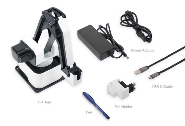
This is for the basic kit that includes:

• The Hexbot robot arm,
• The Pen holding module,
• The Power supply,
• The high-speed USB-C cable.

The following addons can also be purchased:
+$80 for laser engraving module with a protecting shield.
+$79 for 3D printing module.
+$50 for 3.5-inch touchscreen.
+$109 for the pneumatic kit.
+$439 for conveyor belt.
+$869 for sliding rail.

The Hexbot can be preordered via their Indiegogo Indemand page right now, with shipments scheduled to begin in October 2019. The preorder price is $299 which they state is $360 off the planned retail price.

Filed in categories: News

Tagged: ,

The Hexbot robotic arm extends the reach of your creative mind originally appeared on The Gadgeteer on August 25, 2019 at 8:14 am.

Note: If you are subscribed to this feed through FeedBurner, please switch to our native feed URL http://the-gadgeteer.com/feed/ in order to ensure continuous delivery.

Gridopolis 3D game system, Carro smart fan, and Sens minimalist pen – Notable crowdfunding campaigns

CROWDFUNDING NEWS – Here are three crowdfunding campaigns that caught our eye this week. Let me know if these products interest you too or if we missed a campaign that we should be letting everyone know about.

Gridopolis – a 3D Strategy Game and System

What is it?

Gridopolis is a 3D game system that combines an element of building with the gameplay style of chess, tic-tac-toe, and checkers for games that are fun for kids as well as adults.

Why do I like it?

I like Gridopolis 3D gaming system because it’s a modular and expandable game system that you can use to play in a variety of ways.  There are already a few existing blueprints for games to get you started or you can create your own original 3D games by snapping together the basic 7 parts that comprise the Gridopolis system.

Where can I find more info?

The Gridopolis campaign ends on 8/22/19 they have met their funding goal of $15,000. You can pre-order a Gridopolis starting at $35. After the Gridopolis campaign ends, rewards are estimated to start shipping in March 2020. Visit their Kickstarter page for all the details.

Sens – design your own minimalistic pen

What is it?

The Sens pen is a minimalistic pen made of just 2 pieces of anodized aircraft aluminum that are CNC machined into a teardrop-shaped pen barrel with a twist knob at the top that extends and retracts the writing tip.

Why do I like it?

I like the Sens pen based on its design, the fact that it is compatible with Parker G2 style refills, and that you can choose the barrel color and knob color to customize the look of your Sens pen. I also like that the Sens pen comes with a walnut stand and that some of the pledge points include a marble notebook and leather notebook cover.

Where can I find more info?

The Sens campaign ends on 9/14/19 they have already met their funding goal of $1500. You can pre-order a Sens starting at $39. After the Sens campaign ends, rewards are estimated to start shipping in Oct 2019. Visit their Kickstarter page for all the details.

Carro Smart Ceiling Fan

News by Bill Henderson

What is it?

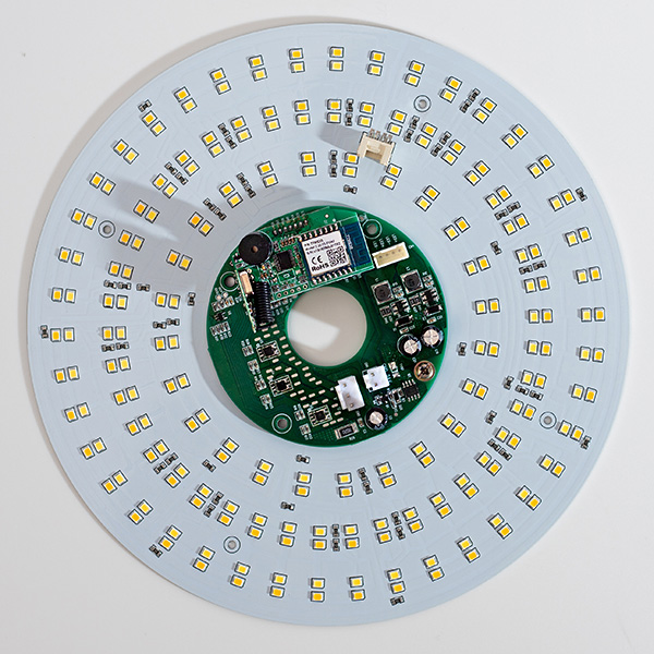
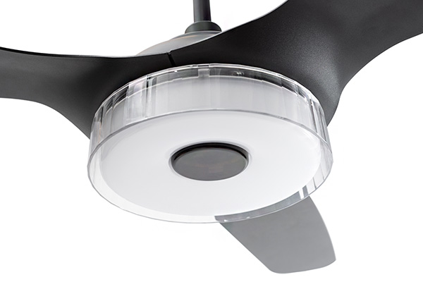
The Carro Smart Ceiling Fan is a 3-blade fan that works with Google Home and Amazon Alexa allowing you to control all aspects of the fan with your voice. Plus, it can connect to your home wifi for customizing different modes and settings using a smartphone. It has a 10 speed reversible DC motor. The fan can be used in tandem with a heater or air conditioner to optimize air circulation lowering energy bills. The motor uses up to 70% less electricity. It can be mounted on a flat or angled ceiling and the blades can be swapped out as decor tastes change.

Why do I like it?

What’s not to like? As almost every appliance and home gadget becomes smart, it’s only natural that a ceiling fan should follow. However, Carro went beyond just app control by also incorporating AI voice control using Alexa or Google Home (notably absent is compatibility with Apple’s HomeKit). For those who prefer more traditional tech, Carro includes its own remote control. 

The reversible DC motor and blades are designed to be extremely quiet, no matter the speed.

If you want, there’s an optional 20 watt dimmable LED light kit that can show both warm (2700k) and white (4000k) light. The LEDs have a 5 year/50,000 hour life span.

The fan is available in either black or white with a variety of blade colors and materials.

Where can I find more info?

The Carro Kickstarter campaign is well over its initial funding goal of $30,000. The fan can be pre-ordered for $240 (without light kit) or $329 (with light kit). Delivery is set for October, 2019. Once the campaign is over, the retail price will be $479 and $579 (without or with light kit). Visit Carro’s Kickstarter page for all the details.

Filed in categories: News

Tagged:

Gridopolis 3D game system, Carro smart fan, and Sens minimalist pen – Notable crowdfunding campaigns originally appeared on The Gadgeteer on August 19, 2019 at 8:00 am.

Note: If you are subscribed to this feed through FeedBurner, please switch to our native feed URL http://the-gadgeteer.com/feed/ in order to ensure continuous delivery.

REECHO EchoWeek Wireless Earbuds review

CROWDFUNDED REVIEW – Today, we’re taking a hard look at the REECHO EchoWeek to find out if these truly wireless stereo earbuds are an instant classic or a cautionary tale of crowd-funding gone awry.

What is it?

REECHO’s EchoWeek TWS earbuds are yet another entry into the crowded wireless earphone market. They are currently in prototype stage and have only in the past month or so sent out their first batch of product to their Indiegogo backers. I received a sample product with that first shipment, and I really hope I didn’t jump someone’s place in line who paid real money for a pair.

Behold, another tiny Truly Wireless earbud.

What’s in the box?

  • earbuds and case
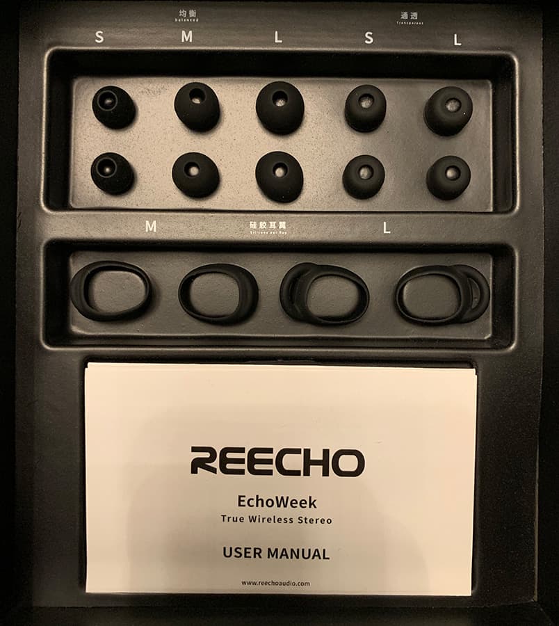
  • 3 different earbud tips and sports wingtips
  • micro-USB cable
  • manual and quick guide
It does come with an array of eartip and wing sizes.

Hardware specs

  • Unique rounded balanced armature
  • True-wireless stereo earbuds
  • 3 sizes of wingtips & 3 sizes of eartips
  • IPX6 sweat resistance
  • Bluetooth 5.0 wireless connection
  • Up to 48 hours with use of charging case (750mAh case capacity, 50mAh earbud capacity)
  • Easy access to voice control smart assistants

Design and features

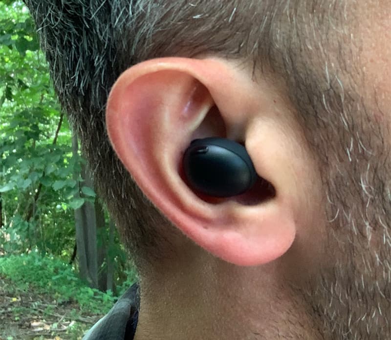
The EchoWeek earbuds have a nice look to them. Made from smooth, black matte plastic, they have sleek, sporty feel and are very lightweight. I was pleased that the largest of the earbud tips fit well in my notoriously difficult ears, fully sealing my ear canals.

Fits the big ear holes.

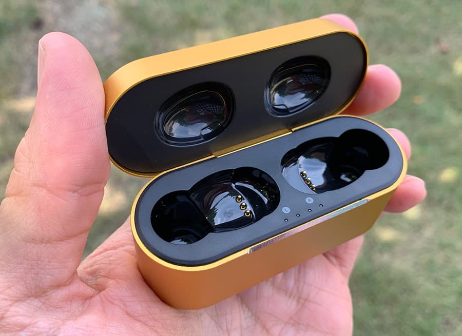
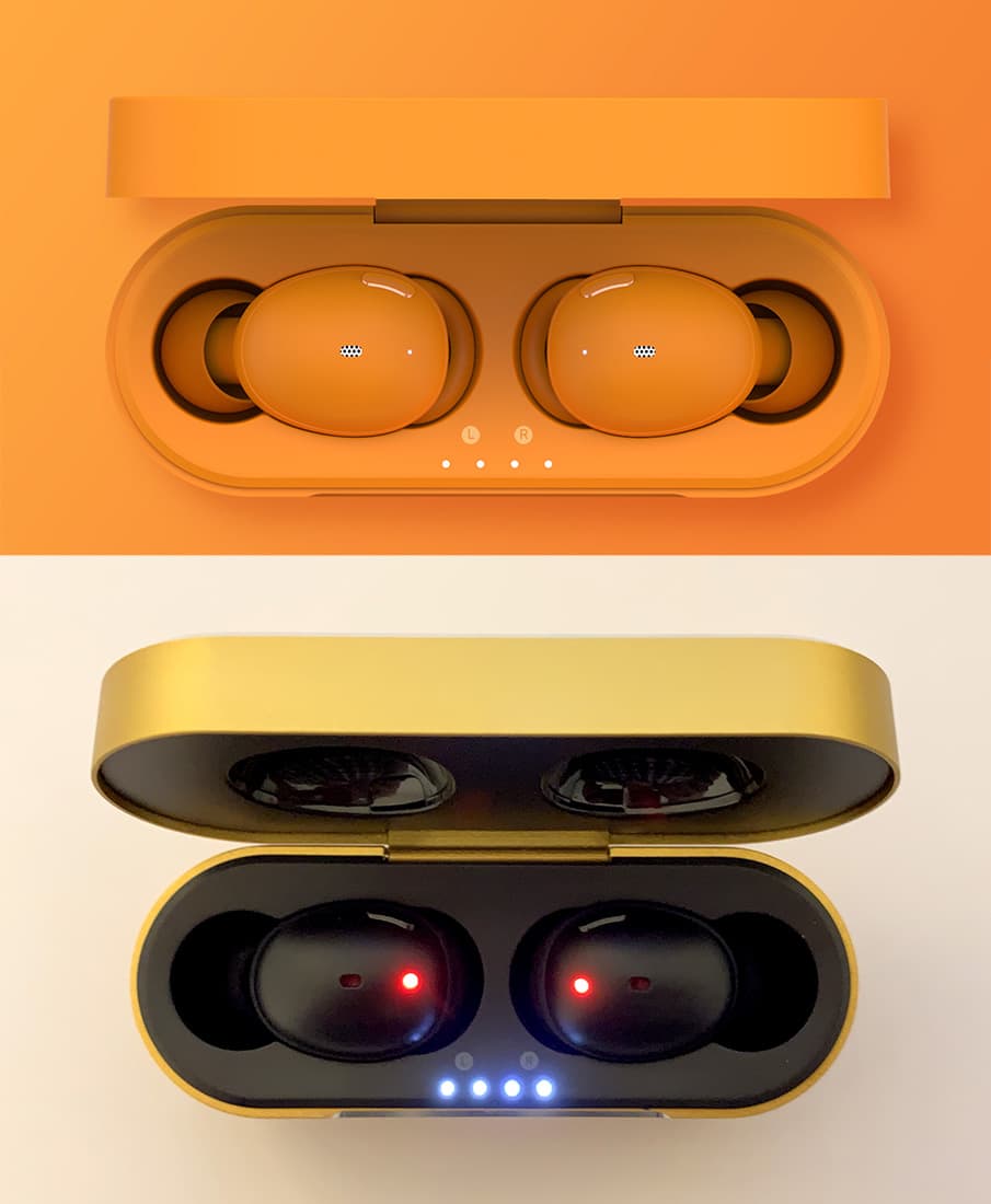
The case is … fine. It’s colored metal, with chamfered silver edges, and you can tell that they were simply trying to match the color of the plastic cases pictured in their Indiegogo campaign page. Looking at what they were promising versus what they delivered, it’s clear that they either ran out of time or the glossy plastic of the 3D prototype just couldn’t be achieved.

Ooh that sharp metal edge.

They don’t even match the box they were shipped in. It must have been a really late decision in the manufacturing process.

The earbuds were supposed to match the color of the case, but instead, all of the shipped products were black, which garnered a lot of complaints from their project backers. I would have preferred a straight silver case instead of this color, but I’m assuming they still had to try to match the seven colors they were offering in the campaign.

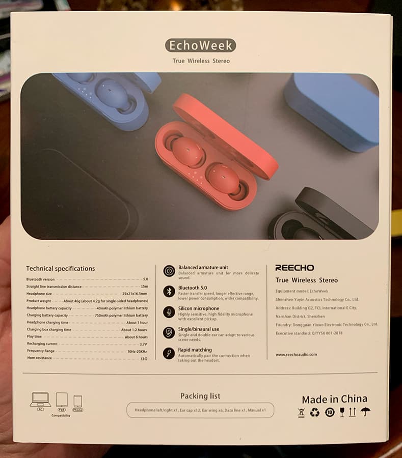
What they were promising vs. what they delivered. Yes, really. Big oof.

I wonder if REECHO called it the EchoWeek because there were 7 colors, one for each day of the week. Indeed, the top-tier perk ($399) was for a 7-pack. Just a random thought.

Setup and Functionality

Pairing is, as usual, pretty straightforward. I’ve heard that these TWS earbuds are sort of hit and miss when it comes to Bluetooth setup, since they’re technically two separate devices that work together as one, but I’ve never run into any issues.

Once you’re paired up, it’s a simple matter of opening the case and removing the earbuds from their chargers to connect to your device. You can use one or both earbuds, which is nice for when you want to keep an ear free for traffic or talking to others.

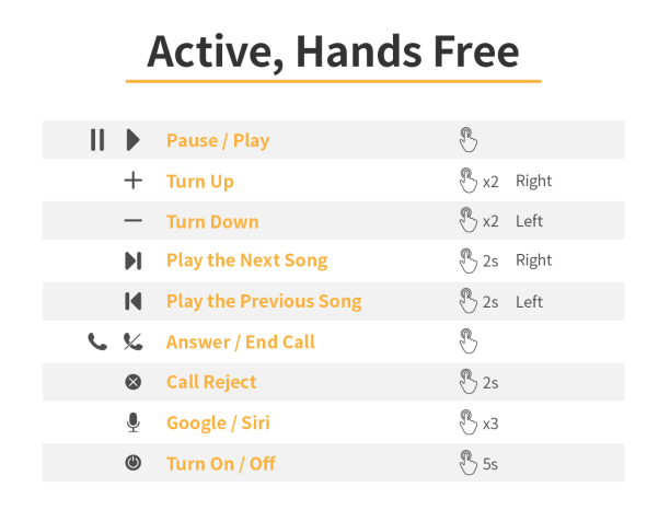
One thing that I’m a bit torn on is the button function. Look at this button guide.

It’s comprehensive as to what you can do with the buttons, but difficult to remember what hitting the right button 2 times or the left button one time will do. Plus, the buttons are a bit tough to press, so completing a triple-click is quite difficult. Compare that to a programmable double-tap on Apple’s AirPods, and, well, even if that’s not a fair comparison, I guess I just like things simple.

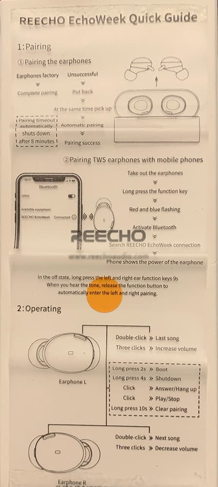
Just look at this “easy setup guide.” Come on.

Sound

The sound drivers, which Reecho is dubbing their “balanced armature drivers (BADs?),” are claimed to have superior sound isolation, require less power, and are very small and lightweight. And given the apparent uniqueness of this driver, REECHO can tout on their IndieGoGo page that the EchoWeeks are the “smallest rounded BA TWS Earbuds,” because everything has to the be the first and/or only thing of its kind on crowdfunding sites.

Good fit. Decent sound. Now if you could pick them up for $29? Pretty easy recommendation.

Overall, they sound pretty good! Especially if these earbuds would only set you back a mere $29. They sound a little flat, overall, like the highs are a bit muted. I can’t say if the

Connection

As with some past TWS earbuds that I’ve come across, the connection seems rather spotty. Reecho claims 10m “straight line connection distance,” but it seems even putting my phone in my pocket is enough to interrupt the audio at times. Placing my hands over my ears is also enough to cause music to fuzz out to silence.

You’re certainly not going to be full on swimming with these things on, despite REECHO’s promotional videos might show. I mean, seriously?

I can’t even get a wall to work between these earbuds and my iPhone, and this dude is full on Michael Phelps-ing around the pool. I’m not buying it.

Battery Life

Unsurprisingly, the battery life on these earbuds didn’t quite match their advertised 6 hours. I got about 3.5 hours of constant music out of them before they died. I imagine you would get 7 charges out of the case, though, mathematically speaking, bringing that total listening time to over 24 hours. That’s not too bad, it’s in keeping with most other TWS earbuds of this size.

What I like

  • They do sound pretty great for the apparent price
  • Build quality is good, too

What I’d change

  • Buttons are a bit hard to press
  • Weak connection, sound drops out
  • Simplify the button controls

Final thoughts

If the time spent with the EchoWeek’s taught me anything, it would be to approach crowdfunded products with a side of caution, because this is a very real outcome.

From an objective standpoint, these earbuds sound great for $29. If REECHO somehow launched their product on a mass scale at this price, they’d be a clear favorite. Even with the weak connectivity issues. But as to whether or not you’ll actually be able to get your hands on a pair … let’s just say I wouldn’t hold my breath.

I tried to get in touch with a representative from the company and didn’t hear back from them. Reading the comments on the Indiegogo page, there are a lot of others who unfortunately had the same issue.

Price: Lowest backing “secret” price was $29, but no word on what the final retail product cost will be or if they’ll go into full production.
Where to buy: This product is, as of the time of writing, unavailable for purchase. You can find their closed Indiegogo page here. And if you want a bit of schadenfreude for their backers, read through the comments section.
Source: The sample of this product was provided by REECHO.

Filed in categories: Reviews

Tagged: ,

REECHO EchoWeek Wireless Earbuds review originally appeared on The Gadgeteer on August 10, 2019 at 10:10 am.

Note: If you are subscribed to this feed through FeedBurner, please switch to our native feed URL http://the-gadgeteer.com/feed/ in order to ensure continuous delivery.
PurePort promises clean and clear Lightning plugs and ports

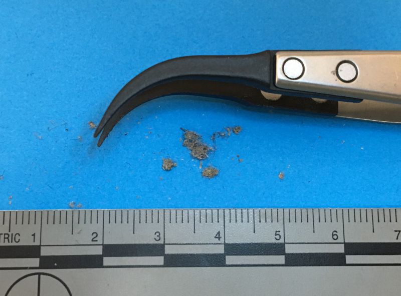
CROWDFUNDING NEWS – For iPhone users, especially the ones who put their iPhones in a pocket (isn’t that everyone?), the curse of pocket lint and random moisture tends to fill the ports of those devices with a substance that refuses to be extricated, especially once you’ve jammed the plug into it a few times when it wasn’t connecting. I can’t tell you how many times I saw this when I was working at an Apple Store. It was always such a surprise to the customer – I’d usually take the lint out to show how much had accumulated because they’d not believe it otherwise. (Photo from @DrDrang’s blog “And Now It’s All This” – highly recommended!)

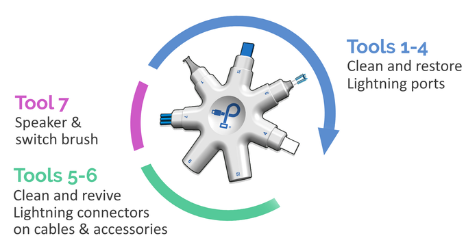
We used soft bristle brushes and non-conductive tools, which prevented damage, but short of a toothpick and an old toothbrush, most folks don’t have access to this. Enter a new KickStarter campaign called PurePort. It’s a set of 7 tools that are designed to safely maintain your ports and the cable plugs as well. Even with less than 50 supporters, they are already past six times their funding goal, so there must be a LOT of folks who put in more than the $20 EarlyBird special!

Apple’s Lightning port was introduced in the fall of 2012 and caused gnashing of teeth as well as rejoicing. The gnashing of teeth was due to the huge investment customers and manufacturers had made in 30-pin connector cables and accessories. (Fast-forward seven years and the specter of change is visible with the advent of USB-C, but Apple seems relatively certain to stay on this train for the iPhones and lower-end non-Pro iPads.) The rejoicing was due to being able to plug in the cable either way, which is also part of the joy of USB-C. The small deep port is much more difficult to see into, so getting little bits of stuff in there is much more of a problem than it was with the 30-pin connector, which was wider and more open. If you’re not worried that Apple will abandon their proprietary port soon, you may want to get a set like this to protect yourself. Just be aware that you can void your warranty with aggressive poking into the ports!

Filed in categories: Reviews

Tagged: ,

PurePort promises clean and clear Lightning plugs and ports originally appeared on The Gadgeteer on July 31, 2019 at 10:00 am.

Note: If you are subscribed to this feed through FeedBurner, please switch to our native feed URL http://the-gadgeteer.com/feed/ in order to ensure continuous delivery.