Android 7.0 tips: Notifications and power notification controls


I thought it might be interesting to write up some tips about Android 7.0 (Nougat) features that I find fun to use. I realize that not all our readers have Android 7.0, but for those of you who do, you will find some of the new features very handy. One of those features that I really enjoy using is being able to customize my notifications in the notification shade and Nougat offers a faster and easier way to manage them.


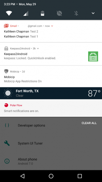
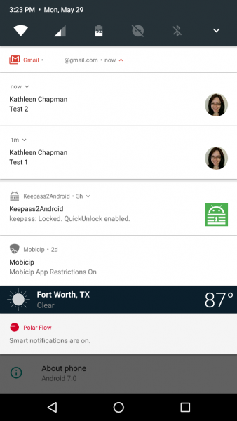
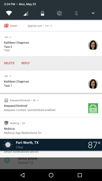
Android 7.0 now allows apps like Gmail to bundle their notifications in the notification shade (although not all apps do this). When you receive several emails, Gmail will group them together in the notification shade like that shown in the left screenshot above. If you pull down on the Gmail notification, it will separate each email as shown in the center screenshot above. And, if you continue to pull down on each email, you will be given the options to Delete or Reply.

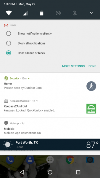
Now, to easily manage your notifications, you’ll need to pull down on the notification shade and long press on the notification you wish to customize. This reveals three options to choose from: “Block all notifications”, “Show notifications silently”, or “Don’t silence or block”. Pretty sweet, right?

But wait, that’s not all. What if you would like to prioritize your notifications in the notification shade by order of importance? Nougat allows you to do so via the Power Notification Controls available in the System UI  Tuner.


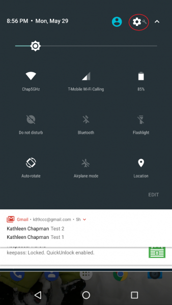
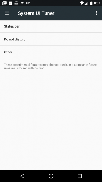
Where is the System UI Tuner? It is located in your device Settings (the gear icon located in the upper right corner after pulling down on the notification shade twice as shown in the left screenshot above) but it does not show up automatically so you will have to long press on the Settings gear icon for about five seconds then release. After you release, a message pops up saying, “Congrats! System UI Tuner has been added to Settings.” Another message warns you (after opening the Tuner) that it is “Fun for some but not for all. System UI Tuner gives you extra ways to tweak and customize the Android user interface. These experimental features may change, break, or disappear in future releases. Proceed with caution.” (Ooh, how I hope they don’t take this away!!!)

NOTE for HTC users who wish to access the System UI Tuner: Thanks to hasmujo on YouTube, there is a workaround for you to access the System UI Tuner. To do this you will have to download Nova Launcher (the free version is fine) if you don’t already have it installed.


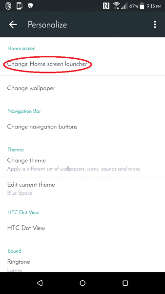
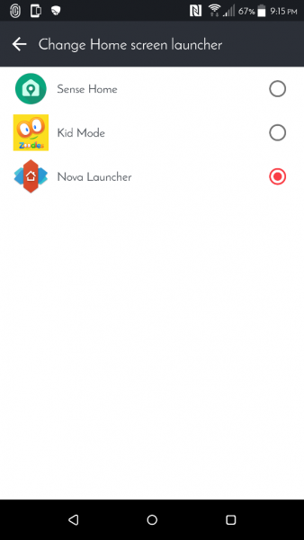
Once installed, you’ll need to set Nova Launcher as your new launcher by tapping on the following:

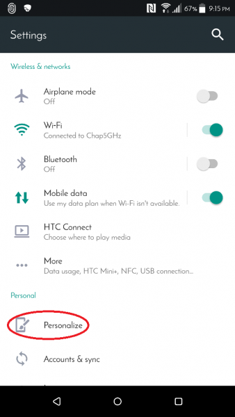
device Settings (gear icon) > Personalize > Change Home screen launcher > Nova Launcher (depicted in the screenshots above; you can revert to your previous launcher later once you’ve selected all the System UI Tuner settings you want).


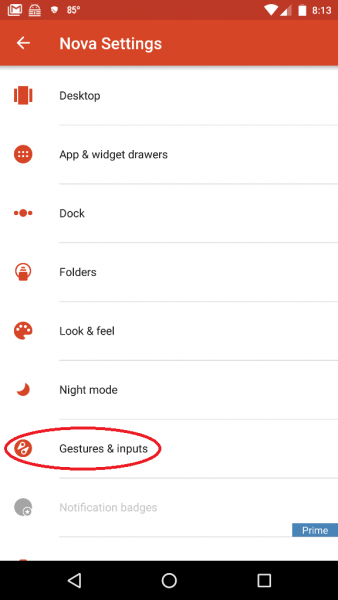
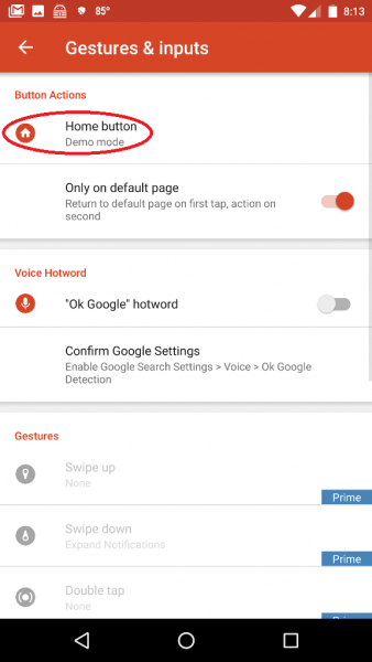
Now you’ll need to set up your phone’s soft Home key to launch the System UI Tuner. To do this you’ll need to tap on the following:

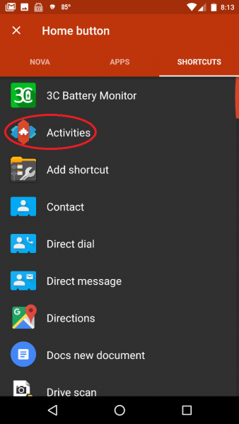
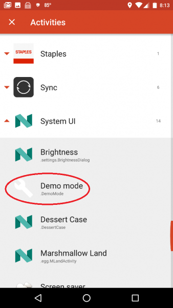
Nova Settings app (in the App Drawer) > Gestures & Inputs > Home button > Shortcuts (located at the top of the app screen next to “Nova” and “Apps”)> Activities > System UI > Demo mode (the steps are shown in the screenshots above which may be tapped on to view a larger size).

After setting up the Home button to launch the Demo mode System UI setting, you’ll then back out of all these settings then tap on the soft Home key on your phone (you might need to tap on the Home button twice if you weren’t already on your phone’s Home screen). This launches the System UI Tuner settings. Now back to Power Notification Controls…


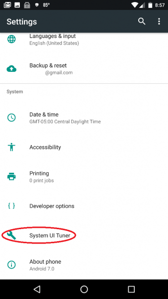
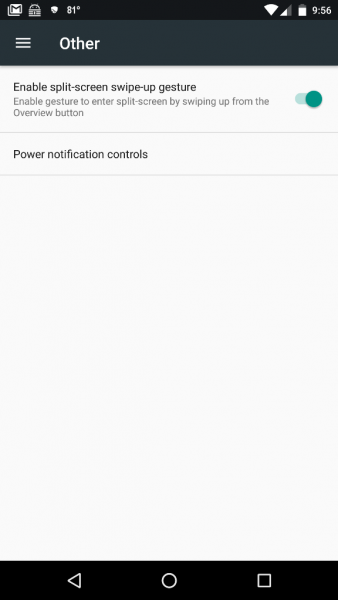
To navigate to and turn on the Power Notification Controls, you’ll need to go to the System UI Tuner settings by tapping on your device Settings icon (gear icon) > System UI Tuner (located near the bottom of the list) > Other > Power Notification Controls and slide the button to the On position (shown in the right screenshot above).


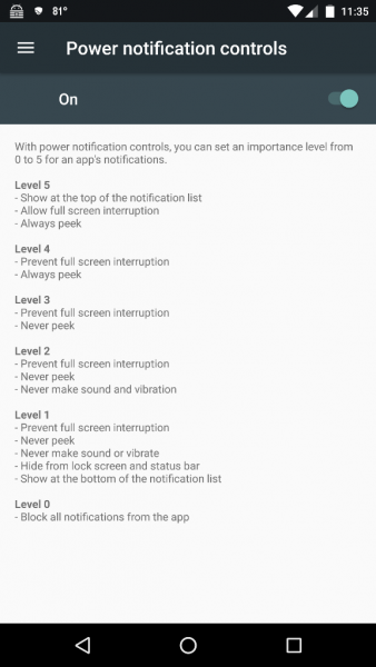
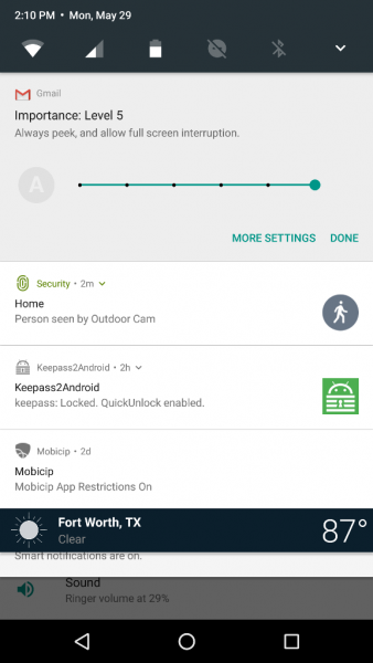
Now when you long press on a notification in the notification shade, you will see information like that shown in the left screenshot above. Each of the dots on the horizontal slider bar represents a notification importance level (shown in the right screenshot above):

  • Level 5
    • Show at the top of the notification list
    • Allow full-screen interruption
    • Always peek
  • Level 4
    • Prevent full-screen interruption
    • Always peek
  • Level 3
    • Prevent full-screen interruption
    • Never peek
  • Level 2
    • Prevent full-screen interruption
    • Never peek
    • never make sound and vibration
  • Level 1
    • Prevent full-screen interruption
    • Never peek
    • Never make sound or vibrate
    • Hide from lock screen and status bar
    • show at the bottom of the notification list
  • Level 0
    • Block all notifications from the app

Notice the grayed out “A” located on the left of the slider bar? When this is NOT grayed out, it means that the app automatically determines the level of importance for you. This is the default setting of installed apps, and you must tap on the “A” to be able to customize the level of notification importance. Voilà! There you have it – custom notifications!

Isn’t Android awesome? And it just keeps gettin’ better with time…

Filed in categories: Articles

Tagged:

Android 7.0 tips: Notifications and power notification controls originally appeared on on May 30, 2017 at 7:58 am.

Note: If you are subscribed to this feed through FeedBurner, please switch to our native feed URL http://the-gadgeteer.com/feed/ in order to ensure continuous delivery.

Julie’s gadget diary – No iPhone 8 till next year?


The Apple rumor mill is churning wildly today with news (should I call it fake news, if it’s still just a rumor?) that we might not see the mythical bezel-less iPhone 8 until 2018 instead of later this fall when Apple typically rolls out new phones. There appear to be problems in the supply chain with the availability of critical components.

This autumn (usually in September) won’t be completely devoid of new iPhones though, Apple will most likely launch the iPhone 7S and 7S Plus models.

-Queue the cricket noises-

Does anyone really care about iPhone 7s devices at this point when all the hype is for the iPhone 8? After all, wasn’t the iPhone 7 just an updated iPhone 6?

It’s true that I haven’t been an iPhone fan for several years, but that doesn’t mean that I don’t care about a potential delay for the iPhone 8. I’m always excited when Apple trots out a new device because I feel like there’s always the hope that it might be the one to seduce me back to the Apple empire.

What do you think? Bummed or meh?

[via The Verge]

Filed in categories: Articles

Tagged:

Julie’s gadget diary – No iPhone 8 till next year? originally appeared on on May 2, 2017 at 4:50 pm.

Note: If you are subscribed to this feed through FeedBurner, please switch to our native feed URL http://the-gadgeteer.com/feed/ in order to ensure continuous delivery.
Julie’s gadget diary – I have finally found my perfect travel computer

After years of trying and failing to force an iPad or Android tablet to work like a laptop when I travel, I have finally found what I think is going to be my perfect travel computer. The 12″ MacBook. I ordered a refurbished unit from Amazon last Friday and it was delivered Saturday morning. I’ve been using it since then and I am almost giddy about how much I like this laptop!

If you have been following my gadget diary posts for any length of time, you’ve probably grown tired of my whining every time I travel. I either moan about how my laptop is too bulky to carry through an airport or I cry about how my tablet won’t do Gmail the way I want in full desktop mode.

I’ve even annoyed myself year after year when I complain about the same issues. But it looks like I can move on thanks to Dave Rees and a some of you who have told me to check out the 12″ MacBook. I decided not to splurge for a brand new one but did like Dave had done and bought a refurb. He bought his through Swappa and I opted to order through Amazon’s Warehouse Deals.

With refurbs, you can end up with some scratches, dents or other wear and tear, but the one I ordered is perfect as far as I can tell.

Compared to the early 2015 13″ MacBook Pro that I’ve been using for over a year, the 12″ MacBook feels like an iPad when it comes to weight and size. The MacBook only weighs 2 lbs compared to the almost 3.5 lb MacBook Pro. 1.5 lb doesn’t sound like a lot, but it really makes a big difference to me.

I was concerned that the display and especially the keyboard would feel too tiny, but that hasn’t been the case at all. I’m completely happy with the display. It is a retina display after all.

The keyboard and trackpad feel very roomy. More so than I had anticipated. The keys on the keyboard are even a little larger than the keys on my MBP, but they don’t stick up as high. That took a little getting used to, but it didn’t bother me for more than an hour or so. Now I can touch type as fast as I do on other keyboards.

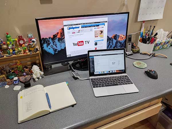
Yesterday I decided to order a Type-C dock adapter with HDMI, pass-through charging, and a USB-A port so I could hook the MB up to my 29″ LG monitor like I’ve done with the 13″ MBP using a LandingZone Dock. You might be thinking “Julie, why are you connecting this laptop up to a monitor when you’re just going to use it when you travel?” Good question! It’s because I am about 90% sure I’m going to make the 12″ MacBook my main/only computer. That’s right. I like it so much that I don’t think I even need my 13″ MBP any longer.

The Travel Inspira USB-C to HDMI Hub works great! It only offers HDMI and one USB-A port, but that’s fine. I don’t really plug that many USB devices into my computer anyway.

The HDMI output with this adapter is fantastic and looks better/sharper than my 13″ MBP using the LandingZone Dock’s HDMI connection.

I’ve installed almost all of the apps that I use on a regular basis: Photoshop, Chrome, iMovie, Garageband, Wondershare Filmora, OpenOffice, FileZilla, Canon EOS Utility, TypeIt4Me and more. So far I’ve not noticed any real lag or sluggishness from the MacBook’s mobile processor.  I haven’t done any video editing yet though…

I’m really happy with the 12″ MacBook and plan to use it for the next couple of weeks to see if there’s any reason why it can’t be my main computer. If it succeeds which I think it will, I’ll be selling my MBP.

Now I need to find a new bag to carry the 12″ MacBook. It’s kind of like when you get new rugs or carpet in your house and all of a sudden your couch looks shabby 😉 It’s time for a new bag too.

Filed in categories: Articles

Tagged:

Julie’s gadget diary – I have finally found my perfect travel computer originally appeared on on April 10, 2017 at 5:57 pm.

Note: If you are subscribed to this feed through FeedBurner, please switch to our native feed URL http://the-gadgeteer.com/feed/ in order to ensure continuous delivery.
Julie’s gadget diary – Thinking about buying a new laptop (or tablet) for my next trip

I had to take Jeanne to the hospital this morning for surgery to have her gallbladder removed. I went back and forth last night trying to decide if I wanted to lug my 13″ MacBook Pro with me, my Samsung Galaxy S Tab 10.5 or just my phone which is currently the LG G6 which I’m reviewing.

But I knew that I wanted to do a little Gadgeteer writing while I was waiting for her surgery to finish, so I didn’t want to just rely on my phone. So the internal struggle was really just about the full sized MBP laptop and the Android tablet.

I ended up leaving the MBP at home and took the Galaxy S Tab. I really enjoy the S Tab, but that’s only when I’m playing on it. By “playing”, I mean a few games of Words with Friends, catching up on my Feedly RSS feeds, Instagram, and stuff like that.

When I tired of those tasks and decided that I wanted to dig into some email reading and writing, and Gadgeteer writing, I started getting a little frustrated with the tablet’s lack of a physical keyboard. I even complained in real time about it with Dave Rees via Google Hangouts.

If you read the chat transcript above (click for a bigger view), you can see that I had a few typos. That’s because tablet touch style keyboards are a  big pain in the… fingers! I’m a really good touch typist, but only on a physical keyboard.

It’s great to be able to share the same first world problems over and over again with Dave. Let’s just say that after years of being friends, he just gets me when it comes to gadgets. Probably because he keeps dealing with the same issues as far as the best devices for travel.

My problem is that I really want to make a tablet work for me and just can’t seem to let go of that dream. I continue to revisit this same question every year about this time. What’s so special about this time of year? It’s a few weeks before our first vacation which we always take in May. Vacations require planning. Jeanne plans where we’ll go and planning for me involves the gear that I plan to take with me.

I’ve tried the iPad Pro, a Windows Surface Pro, and a Samsung Galaxy S Tab. It’s time to FINALLY find an ultra light weight laptop with a full sized keyboard that lets me use the laptop on my lap and not just on a table.

Although I’m not a huge fan of Windows 10, I can deal with it if the solution is a better buy than Dave’s suggestion of a used 12″ MacBook.

It’s time to start researching options before I run out of time before the trip. Wish me luck!

Filed in categories: Articles

Tagged:

Julie’s gadget diary – Thinking about buying a new laptop (or tablet) for my next trip originally appeared on on April 6, 2017 at 3:56 pm.

Note: If you are subscribed to this feed through FeedBurner, please switch to our native feed URL http://the-gadgeteer.com/feed/ in order to ensure continuous delivery.
Julie’s gadget diary – I just held a Samsung Galaxy S8+ and I liked it

Two days ago after Samsung unveiled the new Galaxy S8 and S8+ phones, I wrote that I’d be staying up and pre-ordering one at the crack of dawn the next day. As it turned out, I didn’t pre-order one because I found out that I would not be able to order an unlocked phone until May 9th.

I wasn’t that tore up about not being able to pre-order because I knew I’d be able to test drive one from Verizon at the end of April when they start shipping on 4/21. I also knew that a shiny new LG G6 loaner unit would be waiting for me on Thursday. New toys make it easier waiting for future toys.

Today I decided to stop by my local Best Buy after work because it was on the way to my accountant where I had to pick up my taxes. The reason why I wanted to stop at Best Buy was so I could check out the Samsung Galaxy Tab S3 in person. But I got an even better surprise when I walked in and saw a big Galaxy S8 and S8+ display. It didn’t really occur to me that they would already have them in the store.

I got to try both sizes and was really surprised how similar they look and feel. I kept having to check the sticker on the back of the phone to see which one I had in my hand.

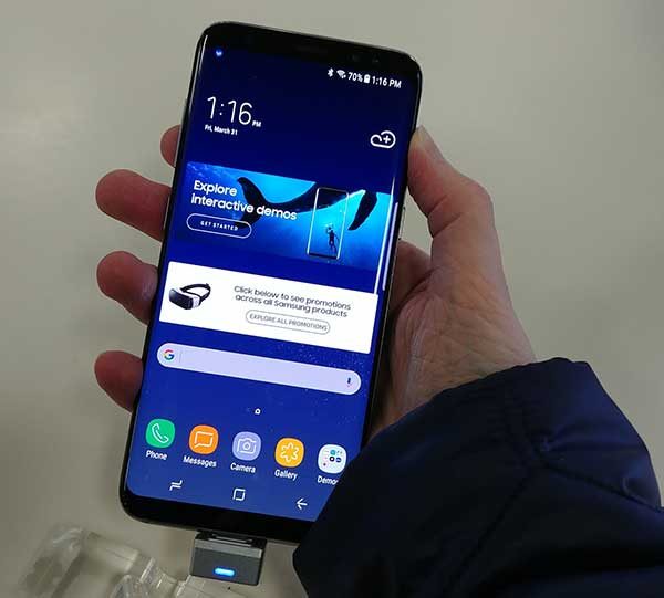
I never liked the Samsung Galaxy S6 Edge and Galaxy S7 Edge devices because my palm would accidentally touch the curved edges of the display causing weird behavior. I didn’t notice that issue with the S8+ (shown above) or the S8 (shown below). At least not during the few short minutes that I played with each phone.

I will tell you that two things were immediately apparent to me upon holding the devices. One thing I love and one thing I hate.

I love Samsung’s displays. They really do make every other smartphone’s display look anemic in comparison. Some people might not fancy the vivid, almost over saturated displays, but I kinda love them.

I love the displays but I hate the slimy, smeary, fingerprinty feel of the back of the phone. Ick. That said, the LG G6 that I started testing has the same issue. If I do end up buying an S8+ (that’s the one that I’m leaning towards now that I’ve actually held one), I’ll have to put a skin on the back like the “leather” dbrand skin that I have on my Nexus 6P.

Other than not liking the back of the phone, I found the S8 and S8+ to be comfortable to hold and oh so pretty to look at. Where the S8 devices feel like slab of glass in my hand, the Nexus 6P feels more like a slab of steel. I prefer the feel of the 6P, but that won’t keep me from probably buying an S8+.

I really am looking forward to using one for a few weeks when I get the chance to get one to review.

I was disappointed that Best Buy didn’t have a DeX dock because I’m really interested in trying one.

Oh, I also checked out the Samsung Galaxy Tab S3 which was my main reason for stopping at the store. Really thin and light. I’m tempted… I wish my current S Tab 10.5 would just die already so I wouldn’t feel guilty buying a new one!

Anyone else had a chance to see and touch one of the S8’s in the wild yet? Thoughts?

Filed in categories: Articles

Tagged: ,

Julie’s gadget diary – I just held a Samsung Galaxy S8+ and I liked it originally appeared on on March 31, 2017 at 4:32 pm.

Note: If you are subscribed to this feed through FeedBurner, please switch to our native feed URL http://the-gadgeteer.com/feed/ in order to ensure continuous delivery.