 If you’ve been reading The Gadgeteer for any length of time, you know how I like to drone on and on about how I can’t use a tablet or smartphone as my only “computer” when I travel because of one main reason. That reason is Gmail. I use Gmail as my email client of choice and I consider myself as a power user. On my laptop, I can use multiple inboxes, canned replies, all the stars, and 100’s of labels to organize and keep track of things that I need to get done using the web version of the Gmail app.
The problem is that I can’t completely unplug from tech when I travel because my inbox would quickly become a disaster within a day due to the number of emails that I receive. Yes, I know that there is a perfectly fine mobile Gmail app. I’ve used it for years. But for some insane reason, Google doesn’t provide the mobile version of the Gmail client with the same power user features as the desktop version of the app. With the mobile Gmail client, I can’t create multiple inboxes by using a dozen different colored stars, I can’t use canned replies, and worst of all, I can’t easily search for messages with certain labels or file emails with existing labels or create new labels. So I end up taking my laptop with me whenever I travel which means that I easily get sucked into wanting to work when I am supposed to be relaxing. Or at least I did that in the past. I’ve recently come one step closer to being able to leave my laptop home since discovering Newton Mail.
What’s Newton Mail?
Newton Mail is an email client for iOS, Android, Windows, and macOS that you can use with different mail services like Yahoo, iCloud, Hotmail, Outlook, and others including Gmail.
Features and usability
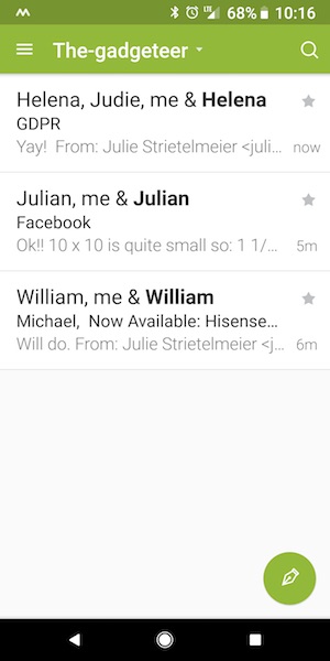
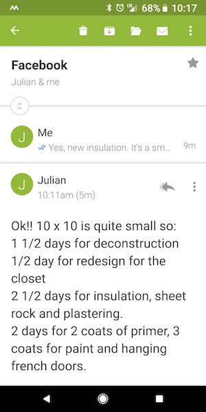
Newton Mail has all the features you’d assume an email client should have like the ability send and receive emails. Duh. But it has other features that make it the perfect email client for me and my obsessive compulsive email filing disorder. Yes, that’s a thing… or it should be a thing.
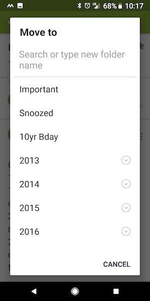
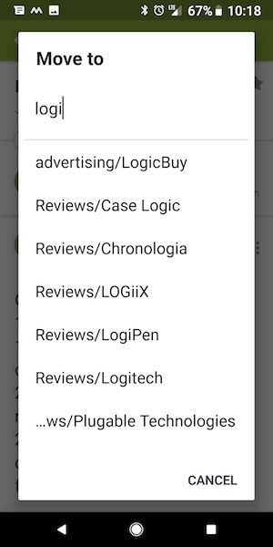
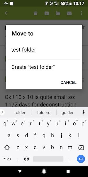
Newton allows you to tag an email to a label without having to scroll through a list of 1000’s of labels just to get to the one you need. Instead, you can start typing the label’s name to narrow down the list. AND, you can create new labels. It sounds so trivial, but this is the first mobile Gmail client that I’ve found that allows you to do this and that’s why I’m so happy to have found it! Being able to type in the label name without having to manually find it saves me a LOT of time.
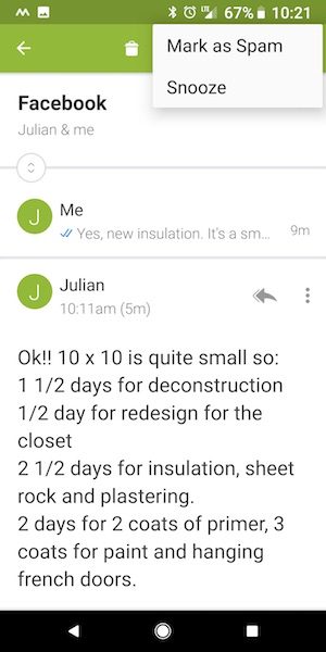
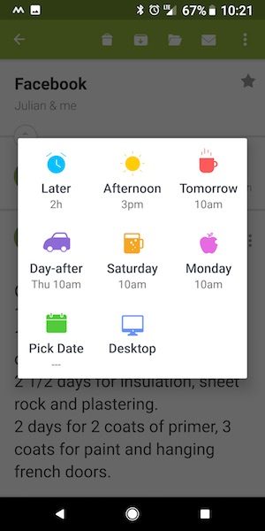
In addition to that very important feature, Newton Mail includes other great features that you I haven’t found with other email apps. One of those features includes the ability to snooze a message. When you snooze a message, it will disappear from your inbox and reappear later at the time, date, or on the platform that you specify. I’ll admit that this isn’t a feature I use because I like to take care of things as they appear. But I do see it as a useful feature that I may add to my workflow at some point.
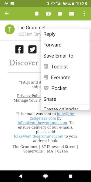
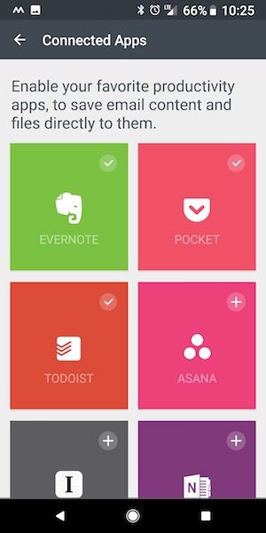
Newton will also allow you to save messages to your favorite productivity apps like Evernote, Todoist, and more.
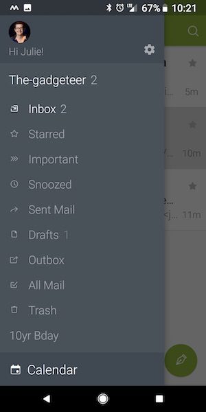
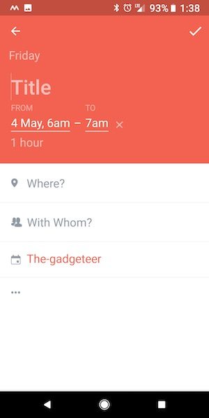
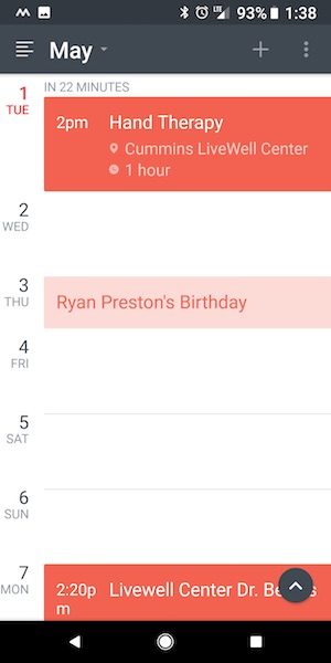
Calendar access is integrated into Newton Mail too, which means that you can easily pull up your calendar without leaving the app, and you can even create events from within an individual email.
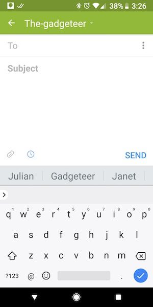
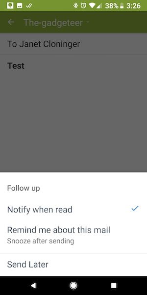
I also like that the app suggests people to send an email to when you compose a new one. If you click the little blue clock icon, you can toggle read receipts, reminders if the person doesn’t get back to you in a specified time, or you can schedule the email to be sent later.
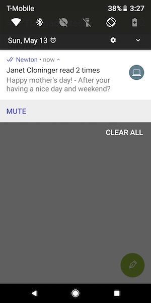
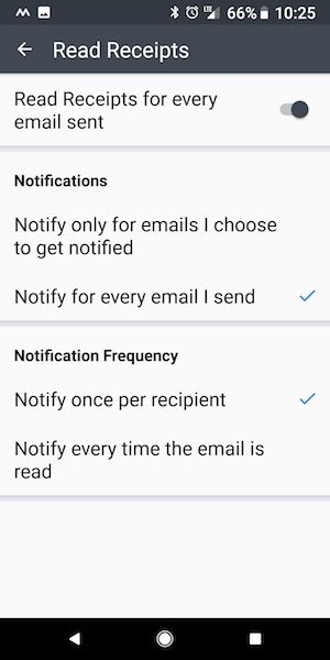
I really like the read receipts so you’ll know when someone has read your email after you’ve sent it to them. You can toggle the read receipts to happen for all emails or on an individual basis if you don’t want to be bothered with too many notifications.
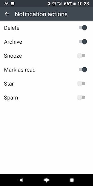
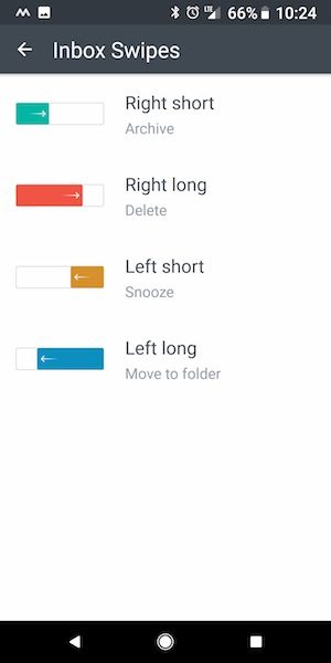
Speaking of notifications, you can even customize how those are handled when you swipe them in the inbox. There are 4 types of swipes for each message and each one can have its own action. Cool right?

All of these features help me achieve email nirvana, which for me means inbox zero or for those who haven’t heard that term, it just means that my inbox is empty and all the messages are stored where they should be.
I’ve been using Newton Mail for the past month and love it. They recently introduced a new feature that they call conversation view which they say gets rid of the sent folder because all the emails to the same person are grouped together including the message that you sent to start the email thread. This keeps you from having to go into the sent folder to look for messages.
I tried this new feature for a few days and didn’t care for it so I turned it off because it made my inbox more cluttered than I liked. I can see the advantages of having your original email in the same place as the responses, but that’s not a priority feature that I care about.
But all this yummy email goodness comes at a price
I’m not a penny pincher, but I don’t like paying for a 100 different subscription services. That’s why I ditched Nest security cameras in favor of WyzeCams and it’s why do regular audits on services I pay for but don’t use enough to justify the monthly or yearly subscription price. Some examples include Hulu. I dumped it when I started using Chromecast from my phone to watch shows on my 65-inch TV and it wouldn’t cast the audio along with the picture. So it went bye bye. I also dumped Evernote when I realized that I was paying $50 per year for a service I was rarely using.
So would I pay $50 per year for Newton Mail just for a handful of features that are missing from the free Gmail app from Google? While I wish the price was less than it is, I think that Newton Mail is completely worth it for me just for the time I save dealing with email when I’m mobile.
What I like
I like Newton Mail because it’s similar to the Gmail app that I know and love but on steroids. The easy label lookup, filing, and the creation of new labels is my absolute favorite feature, but the read receipts is a close second. Add in the ability to snooze emails and send them later and all the other little extras and Newton Mail has swiftly become my favorite email app.
What needs to be improved
While I really enjoy Newton Mail, it isn’t perfect. There are a few features I wish it had to make it even better. Canned responses and multiple stars like the Gmail web app would be awesome as well as Gmail’s reply prompts. Those features would just be icing on the cake though.
Final thoughts
If you consider yourself a Gmail power user and have been let down by Google’s stock Gmail mobile app, you should definitely try Newton Mail. I think you’ll be impressed. Give it a try, you won’t be disappointed. You can test it for 14 days for free.
Price: $49.99 a year (14-day free trial)
Where to buy: Newton
Source: A free membership for this software was provided by Newton.
The post Newton Mail review appeared first on The Gadgeteer.
Filed in categories: Reviews
Tagged: Apps, Email, Gmail
Newton Mail review originally appeared on The Gadgeteer on May 14, 2018 at 1:00 pm.
Note: If you are subscribed to this feed through FeedBurner, please switch to our native feed URL http://the-gadgeteer.com/feed/ in order to ensure continuous delivery.


 If you’ve been reading The Gadgeteer for any length of time, you know how I like to drone on and on about how I can’t use a tablet or smartphone as my only “computer” when I travel because of one main reason. That reason is Gmail. I use Gmail as my email client of choice and I consider myself as a power user. On my laptop, I can use multiple inboxes, canned replies, all the stars, and 100’s of labels to organize and keep track of things that I need to get done using the web version of the Gmail app.


 Is there an app that can figure out what makes you happy, productive, and active? Hello Code’s Exist for iOS and Android thinks it can. This app gathers data from your Twitter account, email account, local weather, Google Fit, Withings, Fitbit, Instagram, Facebook, and other accounts to draw conclusions about your moods and behaviors.