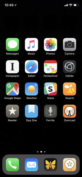
Regular readers of The Gadgeteer know that there is an ongoing – umm – discussion among the writers and regular commenters here about the two most popular mobile operating systems – Android and iOS – and which has the better feature set. I’m not here to stoke those fires or to say if the feature I’m showing is even worthwhile. I’m just here to make this community aware of a workaround available to mitigate one feature missing from iOS that seems to be high on the list of items Android users prize. What “feature” is this? Being able to place an icon anywhere you want on a screen, rather than being limited to the top-left-to-bottom-right regimentation of the iOS icon arrangement grid. How is this magic accomplished? As it turns out, it’s not really alchemy, and requires no slaughter of any animals or visiting graveyards at midnight. It does require that you set your background to a solid black, however. My friend, Manton Reece, recently featured a blog post pointing to the process below. He uses it to bring the entire set of apps on his home screen down a row, but you can put gaps anywhere.
David Smith has created all the pieces you need at his blog. Basically, you just set the background to black and put in black icons with no name everywhere you want to have a gap. So, there really is something in that gap, but, since it’s the same color as the background, has no display name, and does nothing if you click on it, it’s essentially a blank spot on your SpringBoard. But your eyes don’t see it.

