Homiee BP1003 blood pressure monitor review

REVIEW -Remember in The Lion King, when the hyenas, Shenzi, Banzai and Ed, say,

“Mufasa”
“Ooooo, do it again”
“Mufasa”
“Ooooooo”
“Mufasa, Mufasa, Mufasa”

It’s just fun to say.  Kinds of like, “sphygmomanometer”.  OK, maybe that’s a little more difficult than “Mufasa”, but it’s still a fun word.  What is it, you ask?  That’s the official, hoity-toity medical word for a blood pressure cuff.

One of the most important health indicators is blood pressure. High blood pressure means that there is too much resistance in your arteries and that can increase your risk for stroke, heart attack, and heart or kidney failure. Low blood pressure can predict future heart issues.

Other than going to a local grocery store and use that public blood pressure tester with questionable cleanliness and accuracy, what is a health-conscious person to do if they want to keep tabs on their blood pressure regularly? Homiee has the answer with their reasonably-priced BP1003 home blood pressure monitor.

What is it?

The BP1003 is a battery-operated, automatic blood pressure and pulse monitor. It can store 120 individual readings for two different users.  It can also detect atrial fibrillation (AFib) – a quivering or irregular heartbeat.

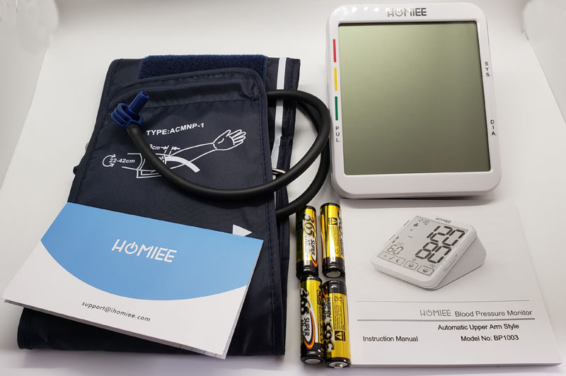
What’s in the box?

  • BP1003 monitor
  • Adjustable cuff
  • 4 AA batteries
  • Welcome card
  • Instruction manual

Hardware specs

  • Dimensions: 4.7 x 3.9 x 6.3 inches
  • Weight: 1.32 pounds
  • BP accuracy: +/- 3mm Hg
  • Pulse accuracy: +/- 5%
  • Memory: 120 readings for each of two users (about 8 weeks of 2 x daily readings)
  • Cuff size: 9″ – 17″

Design and features

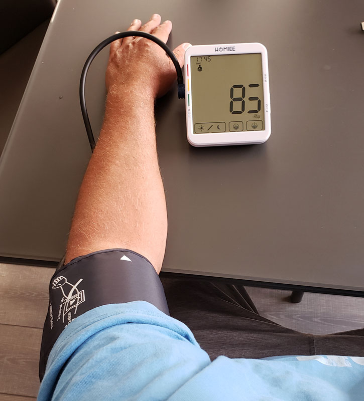
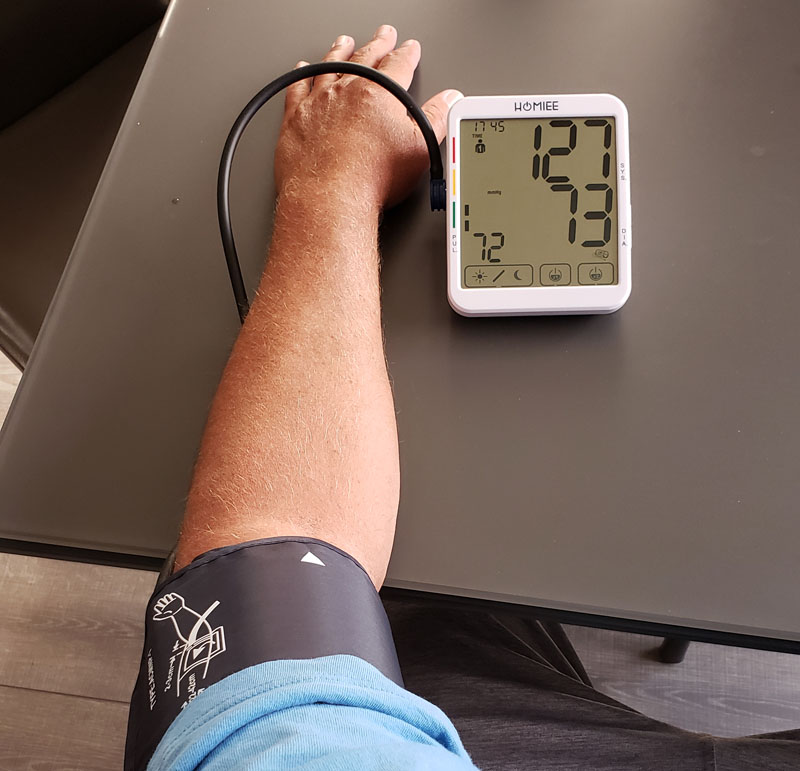
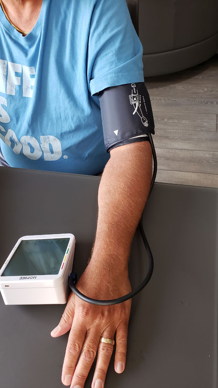
The main unit is a solidly constructed wedge design, meant to keep the display aimed comfortably at your eye when you are seated and the unit is on a table.  It works for me.  The cuff is adjustable and secures with several inches of overlapping velcro, making it easy to get your arm in and snug up the cuff.  The cuff’s hose is long enough to allow you to comfortably have your arm resting with the monitor in front of you.

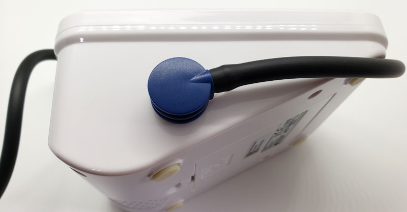
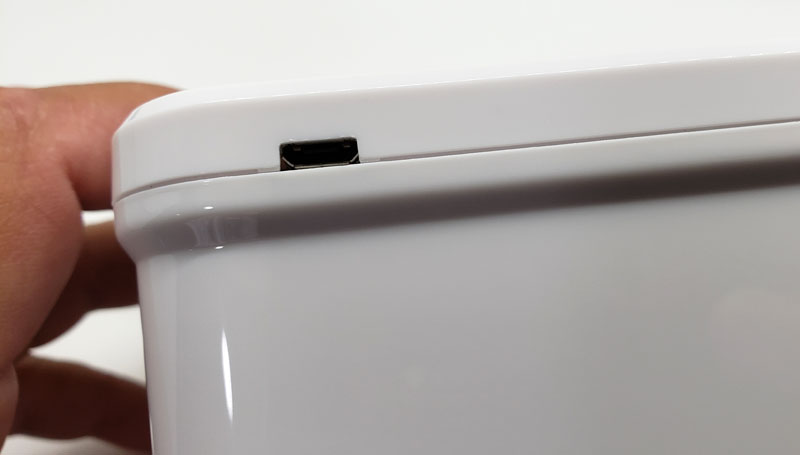
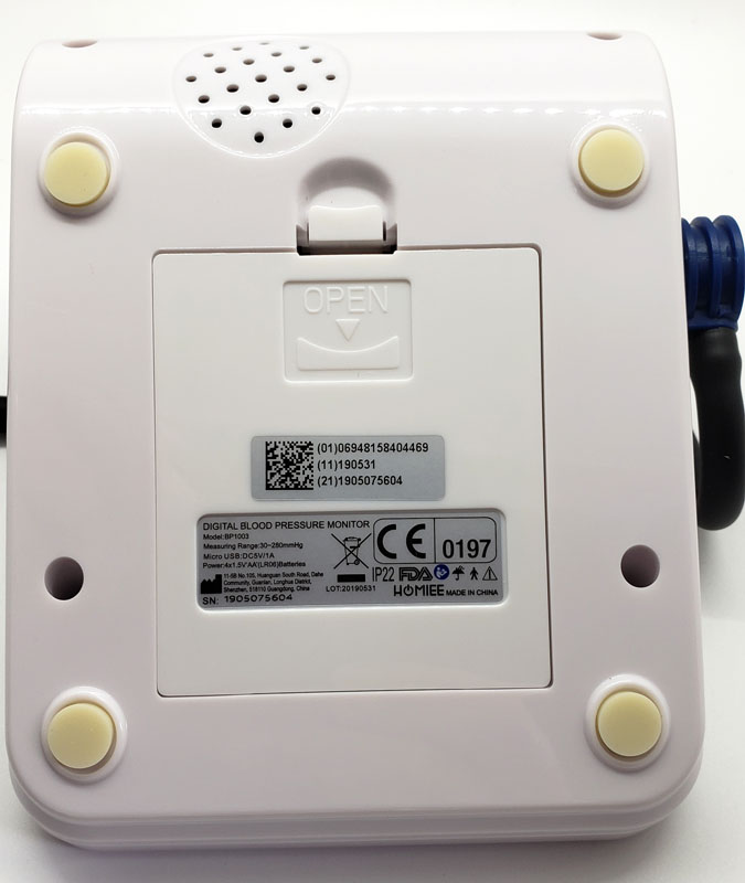
On the back, we find a micro-USB port.


Interestingly, there is nothing in the manual about it.  Online, I discovered that it is a power port if you elect to eschew the convenience of batteries and tether yourself to a wall plug. I won’t be doing that.

Setup

Setup starts pretty simply.

Install the included 4 AA batteries in the back battery compartment.

Plugin the cuff hose.

Then, the setup gets a little more complicated.

On the right side of the unit, we find two buttons:

They are cleverly labeled “M” for memory to access the stored readings and “L” for setup. OK – I don’t get that last one, but that’s what it is. To complete the setup, hold the “L” button until the user icon flashes.  Hitting “M” when something is flashing changes values. Hitting “L” changes the active parameter. So, hit “L” to get to the year and “M” to set it, “L” to get to the month and “M” so set it, “L” to get to the day, and so on. This continues for the hour, minute and measurement units – millimeters of mercury (mmHg) or kilopascals (KPa). Your doctor most likely uses mmHg. This is the same process used to changes from user 1 to user 2.  Suffice it to say that the user interface needs some tweaking.

Performance

First – a note about the photos. Any missing segments on digits are an issue with the photo and not the unit.  LCDs flash a little bit.  While this isn’t visible to the naked eye, a camera’s shutter can open at just the wrong time and a segment may appear to be off when it is actually on to the eye.

After putting on the cuff, you press the “x1” or “x2” button to start a blood pressure reading. More on the “x1” and “x2” button later.


Like all blood pressure units, the cuff inflates beyond where it needs to be to read the pressure, and then slowly deflates while it records the systolic number or top number, followed by the diastolic or bottom number. The systolic number measures pressure inside your arteries during a heartbeat while the diastolic number measures that same pressure between beats.  Once both numbers are recorded, the cuff deflates completely and the reading is complete.

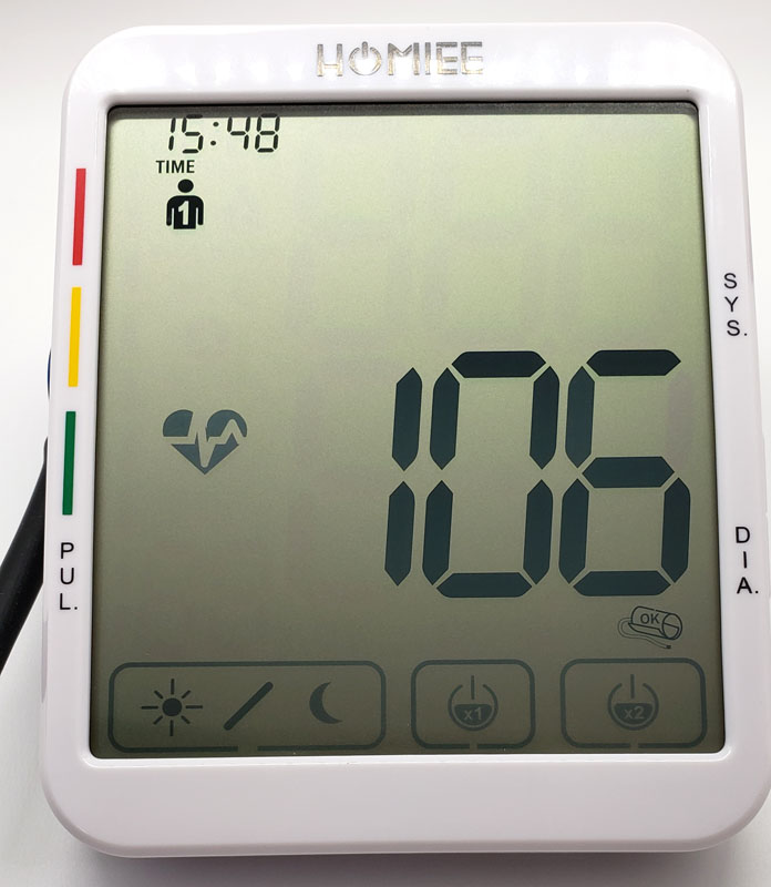
The large pressure numbers count down as the pressure is released.

While readings are being taken, the heart icon on the left flashes as it detects heartbeats.  This indicator turns off after the reading unless it defects AFib. In that case, it will remain on and will also show when you review historical readings where AFib was detected.

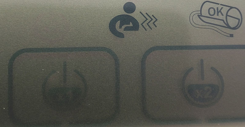
If you move your arm too much during a reading, the person icon shows up to remind you to sit still.  To the right of that is the OK icon, indicating that the cuff is properly attached.  It will indicate if the cuff is too loose, ensuring that you get a good reading.

Once you get a good reading, the display shows your systolic and diastolic numbers in large, easy to read numbers, Your pulse is shown in the lower left in smaller numbers.  A vertical bar graph along the left indicates if you are in the green (normal), yellow (at risk) or red (see a doctor – now!) zones.

One problem with blood pressure readings is that they are notoriously variable.  I was at my doctor’s office and a nurse took it the old-fashioned way with a manual cuff and stethoscope. It was abnormally high so another nurse took it the same way five minutes later and got results 10-15 points lower on both numbers.  Automated monitors suffer from the same variability.  Homiee has an answer for that.

Remember the “x1” and “x2” buttons?

Pressing x1 will a single reading.  Pressing x2 runs a reading, pauses for a few seconds and then runs a second reading.  It then averages the two providing what should be a more accurate overall reading by allowing for the small variances that happen naturally.  I really like this feature.

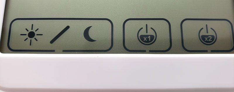
To the left of those buttons are the day and night buttons. Pressing these provides overall eight week averages and weekly averages for daytime or nighttime measurements.

To change users, as mentioned above, hold the “L” button for three seconds until the user icon flashes and then press the “M” button to change users.

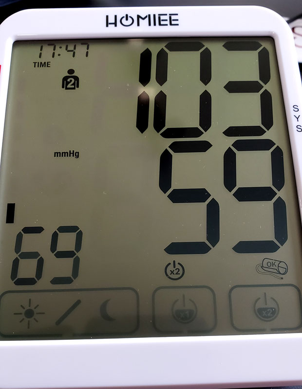
Here we see a user #2 reading for my lovely, and low-pressure wife.

When you aren’t in reading mode, pressing the “M” button will cycle through the last 120 readings for the selected user.  Time and date are shown for each reading along with the AFib indicator if AFib was detected for that reading.

One thing to note is that the display never shuts off.  It always displays the time, user, and the buttons along the bottom. LCDs have a very low power draw, so that shouldn’t affect battery life in any meaningful way.

Another user interface issue for me is that there is seemingly no way to get out of memory review other than wait for the unit to power down and revert to time display mode. After fiddling a bit, I discovered that hitting the “x1” button reverts the unit into reading mode without actually starting a reading.  Again, poor user interface design.

Finally, holding the “M” button for several seconds will wipe out all stored readings.

What I like

  • Accurate
  • Super easy to read
  • Good memory for tracking trends
  • The double reading averaging feature

What I’d change

  • The user interface needs to be improved and simplified – especially for switching users.

Final thoughts

We should all be aware of our blood pressure.  For a healthy person, once a year readings during your annual physical can suffice.  But as we age, or are otherwise at risk for health issues, that need becomes more critical.  The Homiee BP1003 is a capable unit that can help you track your blood pressure and watch for any trends that might warrant a trip to the doctor.

Sphygmomanometer
Oooooo, do it again!
Sphygmomanometer
Oooooooo
Sphygmomanometer, sphygmomanometer, sphygmomanometer!

Price: $49.99
Where to buy: Amazon
Source: The sample of this product was provided by Homiee.

Filed in categories: Reviews

Tagged:

Homiee BP1003 blood pressure monitor review originally appeared on The Gadgeteer on August 13, 2019 at 9:00 am.

Note: If you are subscribed to this feed through FeedBurner, please switch to our native feed URL http://the-gadgeteer.com/feed/ in order to ensure continuous delivery.

BenQ ZOWIE XL2411P 144Hz 24-inch e-Sports Monitor review

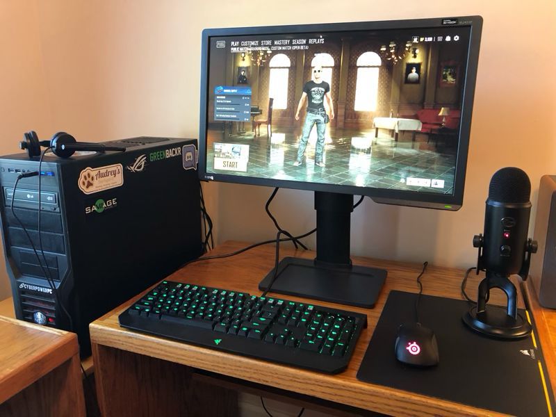
REVIEW – Without a doubt, the two most important components of a good gaming system are the video card and the monitor.  The monitor is what gamers are looking at while playing, and the video card is what renders the games on the monitor.  When I designed my current system, I included a GeForce GTX 1070 Ti, a solid, mid-range video card.  For a monitor, I use a Dell UltraSharp U2715H.  This monitor is a compromise for a gaming system.  On the one hand it’s wonderfully large (27 inches), has great resolution (2560 x 1440), and includes a wealth of ports (including DP, mDP, 2xHDMI, 5xUSB); on the other hand, it has a60 Hz refresh rate and a lethargic 8 ms response time.  It’s a great general-purpose monitor, but it’s not ideal for video gaming, especially for fast-paced, first-person shooter (FPS) games.  This is why I was super excited to get an opportunity to review the BenQ ZOWIE XL2411P gaming monitor.

What is it?

BenQ is a Taiwanese company that sells projectors, monitors, speakers, gaming accessories, and other digital products.  ZOWIE is their line of gaming products, and the XL Series is their premier line of monitors targeted at competitive esports gamers.  The BenQ ZOWIE XL2411P is an entry-level gaming monitor that offers good specifications at a reasonable price point.  It’s targeted at video gamers, especially those who play competitive FPS games like Overwatch, CS: GO, and Rainbow Six Siege.

What’s in the box?

  • The monitor (aka the panel)
  • The base
  • The stand arm
  • Power cord
  • Display port to display port video cable

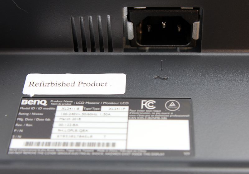
Surprisingly, there were no manuals, quick start guides, or CD-ROMs included with the monitor.  It’s possible that they were not included because BenQ sent me a refurbished monitor instead of a new one.

Hardware specs

  • Panel Type:  TN
  • Refresh Rate:  144 Hz
  • Response time‎:  1ms (GtG)
  • Resolution:  1920 x 1080
  • Pixel Pitch:  0.276 mm
  • Size:  24 inches
  • Aspect Ratio:  16:9
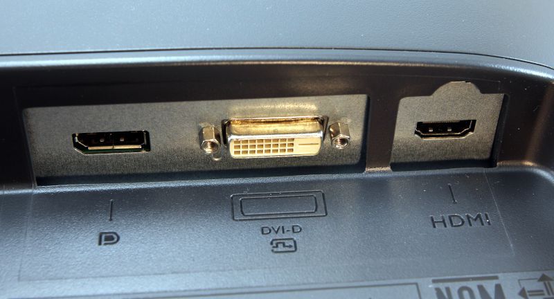
  • Video Ports: DisplayPort, DVI-DL, and HDMI
  • Other Ports:  Audio jack
  • VESA mount:  100 x 100 mm
  • Panel Dimension:  22.5 x 13.5 inches
  • Max/Min Height:  22/17.5 inches
  • Weight:  12.8 pounds

Design and features

When it comes to consumer products, some companies have a “form over function” design philosophy—I’m looking at you, Apple.  With the XL2411P, BenQ has taken the opposite approach of “function over form.”  It’s made out of black plastic, has a nearly ¾-inch bezel all the way around, and doesn’t have any sort of visual bells or whistles.  You might say it’s rather pedestrian to look at.  But this is totally ok, because BenQ has decided to invest in what’s really important for gaming:  The panel.

Installation and setup

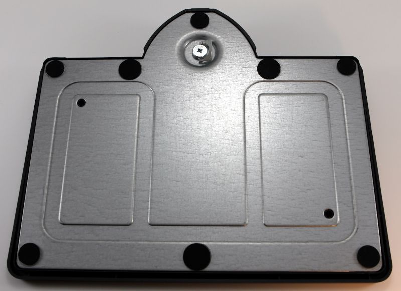
The first step for installation is to connect the arm onto the base.  On the bottom of the base is a thumbscrew.  I inserted the arm into the base and tightened the thumbscrew until it was snug.

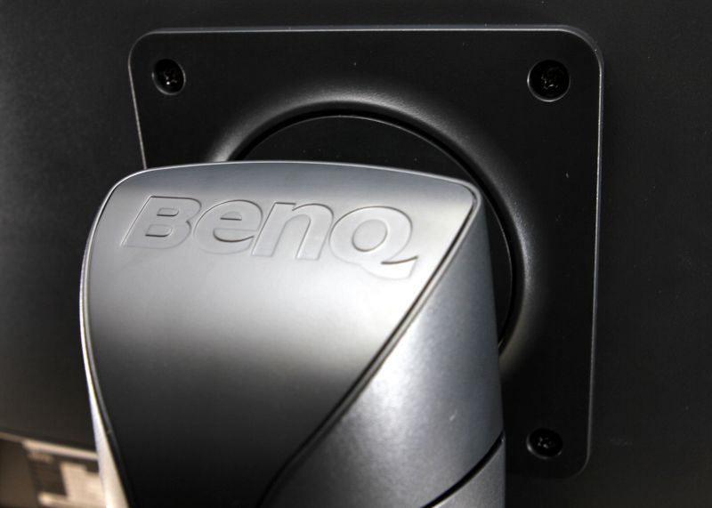
The second step was connecting the panel to the arm, which I found easier to do with the help of a second person, and it requires a medium-sized Phillips screwdriver (not included).  I removed the four screws from the back of the panel, and while my wife held the panel up to the arm, I reinserted the screws.  All of these pieces seem very solid and sturdy; short of giving it a good, hard shove, this monitor’s in no danger of tipping over.  The base has a built-in little tray for storing small items; I promptly put the remote to my speakers in there.

The third step was to insert the power cable and the video cable.  I used the display port cable to connect it to my computer.

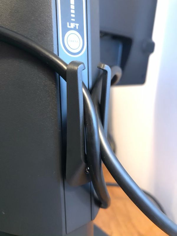
On the back of the monitor arm is a pair of small plastic arms used for cable management.  When I tucked the power cable and the video cable into them, however, they warped and looked like they were going to snap off, so I removed the cables and just left this alone.  I prefer the hole-in-arm solution that their XL2430 monitor uses, which is also what my Dell uses.

This monitor is quite flexible.  The panel can be raised up 4.5 inches by pressing the height release button on the back of the arm, and it can be freely tilted in any direction up, down, left, or right.  This allowed me to position the monitor in my optimal viewing position.

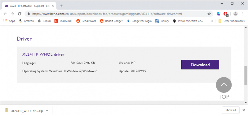
When I started up my computer, Windows 10 used a default driver for the monitor, and that worked, but as it’s a gaming monitor, I thought it would be best to install a specific driver.  I found a driver on BenQ’s website and installed it.

When I turned this monitor on, the first thing I noticed was that the colors were really washed out in comparison to my Dell, and there were two reasons for this.  The first reason is that my Dell is an IPS panel, whereas the XL2411P is a TN panel.  IPS panels are known for their color accuracy, whereas TN panels are known for their fast response time.  There’s also a third type, a VA panel, that takes a middle road.  The BenQ monitor has a much crisper image, especially when objects are moving quickly in a game, but the colors are likely to be less vibrant.

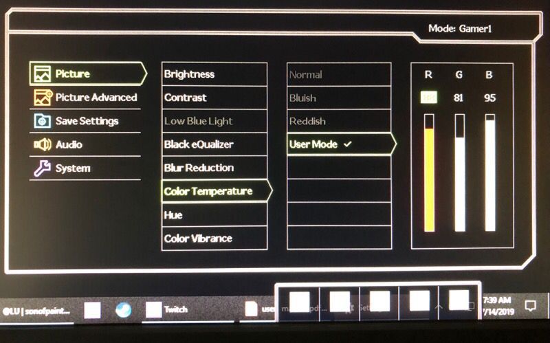
The second reason is that the default settings for the monitor are less than ideal.  The XL2411P has a host of settings that you can use to adjust the display image, including brightness, contrast, color temperature, hue, color vibrance, and sharpness.

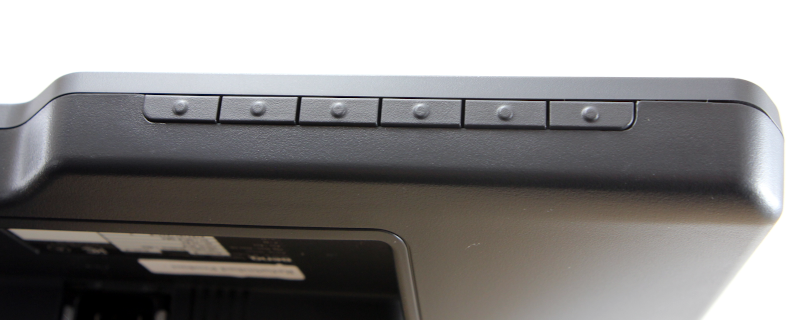
This monitor has 8 pre-defined groups of settings, which it calls picture modes.  You can test any of these, but if none of them suit your fancy, you can choose your own settings and save it in one of three slots.  The modes and settings can be configured with the control keys found on the lower right of the monitor.

With so many choices, it can be a bit intimidating to figure out what the optimal settings should be. The good news is that a host of other people have had this same issue, and a quick search online returns many suggestions.  I tried a few of the suggestions and then began tweaking things until I found a set that worked for me.  If you buy this monitor, you’ll definitely want to spend some time tweaking it for your own tastes.

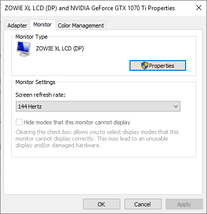
The final step in setting up the monitor was to set the refresh rate.  On Windows 10, I found this setting by going to:

  • Settings
  • System
  • Display tab (on the left)
  • Advanced Display Settings
  • Display Adapter Properties (which opens a new window)
  • Monitor tab

Set the screen refresh rate to 144 Hertz.

If you want to learn more about this monitor, you can download and read the user manual.

Panel Features

The XL2411P has a refresh rate of 144 Hz.  The higher the refresh rate, the more images per second, the smoother the game appears to be.  60 Hz is fine for ordinary activities; 144 Hz is great for gaming, especially for FPSs; and 240 Hz is for those at highest levels of competitive gaming.

This monitor has a response time of 1 ms (GtG).  The grey-to-grey (GtG) response time is a measurement of how long a pixel takes to changes colors.  The lower the value the better, and the higher the refresh rate, the more important it is to have a lower response time.  Low response times prevent ghosting, which is where fast-moving objects on the screen leave a trail behind them as they move across the screen.  Most monitors are under 10 ms; my Dell, for example, has a response time of 8 ms.  Gaming monitors should have 5 ms or less, and a 1 ms response time is good.   To achieve a 1 ms response time, the XL2411P has a feature known as advanced motion acceleration (AMA) that must be enabled using the control keys.  This drives more voltage to the liquid crystals, thus producing images faster.

BenQ’s monitor also has a feature known as the Black eQualizer.  In some games, enemies will tend to hide in dark corners of the map in order to ambush other players.  The Black eQualizer can be used to lighten up these dark spots, making it easier to see other players.  This will slightly decrease overall image quality, but that’s a small price to pay for avoiding ambushes.

It’s Color Vibrance feature makes it possible to tune the colors so that images are more realistic and colors are more vibrant.  This is more of a “personal preference” feature than it is a “make the game easier” feature.  It’s Flicker-Free Technology is an eye strain reducing feature.  Normally LED panels don’t have flickering, but apparently, it can be an issue when using poor cabling or outdated graphics cards, and this can cause eye strain when gaming for a long time.  The XL2411P eliminates this flicker, thus increasing eye health and comfort.

My Testing

Reading a list of features is fine, but the real test comes when playing games.  I began by testing the monitor with Dota 2, a multiplayer online battle arena (MOBA).  First, I tried various ways to create rapid movement, such as panning back and forth and zipping around with Storm Spirit’s ultimate.  Second, I played many games, switching back and forth between my Dell monitor and the BenQ ZOWIE monitor.  When it comes to movement and refresh rate, I honestly can’t tell any difference between these monitors.  I doubt this due to any lack in the XL2411P; rather, I think this is more about Dota, which is a slower-paced game that doesn’t take advantage of the XL2411P’s capabilities.  I can, however, see a difference in appearance.  Dota is sharper and more vibrant on the Dell, which is probably due to it having an IPS panel and a higher resolution.

I continued testing with Player Unknown’s Battle Grounds (PUBG), a battle royale game, using a first player perspective (FPP), my personal preference.  In this game, I can definitely tell a difference.  When looking around in game, I can visibly see the game refresh faster with XL2411P.  Trees and rocks look crisper, and cars that are driven are clearer.  Now if the monitor could help me shoot straighter, that would be something!

Expert Testing

I don’t play very many FPS games, so I decided to get some expert help from a couple of guys who do.  My son, Jacen, is the President of Liberty University’s Gaming Club and Director of Liberty Esports.  Jacen and his business partner, Jaden, started the College Call of Duty League (CCL) where universities compete against each other regionally and nationally each year.  Jacen (pictured left) plays on Liberty’s Overwatch and Dota teams.  His friend, Trevor Ray (pictured right), is the manager of Liberty’s Dota team, and he plays on Liberty’s Dota and Rainbow Six Siege teams.

Together they tested the ZOWIE monitor on four FPS games, CS:GO, Rainbow Six Siege, Apex Legends, and Overwatch, and the following is a summary of their thoughts.

The Black eQualizer definitely made it easier to spot enemies who were trying to hide in CS:GO and Rainbow. These games are more realistic, and they tend to have dark places on the map.  This feature was not as useful in Apex and Overwatch, as they are already very bright games.

The high refresh rate and low response time were helpful in all the games, but they were most noticeable in Rainbow, Apex, and Overwatch, as these games have a lot of very fast movement.  They saw no trace of ghosting, especially once they set the AMA to the highest setting, “premium.”  Even when they were zoomed in with a sniper rifle and tracking an enemy across the screen, there were no signs of blurring or trails.

Jacen preferred the sturdier base of the XL2411P over the base of his monitor, an MSI Optic G24C.  Trevor liked the UI of the XL2411P as well as its rich set of features and options; he found changing the settings with the control keys to be easier on the BenQ than with his monitor, an AOC G2460P.  Both of these guys, however, echoed my observations that the color on the XL2411P was worse; they spent more time on the BenQ adjusting the settings than they did on their own monitors, though in the end they were happy with their settings.  Here are the settings that Trevor uses, if you need something to get you started:

  • Brightness: 15
  • Contrast: 50
  • Low Blue Light: 0
  • Black eQualizer: 2
  • Blur Reduction: off
  • Color Temp: R:92 G:92 B:97
  • Hue: 50
  • Color Vibrance: 11
  • AMA: Premium
  • Instant Mode: ON
  • Sharpness: 7
  • Everything else:  Default

In addition to gaming, Trevor ran a set of tests designed to detect backlight bleeding.  This is a problem common with TN panels where excess light from behind the panels “bleeds” around the edges, causing a visual distraction. Trevor ran the Eizo Monitor Test, which can highlight backlight bleeding, as well as other problems.  I’m happy to report that he found no sign of this problem on the ZOWIE monitor.

In summary, Jacen and Trevor declared the XL2411P to be a solid monitor that is good for gaming and a great value at its price point, so long as you are willing to spend some extra time adjusting the settings.  If buying a new monitor now, Trevor asserted that he would definitely consider buying the BenQ over his AOC, as it can take advantage of his EVGA GTX 1070 video card.  Jacen, however, gave a more nuanced answer.  If gaming on a laptop—he games on a Razer Blade 14 RZ09—he would probably stick with his MSI, as all the video ports on his MSI are capable of 120 Hz, the max refresh rate that his Razer can push, whereas on the BenQ, only the DP port can do 120 Hz.  If, however, he switched to a desktop with a more capable video card, which he would prefer to do, then yes, he would also consider buying the BenQ over his MSI.

The experts have spoken.

Extra Features

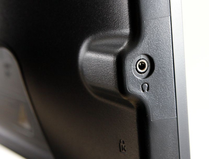
There are no built-in speakers on the XL2411P, but it does have an audio jack on the left side, which works great.

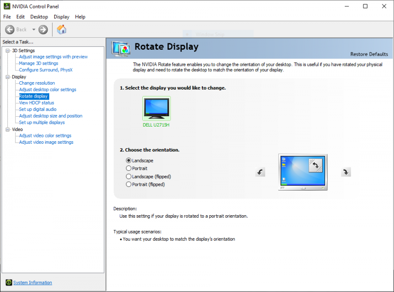
The monitor can also be rotated 90° so that it’s in portrait mode.  On my PC, I used the NVIDIA Control Panel to let Windows know that I wanted to rotate the display.  This feature is typically used with Microsoft Word or other editing tools where it’s advantageous to see an entire page of text at once.  I’m honestly not sure how this would be useful for a gaming monitor, but it’s here if you need it.

The XL2411P also has a Kensington lock slot on the back to help secure the monitor if necessary.

What I like

  • Great set of features, like the Black eQualizer, especially for this price point
  • High refresh rate, low response time
  • Solid base, flexible arm for adjusting the panel

What I’d change

  • Improved default color settings
  • Studier cable management system

Final thoughts

If you’re looking to get into the fast-paced world of competitive FPS video games, or if you want to upgrade your current monitor without breaking the bank, then I think you should take a hard look at the ZOWIE XL2411P monitor.  It may not be the most attractive monitor on the outside, but it’s got it where it counts, a rich set of features that are going to help you take your game to the next level.  Just keep in mind that you will have to spend some extra time configuring this monitor.  I think, however, that you will find it to be worth the time you spend.  Game on!

Price: $199 (new), $187 (refurbished)
Where to buy:  BenQ Direct (new, refurbished) and Amazon
Source: The sample for this review was provided by BenQ.

Filed in categories: Reviews

Tagged: ,

BenQ ZOWIE XL2411P 144Hz 24-inch e-Sports Monitor review originally appeared on The Gadgeteer on August 13, 2019 at 8:00 am.

Note: If you are subscribed to this feed through FeedBurner, please switch to our native feed URL http://the-gadgeteer.com/feed/ in order to ensure continuous delivery.
SpyTracker Nano GPS tracker review

REVIEW – Wanting to track or find physical items by attaching some sort of small device is as old as suspicion. It’s taken until the advent of small wifi and cellular transmitters to make it happen at a price point that normal people can really consider. I’ve been testing out the Nano from SpyTracker, a wireless tracker which would have made for good science fiction just a few years ago.

What is it?

A closed box roughly 3″ x 1.5″ x 1″. There is a smooth face with three LEDs labeled for GPS, PWR, and CEL. On one of the long sides there is a waterproof covered charging port (miniUSB cable included) and on one of the smallest sides there is a power button, also weatherproof. Next to the power port is a SIM card port covered with a piece of plastic and secured by two very small Phillips screws. There’s also a weatherproof SOS button on the face with the LEDs.

What’s in the box?

  • GPS unit itself
  • USB-A to miniUSB cable
  • wall charger

Design and features

The Spytrack Nano is a solid little black box that broadcasts its position every ten seconds. The service is available worldwide and, while it’s not cheap, it’s better than most phone plans. You can view the location of the Nano from within the website, or with a mobile app. This is where all the setup happens.

There’s an SOS button the user can trigger to alert you, or you can determine a geographical area you want it to stay in, and get an alert when it leaves. You can see velocity, position, and travel routes in real-time or as history. If you have serious gear (think video gear for a location crew, or scientific gear that you have to ship to a location for a project), you’re able to see exactly where it is while it’s being shipped. With a ten-day standby time, any but the longest travel times will be covered.


This device is dead simple. While it’s not the “James-Bond, hide-it-in-your-shoe-heel-size,” it’s still able to tell you where it is reliably every ten seconds from anywhere on the globe. Sure, there are creepy ways to use this technology, but there are also very legit ways that this could enhance your life. Say you’ve got a route manager servicing stores with whatever product you’re selling. Someone calls and says, “Hey, when is the guy gonna be here today?” You pull out your phone, check the location of the truck, and see it’s on the way to your caller. Or 20 miles away in traffic. Without bothering your driver, you can give your customer a heads up so they can plan.


Or, in my case, I have an aging mother who still cherishes her independence. She lives near one of my sisters, but if she was in town, you can bet this would be in her bag, and at 63 grams, she’d never notice it. But she’d be happy to know her son was looking out for her. Sure, I could track her iPhone, or get her an Apple Watch to wear, but this is much cheaper, has longer battery life, and even offers her an SOS button if she just wants me to check on her. (Better believe that would be worn out!) The screenshot below will show your location, and that of the tracker, and allow you to plot an intercept course. My phone thought I was across the street in the neighbor’s yard, but the tracker knew right where it was. Different service, different towers, different triangulation.


Setup

When the unit arrived, it was already activated and a login assigned. I was able to resign it to a different account with no issues. Loading the app and logging in worked without a hitch. You can purchase additional service time in the app when your plan expires. Prices currently range from £10/device for a month to £85/device for a year, purchased in advance.

Performance

The app behaved itself like a pro throughout my testing period. I was able to see historical routes by date and time, watch the progress in real-time or speeded up, and find my way to the device from my smartphone.

What I like

  • Light and tough
  • No real operational tasks
  • SOS button

What I’d change

  • Price for service is a bit high, but it is global and unlimited

Final thoughts

At some point in your life, there’s going to be something you want to track: a parent, child, vehicle, or shipment. This unit provides that service in a fairly inexpensive package, and you can just toss it in a drawer and reactivate it (top-up) when you want to use it. There is no setup, other than to pair it to the app, which takes all of a minute.

Price: £59.99 (US$72.82 as I write this)
Where to buy: Rewire Security
Source: The sample of this product was provided by Rewire Security.

Filed in categories: Reviews

Tagged: ,

SpyTracker Nano GPS tracker review originally appeared on The Gadgeteer on August 12, 2019 at 10:00 am.

Note: If you are subscribed to this feed through FeedBurner, please switch to our native feed URL http://the-gadgeteer.com/feed/ in order to ensure continuous delivery.
CookPerfect wireless meat thermometer review

REVIEW – Is anything better than a perfectly cooked meal? The main course, done exactly to your liking, makes for the perfect dining experience. But, how do you know when your main course is done?  And, what if folks like things done to different levels?  CookPerfect can help with its dual-probe wireless meat thermometer.

What is it?

The CookPerfect is a wireless meat thermometer that supports two independent temperature probes. It connects to their app on your Android or IOS device via Bluetooth to provide cooking progress and tells you when the meat is done.

What’s in the box?

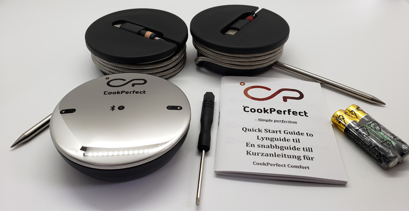
  • CookPerfect main unit
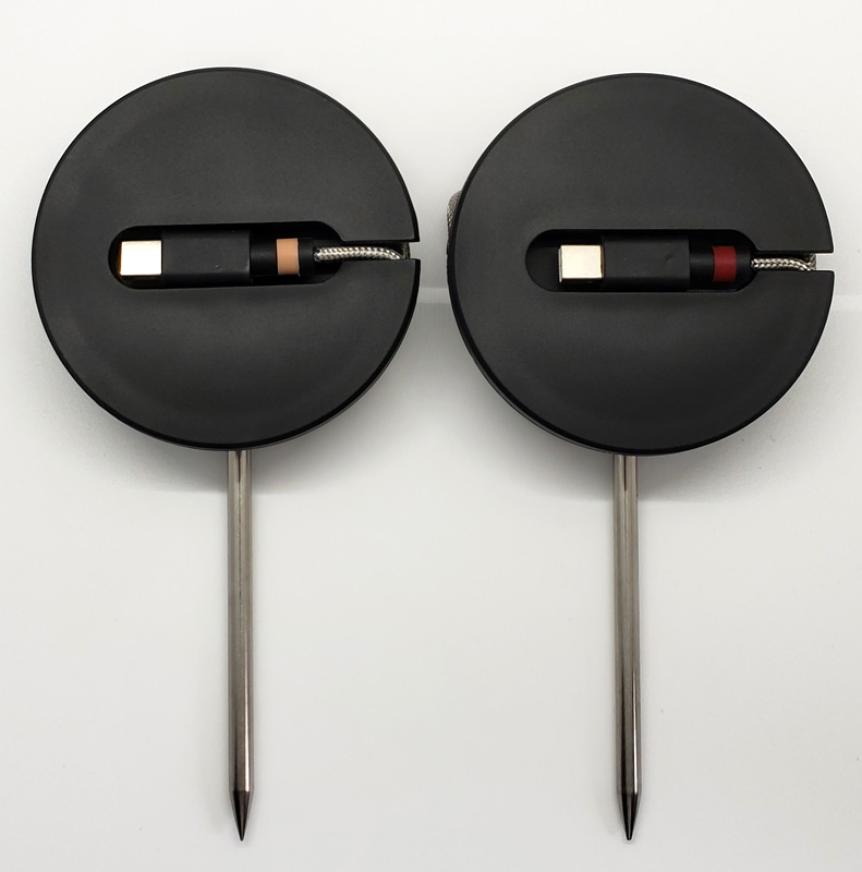
  • Temperature probe with storage spool (a second probe/spool was also included for this trial)
  • Screwdriver
  • AAA batteries (2)
  • Quick start guide

Hardware specs

  • Width: 76mm
  • Height: 25mm
  • Probe length: 100mm (134mm overall)
  • Probe cable length: 1m
  • Bluetooth range: 100m
  • Battery life: 150 hours
  • Temperature range: -40C – +300C
  • Water resistance: IP45 (Protected from tools and small wires greater than 1 millimeter. Protected from low-pressure water jets from any direction)

Design and features

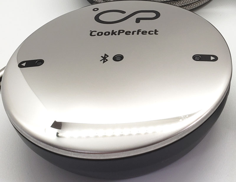
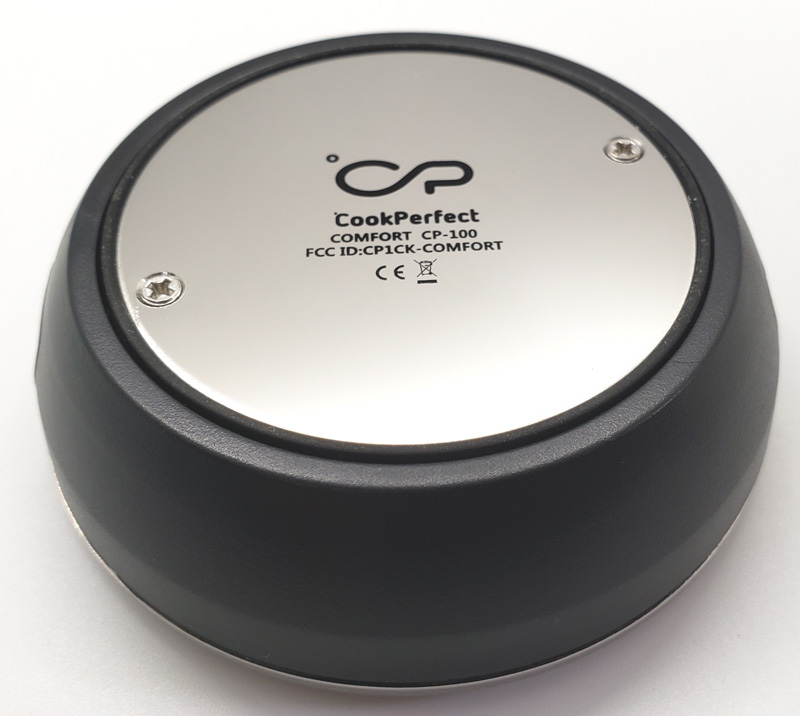
The top and bottom of the main unit are covered in shiny stainless steel.  It’s pretty but prone to fingerprinting and spotting. The bottom has a magnet in the base so you can stick it on ferromagnetic surfaces (think: steel).

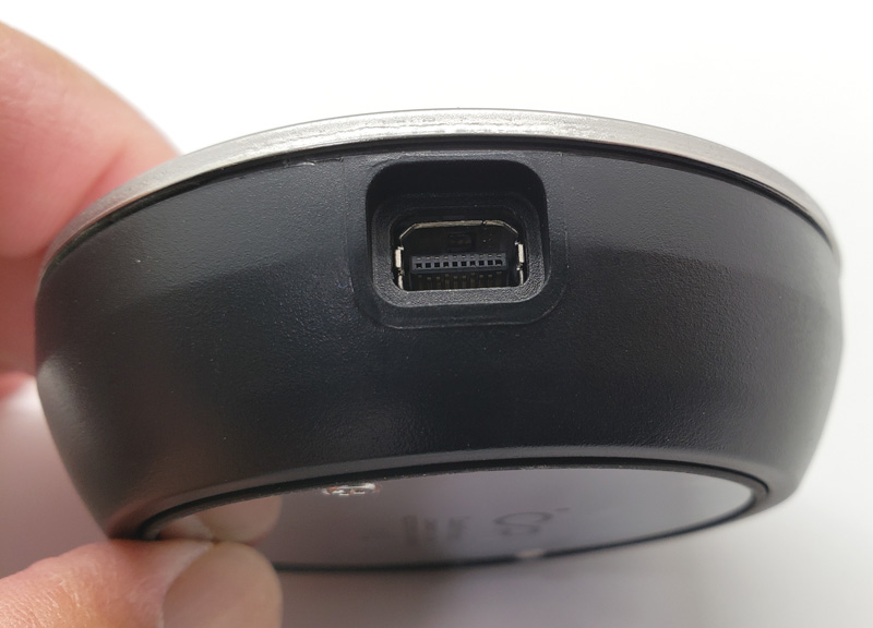
The round main unit has two probe connectors on opposite sides of the unit.

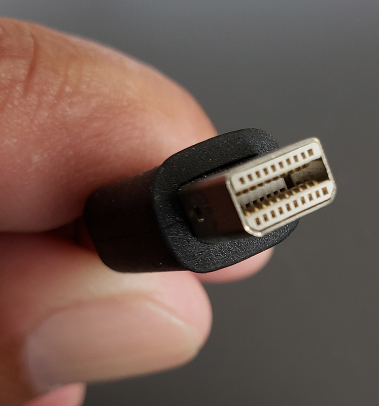
While they resemble USB ports, the probe connector is a proprietary design.

Setup

Setup involves two steps:

  1. Install the batteries by removing the back of the unit with the included screwdriver, installing the batteries, and reinstalling the back
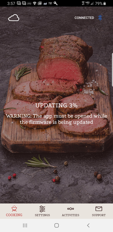
  2. Download the CookPerfect app to your Android or IOS device (and let it update the firmware…)

Performance

To begin cooking, attach one, or both probes to the main unit.  Connecting a probe powers-up the unit.  The center blue light flashes until it makes a Bluetooth connection to your device, at which point, it turns solid blue. Each probe has its own status light.  Flashing means it is connected.  Fast flashing means the internal temperature is within five degrees of the target.  Solid green means cooking is done.

Once the app is open and a probe is connected, insert the probe into the meat to the scribe mark on the probe.  The probes have multiple sensors along its length allowing for a more accurate core temperature reading. The exposed end of the probe has an ambient temperature sensor so the app can tell what the temperature is in the grill or oven.

Each probe can be programmed for a different cook level or even different type of meat.  To start, after selecting the probe to set up, you get a meat selection grid:

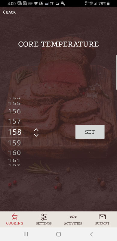
You choose the meat you are cooking, or, just pick quick start and select a target temperature.

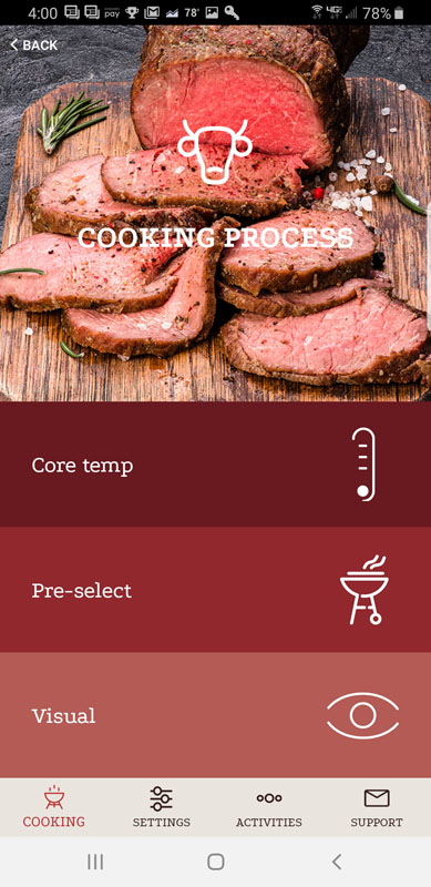
If you go the meat choice route, you are presented with three options:

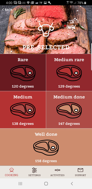
You can just choose the target temperature (same screen shown above), choose target doneness level or pick your doneness level by photo.

Here is the doneness selection screen:

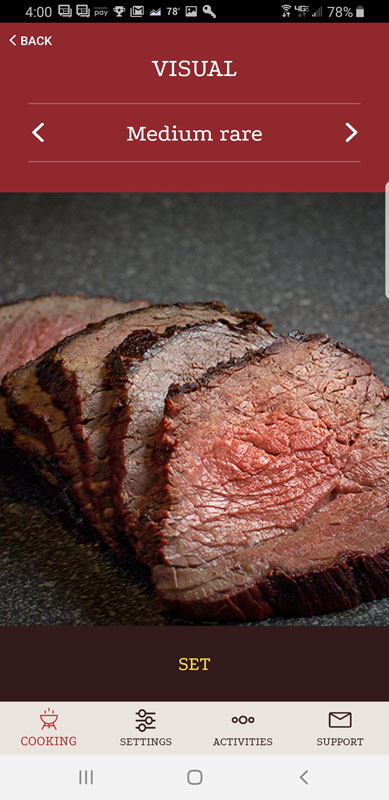
And if you don’t know what those terms mean, you can use the visual doneness selection menu:

To me, the visual guide seems kind of silly, but I guess they are designing for newbie cooks who might know well done from medium-rare.

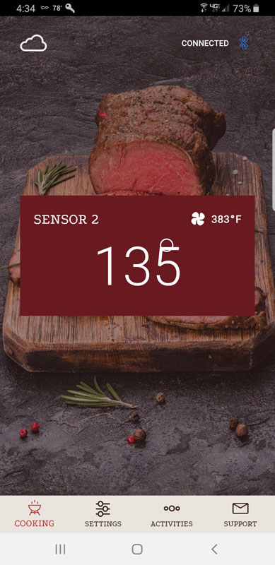
Once you get the probe in and the meat on the grill or in the oven, clicking Start Cooking brings up the status screen.

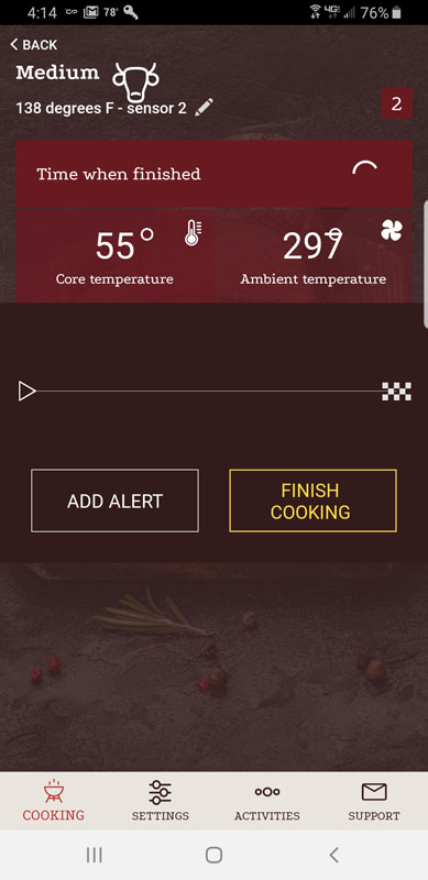
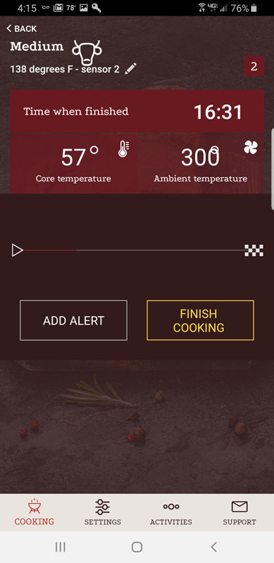
Note that the design of the screen needs work.  As long as temperatures are two digits or less, it looks good, but if the temp hits three digits, the degree symbol gets stuck behind the last digit.  Not a big deal, but lack of attention to this makes one wonder what else got missed in the app.

The Time when finished indicator remains a spinning circle for the first five minutes of cooking until the app calculates the remaining time based on internal temperature changes and ambient temperature in the grill or oven. Then it is replaced by an end time estimate in military time.  There is no option for a twelve-hour display.

Note that this screen doesn’t show Bluetooth status.  To make sure that the app is still connected to the CookPerfect, you need to go back a screen to the probe screen.

This screen has the same issue with the degree symbol.  It shows both the core temperature and ambient temperature along with the Bluetooth connection status but doesn’t show the estimated completion time. It sure would be nice to see everything on one screen.

Once cooking the target temperature is reached, the app sounds an alarm, letting you know it’s time to get the meat out of the grill or oven.

All this is fine and good, but it is only of value if the results are perfect.  I targeted medium steaks and the app used an internal temperature of 138 degrees Fahrenheit as the target temperature.  The steaks were perfectly cooked, just as we wanted.

Other niceties in the app include the ability to set multiple alarms based on cook time.  For example, you can set an alarm to let you know when there are 15 minutes remaining in the cooking time, perhaps so you can pop the dinner rolls in the oven or prepare the salad. You can choose between Celcius or Fahrenheit displays, but as I mentioned above target completion time is only in 24-hour format.

The biggest problem I have with the CookPerfect is that the Bluetooth range is nowhere near the 100-meter advertised range.  Granted, my situation isn’t ideal. My house is built with metal studs, and that certainly negatively affects Bluetooth range.  Even so, if the CookPerfect is supposed to have a 100-meter range, you’d think it would work from about 10-meters, even through the two walls between my living room and my grill. But it doesn’t. The Bluetooth disconnected constantly, forcing me to move more in a line-of-sight to my grill. I have another Bluetooth meat thermometer that has the same problem, so this isn’t unique to CookPerfect.  Its promised range is way more than my other thermometer so I was hopeful, but alas, I am disappointed.

What I like

  • Simple setup
  • Temperature sensors seem pretty accurate based on the cooking results
  • The probe cable is sufficiently long to allow easy placement in the grill or oven
  • You can create alarms based on remaining cooking time to help with meal prep

What I’d change

  • Improve Bluetooth range
  • Fix user interface display issues
  • Show time in 12-hour format as an option
  • Have a single screen that shows both cook progress and Bluetooth connection status
  • The app is pretty basic and doesn’t provide resting time after the cook
  • Change the battery compartment to not need a screwdriver to open

Final thoughts

Overall, the CookPerfect is a capable wireless meat thermometer.  It produces great results and is pretty easy to use. Its app is far less sophisticated than others I have used and there are some nagging display issues that I hope can be fixed with a software update. If your needs are basic and the range isn’t an issue, the CookPerfect will most certainly improve your meat cooking results.

Price: $99.99
Where to buy: Amazon
Source: The sample of this product was provided by CookPerfect.

Filed in categories: Reviews

Tagged: ,

CookPerfect wireless meat thermometer review originally appeared on The Gadgeteer on August 12, 2019 at 8:00 am.

Note: If you are subscribed to this feed through FeedBurner, please switch to our native feed URL http://the-gadgeteer.com/feed/ in order to ensure continuous delivery.
Pivo Tiny Pod camera mount review

REVIEW – I am usually interested in almost every type of gadget that is designed for videography and/or photography. These days, almost everyone has a smartphone and many people use the built-in features to shoot either videos or to take pictures or both. In response to this popularity, many companies have manufactured various kinds of gadgets to help phone users to get more enjoyment and versatility when shooting. The Pivo Tiny Pod is just that type of gadget.
What is it?

Pivo is a smart interactive pod for smartphone photography and videography. It is built around 12 main features that include 9 quick create modes, 2 auto-follow modes, and 1 multi live streaming mode.

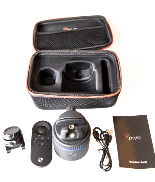
What’s in the box


1 x Pivo Pod
1 x Panoramic Mount
1 x Adjustable Mount
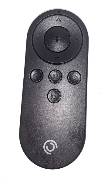
1 x Remote Control
! x Micro USB Cable
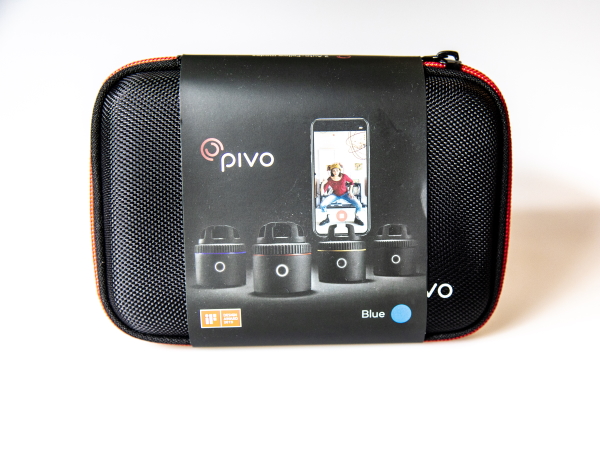
1 x Travel Case
1 x User Leaflet

Design and features

Specifications
Pivo Pod –
Max Load: 1kg
Bluetooth: BLE 4.0
Rotation Degree: 360 degrees
Speed Rotation: 10s/r-2h/r
Bluetooth: 2402MHz~2480MHz
SRD: 2440MHz
Battery: 500mAh
Charging Method: Micro-USB Part, 5VDC, 0.5A
Charging Time: 1 hour
Working time: 10 hours
Height (without mount): 5 cm / 2 inches
Height (with mount): 7.3 cm / 2.9 inches
Width: 6.3 cm / 2.5 inches
Weight: 176g / 6.2 ounces

Remote Control –
Controller: 2.4GHz RF
Distance: 50ft (15m)
Height: 8.8cm / 2.7 inches
Width: 3.65cm / 1.4 inches
Weight: 30g / 1.0 ounces
Battery: 3V Coin Button Cell

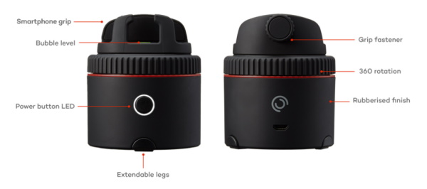
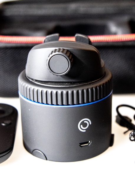
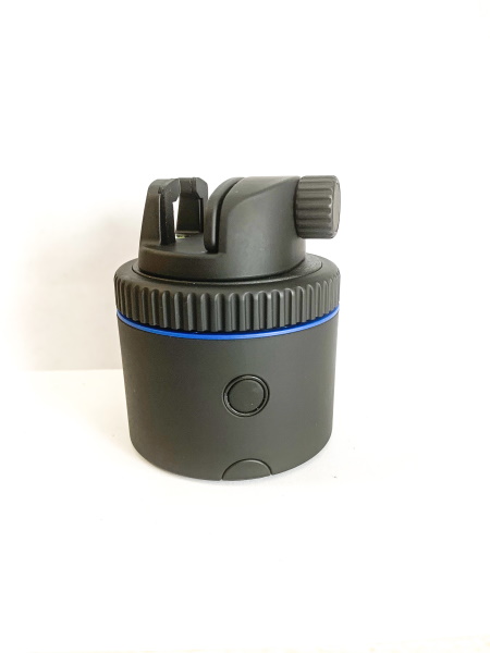
Looking at the Pivo Pod, on one side, there is the grip fastener at the top, the 360-degree rotation gear below that, and a USB charging port at the bottom. Around the body of the Pod, there is a sort of rubberized finish/coating.

On the opposite side of the Pivo Pod, there is the power button.

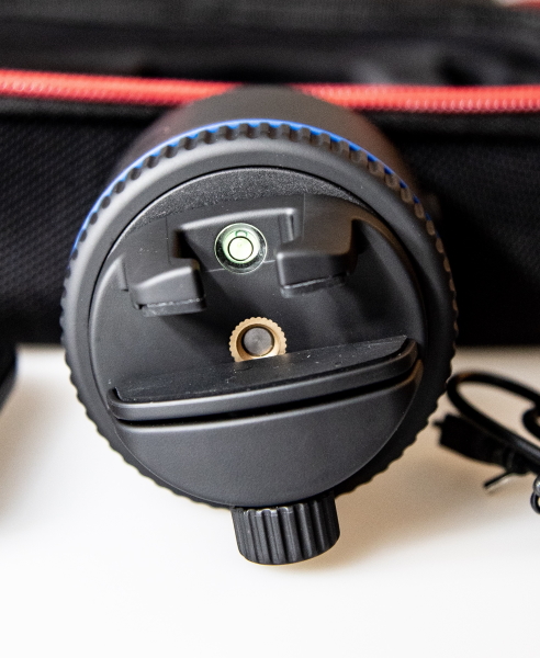
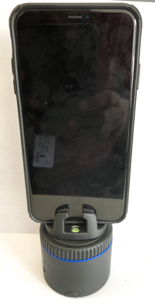
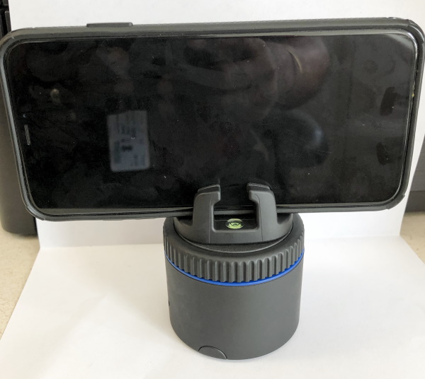
Looking down at the Pivo from the top, there is the smartphone holder/grip and a bubble level.


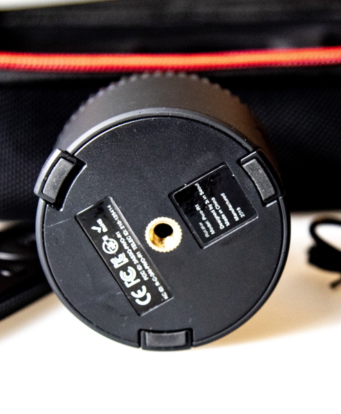
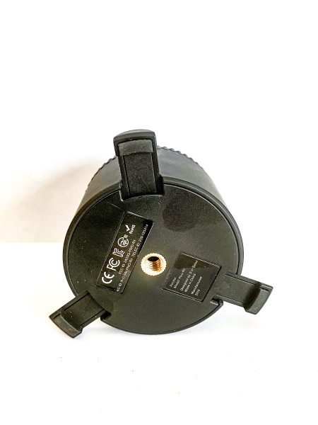
At the bottom/underneath of the Pivo, there is a 1/4-20″ tripod mount and 3 extendable feet.


The Pivo Pod also comes with a remote that controls shooting modes, speed, capture and rotation functions.

Performance

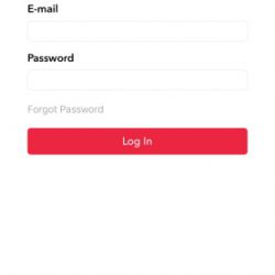
The Pivo Pod is very easy to set up and use. Just take it out of the box and charge it, download the app and it is ready to go. The app requires that you create an account and then login. It connects via Bluetooth but the app controls the connection. Once you mount the phone into the Pivo you can start recording. You can mount it either vertically or horizontally.


It has several modes that can track in different ways to handle tasks like panoramic or 2 persons back and forth switching or individual movement tracking, timelapse, motion timelapse, etc. Since it is a bit hard to explain and showcase all of its functionality, here is a video to help do so:

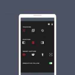
The Pivo Pod app is also easy to setup and use. Here are some screenshots from the app:


The following is a short tracking video test that I did from my point of view:

What I like

  • The compact size
  • The features and functionality
  • The versatility
  • The ease of use
  • It works with the remote, snapping your fingers and even saying cheese
  • It uses front and back cameras

What I’d change

  • It works great so I can’t think of anything at the moment.

Final thoughts

I really like the Pivo Pod, especially in my case for shooting product videos and product photography. It shoots 360-degree photos/video. The tracking feature is great and responsive enough that it allows for versatility when shooting video. The remote works well for any distance that I have need. You also have the ability to stream live to popular platforms like Facebook and YouTube, and they have partnered with Ustream to allow streaming to over 30 platforms. I give this device a well done and two thumbs up!!

Price: $109
Where to buy: The Pivo Website
Source: The sample for this review was provided by Pivo

Filed in categories: Reviews

Tagged: ,

Pivo Tiny Pod camera mount review originally appeared on The Gadgeteer on August 11, 2019 at 9:47 am.

Note: If you are subscribed to this feed through FeedBurner, please switch to our native feed URL http://the-gadgeteer.com/feed/ in order to ensure continuous delivery.