Otter + Pop Defender Series case for iPhone XR review

REVIEW – With every new generation of the iPhone, the phones seem to get thinner and harder to hold.  I always add a case to my phone, and that adds the protection and extra grip I need.  My husband also uses a case for protection, but he wanted something else that could further improve the grip-ability of his new iPhone XR.

I had previously seen PopSockets, little cone-shaped grips that adhere to the back of your phone with suction, that pop open to give you something to hold onto to while you use your phone and collapse flat when you have your phone in your pocket or bag.  Those attachable grips interested Butch, but learning about PopSocket’s newest venture with OtterBox really caught his attention.

What is it?

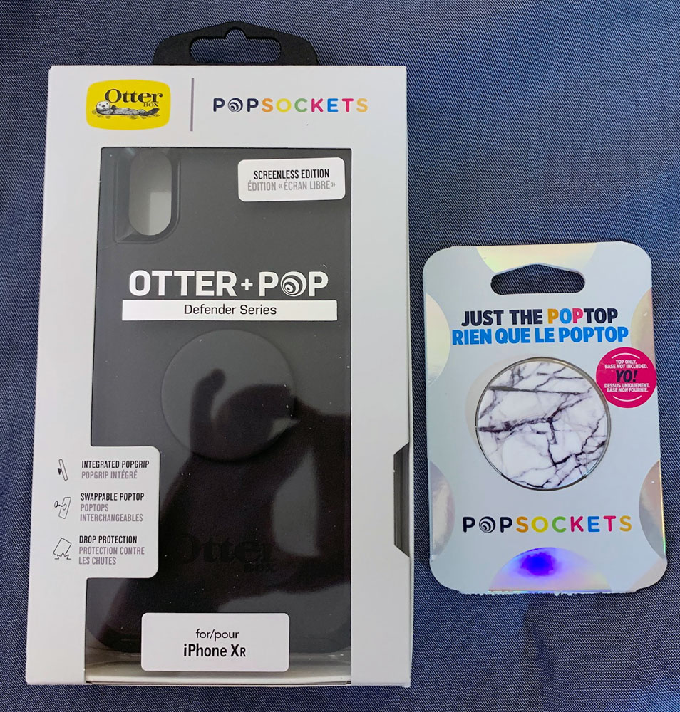
The Otter + Pop Defender Series combines a strong, protective OtterBox case with the security of the PopSocket PopGrip (also called the PopTop, which we’ll use in this review).  The grip “screws” into the case, so you never have to worry that the PopTop grip will accidentally detach from the phone.  And the PopTop is changeable and available in a variety of designs, so you can create just the perfect look for your iPhone (or Samsung Galaxy).

Hardware specs

Otter + Pop Defender Series cases are available in Black, Winter Shade (teal blue), and Fall Blossom (berry red).  The included PopTop matches the color of the case in the standard configuration, but you can choose to customize your case with an additional, decorative PopTop for only $8.00 extra.

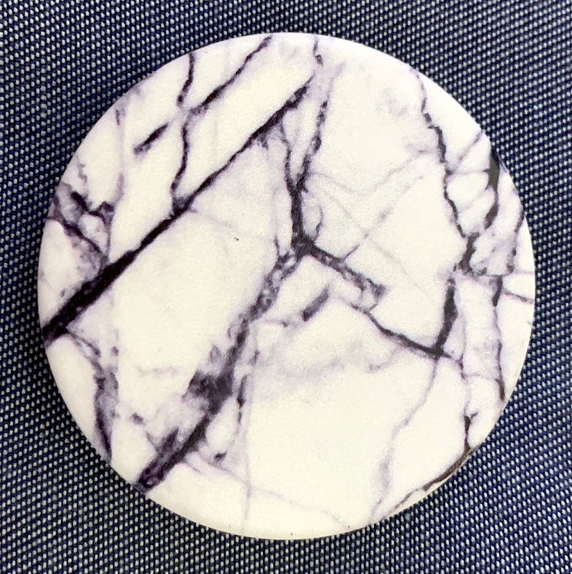
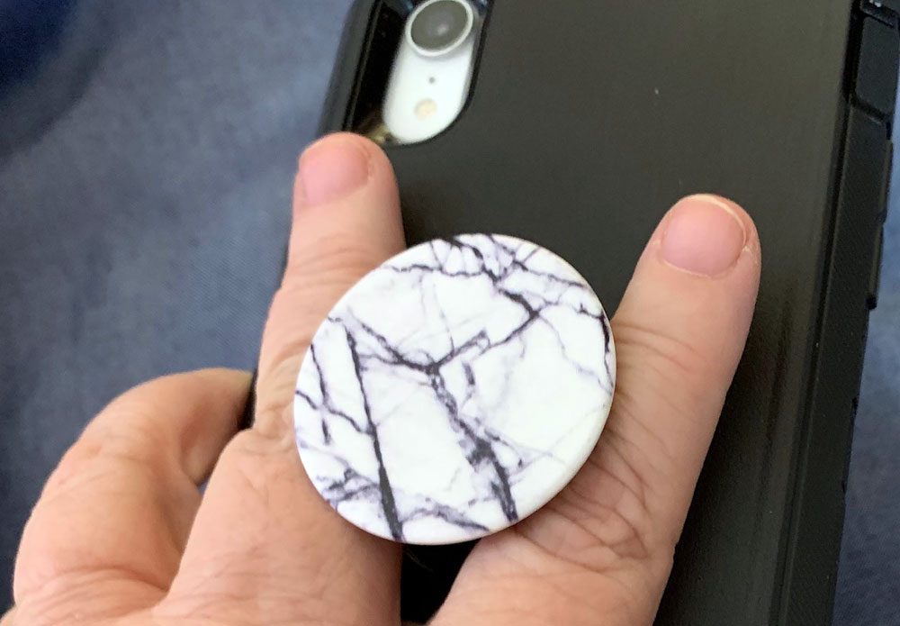
I requested the black case, and I received an extra PopTop with a black/white marble design.

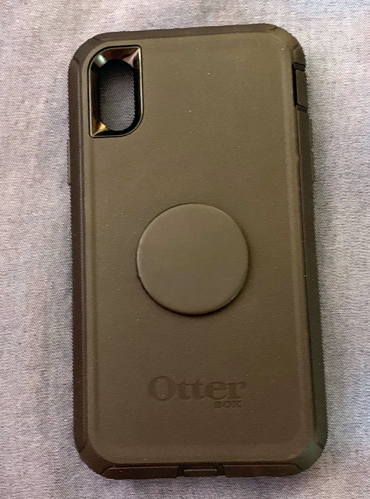
The above image shows the back of the Otter + Pop Defender case with the color-matched PopTop installed.

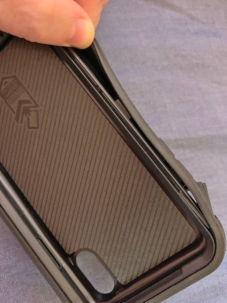
The Otter + Pop case has a hard, protective polycarbonate inner shell that is surrounded with a synthetic rubber outer case.  The rubber outer shell snaps into the polycarbonate shell for security and protection.

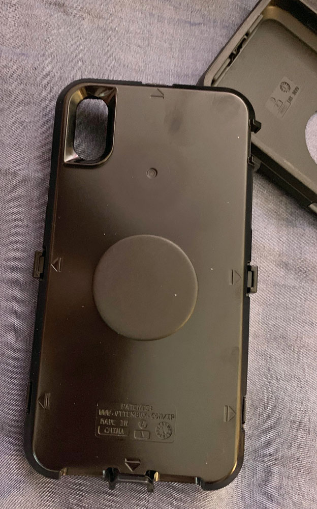
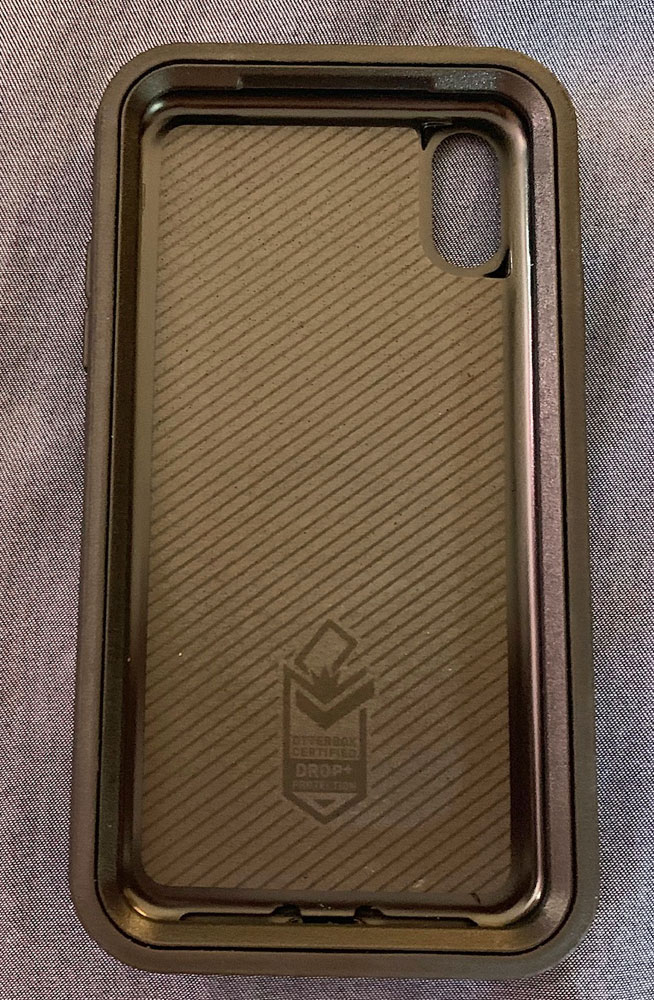
You’ll need to separate the inner and outer pieces to insert your phone.  Notice that the polycarbonate shell is lined to protect the back of your phone.

Here’s the back of the polycarbonate shell with the original PopTop still attached.

Design and features

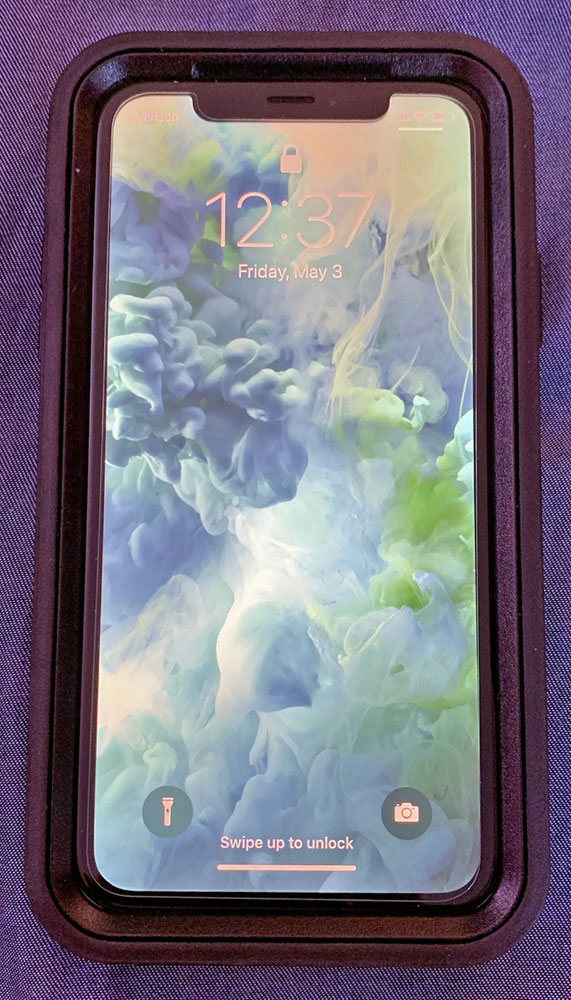
The Otter + Pop case does not have an integrated screen cover.  It does allow room for the glass screen protector that Butch already had installed on his iPhone XR.

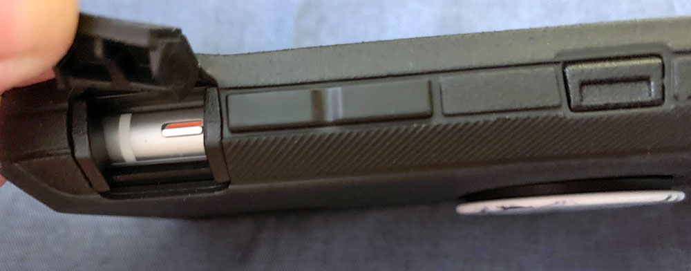
The synthetic rubber outer shell covers the power and volume buttons completely.  You operate these buttons by pressing through the rubber shell.  The XR’s mute switch is accessible through a rubber flap that snaps securely closed when you don’t need to access the mute switch.

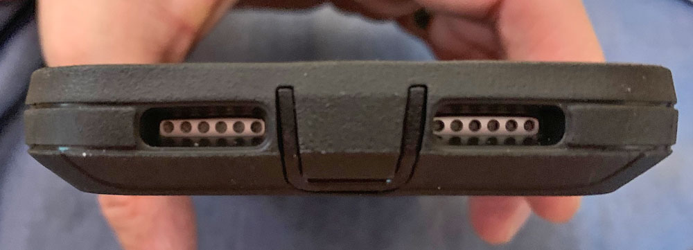
The iPhone’s back camera and the speakers are left uncovered.

Here’s the decorative PopTop I received.  The marble design adds a little pizzazz the black OtterBox case.  There’s also a “full moon” PopTop that I think would be appreciated by amateur astronomers, like my husband.

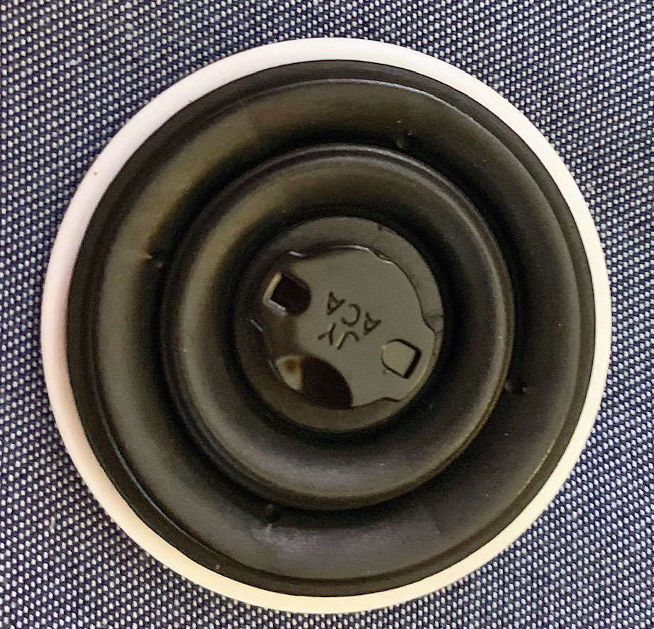
The back of the PopTop reveals the screw-in assembly that secures the PopTop to the back of the OtterBox.  The concentric circles are a rubbery material that is shown here compressed flat for storage but will extend out to form the grip.

The iPhone XR can be wirelessly charged, and OtterBox says the Defender Series cases are compatible with Qi wireless chargers, but they warn that you may need to remove the PopTop before charging.  I didn’t get to test this out, because we don’t use wireless charging for our iPhone XRs.

Performance

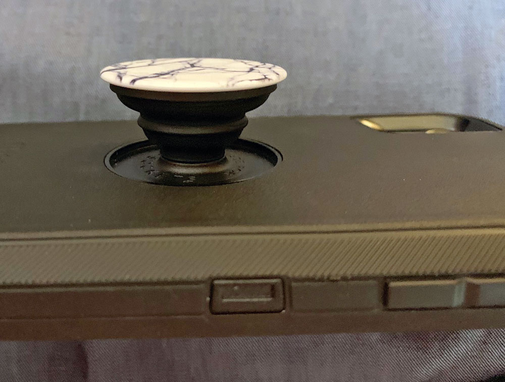
Here’s the PopTop extended out from the back of the Defender case.

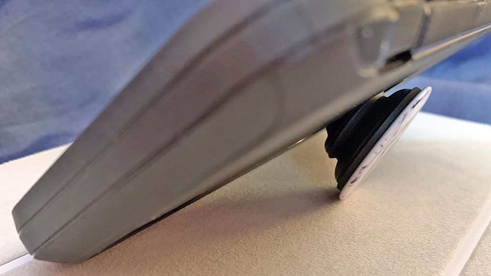
When extended, you can use it as a horizontal stand for the iPhone.  It’s surprisingly stable, considering how big and heavy the cased iPhone XR is.

When you’re talking on the phone or interacting with the screen, slip a couple of fingers under and around the PopTop to improve your grip on the phone.  Butch especially likes the security of this grip because he paces around a lot while he talks on the phone.

What I like

  • OtterBox cases are known for their protection for your expensive devices.
  • PopSocket’s PopTop adds further protection because it improves your grip on your expensive phone.
  • You can customize your Otter + Pop Defender series case by changing out the PopTop.

What I’d change

  • Nothing

Final thoughts

Butch loved the increased security with the sturdy, protective Defender case.  He liked using the PopTop grip, and he said it really did feel like he had a better hold on his iPhone XR when using the PopTop.  He said the Otter + Pop Defender Series case did add significant weight and bulk to his phone, as you would expect.  He found that the bigger size and the somewhat “grippy” texture of the rubber outer shell made it more difficult to quickly get the phone in and out of his pockets.

Price: $69.95 for the Otter + Pop Defender Series case for iPhone XR, or $77.95 for the customizable version.
Where to buy: OtterBox, Target, and Verizon
Source: The sample of this product was provided by OtterBox

Filed in categories: Reviews

Tagged:

Otter + Pop Defender Series case for iPhone XR review originally appeared on The Gadgeteer on July 3, 2019 at 8:00 am.

Note: If you are subscribed to this feed through FeedBurner, please switch to our native feed URL http://the-gadgeteer.com/feed/ in order to ensure continuous delivery.

Sena Wallet Skin Leather Case for iPhone XS Max review

REVIEW – So you’re trying to ditch your wallet, but you need a bit more room for cash and cards than one of those single-slot phone cases. The Sena Wallet Skin Leather Case may be the answer you’re looking for. It features a design that still maintains that minimalist profile, and it looks great too. How does it stand up to our testing? To the review!

What is it?

It’s a combination wallet/iPhone case. The one I am testing is a bundle package for the iPhone XS Max, but many styles and device types are available.

What’s in the box?

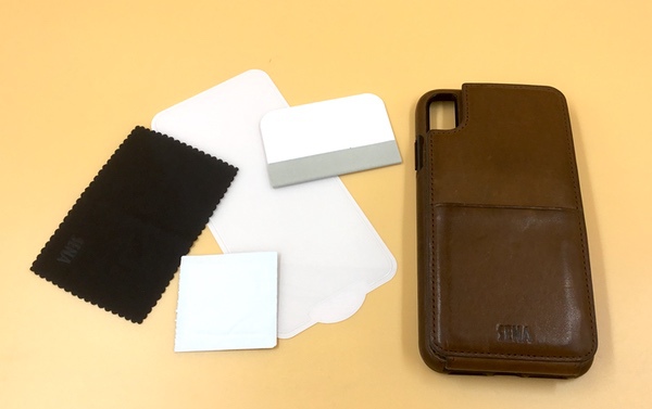
I’ve got the bundle, so my test package includes both the case as well as a screen protector (you can get just the case). The screen protector includes all the stuff you need to apply the screen (a cleaning swab, applicator, and a bit of adhesive film to remove dust that might collect during application).

Specs

  • 3.25″ by 6.25″ by 0.75″ deep (closed)
  • 3 ounces total weight (without phone)

Design and features

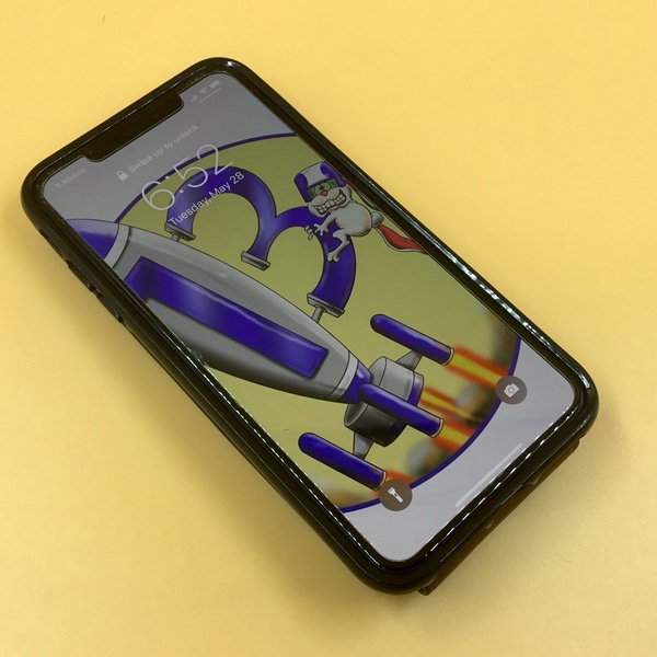
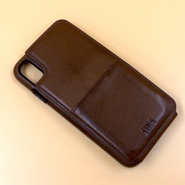
The Sena Wallet Skin is a combination iPhone case and wallet design. What’s interesting about this particular design is the form factor. The front of the phone is fully exposed, while the back panel flips down to get access to all of your cash and cards.

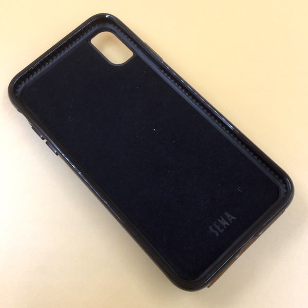
Your phone is nestled in a form-fitted case that includes a plastic bumper to protect it from drops and bumps. The back is also protected by a felt lining to avoid scratches:

Simply pop your phone in the case, and you’re good to go. While the edges are protected, the entire front face is open so that you have uninterrupted access to all the features. If you buy the bundle you’ll get a tempered glass screen protector to fully armor your phone.

Sena doesn’t mention anything about the leather sourcing, which looks to be a thin cover backed by vinyl or plastic throughout the build. While it may be thin, it’s pretty well crafted. I’m not seeing any scratches that pull through an underlying color, and the leather itself has a deep, rich texture. I’ve been using mine for about 4 weeks, and haven’t noticed any signs of wear on any of the corners either.

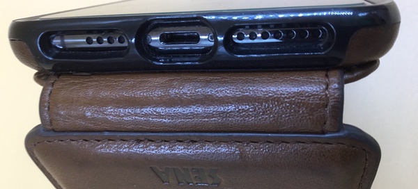
The build quality is excellent. The phone fits perfectly with open access to ports and speakers, while the flap is connected by an extra reinforced bit of leather for additional durability. Check out the close up below:

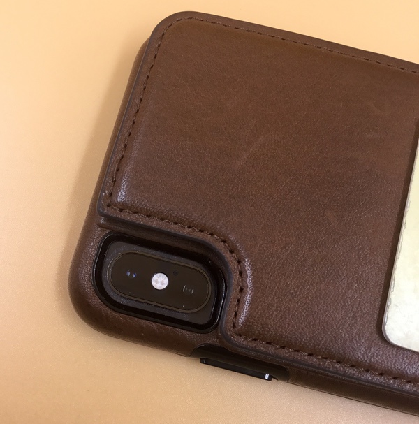
Same goes for the camera port. The case is precisely cut for a tight fit that doesn’t interfere with the camera when you want to take a picture.

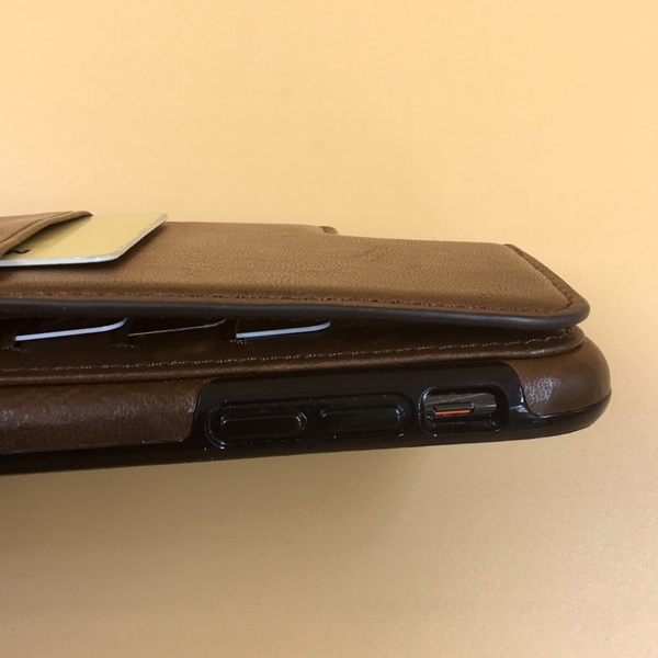
Buttons are molded into the plastic bumpers, with the typical open slot for the silencer switch. Controls work great right out of the box, and don’t require any break-in period to get to smooth function:

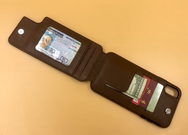
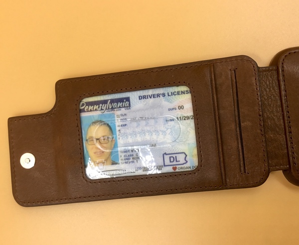
You’ll find one card slot on the back panel, perfect for a work ID if you need to badge-in to your place of business. A magnetic snap closure keeps the flap in place. Open it up, and you’ll find room for 5-6 additional cards and your cash. The flap side has a card slot with a clear window and a cutout so that you can easily slide your cards in and out. There’s a second card slot behind it.

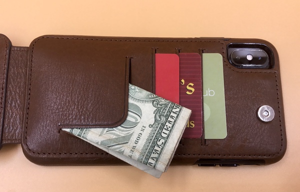
The side on the back of the phone includes three additional card slots and a little tab that can be used to stuff a few bills if you need them:

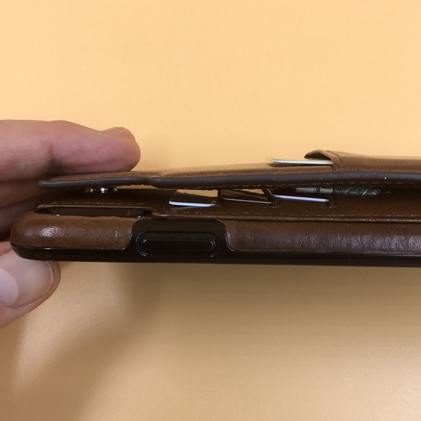
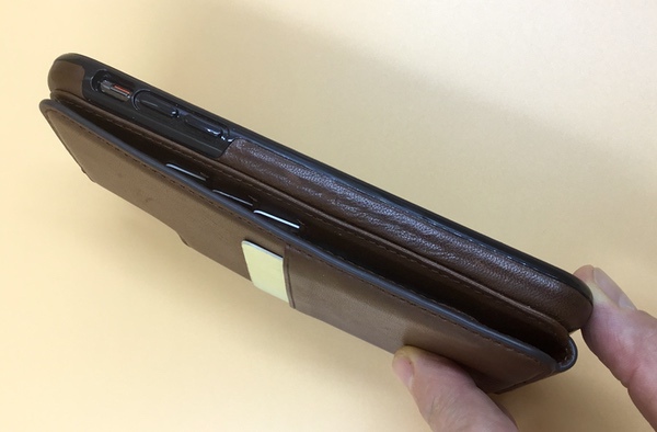
When folded, the total depth of the case is about 3/4″, but that will compress down a bit when you have it in your packet. Here’s a side shot for reference:

Performance

If you’re a minimalist but you need *just* a bit more capacity from a phone wallet, the  Sena Wallet Skin Leather Case might be right for you. I think it comes down to how much stuff you need to carry, and how much you use your phone.

The Sena Wallet Skin design works really well in day-to-day use. It’s not much bigger than a standard wallet, so you can carry this in your front pocket. After a month of use it looks just as good as the day I got it, so construction looks to be on point. I also really like that the design doesn’t interfere with any of the phone functionality.

Another plus here is that the card slots are very tight, so your cards won’t pop out when you use your phone. On the flip side, you’ll want to keep those frequently used cards in the clear panel slot with the cutout so that you can slide the cards out with your finger. Otherwise, you’ll be engaged in a wrestling match to get to the rest, which can be a little irritating when you’re in line at the convenience store. You’ll be able to get a couple of bills in the cash flap, but a wad of bills will interfere with the closure mechanism. The bottom line is that you’ll want to think about how much you carry on a regular basis to see if this configuration works for you.

If you’re the type who is on your phone all the time, this may not be your jam. Because I am so used to carrying my phone separately, I have a tendency to leave it on my desk when I run off to a meeting… which isn’t good when leaving cash & credit cards (and ID) out there. If you’re traveling (or going to the gym) you may have similar concerns about exposing your essential stuff in public places each time you use your phone. You’ll want to think about how and where you go on a regular basis before choosing this case.

What I like

  • Sleek, good looking design
  • Well built with nice finishing
  • Very usable form factor that does not interfere with phone use
  • Cards are tight, and won’t fall out when using the phone

What needs to be improved

  • Tough to get cards out of those tight slots when you need them
  • Limited capacity may not work for some users

Final thoughts

The Sena Wallet Skin Leather Case is a well-designed and good looking alternative phone case for those who want to go without a wallet. But it does have capacity limits, so it’s something you’ll want to keep in mind with respect to your daily use. If you can run with 6-7 cards and a couple of bills on a regular basis, I think you’ll be happy with this case.

Price: $79.95 for the bundle, $69.95 for just the case.
Where to buy: Sena
Source: The sample of this product was provided by Sena.

Filed in categories: Reviews

Tagged: ,

Sena Wallet Skin Leather Case for iPhone XS Max review originally appeared on The Gadgeteer on June 8, 2019 at 8:35 am.

Note: If you are subscribed to this feed through FeedBurner, please switch to our native feed URL http://the-gadgeteer.com/feed/ in order to ensure continuous delivery.
InkCase adds a second screen to your iPhone

NEWS – What if you could have your eInk and your iPhone be in the same physical unit? And what if they communicated with each other? That’s the promise of the InkCase for iPhone.

What is it?

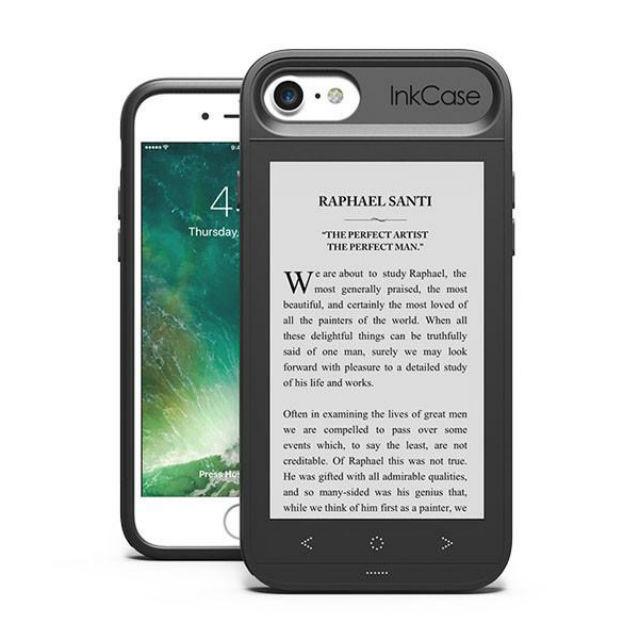
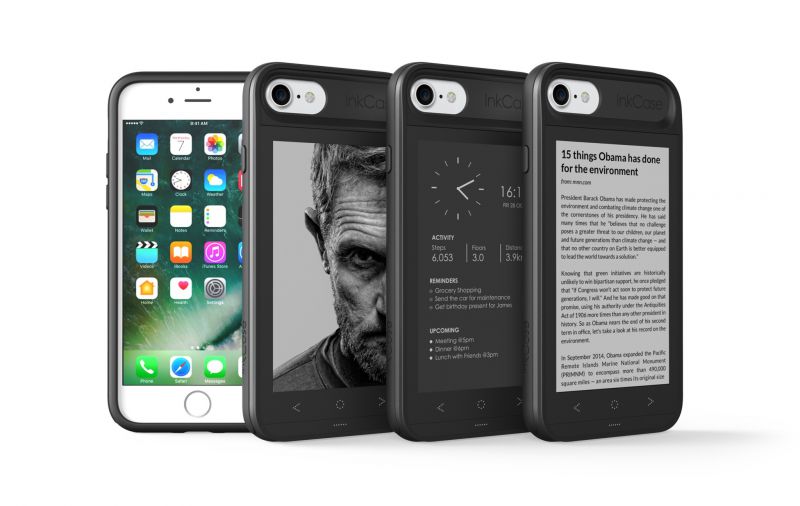
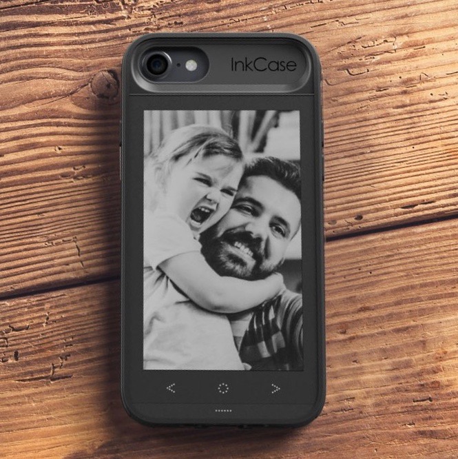
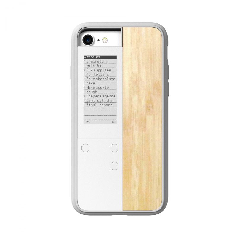
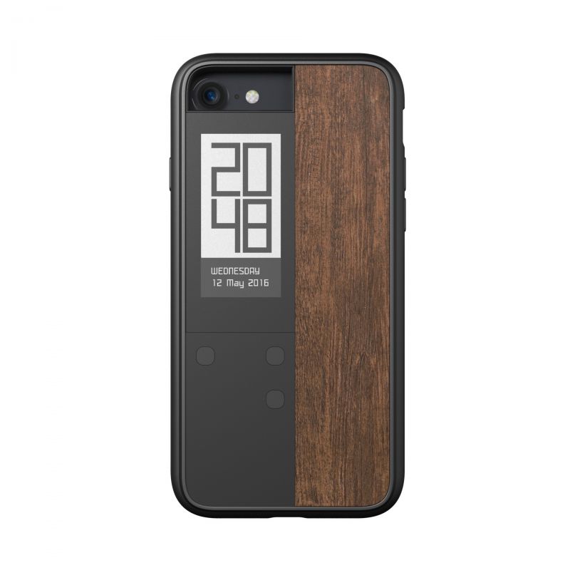
A protective case for your phone with a BlueTooth connected eInk screen that is built-in to the back. There’s an app where you can sync the case to your news reader service, and be able to read articles, as well as view appointments, weather, and photos on the back of your phone. It actually looks quite functional in the videos on the website.

The case charges with its own proprietary magnetic USB charger and (sadly) blocks the wireless charging of your phone, but it should save you a good bit of phone battery, since your weather, schedule, and reading can be done on the lower-power screen. I’ve been using my daughter’s old Kindle Paperwhite for the last two books I’ve read and would really like this, actually! It’s kinda like a mini-Kindle that is attached to your iPhone with a case that protects both of them.

You’ll need to update the case when the phone form factor changes, but there are quite a few protective cases that cost more than this, so if you spread it out over two phone upgrade cycles, that would be no real change.

Expected battery life

(from their website)

  • Standby time (~ 100 page flips per day) – 60 hours
  • Auto shut down on photo wallpaper – Infinity hours
  • Auto shut down on new widget clock (5 minute update) – 32 hours
  • Auto shut down on previous widget clock (1 minute update) – 19 hours
  • Number of page flips to drain the InkCase – 1500 page flips
  • Time it takes to drain the InkCase if the screen is refreshed once every minute – 19 hours
  • Time it takes to drain the InkCase if the screen is refreshed twice every minute – 10 hours
  • Time it takes to drain the InkCase if the screen is refreshed thrice every minute – 6 hours

There is a second model that only embeds a half-screen into the case. It has time, calendar, and notification display, but no photos, and it’s a much smaller screen (only half the width). Called the InkCase Ivy, it’s available in 4 finishes for iPhone 8/7/6s/6 (no Plus models).

InkCase iPhone 8/7/6s/6 is priced at $129 on sale for $79 – iPhone 8/7 Plus and 6s/6 Plus $148 on sale for $99 (currently sold out). Ivy is usually $69, on sale for $39, and available in Cool Black, White Mica, Rosewood, and Maple textured finishes.

Visit oaxis.com for more info.

Filed in categories: News

Tagged:

InkCase adds a second screen to your iPhone originally appeared on The Gadgeteer on May 29, 2019 at 8:00 am.

Note: If you are subscribed to this feed through FeedBurner, please switch to our native feed URL http://the-gadgeteer.com/feed/ in order to ensure continuous delivery.
Zohmo iPhone Battery Case review

REVIEW – I am a high screen time phone user and regularly drain my battery – as well as spend a large portion of most days with it plugged in to a lightning cord to keep from it dying on me. I have a love-hate relationship with phone charging cases as they typically come with quite a bit of convenience, but at the cost of carrying around the equivalent of a hot brick in your pocket. I have a few standalone battery packs, but the problem there is that I never remember to put them in my pocket or backpack before I leave the house! I was intrigued to give the Zohmo Z Series Battery Case a try.

What is it?

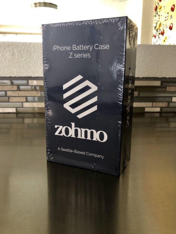
The Z Series is a minimalist design battery back up charging case for your iPhone that will provide charging capabilities while also providing some protection from daily wear and tear.

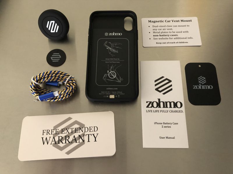
What’s in the box?

  • Air Vent Magnetic Mount
  • Magnet with adhesive sticker for non-battery case
  • Braided Charging Cord
  • Warranty Card
  • User Manual
  • Promo Tag
  • Battery Back-up Phone Case

Design and features

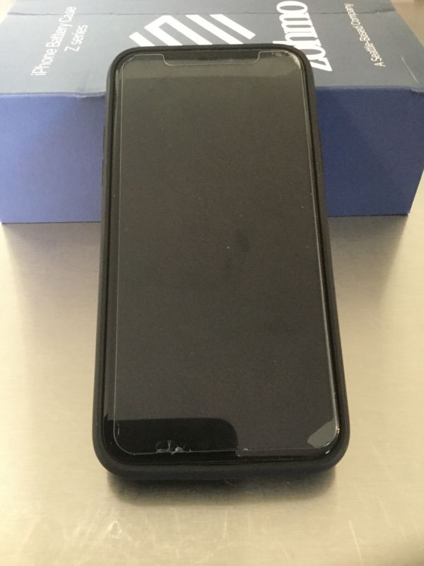
My phone slid easily into the batter case, it has a lightning adapter in the bottom that fits into the power/data port. Push the upper two corners over the edge of the phone and it is then snug within the case for use. Excuse the cracks from my screen protector but you can see that the case doesn’t change the profile of the phone any more (and maybe less) than most cases. This is great since the iPhone X screen does stretch so close to the edges of the screen.

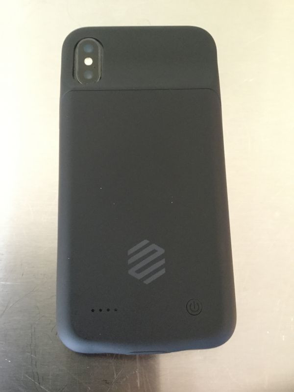
You can see here on the back, there is a power button, as well as 4 led indicator lights that show how much charge time is remaining. To turn the battery pack on, it takes a long press of the button. You can turn off with another long press, or it will turn itself off after fully discharged. It also has the cut out for the cameras, so you have no loss of functionality there. Along the side is a cut out for your mute/vibrate switch and then buttons for the screen power button and volume controls.

Performance

For about a month now, I used this case on a daily basis. And there hasn’t been a day go by that I didn’t utilize it to recharge my phone. Typically once I get my 20% battery remaining warning, I switch it on and let it go to work. Within an hour or so, depending on how much I continue to use it, I’m back over 80% at least and it lasts me through the rest of the day. The case only weighs 3.7 ounces, so with the phone it comes in at 10.0 ounces total weight. There is a bit of heat produced, even more so if I keep it in my pocket while but overall much less heat than previous batter cases I tested. Finally, the poly-carbonate material that this is made from is really great in that it not only looks nice, but it also provides a little bounce back when dropped and protects the phone.

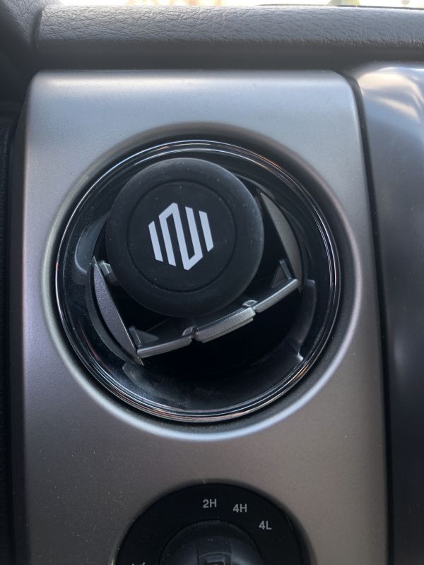
The sample I was provided came with the optional car kit, which has a magnetic air-vent mount which installed very easily in my truck.

The only problem I experienced with this is that on rough or bouncy roads, the magnet in the mount wasn’t quite able to hold the phone in place, either it would start to slide sideways or it would fall completely off and send my phone flying to the floorboard – not ideal while driving.

The only other thing I wanted to touch on is the charging port. It accepts any standard lightning cable and it located in the same place as all iPhone charging ports. The problem I experienced is that the charger cord (regardless of brand, make, model, etc.) simply slides into the port, it doesn’t really clamp or click into place. So again while driving, or even moving the phone around while cord charging, the cord slips out easily – especially while vertical on the mount. This is frustrating and even more so when you don’t notice it’s moved out just a bit and stopped charging either the case or your phone.

What I like

  • Light weight at only 3.7 ounces
  • Poly-carbonate material is soft, sleek and has a little bounce to it
  • Doesn’t overheat
  • Provides a reliable and consistent charge
  • Car mount kit with braided charging cord is useful

What needs to be improved

  • Plug in port for charging cord needs better hold on the lightning connector, falls out extremely easily
  • Magnet air-mount kit could afford to have a stronger hold

Final thoughts

Overall, I’m very satisfied with the Zohmo battery pack case. It doesn’t exactly what it’s designed to do and does so without the extra weight or heat I’ve experienced with other battery cases. The only problems I found with the unit are rather ancillary – in as much as they don’t impact the utility of the product, just become minor annoyances. I have yet to have to “abandon” my phone and leave it charging somewhere while I carried on with my day, although some could argue I probably should try and do that some time!

Price: $59.99
Where to buy: Can be purchased directly at Zohmo.com
Source: The sample of this product was provided by Zohmo.

Filed in categories: Reviews

Tagged: ,

Zohmo iPhone Battery Case review originally appeared on The Gadgeteer on May 2, 2019 at 9:00 am.

Note: If you are subscribed to this feed through FeedBurner, please switch to our native feed URL http://the-gadgeteer.com/feed/ in order to ensure continuous delivery.
Saddleback Leather Boot Leather iPhone Case review

REVIEW – A warm leather hug for your iPhone. That’s what I’m testing this week with Saddleback Leather’s latest phone case design. Forget about plastics, silicone, or rubberized bits… this is 100% leather, and each one is made by hand. To the review!

What is it?

The name says it all. It’s a handmade leather iPhone case. ‘Nuff said.

Design and features

The Saddleback Leather Boot Leather iPhone Case is made from a single piece of heavy boot leather, by hand, in a process that takes 5 hours to complete. Not only are there no plastic or rubberized components, but you won’t even find a stitch of thread in the build. Check out this video to see how each case is cut, shaped, and molded by hand for the final product. Neat, huh?

The cool thing about this process is that the finished piece also shows all the little handmade details, so each item has its own unique personality. Here’s a shot of the front and back of the case… note that mine has been in use for several weeks now, so it’s started to pick up some patina from use (and maybe a water spot from an accidental splash… but that’s another story):

The edges are cut and molded to wrap around the phone. You’ll even see the marks from the shaping process:

The volume buttons on the left side are covered, with the leather being shaved to a thin bevel to allow for clicking. The mute switch is also shaved, but a bit of a cut out so that you can flip it:

The main button on the right hand side is also covered & shaved from the leather, while the camera pod is cut out:


I’ve got an iPhone XS Max, and the case is perfectly sized for a snug fit.

Just slide it into the case, and you’re good to go. Note that the bottom panel is completely open for access to your speaker and ports. The camera pod cutout is right on the money, cut perfectly so that it doesn’t interfere with the functionality.

And that’s all there is to it. Slide your iPhone into the case, and you’re off and running!

Performance

There’s something refreshing about the simplicity and elegance of the Saddleback Leather Boot Leather iPhone case. Don’t get me wrong, I love how designers are pushing the limits with cutting-edge materials to create new products. But it’s also impressive to see a company that’s able to create the same modern usability we demand from our tech with the classic attributes of materials like leather.

From the minute I opened the package, the Boot Leather iPhone case was fully functional. Not only is it easy to install, but I haven’t seen any signs of stretching or loosening in the case that would cause it to slip off the phone. It’s just as tight and snug as any molded plastic or silicone case I have played with. In reading the product details, it looks like Saddleback made some tweaks to this design to address issues with access to the ports and buttons. I’ll tell you that I have seen no issues with any of that so far. The lightning cable pops right into place, buttons work as designed, and the speakers aren’t obstructed. The cutout for the mute switch was a *teeny* bit tight but loosened up after about a day of use. You really don’t notice any degradation in performance or functionality when using the phone on a regular basis.

The protection offered by the phone is also excellent. I’m prone to fumble fingers, so my iPhone takes its share of drops and bangs on a regular basis. The heavy leather does just as good a job of protecting my precious as any silicone or rubber base I’ve had. Now don’t get me wrong… I’m not planning on tossing it out a second story window to be sure! But for general whoopsies, it’s good. Note that the screen is not protected, but that’s common to all phones in this category. I have a secondary screen cover on the phone for that purpose anyway.

You also get all the benefits of beautiful full-grain boot leather with this case. The leather is just fantastic, as we’ve come to expect from Saddleback Leather products. A month in and my case is already starting to pick up a nice patina as well as some personality from use, which will just get better over time. It’s also surprisingly slim and lightweight, well in line with other cases geared towards protection. I’ve had no issues carrying it in a bag or in my jeans pocket; I really don’t notice anything different from a typical phone case.

What I like

  • Simple, elegant construction
  • No parts of any kind that could come loose, break, or fail
  • Beautiful leather that will age wonderfully
  • All the protection benefits of modern-day materials in a classic looking case

What needs to be improved

  • None that I am seeing yet

Final thoughts

This is my second review from their newer lineup of Saddleback Leather products that feature the simpler, streamlined design language. Like the iPad case review I did last October,  the Boot Leather iPhone Case is another winner. Usability and functionality are both excellent, imparting all the benefits of modern design with the simple goodness of high-quality handmade leather. It’s beautiful and durable, and will probably outlast my phone. It also retails at $79, which is well within the competitive price range for high-end iPhone cases… and pretty great for a hand made product. I’m a fan.

Please note that, as of this writing, the Boot Leather iPhone Case is available for the newer generation of iPhones (X, XS, XS Max, and XR).

Price: $79.00
Where to buy: Get ye to the Saddleback Leather product page for this item.
Source: The sample of this product was provided by Saddleback Leather

Filed in categories: Reviews

Tagged: ,

Saddleback Leather Boot Leather iPhone Case review originally appeared on The Gadgeteer on February 18, 2019 at 9:17 am.

Note: If you are subscribed to this feed through FeedBurner, please switch to our native feed URL http://the-gadgeteer.com/feed/ in order to ensure continuous delivery.