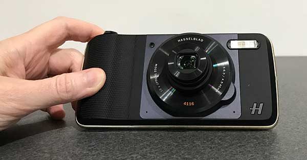
Hasselblad True Zoom Camera Moto Z Mod review

When you shop for a new smartphone, do you base your decision on how good the camera is? It’s a determining factor for me. I wouldn’t consider buying a phone that has a sub par camera because my phone is my main camera. That’s why I’ve been fascinated with camera accessories like clip on lenses that might improve my images and when Motorola and Hasselblad created the True Zoom camera Moto Mod, it perked my interest and I was happy to get the chance to try one out for a few days. Let’s take a look.

What is it?

The Hasselblad True Zoom is a Moto Mod for Motorola Moto Z smartphones that turn the Moto Z into a true pocket camera with a zoom lens.

This quick review isn’t going to be super technical because I’m not a professional photographer and I don’t know all the ends and outs of lenses and camera gear. I just am a casual photo snapper who mainly uses automatic mode to snap a few images every day. But I am always interested in making those images look better with the least amount of effort.
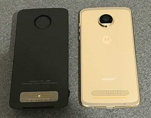
You probably already know what Moto Mods are by now, but just in case you don’t, they are magnetic attachments for Motorola Moto Z phones that offer extra functions and customizations. There are decorative covers for the back of the phone, Bluetooth speakers, projectors, gaming controllers, and more.

The Hasselblad True Zoom Camera Moto Z Mod shown above on the left has electrical contacts that match up with contacts on the back of a Moto Z phone to create an electrical connection. The mod is also magnetic which allows it to attach to the back of the phone without clips or latches.
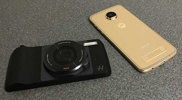
At first glance, the True Zoom looks like a point-and-shoot camera. But upon closer inspection, you will notice that it doesn’t have a viewfinder, a display or a memory card slot. That’s where the Moto Z comes in.
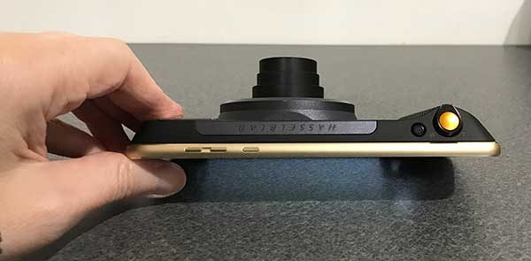
The True Zoom snaps securely to the back of the Moto Z to turn it into a full fledged 12MP camera with 10x optical zoom, a xenon flash, shutter button, and zooming mechanism.

What’s in the box?
Hasselblad True Zoom Moto Mod
Protective carrying case
User guide

Camera specs
Sensor type: BSI CMOS
Sensor size: 1/2.3-inch
Pixel size: 1.55 um
Aperture: f3.5-6.5
Zoom: 10x optical/4x digital
Focal length: 4.5-45 mm (25-250mm 35mm equivalent)
Macro: 5cm @1x – 1.5m @10x
Image stabilization Still: OIS Video: EIS
ISO equivalent: Auto, 100, 200, 400, 800, 1600, 3200
Dimensions: 152.3 x 72.9 x 9.0 – 15.1 mm
Weight: 145g
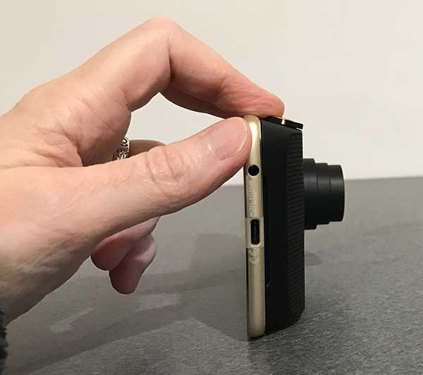
The True Zoom doesn’t need to be charged as it gets all the power it needs directly from the phone it’s attached to. It also doesn’t need its own software because it uses the built in camera app. So all you need to do is snap it on the back of the Moto Z and you’re ready to shoot.

The True Zoom Moto Mod adds considerable thickness to the very thin Moto Z2 Play Android smartphone that was included with the True Zoom for my evaluation. It’s a bulky mod and as such, it’s not something that you would leave attached to your phone all the time.
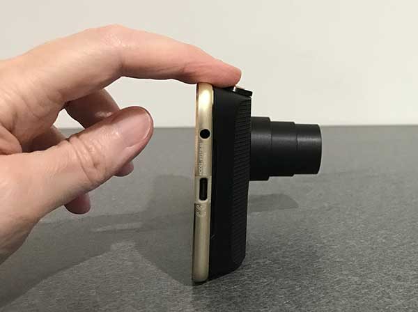
The True Zoom lives up to its name because it does indeed have a built in lens that zooms from 4.5-45 mm (25-250mm 35mm equivalent).
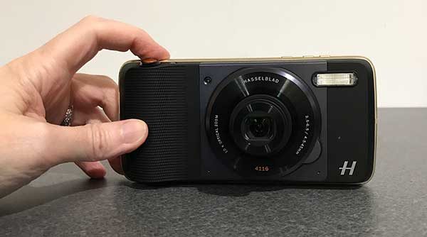
The Hasselblad True Zoom Moto Mod has a small power button on top and a larger shutter button with a spring loaded collar around it that is used to zoom the lens in and out.
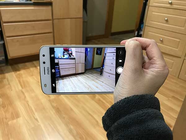
Just like true cameras, you can press the shutter half way to focus and then all the way to snap the image.

The mod also offers a nice grip that adds even more to the pocket camera feel when you’re using it.

Let’s check out some images to see if the True Zoom makes a noticeable difference shooting images compared to capturing the same images with just the Moto Z2 Play.

Example images

I tried to frame the comparison shots as closely as I could and snapped them one after the other. So I would take a picture with the Moto Z2 Play and then put the Hasselblad True Zoom Moto Mod on the back and shoot the same image in that order. Also, all shots are taken without a tripod.

All images can be clicked to see the original full size photo.


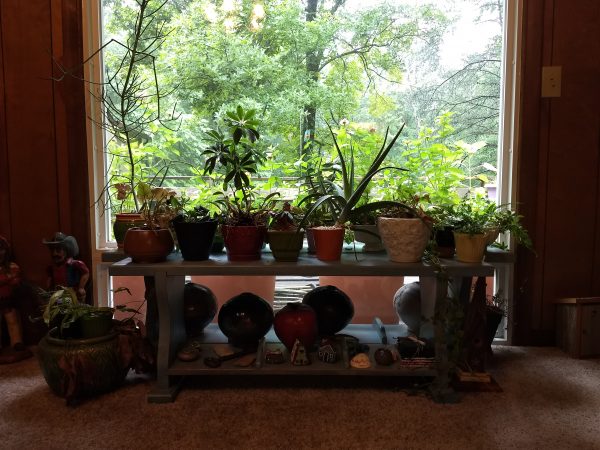
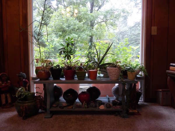
Indoor shot with bright backlight. Both were taken with no zoom applied.


Both images above were taken without any zoom applied. They are similar except that I think the True Zoom captures colors that look more natural compared to the Moto Z2 Play’s image on the left which has too much green/yellow tint to it.


Both images have zoom applied and we start to notice that the True Zoom is sharper than the digital zoomed image from the Moto Z2 Play without the moto mod attached. The color tinge on the Moto picture is still noticeable.


More zoom applied to both. Both are blurry when you view the full sized image but the True Zoom pic looks considerably better in small sized web images.


Max zoom applied to both. The Moto Z2 Play image looks very blurry compared to the True Zoom pic. But if you click to see the full sized image, the True Zoom is also a little blurry. That could be because the picture was taken without a tripod which probably should be used with 10X zoomed pics. A threaded tripod socket on the True Zoom would be a nice feature that is lacking.


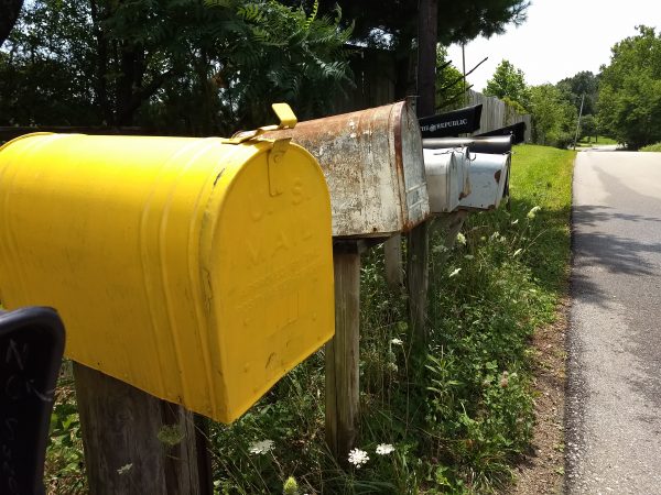
The yellow mailbox in the True Zoom image looks better than the Moto Z2 Play’s image because the color on the top curve of the mailbox is smoother and not over exposed like in the Moto Z2 image.


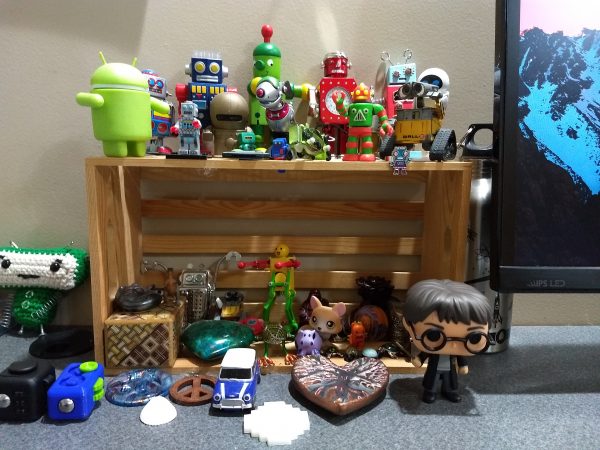
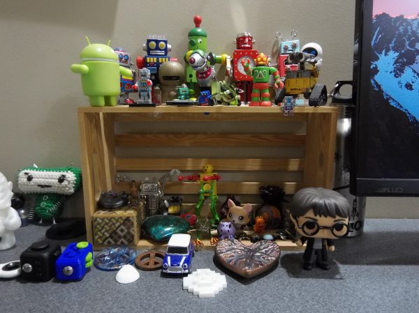
Again, the True Zoom’s image looks better when you compare the two Android figures.


When it comes to indoor low light pics, the Moto Z2 Play’s image without flash is brighter than the True Zoom’s image.

Using flash, the True Zoom’s image looks better. Check out the window in both images and notice how you can see the trees in the True Zoom’s picture (FYI: this is a basement window).

Note: you can shoot in RAW format with the True Zoom.

Using the Hasselblad True Zoom Moto Mod was easy for the most part because all I had to do was place it on the back of the phone and launch the camera app. No other special changes are needed. But I did notice a few issues.
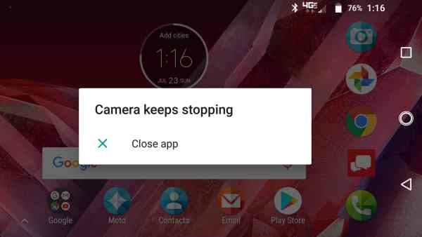
The camera app seemed to crash on a semi-regular basis while the True Zoom was connected to the phone. I also noticed that sometimes the lens would extend when I would pull the phone with the attached mod out of my pocket because it was easy to press one of the buttons on the mod which sometimes (but not always) cause the mod to activate and wake the phone.

Final thoughts

I like the idea of the Hasselblad True Zoom Moto Mod, but when it comes down to the images improvements over a Moto Z without the True Zoom, I wasn’t overly impressed especially with non-zoomed images. I’d personally only carry this mod with me when I knew I’d be taking a lot of telephoto (zoomed) shots. Otherwise, I wouldn’t bother using it due to the added bulk. There’s also the price which puts this accessory in the “I’d like to have this but I don’t want to pay this much for it” category for most people.

Source: The sample for this review was provided by Verizon Wireless. Please visit their site for more info.


Product Information

Price: $249.99
Manufacturer: Hasselblad / Motorola
Retailer: Verizon Wireless
Requirements:
  • Moto Z family of smartphones
Pros:
  • Easily snaps on the back
  • No charging necessary
  • 10 X zoom
Cons:
  • Bulky
  • Expensive
  • Camera app crashes regularly
  • Lacks a tripod socket

Filed in categories: Reviews

Tagged: , , ,

Hasselblad True Zoom Camera Moto Z Mod review originally appeared on The Gadgeteer on July 28, 2017 at 4:53 pm.

Note: If you are subscribed to this feed through FeedBurner, please switch to our native feed URL http://the-gadgeteer.com/feed/ in order to ensure continuous delivery.

Android 7.0 tips part 2: Open Chrome in two separate windows using split-screen and enable Night Mode


Last month I wrote an article entitled Android 7.0 tips: Notifications and power notification controls which seemed to interest some of you, so this month I thought that I would share some additional Android 7.0 tips. Did you know that you can open two Chrome windows using the split-screen feature? And did you know that Nougat has a hidden Night Mode feature that you can enable without rooting your phone?

Before I detail the steps on how to open two Chrome windows using split-screen, I will cover how to use the split-screen feature with two different apps.

Split-screen for two different apps


First, you will need to open an app that works with the split-screen feature (not all apps do; you will not be able to enter split-screen mode if the app does not work with it). Next, long press on the Recent Apps button which is the square soft key located at the bottom of your phone. After doing so, you will notice that the square soft key becomes two stacked horizontal rectangles and the app will be placed in the upper portion of your phone’s screen. At that time, if you have other apps that are open, you may scroll through the Recent Apps area in the lower part of the screen and tap on the one you want to fill the lower half of your screen. If you do not have any other apps open, you can tap on your phone’s Home button and then select an app to open. If the second app you launch does not work with split-screen, you may have to start over with the split-screen process. You can adjust the size of the two windows by long pressing and dragging up or down on the small dash located within the center of the bar that separates the apps.

If you would like to switch the app in the lower window to another app, use a short single tap on the Recent Apps button then either select another app from the Recent Apps area or tap on the Home button of your phone to open another app. To exit split-screen mode, you’ll need to long press on the Recent Apps button again. That’s it.

Open two Chrome windows using split-screen


To open two Chrome windows in split-screen, you need to open your Chrome app then open two tabs in Chrome that you are interested in as shown in the left screenshot above (the square containing the number 2 located at the top of the Chrome app to the right of the web address indicates the number of tabs you have open). Make sure that the tab that you want to move to the LOWER part of your phone’s screen is the active window (the tab that you are viewing), then long press on the Recent Apps button.


Next, you will need to tap on the vertical ellipsis (or More Options) icon located in the upper-right corner of the Chrome app to access the Chrome app menu as shown in the left screenshot above. Now you’ll need to tap on “Move to other window” after which, the Chrome tab that you are viewing will be moved to the lower part of the split-screen, leaving the other tab to fill the upper part of your phone’s screen. When you want to exit the split-screen mode, you’ll need to long press on the Recent Apps button again.

Enabling Night Mode

The next tip I have for you is enabling Night Mode. Night Mode is a blue-canceling mode for your phone to help reduce interference with your sleep patterns. I learned how to activate this feature thanks to android.gadgethacks.com and found that this feature is somewhat twitchy to use, but it is possible to get it to work.


Even though this feature did not visibly make it to the final version of Android 7.0, the code is apparently still there and can be accessed (without root) by downloading the app called Night Mode Enabler by Mike Evans.

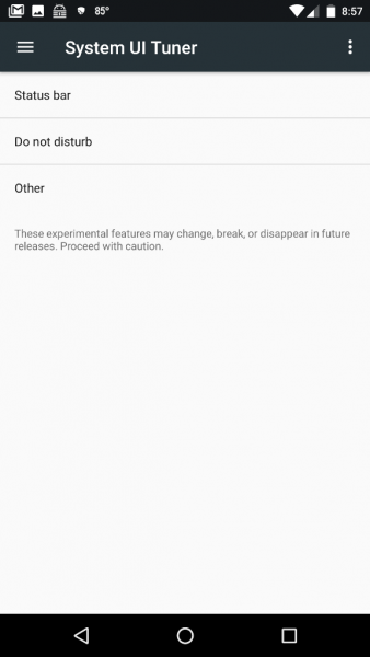
NOTE: Before being able to use the Night Mode Enabler app you must first enable the System UI Tuner. If you haven’t already done this, please visit the Android 7.0 tips: Notifications and power notification controls article that I wrote last month (the steps to enable it are located in the middle of the article). HTC phones users and others that cannot enable AND access the System UI Tuner from your phone’s settings will not be able to enable Night Mode. Remember, all of the System UI Tuner settings are experimental and may not work.

When you open the Night Mode Enabler app, you’ll need to tap on the Enable Night Mode button as shown in the right screenshot above.


Just after tapping on the button, you will be brought to the Night Mode settings located in the System UI Tuner. The Night Mode settings consist of turning the mode on, turning it on automatically, adjusting the tint and adjusting the brightness.

When you fully expand your phone’s Quick Settings (by pulling down on the Notification Shade twice) you will then notice that the Night Mode toggle was added to your list (it was added automatically for me). If it was not, you can tap on the Edit button located in the lower right corner of the Quick Settings area then, from the list of additional toggles, long press on the Night Mode toggle and drag it to your desired location in Quick Settings (you can reorder any of your toggles using this process). If you have trouble adding it, according to android.gadgethacks.com, you can “reset your Quick Settings toggles, then add the Night Mode switch again. To do that, just head to the ‘Edit’ menu in Quick Settings, then tap the three-dot menu button in the top-right corner and choose ‘Reset.’” Now you can manually toggle Night Mode on or off if you wish. When this feature is active, the screen on your phone takes on an orange hue which I could not capture with screenshots.

NOTE: the ONLY way to access and alter these Night Mode settings is by long pressing on the Night Mode toggle in your phone’s Quick Settings or by launching the Night Mode Enabler app – you WILL NOT see it by going into the System UI Tuner settings directly.

It was my experience that leaving the Night Mode settings in their default positions allowed me to manually turn Night Mode on or off from my phone’s Quick Settings. Turning off the Adjust Tint setting seemed to prevent my phone’s screen color from changing, so I left this in the “On” position. I have not tested turning on Night Mode automatically, I’ve only used the manual toggle in Quick Settings. I realize that there are night mode apps available that perform this function well, but this method is free (no ads to deal with) and I do like having a Night Mode toggle available in my phone’s Quick Settings.

I hope you find these features useful and fun to use like I did!

Filed in categories: Articles

Tagged:

Android 7.0 tips part 2: Open Chrome in two separate windows using split-screen and enable Night Mode originally appeared on on June 29, 2017 at 1:12 pm.

Note: If you are subscribed to this feed through FeedBurner, please switch to our native feed URL http://the-gadgeteer.com/feed/ in order to ensure continuous delivery.
Samsung Galaxy S8 review


I’m guessing that almost every review of the Samsung Galaxy S8 or S8+ starts out with some mention of last year’s recall of the Note 7 due to battery issues that led to the spontaneous combustion of some phones. You would think that all that drama and bad press would have hurt Samsung’s reputation. But it doesn’t appear to be the case because many of my gadget reviewing brethren are saying that Samsung’s latest smartphones are the best smartphones ever made by anyone. What do I think? Click through to find out.

What is it?

The Samsung Galaxy S8 is Samsung’s latest Android smartphone.

Hardware specifications

Processor: Qualcomm® Snapdragon™ 835 MSM8998 Octa-Core, 2.35 GHz (Quad) + 1.9GHz (Quad)
Display: 5.8” Quad HD, Super AMOLED, 571 PPI, 1440 x 2960 pixels resolution, Corning Gorilla Glass 5
Operating System: Android 7.0, Nougat
Memory: Flash: 64GB RAM: 4GB
Expandable Memory: Removable microSD up to 256GB (sold separately)
Network: CDMA 1X and EvDO Rev 0/Rev ALTE (Domestic): B13/B4/B2/B5/B66
Global Network: LTE (Global): B3/B7/B20/B8/B18/B19/B28/B26GSM Quad B5/B8/B3/B2 (850/900/1800/1900MHz) & UMTS Quad: B5/B8/B2/B1 (850/9001900/2100MHz) TDS CDMA 34, 39 & TDD LTE 38, 39, 40, 41, LTE-U: B252/B255(in SU)CAT 4/ CAT 6/ CAT 9
Camera (rear): 12 MP f/1.7, 26mm
Camera (front): 8 MP f/1.7
Bluetooth: 5.0, A2DP, LE, aptX
Wi-Fi: 802.11 a/b/g/n/ac 2.4G+5GHz, VHT80 MU-MIMO,1024-QAM
NFC
Battery: 3,000mAH, Non-removable
Dimensions: 5.86 in x 2.68 in
Weight: 5.47 oz

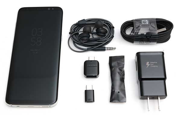
What’s in the box?

Samsung Galaxy S8
AC adapter
USB Type-C charging cable
USB to Type-C adapter
micro USB to Type-C adapter
Headphones
Ear tips for headphones
SIM card removal tool

Design and features

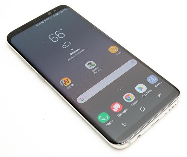
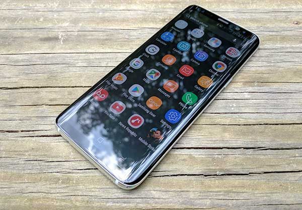
I can’t argue when people say that the S8 is the nicest looking smartphone that has ever been made. It’s thin, with smooth sides, rounded corners and of course, that almost bezel-less curved glass display. It’s a looker for sure.

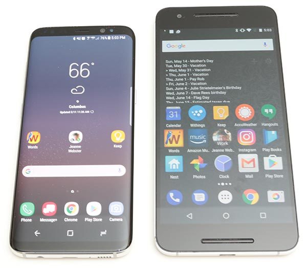
The S8 is pictured above to the left of my Nexus 6P. The Nexus has a 5.7” 2560 x 1440 resolution display and the Samsung Galaxy S8 has slightly larger 5.8″ higher resolution 2960 x 1440 display but in a noticeably smaller package.


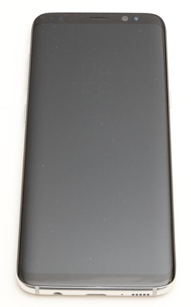
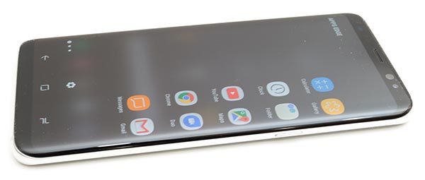
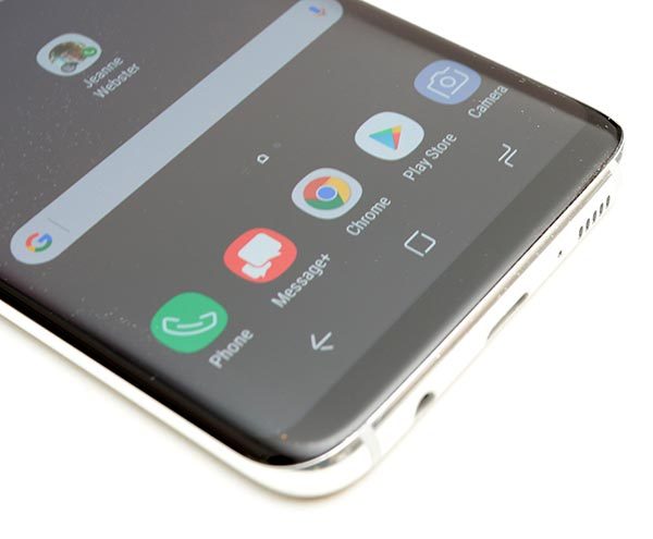
The front of the S8 has a Corning Gorilla Glass 5 display with thin black bezels at the top and bottom edges. Gone is the familiar physical home button that has graced Galaxy phones for as long as I can remember.

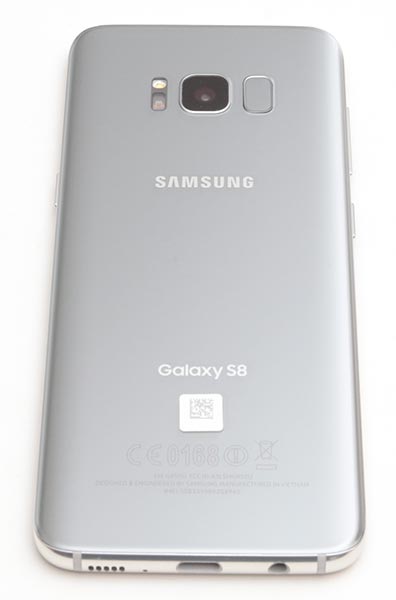
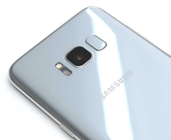
The back of the phone is also made of Corning Gorilla Glass 5 with a LED flash, camera, and an awkwardly placed fingerprint scanner which I’ll talk about later.

On the left side of the phone are two buttons. There’s a long one-piece volume rocker button and the Bixby button below it. If you’re not familiar with Bixby, that’s Samsung’s version of Siri and Google’s digital voice assistants. I’ll talk more about Bixby later in the review, but suffice to say, that the location of the Bixby button is not optimal because it’s too close to the volume button.

On the opposite side of the phone, you’ll find the power/wake button.

All of the Samsung Galaxy S8’s buttons have good tactile feedback and stick out far enough from the frame so that your fingers can find the buttons without looking.

On the top edge of the Galaxy S8, you’ll find a microphone…

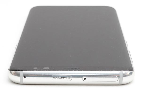
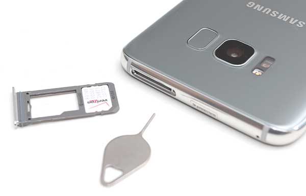
and the SIM/micro SD card tray.

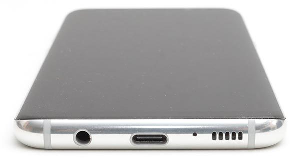
On the bottom edge of the S8, you’ll find an antiquated 3.5mm headphone jack (just kidding), a USB Type-C charging port, another microphone, and the speaker.

The location of the speaker is problematic if you like to hold your phone in your hand while watching videos. It’s too easy to block the speaker with the palm of your hand, causing audio to be muffled.

The S8 is a solid device that has no problems surviving my almost 2 decades old squeeze test. The phone feels great in hand and is the perfect size for one-handed use and fits much better in my pocket than my Nexus 6P. But, the S8 is a slippery phone and with a glass back, I worry about how fragile it is.

I’m not going to drop it to test how fragile it is, but it is nice to know that the S8 has an IP68 rating which means that is water resistant when dunked in up to 3 feet of water for up to 30 minutes.

Display

The S8’s display is gorgeous. But then I think all Samsung devices have the excellent displays. The display on the S8 is bright, with vivid colors, and great viewing angles.

Even in full sunlight, the S8’s screen can be read relatively easily.

Barely there bezels mean that the S8’s screen takes up 83% of the phone’s face. The S8 isn’t the first smartphone to feature almost invisible bezels. LG beat Samsung to launch with the first almost bezel-less phone when they rolled out their LG G6.


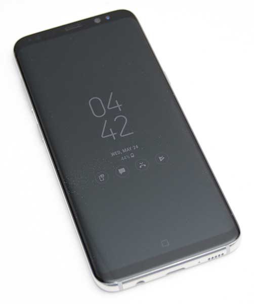
I do love the Samsung Galaxy S8’s always on display which shows the current time along with notification icons for incoming emails, text messages, missed calls, etc. However, interacting with the notification icons can feel a little inconsistent.

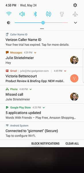
When you double tap a notification icon on the lock screen, it will either show a list of your notifications like the screenshot above, or it will prompt you to unlock the phone. I haven’t figured out why it chooses to show the list or not show the list when double tapped. Even when it does show the list, you can’t really do anything until you unlock the phone.

Curves in all the right places?

Curved screen edges are not a new feature for Samsung smartphones. We’ve seen them for several years now. In the past, I’ve had issues with my palm accidentally pressing the screen when I’m gripping it in my hand. I’m happy to say that I didn’t notice any of these problems with the S8. That said, I’m just not a big fan of rounded screen edges for the very reason that the screen wraps around the edge. It feels like the screen is squeezed and thinner/smaller than it should be.

I also don’t use the edge panels that are accessed by swiping the panel handle on the edge of the screen. If you’re not familiar with them, you can think of edge panels as an app speed dial list. I just don’t see the point.

The Samsung Galaxy S8’s 18.5:9 display is taller and narrower than the Samsung Galaxy S7 which makes it easier to hold and use with just one hand.

This is the first Samsung smartphone that does not have a physical home button. Do I miss the home button? Nope, not at all. But that’s mainly because I’ve been using the Nexus 6P as my primary phone for over a year, which also does not have a home button.

Before you ask, there is a home button, it’s just not a mechanical/physical button. It’s a virtual button that is always there, even on the lock screen. When you press the virtual home button, it vibrates to provide tactile feedback. The onscreen button graphics move slightly all the time to prevent screen burn in.

Audio quality

The Samsung Galaxy S8 sounds pretty great with the included AKG in-ear wired headphones which are worth about $100 on their own. Music sounds better through the S8 and headphones when compared to my Nexus 6P.

Listening to music, movies, etc using the built-in speaker is ok but it’s nothing to high five about.

Camera

When it comes to smartphone cameras, everyone’s go-to comparison is going to be with the latest iPhone. I don’t have an iPhone 7 or 7 Plus to do any comparisons with the S8 for this review, but I was not unhappy with the S8’s image snapping performance. I’ve included some samples below.


The camera interface is not too much different than previous models of the Galaxy phone. There are a few minor updates though. One nice update is that Samsung finally allows you to double tap the power button to launch the camera app. That means you can snap a quick pic without needing to first unlock the phone.


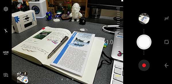
The app also has an easy way to zoom in by moving the on-screen shutter button up and down.

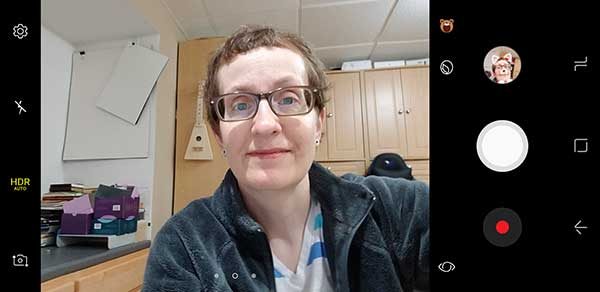
If you’re into silly Snapchat style image overlays, the S8’s camera app includes a few animal “stickers”. How do I look as a cat?


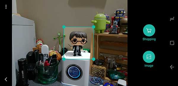
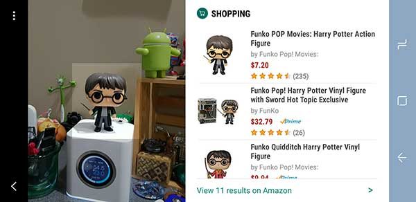
Clicking the stylized eye icon in the camera app will launch Bixby Vision. With Bixby Vision, you can point the camera at a product and it will look up the pricing info for it on Amazon. I tried it with a few items around the house and it worked surprisingly well. The only issue is that the phone has to be unlocked to use Bixby Vision. That means if you use the double tap power button feature to launch the camera app and then tap the Bixby Vision icon, you’ll be prompted to unlock the phone before you can use the product lookup feature.

Although the camera takes good pictures, it is a little disappointing that the S8 only has one camera lens on the back. So you can’t get the wide angle shots or the same bokeh (fuzzy background) features that the iPhone 7 Plus and LG G6 offers. I’m guessing that Samsung will save the dual camera feature for the Note 8.

Unlocking the phone

You’ve no doubt already heard that the fingerprint scanner is located on the back of the S8 next to the camera lens and that the location sucks. I’m not going to argue with that. The location DOES suck and I hate everything about the S8’s fingerprint scanner because it doesn’t work for me more than 1-2 times out of 10. Fingerprint scanners hate me… it’s just one of the sad facts of my gadget reviewing existence. However, I didn’t have any probs with the fingerprint scanner on the LG G6. It worked almost every time… which is rare for me. Because I have so much trouble with fingerprint scanners, I just don’t use them.

If you also have issues with fingerprint scanners, the S8/S8+ has three other ways to unlock the phone. You can use the iris scanner, face scanner, or go old school and setup a pattern. I find that using the pattern is the fastest way for me to unlock the phone because you have to swipe the unlock screen first to use the iris or face scanner which I think is an unnecessary step. I also use the Smart Lock feature which lets you unlock instantly by pressing the power button or home button when you’re at a trusted place, are connected to trusted devices, or use a trusted voice (the voice set up for Ok Google).

I also use the Smart Lock feature which lets you unlock instantly by pressing the power button or home button when you’re at a trusted place, are connected to trusted devices, or use a trusted voice (the voice set up for Ok Google).

Software and user interface


The S8’s user interface has Samsung’s TouchWiz interface on top of Android Nougat. There are a few things that TouchWiz changes about Nougat when compared to a Google Pixel or the Nexus 6P. For one thing, the icons have rounded frames around them so that they look alike. If you hate this feature like I do, you can turn it off, but Samsung’s apps retain the look even when you turn off the feature.

Another difference includes the option to toggle on a blue light filter which is supposed to help prevent eye strain by limiting the amount of blue light emitted by the screen.

But one of the biggest difference between the Samsung Galaxy S8/S8+ and other Android phones is Bixby Home, Vision and Voice. I already mentioned the Bixby Vision feature when I discussed the camera.

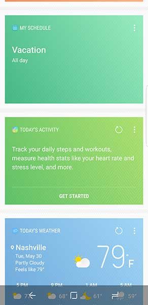
Bixby Home is like Google Now which you access by swiping right on the home screen. It shows cards with the weather, people who you contact regularly based on the time of day, calendar events, news and more. I rarely use Google Now on my Nexus 6P and don’t see a real need to use it on the S8 either.

Bixby Voice is supposed to be a virtual assistant like Alexa, Siri, and Ok Google. The problem is that doesn’t work yet, so it’s yet to be determined if it’s better than Ok Google which I seriously doubt it will be.

Using the Samsung Galaxy S8 for phone calls

I didn’t have any complaints from people I talked to while testing the Samsung Galaxy S8. Conversations on both sides of calls were clear and with ample volume. I also did not have any issues with dropped calls while testing this phone. Signal strength seemed to be no better or worse than other phones that I use and test on the Verizon network.

Overall performance and battery life using the Samsung Galaxy S8 for day to day tasks

The Samsung Galaxy S8’s performance is smooth and snappy. I had no issues launching apps, switching back and forth between apps, scrolling web pages, lists, etc. I also didn’t have any issues with the S8 freezing or crashing.

When it comes to battery life, I was easily able to make it through a full day and sometimes much longer before needing a recharge.

Also, the fact that the S8 has wireless charging gets a big thumbs up from me.

Final thoughts

When other reviewers say that the Samsung Galaxy S8 and S8+ are the best smartphones in the world, I have to agree. The S8 is a solid well-made phone that looks great. It’s fast, has a very good camera and the screen is spectacular. Even though I’m not a fan of the curved display sides, I really have enjoyed using this phone and was sorry to box it up and return it to Verizon today.

The only downside to this phone is the price (especially if you plan to buy the unlocked version) but unfortunately, that is the trend led by Apple and I don’t see any relief in sight.

If you’re shopping for a new high-end Android smartphone and can’t make up your mind between the S8 and the LG G6, I feel your pain. It just comes down to what looks best to you. That said, I’m happy to recommend the S8.

Source: The short term loaner sample for this review was provided by Verizon Wireless. Please visit their site for more info and to order.


Product Information

Price: $756.00
Manufacturer: Samsung
Retailer: Verizon Wireless
Pros:
  • Gorgeous display
  • Wireless charging
  • Good battery life
  • microSD card slot
Cons:
  • Expensive
  • Fingerprint sensor location
  • Only one camera on the back
  • Downward firing speaker

Filed in categories: Featured Items, Reviews

Tagged: ,

Samsung Galaxy S8 review originally appeared on on June 1, 2017 at 11:57 am.

Note: If you are subscribed to this feed through FeedBurner, please switch to our native feed URL http://the-gadgeteer.com/feed/ in order to ensure continuous delivery.

Android 7.0 tips: Notifications and power notification controls


I thought it might be interesting to write up some tips about Android 7.0 (Nougat) features that I find fun to use. I realize that not all our readers have Android 7.0, but for those of you who do, you will find some of the new features very handy. One of those features that I really enjoy using is being able to customize my notifications in the notification shade and Nougat offers a faster and easier way to manage them.


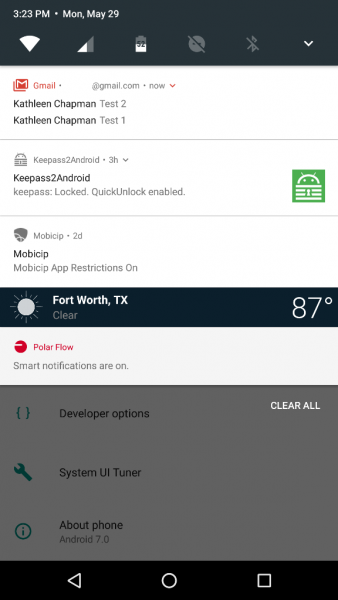
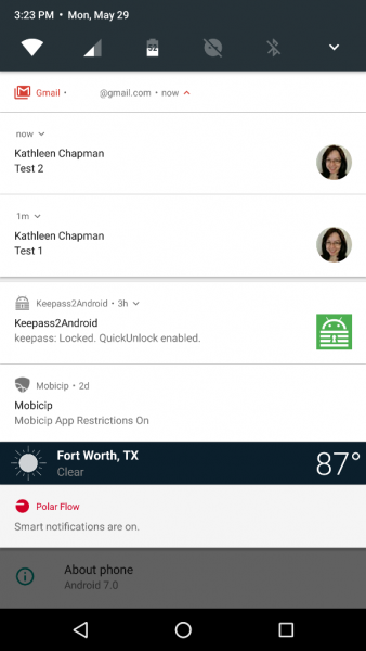
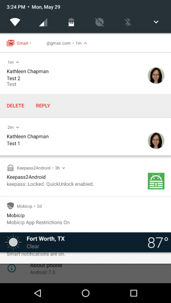
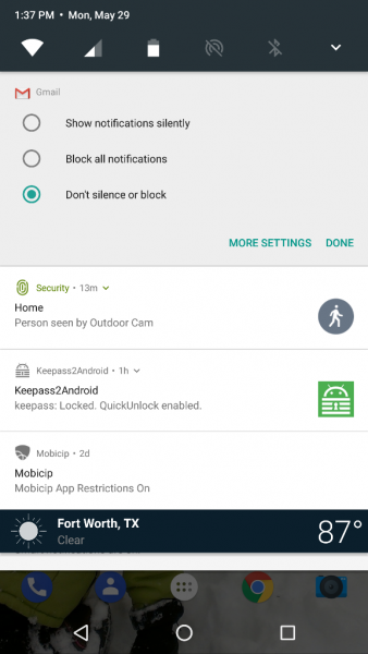
Android 7.0 now allows apps like Gmail to bundle their notifications in the notification shade (although not all apps do this). When you receive several emails, Gmail will group them together in the notification shade like that shown in the left screenshot above. If you pull down on the Gmail notification, it will separate each email as shown in the center screenshot above. And, if you continue to pull down on each email, you will be given the options to Delete or Reply.

Now, to easily manage your notifications, you’ll need to pull down on the notification shade and long press on the notification you wish to customize. This reveals three options to choose from: “Block all notifications”, “Show notifications silently”, or “Don’t silence or block”. Pretty sweet, right?

But wait, that’s not all. What if you would like to prioritize your notifications in the notification shade by order of importance? Nougat allows you to do so via the Power Notification Controls available in the System UI  Tuner.


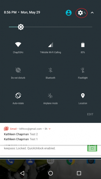
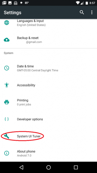
Where is the System UI Tuner? It is located in your device Settings (the gear icon located in the upper right corner after pulling down on the notification shade twice as shown in the left screenshot above) but it does not show up automatically so you will have to long press on the Settings gear icon for about five seconds then release. After you release, a message pops up saying, “Congrats! System UI Tuner has been added to Settings.” Another message warns you (after opening the Tuner) that it is “Fun for some but not for all. System UI Tuner gives you extra ways to tweak and customize the Android user interface. These experimental features may change, break, or disappear in future releases. Proceed with caution.” (Ooh, how I hope they don’t take this away!!!)

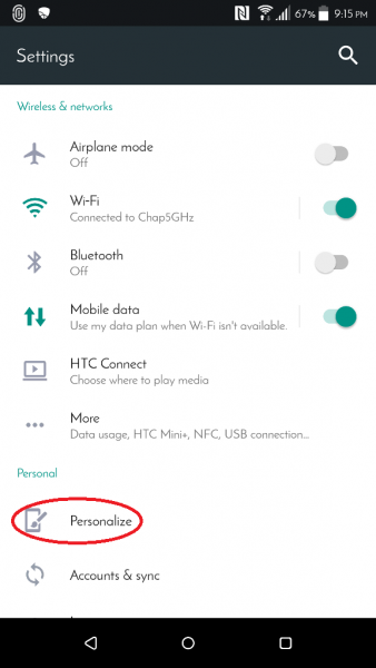
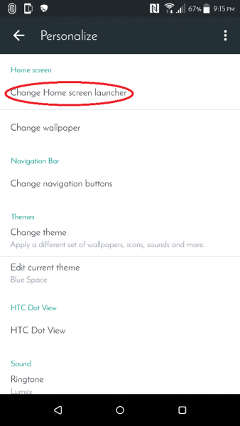
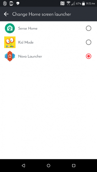
NOTE for HTC users who wish to access the System UI Tuner: Thanks to hasmujo on YouTube, there is a workaround for you to access the System UI Tuner. To do this you will have to download Nova Launcher (the free version is fine) if you don’t already have it installed.


Once installed, you’ll need to set Nova Launcher as your new launcher by tapping on the following:

device Settings (gear icon) > Personalize > Change Home screen launcher > Nova Launcher (depicted in the screenshots above; you can revert to your previous launcher later once you’ve selected all the System UI Tuner settings you want).


Now you’ll need to set up your phone’s soft Home key to launch the System UI Tuner. To do this you’ll need to tap on the following:

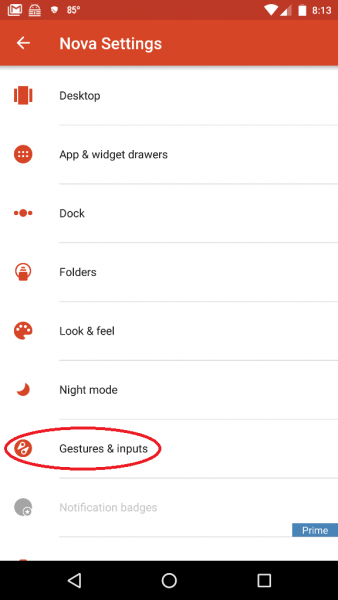
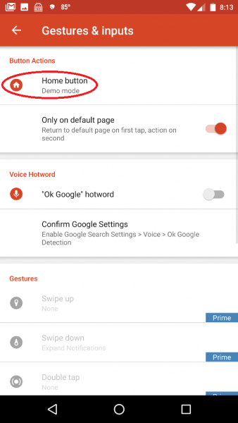
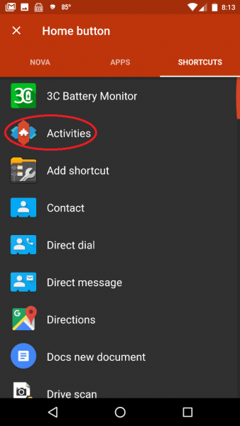
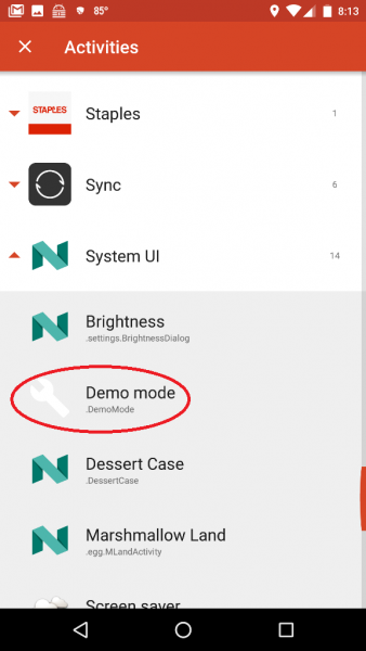
Nova Settings app (in the App Drawer) > Gestures & Inputs > Home button > Shortcuts (located at the top of the app screen next to “Nova” and “Apps”)> Activities > System UI > Demo mode (the steps are shown in the screenshots above which may be tapped on to view a larger size).

After setting up the Home button to launch the Demo mode System UI setting, you’ll then back out of all these settings then tap on the soft Home key on your phone (you might need to tap on the Home button twice if you weren’t already on your phone’s Home screen). This launches the System UI Tuner settings. Now back to Power Notification Controls…


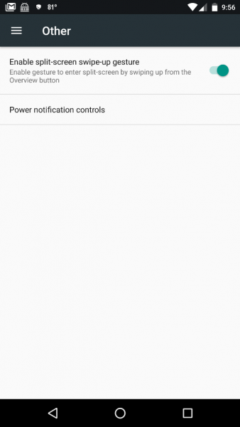
To navigate to and turn on the Power Notification Controls, you’ll need to go to the System UI Tuner settings by tapping on your device Settings icon (gear icon) > System UI Tuner (located near the bottom of the list) > Other > Power Notification Controls and slide the button to the On position (shown in the right screenshot above).


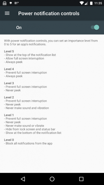
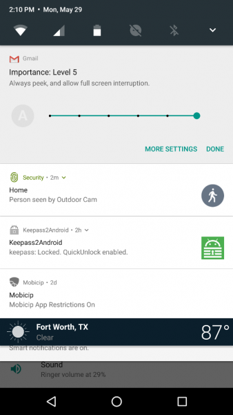
Now when you long press on a notification in the notification shade, you will see information like that shown in the left screenshot above. Each of the dots on the horizontal slider bar represents a notification importance level (shown in the right screenshot above):

  • Level 5
    • Show at the top of the notification list
    • Allow full-screen interruption
    • Always peek
  • Level 4
    • Prevent full-screen interruption
    • Always peek
  • Level 3
    • Prevent full-screen interruption
    • Never peek
  • Level 2
    • Prevent full-screen interruption
    • Never peek
    • never make sound and vibration
  • Level 1
    • Prevent full-screen interruption
    • Never peek
    • Never make sound or vibrate
    • Hide from lock screen and status bar
    • show at the bottom of the notification list
  • Level 0
    • Block all notifications from the app

Notice the grayed out “A” located on the left of the slider bar? When this is NOT grayed out, it means that the app automatically determines the level of importance for you. This is the default setting of installed apps, and you must tap on the “A” to be able to customize the level of notification importance. Voilà! There you have it – custom notifications!

Isn’t Android awesome? And it just keeps gettin’ better with time…

Filed in categories: Articles

Tagged:

Android 7.0 tips: Notifications and power notification controls originally appeared on on May 30, 2017 at 7:58 am.

Note: If you are subscribed to this feed through FeedBurner, please switch to our native feed URL http://the-gadgeteer.com/feed/ in order to ensure continuous delivery.

Samsung teams up with The Weather Channel to bring new functionality to weather app

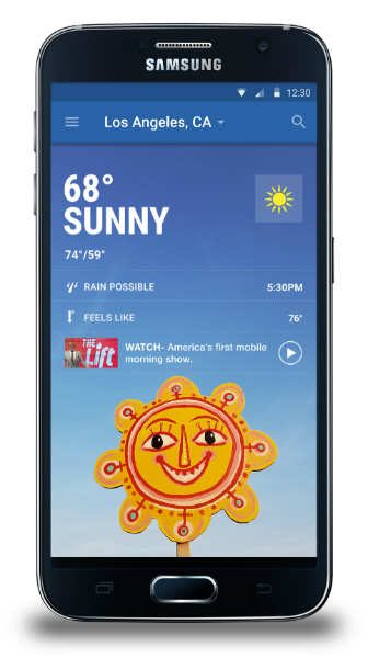
The Weather Channel App for Samsung, which was released in 2016, offers exclusive functionality to users of the soon-to-be-released Galaxy S8 and Galaxy S8+ devices and older devices like the S7, S6 and Note 5. The latest feature to be added to the Weather Channel App for Samsung includes Google calendar event syncing and Lyft ride requests. The Google calendar syncing will link a user’s events with weather forecasts for their selected location to provide the weather forecast for those specific events. Now users can also book a ride to the event using the Lyft app. The Lyft feature is now accessible for app users within the U.S., and The Weather Channel for Samsung App is accessible globally within the Galaxy Apps store.

Filed in categories: Android, News

Tagged: ,

Samsung teams up with The Weather Channel to bring new functionality to weather app originally appeared on on April 12, 2017 at 9:51 am.

Note: If you are subscribed to this feed through FeedBurner, please switch to our native feed URL http://the-gadgeteer.com/feed/ in order to ensure continuous delivery.