Jelly Pro super mini 4G smartphone review

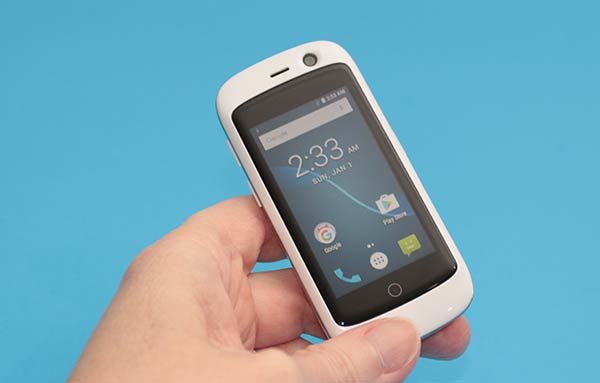
While most new smartphones make it a point to feature larger displays with each new generation of phone, the designers at Unihertz decided to go the opposite direction when they created the Jelly Pro smartphone. This doll-sized Android smartphone might fool you into thinking that it’s a toy. Let me tell you, it’s not. Grab your magnifying glass and let’s take a closer look.

What is it?

Jelly is a tiny Android smartphone that’s pocket and budget-friendly and can support 2 SIM cards and a micro SD card for memory expansion.

What’s in the box?

Jelly Pro
micro USB cable
User manual

Hardware specs

Processor: Quad Core 1.1Ghz
Display: 2.45 inch 240×230 pixel touchscreen
Operating System: Android 7.0
Memory: Flash: 2GB RAM + 16GB
Expandable Memory: Removable microSD
Network: 4G LTE, GSM 850 (Band5)/900 (Band8)/1800 (Band3)/1900 (Band2) MHz;WCDMA 850 (Band5)/900 (Band8)/1900 (Band2)/2100 (Band1) MHz;FDD-LTE Bands 1/2/3/4/5/7/8/12/17/19/20; TD-LTE: Band 40
WiFi, Bluetooth 4.0
Camera (rear): 8MP, (front): 2MP
Battery: 3,300mAH, Non-removable
Dimensions: 3.07 x 4.92 x 1.97 in
Weight: 7 oz

Design and features
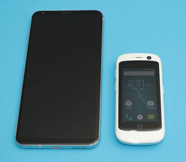
When they say that the Jelly Pro is the world’s smallest smartphone, they aren’t kidding. It looks positively adorable next to an LG V30 in the image above.

The Jelly Pro is available in black, blue, and white like the one that was sent to me.
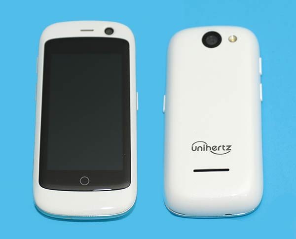
You won’t find a metal or glass housing on the Jelly Pro. It features good old plastic which I don’t think is a bad thing. Plastic is lighter weight and tends to hold up better than glass and metal as far as scratches go.
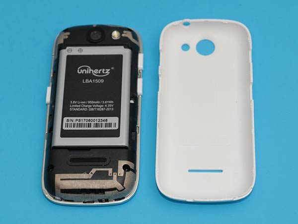
A plastic shell can also mean that the back of the phone can be removed to gain access to a removable battery which is just what the Jelly Pro has inside.
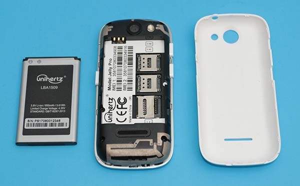
The Jelly Pro is powered by a 950mAh lithium-ion rechargeable battery. Also inside the phone, you’ll find 2 SIM card slots and a micro SD card slot for memory expansion.
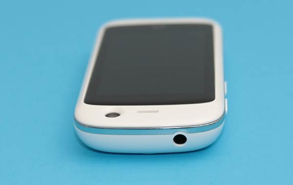
The Jelly Pro smartphone also sports a 3.5mm headphone jack on the top edge.
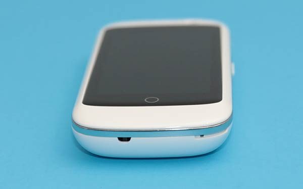
On the bottom edge is a microphone.
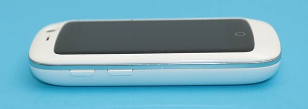
The volume buttons are located on the left side of the phone.
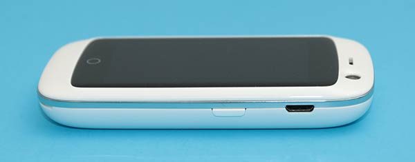
And the power button and micro USB charging port are located on the right side of the phone.
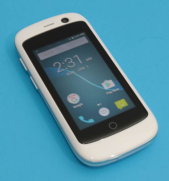
Although the Jelly is a mini-sized phone, it has quite a large “chin”, “forehead”, and bezels for its size.
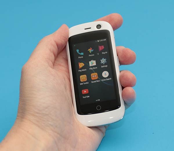
The phone is comfortable to hold because it fits easily in even the smallest of hands. It also fits in the “girl’ pockets in my jeans which I love!

The Jelly phone feels solid and is able to survive my crushing Gadgeteer squeeze test without surrendering. However, I do hear faint rattling when I shake it, which comes from the volume and power buttons.

Display

The Jelly’s touchscreen display is an eye-squinting 2.45 inches diagonally.
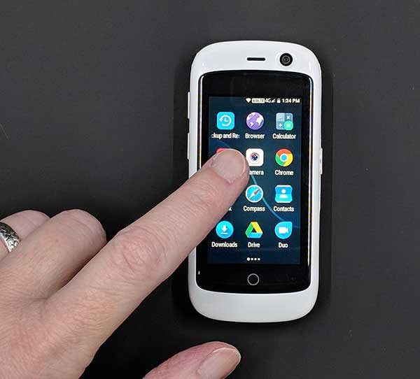
Tapping icons and scrolling isn’t a problem, but reading text can be a challenge.
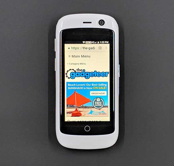
Surfing web pages using the Jelly phone doesn’t provide the best experience either because you constantly need to scroll the page to read more text.
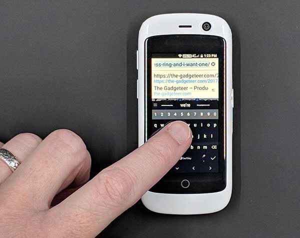
But the worst part about the tiny screen size becomes very noticeable when you need to input text to type in a web page address or send a text message. The onscreen touch keyboard is so small that it takes some finesse to tap the right key because your fingertip is large enough to touch 4 keys at a time. Let’s just say that I spent more typing pressing the backspace key than actual letter keys.

Camera

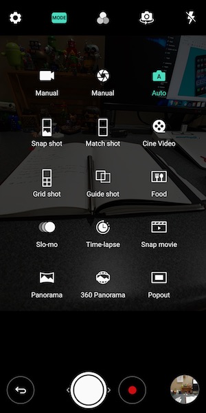
The Jelly Pro has a built-in 8mp camera. It’s not fair to compare this $125 phone’s camera with the camera on a $1000 iPhone X or the Pixel 2 XL, so I won’t. I’ll just show you some sample images and you can make up your own mind. But as the saying goes, the best camera is the one that’s with you, so the camera on the Jelly Pro is better than not having a camera at all.


Audio quality

This phone is small, but the built-in speaker is surprisingly loud. You’ll have no problem hearing alarms and notifications, and if you’re so inclined, you can even listen to music through the speaker. Music doesn’t sound stellar through the built-in speaker, but it’s good enough in a pinch.

Plug a set of headphones into the 3.5mm jack or pair with Bluetooth headphones and music sounds fine to pretty darn good.

Software and user interface
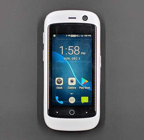
Surprisingly, this phone doesn’t have a watered down version of Android. It runs on Android v7.0 (Nougat), which is one version older than v8.0 Oreo which is currently the newest version of the Android operating system. That said, v7.0 is still the version that most phones are currently running.

The phone doesn’t come with any bloatware. It has just the standard core Android apps and a few extras like an FM radio app, pedometer app, file manager, flashlight, sound recorder and SIM toolkit.

Speaking of the SIM toolkit, the Jelly Pro can switch between 2 different SIM cards if you happen to have a card for work and a card for your personal business.

I’ve had the Jelly Pro for almost a month and in that time the phone has received at least two updates, which inspires confidence that this phone will have support going forward.

Using the Jelly Pro for phone calls

I have no complaints using the Jelly Pro to make and receive calls. Volume levels on both sides of the call are fine and I didn’t have any issues with dropped calls.

Overall performance and battery life using the Jelly Pro for day to day tasks
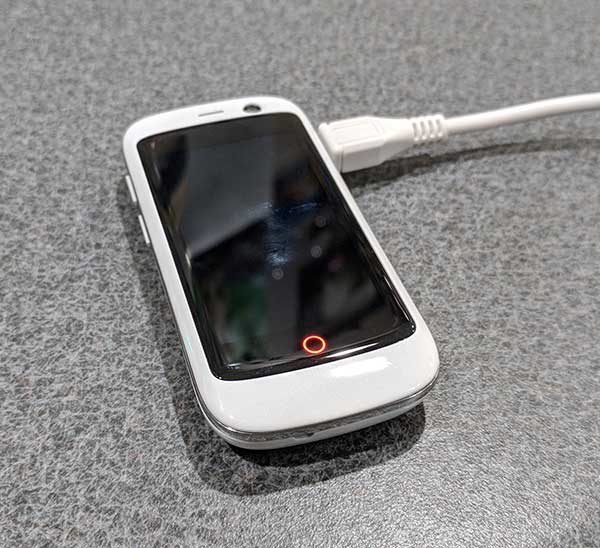
The Jelly Pro has a cool little LED battery charging indicator on the front of the phone that glows red while charging and then turns green after the phone is fully charged. I like this feature which is great considering that I had to look at it a lot due to the short battery life per charge.

If you don’t do anything at all with the Jelly Pro, you should be able to make it a full day on a charge. But if you’re using the phone to make calls, send texts, surf Instagram, etc. You’ll be charging the phone halfway through the day, if not sooner.

What I like about the Jelly Pro smartphone

The size of this phone is my favorite feature mainly because it fits in the front pocket of my snug jeans and I forget it’s there unlike my Pixel 2 XL which sticks 2/3rds out of the back pocket of my jeans.

The Jelly Pro is a cute phone and people will ask you about it when they see you using it. It’s also fun to use as long as all you really want and need to do is to make and receive calls with it.

What needs to be improved

Although the Jelly Pro is considered a smartphone, you probably won’t want to do a lot of smart things with it. You won’t want to read the latest ebook on it, surf your favorite sites on it, play your favorite games with it, or even text your BFF with it unless your answers to questions consist of 1-3 letter answers like K and sup. The screen is just too freaking tiny for any of those tasks.

I’m not saying that it isn’t possible to do all those things with the Jelly Pro smartphone. I’m just saying that you probably won’t want to if you have adult sized fingers and older eyeballs like me.

Final thoughts

In a world full of phablets, it’s refreshing to see an alternative like the Jelly Pro. Testing this phone made me remember the early days of cell phones when I could carry one in my pocket without worrying that it would fall out.

The Jelly Pro is the perfect little phone for people who only want to make and receive calls or want a vacation from a “real” smartphone.

Source: The sample for this review was provided by Unihertz. Please visit their site for more info and Amazon to order.


Product Information

Price: $124.99
Manufacturer: Unihertz
Retailer: Amazon
Pros:
  • Bargain priced
  • Pocket friendly
  • Built-in FM radio
Cons:
  • Battery life is short
  • Tiny onscreen keyboard is tough to use

Filed in categories: Featured Items, Reviews

Tagged: ,

Jelly Pro super mini 4G smartphone review originally appeared on The Gadgeteer on December 5, 2017 at 12:00 pm.

Note: If you are subscribed to this feed through FeedBurner, please switch to our native feed URL http://the-gadgeteer.com/feed/ in order to ensure continuous delivery.

ZTE Axon M Android smartphone review

Extended (tablet) mode

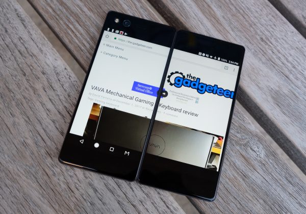
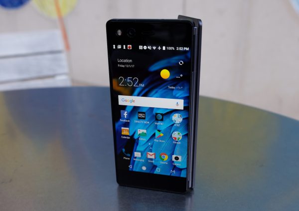
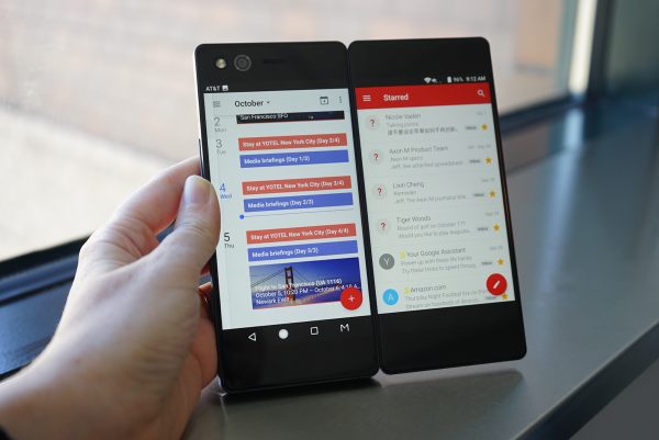
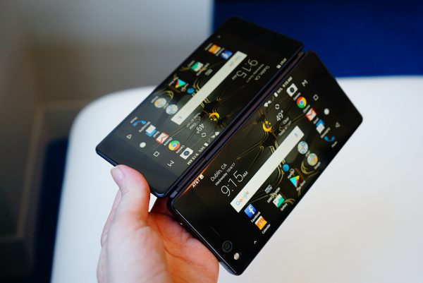
ZTE’s Axon M is one of the devices that threw us for a loop in 2017. The company managed to the be the first to come out with a foldable smartphone with two screens. A multitaskers dream, the displays on the Axon M are each a 5.2-inch 1080p IPS display. Together they combine to form a 6.75″ tablet-like display with a somewhat distracting seam running down the middle.
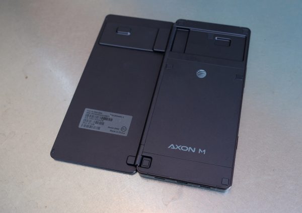
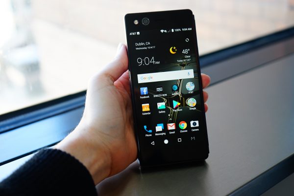
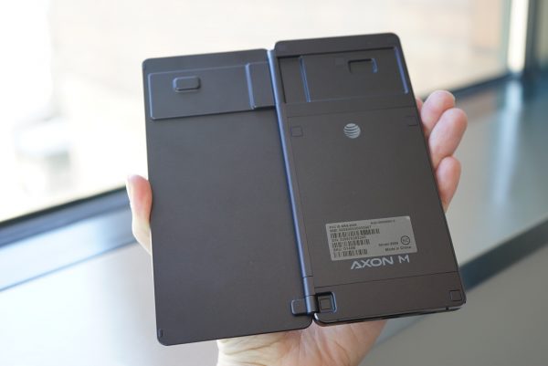
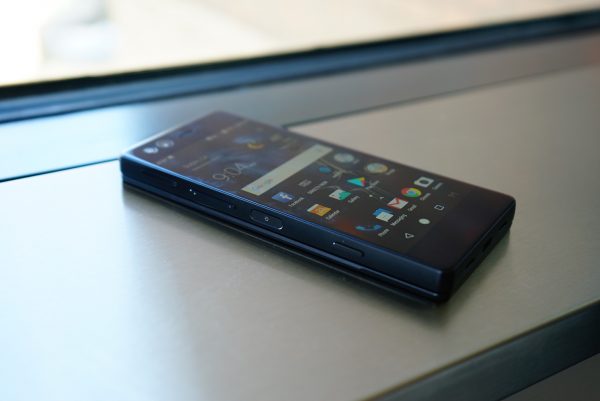
 Unsurprisingly, weighing 8.1 ounces and measuring 5.9 x 2.8 x 0.5 inches the ZTE Axon M is heavier and bulkier than your typical smartphone, but that’s the price you pay for getting 2 displays. Fortunately, it’s still somewhat pocket friendly. Because it has its hinge on the right side, it houses most of its buttons on the left side. Running along the left side of the device, ZTE has placed a fingerprint reader that doubles as a power button, a volume button, and a third somewhat programmable button. The programmable button lets you quickly launch TV mode which in turn lets you load the YouTube or DirecTV app. That said, we’d like to have the option to program that button with whatever app we choose.
But what is especially awkward in the design is the camera placement. The Axon M houses a single 20MP camera. Taking regular non-selfie photos with the camera is an awkward experience because you have to flip the phone around.  The camera itself takes ok photos. In daylight, the photos offer pretty accurate colors and visuals are pretty sharp. But the phone struggles with autofocus and in low light, photos tend to be noisy and often blurry, probably due to the lack of optical image stabilization.
The displays on the Axon M are not flagship level displays, but they are solid displays with sharp visuals and accurate colors, we just wish they could reach higher brightness levels. The bigger issue for some may be the seam running down the middle in Extended (tablet) mode. Personally, we adjusted to it after a few days and eventually forgot it was there. It’s not that different to the notch on the iPhone X, which is also distracting at first, but you’re able to adjust to it over time.

Dual Mode

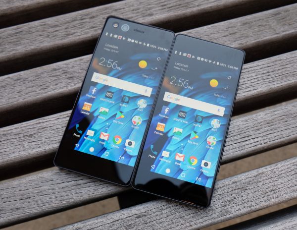
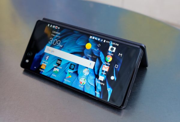
 Besides single screen mode, there is Mirror Mode, Extended Mode, and Dual (multitasking) mode. Mirror mode is useful for two people watching movies on either side or playing a game like Battleship. Extended mode takes a single app and extends it across the two displays. For example, that means you get double the real estate for your web browser or Facebook feed. Mirror mode is useful for two people watching movies on either side or playing a game like Battleship, especially if the device is folded like a tent.

Mirror Mode

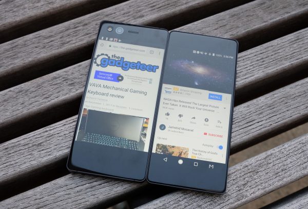
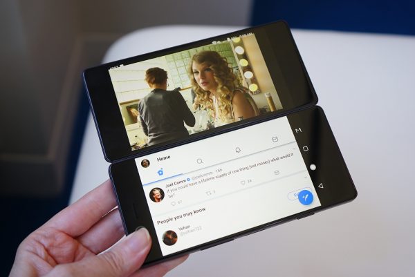
 Last but not least, Dual (multitasking) mode lets you run a different application on each screen – so you can have Twitter opened on one display while watching YouTube on the other. This set up is pretty much a multitasker’s dream, and so much better than using a split screen window mode on a single cramped smartphone display.
When you start up the phone, you’ll go through an easy tutorial which shows you how to switch between different modes. A 3 finger swipe moves an application over to the opposite display.  Switching between modes is easy and generally works well, but we often ran into some slowdowns when switching between modes, as well as some app crashes. We hope that ZTE will push out an update that addresses these bugs soon. ZTE has said that they are committed to frequently updating the Axon M and that they will be updating it to Android Oreo.

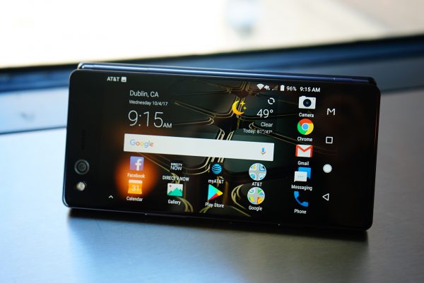
The Axon M can be folded like a tent

 AT&T picked up the ZTE Axon M because it’s the perfect device for a DirecTV user. After all, you can be watching DirecTV on one display while checking your email or Tweeting on the other. We showed the device to a DirecTV user and they got really excited about it, but they actually assumed it was a tablet before we explained to them that it was a phone. Speaking of DirecTV, the Axon M comes preloaded with the DirectTV app, along with lots of AT&T bloatware apps, all running along side Android 7.1.2 Nougat.

The unibody metal construction of the Axon M is very solid

 The phone is powered by a capable Qualcomm Snapdragon 821 processor with 4GB of Ram. When we tested the phone with AnTuTu, it scored a benchmark of 128845. That indicates that it’s a capable, fast performer, though not nearly as fast as flagships like Huawei Mate 10 Pro and Note 8, and its performance is more in line with the Galaxy S7. In general, even in Dual mode with two apps running in tandem, performance is good and the phone is able to handle running two apps without issue. However, it’s switching between modes that can be a buggy experience sometimes.
The 3,180 mAh battery provides solid battery life, especially for a device with two displays! We were able to get a full day of use on a charge.

Final Thoughts

 We have to give ZTE tons of credit for taking the plunge and innovating in the smartphone category. One thing is for sure, the ZTE Axon M is a vision of the future. There are already rumors swirling that both Samsung and Apple are coming out with foldable smartphones, so we expect to see more competing foldable phones in the not too distant future. Overall, ZTE has done an admirable job with the Axon M, especially for a first gen device. But we’re even more excited for a second gen Axon M which we hope will be thinner, sporting a better camera, rocking bborderless displays and running less buggy software.
The ZTE Axon M is an AT&T exclusive and it retails for $724.99 off contract. The phone comes standard with an extensive (and above average) 2 year warranty that includes a free premium protection plan.
Source: The sample for this review was provided by ZTE and AT&T. Please visit their site for more info.
 

Product Information

Price: $724.99
Manufacturer: ZTE
Retailer: AT&T
Pros:
  • Two screens – did we mention two screens!? Switching between modes is easy
  • This is a multitasker’s dream device
  • Good battery life and performance despite having two displays
  • Sports an audio jack and microSD card slot
  • Ideal for DirecTV users
  • Well made unibody metal design
Cons:
  • AT&T exclusive
  • Camera is awkward to use
  • Software can be buggy
  • Middle seam can be distracting
  • Pricey

Filed in categories: Featured Items, Reviews

Tagged: , , ,

ZTE Axon M Android smartphone review originally appeared on The Gadgeteer on December 4, 2017 at 11:00 am.

Note: If you are subscribed to this feed through FeedBurner, please switch to our native feed URL http://the-gadgeteer.com/feed/ in order to ensure continuous delivery.

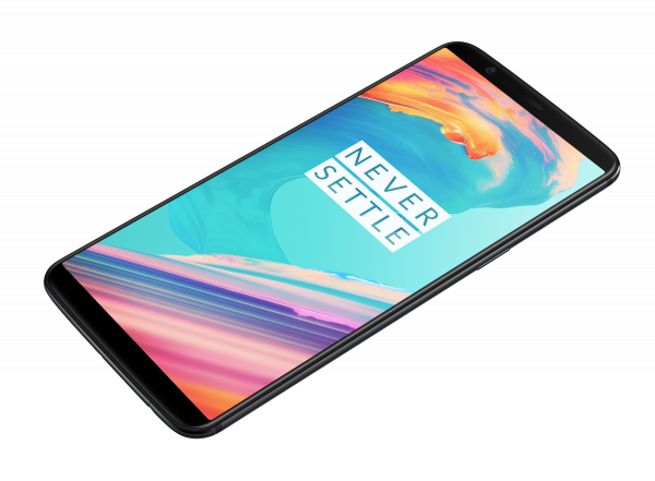
OnePlus 5T goes big with a larger display and improved camera

Today in New York, OnePlus revealed their new OnePlus 5T. With a large 6-inch Optic AMOLED display and an impressive spec list, the OnePlus 5T offers a compelling value at $499. The 6-inch display itself sports an 18:9 aspect ratio, and it has a new Sunlight Display that adapts automatically to harsh light. Most manufacturers get wrapped up into PPI and what not, and they tend to forget about the most practical things like being able to use a device in sunlight, so this is a very welcome feature for us. OnePlus has also made it possible for users to calibrate their screens based on their viewing preferences. 

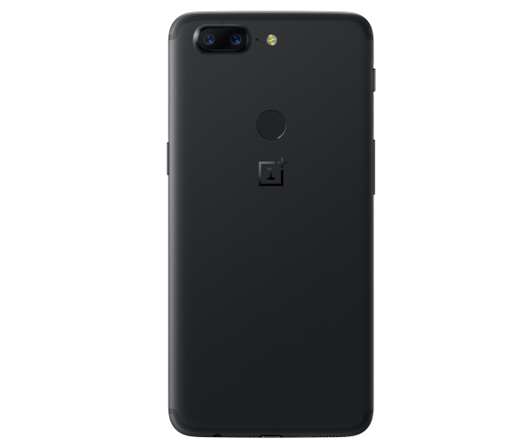
On the design front, OnePlus has changed things up a bit too by moving their ceramic fingerprint sensor to the back of the device. The device itself is made of aluminum. When it comes to optics, the OnePlus 5T packs in a dual camera with “enhanced” low-light performance. The phone is also able to charge up very quickly, with a half-hour charge being able to power the OnePlus 5 through the day.

Of course, the phone comes with a dual camera. Software improvements to its Portrait mode promise to improve noise reduction and make portraits even sharper. OnePlus has also made updates to their OxygenOS to make it faster, cleaner and more customizable based on user feedback. Some new additions to the OxygenOS include Face Unlock.

Under the hood, the OnePlus 5T is powered by a Qualcomm Snapdragon 835 processor with an Adreno 540 GPU and 8GB of RAM. The OnePlus 5T will be available in a 64GB and 128GB capacity, with the 128GB capacity coming in a midnight black color. The phone goes on sale November 21st.

Filed in categories: News

Tagged: ,

OnePlus 5T goes big with a larger display and improved camera originally appeared on The Gadgeteer on November 17, 2017 at 8:00 am.

Note: If you are subscribed to this feed through FeedBurner, please switch to our native feed URL http://the-gadgeteer.com/feed/ in order to ensure continuous delivery.

LG V30 review

When I made the decision to go back to an Android smartphone after a brief vacation to Apple land this summer, my choices for a new phone were between the Samsung Galaxy S8, Samsung Galaxy Note8, Pixel 2 XL, and the LG V30. I ruled out the Samsung devices because I’m not a fan of the curved sides or the fingerprint sensor location. That meant that my choice was narrowed down to the new Pixel 2 XL and the LG V30. Fortunately for me, Verizon Wireless sent me a loaner unit of the LG V30 which I’ve been using on and off for the last couple of weeks. Let’s take a look to see if I end up choosing to buy the LG V30 or the Google Pixel 2 XL. 

What is it?

The LG V30 is LG’s latest flagship Android smartphone running Android OS version 7.1.2.

What’s in the box?

LG V30
USB (Type-C to Type-C) Cable
USB (Type-C to Type-A) Cable
SIM Eject Pin
Quick Reference Guide

Hardware specs

Processor: Qualcomm Snapdragon™ 835 2.45 GHz x 4 + 1.9 GHz x 4 Octa-Core MSM8998
Display: POLED 6.0″ QHD Plus FullVision™ Display (2880 x 1440) with 538 ppi, Corning Gorilla Glass 5
Operating System: Android 7.1.2 Nougat
Memory: Flash: 64GB RAM: 4GB
Expandable Memory: Removable microSD up to 2TB (sold separately)
Network: CDMA, GSM, UMTS, LTE frequencies: 1.9 GHz CDMA PCS, 800 MHz CDMA; GSM 850/900/1800/1900 MHz; UMTS 850/900/1900/2100 MHz; LTE Bands 2/3/4/5/7/13/20/46/66 Data Transmission: EVDO, EVDO Rev A, 1xRTT, LTE, GPRS, EDGE, UMTS, GSM, HSPA+, HSPA
Camera (rear): 16 MP Standard-Angle Lens f/1.6
Camera (front): 5 MP Wide-Angle Lens f/2.2
Bluetooth: 5.0, Wi-Fi, NFC
Battery: 3,300mAH, Non-removable
Dimensions: 5.97 in x 2.97 in
Weight: 5.57 oz

Design and features


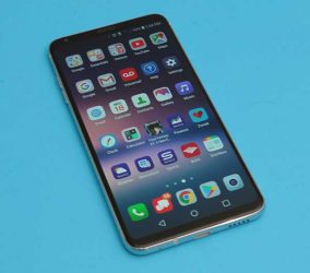
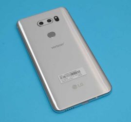
The LG V30 looks a lot like the Samsung Galaxy S8 with polished metal rails around all sides and rounded edges which thankfully, aren’t curved like the S8’s edges. The LG V30 also has a glass back which allows for Qi wireless charging.

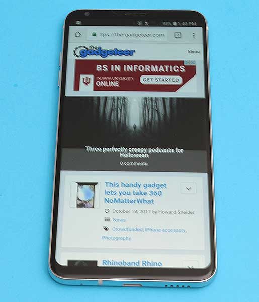
Like the S8, the LG V30 has a buttonless front with a very nice 6-inch display that has minimal top and bottom bezels.

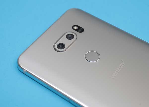
The back of the phone has a dual camera lens and an LED flash at the top with the perfectly placed combination fingerprint sensor/power button in the upper center exactly where your index finger rests when you pick up the phone.

On the left side of the V30 are separate volume buttons that have very good tactile feedback and are raised far enough that it’s easy to find each button with your finger without looking.

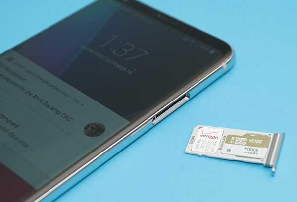
On the opposite side of the phone, you’ll find the combination SIM/microSD card tray.

Correct me if I’m wrong, but I think LG and Samsung are the only high-end smartphones that still offer a microSD card slot. I used to demand this feature in any new phone that I would purchase because I wanted the security of backing up my photos to a card. But in this day and age, I find that I don’t care about this feature quite so much due Google Photos automated image back up to the cloud. It’s still a nice feature to have though.

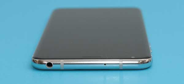
The top edge of the LG V30 has a microphone and what’s swiftly becoming an endangered port: a 3.5mm headphone jack.

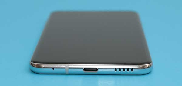
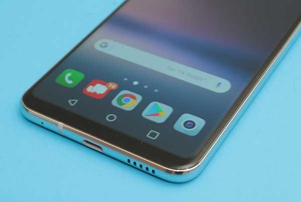
If we examine the bottom edge of the V30, we find another microphone, a USB Type-C port, and a speaker. The location of the speaker is a little unfortunate if you like to hold the phone in your right hand like I do which ends up covering the speaker and muffling the sound.

The fit and finish of this phone get a thumbs up from me. It looks nice, feels solid, and is comfortable in hand. Speaking of in hand, the LG V30 passes the Gadgeteer squeeze test with no complaints, but if I give it a really strong shake, I can hear the volume buttons rattling ever so slightly. Yes, I know I am crazy to still be doing the Gadgeteer squeeze test after 20 years 😉

Display

This phone sports a 6 inch POLED display. If the addition of a P in front of OLED is confusing you, you’re not alone. The P stands for the plastic base layer that is used instead of a glass base layer which is used in most OLED displays.

The display has thin bezels and virtual navigation buttons that can disappear automatically in some apps like Chrome shown above.

The nav buttons reappear if you swipe up from the bottom edge of the phone.


In some apps, you can close the nav bar with the small arrow on the left side of the nav bar.


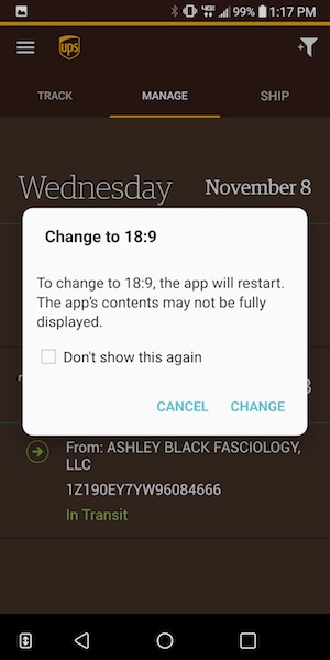
Sometimes you’ll see a double arrow next to the nav bar that will prompt you to switch to the 18:9 display mode.

If you’ve been following the Pixel 2 XL displaygate bruhaha, you’ve heard about the blue tint issue that the Pixel 2 XL has when you tilt the screen. The LG V30 has the same “issue” which is not a surprise since LG makes the Pixel 2 XL and they both share the same POLED display technology.

I wasn’t able to photograph the display well enough to demonstrate the blue tint issue, but suffice to say, that I personally do not find it to be the huge catastrophe that some people feel it to be. I didn’t even notice the problem on the V30 or my Pixel 2 XL until after people started talking about it and then I could see it. But the thing is, I don’t care because I’m not using my phone with it tilted away from me. I use my phones facing my eyes straight on and at that angle, there’s no blue tint.

Then there’s the burn-in issue that some people are seeing on the Pixel 2 XL. This can be an issue with OLED displays, but again, I’ve yet to see it on my loaner LG V30 or my Pixel 2 XL. That said, I’m more anxious about the potential for burn-in than the blue tint issue so I plan to keep an eye on my Pixel 2 XL’s display. Now back to the LG V30 review…

When it’s all said and done, I find the LG V30’s display to have sharp crisp text and bright vivid colors. It’s enjoyable to read, surf and watch videos on it and I have no complaints about the display at this time.

Camera

LG phones usually have decent cameras, but they aren’t known for their cameras like the iPhone and last year’s Pixel XL.

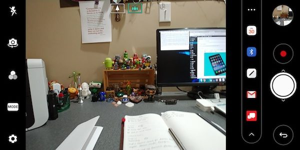
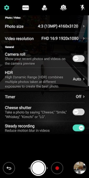
The stock camera app is pretty basic except for the handy built-in sharing bar that you can use to send images to a calendar event, Bluetooth, the LG Memo app, email, and the Verizon messaging app.


The also has a selection of modes that you can use to spice up your shots. But missing is a portrait mode which has becoming a big selling point for the iPhone and the Pixel 2.


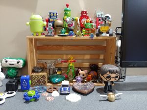
The LG V30’s dual camera lens does offer a really nice wide angle mode that will allow you to fit in a lot more “stuff” in your images. Both images above were taken from the same distance, but the only difference was toggling the wide angle mode in the image on the right.


I was impressed with the images that I shot with the V30. Click any of these example images to view the full sized shot.


All my shots came out great if a bit oversaturated… but I personally like that look when it’s not overdone.

Audio quality

I already touched on the fact that I don’t like the placement of the speaker on the bottom right of the phone. There’s also the fact that it’s just a mono speaker. While most people probably won’t be listening to a lot of audio/music through that speaker, it is a little disappointing that LG didn’t put more effort in that area. My guess is that the decision to go with the placement was to keep the phone as small as possible and the screen’s bezels equally small.

But plug in a pair of headphones and your ears will be happy. Audio through headphones wired and unwired sounds very very nice.

Software and user interface


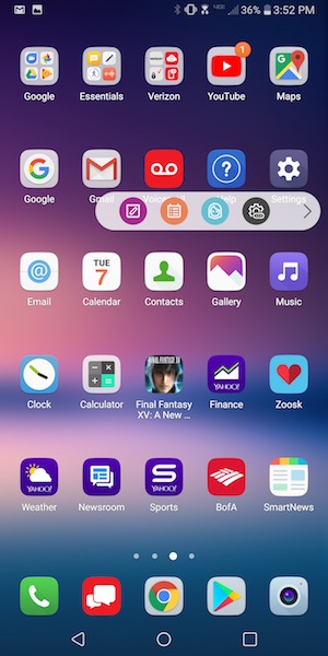
The LG V30’s user interface is pretty basic even with LG’s layer on top of stock Android. LG offers a few extras like the pop out shortcut bar that harkens to Samsung’s edge display. The difference is that you can’t swipe the edge of the screen to pop out the bar, you have to tap on the little tab. Since the tab is quite small, it makes the effort a little frustrating at times. I don’t know about you, but I rarely use these extra nav bars since it’s just as easy to put my most used app shortcuts and widgets right there on the first home screen.

Speaking of home screens, that’s where all your apps icons will live because LG’s custom skin over Android does not include an app drawer.

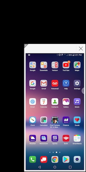
Another special LG feature allows you to shrink the screen for easier one-handed use. I don’t use this either.

One complaint that I do have about software and the V30 is that the phone doesn’t ship with Oreo. It has Android v7.1 Nougat.

Using the LG V30 for phone calls

I didn’t have any complaints from people I talked to while testing the LG V30. Conversations on both sides of my calls were clear and with decent volume. I also did not have any issues with dropped calls while testing this phone. Signal strength seemed to be no better or worse than other phones that I use and test on the Verizon network in my area.

Overall performance and battery life using the LG V30 for day to day tasks

When it comes to overall system speed, I have no complaints about the V30. Apps launch quickly, screens scroll smoothly, and I didn’t notice any sluggishness or problems navigating between apps.

I didn’t do any special battery life testing, but it felt better than other phones I’ve recently tested. You should have little trouble getting through a day on a full charge and if you barely use your phone, it might last for up to a week on a charge if you turn off apps that constantly ping for new info.

Final thoughts

After spending a few weeks with the LG V30 and the Pixel 2 XL at the same time, I ultimately decided to buy a Pixel 2 XL instead of an LG V30. The V30 is a really nice phone and I’ll be sad to send it back to Verizon because it has wireless charging and a microSD card slot, which I like. It also has the volume buttons on the left side of the phone instead of the right side, which I prefer.

But when it came down to it, my main reasons for going with the Pixel 2 XL instead of the V30 are stock Android, faster OS updates, and full resolution automatic image backup to the cloud. Those benefits tipped the scale for me.

Source: The sample for this review was provided by Verizon Wireless. Please visit their site for more info.


Product Information

Price: $840.00
Manufacturer: LG
Retailer: Verizon Wireless
Pros:
  • Thin bezels
  • Wireless charging
  • microSD card slot
  • Extra 1yr warranty through Verizon
Cons:
  • Some people may complain about the slight blue tint on the display when not viewed straight on

Filed in categories: Featured Items, Reviews

Tagged: , ,

LG V30 review originally appeared on The Gadgeteer on November 9, 2017 at 11:00 am.

Note: If you are subscribed to this feed through FeedBurner, please switch to our native feed URL http://the-gadgeteer.com/feed/ in order to ensure continuous delivery.

ZTE Axon M’s dual screen foldable smartphone will make you do a double take (Hands-on)

With ZTE’s AXON M, you can watch videos on one display and scroll through your Twitter feed on the other.

ZTE has a new Axon phone to show off, and while it’s not a follow up to last year’s Axon flagship, it is pretty much one of the coolest devices we’ve encountered so far in 2017. That is because the new Axon M is a foldable dual screen phone. Because two screens are better than one! At least thats the concept behind the Axon M.

The ZTE Axon M houses 2 5.2″ displau

ZTE did research and learned that most folks do prefer larger screen phones, but that they top out at 6” when the phone stops becoming pocket friendly. Their solution is to provide users with not one, but two 5.2” screens in the Axon M. Each display is a 1080P TFT FHQ Gorilla Glass display with 426 PPI.
With the ZTE Axon M, the second screen is able fold out to a 180 degree angle, so the device can be used flat or in a laptop-like mode. And that’s where the possibilities roll in – and oh, there are so, so many, for this form factor.

Mirror mode is useful for two people watching movies on either side, or playing a game like Battleship.

Extended mode takes a single application and extends it across 2 screens. For example, that means double the real estate for your Facebook News feed.

Multitasking Mode

Multitasking mode lets you run a different application on each screen – so you can have your email opened on one display while viewing your calendar on the other. It’s pretty much a multitasker’s dream, and so much better than having just a split screen window mode on a single smartphone display. A simple 3 finger swipe moves an application over to the opposite display.

Mirror Mode

Under the hood, the ZTE Axon M is powered by an 821 Qualcomm Snapdragon processor and 4GB of RAM, and it comes running Android Nougat (7.1.2). The rear-facing camera sports a 20MP sensor with dual image stabilization, and a dual LED flash, and it can record 4k video at 30fps. Its aluminum full metal unibody weighs 230 grams, and it comes with a micro-SD card slot for expansion. The Axon M even includes a 3.5mm audio jack along with an AKM 4962 HiFi main chipset for HiFi listening and recording.

One thing is for sure – the ZTE Axon M is one of the most exciting and unique mobile devices we’ve seen in a while. Personally, it brought me back to my fond memories of using a Sidekick. Of course, it remains to be seen how many folks will gravitate to this kind of form factor, but from what we can tell, ZTE has done a great job with the first gen Axon M.

The ZTE Axon M will be available from multiple carriers, including AT&T. We’ll update this story once we have pricing and availability.

Filed in categories: News

Tagged: ,

ZTE Axon M’s dual screen foldable smartphone will make you do a double take (Hands-on) originally appeared on The Gadgeteer on October 17, 2017 at 10:40 am.

Note: If you are subscribed to this feed through FeedBurner, please switch to our native feed URL http://the-gadgeteer.com/feed/ in order to ensure continuous delivery.