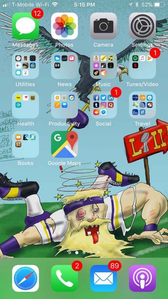
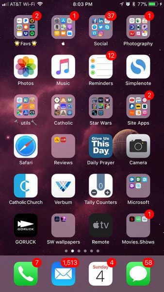
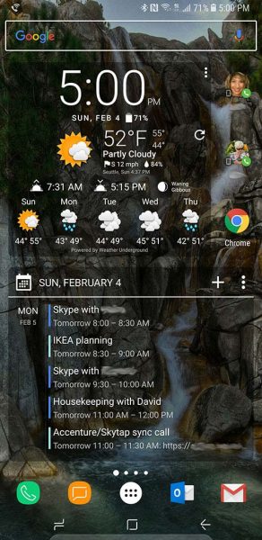
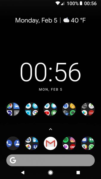
I’m a naturally curious person. Or maybe a better word is nosy. I love reading articles where people describe how they work or show the gear that they use. I also enjoy seeing how people setup their computer home screens and their phone home screens. I thought it would be fun to share the Gadgeteer team’s phone home screens with all of you out here. So without further ado, here we go!
Julie Strietelmeier
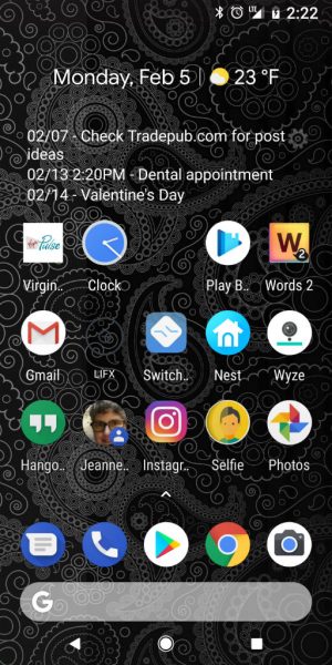
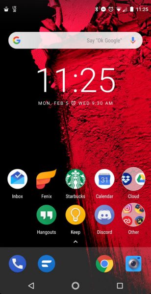
Yeah, I know my Pixel 2 XL home screen setup right now isn’t very exciting. I could tell you that I’m in between setups, but in all honesty, I’m no longer interested in having a ton of widgets cluttering my screen. I’m only using two widgets right now. Pure Calender at the top which shows 14 days worth of events and appointments, and then the LIFX widget (next to the Gmail icon), which toggles the LIFX smart bulb in my bedroom. The LIFX icon is black when the light is off, so you can’t see it because it’s blending into my dark background. The rest of the apps are pretty basic, but they are the apps and shortcuts that I use the most.
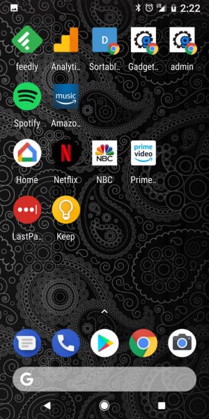
My 2nd home screen is used for the next set of apps that I use on a regular basis. I try to keep them organized in rows so I can quickly find them. FYI: I don’t like folders…
Howard Sneider
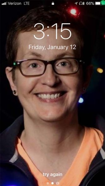
Well this is awkward..
Leslie Hosmer
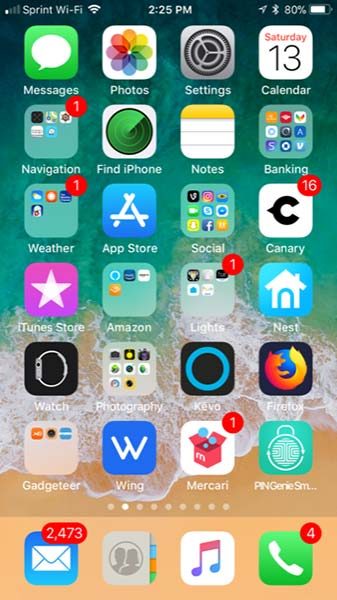
As you can see I do utilize folders and I categorize things that I use together to make them easier to find. I have all my banking, weather, navigation, photography, lights, social media, and Gadgeteer apps grouped together so that I can use them easily. I always keep my current reviews on the first page also and right now the only one I’m reviewing with an app is the PIN Genie Smartlock which is in the lower right. I have the Wing app that is front and center because this is my cell phone provider and I use the app to pay the bill and see how much data I’ve used. The Nest and Canary apps are upfront because those are my home security apps so I can see what’s going on at home when I’m not there. Everything else seems to be pretty basic… please don’t judge me for having 2,473 unread emails!
Kathleen Chapman
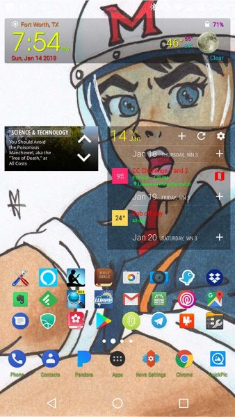
I love Android because I can customize my phone which is currently a Nexus 6 running Android 7.0 (but I will be upgrading my phone in the next few months to a Pixel 2 XL). The “Speed Racer” wallpaper was drawn and colored in by hand on paper (it was then scanned in) by one of my teenage kids who loves art and wants to work for Pixar one day.
I use the paid version of Nova Launcher to set up my dock icons, resize the grid on each of my screens, and resize my icons in the app drawer among many other things. This is my favorite launcher because of your ability to customize just about everything.
I also use the Transparent Clock & Weather app. I love the widget for this app because it tells me the time, date, and weather information at a glance just the way I like it. It allows me to customize the look of the weather icons, the color of the text, and the widget transparency. There are other sizes of widgets which provide you with more detailed information, but I like to keep it succinct. I placed this widget at the top of my home screen.
I use the Business Calendar Pro app as well. I like the widgets for this calendar because I can customize the calendar views (month view, agenda, etc.), the colors of the font of my events and locations, the transparency of the widget, etc. And if I enter the location of the event in the calendar, the widget allows me to tap on the map icon next to the location information within the widget to immediately launch Google Maps so I can quickly get going.
Curiosity is one of my favorite apps to read. There are all kinds of interesting articles in it and thus I set up a Curiosity widget on my home screen to view the 5 highlighted articles of the day.
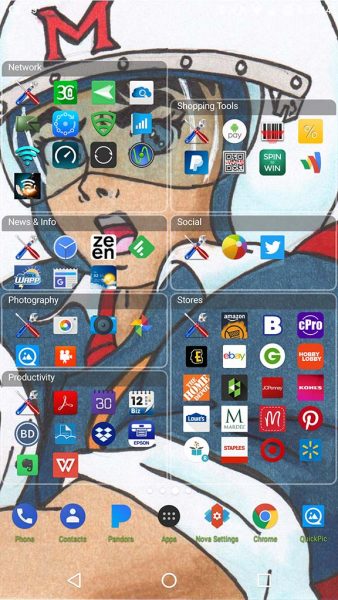
I also love to use the Folder Organizer Lite app. This app allows me to create folders of all kinds using my own titles, but unlike other folders, you do not have to tap on them to open them just to see all the apps within it. It allows you to create folder widgets of different sizes so that you can resize the folder to view all the apps within it and immediately tap on any app to launch it. It also allows you to choose a color theme or even create your own. The apps you see on my default home screen are actually inside a folder that I named “Common”. This folder uses the “Empty” theme which hides the title and outline of the folder to give this screen a cleaner look.
I love the way I have my phone set up and Android allows me that freedom!
Dave Rees
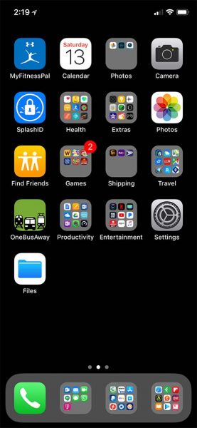
Smartphone: iPhone X (256 in space gray)
I’m shooting for the most boring/bland home screen award. When I upgraded to the iPhone X I changed my background to all black to match the infamous notch. Organizationally I find iOS lacking when compared to Android. But, like many I make do.
Smythe Richbourg
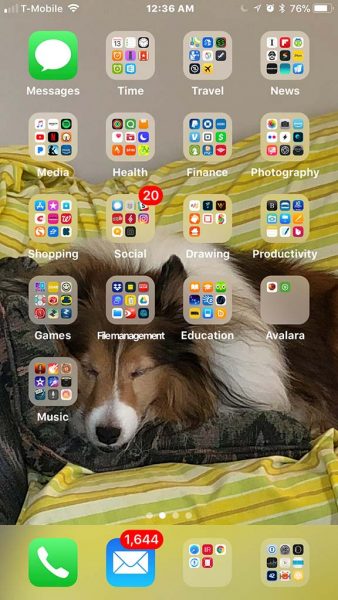
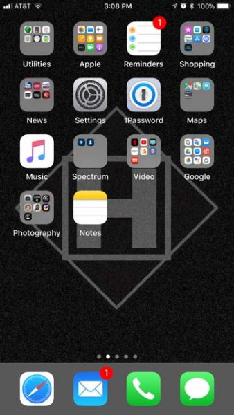
You’ll note that only three apps are not contained within folders on my homescreen: Messages, Phone, and eMail. For most of my day-to-day life, these apps play a huge part. During the course of the day, I may need to check into schedule/to-do type apps, so the Time folder is there. When I wake up and go to bed, I turn on various apps in the Health folder for weight, blood pressure, and exercise. The Social folder just below that holds the contacts app, plus social network apps (Instagram, Echofon for Twitter, Yelp, Slack, Micro.blog and others.) The two folders that may confuse readers is Media and Music. Media is anything coming into my environment from another source: Spotify, iTunes, OverCast (podcasts), Kindle, Netflix, YouTube, Pandora, etc. The music folder contains apps that I use to play/create music, or at least to play around with music. Garage Band, Bebot, Music Clips, iMovie and the like. The bottom right folder in the Dock is called Utilities. It contains Settings, My Password manager, my Watch app, PCalc (best calculator ever!) and keyboards, plug-ins, and other stuff. It’s like 7 pages deep. Avalara is the company I work for, and we use two apps to manage time and payroll, so I need those near at hand to check my schedule and to clock in and out.
Education is anything reference, reading, etc. Dictionary, iBooks, IMDb, MacTracker, Sky Guide, Duolingo. The other folder in the dock is Browsers – Safari, Chrome, Scanbot, RedLaser, and one in testing called Hound, which is kind of a Siri enhancement.
The background picture changes frequently. Currently, it’s Jack snoozing on the sofa. Don’t you want to just scratch his little ears???
Janet Cloninger
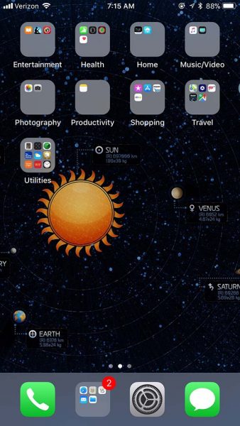
I don’t use my iPhone 7 Plus the same way I use my iPad Pro 12.9, so I buy the least amount of memory I can, and I keep a bare bones set of apps on there. I tend to keep all my apps organized by type in folders. The dock at the bottom is where I keep my most used apps: phone, message app, settings, and the folder has my browser, contacts, calendar, mail, and the files app. The other folders are pretty self-explanatory. The Entertainment folder has my ebook readers and my Regal Cinemas app. Home has my Hue app for my lights in my home and Nest app for my thermostat and smoke detectors. Travel has maps, the AAA app, the Automatic Pro app for my daughter’s car, and the BMW app that’s supposed to talk to my car. Utilities is a catch-all, with weather apps, calculator, hair cut app, and the clock, among others. The other folders are pretty obvious.
Andy Chen
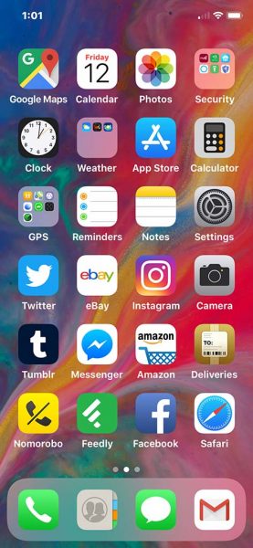
My home screen on an iPhone X. The “home bar” is populated with what I consider communications apps (phone, email, messaging).
The most common apps are arranged mostly on the right side so I can open them with my right thumb. That includes Gmail, Safari, Facebook and Deliveries.
Bill Henderson
Mine is boring…
Michael Strange
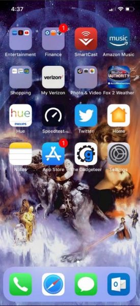
The home screen on my iPhone X really has no rhyme or reason. I’m constantly adding and subtracting apps. The main Dock is reserved for my most used apps but beyond that, it’s kind of a free for all.
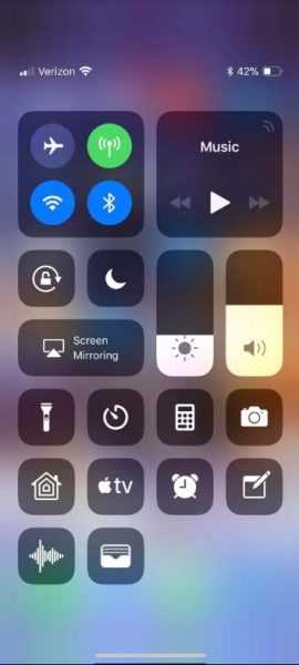
I find that I use Control Center a lot. It gives me easy access to things like Home Kit to control my Philips Hue lights, my 4K Apple TV remote and the camera app which I use quite often.
I also like to change my Wallpaper a lot based on my mood. Currently, it’s “The Empire Strikes Back” which is my favorite Star Wars film and because the weather here lately makes me feel like I’m living on the planet Hoth.
Dave Moore
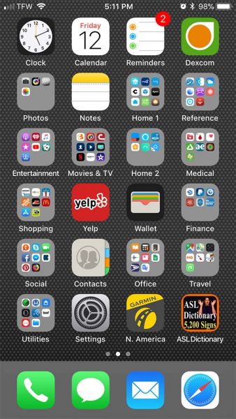
Here’s mine. It’s boring, but functional. It’s an old-school iPhone 6. I keep this chugging along because I need to keep my Dexcom continuous glucose monitor alive without worry of the battery konking out. I have a brick of a battery pack to keep it alive, a Zerolemon 5400mAh that has worked very well that I’m reluctant to part with. As a plus, I like the 1/8” audio jack and use it frequently. The layout is as such because I don’t like digging through multiple pages to find what I’m looking for.
Jacob Haas
Ever since upgrading to my iPhone 7+, I have one-tap access to a whopping 28 apps on my home screen. I like to keep my “time wasting” apps (games, social media, Reddit, Instagram) in folders on my second page. This screen gives me everything that I’d need at a glance to maximize health, tasks, finance and photos. It generally stays in this configuration, but sometimes I’ll swap out an app if I haven’t used it for a while or if I find something more useful.
Ryan Pagel
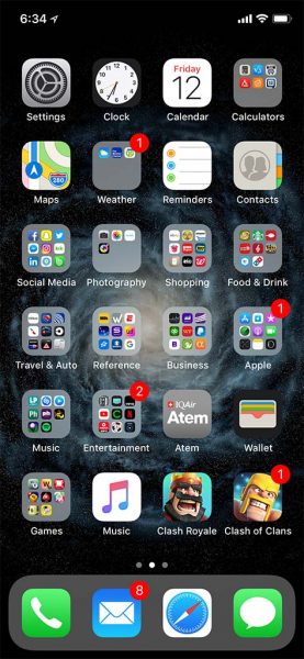
I use a lot of groups on the home screen of my iPhone X. I like to keep everything I use on any regular basis on one screen and have grouped my apps into standard categories like Business, Reference, Food and Drink, Social Media, etc. I have been using this setup for many generations of the iPhone so finding my apps is easy despite the cluttered appearance of the screen. It makes sense to my engineering brain.
Steve Holt
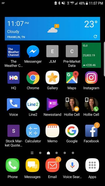
I probably swap out 2 or 3 icons on a regular basis, but most of the items stay the same. I use a Samsung Galaxy S6 Edge+, and I love how Samsung allows you to keep 5 icons across the bottom no matter which screen you are on. So my most used items are there… phone calls, messages, email, Google voice search, and apps.
I also love that Android allows me to have direct shortcuts to things like text messaging a specific person and calling a specific person, and websites. So I always have 2 shortcuts on my homepage for my wife to text and call her, since I do that alot! And I have shortcuts to websites I use on a daily basis. I have a black background because I don’t want an image behind everything mucking up what I am looking at. Finally, I use a Weather.com widget across the top so when I wake up in the morning I can see what the weather is like.
Elizabeth Rodriguez
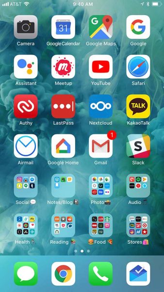
I’m using the iPhone 7 Plus, and keep my first home screen with the most frequently used apps. Some are in folders since I use multiples of one type. Apps that aren’t within a folder are because I use them much more than the rest. The second screen has even less frequently used apps. I like to use emoji in my folder names 
I change up my background wallpaper every now and again, usually with something that takes advantage of the perspective or live photo features.
Sorry it’s not very exciting.
Ryan Chapman
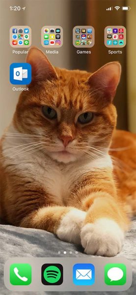
I keep the home screen on my iPhone X clean and tidy so I may see my cat better when I open my phone. My main categories are on the first page here while categories that I use less frequently are just a swipe to the right. Outlook is my one odd ball, since I use it for work. I use Spotify instead of the Apple Music app, since all the music I need is there. Funny enough, I rarely use the phone to actually talk to people, but it would feel wrong to remove the phone icon from my bottom dock. This is a phone after all! Out of all the visible icons, I use Reddit, Facebook, Spotify, email, and the messaging apps the most.
Larry Geisz
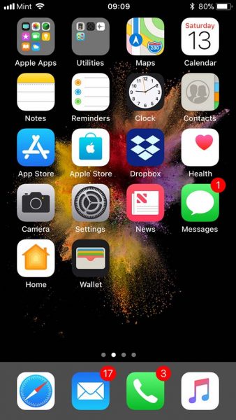
My home screen on my iPhone is a mish-mosh of apps that I use frequently. I use my news and Dropbox mostly but my updates and messages are a close second. I have placed a lot of the Apple apps in their own folder, especially the ones I do not use often.
Bob Patterson
I’m not a smartphone power user, but I like my organization. Honestly, I wish the iPhone (mine is the 6s) had a way to add more apps to the docking bar. Since it can’t, I keep an assortment of my most used icons on the home screen in addition to my docked apps.
As far as the rest, I try to keep my most-used apps in general groups based on common function. I don’t get too fancy here, and I tend to tweak the layout regularly. Once you get past the home screen, I have to confess that things get a bit… messy.
I also do illustration, which I post online. My latest piece is always my background screen, because it motivates me to critique my own work and look for ways to improve my techniques for future drawings!
Andy Jacobs
Behold the home screen on my trusty iPhone 6 Plus! I set my home screen up with my most-used apps and categories of apps: if you see an icon to an app, I use this daily or almost daily; if you see a folder, I might use these daily or a few times per week. I am almost constantly rotating icons from the home screen to either folders or to other pages—-still trying to find my “perfect” home screen setup, but I have a feeling it that it will continue to evolve constantly, which is fine with me!
Dave Ferreira
I am using a Samsung Galaxy Note 8 on T-Mobile running Android 7.1. I want my home screen to give me a quick picture of my day (the Chronus calendar widget), let me know what I should wear (again, the Chronus weather widget). I also have direct dial widgets to important people, a shortcut for the Chrome browser, and a stationary dock at the bottom with phone, messaging, Outlook (because you can’t escape work) and Gmail (because you can’t escape Android). All of this runs on top of the Nova launcher.
Joe Porletto
I’m using a Google Pixel running Android 8.1.0 on Google’s Project Fi network. I’m a minimalist when it comes to my tech, so solid black wallpaper and all apps on one screen grouped according to function in folders easily accessible from the homescreen. Android 8.1.0 provides a date and weather update on the screen as well as a Google Search Bar and I’ve always been partial to military time.
Rob Tillotson
Most of the interesting stuff like entertainment and home control is on other pages, but this is my core set of apps that I use often throughout the day. I still don’t know what to put in the fifth dock slot, because until now I always used a launcher that only had four.
Raul Sanchez
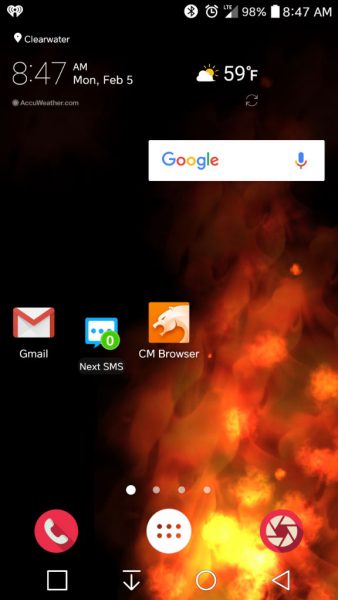
The screen shot with the red flame background-
That wall paper is actually a Live Wallpaper. It takes little battery power so there is little battery drain. My main apps on the Home screen are my Gmail, the Next SMS for text messaging, time and weather, Google Search, and of course my phone button. I like to use CM Browser because it’s pretty snappy and I have a few other CM apps and have always had good experiences with them. Plus I have to make sure I have my Camera easily accessible. I changed the standard Camera and Phone icons to the ones on there now.
This is on a LG V20.
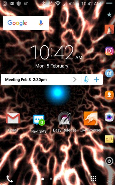
The screenshot with the electric light tunnel-
That is also a Live Wallpaper. I like Live Wallpapers if you couldn’t tell. This one I can change frame rate and quality so it doesn’t use a lot of resources and battery as well.
I keep my Gmail, Next SMS, CM Browser, Google Search, time and date handy in the Home screen. I keep my Easy Release app on the home screen so I have it handy when I need the model/talent releases. Time is money you know…
I also keep my most used apps on the Second screen on the side of the phone.
This is the Samsung Note Edge.

