REVIEW – You know how a dealer will tell you what needs to be fixed on your car, and you find yourself scratching your head wondering if any or all of it was really necessary? This little gizmo claims to be able to help you know what’s wrong with your car before you get to the dealer or shop. Sounds like a good thing right? I agree and had the chance to test one out.
What is it?
The MX+ is a bluetooth adapter for the OBD port on your car that in combination with your phone and a free app creates a powerful diagnostic tool and real-time performance monitor.
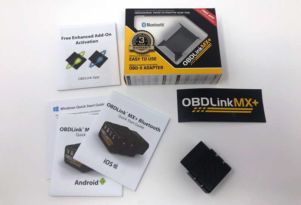
What’s in the box?

- OBDLink MX+ adapter
- Quick start guide
- Item
Hardware specs
Bluetooth: Secure 128-bit data encryption, Class 2 BT v3.0 transmission (262′ max range)
Dimensions/Weight: 50 x 45 x 23mm / 85g
Supports: All OBDII protocols, Single wire CAN (GMLAN), Ford medium speed CAN (MS-CAN)
Power: 8-18v DC, 62mA operating current, 2mA battery saver mode
Thresholds: -4º to 131ºF operating temperature, 10-85% humidity (non-condensing)
Max Parameter ID: ~100 PIDs/sec for PC and Android
Certifications: International: Rohs, REACH | N. America: FCC Part 15B, IC ICES-003, ETSI EN 301 489-1 V1.9.2 & -3 V1.6.1
Design and features
The OBD port is usually found below the steering wheel in an accessible location, either immediately accessible or behind an easy to open panel. It’s been included on all US cars since 1996 and is primarily used for diagnostics by dealers and repair shops.

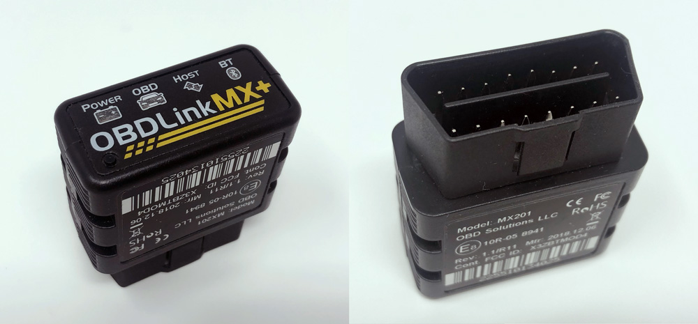
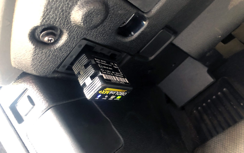
OBDLink designed the MX+ into a small form factor so that it can be inserted and left in that port for continual information flow over bluetooth. Part of that design choice was enabling a low power mode with auto-wake so you don’t need to do anything different when getting in and starting your car. LEDs sit behind the 4 logos on the front of the device; Power, OBD, Host and BT. There’s a small raised button under the O in OBDLink that you’ll need to press for pairing.
Setup
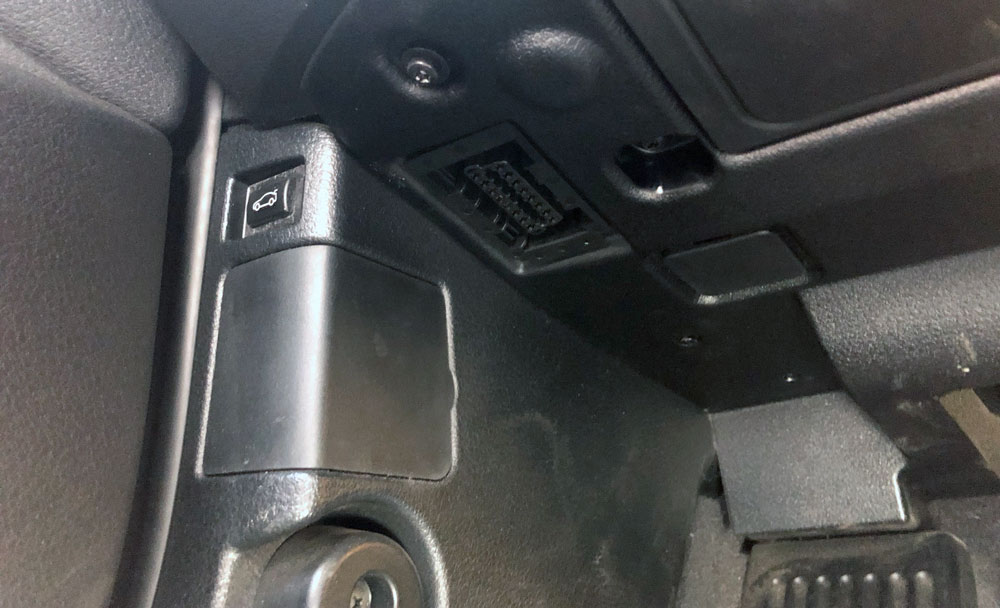
The hardest part about getting started is locating the port in your car, and more specifically determining the orientation. The camera on your phone can be handy here to avoid getting on your back in the driver’s footwell. Here’s the process for iOS.

In our car, the port is directly above the left footrest and is visible without opening or removing any kind of panel. Once you’ve made the determination for your car, go ahead and plug it in.
Next step is to put your car in the ON position without starting the car. You may need to press the ‘start’ button without your foot on the pedal if you have and electronic ignition and don’t have a standard key.

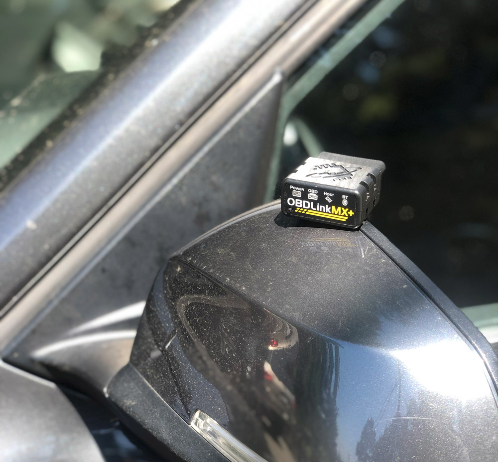
The above photo shows the MX+ installed and connected to my phone, indicated by the green Power and solid blue BT LEDS. The only tricky part here is that you may not be in a position to see those lights.
On your iPhone make sure bluetooth is on, then press the raised button on the MX+. Select OBDLink MX+ when it appears in the bluetooth menu on your iPhone.
Now you can launch the OBDLink app. In settings/preferences/communications choose Bluetooth, then go back to the main menu of the app and click connect at the bottom.
The app will auto-detect your car’s OBD protocol and then connect. The BT light on the MX+ will turn solid when complete.
Performance
I was able to install and connect the MX+ pretty quickly. I have an electric ignition, so I did have to turn the car back off and turn on again without my foot on the pedal to get to the ‘on with engine off’ scenario.
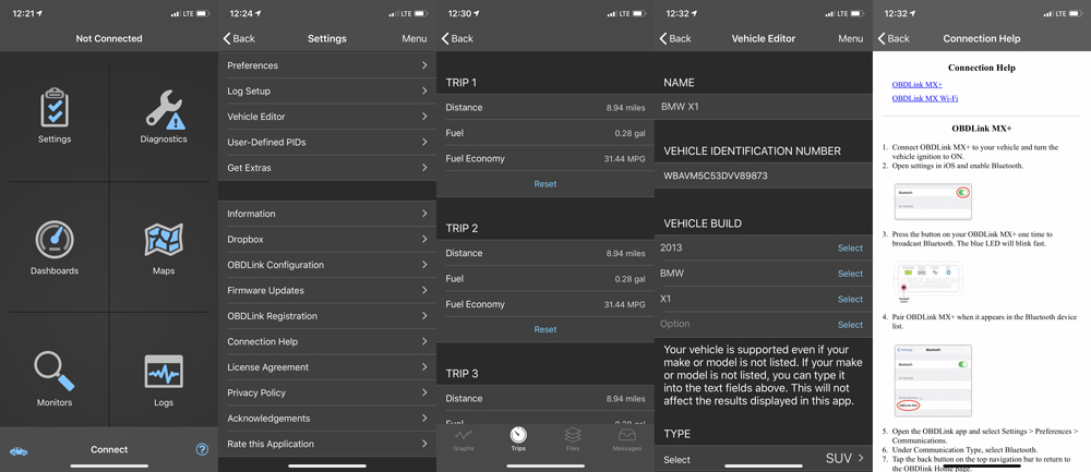
There’s a lot to digest when first opening the app. The first screen is pretty straightforward with 6 buttons; Settings, Diagnostics, Dashboards, Maps, Monitors and Logs. The blue Car and (?) icons in the bottom left and right are also buttons, but the ‘Connect’ in the bottom center is too. I get that it’s an action word, but it’s not very intuitive.

The Settings button takes you to the 2nd screen above. Each of those selections takes you to another myriad of selections which I’m not showing here. The app does an okay job of letting you know if you’re jumping into settings that you shouldn’t be messing around with.
Diagnostics and Maps are what they sound like. I’m not quite sure why you’d use maps here over a real map program. Maybe just to stay within the app?
Logs takes you to graphs, files, messages and trips (shown above middle) for your vehicle.
The Car icon takes you to a settings page specific to your car which you can also access through settings (4th screen above)
(?) will help you with connection issues (far right) which we’ll talk about at the end.
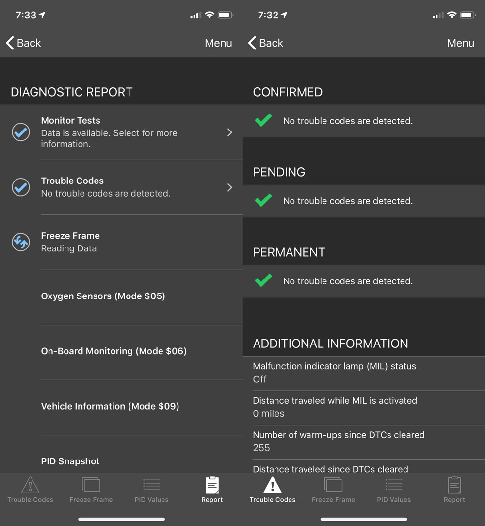
Let’s talk about diagnosing. Our car was overdue for service and had error messages on the instrument panel. We had a chronically low right rear tire and I knew that our coolant was low. I figured great, I’ll connect the MX+ and it’s guaranteed to show me some errors that I can dig into, so I connected and ran the diagnosis.

On the left is the in-process screenshot as the MX+ was gathering data. On the right was the outcome. No trouble codes. Hmm.
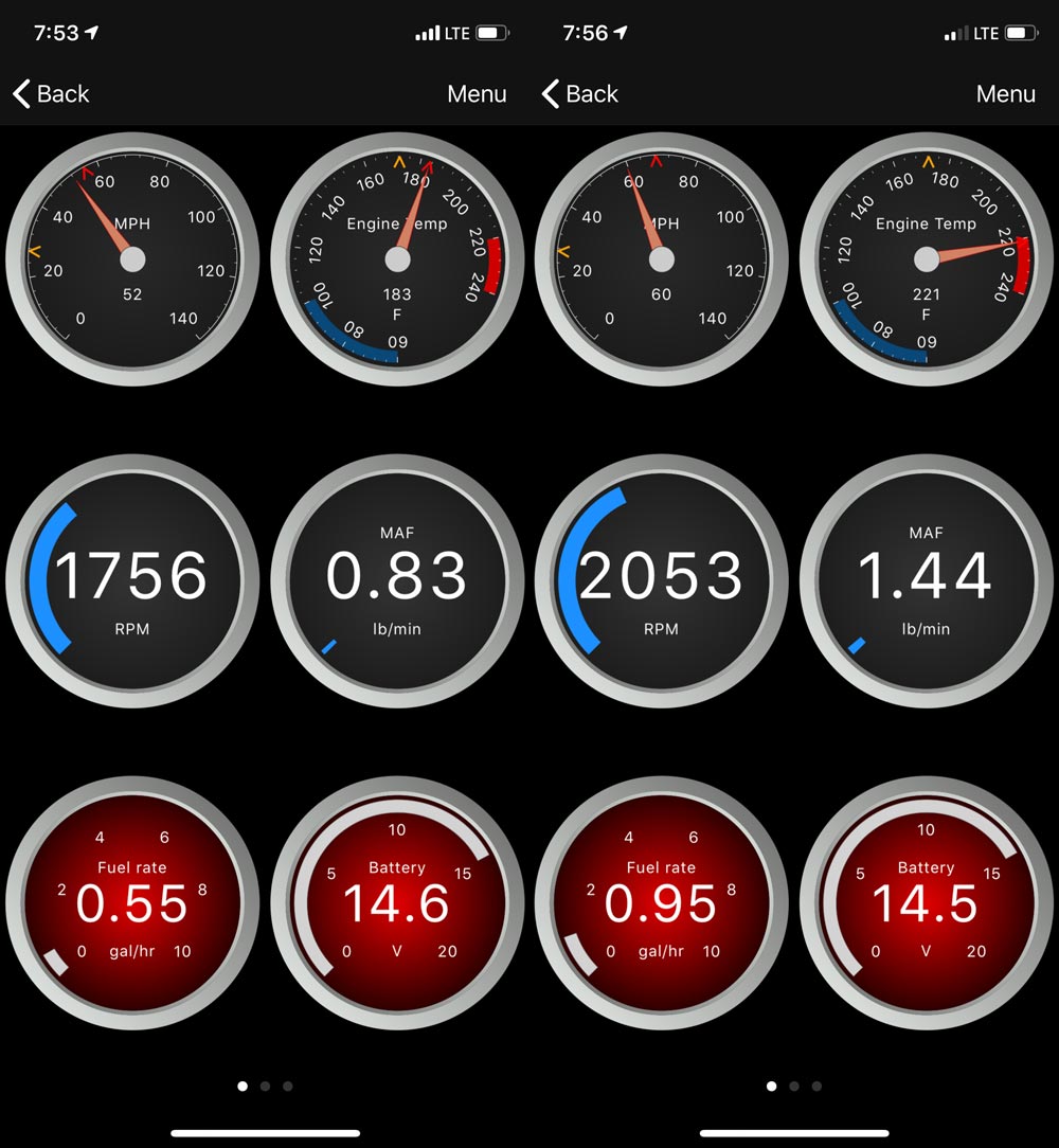
As this was the morning of my appointment, I put my iPhone in the dash mount, launched the app and drove to the dealer with the Dashboards screen up. This is probably the coolest and definitely most active screen in the app.

It’s about a 15 minute drive so I took a screenshot pretty quick (about 3 minutes in) and the second about 10 minutes later. All the gauges (except battery) jump a bit, the most interesting of which is the temperature gauge moving into the red. This completely makes sense as again, I knew I was low on coolant.
The dealer found a nail in the rear tire, both rear tires were in need of replacement and that I was a 1/4 low on coolant, but no leaks after a pressure test. Sounded about right, but not something that the MX+ helped me to diagnose or decide on.
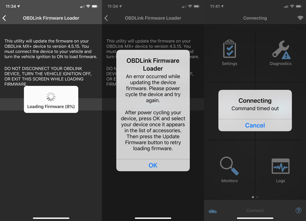
Jumping forward to today, I thought I would look into diagnostics again and re-run them. I noticed that there was a firmware update when I was in the settings panel. With the car in the on (not running) not running position. I followed the prompts to get the update started, but it then threw a firmware loader error. I followed those instructions and then continually hit a command time out error.

A quick visit to the support page showed 413 views on a ‘firmware update failure’ subject that isn’t taking comments. One troubleshooting tip says “Do not hit the OBDLink app CONNECT button at any time during this procedure” which I find ironic considering that it’s the first thing you’ll do if the app tells you it timed out. Needless to say I hit a wall here and have opted to take a break for now and finish up this review for the time being.
What I like
- Price. It potentially pays for itself if it can avoid even one shop visit
- Easy to use compact tool that you can connect and forget
- Broad vehicle compatibility
What needs to be improved
- May not be able to read all error codes for your vehicle
- Better process instructions for how to use each screen
- Better firmware update process, like a test that confirms connection is stable
Final thoughts
I really want to like this product. The dashboard feature is great and the diagnostic function is a feature many car types have a need for. I get that it’s hard to build any product for universality and that each car make and model creates scenarios that complicate issues. The Amazon reviews are positive overall so I’m clearly having issues that aren’t completely normal, but the fact that I know I had errors and the MX+ scan said no error codes bothers me. If you’ve used this and had good luck, let me know in the comments. I’ll give it another crack on an upcoming free weekend to see if I can turn this around.
Price: $79.95
Where to buy: Amazon.com
Source: The sample of this product was provided by OBDLink.
Filed in categories: Reviews
Tagged: Car Gear
OBDLink MX+ review originally appeared on The Gadgeteer on May 18, 2019 at 9:30 am.
Note: If you are subscribed to this feed through FeedBurner, please switch to our native feed URL http://the-gadgeteer.com/feed/ in order to ensure continuous delivery.
