Own your own copy of the golden records sent out on the Voyager spacecrafts

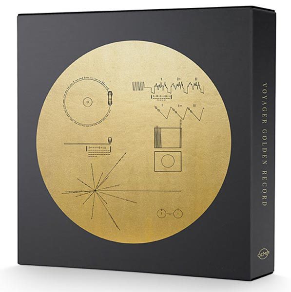
Back in the 1970s, NASA sent out two interstellar probes, the Voyagers 1 and 2.  They were designed to travel through space, not directed at any particular star, with information about us should any intelligent life happen upon the probes.  The information in the Voyager vessels was in the form of two golden records, which were a sort of calling card to other life in the universe.  Carl Sagan likened the Voyager records to sending out a message in a bottle with information about life and cultures on Earth.  And they also had information describing our location – in case someone out there wanted to come for a visit.  The Voyager records made appearances in movies like Star Trek: The Motion Picture and Starman, both of which showed what might happen after Voyager was intercepted by alien life.  Those movies piqued my interest in those golden records.  And apparently I’m not the only Earthling who’d like to have their own copy of our inter-galactic invitation, because ThinkGeek is offering The Voyager Golden Record: 40th Anniversary Edition Vinyl 3LP Box Set.

The set contains:

  • 3 translucent gold 140 gram vinyl LPs in poly-lined paper sleeves; sounds remastered from high-resolution digital transfers of the original golden record tapes
  • 3 heavyweight jackets, gold ink on black
  • 96-page softcover book containing all images included on the original Voyager Interstellar Record, gallery of images transmitted back from the Voyager probes, and new essay by Timothy Ferris, producer of the original golden record
  • Gold foil print of Voyager Golden Record cover diagram, archival paper, 12″ x 12″
  • Full-color plastic digital download card for all audio of the Voyager Golden Record (MP3 or FLAC formats)
  • Turntable slipmat featuring NASA/JPL-Caltech diagram of the Voyager spacecrafts’ trajectories across the solar system, gold ink on high-quality black felt
  • A deluxe record box with pull-ribbon, gold ink on black

The Voyager Golden Record: 40th Anniversary Edition Vinyl 3LP Box Set is $99.99 at ThinkGeek.

Julie’s gadget diary – I’m ditching paper and going back to a digital To-Do system

I have been using a very simple Bullet Journal style of task management for the last 4 years. It has worked out well for me because I can keep a notebook open next to me all day so I am able to see a daily list of what I need to do and I get a natural buzz from checking off tasks each day.

The fact that I’m a pen, notebook, and stationery addict has made using an analog task system easy for me over the past few years. But I’ve recently realized that although I enjoy using a paper notebook, something is missing and I’m not as productive as I could be if I were using a digital To-Do system.


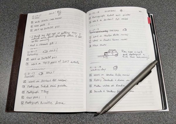
My main problem with an analog To-Do system is that there’s no easy way to search past entries. For example, click the image above and you’ll see my very dumbed down Bullet Journal system which consists of tasks with a box next to them. If I finish the task, I put an X through it. If I didn’t finish it on the day it was listed, I draw an arrow and add it to the next day’s list of tasks. It’s extremely simple, but it has been working very well for me. Except, for notes. If you look at my pages above, you’ll see that I have a couple of notes where I talk about problems with my eye, and a note about blowing out a tire. I also make notes on ideas I have for articles that I want to write, quotes that I want to remember, and more. But with an analog system, I can’t go back and do an easy search to find these notes. The best I can do when I want to find something I’ve written is to manually flip through pages. But mainly, I’ll write down ideas and they will be forgotten forever.

You might suggest that I take pictures of my pages at the end of each day and upload them to Evernote or Google Keep which allows text searching within images. That’s a decent idea, but I’m too lazy to do that on a regular basis. I might have good intentions and do it for awhile, but I know that I won’t keep it up for very long.

A couple of weeks ago I decided that it was time to go back to a digital system and I’ve been stuck down a rabbit hole searching productivity sites, apps, and To-Do list ideas. There are so many options out there that it makes it difficult to pick something and get started. My list of must-have features include:

  1. Free or no reoccurring fees – I don’t want to pay a monthly subscription for a task management system but I’d be willing to pay a one time fee to buy a piece of software
  2. Ability to add notes
  3. Ability to add sub-tasks
  4. Easy to search for past entries
  5. Completed tasks aren’t deleted
  6. Must be able to use it via the web or mobile app

List of nice to have but can live without features include:

  1. Ability to tag entries
  2. Ability to add web links, and images to entries
  3. Easy to make entries via email
  4. Ability to add a task using Google Assistant

I have decided to try out different apps and services for 3-4 days at a time and write quick posts about what I think of each one I try and hopefully spark some interest where you’ll chime in with ideas of other task and To-Do systems that I should check into.

The first To-Do system that I decided to try is:

Google Tasks

If you’re not familiar with Google Tasks, it’s a simple To-Do list system that’s built right into Gmail. Since there’s never a time when my browser doesn’t have a Gmail tab open, I figured that this would be the perfect system to start using first.

I’ve found three ways to access Google Tasks and I’ll show you each one.

Google Tasks through Gmail

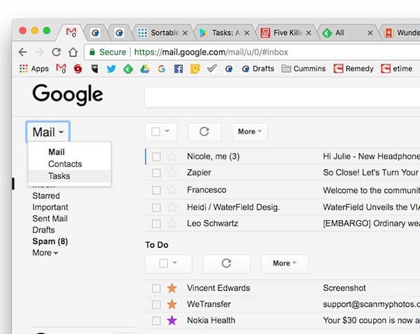
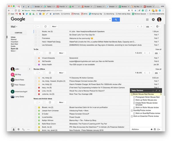
Login to Gmail and you’ll see a drop-down menu to the right of the Mail header under the Google logo. When you click the arrow, you’ll see Tasks. Click on it.

A small widget opens in the right corner of your browser with your Tasks list. From this widget, you can view different tasks groups, add, delete, and sort your tasks.

Google Tasks through Google Calendar

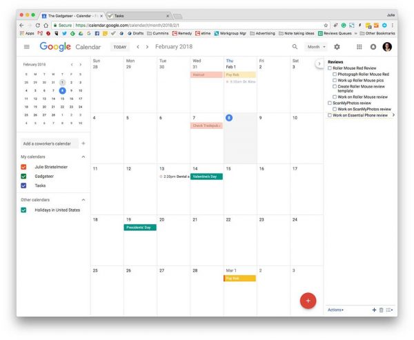
If you don’t want to clutter your Gmail window with a Tasks widget and you like to have a Google Calendar tab open in your browser, you can access the Tasks list from there too.

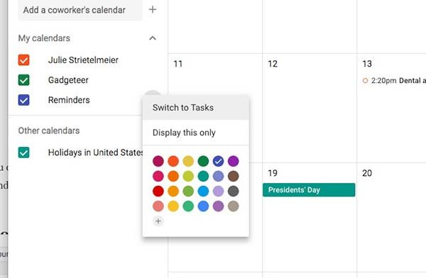
To do so, all you have to do is click the 3 dots to the left of the Reminders calendar under My Calendars in the left sidebar. You’ll see a Switch to Tasks option at the top. Click that and the Tasks will be listed in the right sidebar of your Calendar window. This view works exactly like the smaller widget in Gmail.

Google Task’s own web app


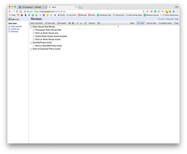
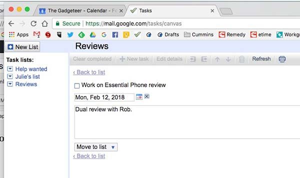
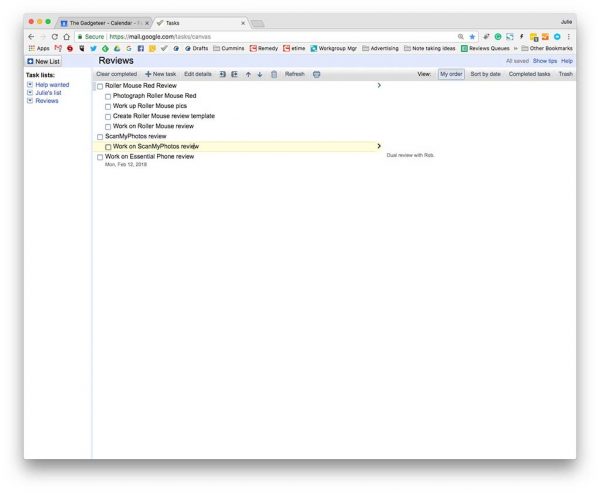
You can also open Tasks in its very own tab by going to https://mail.google.com/tasks/canvas

Having Google Tasks open in its own window is nice because the tasks list items probably won’t word wrap since the screen is wider.

You can even add notes and due dates for each task.

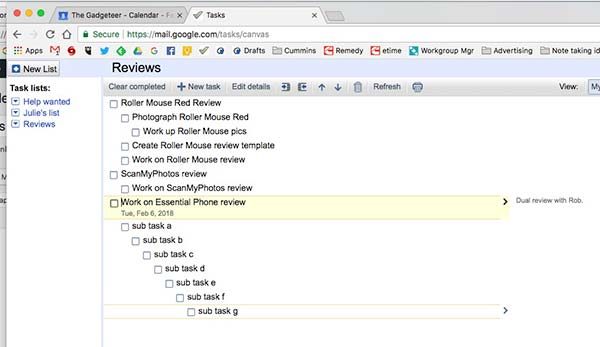
When notes are added, they show up to the right of each task item and the due dates display below each item. If you add a due date, it will also be added as a Google Calendar entry.

Regardless as to which way you view Google Tasks, you can rearrange the order of the list by dragging and dropping with your mouse, keyboard shortcuts, or using the arrow buttons in the toolbar.

It also looks like you have unlimited subtasks. I stopped testing after adding 20 subtasks.

What I like about Google Tasks

I like that I already have access to it without having to download and install a new app and that I can access from any computer with a browser. I also like that it’s easy to use and that I can even create a new task with an email.

All you have to do is select the email, click the down arrow next to More, and select Add to Tasks.

Things I wish were better with Google Tasks

Other than being able to add tags, images, and web links to tasks entries, the biggest feature that’s missing from Google Tasks is the ability to search tasks based on a word. As far as I can figure out after using Google Tasks for the last few days, there’s no way to find a task other than just scrolling through the list. Since search is one of my must-have features, it’s not going to be a big surprise that Google Tasks is not going to cut it for me and my new quest to find my ultimate productivity and task manager is just getting started.

I haven’t chosen my next system to try. Do you have any suggestions?

Adobe Photoshop Elements 2018 review

I’m not entirely sure how it happened, but over the years I have become the curator of the family media archive.  I routinely receive old movie reels, slide and photos to digitize and archive.  Many of these items arrive in somewhat less than pristine shape, and it just doesn’t make sense to store damaged images.  This is the space where a tool like Adobe’s Photoshop Elements 2018 plays best.  The question is will this application make things easier for me and improve the quality of our digital memories, or will I spend a lot of time with little to show for it?  Read on to find out.

In order to decide whether Photoshop Elements would help or hinder, I wanted to take a real-life example.  When my father passed away I helped to clean out storage at the house I grew up in, and along the way, I found a treasure trove of old photos from when my Dad was far younger than I ever was.  Most were in pretty good shape, but some were scratched and dusty from years of storage.  The following photo is my Dad when he was 4 years old and growing up in New Jersey.

What you can see immediately are the scratches and discoloration that happens when a picture sits in a shoe box for 65+ years.

Photoshop Elements offers a “guided mode” which allows you to choose a path to enhancing your images.  After loading the photo in the application, I switched to the guided mode.  There are dozens of options, but since this is a black and white image, I limited the choices to that type of guide only.  From the 10 or so guides that came up, I selected the scratch and dust removal guide.

Once the path was chosen, a step-by-step guide came up on the right side of the screen.  I selected each step that seemed appropriate to the picture I was working on.  First I cropped the image to highlight my Dad and not necessarily the table.  Tools like spot healing to remove lines, blur to smooth out imperfections and dust removal to get rid of spots, each tool making the image just that much better than it was.  At the end, I removed the extraneous colors that scanning a less than perfect photo introduces, adjusted the brightness and contrast, and finally sharpened the image.

And here is the result.

Arguably better than the original in my opinion.  The whole process for this picture took me less than 5 minutes – I could have spent more time on this and improved it even more if I wanted.  And the original image is untouched as the guide allows you to either overwrite or save to a new image.  If this were something I had taken with my phone, I could also have used the guide to share the picture on Facebook or Instagram.

Not just for the record anymore!

So I know that Photoshop Elements can handle the hard work of preserving my family’s precious memories.  But how will it stack up against tasks like inserting myself into places I have never been?  You know, the important stuff.  I started this part of the journey with a picture of a close friend.

That, of course, is Groot from Marvel’s Guardians of the Galaxy.  If you haven’t seen the movie(s) go watch them now.  I’ll wait.

There.  Now you see why I love Groot.  Problem is, there is very little opportunity to spend time with him outside of those movies.  My head may be in space, but the rest of me is firmly rooted here.

How can I get us together?  Photoshop Elements to the rescue!  Using Expert mode and a tutorial I found online (and there are a ton of these kinds of tutorials out there to help you with anything you want to do), I was able to get my favorite tree person to photobomb me.  Start to finish, even with my fumbling around and reading the tutorial over and over, the whole thing took less than 10 minutes.  Oh, and after the fact I learned there is a guide to do this as well, but…experience.  Here is the result.

Maybe not up to the standard of some Photoshop work, but more than enough to show my friends I know trees in high places.

What else do you get?

Photoshop Elements also provides an excellent way to organize your images through the Organizer tool.  The tool allows you to view, rename and manage your library.  In the 2018 edition, Adobe has added an AI tool called Auto Curate which will examine the images in your library to point out possible flaws like composition, exposure and focus problems.  It can also help identify faces plus tag images with any kind of data – including EXIF data coming from your camera, and all delivered via smart tools.

There is even a smart tool which will take a photo where the subject’s eyes are closed and will open them.  Here’s the before (from our wedding 8 years ago).

And after running the Open Closed Eyes tool.

So now that Auto Curate has pointed out some image flaws, do you have to edit each image individually to fix those problems?  Good question!  And the answer is “of course not” – Photoshop Elements also offers a batch processing mode that will allow you to select a group of photos, apply transformations (resizing, corrections and other adjustments) and output the results to another location to let you choose whether they keep the old or new.  It will even change image formats, like taking all of your PNG files and converting them to JPG.

Now that you have a nice, clean library of photos, the Slide Show tool will allow you to arrange the images into a presentation.  You can apply artistic effects like watercolor rendering, transition effects like dissolves, and add your own soundtrack to the results.  When you are done, you can share your creation in the usual places.

So what are the quirks?

As great as Photoshop Elements is, the application is not without any shortcomings.  First, there is a weird problem if you use multiple monitors.  Elements always opens on the primary monitor, but you can drag the window to your secondary monitor (or any other you might have connected).  What’s weird is that once the window is on the non-primary monitor, any attempt to resize the window causes the application to snap the window back to the primary monitor and the window is maximized.  This happens on both the Mac and Windows versions of the application.

And if you own an iPhone or iPad that you use to take pictures, you might not be able to edit the images in Elements on either platform.  iOS 11 introduced the HEIF format (High Efficiency Image Format), a container that gives greater compression to your images so you don’t run out of space on your device.  At the moment Elements does not support the HEIF format although a patch has been promised.  If you use an Apple device, you will have to go into Settings for the Camera app and choose Most Compatible rather than High Efficiency.

Final thoughts

If you take pictures, Adobe’s Photoshop Elements is one of the friendliest and least expensive way to manipulate, catalog and preserve your media.  When paired with the sister application (Adobe Premiere Elements 2018, review coming soon), these two applications will make your digital life the envy of your friends.  And at $99.99 list price (cheaper on sale at Amazon for digital downloads), the application won’t break the bank.

Available in versions for both macOS and Windows and a generous license which will allow you non-simultaneous use on 2 machines – and cross-platform licensing so you can use the application on either OS – makes this a must-have tool if you want to curate your digital life.

Price: $99.99 (bundled with Premiere Elements 2018 for $149 – but often on sale for much less)
Where to buy:  Amazon
Source: The sample for this review was provided by Adobe.
The ZEEQ pillow helps you get more z’s and snore less

A pillow isn’t normally considered a gadget, but the ZEEQ Smart Pillow from REM-Fit definitely fits in that product category. The ZEEQ pillow was a successfully funded Kickstarter project from two years ago and features an adjustable foam filling that hides a variety of tech features like a built-in Bluetooth speaker that you can use to fall asleep or wake to soothing nature sounds or your favorite tunes.

The ZEEQ Smart Pillow works with an app on your phone and 3D motion sensors in the pillow to track your sleep quality and snoring problems. If ZEEQ notices that you’re snoring, the pillow will vibrate to encourage you to change positions. If you don’t snore, the built-in motors will gently vibrate to help you wake up at just the right time during your sleep cycle so that you’ll wake up refreshed and ready to face the day.

A sleep tracking smart pillow does come at a cost. The ZEEQ Smart Pillow is priced at $199.99 and is available now from zeeqpillow.com. A fitness tracker is included in the price, as well as a 60-day money back guarantee.

Organize your pocket gadgets with the PocKit Pro EDC organizer from Yellow Birch Outfitters

I’m all about EDC organization.  In fact, I’m constantly on the lookout for little pockets and pouches that I can use to keep my loose pocket items from clanking about. I might have just found it in the Yellow Birch Outfitters PocKit Pro EDC Organizer. This little pardner is ruggedly built from 1000D Cordura Nylon with Nylon No. 69 thread, YKK zippers and pulls and Mil Spec taping and “Handmade in the USA by someone who proudly served it.” It has 3 pockets on the front that will hold lots of different types and sizes of smallish EDC items, like knives, flashlights, mini-pens and the like. Just behind that is a wide slot for a small notebook. On the back side is a larger, full-zippered pocket for larger items. At 4″x6″ it won’t crowd your pocket much and will keep everything protected and in one place. The PocKit Pro EDC Organizer is available in Coyote Brown (pictured) and in two versions: Modern Carry with 3 pockets on the front and Classic Carry with 4 pockets on the front, each for $49.99. Visit YellowBirchOutfitters.com for more info or to order.