Android 7.0 tips part 2: Open Chrome in two separate windows using split-screen and enable Night Mode


Last month I wrote an article entitled Android 7.0 tips: Notifications and power notification controls which seemed to interest some of you, so this month I thought that I would share some additional Android 7.0 tips. Did you know that you can open two Chrome windows using the split-screen feature? And did you know that Nougat has a hidden Night Mode feature that you can enable without rooting your phone?

Before I detail the steps on how to open two Chrome windows using split-screen, I will cover how to use the split-screen feature with two different apps.

Split-screen for two different apps


First, you will need to open an app that works with the split-screen feature (not all apps do; you will not be able to enter split-screen mode if the app does not work with it). Next, long press on the Recent Apps button which is the square soft key located at the bottom of your phone. After doing so, you will notice that the square soft key becomes two stacked horizontal rectangles and the app will be placed in the upper portion of your phone’s screen. At that time, if you have other apps that are open, you may scroll through the Recent Apps area in the lower part of the screen and tap on the one you want to fill the lower half of your screen. If you do not have any other apps open, you can tap on your phone’s Home button and then select an app to open. If the second app you launch does not work with split-screen, you may have to start over with the split-screen process. You can adjust the size of the two windows by long pressing and dragging up or down on the small dash located within the center of the bar that separates the apps.

If you would like to switch the app in the lower window to another app, use a short single tap on the Recent Apps button then either select another app from the Recent Apps area or tap on the Home button of your phone to open another app. To exit split-screen mode, you’ll need to long press on the Recent Apps button again. That’s it.

Open two Chrome windows using split-screen


To open two Chrome windows in split-screen, you need to open your Chrome app then open two tabs in Chrome that you are interested in as shown in the left screenshot above (the square containing the number 2 located at the top of the Chrome app to the right of the web address indicates the number of tabs you have open). Make sure that the tab that you want to move to the LOWER part of your phone’s screen is the active window (the tab that you are viewing), then long press on the Recent Apps button.


Next, you will need to tap on the vertical ellipsis (or More Options) icon located in the upper-right corner of the Chrome app to access the Chrome app menu as shown in the left screenshot above. Now you’ll need to tap on “Move to other window” after which, the Chrome tab that you are viewing will be moved to the lower part of the split-screen, leaving the other tab to fill the upper part of your phone’s screen. When you want to exit the split-screen mode, you’ll need to long press on the Recent Apps button again.

Enabling Night Mode

The next tip I have for you is enabling Night Mode. Night Mode is a blue-canceling mode for your phone to help reduce interference with your sleep patterns. I learned how to activate this feature thanks to android.gadgethacks.com and found that this feature is somewhat twitchy to use, but it is possible to get it to work.


Even though this feature did not visibly make it to the final version of Android 7.0, the code is apparently still there and can be accessed (without root) by downloading the app called Night Mode Enabler by Mike Evans.

NOTE: Before being able to use the Night Mode Enabler app you must first enable the System UI Tuner. If you haven’t already done this, please visit the Android 7.0 tips: Notifications and power notification controls article that I wrote last month (the steps to enable it are located in the middle of the article). HTC phones users and others that cannot enable AND access the System UI Tuner from your phone’s settings will not be able to enable Night Mode. Remember, all of the System UI Tuner settings are experimental and may not work.

When you open the Night Mode Enabler app, you’ll need to tap on the Enable Night Mode button as shown in the right screenshot above.


Just after tapping on the button, you will be brought to the Night Mode settings located in the System UI Tuner. The Night Mode settings consist of turning the mode on, turning it on automatically, adjusting the tint and adjusting the brightness.

When you fully expand your phone’s Quick Settings (by pulling down on the Notification Shade twice) you will then notice that the Night Mode toggle was added to your list (it was added automatically for me). If it was not, you can tap on the Edit button located in the lower right corner of the Quick Settings area then, from the list of additional toggles, long press on the Night Mode toggle and drag it to your desired location in Quick Settings (you can reorder any of your toggles using this process). If you have trouble adding it, according to android.gadgethacks.com, you can “reset your Quick Settings toggles, then add the Night Mode switch again. To do that, just head to the ‘Edit’ menu in Quick Settings, then tap the three-dot menu button in the top-right corner and choose ‘Reset.’” Now you can manually toggle Night Mode on or off if you wish. When this feature is active, the screen on your phone takes on an orange hue which I could not capture with screenshots.

NOTE: the ONLY way to access and alter these Night Mode settings is by long pressing on the Night Mode toggle in your phone’s Quick Settings or by launching the Night Mode Enabler app – you WILL NOT see it by going into the System UI Tuner settings directly.

It was my experience that leaving the Night Mode settings in their default positions allowed me to manually turn Night Mode on or off from my phone’s Quick Settings. Turning off the Adjust Tint setting seemed to prevent my phone’s screen color from changing, so I left this in the “On” position. I have not tested turning on Night Mode automatically, I’ve only used the manual toggle in Quick Settings. I realize that there are night mode apps available that perform this function well, but this method is free (no ads to deal with) and I do like having a Night Mode toggle available in my phone’s Quick Settings.

I hope you find these features useful and fun to use like I did!

Filed in categories: Articles

Tagged:

Android 7.0 tips part 2: Open Chrome in two separate windows using split-screen and enable Night Mode originally appeared on on June 29, 2017 at 1:12 pm.

Note: If you are subscribed to this feed through FeedBurner, please switch to our native feed URL http://the-gadgeteer.com/feed/ in order to ensure continuous delivery.

Mychanic Pod Light Review


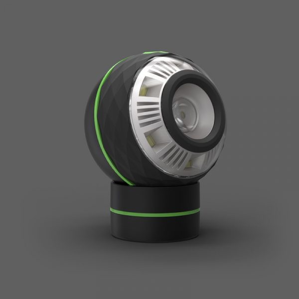
“Oh cool” was my son’s reaction when he saw this… thing.  What is this thing?  It’s called the Pod Light from Mychanic, a unique take on the work light that goes almost anywhere.


  • Sphere is 3.5” in diameter
  • Base is 2.25” in diameter
  • Sphere + Base is 4.5” tall
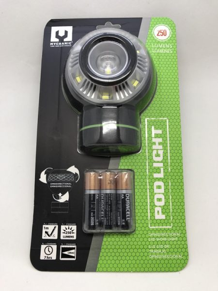
  • 250 lumens
  • Weight: .6 lbs
  • Includes 3 AA Duracell(R) batteries
  • Durable ABS housing
  • Patent pending

The first thing I noticed:  Batteries included!  It also meant it wasn’t USB rechargeable, something I’ve been looking for in lights recently.

Let’s take a look at that base.  It’s magnetized on both the concave side (to hold the pod) and the flat side, for mounting on a metallic work surface.

Feeding time!  The Pod Light takes three AA batteries.

There’s a single diamond-shaped button on the top of the softball-sized light.  You get a low (6 surround LEDs) and a high (all LEDs) setting.  There’s no setting for just the central LED.

Here’s the Pod Light, mounted on a metal part under my hood.

How long does the Pod Light stay lit? To try this, I installed a set of regular rechargeable Eneloop AA batteries and let it sit on the brightest setting.  After a few hours, the LED intensity dropped.  I’d say the listed 7 hours is pretty accurate.

By the next morning, it was more like a dim night light. The Pod Light kept putting out a faint glow of light (not very useful) for nearly 36 hours before going completely dark. I’m not sure how alkaline AA batteries would fare, but the discharge curve is probably a little different.

Mychanic states that “you won’t be able to put it down” and I think they’re right.  The sphere shape just feels fun, and I ended up going around the house to see where I could stick the magnetic base (appliances, shelves, car door).  I still wish the Pod Light was USB rechargeable, but at least they were good enough to include AA batteries.

Source: The sample for this review was provided by Mychanic. Please visit their site for more info.


Product Information

Price: $19.99
Manufacturer: Mychanic
Requirements:
  • 3 AA batteries (included)
Pros:
  • Two brightness modes. Base sticks to any magnetic surface
Cons:
  • USB rechargeable would have been nice.

Filed in categories: Reviews

Tagged:

Mychanic Pod Light Review originally appeared on on June 29, 2017 at 9:00 am.

Note: If you are subscribed to this feed through FeedBurner, please switch to our native feed URL http://the-gadgeteer.com/feed/ in order to ensure continuous delivery.

24 Hours with Bixby


Unless you have been under a rock, you already know about Samsung’s entry into the Smart Assistant category with the odd name Bixby.  If you have been under a rock, welcome back and we’ll wait while you catch up.

Bixby launched on the new Samsung Galaxy S8 and S8 Plus phones back in April, but it was incomplete.  At launch, it only supported a small set of functions (no voice) that made it look a lot like Google Now.  Months later, Samsung is finally preparing to launch voice capabilities for Bixby.  I have been lucky enough to get early access and as I am not under an NDA, I get to tell you about my experience with Samsung’s Smart Assistant.  Is it a worthy competitor to Siri, Cortana and Google Assistant?  Read on to find out…

Samsung is sending odd messages about how Bixby fits into the Smart Assistant landscape.  They pointedly avoid any sort of comparison to any of the other assistants like the Google Assistant or Siri.  Instead, the messaging is around how personal and local to you Bixby is.  It is an intelligent interface to your device, although from a function perspective it is difficult to see how that interface differs from the competition.

Both the S8 and the Plus come with a dedicated Bixby button on the left side of the phone.  That’s important to know later when I get into how to use Bixby, but for now, it just serves to bolster the message that Bixby is part of the phone’s interface.  Installation was pretty simple – an over the air update delivered the necessary modules, and after a quick restart of my S8 Plus, I was ready to train Bixby.

Yes, train.  While both Cortana and Google Assistant offered to improve voice recognition through training, neither actually required me to read phrases into my device like Samsung did.  And the interface for training was particularly laggy – during the training, the phrase to speak would take a minute or more to appear on the screen.  I was not prevented, however, from pressing the Bixby button nor did anything I say to the phone actually get used UNTIL the phrase appeared on the screen.  Instead, I was greeted with an error message telling me the phrase was not understood – and the error message showed before the phrase to read.

Once trained, Bixby sits (mostly) in the background waiting for you to give him something to do.  Bixby is supposed to respond to a trigger phrase (in this case, “Hi, Bixby”), which implies an always-listening connection on your phone.  I have yet to be able to get Bixby to respond to the trigger phrase except for the first time I say it post-reboot of the phone.  After I have used the trigger phrase, Bixby apparently stops listening until the phone restarts.  This is beta software, I guess, but it seems like a big miss.

The only consistent way I can get Bixby to respond is to press the dedicated button.  A quick press of the button launches Bixby Home, which should remind you of a pastel version of Google Now.  Context cards appear on the screen that tells you about the weather, your calendar, and alarms, some “trending stories” categories that take you to a Google news search and Samsung Themes (in case you obsessively want to change the look of your phone).  There are other links to apps like Samsung Health and reminders, but only if the app lives on your phone and you connected it with Bixby via setup.

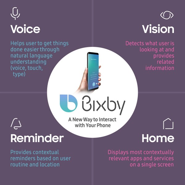
This chart is the optimistic use case for Bixby.  Home is the Google Now-equivalent page.  Vision is connected to the Samsung Camera app and is supposed to allow you to snap a picture of something and get a translation, identification or other data.  So far, I get about 1 hit with data out of every 5 attempts.  Often the data is wrong – I snapped a picture of a “wet floor” sign at my local Starbucks and instead of a translation of “piso mojado” I was shown a Google search for the phrase “slippery when wet” – granted, it is in the same ballpark, but since the Spanish phrase was all that was visible in the picture, it seems like an odd way to answer what should have been a simple translation.

Reminders are just that – location and time aware reminders to do something.  When you are able to get the reminder into Bixby, they work exactly the same as Google’s reminders (and Cortana’s and Siri’s, I would guess).  Getting the reminder in is challenging, though, because…

Voice is the interface portion of Bixby and primarily how you are supposed to interact.  You can tell Bixby to remind you to pick up milk when you get to Metropolitan Market or to remind you to buy tickets for Chris Isaak tomorrow at 9 AM.  You can tell Bixby, but if there is any noise in the room or anything going on with your phone, Bixby will almost always get it wrong.  Asking Bixby to remind me to get milk while walking towards the store netted me a Google search for the etymology of the word “ilk”.  In fact, about half the time I got something entirely different than the reminder I was hoping for.

Pressing and holding the Bixby button allows you to launch a command or set a reminder without the trigger phrase, which is a very good thing since I could never get the trigger to work consistently.  You can use commands like “Open Messages” and the Messages (SMS) app will open.  For apps that have deep-linking (at the moment, only a handful of Samsung apps like Health and Messages), you can add an operation to the command – like “Open Messages and Send a Text to Beth”.  For the apps which Samsung has deep-linking setup, this works quite nicely.  However, Bixby has recognition problems here, too.  I use Pulse for SMS messaging, and if I use the command “Open Pulse” inexplicably Bixby launches Samsung Health – while I get the “pulse” reference, it would appear Bixby has trouble parsing the syntax of commands and just executes whatever it thinks it is near-matched.

Other than reminders and VERY light phone commands, Voice leaves a lot to be desired.  And even those leave something to be desired.

I would love to tell you of a better experience, but it is truly early days for Bixby.  Samsung must have realized that the assistant is something less than half-baked because not long after the beta was launched Samsung announced the general availability would be delayed until there are more resources (read: apps) available.  Probably a good thing, too, because it gives them more time to perfect something the other guys have right already: voice recognition with consistent results.  It was 24 hours of frustrating near misses, reminders to check my alarms (which I routinely dismissed only to have them reappear a couple of hours later), inability to set reminders for the things I needed, and other quirky results that made me think of Apple’s Newton handwriting fiasco many years ago.  If you want a laugh, go look that last one up.

So for now, back to the Google Assistant where I know it will remind me to get milk.

Filed in categories: Articles

Tagged:

24 Hours with Bixby originally appeared on on June 29, 2017 at 7:59 am.

Note: If you are subscribed to this feed through FeedBurner, please switch to our native feed URL http://the-gadgeteer.com/feed/ in order to ensure continuous delivery.

A celiac’s new best friend: the Nima portable gluten sensor


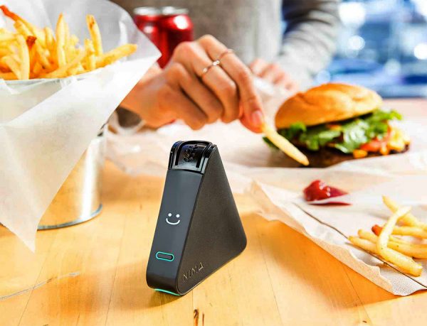
For people with celiac disease, an autoimmune condition for which there is no cure, eating gluten-free isn’t just a way of life. It is life, considering a mere 20 ppm of gluten is all it takes to trip an immune response. Enter Nima, a portable gluten sensor that tests food for the presence of gluten exceeding the threshold of safety for celiacs.

The unit, which retails for $279 ($229 at the time of this posting), comes with three test vials, a micro-USB recharging cable and a carrying pouch, which fits in a purse or pocket. The unit measures 3.5 inches wide and 3.1 inches high and has bluetooth connectivity so it can synch to your smartphone. Users can contribute their test results to the Nima community using a free Nima app, which also provides a list of Nima-tested restaurants.

To test for the presence of gluten, users put a sample of food – liquid or solid – into a vial and insert the vial into the device. In three minutes, a wheat icon and a “gluten detected” warning will warn users if their food is not safe to consume; a smile icon gives diners the go-ahead.

Nima works using a combination of chemistry and sensors, and the vials are not reusable. Subscriptions are available for $59.95 per month for 12 capsules or $61.95 for 12 vials every other month. Those who eat restaurant or processed food often can opt for the $116.94, 24-capsule plan per month. Some foods – soy sauce, pure vinegar, beer, or alcohol – cannot be tested, leaving diners to make educated judgment calls before consumption.

Visit nimasensor.com for more information.

Filed in categories: News

Tagged: ,

A celiac’s new best friend: the Nima portable gluten sensor originally appeared on on June 29, 2017 at 6:47 am.

Note: If you are subscribed to this feed through FeedBurner, please switch to our native feed URL http://the-gadgeteer.com/feed/ in order to ensure continuous delivery.

ShedRain e-Motion motorized compact umbrella review


Do you carry a compact umbrella with you for rainy days? I have one in my drawer at my day job and one in the glove compartment of my car just so I have all my bases covered. The overall design of compact umbrellas hasn’t changed much over the years unless you include the button on the handle that automatically extends the canopy over your head when you press it. Yes, that’s a very handy feature, there hasn’t been a button to automatically close the umbrella until now. Let’s go singing in the rain with the ShedRain e-Motion motorized compact umbrella.

What is it?

The ShedRain e-Motion motorized compact umbrella is a 14″ long umbrella that fully opens and closes with the press of a button.

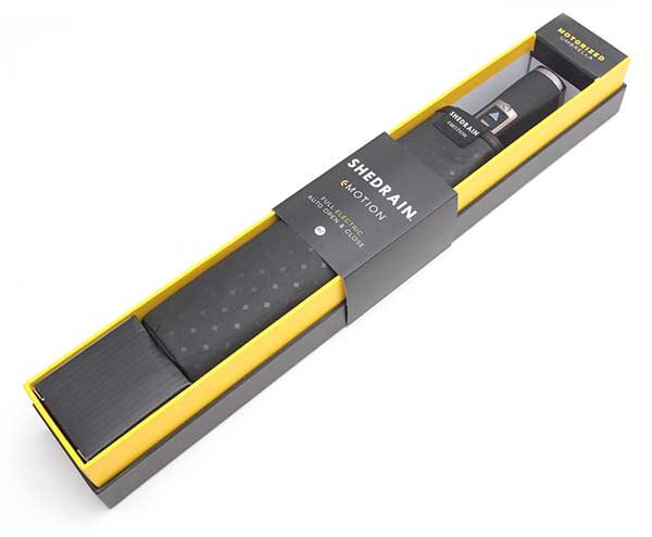
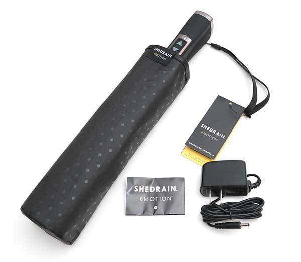
What’s in the box?

ShedRain e-Motion motorized compact umbrella
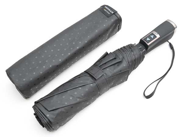
Protective sleeve
AC adapter
Instructions

Design and features

At first glance, the ShedRain e-Motion motorized compact umbrella looks like an ordinary black umbrella that you probably already own.

The umbrella is 14″ long when closed and features an 8-panel design that is made of a black polka dotted polyester material that has a rain repellent Teflon coating, sturdy fiberglass ribs, and a steel shaft.

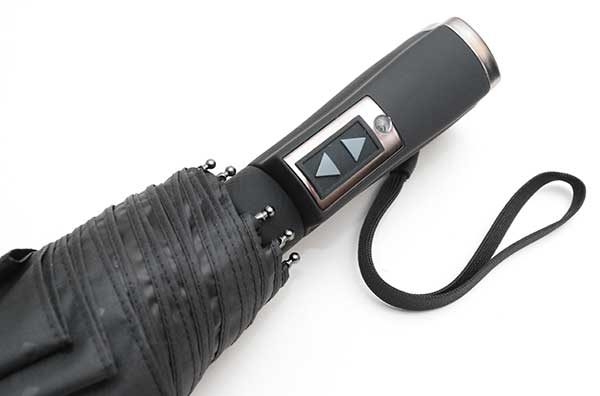
The e-Motion has a comfortable rubberized handle with a wrist strap. But when you look a little closer you’ll notice two arrow buttons and a battery status LED below them.

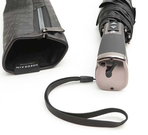
The ShedRain is powered by a built-in rechargeable battery that can last for months on a charge which is done using the included AC adapter. The adapter plugs into a socket on the bottom of the umbrella handle and a small rubber cover protects the socket when it’s not being used.

Charging the umbrella is as easy as plugging the cable into the umbrella, plugging the adapter into a wall outlet, and then waiting for the LED on the AC adapter to turn from red to green.

There’s also a status LED on the umbrella handle, which turns red when the battery needs to be recharged. I’ve yet to see it light up because one charge provides enough power for up to 150 openings and closings.

How does it work?

It really couldn’t be any easier. You unwrap the velcro strap around the closed umbrella and press and hold the up arrow on the handle. That’s it. To close you press and hold the down button. Like I said, easy.

See it in action

As you can see from the video, using the ShedRain is easy and it’s fun too. I love it!

Final thoughts

Most standard umbrellas offer a one-button open of the umbrella, but they still have to manually push the folded canopy down the handle. I bet some of you thinking that people are lazy if they can’t even close an umbrella without needing a button or a motor to do it. But think about it for a minute. Closing an umbrella is awkward when your other hand is holding something, you have dexterity problems or you only have one arm in the first place.

The only criticism of the ShedRain that I can think of is that it uses a proprietary AC adapter. I wish it used a microUSB or USB Type-C connector instead so I could charge it at the office, in my car, etc. As is, you have to to make sure not to lose the AC adapter that ships with the umbrella.

Note: I’m not sure what happens if the battery in the umbrella is completely dead. Will it open? I have sent that question to ShedRain and will update the review as soon as I get an answer.

The ShedRain e-Motion motorized compact umbrella makes using an umbrella fast and easy by completely opening and closing it with the simple hold of a button. Now I look forward to rainy days!

Source: The sample for this review was provided by ShedRain. Please visit their site for more info.


Product Information

Price: $99.00
Manufacturer: ShedRain
Pros:
  • Very easy to use
  • Opens and closes with the press of a button
  • Compact
  • Rechargeable
Cons:
  • Uses a proprietary charger

Filed in categories: Reviews

Tagged: ,

ShedRain e-Motion motorized compact umbrella review originally appeared on on June 28, 2017 at 4:56 pm.

Note: If you are subscribed to this feed through FeedBurner, please switch to our native feed URL http://the-gadgeteer.com/feed/ in order to ensure continuous delivery.