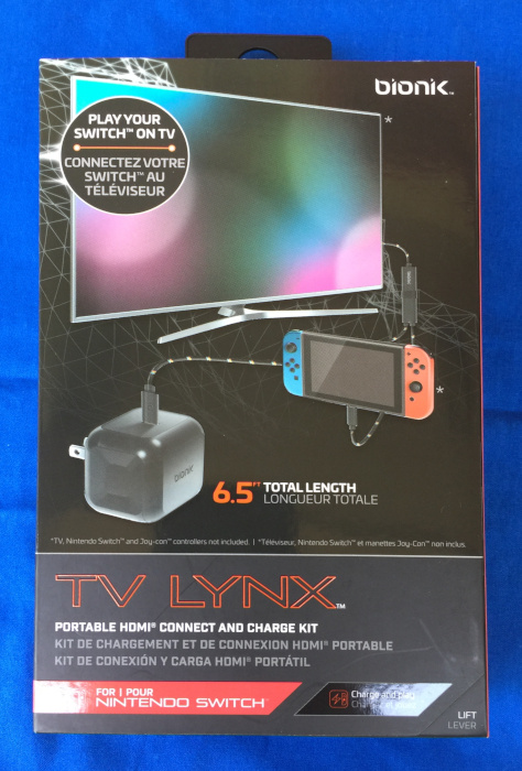
Bionik TV LYNX Nintendo Switch portable connect and charge kit review

REVIEW – One of the most frustrating things about the Nintendo Switch is the need to carry a dock around if you want to both charge the switch and use an external display. The Bionik Lynx for the Nintendo Switch is a compact solution to this problem.

What is it?

The Bionik Lynx for the Nintendo Switch (hereafter referred to as simply Lynx), is a compact solution for providing power to a Nintendo Switch and simultaneously allowing the Switch to be connected to an external display using an HDMI port.

What’s in the box?

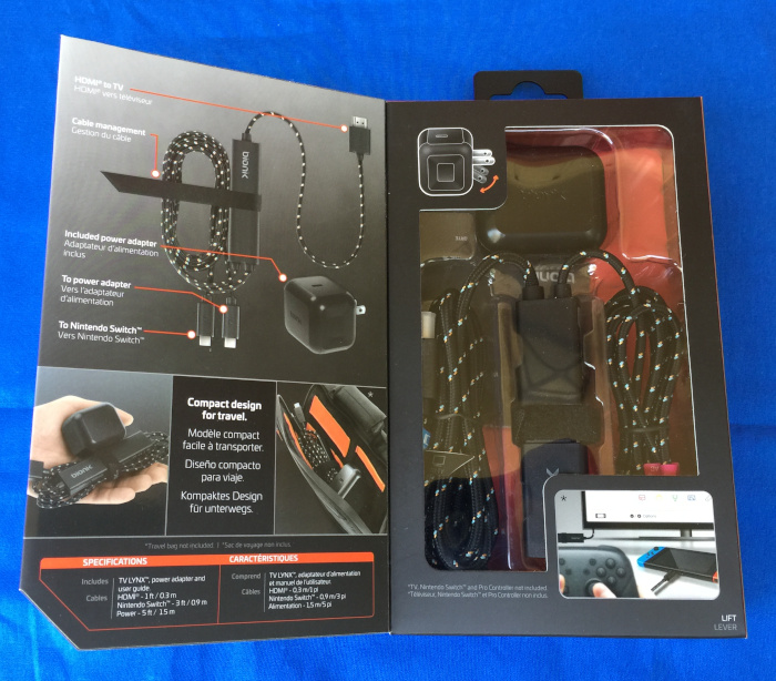
The Lynx is packaged in a nice full-color box with a front flap which allows you to see the kit in all its glory before you purchase or open the package.

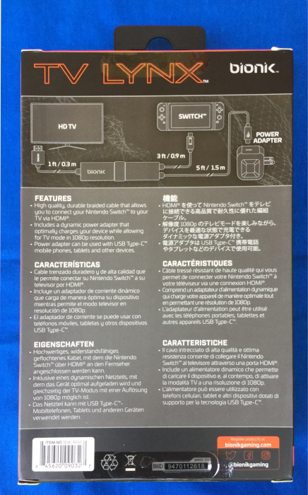
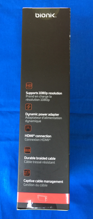
The package describes the basic features of the Lynx in 6 languages with English and French being the featured languages.

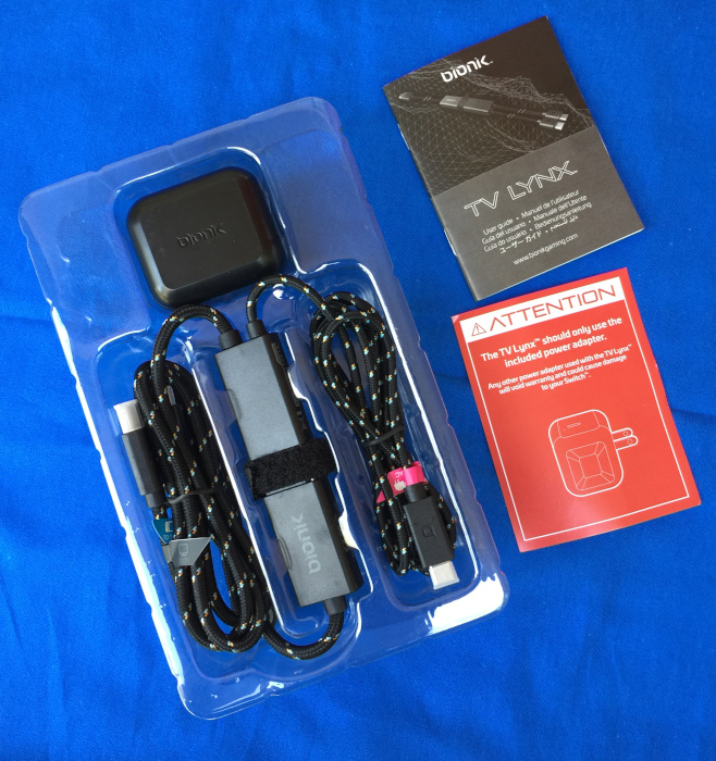
Inside the package are

  • Lynx unit with an attached branded hook-and-loop wire wrap
  • Power brick with USB-C port
  • Quick-start instruction manual (multi-language)
  • Flyer with adamant warning to only use the enclosed power adapter with the unit
Hardware specs

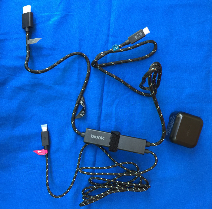
The Lynx unit itself is 9.9 cm long, 2.4 cm wide, and 1.2 cm thick. The Lynx has three attached cables that run to the power adapter (150 cm with a USB-C plug), a Switch (90 cm with a USB-C plug), and an HDMI display (30 cm with a full-sized HDMI plug). When bundled up the Lynx unit and cables is approximately 13 cm long and 5 cm in diameter and weighs 110.5 grams. The power brick measures 5.2 cm by 4.3 cm by 4.5 cm and weighs in at 70 grams.
Design and features

The Lynx is an elegant and functional device which only performs one set of functions, and it performs them very well.

Setup

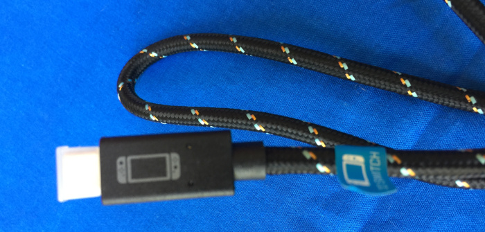
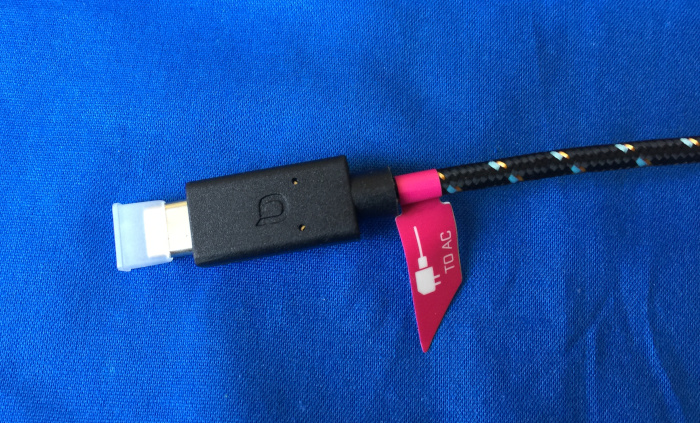
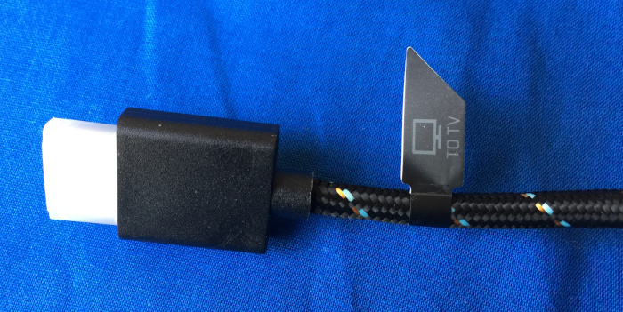
Setting up the Lynx involved simply removing the protective shipping caps from the various connectors, plugging the correct connectors into the correct places following the labeled flags / legends printed on the plugs, plugging the power adapter into an outlet, and turning on the attached display and Switch. I would have liked to see the plugs either embossed with the function or have the plug moldings color coded as I worry about the wire labels coming loose and the printed legends being worn away. I will be addressing this issue on my unit with two different colors of paint to fill in the embossed Bionik logo on the plugs and matching colored wire ties on the cables.
Performance

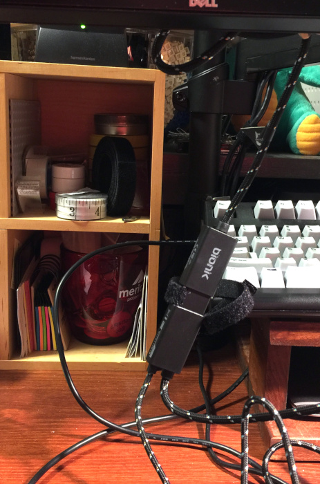
I initially tested my Lynx by hooking it up to the HDMI port on my monitor and hoping that the scaling algorithms in my monitor would render a decent picture. The Lynx outputs a 1080p signal over the HDMI port, but my monitor’s native resolution is WQHD/QHD/2K (2560 x 1440). When I booted everything up, the output looked as good as any other 1080p signal displayed on my monitor. A minor gripe is that the Lynx was hanging down from the bottom of my monitor rather than resting on my desk (yes, I do have my monitor set a bit higher than many others). This is due to the short video cable on the Lynx.
I panicked a bit when I couldn’t get the controls to respond. My younger son helpfully told me that I needed to undock the controllers from the Switch, because they won’t work with an external display when they are still attached. You can see how often I play video games on a Switch. I was able to load and run Super Smash Brothers Ultimate and play with no more trouble than the last time I tried. My younger son “helpfully” offered suggestions on my game play, but I was mostly able to ignore him. The only performance issue that we noted was that the HDMI signal coming out the Lynx runs audio at full volume and there is no way to adjust the volume. I have an inexpensive set of speakers that do not have an onboard volume control attached to my monitor, so game play was very loud.

We next moved to my younger son’s room and performed a second test. Since we were hooking the Lynx up to a regular TV, we could adjust the volume, but we had to rig a mounting solution because his television is mounted five feet up from the floor and the location of the nearest power outlet was just outside the maximum length of the cables. A piece of 3M Command Adhesive solved that problem. He played for over an hour, and would have played longer, but his older brother came in and demanded that his Switch be returned.

My older son has used the Lynx on several outings to friends’ houses for the Switch equivalent of LAN parties, and the Lynx has been a big hit. Again the short HDMI cable proved to be problematic, but the addition of a spare male-to-female HDMI extension cable that his friend’s father happened to have come to the rescue. I will be adding an extension cable to our kit as well.

With the addition of an HDMI extension cable, the parts count reaches three, which is where things start to get lost. I think Bionik has made an error in not including a small bag for carrying the Lynx and power adapter. Yes, they could be put into the case with the switch, but the thin cases are already tight on space and the larger carrying cases that are designed to also carry the dock have room for the dock and spare cables and power adapters, so the Lynx is a bit redundant and rattles around in that big space if you choose to use the larger case anyway.

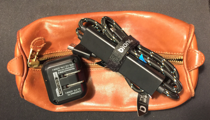
My solution was to pull an old Levenger leather pencil/pen/cable case out of mothballs and put everything in there. Without the HDMI extension cable, it is a bit large for the Lynx and power adapter, but I imagine that the extension cable will take up much of the left over space.
What I like

  • Neat and simple tool
  • Easy to setup and use
  • It just works

What needs to be improved

  • HDMI cable could be lengthened to 50-75 cm
  • Plugs could be better labeled to ensure that the wrong USB-C plug doesn’t end up in the wrong port
  • Needs a carry bag

Final thoughts

The Bionik TV Lynx for the Nintendo Switch is an excellent addition to any Nintendo Switch kit. It solves the problem of powering and simultaneous external display while playing on a Nintendo Switch without having to bring along a dock and its power supply. With a few tweaks, the TV Lynx would be perfect, but don’t let the cable and storage bag issues scare you away. The TV Lynx has become a permanent part of our Nintendo Switch kit.

Price: $59.99
Where to buy: Bionik’s e-commerce site or Amazon
Source: The sample of this product was provided by Bionik.

Filed in categories: Reviews

Tagged:

Bionik TV LYNX Nintendo Switch portable connect and charge kit review originally appeared on The Gadgeteer on April 19, 2019 at 9:04 am.

Note: If you are subscribed to this feed through FeedBurner, please switch to our native feed URL http://the-gadgeteer.com/feed/ in order to ensure continuous delivery.

Ematic Jetstream AGT48 4K Android TV Box review

REVIEW – Cord cutters have a wide assortment of gadgets that can help them sever ties with cable and satellite companies for their entertainment. There are OTA antennas that you can use to bring in local TV network stations, and then there are gadgets like the Apple TV, Roku, and Android TV boxes that provide an easy to use interface and familiar apps to watch shows and movies on your TV. Today I’m going to show you my first Android TV box review. It’s the Jetstream AGT48 Android TV box. Let’s go!

What is it?

Jetstream AGT48 is an Android v8.1 powered device that will let you play games and stream content from your favorite streaming services like Netflix, YouTube, Hulu and others on your big screen TV.

Hardware Specs

CPU: ARM Quad 64-bit Cortex-A53 up to 1.5GHz
OS: Android 8.1
60FPS Video decoding at 4K, HDMI 2.0b AV
2GB DDR Memory
8GB eMMC storage
2 USB ports, microSD slot
WIFI: 2.5GHz, 5GHz 802.11 a/b/g/n/ac
Ethernet: 10/M/100M adaptive
Bluetooth 4.2
Built-in Chromecast

What’s in the box?

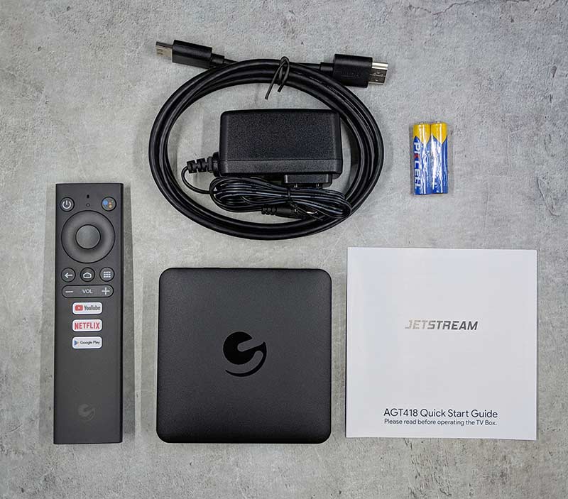
  • Jetstream AGT48 Android TV
  • Remote control
  • 2 AAA batteries
  • HDMI cable
  • Quick start guide

Design and features

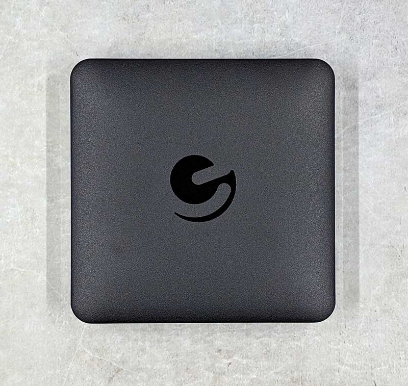
The Jetstream AGT48 Android TV box is an unassuming square black plastic device with the Ematic logo on top.

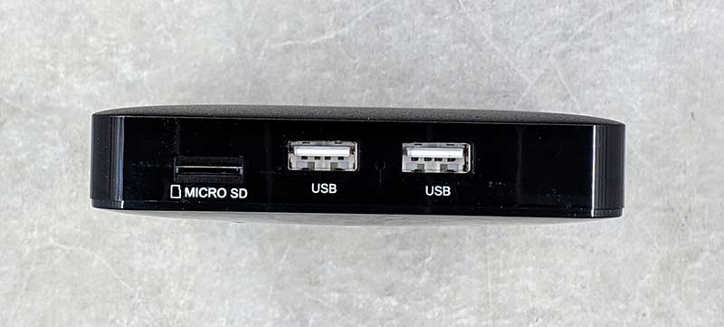
On one side of the device, you’ll find a micro SD card slot and two USB ports that you can for memory expansion or peripherals like a wireless keyboard dongle.

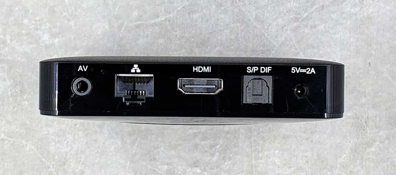
On the back of the Jetstream is an AV output, Ethernet port, HDMI out, Optical S/P Dif, and DC power in.

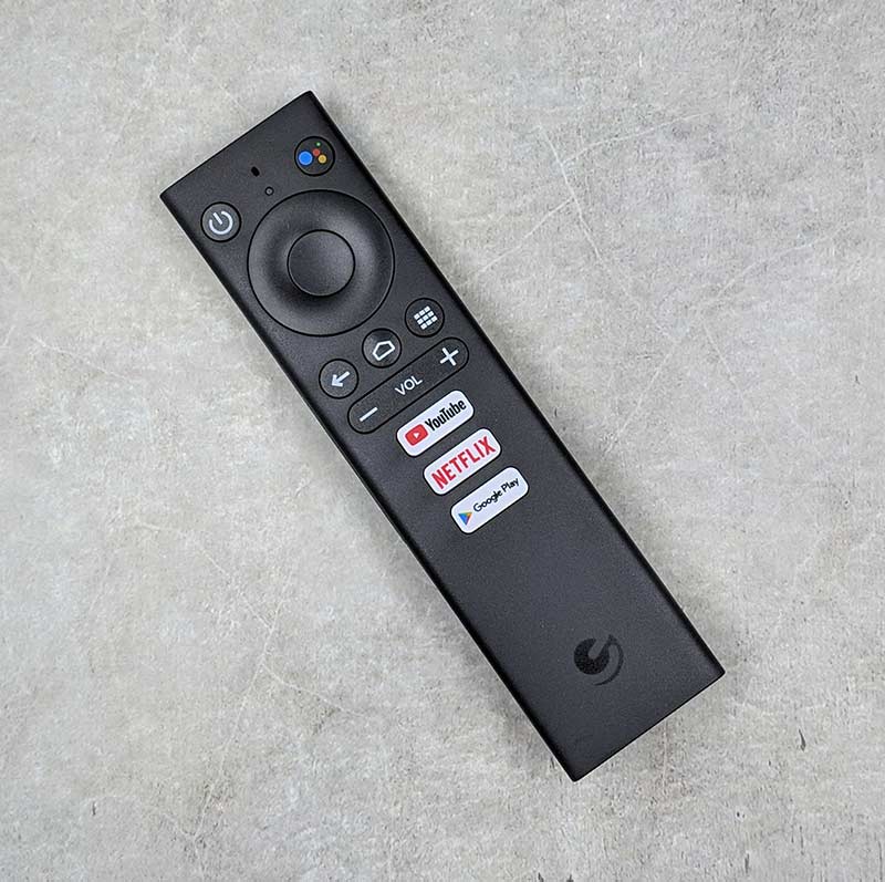
Included with Android TV box is a remote that features dedicated buttons that will launch YouTube, Netflix, and the Google Play store apps. There’s also a Google assistant button in the top right corner if you want to use your voice to control the box.

Setup

Setup is simply a matter of connecting the Jetstream to your TV using the included HDMI cable and powering it up with the included AC adapter.

You’ll be asked to sign into your Google account and from there you will have access to all your favorite streaming apps and can install other apps as well.

Let’s watch something!

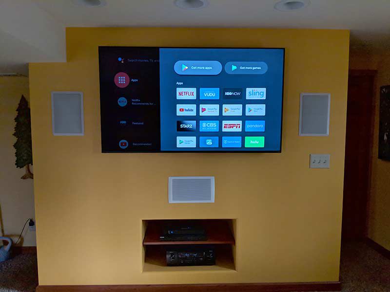
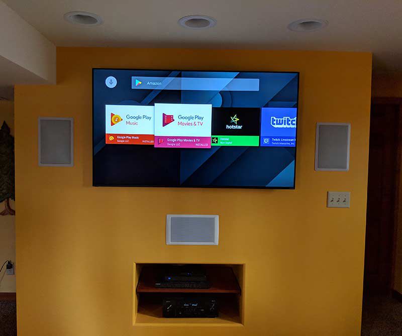
I performed all of my testing of the Jetstream 4K Android TV box with it connected to my Vizio M65-F0 TV and to my network via WiFi.

By default, the most popular streaming apps are already available including Netflix, Hulu, Vudu, Sling, ESPN, and more.

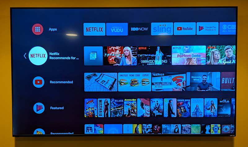
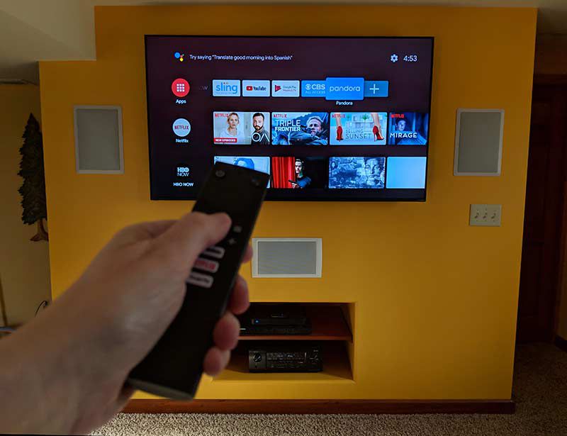
The main Android TV interface is easy to use and shows recommendations for your favorite streaming apps.

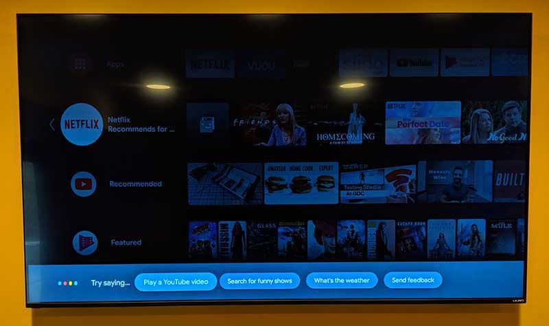
The remote works great for navigating through menus and choosing things to watch but if you’re just too tired to scroll around, you can press the Google Assistant button on the remote and use your voice to find something fun to watch or even ask the same types of questions that you normally do with the assistant.

I was able to say things like “launch Netflix”, “play”, “pause”, etc.

The Google Play store is also available so that you can install all your other favorite apps and games. I did notice a very notable app missing from the Play store though… the Amazon Prime app. I’m more of a Netflix person, so the lack of the Prime app didn’t bother me that much. But for those of you who use it a lot, that’s something to keep in mind if you are interested in buying this device.

I watched a lot of movies and shows with the Netflix app and other apps and the Jetstream Android TV box would great as long as I had not loaded games and other apps before using a streaming app. When I did, the playback was very choppy and blurry until I just cycled power on the device by pressing the power button on the remote. After that, everything was smooth and sharp again.

My TV is a 4K TV and I was able to try some 4K YouTube videos which looked really nice. I don’t watch many 4K movies or shows though and thought that everything look crisp, sharp, and vibrant as is. No complaints there.

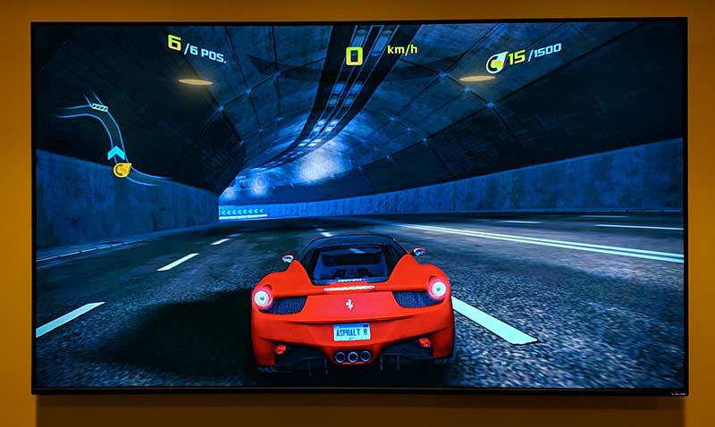
Speaking of games, I paired a Bluetooth game controller with the TV box and was able to play a few games on the big screen TV which was a lot of fun! Note that I’m not a gamer and from what I am reading, this TV box is not a gaming powerhouse like the Nvidia Shield. But for casual games, it seems to work fine.

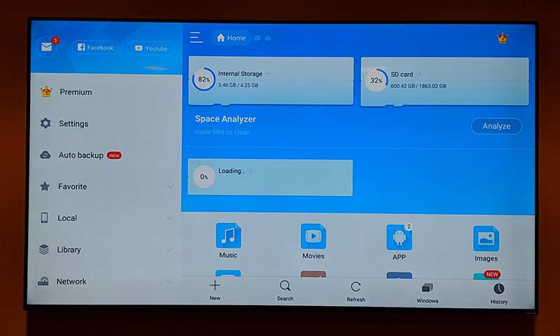
The Jetstream AGT412 Android TV box has 2 USB ports and a micro SD card slot, so you can put media on a flash drive or micro SD card and watch from there. When you plug in a memory device into one of the ports, the default file storage app will popup and allow you to navigate through the folders.

I had a little trouble getting a Seagate 2TB hard disk to show up in the file explorer app while also having a micro SD card plugged into the TV box at the same time. I eventually got it to show up after plugging and unplugging it a couple of times.

The AGT412 also has a built-in Chromecast so you can case contact from your phone or tablet to the Android TV box.

What I like

  • Easy to setup and good user interface
  • Built-in Chromecast
  • 4K
  • Remote is easy to use to navigate the interface

What needs to be improved

  • Doesn’t support Amazon Prime video
  • Doesn’t support Dolby ATMOS audio
  • Loading too many apps can make video streaming choppy
  • Future OS updates doubtful

Final thoughts

The Ematic Jetstream AGT412 Android TV box is the first Android TV device that I’ve reviewed and so far it’s my favorite if only for the fact that it’s the only one I’ve reviewed so far. It’s easy to use and works great with my main streaming app – Netflix as long as I don’t load too many other apps first. Even if I do, it’s only a simple matter of cycling power to fix the choppy audio/video issue. I’m sure there are better Android TV boxes on the market, but for $69, this one works well and won’t bust your budget.

Price: $69.00
Where to buy: Walmart
Source: The sample for this review was provided by Ematic.

Filed in categories: Reviews

Tagged:

Ematic Jetstream AGT48 4K Android TV Box review originally appeared on The Gadgeteer on April 18, 2019 at 11:54 am.

Note: If you are subscribed to this feed through FeedBurner, please switch to our native feed URL http://the-gadgeteer.com/feed/ in order to ensure continuous delivery.
Nomad Base Station Apple Watch Edition review

REVIEW – Looking for an alternative to Apples now defunct Airpower wireless charging pad? I finally got my hands on Nomad’s Base Station Apple Watch Edition, and it just might be the perfect replacement.

What is it?

The Nomad Base Station Apple Watch Edition is a wireless charging pad for Apple iPhones and AirPods with an integrated Apple Watch charger.

Hardware specs

  • 3 Qi-certified coils at 7.5W wireless charging each
  • Integrated MFi-certified Apple Watch Charger
  • Padded leather wireless charging surface
  • LED charging indicators
  • Ambient light sensor dims LED’s at night

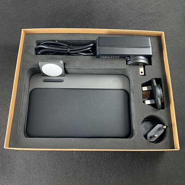
What’s in the box?

  • Wireless charging pad
  • A/C adaptor
  • International EU & UK adapters

Design and features

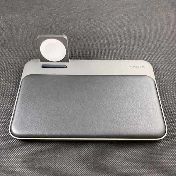
I reviewed Nomad’s Base Station Hub Edition back in November, and the Apple Watch Edition uses the same design. It retains the sleek lightweight aluminum chassis and the soft padded leather charging surface. 

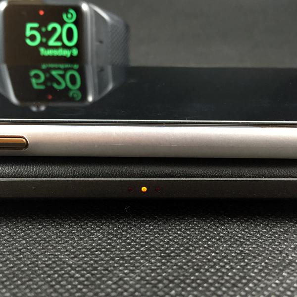
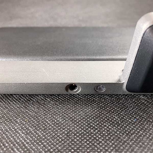
There are 3 LED charging indicators on the front and an ambient light sensor on the back.

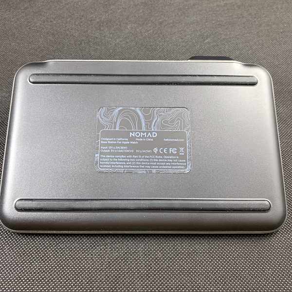
On the bottom of the device, there are two no-slip grip rubber feet.

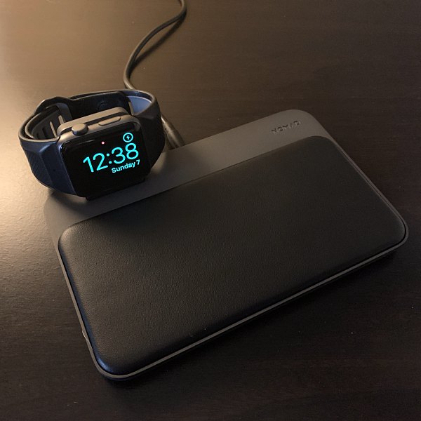
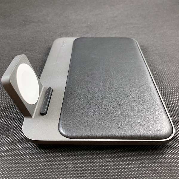
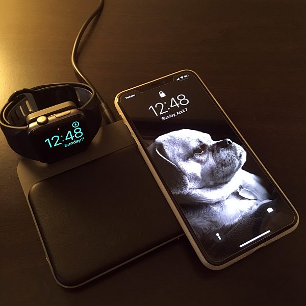
The only obvious difference is the integrated magnetic Apple Watch charger. Its located on the back left of the charging pad. There’s even a small rubber pad that cradles the bottom of your Apple Watch when it’s on the charger.

Charging

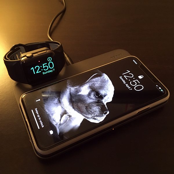
Like the Hub Edition, the Apple Watch Edition has 3 Qi-certified charging coils, allowing multiple charging orientations for your phone.

Or you can simultaneously charge your phone and Apple AirPods with wireless charging case.

Charging with this device is simple, all you have to do is center your phone over a coil, and it begins to charge.

To charge your Apple Watch just place it onto the magnetic charger.

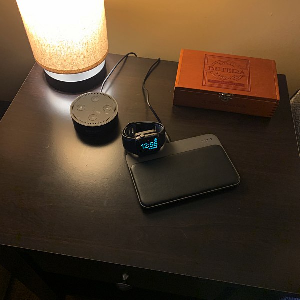
The built-in Apple Watch charger is compatible with Apple’s Nightstand Mode. This allows you to see the time, date, and your alarm. You can interact with Nightstand Mode by tapping your nightstand.

It’s great for me because I don’t use an alarm clock and my previous charger wasn’t compatible with Nightstand Mode. It’s now nice to roll over and tap my nightstand to see what time it is without having to pick up my phone.

No more clutter

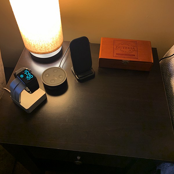
The best thing about the Apple Watch Edition, it instantly decluttered my nightstand. I went from having separate chargers (and their cords) for my Apple Watch and iPhone XS Max to one single beautiful charging pad for both. Thank you, Nomad.

What I like

  • Premium design
  • Compatible with Nightstand Mode
  • Decluttered my nightstand
  • It’s made by Nomad

What needs to be improved

  • Nothing

Final Thoughts

It’s no secret that I’m a fan of Nomad’s products and the Base Station Apple Watch Edition is no exception. If you charge your Apple Watch every night like I do It’s the perfect bedside companion.

The Apple AirPower charger is dead, long live the Nomad Base Station Apple Watch Edition!

Price: $139.95
Where to buy: Nomad and B&H Photo
Source: The sample for this review was provided by Nomad.

Filed in categories: Reviews

Tagged: ,

Nomad Base Station Apple Watch Edition review originally appeared on The Gadgeteer on April 18, 2019 at 10:34 am.

Note: If you are subscribed to this feed through FeedBurner, please switch to our native feed URL http://the-gadgeteer.com/feed/ in order to ensure continuous delivery.
ROBOQI Self Gripping Fast Wireless Car Charger review


REVIEW – Late last year, I tested and reviewed a car cell phone mount with wireless charging, and I was very happy with the functionality and the with the product overall. That device remained in my truck and was used daily, but about a month ago it just stopped charging and the clamping arms no longer open and close. I still very much like and need this type of device and accepted the opportunity to test and review the Roboqi Self Gripping Fast Wireless Car Charger. Will I be disappointed? Let’s see!!

What is it?

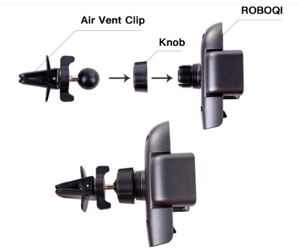
The Roboqi Self Gripping Fast Wireless Car Charger is a dashboard/windshield/vent mount for your cell phone that offers easy access to your phone and wireless charging while it is in the mount.

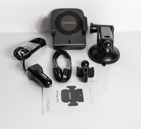
What’s in the box


1 x Roboqi Self Gripping Fast Wireless Car Charger
1 x QC 3.0 DC Power Adapter
1 x USB-C cable
1 x Dash Mount
1 x Vent Mount
1 x Instruction Manual

Design and features

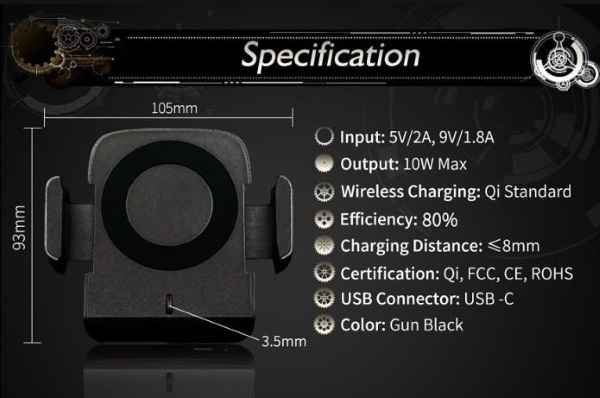
Specifications:


Features:

One Hand Operation:
Take out and put in your phone in 1 second. Automatic wireless car charger with a unique sensor. No button needed.

Fast Wireless Charge:
iCarQi supports Qi fast wireless charging 7.5W compatible for iPhone XS/Max/XR/X/8 8plus & 10W compatible for Android Samsung Galaxy S9/S9+/S8/S8+/S7/Note 8 and 5W other Qi-enabled phone (QC 3.0 adapter included).

Three Mounting Ways:
Two kinds of car mount are provided, and they can be stalled in three different ways: windshield installation, driving-platform installation, air outlet installation. The universal rotary ball, with360 degree of freedom rotation. It can be used at any angle, which brings a flexible range of viewing angle.

5 Reliable methods of Protection:
The iCarQi wireless car charger can detect the voltage of your devices intelligently so as to apply different wireless charging speeds, up to 90% charging conversion. Also includes built-in Over-Temperature Protection, Over-Voltage Protection, Over-Current Protection, and Short-circuit protection keeps your smartphone safe comprehensively.

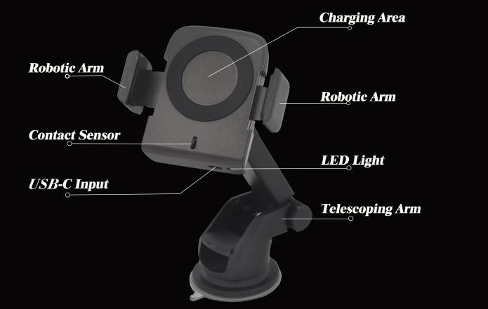
The charging base has the wireless charger in the center that touches the back of your cell when it is placed in the mount. The clamping arms on each side are controlled by the small protruding button/contact sensor in the lower center of the base.


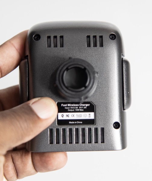
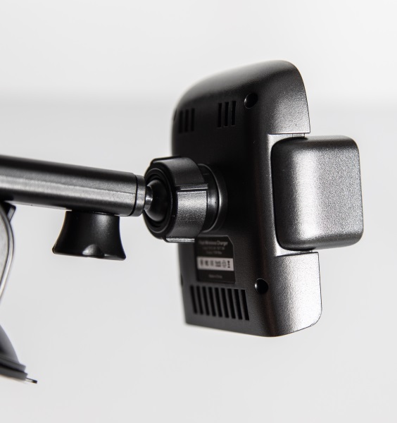
On the back of the charging base, there is the receptacle for the dash or vent mount. There are also some air vents on the back.

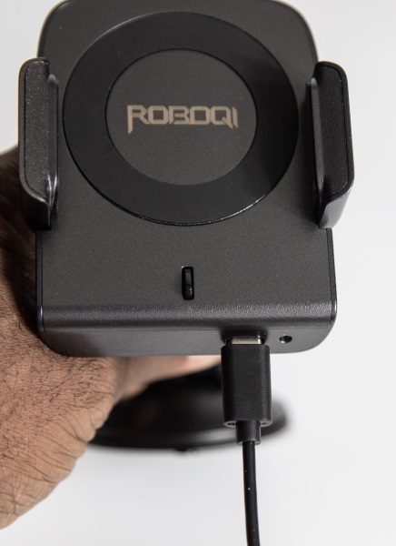
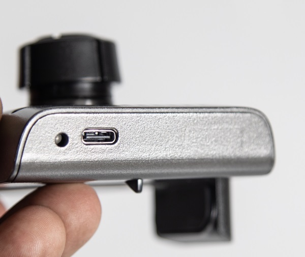
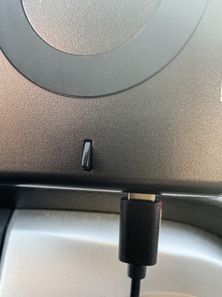
On the bottom of the charger, there is a LED status light and a USB-C port.
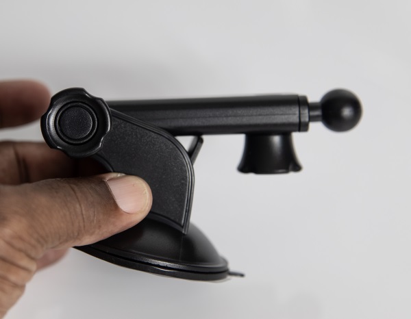
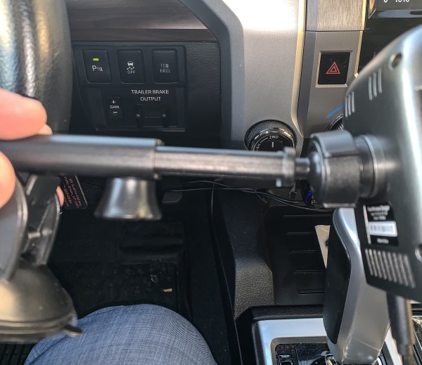
The dash mount has two thumb screws that allow you to adjust the mount up/down and to extend the mount in/out.


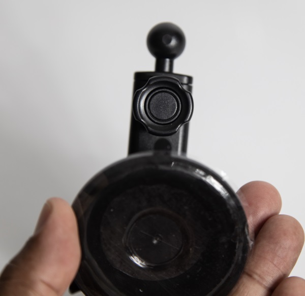
At the bottom of the dash mount, there is the suction cup that is used to attach the mount to the windshield or dashboard.
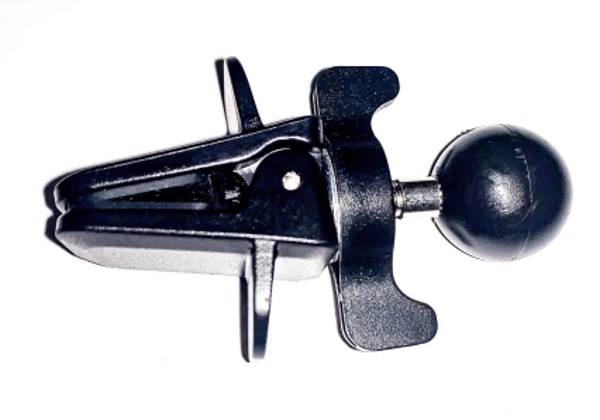
A vent mount clip is also included for mounting the charging base to the air vent.

Performance

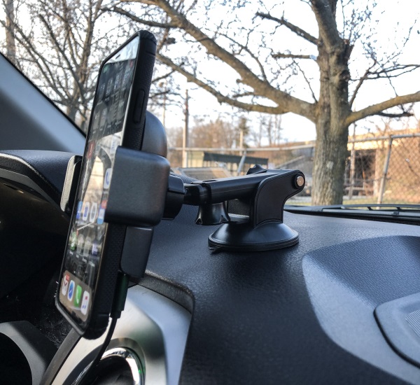
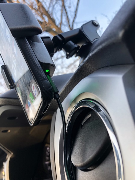
The dash mount is easily adjustable to extend some distance out from the dash and easily attaches to the dashboard via the built-in suction cup. I do not like to attach phone mounts to my windshield or my air vents. In my opinion, the mount is most stable when mounted on the dashboard. It is very steady despite the roughness of the roads and the potholes that I encounter every day when driving.

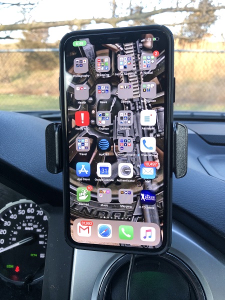
The pictures below show the phone in the dash mount. The top left-hand corner of the phone screen shows the charging icon that confirms that the phone is being charged.


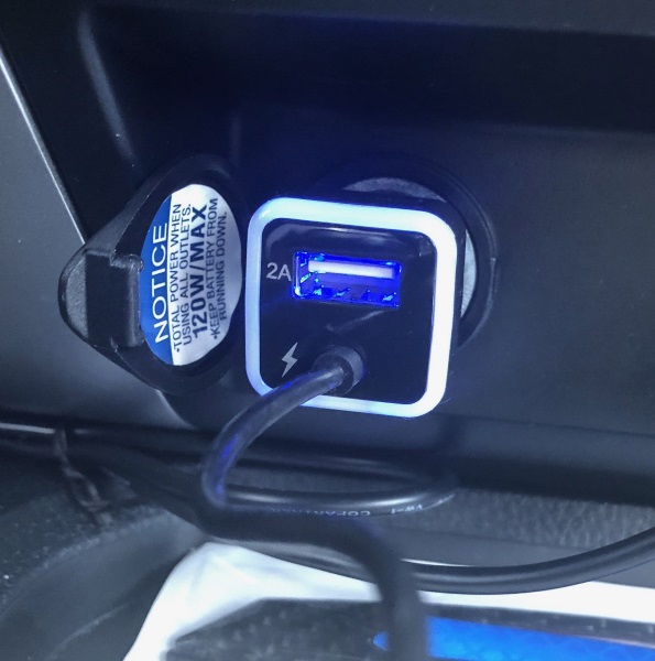
The DC power adapter plugs in the vehicle DC port. In addition to the connected charging cable, it has a second USB jack that allows you to charge/power an additional device. The port is backlit by a blue LED. The status LED on the charging base lights red when there is no phone being charged in the base and green when your phone is connected to the wireless charger.


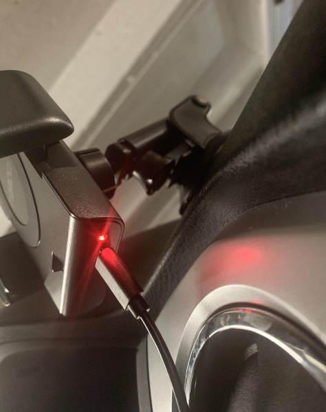
Below is a view of the USB-C power cable connected to the charging base. To remove the phone from the charging base, you simply start to pull it out from the bottom of the phone which disengages the contact sensor seen below and opens the clamping arms. When you place the phone into the charging base and it presses the contact sensor, the clamping arms close.

I am very dependent on my cell phone and my frequent use of it does not allow me to drain the battery to test the charging time from drained to full. However, I will say that whenever I place my phone in the charging base, it is very noticeable that it charges very quickly. For the record, I am using the iPhone 10X Max.

What I like

  • The secure way that the arms hold the phone and how they are activated via the contact sensor
  • The mounting options
  • The wireless charging feature

What can be improved

  • Nothing so far

Final thoughts

This is the second wireless dash mount phone charger that I am testing that is around $50. The previous one started out great but died in less than 3 months. That one had an IR sensor that controlled the clamping arms. This one uses a contact sensor that may prove to be more durable than the previous model. Only time will tell. Otherwise, it works well and does exactly what it is intended to do including providing a fast charge. For now, I will give it two thumbs up!!

Price: $49.99
Where to buy: The Micro Novelty website
Sample: The sample for this review was provided by Micro Novelty

Filed in categories: Reviews

Tagged: , ,

ROBOQI Self Gripping Fast Wireless Car Charger review originally appeared on The Gadgeteer on April 18, 2019 at 9:15 am.

Note: If you are subscribed to this feed through FeedBurner, please switch to our native feed URL http://the-gadgeteer.com/feed/ in order to ensure continuous delivery.
Palm Companion review

REVIEW – When I first heard the news that Palm was coming out with a new phone, I was super excited because I’ve been a big fan of Palm devices since they started the PDA revolution with the PalmPilot eleventy million years ago. But then I read that the small credit card-sized Palm Companion was not designed to be a stand-alone smartphone, but a type of sidekick to your existing main smartphone.

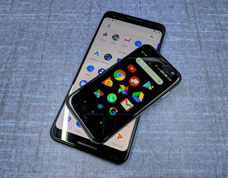
The Palm Companion is meant to be a lightweight small phone that you can take with you that won’t demand your attention all the time like your primary phone. It’s supposed to help you stay present and not keep your eyes on your phone when you’re with your friends and family.
As displays get larger and more cameras are added to our smartphones, it means the overall dimensions of the phone expand until you need cargo pockets to carry it. If you’ve ever wanted to leave your bulky phone at home and carry a much smaller phone but don’t want to hassle with switching out SIM cards, the Palm Companion phone is a possible option… maybe. Let’s take a look.
What is it?

The Palm Companion is a small smartphone that uses Verizon’s Numbershare service to share the same phone number as your primary iPhone or Android smartphone. The idea is that you can take this smaller pocket-friendly phone with you when you don’t want to carry your bulkier larger smartphone. You’ll still receive texts, alerts and phone calls on the smaller device which will sync between the two phones even if the primary phone is turned off.

What’s in the box?

Palm Companion
Pre-installed SIM Card (4FF)
Wall Adapter/USB Cable/USB Connector
Quick Start Guide

Hardware Specs

Processor MSM8940, Octa-core 4 x 1.4GHz + 4 x 1.1GHz
Display 720 x 1280 pixels
Memory 3 GB RAM
LTE Advanced With 50% faster peak speeds in more than 450 cities from coast to coast
World Device Works in over 200 countries depending on your plan
Camera 12 MP
Usage Time – Up to 7.5 hrs
Height 3.8 in Width 1.99 in
Battery 800mAh

Design and features

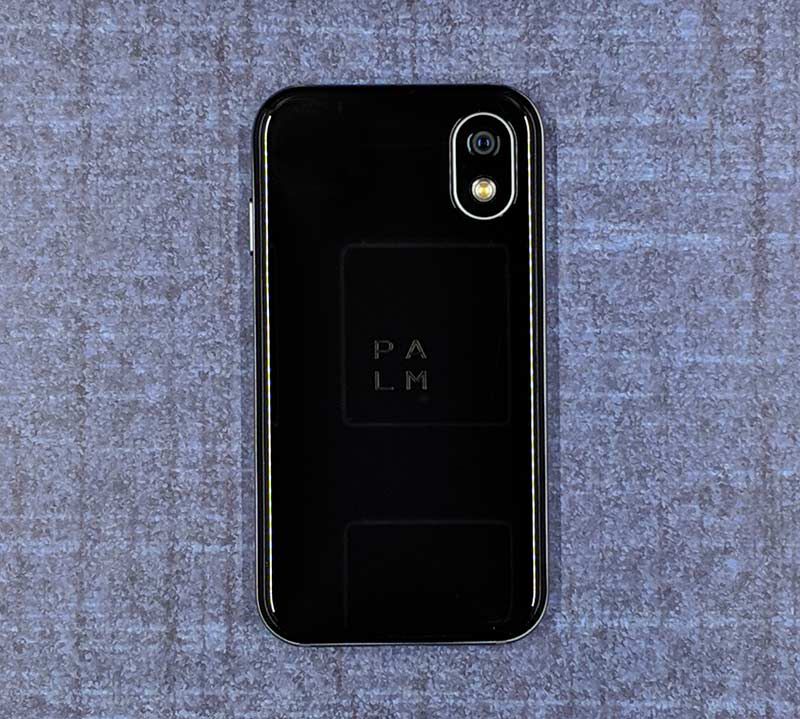
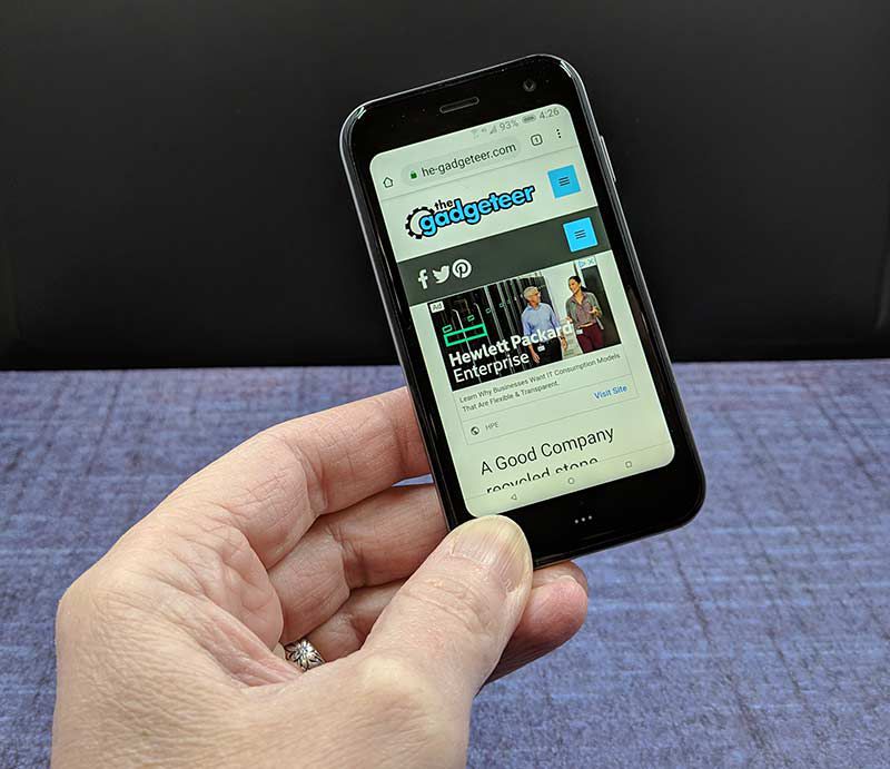
To me, the Palm Companion looks like a miniature version of the iPhone X. It has two pieces of black glass with curved corners and a brushed metal filling sandwiched between them. The only difference is that it’s itty bitty, and runs the Android operating system instead of iOS. That said, you can use the Palm with an iOS device. But there is a caveat. You won’t be able to use iMessage for your text messages. You’ll have to use Verizon’s Messages+ app on the Palm companion if you want to receive a copy of the messages sent to the primary phone too. Google Messages works for sending messages through the Palm, but incoming messages only seem to come through the Verizon Messages+ app. For most die-hard iOS lovers, that will be a big problem. Because iPhone users shun the green bubble.

Look at that camera lens with the LED flash. Even that looks like the iPhone X.

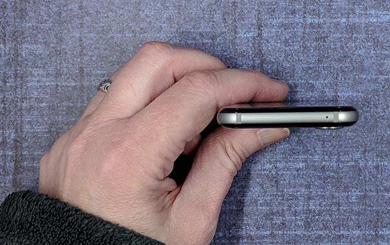
The top edge of the device has a microphone.

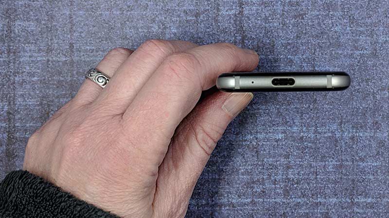
The opposite end has another microphone and a USB-C charging port.

Then on the right side, you’ll find the SIM card slot. The Palm Companion has it’s own SIM card, but it uses the same phone number as your primary phone.

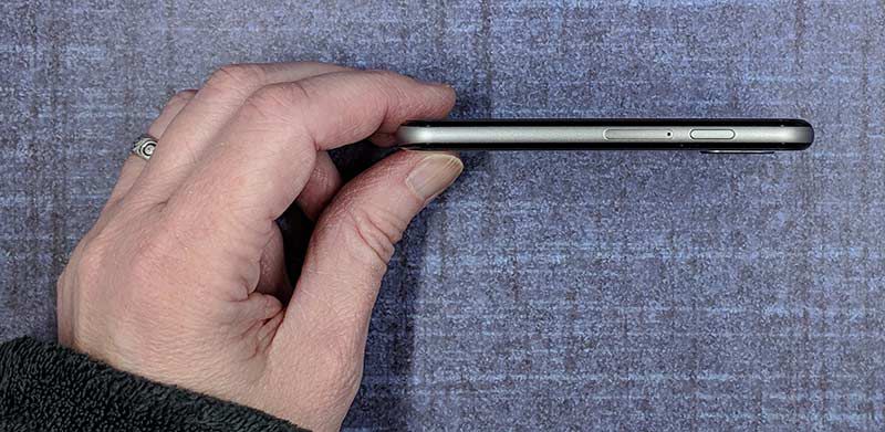
On this side of the phone is the power/wake button which also lets you summon the Google assistant if you double press it.

Yes, there are a couple of things missing. There isn’t a physical volume button or a headphone jack. There’s also no fingerprint reader and no home button. The Palm Companion actually uses facial recognition, PIN, or a pattern to unlock the phone.

Display

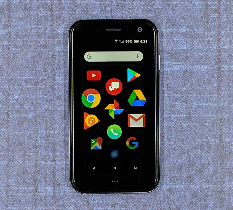
The display is bright, vivid, and crisp. But it’s only 3.3 inches, which means it’s tiny and might be too small for older eyes to read text and larger fingers to press icons and send text messages.

Camera


What can I say here? It has a camera on the front and on the back. You can take pictures with it but the pictures will not impress anyone. They are soft, blurry, and yeah.

Software and user interface

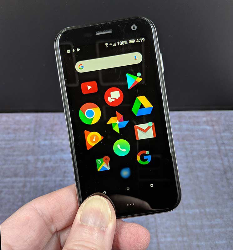
The Palm Companion runs Android version 8.1.0 but the interface is different than other Android smartphones. The Palm has a scrolling list of icons that are full sized and shink as you scroll through them. The interface reminds me of the Apple watch. But other than that difference, you have access to the Play store and can install other Android apps that you like.

Special features

Life Mode is a special Palm feature that lets you decide what will get your attention. Think of it as a more powerful do not disturb feature. It turns on Airplane Mode every time the screen is off, unless you’re on a call, streaming music or using GPS. When you wake your screen, your Palm becomes fully connected again and you can control which apps notify you when you wake up the device.

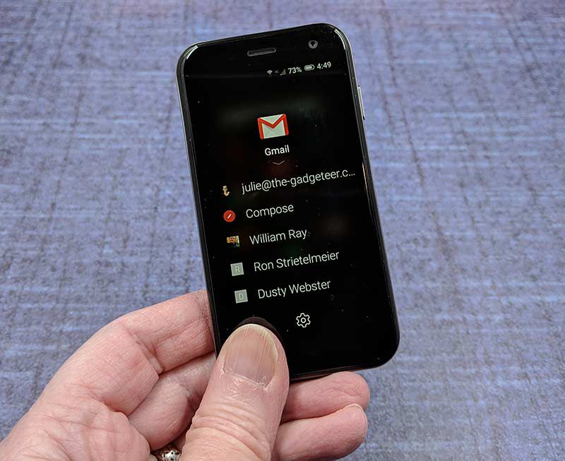
Quick Action menus provide easy access to popular actions by holding down on an icon from the home screen. In the image above, you see the quick action menu when pressing and holding the Gmail icon. Not all apps have a useful quick action menu, but most of the popular apps like Gmail, Twitter, Spotify, and others do.

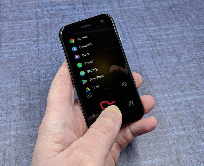
Gesture pad is sort of a throwback to Palm’s Graffiti feature from days gone by. With this option, you can search and launch apps by drawing the first letter of the app. To use it, you have to swipe up on the left side of the screen from the lock screen.

Missing features

Although the Palm Companion is meant to be a mini-me to your primary phone, it is missing an important feature – mobile hotspot. That’s right, you can’t use this little phone as a hotspot.

Audio quality

If you’re in a quiet room, the audio quality is fine. But I find it really inconvenient not to have physical volume buttons. This is especially true while in a phone call because to change volume you have to take the phone from your ear to adjust the volume slider on the phone’s screen. Bah!

Using the Palm Companion for phone calls

What can I say, it looks like a phone and it works like a phone. Just be aware that if you have both the primary phone and the Palm Companion with you and you don’t have the Palm set to not respond to calls or texts when the screen is off if you get calls or text, both devices will ring and or ping.

Overall performance and battery life using the Palm Companion for day to day tasks

I found that the Palm Companion felt slow and sluggish performing most tasks from launching apps, to updating apps, and even unlocking with Face ID.

Battery life wasn’t impressive either. It’s actually worse than that, it’s awful You’ll definitely need a charge cord handy for this little phone because the battery capacity matches the phone’s size. The loaner I had barely lasted a 4 hrs before the battery was depleted. I guess if you don’t actually use the phone for anything then the battery will last longer… Ummm… yeah.

What I like

  • Pocket friendly
  • Shares primary phone number
  • Cute

What needs to be improved

  • The screen is too small for texting
  • Cameras aren’t stellar
  • Mobile hotspot feature is missing
  • iPhone users can’t use iMessage
  • The phone feels sluggish and battery life is short if you actually use the phone

Final thoughts

I understand the idea behind the Palm Companion, which is to offer a smaller sidekick to your primary phone that you can take with you when you don’t want to carry your heavier phone and you don’t want to be as bothered by notifications and calls. The problem is that the Palm Companion runs Android and it has all (most) of the same features as your main smartphone. You can take calls, send text, watch YouTube, read news, etc. So where is the advantage as far as not having a device that will demand your attention? Sure, you can turn on the Lifemode feature, but I’m still not convinced that this little phone is all that useful. The battery life is horrible and it’s just too small if you actually do want to read and/or text people. In my opinion, a better option would be a totally dumb phone that only receives calls and texts.

Price: $349.99 + $10/month for the Verizon NumberShare service
Where to buy: Verizon Wireless
Source: The sample for this review was provided by Verizon Wireless.

Filed in categories: Featured Items, Reviews

Tagged: ,

Palm Companion review originally appeared on The Gadgeteer on April 17, 2019 at 11:00 am.

Note: If you are subscribed to this feed through FeedBurner, please switch to our native feed URL http://the-gadgeteer.com/feed/ in order to ensure continuous delivery.