Fellowes Powershred 12Cs Cross-Cut Shredder review

Spring is here! The flowers are budding and the birds are singing. Unfortunately its also tax season, and time to clean out that mountain of forms, papers and receipts you have been hoarding all winter long! We like to have a paper shredder here in the House of Bob, but our last shredder met a horrible end due to overexertion. Fortunately, Fellowes was kind enough to send me their Powershred 12Cs Cross-Cut Shredder to evaluate as part of the annual office Spring cleanup. How does it handle the job? Let’s shred! 

First Impressions

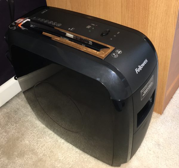
The Powershred 12Cs Cross-Cut Shredder is a heavy-duty shredder designed for household use. Measuring in at 15″ tall by 9″ wide by 17″ deep and nearly 16 pounds, it’s a small beast. But it’s a nice looking beast! The form factor is streamlined and professional looking. The unit is all black with a combination of shiny and matte surfaces. You’ll want to find a permanent spot in the office for this one, but it will look good occupying that floor space or nested under a table or desk.
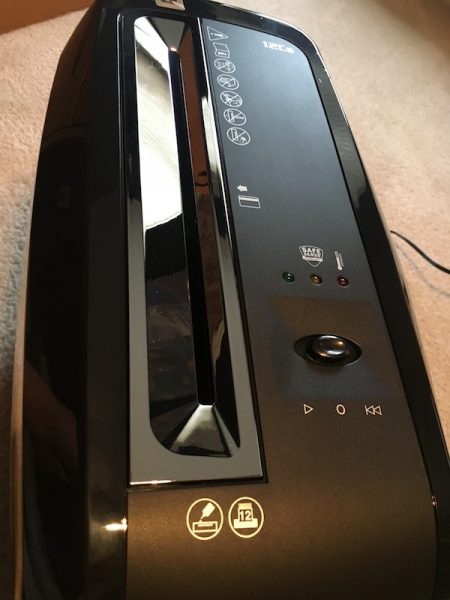
Construction is solid. It’s a heavy-duty plastic two-piece assembly, with a massive 4-gallon catch bin that slides out of the front of the unit. The bin also has a small window so you can see when you’re hitting maximum capacity, which is a nice touch. There’s a single beefy control slider on the top of the unit, and the power switch is on the back. The feeder is silver and beveled to guide the materials into the shredder. I’ve killed shredders before that don’t feel like their built to handle the weight of the shredding motor & mechanism; that’s not the case here.

Operation and Use

Preparation for battle is simple. You plug the unit in and turn on the power switch on in the back. The control slide has three positions: center is the off position (when not in use), left is the on position (for munching), and right is a reverse mode (for “I shouldn’t have tried to fit that in there…”). There are three LED lights above the slider to indicate operation (green), overheating (red), and activation of the SafeSense safety feature (yellow). The shredder is motion activated, and starts grinding when it senses that material has been inserted in the feeder.

As far as shredding goes, the feeder can take a stack of up to 12 sheets at a time as well as paper clips, staples, plastic credit cards, and the assorted extras you might find in junk mail. All material is shredded into 5/32″ by 2″ cross-cut particles. The shredder can run continuously for about 5 minutes before overheating, at which point it requires 15-20 minutes to cool down before continuing. 
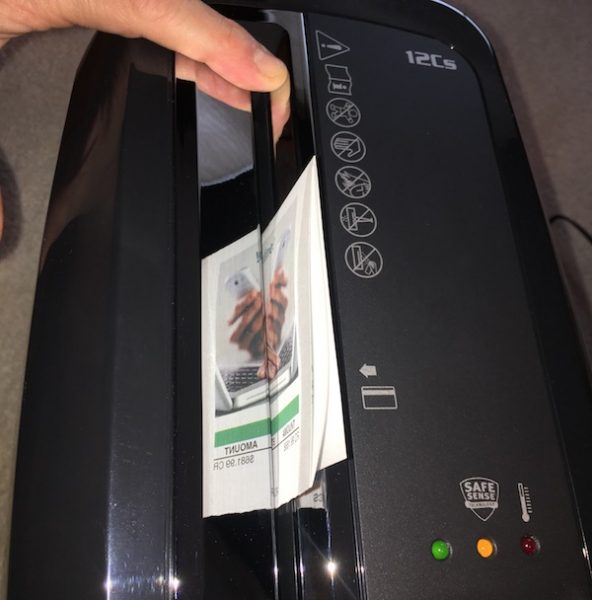
Another feature is what Fellowes calls its SafeSense technology. It’s activated by your hand or finger touching the feeder, at which point the shredder stops running. It’s a nice safety feature, especially if you forget that you have left the shredder in the on position.

The Test Case(s) 

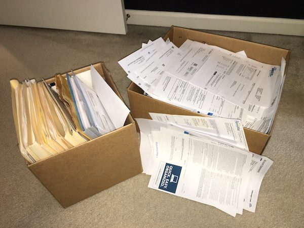
Enough with the specifications; it’s time to see if the Powershred lives up to its name. Here in Bob’s house, we keep the paperwork flotsam and jetsam in a box (or two) in the closet until Spring cleaning time arrives. You’re looking at 25 pounds of receipts, papers, junk mail and assorted plastic credit cards that have been waiting for this moment to meet their shredding demise.
Let the Destruction Commence!

As we worked our way through the collection, I found that thePowershred 12Cs Cross-Cut Shredder did an excellent job with most tasks. Papers (alone or in stacks) flew through the beastie as it chuckled and begged for a real challenge. I had a stack of expired credit cards and used gift cards that it chewed up with equal zeal. Staples and paper clips didn’t even phase it. The feeder is 9 inches long, but even when I fed 8-1/2 by 11 sheets in lengthwise, the shredder sucked it all in.
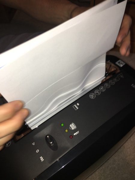
Junk mail, however, did pose some challenges. You know those thicker mailings you get with brochures or little sticker books in the package? I’m happy to report that, while operation slowed a bit with these heftier feedings, the shredder chugged through them without too much trouble. There was one extra-thick mailer, however, that did slow it to a stop. We had to use the reverse switch a couple of times to back the envelope out and refeed it to chew it through. It got there eventually, but I admit that I was pushing the max capacity of the device. You’d probably want to break down bigger items like this (or old checkbooks, for example) to make sure they go through.

The SafeSense technology works well. If you even brush it with your finger anywhere on the metal feeder, the unit will stop and alert you that the safety feature has been triggered. I tested this a couple of different ways, and it works consistently once contact is made.
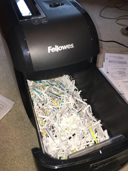
The collection bin does a nice job of trapping all the shredded bits, including paper dust. I did notice that it was easy to overload the bin unless you are paying attention to the window, however. Sliding the bin out is easy, and it locks firmly in place when you put it back in.

As far as negatives go: removal of the bin can get messy if you overload it before removal. There are also stray shredded bits that get knocked loose from the shredding mechanism when you remove the bin that requires cleanup. This unit is a lot cleaner than others I have owned. The good news is that the bin area is spacious and clear of obstructions, so it’s easy to run a vacuum nozzle through occasionally for quick cleanup. It should also be noted that the bin is flush with the bottom of the unit. I had it set up on a carpet, so the bin would catch occasionally when sliding it out. I believe that this would work better on a smooth surface, but I consider this a minor issue in practice.

In our test of the Spring cleanout boxes, we found that the 5 minute continuous run time is pretty accurate before it overheats, and we were able to go farther with brief breaks. We ran it as fast and far as it would go, and it took about 90 minutes total to get through the 25 pounds of test material. For an occasional-use home shredder, I think this a pretty good expectation for that amount of material all at once. If I were keeping up on my regular cleanup, I would expect that I would not see it overheat very often.

Conclusions and Pricing

Not everyone needs (or wants) a home shredder. We like to have one handy because we seem to collect a lot of printed material with personal information on it. If you decide you need one for your house, it should really do three things well:

  • Shred your papers, documents, and cards into consistently small and unrecognizable bits;
  • Minimize the mess from paper dust and flying particles in regular use; and
  • Show enough durability that you don’t need to buy a new one every couple of years.

Retailing at about $125, the Fellowes Powershred 12Cs Cross-Cut Shredder meets all of these requirements and meets them well. It performs better than the cheaper models I have killed over the years, and it looks nice in the office. I’d recommend it as a solution if you are looking for a new paper shredder in your home office. 

Source: The sample for this review was provided by Fellowes, and is available at Amazon and other retailers. For more info visit their site.


Product Information

Price: $125.00
Manufacturer: Fellowes
Retailer: Amazon
Pros:
  • Handles up to 12 sheets of paper, paper clips, plastic cards, and staples easily.
  • Sleek profile for the office (despite the size and weight).
  • Large collection bin for easy cleanup.
Cons:
  • Bin can get stuck on thicker carpeted floors.

Filed in categories: Home and Kitchen, Reviews

Tagged: ,

Fellowes Powershred 12Cs Cross-Cut Shredder review originally appeared on on April 5, 2017 at 7:11 am.

Note: If you are subscribed to this feed through FeedBurner, please switch to our native feed URL http://the-gadgeteer.com/feed/ in order to ensure continuous delivery.

Knomo Kobe 15″ Soft Leather Messenger Bag review

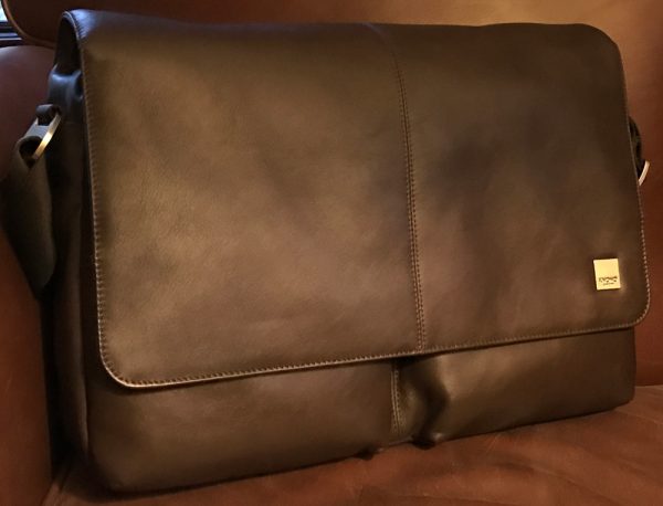
I prefer leather messenger bags to carry my gear around with me. Many of the bags I review are large enough to lug around all of my EDC gear and my 15″ MacBook as well. But when a bag is that big and made from extra thick cowhide they are heavy, many four to five pounds or more. Add in the weight of my gear and five pound laptop and the total burden is nearly twelve pounds. Julie calls me crazy, but we both agree it is a first world issue. That said, the Kobe from Knomo London is big, spacious, made from high quality leather, nicely constructed, and best of all…surprisingly light. 

Note: Images can be clicked to view a larger size.

The Kobe is a soft leather messenger bag designed to carry up to a 15″ laptop in addition to a good amount of gear. To achieve its lightweight status, the Kobe is a nice mix of relatively thin full grain leather, rugged nylon weave canvas, and soft microfiber lining.

SPECIFICATIONS:

Materials:

  • Inbuilt RFID signal blocker lining
  • Crafted from full grain leather
  • Adjustable, durable PET weave shoulder strap
  • Leather ‘dust flaps’ to protect inside from dirt
  • Back slip band for sliding over a larger trolley

Size:

  • Dimensions: H11.8″ x W16″ x D3.5″
  • Fits laptops up to 15″
  • Weight: 2.6 lb

The messenger bag flap and a majority of the front is made from a high quality leather that is nicely stitched, stained, and finished. But compared to a Saddleback or Colonel Littleton bag the Knomo leather is a fraction of their thickness/ruggedness. But that thinness is how the softness of the leather and the bags overall lightweight is achieved. The dark brown leather and nylon stitching are highlighted by polished metal hardware. The main flap is held securely closed by an integrated magnetic closure system stitched into the lining.

The back is a man-made (I’m pretty sure it is a nylon-based) material that is soft yet durable. There is an easy access slipper pocket built into the back.

Knomo also engineered a slip band into the back for sliding the Kobe over your luggage handle for more convenient, secure transport while rushing thru the airport. When not in use, there is a zipper at the bottom of the slipper pocket enabling the access point to be closed.

The quality of the bag is excellent — the leather, fabric, and metal hardware are all very nicely done and work well together. In this closeup you can see the attention to detail of the materials, stitching, and finish.

Knomo lines the interior of the Kobe with a microfiber material. The lining is a bright blue that is pretty vibrant but grows on you. The lining is very soft and will not mar your gear. The Kobe is a spacious bag with ample room for all your EDC stuff.

The Kobe easily holds all of my gear. The interior of the bag is divided into two primary sections: the main compartment is padded and meant for laptops with the front compartment for tablets and your bits and pieces. Here you see the bag containing my 15″ MacBook Pro, 9.7″ iPad Air, identification, James Chapter knife, bag of cables and adapters, Surefire Pen 3, permanent marker, a couple of thumb drives, sunglasses, etc…you get the point. Even with all my stuff there us still room for more.

Knomo does a great job “combining ‘unstructured’ design with premium organization”. The Kobe’s compartmentalized design (molded shape and flexible structure) gives everything its own place which is very in line with my AR tech-loving lifestyle. A design I find far superior to a messenger bag that is simply a big massive cavern where everything is dumped into to be bumped around and/or buried, never to be seen again.

On the face of the main compartment are 2 front pockets. The right one zips closed and has RFID lining – “perfect for cards, passport, and phones” with the one on the left open for easy access.

Knomo stitches a unique identifier into the inside of the Kobe’s main closure flap, enabling you to register your bag and if it’s lost, some good samaritan can return it to you through the Knomo website.

I have never been a fan of nylon shoulder straps for many reasons. But the Kobe’s adjustable PET weave strap is durable, (surprisingly) comfortable, and rides very well on my shoulder. It is attached to the bag via metal hard points. You can wear the bag over a shoulder or cross body. The strap is fully adjustable but not removable.

The Kobe is also available in black leather/weave with yellow interior.

Overall the Kobe 15″ soft leather messenger is a great bag. Knomo has created a very well made carryall with a professional, polished look. For its size, the Kobe is lightweight but large enough to carry all your gear and then some. Its full grain leather and soft, padded microfiber interior do an excellent job of gingerly transporting your gear while the flap and magnetic closer keep items securely within.

Source: The sample for this review was provided by Knomo Bags. Please visit their site for more info.  Check prices and order on Amazon.


Product Information

Price: $299.95
Manufacturer: Knomo
Retailer: Amazon
Pros:
  • Well made from quality materials
  • Nicely finished
  • Lightweight
  • Spacious (holds up to 15" laptop)
  • Secure magnetic closure system
  • Padded microfiber lining
Cons:
  • Not as rugged as other equivalent bags
  • Leather is pretty thin

Filed in categories: Bags, Reviews

Tagged:

Knomo Kobe 15″ Soft Leather Messenger Bag review originally appeared on on April 4, 2017 at 7:07 am.

Note: If you are subscribed to this feed through FeedBurner, please switch to our native feed URL http://the-gadgeteer.com/feed/ in order to ensure continuous delivery.

LEDVANCE’s Sylvania Lightify Gateway review

The LEDVANCE Gateway is a smart hub that interprets commands from a Wi-Fi network and transmits them to devices on its ZigBee network, and also monitors the status of those devices and reports it to authorized users. It is metaphorically the jam that holds all of the intelligent LEDVANCE products together. But, like the jam that holds your sandwich together, there are competing brands to choose from and different qualities of each. What you choose depends on your preferences and, to some extent, budget. Ok, enough of this metaphor, I’m getting hungry and want to check out this hub. Let’s see how it works and what it has to offer.

You may have noticed that the manufacturer listed in the title of this post is LEDVANCE but the device is branded with the Osram trademark. This is because in January 2016, Osram GmbH spun-out some of its business units into a new company named LEDVANCE. The portfolio of the new company includes, amongst other units, connected and intelligent lighting solutions for smart homes and smart buildings. The app on the iTunes store and the Google Play site are still branded as Osram, even though the iTunes app has been revised 6 times and the Android app 7 times since the rebranding.

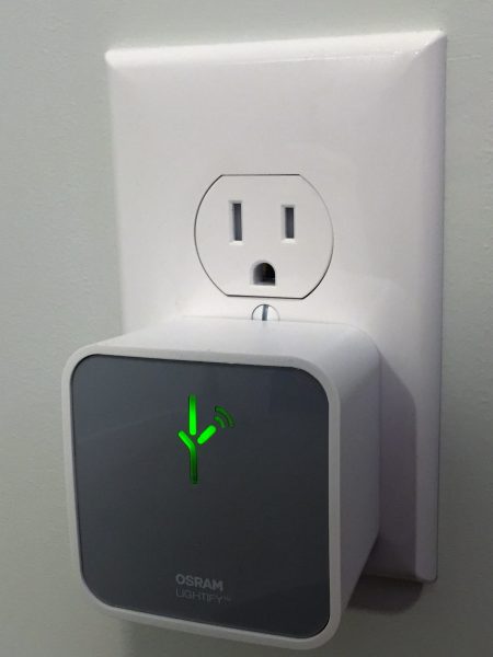
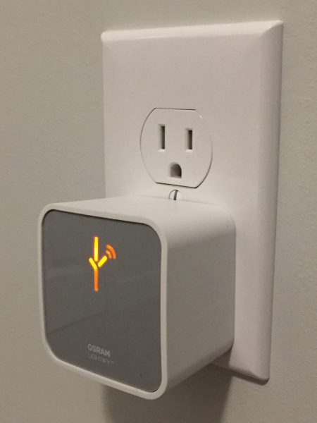
The actual product is a 60 mm wide, 60 mm high, and 41 mm deep (not including the outlet prong) box. The plug is a 15 amp non-polarized design so it permits the most flexibility when installing it into your chosen receptacle. When installed and configured correctly the symbol on the front (which I think looks like the alphabet used by the Predator) glows green with just enough brightness that it is easy to tell it is functioning during the day but isn’t obtrusive at night. When the hub is offline the symbol glows orange/amber and when it is logging into the WI-FI it blinks orange/amber. The gateway requires 5 watts, so that’s 3.65kWh/month, or less than a dollar.

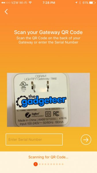
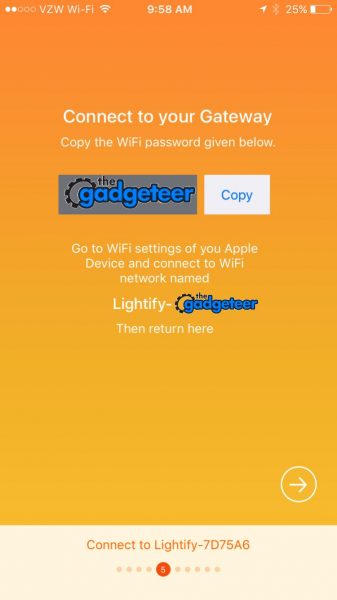
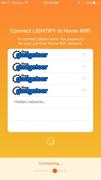
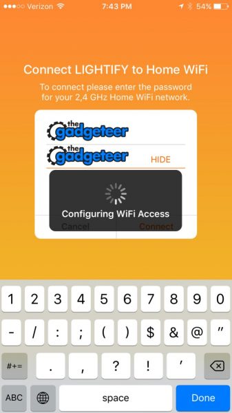
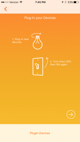
The set up process is easy but sort of lengthy, the video that they send to you in the sign-up email is not found on YouTube, and the only other YouTube videos are in German. So, I’ll describe the setup here and provide some pictures to go along with it for those of you who don’t sprechen Deutsch. These are iPhone screenshots but the process on the iPhone and Android is very similar. I’ve covered the MAC addresses, SSID’s and passwords used with The Gadgeteer logo for security. Download and install the companion app before plugging in the hub. Current versions are 32 MB for iOS and 27 MB for Android. The first step is to scan a QR code on the back of the hub. This allows the app to look up the SSID and password of the hub’s built in ad hoc Wi-Fi network. Alternatively, you can type in the 13 character alphanumeric serial number. (If you plan to integrate this into Amazon Alexa, write down the serial number; you’ll need it later, but you’ll also need to keep the hub plugged into the wall.)

Assuming you don’t have an existing account you must create an account here and verify that it is a real account. I just used a throw-away Mailinator account for this demo. The account will be verified so you need to use an account that you can actually access. You may share this account login information with up to four other devices to permit shared operation of the hub. App settings will be synchronized across each device through the internet.

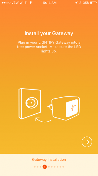
 After creating the account you can finally install your hub. The unit will power up and start an ad-hoc Wi-Fi network. The app will conveniently display the password to the network and display the name of the SSID you need to join. Task switch to the settings screen and join the provisional Wi-Fi network.

  After task switching back to the app, and after the phone is connected to the hub, it will search for 2.4 GHz Wi-Fi hotspots (or 2,4 GHz in Europe) and display the detected SSID’s on the next screen. If you don’t broadcast your SSID you can still type it in by selecting “Hidden Networks”.

Here you will provide the password to your SSID and the hub will associate itself with your home Wi-Fi network. Mid last year, this article was published on how there were security flaws in the Osram app and how the home Wi-Fi password was not encrypted in the app. The app has since been patched and this security flaw has been fixed. Also, unlike SmartThings, there is no option to run the hub off of a wired connection and there doesn’t appear to be a battery backup to the AC power.

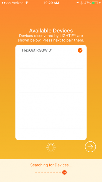
Once the hub has associated itself with your network it will ask you to plug in your devices. Turning them on, off, and on again should signal the controller within each to join the newly established network. ZigBee devices can only be part of one network at a time. If the lamp is not responding then you may need to turn it on for 5 seconds and off for 1 second 6 times in order to reset the controller. Other devices may have a hard reset button.


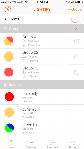
After the devices are found you are brought to the home screen.  This will show two empty categories: group and scene. Groups are collections of devices that you can turn on or off at the same time and apply dynamic lighting presets to all at once (more about this later). Scenes are groups of devices that have preset settings, but not each device in a scene has to have the same settings. Each device in a scene may have independent or shared correlated color temperature, brightness, or hue. Think of a scene in a theatrical production: there may be some bright lamps with red filters and some dim lamps with blue filters. This arrangement could be set by selecting one scene button on the Lightify app.

The cloud with a plug on top of it means that the hub is communicating with the smartphone/tablet using a local Wi-Fi router and also an internet connection. If the smartphone/tablet is not using the same router (if Wi-Fi is turned off on the phone) then the plug disappears. In this case there is about a 0.2 sec delay between pressing the on button on the phone and the light turning on/off. If communication through the router is used then the response time to the button press is almost instantaneous.

To create a group press the + group in the upper right. it will take you to a screen where you can enter an group name and select which device, from amongst all the devices on the network, belong to the group. Once the group is created return to the Home screen. On the home screen the switch to the right of each group looks like a Decora switch that is pressed in when active and flat when switched off. Pressing the circle to the left of the group name will take you to a device settings screen where the settings for each or every device in the group may be set. (More about this in the next paragraph).   On the device setting screen there will be a + Scene button on the top left which you may use to save the current condition of the devices within the group. Pressing the name on the home screen will allow you change the name and set the members of the group. Once a scene is created the color of the button on the home screen will roughly match the colors of the devices in the scene.

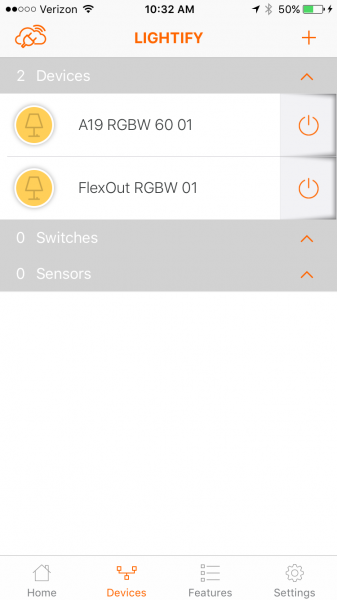
On the devices screen, each device is listed in a separate category. The color of the icon roughly matches the selected hue of the bulb. Pushing either the icon or the name brings you to the device settings screen.

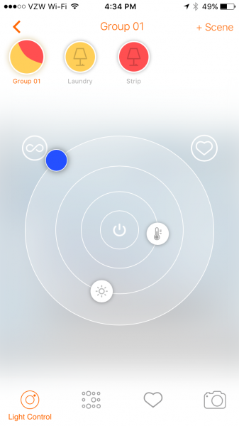
The device settings screen has a main light control wheel that features rotary sliders around a central on/off pushbutton. Adjusting the correlated color temperature sets the hue to the correct color, from cool blue to warm orange. The intensity may be adjusted independently of the hue. Using the outermost slider turns the display into a color wheel which allows the user to specify the hue and saturation. If the Lightify lamp is lit while you are adjusting these settings it changes color according to your selection. The lamp is very responsive to your color and brightness selections which makes finding a lamp color an easy experience. Unfortunately, there is no record of actual RGBW values. Pressing the device name at the top of the screen allows the user to edit the name of the device. Pushing the rocker switch icon at the top left allows the user to change the default appearance of the device. There are three more buttons at the bottom of the screen: Presets, Favorites, and Camera.

The presets screen shows 14 different color presets. There are three presets that are static color settings: plant light, active, and relax. There are two long-period dynamic lighting presets called day light and good night light. The good night light will fade to off in a user-set amount of time and the day light will simulate the color of sunlight throughout the day. The other light patterns are short-period dynamic lighting presets and include Fireplace, Ocean, Evening, LIGHTIFY Loop, Candy, Polar light, White and White, Activate, and Chill Down. The speed of the color change may be set for each dynamic preset and the brightness may be changed for all of these except for Activate and Chill Down.

The color loops and the dynamic lighting are unique features of the Lightify gateway. I was unable to create this with the SmartThings hub CoRE programming, but it may be duplicated if the actual header information is programmed into a SmartThings program. Still, this would take some above average programming knowledge. The main differentiator is the speed at which colors may change. Note that the presets may not be saved as favorites, may not be saved as scenes, and will not resume if the bulb is turned off. They may only be set from the device screen or the group screen.

The favorites button lists the 16 favorite user settings for each device. The favorites may be saved by pressing the circle inscribed heart to the top right of the setting wheel. Note that when I added my Android phone account to the iPhone account that the existing favorites disappeared. The favorites show the approximate hue and brightness, but there is no way to name the favorite.

The camera icon allows the user to match the hue of the light to a grouping of pixels in a stored image or a captured photo. This is a neat trick but I believe it is mostly a tool to demonstrate the range of the RGBW lighting capabilities.

There are six more capabilities of the gateway. Four of them are under the Features menu: Scheduler, Wake-up light, Vacation Modes, TV Simulation. The scheduler will simply turn on the light for a predetermined period every weekday the scheduler is selected. Any number of schedules may be set, so more than one on-off cycle may be scheduled per day. The wake up alarm will dim the selected light from a low brightness to bright daylight and then switch off at a desired time. The smartphone/tablet that created the wake-up event will signal an alarm (alarm and tickling [sic], digital alarm clock, fog horn, old alarm clock and ringing, seagulls on beach, whistle, or wild birds). The acoustic alarm won’t sound if the smartphone/tablet is in silent mode. The vacation mode will turn on and off the lights between every 5 minutes and every 2 hours (user-selectable) in the time period selected. Finally, there is a TV simulator that uses the color loops to simulate a TV being watched within a user-selected time period.

The settings menu allows the lights to work with Nest home and away profiles so that different lighting can be set to each mode. The settings screen on the iPhone allows customization of the today screen widget, and a widget is also available on Android, that allows the user to set group and scene lighting from outside of the app.

Lastly, the gateway can be integrated with Amazon Alexa smart home automation to permit devices to be turned on and off and set to a percent intensity. Sadly, Alexa doesn’t allow the setting of color or correlated color temperature. Alexa only controls devices through the gateway; if you want to control groups you need to define them within the Amazon smart home settings. Also, since you will have to speak the name of your device, make sure it is one that you will be able to roll off your tongue. In the images above I have FlexOut RGBW 01 listed as a device but I renamed this to Strip for use with Alexa.

In conclusion, the LEDVANCE Lightify Gateway provides flexibility and creativity in the operation of lights and plugs. The gateway provides limited automation in the form of turning on and off lights and plugs using ZigBee switches and sensors, programming lights and plugs using timers and alarms, and coordinating modes with a Nest thermostat.  The gateway also allows limited control with Amazon Alexa. More advanced automation, such as integration with IFTTT, Stringify, or other home automation devices is not supported. However, this gateway is available for $32.59 alone, and is often packaged with LEDVANCE lamps for even larger savings. If you want to explore home automation without breaking the bank, and if you want flexible, responsive, and creative lighting capabilities from the palm of your hand, then the LEDVANCE Lightify Gateway may be just what you’re looking for.

Source: The sample for this review was provided by LEDVANCE Sylvania. Please visit their site for more info and Amazon to order.


Product Information

Price: $32.59
Manufacturer: LEDVANCE Sylvania
Retailer: Amazon
Requirements:
  • Requires active WiFi Network and LIGHTIFY Compatible ZigBee Products
  • Free LIGHTIFY App runs on Apple iOS7 or above and Android 4.1 or above
Pros:
  • Inexpensive
  • saves favorite settings
  • color looping
  • scheduler
  • Nest and Amazon Alexa enabled
Cons:
  • No IFTTT or Stringify

Filed in categories: Home and Kitchen, Reviews

Tagged: ,

LEDVANCE’s Sylvania Lightify Gateway review originally appeared on on April 3, 2017 at 10:03 am.

Note: If you are subscribed to this feed through FeedBurner, please switch to our native feed URL http://the-gadgeteer.com/feed/ in order to ensure continuous delivery.

Blue Ella and Sadie headphones review

When I reviewed Blue’s original Mo-Fi headphones in 2015, I compared its unique headband system to my wife”s over-engineered door hinge on her 1997 Lexus SC300. Fast forward two years—Blue has kept the still unusual headband design with its hinge, yet has improved on the Mo-Fi with the new Sadie headphone and vastly improved on the Mo-Fi with the (also) new Ella headphone. So why is Sadie just an improvement while Ella is in another league altogether? It’s audio science, baby.

I’ll deal with the differences between the Ella and Sadie headphones in this review later, but let’s highlight the similarities first. At first glance, both the Sadie and Ella look like twins. With that attention-grabbing headband, they even look almost identical to the original Mo-Fi. So what is it with that headband? Let me explain: As you pull the ear cups on most headphones apart, the cups angle outward. Your head does not angle like that—both sides are mostly parallel. That’s the genius of Blue’s headphones.The hinge system keeps the ear cups parallel to each other, no matter how much you pull them apart, so it’s a better fit for most heads whatever the size.

Both the Ella and Sadie will size themselves to almost any head simply by angling the ear cups up or down while wearing. Once again, it an unusual design solution that just works. Granted, some may feel this is just too different and won’t appreciate hot they fit, but if you’re in the market for headphones, don’t be put off by this design approach. You may be pleasantly surprised at the comfort they offer.

Both are an over-ear design, which makes them less desirable for commuting for two reasons. Over ear (circumaural) headphones trap more heat which can make humid summer commuting not fun. Plus over ear wearing can block important external traffic sounds that could make walking around unsafe. Second is the geek factor—over ear headphones just look kinda overdone when worn in public. They look great in an office or at home, it’s just that they can look weird on the street—but that’s debatable.

Note Later in 2017, Blue is coming out with a headphone specifically designed for commuting—the Blue Satellite.

Both the Ella and Sadie headphone has the usual assortment of accessories: A soft case with an interior storage pocket, a 3.9 ft. audio cable with Apple iPhone/iPad controls and microphone, a 9.8 ft. audio cable with a 3.5mm to 1/4″ adaptor (for home stereo) and a USB charging cable. One notable difference is that the Ella’s cable is cloth covered and tangle-resistant while the less expensive Sadie has rubberized (and cheaper feeling) cables. There’s no Apple Lightning cable offered, which could easily be offered at the price range of both these headphones, especially the Ella.

Both have built-in audiophile amplifiers. So what can the included amps do that a normal pair of headphones can’t? Having a built-in amp allows you to hear a more powerful musical presentation because the power burden is shifted to the headphone’s dedicated amp. This simply means that you’ll get equal power whether you are connected to a home stereo, PC or smartphone. Cool, huh? Obviously, this becomes more important depending on the strength (or lack of) of your music source. Much of my testing was from an external digital audio converter (DAC) connected to an Apple Mac. I detest the Mac’s headphone ports, so even with the added amp, the Ella and Sadie headphones are dependent on the DAC for the initial quality of the source. Music can only sound as good as the weakest link and most PC DACs are poor. ‘Nuff said.

Note that the batteries inside the Ella and Sadie amps require charging. If the headphones have been sitting for a while, the amp may be drained. If that happens, both headphones will work in passive mode (amp off). However, sound is not as clear or nearly as powerful as with the amp on, so keeping the amp charger is always a good thing. The amp switch has three settings: Off (passive), On and On+. On+ activates the amp’s low-frequency analog circuit which amplifies the bass signal.This does not turn the Sadie or Ella into bass monsters. It’s better than that. Bass is pushed forward, but it’s more of a subtle and accurate nudge than a slam to the head. Switching the knob back and forth shows this difference well. I pretty much left both headphones in On+ mode and I’m not a bass head. That’s how nice the difference is.

The ear cups on both models light up through tiny holes drilled into a pattern. When the lights pulse slowly, the amp is charging—solid means the amp is fully charged. Rapid blinking means the battery is down to 15% power and off means the amp is off or the battery is depleted. The lights look cool at first, but you can’t turn them off, so after awhile, it begins to look like a gimmick.

The ear cups are hard plastic covered in metallic paint—Ella in a cream gloss, Sadie in matte black. Metal framework makes up the headband frame. The top of the headband is well padded. Gone is the silly headband adjuster from the Mo-Fi—it never worked for me anyway. The build on both the Ella and Sadie feel a bit more solid than the Mo-Fi’s build. One cool thing is when the headphones are removed, they close up and turn off until they are picked up and opened again. These may not be the only headphones that do that, but it’s still cool.

Despite the similarities between both the Ella and Sadie, they are far more different than alike. Let’s talk about the Ella first.

The Ella is Blue’s first planar magnetic headphone. What is planar magnetic? To put it simply, it’s a completely different speaker design. Most speakers are cones—not these. The planar magnetic speaker is an unbelievably thin stretched membrane that provides fast response time to a sound signal. This results in more accurate reproduction, making music sound richer and more detailed than it does from a cone speaker. There are downsides to this approach. First is a perceived lack of bass. I call it a lack of bloated bass. The On+ switch corrects any bass issues I might have. But more importantly is the cost. Planar magnetic technology is inherently more expensive on a large scale. Plus, the Ella headphones are hand-made in small quantities ensuring higher levels of quality, reproduction and of course price. The Ella headphone is almost double the price of the Sadie. Is this price difference worth it? That’s not a clear yes or no—it all depends on what you are looking for in a headphone.

As I said, music on the Ella headphone is more accurate. I’ve heard my share of accurate headphones and earphones and many times the quest for accuracy comes at the expense of enjoyment. In other words, music may sound “perfect”, but it’s not fun. It’s different with the Ella headphones. I could sit and listen to them all day.

When listening to “Nitty Gritty Surround” by John McEuen and Jimmy Ibbotson, I was struck by the spaciousness of the music with an incredible soundstage. Okay, it is a headphone album recorded in surround sound, but hey, it works! You can tell where each instrument is coming from and the bass (with On+) is low and distinct without bleeding into the middle frequencies. It’s hard to appreciate bass done right until you actually hear it done right. The Ella headphones do bass right.

Brian Eno’s “Spider and I” is a slow, melodic piece recorded when Eno was transitioning from hard art rock into his ambient phase. Eno’s synth keyboard work covers many levels and his plaintive and quiet singing pair quite well with the Ella’s ability to render the song clearly with all its layers still separated, yet blended. Sure the surround aspect isn’t there like the previous album, but there was more of an open feeling than most closed-back headphones are able to produce.

The stereo and sound quality of Neil Young’s remastered “Harvest” album is breathtaking. The album’s opener, “Out On the Weekend”, has lazy, but persistent percussion supported by steel guitar from Young’s supporting band, The Stray Gators. The song’s butter-smooth production is first-rate with instrumental clarity that never approaches harshness. Hearing this album on the Ella headphones adds to the smoothness but never loses its impact. Note that planar magnetic speakers are best suited to higher resolution digital music (as well as good old analog). When remasters are done right (few are), the aural rewards the Ella provides are worth it.

As good as the Ella headphone is, few can—or are willing—to fork over the bucks to experience what planar magnetic technology has to offer. For those people, Blue offers Ella’s sibling, Sadie. As I said earlier, both the Sadie and Ella are twins—on the outside only. The Sadie is a more traditional headphone in design and construction. It feels every bit as well built as the Ella and offers sonic treats of its own. If you can’t swing the money for the Ella, you won’t be disappointed with the Sadie, unless of course, you expect the same, exact sound signature.

The Sadie’s sound signature is more direct and forward. By comparison, the Ella’s signature is more delicate and transparent. Music heard through the Ella retains its power, but sounds lighter and more nimble. The Sadie headphone is a bit “heavier” sounding. I realize these terms describing audio can sound silly, but I’m trying to convey what words or descriptions go through my head as I listen to both headphones. Another way of putting it is that the Sadie sounds more like other headphones in its price range while the Ella sounds more refined and yes, richer. However, the Sadie is no slouch.

First off, there’s the amp. When comparing the Sadie to the original Mo-Fi, the newer Sadie wins hands-down. The Sadie is lighter and better built. It’s only 1.5 oz. heavier than the Blue Lola headphone—and the Lola doesn’t even have an amp! That’s pretty impressive. As I said earlier, Blue has ditched the Mo-Fi’s headband adjuster while improving the padding. Unfortunately, the Sadie also has those same gimmicky lights that the Ella has.

Listening to the same Nitty Gritty Surround album yielded distinct differences with the Sadie. The bass is more plentiful but it’s not quite as refined as the Ella’s bass. It’s more molten sounding and less distinct. It’s one of those things that wouldn’t be noticed unless when directly compared to the Ella. if you never hear the Ella headphone, then ignore this last paragraph and enjoy the sound the Sadie offers.

The Sadie really shines with older music such as classic rock. It’s warmer sound adds depth to older recordings that never had the bass punch that newer music has. The Sadie can add the right amount of bass with its On+ switch turned on and not make the music sound bloated like some brands of headphones are guilty of doing. Procol Harum’s “A Salty Dog” is a good example of an older song helped by a bass boost. The song sounds good in both On and On+ mode, but in On+ mode, the Sadie adds just the right amount of warmth.

Back in the 90s, the late Israeli singer, Ofra Haza did a chilling cover version of Led Zeppelin’s Kashmir. Her echo-laden voice has an airiness and spooky ambiance that sounds like it was recorded in an empty tomb. The Sadie prevents any harshness as Haza’s middle-eastern sounding vocals climb into higher frequencies as the song progresses. It’s a haunting performance from both Haza and the Sadie headphones.

It’s good to see that Blue is not resting on the success of the Mo-Fi and Lola headphones. Even though both the Ella and Sadie headphones follow the same design direction of their predecessors, improvements have been made to make them a better deal (Sadie) and a much better sounding headphone (Ella).

So which should you buy, assuming either is within your budget? Think of the Sadie as a better sounding, better made and more comfortable Mo-Fi. And think of the Ella as a successor that has leapfrogged the original in every way—except price.

Source: The samples for this review were provided by Blue. The Sadie sells for $399.99 and the Ella sells for $699.99 US. Please visit their site for more info and Amazon to order.


Product Information

Price: Sadie – $399.99 US / Ella – $699.99 US
Manufacturer: Blue
Retailer: Amazon
Pros:
  • Both Sadie and Ella are built and sound better than original Mo-Fi
  • Both very comfortable
  • Ella sound is transparent and accurate
  • Sadie sound is warm and smooth
  • Both great for home or office use
Cons:
  • Both are expensive; Ella much more expensive
  • A bit much for commuting

Filed in categories: Audio, Video, TV, Reviews

Tagged:

Blue Ella and Sadie headphones review originally appeared on on April 3, 2017 at 8:00 am.

Note: If you are subscribed to this feed through FeedBurner, please switch to our native feed URL http://the-gadgeteer.com/feed/ in order to ensure continuous delivery.

Penclic Mouse R2 Wireless pen-style mouse review

Workplace ergonomics have become a significant problem in the U.S., with repetitive strain and related injuries costing over $20 billion annually in healthcare costs and lost productivity. Swedish-based Penclic looks to combat this problem through design, producing ergonomic and comfortable computer accessories that emphasize comfort and productivity.

For this review, I am testing the Penclic Mouse R2 Wireless, the latest generation of their pen-style mouse. It’s a slick little piece of engineering, with some additional productivity features on top of excellent ergonomics. Let’s take a walk through the details and see if it’s right for you.

First Impressions

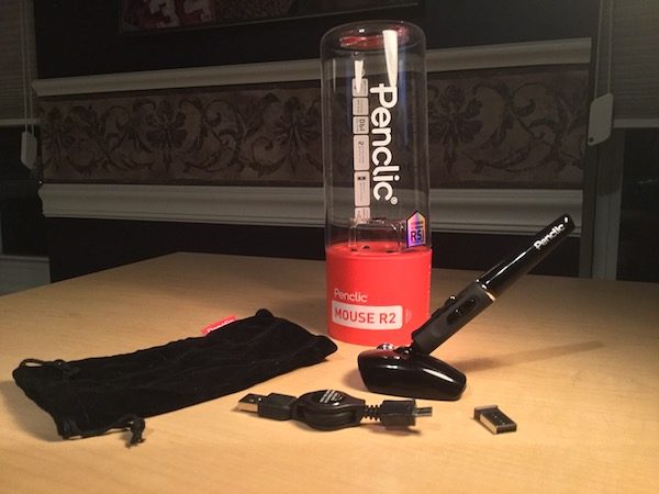
The base of the unit is about a half the size of a traditional mouse, with a pen-style grip attached vertically to the base. A USB nano receiver is included for wireless use. A USB cable is also included for charging the rechargeable battery, and can also be used to drive the mouse while charging. The package includes a felt bag, a nice touch for traveling and commuting.


Out of the box, the Penclic Mouse shows its heritage in Scandinavian engineering. The design is compact, sleek, and balanced. Materials and build quality are excellent, with nice tactile feel to all the appropriate surfaces. There are no whimsical color schemes or artsy design flares here… it looks and feels like a business tool, ready for action.

Device Setup and Walkthrough

I tested the mouse on three devices (a 13″ MacBook, a 15″ Thinkpad, and an iMac desktop), and found that setup was seamless every time. You remove the protective tab to activate the rechargeable battery, plug in the USB receiver, and flip the “on” switch under the base. That’s it. No drivers to install. You’re off and running!

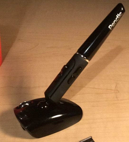
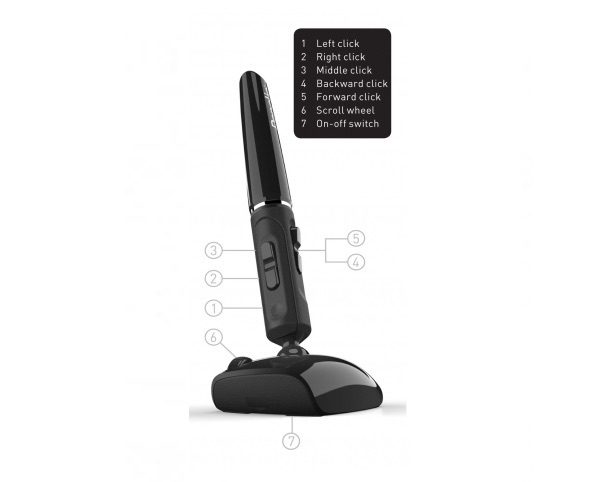
The pen itself is a bit thicker than a standard pen and attaches to the base via a ball joint that allows 360-degree rotation. There is a total of five buttons on the pen itself. The top of the pen sports a primary “left click” button and a set of rocker-panel-style buttons for “right click” and “middle click” actions. The thumb-side of the pen includes two additional buttons for “back click” and “forward click”. A scroll wheel is positioned on the base, designed to be used with your pointer finger when holding the device is a classic pen-style grip.

(Speaking of thumbs: I should note that the model I tested is only made for right-handed users. Penclic does offer left-handed models as well as ambidextrous models on their web site.)

Under the base, you’ll find the on/off switch, a button to reset the wireless connection (typical on all wireless mice), and an access panel to get to the battery. There’s a port on the front of the base to plug in the wired USB cable when a recharge is required.

Using the Penclic Mouse R2 Wireless

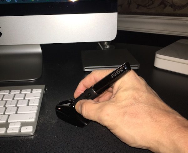
I quickly learned to appreciate the overall design of this mouse. You grip it and use it just like a traditional pen. You can position it at just about any angle that is comfortable for your hand and wrist, and the base stays solidly planted on your work surface. The base and pen are substantial enough that it doesn’t feel like it’s going to slip out of your hand, and rubberized grip surfaces ensure that you have steady control of the mouse through all ranges of motion. It really does feel good to use for extended periods of time.

As far as performance goes, I was pleasantly surprised by the fluidity of motion the mouse presents in actual use. Response is light and easy, requiring much less hand movement than a traditional mouse to get across the screen. Control is precise with smooth, fluid response to your hand gestures without any additional calibration or adjustments. You can tweak the control for different screen resolutions, but I never had to make an adjustment switching between laptops and desktops. It also works consistently on just about any surface without a dedicated pad, which is great for work on-the-go.

The buttons and scroll wheel took a little more time to get used to. I’ve included an illustration from the Penclic web site so you can see how the arrangement works. Everything is positioned naturally where your thumb and pointer finger fall when you grip the barrel, and tactile feel is excellent. It is different from a traditional mouse or track pad, however, and takes some practice to adjust to the configuration. I would expect that you would have a much faster adjustment if you are used to other stylus-type pointing devices.

Battery use is very efficient. The product claims that it can last 3 months on a single charge. Another nice touch: battery life is improved by an automatic shut-down after 10 minutes, and re- activates on first click. There’s an LED indicator on the base that glows red when recharge is required and switched to green when fully charged. I did have to charge it after the first day of use but haven’t had to charge in two weeks of regular activity.

Overall, I would say that it took a couple of hours before I was completely comfortable with using the Penclic. Once I got there, I actually found it to be easier to perform all the usual tasks (web browsing, working in spreadsheets, traversing e-mail, etc.) with significantly improved comfort and less strain on my hand and wrists. I’m a believer.

Conclusions and Pricing

After two weeks of constant use, I completely appreciate the benefits of the Penclic R2 Wireless Mouse. Not only does it deliver on comfort and ergonomics, but it’s clear that Penclic has carefully examined all aspects of the device to improve your day-to-day performance. If you’re having trouble with strain or discomfort related to using a traditional mouse, the Penclic R2 Wireless Mouse may be right for you. In fact, I would say that the ergonomics and design make it worth a look even if you don’t have these issues.

Penclic offers a series of models and options ranging in price from $70 to $100 USD, in addition to some great information about office ergonomics on their web site. Visit the penclic web site to learn more!

Source: The sample for this review was provided by Penclic. For more info visit their site and Amazon to check prices and order.


Product Information

Price: £59.99
Manufacturer: Penclic
Retailer: Amazon
Pros:
  • Ergonomic, comfortable design
  • Easy to setup
  • Solid, substantial feel in regular use
  • Solid construction
  • Excellent design and usability details
Cons:
  • Takes some adjustment to get used to

Filed in categories: Computer Gear, Reviews

Tagged:

Penclic Mouse R2 Wireless pen-style mouse review originally appeared on on April 2, 2017 at 10:03 am.

Note: If you are subscribed to this feed through FeedBurner, please switch to our native feed URL http://the-gadgeteer.com/feed/ in order to ensure continuous delivery.