Woolet 2.0 wallet review


Writing this review really has been a journey for me. You see, I am someone who frequently loses small (and medium, and large) items with frightening regularity. This is why I rely on a scientifically proven system of “leaving things wherever I might be when I decided I no longer need them and hoping I can find them later.” No internal discipline seems to exist that I can summon forth to prevent me from leaving things in potentially unexpected places.

To combat this failing, I’ve taken to attaching tracking devices to the more important bits of tat that I might misplace, and it’s been a successful approach for the most part. Over the last couple of years, several companies have cropped up offering small, battery-powered devices that will help you to keep track of your bits and bobs. I’ve tried most of them, and I consider myself an expert, or at the very least, can say that I’ve spent dozens of hours looking for things that, ostensibly, should be beeping very loudly right now because I told it to in the damn app.

Today, I bring you the Woolet 2.0 from Woolet. According to Woolet (the company, not the wallet), the second version of their namesake product brings a louder buzzer, better protection for the internal electronics, and other, more minor improvements to the Woolet (the wallet, not the company) line.

The Woolet 2.0 looks nice, if unexciting. It features four credit card slots, each of which is intended to hold only one card at a time. A larger, fifth slot can hold an additional four cards. I, personally, had no issue putting two or even three cards in the slots designed for a single card, as they are generously sized, and lined well enough to ensure that cards slide in and out with ease. The Woolet also includes a flap covered pocket in the bill pocket that allows you to carry any number of things such as dental floss, a prophylactic*, a competitor’s product, some coins, or a very small book. For reasons that will become apparent, I found the small pocket very useful.

The Woolet Experience

This review has taken me a very long time to write. I’ve been trying to be sure I’m giving the Woolet a fair shake, though I’ve faced more than a couple hurdles. For starters, the Woolet arrives in a state somewhere between dead and vaguely charged. You need to get it on a QI charging pad to get it charged enough to pair with your phone or tablet. This is where the first issues became apparent.

I have a few QI chargers around the house, but wanted to use the Woolet supplied charger to ensure a thorough review of what was sent to me. The Woolet QI charger is best described as a beautiful mess.
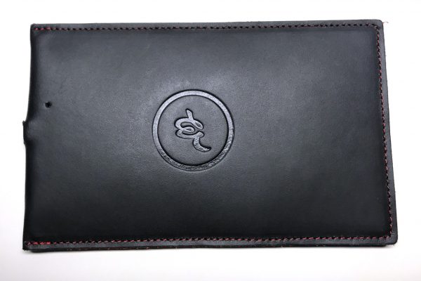
I received my first Woolet QI charger – you can see where this is going – and used it for a few days, doing battery tests and giving it a good overall workout. I think leg day was too much for it, however, and it stopped working soon after testing it. I wasn’t terribly surprised when it died, either, as there is one glaring flaw in the design. The Woolet QI charger (pictured) is a chunky slab of leather with an embossed logo and beautiful stitching. What it lacks, though, is any true mechanical support for the micro USB port centered on one end. At some point, and during reasonably careful handling, the contacts on the Micro USB port were levered off their pads on the PCB, and the charger promptly stopped working. After requesting, and receiving a replacement charger, I set to seeing what was wrong with the first and got out my stitch ripper. Having several hundred (they’re sold in spools!) Micro USB ports handy, I desoldered and replaced the Micro USB port. This worked immediately. Once working, I purposefully put downward pressure on the cable and was able to easily peel it off the board. I’ve now tested three times, and it takes only 2.8lbs of pressure on an attached cable at two inches from the connection to break the USB port off the PCB. I can say at least that they appeared to have chosen a good PCB fabricator, as the traces have yet to pull off the board, despite multiple reflows!

I believe that, for $89, one should be able to expect a bit more durability than I’ve seen here. Given that there are dramatically cheaper QI charging options on Amazon, I’d recommend against the Woolet branded charger.

If the Woolet (the company, not the wallet) charger is not for me, how about the Woolet (the wallet this time) itself? I’ll skip to the point and say I’m not a fan. That said, neither is the Woolet. It’s a wallet.


The Woolet app is very simple, and while it provides some nice features, it doesn’t change the fact that the Woolet itself is not quite ready for prime time.

After installing the app, and charging the wallet, I followed the steps to pair the Woolet., and failed. I was unable to get it to pair the first dozen or so times I tried. Shortly before my patience ran out entirely, it paired. I named my Woolet in the app, and approximately 90 seconds later, I got a notification on my iPhone that I’d left my Woolet at home. Given that I was still at home, and that I hadn’t stood up, much less traveled outdoors, I was confused. I dismissed the notification, assuming it was a test or some one-off bug. A few minutes later, however, I received another notification, this time while the Woolet was nine inches from my phone. This drove me right back into the app, where I tapped the Help option and was immediately encouraged to set Quiet Zones, which tell the app to NOT lie about where your Woolet might or might not allegedly be so long as you remain in a particular area such as your home or office. I’m not surprised that this seems to be the first goal of the built-in help, as without the quiet zones, the Woolet can get a bit needy. I set the Woolet on my desk at work, two feet from my phone, and removed the quiet zone. Though the Woolet did not wander off, I received 4 notifications in four hours that I’d left it behind. This is more than a bit annoying.


One feature that the Woolet sports is the ability to make it play a little tune to help your search should you lose it. In theory, this is a tried and true technology, being found years before in products like Tile’s… Tile. Really, if car companies were as creative as tracker companies, I’d be driving the Acura Acura. The issue is that Woolet has a very, very puny buzzer, and one that’s under a couple layers of leather at that. I was frequently unable to hear it in a room if the air conditioner was going. This frustrated me to no end, as I’d committed to using the Woolet as my primary wallet for the duration of the review period. In an attempt to ensure that I didn’t lose my credit cards, I tucked a Tile Slim into the flapped pocket in my Woolet and tested it out. I was able to hear the Tile through the same amount of leather, and also with the PCB in the way from outside the room, with the door closed. That is, as far as I am concerned, almost all you need to know about which solution I’d prefer to trust with my valuables.

Conclusion 

In the end, I cannot recommend the Woolet 2.0 to anyone based on its performance over the last couple of months. I’ve watched others’ video reviews of the Woolet and have not been able to recreate the same, generally more positive results that they seem to have had. The reality remains that even if the constant false alarms weren’t an issue, the inaudibility of the buzzer really limits the Woolet’s value in my view. The Woolet is available now from Woolet.co, with models ranging from $109.00 to $149.00.

*Do not put prophylactics in your wallet. That’s liable to create surprises later.

Source: The sample for this review was provided by Woolet. For more info visit their site.


Product Information

Price: $109.00 – $149.00
Manufacturer: Woolet
Cons:
  • False alarms
  • Quiet buzzer

Filed in categories: Reviews

Tagged:

Woolet 2.0 wallet review originally appeared on on June 2, 2017 at 3:18 pm.

Note: If you are subscribed to this feed through FeedBurner, please switch to our native feed URL http://the-gadgeteer.com/feed/ in order to ensure continuous delivery.

Tronsmart Encore S1 Bluetooth sport headphones review


With the iPhone 7 series leaving out the headphone jack, the market for wireless earbuds has exploded. There are two types of wireless earbuds/earphones out there: tethered and free. Apple’s Airpods are the most visible expression of the free variety, but there are others. The tethered camp, however, is very crowded. I’ve reviewed several pairs here, and so have others. The latest one to come into my review queue is from Tronsmart, the Encore S1 Sport Headphones.

Note: Photos may be tapped or clicked for a larger image.


The Encore’s are very inexpensive (currently about $30, retail $39.99), but made of a light metal, with rubberized, changeable tips and silicone hooks to fit the ears of a large swath of humanity. The seal around your ears is kept tight by twisting the hooks into your ears slightly, which makes the sound more full. The backs of the earbuds are flat and magnetically equipped so that when you’re not listening, they can be clicked together. This keeps them around your neck if you’re just taking a short break from listening, or keeps them from tangling if you’re not going to use them for a while and are putting them into the included storage bag. There are no other tricks to the magnetic connection – it doesn’t turn them off or stop playback or anything. It just holds the two ends together.

The 22″ cable and the ~2″ inline control module are sealed to prevent moisture from exercise, rain, or a rogue wave splash from getting into your headphones. They are not full-on waterproof, and there is no IP-xx rating, but they are rated as being for exercise. I’ve been wearing them while walking for a while, and haven’t had any issues. I don’t wear any earbuds when I cycle for safety, though.


The sound through the S1s is pretty nice. I’ve had cheap earbuds and really expensive ones, and I can say that these have a really well-defined sound profile for music and speech. I listened to some music from The XX, Sara Bareilles, The Civil Wars, Train, The Fray, and Colbie Caillat. (And with that playlist, one of my daughters just did the “YES!” fist pump from Home Alone, while the other just rolled her eyes and shook her head.) Good sound on phone calls, with an easy two button control (One is a toggle for +/- volume, the other a push-button to power on/off with a long press, start/stop playback with a short press.) I could not get the buttons to call up Siri, but when I hit the button on the phone to do so, Siri listened and replied through the headphones.

The included USB-micro-to-USB cable – though short – easily charges the device, and I found battery life to be incredible. I used them at one point daily for a week and never had to recharge.

The market for earbuds/earphones is undergoing a seismic shift. After years of corded units shipping with most smartphones, major manufacturers are starting to leave off the AUX port on high-end phones. Sure, there are loads of workarounds, and there will be a large market for adapters for a time, the truth is out there: wireless is the next thing. While these aren’t going to last forever, the Tronsmart S1s are inexpensive, durable, sweat-resistant, and tangle-resistant, through the magnetic backs. Decent sound and functions in a nice shiny nylon bag. Worth the investment, in my book.

Source: The sample for this review was provided by Tronsmart. Please visit their site for more info and Amazon to order.


Product Information

Price: $39.99 – on sale for $29.99 at press time
Manufacturer: Tronsmart
Retailer: Amazon
Requirements:
  • Bluetooth 4 device, USB charger
Pros:
  • Magnetic backs tame tangling
  • Earhooks provide security during exercise
  • Silicone seals are easy to change
Cons:
  • None

Filed in categories: Reviews

Tagged:

Tronsmart Encore S1 Bluetooth sport headphones review originally appeared on on June 2, 2017 at 8:55 am.

Note: If you are subscribed to this feed through FeedBurner, please switch to our native feed URL http://the-gadgeteer.com/feed/ in order to ensure continuous delivery.

Vaux Speaker for the Amazon Echo Dot Review


The Vaux Speaker for the Amazon Echo Dot is a powerful, well-designed, and versatile accessory. For existing 2nd generation Echo Dot owners, this is a must-buy and an easy way to expand your Dot’s functionality.

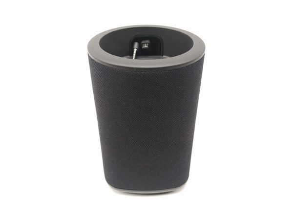
Made by Ninety7 Inc., the Vaux, pronounced “vox”, is the first battery-powered speaker designed to hold the Amazon Echo Dot. This claim only applies to the 2nd generation Dot though. The first generation Dot may technically work with the Vaux, but its dimensions are too large for it to fit into the top of the Vaux as easily as the 2nd generation Dot does.

The Vaux comes in a nicely designed box with a sexy photo of the Vaux and Dot merged on the front. Inside you will find the Vaux and a very simple quick start guide.

Because the Vaux is not a stand alone device, if you don’t already own one, you’ll need an Echo Dot.

Purchasing a Vaux and Echo Dot together costs about $30 less than purchasing an Amazon Tap. If you do go the Tap route, that extra $30 provides slightly better sound quality, significantly better battery life, and Bluetooth connectivity. So, purchasing a Vaux makes the most sense if you already have an Echo Dot and you want to increase its effectiveness.

To use the Vaux, first unplug your Echo Dot. Spin the Vaux around and pull back the silicone cover on the back. There you’ll see a micro-USB connector and a 3.5mm headphone jack.

Drop your Dot into the top of the Vaux and align the connectors with the open space.

Once the Dot is seated correctly plug in the micro-usb and 3.5mm connectors into Dot and close the cover.

The last step is to plug your existing Dot power cord into the back of the Vaux to power the whole unit.

On the back of the Vaux, you’ll find the power button. Press it briefly to start up the device. When you first power on the Vaux it will make a loud audible “pop” sound. According to the manufacturer, this is a normal part of the start-up procedure.

Charging the Vaux from empty takes about five or six hours. If the Vaux is being used as it is charging, it will take about eight to twelve hours.

The LED light on the back of the Vaux stays illuminated while powered on. The colors of the LED indicate the Vaux’s status: Amber: Not powered on, but charging. Green: Not powered on, but fully charged. Blue: Powered on. Blue/Amber flashing: Battery power low.

The manufacturer indicates that the Vaux’s battery should give you around of six hours of playback depending on usage and volume level. This claim was consistent with my testing; at medium to full volume, I got a little less than six hours of playback. At higher volumes, I found that the sound quality degrades quite a bit. Although, the sound quality of the Vaux is still much better than the Dot’s internal speakers.

Be aware that the Vaux is not water-proof or water-resistant, and was designed to be used indoors primarily. It fits right on my shelf and has the same aesthetic as Amazon Echo.

The Vaux also has an auxiliary 3.5mm jack on the back which allows you to use the Vaux has a portable speaker for another music source. Be aware though, when the auxiliary jack is in use, it will override the Dot audio and functionality. Unplugging your device from the auxiliary jack returns the Dot functionality.

I enjoy using the Vaux and being able to grab my Vaux/Dot and bring it into other rooms of my apartment without having to invest in another Amazon device is terrific. It would be cool if the whole unit sat inside a charging dock or cradle to make it easier to grab and go. But, I think, wisely, the lack of a cradle was a decision made to keep the cost of the unit low.

The Vaux comes in two colors, Carbon (Black) and Ash (White).

Specifications

  • Weight: 1.7 pounds
  • Dimensions: 4.2 x 4.2 x 6.4 inches
  • Batteries:5000 mAh Internal rechargeable lithium ion
  • Colors: Black/Carbon and White/Ash
  • Speakers: Two active 52mm drivers, one passive 90mm x 50mm radiator
  • Ports: 3.5mm Aux Input, Micro-USB Charging Port

Source: The sample for this review was provided by Ninety7. Please visit their website or Amazon to order.


Product Information

Price: $49.95
Manufacturer: Ninety7 Inc.
Retailer: Amazon
Requirements:
  • 2nd Generation Echo Dot
Pros:
  • Portable
  • Great battery life
Cons:
  • Not weatherproof
  • Works only with 2nd Generation Echo Dot
  • Sound quality degrades at higher volumes

Filed in categories: Reviews

Tagged: ,

Vaux Speaker for the Amazon Echo Dot Review originally appeared on on June 1, 2017 at 4:23 pm.

Note: If you are subscribed to this feed through FeedBurner, please switch to our native feed URL http://the-gadgeteer.com/feed/ in order to ensure continuous delivery.

Samsung Galaxy S8 review


I’m guessing that almost every review of the Samsung Galaxy S8 or S8+ starts out with some mention of last year’s recall of the Note 7 due to battery issues that led to the spontaneous combustion of some phones. You would think that all that drama and bad press would have hurt Samsung’s reputation. But it doesn’t appear to be the case because many of my gadget reviewing brethren are saying that Samsung’s latest smartphones are the best smartphones ever made by anyone. What do I think? Click through to find out.

What is it?

The Samsung Galaxy S8 is Samsung’s latest Android smartphone.

Hardware specifications

Processor: Qualcomm® Snapdragon™ 835 MSM8998 Octa-Core, 2.35 GHz (Quad) + 1.9GHz (Quad)
Display: 5.8” Quad HD, Super AMOLED, 571 PPI, 1440 x 2960 pixels resolution, Corning Gorilla Glass 5
Operating System: Android 7.0, Nougat
Memory: Flash: 64GB RAM: 4GB
Expandable Memory: Removable microSD up to 256GB (sold separately)
Network: CDMA 1X and EvDO Rev 0/Rev ALTE (Domestic): B13/B4/B2/B5/B66
Global Network: LTE (Global): B3/B7/B20/B8/B18/B19/B28/B26GSM Quad B5/B8/B3/B2 (850/900/1800/1900MHz) & UMTS Quad: B5/B8/B2/B1 (850/9001900/2100MHz) TDS CDMA 34, 39 & TDD LTE 38, 39, 40, 41, LTE-U: B252/B255(in SU)CAT 4/ CAT 6/ CAT 9
Camera (rear): 12 MP f/1.7, 26mm
Camera (front): 8 MP f/1.7
Bluetooth: 5.0, A2DP, LE, aptX
Wi-Fi: 802.11 a/b/g/n/ac 2.4G+5GHz, VHT80 MU-MIMO,1024-QAM
NFC
Battery: 3,000mAH, Non-removable
Dimensions: 5.86 in x 2.68 in
Weight: 5.47 oz

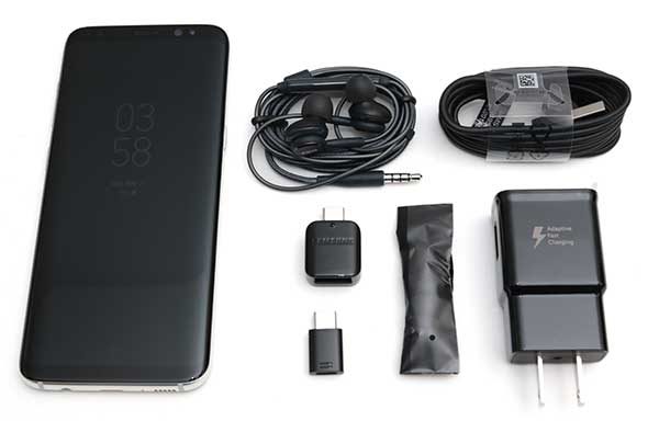
What’s in the box?

Samsung Galaxy S8
AC adapter
USB Type-C charging cable
USB to Type-C adapter
micro USB to Type-C adapter
Headphones
Ear tips for headphones
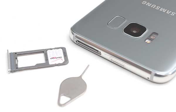
SIM card removal tool

Design and features

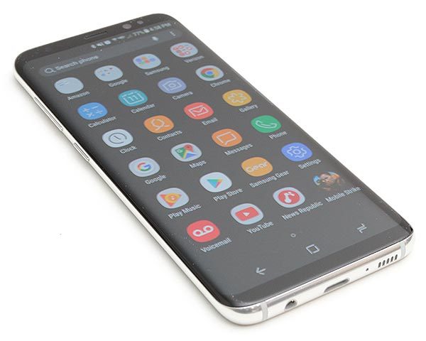
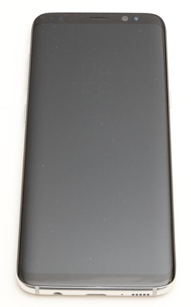
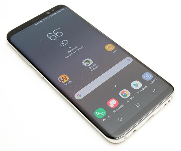
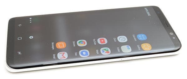
I can’t argue when people say that the S8 is the nicest looking smartphone that has ever been made. It’s thin, with smooth sides, rounded corners and of course, that almost bezel-less curved glass display. It’s a looker for sure.

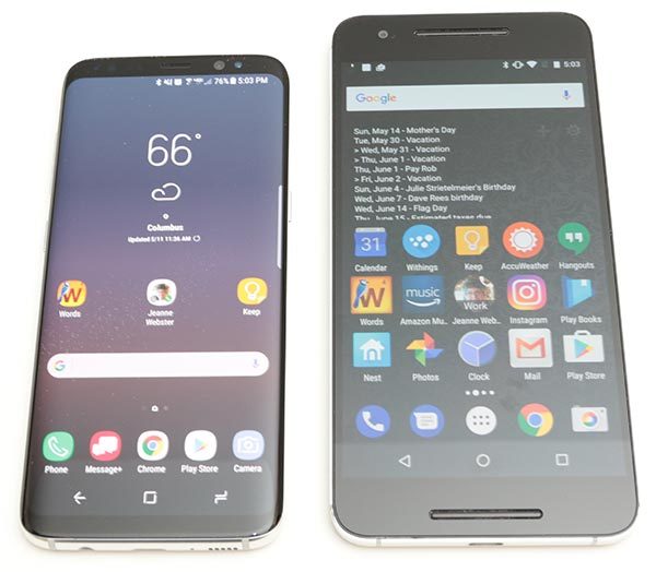
The S8 is pictured above to the left of my Nexus 6P. The Nexus has a 5.7” 2560 x 1440 resolution display and the Samsung Galaxy S8 has slightly larger 5.8″ higher resolution 2960 x 1440 display but in a noticeably smaller package.


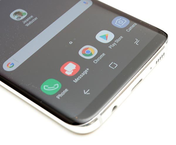
The front of the S8 has a Corning Gorilla Glass 5 display with thin black bezels at the top and bottom edges. Gone is the familiar physical home button that has graced Galaxy phones for as long as I can remember.

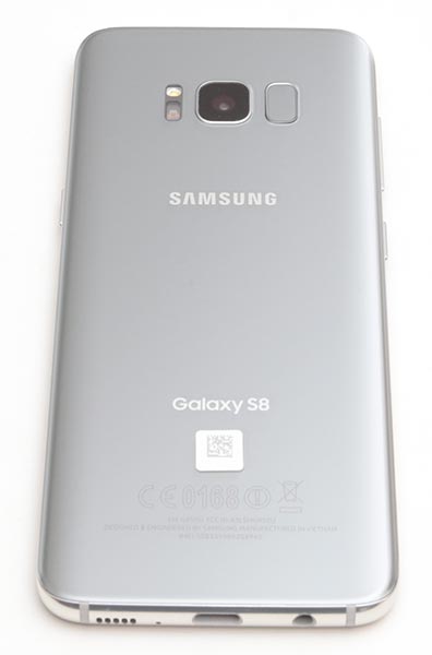
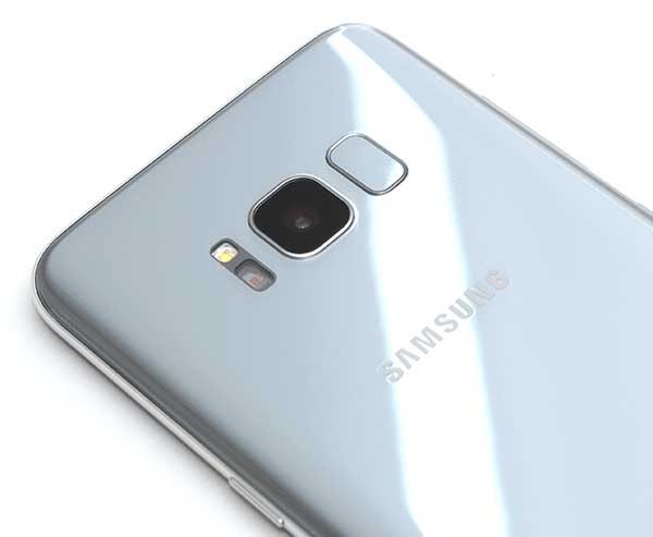
The back of the phone is also made of Corning Gorilla Glass 5 with a LED flash, camera, and an awkwardly placed fingerprint scanner which I’ll talk about later.

On the left side of the phone are two buttons. There’s a long one-piece volume rocker button and the Bixby button below it. If you’re not familiar with Bixby, that’s Samsung’s version of Siri and Google’s digital voice assistants. I’ll talk more about Bixby later in the review, but suffice to say, that the location of the Bixby button is not optimal because it’s too close to the volume button.

On the opposite side of the phone, you’ll find the power/wake button.

All of the Samsung Galaxy S8’s buttons have good tactile feedback and stick out far enough from the frame so that your fingers can find the buttons without looking.

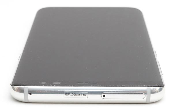
On the top edge of the Galaxy S8, you’ll find a microphone…

and the SIM/micro SD card tray.

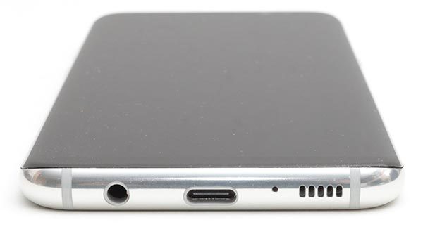
On the bottom edge of the S8, you’ll find an antiquated 3.5mm headphone jack (just kidding), a USB Type-C charging port, another microphone, and the speaker.

The location of the speaker is problematic if you like to hold your phone in your hand while watching videos. It’s too easy to block the speaker with the palm of your hand, causing audio to be muffled.

The S8 is a solid device that has no problems surviving my almost 2 decades old squeeze test. The phone feels great in hand and is the perfect size for one-handed use and fits much better in my pocket than my Nexus 6P. But, the S8 is a slippery phone and with a glass back, I worry about how fragile it is.

I’m not going to drop it to test how fragile it is, but it is nice to know that the S8 has an IP68 rating which means that is water resistant when dunked in up to 3 feet of water for up to 30 minutes.

Display

The S8’s display is gorgeous. But then I think all Samsung devices have the excellent displays. The display on the S8 is bright, with vivid colors, and great viewing angles.

Even in full sunlight, the S8’s screen can be read relatively easily.

Barely there bezels mean that the S8’s screen takes up 83% of the phone’s face. The S8 isn’t the first smartphone to feature almost invisible bezels. LG beat Samsung to launch with the first almost bezel-less phone when they rolled out their LG G6.


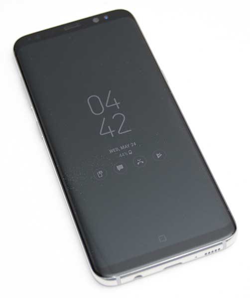
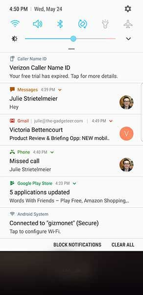
I do love the Samsung Galaxy S8’s always on display which shows the current time along with notification icons for incoming emails, text messages, missed calls, etc. However, interacting with the notification icons can feel a little inconsistent.

When you double tap a notification icon on the lock screen, it will either show a list of your notifications like the screenshot above, or it will prompt you to unlock the phone. I haven’t figured out why it chooses to show the list or not show the list when double tapped. Even when it does show the list, you can’t really do anything until you unlock the phone.

Curves in all the right places?

Curved screen edges are not a new feature for Samsung smartphones. We’ve seen them for several years now. In the past, I’ve had issues with my palm accidentally pressing the screen when I’m gripping it in my hand. I’m happy to say that I didn’t notice any of these problems with the S8. That said, I’m just not a big fan of rounded screen edges for the very reason that the screen wraps around the edge. It feels like the screen is squeezed and thinner/smaller than it should be.

I also don’t use the edge panels that are accessed by swiping the panel handle on the edge of the screen. If you’re not familiar with them, you can think of edge panels as an app speed dial list. I just don’t see the point.

The Samsung Galaxy S8’s 18.5:9 display is taller and narrower than the Samsung Galaxy S7 which makes it easier to hold and use with just one hand.

This is the first Samsung smartphone that does not have a physical home button. Do I miss the home button? Nope, not at all. But that’s mainly because I’ve been using the Nexus 6P as my primary phone for over a year, which also does not have a home button.

Before you ask, there is a home button, it’s just not a mechanical/physical button. It’s a virtual button that is always there, even on the lock screen. When you press the virtual home button, it vibrates to provide tactile feedback. The onscreen button graphics move slightly all the time to prevent screen burn in.

Audio quality

The Samsung Galaxy S8 sounds pretty great with the included AKG in-ear wired headphones which are worth about $100 on their own. Music sounds better through the S8 and headphones when compared to my Nexus 6P.

Listening to music, movies, etc using the built-in speaker is ok but it’s nothing to high five about.

Camera

When it comes to smartphone cameras, everyone’s go-to comparison is going to be with the latest iPhone. I don’t have an iPhone 7 or 7 Plus to do any comparisons with the S8 for this review, but I was not unhappy with the S8’s image snapping performance. I’ve included some samples below.


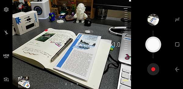
The camera interface is not too much different than previous models of the Galaxy phone. There are a few minor updates though. One nice update is that Samsung finally allows you to double tap the power button to launch the camera app. That means you can snap a quick pic without needing to first unlock the phone.


The app also has an easy way to zoom in by moving the on-screen shutter button up and down.

If you’re into silly Snapchat style image overlays, the S8’s camera app includes a few animal “stickers”. How do I look as a cat?


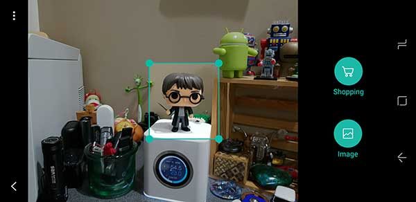
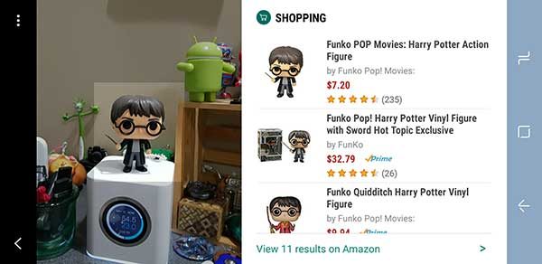
Clicking the stylized eye icon in the camera app will launch Bixby Vision. With Bixby Vision, you can point the camera at a product and it will look up the pricing info for it on Amazon. I tried it with a few items around the house and it worked surprisingly well. The only issue is that the phone has to be unlocked to use Bixby Vision. That means if you use the double tap power button feature to launch the camera app and then tap the Bixby Vision icon, you’ll be prompted to unlock the phone before you can use the product lookup feature.

Although the camera takes good pictures, it is a little disappointing that the S8 only has one camera lens on the back. So you can’t get the wide angle shots or the same bokeh (fuzzy background) features that the iPhone 7 Plus and LG G6 offers. I’m guessing that Samsung will save the dual camera feature for the Note 8.

Unlocking the phone

You’ve no doubt already heard that the fingerprint scanner is located on the back of the S8 next to the camera lens and that the location sucks. I’m not going to argue with that. The location DOES suck and I hate everything about the S8’s fingerprint scanner because it doesn’t work for me more than 1-2 times out of 10. Fingerprint scanners hate me… it’s just one of the sad facts of my gadget reviewing existence. However, I didn’t have any probs with the fingerprint scanner on the LG G6. It worked almost every time… which is rare for me. Because I have so much trouble with fingerprint scanners, I just don’t use them.

If you also have issues with fingerprint scanners, the S8/S8+ has three other ways to unlock the phone. You can use the iris scanner, face scanner, or go old school and setup a pattern. I find that using the pattern is the fastest way for me to unlock the phone because you have to swipe the unlock screen first to use the iris or face scanner which I think is an unnecessary step. I also use the Smart Lock feature which lets you unlock instantly by pressing the power button or home button when you’re at a trusted place, are connected to trusted devices, or use a trusted voice (the voice set up for Ok Google).

I also use the Smart Lock feature which lets you unlock instantly by pressing the power button or home button when you’re at a trusted place, are connected to trusted devices, or use a trusted voice (the voice set up for Ok Google).

Software and user interface


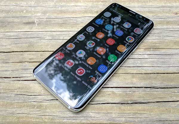
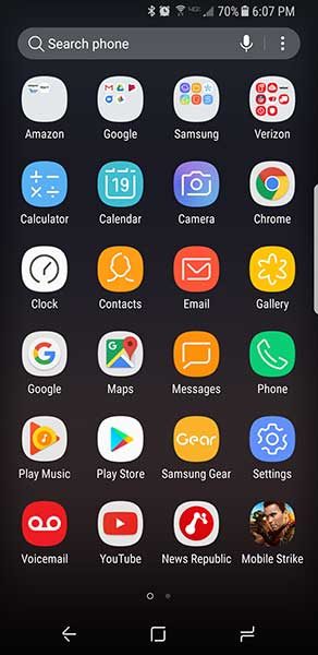
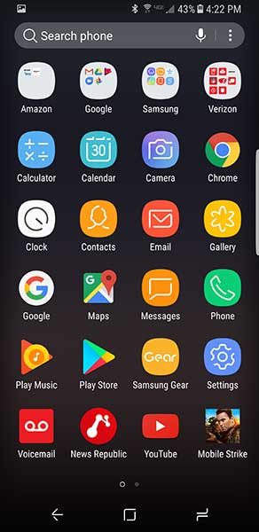
The S8’s user interface has Samsung’s TouchWiz interface on top of Android Nougat. There are a few things that TouchWiz changes about Nougat when compared to a Google Pixel or the Nexus 6P. For one thing, the icons have rounded frames around them so that they look alike. If you hate this feature like I do, you can turn it off, but Samsung’s apps retain the look even when you turn off the feature.

Another difference includes the option to toggle on a blue light filter which is supposed to help prevent eye strain by limiting the amount of blue light emitted by the screen.

But one of the biggest difference between the Samsung Galaxy S8/S8+ and other Android phones is Bixby Home, Vision and Voice. I already mentioned the Bixby Vision feature when I discussed the camera.

Bixby Home is like Google Now which you access by swiping right on the home screen. It shows cards with the weather, people who you contact regularly based on the time of day, calendar events, news and more. I rarely use Google Now on my Nexus 6P and don’t see a real need to use it on the S8 either.

Bixby Voice is supposed to be a virtual assistant like Alexa, Siri, and Ok Google. The problem is that doesn’t work yet, so it’s yet to be determined if it’s better than Ok Google which I seriously doubt it will be.

Using the Samsung Galaxy S8 for phone calls

I didn’t have any complaints from people I talked to while testing the Samsung Galaxy S8. Conversations on both sides of calls were clear and with ample volume. I also did not have any issues with dropped calls while testing this phone. Signal strength seemed to be no better or worse than other phones that I use and test on the Verizon network.

Overall performance and battery life using the Samsung Galaxy S8 for day to day tasks

The Samsung Galaxy S8’s performance is smooth and snappy. I had no issues launching apps, switching back and forth between apps, scrolling web pages, lists, etc. I also didn’t have any issues with the S8 freezing or crashing.

When it comes to battery life, I was easily able to make it through a full day and sometimes much longer before needing a recharge.

Also, the fact that the S8 has wireless charging gets a big thumbs up from me.

Final thoughts

When other reviewers say that the Samsung Galaxy S8 and S8+ are the best smartphones in the world, I have to agree. The S8 is a solid well-made phone that looks great. It’s fast, has a very good camera and the screen is spectacular. Even though I’m not a fan of the curved display sides, I really have enjoyed using this phone and was sorry to box it up and return it to Verizon today.

The only downside to this phone is the price (especially if you plan to buy the unlocked version) but unfortunately, that is the trend led by Apple and I don’t see any relief in sight.

If you’re shopping for a new high-end Android smartphone and can’t make up your mind between the S8 and the LG G6, I feel your pain. It just comes down to what looks best to you. That said, I’m happy to recommend the S8.

Source: The short term loaner sample for this review was provided by Verizon Wireless. Please visit their site for more info and to order.


Product Information

Price: $756.00
Manufacturer: Samsung
Retailer: Verizon Wireless
Pros:
  • Gorgeous display
  • Wireless charging
  • Good battery life
  • microSD card slot
Cons:
  • Expensive
  • Fingerprint sensor location
  • Only one camera on the back
  • Downward firing speaker

Filed in categories: Featured Items, Reviews

Tagged: ,

Samsung Galaxy S8 review originally appeared on on June 1, 2017 at 11:57 am.

Note: If you are subscribed to this feed through FeedBurner, please switch to our native feed URL http://the-gadgeteer.com/feed/ in order to ensure continuous delivery.

Yubico YubiKey 4 hardware security key review


In today’s world of technology and internet security, there always seems to be a website being hacked and personal details being compromised.  A password, even a complex one, isn’t really enough.  Luckily there are a few options out there to make our data a bit safer. You can use two-factor authentication with software (using an authenticator app on a mobile phone, for example) or using a hardware key, such as Yubico’s YubiKey. Two-factor authentication (2FA) adds an extra layer of security to your account that you, and only you, can access in order to prove your identity. Let’s take a look at how the YubiKey 4 and 4 Nano work.Note: Images can be clicked on to view a larger size.
Different services use different types of security protocols. YubiKeys are capable of performing multiple protocols, so you can use the same key for almost an unlimited number of services. U2F is a popular open authentication standard that enables internet users to securely access any number of online services, with one single device, instantly and with no drivers, or client software needed.

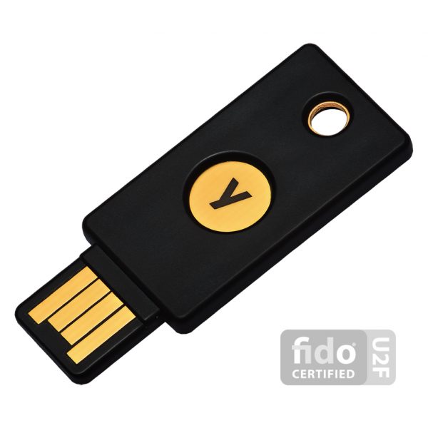
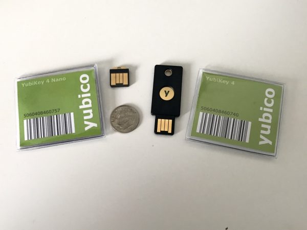
YubiKey 4 Series comes in multiple form factors. Each option includes the same internal components, functionality, and capabilities. I was sent the 4 and 4 Nano.

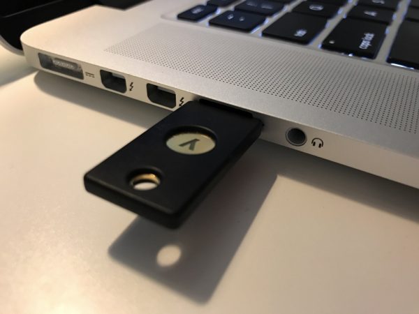
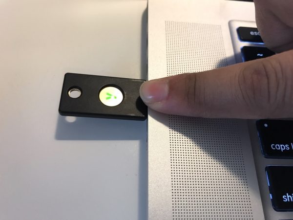
The YubiKey 4 fits on a keychain and plugs into a USB-A port such as on my 2015 Macbook Pro

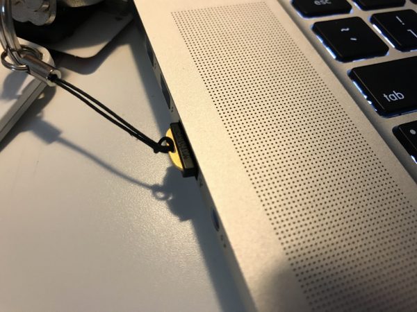
The YubiKey 4 Nano is good for semi-permanent installation and also plugs into a USB-A port. I have put mine on a lanyard for convenience.

Benefits of the YubiKey

  • Prevents unauthorized access by requiring the physical presence of the key to log in on that device
  • Easy to use: Plug it in and touch the gold button or edge; no codes to type or apps to install
  • Affordable: The same YubiKey can be used with nearly unlimited services
  • Durable: Crushproof and water-resistant, no batteries or moving parts
  • Everywhere: Use it on Microsoft Windows, Mac OS X, Linux, and Chrome OS for Chromebooks
  • Convenient: Fits on a keychain, in a wallet, or inside a USB port

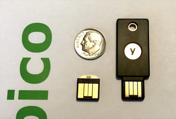
The YubiKey 4 Nano is on the left, and the YubiKey 4 is on the right. For size reference, I’ve included an US dime coin.

YubiKey works with tons of online services and applications such as Google, Facebook, Dropbox, Windows, MacOS Sierra, and password managers such as LastPass, Dashlane, KeePass, etc.

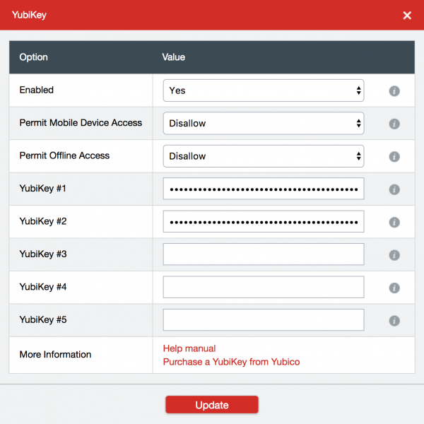
For LastPass, it was very easy to set up the YubiKey. In account preferences, it will ask you to insert your device into the USB port and touch the gold plate on the key itself.

It then acts as a keyboard and types a long string of characters into the YubiKey slot.  You can add multiple keys for extra security, which is really nice to have. (This is a feature of LastPass Premium.)

The same process goes for adding it to any of your favorite online services. Look into account preferences for an option along the lines of “set up a hardware key”. Then insert your YubiKey, follow instructions, and all is set. The YubiKey 4 and 4 Nano work exactly the same by touching the gold plating on the device to activate the key when logging in.  It’s given me peace of mind knowing that I have an extra layer of security on top of my two-factor authentication mobile app and password. To note, you aren’t stuck if you lose your YubiKey or don’t have it near you. You can still log in with a mobile authenticator token, or old-fashioned password.

I highly recommend investing in a second or third round of protection for your most used and important websites.  The YubiKey is available at a discount for education, GitHub users, and also available in bulk trays for businesses.

Source: The sample for this review was sent by Yubico. Please visit their website for more info.


Product Information

Price: $40-50
Manufacturer: Yubico
Requirements:
  • USB A port
  • Mac, Windows or Linux computer
Pros:
  • Very easy to set up
  • Secure
  • Portable
Cons:
  • Very easy to lose unless attached to keys or a lanyard

Filed in categories: Reviews

Tagged:

Yubico YubiKey 4 hardware security key review originally appeared on on May 31, 2017 at 9:00 am.

Note: If you are subscribed to this feed through FeedBurner, please switch to our native feed URL http://the-gadgeteer.com/feed/ in order to ensure continuous delivery.