Sandisk Connect Wireless Stick review


Most smartphones and tablets do not have expandable memory. One way around this is to purchase the device with as much built-in memory as possible. But for those of you that didn’t think that far ahead when you bought your device and now find that storage space is low, you might want to consider a solution like the Sandisk Connect Wireless Stick.

What is it?

The Sandisk Connect Wireless Stick is a USB flash drive that allows you to wirelessly transfer and access your photos, videos, and files with your mobile device, Windows PC or Mac computer via WiFi or the USB port.

Design and features

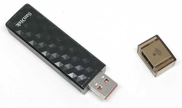
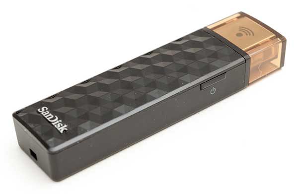
The Connect Wireless Stick looks like a slightly oversized USB flash drive that we’re all familiar with. It has a black plastic case with molded facets that give it a cool look and feel.

One end of the stick has a removable cap that reveals a standard USB 2.0 connector that is used to charge the stick’s internal battery and to transfer files to a computer. On the other end of the Connect Wireless Stick is a lanyard attachment slot.

There’s also a tiny status LED on top and something which you don’t normally see on a flash drive which is a power button.

How does it work?

The Sandisk Connect Wireless Stick is available in capacities from 16GB up to 256GB and works just like you would expect a flash drive to work. You can plug it into your PC or Mac computer and save and copy files to it.  But the stick can also create its own WiFi hotspot that you connect to with your mobile device using the Sandisk Connect app to transfer or stream files to and from your mobile device.

To use the stick, the first step is to install the Sandisk Connect app on your iOS or Android device. I tested the Connect Stick with my LG G6 Android smartphone.


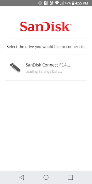
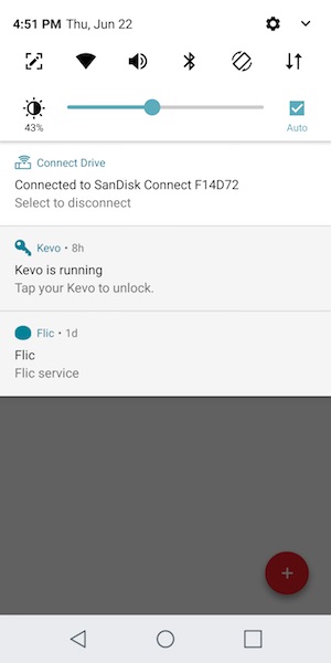
After the app is installed, and the stick has been charged by plugging it into a USB port, you can press the power button on the side of the stick and launch the app. The app will detect the stick and connect to its WiFi hotspot.


The stick has some files already saved on it to give you an idea of how to use it. There is a music, video, and photos folder, but you can create other folders and transfer other file types too.


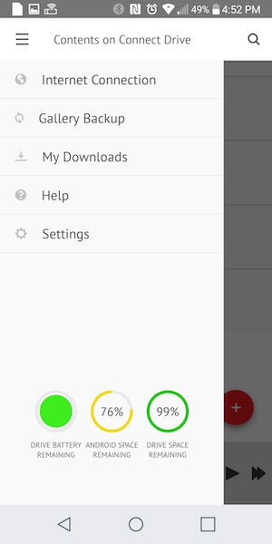
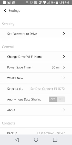
In the Connect Wireless Stick settings, you can set a password to protect the stick and a timeout setting to automatically turn off power when the stick is idle.

You can also enable the photo backup feature that will save the images in your device’s photo gallery to the stick. This can come in handy if you don’t use Google’s Photo’s backup feature or back up your iOS photos to iTunes.


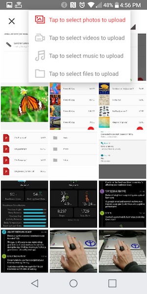
Copying files to and from the stick from your mobile device is as easy as selecting the files and telling the app which folder to place them.

Transfer speed did feel a little slow though. It took a few minutes to copy a 211MB video file stored on the phone to the stick.

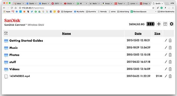
You can even access the contents of the Sandisk Connect Wireless Stick from a web browser on your PC or Mac. You have to be connected to the Stick’s WiFi network to use this feature.

Since I have a 12″ MacBook that only has a USB Type-C connector, I used the web browser option to access files on the Stick from my Mac. I even streamed a 211MB video on the stick through my MacBook which worked pretty well, but there were a couple 1-second pauses at the start of the 2-3 minute video. I don’t know if this was the fault of the stick or my phone. When I tried it later, there were no pauses.

The Sandisk Connect Wireless Stick can stream music and video to 3 devices at a time. I tried streaming two different videos to 2 different devices and the same video 2 devices at the same time. One time there was a 1-2 second pause at the start of playback, but for the most part, it video streaming was stutter free.

Final thoughts

One of the best things about the Sandisk Connect Wireless Stick is that it works anywhere because no internet or cables are required. The only issue with this is that while your mobile device is connected to the stick, it isn’t connected to its primary WiFi hotspot. If you are using a phone, you can still use your regular cellular data connection though.

The Connect Wireless Stick is really easy to use and its size makes it extremely portable. The only thing I’d like to see would be a Type-C version of the stick, but other than that, it’s a handy accessory that makes it easy to expand device memory without wires.

Source: The sample for this review was provided by Sandisk. Please visit their site for more info and Amazon to order.


Product Information

Price: $23.49 – $197.49
Manufacturer: Sandisk
Retailer: Amazon
Pros:
  • Easy to use
  • Transfer files without cables or the internet
  • Automatically backs up your camera roll when connected
Cons:
  • File transfers from mobile device to Connect stick is slow

Filed in categories: Reviews

Tagged: ,

Sandisk Connect Wireless Stick review originally appeared on on June 25, 2017 at 1:44 pm.

Note: If you are subscribed to this feed through FeedBurner, please switch to our native feed URL http://the-gadgeteer.com/feed/ in order to ensure continuous delivery.

Gearbest Cube WP10 4G Phablet review


Phone, tablet, phablet. The market parlance around these three items is somewhat murky, but I’m still not sure there are folks for whom a phablet isn’t a better device than a phone. To test this theory, I volunteered when Julie offered the team the Gearbest Cube WP10 4G Phablet, a Windows 10 tablet with phone service. I got it and have done a few months of testing, and am ready to report back to you folks.

Note: Photos may be tapped or clicked for a larger image.
First off, I’m going to offer a working definition, fresh from Wikipedia:

Current phablets typically have a diagonal display measurement between 5.5 inches (140 mm) and 7 inches (180 mm), assuming a 16:9 aspect ratio. In comparison, most flagship smartphones released in 2016 have a screen size of around 5.5 in (140 mm), with larger versions of mainstream flagships (such as iPhone 7 Plus, Pixel XL, and Samsung Galaxy S7 Edge) using 5.5 in (140 mm) displays. 

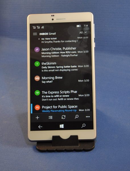
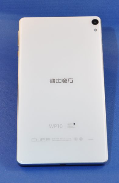
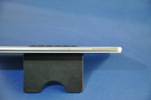
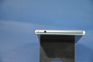
The Cube is a Windows 10 Phablet which has a dual SIM port, wifi, and bluetooth. The Windows 10 software is supposed to be the same as what you’d run on a desktop or laptop, but I found major shortcomings with this (more later). As for physical specs, it is a flat slab 7.25″ x 3.75″ x 0.375 ” (185 mm x 97mm x 8mm). The screen measures right at 7″ diagonally. The face has the familiar earpiece at the top center, with the “selfie” camera lens to the left. There are two other sensor openings above the camera lens, one of which I’d think would be a proximity sensor to turn the screen off when it is up to your face. The other may be a focus assist.


Here are the specs as listed online:

OS Version: Windows 10 (licensed)
CPU: Qualcomm MSM8909
GPU: Adreno 304
Processor Speed (max): 1.3GHz
RAM: 2GB
Internal Memory: 16GB
External Memory: Support for up to 128GB
Display Size: 6.98 Inch IPS
Display Resolution: 1280 x 720

Frequency:

  • 2G: GSM 850/900/1800/1900MHz,
  • 3G: WCDMA 2100MHz,
  • 4G: FDD-LTE 1800/2100MHz
Bluetooth
GPS
Sensors: Gravity
Mic and Speaker
Battery 
Size: 2850 mAh
Continuous Usage Time: up to 3 hours (video playing time)
Battery Standby: up to 48 Hours
Charging time: about 2 hours
Wi-Fi: 802.11 b/g/n
2 Megapixel Front-Facing Camera
5 Megapixel Rear Camera
Video resolution: 640 x 480 front/1280 x 720 back
Ports
Micro SD card slots: up to 128GB
Dual (GSM+WCDMA+FDD LTE)
2x Nano SIM Card Slot
Micro USB
3.5 mm audio out port
Languages - English, Chinese (simp), Chinese (trad)
Media Formats
Video: MOV, MP4, AVCHD
Audio: AAC, MP3, WMA, WAV, M4A
Graphic: JPG, JPEG, GIF, BMP, PNG
Dimensions:
Main Product Dimensions: 185x 95x 6mm (L x W x D)
Main Product Weight: 250g
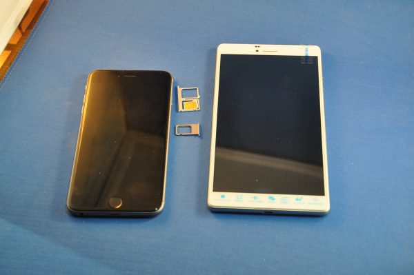
As shown in the photo above, I’ve been using an iPhone 6s Plus (on the left) for almost two years now, and enjoy the large screen much more than I ever thought I would have. But my use of the device itself has changed a lot since the release of the original iPhone in 2007. In short, I rarely actually talk on the phone. I especially only rarely hold it up to my ear and chat with someone on the other end. I use the speakerphone, ear buds, headphones, or text/email/chat quite frequently, but almost never phone-to-face talking. Using the Cube Phablet (on the right, above) held to the ear brings with it the social anxiety of having something that large up by your face. (I have a few friends at work for whom this would not be an issue, though. Their reactions were much more positive than the less height-gifted of my circle of friends was.)

Above, I compared it to the devices of some friends one night at dinner. Top to bottom, that’s a traditionally sized iPad, iPad mini, the Cube, iPhone 6s Plus, iPhone 6, and iPhone SE. Stacked, below, top to bottom are the same devices, in reverse order.
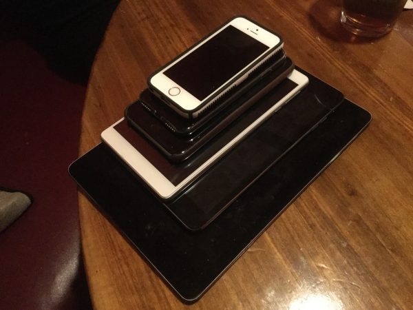
Everyone noted how light it was, compared to the mass it appears to be. The screen is also very clear and bright. The In Plane Switching (IPS) makes the screen readable easily from angles other than straight-on.

The cameras, despite the specs, suffered a bit from poor light management. Here are two photos of the same area, taken seconds apart. Both were on automatic, with onboard flash enabled.

First the Cube:
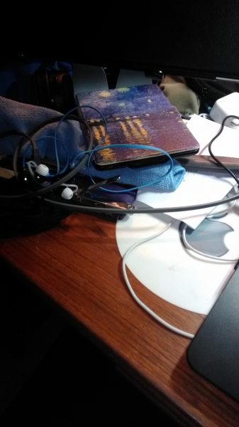
Then my iPhone 6s Plus:
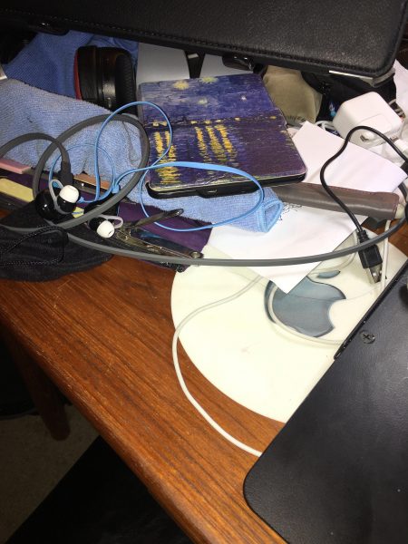
Obviously, the pictures differ widely, due to the sensor on the iPhone being larger, but I found the colors and details, for a 5-megapixel camera, very good. Even the 2 mph front facing camera isn’t too shabby (children should be removed from the room before scrolling further down.):

I found typing on the touchscreen pretty standard for typing on a slab of glass. I’ve gotten pretty good at it. The layout was easy to get used to, and there were only a few pauses with keyboard buffer overruns. I connected to my Live account and was able to read and write to Office 365 documents without problems. (None of the files are sizable, but the formatting issues and fights with the display of fonts seem to finally be in the past!)

I was continually irritated by the fuzziness of the touch targets, however. Tapping a button or a line of text to edit were frustrations that never went away during my testing. Trying to just select a certain word for editing took far longer than it should have. (Remember, I’ve been using my fingers to edit text for almost a decade now, so it’s not like I don’t know how to tap a screen!) I paired my Apple Trackpad with the Cube, and having the cursor show up on screen was fantastic. It’s a bit of trouble to use that when walking down the street, however.
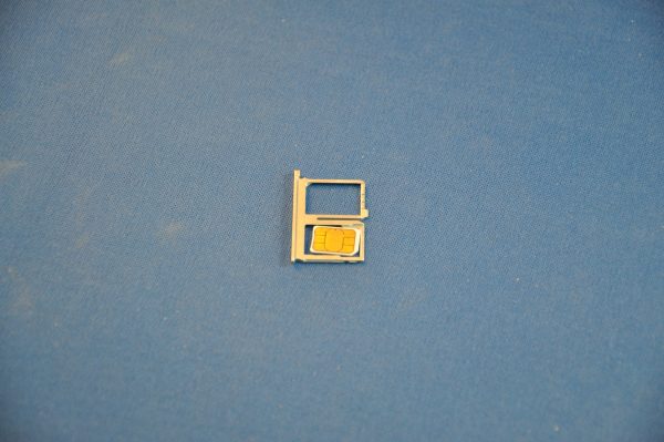
The dual SIM port is a nice touch, but the SIMs need to be micro, not nano. Once I got an adapter for the nanoSIM I carry, I didn’t have any issues getting online, making calls, or texting, but all my Apple friends kept asking me why my texts were green, instead of blue.

The real reason I couldn’t continue using this device is even more fundamental – the quiet little earphone speaker doesn’t really give any notice that your phone is ringing, or even that you’re getting a text unless you are in a very quiet environment. Vibration is fine, but sometimes, you need to hear the ringer. Sure, it’s easy to plug-in a set of headphones or earbuds, or even an external speaker, but that’s not appropriate everywhere. Setting up a Bluetooth speaker was easy, but I never found one that didn’t have a slight blip in the sound stream every 10-15 seconds during playback on video. Spotify seemed to work fine and allowed me to both save music to the device and stream music directly, but there’s always that little background blip every few seconds.

Video playback was fine on YouTube (via the web) and some Netflix videos, but occasionally, I’d get an error that the encoded video was not authorized for my device. The marketing blurbs say this is a fully licensed version of Windows 10, but it seems some sites take issue with it from time to time.

As funny as it sounds, me being an Apple guy and all,  I really wanted to like this phablet. Being as pocketable as it is (for a tablet), it’s a great size if you want to have something that you can walk up to a desk with and plug into a monitor, mouse, and keyboard. But, alas, there is no port for a display hookup. There is a setting for wireless connection to a display, but I don’t have anything that can take advantage of that.

So, bottom line: we’ve got a nicely designed package with a good screen, good weight distribution, and that passes the famous Gadgeteer “creak” test fully. It has easily-accessed SIM card slots and can handle two SIM cards at once. It is, however, hampered by a few things.

First, there needs to be a better speaker, as well as better sound over Bluetooth.

Second, there needs to be a video output, so that users can access things like HDMI, DVI, or even just VGA.

Third, Microsoft needs to decide if Windows 10 is going to be the same as on your desktop/laptop, where you can download printer drivers, keyboard drivers and the like and run the .exe files to install them. If not, the manufacturers of those peripherals need to start writing for this version of Windows specifically and provide the needed drivers in a version this OS can use. It does no one any good to say “works just like Windows on your desktop” and then delivers this substandard subset of the features everyone takes as a given and uses on their “real” Windows computers.

Fourth, the store experience was a bit off. I was not able to find normal apps like Cortana, YouTube, or any of a myriad apps that we have become accustomed to in the current world of smartphones and tablets. On iOS or Android, if I want, say, the Instagram app, I go to the store and it’s there. With this phone (and I’m not fully sure if it’s because of the Chinese manufacturer of the device or a shortcoming of the Windows store), there is nothing. Or, worse, there is a closely-named app by some third party that has a similar icon. That’s not a good experience, since sometimes, that means your personal data is being collected by the party that wrote the rogue software, and other times, actual accidental functions by a well-meaning developer seeking to fill the gaps may compromise, corrupt, or delete your data on these services.

In the Apple world, there is MacOS and iOS, and they are totally different, despite loads of shared DNA. In the Alphabet/Google arena, there is Android, and users of ChromeOS, Windows PCs, Linux and Macs alike run this on their devices, and are able to make the switch mentally from “phone” to “computer.” Microsoft, the “Windows Everywhere” thing is not happening. Running this OS is NOT the same as running Windows 10 on a desktop/laptop. The quicker you admit it and either develop a true mobile OS or make it actually work, the better it will be for the marketplace. But saying it’s the same when it’s not doesn’t make it so. It’s making me curious as to how the Surface devices handle their OS.

But for this device, I have to say it’s “No Go.”

Source: The sample for this review was provided by Gearbest. Please visit Gearbest for more info.


Product Information

Price: $109.99
Manufacturer: Cube
Retailer: Gearbest
Requirements:
  • Phone service with microSIM, or nanoSIM with adapter
Pros:
  • Excellent build quality
  • Nice placement of buttons
  • High quality display
Cons:
  • No speaker other than receiver
  • Glitch in sound playback over Bluetooth
  • No port for video out
  • Unable to run installers for printers, keyboards, mice, etc.
  • Video services sometimes did not allow access

Filed in categories: Reviews

Tagged: ,

Gearbest Cube WP10 4G Phablet review originally appeared on on June 24, 2017 at 9:02 am.

Note: If you are subscribed to this feed through FeedBurner, please switch to our native feed URL http://the-gadgeteer.com/feed/ in order to ensure continuous delivery.
Miggo Pictar Plus iPhone camera grip review


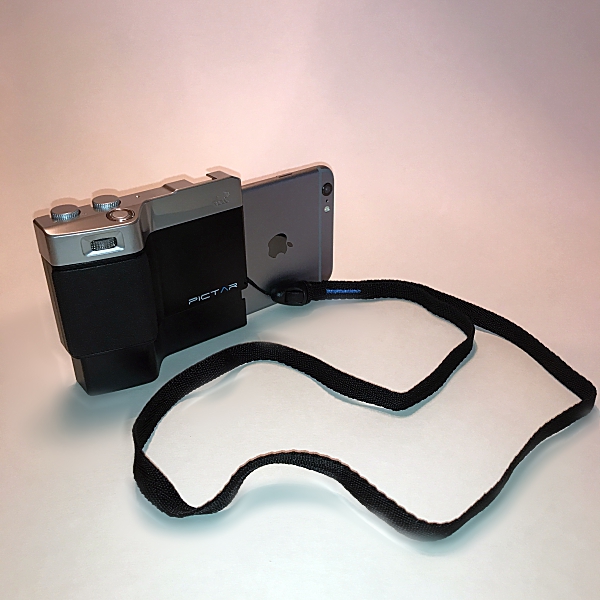
I fashion myself as somewhat of an amateur photographer. I’ve been fascinated with photography ever since I took Mr. Bunton’s “Intro to Photography” class way back in the ninth grade. And like a lot of people I love taking photos with my iPhone. Apple forever changed the way we take photographs when they introduced the first iPhone 10 years ago. With each iteration, the iPhones camera gets better and better. It takes amazing photos, but taking them has always presented different issues. The fact is the iPhone isn’t a camera, it’s a phone, and holding it with one hand to take a photo can be tricky. And if you want to use a tripod you have to buy special cases and or mounts made specifically for the iPhone. Miggo has changed all of that with the Pictar and Pictar Plus. Pictar is a camera grip that claims to turn your iPhone into a DSLR camera. Since I love taking pictures with my iPhone both recreationally and for my product reviews for the-gadgeteer, I jumped at the chance to review the Pictar Plus. Does it really turn the iPhone into a DSLR camera? Let’s take some photos and find out.

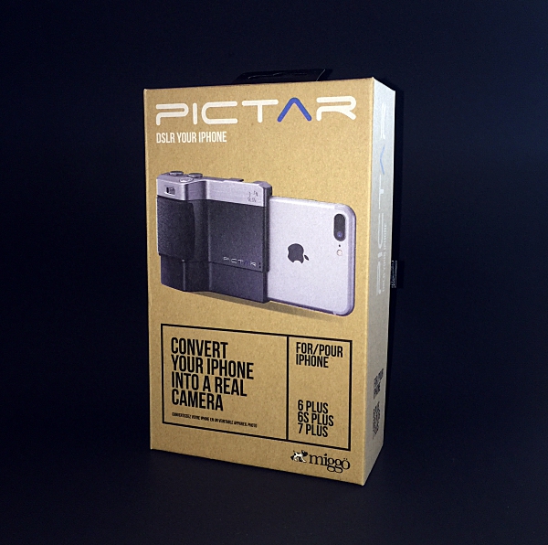
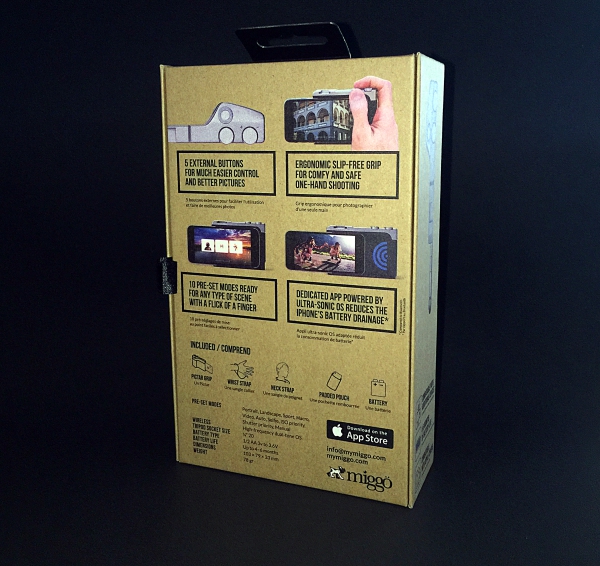
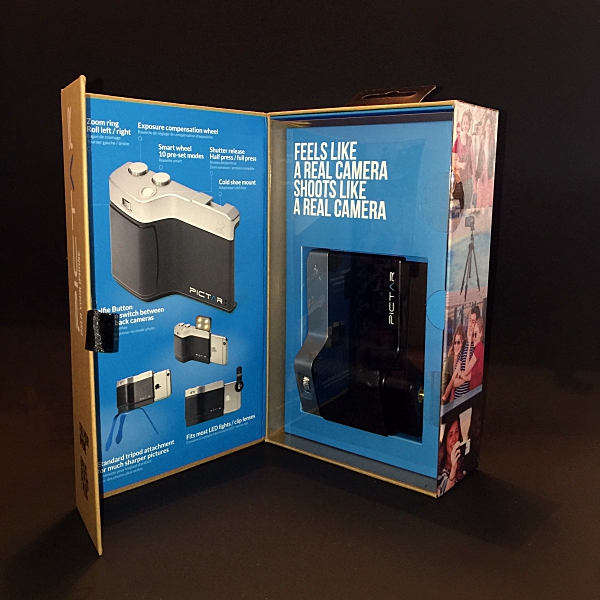
I don’t usually start off a review by talking about the product’s packaging, but when I received the Pictar Plus from Miggo I was really impressed. I thought to myself “Wow if they put this much thought and innovation into the packaging I can’t wait to try out the actual product”. The box opens like a book (the front flap is held closed by a magnet) and the Pictar Plus is displayed behind a plastic window. The box itself is covered with lots of information about the Pictar Plus. A real nice presentation that I thought was worthy of a mention.

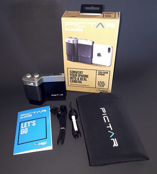
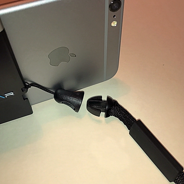
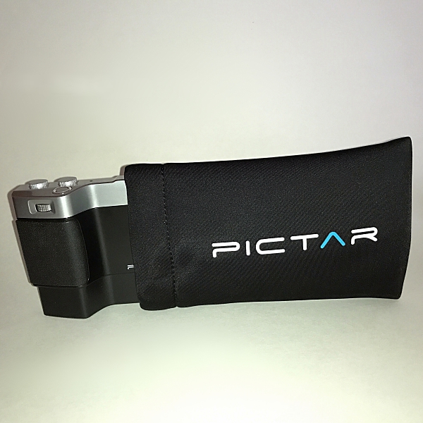
Inside the box, you get the Pictar Plus, wrist strap, neck strap, neoprene padded carrying case and Users Manual.

The Pictar comes with a CR1/2AA battery already installed. To activate the battery, first, open the battery compartment by pushing in the release catch and removing the battery cover. Then pull out and discard the pull tab at the bottom of the battery. This will then allow the battery to connect fully with Pictar. Then click the battery cover back in place. According to Miggo, the battery should last up to 6 months with normal use.

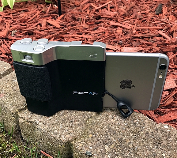
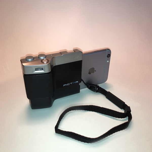
Installing my iPhone into Pictar was easy. After taking it out of its case (you can use Pictar with some very slim-fitting silicone bumper cases) I slid it into the spring loaded bottom of the Pictar, with the back of the phone facing in. Then pressed down until the top of the iPhone clicked into place. Removing it was just as easy.

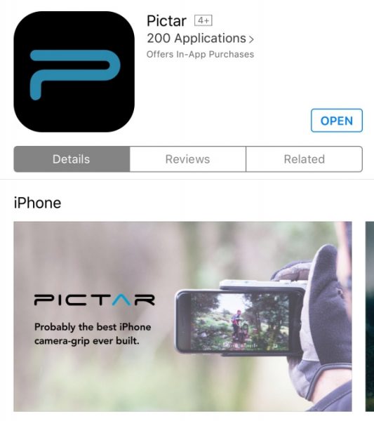
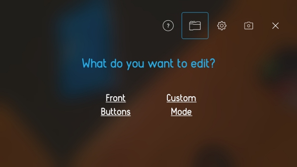
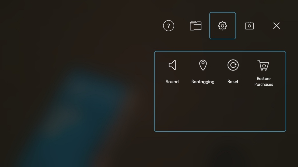
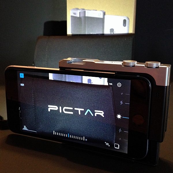
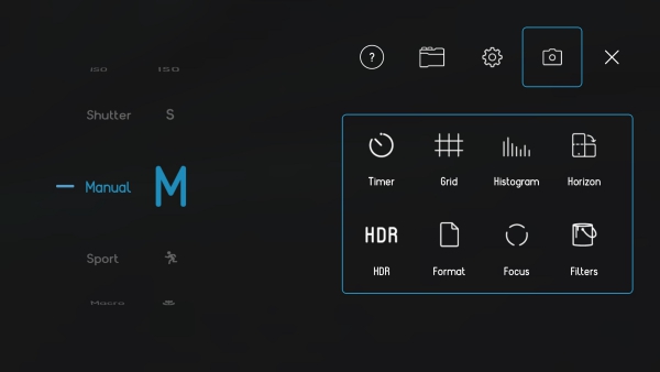
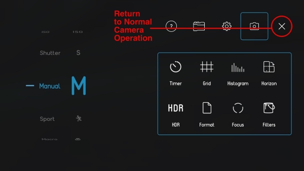
Before you can use Pictar you have to download their free app from the app store. The app is really the brains of the whole operation. Pictar’s Camera app unlocks key features that are inaccessible on iPhone’s native camera app. It connects with the iPhone using a high-frequency dual tone that is inaudible to the human ear. When used, each dial and button emit a unique tone that is detected by the app generating a corresponding action. This also significantly increases the battery life when compared to Bluetooth connectivity. The app itself is easy to use. The first time you launch it there is a short tutorial that prompts you to use each different dial and button, showing in real time what function each performs. The app has nine different built-in modes, Auto, Sports, Macro, Shutter priority, ISO priority, Manual, Selfie, Movie, and Filter. A note about the Filter mode. There are 38 different filters that can be applied before taking a picture which is really cool. However, only 2 of them are free to use. If you want to use any of the other 36 you have to purchase them. Separately each is a $1, or you can buy the bundle for $10. All things considered, that’s not bad, but it would have been nice to include more than 2 free filters. Clicking on the gear icon in the upper-right corner of the Home screen allows you to change and customize lots of settings. There are five main icons at the top right of the settings screen. The question mark icon takes you to the Tutorial / User Guide menu, the Pictar icon to the customization of buttons menu, the Gear icon to Sound, Geotagging, Purchase Restore and Reset menu, the Camera icon to the camera settings menu and the X returns you to normal camera operation.

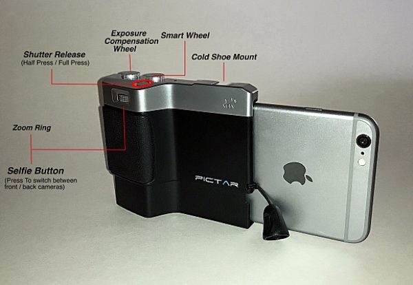
Much like a DSLR camera, Pictar Plus offers five external control buttons. This allows you to easily change settings and take pictures with one hand. No more tapping your iPhone’s screen to set focus, exposure, etc.

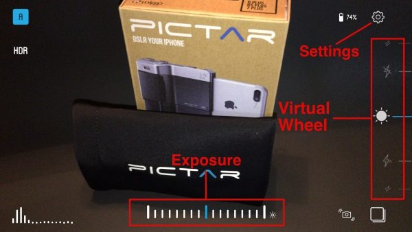
The Smart wheel allows you to choose between Pictar Plus’s 9 different modes. The Exposure compensation wheel allows you to control brightness levels even before shooting. And just like with an advanced camera, the exposure compensation wheel changes the exposure in steps of 1/3 aperture, and the clear display appears at the bottom of the iPhone screen. The Shutter release has two functions. A half-press locks focus and exposure for easy tracking of a moving object and a full-press for immediate shutter release. The shutter button also allows you to take pictures while wearing gloves during the cold weather. The Zoom Ring allows you to zoom in on a subject without having to touch the screen to pinch-and-zoom. It also doubles as a Selfie button. Clicking the Zoom ring will switch between the iPhone’s front and back camera for easy “selfie” shots. The Virtual Wheel is located on the right side of the Camera app screen and allows you to control different modes such as Flash modes, Shutter speed, ISO and more – simply by using your thumb.

The dials can all be reprogrammed to do different things. For example, you can have the Zoom Ring control the flash, white balance, etc. In that case, zoom in and out would be done by “pinching” the iPhone’s screen, like before. All of this can be done in the settings menu I mentioned earlier.

The Pictar Plus also comes with wrist and neck straps. This is nice because if you’re like me you’ve dropped your iPhone more than once trying to get that perfect shot. Once you attach the connector to the Pictar Plus you can easily change between the two straps with just a snap.

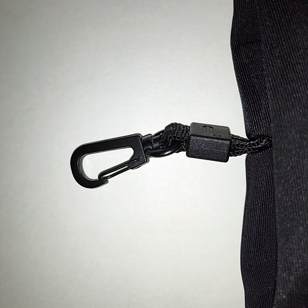
There’s also a nice neoprene padded carrying case for the Pictar Plus. It comes with the added feature of a small metal carabiner that can be attached to a bag or belt loop.

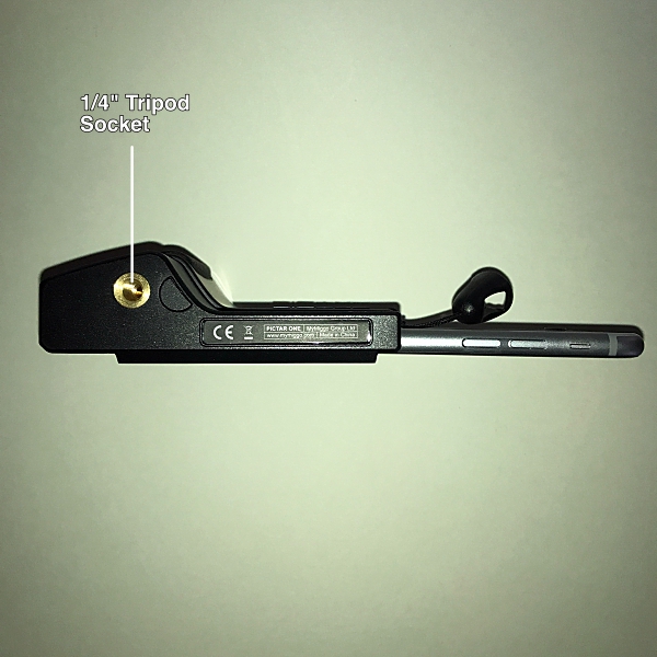
Just like a real camera, Pictar has a standard 1/4” thread tripod socket on the bottom. This is ideal to attach a tripod or other stabilization device and is great for selfies or night time shots, that require long exposure times where the camera needs to be steady.

The top of the Pictar has a standard-size cold shoe mount to allow you to attach many full-size camera accessories, such as LED lights or microphones. I also like that the iPhone’s lens is open when attached to Pictar, giving you the ability to attach most ‘clip on lenses’.

I really loved using the Pictar Plus. It turned taking pictures with my iPhone into a more camera-like experience. It’s really light weight coming in at .17 lbs. so it doesn’t add any extra weight to the iPhone. I like how it’s designed to be held and operated with one hand. And the non-slip grip and wrist strap gave me a real sense of security. I took Pictar Plus along with me while walking my dog and took some photographs using some of the different functions and modes. I was very impressed with how much easier the Pictar Plus made taking photographs. I took a selfie with my dog Zoey and liked being able to switch cameras from back to front simply by pressing the Zoom Ring.

Using the Action Mode I took pictures of the flags that were flying above the local High School football field. It was really windy, but with the Action Mode I was able to capture the flags with no blur, and the images came out sharp and clear. With the Zoom Ring, I was even able to get a close up of Old Glory.

Miggo even provides a link to a Mobile Photography Workshop that has videos on how to use Pictar to capture better pictures in different scenarios. Definitely worth checking out before using Pictar. I look forward to using these tips on my next photography adventure with the Pictar Plus.

Does the Pictar Plus turn your iPhone into a DSLR camera? I might not go that far, but it’s pretty darn close. All and all I think it’s a great product. It makes taking photographs with your iPhone fun and easy, whether you’re an amateur like me or a seasoned photographer. And with all of the Pictar Camera apps built-in features, the photo possibilities are endless. I know it got me excited about taking pictures with my iPhone and I’m sure it will do the same for you.

Pictar comes in 2 models, Pictar, for iPhone sizes, 4s / 5 / 5s / 6 / 6s / SE and 7 and, Pictar Plus, for iPhone, 6 Plus / 6s Plus and 7 Plus. They’re priced at $99.99 and $109.99 respectively.

Source: The sample for this review was provided by Miggo. Please visit their website for more info, or Amazon to purchase.


Product Information

Price: $109.99
Manufacturer: Miggo
Retailer: Amazon
Pros:
  • Easy to use
  • Can operate with one hand
  • Lightweight
  • Wrist and neck straps
  • Multiple modes and settings
  • Neoprene carrying case
Cons:
  • Not enough included free filters in Camera app

Filed in categories: Reviews

Tagged: , ,

Miggo Pictar Plus iPhone camera grip review originally appeared on on June 23, 2017 at 8:46 am.

Note: If you are subscribed to this feed through FeedBurner, please switch to our native feed URL http://the-gadgeteer.com/feed/ in order to ensure continuous delivery.
Braven performs a 360 with the new STRYDE portable speaker


It really wouldn’t be summer without Braven dropping a new speaker on us. And 2017 is no different. True to form, Braven has gone 360° full circle with their new STRYDE 360 portable Bluetooth speaker.

Braven has crafted a soda can shaped speaker to fit into any active lifestyle where water, salt, sand, and snow are as plentiful as air.

The STRYDE 360 is a speaker made to take on the elements with a full IPX7 waterproof rating and with a shockproof exterior for truly roughing it outdoors. Its cylindrical shape will deliver 360-degree sound from dual passive radiators with custom, in-house tuning—all on a 12 hour single charge from its built-in 2500mAh rechargeable battery. The lightweight and vertically shaped STRYDE 360 easily fits in cup holders and water bottle cages as well as backpacks, sport bags or purses. There’s also built-in voice control that works with a smartphone to give a command or make and take calls hands-free.

“Our BRAVEN team believes that you should be able to listen to your favorite music everywhere you go, rain or shine,” says Kristin Archer, Marketing Director BRAVEN Audio. “With the STRYDE 360, our customers are finally able to have a speaker that is compact and portable enough to bring anywhere with sound loud enough for all of your indoor and outdoor summer activities.”

The STRYDE 360 is available now in Silver/Electric or Slate/Crimson for $99.99 US at BRAVEN.com and Amazon.

Filed in categories: Reviews

Tagged:

Braven performs a 360 with the new STRYDE portable speaker originally appeared on on June 23, 2017 at 7:25 am.

Note: If you are subscribed to this feed through FeedBurner, please switch to our native feed URL http://the-gadgeteer.com/feed/ in order to ensure continuous delivery.

Logitech Spotlight Wireless Presenter review


Throughout most of recorded history, a pointed staff has been the preferred method of directing an audience’s attention towards an item displayed during a presentation. A significant advancement came in the 1980’s with the advent of the laser pointer, which allowed presenters to identify specific items on large screens from great distances.  These days, in large venues it isn’t uncommon for the presentation to be displayed on multiple screens. Furthermore, the presentation may be simulcast to remote locations. In these situations a software pointer is needed; a means to control that software pointer is the most pressing need of the modern presenter. The Logitech Spotlight Wireless Presenter is a remote control which allows control of the presentation and can remotely move the mouse pointer by sensing movement of the remote. Let’s see how it works!

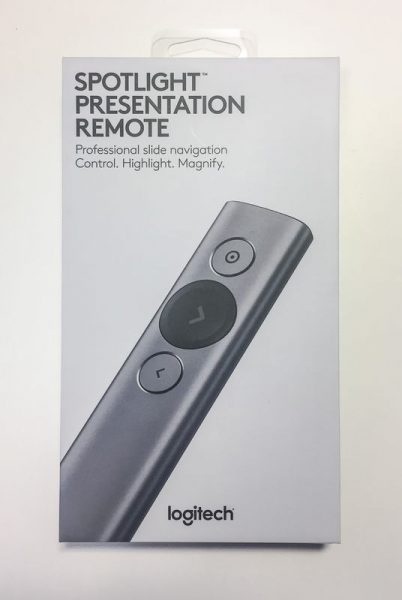
Th Logitech Spotlight Wireless Presenter comes in an attractive gray hard cardboard box, suitable for presentation as a gift to your most esteemed lecturer.

The back of the box summarizes some of the key features of the device. Some of the features include: the capability of highlighting and magnifying circular regions on the screen, using the remote to control the position of the cursor, receiving a vibration alert 5 minutes before the end of the presentation, quickly charging the remote one minute for three hours of use, and using the remote up to 100 feet from the receiving computer.

Opening the box is easy, but the process of unboxing the presenter is designed to be a noteworthy experience. Removing the top cover reveals the remote secured in gray foam with an accented green circle around the next (slide advance) button. The base of the remote is shrouded by a piece of cardboard that requests you download the driver software for the remote.  We’ll review the functionality of the software later in the review.

The remote itself is a very sleek and minimalist design of an aluminum wand 5.1 inches long and 1.1 inches wide. The cross section is somewhat like that of a pharmaceutical tablet. It is finished in an anodized coating of either gold, slate, or silver. The slate model (which is the color of the model The Gadgeteer is reviewing) has dark gray contrasting colors for the next button, USB receiver, battery\antenna cover, and end pieces. The other two color options have white contrasting colors. The top of the remote has three buttons: a large scalloped next button in the contrasting color is set between the pointer button above and back button below. The pointer and back buttons are circular and set slightly below the surface of the remote so that their location is easily determined by feel alone. Holding the remote is very natural. There is no sense of worry about if the right button is being pressed. It feels natural and substantial at the same time.

The front of the remote has a dull plastic cap that hides a white LED underneath. The LED pulses while charging and is illuminated continuously when charging is complete. The LED is also briefly illuminated when the unit is turned on.

The bottom of the remote has a patch of material that is roughly 1″ wide and 3″ long that covers the battery and antenna. This remote includes a rechargeable battery even though most other presentation remotes are powered by replaceable batteries. The theory is that the replaceable batteries are easily obtained and replaced more quickly than the time it takes to find the right cable and sufficiently charge a rechargeable battery. The Spotlight gets around this in two ways: The recharging cable is (almost) a standard type-C device and the charge time for a 3-hour presentation is about 1 minute.
I qualify the type-C cable because the design of any type-C cable that is used for charging the remote must fit within the narrow channel that surrounds the female socket.

I only have one other type-C cable and this just barely fits. I imagine that some USB cables may be thicker around the plug and some may be thinner, as is the case with the many mini and micro USB cables I have.

When not in use, the USB receiver that comes with the remote can fit into the base of the presenter. The receiver is held in place by two plastic tabs that grab the receiver by the indentations on either side.

Back to unboxing; removing the remote reveals a pull tab which allows you to access the charging cable stored under the top layer of packaging.

The charging cable is made from a soft-touch plastic and is almost 5 1/2″ long tip to tip. It is for the most part a conventional type-A to type-C device except that it has an extra-long body on the type-C side. Even though the shroud around the type-C side is longer, it is still only flush when inserted into the remote, which means that one must pull the plug in order to remove the cable. It would be better to make the shroud even longer or come up with some other creative way of charging the presenter.

Under the cable is another compartment that holds a storage pouch the pouch is made from imitation leather and has an imitation felt inside

The storage pouch is a bit too small to hold the charging cable as well as the presenter. But, if you wrap the charging cable around the presenter it fits nicely.

The box also has directions on how to remove the battery from the electronics at the units end of life; the backing is pried off with a flat screwdriver and the battery is removed from within.

Now that you are thoroughly familiar with the hardware it is time to use this on a presentation. The software is downloaded from the Logitech site and installed on your computer.  However, the driver software isn’t entirely necessary. Without the software the remote functions as a mouse and allows forward or reverse slide progression by pressing the next or back buttons (emulating the left and right arrow keys), movement of the cursor by holding the pointer button, and emulating the left mouse button click by clicking the pointer button. If you do decide to install the software you get a host of other features. Either way, it would be great if the USB dongle which fits in the base of the unit were designed as a USB hub, so that it could function both as a USB receiver for the remote and as a USB thumb-drive for a presentation or for storing the actual drivers.
The software is signed by Logitech so there shouldn’t be any issues with installing this on most systems. After installation the software walks you through installing the charging cable, and while the computer counts down one minute of charging, which should provide 3 hours of presenting, the installation program describes the features of the long life battery (how a full charge lasts 3 months), the fast charging, and the intelligent power management (it turns off after 5 minutes of idleness). After the charging is complete the installation walks you through installing the USB receiver or connecting with Bluetooth.

After the device is connected the installation runs a feature tour which highlights some of the most basic features, such as advancing and reviewing slides and using the pointer to highlight and select a button on the screen.

The main window of the installed software has a Windows mobile style to it. the buttons are big so that it is easy to manipulate with the pointer or finger. The main screen shows what the timer is set for, what each of the buttons does if they are long-pressed, the battery state and an icon for settings.

I have the pointer set up for multiple states so that I can switch from highlight to magnify and then to circle by double clicking the top button. This sub-menu also allows adjustment of the side of the items. The size is independently adjustable for each mode, but the color is only displayed in white. The cursor icon to the right of the size slider can be hit to enable or disable the cursor display, and this is also interdependently adjustable for each mode.

The hold next and hold back sub-menus are very similar and determine what to do when the button is long pressed. For the hold back button, I have determined that it should emulate shift-F10, which is the context menu, or right button menu, in Windows. Mac users need to enable universal access and then a right mouse click then can be achieved by Ctrl + 5 on a keyboard with a num pad or Fn + Ctrl + I  on a laptop. These features enable the pointer to act almost like a gyro-mouse, although the hold to move, click to left click, hold another button to right click is a bit cumbersome, it does give a significant amount of control.

The settings screen has 4 tabs for Pointer, Alert, Connectivity and About. The pointer menu adjusts the delay of the pointer movement and the auto center feature. I think that the auto center feature is indispensable so that you don’t have to go searching for the pointer after a brief pause. I have turned the pointer speed all of the way up since a delay in the speed feels like lag in the transmission. Slowing the speed down does appear to make the movement of the pointer more fluid in the screen and a slower pointer may be easier to follow, so this really should be set to your individual presentation style.

The alert settings allow you to set the speed of the vibration and enables or disables the time alert and battery alert. I’m not sure if the battery alert is different than the time alert.

The connectivity screen provides a Bluetooth or receiver setup for connecting the presenter to the computer. If the Bluetooth method is used the computer instructs you to press the pointer and back buttons simultaneously to pair the pointer to the Bluetooth receiver. The about screen provides permission settings for updates, auto start, and anonymous data collection.

To give an impression of how this actually works I made a quick presentation video. I wanted to show how the presenter worked in comparison to a laser pointer so i shot this with a video camera against a screen.

In conclusion, this is a very powerful, very sleek and sturdy device.  As you may imagine, all of these features come at a premium price. The presenter retails for $129.99, which is about the most expensive presenter you can buy. Gyro mice generally cost a bit less than this and will not have the magnification or highlighting capability out-of-the-box.
The software opens up a host of possibilities for presentations as I have briefly demonstrated in the video above. By enabling magnification of the presentation materials the software improves the information density of the presentation – a real game changer for how presentations are prepared and delivered. I recommend this for anyone who is a frequent presenter.

Source: The sample for this review was provided by Logitech. Please visit their site for more info and Amazon to order.


Product Information

Price: $129.99
Manufacturer: Logitech
Retailer: Amazon
Requirements:
  • Windows® 10 or later,
  • Windows® 8
  • Mac OS X 10.10 or later
  • Chrome OS™
  • Android 5.0 or later
  • Logitech Proprietary Receiver:
  • Windows 10 or later,
  • Windows 8,
  • Windows® RT,
  • Windows® 7
  • Mac OS X 10.05 or later
  • Chrome OS
  • Linux®
Pros:
  • Intuitive usehiglight
  • Stylish
  • Robust
  • Unique software
Cons:
  • Software must be installed (downloaded on presentation computer or carried separately)
  • Cannot configure highlight color
  • Cannot adjust 5:00 warning timer
  • Cannot change size of time display on window
  • Expensive

Filed in categories: Reviews

Tagged:

Logitech Spotlight Wireless Presenter review originally appeared on on June 22, 2017 at 8:10 am.

Note: If you are subscribed to this feed through FeedBurner, please switch to our native feed URL http://the-gadgeteer.com/feed/ in order to ensure continuous delivery.