Zipbuds 26 wireless sports headphones review

There is no shortage of Bluetooth headphones on the market. You can find them for less than $25 on the low end of the pricing spectrum, and to several hundred dollars on the extreme opposite end. What features justify the price for higher end Bluetooth headphones, earphones, and earbuds and would you spend $150 for the interestingly designed Zipbuds 26 wireless sports headphones? Let’s take a closer look.

What is it?

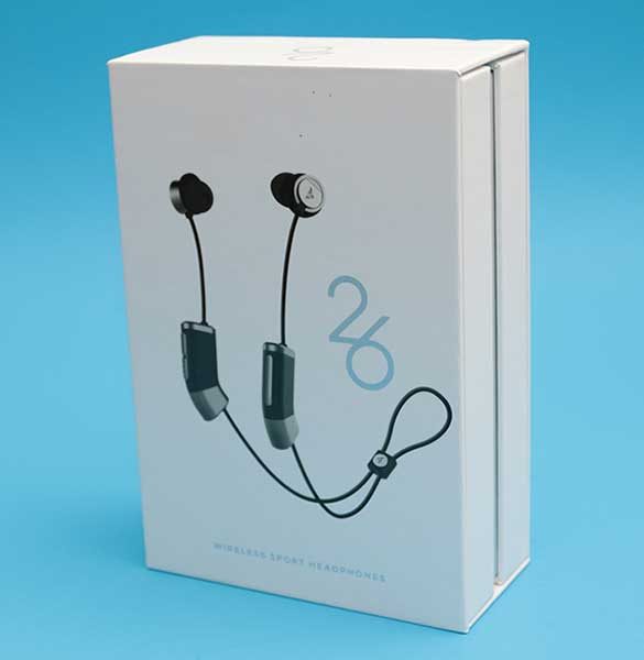
Zipbuds 26 wireless sports headphones are Bluetooth earbuds that feature a built-in sub-woofer and long battery life.

What’s in the box?
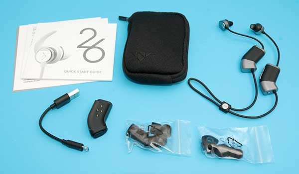
Zipbuds
micro USB charging cable
Magnetic charging dock that doubles as an attachable extra battery pack
Quick start guide
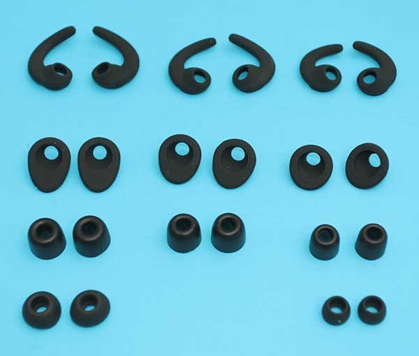
Zipbuds also ships with a large selection of ear tips so that you can easily find the best fit and comfort possible for your ears.

3 pairs of Fitness lock stabilizers
3 pairs of C-Lock stabilizers
3 pairs of silicone ear tips
3 pairs of memory foam ear tips

Design and features
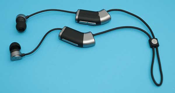
If you remove the somewhat odd looking inline modules attached to each Zipbud earbud cable, these headphones resemble countless of other Bluetooth earbuds that you can find on Amazon and other online retailers. But those inline modules are what set the Zipbuds apart from other wireless headphones.
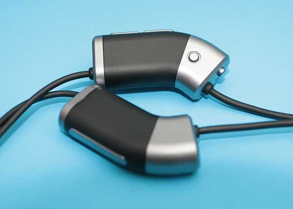
Typically with wireless headphones, there is one inline controller that has a micro USB connector for charging, a power button, and volume buttons. But with the Zipbud 26 wireless sport headphones, there are two inline modules. The module hanging from the right earbud has a power / pairing button on the bottom edge and a multifunction play/pause/call answer/end button on the side. There’s also a volume rocker button and a status LED on the other side. of the inline module.

I like that the volume down button has raised bumps that make it easy to figure out which button raises the volume and which button lowers it.
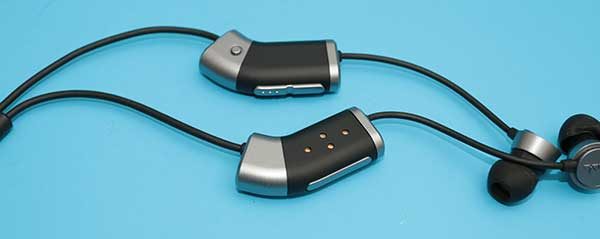
The module that is attached to the left earbud has four electrical contacts.
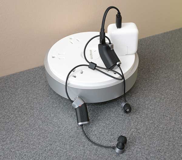
The included magnetic charging dock magnetically snaps to the module to charge it. A full charge provides up to 7hrs of talk and playtime with 400 hours of standby time.

The magnetic dock has its own built-in battery that can be used as an extra power bank for the Zipbuds headphones. That means if the Zipbuds run out of juice, you can snap on the battery dock mobile charging clip and keep rocking with your favorite tunes for an additional 8 hours of play time.

Five minutes of charge = 1 hour of play time and the headphones and mobile clip are fully charged in 2 hours.

Fit and comfort
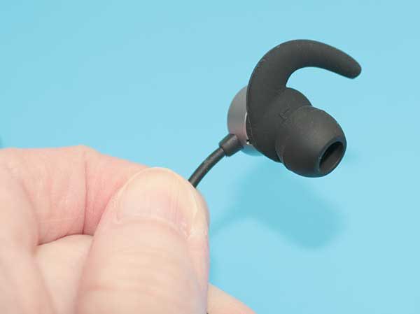
To create the best fit possible, there are several different types of ear tips included with the Zipbuds. You can mix and match the tips for the perfect fit. I tried the C locks first.
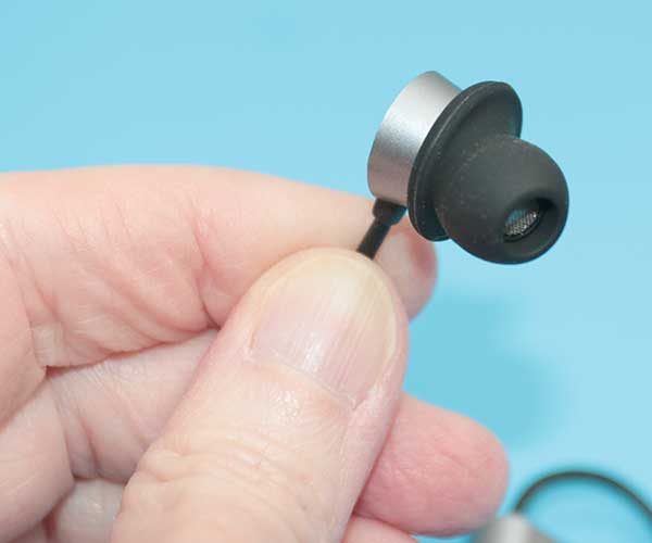
Next, I tried the memory foam tips and then fitness locks. I ended up settling on the C locks with regular silicone ear tips which provided me with a secure and comfortable fit.
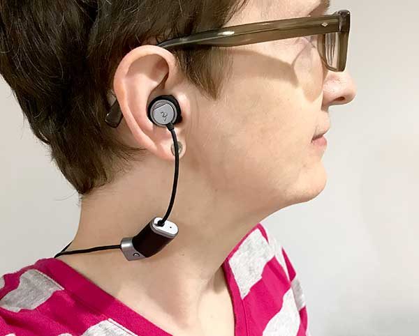
Even with what would be perceived as being extra heaving due to the inline modules, the Zipbuds are very lightweight. I barely noticed them while I was wearing them and they stayed in my ears even when walking and working out. I’m not a runner, so I didn’t test them with high impact type of activities.

Note that these headphones are sweat and water resistant and designed to survive epic workout sessions.

Audio quality

I was impressed by the audio quality of these wireless headphones when listening to all types of music and even podcasts. Audio is clear and crisp and the built-in subwoofer gives hard driving beats extra thump.

I paired the Zipbuds with an iPhone 7 Plus and really enjoyed listening to music through Spotify and Amazon Music apps.

If I could find one complaint as far as audio is that I noticed that sometimes that volume levels were too loud and even turning the audio all the way down wasn’t low enough before automatically muting the audio. I actually had to play around with the volume limits settings on the iPhone.

Call quality

I wasn’t as impressed with call audio quality or I should say that people on the other end of my conversations weren’t impressed. Calls sounded fine on my end while wearing the Zipbuds but on the other end, people said that I sounded like I was in a can and would ask me to repeat myself.

Final thoughts

You’re not going to find Zipbuds 26 wireless sport earbuds in a bargain bin. This Bluetooth headset is in on the pricier side of the Bluetooth earbud ladder. But are they worth the extra cost? In my opinion – yes, they are. They sound great and they are comfortable to wear for extended periods of time. But the best feature of the Zipbuds is the dock that doubles as a clip on extended battery. This is a great feature that comes in handy when you’re listening to music or your favorite podcast and your earbuds run out of juice. Instead of waiting for them to charge back up, you can just snap on the battery clip and enjoy up to 8 hours of playtime.

Source: The sample for this review was provided by Zipbuds. Please visit their site for more info and Amazon to order.


Product Information

Price: $149.99
Manufacturer: Zipbuds
Retailer: Amazon
Pros:
  • Good sound
  • Long play time
  • Clip on battery
  • Comes with lots of ear tip options
Cons:
  • Call audio quality not the best on the receiver side of the conversation

Filed in categories: Reviews

Tagged:

Zipbuds 26 wireless sports headphones review originally appeared on The Gadgeteer on July 30, 2017 at 3:03 pm.

Note: If you are subscribed to this feed through FeedBurner, please switch to our native feed URL http://the-gadgeteer.com/feed/ in order to ensure continuous delivery.

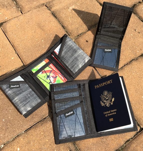
Flowfold Wallets review

Are you in the market for a wallet? I’ve got something new to tell you about. Flowfold is a cool little company out of Maine that sent me a trio of their wallets for evaluation. They’re thin, lightweight, and made from high-tech, super-durable materials. They also rock a modern, distinctive look that stands out from your typical money/card carriers. Pretty cool, right? Let’s check ’em out!

About Flowfold

Flowfold has been creating every day carry products since 2005, featuring a variety of modern and lightweight materials with an emphasis on functional design. Everything is made in the USA, and the company is committed to environmental sustainability and giving back to the community. The term “flowfold” is used in geology to describe layers of rock that flow smoothly together over time; this concept defines their design philosophy and how it translates to rugged, minimalist, interesting carry pieces.

I was sent three wallets to evaluate: a minimalist bifold wallet, a tri-fold wallet and a passport wallet for travelers. Each sample uses different materials, but the whole set demonstrates Flowfold’s approach to consistent, functional, elegant design. 

The Flowfold Sailcloth Vanguard Bi-Fold Wallet

First up is the super-minimalist wallet in the testing lineup: The Flowfold Sailcloth Vanguard Bi-fold Wallet. I’ve been using this as my go-to wallet for several weeks. Here’s a sample picture to give you a sense for what it carries:

The wallet provided for review uses a really interesting base material: high-performance sailcloth with X-ply technology that sandwiches additional reinforced threading between the layers of fabric. This stuff is made for use in racing boats as sail material (literally), and boasts extraordinary durability while being extremely thin and lightweight… while the wallet measures in at a fairly standard 3.25” by 4.25” folded, its only 0.1” thick and barely taps the scale at a weight of 0.7 ounces. That’s ideal if you’re looking for a thin front-pocket wallet, especially if you’re wearing dress pants and don’t want unsightly bulges.

In the sample provided, Flowfold uses a combination of clear fabrics with different embedded thread patterns that give the wallet a slick, modern look (more color combinations in this fabric are available on their web site). There’s a middle layer of solid gray X-pac material, and the interior card slots are faced by another layer of clear X-ply fabric that uses a wider “X” pattern of black threading. It’s a sharp combination that looks good dressed up with a suit or dressed down for casual adventuring. It’s a vey modern-style design, however, so it may not appeal to those who seek a more traditional wallet look. Check out the picture below to see what the exterior looks like:

I thought that the wallet felt a bit plasticky when I first opened it, and expected it to show scratches and folds over time… I should have paid more attention to the benefits of high-performance sailcloth.  For a super-thin construction, it’s really resistant to abrasion and scratches. The wallet also uses ballistic nylon to reinforce all the seams and stress points, including extra reinforcement at the card slots so that they don’t fray as your constantly pulling your credit cards in and out. I have yet to see any signs of wear and tear anywhere in the wallet. Here’s a shot showing a closeup of the detail in the stitching and edges:

From a design perspective, it’s a super-minimalist layout. You have a billfold slot that runs the length of the wallet and two pockets on each side (four total) for your credit cards, ID, etc. The clear material allows you to easily see what’s in the pockets, which saves some time when you’re fumbling for a particular card while in line at the grocery store. The pockets are also slightly oversized so you can fit multiple cards in each slot without feeling like you’re going to pop a seam. It’s easy to use and easy to live with on a day-to-day basis, which is about the best you can expect from a well-designed wallet.

I’m always trying to minimize my daily carry, and the Vanguard is a great choice for this. It’s just big enough to handle some cash, your drivers license and work ID, and a couple of extra cards that you may need for the daily essentials. According to the specifications you could fit 10-16 cards in this wallet, but I would expect that this would get pretty bulky pretty quickly.

If there is one drawback to this particular wallet, it may be the contemporary use of materials. It does have a very smooth surface, which makes it easy to slide in and out of your pocket… but some may be looking for a less “techy” look. I like it personally, but Flowfold also offers this style in a variety of materials that may be more to your liking.

The Flowfold Traveler Trifold Wallet — Limited Edition Heather Grey

The next wallet I tested was the Traveler Trifold Wallet, in a different material. This is a limited edition version and uses X-pac ultra lightweight fabric instead of the X-ply sailcloth material.

The trifold uses a 3-panel design which measures in at 4.4” by 3.1” by 0.2” when fully folded, and weighs 1.1 ounces out of the box. The cash pocket is deeper and wider, allowing for international-sized currency of varying sizes. You’ll also find 6 card pockets here, with a transparent center pocket. You’ll easily fit a dozen cards or more in this wallet, with room to spare for extras (like your frequent-buyer coffee club card, which I find critical for survival).

The material and construction choices here shows the versatility in Flowfold’s design philosophy. You’ll find the same design language used in the Bi-Fold, with different base materials. The X-pac ultra lightweight fabric is an outdoor-use material that is found in a lot of outdoor materials these days, tweaked in this case to present a more refined & classic look while still maintaining the durability and lightweight attributes of the whole product lineup. It’s got a nice textured feel to the material, and a more traditional look (if that’s your thing). Build quality is just as tight as I found in the bifold wallet, with reinforced seams and stitching throughout. Here’s a closeup of the interior flap to give you a sense for the material combination:

Here’s a shot of the center panel, leveraging the clear sailcloth X-ply material:

Just like the Vanguard Bi-Fold, the Tri-Fold model can be had in a variety of different materials including the funky X-ply performance sailcloth. You’ll see a bunch of combinations on their web site if you want to explore other styles.

Overall, I found this wallet to be great for days when I need to carry more stuff, specifically multiple cards. It’s still plenty thin and light but offers you lots of room for extras without getting really bulky. There’s also some nice water- and abrasion- resistance to be had here if your journeys take you off the beaten path.

The Flowfold Navigator Passport Wallet — Limited Edition Grey X-pac

Finally, we get to the Big Daddy of the group: the Navigator Passport Wallet. The version I am testing is a limited edition in Grey X-pac fabric, but they also offer variations on their site in the high-performance sailcloth material used in the Vanguard Bi-Fold wallet that I tested.

This wallet is designed for international travel. It measures 6″ by 4″ by 0.12″ deep, and weighs in at 1.1 ounces. You’ll find a pocket specifically designed for your passport, three card pockets with the clear sailcloth material, and several internal pockets that run the height of the wallet for cash, tickets, receipts, and assorted bits that accumulate while traversing planes, trains, and automobiles.

This version uses the typical X-pac material that’s becoming more popular in bags & carry products today, and it’s lovely to use. It’s lightweight, extremely durable, and water-resistant without any additional coatings or liners. It works quite well here as the primary material choice making for a wallet that, while fairly large, is still super slim and lightweight. The look is clean, classy, and unobtrusive… an important feature when traveling so that you don’t draw undue attention. You can also get the X-ply material in it’s high-tech variations if you prefer,

Here’s a closeup of the seam construction for your consideration:

I was just on a business trip to Germany for work a few weeks ago, and used this as my primary wallet for all my travels. Unlike many passport wallets, this one is thin enough that its comfortable to carry around wherever you go and still keep your passport and essentials handy. As I mentioned above, it also offers some dedicated stash pockets for receipts and tickets on-the-go so that you can throw everything in one place and don’t have to carry around an extra envelope of stuff.

Pricing and Conclusion

There’s something I really like about what Flowfold is doing here. I really dig their modern design aesthetic, attention to detail, and use of innovative materials that don’t detract from the form and function of their products. As a community-oriented company that makes everything in the USA, they are also an easy company to like.

Here’s where it gets better: Flowfold’s wallets are very well-priced, ranging from $29 to $45 depending on the style and materials choices, with some super minimalist styles coming in at under $20. That’s a great buy for unique products using cutting-edge materials, made by a company you can get behind. They also stand by everything they make with a lifetime warranty. It doesn’t get much better than that. For more information and to check out their whole lineup of wallets, bags, and apparel, check out the Flowfold web site.

Source: The sample for this review was provided by Flowfold. For more info visit their site


Product Information

Price: $12 – $45
Manufacturer: Flowfold
Pros:
  • Minimalist design
  • Cutting edge materials
  • Excellent construction and finish
  • Thin and lightweight
Cons:
  • May not appeal to those that prefer traditional design and materials

Filed in categories: Reviews

Tagged:

Flowfold Wallets review originally appeared on The Gadgeteer on July 30, 2017 at 9:30 am.

Note: If you are subscribed to this feed through FeedBurner, please switch to our native feed URL http://the-gadgeteer.com/feed/ in order to ensure continuous delivery.

OtterBox uniVERSE Case System and charge force battery review

Phone cases can be a highly personal thing. People have all sorts of requirements for what they want in a phone case, color, size and even features. For me, I like a case that can meet my daily needs as well as my travel needs, as an example my current case the Dog&Bone Backbone case. This case offers protection for my iPhone as well as Qi charging and a removable backup battery. OtterBox has come out with their new uniVERSE Case System that does all of what my Backbone case does and more.

Note: Images can be clicked to view a larger size.

The question you may have is “do I need a case that does more than just protect my phone”? For some of you, that may be no, but the answer is yes for me. The OtterBox uniVerse Case System Case has the following listed feature on the OtterBox web page;

  • Modular design: connect modules to give your phone smart new features
  • Powerful protection: engineered to survive drops, scuffs, and scrapes
  • Slim design: one-piece build that complements your phone’s clean lines
  • Easy to install: slips onto your phone fast and comes off quick

And is made with the following materials;

  • Synthetic rubber interior with engineered ribbing helps absorb shock
  • Hard polycarbonate exterior helps prevent scratches
  • Synthetic rubber raised beveled edge helps keep your touch screen safe

The charge force battery has the following features;

  • Designed just for the uniVERSE Case System
  • Low-profile battery easily connects to any OtterBox uniVERSE case and fits comfortably in your hand.
  • 2,500mAh battery gives users 39 total hours of talk time.
  • Universal wireless charging compatible with Qi and other wireless charging systems like those available at coffee houses, in furniture and many new cars.
  • Compatible with all Mophie Charge Force wireless accessories and mounts.
  • uniVERSE case sold separately. Available for iPhone 6/6s, iPhone 6 Plus/6s Plus, iPhone 7 and iPhone 7 Plus

And is made with the following materials;

  • Premium soft-touch plastic
  • Lithium-ion battery

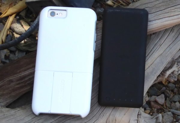
The uniVERSE Case comes in two colors, black and snow capped (white and gray as seen by the one I am reviewing). It has a lightly textured finish for a good grip and feel in the hand.

I am using an iPhone 6 for this review so all the buttons and switches are on the sides. The top of the uniVERSE case is smooth except for a notch point to attach some of the external accessories made for this case.

The bottom of the uniVERSE case is cut out to allow access to the Lightning port, the headphone jack, and speaker.

On the right side of the case has a covered on/off button cutout that functions well and feels solid when used.

[OtterBox uniVERSE Case System-7 left side]

The left side of the uniVERSE case has a cut out for the phone silent slider and covered volume rocker switches. Like the right side covered switch the rocker switch cover works well and feels good to use.

There is nothing really special about the front of the case, it has the cutouts for the camera and flash. On my case the upper half of the molded case is gray

The back of the OtterBox uniVERSE case has the cutout for the camera and flash and the removable accent plate that slides off to allow the users to attach the different modules that are made for the case system.

When being offered the chance to review this case I was also offered a chance to review the mophie charge force battery designed to be used with this case. The features and materials are listed above.

The back of the mophie has mophie stamped in the middle, a button in the lower left and four LED lights next to the button. The lights are used to tell you how much charge you have in the battery. You can tell this by pressing the button. When attached to the uniVERSE case and your phone the button also starts the charging process on the phone.

The front of the battery unit has a Lightning connector, an accent plate connector to attach the battery to the case and the serial number and technical information (the technical info is hard to see because it is black). When connected to your phone and the case the battery stays in place with no noticeable movement.

The bottom of the mophie charge force battery has a bump out that holds the Lightning connector. The bottom also has the Micro USB port that allows the battery to be charged. A nice feature of this battery is that it can be charged on or off of the phone case, and when you are charging the battery, when it is attached to the phone it, will charge the iPhone as well. Let me address the Micro USB port before I go on. I know some of you will say “if it is an Apple specific product why doesn’t have a Lightning connector” and I originally thought that way with my Dog&Bone case, but I found out that when you are on the road it is easier finding a Micro USB cable to borrow than a Lightning cable, plus the battery comes with a Micro USB cable.

So, what’s my bottom line here? Well, that depends. I like the case and battery a lot. The fit, finish, and materials seem first rate. So, it comes down to about three things for me. Price, accessories integration, and need. As you see from above I have a Dog & Bone Backbone case that serves the same function as the OtterBox uniVERSE case. Honestly, I think the Dog & Bone design and integration is better than the OtterBox offering. Although the Dog & Bone case is slightly longer nothing sticks out of the end. On accessories the OtterBox uniVERSE case has the Dog & Bone beat hands down. What made the Dog & Bone Backbone case appealing to me was the Qi charging integration and the ability to add an integrated battery, OtterBox has upped the ante with a host of products that can be integrated to its uniVERSE system; speakers, chip readers even thermal imaging cameras. This one goes to OtterBox for sure. Price is the final factor here and on that front, the cases are tied. Although the Dog & Bone Backbone case is initially higher in price ($89.95) compared to the OtterBox uniVERSE case ($49.95). The Dog & Bone case comes with the Qi charging back and a charging pad so if you add in any of the uniVERSE accessories (prices range from $19.95 to $299) you break about even.

When it comes down to the common accessories that I have for both cases, the mophie battery I will admit has more juice in it and is built nicer with the LED readout on the back telling you how much charge you have left in it. But, as I mentioned above the battery integration on the Dog & Bone case is better. And now that I have left you with no clear winner in this comparison let me say this, both of these cases are worth consideration. Both are solid choices for protection and use. I guess what it comes down to is how you plan to use your phone and what accessories you potentially want to use with your iPhone. The versatility of the OtterBox uniVERSE Case System will appeal to a lot of folks who want to use their phones for more than a phone. The OtterBox uniVERSE case is available for $49.95 on the OtterBox website along with the $69.95 mophie charge force battery.

ource: The sample for this review was provided by OtterBox. Please visit their site for more info and Amazon to order.


Product Information

Price: $49.95 case $69.95 mophi battery
Manufacturer: OtterBox
Retailer: Amazon
Requirements:
  • iPhone 6/6s, 6 Plus or iPhone 7/7 Plus
Pros:
  • A lot of attachable accessories

Filed in categories: Reviews

Tagged:

OtterBox uniVERSE Case System and charge force battery review originally appeared on The Gadgeteer on July 29, 2017 at 9:00 am.

Note: If you are subscribed to this feed through FeedBurner, please switch to our native feed URL http://the-gadgeteer.com/feed/ in order to ensure continuous delivery.

Hasselblad True Zoom Camera Moto Z Mod review

When you shop for a new smartphone, do you base your decision on how good the camera is? It’s a determining factor for me. I wouldn’t consider buying a phone that has a sub par camera because my phone is my main camera. That’s why I’ve been fascinated with camera accessories like clip on lenses that might improve my images and when Motorola and Hasselblad created the True Zoom camera Moto Mod, it perked my interest and I was happy to get the chance to try one out for a few days. Let’s take a look.

What is it?

The Hasselblad True Zoom is a Moto Mod for Motorola Moto Z smartphones that turn the Moto Z into a true pocket camera with a zoom lens.

This quick review isn’t going to be super technical because I’m not a professional photographer and I don’t know all the ends and outs of lenses and camera gear. I just am a casual photo snapper who mainly uses automatic mode to snap a few images every day. But I am always interested in making those images look better with the least amount of effort.

You probably already know what Moto Mods are by now, but just in case you don’t, they are magnetic attachments for Motorola Moto Z phones that offer extra functions and customizations. There are decorative covers for the back of the phone, Bluetooth speakers, projectors, gaming controllers, and more.

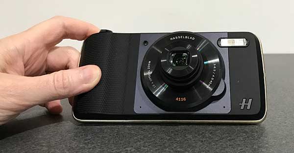
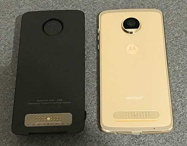
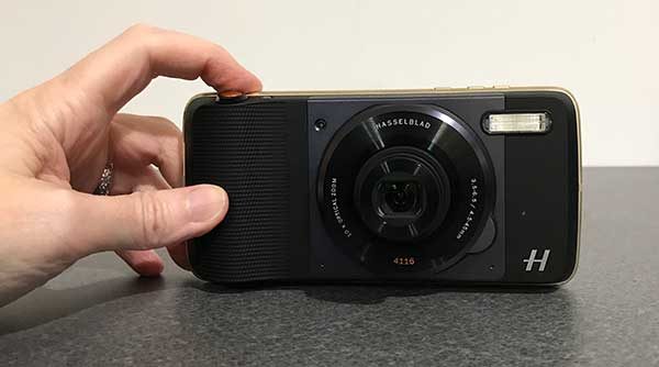
The Hasselblad True Zoom Camera Moto Z Mod shown above on the left has electrical contacts that match up with contacts on the back of a Moto Z phone to create an electrical connection. The mod is also magnetic which allows it to attach to the back of the phone without clips or latches.

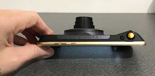
At first glance, the True Zoom looks like a point-and-shoot camera. But upon closer inspection, you will notice that it doesn’t have a viewfinder, a display or a memory card slot. That’s where the Moto Z comes in.

The True Zoom snaps securely to the back of the Moto Z to turn it into a full fledged 12MP camera with 10x optical zoom, a xenon flash, shutter button, and zooming mechanism.

What’s in the box?
Hasselblad True Zoom Moto Mod
Protective carrying case
User guide

Camera specs
Sensor type: BSI CMOS
Sensor size: 1/2.3-inch
Pixel size: 1.55 um
Aperture: f3.5-6.5
Zoom: 10x optical/4x digital
Focal length: 4.5-45 mm (25-250mm 35mm equivalent)
Macro: 5cm @1x – 1.5m @10x
Image stabilization Still: OIS Video: EIS
ISO equivalent: Auto, 100, 200, 400, 800, 1600, 3200
Dimensions: 152.3 x 72.9 x 9.0 – 15.1 mm
Weight: 145g

The True Zoom doesn’t need to be charged as it gets all the power it needs directly from the phone it’s attached to. It also doesn’t need its own software because it uses the built in camera app. So all you need to do is snap it on the back of the Moto Z and you’re ready to shoot.

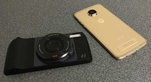
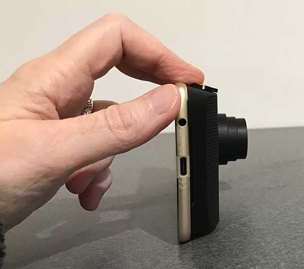
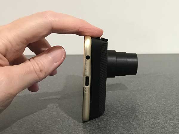
The True Zoom Moto Mod adds considerable thickness to the very thin Moto Z2 Play Android smartphone that was included with the True Zoom for my evaluation. It’s a bulky mod and as such, it’s not something that you would leave attached to your phone all the time.

The True Zoom lives up to its name because it does indeed have a built in lens that zooms from 4.5-45 mm (25-250mm 35mm equivalent).

The Hasselblad True Zoom Moto Mod has a small power button on top and a larger shutter button with a spring loaded collar around it that is used to zoom the lens in and out.

Just like true cameras, you can press the shutter half way to focus and then all the way to snap the image.

The mod also offers a nice grip that adds even more to the pocket camera feel when you’re using it.

Let’s check out some images to see if the True Zoom makes a noticeable difference shooting images compared to capturing the same images with just the Moto Z2 Play.

Example images

I tried to frame the comparison shots as closely as I could and snapped them one after the other. So I would take a picture with the Moto Z2 Play and then put the Hasselblad True Zoom Moto Mod on the back and shoot the same image in that order. Also, all shots are taken without a tripod.

All images can be clicked to see the original full size photo.


Indoor shot with bright backlight. Both were taken with no zoom applied.


Both images above were taken without any zoom applied. They are similar except that I think the True Zoom captures colors that look more natural compared to the Moto Z2 Play’s image on the left which has too much green/yellow tint to it.


Both images have zoom applied and we start to notice that the True Zoom is sharper than the digital zoomed image from the Moto Z2 Play without the moto mod attached. The color tinge on the Moto picture is still noticeable.


More zoom applied to both. Both are blurry when you view the full sized image but the True Zoom pic looks considerably better in small sized web images.


Max zoom applied to both. The Moto Z2 Play image looks very blurry compared to the True Zoom pic. But if you click to see the full sized image, the True Zoom is also a little blurry. That could be because the picture was taken without a tripod which probably should be used with 10X zoomed pics. A threaded tripod socket on the True Zoom would be a nice feature that is lacking.


The yellow mailbox in the True Zoom image looks better than the Moto Z2 Play’s image because the color on the top curve of the mailbox is smoother and not over exposed like in the Moto Z2 image.


Again, the True Zoom’s image looks better when you compare the two Android figures.


When it comes to indoor low light pics, the Moto Z2 Play’s image without flash is brighter than the True Zoom’s image.

Using flash, the True Zoom’s image looks better. Check out the window in both images and notice how you can see the trees in the True Zoom’s picture (FYI: this is a basement window).

Note: you can shoot in RAW format with the True Zoom.

Using the Hasselblad True Zoom Moto Mod was easy for the most part because all I had to do was place it on the back of the phone and launch the camera app. No other special changes are needed. But I did notice a few issues.

The camera app seemed to crash on a semi-regular basis while the True Zoom was connected to the phone. I also noticed that sometimes the lens would extend when I would pull the phone with the attached mod out of my pocket because it was easy to press one of the buttons on the mod which sometimes (but not always) cause the mod to activate and wake the phone.

Final thoughts

I like the idea of the Hasselblad True Zoom Moto Mod, but when it comes down to the images improvements over a Moto Z without the True Zoom, I wasn’t overly impressed especially with non-zoomed images. I’d personally only carry this mod with me when I knew I’d be taking a lot of telephoto (zoomed) shots. Otherwise, I wouldn’t bother using it due to the added bulk. There’s also the price which puts this accessory in the “I’d like to have this but I don’t want to pay this much for it” category for most people.

Source: The sample for this review was provided by Verizon Wireless. Please visit their site for more info.


Product Information

Price: $249.99
Manufacturer: Hasselblad / Motorola
Retailer: Verizon Wireless
Requirements:
  • Moto Z family of smartphones
Pros:
  • Easily snaps on the back
  • No charging necessary
  • 10 X zoom
Cons:
  • Bulky
  • Expensive
  • Camera app crashes regularly
  • Lacks a tripod socket

Filed in categories: Reviews

Tagged: , , ,

Hasselblad True Zoom Camera Moto Z Mod review originally appeared on The Gadgeteer on July 28, 2017 at 4:53 pm.

Note: If you are subscribed to this feed through FeedBurner, please switch to our native feed URL http://the-gadgeteer.com/feed/ in order to ensure continuous delivery.

Syllable D300L Wireless Bluetooth Earphones review

I am writing this review on a train while heading into the City of Philadelphia for a business meeting. I also happen to be listening to one of my favorite podcasts on my new favorite headphones: the Syllable D300L Wireless Bluetooth Earphones. I’ve been using these for a month, and I am a big fan of their sound quality and overall design. Are they the right headphones for you? Let’s have a look at the details…

Design and Construction

The Syllable D300L Wireless Bluetooth Earphones are a one-piece, necklace-style design that consists of four parts: the ear pods, a control pod, and a cord that connects everything together. I’ll walk you through the key components, then tie it all together.

The primary component of the design is the two post-style ear pods, which contain all the hardware bits for the headphones. Each pod is about 1-3/8″ by 3/8″ by 1/4″, with the earbuds positioned at a 120-degree angle so that the pods themselves don’t rub against your ear when in position. There’s also a crescent-shaped bit of rubber on each earbud that tucks in under the whorl of your ear when in a position that anchors the earbuds in place. 

The control pod is set in the connecting cord and hangs a few inches below your right ear. You’ll find three control buttons set into this pod, arranged in order from top (closest to your ear) to bottom: volume up, a multifunction button, and volume down. The buttons are raised and well-spaced with good tactile feedback, promoting intuitive operation when you’re running about. You’ll also find the charging port here, sealed behind a rubber tab when not in use. There’s also a tiny LED status indicator light on the control pod (more on that below). The necklace-style chord itself is 23 inches long from earbud-to-earbud, including the control pod.

Construction of the Syllable D300L is very good. It’s designed for use during exercise, so the whole setup is designed to be water resistant. The ear pods themselves are solidly assembled with no moving parts, and all seams are sealed and/or rubberized to promote water resistance. It’s a solid build, so it will take some pulling, dropping, or being thrown in your gym bag without worrying about pieces breaking. I don’t think I would test it by stomping on it, but I’ve used it for a month of abuse without any cracks or fails in the construction.

The complete package includes several different sized ear nodules and crescents so that you can find a fit that works based on the size/shape of your ear. You’ll also find a USB charging chord, with a micro USB end that fits into the charging port on the control pod. I’ve been using my iPhone or iPod power pack as the charging base, and this works just fine… just don’t lose that power chord unless you have another USB-to-micro USB cable. You also get a little felt drawstring bag to keep everything together.

In Use

The Syllable D300L Wireless Bluetooth Earphones use Bluetooth 4.2, which is great for use across a broad range of devices. Pairing is fast and easy. Turn on the device via the multifunction button, then push and hold the button for three seconds. The LED will blink red and blue to indicate discovery mode, at which time you can pair it with your device. Once paired the device retains a memory of previous pairings, so it automatically reconnects to the last used device if it’s in range. There are also audio tones that indicate successful pairing so that you can just turn it on and listen for confirmation that you’re connected while wearing the headphones. The earphones also have a range of up to 10 meters from the device, which is convenient if you’re roaming about the office or your gym (provided that your device is safe!).

Sound quality is excellent. I don’t claim to be an audiophile, but I have found that the earphones have a broad volume range, with great stereo sound and bass. Listening quality is excellent even at lower volumes in noisy places. I’ve been even more impressed with the quality of phone calls. People I have been on the phone with have commented on the clarity, even on a moving train and speaking in a low tone (so I don’t offend my fellow travelers… I tend to have a booming voice). The microphone does a decent job of eliminating background noise as well. I’ve taken conference calls in busy places like airports, with no distracting background noise reported by my fellow meeting participants.

As far as comfort and functionality goes, I’ve been very happy with the design. The whole arrangement seems like it would be awkward at first with all that hardware hanging off of your ears, but I found them to be pretty unobtrusive in active use. With the rubber ear buds in place, I also found it to be surprisingly comfortable to wear for extended periods of time. The chord is long enough that you can wear it below your chin or flip it over to rest on the back of your neck, but it is not so long that it will get caught up in something if you’re throwing your bag on your shoulder or in the middle of a workout. I’ve also found that those rubber crescent bits on the earbuds do a very good job of keeping the pods in position when worn, and are resistant to the occasional bump or pull.

If there is one big drawback to this headset, I would say that it is the battery life. Syllable claims that the earphones have 4 hours of active use which seems accurate in my testing, but their claim of 10 hours of standby time doesn’t match up to my experience. This basically means that if you forget to charge the earphones, you’ve got 4-6 hours from the last charge until they konk out. This may not seem too bad if you’re just using them to go to the gym… unless you forgot to power down the earphones after your last visit. I found on more than one occasion I was facing a dead battery because I forgot to turn the earphones off after the last use. I have also found that I need to manage them closely during day trips, powering down periodically to conserve battery life.

Pricing and Conclusion

The Syllabus D300L Wireless Bluetooth Earphones really have some nice features going for them: comfortable, excellent sound quality, quality construction, and easy pairing are all highlights in the design. The relatively short battery life is a problem, however, that may not work for you depending on your desired use. If you want a good quality set of headphones for the gym or short periods of use, they are fantastic. If you need something with extended battery life, they probably won’t work for you unless you bring your own portable charging device.

Here is the other factor to consider, however: the price. You can pick these earphones up on Amazon right now for under $30, which seems to me to be an excellent value given their quality and durability. Check them out on Amazon for more information.

Source: The sample for this review was provided by Syllable. Please visit the product page on Amazon for more information.


Product Information

Price: $29.99
Manufacturer: Syllable
Retailer: Amazon
Pros:
  • Well built & durable
  • Great sound quality
  • Excellent for phone calls (microphone quality and background noice cancellation)
Cons:
  • Short battery life requires regular charging
  • Ear pod design may be uncomfortable for some

Filed in categories: Reviews

Tagged:

Syllable D300L Wireless Bluetooth Earphones review originally appeared on The Gadgeteer on July 28, 2017 at 11:00 am.

Note: If you are subscribed to this feed through FeedBurner, please switch to our native feed URL http://the-gadgeteer.com/feed/ in order to ensure continuous delivery.