LG V30 review

When I made the decision to go back to an Android smartphone after a brief vacation to Apple land this summer, my choices for a new phone were between the Samsung Galaxy S8, Samsung Galaxy Note8, Pixel 2 XL, and the LG V30. I ruled out the Samsung devices because I’m not a fan of the curved sides or the fingerprint sensor location. That meant that my choice was narrowed down to the new Pixel 2 XL and the LG V30. Fortunately for me, Verizon Wireless sent me a loaner unit of the LG V30 which I’ve been using on and off for the last couple of weeks. Let’s take a look to see if I end up choosing to buy the LG V30 or the Google Pixel 2 XL. 

What is it?

The LG V30 is LG’s latest flagship Android smartphone running Android OS version 7.1.2.

What’s in the box?

LG V30
USB (Type-C to Type-C) Cable
USB (Type-C to Type-A) Cable
SIM Eject Pin
Quick Reference Guide

Hardware specs

Processor: Qualcomm Snapdragon™ 835 2.45 GHz x 4 + 1.9 GHz x 4 Octa-Core MSM8998
Display: POLED 6.0″ QHD Plus FullVision™ Display (2880 x 1440) with 538 ppi, Corning Gorilla Glass 5
Operating System: Android 7.1.2 Nougat
Memory: Flash: 64GB RAM: 4GB
Expandable Memory: Removable microSD up to 2TB (sold separately)
Network: CDMA, GSM, UMTS, LTE frequencies: 1.9 GHz CDMA PCS, 800 MHz CDMA; GSM 850/900/1800/1900 MHz; UMTS 850/900/1900/2100 MHz; LTE Bands 2/3/4/5/7/13/20/46/66 Data Transmission: EVDO, EVDO Rev A, 1xRTT, LTE, GPRS, EDGE, UMTS, GSM, HSPA+, HSPA
Camera (rear): 16 MP Standard-Angle Lens f/1.6
Camera (front): 5 MP Wide-Angle Lens f/2.2
Bluetooth: 5.0, Wi-Fi, NFC
Battery: 3,300mAH, Non-removable
Dimensions: 5.97 in x 2.97 in
Weight: 5.57 oz

Design and features


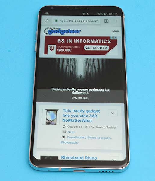
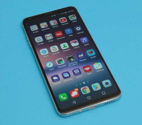
The LG V30 looks a lot like the Samsung Galaxy S8 with polished metal rails around all sides and rounded edges which thankfully, aren’t curved like the S8’s edges. The LG V30 also has a glass back which allows for Qi wireless charging.

Like the S8, the LG V30 has a buttonless front with a very nice 6-inch display that has minimal top and bottom bezels.

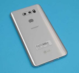
The back of the phone has a dual camera lens and an LED flash at the top with the perfectly placed combination fingerprint sensor/power button in the upper center exactly where your index finger rests when you pick up the phone.

On the left side of the V30 are separate volume buttons that have very good tactile feedback and are raised far enough that it’s easy to find each button with your finger without looking.

On the opposite side of the phone, you’ll find the combination SIM/microSD card tray.
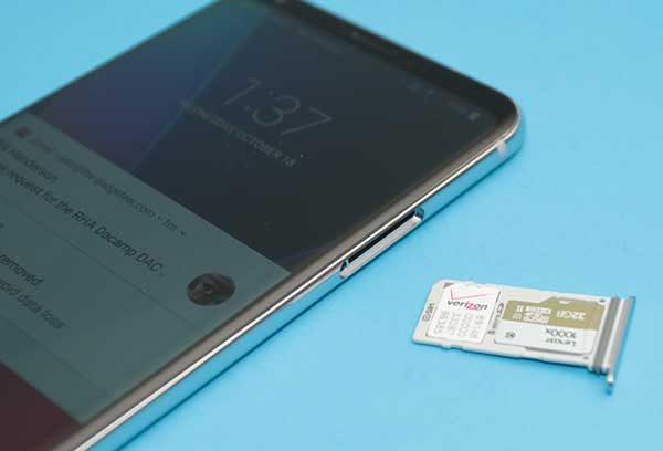
Correct me if I’m wrong, but I think LG and Samsung are the only high-end smartphones that still offer a microSD card slot. I used to demand this feature in any new phone that I would purchase because I wanted the security of backing up my photos to a card. But in this day and age, I find that I don’t care about this feature quite so much due Google Photos automated image back up to the cloud. It’s still a nice feature to have though.
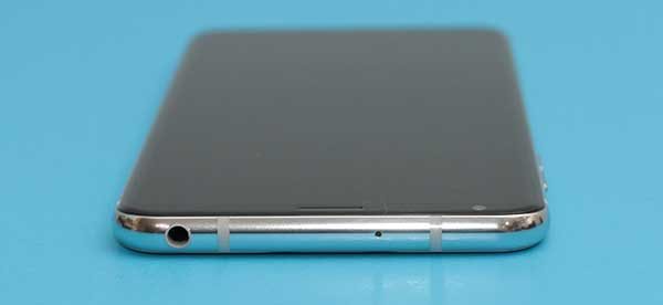
The top edge of the LG V30 has a microphone and what’s swiftly becoming an endangered port: a 3.5mm headphone jack.
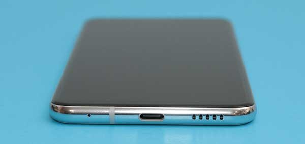
If we examine the bottom edge of the V30, we find another microphone, a USB Type-C port, and a speaker. The location of the speaker is a little unfortunate if you like to hold the phone in your right hand like I do which ends up covering the speaker and muffling the sound.

The fit and finish of this phone get a thumbs up from me. It looks nice, feels solid, and is comfortable in hand. Speaking of in hand, the LG V30 passes the Gadgeteer squeeze test with no complaints, but if I give it a really strong shake, I can hear the volume buttons rattling ever so slightly. Yes, I know I am crazy to still be doing the Gadgeteer squeeze test after 20 years 😉

Display

This phone sports a 6 inch POLED display. If the addition of a P in front of OLED is confusing you, you’re not alone. The P stands for the plastic base layer that is used instead of a glass base layer which is used in most OLED displays.

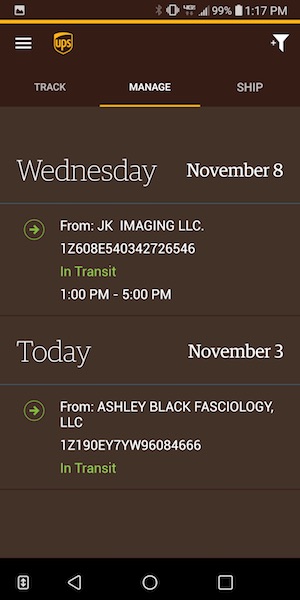
The display has thin bezels and virtual navigation buttons that can disappear automatically in some apps like Chrome shown above.
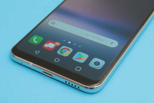
The nav buttons reappear if you swipe up from the bottom edge of the phone.


In some apps, you can close the nav bar with the small arrow on the left side of the nav bar.


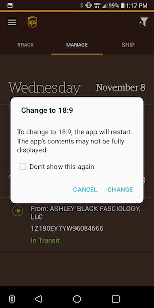
Sometimes you’ll see a double arrow next to the nav bar that will prompt you to switch to the 18:9 display mode.

If you’ve been following the Pixel 2 XL displaygate bruhaha, you’ve heard about the blue tint issue that the Pixel 2 XL has when you tilt the screen. The LG V30 has the same “issue” which is not a surprise since LG makes the Pixel 2 XL and they both share the same POLED display technology.

I wasn’t able to photograph the display well enough to demonstrate the blue tint issue, but suffice to say, that I personally do not find it to be the huge catastrophe that some people feel it to be. I didn’t even notice the problem on the V30 or my Pixel 2 XL until after people started talking about it and then I could see it. But the thing is, I don’t care because I’m not using my phone with it tilted away from me. I use my phones facing my eyes straight on and at that angle, there’s no blue tint.

Then there’s the burn-in issue that some people are seeing on the Pixel 2 XL. This can be an issue with OLED displays, but again, I’ve yet to see it on my loaner LG V30 or my Pixel 2 XL. That said, I’m more anxious about the potential for burn-in than the blue tint issue so I plan to keep an eye on my Pixel 2 XL’s display. Now back to the LG V30 review…

When it’s all said and done, I find the LG V30’s display to have sharp crisp text and bright vivid colors. It’s enjoyable to read, surf and watch videos on it and I have no complaints about the display at this time.

Camera
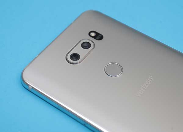
LG phones usually have decent cameras, but they aren’t known for their cameras like the iPhone and last year’s Pixel XL.
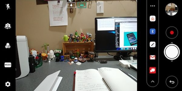
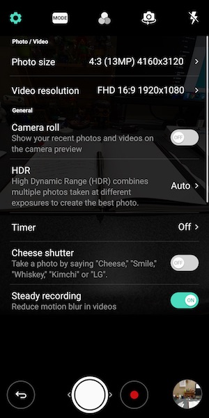
The stock camera app is pretty basic except for the handy built-in sharing bar that you can use to send images to a calendar event, Bluetooth, the LG Memo app, email, and the Verizon messaging app.


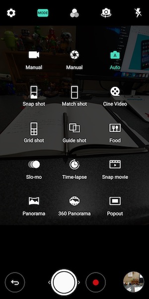
The also has a selection of modes that you can use to spice up your shots. But missing is a portrait mode which has becoming a big selling point for the iPhone and the Pixel 2.


The LG V30’s dual camera lens does offer a really nice wide angle mode that will allow you to fit in a lot more “stuff” in your images. Both images above were taken from the same distance, but the only difference was toggling the wide angle mode in the image on the right.


I was impressed with the images that I shot with the V30. Click any of these example images to view the full sized shot.


All my shots came out great if a bit oversaturated… but I personally like that look when it’s not overdone.

Audio quality

I already touched on the fact that I don’t like the placement of the speaker on the bottom right of the phone. There’s also the fact that it’s just a mono speaker. While most people probably won’t be listening to a lot of audio/music through that speaker, it is a little disappointing that LG didn’t put more effort in that area. My guess is that the decision to go with the placement was to keep the phone as small as possible and the screen’s bezels equally small.

But plug in a pair of headphones and your ears will be happy. Audio through headphones wired and unwired sounds very very nice.

Software and user interface


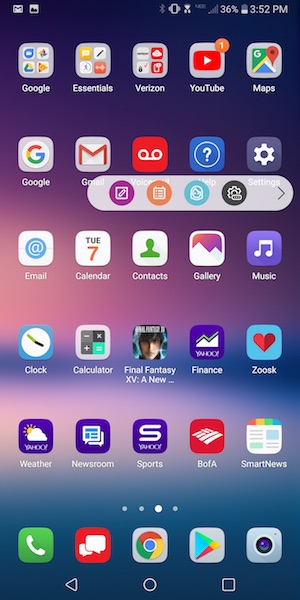
The LG V30’s user interface is pretty basic even with LG’s layer on top of stock Android. LG offers a few extras like the pop out shortcut bar that harkens to Samsung’s edge display. The difference is that you can’t swipe the edge of the screen to pop out the bar, you have to tap on the little tab. Since the tab is quite small, it makes the effort a little frustrating at times. I don’t know about you, but I rarely use these extra nav bars since it’s just as easy to put my most used app shortcuts and widgets right there on the first home screen.

Speaking of home screens, that’s where all your apps icons will live because LG’s custom skin over Android does not include an app drawer.

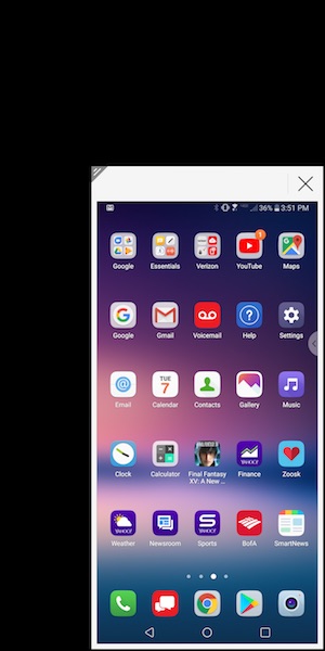
Another special LG feature allows you to shrink the screen for easier one-handed use. I don’t use this either.

One complaint that I do have about software and the V30 is that the phone doesn’t ship with Oreo. It has Android v7.1 Nougat.

Using the LG V30 for phone calls

I didn’t have any complaints from people I talked to while testing the LG V30. Conversations on both sides of my calls were clear and with decent volume. I also did not have any issues with dropped calls while testing this phone. Signal strength seemed to be no better or worse than other phones that I use and test on the Verizon network in my area.

Overall performance and battery life using the LG V30 for day to day tasks

When it comes to overall system speed, I have no complaints about the V30. Apps launch quickly, screens scroll smoothly, and I didn’t notice any sluggishness or problems navigating between apps.

I didn’t do any special battery life testing, but it felt better than other phones I’ve recently tested. You should have little trouble getting through a day on a full charge and if you barely use your phone, it might last for up to a week on a charge if you turn off apps that constantly ping for new info.

Final thoughts

After spending a few weeks with the LG V30 and the Pixel 2 XL at the same time, I ultimately decided to buy a Pixel 2 XL instead of an LG V30. The V30 is a really nice phone and I’ll be sad to send it back to Verizon because it has wireless charging and a microSD card slot, which I like. It also has the volume buttons on the left side of the phone instead of the right side, which I prefer.

But when it came down to it, my main reasons for going with the Pixel 2 XL instead of the V30 are stock Android, faster OS updates, and full resolution automatic image backup to the cloud. Those benefits tipped the scale for me.

Source: The sample for this review was provided by Verizon Wireless. Please visit their site for more info.


Product Information

Price: $840.00
Manufacturer: LG
Retailer: Verizon Wireless
Pros:
  • Thin bezels
  • Wireless charging
  • microSD card slot
  • Extra 1yr warranty through Verizon
Cons:
  • Some people may complain about the slight blue tint on the display when not viewed straight on

Filed in categories: Featured Items, Reviews

Tagged: , ,

LG V30 review originally appeared on The Gadgeteer on November 9, 2017 at 11:00 am.

Note: If you are subscribed to this feed through FeedBurner, please switch to our native feed URL http://the-gadgeteer.com/feed/ in order to ensure continuous delivery.

RocketLife Xero fidget spinner review

Is there such a thing as a premium fidget spinner? You bet there is and it’s the Xero fidget spinner from RocketLife. Let’s take it for a spin! <- You knew I was going to say that right?

What is it?

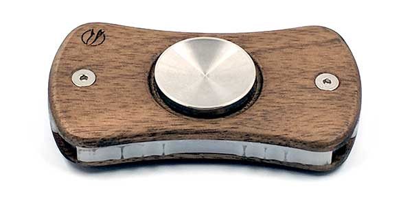
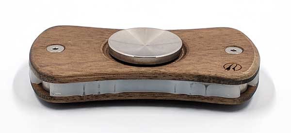
The RocketLife Xero Fidget Spinner is a two-armed spinner that features high-end materials and components that allow for a compact design and an average 5-7 minute long spin times.

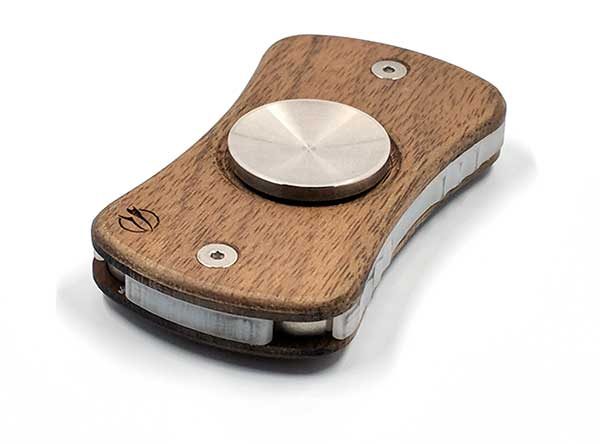
Each RocketLife Xero fidget spinner is made in California of hardwoods like maple, alder, walnut, and mahogany, with a laser-cut polymer core, ceramic bearings, and tungsten weights that are as heavy as gold.

The Xero fidget spinner doesn’t feel like the type of fidget spinner that you can buy at the gas station or the Walmart checkout lane. The Xero spinners have a quality look and feel thanks to the hand-rubbed mineral oil finish on the wood shell.

Another difference between the Xero spinner and other spinners is just how long it can spin. I didn’t think I’d be that impressed, but I was pretty surprised when I put the RocketLife Xero spinner up against my small collection of fidget spinners.

See it in action

It didn’t spin for the average 5-7 minute spin, but according to RocketLife, the spin times will improve as the spinner gets broken in. Even with more than 4 minutes, I was already impressed.

Final Thoughts

If you’re a fidget spinner aficionado or collector with a more than average budget for your hobby, head over to RocketLife and take a look at their premium fidget spinners that look good and provide long spin times for fidgeting fun.

Source: The sample for this review was provided by RocketLife. Please visit their site for more info.


Product Information

Price: $45.00 and up
Manufacturer: RocketLife
Pros:
  • Spins for several minutes
  • Hand assembled with quality components
Cons:
  • Pricey

Filed in categories: Reviews

Tagged:

RocketLife Xero fidget spinner review originally appeared on The Gadgeteer on November 8, 2017 at 12:46 pm.

Note: If you are subscribed to this feed through FeedBurner, please switch to our native feed URL http://the-gadgeteer.com/feed/ in order to ensure continuous delivery.
Schlage Connect Touchscreen Deadbolt door lock review

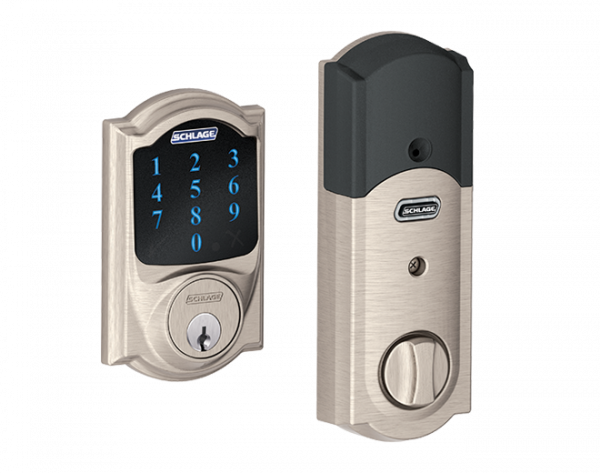
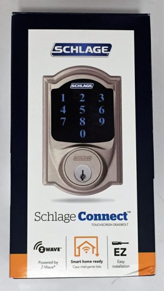
Keyless number pad door locks have been a familiar sight at airports and other commercial settings for years. These locks are especially useful for applications where multiple people must share access to a secure location, control of physical keys must be maintained, entry and security access must be logged, and tampering or unauthorized access must be alarmed. Historical installation cost of these commercial systems was a minimum of a few thousand dollars. Today, Schlage offers the Connect Touchscreen Deadbolt Door Lock. This lock is designed for residential use but is capable of providing all of the professional features listed above and is available for under $200 (not including the Z-wave hub). Read on to see what I think!

Installation

The Schlage connect comes with everything that you need to install the lock into a brand new door or to replace an existing lock. The lock does have some prerequisites:

  • the door should be able to be locked without pushing or pulling against the frame
  • the door must be easy to lock and unlock in the summer and winter.
  • the frame has at least 1″ for the bolt to extend into
  • the door is not more than 1 3/4″ thick (or Schlage will provide a thick door kit)
  • there is a minimum of 5″ between the doorknob latch and the bolt hole
  • a single cylinder installation is warranted (deadbolt operated by key from the outside and by the turn unit on the inside)

Since I meet all of the requirements I’m going to replace an existing deadbolt door lock.

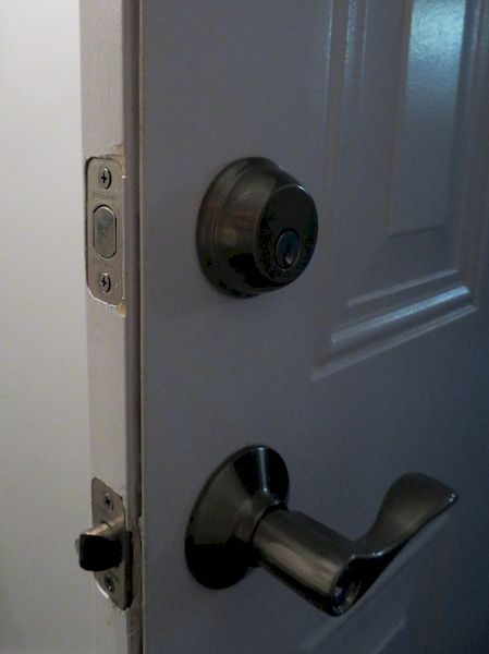
I installed this in a door that already had a Schlage deadbolt so I did not need to replace or alter the existing strike plate (the part that goes against the door frame).  The strike plate included with the package uses two reinforcing bolts that secure a steel reinforcing plate to the door frame with two 3″ long hardened steel wood screws. This plate is covered with a strike plate with smaller screws. This enhances the resilience of the lock to withstand being able to be struck up to 10 times with 150 ft-lbs.

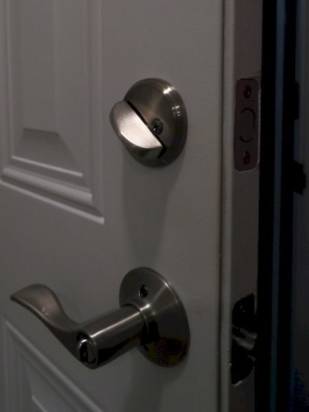
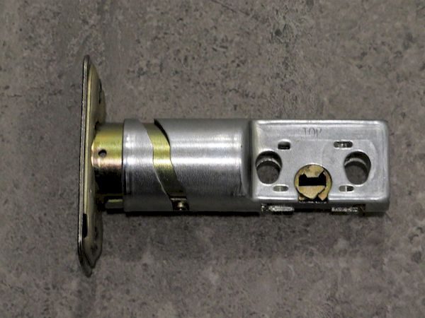
The bolt that comes with the lock is designed to be reconfigured depending whether the door has a mortise or not around the bolt hole, and also depending on the depth of the crossbore. Therefore the faceplate is either removed or replaced, and the faceplate is twisted, if necessary, to increase the length of the bolt. The latch bolt extends 1″ when engaged, but it is tapered somewhat towards the front, perhaps to aid in automated opening and closing. Therefore, even if you have a compatible bolt it is important to use the one that came with this system.  The tapered portion of the bolt is well behind the strike plate when engaged, so it shouldn’t impact the security performance. The robustness of the lock and mechanism has been rated Grade 1, the most secure, by BHMA and ANSI.

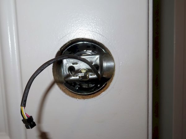
After installing the bolt and testing its operation, it is time to install the touchscreen. The tricky part of this is getting the keypad to mount vertically on the door and to ensure that the interface cable is fed correctly below the bolt through the crossbore. The lockset on the keypad is a standard Schlage assembly but with a custom stem (with tab) to mate with the actuator on the inside. I re-keyed the lock myself by carefully removing the weiser cap, exchanging the lock stem between this new lock and the lock I had at my house, and replacing the weiser cap.

The keypad and cylinder are bolted to a steel plate with hardened machine screws. The steel plate, while not attractive or useful, functionally completes the lock. The lock can be opened and closed from the key on the outside or the stem on the inside. The remaining parts, the actuated turn unit, and the alarm are what make this lock stand out from the competition.

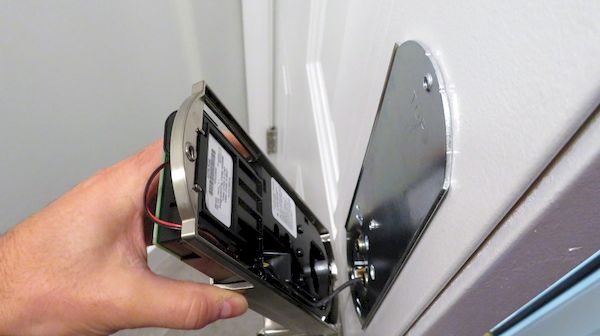
The picture below shows the interface cable connected and the actuator about to be installed. The pre-configured 4 digit key codes and 6 digit master code are printed on the label on the inside of the lock. Because this label is in an easy to access place by any unsupervised visitor to the house, it is recommended that the master and preset codes be changed or that the sticker be removed.

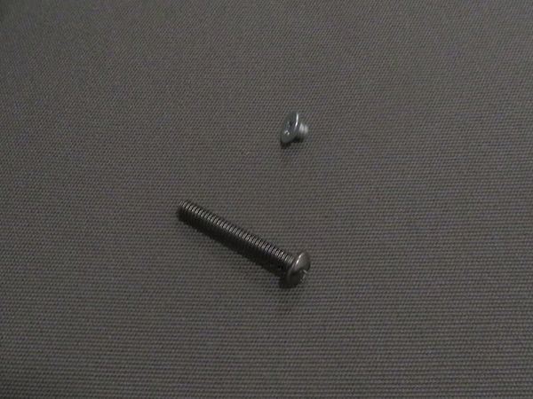
The screw which holds the top of the actuator and housing against the steel doorplate is tiny. Make sure you don’t lose it!

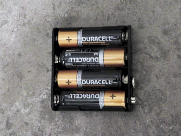
The kit comes with 4 Duracell AA batteries

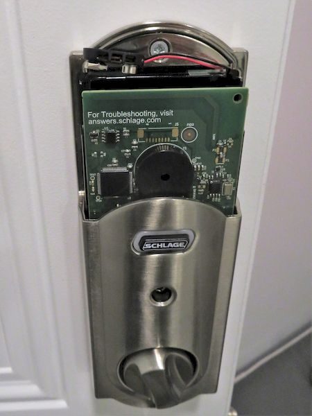
The battery compartment exposed. The battery cover slides on to the metal frame.

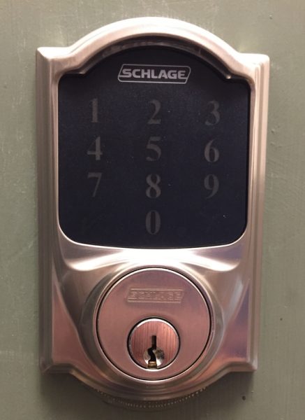
The installed keypad (on another doorframe)

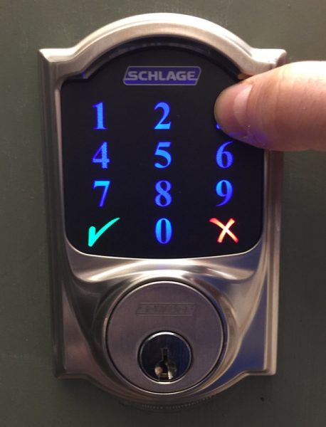
and with backlighting:

Local Operation

After installation is complete the lock performs a calibration to learn which side of the door the lock is installed on to. After calibration, the directions require that several exercises be conducted to ensure the door operates correctly.

If the door alignment is slightly off it may take more power than minimally required to open and close the door lock. The Schlage Connect has two power settings to conserve battery power. It will try to open the door with low power first and then use high power if necessary. If the door requires high power on three consecutive occasions it will use high power mode exclusively until the lock is reset.

The lock has the following features:

  • Storage of up to 30 individual user codes
  • A vacation mode that disables all user code access (entered by using the Programming code)
  • An option to turn on or off the beep to provide feedback of button presses
  • An option to be able to lock the door by pressing the Schlage logo on the keypad without entering a code
  • An auto lock feature to automatically re-lock the deadbolt 30 seconds after opening. This feature may be temporarily disabled

Programming is accomplished by opening the door and extending the deadbolt. The sequences are all initiated by pressing the Schlage button, entering a 6-digit programming code, and entering a function code (1 – 9).  It’s not the most user-friendly experience, but should not be done that frequently, and may optionally be completed by the Z-wave system if it is enabled and configured to access these setup codes.

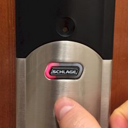
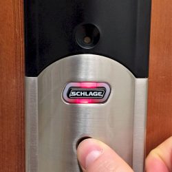
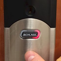
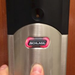
The alarm function is activated and configured using the inside Schlage button. The button is surrounded by three LED zones that are used to convey the alarm configuration. The alarm may be turned on or off, set to three different modes and may also be adjusted to 5 different sensitivity levels. These settings are all configured by pressing and holding the inside Schlage button for different amounts of time and releasing depending on LED flashes and beeps generated by the lock. Even with the manual in hand, it is a difficult process to go through.

The pictures below show the different LED patterns of the inside Schlage button.


The alarm is loud enough on the inside of the house that it should be heard on the other side of the door. However, I think the true benefit of this system is that you can be alerted when you are inside of your house and someone is trying to break into your front door. (Sorry for the chilling thoughts)

In addition to the tamper alarms that are generated by moving the door, the keypad enters a 30-second pause if 3 wrong entries are entered in a row. This is done to lower the chance of a successful brute force attack. For a 4 number code, this should only take about 8 hours, on average, assuming a 5 second entry time. However, adding a 30-second pause after 3 wrong attempts increases this to 18 hours. Clearly, there is a lot of benefit to having a longer code and I would recommend using the maximum 8 digit code for improved security and resistance to a brute force entry.

Remote Operation

The Schlage Connect lock is equipped with a Z-Wave radio. The radio is disabled as a default setting to conserve battery life but can be enabled to permit remote control of the lock. I integrated the lock with my SmartThings setup, but this can also be used with IRIS or Wink hubs

The stock SmartThings device handler shows the status (locked, locking, unlocked, unlocking, jammed), has soft buttons for lock, unlock, and reset, and a panel that shows the battery level. The SmartThings Community has a code available for enhancing this default handler.  Some code is free and others are for purchase. The type of additional features you might expect includes support for Schlage to enable/configure the Alarm modes as well as the sensitivity of the alarm; support for using the lock as a motion sensor device that generates a motion event when the alarm is set off so it can be used as a trigger;  support for enable/disabling the AutoLock features, enabling/disabling one-touch locking/lock and leave, enabling/disabling the Keypad (vacation mode) and enabling/disabling the audio alerts. Support may also include the ability to capture invalid user code attempts and lock tampering and being able to report if the door was locked/unlocked manually internally, externally, or remotely. Other functionality may include dynamically configuring the list of people that have access to open the lock.

Being able to configure the alarm state remotely also means that with a little programming the alarm could be set based on routines so that the alarm is set before bed but disabled in the morning.

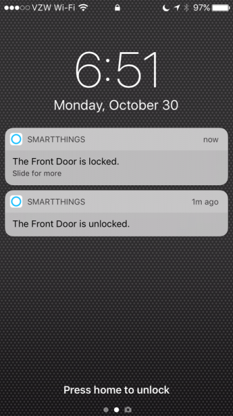
One of the best features is that the SmartThings app issues alerts about the door operation so that verifying the door is locked is easy to do with just a glance at a phone.

SmartThings plays well with Amazon Alexa so after a home automation query, the deadbolt, which I have named front door, shows up on Alexa’s home automation interface. Below is a movie which shows how the door can be activated with Alexa.

Performance

The lock has performed quite reliably for about two months now. I have not noticed that the door jams or that the lock fails to engage. The lock carries its own log of operations; from querying the correct parameter I can determine that the lock as operated with normal power 586 times, failed 27 times (I believe almost all of these are “test” runs), and operated with high-preload power 184 times.  The door is adjacent to my SmartThings hub so I’m not sure how much power the radio is consuming, but the Z-wave radio has been on the whole two months as well. With all of this activity, the battery is at 98%. Some people have reviewed this product and observed that the battery is quickly depleted but it does not seem to be the case with my experience.

The actuator is a bit loud but not unlike the other units that I have heard reviewed online. If I’m returning home late and I don’t want the lock to be loud, I use the key to open the door.

Having the door lock installed has allowed me to go for keyless jogs around the neighborhood. Also, I have provided our cleaning service with codes so that I can monitor the time that they are here and change the code if our cleaning service needs change.

Conclusion

The Schlage Connect is a well designed, feature rich door lock that combines keyless entry with remote operation and monitoring. The Schlage model offers the ability to enable and disable the keypad and includes built-in alarms; features that competitive offerings from Yale and Kwikset don’t include. The cost of the Schlage Connect is currently about $180, which is in line with the competitive offerings from Yale and Kwikset, although about ten times the cost of an equivalent Schlage single cylinder deadbolt. If you have a need for monitoring and controlling access by multiple people or just an interest in home automation then the Schlage Connect is a solid performer.

Source: The sample for this review was provided by Schlage. Please visit their site for more info and you can order one from Amazon.


Product Information

Price: $179.17
Manufacturer: Schlage
Retailer: Amazon
Requirements:
  • the door should be able to be locked without pushing or pulling against the frame
  • the door must be easy to lock and unlock in the summer and winter.
  • the frame has at least 1" for the bolt to extend into
  • the door is not more than 1 3/4" thick (or Schlage will provide a thick door kit)
  • there is a minimum of 5" between the doorknob latch and the bolt hole
  • a single cylinder installation is warranted (deadbolt operated by key from the outside and by turn unit on the inside)
Pros:
  • Storage of up to 30 individual user codes
  • A vacation mode that disables all user code access (entered by using the Programming code)
  • An option to turn on or off the beep to provide feedback of button presses
  • An option to be able to lock the door by pressing the Schlage logo on the keypad without entering a code
  • An autolock feature to automatically re-lock the deadbolt 30 seconds after opening. This feature may be temporarily disabled
Cons:
  • Program master code and default user codes are in conspicuous location
  • actuator can be loud
  • Programming and alarm operation is difficult using keypad and alarm key

Filed in categories: Reviews

Tagged: ,

Schlage Connect Touchscreen Deadbolt door lock review originally appeared on The Gadgeteer on November 8, 2017 at 11:00 am.

Note: If you are subscribed to this feed through FeedBurner, please switch to our native feed URL http://the-gadgeteer.com/feed/ in order to ensure continuous delivery.
LandingZone 12-inch MacBook docking station review

I’m not a stranger to LandingZone docking stations. I had their 15-inch MacBook Pro docking station on my Julie’s Favorite Gear page for 3 years. But then I downsized from the 15-inch MacBook Pro to a 12-inch MacBook and could no longer use it. To make matters worse, a docking station is a must-have accessory for the 12-inch MacBook because it only has one USB Type-C port that is used for everything. Luckily, LandingZone makes a docking station for Apple’s smallest MacBook. Let’s take a look.

What is it?

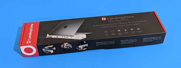
It’s a docking station for the 12-inch Apple MacBook (released in 2015 – present) that provides 11 ports and connections to address the fact that the MacBook only has one USB Type-C port that is used for connecting devices and for charging the laptop.

Design and features

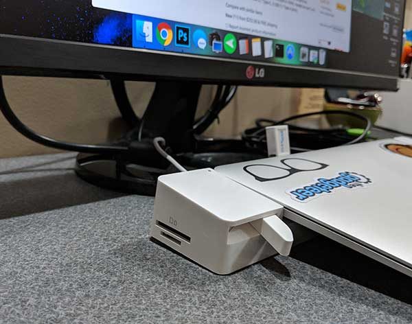
The docking station is made of shiny white plastic with two connectors that plug into the MacBook when it’s docked. There’s the USB Type-C connector that plugs into the left side of the laptop and a 3.5mm headphone plug on the right side of the MacBook.

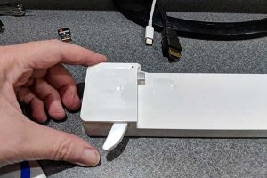
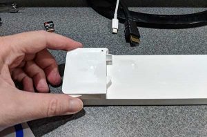
The right side of the docking station slides out to make it easier to position the MacBook in the docking station.

The ports are located on the back edge of the docking station. From left to right, there’s a Kensington security slot that can be used to secure the laptop with a cable, a 3.5mm audio out port, Gigabit Ethernet port, USB 3.1 Type-C high speed charging port, another USB 3.1 Type-C port, 2 USB 2.1 ports (one is a high speed charging port), an HDMI port (that supports 4K monitors at a resolution of 3840 x 2160) and the USB 3.1 Type-C port that charges the MacBook when it’s docked. You’ll need to use your MacBook power adapter for charging.

The docking station is designed so that you can only charge one smart device at a time and it is not recommended to plug in more than two high power or high transfer devices at once like a smartphone and external hard drives.

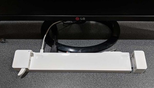
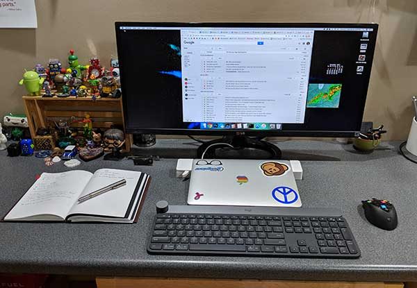
I’ve been using the LandingZone 12-inch MacBook docking station with an LG 29-inch monitor which plugs into the HDMI port on the back of the dock.

To dock the laptop, you just slide out the right side of the dock.

Then you plug the audio plug on the right side of the docking station into the MacBook’s audio port on the right side and line up the USB Type-C connector on the left side and slide both ends securely in place.

Here is my 12-inch MacBook docked and ready to be used. There’s a small status LED on the left side of the docking station near the USB Type-C port. This LED shows the MacBook’s battery charging status. It will glow yellow while charging and green when the battery is fully charged.


Undocking is just as easy. All you do is press the release lever on the left side of the dock which pushes the MacBook to the right and disengages the USB Type-C connector from the left side of the laptop. You can then slide out the right side of the docking station to unplug the audio connector. The docking and undocking procedure is smooth and easy.

The LandingZone 12-inch MacBook docking station even has a built-in card reader for SD and microSD cards. But from my testing, it looks like you can only use one of the slots at a time. If you have a card in the SD card slot and insert one in the microSD card slot or vice versa, it will automatically eject the other card.

During my testing of the LandingZone 12-inch MacBook docking station, I had no problem using it with a monitor and a USB dongle connected keyboard. I also used the high-speed USB Type-C port to charge my Pixel 2 XL and connected other accessories with no issues.

Final thoughts

I love my 12-inch MacBook but connecting accessories and peripherals is a pain in the rear due to it only having one port. the LandingZone 12-inch MacBook docking station comes to the rescue and solves that issue easily and elegantly. This docking station gets two thumbs up from me and easily earns a spot on my favorite gear page.

Source: The sample for this review was provided by LandingZone. Please visit their site for more info and Amazon to order.


Product Information

Price: $229.00
Manufacturer: Landingzone
Retailer: Amazon
Requirements:
  • 12-inch Apple MacBook 2015 – present
Pros:
  • Adds multiple ports to the 12" MacBook
  • Easy to use
Cons:
  • Can only use one of the card reader slots at a time

Filed in categories: Reviews

Tagged: ,

LandingZone 12-inch MacBook docking station review originally appeared on The Gadgeteer on November 7, 2017 at 1:26 pm.

Note: If you are subscribed to this feed through FeedBurner, please switch to our native feed URL http://the-gadgeteer.com/feed/ in order to ensure continuous delivery.
Daniels NYC Leather Briefcase review

When my sister finished her Master’s program, I gifted her with a leather portfolio/briefcase. When I finished mine, an aunt and uncle did the same for me. I still have the leather folio my dad was given early in his career. Leather briefs, it seems, are a rite of passage of sorts. They are cherished and used with joy not only because of the feel of the leather, but the knowledge of the expense and investment they represent. So, what if a leather briefcase could be had for less than $200, rather than two or three times that amount? Would it change the calculus of its value? Daniels NYC is asking us that very question with their new line of leather briefcases that cost only $149.
Note: Photos may be tapped or clicked for a larger image.

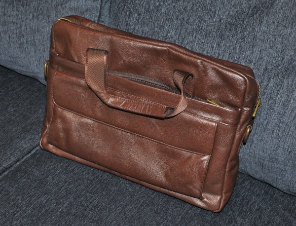
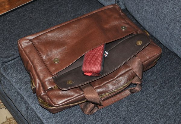
The Briefcase comes in two colors – brown and black. Both are made from cowhide tanned in Novo Hamburgo, Brazil, and then cut, sewn, and assembled in Ho Chi Minh City, Vietnam. The manufacture of the briefcase is top-notch. The seams inside are either fully folded in or covered with heavy bias tape. The zippers and pockets are decoratively top-stitched and dual layered. The quality metal zippers have heavy, molded pulls, and the sewn-in D-rings feel solid but are so snugly fitted that I cannot turn them to see if there is a weld. The full-length rear pocket’s magnet-enhanced snap closure is punched perfectly, as are the two on the front pocket flap. The smooth, seat-belt quality webbing in the handle is covered by leather where your hand will hold it. The pebble-grain leather feels lush to the touch.


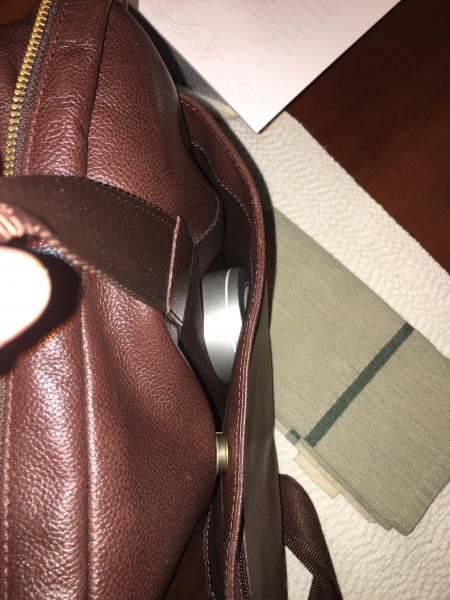
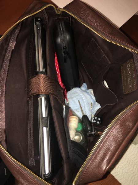
The layout of the pockets is as follows: The front has a full-length zippered pocket with another flap-covered pocket about an inch in from either side. The flapped pocket has a 1” bellows, which will hide bulky items like power supplies, sunglasses cases, or a wad of keys. The zippered pocket is only about 7” deep, so will not hold full sheets of paper unless they are folded. On the opposite side, there is an open pocket a little deeper but it has a metal magnetic snap which is just inside the top rim. There is easily enough play to slip in a newspaper or magazine for reading on your morning commute. A flat zipper pocket on top of it measures 11” across, but is only 6.5” deep.


The middle (main) storage area has a full-length padded laptop pocket, with a Velcro-fastened strap centered. There is no real padding in the bottom, but the pocket is protected from anything within the rest of the interior. On the back of this is a 6”x10” zippered flat pocket with an exposed zipper. (Your computer or iPad may be scratched by this zipper if it does not have a case on it.) Across from the laptop pocket is an organization panel that has three very tight, skinny pen holders, a 4” flat patch pocket, and a 3” bellows pocket. The flat pocket would just hold my iPhone 6s Plus, with about an inch sticking out, and the bellows pocket could hold a credit card wallet or business card holder. To the side of the bellows pocket is a key clip.


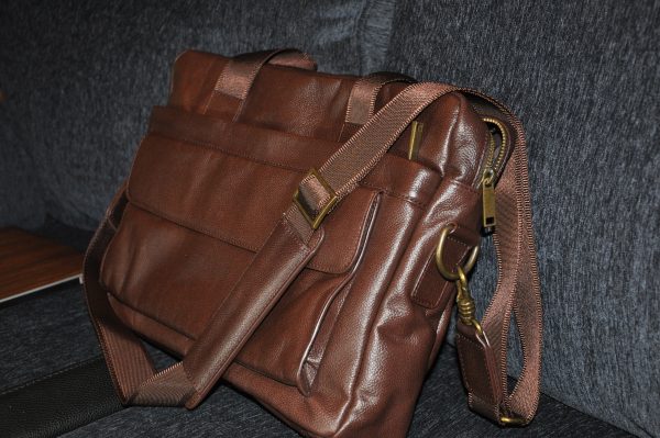
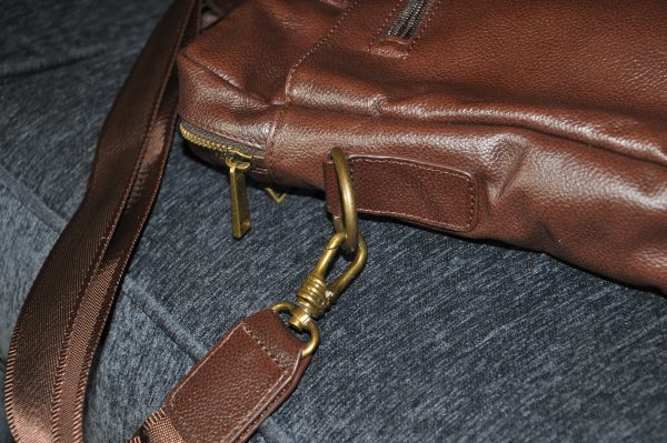
At either end on the exterior, there is a sewn-in brass-colored metal D-ring. The D is about 1.5” across. This is held to the case by a 2.5” tab of leather doubled over and box-stitched in. The strap has matching hardware, with smooth webbing connecting the hardware. A leather stress pad slides easily along the length.
At 16” x 10.5”x 3”, the case is a great size for a laptop, papers, and presentation supplies. If you’re going to be doing tech-heavy work, or need a protein bar or change of clothes, this is not going to be a good case for you. But if, as the setup in their website states, you’re one of the “young, intelligent, and ambitious men off to their first interviews, internships, and eventually, jobs… wearing…suits and ties…carrying backpacks,” this case is made with you in mind. It’s certainly formal enough for any office I’ve worked in but can be dressed down for any environment.

I’ve been carrying it with my iPad Pro 12.9”, my Logitech K811 Bluetooth keyboard, and a few other essentials. It’s easy to load or access the contents, and not so cavernous that you tend to overload it with your full portable assault gear, which makes it less stressful on your shoulders. I’ve not noted any scratches or scuffs as yet, maybe because it tends to bring out my inner gentleman who doesn’t get into scratchy, scruffy situations. It’ll be interesting to see how this plays out over time. Maybe it’ll compare with my dad’s folio in years to come.

Source: The sample for this review was provided by Daniels NYC. Please visit their site for more info.


Product Information

Price: $149
Manufacturer: Daniels NYC
Requirements:
  • none
Pros:
  • Affordable briefcase of real leather
  • heavy-duty hardware
  • quality workmanship
Cons:
  • Not full-grain leather
  • Exposed zipper inside laptop compartment

Filed in categories: Reviews

Tagged: ,

Daniels NYC Leather Briefcase review originally appeared on The Gadgeteer on November 7, 2017 at 10:17 am.

Note: If you are subscribed to this feed through FeedBurner, please switch to our native feed URL http://the-gadgeteer.com/feed/ in order to ensure continuous delivery.